Use Music To Create A Particle Splash

Using the keyframe data generated from the audio waveform, we’ll be connecting our Particular emitter to create a splashy particle animation. Enjoy!


Tutorial

Download Tutorial .flv

File size 165MB

Additional Resources


Quick Tip: How to Create Mixed Ink Swatches with InDesign


Today’s financial situation has led to more clients asking for better value for money when setting budgets for design and print. A common request for a designer is to cut the number of inks from four down to two. Although this does cut print costs, it also cuts the designer’s color palette down dramatically. This tut will give you the knowledge to create more colors from a two color brief.

Continue reading “Quick Tip: How to Create Mixed Ink Swatches with InDesign”

Quick Tip: Realistic Solo Orchestra Instruments with Keyswitch Articulations

Performers who play orchestral instruments often use multiple playing styles throughout a piece of music. Therefore, knowing when to switch articulations is important for computer composers who want to achieve a realistic sound. Fortunately, many orchestral VSTi have a feature that helps us do this, called keyswitching.

Download audio file (04Keyswitch.mp3)


Step 1: Pattern

To demonstrate this, I’ll be using the Viola Solo instrument from Kontakt 4, but this tutorial will apply to any orchestral plugin that supports keyswitching, though different plugins may use slightly different terms for articulations. Note that I selected the Sforzando articulation, which has a hard attack, allowing us to hear even the shortest notes.

Here is our pattern. Feel free to use the midi file if you’d like to follow along: StartingPattern.mid, or you could apply these tips to an original piece of your own. Note that for my pattern, the tempo is set to 178bpm.

Download audio file (01Keyswitch.mp3)


Step 2: Staccato

When a plugin’s design allows us to switch articulations using notes, this feature is called Keyswitching. Usually, these notes will be assigned to a very low octave, outside the musical range of the instrument. Once we locate these notes, we can change the articulation from inside the piano roll.

To begin, let’s apply the Staccato articulation to our staccato (short) notes. To do this, you’ll place a note on the Stacatto key to turn on this articulation, and you’ll also place a note on the Sforzando key where you want to switch out of it. In the image, I added the grey bars to help show where Staccato is turned on. Note that it is okay to be a little early with your keyswitches.

Download audio file (02Keyswitch.mp3)


Step 3: Legato/Sustain

When some notes are connected, it can sound great to have a hard first note and then soft attacks on the following notes. This makes for a realistic legato phrase where the notes blend into each other smoothly. Let’s turn on the Sustain articulation for our legato notes, and maybe have a little bit of overlap on some of those notes.

Download audio file (03Keyswitch.mp3)


Step 4: Fortepiano

The Fortepiano articulation is like a sustain note, having a soft attack, but with the addition of a swell. It can add a nice flourish to a pattern.

Download audio file (04Keyswitch.mp3)

I also want to note that we have a section with hard articulations (Sforzando, Staccato) and then we have a section with smooth articulations (Fortepiano, Sustain). This is why the pattern is so believable.


Step 5: Pizzicato

It takes a moment for a performer to switch between using their bow and their fingers, so the Pizzicato articulation should be used for entire sections like a verse or breakdown. Here it is in action.

Download audio file (05Keyswitch.mp3)

Did you notice how our previously staccato notes stood out? It is unrealistic for us to expect a violin performer to pluck those notes so quickly, so let’s remove some of them. Let’s also add some more dynamic range to our Pizzicato section, as our violin player may hurt his fingers having to play each note that hard. In FL Studio this is easily achievable by using the Scale levels tool ALT-X, and using the Tension knob, or you may prefer to adjust each note individually.

Download audio file (06Keyswitch.mp3)


Step 6: Clarinet

To demonstrate that this technique is applicable for other instruments, I copied the notes from Step 4 and had a Clarinet play them.

Without keyswitching articulations:

Download audio file (07Keyswitch.mp3)

With keyswitching articulations:

Download audio file (08Keyswitch.mp3)

Notice how much better the second example sounds? These principles apply to all instruments that support multiple articulations.


General Guidelines

  • Study the meanings and uses of these articulations. For example, if you know that Staccato means short notes and that Sustain/Legato means connected long notes, you can easily select a suitable articulation for each note.
  • If you’re going for realism, try to imagine what a performer is actually capable of. Notes cannot last forever, performers will need rests, and there’s a limit to how quickly a performer can switch between notes and articulations.
  • Don’t overdo it. Too many articulation changes in one phrase can sound as fake as having none. Like with a lot of subtle things in audio, it should be unnoticable to the average listener, unless you take it away.


Seven Steps To Writing Memorable Melodies – Part 3

Welcome back to Part 3 of our mini-series in ‘Seven Steps To Writing Memorable Melodies’. If you missed the previous parts, then I do urge you to pop over and read those first, as there is a natural progression of the steps as we build on information learned from each previous stage. You can read Part 1 here, and Part 2 here.

If you’ve already read and digested the previous two parts, then lets get stuck in to the final steps of this tutorial.


Step 6: Compose, Stop, Repeat, Record

As I’ve already mentioned in the introduction to this tutorial, writing a good melody is not something that can be achieved simply by ‘doing it like this… a. b. c.’. The steps in this tutorial are techniques, guides, tips – but they all require the composer to use their own creativity to takes these tips and implement them in to a unique composition.

As such, as you move along with your melody and try out different ideas from the steps in this tutorial series, you should always be prepared to STOP and REPEAT when something magical happens.

What I mean by this is oftentimes when you’re composing, humming, singing, or playing your new melody alongside a chord sequence, suddenly a certain musical phrase or part of the phrase sounds simply fantastic… the natural thing to do here is to continue along with the composition as the song carries you along and you feel excited to see what else you can come up with. You heart is captured by the moment and you become excited to continue composing this amazing new melody. However, by the time you reach the ‘end’ or become creatively exhausted, you may well have forgotten the exact combination of the chord, melody notes, rhythm, and so on that you played during that heart-stopping moment of greatness!

As such, I always recommend no matter how emotionally deep you’re getting into the new composition as you sing/play your melody, just remember to stop immediately following the ‘great moments’, and make sure you repeat, re-repeat and then record or write down those inspired moments. It is these small moments of magic which make your melody something very special, and therefore it’s essential you capture them!


Step 7: Rhythm & Varying Note Lengths

One thing that can make a good melody great, is the clever use of rhythm and note-length. It is very tempting for composers to just change from one note to the next, on every beat of the bar, or at the same time as chord changes.

This can be suitable for the right kind of song, but, the melody really needs to be strong and there should be something else picking up the interest too such as clever chord changes, or percussion providing some variety and interest.

Most of the time, you’ll do well to take the notes from the melody you’re starting to compose, and really think hard about how to ‘spice’ them up by holding on to certain notes longer, adding quavers and semi-quavers across slightly quicker passages to bring more musical movement in to the melody.

In the example we’ve been using for our tutorial, the time signature has been in 3/4 time. Understanding key signature theory is perhaps not that critical for those who’ve never studied it before. Certainly not as important as understanding key signatures (as mentioned in Step 2). Most musicians just ‘feel’ the beat of the music and intuitively know the timing without necessarily understand what 3/4 time, 4/4 or 6/8 means. If you do understand time signatures, it will certainly help you when it comes to jotting down your song to a score. And you’ll be able to see where perhaps the melody has become ‘stuck’ in the rhythm of simply changing note on each beat of the bar.

One effective tip for adding something extra to a melody rhythm is to try and allow some notes to be held across bars. What does this mean? Well, if we take our example song from this tutorial, we could amend the rhythm to add more interest as follows.

Download audio file (audio-7-1.mp3)

Here, between the first and second bar, the A is held for two beats, which takes it across the two bars, before the G is finally played. This adds some musical variety to the piece, and once again it moves the melody away from being too ‘obvious’; a little curiosity. You often here composers use this technique of slightly varying the rhythm in repeated patterns. In modern music (the kind with verse, chorus, verse, chorus), you will sometimes hear that the composer makes use of this technique in the final chorus for example. To add an extra special element to the piece, where the listener has heard a melody line a couple of times, and the final time they hear it in the song, it’s ever so slightly tweaked rhythmically, giving it greater impact.


Bonus Tip: Using The Techniques Creatively

So, we now have a solid set of seven techniques/tips to help make our melodies more memorable. As mentioned previously however, these steps alone will not result in a fantastic melody… they require interpretation, creativity, style, and clever use of the various techniques.

If you’re an absolute beginner when it comes to writing melodies, then I forgive you for somewhat ‘copying’ the example given in this tutorial. This will help you understand some of the ways in which each different technique can add something extra to a melody. However, a word of warning, don’t get into the habit of copying melodies. If there’s one thing people will pick up on more than most, it’s a bad copy of a good melody. What I mean here is if you start thinking ‘I want to create a song as good as, or like song X’… you’re heading for a sure fire way to spoil your chances of composing something great.

Instead, I suggest you try your utmost to cast all other melodies and songs out of your head. Be inspired by your own mood at the time of writing. Then choose a key signature, and start matching chord sequences with some harmonizing melody lines. Try to be creative in the way you use the different techniques by forcing yourself to do something you’ve not done before. For example, if you find yourself always writing in C Major, change it, perhaps G Major instead? This will have a dramatic effect on the way your brain, or ‘head voice’ automatically sings along to the chords being played. Mainly because your voice can only sing within a certain range (perhaps a couple of octaves). Shifting the key signature is therefore helpful to try and inspire new creativity in your melodies.

Alternatively you could try using the six note jump technique (Step 4 of this series of tutorials) in completely new parts of the phrase than you’ve tried before. Or linking different jumps together, one directly after another. Sometimes going up six whole tones, others going down. Think of the great ‘Love Story‘ melody, you can see how the first 8 bars of that music are practically entirely based on six note jumps. They’re used in such a clever way, that anyone who’s heard this song once, will probably find it almost instantly memorable!


Conclusion

For those who have previously been struggling with creating strong melody lines I really do urge you to fully familiarize yourselves with the tips provided in this series of tutorials. By being completely comfortable with the techniques, you’ll find you won’t need to ‘think’ about them much, thus allow your creative side take over.

As you listen to your favorite popular melodies, try to listen to them from the point of view of the above tips. This will help you learn how great melodies deploy the different techniques and consequently improve your melody compositions in the long run.

Always remember that generally, a great song needs not only your funky guitar chords, or computer generated cool new instrument choices, or wonderfully written lyrics… but also a really memorable, and strong melody line to take the song from nice to number one!


Use Illustrator and Photoshop to Create a 3D String of Pills – Screencast


Designers often use both Illustrator and Photoshop to create a scene or graphic. Today we will combine both of these powerful applications to create a 3-dimensional pill and then create a composite image using these elements. Let’s get started!


Resources Used

The following resources were used during the production of this tutorial.


Part 1


Part 2


Part 3


Part 4

Build a Sci-Fi Game Intro Using Assets From deviantART – Active Premium

Today, we have another Active Premium tutorial exclusively available to Premium members. This massive Premium offering covers design and development in equal measures, so open up Flash and Photoshop, then grab a large cup of coffee!


This Premium Tutorial is Filled with Creative Tips

In this tutorial we will create an intro to a space-themed tower defense game using only assets from deviantART.com. We will create all parts of the animation ourselves, mostly with the help of Photoshop brushes. In the end you will be able to create a stunning intro animation and a professional start menu for a sci-fi Flash game.


Preview

Take a look at the sci-fi interface you’ll be building:


Professional and Detailed Instructions Inside

Premium members can Log in and Download! Otherwise, Join Now! Below are some sample images from this tutorial.

Sci-fi Interface Active Premium

Active Premium Membership

We run a Premium membership system which costs $9 a month (or $22 for 3 months!) which periodically gives members access to extra tutorials, like this one! You’ll also get access to Psd Premium, Vector Premium, Audio Premium, Net Premium, Ae Premium and Cg Premium too. If you’re a Premium member, you can log in and download the tutorial. If you’re not a member, you can of course join today!

Also, don’t forget to follow @activetuts on twitter and grab the Activetuts+ RSS Feed to stay up to date with the latest tutorials and articles.

Flash for Android: Beer Tapper Preview

Today’s quick screencast is a preview of the latest Flash Android game I am working on with Aidan Coyne. This game is a port of Beer Tapper and I plan on reskinning it to help promote my Developer Happy Hours.


Screencast: Beer Tapper Preview

This version of Beer Tapper was created with Flixel and has been optimized to run on web and mobile. The source code can be found at http://github.com/raptros/DeveloperHappyHour.

Don’t like ads? Download the screencast, or subscribe to Activetuts+ screencasts via iTunes!

Don’t forget you can tart up your desktop and mobile devices with the Flash for Android Wallpaper!

Enhance Your Flash Layouts with Draggable Windows

In this tutorial you’ll learn how to create draggable windows using Flash and AS3. I’ll cover the basics of drag&drop, window bounds, adding content, and how to minimize the window.


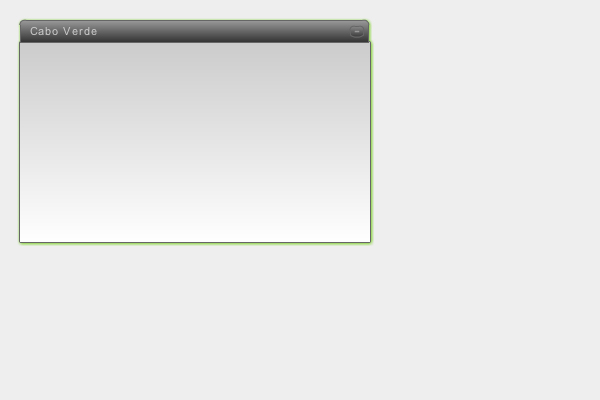
Final Result Preview

Let’s take a look at the final result we will be working towards:


Step 1: Create a New File

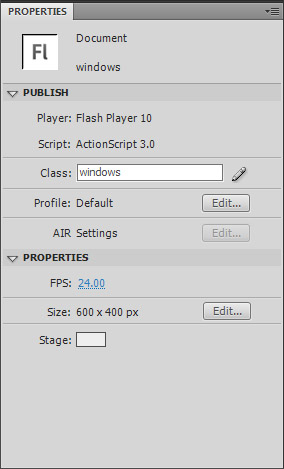
Okey, let’s gooo! Create a new document by hitting CTRL+N and selecting Flash File (ActionScript 3). Set the stage size to 600×400 px and the background color to #EEE. In the Properties window, set the class to windows and save your file as windows.fla.


Step 2: Design the windowArea

Select the Rectangle Tool (R) and draw a rectangle with 280×90 px. Select your shape, go to the Color palette (Window > Color) and create a gradient from #FFF to #CCC.

Hit F for the Gradient Tool, select your gradient, rotate it 90 degrees (by holding the Shift button while you rotate) and shorten it so it adapts the rectangle.

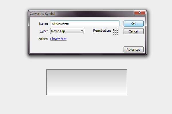
Select all the shape, hit F8 to Convert to Symbol, name it windowArea and set the registration point to the top left.

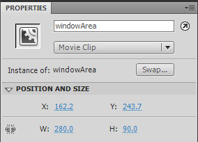
Select the symbol and in the Properties window set the instance name to windowArea.

For the border, use the Glow filter, with a 2px blur, strength 500%, color #666666. I used a glow because if you use a stroke, when you resize the Window the stroke will also resize.


Step 3: Design the windowBar Button

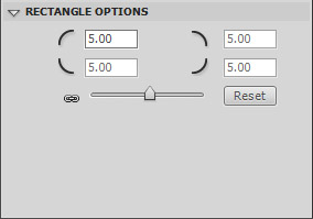
Select the Rectangle Tool (R) again and draw a rectangle with 280×22 px and a 1px stroke with the color #666. Create another rectangle on top of this, but this time in the Rectangle Options set the Rectangle corner radius to 5.

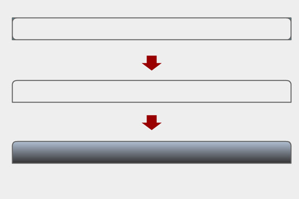
Now, eliminate the necessary corners like on the image below.

Then, paint your shape, select it, go to the Color palette (Window > Color) and create a gradient from #999 to #333. Rotate the gradient 90 degrees, like we did on the previous step.

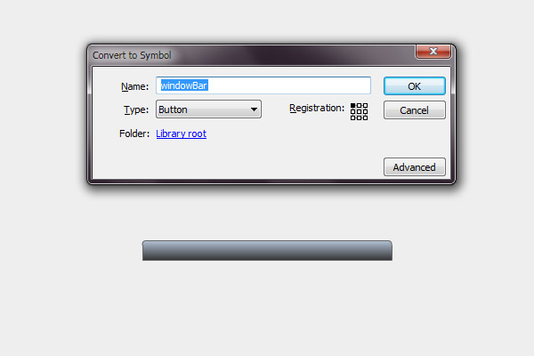
Select the all shape, hit F8. Name: windowBar; Type: Button; Registration: top left.

Select the symbol and in the Properties window set the instance name to windowBar.

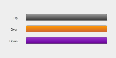
Double click the shape, create keyframes for the Over and Down states. Now change the colors for each one.

I’ve chosen:

  • Over: gradient from #FF9900 to #CC6633
  • Down: gradient from #9933CC to #660099

Step 4: Create the Minimize Button

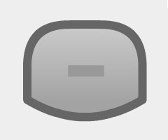
Create a round rectangle with 14×11 px, 5px radius, and change it so it looks something like below.

The minus sign you do by creating a rectangle 5×2 px with the color #999. Set the instance name to minimizeBtn.

I used the same colors from the windowBar, but the UP State with a 40% alpha for the gradient.


Step 5: Create the Window

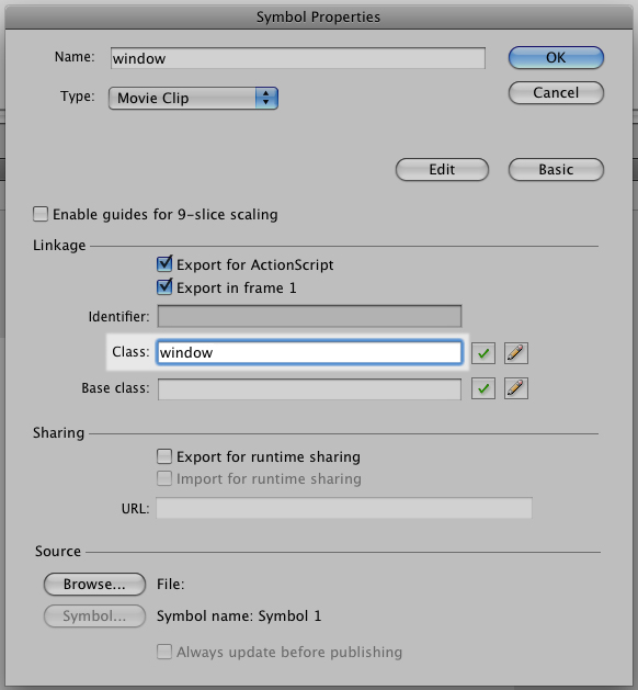
Arrange all shapes in form of a window, hit F8 and create a MovieClip with the name window and registration: top left.

In the Library, right click the Window and go to Properties. Set the class to window. This way the window will be assigned to the class we’ll be creating later.

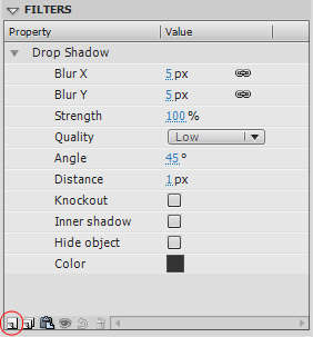
Select the symbol and in the Properties window set the instance name to window. In the Filters, click Add filter (the circled button in the image below), and add a Drop Shadow with the color #333 like below:

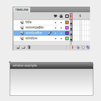
Double-click the symbol to edit it. Select all (CTRL+A), Right Click > Distribute to layers.

In a new layer, write the text for the window’s title with Arial, 11pt, color #CCC, letter-spacing: 1. Set it to Dynamic Text and name it windowTitle.


Step 6: Create the ActionScript File

Now that the design is complete, let’s start coding our scene. The first thing we’ll do is create our ActionScript file.
Hit Ctrl+N or go to File > New and select ActionScript File. Save it in the same directory and with the same name (windows.as) of your FLA file.

Now let’s create our package and import the necessary classes:

package {
	import flash.display.MovieClip;
	import flash.events.Event;
	import flash.events.MouseEvent;
	import flash.events.KeyboardEvent;
	import flash.events.ContextMenuEvent;
	import flash.geom.Rectangle;
	import flash.filters.DropShadowFilter;
	import flash.text.TextFormat;
	import fl.transitions.Tween;
	import fl.transitions.easing.*;
	import fl.transitions.TweenEvent;

	public class window extends MovieClip {

	}
}

Step 7: Add Event Listeners

Now you need to assign functions to our buttons. You’ll need a function to when we start to drag the windowBar, another to stop the drag, one to bring the window to top when you click it, and another to minimize it.

Add these Event Listeners to the public function Window() in our code:

public class window extends MovieClip {

	// variables
	public var title:String;

	public function Window() {

		// set windowTitle
		title = windowTitle.text;
		windowTitle.mouseEnabled = false;

		// windows functions
		this.addEventListener(MouseEvent.MOUSE_UP, onWindowClick);
		this.windowBar.addEventListener(MouseEvent.MOUSE_DOWN, onWindowStartDrag);
		this.windowBar.addEventListener(MouseEvent.MOUSE_UP, onWindowStopDrag);
		this.minimizeBtn.addEventListener(MouseEvent.MOUSE_UP, minimizeWindow);
	}

}

The public var title is used for the window’s title. We’ll be using this later.

Since the windowTitle is a dynamic text we disable its mouse functions so that they won’t affect the dragging area of the windowBar.


Step 8: onWindowStartDrag Function

This is where we start having fun! Copy the following code after the public function Window():

/* START DRAG
**********************************************************/
private function onWindowStartDrag(e:MouseEvent):void {

	var windowWidth  = this.width;
	var windowHeight = this.height;

	var windowBarWidth  = e.target.width;
	var windowBarHeight = e.target.height;

	var boundsRect:Rectangle;

	// window's draggable boundaries
	if (windowArea.visible) {
		boundsRect = new Rectangle(0, 0, stage.stageWidth-windowWidth, stage.stageHeight-windowHeight);
	} else {
		boundsRect = new Rectangle(0, 0, stage.stageWidth-windowBarWidth, stage.stageHeight-windowBarHeight);
	}
	//trace(boundsRect);
	this.startDrag(false, boundsRect);

	// bring window to front
	stage.addChild(this);
}

The first thing we do here is create variables to the widths and heights of the Window and the windowBar.

Next, the window’s boundaries. We’ll create two boundaries: one when the window is normal (if windowArea is visible) and another when it is minimized. You do this by creating a rectangle with the size of the stage. The rectangle supports four attributes (x, y, width, height). It’ll start in the corner of the screen (x: 0; y: 0) and extend to the other corner of the screen. Because the bounds are related to the registration point of the window, we’ll need to subtract the window width and height (or the windowBar‘s in case the window is minimized).

After the bounds have been set, we’ll set the window to drag. We’ll drag this, the Window class. In other words, the whole window.

this.startDrag(false, boundsRect);

The startDrag function supports two attributes: lockCenter and bounds. If you don’t want any bounds just write this:

this.startDrag(false);

If we have several windows we’ll need to bring the current window to the top of the display. We do this with the addChild by adding it again to stage:

// bring window to front
stage.addChild(this);

Step 9: onWindowStopDrag Function

This one is really simple. We’ll use the stopDrag function here. Just copy the following to your code after the previous onWindowStartDrag function:

/* STOP DRAG
**********************************************************/
private function onWindowStopDrag(e:MouseEvent):void {
	this.stopDrag();
}

Step 10: Bring Window to Front

Again, really simple. When we click the window we’ll bring it to front using addChild.

/* WINDOW CLICK
**********************************************************/
private function onWindowClick(e:MouseEvent):void {
	// bring window to front
	stage.addChild(this);
}

Step 11: minimizeWindow Function

To minimize/show the window, we’ll toggle the visibility of the windowArea like this:

/* MINIMIZE WINDOW
**********************************************************/
private function minimizeWindow(e:MouseEvent):void {

	windowArea.visible = !windowArea.visible;
}

You can improve this by fading out the window and hiding it, and vice-versa:

/* MINIMIZE WINDOW
**********************************************************/
private function minimizeWindow(e:MouseEvent):void {

	var fade:Tween;

	if (windowArea.visible) {
		fade = new Tween(windowArea, "alpha", Strong.easeOut, 1, 0, 0.5, true);
		fade.addEventListener(TweenEvent.MOTION_FINISH, fadeFinish);
	} else {
		fade = new Tween(windowArea, "alpha", Strong.easeOut, 0, 1, 0.5, true);
		windowArea.visible = !windowArea.visible;
	}

	fade.start();

	function fadeFinish(e:TweenEvent):void {
		windowArea.visible = !windowArea.visible;
	}
}

The Tween supports the following values:

Tween(object, "property", EasingType, begin, end, duration, useSeconds);

For more extensive reading, use the LiveDocs.

In our case, what we’re doing is, if the windowArea is visible (meaning: not minimized), it will fade out the windowArea and when the tween finishes (TweenEvent.MOTION_FINISH), it will hide the windowArea. Vice versa if it’s minimized.


Step 12: Set the Title

We’ll use the variable t to change the windowTitle. The other two lines are just to resolve a letter spacing issue. If you don’t write them Flash will reset the letter spacing to zero.

/* SET WINDOW'S TITLE
**********************************************************/
public function Title(t:String):void {

	var fmt:TextFormat = windowTitle.getTextFormat();
	windowTitle.text = t;
	windowTitle.setTextFormat(fmt); // letter spacing issue

	title = t;
}

This function will be used later like this:

YourWindowName.Title("Name of your window");

Step 13: Set the Size

This function will receive two attributes: the Width and Height of the window. If neither is filled, it will be set to the default size (280×112 px)

What we do here is change the width of the windowBar, the windowArea and the windowTitle. For the height we just change the windowArea‘s, leaving the height of the Window to its default size, just like a normal window.

When resizing we’ll have to reset the position of the Minimize Button. Which is equal to the window’s width minus the button’s width and 6px.

/* SET WINDOW'S SIZE
**********************************************************/
public function Size(Width:int = 280, Height:int = 112):void {

	// change width
	windowBar.width = Width;
	windowArea.width = Width;
	windowTitle.width = Width - 45;

	// change content height
	windowArea.height = Height;

	// reset minimizeBtn scale/position
	minimizeBtn.x = Width - minimizeBtn.width - 6;
}

This function will be used later like this:

YourWindowName.Size(350,200);

Step 14: Give it a Nice Shadow

Remember when we placed a Drop Shadow under the Window? Well, if you place the window by code you’ll need to add the drop shadow by code as well.

All of the above attributes can be set by code. Copy the function and change the values according to your own taste:

/* SET FILTER: DROP SHADOW
**********************************************************/
public function DropShadow(color:String = "333333"):void {

	var dropShadow:DropShadowFilter = new DropShadowFilter();

	dropShadow.blurX = 5;
	dropShadow.blurY = 5;
	dropShadow.strength = 1;
	dropShadow.quality = 1; // 1- low; 2- medium; 3- high (max: 15)
	dropShadow.angle = 45;
	dropShadow.distance = 1;
	dropShadow.alpha = 1;
	dropShadow.knockout = false;
	dropShadow.inner = false;
	dropShadow.hideObject = false;
	dropShadow.color = int("0x" + color);

	this.filters = new Array(dropShadow); // add filter to the window
}

This function will receive a String with the color’s hexadecimal code. If this is not filled, the default color value will be #333333.

The quality can go from 1 to 15, being 1 2 3 – low, medium and high. We used low, here.

The color must be converted from a String to an int.

After defining the attributes we must add the filter to the window like in the last line. This will create an Array of filters. Which means you could add other filters to the Window as well.

this.filters = new Array(dropShadow);

This function will be used later like this:

YourWindowName.DropShadow("FF0000"); // adds a red shadow

Step 15: Adding a Window by Code

Now change to your Flash file, create a new layer, name it as3 and hit F9 for the ActionScript (or go to Window > Actions).

Adding a Window is very simple. All you need to do is create a variable (let’s call it myWindow), assigning it to the Window class and the add the Window to stage:

var myWindow:window = new window;

addChild(myWindow);

This will produce a Window with its default values.


Step 16: Changing the Values

You can change several attributes of the Window:

  • Title
  • Shadow
  • Size
  • X and Y position
  • Content

Again, the first thing to do is to create the variable assigned by the Window class:

var myWindow:window = new window;

Then you can start changing the attributes:

Changing the Title:

myWindow.Title("Cabo Verde");

Changing the Shadow:

myWindow.DropShadow("66CC00"); // adds a nice lime shadow

Changing the Size:

myWindow.Size(350,200);

Changing the Position:

myWindow.x = 20;
myWindow.y = 20;

Adding the window to stage:

addChild(myWindow);

The all code will be like this:

var myWindow:window = new window;

myWindow.Title("Cabo Verde");
myWindow.DropShadow("66CC00");
myWindow.Size(350,200);
myWindow.x = 20;
myWindow.y = 20;

addChild(myWindow);

Step 17: Using Additional Windows

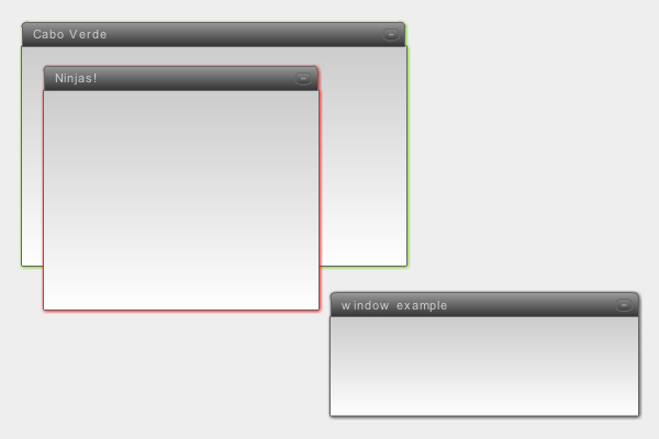
Here’s another example with two windows added by code and a default one in the stage:

var janela:window = new window;
var janela02:window = new window;

janela.Title("Cabo Verde");
janela.DropShadow("66CC00");
janela.Size(350,200);
janela.x = 20;
janela.y = 20;

janela02.Title("Ninjas!");
janela02.DropShadow("FF0000");
janela02.Size(250,200);
janela02.x = 40;
janela02.y = 150;

addChild(janela);
addChild(janela02);

If you need to know the window’s title, you can use this:

trace(janela.title);

Milestone

Well done for following so far! You should now have achieved a result similar to what we looked at in the beginning:


Step 18: Different Content in the Windows

If you notice by now, you can change all the window’s attributes but the content remains the same. So let’s create the content.

Open the Window’s MovieClip, create a new layer for the content and go to Insert > New Symbol (CTRL+F8). Choose MovieClip, name it content and hit OK. Now place it at X:0, Y:22.

Select the new content symbol you just created, and set its instance name to CONTENT.

Double-click the content, name the existing layer content and create another one named as3. In the latter, hit F9 and write:

stop();

This will be our default content. Meaning, nothing!

Now create another keyframe and place an image for example. Bear in mind the size of the window you’ll be using. Add another keyframe and write some text in it. Now we have 3 keyframes: 1. no content, 2. image, 3. text.

As for the code, add this to your class file:

/* CHANGE CONTENT
**********************************************************/
public function Content(c:int):void {

	CONTENT.gotoAndStop(c);
}

Really simple. We’ll just say which keyframe we’ll want to go to.

You’ll also need to change the minimizeWindow function to this:

/* MINIMIZE WINDOW
**********************************************************/
private function minimizeWindow(e:MouseEvent):void {

	var fade:Tween;

	if (windowArea.visible) {
		CONTENT.visible = !CONTENT.visible;
		fade = new Tween(windowArea, "alpha", Strong.easeOut, 1, 0, 0.5, true);
		fade.addEventListener(TweenEvent.MOTION_FINISH, fadeFinish);
	} else {
		fade = new Tween(windowArea, "alpha", Strong.easeOut, 0, 1, 0.5, true);
		windowArea.visible = !windowArea.visible;
		CONTENT.visible = !CONTENT.visible;
	}

	fade.start();

	function fadeFinish(e:TweenEvent):void {
		windowArea.visible = !windowArea.visible;
	}
}

Step 19: Changing the Content in the Code

In the previous example, add this to the code:

janela.Content(2); // goes to the image keyframe

Here is the complete code:

var janela:window = new window;
var janela02:window = new window;

janela.Title("Cabo Verde");
janela.DropShadow("66CC00");
janela.Size(350,240);
janela.Content(2); // goes to the image keyframe
janela.x = 20;
janela.y = 20;

janela02.Title("Ninjas!");
janela02.DropShadow("FF0000");
janela02.Size(250,200);
janela02.Content(3); // goes to the text keyframe
janela02.x = 40;
janela02.y = 150;

addChild(janela);
addChild(janela02);

Conclusion

So, there’s a simple way to create a draggable window (much like we see on Windows). If you want to go further, you can change the content MovieClip, adding text, buttons, images, etc. You could add scrollbars, call content through XML, or whatever you can think of. The possibilities are endless!

Here’s another awesome example:

This is eXOTRik, and I hope you found this useful. It’s my first tutorial, hope to bring you some more ninja tricks. Ayaaaa!

And the Winners of our July Competition are…

Our July Competition asked you to showcase one of your models in the amazing new v1.01 release of 8MonkeyLabs’ Marmoset Toolbag. We had an amazing selection of entries to choose from so without much further ado, let prize-giving commence!

After gathering all of the entries together it took both myself, the 8MonkeyLabs team and the Tuts+ management to come to a final decision, and it was a very close call between several finalists – we were all amazed at the quality of the work shown! However there were 3 licenses to give away so we had to eventually decide on 3 winners.

And they are, in no particular order :

Winner 1 – Konrad Beerbaum

Konrad’s FlakCannon model, with it’s HDR reflections, bump mapping and excellent overall texture work caught our eye straight away. Great work Konrad!


Winner 2 – Matt Dirks

Matt’s cell-shaded mercenary character certainly stood out from the other entries, showing another side to Marmoset Toolbag that all of the judges loved. Plus the pose is just awesome…


Winner 3 – Reggie Santiago

Reggie’s detailed WoW-esque wagon model showed yet another way that Marmoset Toolbag can be used to display your final models in your portfolio (and we especially loved the lighting on this one!)


Honourable Mention – Nick Sukharichev

Nick’s presentation of his Ogre character model has earned him this honourable mention! I particularly loved how the Ogre’s mace shifts slightly out of focus as it passes the camera – an awesome touch!


So congratulations to our winners, and well done to everyone who entered! I know it’s a little clichéd but it really was very difficult to narrow it down to the three eventual winners. I also want to thank the 8MonkeyLabs team for supplying the great prizes and for their support in the comments.

I can’t wait for our next competition, but in the meantime there are rumours of an exciting giveaway coming very soon…


Don’t miss more CG tutorials and guides, published daily – subscribe to Cgtuts+ by RSS.

Working in a Collaborative Group Environment

As a professional designer for five years, I have learned a few things about the industry, but none are as important as the following: Understanding how to work within collaborative groups is absolutely essential to creating great work, and advancing your career. Group dynamics obviously depend on the type of place you work at. I have now tried both sides of the spectrum (in-house and agency) and while they are totally different, the concept of working within groups is still relevant. Today, I will be sharing a collaborative project that we have recently completed at my current place of employment, Huffy Bicycles.

Having previously worked at the world’s largest branding agency, a group project at an in-house corporation is a completely different animal than I was previously exposed to at the agency. I will not go into the differences between in-house and agency settings, but if you are an in-house designer I highly recommend visiting the AIGA In-house website for some good reading.


Basic Collaboration Tips

  • Check your ego at the door. Don’t be an “I know everything” person… you don’t.
  • It is about the team. Teams will almost always come up with better solutions than individuals. Don’t think of ideas as my idea, but rather our idea.
  • Not every idea is a good idea, but it should be considered anyways.
  • Document the journey. Showing all the effort that went into coming up with the final solutions will help with the sell in to the client, management, or whoever you need to sell your ideas to.

On a side note, John Lasseter has some great tips for creative’s to review.


The Project – Huffy Branded Proprietary Grips

In an effort to step-up the quality on our adult product, we decided the obvious thing we can improve on is one of the major consumer touch points, the grips. Our adult bicycle line is segmented into three categories: Mountain, Comfort, and Cruisers. We decided that we would end up with 2-3 solutions for each category. We had one lead designer on this project, with four other designers jumping in at various stages.


Research – To get to where you are going, you have to know where you have been and how others got there

As a team, we decided to take a trip to retail and visit some of the stores our (and our competitor’s) product is sold at. We visited all of the major retail stores and as a team, we discussed areas of opportunity. We considered variables such as Shape, Size, Texture, Pattern, Material and Branding.

It really is an eye-opening experience to walk around with a specific aspect in mind (such as grips) and just take a look at what is out there in the marketplace. How important are the grips to a bicycle? Watch your average consumer walk up to a bicycle rack and pull a bike out. Their hands immediately get a feel for the bike by gripping the bars.


Sketching – Get to the point you think you are done, then keep going

The first stage was just getting ideas out on paper. At this point it isn’t about who can sketch the best, but rather getting your concept down on paper. Sketches should be as detailed as they are needed to be, based on the audience. Since this was an internal design project, the sketches didn’t need to be as refined. Creatives naturally understand things more visually than non-creatives, and can visualize the final product better.

After we put all the sketches on the wall, we talked about what was working, and what else we needed to add to fill gaps. We also noticed some themes or ideas that several of the designers were hitting on in slightly different forms, so we started to bucket these themes together as single ideas. Below you will see just a small sample of the sketches.


Refining – The power of the dots

At this point we decided to mix it up a bit. After our critique, we decided that we needed to narrow down, and refine the concepts. We then started to pick other designer’s sketches off the wall and improve on them. This accomplished two things: one, it allowed us to incorporate the group feedback in to a better, more well thought out design. And two, this turned these concepts even more from a my idea feeling into an our idea feel.

After we had completed the refining process, it was time to narrow down to the concepts that we felt as a team would best accomplish the goals and objectives we had from the beginning. We had each designer mark their four favorite sketches with a dot, and the nine concepts with the most dots move forward. The whole group had spoken – democracy at work.

Below you can see three buckets we had for our Mountain Bikes.


Execution – It is all about the details

For the next step in this process, we had to create 2D artwork that we could pass on to our CAD artists. At this point, most of the concept work was done, so the lead designer took over on this portion of the project. This is fairly straight forward, but the devil is in the details.

After we received the CAD drawings back from the 3D artist, again we got together as a group and gave feedback. Every step of this project has been about the team, and this was no exception.


Production – The waiting game

At this point the creative work was done, and it was now just a waiting game to get in actual samples. When they finally arrived, it was a great site to see the whole team crowded around a table looking at all the new grips that we had created as a team. Below you can see some images of our final production grips.


Conclusion

Working in groups can be very stressful at times, and there will always be time and budget issues when you start making the groups larger, but working in groups produces better work. Learning how to manage those groups, and the timing and budget issues that come with group projects is a great way to start to get management experience, especially for young designers who are still a few years out of college. I really hope you enjoyed this real-world example of a creative collaboration project at Huffy.

Overview of The Foundry’s New “CameraTracker” Plug-in – Part 2

In Part 2 of the Tuts+ network’s look at the new CameraTracker plugin from The Foundry, Marc Leonard takes us through how to use data exported from After Effects to reconstruct the original 2D plate within Cinema 4D, allowing us to place new elements in true 3D space.

This tutorial is Part 2 of a special series being published across the Tuts+ network. Click here to view Part 1, and Click Here to view Part 3 over on Aetuts+.


Tutorial

Download Video

File size 237MB

This tutorial is Part 2 of an exclusive series being published today across the Tuts+ network. Click here to view Part 1 over on Aetuts+.


Don’t miss more CG tutorials and guides, published daily – subscribe to Cgtuts+ by RSS.

Project Management Software Review: 5pm

My boyfriend’s company recently switched project management tools and my boyfriend was so happy with the new program, 5pm, that he told me all about it (yeah, we’re geeks).  I quickly became very curious about the seemingly great features and so I signed up for 5pm’s 14-day free trial.

What is 5pm?

It’s a web-based project management and time tracking software that allows team members to log information on how they’re progressing on tasks related to a given project.

How does it work?  How do you use it?

  • A project administrator creates a 5pm site for his or her team (for example workawesome.5pmweb.com).
  • The administrator may sign up anyone using just their email, which I found a bit invasive because the notification email isn’t a request for confirmation of account setup but rather simply tells the recipient that he or she has been signed up for the website and gives them their password.
  • The administrator may create different types of accounts: user, administrator, external user and client, and there may be multiple administrators, who may then assign tasks to users and choose to hide tasks from clients.
  • Users can download a desktop widget to easily track time (more about it below).
  • Users may also go on their team website to check on the progress of any project at any given time.

Navigation is really easy!  There’s one landing page and all navigation is done through there (see a screen shot below).  This page contains permanent tabs through which users can switch among projects, timeline, reports and profiles.  Clicking on a tab takes a user into that section of their site, where the user will find a list of drop-down menus that make for effortless navigation among tasks, member profiles, different types of reports and other functions.  Administrators can also create different groups and invite different team members to each group.  All it takes to switch between groups is a click on the drop-down menu at the top of the page.

Landing page on 5pm

Users may also upload files so that everything related to a project is right there for all members working on that project to see.

The desktop time tracking widget is one of my favorite features.  Users download this widget and it stays on top of all windows (with the option to hide it).  To track time, users select the project and the task related to that project from the drop-down menu at the bottom of the timer then click the play button to start tracking time.  One annoying thing about the timer is that it logs time in increments of 15 minutes but only when a user goes over a 15-minute chunk, otherwise the user has to manually enter the time.  For example, if a user worked for 25 minutes he or she will need to manually select a whole 30 minutes from the drop-down menu.

The desktop time tracking widget

The main other features include links to iCal and google docs, an RSS feed, a free mobile app and even the ability to import information from Basecamp.

The Downside

The price isn’t very friendly.  Unless you can afford to pay $175/month for unlimited space and users, you’re likely to find yourself out of space, as 5pm offers a low space limit.  The least expensive account costs $18/month and allows up to 5 users to work on up to 10 projects for a total of 1GB of space, which I can’t see working for a designer who might want to upload files for client approval for example.  The largest allocation of space other than unlimited is 12 GB for $88/month.

Prioritizing tasks doesn’t work well at all. Although there is an option to select the priority of a task, a user can only see if a task is urgent by going into the task and not by looking at the list of tasks in their project.  This might be a big problem for users who have many projects on their plate, since prioritizing tasks is essential to completing them on time.

The timeline is not very useful.  Though there are options to view the calendar of tasks by day, week and month, all that switching among views does is stretch or shrink the view of the monthly calendar.

Who is 5pm for?

The pricing was a bit steep for me, so I think some individual freelancers would be inclined to feel the same.  However, teams (remote or local) with a decent budget that are collaborating on projects and freelancers with small budget and files who want to send information on project progress to their clients would find 5pm useful.

If you’d like more information about the software you may visit its website.  5pm was developed by Quatre Group, LLC, an American software company and they had no involvement in my writing this review.

Who Is Your Mentor?

There are some things that you knew how to do from the moment you arrived on this planet.  Eating – yup, sleeping – yup, and a few other related “projects”.  But for everything else you do, you had to learn by watching or listening to someone else.  You might have done this as a child, watching your parents make funny noises until you realized it was their own language.  Or you might have learned this as a teenager, learning how to drive a car with the help of a very patient parent or a professional instructor.

Chances are, you weren’t born knowing exactly how to do your job, whether it’s your current position or your dream position – unless your dream position involves eating, sleeping, and er, other biological needs.

Martha wrote a great post about the benefits of mentoring over on FreelanceSwitch, as well as some good info on the different types of mentors that are out there.  The act of teaching someone can help reinforce your knowledge of your job, as well as provide you with a welcome boost to your ego, while the opportunity to learn from an expert in your field can pay off handsomely now and in the future.

Are you looking for someone that you can mentor, or are you looking for someone to mentor you?  Hopefully, your answer is “yes” to both.

How do you foster your mentor relationship?  Please share some of the tips and tricks on how to find and develop a positive mentor relationship.

Creating a Newsletter in Word in 10 Steps

In my past articles, I’ve discussed how to create several customizations with your Microsoft Office suite.  Creating a newsletter in Word is a simple 10-step process. Here’s how to do a newsletter in Word:

Step 1

Open up a new document in Word & by clicking on the Microsoft Icon on the top left.

Step 2

Click on the Page Layout Tab and select the Columns Icon. There choose Three Columns.

Step 3

Next thing, double click on the Header Section and add a title. Set the font to bold and relatively large.

Step 4

Add a rectangle via the Insert Tab > Shapes. We will set this shape behind the title and give it a color.

Step 5

I chose a blue color and placed the shape behind the text. You can do so by rich clicking on the shape and in the pop up window select Order and Place Behind Text.

Step 6

Now add some text. Since we added three columns, we already have a nice looking layout.

Step 7

Let’s add some headers and sub headers. Add a header before your text in a nice big font. I chose Arial Black, 24pt. In word you have preset Style for headers, sun headers and so on. You can save your own style too. To do so, just highlight the text, right click and in the pop up window choose Styles > Save Selection as a new Quick Style.

Step 8

Add another sub title (e.g. a quotation). Quotations stand out nicely in a newsletter and highlight a message well. Repeat step 7 and add this to the quick styles so you can add it at any time.

Step 9

Let’s add a picture. Enter with the cursor at a point between the text where you would like to add an image. The add a paragraph and select the Insert Tab, choose Picture and browse to the image you would like to add.

Step 10

This is what we have so far. I added a footer the same way I added a header in step 3.

Conclusion

I fancied up the newsletter a bit by adding a First Edition Tab, a by-line and some vertical lines. All elements are easily added via the Insert Tab. In case you have more to say, just add another page, the header and footer will stay, so will the columns and your newsletter will look continues. Now if you like, you can convert it into a PD via the Acrobat Tab in Microsoft or print it out on your desktop printer.

So far I’ve offered four tutorials on how you can customize Microsoft Office for your own needs – and there’s more to come. However, if there’s a piece of software that you’d love WorkAwesome to post a walkthrough of or would like more tips and tricks that you can use with Microsoft Office, leave a note in the comments.