How to Create a Fun, Red-Haired Boy Character – Screencast

In today’s screencast we will revisit a tutorial by Anastacia Sholik that demonstrates how to illustrate a fun red-haired child in Adobe Photoshop. This tutorial shows how to use shapes, layer styles, brushes, and other tools and effects to add dimension of depth to our character.

View the written version of this tutorial How to Create a Fun, Red-Haired Boy Character


Beyond Cylons and Warp Drive: Phenomenal Sci-Fi Concept Art

Science fiction art is seen everywhere these days. If you enjoy a good blockbuster movie or spending your Sunday afternoons playing Halo or Final Fantasy, you probably know sci-fi concept art quite well. Sites such as Behance or DeviantART frequently post incredible sci-fi concept art renderings. This post showcases a collection of 40 incredible and stunning sci-fi concept art pieces to help boost your creativity; most of which have been created using Adobe Photoshop or a similar application with the artists bare hands. Enjoy!


Watching For The Last Launch

This stunning matte painting by Bechira Sorin uses some lovely colors, including various washed-out shades, to give the piece a surreal and soft look.


Passenger

This great painting by Sven Sauer is a concept piece for a television sci-fi series. The painting reflects the atmosphere, mood and the intensity of destruction.


Perry Rhodan

Another piece by the great matte painter Sven Sauer. This piece was specifically painted for a background image for the “Perry-Rhodan” adventure game.


Ankaris

The dark and gloomy atmosphere in this painting by Wayne Haag makes the main source of light from the spaceship stand out like there’s no tomorrow.


Sci-Fi Book Cover

This book cover design by Franco Brambilla uses a cleaner and brighter color scheme compared to most others in this showcase, making it very unique.


Space Scenes

An absolutely incredible piece of digital art by David Fuhrer. The intensity of glowing lights makes this work fascinating to look at, and is very inspiring.


The Luminarium

This piece by Husam Elfaki was produced differently than many others in this compilation. Instead of a painting, it is actually a photo manipulation, and a pretty impressive one!


Shuttle Landing

This shuttle concept painting by Benjamin Penrose revolved around the narrative of “seeding” a new planet with life. The mothership design was based upon a seed pod containing hundreds of shuttles.


Space Sunset

A wonderful sci-fi space illustration by Walter Vermeij, using a lovely selection of colors to produce a dramatic atmosphere.


My Red Tie

This piece by Daniel Conway uses a dull and limited color scheme to make the red tie (the title of the piece) stand out. The background was completed in a short period of time, allowing the user to focus more of their attention on the subject rather than its surroundings.


Hostile Takeover

Hostile Takeover is a digital painting by the talented Marek. This particular piece of art was for a book cover for Polish publisher “Fabryka Slow”.


Shrapnel

Another piece by Marek. This digital painting was used as a cover for the awesome comic book “Shrapnel: Aristeia Rising” (Issue #3), published by Radical Comics.


Shrapnel Concept

This digital painting by Ukitakumuki was completed as a ‘pre-concept’ piece for Shrapnel (Zombie Studios).


Inherited Hell

A very impressive monochrome digital painting by Vitaly Alexius, completely specifically for the “Inherited Hell” CD cover for a music band named Stonecast.


100 Years of Force

Another piece by Ukitakumuki, this time completed for the San Diego Comic Con’s souvenir book. The piece was inspired by Heinlein’s concept of cap(sule) troopers.


Delphian Calamity

This great piece of art by Vitaly Alexius was created in Photoshop at a whopping 10,000 x 7,617 pixels at 300dpi. The illustration (and story that goes with it) was witnessed in a dream; several weeks were spent on this project.


China Tower

This piece by Torvenius has a slightly rougher look to it than most others in this post, and took just 55 minutes to complete.


Steampunk

A steampunk piece by Patrick Reilly, using a strong combination of copper tones to really bring out the great highlights and shadows in the piece.


Steampunk Octopus

A wonderful sci-fi piece by Raybender, created for a Steampunk Challenge over at CGTalk.


Feral Nova

This experimental exploration project by Vitaly Alexius was created for the improvement of anatomy, perspective, colors and expanding the artists “dreaminism” style and ideas. This piece was completed in Photoshop and took approximately 2 full days (40 hours) to complete.


Titan

This gloomy, dark and grim Warhammer piece by Rado Javor incorporates the differences between light and shadow very well, making it pleasing to look at.


City Docks

A slightly different approach to digital painting and airbrushing by Antifan Real, using vivid colors and dynamic lighting to give the piece a new form of life. This illustration was completed for the digital painting book “Bold Visions”.


Final Confrontation

An incredible piece completed by Lorenz Hideyoshi Ruwwe for a sci-fi/horror saga called “The Lost Launders” written by Matthew Ewald.


Hide and Seek

Hide and Seek is yet another piece completed by the great digital painter Marek. This piece was created for the workshop section of popular magazine “ImagineFX”, and was produced by hand in Photoshop.


Sky Riders

Another piece completed by Marek for the great “ImagineFX” magazine. This particular piece combines various different styles, making it different and unique compared to a lot of others showed in this post.


Heaven 2.0

This wonderful piece “Heaven 2.0″ by Nicolas Ferrand was completed as a challenge. The gorgeous color scheme and highly textured canvas adds a lot of depth to the work.


Future City

“Future City” by Antifan Real uses a lovely warm, glowing color scheme. Based on a crop from another piece, this piece took just 70-80 minutes to complete, incredible keeping in mind the amount of detail this piece has!


The Spiral Staircase

A personal piece of work by Lisa Rye, featuring a spiral staircase that was originally a three dimensional model, and then brought to life using Photoshop and a Wacom Intuos graphics tablet.


What Will Be After

The popular Marek is back again, this time with an apocalyptic-style traumatic painting. Originally this piece was going to be a promotional piece but ended up being a personal piece of work.


Antipodal Evolution

The monochromatic (almost black and white) style of this painting by Vitaly Alexius adds a superb dimension and makes the viewers appreciate just how incredible the lighting and shadowing skills used in this painting are.


Redux

This lovely space scene by Antifan Real consisted of 20-22 hours work, and was completed purely in Photoshop CS3 using a Wacom Intuous 3 graphics tablet.


The Sky Opens

By Antifan Real once again, this green monochromatic-style painting puts the power of depth to great use to create this interesting composition. The piece took 15 hours from start to finish.


Aburod Terra

As you can tell from this compilation, Vitaly Alexius is a very busy digital artist. This piece took over 50 hours to complete and it’s clear to see why. Click through to see some of this piece whilst in progress, as well as early sketches.


Into The Fray

Into The Fray by Ukitakumuki is a very detailed experimental piece of digital art, combining modern warfare with zombies and a touch of sci-fi.


Divinity, The Descent

This personal piece by Yap Kun Rong started (unbelievably) as a speed painting on a Nintendo DS. The artists imagination took over, and it was eventually taken into Photoshop to create this stunning and vivid piece.


Our Phantom Skies

Finished off nicely with some white symbols, this huge A1 poster painting by Ukitakumuki was completed as a solo project for a diploma/college class.


Castaway in the Stardust City

Compared to most others in this showcase, this piece by Cyril Rolando may look quick, but in fact it took over 40 hours from start to finish. Its warm color scheme and soft tone make it a pleasure to view.


City T25

This industrial-style painting by Amir Salehi holds such detail that, without very close inspection, it appears to be real life. It was painted in Photoshop CS3.


Res-wR

Kai Spannuth has combined two eye-peeling colors from the opposite ends of the spectrum to create a wonderful first-person style painting completed in Photoshop CS2.


Waterfall City Extreme

The glowing yellow and orange color palette combined with the fine detail of line-work in this piece by Theo Prins is spectacular to look at. Before it became Waterfall City Extreme, it was just Waterfall City. Click through to see the original piece, which wasn’t sci-fi.


You May Also Like


Create a Realistic Panoramic Matte Painting in Photoshop

Matte paintings are images commonly used in the film industry to create the illusion of an environment that would otherwise be too expensive or impossible to build. In this tutorial I will show you how to turn a single stock photo into a realistic panoramic scene. Click to enlarge the image.


Resources

The following images were used during the production of this image.


Step 1

Download the following stock image in order to follow this step-by-step tutorial: if you choose to work on a different plate, try to find a photo with a mostly clear sky so it will be easier to enlarge the photo in the following steps.

Now open your stock of choice in Photoshop and increase the canvas size in all directions except for the ground. First right-click on the background layer in the layer palette and choose the option Layer From Background. Name your layer plate. After that go to Image > Canvas Size and set Width to 3250 and Height to 1450 pixels. Make sure to select the bottom centre rectangle for your canvas extension area in the Canvas Size menu and click OK. The image should now be extended with a transparent background.


Step 2

Now we will start to fill the new transparent area with life. This might turn out to be a very time consuming step if you are not used to working with stock images in this way. Duplicate your plate layer and move the original layer with the Move Tool (V) about 200 pixels to the left where the background is to be enlarged. Make sure the Show Transform Controls in the upper menu is selected and then increase the size of the layer to about 101%. Why do we do this? Have you noticed the thin white line in our stock image? The new area has to blend seamlessly with our original image, therefore we have to move both lines to the same height.

Next we have to get rid of the sharp edges in the upper layer. For this, select your duplicated plate layer in the layer palette and add a Layer Mask by clicking on the Add Layer Mask button below. Select the Brush Tool (B) and pick a large 200 pixel round soft brush to delete unwanted areas of your layer. To do this you will have to set your Foreground Color to black and Opacity as well as Flow to 100%. Then start brushing on your edges while the layer mask is still selected.


Step 3

The left area now obviously looks duplicated, so we will use the Clone Stamp Tool (S) to fix that. First create a new layer on top of all other layers, then grab the Stamp Tool and select the option Sample: All Layers in the upper menu. This way the Stamp Tool will clone areas from all layers, while it will neglect everything except for the selected layer in case the option Current Layer is chosen. Again use a large round soft brush and set its opacity to about 50%. This is a very experimental step, so I recommend that you vary your brush sizes and opacities to get the optimal cloning result. Make sure you press Alt on your keyboard while you select the desired area in your image that you would like to clone. Do so with a single left-click.

After selecting your area, stop pressing Alt and click in your empty layer once again to start cloning. Depending on the direction you are moving with your mouse the Clone Stamp Tool will now recreate elements from the desired area in your new layer. Make sure you do not cross noticeable edges of your image while cloning as it will bring the quality of your result down a lot. With some patience you might get a similar result to mine. Feel free to merge your background layers whenever you are satisfied with the result. Be aware that it is not as simple to correct mistakes afterwards.


Step 4

Use the Clone Stamp Tool as described in step three in order to expand the background on the right as well. This is, again, very experimental. Try to clone some nice cloud formations and blend them as best as you can with your original plate layer by using methods from steps two and three. There is no need to be overly accurate here, as we will cover the sides with photos of trees and bushes later on.


Step 5

Create a new layer and then go to Image > Apply Image with the settings shown in the following image and press OK. We will now fill the empty areas by increasing the size of this layer. Go to Edit > Free Transform and increase the layer size to about 130% until all empty space is filled. The sky in our background is very dusty and grainy so this method does not hurt the quality that much. I usually do not recommend using this technique as it may bring down the quality of an image drastically. In our case the relevant areas will be hidden by other elements at the end, so it does not really matter to us.

Next, add a Layer Mask and erase all the parts in the center where the applied image and original layers overlap each other. That way we will keep the quality and sharpness in the central areas high. Like in step two, try to blend your layer as best as you can. You might want to use the Clone Stamp Tool again in order to fix all bad transitions, which you do not plan to cover with other elements in the end.


Step 6

In this step we will fill the canvas with more chimneys. Again go to Image > Apply Image as explained in step five. After that select Edit > Free Transform and rotate your layer 60 degrees clockwise. Then erase the chimneys but keep the smoke. We will add new chimneys instead to add variety to our scene. I have used the following stock photo: chimney.

Drag this layer into your file and erase everything except for the chimney. You can use Adjustment Layers to blend the stock photo with our original plate. Create a new Adjustment Layer by clicking the fourth button at the bottom of your layer palette and choose Hue/Saturation from the menu. Our other chimneys have a dark purple color, so adjust the colors as followed: Hue = -108; Saturation = -43; Lightness = -14.

Right click on your new Adjustment Layer in the palette and choose Create Clipping Mask. Make sure your Hue/Saturation layer is right upon your chimney as a Clipping Mask only affects one single layer and not the entire image. Repeat this step if you need to add more chimneys. You may want to set the Blending Mode of your chimney layer to Darken in order to blend it nicely with the background (do not forget to extract it with a layer mask or whatever technique suits you best). I also reduced the opacity to about 40%. It is reasonable that objects in the distance are covered with a lot of dust and haze, which is why we have to decrease the contrast to create the illusion of depth.


Step 7

Use the Clone Stamp Tool (S) described in step three to compliment the smoke on the right with additional clouds. However, pay attention to lighting and shading of the smoke while cloning areas. Concerning other objects in our image, the smoke clouds should always be lit from the right. In order to blend elements properly you always have to keep track of your color of light and shadows, as those are essential for a coherent image and realistic atmosphere.


Step 8

Apparently there is enough empty space for another chimney. Download the following stock image which appears to have similar lighting conditions: chimney2. The photo is desaturated, so we will have to recolor it. Open the stock photo and go to Image > Adjustments > Color Balance and Image > Adjustments > Brightness/Contrast to adjust the image with the following settings. Start with Color Balance and then do brightness adjustments. Do not change this order as it will alter your results greatly! After that drag the photo into your work-file and erase all unneeded areas. I recommend extracting it with a large round soft brush at different opacity levels.


Step 9

The new chimney does not blend very well with the scene yet, so we will apply a couple of additional adjustments. Firstly, create a new layer on top of your new chimney and set the Blending Mode to Soft Light. Pick a small soft round brush (about 20 pixels) and turn the Opacity of your brush down to 30%. Set the Foreground Color to white and then brush over the right of the chimney to brighten it according to the direction of our light source. Secondly, create a new layer, set the Blending Mode to Multiply and now brush over the chimney in order to darken it. This time be careful with your brush opacity as the Multiply Blending Mode tends to work more effectively than the Soft Light mode. Set the opacity to about 10% and change the Foreground Color to black or dark grey. Thirdly, create another new layer, again set its mode to Multiply, but this time grab a larger soft brush (about 100 pixel) and set the Foreground Color to #f0b5aa. By brushing over the smoke we will mainly adjust the colors of its highlights and therefore change the reflection of light. Depending on your result you might want to experiment with the layer opacity as well. Try to get a similar result to mine by varying brush sizes and opacities.


Step 10

Our image still looks awkward, but we will now finally add the missing foreground elements! Feel free to look for tree and bush images yourself. You may also download the following: 1, 2.

First open stock image #2 and drag it into your work-file. The layer should be on top of everything else. Due to the fact it has a white background it can be extracted fairly easily. Go to Select > Color Range and make sure Sampled Colors are selected in the drop-down menu. Then click left into the white area of your layer to get the right color with the Eyedropper Tool. Set the Fuzziness to 95, activate Invert and click OK. After that directly apply a mask to this layer by clicking the third button at the bottom of the layer palette. If you did everything correctly, the branch should now be almost entirely extracted. You will most likely see some awkward white lines around it. Don’t worry about them for now because first we will apply a few color and lighting adjustments.


Step 11

The most important aspect of a matte painting is that all elements in our composition have similar lighting conditions. The easiest method to blend your stocks properly is to check highlights and shadows of your original plate and adjust the new elements accordingly. In our image the foreground elements (the bushes) are very dark, so we must decrease the contrast of our branch a lot to ensure that it blends nicely with the scene. Click on the fourth button in your layer palette and add the following Adjustment Layers (see image below). Once again make sure you don’t change the order. After that turn every Adjustment Layer into a clipping mask applied to your branch as described precisely in step six. Lastly set the Opacity of your branch layer to 85% and change the blending mode to Darken. Hopefully all white edges are gone now.

Finish this step by mirroring the branch layer with Edit > Free Transform and then move it to the upper right corner until you are satisfied with the composition.


Step 12

Now open the other stock image and try to change the color of the trees to a dark and desaturated purple with less contrast. I recommend to experiment with adjustment layers yourself. If you can’t get a similar result, use the following settings and drag the finished product into your work-file. Put it below the branch so that the tree layers overlap each other nicely. Set the blending mode to Darken. In this tutorial we will only use the right half of that stock image, however, feel free to make use of the left half as well.


Step 13

This needs more work on blending: Select the tree layer and then erase the red marked areas with a big round soft brush and brighten the green marked parts with the Dodge Tool. Make sure the Dodge Tool is set to Midtones with low Opacity (something around 15% will do it). Dodge the upper tree leaves until they disappear behind the branch we added in step 10. Do not overuse the Dodge Tool, though, as it also desaturates your stock image in the process. If the leaves appear to be too desaturated afterwards you might want to adjust them with Image > Hue/Saturation again.


Step 14

There is still a small area to the left which needs to be fixed. Create a new layer upon your tree layer and set the Blending Mode to Color. Now pick a purple color from the background with the Color Picker Tool (I chose #a08999) and brush onto the yellow marked area. After that turn the layer into a Clipping Mask and set the layer Opacity to 75%.


Step 15

As you might know cutting stock images of trees can be really exhausting. I have a special technique that is very useful for extracting images with leaves or any other random and sharp pattern. Download the following stock image and adjust the colors and contrast as described prior: stock. Drag this image into your canvas and position it as you like. Now add a Layer Mask as explained in step two and grab the Brush Tool (B). Photoshop comes along with a lot of nice default brushes. We pick the leaf brush: Scattered Maple Leaves and set the size to 44 pixels. Check the attached images if you are unsure of what brush I am talking about. Also the settings for Scattering and Shape Dynamics are really important. Choose black as your Foreground Color and then draw into your Layer Mask to extract the leaves. You will notice that this technique is not very accurate, so you might want to vary with scattering, brush size and opacities in order to get a better result. This method works best for objects with a random pattern, and a graphic tablet can be of great use, too. In case the contrast of this layer comes off as too high, set the Opacity of this layer to about 80%.


Step 16

Keep adding more trees and bushes in the foreground with the techniques listed in steps 10 to 15. Most importantly try to cover all the flawed areas which are still left. Also keep in mind that the basic composition tends to be central/symmetric, so try to fill equally as much space on the left as we did on the right to keep our composition in balance. Do not just simply copy + paste the existing layers. Matte Paintings have to be as realistic and convincing as possible, so any repetition in our scene will hurt the atmosphere of our piece badly.


Step 17

Now we need to fix some lines that disappear in our painting. This is very easy to do if you own a graphic tablet, if not use the Pen Tool (P) to create perfect lines. First create a new layer, then switch to the Pen Tool and click once for the starting point and a second time where you would like to end the line. Click and hold your mouse and then move it around to create perfectly curved lines. Before you go on, pick the Brush Tool and set the brush to Hard Round 3 pixels. After that choose your Foreground Color with the Color Picker Tool and pick up the color of the already existing lines, which should be #857082. Now switch to your Pen Tool again – make sure the paths are not gone yet – click right on your image and select the option Stroke Path. Select Brush from the drop-down menu and click OK. Finally deselect the path and repeat this step for all other missing lines.


Step 18

Since the basics of your image are done, all the following steps are optional. Feel free to proceed to step 20 where final touch-ups are made. In this step we keep adding more details to our composition to create more levels of depth and some interesting eye catchers. Let us start with adding more factories in the background. Download the stock image and make use of the fact that it has a dark silhouette on a bright background. In this case the Blending Mode Darken works very well. Try to brighten the sky of your stock image until it is brighter than the background of our work-file, but at the same time keep the silhouette dark, so that it will not disappear when we switch the Blending Mode.

Additionally, do not forget to change the color to purple with Image > Adjustments > Hue/Saturation. Use the attached settings if you are unsure. You may place the factories several times in your background, always using different elements of your stock image in order to keep variety. Keep in mind that your composition has a lot of distance haze, so the new factories should be similar in contrast to the already existing chimneys. It can be helpful to reduce the layer Opacity to a value of 60%.


Step 19

Add some animals to your composition and bring your picture to life in order to make the scene more convincing. Also think of any other details that may support your concept. Our image represents the typical conflict of nature and technology, so a good idea could be to search for images which present deforestation, for instance rotten trees or tree stubs. Some of these stocks can give you an idea of what I am talking about: 1, 2, 3, 4. Always pay attention to your light source while adding new elements. Use Adjustment Layers and Blending Modes to blend your images according to your light source.

I will give you one more example: Extract the tree stub and place it in your image where you like it best. Don’t forget to change the color to purple. Now create a new layer on top of your tree stub and turn it into a Clipping Mask. With the Color Picker Tool selected pick up a color from the highlights of the smoke in the background and then brush on your new Clipping Mask with this color to add highlights to your tree stub. Switch the Blending Mode of your Clipping Mask to Overlay.

Apply this technique on all other objects you would like to add. Experiment with the Blending Modes as the result always varies depending on the photo which you are planning to use. I can recommend the Blending Modes Soft Light, Overlay, Screen and Color Dodge for all actions which imply adding highlights to your composition.


Step 20

This is almost the final step. In this step we are going to add a lot of color and contrast Adjustment Layers, which will completely change the atmosphere of our image. The final result will look much more like an actual artwork rather than a photo-manipulated stock image. First we start off with a Curves Adjustment Layer in order to improve the contrast. Create new Adjustment Layers on top of all other layers with the following settings.


Step 21

You can stop here if you like this surreal night scene. Otherwise add some more Adjustment Layers as we are going to turn night into day with this step.


Step 22

There is a small area to the left which pops out with blue color. Fix this area by creating a new layer and setting the Blending Mode to Color. Pick up a desaturated brown color (#6b6254) and then brush over those parts which have to be recolored. After that decrease the layer Opacity to 75%.

Furthermore, we are going to add some light rays. Create a new layer, select the Paint Bucket Tool (G) and fill it with black. Then grab a big round soft brush and pick a bright orange color. You can now draw diagonal orange lines onto your black layer (in case you own a graphic tablet), or click once with your mouse into your black canvas and create a big round circle. Then go to Filter > Blur > Motion Blur. Set Angle to 45° and Distance to 999, then press OK. After that set the Blending Mode to Linear Dodge, which will result in some nice lighting effects. Move your layer around and erase the parts which you do not like. You may also duplicate and distort this layer if you want to add even more light rays. That is all up to you.


Final Image

When you are finished, your image should look something like the image below. Click the image to enlarge.


Best of the Web – April 2010

Once again we have another month filled with great content for our readers. This month features some awesome tutorials that will cover all types of design topics from advertising, typography, to cinematic photo manipulation. Once you get done with the tutorials, you can move on to a great selection of free fonts, wallpapers, and textures. Finally, you can read about Photoshop CS5, as well as some great articles about branding and freelancing. So lets get into the April roundup.

Tutorial Wrap

  • Create Shattering Text Effect

    This tutorial is an awesome typographic one. The author focuses on explaining how to first create some cool looking 3d text and then import it to Photoshop to give it some color as well as texture. If you are someone who is interested in these types of 3D typography tutorials then this is definitely for you.

    Visit Tutorial

  • Creating 3D Type With CS5

    If you want to get a sneak peak at what Photoshop Cs5 has to offer, then you should definitely check this tutorial out. In this tutorial Nik Ainley goes over his signature typographic effect and adds some new twists to the design. If you still are not convinced, then check out the final result, which will definitely entice you to read through this great tutorial.

    Visit Tutorial

  • Master the Layer Mask

    Those new to Photoshop might shy away from the layer mask tool, and this is definitely something they should not do. This tool is a useful, non-destructive way of adding patterns to certain shapes and layers without having to delete anything. This tutorial will show you how to master the layer mask after a bit of practice.

    Visit Tutorial

  • Design Laptop Advertisement

    Our next tutorial will show you how to create an out of this world laptop advertisement. There are many elementary techniques employed in this tutorial, but no one will argue with the results, and that is why this is a perfect tutorial for the Photoshop newbie’s out there; you will learn a lot from this tutorial so make sure to try it out.

    Visit Tutorial

  • Create illustration using Pro Masking Skills

    If you are feeling very comfortable with your layer mask skills from the tutorial mentioned earlier than you might want to take a crack at this tutorial. The author focuses on using some professional grade masking techniques to make an awesome cartoonist illustration using various stocks. This is a great tutorial for the advanced users.

    Visit Tutorial

  • Create an Avatar like Scene

    Avatar had the best visuals anyone has ever seen in a movie. Experiment in Photoshop to mimic some of these awesome scenes. This tutorial does just that by showing the reader how to create realistic looking floating islands. This is a great tutorial because you can always use this as a base and expand on it to further enhance the scene. So check this one out.

    Visit Tutorial

(FREE!) Download Picks

  • 40 Dark Desktop Wallpapers

    If you are in need of a wallpaper change, and you prefer something dark compared to a colorful desktop, then check this post out. The author of this post rounds up 40 awesome dark wallpapers. It covers grunge designs to just dark photos, so you will most likely find something you like in this pack.

    Visit Download Site

  • Vector Skyline Set

    This is a very cool set of vectors that are brought to you by Wegraphics.net. This pack features 15 great shots of various city skylines that were then turned into vectors for your using pleasure. So definitely download this, as you will probably find a use for it soon enough.

    Visit Download Site

  • Free Web 2.0 Fonts

    This freebie is a pack of 30 very creative fonts. These typefaces are all extremely high quality and they all look great. So look through them and download the ones you like.

    Visit Download Site

  • 20 Free Groovy Fonts

    Our next font pack focuses on a more specific topic, which is groovy 60’s and 70’s inspired fonts. So if you see yourself trying to do some retro art then these fonts will definitely be of use to you. Check them out and download a few.

    Visit Download Site

  • Texture Tuesday Grab bag

    Bittbox’s Texture Tuesdays has changed its normal packs up a little bit and dropped the themes. This week will have a bunch of random textures all in one, you are still guaranteed some high quality ones that you can definitely use in a lot of your art so check them out.

    Visit Download Site

  • Free GrungeFolio Template

    Our last freebie of the month is for those who are looking to create a portfolio for themselves but do not know how to start. This freebie is a simple basic layout of how a portfolio should look. If you are in need of one, go ahead and download it. You can then tweak it until it fits your purpose.

    Visit Download Site

Article Wrap

  • Adobe Cs5 Q&A Press Session

    With Adobe’s latest project CS5 coming out, designers around the world have flocked to the internet to find any information about what is to be included in their new design software. This article highlights some important points that were mentioned in the recent Adobe panel.

    Visit Article

  • 20 Reasons You Shouldn’t Be a Freelancer

    Personally I’ve seen tons of articles over the years about being a freelance designer, but this is probably the first one that flat out gives you reasons why you shouldn’t become one. This is a great read for all because it gives some perspectives that you might not have considered. So freelancer or not, check this great article out.

    Visit Article

  • Branding, Identity, Logo Design, Explained

    Just like the title says, this article breaks down each of the three important terms and shows you how unique each one is. I can not stress how important this is for some of the newer designers who wish to work in creating logos and ads for companies. These terms will come up a 100% of the time, so this is another must read.

    Visit Article

  • Why Branding Yourself Is Important

    Now that you know the proper definition for branding from our last article, you can go about properly branding your own image. This article will give you six concrete reasons why you should brand yourself as a designer.

    Visit Article

  • Graphic Design Dream Team

    This article makes a great analogy to the Dream Team of sports in the introduction, so why not go through the most prominent work of the pioneers of graphic design? This two part article rounds up some of those designers and gives a look into some of their best work over the years.

    Visit Article

  • The Optimal Work Environment

    Those who are comfortable in their environment are more likely to produce high quality work than those who cant stand where they are; and that’s why this article focuses on ways to optimize your work environment. Discover several good suggestions to reduce distractions and clear up space so you can crank out the best work possible.

    Visit Article


Create a Knife in Photoshop

Photoshop is a fantastic app to use to manipulate photos but it is also a great app to use to illustrate still life objects. In today’s tutorial we will demonstrate how to create a semi-photo-realistic knife in Photoshop using vector drawing tools, layer styles, textures, and effects.


Step 1

In new document (size 1000px x 1000px), create a new layer and call it “knife”. Use the Pen Tool and draw a shape as in (1a) and fill it with any color (1b). Then apply the layer styles as shown in (1c).


Step 2

On the “knife” layer, use the Pen Tool and draw a shape as in (2a). Press Command + Enter to make the selection. Press Command + J to duplicate this selection. Rename the new layer “knife 2” then apply a layer style as shown in (2b).


Step 3

Press Command + J to duplicate “knife 2” and delete its layer style and rename this new layer “knife 3”. While holding down “Command” click on “knife 3” to obtain its selection. Go to Filter > Noise > Add Noise, set as in (3a). Go to Filter > Blur > Motion Blur and set as in (3b). Then change its Blending Mode to Overlay and reduce Opacity to 40%.


Step 4

On “knife 2”, use the Pen Tool to draw a path as in (4a). Press Command + Enter to make the selection. Press Command + J to duplicate this selection and delete its layer style. Rename this new layer “knife 4” then move it on top of “knife 3”, fill with white color and reduce its Opacity to about 70% (4b).


Step 5

Select “knife”, “knife 1”, “knife 2”, “knife 3” and “knife 4”, press Command + E to merge these layers into one layer. Rename this new layer “silver knife”. Create a new layer on top and call it “hole”. Use Pen Tool to draw a shape as in (5a) and fill it any color. Keep the selection of “hole”, choose “knife” and press Delete (5b). Select Rectangular Marquee Tool then press the down arrow key 3 times and press left arrow key 1 time to move the selection as in (5c). On “hole”, press Delete (5d).


Step 6

Open the layer style menu for “hole” and adjust the settings as shown below.


Step 7

Create a new layer on top, call it “hilt”. Use Pen Tool to draw a shape as in (7a) and fill it with any color. Then open its layer styles and use settings as shown in (7b).


Step 8

Press Command + J to duplicate “hilt”, rename the new layer “golden hilt”. Delete layer style “hilt” and place as shown below.


Step 9

Create a new layer between “hilt” and “golden hilt”, call it “golden hilt 2”. Use the Pen Tool to draw a shape as shown below.


Step 10

Merge “hilt” “golden hilt” and “golden hilt 2” into one layer, rename new layer “golden hilt”. Place texture on top of “golden hilt”. While holding “Command” down click on “hilt 2” to obtain its selection. On the texture layer, press Command + J to duplicate this selection. Rename new layer “texture hilt”.


Step 11

Use Dodge Tool and Burn Tool with smooth brush to add shading to the hilt.


Step 12

Create a new layer on top of “texture hilt”, call it “line”. Use Pen Tool to draw as shown in (12a). Set a hard 2 px brush then select the Rectangle Tool, right click on path, choose Stoke Path with Brush to draw the black line (12b). Apply layer styles as shown in (12c).


Step 13

Press Command + J to duplicate “golden hilt”, rename the new layer “noise hilt”. While holding down “Command” click on “golden hilt” to obtain its selection. Go to Filter > Noise > Add Noise, set as in (13a). Go to Filter > Blur > Blur. Then change its Blending Mode to Overlay and reduce Opacity to 15%.


Step 14

Merge all layers (except background layer), rename new layer “final knife”. Then press Command + T to transform it as shown below.


Step 15

Press Command + J to duplicate “final knife”, rename the new layer “shadow 1” and transform it as shown in (15a). Go to Filter > Blur > Gaussian Blur, set as in (15b). Use Rectangular Marquee Tool to make the selection as in (15c). Press Command + Alt + D, set Feather Radius as in (15d) and press Delete. Then reduce Opacity to 60% (15e).


Step 16

Create a new layer on top of “shadow 1”, call it “shadow 2”. Perform the following steps.


Final Image

Your final design should look similar to the image below. Hope you learned something new and fun!


Create a Glossy Boom Box Icon in Photoshop – Premium Psd Tutorial

Today, we have another Psd Premium tutorial exclusively available to Premium members. If you want to take your drawing skills to the next level, then we have an awesome tutorial for you. Learn more after the jump!


This Premium Tutorial is Filled with Creative Tips

In Photoshop there are very few tasks more satisfying than creating a stunning graphic using only your own artistic abilities. While Photoshop is an excellent app for photo manipulation, it is also an incredible tool to use to sketch and color drawings. In today’s tutorial, I team up with my friend Negreu Andreas to sketch out and create a boom box icon using some of Photoshop’s excellent drawing tools.


Professional and Detailed Instructions Inside

Premium members can Log in and Download! Otherwise, Join Now! Below are some sample images from this tutorial.


Psd Premium Membership

As you know, we run a premium membership system here that costs $9 a month (or $22 for 3 months!) which gives members access to the Source files for tutorials as well as periodic extra tutorials, like this one! You’ll also get access to Net Premium and Vector Premium, too. If you’re a Premium member, you can log in and download the tutorial. If you’re not a member, you can of course join today!


Create a Photo Realistic USB Cable in Photoshop

In the right hands, Photoshop’s pen tool can be a very powerful tool for creating incredible; even photo realistic images. In today’s tutorial we will demonstrate how to draw a photo realistic USB cable in Photoshop.


Step 1

Open a New Document 1000 x 1000 pixels, Resolution: 72 dpi. This document will be created using approximately 60 layers. Organization is key. I have created 4 folders to organize my layers. See the image below.


Step 2

Take the Pen tool (P), draw the shapes below. Create New Layers for each part of the drawing.


Step 3

Use following Layer Styles for parts listed numerically.


Step 4

Copy this Layer Style & apply it to the other 3 drawing layers. For each layer you will need to change the angle of the Gradient Overlay, For Shape 2, use an angle of -59 degrees, for shape 3 & 4, use an angle of -51 degree. See the completed effect below.


Step 5

Now create the inner side of the Head. Again, use Pen tool. See the image below.


Step 6

Add detail to the Head of the USB Cable. Cmd + Click on the Layer thumbnail of Drawing area 1 (see step 2), go to Edit > Stroke, Width – 3px, Color – white, Location- center. Now go to Filter > Blur > Gaussian Blur, Radius- 0.6px. Take the Eraser tool (E), Brush Size- 100, Opacity- 50%, Flow- 100%. See the image below.


Step 7

Again take the Pen tool and draw a shape like the one below. Then apply the following layer styles.


Step 8

Take the Pen tool and create a shape like this one, if you facing problems in creating the right shape you could also use the Add Anchor Point tool and the Direct selection tool for adjustment. You could also use Rounded Rectangle tool (U) for this one, after you create the shape hit Cmd + T to transform it. Once this is done apply the following layer styles.


Step 9

Cmd + Click on the Layer thumbnail that we just created. Create a New layer, go to Select > Modify > Contract, Contract by 1px. Fill it with white color. Now follow the Layer styles. See the image below.


Step 10

Create a New Folder, name it "Head" as I described before in step 1 & place all of the layers into this. Now create a New layer below the "Head" folder. Take the Pen tool and create 3 the shapes shown below. Create a new layer for each part of the drawing.


Step 11

Copy this Layer Style & paste it onto the other 2 portions, change the Gradient Overlay Angle. For ‘Part 2′ use change the Angle to -35 degrees and for ‘Part 3′ use an Angle of 13 degrees.


Step 12

Now it is time to add some lines to the side of the ‘Body’. Create a New Layer and name it ‘Line’. Then create multiple copies as shown below.


Step 13

After creating the copies of the lines, select all of ‘Line’ layers and press Cmd + E to Merge the layers. Cmd + Click on the layer thumbnail of ‘Line’ to make selection. Create a new layer, fill the selection with white.


Step 14

Use Rounded Rectangle tool to create a shape like the one described below & follow the instructions.


Step 15

Add more details to the ‘Body’. Take the Elliptical Marquee tool (M) and create a shape like the one described below, then apply layer styles.


Step 16

Take the Pen tool, create a shape as described below and then follow instructions.


Step 17

Add some highlights to the ‘Body’ area. You can do this by drawing the shapes with the pen tool and by adding a Gaussian Blur.


Step 18

Now let’s create the ‘Head Wire’, the wire that connects the head to the wire. For this, use the pen tool and follow the instructions below.


Step 19

To add a bit of detail to this ‘Wire’ layer, create a New layer, Cmd + Click on the Layer thumbnail of ‘Wire’, fill the selection with white color, take the Eraser tool, brush size 35px (use soft brush), Opacity 50%, and follow instructions below.


Step 20

Again take the Pen tool and create the shape as shown below.


Step 21

Add some highlights to this portion.


Step 22

Use the methods that we have shown previously to create the ‘Back Side’ of the object.


Step 23

Let’s add some finishing touches. Select all the Layers of the USB cable except the Background layer, Right click > Duplicate. Now Merge all of the duplicated layers. Drag this layer to top, Cmd + Click on the layer thumbnail to make selection, Fill it with black, go to Filter > Noise > Add Noise, Amount 23.62% on Gaussian and Monochromatic. Change the Layer Blending mode to Overlay & Opacity to 10%.

Additionally, you can create a shadow of the object at the bottom.


Conclusion

When used properly, the pen tool can be a powerful tool for creating objects in Photoshop. Hopefully, this tutorial has given you some insight into how you can use the pen tool combined with layer styles to create amazing designs in Photoshop.


Small App

I need an application to perform quite a simple task.

(A) Must work under Windows XP and over and on Windows server 2003 and over
(B) Need an open source database
(C) Must have a code to be installed on a computer
(1) The application will permit to create an unlimited number of set of items.(estimed between 30 and 40 sets)
(2) Every and each item will have a code (letters and/or numbers) and will have a numeric value (estimed between 400 and 500 items)
(3) Every set created will have a numeric value
(4) Equivalence must be permitted ( UREA = UREE or POT = K or NA = SOD …)

A user will pick a non specific number of item in the list of (2) and the application will try to match the closest set
and compare the value of the sum of each item and the value of the set. It will provide the lowest value.

Let’s have an example:

(1)
GH50 = FSC + E + CREA + AMY + LIP + CHO
LIPI = CHO + TG

(2)

DEA75 = 25
FSC = 35
E = 40
U = 50
OT = 32
AT = 32
CREA = 30
AMY = 32
LIP = 32
UR = 32
CHO = 45
TG = 32
CK = 32

(3)

GH50 = 140
LIPI = 70

So, let’s select items FSC, CREA, AMY, CHO

The value would be 35 + 30 + 32 + 45 = 142
The items are found in the set GH50 and the value is 140.

The application will give the results and underline the lowest value

GH50 = FSC + E + CREA + AMY + LIP + CHO = 140
FSC + CREA + AMY+ CHO = 142

The result must be printed out

Expert Php Programmer Tasks

Need php programmer for tasks involving getting my membership site setup the way I want it.

You must have experience with Paypal
You must have experience with membership and digital download management.
Must have experience with user databases
Must have experience with setting up and modifying affiliate scripts.

If you dont know what an affiliate script is, please do not bid. I need this done quickly, cheaply, effectively and realistically fast.

I need an all around expert in PHP to streamline this for me quickly.

You can use available scripts or your own. I just need i setup per my instructions.

I need an expert PHP programmer to help me for about a days worth of work. If this sounds like you and you are good at setting up, modifying and customizing scripts then please submit your bid.

WordPress Install Theme Mod

I need a wordpress theme installed on my site with the images changed (11) total (residing in flash)and the powered by wordpress link removed and a link to another site .

I will send you the theme .zip file and log in info
once you get it installed I will need the size and format of the replacement images so I can order up the suitable images.

at the end of the project i will need detailed instructions on how to replace the images myself at a later date.

this is a simple project I’d like to have it knocked out in 4 hours

Building a 5 Star Rating System with jQuery, AJAX and PHP

In this tutorial, you’ll learn how to build a rating system with AJAX, PHP, and jQuery. Votes will be recorded and updated in real-time with the magic of AJAX, and we’ll also leverage the power of PHP so that you don’t even need a database!


Step 1. Building the HTML

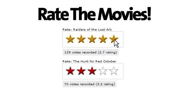
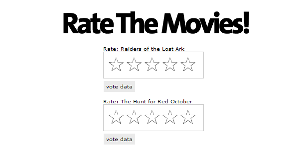
We’re going to create a simple page that lists two movies, and allows you to rate them. This means we need the stars to show the current rating, and to allow voting. We also want an area to show the total votes cast, and the current rating down to one decimal place.

Let’s take a look at the HTML/CSS

        <div class='movie_choice'>
            Rate: Raiders of the Lost Ark
            <div id="r1" class="rate_widget">
                <div class="star_1 ratings_stars"></div>
                <div class="star_2 ratings_stars"></div>
                <div class="star_3 ratings_stars"></div>
                <div class="star_4 ratings_stars"></div>
                <div class="star_5 ratings_stars"></div>
                <div class="total_votes">vote data</div>
            </div>
        </div>

        <div class='movie_choice'>
            Rate: The Hunt for Red October
            <div id="r2" class="rate_widget">
                <div class="star_1 ratings_stars"></div>
                <div class="star_2 ratings_stars"></div>
                <div class="star_3 ratings_stars"></div>
                <div class="star_4 ratings_stars"></div>
                <div class="star_5 ratings_stars"></div>
                <div class="total_votes">vote data</div>
            </div>
        </div>
    

Notice how there are no graphics in this HTML? They’ll be added with CSS. We’re just using the HTML to create the framework that the widget works from. Now it’s time to start adding CSS.

        .rate_widget {
            border:     1px solid #CCC;
            overflow:   visible;
            padding:    10px;
            position:   relative;
            width:      180px;
            height:     32px;
        }
        .ratings_stars {
            background: url('star_empty.png') no-repeat;
            float:      left;
            height:     28px;
            padding:    2px;
            width:      32px;
        }
        .ratings_vote {
            background: url('star_full.png') no-repeat;
        }
        .ratings_over {
            background: url('star_highlight.png') no-repeat;
        }
    

This first part of the CSS accomplishes a few things:

  • Gives the default ‘empty’ start to each star location
  • Sets up classes for filled in stars, and highlighted stars
  • Defines and styles the stars’ container.

You can either use the graphics provided in the download, or make your own. There needs to be a graphic for each of the three states: empty, full, and highlighted.

Next we add a little more CSS to position the total votes box, and center the widgets so the page matches the graphic at the start of this section.

        .total_votes {
            background: #eaeaea;
            top: 58px;
            left: 0;
            padding: 5px;
            position:   absolute;
        }
        .movie_choice {
            font: 10px verdana, sans-serif;
            margin: 0 auto 40px auto;
            width: 180px;
        }
    

Step 2. Adding the UI Interactivity

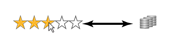
At this point, we have a very plain looking bunch of empty stars, but they don’t do a whole lot at this point. This is where jQuery comes to the rescue.

Our first step is to add mouseover and mouseout handlers for the stars. We need to highlight the star the mouse is over, and all the preceding stars.

        $('.ratings_stars').hover(
            // Handles the mouseover
            function() {
                $(this).prevAll().andSelf().addClass('ratings_over');
                $(this).nextAll().removeClass('ratings_vote');
            },
            // Handles the mouseout
            function() {
                $(this).prevAll().andSelf().removeClass('ratings_over');
                set_votes($(this).parent());
            }
        );
    

We’re taking advantage of jQuery’s powerful .prevAll() and .nextAll() methods to get the stars preceding and following the currently moused over star.

The code above then adds and removes the classes to make the stars under the mouse and before ‘highlighted’, and the stars after ‘not highlighted’.

What about set_votes() ?

This is a function that checks which stars should be in the ‘full’ state, and ties in closely with the next step, where we grab remote data from the server.


Step 3. Retrieving Data from the Server

Our stars highlight when you move the mouse over them, and that’s a great start. But what about the red stars showing the current vote? To reach this step, we need to both get the information from the server, and write some JavaScript to handle that data.

        $('.rate_widget').each(function(i) {
            var widget = this;
            var out_data = {
                widget_id : $(widget).attr('id'),
                fetch: 1
            };
            $.post(
                'ratings.php',
                out_data,
                function(INFO) {
                    $(widget).data( 'fsr', INFO );
                    set_votes(widget);
                },
                'json'
            );
        });
    

This code block – actually all the JavaScript – goes in a document.ready block. This particular code executes right away. It queries the server and gets some information on every vote widget on the page.

First we set up an object, out_data, to contain the information we’re sending to the server. Our PHP script expects to see ‘fetch’ when just grabbing data, so we include it here. We also include the ID of the widget, which lets the server-side script know what data we’re after. When the call back function fires, it contains a JavaScript object that looks like this:

        {
            "widget_id"     : "r1",
            "number_votes"  : 129,
            "total_points"  : 344,
            "dec_avg"       : 2.7,
            "whole_avg"     : 3
        }
    

The .data() method is a bit of jQuery magic that allows you to associate arbitrary data with a DOM
object.

If you look closely at the code, you’ll see we’re taking that object (stored in the variable INFO) and
doing something with it via the .data() method.

The .data() method is a bit of jQuery magic that allows you to associate arbitrary data with a DOM
object. In this case, we’re storing the data in the widget div. It can be accessed later like this:

        $('#one_of_your_widgets).data('fsr').widget_id;
    

set_votes(), Finally.

After the data has been returned from the server, its handed off indirectly to set_votes().

        function set_votes(widget) {

            var avg = $(widget).data('fsr').whole_avg;
            var votes = $(widget).data('fsr').number_votes;
            var exact = $(widget).data('fsr').dec_avg;

            $(widget).find('.star_' + avg).prevAll().andSelf().addClass('ratings_vote');
            $(widget).find('.star_' + avg).nextAll().removeClass('ratings_vote');
            $(widget).find('.total_votes').text( votes + ' votes recorded (' + exact + ' rating)' );
        }
    

The first three lines are for readability, as those variable names are pretty long. So let’s take a look at what’s happening here.

Line 7: ‘avg’ is a whole number, representing the rounded vote average of this widget. Because it’s
a number 1-5, we can use it to find the proper star in the widget, and turn it, and the
preceding ones to our ‘filled’ graphic. Notice the use of .andSelf() to include the star that
we’ve selected.

Line 8: This is quite similar to line seven, but we’re removing the filled graphic from later stars. This
is necessary in case the average for this widget has gone down since the last vote.

Line 9: Here we’re updating the grey box underneath the widget, which shows a more precise rating,
and lets a visitor know how many votes have been cast.


Step 4. Let the Voting Begin

The final step for the UI is to enable voting. We’re going to add a click handler to each of the stars. This click handler will be responsible for sending the vote data to the server.

Here’s the click handler:

        $('.ratings_stars').bind('click', function() {
            var star = this;
            var widget = $(this).parent();

            var clicked_data = {
                clicked_on : $(star).attr('class'),
                widget_id : widget.attr('id')
            };
            $.post(
                'ratings.php',
                clicked_data,
                function(INFO) {
                    widget.data( 'fsr', INFO );
                    set_votes(widget);
                },
                'json'
            );
        });
    

In this code block, we start out by creating some variables not only for clarity, but, in this case, so they can be used within the .post callback. Remember the click handler is assigned to the stars, so we also need that second variable, widget, to have the object containing the data.

First, we set up our outgoing data, which we place in the object clicked_data. We grab the class which includes a class name in the format of star_# telling us what vote is being given, and prepare to send that to the server, along with the widget’s ID.

The widget ID is the corner stone that this voting system relies on. It allows us to look up our stored data, and to easily show that data to the visitor.

Finally, on line line, we send this information to the server. The server will add the vote to the current totals, and send information back to the browser containing the updated data. The values displayed by the widget are then updated with set_votes().


Step 5. PHP: Creating the Class

Now that the UI is finished, we need to create a server side script to store and retrieve voting data.

We’re going to create a very simple class in PHP, called ‘Ratings,’ and use it to handle server requests for our rating system. There are only going to be two methods, plus the invocation. The use of our class will look like so:

        # New Object
        $rating = new ratings($_POST['widget_id']);

        # either return ratings, or process a vote
        isset($_POST['fetch']) ? $rating->get_ratings() : $rating->vote();
    

If you go back to section four, you’ll see we load the data with the variable ‘fetch’ set – that’s what we’re looking for here on line five. If its not set, then we’re processing a vote.

The first thing we’re going to look at is the begining of the class, and, more specifically, the constructor.

        class ratings {

            private $data_file = './ratings.data.txt';
            private $widget_id;
            private $data = array();

        function __construct($wid) {

            $this->widget_id = $wid;

            $all = file_get_contents($this->data_file);

            if($all) {
                $this->data = unserialize($all);
            }
        }
    

serialize() and unserialize are a great way to easily store
PHP data structures on disk.

There’s a lot going on here in very few lines, so I’m going to cover the important bits.

Line 3: This needs to be set to a text file you’d like to use to store your data. We’re not using a database for this project, although you easily could. A simple file will suffice for our needs.

Line 7: The constructor. This is called when we create our object, and immediately stores the ID of the widget.

Line 11: We try to load the text file. If the file doesn’t exist, fine, but on some systems you’ll need to create it ahead of time and give it the proper permissions for PHP to be able to read and write to it.

Line 14: This line is important. It takes the data from the text file – if there is one – and unserializes() it. The file contains a complex PHP array that’s been converted to a plain text representation, via serialize(), allowing us to store it and read it back in as an array later.


Step 6. The get_ratings() Method.

This method is called either on its own, or from the vote() method. It finds the data for a particular widget ID and returns it to the requesting page, in JSON format.

    public function get_ratings() {
        if($this->data[$this->widget_id]) {
            echo json_encode($this->data[$this->widget_id]);
        }
        else {
            $data['widget_id'] = $this->widget_id;
            $data['number_votes'] = 0;
            $data['total_points'] = 0;
            $data['dec_avg'] = 0;
            $data['whole_avg'] = 0;
            echo json_encode($data);
        }
    }
    

This only looks complicated – it’s actually pretty simple. The first thing we do is check if the array stored in $this->data has a key matching our widget ID. If it does, we just return that information, because that’s the widget data the page was requesting.

We don’t have to do anything to that data because its already in array form. $this->data is just an array of arrays. We encode the array we want with json_encode() and send it back to the browser.

If there’s no data for the widget ID we’ve requested, we create a record with all zero values, and send it back to the browser.

Step 7. The vote() Method

Next, we need to create a method to handle incoming votes. When the method finishes, it has to call get_ratings() to send the updated information back to the web browser.

The Method Start

        public function vote() {
            # Get the value of the vote
            preg_match('/star_([1-5]{1})/', $_POST['clicked_on'], $match);
            $vote = $match[1];   

The first thing we do is get the value of the vote. Remember that somewhere in ‘clicked_on’ is a class name in the format of star_#. "star_4", for example. To get that value, we’re using a regular expression and capturing the value of the number to $match[1].

The method Middle

            $ID = $this->widget_id;
            # Update the record if it exists
            if($this->data[$ID]) {
                $this->data[$ID]['number_votes'] += 1;
                $this->data[$ID]['total_points'] += $vote;
            }
            # Create a new one if it does not
            else {
                $this->data[$ID]['number_votes'] = 1;
                $this->data[$ID]['total_points'] = $vote;
            }
    

Here we store $this->widget_id into $ID for clarity – the following code gets a bit rough on the eyes without it.

We check if information for this ID exists, and, if so, we add a vote to the total vote count, and add the points from the vote received. This is a running total of all votes; so if one person gives five stars, and another, three, that’s eight points total.

If the record doesn’t exist, we create one, with one vote, and just the points from the incoming vote.

Finishing Up

            $this->data[$ID]['dec_avg'] = round( $this->data[$ID]['total_points'] / $this->data[$ID]['number_votes'], 1 );
            $this->data[$ID]['whole_avg'] = round( $this->data[$ID]['dec_avg'] );

            file_put_contents($this->data_file, serialize($this->data));
            $this->get_ratings();
        }
    

Once we’ve updated the vote and point totals, we have to calculate both the average expressed as a whole number, and to one decimal point. To avoid having to do the math twice, we first calculate the average to one decimal on line one, and then round that off to a whole number, on line two.

On line four, we’re storing the changed information back on disk after processing it with serialize(). Once the data is safely stored away, we call $this->get_ratings() to send the new, updated information to the browser.


Conclusion

For the sake of simplicity, this isn’t a 100% complete solution. To extend this project, we should store a cookie to make sure people only vote once, or even record the IP address. It’s also possible that two first-votes couple happen simultaneously, and only one may be recorded. It is, however, a great start, and is more then suitable for keeping track of votes on a few handfuls of items on your website. Thoughts? Thanks for reading!


Writing Job

Hello all freelancers,

I’ll list what I need below. Please bid accordingly. Realistic bids please:
100 articles.
Topics vary. No adult, etc.
Basic keyword usage.
Pay weekly though paypal.
5 daily articles.
Immediate start.
Articles must pass copyscape.

Show me your writing ability when you bid. If you have a sample then your bid will be looked at first. Thankyou.