Make A Stop At An Old Deserted Motel

Learn how to composite a multi-purpose short scene using still pictures and .vpe files. We will be using the 3d resources in AE to make the pictures blend together. In addition, a new technique to achieve a different neon text effect and more compositing tips. Lets hit the road!


Preview

Want access to the full AE project files and assets for every tutorial on Aetuts+, including this one? Join Ae Premium for just $9/month. You can view the final effect preview video below.

Tutorial

Download Tutorial .flv

File size 310MB

Assets:
Original footage and pictures by Openfootage.net, Gamillos and Zboula.


Exclusive Freebie: Personalized 3D Interactive Beach Ball

It’s time for another Exclusive Freebie; this time AerisT offers a flavor of summer to Activetuts+ readers. Add your own custom beach party logo to this 3D interactive beach ball! The file uses the open-source Papervision3D engine and loads images via XML.


Interactive Demo

Check out the beach ball with an example logo:

If you take a look at the demo, you can click and drag the ball to rotate it. You can replace the logo with any image you like! It’s controlled by an external XML file, so you don’t even need to have the Flash authoring environment.

Baseball Origins

Recently, a client of mine, who was in the process of designing a website for a kid’s baseball team, asked me to help him spice up the site with some Flash elements. I proposed the idea of incorporating a 3D interactive baseball showcasing the team’s logo. At the time, I did not have the slightest idea how I would accomplish the task, but it was an interesting idea so I decided to pursue it.

After stumbling around with various implementation concepts to create a 3D sphere effect and browsing through ActiveDen’s stock Flash offerings without much success, I finally landed on using the open-source Papervision3D engine. Although I was new to PV3D, my early tests gave me some really promising results and I quickly realized that it was the correct technology for the task at hand.

I dug in to PV3D and after a lot of experimentation and some excellent advice from other authors on ActiveDen, I was able to create a 3D sphere to which a detailed texture could be applied, was interactive with the mouse, and featured a custom logo driven by an XML text file. It was the perfect solution for my 3D interactive baseball (and this beach ball).


The Challenge: Getting the Texture to Wrap

The next challenge was to create a realistic bitmap texture that could be applied to the 3D sphere. This turned out to be a bit tricky due to the way PV3D wraps textures around sphere primitives. In designing my texture, I had to take into consideration the fact that the top and bottom edges of the bitmap would be compressed when mapped to the sphere. Visual elements in my bitmap texture that were near the top or bottom edge of the bitmap needed to be stretched wide in order to compensate. (For example, on the beach ball, the top and bottom red circles are actually red rectangles that stretch all the way across the bitmap texture’s width – see figure. When wrapped onto the sphere, they appear as circles.)

As a result of PV3D’s texture wrapping method, I spent some time perfecting textures in a graphic design program.


Final Result

As you can see from this 3D beach ball, the result of my efforts turned out quite nicely. This beach ball is a stripped-down version of the ActionScript 3.0 code I used for the original baseball. The beach ball is contained entirely within its own movieclip – so it is easy to drag-and-drop into a Flash project. All of the ActionScript code for the beach ball is contained on the beach ball’s own timeline, so there are no external class files to manage. I’ll admit that external class files are a great way to code, but in this case, I preferred the simplicity of keeping everything in one place.

The beach ball is a great way to announce an upcoming beach-themed event or summer trip. Add your own custom logo easily by modifying the included XML text file and link to another site by specifying a URL link on double click. Your viewers will appreciate having something they can interact with.

So what’s next? Perhaps in the future I’ll consider building a game using one of these 3D balls. (Let me know if you have any great game concepts.)

If you like this beach ball, go and check out my 3D Sports Balls on ActiveDen and see the baseball that started it all!

Tailor Your Flash Workspace by Creating Custom Panels

In my last tut: Create New Features for Flash with JSFL we created new commands for Flash. Now we’re going to take things further by creating entirely new panels within the Flash authoring environment.


Final Result Preview

To try the Buttonizer panel, download the Source zip file and extract the Buttonizer.swf file to the folder listed in Step 3. Restart Flash and you’ll find it in Window > Other Panels.


Step 1: Create Panel SWF

A Flash panel is just a regular SWF that you tell Flash to run in a panel rather than a separate window. All you need to do is create a new FLA. The name of the FLA will be displayed as the title of the panel; I’m calling mine Buttonizer.fla. We’ll use AS3 for this tutorial.


Step 2: Populate Your Panel

A plain white panel’s pretty useless, of course, so let’s fill it out. Resize the stage to 250px wide by 170px high (not that it matters – I’ve picked these numbers because I know they’re big enough for what I have planned later) and change the background color to #EDEDED (this matches the backgrounds of the panels on my system, anyway).

Open the Components panel (Window > Components) and drag a Button from the User Interface folder onto the stage.


Step 3: Turn the SWF into a Panel

Compile a SWF from this FLA. To get Flash to use this as a panel, all you have to do is drag the SWF into the correct folder, then restart Flash.

The folder is called WindowSWF and its location varies depending on your operating system:

  • Mac OS X: [hard drive]/Users/userName/Library/Application Support/Adobe/Flash CS3/language/Configuration/WindowSWF
  • Windows XP: [boot drive]\Documents and Settings\username\Local Settings\Application Data\Adobe\Flash CS3\language\Configuration\WindowSWF
  • Windows Vista: [boot drive]\Users\username\Local Settings\Application Data\Adobe\Flash CS3\language\Configuration\WindowSWF
  • Windows Vista (alt): [boot drive]\Users\username\AppData\Local\Adobe\Flash CS3\language\Configuration\WindowSWF
  • Windows 7: [boot drive]\Users\username\Local Settings\Application Data\Adobe\Flash CS3\language\Configuration\WindowSWF
  • Windows 7 (alt): [boot drive]\Users\username\AppData\Local\Adobe\Flash CS3\language\Configuration\WindowSWF

The username folder will match the name you use to log in with, language will change depending on what you picked when you installed Flash (for English speakers it’ll probably be en-us or just en), and if you’re using a newer version of Flash than CS3, that folder will change too.

(Frankly, it’s probably easiest to search your computer to find all folders named WindowSWF. One will be correct.)

Drag your SWF over to the WindowSWF folder then restart Flash. Don’t worry, you won’t have to restart Flash every time you make a change. Once you’ve opened it again, check out the Window > Other Panels sub-menu and you should see Buttonizer as an option. Click it:

Awesome.


Step 4: Change the Panel

With the panel open, move the button in the FLA, then re-compile the SWF. The panel doesn’t change.

Move the SWF to the WindowSWF folder. The panel still doesn’t change.

Close the panel and re-open it from the menu. It changes.

We can speed this up by having the panel’s SWF publish directly to the WindowSWF folder. Click File > Publish Settings, then click the folder icon next to the box that says Buttonizer.swf, browse to your WindowSWF folder and hit Save.

Uncheck the HTML checkbox, too; you don’t need it.

Now move the button again, recompile the SWF (you can hit Shift-F12 to do this without making Flash Player appear), close the panel, re-open it, and it will have updated.


Step 5: Run Some Code in the Panel

As the panel is a functioning SWF, we’re not restricted to changing how it looks; we can add code, too.

Create a new AS file called Buttonizer.as, and set it up as the document class of your FLA. Here’s the basic code:

package
{
	import flash.display.MovieClip;
	public class Buttonizer extends MovieClip
	{
		public function Buttonizer()
		{

		}
	}
}

(If you’re not familiar with using a document class, check out this quick introduction.)

To prove code can work, we’ll change the text on the button. In the FLA, give the button an instance name of theButton (imaginative), then in your constructor function, add this line of code:

theButton.label = "Buttonize";

Hit Shift-F12, close and re-open the panel, and you’ll see the text has changed.

If not, then check you’ve linked the FLA to the document class and named the button.


Step 6: Make the Button Do Something

Let’s get a function in there to handle the button being pushed:

package
{
	import flash.display.MovieClip;
	import flash.events.MouseEvent;

	public class Buttonizer extends MovieClip
	{
		public function Buttonizer()
		{
			theButton.label = "Buttonize";
			theButton.addEventListener( MouseEvent.CLICK, onClickTheButton );
		}

		private function onClickTheButton( a_event:MouseEvent ):void
		{
			trace( "Button clicked" );
		}
	}
}

Nothing complicated there. I’ve used a trace() to make sure it’s all hooked up correctly. Reload the panel and make sure it works.

Oh… it doesn’t?

That’s right; the AS3 trace() function doesn’t trace results to the Output panel when run from within another panel. I hate working without trace(), so we’ll have to get around this somehow.


Step 7: Debugging without Trace()

In my JSFL tutorial, I showed you the JavaScript fl.trace() function. It traces text to the Output panel, but is run within the Flash authoring environment itself, rather than from a Flash Player window. That’s great – it means we can run it from within our panel!

But we can’t just type fl.trace( “Button clicked” ); within our AS3 code, because it’s not an AS3 function. We have to tell Flash to run this as JSFL, and to do that we use the adobe.utils.MMExecute() function, which is AS3:

package
{
	import adobe.utils.MMExecute;		//don't forget this!
	import flash.display.MovieClip;
	import flash.events.MouseEvent;

	public class Buttonizer extends MovieClip
	{
		public function Buttonizer()
		{
			theButton.label = "Buttonize";
			theButton.addEventListener( MouseEvent.CLICK, onClickTheButton );
		}

		private function onClickTheButton( a_event:MouseEvent ):void
		{
			MMExecute( "fl.trace( 'Button clicked' );" );	//quotes in quotes get confusing
		}
	}
}

MMExecute() takes a string and runs it as a JSFL call. It’s completely ignored by the Flash Player window.

If you test this out now, clicking the button will trace to the Output panel. Excellent.


Step 8: Run the Buttonize JSFL Script

It would be inconvenient to take a longer script and push it through an MMExecute() call. Instead, we can save the JSFL to a script file and tell Flash to run that.

If you followed my JSFL tutorial, you’ll have a Buttonize.jsfl file already; if not, copy the following code to a new JSFL file:

if ( fl.getDocumentDOM().selection.length == 1 )
{
	if ( fl.getDocumentDOM().selection[0].elementType == "text" )
	{
		var textLeft = fl.getDocumentDOM().selection[0].x;
		var textTop = fl.getDocumentDOM().selection[0].y;
		var textRight = fl.getDocumentDOM().selection[0].x + fl.getDocumentDOM().selection[0].width;
		var textBottom = fl.getDocumentDOM().selection[0].y + fl.getDocumentDOM().selection[0].height;
		var textText = fl.getDocumentDOM().selection[0].getTextString();

		fl.getDocumentDOM().convertToSymbol('button', textText, 'top left');
		var lib = fl.getDocumentDOM().library;
		if (lib.getItemProperty('linkageImportForRS') == true) {
		lib.setItemProperty('linkageImportForRS', false);
		}
		else {
		lib.setItemProperty('linkageExportForAS', false);
		lib.setItemProperty('linkageExportForRS', false);
		}
		lib.setItemProperty('scalingGrid',  false);

		fl.getDocumentDOM().enterEditMode('inPlace');
		fl.getDocumentDOM().getTimeline().convertToKeyframes();
		fl.getDocumentDOM().getTimeline().convertToKeyframes();
		fl.getDocumentDOM().getTimeline().convertToKeyframes();
		fl.getDocumentDOM().addNewRectangle({left:textLeft, top:textTop, right:textRight, bottom:textBottom}, 0);
	}
}

Save it as Buttonize.jsfl anywhere on your hard drive. Now you can run that script by calling (in AS3):

MMExecute( "fl.runScript( '(path-to-your-script)' + '/Buttonize.jsfl' )" );

Step 9: Move the Script

To keep things simple, move your JSFL file into your WindowSWF directory. You can now replace ‘(path-to-your-script)’ with fl.configURI + ‘WindowSWF/’. Let’s try it out:

package
{
	import adobe.utils.MMExecute;
	import flash.display.MovieClip;
	import flash.events.MouseEvent;

	public class Buttonizer extends MovieClip
	{
		public function Buttonizer()
		{
			theButton.label = "Buttonize";
			theButton.addEventListener( MouseEvent.CLICK, onClickTheButton );
		}

		private function onClickTheButton( a_event:MouseEvent ):void
		{
			MMExecute( "fl.runScript( fl.configURI + 'WindowSWF/' + '/Buttonize.jsfl' )" );
		}
	}
}

Start a new FLA, create some text, select it, and hit the Buttonize button. It should turn into a button, just like the script does normally.


Step 10: Add a “Down” State ColorPicker

Back in the Buttonizer FLA, drag a ColorPicker and a Label from the User Interface components to the stage. We’ll use the color picker to change the color of the text in the button’s Down state. Arrange the components appropriately:

Give the color picker an instance name of downColorPicker.


Step 11: Encase the Script in a Function

We’ll need to pass the color from the ColorPicker to the Buttonize script, but first, we’ll turn the script into a function so that it can accept arguments.

Modify it like so:

function makeButtonFromText( downColor )
{
	if ( fl.getDocumentDOM().selection.length == 1 )
	{
		if ( fl.getDocumentDOM().selection[0].elementType == "text" )
		{
			var textLeft = fl.getDocumentDOM().selection[0].x;
			var textTop = fl.getDocumentDOM().selection[0].y;
			var textRight = fl.getDocumentDOM().selection[0].x + fl.getDocumentDOM().selection[0].width;
			var textBottom = fl.getDocumentDOM().selection[0].y + fl.getDocumentDOM().selection[0].height;
			var textText = fl.getDocumentDOM().selection[0].getTextString();

			fl.getDocumentDOM().convertToSymbol('button', textText, 'top left');
			var lib = fl.getDocumentDOM().library;
			if (lib.getItemProperty('linkageImportForRS') == true) {
			lib.setItemProperty('linkageImportForRS', false);
			}
			else {
			lib.setItemProperty('linkageExportForAS', false);
			lib.setItemProperty('linkageExportForRS', false);
			}
			lib.setItemProperty('scalingGrid',  false);

			fl.getDocumentDOM().enterEditMode('inPlace');
			fl.getDocumentDOM().getTimeline().convertToKeyframes();
			fl.getDocumentDOM().getTimeline().convertToKeyframes();
			fl.getDocumentDOM().getTimeline().convertToKeyframes();
			fl.getDocumentDOM().addNewRectangle({left:textLeft, top:textTop, right:textRight, bottom:textBottom}, 0);
		}
	}
}

Step 12: Pass the Color to the Function

Now we should alter the MMExecute() call, to refer to that specific function in the script. All that’s required is to pass the function name as a second parameter:

MMExecute( "fl.runScript( fl.configURI + 'WindowSWF/' + '/Buttonize.jsfl', 'makeButtonFromText' )" );

For every argument we want to pass to the JSFL function, we just add another parameter to the MMExecute() call. So, to pass the selected color:

MMExecute( "fl.runScript( fl.configURI + 'WindowSWF/' + '/Buttonize.jsfl', 'makeButtonFromText', " + downColorPicker.selectedColor.toString() + " )" );

We have to break out of the double quotes to include that argument, since we obtain it via AS3, not via JSFL. It’s messy, and more than a little confusing, I know.

Let’s add a simple trace to the JSFL function to make sure this is working:

function makeButtonFromText( downColor )
{
	fl.trace( "color: " + downColor );
	if ( fl.getDocumentDOM().selection.length == 1 )
	{

(Since it’s above the selection condition, you can see the trace without having to actually buttonize some text.)

I tried it with black and then white, and here’s what appeared in the Output panel:


color: 0
color: 16777215

Looks like it’s working to me.


Step 13: Color of the “Down” Text

To find out what JSFL to use to change the text color, use the trick from the JSFL tut; hit “Select All”, then change the fill color and take a look at the code in the History panel:

fl.getDocumentDOM().selectAll();
fl.getDocumentDOM().setFillColor('#009999');

Uh-oh. Are we going to have to convert the uint color we got from the ColorPicker into an HTML string? Fortunately, no; the document.setFillColor() help page tells us that we can use either format.

So, all we need to do is insert that new script in the correct place. Since the “Down” frame is the third one, we should insert it after the second convertToKeyframes() call:

fl.getDocumentDOM().enterEditMode('inPlace');
fl.getDocumentDOM().getTimeline().convertToKeyframes();

fl.getDocumentDOM().getTimeline().convertToKeyframes();
fl.getDocumentDOM().selectAll();				//new line
fl.getDocumentDOM().setFillColor( downColor );	//new line

fl.getDocumentDOM().getTimeline().convertToKeyframes();
fl.getDocumentDOM().addNewRectangle({left:textLeft, top:textTop, right:textRight, bottom:textBottom}, 0);

This works:


Step 14: Do the Same for the “Over” State

Add a new ColorPicker (overColorPicker) and Label to let the user change the color of the “Over” text:

Change the signature of the JSFL function to accept this other color:

function makeButtonFromText( overColor, downColor )

While we’re editing the JSFL function, we might as well add the script to change the color of the “Over” state:

fl.getDocumentDOM().enterEditMode('inPlace');
fl.getDocumentDOM().getTimeline().convertToKeyframes();
fl.getDocumentDOM().selectAll();
fl.getDocumentDOM().setFillColor( overColor );

Now let’s change the call to MMExecute() in the AS3 so that it passes along the “Over” color:

MMExecute( "fl.runScript( fl.configURI + 'WindowSWF/' + '/Buttonize.jsfl', 'makeButtonFromText', " + overColorPicker.selectedColor.toString() + ", " + downColorPicker.selectedColor.toString() + " )" );

…Ugh. That’s too messy, and it’s going to get worse. How can we fix this?


Step 15: Thank the Stevens

Steven Sacks and Steven Hargrove came up with a neat little function to make this call easier. I’ve adapted it here:

private function runButtonizeScript( ... args ):String
{
	if ( args.length > 0 )
	{
		return MMExecute( "fl.runScript( fl.configURI + 'WindowSWF/' + '/Buttonize.jsfl', 'makeButtonFromText', " + args.join(", ") + " );" );
	}
	else
	{
		return MMExecute( "fl.runScript( fl.configURI + 'WindowSWF/' + '/Buttonize.jsfl', 'makeButtonFromText' )" );
	}
}

So now we can call:

private function onClickTheButton( a_event:MouseEvent ):void
{
	runButtonizeScript( overColorPicker.selectedColor.toString(), downColorPicker.selectedColor.toString() );
}

Much neater!


Step 16: Do the Same with the “Up” State

Add new components:

Change signature of JSFL function:

function makeButtonFromText( upColor, overColor, downColor )

Make JSFL change color of text:

fl.getDocumentDOM().enterEditMode('inPlace');
fl.getDocumentDOM().selectAll();
fl.getDocumentDOM().setFillColor( upColor );

Pass “Up” color to JSFL from AS3:

private function onClickTheButton( a_event:MouseEvent ):void
{
	runButtonizeScript( upColorPicker.selectedColor.toString(), overColorPicker.selectedColor.toString(), downColorPicker.selectedColor.toString() );
}

Test it:

Brilliant. Just one thing left.


Step 17: Get Existing Color from JSFL

Chances are, the user is going to want to stick with the color they picked for the text for at least one of the three states. But we start all three ColorPickers with black as the selected color.

So, now we need to get the existing fill color from the text object, and use JSFL to pass it through to the panel, then use AS3 to change the color of the ColorPickers. It’s the opposite of what we’ve been doing, really.

Where in our AS3 code should we set the color of our pickers, though? I see three choices:

  • In an ENTER_FRAME handler: not a bad idea, but can cause the whole Flash app to lag when done in a panel.
  • In a MOUSE_CLICK handler for the entire panel: here we’d keep track of whether the user had changed any of the color pickers since selecting the text, and if not, would reset all three to match the text. A good method, but a bit beyond the scope of this tutorial.
  • In a MOUSE_CLICK handler for another button: simple, avoids accidents, easy for the user to understand what’s going on… we have a winner.

So, add a new Button to the Buttonizer, labeled “Set Defaults”. Give it an instance name of setDefaults.


Step 18: Add MOUSE_CLICK Handler

Back in Buttonizer.as:

public function Buttonizer()
{
	theButton.label = "Buttonize";
	theButton.addEventListener( MouseEvent.CLICK, onClickTheButton );
	setDefaults.addEventListener( MouseEvent.CLICK, onClickSetDefaults );
}

private function onClickSetDefaults( a_event:MouseEvent ):void
{

}

Step 19: Put Test Code in Handler

Just to make sure this will work when we have the correct data:

private function onClickSetDefaults( a_event:MouseEvent ):void
{
	var defaultColor:int = 0x000000;	//black
	upColorPicker.selectedColor = defaultColor;
	overColorPicker.selectedColor = defaultColor;
	downColorPicker.selectedColor = defaultColor;
}

Make sure that it works by setting some random colors, then clicking the Set Defaults button. It should reset them all to black.


Step 20: Get Color From JSFL

The MMExecute() function returns the return value of any function run through it. (If several functions are run, it returns the return value of the last one.)

To get the color of the selected text, we can use the JSFL document.getCustomFill( ’selection’ ) function. This returns a Fill object, whose color property is what we need. So, we can get the color like so:

MMExecute( "document.getCustomFill( 'selection' ).color" );

This is actually not quite what we want, as it returns the color in CSS String format: “#AA43E2″, for example. I’ve written a little extra code to convert this to the uint format that we need:

private function onClickSetDefaults( a_event:MouseEvent ):void
{
	var cssFormatDefaultColor:String = MMExecute( "document.getCustomFill( 'selection' ).color" );
	cssFormatDefaultColor = cssFormatDefaultColor.replace( "#", "0x" );
	var defaultColor = uint( cssFormatDefaultColor );
	upColorPicker.selectedColor = defaultColor;
	overColorPicker.selectedColor = defaultColor;
	downColorPicker.selectedColor = defaultColor;
}

Try this out:

Awesome :)


Wrap Up

Take a look back at what you’ve learned. You can now create your own panels inside Flash, run JSFL commands and scripts, pass data from a panel to the stage, and even get data from the stage to use in the panel. Congrats!

Creating Flash Components for Distribution

During this tutorial I will explain how to create a FLA-based User Interface (UI) component. Like the components that come with Flash, it will be visible on the stage, the preview then automatically updating as you change its parameters. This specific example is a circular progress bar.


Preview

Here’s how our component will look. Click the example to see it working with random values:

But we’re not focusing on the SWF result in this tutorial. To see the component itself and change its skin, download the zip file, extract it, and run RoundProgress.mxp to install it. (You may need to download the Adobe Extension Manager first.)


Step 1: Configure Flash for UIComponent

UIComponent is the base class of all Flash components. All User Interface components which are already in Flash (like the ColorPicker, the Checkbox and so on) extend the UIComponent (or extend some class that extends the UIComponent); the reason being that the UIComponent makes it easier for developers to allow their components to be “skinned”.

When used, the UIComponent class recreates the object, removes everything on the stage and adds the skins. This is important for personalization of the component; the user can just double-click the component and edit it visually, with Flash. You just create a component avatar on Frame 1 and the skins on Frame 2, and the UIComponent class does the rest.

You can do all this manually, but it is much better using UIComponent – you’ll see why.

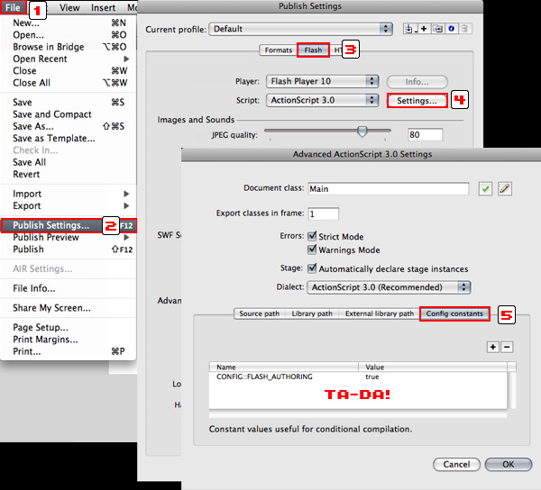
I have explained what the UIComponent is and what it does, but you have to configure the classpath for the UIComponent as it is not configured by default. So, a few steps must be followed:

  1. Go to Edit > Preferences (or Ctrl+U)
  2. Click ActionScript in Category
  3. Click ActionScript 3.0 Settings
  4. Where you have "Source path", click the "+" button and add $(AppConfig)/Component Source/ActionScript 3.0/User Interface
  5. Click OK until you’ve closed all the Preferences windows.

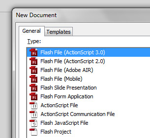
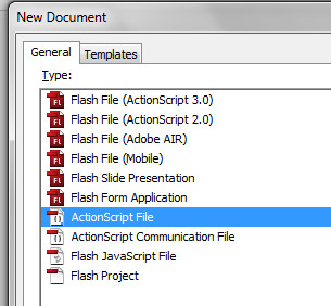
Step 2: New Flash Actionscript 3.0 File

Let’s start by creating a new Flash AS3 file. Save it as RoundProgress.fla, wherever you want (example: C:\RoundProgress\)


Step 3: Prepare the Folders

We will assume the package org.display for our component, so in the same folder that you’ve saved RoundProgress.fla, create a folder with a subfolder, /org/display (example: c:\roundprogress\org\display\)

This is where we will save our component ActionScript file. This is just used to create the component or edit it; you won’t give the final user the .as file.


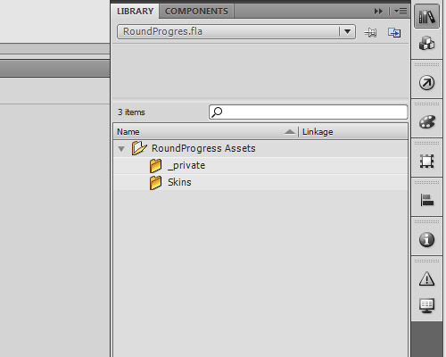
Step 4: Configure the Library Folders

When we create a component for Flash the library organization is very important (perhaps even more so than usual). When you drag the component to the stage of a project its library assets will be automatically added to the project’s library, so keep it organized.

Create a folder in the library called RoundProgress Assets.

Inside this folder create two other folders, Skins and _private.


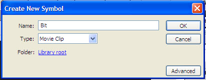
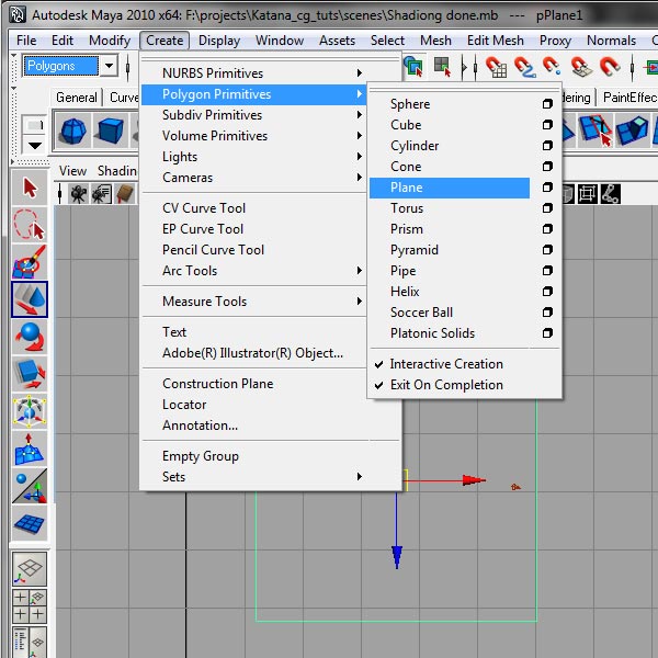
Step 5: Create the RoundProgress Object

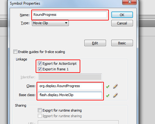
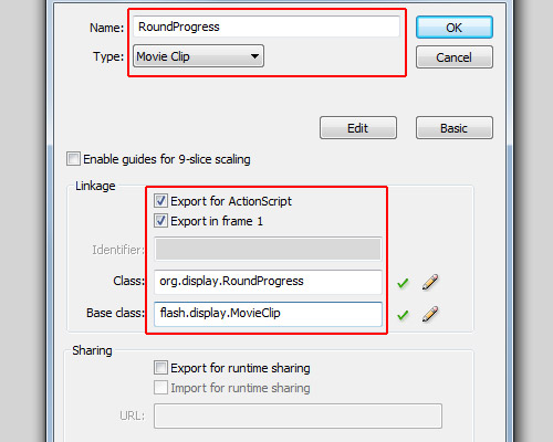
Click Insert > New Symbol. For the name: RoundProgress; type: Movie Clip; linkage: check the options "Export for ActionScript" and "Export in frame 1"; for the class: org.display.RoundProgress; base class: flash.display.MovieClip (though it will be changed when we create the .as file for this object).


Step 6: Component Definition

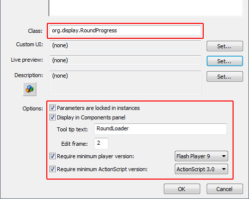
Let’s treat the RoundProgress object as Component. To do this, open the library, right-click on the RoundProgress object and click "Component Definition".

In the window that opens, in the class field insert: org.display.RoundProgress (we will create this class later); in the options panel, check all the options, and for Edit Frame type "2" (it’s actually irrelevant). The most important field here is "Display in Components panel": this option allows the component to be shown show in the components panel when you publish it (we will see this later).

So far we have in our library the “RoundProgress” object as a Component and the folder “RoundProgress Assets” with subfolders “Skins” and “_private.”


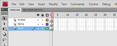
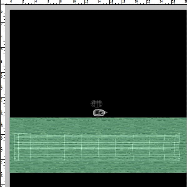
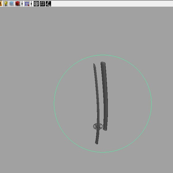
Step 7: Configure the Timeline

As we will use the UIComponent, we will need three layers and two frames on each layer. We need two frames because UIComponent uses the dimensions of the first frame to define the size of the component, and uses the second frame for Skin Editing.

In the library, double-click the RoundProgress component to open it as a movie clip.

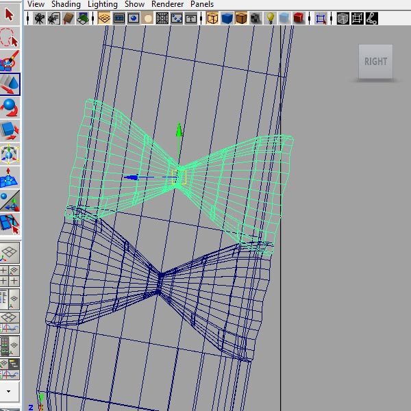
In the timeline, add two new layers, rename the top layer to “Avatar”, the middle layer to “Skins” and the bottom layer to “Shim.”

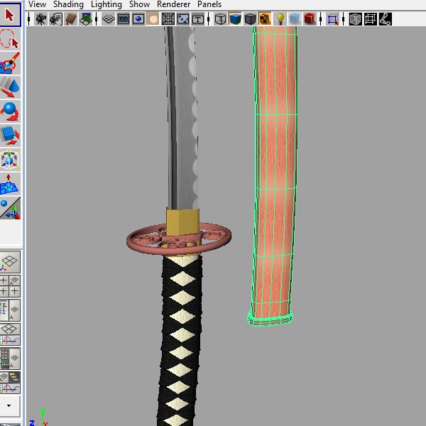
Also create a new blank keyframe for each layer (select Frame 2 and press F7). It should now look like the image:
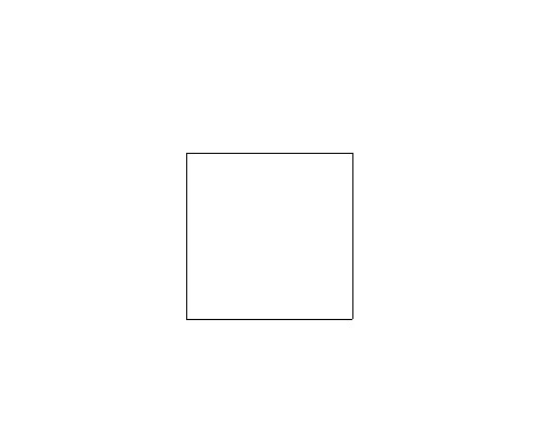
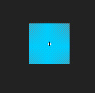

Step 8: Avatar

No, not the movie, the Avatar is an object which the UIComponent takes as the size of the object, then removes. Let’s create a square with a white background and black outline (hairline).

Select the square and convert it to a movie clip (Modify > Convert to Symbol), with type: Movie Clip, and name: RoundProgressAvatar. It’s important that the registration point is set to the top left; the name is completely irrelevant.

Go to the library again and drag the RoundProgressAvatar to the folder “_private” inside “RoundProgress Assets.”

Then, double-click on the RoundProgress component again to edit it, select Frame 1 and the Avatar layer, and drag an instance of RoundProgressAvatar on to the stage (so it will be at Frame 1, on the Avatar layer of the RoundProgress component). Set its position to x:0 and y:0.


Step 9: Create the Background

The background will be one of the skins we will create, it will be the background of our RoundProgress component.

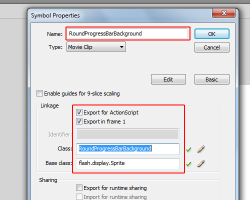
Create a new movie clip (Insert > New Symbol):

For the name we will use “RoundProgressBarBackground”; check “Export for ActionScript” and “Export in frame 1″; for the class we will use “RoundProgressBarBackground” just like the name; and for the base class, since we won’t use animation we will use “flash.display.Sprite” (but if you use flash.display.MovieClip it will work too).


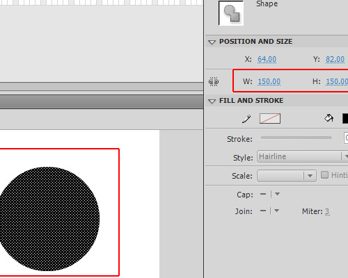
Step 10: Draw the Background

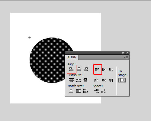
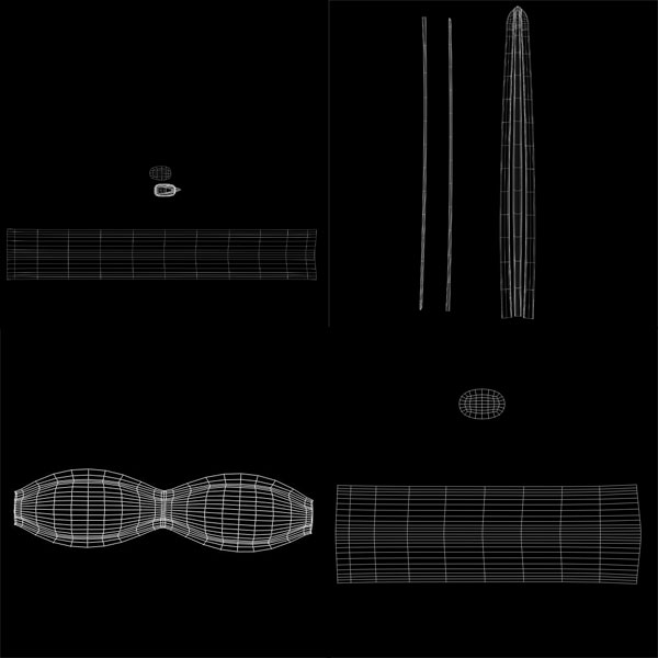
Assuming in the last step you left the RoundProgressBarBackground object open (if not, double-click on it in the library to open it again), let’s draw a ring. First, draw a circle with a diameter of 150px.

Align it to top and left (Window > Align); its position will be x:0 and y:0.

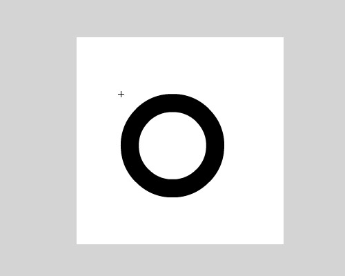
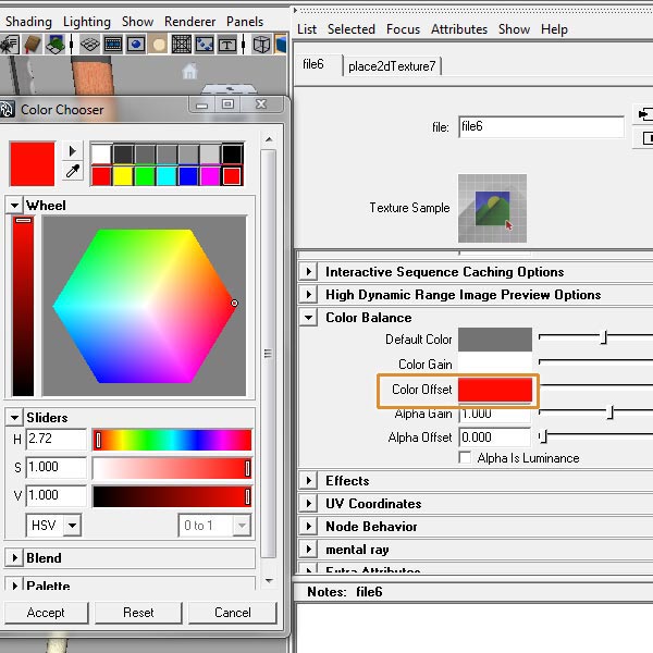
If you copy and paste-in-place (using Ctrl+Shift+V) you will create a copy of the circle, but don’t deselect it, just change its size to make it a little bit smaller than the other circle. Then change its color, all without deselecting the copy of the circle. After this you can deselect it, so you will get a circle inside another, then you can select the smaller circle (which will have another color) and delete it, so you will be left with a ring.

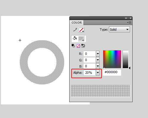
Change its color alpha to 20%.

Now you can exit the Edit mode of RoundProgressBarBackground object.

Open the library and drag the RoundProgressBarBackground we have created to the folder RoundProgress Assets/Skins.


Step 11: Create the Face

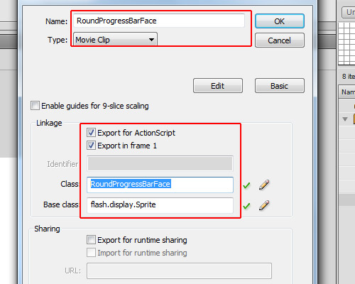
The face is a copy of the background, but with the color alpha set to 100%; it must have exactly the same width and same height of the Background…

Open the library, right-click RoundProgressBarBackground and click "Duplicate". This will create another object just like the RoundProgressBarBackground; for the name of this use RoundProgressBarFace, for the type: MovieClip, check the options "Export for ActionScript" and "Export on frame 1", for the class use "RoundProgressBarFace", and since we don’t have animations set the base class to “flash.display.Sprite.”

Enter edit mode (in the library double-click the object) and set its color alpha to 100%.

If it is not in there yet, drag the RoundProgressBarFace object to the folder RoundProgress Assets/Skins.

So far we have in our library the RoundProgress component, the RoundProgressAvatar in the _private folder and the RoundProgressBarBackdround and RoundProgressBarFace in the Skins folder.


Step 12: The RoundProgress.as File

OK, the design is ready, now we will start the dirty job, the code… First create a new Actionscript File

Save it as RoundProgress.as in the org/display folder which was created in the beginning of the tutorial, and let’s start coding it.


Step 13: Package and Imports

Let’s create the package and import the necessary classes.

package org.display{

	import fl.core.UIComponent;
	import flash.display.Sprite;

}

As we want to use the package org.display we saved our RoundProgress.as inside the org/display folder, so the package is org.display.

We import the class fl.core.UIComponent, which we will extend. This will be the base of our component and the Sprite class will be the mask.


Step 14: Create the Class

Now we’ll create the Class, extending the UIComponent Class.

package org.display{

	import fl.core.UIComponent;
	import flash.display.Sprite;

    public class RoundProgress extends UIComponent{
    }

}

Step 15: Variables

Next up, we create the variables used in RoundProgress

package org.display{

	import fl.core.UIComponent;
	import flash.display.Sprite;

    public class RoundProgress extends UIComponent{

    	private const RAD:Number=Math.PI/180;
		private var _face:Sprite;
		private var _background:Sprite;
		private var _mask:Sprite;
		private var _ratio:Number=0;

    }

}

The _face and the _background will be the skin for the face and background; we will use Sprites for these. The _mask will be an empty Sprite, the const RAD is just a conversion factor from degrees to radians, and the _ratio is the current progress value, which ranges from 0 to 1.


Step 16: Overriding configUI()

The protected configUI() function is from the UIComponent class; it is called when the object is created – almost like the constructor function, but it removes everything from the stage, so you have to recreate everything.

Since we are overriding the function configUI(), we need to call it in our class. If not, our script will run but nothing will be removed from the stage, so our Avatar will be there when we use the component. We call the superclass’s configUI() method by using super.configUI():

package org.display{

	import fl.core.UIComponent;
	import flash.display.Sprite;

    public class RoundProgress extends UIComponent{

    	private const RAD:Number=Math.PI/180;
		private var _face:Sprite;
		private var _background:Sprite;
		private var _mask:Sprite;
		private var _ratio:Number=0;

       	override protected function configUI():void{
        	//Call the superclass configUI function
			super.configUI();

            //Create a definition for the background
			var bgDef:Object=this.loaderInfo.applicationDomain.getDefinition("RoundProgressBarBackground");

            //Create a definition for the face
			var fcDef:Object=this.loaderInfo.applicationDomain.getDefinition("RoundProgressBarFace");

            //Create the background object, cast it as Sprite and add it in our RoundProgress object
			_background=addChild(new bgDef) as Sprite;

            //Create the face object, cast it as Sprite and add it in our RoundProgress object
			_face=addChild(new fcDef) as Sprite;

            //Create the mask object, cast it as Sprite and add it in our RoundProgress object, also setting the _face.mask as this object
			_face.mask=_mask=addChild(new Sprite()) as Sprite;
		}
    }
}

Note that since the addChild() function returns a DisplayObject we can instantiate an object when we create it and cast it as whatever we want (in this case I cast it as Sprite). In one single line I created the object, cast it as Sprite and added in our object.


Step 17: The draw() Method

The method draw() is also from UIComponent; it’s called when an property is changed in our FLA file and updates the live preview of the component. This allows the user see how the component will change on the stage, rather than having to compile a SWF. We’re going to override it so that when we change a value the draw method will be called.

package org.display{

	import fl.core.UIComponent;
	import flash.display.Sprite;

    public class RoundProgress extends UIComponent{

    	private const RAD:Number=Math.PI/180;
		private var _face:Sprite;
		private var _background:Sprite;
		private var _mask:Sprite;
		private var _ratio:Number=0;

       	override protected function configUI():void{
			super.configUI();
			var bgDef:Object=this.loaderInfo.applicationDomain.getDefinition("RoundProgressBarBackground");
			var fcDef:Object=this.loaderInfo.applicationDomain.getDefinition("RoundProgressBarFace");
			_background=addChild(new bgDef) as Sprite;
			_face=addChild(new fcDef) as Sprite;
			_face.mask=_mask=addChild(new Sprite()) as Sprite;
		}

        override protected function draw():void{
        	//it is always important to set the background and the face objects with the same width of the component
            //It doesnt resize automatically
			_background.width=_face.width=width;
			_background.height=_face.height=height;

            //Calculate the angle based on the ratio
            //The .1 is because if the graphics doesnt draw a little bit more it will stay a line of fail
			var angle:Number=(360.1*_ratio)-90;

            //store a little bit more than the radius of the face
			var h:Number=_face.height*.6;

            //If we resize our component but the width and height stay different, gets the width too
			var w:Number=_face.width*.6;

            //this is for offset mask, as we want to draw from the center of the face, we need to get this offset
			var dx:Number=_face.width/2;
			var dy:Number=_face.height/2;

            //Start drawing from center and create a line until the top of the object
			_mask.graphics.clear();
			_mask.graphics.beginFill(0x00FF00);
			_mask.graphics.moveTo(dx,dy);
			_mask.graphics.lineTo(dx,dy-h);

            //Create a segment of circle, this will be the mask of the _face object
            //These lines are what makes the magic, starting at -90 degrees and running around by the amount of degrees specified
			for(var i:int=-90;i<angle;i++){

            	//Math.cos will return the cos of the angle, multiplyed by the w (width radius)
                //As Math.cos needs to use radian as parameter we convert the angle i to radians by multiplying it by our constant RAD
				var px:Number=Math.cos(i*RAD)*w;

                //Math.sin will return the sin of the angle, multiplyed by the h (height radius)
                //As Math.sin needs to use radian as parameter we convert the angle i to radians by multiplying it by our constant RAD
				var py:Number=Math.sin(i*RAD)*h;

                //Here is the offset, it is based on the radius of the face
				px+=dx;
				py+=dy;

                //then we create a line to the position px and py
				_mask.graphics.lineTo(px,py);
			}
            //After the code is executed, we need the graphics return to the center of the _face object
            //So we line it to the first position, which is the offset
			_mask.graphics.lineTo(dx,dy);
			_mask.graphics.endFill();

            //it is always important to use super.draw() to update widths and heights
			super.draw();
		}
    }
}

Don’t worry too much about this code. As I said before, it’s not the focus of the tutorial.


Step 18: Creating the Ratio Property

Well, here we create the ratio property. This is like a variable, but it’s a function: we use the [Inspectable] tag immediately before the function’s definition so this property can be changed using the "Component Inspector" when we use it in Flash.

Let’s get to grips with [Inspectable]. We have some parameters that we can use on it, like defaultValue, name and some others. If using defaultValue then Flash will use it as the default value in the component inspector (where we can change the parameters); the name parameter defines how it will appear in the component inspector, but is not necessary. If you want to set another name for this for example you can use [Inspectable(name="MyCustomName",defaultValue=0)]. You can also set the Type (Number, String), but as it is set in our ratio property this is not needed.

package org.display{

	import fl.core.UIComponent;
	import flash.display.Sprite;

    public class RoundProgress extends UIComponent{

    	private const RAD:Number=Math.PI/180;
		private var _face:Sprite;
		private var _background:Sprite;
		private var _mask:Sprite;
		private var _ratio:Number=0;

       	override protected function configUI():void{
			super.configUI();
			var bgDef:Object=this.loaderInfo.applicationDomain.getDefinition("RoundProgressBarBackground");
			var fcDef:Object=this.loaderInfo.applicationDomain.getDefinition("RoundProgressBarFace");
			_background=addChild(new bgDef) as Sprite;
			_face=addChild(new fcDef) as Sprite;
			_face.mask=_mask=addChild(new Sprite()) as Sprite;
		}

        override protected function draw():void{
			_background.width=_face.width=width;
			_background.height=_face.height=height;
			if(!_mask) return;
			var angle:Number=(360.1*_ratio)-90;
			var h:Number=_face.height*.6;
			var w:Number=_face.width*.6;
			var dx:Number=_face.width/2;
			var dy:Number=_face.height/2;
			_mask.graphics.clear();
			_mask.graphics.beginFill(0x00FF00);
			_mask.graphics.moveTo(dx,dy);
			_mask.graphics.lineTo(dx,dy-h);
			for(var i:int=-90;i<angle;i++){
				var px:Number=Math.cos(i*RAD)*w;
				var py:Number=Math.sin(i*RAD)*h;
				px+=dx;
				py+=dy;
				_mask.graphics.lineTo(px,py);
			}
			_mask.graphics.lineTo(dx,dy);
			_mask.graphics.endFill();
			super.draw();
		}

        [Inspectable(defaultValue=0)]		//allows the ratio property to be set in the Component Inspector
		public function get ratio():Number{
        	//Return the ratio value (0 to 1)
        	return _ratio;
        }
		public function set ratio(value:Number):void{
        	//If the value is out of the range it throws an error
			if(value>1 || value<0) throw new Error("Value is out of range (0-1)");

           	//set the variable _ratio
			_ratio=value;

            //Update the component for the new _ratio value
			draw();
		}
    }
}

Step 19: The setProgress() Function

Let’s add a function to set the progress, you can use a current value and a max value.

package org.display{

	import fl.core.UIComponent;
	import flash.display.Sprite;

    public class RoundProgress extends UIComponent{

    	private const RAD:Number=Math.PI/180;
		private var _face:Sprite;
		private var _background:Sprite;
		private var _mask:Sprite;
		private var _ratio:Number=0;

       	override protected function configUI():void{
			super.configUI();
			var bgDef:Object=this.loaderInfo.applicationDomain.getDefinition("RoundProgressBarBackground");
			var fcDef:Object=this.loaderInfo.applicationDomain.getDefinition("RoundProgressBarFace");
			_background=addChild(new bgDef) as Sprite;
			_face=addChild(new fcDef) as Sprite;
			_face.mask=_mask=addChild(new Sprite()) as Sprite;
		}

        override protected function draw():void{
			_background.width=_face.width=width;
			_background.height=_face.height=height;
			if(!_mask) return;
			var angle:Number=(360.1*_ratio)-90;
			var h:Number=_face.height*.6;
			var w:Number=_face.width*.6;
			var dx:Number=_face.width/2;
			var dy:Number=_face.height/2;
			_mask.graphics.clear();
			_mask.graphics.beginFill(0x00FF00);
			_mask.graphics.moveTo(dx,dy);
			_mask.graphics.lineTo(dx,dy-h);
			for(var i:int=-90;i<angle;i++){
				var px:Number=Math.cos(i*RAD)*w;
				var py:Number=Math.sin(i*RAD)*h;
				px+=dx;
				py+=dy;
				_mask.graphics.lineTo(px,py);
			}
			_mask.graphics.lineTo(dx,dy);
			_mask.graphics.endFill();
			super.draw();
		}

        [Inspectable(defaultValue=0)]
		public function get ratio():Number{
        	return _ratio;
        }
		public function set ratio(value:Number):void{
			if(value>1 || value<0) throw new Error("Value is out of range (0-1)");
			_ratio=value;
			draw();
		}

        public function setProgress($bytesLoaded:Number,$bytesTotal:Number):void{
        	//The ratio is just the current value divided by the maximum value
			ratio=$bytesLoaded/$bytesTotal;
		}
    }
}

Step 20: Percent Property

The percent property is like the ratio property, but instead of values between 0 and 1 you will use 0 to 100. It is a percentage calculation, it also returns a float value between 0 and 100:

package org.display{

	import fl.core.UIComponent;
	import flash.display.Sprite;

    public class RoundProgress extends UIComponent{

    	private const RAD:Number=Math.PI/180;
		private var _face:Sprite;
		private var _background:Sprite;
		private var _mask:Sprite;
		private var _ratio:Number=0;

       	override protected function configUI():void{
			super.configUI();
			var bgDef:Object=this.loaderInfo.applicationDomain.getDefinition("RoundProgressBarBackground");
			var fcDef:Object=this.loaderInfo.applicationDomain.getDefinition("RoundProgressBarFace");
			_background=addChild(new bgDef) as Sprite;
			_face=addChild(new fcDef) as Sprite;
			_face.mask=_mask=addChild(new Sprite()) as Sprite;
		}

        override protected function draw():void{
			_background.width=_face.width=width;
			_background.height=_face.height=height;
			if(!_mask) return;
			var angle:Number=(360.1*_ratio)-90;
			var h:Number=_face.height*.6;
			var w:Number=_face.width*.6;
			var dx:Number=_face.width/2;
			var dy:Number=_face.height/2;
			_mask.graphics.clear();
			_mask.graphics.beginFill(0x00FF00);
			_mask.graphics.moveTo(dx,dy);
			_mask.graphics.lineTo(dx,dy-h);
			for(var i:int=-90;i<angle;i++){
				var px:Number=Math.cos(i*RAD)*w;
				var py:Number=Math.sin(i*RAD)*h;
				px+=dx;
				py+=dy;
				_mask.graphics.lineTo(px,py);
			}
			_mask.graphics.lineTo(dx,dy);
			_mask.graphics.endFill();
			super.draw();
		}

        [Inspectable(defaultValue=0)]
		public function get ratio():Number{
        	return _ratio;
        }
		public function set ratio(value:Number):void{
			if(value>1 || value<0) throw new Error("Value is out of range (0-1)");
			_ratio=value;
			draw();
		}

        public function setProgress($bytesLoaded:Number,$bytesTotal:Number):void{
			ratio=$bytesLoaded/$bytesTotal;
		}

        public function set percent(value:Number):void{
			if(value>100 || value<0) throw new Error("Value is out of range(0-100)");
            //Just some math...
			ratio=value/100;
		}
		public function get percent():Number{
			return ratio*100;
		}
    }
}

Save your document (remember, in /org/display/RoundProgress.as if you haven’t saved it yet).


Step 21: Live Preview

Nope, it isn’t finished yet. If we drag our component to the stage now, it will appear as the white square with the black outline, but if we test our movie it will show the component. This is because we haven’t created a “live preview” – the live preview can visualize a SWF of the component, and as we set the properties it will adjust and update visually too. If we don’t have a live preview only the avatar will be shown.

Let’s create our live preview; there are two ways I know of to create the live preview, so I’ll explain the one that works perfectly for me.

In the library of RoundProgress.fla, right-click over the RoundProgress component, click "Export SWC" and export in the same folder of the RoundProgress.fla file. The .swc file is a zipped file, so you can open it with WinRAR or something similar. Alternatively, you can rename the extension to “.zip” and open it that way.

Open the .swc as above and you will see some files. One of them is the library.swf; extract the library.swf to the same folder as the .fla file.


Step 22: Implementing the Live Preview

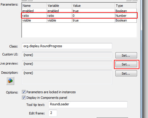
Go back to the Flash authoring environment. In the RoundProgress.fla file, open the library, right-click on the RoundProgress component and click the option "Component Definition".

In the Component Definition, note that in Parameters we have now the parameter ratio, which is the variable “ratio” and the value “0″ – this is the [Inspectable] we have defined with defaultValue=0 (the other parameters comes from the UIComponent class). It might not be configured yet; if not you need to open the Component Definition panel and click OK to update this, whenever you make changes in the .as file.

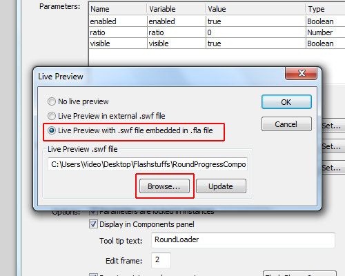
Now click the button "Set…" in the Live Preview section.

In this window that opens, select the option "Live preview with .swf embedded in .fla file", and click Browse:

…then select the library.swf which we extracted from the .swc file.

If you drag the RoundProgress component on to the stage you should now be able to see the “live preview”. Try changing the value of “ratio” in the Component Inspector.


Step 23: ComponentShim

So far, we have created the component and it is already working with a live preview, but if you want to distribute your component as an .mxp file, you will have to send the .as file in the .mxp file. Maybe you don’t want people having access to your source .as file, or, if you have a lot of .as files, maybe you would find it boring to create the .mxi file (explanation later). The best thing you can do is to embed the .as file inside the .fla file in a compiled clip, which we call the ComponentShim.

Note that if you drag any User Interface component to the stage there will be a ComponentShim object. For example, look in the library in Component Assets/_private – which is a compiled clip, but we won’t use this one, we will create our own.

Another good reason for using a shim compiled clip is that it is already compiled, so when you compile your .swf it will just be added, not recompiled, giving a faster compilation.

Let’s start by creating another .fla file and saving it with the name “RoundProgressShim.fla” in the same folder as “RoundProgress.fla.”

In the RoundProgressShim.fla document, open the library.

For each component which has external .as files you may create a new object in the RoundProgressShim.fla. As we have only one component with one .as file, we will create the shim for this component only.

Create a new Symbol in the library, it must be of type Movie Clip and for its name choose the same name as our component (in this case RoundProgress). Check the options "Export for ActionScript" and "Export in frame 1"; for the class we will use the name of the component, so use “org.display.RoundProgress.”

OK, this is our reference for the org.display.RoundProgress object (we need one reference for each component).

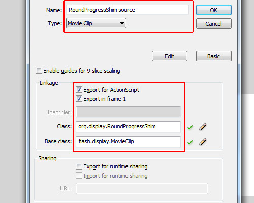
Now we create the shim source. Open the library again in RoundProgressShim.fla, and create a new Symbol named “RoundProgressShim source”. Check the options "Export for ActionScript" and "Export in frame 1"; for its class use org.display.RoundProgressShim (this is irrelevant); for its base class use flash.display.Sprite. Note that the name and the class don’t exist, really, but this will be our compiled clip, so to avoid conflicts it can’t have the same name or the same class as our component…

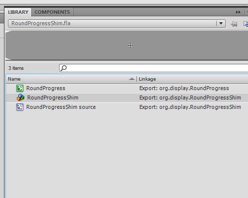
Now in the library, right-click on “RoundProgressShim source” and select "Convert to Compiled Clip"; now we will have one more object in the library called "RoundProgressShim source SWF". Rename it to "RoundProgressShim".

OK, our custom ComponentShim is created, just save the RoundProgressShim.fla in the same folder as the RoundProgress.fla, and close RoundProgressShim.fla.


Step 24: Using the RoundProgressShim

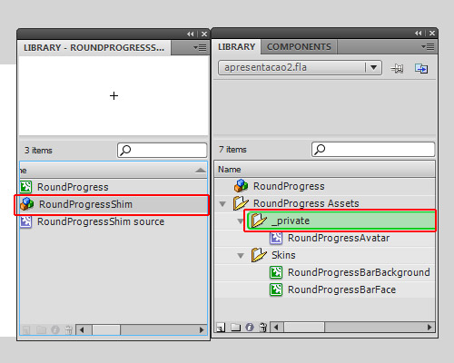
Back in our RoundProgress.fla document, click File > Import and click "Open external library" (Ctrl+Shift+O), find and select the RoundProgressShim.fla and open it as library.

Put the two libraries side by side, the library of RoundProgress.fla and the library of RoundProgressShim.fla.

Now drag the RoundProgressShim object from the RoundProgressShim.fla library to the RoundProgress Assets/_private folder in the RoundProgress.fla library.

…and now you can close the RoundProgressShim.fla library.

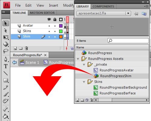
Go into edit mode of the RoundProgress component again (double click on RoundProgress object in the library), select the layer Shim, and go to Frame 2.

Now just drag the RoundProgressShim from RoundProgress Assets/_private in the library to the stage.

OK, now our component is ready to use. Save it and let’s learn how to package it into an .mxp file, ready to distribute.


Step 25: Create the .mxi XML File

Create a new XML file outside Flash, you can use Dreamweaver for this, or even notepad. I’ll use Dreamweaver.

Save it as “RoundProgress.mxi” in the same folder as RoundProgress.as. It is very important you define the type (.mxi), or else you’ll save just as a .xml file which is no good to us.

Copy the XML I’ve created for this tutorial and paste into your RoundProgress.mxi:

<macromedia-extension name="RoundProgress Bar" version="1.0" type="Library">
	<author name="Andre Cavallari" />
	<products>
		<product name="Flash" version="9" primary="true" />
	</products>
	<description>
		<![CDATA[A Circle Progress Bar]]>
	</description>
	<ui-access>
		<![CDATA[window - Components (ctrl+f7)]]>
	</ui-access>
	<files>
		<file name="RoundProgress.fla" destination="$flash/Components" />
	</files>
</macromedia-extension>

Let’s break down the XML file: the first line is where we assign the name of our component (this is for the Adobe Extension Manager only, not for Flash) the version and the type (which is Library; for other types check the Adobe Extension Manager manual).

The author tag is to define the author of the package. Again, this is only for the extension manager.

The product tag defines which product your component is for. In our case it’s for Flash CS3 or CS4, so for name we use “Flash”, version being “9″ (CS3).

The description tag is for a description in Adobe Extension Manager. It can’t be null, but you may write anything there. The CDATA tag tells us that we can have HTML code inside so it won’t try to read as xml.

Inside the ui-access tag you can define how to use your component, how to access it in the Flash authoring tool.

The files tag contains the list of the files that will be copied to Flash’s configuration folder. In our case we will copy just the RoundProgress.fla, as we created the RoundProgressShim, we won’t need to copy the org/display/RoundProgress.as too. If you have more files to copy you may specify them inside the files tag (hence why having lots of AS files could make this step boring!)


Step 26: Package the MXI into MXP

The .mxi file simply gives instructions on how the Adobe Extension Manager should create the .mxp file. The .mxp file is like a zipped file, but if you try to open it in any zip application or rename it, it will return an error. This is because its compression algorithm is different to the zip algorithm. However, the Adobe Extension Manager can read the contents of the mxp file and the instructions of the mxi file, and will use this information to install your component.

When you install the MXP file with Adobe Extension Manager, the MXI file is also copied for later removal of the component; it will be in the configuration folder of Flash inside the Extension folder.

If it’s all OK you can now find the .mxi file you just created and double-click on it to open with Adobe Extension Manager.

When the extension manager opens, it will ask where you want to save your extension package. Let’s select the same folder as the RoundProgress.fla, though it can be anywhere since the RoundProgress.fla is inside the MXP file now.

It will then generate and save your MXP file.


Step 27: Using the .mxp Extension

It is important that you do this with Flash if your Adobe Flash language isn’t the same as the computer language (this is a bug in CS4 extension manager: let’s say that your computer is in Portuguese language, but Flash was installed in English language; if you just double-click an .mxp file and add it, the extension manager will understand that the language that it must install in is in Portuguese, not English, so in the configuration folder of Flash, instead of using the /en folder it will create a new folder /pt and copy the files there instead. If you open Flash, click Help and select the option "Manage extensions" it will open the extension manager in the same language as Flash, so anything you add here will be in the correct place.)

Open the Extension Manager via Flash (Help > Manage extensions).

In the Extension Manager click "install" at the top of the application.

Find the .mxp file, and agree with anything you need to. OK, it is installed; you can now close the Extension Manager. You’ll also need to close and re-open Flash for these changes to take effect.


Step 28: Test Your Component

Create a new Actionscript 3.0 file and save it anywhere, for example in c:\test\RoundProgressTest.fla

Set its stage size to 170×170px then go to Window > Components.

Note that our component is in the list now, as it is in the RoundProgress.fla it will appear in the RoundProgress folder with the name of the component inside. If we wanted it in the User Interface folder we would need to save the .fla as “User Interface.fla”, but this isn’t good practice since a file can overwrite others.

Now drag the RoundProgress component on to the stage. You can see that the live preview will work now, it will show our component with the skins, etc.

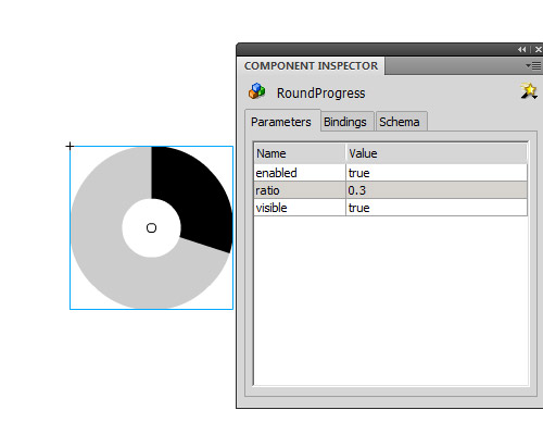
Set the component’s position to x:10 and y:10, just to center the component in the stage. Open the component inspector ("Window -> Component Inspector"), and with our component selected on stage look at the parameters tab. There you can see the parameters of our component, so change the ratio value to 0.3 and you will see the live preview update.

You can double-click it to edit its skins and you can put a text label down next to each skin to identify them (the UIComponent will remove everything). Also, you can open the library and in RoundProgress Assets/Skins you can double click each skin to edit them – but remember: the circle’s size must not be changed when editing the skin, if you want it bigger or smaller resize the component on the stage.

Important: If you set the ratio value in an ActionScript file, let the parameter in the Component go to its default value (0 in our case).

The parameters we can set and get are ratio and percent: the ratio range is from 0 to 1, and the percent range is from 0 to 100. Both do the same thing but the ranges are different. Also, we have the method setProgress(), with 2 parameters: the first is the current value and the second is the maximun value.


Conclusion

Now you’ve learned how to create a Flash component, you can start creating your own components, selling then on ActiveDen, or creating some freebies for us here. I hope you like it and if you have any questions just ask in the comments.

One last thing: if you want to use a Tween in the example at the top, you can: let’s assume the instance name of our component is progressbar, and our tween engine is TweenLite; you can set the ratio to 0 in the component inspector then tween it to any value bigger than 0 and smaller than 1. For example:

	TweenLite.to(progressBar,.5,{ratio:.75});

Quick Tip: A Guide to Cross Domain Policy Files

Every Flash or Flex developer who has had to access remote resources has come across a crossdomain.xml policy file at some point. This article takes a look at what these policy files are, how they work and how you can create one for yourself.

Example

Let’s take a look at an example of what we’re talking about:

What’s so special about this? Well, the SWF is loading the smiley picture from http://mytestgae.appspot.com/images/smiley.jpg, not from the Activetuts+ domain. Without a cross domain policy file, trying to load the image would trigger a SecurityError.


What is a Cross Domain Policy File?

The security model known as the "same origin" policy, implemented by most modern web browsers, prevents some types of content from being accessed or modified if the file exists on another domain. It’s not a hard and fast rule; HTML pages will happily display images and HTML from pages on other domains. But for JavaScript the same origin policy prevents a document or script loaded from one origin from getting or setting properties of a document from another.

Flash includes a similar security policy which generally prevents a Flash application from accessing data that is hosted on a remote domain. However there are many circumstances where it is not only useful but expected that resources will be accessed remotely. An online photo album would find itself limited if external applications could not download its images. It would also be silly if a web service didn’t allow outside applications to interact with it.

For this reason it’s possible to create an XML file, called crossdomain.xml, that specifies how data on a domain can be accessed by a Flash application hosted on a remote domain. For the most part these policy files are quite simple, but there are a few details that it is useful to be aware of.

If you are hosting content that you want to be accessed by external Flash applications, you will need to create a crossdomain.xml file. Let’s start by taking a look at a basic example.


Step 1: A Basic crossdomain.xml File

Here is a very simple crossdomain.xml file. When this file is hosted on the root of your domain it permits external Flash applications access to all the resources on your domain.

<?xml version="1.0"?>
<cross-domain-policy>
<allow-access-from domain="*" />
</cross-domain-policy>

The policy file contains a single <cross-domain-policy> tag. Inside this you can have zero or more <allow-access-from> tags. Each <allow-access-from> tag can be used to define a domain or IP address from which a Flash application can access the local resources. The attribute domain="*" specifies that all domains have access. This is thanks to the asterisk wildcard, which is used here to match all domains and IP addresses.

For most situations this "allow all" policy file is sufficient. It grants Flash applications access to all pubic resources, while any security you have in place (like password protected pages) will still prevent Flash applications from accessing sensitive data.

(Note that you cannot put a crossdomain.xml file on your domain that will allow SWFs also on your domain to access remote files on another domain!)


Step 2: Specified Domains

If you do not want to allow global access to your public resources, the domain attribute in the <allow-access-from> tag can be used to grant access to specific domains.

You can specify a domain in its entirety. The example below will give access to Flash applications hosted in the www.example.com domain.

<allow-access-from domain="www.example.com" />

You can use the asterisk wildcard to match those domains that end with the given suffix. Here we grant access to Flash applications on the domains example.com, www.example.com, whatever.example.com etc.

<allow-access-from domain="*.example.com" />

Step 3: Specified IP Addresses

You can specify access by IP address just as you can grant access to Flash applications hosted on specified domains. The same tag and attributes are used, except in this case you use an IP address:

<allow-access-from domain="123.456.789.123" />

Step 4: Working with HTTPS

By default a Flash application hosted on an HTTPS server can only access resources on remote HTTPS servers. But given the overhead that HTTPS can add to a server you may not want to use it. In this case setting the secure attribute to false will allow a Flash application on an HTTPS server to access data from an HTTP server.

<allow-access-from domain="*" secure="false"/> 

Step 5: Remote Flash Applications

So what if you don’t want remote Flash applications accessing your data? You can either create a crossdomain.xml file that does not include any <allow-access-from> tags:

<?xml version="1.0"?>
<cross-domain-policy>
</cross-domain-policy>

Or you can simply not have a crossdomain.xml file at all.


Step 6: Granular Control of Subdirectories

A cross domain policy file will control access to the directory it resides in, and all the subdirectories beneath it. This is how placing a "allow all" policy file at your domain root allows access to your entire domain. But there may be situations where you want to only allow access to a certain subdirectory.

With the latest versions of the Flash Player this requires two XML files. First you need to place a crossdomain.xml file in the root of your domain that allows Flash to process additional cross domain policy files within the subdirectories. This is done with the <site-control> tag. In the example below we set the permitted-cross-domain-policies attribute to all, which means that the cross domain policy files that may exist in the subdirectories will be processed. This behavior is a change in Flash Player 9 Update 3 and up. Previously policy files in subdirectories were processed by default without having to set the permitted-cross-domain-policies attribute.

Note that we have not added any <allow-access-from> tags, which means in the absence of an additional crossdomain.xml files in the subdirectories, remote Flash applications will not have access to the resources on this server.

You can find out more about the meta policy options in this article.

<?xml version="1.0"?>
<cross-domain-policy>
<site-control permitted-cross-domain-policies="all"/>
</cross-domain-policy>

Next, you place a crossdomain.xml file in the subdirectory you wish to control.

To see an example of this in action check out this file. This policy file, in the root of the http://mytestgae.appspot.com/ domain, uses the <site-control> tag to delegate control to any crossdomain.xml files that may exist in the subdirectories. Then this policy file in the /images/ subdirectory grants full access to the directory and any subdirectory beneath it. So a remote Flash application could access the smiley face image in the images directory like so:

<?xml version="1.0" encoding="utf-8"?>
<mx:Application
	xmlns:mx="http://www.adobe.com/2006/mxml"
	layout="absolute"
	width="550"
	height="400"
	applicationComplete="onAppComplete()">
	<mx:Image id="image" scaleContent="true" horizontalCenter="0" verticalCenter="0"/>
	<mx:Script>
		<![CDATA[
			private function onAppComplete():void
			{
				Security.loadPolicyFile("http://mytestgae.appspot.com/images/crossdomain.xml");

				var loaderContext:LoaderContext = new LoaderContext();
				loaderContext.checkPolicyFile = true;

				var loader:Loader = new Loader();
				loader.contentLoaderInfo.addEventListener(
					Event.COMPLETE,
					function(event:Event):void
					{
						image.source = event.currentTarget.content;
					}
				);
				loader.load(new URLRequest(encodeURI("http://mytestgae.appspot.com/images/smiley.jpg")), loaderContext);
			}
		]]>
	</mx:Script>
</mx:Application>

However, access to the smiley face image in the /images-restricted/ directory is not permitted because there is no crossdomain.xml file in the images-restricted directory to override the (lack of) access granted by the crossdomain.xml file in the root of the domain. Running the code below will result in an exception being thrown:

<?xml version="1.0" encoding="utf-8"?>
<mx:Application
	xmlns:mx="http://www.adobe.com/2006/mxml"
	layout="absolute"
	width="550"
	height="400"
	applicationComplete="onAppComplete()">
	<mx:Image id="image" scaleContent="true" horizontalCenter="0" verticalCenter="0"/>
	<mx:Script>
		<![CDATA[
			private function onAppComplete():void
			{
				var loaderContext:LoaderContext = new LoaderContext();
				loaderContext.checkPolicyFile = true;

				var loader:Loader = new Loader();
				loader.contentLoaderInfo.addEventListener(
					Event.COMPLETE,
					function(event:Event):void
					{
						image.source = event.currentTarget.content;
					}
				);
				loader.load(new URLRequest(encodeURI("http://mytestgae.appspot.com/images-restricted/smiley.jpg")), loaderContext);
			}
		]]>
	</mx:Script>
</mx:Application>

The exception reads:
SecurityError: Error #2123: Security sandbox violation: LoaderInfo.content: file:///D|/CrossDomain.swf cannot access http://mytestgae.appspot.com/images-restricted/smiley.jpg. No policy files granted access.
at flash.display::LoaderInfo/get content()
at MethodInfo-635()


Step 7: Cross Domain Policy vs. Firewall

So from the above information it looks like cross domain policy files can be used to effectively restrict access to Flash applications not hosted on your own domain. While that is true, you should not rely on a cross domain policy file to restrict access to sensitive information. While Flash may respect a crossdomain.xml policy file, other platforms like PHP won’t. Do a search for PHP Flash Proxy to see what I mean. By using a proxy it’s possible to get access to any publicly available data regardless of the existence of cross domain policy files. And you don’t even have to pay for a PHP server – as I will demonstrate in a future article, Google App Engine can be used as a proxy with no up front costs.

The bottom line is that cross domain policy files provide a way to selectively grant access to local resources by remote Flash applications, but only if everyone plays by the rules. If you want to ensure that your private data stays private, there is no substitute for a firewall.


Conclusion

Dealing with cross domain policy files doesn’t need to be complicated. Once you understand the basics of how they work it is quite easy to grant or restrict access to your data by remote Flash applications. Just be aware that they are not as secure as they might initially seem.

I hope you liked this Quick Tip, thanks for reading!

Create New Features for Flash with JSFL

In this introduction to the JavaScript for Flash (JSFL) scripting language, you’ll learn how to automate repetitive tasks and add new commands to the Flash authoring environment.


Introduction

We’ll start by exploring JSFL in general, seeing what it can do, then building up to a useful application of it: a command that can turn text into a button (with its hit area set correctly) in a single click.

Awesome font is Urbix by urbanpixel.ca

Step 1: Create a JSFL File

Open Flash and click File > New. Select Flash JavaScript File from the list, and save your new document as example.jsfl, anywhere you like.

JSFL is a plain text format, so you can open JSFL files in any text editor.


Step 2: Create a FLA

We’ll need a blank FLA to test our scripts, so create one of these, too. You don’t even have to save it; it’s just for testing.


Step 3: Write Some Script

In your JSFL file, paste the following code:

fl.getDocumentDOM().addNewOval({left:100, top:150, right:150, bottom:200});

Even if you’ve never used JavaScript before, the syntax is similar enough to ActionScript that you can guess what it does:

  • fl is an object representing the Flash application itself
  • getDocumentDOM() returns the currently open FLA
  • addNewOval() draws an oval to the FLA, with the parameters given

Step 4: Run the Script

If you’re editing the JSFL in Flash, run the script by clicking the big triangular Play button in the toolbar. Otherwise, double-click the JSFL file on your computer and it will automatically run in Flash.

You should see a circle appear, using whatever colors you had selected. Great! Now whenever you need to draw a 50px circle centered at (125, 125), you don’t even need to draw it.


Step 5: Make the Script More Codey

This is kind of a dull result, though. Let’s make things more complex:

for (i=0; i<8; i++)
{
    fl.getDocumentDOM().addNewOval({left:(i*50), top:(i*50), right:(i*50)+50, bottom:(i*50)+50});
}

Yep – JavaScript has for-loops too. This time, run the JSFL by switching to your FLA, clicking Commands > Run Command, then finding your script file on your hard drive.

Check out the result:

Already it’s clear that this can be very useful for taking care of repetitive, precise tasks. For example, it would be easy to modify that code to create a grid of circles… and from there it’s a small step to creating a grid of buttons. No more copying, pasting, and gently nudging symbols around the stage to line them up properly.


Step 6: Trace

It’s always good to have a trace() command available when you’re testing something new. In JSFL, we have the fl.trace() function, which takes a single string (unlike AS3’s trace(), which can take several at once) and prints it to the Output panel. Try it out:

for ( var i = 0; i < 8; i++ ) {
    fl.getDocumentDOM().addNewOval({left:(i*50), top:(i*50), right:(i*50)+50, bottom:(i*50)+50});
	fl.trace( "i is: " + i.toString() );
}

The result:

i is: 0
i is: 1
i is: 2
i is: 3
i is: 4
i is: 5
i is: 6
i is: 7

Step 7: Add the Command to the Menu

Having to keep the JSFL open or browse to it whenever you want to use it would be a real pain. Instead, you can add it to the Commands menu so it’s just a couple of clicks away. (And once it’s there, you could even assign it a keyboard shortcut.)

All you have to do is move your example.jsfl file to Flash’s \Command\ folder. The location of this folder depends on your OS, though:

  • Mac OS X: [hard drive]/Users/userName/Library/Application Support/Adobe/Flash CS3/language/Configuration/Commands
  • Windows XP: [boot drive]\Documents and Settings\username\Local Settings\Application Data\Adobe\Flash CS3\language\Configuration\Commands
  • Windows Vista: [boot drive]\Users\username\Local Settings\Application Data\Adobe\Flash CS3\language\Configuration\Commands
  • Windows Vista (alt): [boot drive]\Users\username\AppData\Local\Adobe\Flash CS3\language\Configuration\Commands
  • Windows 7: [boot drive]\Users\username\Local Settings\Application Data\Adobe\Flash CS3\language\Configuration\Commands
  • Windows 7 (alt): [boot drive]\Users\username\AppData\Local\Adobe\Flash CS3\language\Configuration\Commands

The username folder will match the name you use to log in with, language will change depending on what you picked when you installed Flash (for English speakers it’ll probably be en-us or just en), and if you’re using a newer version of Flash than CS3, that folder will change too.

Once saved in that folder, it will appear in the Commands menu, using the name of the JSFL file:

Just click to run it. You can now edit the JSFL file inside the Commands folder, to speed things up.


Step 8: Retrieve Information from the FLA

JSFL can do more than run lists of commands. It can also get information about the FLA and the items in it, and make decisions based on that info.

For example, we could write a script to trace how many items are currently selected:

fl.trace( fl.getDocumentDOM().selection.length )

The selection object is actually an array, with each element containing one of the selected objects. That’s why selection.length gives us the number of objects selected.

This simple script gives an insight into how Flash works: try drawing a few circles, selecting them all, and running the script. It’ll return “1″. Create a few text fields, select them all, and run the script, and it’ll return a number equal to the number of text fields.


Step 9: Find the Type of an Object

We can get information about the objects inside that selection, too:

for ( var i = 0; i < fl.getDocumentDOM().selection.length; i++ )
{
	fl.trace( fl.getDocumentDOM().selection[i].elementType );
}

I have two text fields and a bunch of circles selected, and this script outputs:

text
text
shape

For a full list of objects and functions, explore the Extending Flash book in the Adobe LiveDocs.


Step 10: Modify Objects on the Stage

Here's a simple script that squashes all the selected shapes on the stage - but nothing else:

for ( var i=0; i < fl.getDocumentDOM().selection.length; i++ )
{
	if ( fl.getDocumentDOM().selection[i].elementType == "shape" )
	{
		fl.getDocumentDOM().selection[i].scaleY = 2;
	}
}

Before:

...and after:


Step 11: "Buttonize" Overview

You've got the basics. Now it's time for the meat of this tutorial.

We're going to create a script that takes a text field and turns it into a button. I'll walk through the steps this script will replicate; start a new FLA and put a text field in the middle, then follow along:

  1. Click the text
  2. Convert it to a symbol
  3. Go into Edit Mode
  4. Create new keyframes: over, down, hit
  5. Draw a solid rectangle covering the text to define the hit area.

It's quite simple, when you see it listed like that. But how do we do all of that in JSFL? What's the script?

We could look everything up in the LiveDocs, but there is a much easier way...


Step 12: The History Panel

Click Window > Other Panels > History to bring up the History panel:

Those are all the steps we need. If only they were in JSFL...


Step 13: The History Panel List in JSFL

Oh, right, they are in JSFL. Click this little button:

...then click View > JavaScript in Panel:

Result:

It's not exactly what we need, but it gives us some indication of where to look in the LiveDocs.


Step 14: Copy the History

Click the top history item that you need and shift-click the bottom to select all the steps in between. You can ctrl-click (cmd-click on Mac) individual items to deselect them from this list (I've removed some unnecessary mouse clicks from mine). Then, click that little menu button again and select Copy Steps. You can now paste them in to a JSFL file:

fl.getDocumentDOM().convertToSymbol('button', '', 'top left');
var lib = fl.getDocumentDOM().library;
if (lib.getItemProperty('linkageImportForRS') == true) {
lib.setItemProperty('linkageImportForRS', false);
}
else {
lib.setItemProperty('linkageExportForAS', false);
lib.setItemProperty('linkageExportForRS', false);
}
lib.setItemProperty('scalingGrid',  false);

fl.getDocumentDOM().enterEditMode('inPlace');
fl.getDocumentDOM().getTimeline().convertToKeyframes();
fl.getDocumentDOM().addNewRectangle({left:125.0, top:133, right:344.9, bottom:207}, 0);

Save this as Buttonize.jsfl.

(Alternatively, you can click the Save button to create a JSFL file in the Commands directory, in which case the script will have comments to help explain each step.)


Step 15: Test Script

Let's test the script as it is right now so that we can get a good idea of what we need to improve. Start another blank FLA, create a text field (put it in a different position, with different text), click it, and run the JSFL.

Did it work? Mine was not a success:

We can see that we'll need to move the box so that its size and position matches that of the text field.


Step 16: Get Text Field Dimensions

Fortunately, we already know how to get information about a selected item. We can guess what the dimension properties of the selected object will be called; let's try tracing them and see if we're right:

fl.trace( fl.getDocumentDOM().selection[0].x );
fl.trace( fl.getDocumentDOM().selection[0].y );
fl.trace( fl.getDocumentDOM().selection[0].width );
fl.trace( fl.getDocumentDOM().selection[0].height );

Surprise, surprise, yes, that works fine. Now we can use that information to draw the rectangle:

fl.getDocumentDOM().addNewRectangle({left:fl.getDocumentDOM().selection[0].x, top:fl.getDocumentDOM().selection[0].y, right:fl.getDocumentDOM().selection[0].x + fl.getDocumentDOM().selection[0].width, bottom:fl.getDocumentDOM().selection[0].y + fl.getDocumentDOM().selection[0].height}, 0);

Try it out:

...Oh.


Step 17: Store Information before Selection Changes

What happened? Well, when the script entered Edit mode, the selection changed; we're inside the Button symbol, so we don't have it selected any more. Watch out for that sort of error when working with JSFL.

This is easy to fix, though - we just have to store the left, top, right, and bottom properties early, before the selection changes:

var textLeft = fl.getDocumentDOM().selection[0].x;
var textTop = fl.getDocumentDOM().selection[0].y;
var textRight = fl.getDocumentDOM().selection[0].x + fl.getDocumentDOM().selection[0].width;
var textBottom = fl.getDocumentDOM().selection[0].y + fl.getDocumentDOM().selection[0].height;

fl.getDocumentDOM().convertToSymbol('button', '', 'top left');
var lib = fl.getDocumentDOM().library;
if (lib.getItemProperty('linkageImportForRS') == true) {
lib.setItemProperty('linkageImportForRS', false);
}
else {
lib.setItemProperty('linkageExportForAS', false);
lib.setItemProperty('linkageExportForRS', false);
}
lib.setItemProperty('scalingGrid',  false);

fl.getDocumentDOM().enterEditMode('inPlace');
fl.getDocumentDOM().getTimeline().convertToKeyframes();
fl.getDocumentDOM().addNewRectangle({left:textLeft, top:textTop, right:textRight, bottom:textBottom}, 0);

Did it work? It did for me!


Step 18: Check for Potential Errors

What happens if we run the command without selecting the text? We get the same error as before:

We should check to see whether any objects are selected before doing anything:

if ( fl.getDocumentDOM().selection.length > 0 )
{
	var textLeft = fl.getDocumentDOM().selection[0].x;
	var textTop = fl.getDocumentDOM().selection[0].y;
	var textRight = fl.getDocumentDOM().selection[0].x + fl.getDocumentDOM().selection[0].width;
	var textBottom = fl.getDocumentDOM().selection[0].y + fl.getDocumentDOM().selection[0].height;

	fl.getDocumentDOM().convertToSymbol('button', '', 'top left');
	var lib = fl.getDocumentDOM().library;
	if (lib.getItemProperty('linkageImportForRS') == true) {
	lib.setItemProperty('linkageImportForRS', false);
	}
	else {
	lib.setItemProperty('linkageExportForAS', false);
	lib.setItemProperty('linkageExportForRS', false);
	}
	lib.setItemProperty('scalingGrid',  false);

	fl.getDocumentDOM().enterEditMode('inPlace');
	fl.getDocumentDOM().getTimeline().convertToKeyframes();
	fl.getDocumentDOM().getTimeline().convertToKeyframes();
	fl.getDocumentDOM().getTimeline().convertToKeyframes();
	fl.getDocumentDOM().addNewRectangle({left:textLeft, top:textTop, right:textRight, bottom:textBottom}, 0);
}

Actually, we can do better than that... how about checking whether exactly one text field has been selected?

if ( fl.getDocumentDOM().selection.length == 1 )
{
	if ( fl.getDocumentDOM().selection[0].elementType == "text" )
	{
		var textLeft = fl.getDocumentDOM().selection[0].x;
		var textTop = fl.getDocumentDOM().selection[0].y;
		var textRight = fl.getDocumentDOM().selection[0].x + fl.getDocumentDOM().selection[0].width;
		var textBottom = fl.getDocumentDOM().selection[0].y + fl.getDocumentDOM().selection[0].height;

		fl.getDocumentDOM().convertToSymbol('button', '', 'top left');
		var lib = fl.getDocumentDOM().library;
		if (lib.getItemProperty('linkageImportForRS') == true) {
		lib.setItemProperty('linkageImportForRS', false);
		}
		else {
		lib.setItemProperty('linkageExportForAS', false);
		lib.setItemProperty('linkageExportForRS', false);
		}
		lib.setItemProperty('scalingGrid',  false);

		fl.getDocumentDOM().enterEditMode('inPlace');
		fl.getDocumentDOM().getTimeline().convertToKeyframes();
		fl.getDocumentDOM().getTimeline().convertToKeyframes();
		fl.getDocumentDOM().getTimeline().convertToKeyframes();
		fl.getDocumentDOM().addNewRectangle({left:textLeft, top:textTop, right:textRight, bottom:textBottom}, 0);
	}
}

This opens up all sorts of other options. If several items are selected, you could loop through them all, and turn them all into buttons. If an object is selected that isn't a text field, you could treat it differently - perhaps it wouldn't need a rectangle for its Hit shape.


Step 19: Name the Button After the Text

A nice touch would be to give the Button symbol the same name as the text it contains. That would keep the Library tidy, too. But there's nothing in our script to suggest how we might do that.

We do know that the JSFL to convert a selection into a symbol is fl.getDocumentDOM().convertToSymbol(), thanks to the History panel. If you look that up in the LiveDocs, you'll find that the second parameter (which the History panel's script left blank) is called name, and described like so:

A string that specifies the name for the new symbol, which must be unique. You can submit an empty string to have this method create a unique symbol name for you.

Bingo! Of course, we don't know what the text says...


Step 20: Get the Text

We could have a guess:

fl.trace( fl.getDocumentDOM().selection[0].text );

Sadly, this returns undefined. Ah well.

Not to worry - a quick scan through the LiveDocs reveals this page on the Text object. In there we can find the function we're looking for: text.getTextString().

Add that to your script:

var textLeft = fl.getDocumentDOM().selection[0].x;
var textTop = fl.getDocumentDOM().selection[0].y;
var textRight = fl.getDocumentDOM().selection[0].x + fl.getDocumentDOM().selection[0].width;
var textBottom = fl.getDocumentDOM().selection[0].y + fl.getDocumentDOM().selection[0].height;
var textText = fl.getDocumentDOM().selection[0].getTextString();

fl.getDocumentDOM().convertToSymbol('button', textText, 'top left');

Test it.

Fantastic.


Wrap Up

Buttonize is a handy little command to have available if you need to mock up a UI quickly, but it wasn't the point of the tutorial. The goal was to get to grips with JSFL, and see where it could be used. I hope that the next time you're faced with an hour's work of tedious Flash chores, you'll figure out how to automate it with a script in half the time :)

Quick Tip: Compile a Debug Version of Your Flash Project

In this Quick Tip I’ll show you how to use Config Constants to compile different debug and release versions of your code, so you can easily switch between them.


Step 1: Config Constants Settings

A lot of people don’t know about Flash’s Config Constants because they’re new to CS4 and because they’re buried deep within two sets of tabs and two different windows. Here’s how to find them:

In your Flash file, open the Publish Settings (File > Publish Settings…) and click the Flash tab. Click the Settings button next to the Script: Actionscript 3.0 pulldown.

In this new window click the Config constants tab at the far right.

Where are the Config Constants?

Whew…


Step 2: Add the DEBUG Constant

You should see one constant (FLASH_AUTHORING) already in the list. Now we’ll add one of our own.

Click the plus button to add a new constant and give it the name ‘CONFIG::DEBUG’. In the Value field enter ‘true’.

Adding the DEBUG Constant

The interface here is pretty poor. If you’re having trouble getting the Value field to gain text focus try double clicking somewhere in that giant empty space to the right of the constant you just created. A little higher… more to the right… there! Remember CS5 is out soon – maybe they’ll have fixed this.


Step 3: Use the Constant in Your Code

Now that we have the DEBUG constant set up in our Flash file we can use it anywhere in our code:

CONFIG::DEBUG {
	trace("This code will only be compiled if DEBUG is true.");
}

The code that you place in between the braces will only be compiled into your SWF if the DEBUG constant is set to true.


Step 4: The Debug Publishing Profile

You can go into the Publish Settings and change the value of the DEBUG constant each time you want to switch between compiling a release and a debug version, but that quickly becomes tedious. To save some time you can set up a couple of different publishing profiles.

Go back to the Publish Settings and Click the ‘Rename Profile’ button. For some reason the icon for this is an ‘i’.

Name your profile ‘Debug’.

Rename Debug Profile

While you’re in here you might want to set some of the other options that will be handy for a debug build, like Permit debugging. I also find it helpful to change the audio compression settings for faster publishing of debug builds.

Permit Debugging

Step 5: The Release Publishing Profile

Once you have your Debug profile set up, hit the ‘Duplicate Profile’ button and name the new profile ‘Release’.

Release Profile

Define the settings for your release version. (Turning off Permit debugging, etc.)


Step 6: Change the DEBUG Constant

Go back to the Config constants in your Release profile and change the DEBUG constant’s value to ‘false’.

Change the DEBUG value

Conclusion

That’s it! You now have an easy way to switch between debug and release versions of your code.

This can be really handy in situations where you need different code in your program while you’re testing it than you’ll have in the final version. For example, if you’re game gets some of its data from a server or from another SWF that you don’t have access to while testing, you can feed in fake data to the Debug version.

You could also use it to set your game to start on the level you’re trying to test, without having to play through the entire the game.

When you’re done testing, just switch back to the Release profile and republish.

Build a Brilliant Binary Clock with Flash

In this tutorial we are going to create an unusual, but very cool kind of clock: a binary clock.


Final Result Preview

Let’s take a look at the final result we will be working towards:


Step 1: What Does Binary Mean?

Everyone knows how to count, but not everyone knows there are so many different ways to do so. We are used to a special way of counting named the decimal system, but we could also use the hexadecimal, octal or binary system, among others.

In our decimal system, we assign 10 to represent the total number of fingers and thumbs that we each have, and count up and down from there. But in binary, 10 represents just the total number of thumbs — so 10 in binary is equal to 2 in decimal; 11 in binary is 3 in decimal; 100 in binary is 4 in decimal, and so on. So rather than each column representing units, tens, hundreds, thousands, … (counting from right to left), they represent units, twos, fours, eights, …, doubling each time.

So the number 10 we normally see, can be represented in diferent ways:

The binary system is based on the number two, that’s why it is called binary, as opposed to the decimal system which we normally use and which has a base of 10. The binary system is the one used by computers to work, because we can use it to represent any number using a series of switches “on” (1) and “off” (0).

With this knowledge, can you figure out how to read the clock in the SWF?

If you want to learn more about this you can Google binary numeral system and check the info about it =)


Step 2: Create the Flash File

Create a new AS3 Flash file and name it “Binary_Clock.fla”.


Step 3: Set up the Stage

Go to the properties and change the size to 550×400 and the background color to #222222.


Step 4: Get TweenMax

Go to the TweenMax project webpage and download the library for AS3.


Step 5: Extract TweenMax

Unrar the file and copy the folder named “com” to the folder where you have your Binary_Clock.fla file.


Step 6: Create a Bit

Now, go to Insert > New Symbol and name it “Bit” with type Movie Clip.

This “Bit”” will represent a single digit of a number. It will have two states, in two different colors: one will represent 0 and the other will represent 1.


Step 7: Draw a Bit

Next, in the symbol you just created, make a new square of 50×50px.


Step 8: Modify the Bit

Change the color of the square to #00CBFF and center it.


Step 9: Create the Columns

Back on the stage, take some bits from the library panel and arrange them to create the columns we will use. You should end with something like this:


Step 10: Add Some Elements

If you want, you can add text labels and lines to make it more understandable:


Step 11: Assign Instance Names

For each bit, change the instance name on its properties panel. Give them the names such as the image below demonstrates:


Step 12: Link the FLA to a Document Class

Go to the properties panel and set the class field to “Main”, this is the name of the class we are going to create in the next step.

(Not sure what we’re doing here? Read this quick introduction to document classes.)


Step 13: Create the Document Class

With the stage completed, we can now start coding. First create a new ActionScript 3.0 file and save it as “Main.as”.

Add this code to the file:

package{
	import flash.display.MovieClip;

	public class Main extends MovieClip
	{
		public function Main()
		{

		}
	}
}

Step 14: Add the Imports Needed

We’ll begin by importing the necessary classes. Add this below the package declaration:

import flash.display.MovieClip;
import flash.utils.Timer;
import flash.events.TimerEvent;
import com.greensock.*;
import com.greensock.easing.*;

Step 15: Declare Variables

Next, we’ll declare some public variables. Add this below the class declaration:

public var clock:Timer=new Timer(1000);
public var date:Date=new Date();
public var hr:int;
public var min:int;
public var sec:int;
public var bits:Array;

Creating a new Date object automatically sets it to the current time.


Step 16: Assign Values

OK so now let’s add the code that will start the clock. This goes inside the Main() function:

//With this we assign the actual values for the clock to each variable
sec=date.getSeconds();
min=date.getMinutes();
hr=date.getHours();
clock.start();
clock.addEventListener(TimerEvent.TIMER, setTime);

Step 17: Create the setTime() Function

This is the function that will be called every second.

private function setTime(e:TimerEvent):void
{
	date=new Date();
	sec=date.getSeconds();
	min=date.getMinutes();
	hr=date.getHours();
}

Step 18: Convert Decimal to Binary

This function will change a decimal number to a binary array, which will be used later.

private function dec2bin(dec:int, length:int):Array
{
	var bin:Array = new Array();
	while((dec/2)>0)	//note this has the same effect as "while((dec/2)>=1)"
	{
		bin.push(dec%2);	//dec%2 is the *remainder* when dec is divided by two. 3%2=1; 4%2=0; 5%2=1; 6%2=0; etc.
							//in other words, dec%2 is 1 if dec is odd and 0 if dec is even.
		dec=dec/2;			//because dec is an int, it will be rounded
	}
	while(bin.length<length) bin.push(0);	//this is just padding the array with extra zeroes
	return bin;
}

So, dec2bin(13, 4) gives [1,1,0,1].


Step 19: Create the converter() Function

This function takes a decimal number and uses dec2bin() to convert it to the 2-column array we have in the display.

private function converter(num:int):Array
{
	var st:String=String(num);
	if (st.length==1) st='0'+st;
	var fDigit:int=int(st.charAt(1));
	var sDigit:int=int(st.charAt(0));
	var fColumn:Array=dec2bin(fDigit,4);
	var sColumn:Array=dec2bin(sDigit,3);
	var result:Array=fColumn.concat(sColumn);
	return result;
}

Step 20: Turning Bits On and Off

Now we need to add something that will turn the bits on and off; that’s what this function does:

//newBits is the 2-column array we get from converter(), target is "H" "M" or "S" to indicate which column to use
private function turnBits(newBits:Array, target:String):void
{
	//Loops through the 2-column array to change the state of the bit
	for(var a:int=0; a<newBits.length; a++)
	{
	   //This checks if you are now trying to access element 6 of the hour columns; remember that the H col only has 5 bits
		if((a!=6)||(target!="H"))
		{
			//if it is 0, get the instance named for example "S0" which will be the first bit then "S1" and so on
			if(newBits[a]==0) this.getChildByName(target+String(a)).alpha=.2;
			//it it is 1, change the alpha to 1 (Turn it on)
			else this.getChildByName(target+String(a)).alpha=1;
		}
	}
}

Step 21: Modify the Functions

A couple of modifications to the Main() and the setTime() Functions: we just need to call the function so the changes are made each second and at the start:

public function Main()
{
	sec=date.getSeconds();
	min=date.getMinutes();
	hr=date.getHours();
	turnBits(converter(sec),'S');
	turnBits(converter(min),'M');
	turnBits(converter(hr),'H');
	clock.start();
	clock.addEventListener(TimerEvent.TIMER, setTime);
}

private function setTime(e:TimerEvent):void
{
	date=new Date();
	sec=date.getSeconds();
	min=date.getMinutes();
	hr=date.getHours();
	turnBits(converter(sec),'S');
	turnBits(converter(min),'M');
	turnBits(converter(hr),'H');
}

Try it out, and you’ll see it correctly display the time. But we can do better…

Step 22: A Little Bit of Style

This is where TweenMax comes in. We will add glow and ease to give a better look to the clock. Modify your turnBits() function like so:

private function turnBits(newBits:Array, target:String):void
{
	for(var a:int=0;a<newBits.length;a++)
	{
		if((a!=6)||(target!="H"))
		{
			if(newBits[a]==0) TweenMax.to(this.getChildByName(target+String(a)), 1, {glowFilter:{color:0x00cbff, alpha:0, blurX:15, blurY:15,strength:1},alpha:.1});
			else TweenMax.to(this.getChildByName(target+String(a)), 1, {glowFilter:{color:0x00cbff, alpha:1, blurX:20, blurY:20,strength:.8},alpha:1});
		}
	}
}

And that’s it! We’ve finished our tutorial =)

Conclusion

Now we have an attractive clock which we could use as our screensaver or add to a webpage.

This is my first tutorial so I hope you liked it. Thanks for reading!

A Better Way to Build Flash Banners

Banner development is often plagued by multiple files, fragmented code and messy timelines. This tutorial will show you how you can create a project template to serve as a solid base which will help you develop robust banners quickly, freeing you up to focus on bringing the creative idea to life.


Step 1: Setting Up Project Folder Structure

When building multiple banners, good file management is essential to keep your workflow efficient. Start your banner project template by creating the folder structure shown below:

Step 1

Step 2: Creating A Photoshop Template

Now we are going to create a set of Photoshop templates to use when starting to design a banner campaign. (If you don’t have Photoshop don’t worry, you can skip ahead to Step 5). The Interactive Advertising Bureau maintain Ad Unit Guidelines that list the common dimensions of ad units (banners). For the purposes of this tutorial, we’re going to create the three most common:

  • The Wide Skyscraper (160px wide x 600px tall)
  • The Medium Rectangle (300px wide x 250px tall)
  • The Leaderboard (728px x 90px tall)

Let’s start by creating the template for The Wide Skyscraper. Open Photoshop and select File > New. Configure the properties for your new Photoshop document as shown below:

Step 2

Step 3: Adding Layer Groups

To keep the layers in your Photoshop file as structured as your project folders when it’s time to produce a banner design, we’re going to add Layer Groups in the template file to hold core design elements.

Using New Group from the menu in the top-right corner of the Layers panel create the Layer Group structure shown below:

Step 3

The ‘Background’ layer group will hold design elements that are in the background of your banner at all times, for example a color or a texture.

The ‘Foreground’ layer group will hold design elements that are in the foreground of your banner at all times, such as a company logo.

The ‘Frame’ layer groups will hold design elements of the key moments in your banner sequence or interaction. This could include key messages, critical points of an animation, or user interfaces.


Step 4: Save

Now your template is ready to save. Go to File > Save As and navigate to the ‘design’ folder in your project folder structure. Name the file according to its dimensions, in this case ‘160×600′ and ensure it’s in Photoshop format, with Layers checked.

Step 4

That’s your first banner template created! Repeat these steps for The Medium Rectangle (300px wide x 250px tall) and The Leaderboard (728px x 90px tall). With these Photoshop templates completed, we’re ready to move into Flash.


Step 5: Creating Your Flash Project

Let’s start by creating a Flash Project so you can navigate your file structure in the Flash IDE. Open Flash CS4 (the process is very similar in Flash CS3 although the Flash interface will differ) and go to Window > Other Panels > Project. In the Project panel, click on the Projects dropdown and select New Project. Specify the Project name as ‘BannerTemplate’.

For the Root Folder, navigate to the /banner_template/development/ folder you created in Step 1 using the folder icon. Make sure the ActionScript version is set to ActionScript 3.0 and click Create Project.


Step 6: Flash Project Classes Folder

Now we are going to set the Flash Project properties to help Flash do the work of stubbing out our classes for us. Click the dropdown with the gear icon in the top right corner of the Project panel and select Project Properties. For the ‘Save classes in’ field, navigate to the /as/ folder you created in Step 1 and click OK.


Step 7: Banner Package Folder

If you performed the last step correctly, you should see little code brackets are now on your /as/ folder icon. We are now going to create a folder for all classes specific to our banner templates. Select the /as/ folder and click the new folder icon in the bottom of the panel. In the dialog box that appears name your folder ‘banner’ and click OK.


Step 8: Banner Base Document Class

Now (at last!) you are ready to create your banner base document class. If you’re not familiar with using document classes (or classes in general), it’s a good idea to read this quick tip first.

With the /as/banner/ folder selected, click the Create Class icon in the bottom of the panel. In the Class field add the class name ‘Banner’ after the package name ‘banner.’ and click Create Class.

Now we need to take this class stub and modify it to a functional base document class. Add to the ActionScript to reflect the code shown below:

package banner {

	import flash.display.MovieClip;

	public class Banner extends MovieClip {

		// Constants:

		// Public Properties:

		// Private Properties:
		private var config:Object;

		// Initialization:
		public function Banner(config:Object = null):void {
		}

		// Public Methods:
		public function init():void {
			trace("Banner class initialized");
		}

		// Protected Methods:
	}

}

Let’s quickly cover the changes we’ve made to the Banner class:

  • Imported the MovieClip class.
  • Made the class Banner extend MovieClip (so it can be used as a document class).
  • Made the Banner document initialization function receive an optional config Object that we can use to pass in parameters.
  • Created a public init() function that outputs a trace when called. The reason why this is handy will be explained when we start to create the banner .FLAs.

Right now this isn’t doing much, but the important thing here is to build a class structure that allows us to centralize banner logic, reducing code repetition. From here, we can now extend the Banner class to create our individual banner document classes.


Step 9: Banner Document Classes

Let’s start with the class file for The Wide Skyscraper. Create a “WideSkyscraper” class in your Flash project /as/banner/ folder just as you did for the “Banner” class. Take the generated class stub code and add to it so it looks like this:

package banner {

	public class WideSkyscraper extends Banner {

		// Constants:
		// Public Properties:
		// Private Properties:
		private var config:Object;

		// Initialization:
		public function WideSkyscraper() {
			super();
		}

		// Public Methods:
		public override function init():void {
			trace("WideSkyscraper class initialized");
			super.init();
		}

		// Protected Methods:
	}

}

Let’s go over the changes we’ve made to the WideSkyscraper class:

  • Made the WideSkyscraper class extend Banner.
  • Called the base Banner class document function with super() in the WideSkyscraper document function.
  • Overridden the base Banner class init() function with a custom init() function that outputs a trace when called, then calls the Banner class init() function.

Now repeat this step to create the banner document classes for the MediumRectangle and the Leaderboard. With this done, our document class structure is now in place.


Step 10: Creating Your Banner .FLAs

Now we can start to create the .FLA files we need. Again, let’s start by creating the template for The Wide Skyscraper (160×600).

Open Flash CS4 and select File > New. Select “Flash File (ActionScript 3.0)” as the Type and click OK. In the Properties panel, edit the Publish and Properties settings as shown below:

Now save your file as “160×600.fla” in the /development/ folder of your project.


Step 11: Setting A Relative Source Path

We’re now going to set a relative source path and a relative publish path. This becomes important when you want to make a copy of your banner template project, rename it and start working, or when you want to give the template to someone else. Absolute paths can be a real pain to update (especially across multiple files!) every time you want to start a project.

To set the source path go to File > Publish Settings and click the Flash tab. Now click the Settings button beside the Script dropdown to open the Advanced ActionScript 3.0 Settings window. Make sure Source Path is the active tab and click the ‘+’ to add the ‘./as’ path. Now you can add the text ‘banner.WideSkyscraper’ in the Document Class field. Your window should look like this:

Click OK and your document is now linked to the WideSkyscraper class you created in Step 9.


Step 12: Setting A Relative Publish Path

To set the publish path, go to File > Publish Settings and click the Formats tab. We don’t need the HTML file, so uncheck this box. In the publish path for the SWF, target the /www/ folder in your project folder as shown below. If everything looks correct, click OK. Your compiled swf will now be put in the /www/ folder when you preview or publish it.

There’s a little more info on this in this Quick Tip screencast.


Step 13: The Main Timeline

For some reason, some ad serving systems require the first frame of your movie to be blank (Eyeblaster is an example of this), or to import their classes/include their ActionScript on the first frame. Often the Flash extensions you can install for these ad serving systems will refuse to package your file if you don’t comply with this stipulation.

This is where the init() function you created in your document class earlier comes in. To ensure our template can be used in this situation, we are going to create a two frame timeline with the first frame blank, the second one containing a stop action and a call to the init() function as shown below:

If you compile this file now you should get the following in your Output panel which confirms your WideSkyscraper document class and Banner base document class are working:

WideSkyscraper class initialized
Banner class initialized

Step 14: Creating A Library Symbol Class

Now we’re going to create a library symbol to hold the banner creative, whether it’s an animation or an interface. Go to Insert > New Symbol and give it the name “creative”, check Export for ActionScript and give it the class “Creative”. Make sure the type is Movie Clip and click OK.

Now add some placeholder text on the stage as shown below so you can see something when you add it to your stage in code later:

And that’s all we need from the .FLA file! Go ahead and create the other .FLAs for The Medium Rectangle (300 wide x 250 tall) and The Leaderboard (728 wide x 90 tall). With this in place, we can revisit our Banner document class and start adding core functionality across all these banners.


Step 15: Adding A Background Sprite

Nearly all banner guidelines advise you to place a solid background color in your Flash file as the Stage background color can be overwritten when the Flash object is embedded in an HTML page. Rather than going into every .FLA and drawing a shape on the stage, we can centralize this task in code. Open up your Banner class and update the file to reflect the code shown below:

package banner {

	import flash.display.MovieClip;
	import flash.display.Sprite;
	import flash.display.Graphics;

	public class Banner extends MovieClip {

		// Constants:
		private const BG_COLOR:Number = 0x0E0E0E;

		// Public Properties:

		// Private Properties:
		private var config:Object;

		// Initialization:
		public function Banner(config:Object = null):void {
		}

		// Public Methods:
		public function init():void {
			trace("Banner class initialized");

			// Create background
			var bg:Sprite = new Sprite();
			bg.graphics.beginFill(BG_COLOR);
			bg.graphics.drawRect(0,0,stage.stageWidth,stage.stageHeight);
			bg.graphics.endFill();
			addChild(bg);
		}

		// Protected Methods:
	}

}

Let’s recap the modifications we’ve made to the Banner class:

  • Imported the Sprite and Graphics classes.
  • Added a constant BG_COLOR and assigned to it a hexadecimal value.
  • Created a bg sprite and drawn a rectangle with a fill of BG_COLOR that covers our whole stage.
  • Added bg to the display list.

Now all you need to do is change the BG_COLOR value to get the right color background in all your banners.


Step 16: Adding to the Display List

Now we need to add the Creative symbol that we created in Step 14 to the display list as this will be the container for the creative execution. This is really easy to do, just update the init() function to this:

// Public Methods:
public function init():void {
	trace("Banner class initialized");

	// Create background
	var bg:Sprite = new Sprite();
	bg.graphics.beginFill(BG_COLOR);
	bg.graphics.drawRect(0,0,stage.stageWidth,stage.stageHeight);
	bg.graphics.endFill();
	addChild(bg);

	// Add Creative
	var creative:Creative = new Creative();
	addChild(creative);
}

Step 17: Adding A Clickable Area

Another common requirement is for the banner’s clickable area to open a new window based on a “clicktag” variable passed in from the HTML page when the Flash object is embedded. Let’s create a utility class to handle this for us. In the Flash Project panel navigate to your /as/banner/ folder and create a new subfolder called /util/. Create a new class in here called ‘ClickArea’ and code this as shown below:

package banner.util {

	import flash.display.Sprite;
	import flash.display.Graphics;
	import flash.display.Stage;
	import flash.events.MouseEvent;
	import flash.net.URLRequest;
	import flash.net.navigateToURL;

	public class ClickArea extends Sprite {

		// Private Properties:
		private var clickthroughURL:String;

		// Initialization:
		public function ClickArea(loaderInfo:Object,stage:Stage) {

			// Create clickable area
			this.graphics.beginFill(0x00FF00,0);
			this.graphics.drawRect(0,0,stage.stageWidth,stage.stageHeight);
			this.graphics.endFill();

			// Determine clickthrough URL (by checking known naming conventions)
			if(loaderInfo.parameters.clicktag != null) {
				clickthroughURL = loaderInfo.parameters.clicktag;
			} else if(loaderInfo.parameters.clickTag != null) {
				clickthroughURL = loaderInfo.parameters.clickTag;
			} else if(loaderInfo.parameters.clickTAG != null) {
				clickthroughURL = loaderInfo.parameters.clickTAG;
			}

			// Add button behaviour
			this.buttonMode = true;
			this.addEventListener(MouseEvent.CLICK, mouseClickHandler, false, 0, true);
		}

		// Public Methods:

		// Protected Methods:
		private function mouseClickHandler(e:MouseEvent):void {
			if(clickthroughURL != null) {
				navigateToURL(new URLRequest(clickthroughURL),"_blank");
			} else {
				trace("Clickthrough");
			}
		}
	}

}

Let’s quickly summarize what the ClickArea class is doing:

  • Imports the necessary Flash classes.
  • Is based on the Sprite class.
  • ClickArea’s constructor function requires two variables, the loaderInfo Object and the Stage. We will pass these in from our Banner document class.
  • Draws a transparent clickable area the width and height of the stage.
  • Attempts to get a clickthrough url out of the loaderInfo object and assign it to the clickthroughURL variable.
  • Adds behavior on mouse click that launches a clickthroughURL in a new window or outputs a trace if no URL is available. This is handy when testing in the Flash IDE.

Now open up your Banner class again and add import banner.util.ClickArea under your list of Flash class imports and update the init() function to instantiate the ClickArea and add it to the display list as shown below:

// Public Methods:
public function init():void {
	trace("Banner class initialized");

	// Create background
	var bg:Sprite = new Sprite();
	bg.graphics.beginFill(BG_COLOR);
	bg.graphics.drawRect(0,0,stage.stageWidth,stage.stageHeight);
	bg.graphics.endFill();
	addChild(bg);

	// Add Creative
	var creative:Creative = new Creative();
	addChild(creative);

	// Create clickable area
	var clickArea:ClickArea = new ClickArea(loaderInfo,stage);
	addChild(clickArea);
}

We’re adding the basic fundamentals of banner development into this class, but the real value here is that we are adding these to all our banners in one centralized class. Any common tasks you find yourself doing repeatedly in banners can be added in here to free up your time to craft the unique animation or interaction the banner creative has.


Step 18: Publishing Your .FLAs

With all of our code nicely organized, opening the individual .FLAs and publishing them is starting to feel like a hassle. The good news is, we can automate this as well. Go to your Project panel and check the tickbox beside each banner .FLA format (if you can’t see them in this list, click on the dropdown with the Gear icon and select Refresh) as shown below:

Now you can publish all of your banners to the /www/ folder you configured in Step 12 by clicking on the dropdown with the Gear icon and selecting Publish Project.


Step 19: HTML Presentation Page

The last element we need to complete to finish our banner project template is creating an HTML page to present them on so they can be shown to a client easily. Download SWFObject and place swfobject.js in the /www/ folder, then create a HTML file in the editor of your choice and write the code shown below:

<!DOCTYPE html PUBLIC "-//W3C//DTD XHTML 1.0 Transitional//EN" "http://www.w3.org/TR/xhtml1/DTD/xhtml1-transitional.dtd">
<html xmlns="http://www.w3.org/1999/xhtml">
<head>
	<meta http-equiv="Content-Type" content="text/html; charset=UTF-8" />
	<title>Banner Signoff Template</title>
	<style type="text/css" media="screen">
		body { padding:60px; }
		.banner { padding:0 40px 40px 0; float:left; display:block; }
	</style>
	<script src="swfobject.js" type="text/javascript"></script>
	<script type="text/javascript">
		var flashvars = { clickTag: "http://www.hornergraphic.com/" }
		swfobject.embedSWF("160x600.swf", "wide_skyscraper", "160", "600", "9", false, flashvars);
		swfobject.embedSWF("300x250.swf", "showcase", "300", "250", "9", false, flashvars);
		swfobject.embedSWF("728x90.swf", "leaderboard", "728", "90", "9", false, flashvars);
	</script>
</head>
<body>
	<div class="banner"><div id="wide_skyscraper"></div></div>
	<div class="banner"><div id="showcase"></div></div>
	<div class="banner"><div id="leaderboard"></div></div>
</body>
</html>

You can read more about how to use SWFObject in the online documentation, but let’s quickly cover the key things we’re doing here:

  • Declaring two css styles to create some space around the page and the individual banners.
  • Including swfobject.js, creating a test clickTag to pass in to our banners and writing the swfobject embed statements.
  • Defining a div structure and assigning a unique id to a div for SWFObject to dynamically replace with our SWF file.

Now save this file as index.html in the /www/ folder. You can now preview your banners in a web browser or upload this folder somewhere for your client to view:


Step 20: Review Your Project File Structure

Let’s finish by reviewing our populated folder structure and ensuring all files are in the appropriate place:

You now have a project template with:

  • A set of Photoshop templates to produce the artwork in.
  • A set of Flash templates to import library assets into and create timeline animations in.
  • A document class structure that allows you to implement functionality in one or all banner formats.
  • A way to compile all of your banners at once.
  • An HTML page to view all the banners together for yourself and your client.

Conclusion

This tutorial is really only the start. Identify recurring tasks in your banner projects and tailoring your project template to address them to make it speed up your workflow as much as possible. Extend upon it by including your favorite lightweight frameworks (TweenNano is great for scripted animation) and libraries so your favorite tools are at your fingertips when you start your next project.

If you use Subversion or some other kind of source control, this would be a great project to include in your repository so you can improve on it over time and check out the latest revision for each banner project you start.

Got ideas about how this could be improved or comments about issues that hamper your banner development? Join in the discussion below!

Model a High Rez Domed Fountain Structure in 3ds Max

In this intermediate level modeling tutorial, you will follow Ben Tate as he demonstrates how to create a deatailed domed structure and water fountain in 3ds Max.

A combination of both poly modeling and spline modeling techniques will be used to complete the structure and the water fountain. You will learn quick and efficient methods to build detailed molding pieces, utilizing simple extrude and bevel techniques, as well as combining spline profiles and the lathe modifier, as well as creating and positioning objects using the Array tool, and applying smoothing groups to your models.

Video 1

Download

Note: click the ‘Monitor’ icon to view tutorial in full-screen HD.

Video 2

Download

Note: click the ‘Monitor’ icon to view tutorial in full-screen HD.

Video 3

Download

Note: click the ‘Monitor’ icon to view tutorial in full-screen HD.

Video 4

Download

Note: click the ‘Monitor’ icon to view tutorial in full-screen HD.

Don’t miss more CG tutorials and guides, published daily – subscribe to Cgtuts+ by RSS.

Quick Tip – Render Faster using the Windows Command Line with Maya

In this Quick Tip tutorial, you will learn how to batch render Maya scenes faster using the Windows command line, and in this way, maximize the amount of processing power you can get from your computer.

Step 1

First if you’re using Windows 7, and the latest version of Maya 2010, you need to set the path of the mayabatch to the systems’ Environment Variables. Right click on ‘Computer’ and select ‘Properties’. In the window that opens, click on ‘Advanced System Settings’.

Step 2

In the window that pops up, select the ‘Advanced’ tab on top, and then click on ‘Environment Variables’.

Step 3

Under ‘System Variables’, scroll and find the one with the name ‘Path’, select it, and click the ‘Edit’ button.

Step 4

In the window that comes up next to ‘Variable value:’, scroll to the end of the field, and add ‘;’ plus the path to your Maya directory (and its ‘bin’ folder). By default the directory is ‘C:\Program Files\Autodesk\Maya2010\bin’ Then click ok on all of the windows to close them.

Step 5

When rendering your file through the command line, the batch renderer will take all of the settings from the Maya file. These include settings in the render options, such as: the file name of the output files, image format, frame padding, start and end frames, renderable cameras, image size, and all of the other quality and render settings in the render set up. It will also take the different render layers (if you have them), and overall all the information will come from this file.

Step 6

Also the file’s output directory will be the same as specified in the project of the file.

Step 7

Now to open the command line, click on the ‘Start’ button, and then in the search field type ‘cmd’. The command line should show then show up. Click to open it. If you’re using XP, first click the ‘Start’ button, then select ‘Run’, and there type ‘cmd’ in the field.

Step 8

Then, an easy way to batch render a file is to navigate to the folder with the particular file you want to render. Let’s say the folder is ‘C:\Users\Pipera\Desktop\Project\My Projects\Project’, and in that folder there’s a file called ‘Concept_Scene_1’. To render it, first you need to enter the directory type ‘cd’, and the name of the folder (in this case it will be ‘cd C:\Users\Pipera\Desktop\Project\My Projects\Project’). Now to render the file, just type ‘Render FileName_and_Extension.mb (for Maya Binary). In this case the command line will look like this ‘Render Concept_Scene_1.mb’

Step 9

In general, when rendering from the command line, the batch renderer will always take the settings from the file. But there’s a way to edit the settings if you need to, without opening the file again and saving it. These settings are called ‘flags’, and are typed after the ‘Render’ command and before the file name. These flags won’t change your file, just the render that you’re going to output. To see all the different flags, open the command line and type ‘Render –h’

Step 10

The only settings that are going to change are the ones that are overridden with flags. Let’s say you need to change the size of your image, and you want to render with mental ray. In the command line type ‘Render –r mr –s 1 –e 125 Concept_Scene_1.mb’, where the ‘-r’ flag specifies which render to use (in this case ‘mr’ for mental ray), the ‘-s’ is the start frame of the animation, and the ‘-e’ is the end frame.

Step 11

Now for a more efficient way of rendering with Windows executable .bat files. These files are made and edited in Notepad. Let’s say that you want to render a file with mental ray. In Notepad write ‘Render –r mr Concept_Scene_1.mb’ and save the file, but make sure in the end of the name to put ‘.bat’, so that the file can save in a .bat format.

Step 12

Put the .bat file in the same folder as the file you want to render, and double click it to run the batch renderer.

Step 13

Using .bat files is great when you need to render several scenes that are in different directories. And what’s more, you can put different flags for each scene. It doesn’t matter where you put the .bat file, because the directories are listed within it. Also, the scenes will render consequently.

Step 14

With the ‘-rd’ flag, you can specify in which directory your files are going to be rendered.

Step 15

The ‘-rd’ flag can also be used for multiple files at the same time.

Step 16

Another highly useful flag is the ‘-cam’ flag, which lets you specify which camera to render from the scene.

Step 17

You can render as many cameras as you like from the same or different scenes, and also put different flags to make it even more efficient.

Step 18

Rendering different cameras is even better when combined with the ‘-rd’ tag, so each camera will be output into a different folder

Step 19

Remember that you can combine as many flags as you want to speed up your renders, and then you can view the commands when you type ‘Render –h’ in the command line.

Step 20

Some final useful tips for rendering from the command line: Don’t use spaces in the name of the files always put an ‘_’ instead; Make sure that the .bat files are saved with their extension after the name; If you want to stop the render process, just close the command line.

Don’t miss more CG tutorials and guides, published daily – subscribe to Cgtuts+ by RSS.

Model, Texture, and Render the Legendary Katana in Maya – Day 3

In this 3 part Maya workflow tutorial you will learn how to model, texture, and render a Katana, the legendary Samurai sword. For the modeling portion, we will use Maya’s basic polygon editing tools, while UVlayout will be used to create the UVs, and of course Photoshop to create the textures. We will also briefly cover Mental Ray for rendering the final image.

This tutorial is Day 3 in a series – Go to Day 1, or Day 2.

Step 1

The last time we prepared our model for texturing, we laid out the UVs and made UV snapshots. Now we are going to make the textures and bump maps in Photoshop. I’m going to use textures from www.cgtextures.com, where you can find a great choice of high quality textures completely free. Note: Redistributing textures from cgtextures is prohibited, so anywhere I use a texture from their site, I’m going to put the directory and keywords for searching so you can download it yourself. Luckily the finished textures along with a model are allowed for distribution. So let’s get started .

Step 2

Start Photoshop and open the outUV_blade.jpg (the UV snapshot we made earlier).

Step 3

Create a new layer (Layer>New>Layer), or you can use the keyboard shortcut (Shift+Ctrl+N), or click on the little icon in the layer palette .

Step 4

Fill the new layer with 50% gray.

Step 5

Go to (Filter>Noise>Add noise). For amount enter about 20%, for distribution choose Uniform, and check Monochromatic.

Step 6

Go to (Filter>Blur>Motion Blur). For angle enter 90 degrees, and for distance enter 90 pixels. With this we have our base for the metal .

Step 7

Double click on the background layer and then click OK in the new window. With this we have unlocked this layer.

Step 8

Place the unlocked layer on top of the metal base layer, and choose Linear Dodge for the blending mode.

Step 9

Now we are going to make the Hamon (the pattern on the edge of the blade). For that we are going to use the Dodge tool.

Step 10

For the brush shape choose a round brush with radius of about 60px, 90% hardness, and for the range choose Highlights.

Step 11

Add the pattern by just clicking to create the circle pattern, but only about 1/4 to 1/3 of the circle should fall on the edge. Make sure there is no overlapping on the edge itself. Repeat this step all the way down and on the other side too.

Step 12

Take the Healing Brush tool.

Step 13

Make the brush size 20px and the hardness 20%.

Step 14

Press the alt key, and click on the inside of the circles to take a sample. Soften the point where to circles touch.

Step 15

Take the Burn tool. The default settings are fine, but just choose a bigger brush (something around 150px).

Step 16

With the burn tool, darken the UVs of the blood groove.

Step 17

Go to (Filter>Render>Lighting Effects). The shape of the light area, should cover the whole right part of the picture, so that the highlight is in front of the Hamon and the Hamon is lit evenly.

Step 18

Save the image in your textures folder as a jpg, with blade_color for the file name. Save the psd as well.

Step 19

Open the outUV_handle. This one is going to be easy. We will use a leather texture for the handle. You can use any leather texture you like, but if you would like to follow along, we are going to use a leather texture from cgtextures.com. It’s under fabric>leather, it’s a soft yellow leather texture, file name Leather0045. Keywords for searching “leather skin fine human” .

Step 20

If you downloaded the tileable one, duplicate it by holding the Alt key and dragging the layer, or by right clicking on the layer in the layer palette and going to “Duplicate layer”.

Step 21

Merge the two leather layers. In the layer palette, select the two layers, right click>Merge Layers.

Step 22

Save this image in your textures folder as a jpg, for file name enter handle_color.

Step 23

Duplicate the leather layer and go to (Image>Adjustments>Desaturate).

Step 24

Go to (Image>Adjustments>Brightness/Contrast), and tone down the brightness.

Step 25

Save this image in your textures folder as a jpg, the for file name enter handle_bump. Save the psd as well.

Step 26

Open the outUV_saya. For the texture here we are going to use a texture from cgtextures.com. It’s under paper>decorative paper, and it is a green creased paper. File name PaperDecorative0019. Keywords for searching, “paper folds fold crumpled crumples crumple wrinkle wrinkled wrinkles”.

Step 27

If you downloaded the tileable one, place it, and duplicate it for the length of the scabbard.

Step 28

If you go to viewing 100% of the image, you will notice that the texture creases are a bit big, and we want them a bit more subtle. Merge the duplicates and scale the merged layer down.

Step 29

Duplicate the merged layer again so it fills the scabbard UVs.

Step 30

Merge these layers, and duplicate the merged layer.

Step 31

Go to (Image>Adjustments>Brightness/Contrast) and lighten the layer a bit.

Step 32

Using the marquee tool, make rectangular selections along the length of the scabbard. Note: Holding the Shift key after you have made your first selection will allow you to make multiple selections.

Step 33

Press (Ctrl+Shift+i) to invert the selection, and then delete the selected area.

Step 34

Go to (Filter>Blur>Gaussian Blur), and enter 20px for the radius. These stripes will break up the monotony of the texture.

Step 35

Save this image in your textures folder as a jpg, for the file name enter Saya_color. Save the psd as well.

Step 36

Open the outUV_cloth.jpg. Here we are going to use a fabric weave texture from cgtextures.com. It’s under Fabric>Plain Fabric. File name FabricPlain0079. Keyword for searching “fabric weave woven”.

Step 37

Scale the fabric down to half of the bow using the scale tool (Edit>Free transform). Hold the shift key to scale proportionally.

Step 38

Go to (Image>Adjustments>Hue/Saturation) and darken the layer.

Step 39

Go to (Edit>Transform>Warp) and warp the layer to follow the curvature of the bow.

Step 40

Duplicate the layer and place it on the other half of the bow.

Step 41

Save this image in your textures folder as a jpg. For the file name, enter cloth_color.

Step 42

Merge the layer and duplicate the merged layer.

Step 43

Go to (Image>Adjustments>Brightness/Contrast) and lighten the layer. Desaturate it by going to (Image>Adjustments>Desaturate).

Step 44

Save this image in your textures folder as a jpg. For the file name, enter cloth_bump. Save the psd as well.

Step 45

Open Maya, and your most recent scene. You may have noticed that your meshes have hard edges after importing back from UVLayout. To fix that select everything, and under “Polygons”, go to (Normals>Soften Edge).

Step 46

For better previewing of your textures, add one light for now. Go to (Create>Lights>Spot Light).

Step 47

By default the light will be selected, so go to (Panels>Look trough Selected). Place the light so that it hits the edge of the blade at an angle. When you are finished with positioning the light, either click the perspective icon on the side or go to (Panels>Perspective>persp) to go back to perspective view.

Step 48

Open up the Hypershade by going to (Window>Rendering Editors>Hypershade).

Step 49

Drop an Anisotropic Maya shader, and double click it to open the Attribute Editor.

Step 50

In the Attribute Editor, click the checkered square next to color.

Step 51

In the Create render Node windows, choose File.

Step 52

Under the file attributes, click the folder icon next to image name, navigate to your textures folder, and choose blade_color.jpg.

Step 53

With the Hypershade open, select the blade mesh, then right click on the anisotropic shader in the Hypershade and go to Assign Material to Selection.

Step 54

We are now going to do the rendering with Mental ray, so go to (Window>Settings/Preferences>Plug-in Manager) and make sure “Mayatomr.mll” is checked.

Step 55

Press the Render the current frame button. Make sure you are using mental ray for rendering. Looks pretty good.

Step 57

Add another Anisotropic shader, and double click it to open the attribute editor.

Step 58

Click on the rectangle next to Color. In the Color Chooser, pick a color for the Tsuba. And press Accept.

Step 59

Select all of the pieces of the Tsuba .

Step 60

Assign the colored anisotropic material.

Step 61

Do a test render to see if you like the color. Looks good for now.

Step 62

In the Hypershade, click on Create Maya Nodes, and choose Create mental ray Nodes.

Step 63

Drop a mia_material, and assign it to the Habaki and Fuchi.

Step 64

Double click, the mia_mental ray material to open the Attribute editor. Click on the presets button and go to (copper>replace). Up the weight to 1, and change the Diffuse color to a lighter yellow.

Step 65

Do a test render. Looks good.

Step 66

Go back to Maya nodes, create a new Lambert material, and assign it to the cloth bow.

Step 67

In the Attribute editor, for ‘color’ choose ‘file’, and plug in the cloth_color.jpg image from your textures folder.

Step 68

In the Hypershade window, double click on the cloth Lambert to open the Attribute editor for it. Click on the checkered square next to Bump Mapping. Then choose file.

Step 69

For bump depth enter 0.2, this is usually a good starting point, but further tweaking will probably be required. Click on the triangle and square icon next to the Bump Value. This will show us the input.

Step 70

For Image name, plug in the cloth_bump.jpg image from your textures folder.

Step 71

In edit faces mode, select the end of the handle.

Step 72

Go to (Mesh>Extract), to extract this into a separate piece.

Step 73

Extrude this piece outward, to add some thickness to it.

Step 74

In the Hypershade window, drop a Blinn material, and assign it to the handle.

Step 75

Open the Attribute editor for the Blinn material, and for color, plug in the handle_color.jpg.

Step 76

Go to the Attributes for the Blinn material, and for Bump Mapping, plug in the handle_bump.jpg image file.

Step 77

In edit faces mode, select the tip of the scabbard, and add an edge loop if needed.

Step 78

Go to (Mesh>Extract), to extract this into a separate piece.

Step 79

Extrude it to add thickness.

Step 80

Select the rest of the scabbard, and open the UV texture editor.

Step 81

Go to edit faces mode.

Step 82

Select the faces of the piece you didn’t flatten.

Step 83

Go to (Mesh>Extract), to extract this in a separate piece.

Step 84

In the Hypershade, drop a Phong material, and assign it to the long piece of the scabbard.

Step 85

Open the Attribute editor for the Phong material, and for color, plug in the image file handle_color.jpg. If you like this green color, skip the next step.

Step 86

In the Attribute editor for the texture file, scroll down and open the Color balance options. Click on the Color Offset rectangle, and choose a color. This is a quick way to change the overall color of your texture. If you want more control over the color, you should adjust the color in Photoshop.

Step 87

In the Hypershade, drop another Phong material, and for color choose a similar color to that of the scabbard.

Step 88

Assign this material to all the pieces that were extracted before (the two pieces of the scabbard, and the one piece from the handle).

Step 89

Duplicate the cloth piece, and place it so that it overlaps the previous piece.

Step 90

Under “Animation”, go to (Create Deformers>Lattice).

Step 91

Right click near the Lattice, and choose Lattice Point.

Step 92

Move the points so that the top piece doesn’t intersect with the lower piece.

Step 93

After you are finished with tweaking the shape, select the piece, and go to (Edit>Delete by Type>History).

Step 94

Repeat this for the length of the handle.

Step 95

A little cleaning up and we are ready for the render setup. Select the bottom piece of the Scabbard, and Shift select the length of the Scabbard, than press the p key on your keyboard. With this, you have parented the tip piece with the length of the scabbard. Now whenever you select or move the length of the scabbard, the tip piece will move with it. Do the same with the top piece now.

Step 96

Select the center piece of the Tsuba. Shift select one of the circular ornaments, and press the p key on your keyboard.

Step 97

Select the parented circular ornament, then shift select the outer pipe, and press the p key on your keyboard.

Step 98

Select the remaining 3 ornament pieces, then shift select the outer pipe, and press the p key on your keyboard.

Step 99

Select all of the cloth pieces, the handle cap, and the handle, and then group them (Ctrl+g).

Step 100

With the group selected, Shift select the Fuchi, and then press the p key on your keyboard.

Step 101

Select the Fuchi, then Shift select the outer pipe, and press the p key on your keyboard.

Step 102

Select the Habaki, then Shift select the outer pipe, and press the p key on your keyboard.

Step 103

Select the outer pipe, then shift select the blade, and press the p key on your keyboard. Now when you select the blade, the whole sword is selected, and when you select the length of the Saya, the whole Saya is selected. Delete the history (Edit>Delete All by Type>History).

Step 104

Open the Outliner (Window>Outliner).

Step 105

Select the Blade in the perspective view, rename the highlighted part in the Outliner to Sword. Do the same for the Scabbard, but name it Saya.

Step 106

Go to (Create>CV Curve).

Step 107

In the side view create the profile for your backdrop.

Step 108

Move and duplicate the curve, for the width of your backdrop.

Step 109

Select the two curves, and then under “Surfaces”, go to (Surfaces>Loft).

Step 110

Create a polygon plane.

Step 111

Select the Spot light you created earlier, place it in the middle of the poly plane, and rotate it on the x axis by -90 degrees.

Step 112

Select the plane, then shift select the light, and press the p key on your keyboard.

Step 113

In the Hypershade, drop a surface shader, and for the Out Color, choose pure white.

Step 114

Apply the surface shader to the polyplane.

Step 115

Create a new Lambert material, and for color, choose a lighter gray.

Step 116

Assign the Lambert to the backdrop.

Step 117

Choose a position for rendering.

Step 118

Select the spot light, and in the attribute editor, enter 20 for Penumbra Angle . This will give a softer edge on the light.

Step 119

Select the light, and position it to the left and looking down on an angle at the sword.

Step 120

Duplicate the light setup, position it to the right, and looking almost perpendicular to the sword.

Step 121

Do a test render. As you can see, the image is a little blown out. You will have to tone down the lights. .

Step 122

Start by setting the intensity of the lights to 0.8. This might vary depending on the position of the lights, sword, color of the backdrop, and so on, so you will probably need to spend some time tweaking the intensity to get the desired result.

Step 123

Select the lights, and in the Attribute editor, scroll down until you find shadows and then Raytrace Shadow Attributes. Check the Use Ray Trace Shadows, and for Shadow Rays enter 16.

Step 124

When you are satisfied with your light setup, do a final render. Go to (View>Camera Settings>Resolution gate). So you can see exactly what area you will be rendering.

Step 125

Go to (Window>Rendering Editors>Render Settings).

Step 126

Under the quality tab, in Quality Presets, choose Production.

Step 127

Scroll down until you find the Raytracing options. For shadows enter 16.

Step 128

In the Common tab, under the Image size setting, enter your final resolution. Press the render button to render your final image.

Step 129

Here is the final result. Just for better presentation, I added a stand. You are welcome to create your own stand, or maybe a hand to hold the sword…or anything else you like!

This tutorial is Day 3 in a series – Go to Day 1, or Day 2.

Don’t miss more CG tutorials and guides, published daily – subscribe to Cgtuts+ by RSS.

Create a Cool Smoking Text Effect using Fluid Mapping with Particle Flow

In this tutorial, you will model, light and texture some simple 3D text inside of 3dsmax. Then, using Particle Flow, the built-in particle system, along with the FumeFX plugin, you will simulate some convincing looking smoke to add a visual interest to your otherwise run of the mill 3D text .

Inside of the plugin UI you will learn what Fluid mapping is, and how to use it to your advantage. After the scene is completed you will render it out into different passes and then composite them back together inside of After Effects.

Video 1

Download

Note: click the ‘Monitor’ icon to view tutorial in full-screen HD.

Don’t miss more CG tutorials and guides, published daily – subscribe to Cgtuts+ by RSS.