During this tutorial I will explain how to create a FLA-based User Interface (UI) component. Like the components that come with Flash, it will be visible on the stage, the preview then automatically updating as you change its parameters. This specific example is a circular progress bar.
Preview
Here’s how our component will look. Click the example to see it working with random values:
But we’re not focusing on the SWF result in this tutorial. To see the component itself and change its skin, download the zip file, extract it, and run RoundProgress.mxp to install it. (You may need to download the Adobe Extension Manager first.)
Step 1: Configure Flash for UIComponent
UIComponent is the base class of all Flash components. All User Interface components which are already in Flash (like the ColorPicker, the Checkbox and so on) extend the UIComponent (or extend some class that extends the UIComponent); the reason being that the UIComponent makes it easier for developers to allow their components to be “skinned”.
When used, the UIComponent class recreates the object, removes everything on the stage and adds the skins. This is important for personalization of the component; the user can just double-click the component and edit it visually, with Flash. You just create a component avatar on Frame 1 and the skins on Frame 2, and the UIComponent class does the rest.
You can do all this manually, but it is much better using UIComponent – you’ll see why.
I have explained what the UIComponent is and what it does, but you have to configure the classpath for the UIComponent as it is not configured by default. So, a few steps must be followed:
- Go to Edit > Preferences (or Ctrl+U)
- Click ActionScript in Category
- Click ActionScript 3.0 Settings
- Where you have "Source path", click the "+" button and add $(AppConfig)/Component Source/ActionScript 3.0/User Interface
- Click OK until you’ve closed all the Preferences windows.
Step 2: New Flash Actionscript 3.0 File
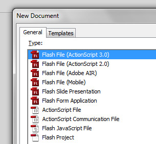
Let’s start by creating a new Flash AS3 file. Save it as RoundProgress.fla, wherever you want (example: C:\RoundProgress\)
Step 3: Prepare the Folders
We will assume the package org.display for our component, so in the same folder that you’ve saved RoundProgress.fla, create a folder with a subfolder, /org/display (example: c:\roundprogress\org\display\)
This is where we will save our component ActionScript file. This is just used to create the component or edit it; you won’t give the final user the .as file.
Step 4: Configure the Library Folders
When we create a component for Flash the library organization is very important (perhaps even more so than usual). When you drag the component to the stage of a project its library assets will be automatically added to the project’s library, so keep it organized.
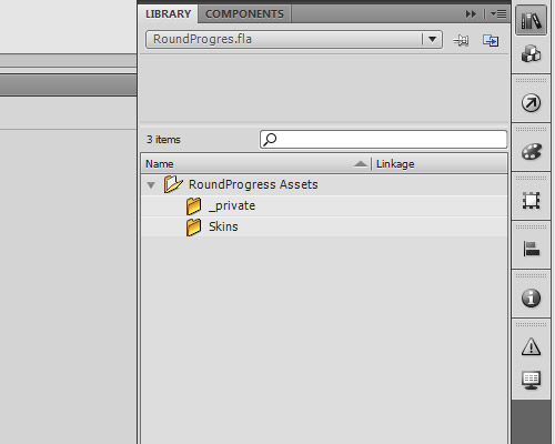
Create a folder in the library called RoundProgress Assets.
Inside this folder create two other folders, Skins and _private.
Step 5: Create the RoundProgress Object
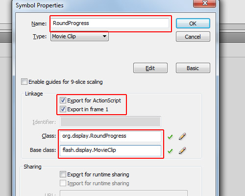
Click Insert > New Symbol. For the name: RoundProgress; type: Movie Clip; linkage: check the options "Export for ActionScript" and "Export in frame 1"; for the class: org.display.RoundProgress; base class: flash.display.MovieClip (though it will be changed when we create the .as file for this object).
Step 6: Component Definition
Let’s treat the RoundProgress object as Component. To do this, open the library, right-click on the RoundProgress object and click "Component Definition".
In the window that opens, in the class field insert: org.display.RoundProgress (we will create this class later); in the options panel, check all the options, and for Edit Frame type "2" (it’s actually irrelevant). The most important field here is "Display in Components panel": this option allows the component to be shown show in the components panel when you publish it (we will see this later).
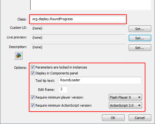
So far we have in our library the “RoundProgress” object as a Component and the folder “RoundProgress Assets” with subfolders “Skins” and “_private.”
Step 7: Configure the Timeline
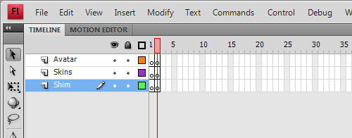
As we will use the UIComponent, we will need three layers and two frames on each layer. We need two frames because UIComponent uses the dimensions of the first frame to define the size of the component, and uses the second frame for Skin Editing.
In the library, double-click the RoundProgress component to open it as a movie clip.
In the timeline, add two new layers, rename the top layer to “Avatar”, the middle layer to “Skins” and the bottom layer to “Shim.”
Also create a new blank keyframe for each layer (select Frame 2 and press F7). It should now look like the image:
Step 8: Avatar
No, not the movie, the Avatar is an object which the UIComponent takes as the size of the object, then removes. Let’s create a square with a white background and black outline (hairline).
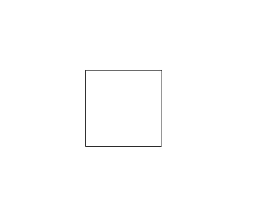
Select the square and convert it to a movie clip (Modify > Convert to Symbol), with type: Movie Clip, and name: RoundProgressAvatar. It’s important that the registration point is set to the top left; the name is completely irrelevant.
Go to the library again and drag the RoundProgressAvatar to the folder “_private” inside “RoundProgress Assets.”
Then, double-click on the RoundProgress component again to edit it, select Frame 1 and the Avatar layer, and drag an instance of RoundProgressAvatar on to the stage (so it will be at Frame 1, on the Avatar layer of the RoundProgress component). Set its position to x:0 and y:0.
Step 9: Create the Background
The background will be one of the skins we will create, it will be the background of our RoundProgress component.
Create a new movie clip (Insert > New Symbol):
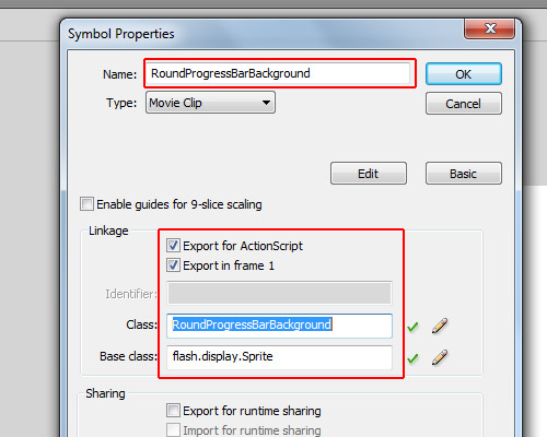
For the name we will use “RoundProgressBarBackground”; check “Export for ActionScript” and “Export in frame 1″; for the class we will use “RoundProgressBarBackground” just like the name; and for the base class, since we won’t use animation we will use “flash.display.Sprite” (but if you use flash.display.MovieClip it will work too).
Step 10: Draw the Background
Assuming in the last step you left the RoundProgressBarBackground object open (if not, double-click on it in the library to open it again), let’s draw a ring. First, draw a circle with a diameter of 150px.
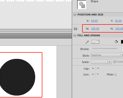
Align it to top and left (Window > Align); its position will be x:0 and y:0.
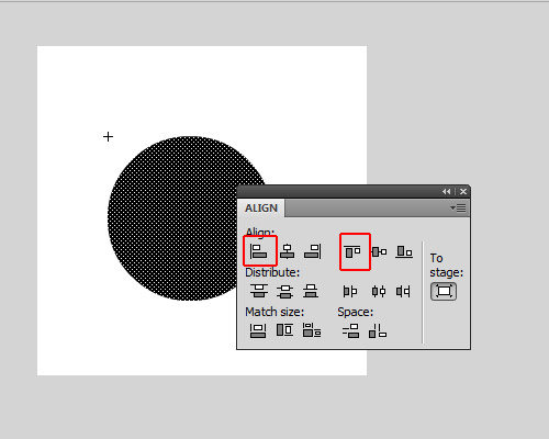
If you copy and paste-in-place (using Ctrl+Shift+V) you will create a copy of the circle, but don’t deselect it, just change its size to make it a little bit smaller than the other circle. Then change its color, all without deselecting the copy of the circle. After this you can deselect it, so you will get a circle inside another, then you can select the smaller circle (which will have another color) and delete it, so you will be left with a ring.
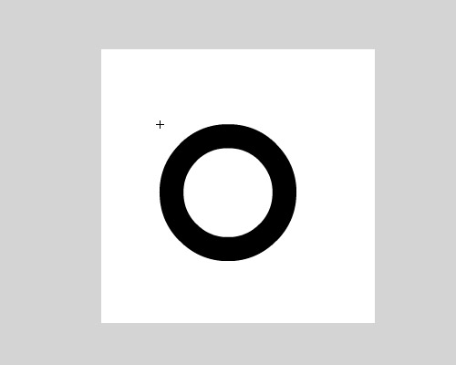
Change its color alpha to 20%.
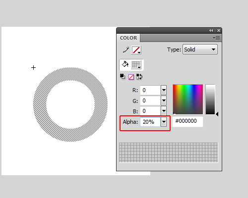
Now you can exit the Edit mode of RoundProgressBarBackground object.
Open the library and drag the RoundProgressBarBackground we have created to the folder RoundProgress Assets/Skins.
Step 11: Create the Face
The face is a copy of the background, but with the color alpha set to 100%; it must have exactly the same width and same height of the Background…
Open the library, right-click RoundProgressBarBackground and click "Duplicate". This will create another object just like the RoundProgressBarBackground; for the name of this use RoundProgressBarFace, for the type: MovieClip, check the options "Export for ActionScript" and "Export on frame 1", for the class use "RoundProgressBarFace", and since we don’t have animations set the base class to “flash.display.Sprite.”
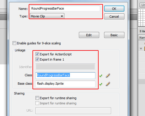
Enter edit mode (in the library double-click the object) and set its color alpha to 100%.
If it is not in there yet, drag the RoundProgressBarFace object to the folder RoundProgress Assets/Skins.
So far we have in our library the RoundProgress component, the RoundProgressAvatar in the _private folder and the RoundProgressBarBackdround and RoundProgressBarFace in the Skins folder.
Step 12: The RoundProgress.as File
OK, the design is ready, now we will start the dirty job, the code… First create a new Actionscript File
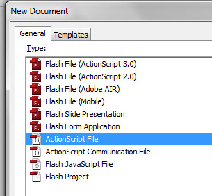
Save it as RoundProgress.as in the org/display folder which was created in the beginning of the tutorial, and let’s start coding it.
Step 13: Package and Imports
Let’s create the package and import the necessary classes.
package org.display{

	import fl.core.UIComponent;
	import flash.display.Sprite;

}
As we want to use the package org.display we saved our RoundProgress.as inside the org/display folder, so the package is org.display.
We import the class fl.core.UIComponent, which we will extend. This will be the base of our component and the Sprite class will be the mask.
Step 14: Create the Class
Now we’ll create the Class, extending the UIComponent Class.
package org.display{

	import fl.core.UIComponent;
	import flash.display.Sprite;

    public class RoundProgress extends UIComponent{
    }

}
Step 15: Variables
Next up, we create the variables used in RoundProgress
package org.display{

	import fl.core.UIComponent;
	import flash.display.Sprite;

    public class RoundProgress extends UIComponent{

    	private const RAD:Number=Math.PI/180;
		private var _face:Sprite;
		private var _background:Sprite;
		private var _mask:Sprite;
		private var _ratio:Number=0;

    }

}
The _face and the _background will be the skin for the face and background; we will use Sprites for these. The _mask will be an empty Sprite, the const RAD is just a conversion factor from degrees to radians, and the _ratio is the current progress value, which ranges from 0 to 1.
Step 16: Overriding configUI()
The protected configUI() function is from the UIComponent class; it is called when the object is created – almost like the constructor function, but it removes everything from the stage, so you have to recreate everything.
Since we are overriding the function configUI(), we need to call it in our class. If not, our script will run but nothing will be removed from the stage, so our Avatar will be there when we use the component. We call the superclass’s configUI() method by using super.configUI():
package org.display{

	import fl.core.UIComponent;
	import flash.display.Sprite;

    public class RoundProgress extends UIComponent{

    	private const RAD:Number=Math.PI/180;
		private var _face:Sprite;
		private var _background:Sprite;
		private var _mask:Sprite;
		private var _ratio:Number=0;

       	override protected function configUI():void{
        	//Call the superclass configUI function
			super.configUI();

            //Create a definition for the background
			var bgDef:Object=this.loaderInfo.applicationDomain.getDefinition("RoundProgressBarBackground");

            //Create a definition for the face
			var fcDef:Object=this.loaderInfo.applicationDomain.getDefinition("RoundProgressBarFace");

            //Create the background object, cast it as Sprite and add it in our RoundProgress object
			_background=addChild(new bgDef) as Sprite;

            //Create the face object, cast it as Sprite and add it in our RoundProgress object
			_face=addChild(new fcDef) as Sprite;

            //Create the mask object, cast it as Sprite and add it in our RoundProgress object, also setting the _face.mask as this object
			_face.mask=_mask=addChild(new Sprite()) as Sprite;
		}
    }
}
Note that since the addChild() function returns a DisplayObject we can instantiate an object when we create it and cast it as whatever we want (in this case I cast it as Sprite). In one single line I created the object, cast it as Sprite and added in our object.
Step 17: The draw() Method
The method draw() is also from UIComponent; it’s called when an property is changed in our FLA file and updates the live preview of the component. This allows the user see how the component will change on the stage, rather than having to compile a SWF. We’re going to override it so that when we change a value the draw method will be called.
package org.display{

	import fl.core.UIComponent;
	import flash.display.Sprite;

    public class RoundProgress extends UIComponent{

    	private const RAD:Number=Math.PI/180;
		private var _face:Sprite;
		private var _background:Sprite;
		private var _mask:Sprite;
		private var _ratio:Number=0;

       	override protected function configUI():void{
			super.configUI();
			var bgDef:Object=this.loaderInfo.applicationDomain.getDefinition("RoundProgressBarBackground");
			var fcDef:Object=this.loaderInfo.applicationDomain.getDefinition("RoundProgressBarFace");
			_background=addChild(new bgDef) as Sprite;
			_face=addChild(new fcDef) as Sprite;
			_face.mask=_mask=addChild(new Sprite()) as Sprite;
		}

        override protected function draw():void{
        	//it is always important to set the background and the face objects with the same width of the component
            //It doesnt resize automatically
			_background.width=_face.width=width;
			_background.height=_face.height=height;

            //Calculate the angle based on the ratio
            //The .1 is because if the graphics doesnt draw a little bit more it will stay a line of fail
			var angle:Number=(360.1*_ratio)-90;

            //store a little bit more than the radius of the face
			var h:Number=_face.height*.6;

            //If we resize our component but the width and height stay different, gets the width too
			var w:Number=_face.width*.6;

            //this is for offset mask, as we want to draw from the center of the face, we need to get this offset
			var dx:Number=_face.width/2;
			var dy:Number=_face.height/2;

            //Start drawing from center and create a line until the top of the object
			_mask.graphics.clear();
			_mask.graphics.beginFill(0x00FF00);
			_mask.graphics.moveTo(dx,dy);
			_mask.graphics.lineTo(dx,dy-h);

            //Create a segment of circle, this will be the mask of the _face object
            //These lines are what makes the magic, starting at -90 degrees and running around by the amount of degrees specified
			for(var i:int=-90;i<angle;i++){

            	//Math.cos will return the cos of the angle, multiplyed by the w (width radius)
                //As Math.cos needs to use radian as parameter we convert the angle i to radians by multiplying it by our constant RAD
				var px:Number=Math.cos(i*RAD)*w;

                //Math.sin will return the sin of the angle, multiplyed by the h (height radius)
                //As Math.sin needs to use radian as parameter we convert the angle i to radians by multiplying it by our constant RAD
				var py:Number=Math.sin(i*RAD)*h;

                //Here is the offset, it is based on the radius of the face
				px+=dx;
				py+=dy;

                //then we create a line to the position px and py
				_mask.graphics.lineTo(px,py);
			}
            //After the code is executed, we need the graphics return to the center of the _face object
            //So we line it to the first position, which is the offset
			_mask.graphics.lineTo(dx,dy);
			_mask.graphics.endFill();

            //it is always important to use super.draw() to update widths and heights
			super.draw();
		}
    }
}
Don’t worry too much about this code. As I said before, it’s not the focus of the tutorial.
Step 18: Creating the Ratio Property
Well, here we create the ratio property. This is like a variable, but it’s a function: we use the [Inspectable] tag immediately before the function’s definition so this property can be changed using the "Component Inspector" when we use it in Flash.
Let’s get to grips with [Inspectable]. We have some parameters that we can use on it, like defaultValue, name and some others. If using defaultValue then Flash will use it as the default value in the component inspector (where we can change the parameters); the name parameter defines how it will appear in the component inspector, but is not necessary. If you want to set another name for this for example you can use [Inspectable(name="MyCustomName",defaultValue=0)]. You can also set the Type (Number, String), but as it is set in our ratio property this is not needed.
package org.display{

	import fl.core.UIComponent;
	import flash.display.Sprite;

    public class RoundProgress extends UIComponent{

    	private const RAD:Number=Math.PI/180;
		private var _face:Sprite;
		private var _background:Sprite;
		private var _mask:Sprite;
		private var _ratio:Number=0;

       	override protected function configUI():void{
			super.configUI();
			var bgDef:Object=this.loaderInfo.applicationDomain.getDefinition("RoundProgressBarBackground");
			var fcDef:Object=this.loaderInfo.applicationDomain.getDefinition("RoundProgressBarFace");
			_background=addChild(new bgDef) as Sprite;
			_face=addChild(new fcDef) as Sprite;
			_face.mask=_mask=addChild(new Sprite()) as Sprite;
		}

        override protected function draw():void{
			_background.width=_face.width=width;
			_background.height=_face.height=height;
			if(!_mask) return;
			var angle:Number=(360.1*_ratio)-90;
			var h:Number=_face.height*.6;
			var w:Number=_face.width*.6;
			var dx:Number=_face.width/2;
			var dy:Number=_face.height/2;
			_mask.graphics.clear();
			_mask.graphics.beginFill(0x00FF00);
			_mask.graphics.moveTo(dx,dy);
			_mask.graphics.lineTo(dx,dy-h);
			for(var i:int=-90;i<angle;i++){
				var px:Number=Math.cos(i*RAD)*w;
				var py:Number=Math.sin(i*RAD)*h;
				px+=dx;
				py+=dy;
				_mask.graphics.lineTo(px,py);
			}
			_mask.graphics.lineTo(dx,dy);
			_mask.graphics.endFill();
			super.draw();
		}

        [Inspectable(defaultValue=0)]		//allows the ratio property to be set in the Component Inspector
		public function get ratio():Number{
        	//Return the ratio value (0 to 1)
        	return _ratio;
        }
		public function set ratio(value:Number):void{
        	//If the value is out of the range it throws an error
			if(value>1 || value<0) throw new Error("Value is out of range (0-1)");

           	//set the variable _ratio
			_ratio=value;

            //Update the component for the new _ratio value
			draw();
		}
    }
}
Step 19: The setProgress() Function
Let’s add a function to set the progress, you can use a current value and a max value.
package org.display{

	import fl.core.UIComponent;
	import flash.display.Sprite;

    public class RoundProgress extends UIComponent{

    	private const RAD:Number=Math.PI/180;
		private var _face:Sprite;
		private var _background:Sprite;
		private var _mask:Sprite;
		private var _ratio:Number=0;

       	override protected function configUI():void{
			super.configUI();
			var bgDef:Object=this.loaderInfo.applicationDomain.getDefinition("RoundProgressBarBackground");
			var fcDef:Object=this.loaderInfo.applicationDomain.getDefinition("RoundProgressBarFace");
			_background=addChild(new bgDef) as Sprite;
			_face=addChild(new fcDef) as Sprite;
			_face.mask=_mask=addChild(new Sprite()) as Sprite;
		}

        override protected function draw():void{
			_background.width=_face.width=width;
			_background.height=_face.height=height;
			if(!_mask) return;
			var angle:Number=(360.1*_ratio)-90;
			var h:Number=_face.height*.6;
			var w:Number=_face.width*.6;
			var dx:Number=_face.width/2;
			var dy:Number=_face.height/2;
			_mask.graphics.clear();
			_mask.graphics.beginFill(0x00FF00);
			_mask.graphics.moveTo(dx,dy);
			_mask.graphics.lineTo(dx,dy-h);
			for(var i:int=-90;i<angle;i++){
				var px:Number=Math.cos(i*RAD)*w;
				var py:Number=Math.sin(i*RAD)*h;
				px+=dx;
				py+=dy;
				_mask.graphics.lineTo(px,py);
			}
			_mask.graphics.lineTo(dx,dy);
			_mask.graphics.endFill();
			super.draw();
		}

        [Inspectable(defaultValue=0)]
		public function get ratio():Number{
        	return _ratio;
        }
		public function set ratio(value:Number):void{
			if(value>1 || value<0) throw new Error("Value is out of range (0-1)");
			_ratio=value;
			draw();
		}

        public function setProgress($bytesLoaded:Number,$bytesTotal:Number):void{
        	//The ratio is just the current value divided by the maximum value
			ratio=$bytesLoaded/$bytesTotal;
		}
    }
}
Step 20: Percent Property
The percent property is like the ratio property, but instead of values between 0 and 1 you will use 0 to 100. It is a percentage calculation, it also returns a float value between 0 and 100:
package org.display{

	import fl.core.UIComponent;
	import flash.display.Sprite;

    public class RoundProgress extends UIComponent{

    	private const RAD:Number=Math.PI/180;
		private var _face:Sprite;
		private var _background:Sprite;
		private var _mask:Sprite;
		private var _ratio:Number=0;

       	override protected function configUI():void{
			super.configUI();
			var bgDef:Object=this.loaderInfo.applicationDomain.getDefinition("RoundProgressBarBackground");
			var fcDef:Object=this.loaderInfo.applicationDomain.getDefinition("RoundProgressBarFace");
			_background=addChild(new bgDef) as Sprite;
			_face=addChild(new fcDef) as Sprite;
			_face.mask=_mask=addChild(new Sprite()) as Sprite;
		}

        override protected function draw():void{
			_background.width=_face.width=width;
			_background.height=_face.height=height;
			if(!_mask) return;
			var angle:Number=(360.1*_ratio)-90;
			var h:Number=_face.height*.6;
			var w:Number=_face.width*.6;
			var dx:Number=_face.width/2;
			var dy:Number=_face.height/2;
			_mask.graphics.clear();
			_mask.graphics.beginFill(0x00FF00);
			_mask.graphics.moveTo(dx,dy);
			_mask.graphics.lineTo(dx,dy-h);
			for(var i:int=-90;i<angle;i++){
				var px:Number=Math.cos(i*RAD)*w;
				var py:Number=Math.sin(i*RAD)*h;
				px+=dx;
				py+=dy;
				_mask.graphics.lineTo(px,py);
			}
			_mask.graphics.lineTo(dx,dy);
			_mask.graphics.endFill();
			super.draw();
		}

        [Inspectable(defaultValue=0)]
		public function get ratio():Number{
        	return _ratio;
        }
		public function set ratio(value:Number):void{
			if(value>1 || value<0) throw new Error("Value is out of range (0-1)");
			_ratio=value;
			draw();
		}

        public function setProgress($bytesLoaded:Number,$bytesTotal:Number):void{
			ratio=$bytesLoaded/$bytesTotal;
		}

        public function set percent(value:Number):void{
			if(value>100 || value<0) throw new Error("Value is out of range(0-100)");
            //Just some math...
			ratio=value/100;
		}
		public function get percent():Number{
			return ratio*100;
		}
    }
}
Save your document (remember, in /org/display/RoundProgress.as if you haven’t saved it yet).
Step 21: Live Preview
Nope, it isn’t finished yet. If we drag our component to the stage now, it will appear as the white square with the black outline, but if we test our movie it will show the component. This is because we haven’t created a “live preview” – the live preview can visualize a SWF of the component, and as we set the properties it will adjust and update visually too. If we don’t have a live preview only the avatar will be shown.
Let’s create our live preview; there are two ways I know of to create the live preview, so I’ll explain the one that works perfectly for me.
In the library of RoundProgress.fla, right-click over the RoundProgress component, click "Export SWC" and export in the same folder of the RoundProgress.fla file. The .swc file is a zipped file, so you can open it with WinRAR or something similar. Alternatively, you can rename the extension to “.zip” and open it that way.
Open the .swc as above and you will see some files. One of them is the library.swf; extract the library.swf to the same folder as the .fla file.
Step 22: Implementing the Live Preview
Go back to the Flash authoring environment. In the RoundProgress.fla file, open the library, right-click on the RoundProgress component and click the option "Component Definition".
In the Component Definition, note that in Parameters we have now the parameter ratio, which is the variable “ratio” and the value “0″ – this is the [Inspectable] we have defined with defaultValue=0 (the other parameters comes from the UIComponent class). It might not be configured yet; if not you need to open the Component Definition panel and click OK to update this, whenever you make changes in the .as file.
Now click the button "Set…" in the Live Preview section.
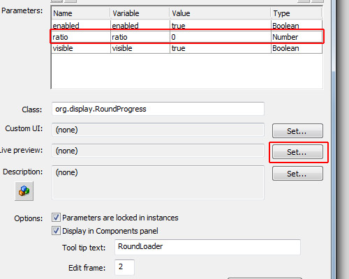
In this window that opens, select the option "Live preview with .swf embedded in .fla file", and click Browse:
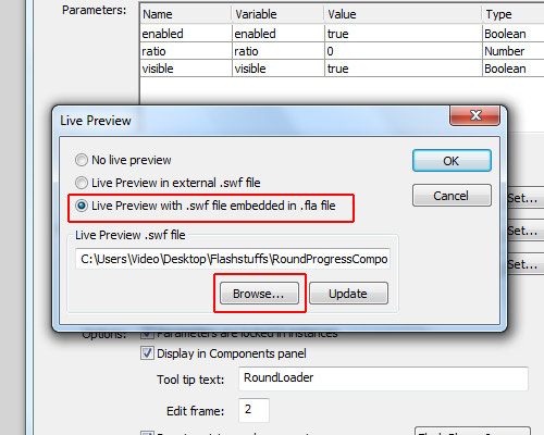
…then select the library.swf which we extracted from the .swc file.
If you drag the RoundProgress component on to the stage you should now be able to see the “live preview”. Try changing the value of “ratio” in the Component Inspector.
Step 23: ComponentShim
So far, we have created the component and it is already working with a live preview, but if you want to distribute your component as an .mxp file, you will have to send the .as file in the .mxp file. Maybe you don’t want people having access to your source .as file, or, if you have a lot of .as files, maybe you would find it boring to create the .mxi file (explanation later). The best thing you can do is to embed the .as file inside the .fla file in a compiled clip, which we call the ComponentShim.
Note that if you drag any User Interface component to the stage there will be a ComponentShim object. For example, look in the library in Component Assets/_private – which is a compiled clip, but we won’t use this one, we will create our own.
Another good reason for using a shim compiled clip is that it is already compiled, so when you compile your .swf it will just be added, not recompiled, giving a faster compilation.
Let’s start by creating another .fla file and saving it with the name “RoundProgressShim.fla” in the same folder as “RoundProgress.fla.”

In the RoundProgressShim.fla document, open the library.
For each component which has external .as files you may create a new object in the RoundProgressShim.fla. As we have only one component with one .as file, we will create the shim for this component only.
Create a new Symbol in the library, it must be of type Movie Clip and for its name choose the same name as our component (in this case RoundProgress). Check the options "Export for ActionScript" and "Export in frame 1"; for the class we will use the name of the component, so use “org.display.RoundProgress.”
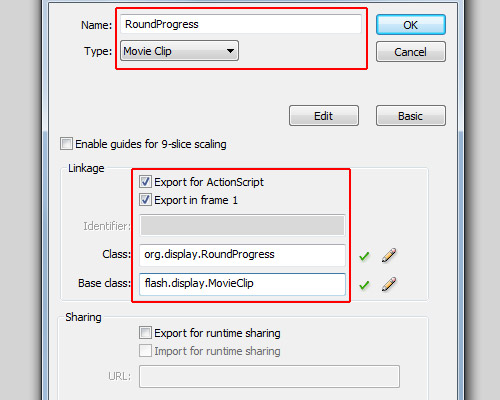
OK, this is our reference for the org.display.RoundProgress object (we need one reference for each component).
Now we create the shim source. Open the library again in RoundProgressShim.fla, and create a new Symbol named “RoundProgressShim source”. Check the options "Export for ActionScript" and "Export in frame 1"; for its class use org.display.RoundProgressShim (this is irrelevant); for its base class use flash.display.Sprite. Note that the name and the class don’t exist, really, but this will be our compiled clip, so to avoid conflicts it can’t have the same name or the same class as our component…
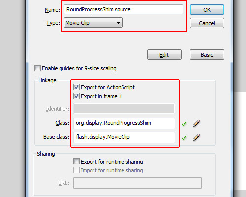
Now in the library, right-click on “RoundProgressShim source” and select "Convert to Compiled Clip"; now we will have one more object in the library called "RoundProgressShim source SWF". Rename it to "RoundProgressShim".
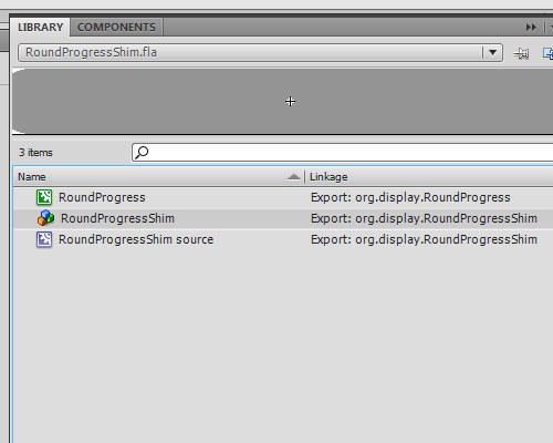
OK, our custom ComponentShim is created, just save the RoundProgressShim.fla in the same folder as the RoundProgress.fla, and close RoundProgressShim.fla.
Step 24: Using the RoundProgressShim
Back in our RoundProgress.fla document, click File > Import and click "Open external library" (Ctrl+Shift+O), find and select the RoundProgressShim.fla and open it as library.
Put the two libraries side by side, the library of RoundProgress.fla and the library of RoundProgressShim.fla.
Now drag the RoundProgressShim object from the RoundProgressShim.fla library to the RoundProgress Assets/_private folder in the RoundProgress.fla library.
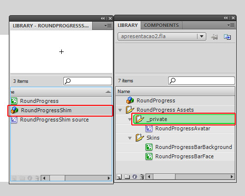
…and now you can close the RoundProgressShim.fla library.
Go into edit mode of the RoundProgress component again (double click on RoundProgress object in the library), select the layer Shim, and go to Frame 2.
Now just drag the RoundProgressShim from RoundProgress Assets/_private in the library to the stage.
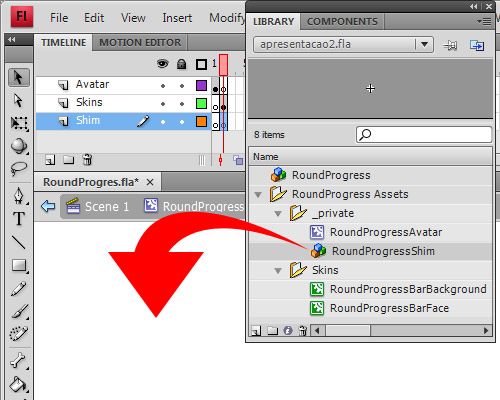
OK, now our component is ready to use. Save it and let’s learn how to package it into an .mxp file, ready to distribute.
Step 25: Create the .mxi XML File
Create a new XML file outside Flash, you can use Dreamweaver for this, or even notepad. I’ll use Dreamweaver.
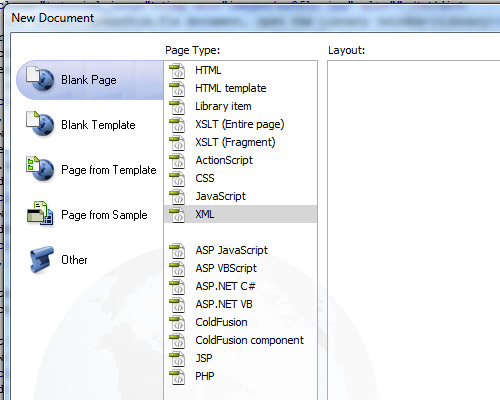
Save it as “RoundProgress.mxi” in the same folder as RoundProgress.as. It is very important you define the type (.mxi), or else you’ll save just as a .xml file which is no good to us.
Copy the XML I’ve created for this tutorial and paste into your RoundProgress.mxi:
<macromedia-extension name="RoundProgress Bar" version="1.0" type="Library">
	<author name="Andre Cavallari" />
	<products>
		<product name="Flash" version="9" primary="true" />
	</products>
	<description>
		<![CDATA[A Circle Progress Bar]]>
	</description>
	<ui-access>
		<![CDATA[window - Components (ctrl+f7)]]>
	</ui-access>
	<files>
		<file name="RoundProgress.fla" destination="$flash/Components" />
	</files>
</macromedia-extension>
Let’s break down the XML file: the first line is where we assign the name of our component (this is for the Adobe Extension Manager only, not for Flash) the version and the type (which is Library; for other types check the Adobe Extension Manager manual).
The author tag is to define the author of the package. Again, this is only for the extension manager.
The product tag defines which product your component is for. In our case it’s for Flash CS3 or CS4, so for name we use “Flash”, version being “9″ (CS3).
The description tag is for a description in Adobe Extension Manager. It can’t be null, but you may write anything there. The CDATA tag tells us that we can have HTML code inside so it won’t try to read as xml.
Inside the ui-access tag you can define how to use your component, how to access it in the Flash authoring tool.
The files tag contains the list of the files that will be copied to Flash’s configuration folder. In our case we will copy just the RoundProgress.fla, as we created the RoundProgressShim, we won’t need to copy the org/display/RoundProgress.as too. If you have more files to copy you may specify them inside the files tag (hence why having lots of AS files could make this step boring!)
Step 26: Package the MXI into MXP
The .mxi file simply gives instructions on how the Adobe Extension Manager should create the .mxp file. The .mxp file is like a zipped file, but if you try to open it in any zip application or rename it, it will return an error. This is because its compression algorithm is different to the zip algorithm. However, the Adobe Extension Manager can read the contents of the mxp file and the instructions of the mxi file, and will use this information to install your component.
When you install the MXP file with Adobe Extension Manager, the MXI file is also copied for later removal of the component; it will be in the configuration folder of Flash inside the Extension folder.
If it’s all OK you can now find the .mxi file you just created and double-click on it to open with Adobe Extension Manager.
When the extension manager opens, it will ask where you want to save your extension package. Let’s select the same folder as the RoundProgress.fla, though it can be anywhere since the RoundProgress.fla is inside the MXP file now.
It will then generate and save your MXP file.
Step 27: Using the .mxp Extension
It is important that you do this with Flash if your Adobe Flash language isn’t the same as the computer language (this is a bug in CS4 extension manager: let’s say that your computer is in Portuguese language, but Flash was installed in English language; if you just double-click an .mxp file and add it, the extension manager will understand that the language that it must install in is in Portuguese, not English, so in the configuration folder of Flash, instead of using the /en folder it will create a new folder /pt and copy the files there instead. If you open Flash, click Help and select the option "Manage extensions" it will open the extension manager in the same language as Flash, so anything you add here will be in the correct place.)
Open the Extension Manager via Flash (Help > Manage extensions).
In the Extension Manager click "install" at the top of the application.
Find the .mxp file, and agree with anything you need to. OK, it is installed; you can now close the Extension Manager. You’ll also need to close and re-open Flash for these changes to take effect.
Step 28: Test Your Component
Create a new Actionscript 3.0 file and save it anywhere, for example in c:\test\RoundProgressTest.fla

Set its stage size to 170×170px then go to Window > Components.
Note that our component is in the list now, as it is in the RoundProgress.fla it will appear in the RoundProgress folder with the name of the component inside. If we wanted it in the User Interface folder we would need to save the .fla as “User Interface.fla”, but this isn’t good practice since a file can overwrite others.
Now drag the RoundProgress component on to the stage. You can see that the live preview will work now, it will show our component with the skins, etc.
Set the component’s position to x:10 and y:10, just to center the component in the stage. Open the component inspector ("Window -> Component Inspector"), and with our component selected on stage look at the parameters tab. There you can see the parameters of our component, so change the ratio value to 0.3 and you will see the live preview update.
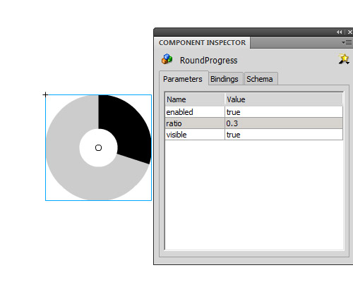
You can double-click it to edit its skins and you can put a text label down next to each skin to identify them (the UIComponent will remove everything). Also, you can open the library and in RoundProgress Assets/Skins you can double click each skin to edit them – but remember: the circle’s size must not be changed when editing the skin, if you want it bigger or smaller resize the component on the stage.
Important: If you set the ratio value in an ActionScript file, let the parameter in the Component go to its default value (0 in our case).
The parameters we can set and get are ratio and percent: the ratio range is from 0 to 1, and the percent range is from 0 to 100. Both do the same thing but the ranges are different. Also, we have the method setProgress(), with 2 parameters: the first is the current value and the second is the maximun value.
Conclusion
Now you’ve learned how to create a Flash component, you can start creating your own components, selling then on ActiveDen, or creating some freebies for us here. I hope you like it and if you have any questions just ask in the comments.
One last thing: if you want to use a Tween in the example at the top, you can: let’s assume the instance name of our component is progressbar, and our tween engine is TweenLite; you can set the ratio to 0 in the component inspector then tween it to any value bigger than 0 and smaller than 1. For example:
TweenLite.to(progressBar,.5,{ratio:.75});