Model a High Poly Canon A1 Camera in Modo – Day 5

In Day 5 of this tutorial we’ll be finishing up the UV maps for the remaining sections of the model, and then start discussing how to apply graphics/decals during the texturing and render stages. Along the way we’ll be covering a few new UV techniques whilst exploring Modo’s much-talked-about UV toolset.

This tutorial is Day 4 in a series – Go to Day 1, Day 2, Day 3, or Day 4.


Video 1

Download

Note: click the ‘Monitor’ icon to view tutorial in full-screen HD.

Video 2

Download

Note: click the ‘Monitor’ icon to view tutorial in full-screen HD.

Video 3

Download

Note: click the ‘Monitor’ icon to view tutorial in full-screen HD.

This tutorial is Day 4 in a series – Go to Day 1, Day 2, Day 3, or Day 4.


Don’t miss more CG tutorials and guides, published daily – subscribe to Cgtuts+ by RSS.

Quick Tip: 6 Things to Do Before Your Mix Goes to Mastering

I like thinking about mastering as a type of black magic. Filled with taboos and approachability.

Everybody and their grandmother has an opinion about how things should be recorded and mixed, but when asked about mastering most people hush up and shrug. Mastering is a trickier subject to tackle than mixing I feel, and the delicate touch and subtleties a mastering engineer gives to a final mix sometimes sadly goes unappreciated.

However, there are certain things you mixing engineers can do to make the voodoo doctor’s work easier. Mastering takes a few oddball songs that were recorded in various places by various people and makes them sound like they were actually recorded, if not in the same room, at least on the same planet. So help out the mastering process by making sure your mix is ready to be mastered.


1. Find a Mastering Engineer

Like any good product or service there is difference in price and quality. Find a dedicated mastering engineer that has some specialization instead of some guy that will happily take your money in exchange for putting a limiter on your stereo track and boosting the hell out of it.


2. Finish Your Mix

You need to be absolutely certain that you like the mix the way it is right now. A mastering session is no time and place to start worrying about if your vocals are too low or if the kick drum doesn’t sound right. Make sure you are in love with the way your mix sounds so that when mastered, it will only sound better.


3. Make Sure Your Mix Isn’t Overloading the Master Fader

A mastering engineer can’t do anything to a mix that has already maxed out the stereo buss. If the master fader is blowing steaming red all the time, chances are there is no headroom for the mastering engineer to work with. Make sure your faders aren’t overloading the master fader and try to have a nice headroom on the master fader. The amount of headroom a mastering engineer wants can vary so check with your guy how where he wants the peaks of the master to reach.

By having enough headroom on the master track you give plenty of room for the mastering engineer to work with, and he can compress and equalize and boost your mix to a mastered perfection without worrying about digital clipping. If your mix is already maxed out, select all the faders of your mix and collectively lower their volume until the master buss has a lower level to it.


4. Put Your Mix In the Right Format

Ask your mastering engineer how he likes working. Some people like breaking the mix down into separate groups, creating an added advantage to the mastering process. Does he want a typical stereo track or does he like separate instruments bounced in stems?

Making the setting up and loading up time quicker means more time and money is spent on actually working with your music.


5. Bounce to the Correct Format

CDs are 44.1 kHz, 16-bit format. That does not mean that your mix should be bounced to that format. If you recorded at 48 kHz/24 bit, it’s generally a good idea to leave it to the mastering engineer to bounce the track down to CD format. The mastering engineer will want all the headroom he can get so leave the format the way you recorded it in.

And never, ever, under any circumstances bounce your tracks to MP3 for them to be mastered. It should go without saying, but MP3s cut the quality immensely so in reality, there’s probably not a lot left to be mastered.


6. Take Any Mastering Plug-ins Off Your Master Fader

Before you bounce your tracks to a WAV file, make sure you don’t have any crazy mastering plug-ins already on the stereo buss. Maybe you put up a nice mastering patch to impress your friends or girlfriend, but leave it off for the mastering engineer. He will not be impressed with, I promise you.


Using Sound Effector to Create Animations in Cinema 4D – Basix

Sound effector is a tool of the Mograph module in Cinema 4D that you can use to create animations which are perfectly matched to a sound or musical score. Through this tutorial you are going to learn how to use sound effector as well as its fine-tune function. We will also use Adobe After Effects to blend the animation that was exported from Cinema 4D with the sound track to make our final composition.

Step 1

Create a 50×50×50 Cube object.

Step 2

Add Cloner Object to the scene.

Step 3

Make the Cube a child of that Cloner object.

Step 4

Select the Cloner object, and under the Object tab, set the Count value to 15 and the P.Y value to 55.

Step 5

Add Sound Effector to scene.

Step 6

Be sure that that Sound Effector is enabled under the “Effectors” tab of Cloner object. If not, drag and drop the Sound Effector over that box.

Step 7

Select the Sound Effector object, and under the Effector tab, select a sound file to use. That file must be .wav file, otherwise it won’t work. Again under that tab select “Step” for “Apply mode”.

Step 8

Go to the “Parameter” tab. Under the Transform section, turn on the “Scale” option. Now enter 50 for the S.Z value and delete the P.Y value, which is set to default.

Step 9

Under same tab, go to the Color section and choose “User defined” for the Color Mode. Choose any color you wish. I prefer yellow. Then turn on the “Use Alpha/Strength” option.

Step 10

Select the Cloner object, and under the “Transform” tab, select another color to blend with previous color.

Step 11

Select the “Effector” object, and under the “Falloff” tab, choose “Box” as the “Shape”.

Step 12

Now you can edit that box anyway you like to get best result. I used 100x 480 x 820 for mine.

Step 13

Select the “Animation” layout.

Step 14

Go to the “Parameter” tab of “Sound Effector” and delete the value of S.Z which you had assigned before as 50. Press and hold to control key on your keyboard and click to little dot right near the S.Z section. It must turn to red.

Step 15

There should now be a key on timeline. Click over it and while pressing control key, and drag it to right side. This will copy it.

Step 16

Click over the new key, and under key properties, set the “Key Value” to 50.

Step 17

Return to standard layout. Add a “Floor object” (Object > Scene > Floor) to the scene, and rotate it by 90 degrees to create a wall.

Step 18

Create a new material. Choose a color, and turn on the “Reflection” channel. Now reduce the Brightness to 15% and set the “Blurriness” to 20%. Use that material on the “Floor” object.

Step 19

Add a Camera object and to set it as main camera. Click the little symbol right next to it.

Step 20

Right click the camera object and select the “vibrate” tag.

Step 21

Turn on the “Enable Position” and “Enable Rotation” options. Then set the Frequency of Position to 2, and choose “25 x 25 x 25″ for Amplitude. Set the Frequency of Rotation to 1, and choose “5 x 5 x 5″ for Amplitude.

Step 22

The sound track is approximately 668 frames long, so set the last frame to 668 on the timeline.

Step 23

Go to the Render Settings (Cmd + B), and navigate to the “Output” section. Here you can set the size of your video. At the bottom, set the range to “from” as “0 F” and “to” as “668 F”.

Step 24

Go to the “Save” section. Select “Quicktime movie” as the format, and choose the location and name to save the video as.

Step 25

Click the “Render in Picture View” button and wait for the render. It may take a while depending on your computer.

Step 26

Now open After Effects to combine the exported video with the sound. Go to (File > import > file) and then select the video file. Do the same thing for sound file.

Step 27

Select those two object, and drag and drop them onto the workflow beneath.

Step 28

Click the RAM Preview button, and you will see the combined result.

Step 29

Go to (File > Export) and select any file format you want your final video to be!. That’s it. You have successfully used Sound Effector. Now let’s see what you can make it do to!!

Don’t miss more CG tutorials and guides, published daily – subscribe to Cgtuts+ by RSS.

AEtuts+ Zaxwerks Challenge Halfway Point

This is just a reminder to all of you busy, busy people… The month of May is now officially half over. This means have a little over two weeks left before your free version of Zaxwerks ProAnimator will continue to be available for free. This also means you gotta get crackin’ and take our Challenge if you think you got what it takes!

Don’t tell your friends or anything cause we’re trying to keep it secret… but word on the street is that there has only been one entry thus far! With 5 chances to win prizes worth a total of well over 2 grand, things are looking pretty good…. shhh… you didn’t hear that from me, ok?


Contest Details

To read all the details about this challenge and even more importantly to see the amazing stuff YOU could win CLICK HERE.


Interview With Dimo Trifonov

Dimo Trifonov is a very interesting designer, his style centers around simplistic and vivid imagery. In our interview, Dimo explains why he prefers the simple style over crowding the canvas, he also offers a great analogy as to why he prefers it this way. In addition, we also discuss the question of whether designers should be self taught or go to a specialized school, and finally we also discuss some of Dimo’s amazing art. So check this one out.

Q Welcome to Psdtuts+, please introduce yourself. Could you tell us where you’re from and how you got started in the field?

Hello there. My name is Dimo Trifonov and I am currently living and working in Sofia, the capital of Bulgaria. I have been working in the arts for a long time. I got started in the arts when I was around 12 or 13 years old by doing graffiti, music, and traditional art. When I was 15, a friend of mine gave me Adobe Photoshop 6 and everything began to take shape. I started out doing dumb things like liquifying my friends’ photos and stuff like that and eventually this became my job.

Q From your illustrations we can see that simplicity is key for you. Why did you decide to go with this style for your art?

I choose to be short when I speak visually. The world is complicated enough, I don’t want to complicate it more. A simple shape or color can say the same thing as whole painting full of objects and colors, but it’s important how you use them. Also, I like the air, I like empty spaces they give me freedom and peace of mind. Think of it like a room full of people and you can’t even take a breath…and now think of an empty room only for you and you have all the air in it just for you …I think it’s way more comfortable. This is my design/art.

Q Are you a self taught designer or did you attend school to learn graphic design? Which route do you think is the best to take for the young designers out there?

Ha-ha, well, actually I am almost 20 years old, so I may not be the best person to give tips to the young generation, but I don’t think school is necessary. You can learn from anything and everyone without paying huge amounts of money with the hope that you may one day will become a great designer or artist.

It’s important to learn from yourself. I just finished school last year and have thought about going to a University because it is good for your CV, but that is the only reason I am considering it. Either way, you can always learn more if you have the time and money. If you are already a great designer, maybe you can focus on something else that will make your designs better maybe philosophy? Who knows?

Q Along with your simplistic illustrations you also make very amusing posters like “Good Morning” and “Important Objects“. How do you go about getting your ideas out with these posters?

Thank you. Well both ideas were born in the morning while I was having my cup of coffee. The Good Morning piece took me just 20mins of work but the idea took me just a moment. I was looking at my cup and I was reading a brief and I saw my iMac and I thought it will be nice to visualize my morning and that was easy because of just a flip of an object I visualize 3 different object. I think those series of posters are my best so far.

About the other piece, Important Things, well I just decided to capture the objects I use most and that are important to my daily life. I can live without them but it will not be comfortable to me. And well they are just soulless objects.

Q “Yesterday” is a great simplistic abstract illustration you made. Please talk about the inspiration for this piece and how you went about making it.

MTV had a contest on the Behance network, the theme was Time. So I decide to submit something. The piece visualized my yesterday, when I saw a girl with amazing green eyes look at me. All I wanted is just to hit the pause button and then rewind the same moment again and again. That’s why I made this rainbow color line, it represents the timeline and its cold colors and warm colors and the hand is trying to stop the time on the warm one while it’s melting from desire to touch the girl. I know it’s cheesy but those things don’t happen to me daily so I wanted to capture the feeling.

Q As a designer what would you say is your favorite piece of art? Classical or Modern, and why?

I don’t have a favorite piece of art. Stupid or not I don’t have one. I can’t close my self in one thing. There is so much art around us and everything is charming in its own way. However, I am more of a vintage addict. I found those 70s and 80s designs very attractive, stylish and perfect. I mean all aspects of design from graphic design to industrial design. Back in those days there were people who really understood their jobs. Today 60-70% of design in not well made which is not good for the young generation or for the clients. Good design is never trapped in time, good design is forever.

Q Please talk about your design studio Nufabric and what projects you are currently involved in or will be doing in the near future.

Studio Nufabric was an idea I started with some mates that consists of Me, Nikolay and Kaloyan. We’ve had very positive responses about our work but in Bulgaria it’s hard to make something that will not target the mass. So we decide to stop the project for now with hope we could really open a studio one day not just a web portfolio.

Q Thanks again for providing Psdtuts+ with this opportunity to interview you. Any final thoughts for our readers?

Thank you too for the interview and keep the site fresh as ever. It’s always nice to share some thoughts about design and art. It’s time to get some sleep.
Look around and do something.


Where to find Dimo on the Web


Interview with Wendy Jim aka Rydeen

Meet Wendy Jim aka Rydeen, who specializes in illustration and color direction. Being a self confessed comic book nut, Rydeen always knew she wanted to be a digital artist and went on to pursue a career in multimedia design. In this interview, Rydeen talks about her work, education, experience and experiments in digital art.

Continue reading “Interview with Wendy Jim aka Rydeen”

The Complete Beginner’s Guide to Lomography – Basix

The digital camera has revolutionized photography. More people have embraced a passion for photography than ever before. So, is film photography dying? Lomographic Society would beg to differ. It can be argued that this organization has done more to keep film alive than any other. This tutorial will guide you through the complexities of becoming a Lomographer using their ten rules as a guide.


Rule 1: Take Your Camera Everywhere You Go

The Lomographic Society was started in the 1990’s when some intrepid students stumbled across a Russian camera called the Lomo L-CA. Now the society distributes, refurbishes and produces a huge array of cameras. With the LC-A as their cornerstone, they also want images with a unique look, but most are plastic with few (if any) adjustable features. They all use film. Lomography has helped popularize the Holga and Diana medium format cameras. And they sell refurbished cameras that are no longer in production.

Buying Lomo

Many of the cameras that Lomographic Society sells may seem overpriced. For example, a few years ago, I purchased a used Zorki 4K a Russian rangefinder modeled after early Leicas, online for $35 USD. A short while after that purchase, Lomo started carrying a similar model of their website, now priced at $175 USD.

The prices for this camera have now risen dramatically at other places online. But what the Lomographic Society is offering is different. They are offering a warranty and a guarantee that their products are in working order. Also keep in mind that you are supporting a niche market. Many of the cameras and films that the Lomographic Society distributes and produces would not be available elsewhere. They have taken a risk with their business model, and if you choose to buy from them, you’re keeping that business model alive.

The only reason I’m dwelling so much on this is that the Lomographic Society gets a lot of criticism for their prices. I just wanted to present why I feel comfortable purchasing from them. The following image was shot with a Holga Wide Pinhole camera, which is one of the many cameras offer by the Lomographic Society:


Rule 2: Use It Anytime – Day and Night

The sheer number and variety of cameras and accessories offered by the Society means that there is something for every occasion. People often ask me why I shoot film, when I have a perfectly good digital camera. Well, digital cameras are basically all the same. Film cameras are not. They do not make a swing-lens panoramic digital camera like the Horizon.

Try as you might, photo editing software can not recreate the look of 3200 speed black and white film. There are also few things in life that are more exciting than picking up a roll of film. It’s always a suprise. When I shoot film, especially with the sometimes functionless Lomographic style cameras, I worry less about technical side of exposure. I just shoot, which encourages me to take photos I wouldn’t normally take. Some turn out, some don’t, but I always learn something.


Rule 3: Lomography Is Not an Interference in Your Life, but Part of It

I mentioned earlier that Lomography is a little like a cult. Well, head to their website and check out the online community. They have 40,132 active users. About a quarter of those users have a LomoHome, which is a personal page for displaying and sharing photos and albums.

There are 4,403,306 photos that users are sharing on the site, and that doesn’t even count the private ones only shared between friends. The members, who live all over the world, provide a constantly updating global snapshot which is always great to browse.

One of my favorite parts of the site is their list that has around 200 camera spanning tons of brands and types. You can read reviews and see sample photos. This part of the site really shows that the Lomographic Society revolves around photography and not just selling their specific cameras.

The following image was shot with a Vivitar Wide and Slim, a camera that is popular on the Lomography website, but not sold there. You can just make out the reflection of the camera in the window I was shooting through.


Rule 4: Try the Shot From the Hip

As I mentioned earlier, for me, the best part of shooting film is the surprise; the happy accidents that you don’t know about until you see your developed film. Nothing makes this happen better than shooting without looking.

By using the hyperfocal distance on your lens (the focus point that allows the most things to be in focus at a given f/stop) or by using a camera wasn’t made to be precisely focused (like the Holga and LC-A), you can snap shots from any angle. Above your head, on the ground or, like the rule says, from the hip.


Rule 5: Approach the Objects of Your Lomographic Desire as Close as Possible

This is not advice for Lomography or even film photography, it is advise for all photography. Whether you’re making photos of your friends or your flowers. Get close! When I shoot, I follow the two step rule. As I start shooting, I find a comfortable distance, then I take two steps closer.

But this rule can also apply to your passion for photography. Get in there. Learn about your gear, the history and the great photographers. The part of shooting film is that I love the most is knowing I’m using the same cameras and doing the same processes that people have been doing for over 100 years.

Helmut Newton, Henri Cartier-Bresson, Robert Cappa and Ansel Adams never touched a digital camera while they were in the peak of their careers. Getting close to the craft is just as important as getting close to your subjects.


Rule 6: Don’t think. (William Firebrace)

This one sounds really easy, right? But I often myself over-thinking exposure and composition. I am a professional, but I still miss shots occasionally when I’m caught up trying to achieve some specific technique. This especially happens when I don’t have the safety net of a screen on the back of my camera.

Lomography’s emphasis on simple cameras makes it easy to just shoot. If your camera’s only control is a shutter button, then what is there to think about. When browsing the Lomographic Society website, you’ll see the users who embrace this rule. Off-the-cuff photos of their friends make for some great keepsakes; much better than your typical “grip and grin” posed shots.


Rule 7: Be Fast.

Move quick while you’re taking picture, but you may also want to move quickly to start shooting film. Lomography has done wonders to preserve the medium, but it is still endangered. Kodak has discontinued some lines of its film including the infamous 64 in 2009. And even if you do happen across a roll of Kodachrome 64, there is only one lab in the entire world that processes it.

Polaroid stopped producing film, but was saved by another company, aptly named Impossible Project, which has started doing small runs. 110 film is almost impossible to buy except online, and unless you’re lucky enough to have a great lab where you live, you’ll need to send off for processing.

In other words, film might not be around forever. Take part in this piece of photographic history before it’s too late. The Lomographic Society carries a lot of film on their site, even some that aren’t made anymore. You can also read reviews of films and see example photos.


Rule 8: You Don’t Have to Know Beforehand What You Captured on Film

Lomographers are not afraid to experiment. One of their favorite, or even trademark, moves is to cross-process their film. This when you develop a film in chemicals meant for different type of film. The most common technique is developing slide film in the more commonly available chemicals used for regular color negative film.

The results can be super saturated and very interesting. But many people also experiment with expired film. The shot below was made with Kodak 400 ISO Tri-X black and white film that expired in 1994. The look of this image isn’t too different or dramatic, but some films really change as they age.


Rule 9: Afterwards Either

Lomography is all about producing images that are different. Everyone has seen a perfectly exposed, in-focus photo with a straight horizon. These photos are not bad, but they’re to be expected with all of the technology packed into modern digital point-and-shoots.

The Lomographic approach isn’t for everyone – even I don’t want all my pictures to over-exposed, tilted and blurry. But treating photography more like a scavenger hunt than oil painting has been a welcome release from my daily style of shooting.


Rule 10: Don’t Worry About Any Rules

Lomography encompasses a lot of things; interesting cameras and films, a global community, the desire to keep film photography alive, but the part of it that has been most rewarding for me has been discovering new things about photography.

Lomography isn’t somewhere I ended up, it’s somewhere I started. Lomography introduced me Russian cameras and showed me that those old bricks of film stashed away in an abandoned darkroom might still work. There are other places online dedicated to these specific things, but there are few places that embrace so many different aspects of film photography.

The Lomographic Society is a clearing house for all things analog. At the very least, shooting film cameras means that no one can see their picture on the back of your camera. Just say, “yes, your hair looked fine, and, yes, I waited until you were finished with huge bite of cake to take the photo.”

Your Portable Studio: iPhone Apps for Musicians

The iPhone really does have some great offerings for musicians that you should know about, and I think it’s a platform with huge potential for musicians, especially on the move. We’ve all experienced the frustration of coming up with a great melody and having no way to get it down, and subsequently forgetting it. Or lost a guitar tuner or forgotten the correct fingering for a chord.

This article was previously published on the AudioJungle blog, which has moved on to a new format in 2010. We’ll be bringing you an article from the AudioJungle archives each week. Although this article is fairly old, I thought it might whet your appetite for next week’s iPad article.

Since there was a forum thread about this recently, I figure it’s a topic of interest, so I’ll share what I’ve learned and found over the past week!


GuitarToolkit

I’ve recommended this app so many times since I bought it that I wish the App Store had a referral program. The truth is I didn’t have a tuner until the day I got my iPhone. I’ve had half a dozen since I picked up my first guitar, but they’ve all since died, or were built-in to an effects pedal that stopped pedalling.

So, given my interim solution, I suppose any iPhone tuner is awesome, because I was booting into Logic 8 on an old, barely-Intel Mac mini to use nothing more than the tuner insert.

But GuitarToolkit isn’t just a very accurate tuner with more than 40 alternate tunings included. For starters, it goes beyond telling you which direction to tune in; if you like to tune by ear, there’s a fretboard with reference samples. Just pluck a string or strum them all.

But what made this app worth the extra money was the chord finder and metronome. I was only looking for a simple tuner and my app budget was running out, so it was a hard decision, but having so many chords at my fingertips and a metronome everywhere basically meant my hand was forced. I had to buy this.

And so far it has worked great, helped me tune faster than any tuner I’ve had and hasn’t crashed at all. Definitely the App Store purchase I’m happiest with. Find out more at GuitarToolkit’s Web site.


Evernote

Evernote, believe it or not, makes the list. I’m a big fan of the desktop app, but it hasn’t been a huge help for me when it comes to music; there are better ways to capture vocal ideas when I’m at my computer. But on the road or out and about, I haven’t come across anything better for capturing a vocal melody that I can transcribe later.

I’m also finding it useful for getting lyrics down in written form, but not being able to edit those notes once they’re made is very frustrating. This app shouldn’t have been released until it could edit notes, but I guess they were more interested in being one of the early birds. It’s conflicting because the in-built Notes obviously allows you to edit your notes, but is way too simple next to Evernote.

Other than the inability to edit, the app is fine, though that’s a bit like saying that the ice cream cone tastes good even though there’s no ice cream in it. Evernote says editing is coming soon.

I would’ve tried Jott for the voice notes like everyone keeps suggesting, but I’m not going to recommend something I can’t try because the developers had the bright idea to make it available only in the US store.


BeatMaker

BeatMaker is a pretty cool app with a lot of potential. You can sequence beats based on sample packs provided with the app or downloadable from the Internet, and using software the company behind BeatMaker provides, you can put your own sample packs together.

There’s a pad section for jamming with your fingers. Once you have an idea you can head over to the sequencer and lay down the patterns, and even add a few effects—including equalization and a bitcrusher distortion unit.

There’s no MIDI export yet, so your tunes are ultimately stuck on the iPhone, but the developers claim it’ll be there very, very soon. When that happens, combined with a healthy number of sample packs ready to go on your phone, BeatMaker might become a serious sequencer and sampler for the iPhone; for now it’s handy, but easier to get a melody down using other software. It is the best option for beats.

If Intua throw in a flexible synthesizer or even full sampled keyboards, BeatMaker will beat out the competition for the ultimate iPhone music machine.


Karajan Beginner

I tested Karajan Beginner because by the time I found out about the main app, Karajan, which costs a bit, I’d already plonked down $50 writing this article and I started feeling cheap ;) . Karajan Beginner is the free version of Karajan that’s designed to hook people in enough to get you onto the paid version.

But, if you’re interested in interval ear training as we discussed here a few weeks back, this app is a good way to get started. Major second, fourth and fifth intervals are all pretty good choices to start honing your ear with. The full range of intervals is available in the Karajan app.

The Chords tab tests your ability to tell the difference between major and minor triads. It’s easy as cake, but I suppose if you forgot the difference it’d be pretty embarrassing, so best to keep that skill up, no?

The Scales tab plays the notes of a scale and you must then pick which one was played from a list of scales. There’s also an absolute pitch trainer on the Pitch tab, though I don’t see much use in this. And finally there’s a tempo trainer which plays a series of piano notes and asks you to select the correct BPM from a list.

Ultimately, the trainers for intervals, chords, scales and tempo are all quite useful (chords more so in the paid version). The rotten egg in this basket is on the Pitch tab.


Band

To me, Band is more of a musician’s toy, but heck it’s a fun toy! That said, it is entirely possible to capture musical ideas using this program using its recording functionality. You can even overdub your tracks.

The first instrument you’re presented with is a drum machine, as shown in the picture to your right there. It’s pretty fun to play with, and if you’re a drummer with a beat stuck in your head it might be useful, but I’m not so I’ll leave it at “pretty fun.”

The next screen is a drum kit. I thought this was stupid at first and that all the samples were strangely matched to the instruments. Then I realized that you didn’t tap the drums: you held you finger down and a loop was played! Duh. Very cool for those who don’t drum (me!), so you can record a loop and overdub it.

The third instrument is a bass guitar. This is where the realm of multi-touch instruments gets interesting, and fretting the notes is pretty cool and allows you to experiment with funky bass riffs, but I can see plenty of room for improvement. Starting with proper samples for slides, hammer-ons, and pull-offs. And bends, too. If you could bend notes with this thing, multi-touch strings would be better than D’Addarios.

The piano offers two octaves worth of keys—stacked on top of each other rather than side-by-side, to make use of limited room—and is, again, handy for recording melodies, but the samples aren’t very pleasant at all. The next app, which we’ll talk about in a minute, is way better for this, and since it and Band came from the same developer, I’m surprised they’d cripple their flagship product.

The 12 Bar Blues is my favorite part of Band. Hold down the correct chord in the progression and solo over the top of it using the strange surface that is part fretboard, half bar (there’s even a bottle of whiskey, get it? 12 Bar Blues? Ha, ha…). There is a beat button to keep the drums going, too.

And last and least (that’s a big “up yours” to all those walking cliches who’ve said last, but not least at some point in there lives) is the Audience screen. It truly is the least desirable part of this app. There are two pushable zones on a picture of an audience. When you push one, the audience cheers. When you push both at once, the audience cheers louder. Um.


Pianist

So far, all these apps have been useful for me or I think they have potential for usefulness and I’ll be thankful that I’ve got them sometime in the next week, as an idea comes to me that I need to capture. If it’s a bass riff, I’ve got Band, for a sequenced drum loop there’s BeatMaker, and the rest are all pretty self-explanatory as to why they’re useful. But Pianist, despite being the simplest app of the bunch, is the one I’ll use the most.

It’s an 88-key multi-touch piano. Of course, you can’t see all the keys at once, but it’s fairly easy to find the ones you need, when you need them. This kind of thing, and the bass guitar in Band, are exactly what I love about multi-touch and why I hope the rumored MacBook Touch is going to become a reality. Musicians and artists are going to be some of the few people who truly get value from one of those over a normal folding laptop. Enough about the future of technology—back to Pianist.

You can record and playback your melodies, and there are soft and sustain buttons so you can more closely model a real keyboard. There are also a few pre-packaged songs you can load up and playback, and watch the indentations in the keyboard as the phone plays the song. But the real beauty of this app is being able to quickly record a melody on a keyboard that actually has pretty decent samples. And samples for all 88 keys, too.

I’m not sure why the developers didn’t just include this keyboard in Band. They could’ve charged a few more dollars for the app without forcing users to install two apps instead of one, the more expensive of which has a pretty shoddy keyboard. Ah, well, that aside, Pianist is very handy.


They’re All Handy, But…

As long as these apps all offer free upgrades for the forseeable future after shelling out the initial cash, then they’re useful and worth the price. For instance, BeatMaker could be great with a few upgrades, but it’s not quite yet worth the AU$24 I paid for it. They can make up for this gap in value by providing a few of those major upgrades for free.

I hope that in the long run Apple allows developers to charge different prices for newcomers and upgraders so fans of an app don’t get continuously stung with the full price every time something changes. There’s something to be said for rewarding loyalty, and it might be a bit early to be talking about this, but being a musician is expensive enough as it is.

This article is now almost two years old, and a lot has happened on the iPhone since then. Let us know your favorite apps in the comments. And watch out for our new iPad article coming out in the next week.


52 Twitter People You Should Be Following

If you arent’t on Twitter yet… well today would be a great day to start because I have 52 people that you should be following if you have an account! Now these people are in no specific order (except number one… cough cough), and all, in my opinion have awesome reasons why they are a great follow to be had. So make sure you check them all out, and if you wanna leave your twitter name in the comments, feel free!


AEtuts+

John Dickinson

Nick Campbell

Toolfarm aka Michele Yamazaki

Rob Birnholz

Reel Roulette

Digital Juice

Brad Zimmerman

Adobe After Effects

Andrew Kramer

Ryan Bollenbach

Kert Gartner

The Motion Exchange

Jorrit Schulte

Robert Redman

Rich Young

Brad Chmielewski

Justin McClure

Phil Strahl

Keyframe TV

Digieffects

Red Giant Software

HASHAE

Amateur Media

Motion Design Love

Carl Larsen

Michael Coleman

Shoaib Khan

Creative Cow

Eran Stern

Sébastien Périer

Satya Meka

CGtuts+

Chad Perkins

Eric Alba

Peder Norrby

Pro Video Coalition

Aharon Rabinowitz

AE Tips

Adobe TV

Tim Clapham

VideoHive

Motionographer

Jerzy Drozda Jr.

Motion Graphics Exchange

AEscripts

Stu Maschwitz

Jim Geduldick

VisualFXtuts.com

Harry Frank

Topher Welsh

AENY

If you enjoyed this post, please give it a vote on Digg or a stumble to say thanks!


Workshop #70: Kick ‘Em in the Ding Ding by David White

At Audiotuts+ we irregularly put up a reader track for workshopping and critique (find out how to submit a track). This is how it works: you upload your song, and every week or so we’ll publish one here and step away from the podium. The floor is yours to talk about the track and how the artist can fix problems in and improve upon the mix and the song.

This track has been submitted for your friendly, constructive criticism. They have put their track (and their heart and soul) in your hands to learn and get useful feedback.

  • Do you enjoy the song or track itself? Does it have potential?
  • Can the arrangement be improved?
  • How did you find the mix? What would you do differently?
  • What do you enjoy about the rhythm track? What can be done to improve it?
  • Is the choice of instruments relevant and effective for the style/song?
  • Are the lyrics (if any) effective? Does the style, arrangement and genre of the song suit them?
  • Can you suggest any specific techniques that might improve the track?
  • Do you have any other constructive feedback?

Kick ‘Em in the Ding Ding by David White

Artist’s website: www.reverbnation.com/davewhitepdx

Description of the track:

For holiday cheer, I thought we needed a song with a fun sense of humor… Hmmm, that’s a bit redundantly redundant. So here’s a song inspired by the opening film montage of Eddie Murphy’s Raw. The basic ‘jingle’ rattled around in my head for a few days till it came to fruition one day. All sounds are Apple loops in Logic, except for my vocal and handclaps…
“does humor belong in music?” – fz

Download audio file (kickeminthedingding.mp3)

Terms of Use: Stream only , otherwise please contact www.audiomoxie.com/.

Composition and performance by David White
(c) 2009 AudioMoxie™ Music (BMI)
(P) 2009 AudioMoxie™ Records

Have a listen to the track and offer your constructive criticism for this Workshop in the comments section.


Submit Your Tracks for Workshopping

Need constructive criticism on your own tracks? Submit them using this form.


Create a Retro Urban Gig Poster in Photoshop – Screencast

Digital graphics are largely dependent on the software used to create them. Given the clean, pixel-perfect nature of Photoshop, artworks always risk looking too perfect therefore it’s important to learn how to bring nature’s random variations into our digital creations. Today’s tutorial is a video version of a tutorial by Andrea Austoni that will create an atmospheric poster for a dance party using the textured, retro look that’s so popular nowadays.

View the written version of this tutorial Create a Retro Urban Gig Poster in Photoshop


Friday Photo Critique #32

Friday Photo Critique is our weekly community project, where we publish a photograph submitted by one of our wonderful readers, then ask you all to offer constructive feedback on the image. It’s a great way to learn more about photography, express your viewpoint, and have your own image critiqued!


Quick Ground Rules

  1. Play nice! We’ve deliberately chosen photographs that aren’t perfect, so please be constructive with any criticism.
  2. Feel free to offer any type of advice – composition, lighting, post-processing etc.
  3. You can also link to photographs that you feel offer a great example of this type of image shot exceptionally well.

Without further ado, here is this week’s candidate for Friday Photo Critique!


The Photograph

Photo Critique

Photographer: Simolius (Simon Feldbein)

Please let us know what you think in the comments – how would you have approached the scene or taken the photo differently? A massive thank you to everyone who commented last week.

The most constructive and helpful comments will be featured on the site, and you’ll also be given priority to feature your own work in a future Friday Photo Critique!.

Easy Graphs with Google Chart Tools

Google Chart Tools provide several ways to easily add charts to any web page. Charts may be static or interactive, and in this tutorial, we’ll learn how to use both of them.


Static vs Interactive Charts

There are two different types of graphs that Chart Tools can generate: image charts (static graphs) and interactive charts.

  • Image Charts.- Use the Google Chart API.
  • Interactive Charts.- Use the Google Visualization API.

Image Charts are quite easy to use, however, interactive charts are far more flexible, because they can trigger events which we can use to interact with other elements in the page.


First, The Super-Easy Way

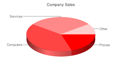
Yes, there is a super-easy way to include a chart in your page – as easy as writing a URL like this:


http://chart.apis.google.com/chart?cht=p3&chs=450x200&chd=t:2,4,3,1&chl=Phones|Computers|Services|Other&chtt=Company%20Sales&chco=ff0000

if you copy and paste this url in your browser, you’ll see the following:

You can place the image anywhere in your page using the URL as the src attribute of an image tag:

<img src='http://chart.apis.google.com/chart?cht=p3&chs=450x200&chd=t:2,4,3,1&chl=Phones|Computers|Services|Other&chtt=Company%20Sales&chco=ff0000'>

That’s the Google Charts API. Request are sent as GET or POST URLs, and the Google charts server returns a PNG image in response. The type of chart, data and options are all specified within the querystring of the URL. The API defines how to do that. Let’s review the different options.

http://chart.apis.google.com/chart?

This is the base URL; we’ll use it for all image chart requests. The rest are parameters in the form name=value separated by &.

Mandatory Parameters

There are only three mandatory parameters: cht, chs, and chd. The rest are optional.

cht=p3

This is the chart type. We are using a 3D pie chart which is p3. You can visit the chart gallery for all available chart types.

chs=450×200

This is the chart size in pixels (width x height).

chd=t:2,4,3,1

This is the data to display in the chart. The first letter (t) indicates the data format. In this case, we are using basic text format which is a list of comma separated values.

Optional Parameters

Each chart type has a few optional parameters to configure some aspects of your graph: title, labels, font types, colors, gradients, etc. This is what we have included:

chl=Phones|Computers|Services|Other

Chart labels for each pie slice.

chtt=Company%20Sales

Chart title.

chco=ff0000

Chart color in rrggbb hexadecimal format.

If you specify one single color, the slices will have different gradations. You can also specify a gradient with two colors (chco=ff0000,00ff00) or a color for each slice (chco=ff0000|3355aa|8322c2|112233).


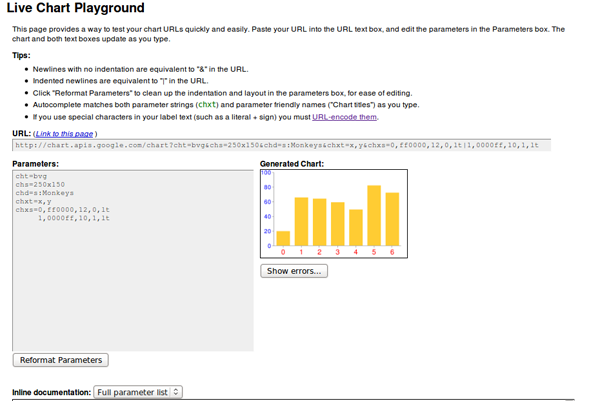
This is it for image charts. There isn’t much to it! There are a lot of different chart types available, and, if you play with the parameters, you can get some really nice results. The Google Live Chart Playground is an excellent tool to do this. You play with parameters and see the changes in the generated image – an easy way to fine-tune the url for your graph!


Interactive Charts

To include interactive charts in your web pages, you have to use a different API: the Google Visualization API. In this case, the interface is not a URL. You’ll have to use a JavaScript library, and write a few lines of code – but nothing difficult.

There is a gallery of ready-made visualizations (graphs) that you can use. You can also create and share your own graph, but the visualizations in the gallery will probably cover most of your needs for displaying data.

The level of interactivity depends on the particular visualizations you use. Usually, the graph will react in a certain way when clicked (showing a tool tip or animating), but the really powerful feature is that they can trigger events and you can register callbacks to perform any action related to that event. Examples of events can be selecting a bar or a pie slice, mouseOver, mouseOut, etc.

We’ll use local data to feed the visualizations in our examples, but you can obtain your data in any other way. A common option would be to retrieve the data from a database using AJAX. You can even use the Visualization API; it also defines a way to request and offer (for servers) data in a format which can be immediatly used in any visualization, but we won’t cover that here.


Formatting the Data

It doesn’t matter how we get our data, but all visualizations need to receive it in a DataTable object. It’s basically a table with rows and columns. Each column is defined with a particular data type (and an ID and a Label which are optional).

To reference a particular cell in the table, you use the pair (row, column). Row is always a number, starting a zero. Column can also be a zero-based number or an optional ID.

If we want to display the earnings of our company in 2009 in a column chart, we have to prepare the data in the following way:

Quarters 2009 Earnings
Q1 308
Q2 257
Q3 375
Q4 123

Two columns: the first one (with type ’string’) is the label for each bar in the chart, and the second one (with type ‘number’) is the value for that bar. We have four rows which means well have four bars to display.

How do we put that in a DataTable object? This is the code to do so – each line is explained later:


//create data table object
var dataTable = new google.visualization.DataTable();

//define columns
dataTable.addColumn('string','Quarters 2009');
dataTable.addColumn('number', 'Earnings');

//define rows of data
dataTable.addRows([['Q1',308], ['Q2',257],['Q3',375],['Q4', 123]]);

First we create our DataTable object with:

var dataTable = new google.visualization.DataTable();

Then we define the two columns in our table using the method addColumn(). The first value is the type and the second value is the optional label.

dataTable.addColumn('string','Quarters 2009');
dataTable.addColumn('number', 'Earnings');

And finally, we define the data rows using the addRows() method.

dataTable.addRows([['Q1',308], ['Q2',257],['Q3',375],['Q4', 123]]);

Each row is an array, and all data is also enclosed in another array.

Rows can also be defined one row at a time:

dataTable.addRow(['Q1',308]);

or even one cell at a time:

data.setValue(0, 0, 'Q1');

Here, the first two numbers are the row and column, respectively.

This is the way to create DataTable objects. Every visualization needs to be loaded with data in this format. That doesn’t mean that the table is the same for every visualization. The particular number and type of columns and rows has to be checked in the documentation for each chart.


Visualizing our Data as a Column Chart

For this first example, we’ll use a Column Chart to present our data. In the Google Visualization Gallery, we can click any chart type to see documentation and examples.

To use any visualization, we have to load the Google AJAX API before; it provides the core functionality needed in many other google APIs.

<script type="text/javascript" src="http://www.google.com/jsapi"></script>

Now we can load the Visualization API using the google.load() function (from the AJAX API):

google.load('visualization', '1', {'packages': ['columnchart']});

The second parameter, ‘1,’ refers to the version of the API to load (‘1′ means the current version). ‘packages’ is an array with all the visualizations we are going to use. In this case, we’ll use only one: the column chart.

At this point, we have the necessary libraries to create our DataTable object and display our graph, however, we need to be sure that the visualization is completely loaded, otherwise we’ll get JavaScript errors and our graph won’t display.

The way to do this is by registering a callback. The function will be called when the visualization (API and package) is loaded.

            //set callback
            google.setOnLoadCallback (createChart);

Function createChart is where we create our data table and our chart. The final, complete code, is:

<!DOCTYPE HTML PUBLIC "-//W3C//DTD HTML 4.01//EN" "http://www.w3.org/TR/html4/strict.dtd">
<html>
    <head>
        <title>Google Charts Tutorial</title>

        <!-- load Google AJAX API -->
        <script type="text/javascript" src="http://www.google.com/jsapi"></script>
        <script type="text/javascript">
            //load the Google Visualization API and the chart
            google.load('visualization', '1', {'packages': ['columnchart']});

            //set callback
            google.setOnLoadCallback (createChart);

            //callback function
            function createChart() {

                //create data table object
                var dataTable = new google.visualization.DataTable();

                //define columns
                dataTable.addColumn('string','Quarters 2009');
                dataTable.addColumn('number', 'Earnings');

                //define rows of data
                dataTable.addRows([['Q1',308], ['Q2',257],['Q3',375],['Q4', 123]]);

                //instantiate our chart object
                var chart = new google.visualization.ColumnChart (document.getElementById('chart'));

                //define options for visualization
                var options = {width: 400, height: 240, is3D: true, title: 'Company Earnings'};

                //draw our chart
                chart.draw(dataTable, options);

            }
        </script>

    </head>

    <body>

        <!--Div for our chart -->
        <div id="chart"></div>

    </body>
</html>

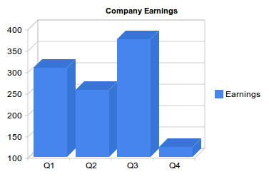
The chart object is created with this line:

var chart = new google.visualization.ColumnChart (document.getElementById('chart'));

The argument is the DOM reference to the element containing the visualization. In this case, we have a <div id=”chart”></div>.

Then, we define the options we want and draw the chart:

 var options = {width: 400, height: 240, is3D: true, title: 'Company Earnings'};
 chart.draw(dataTable, options);

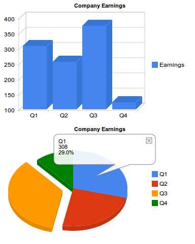
Our graph looks like this:

Note: All images here are static to make the tutorial available regardless of your browser or your JavaScript settings. Review the live demo for the interactive version.


And a Pie Chart Too

The advantage of having a clearly defined data format is that once you know how to create and populate a DataTable object, you know how to feed any visualization. You just have to check the documentation to see the particular table (number and type of columns) you have to build.

For a pie chart, we can use the exact same table we have now. Let’s add a pie chart in the same page.

We have to add our new package in the google.load() line:

google.load('visualization', '1', {'packages':['columnchart','piechart']});

and extend our createChart function with these two lines:

var secondChart = new google.visualization.PieChart (document.getElementById('secondChart'));
secondChart.draw(dataTable, options);

The complete code is:

<!DOCTYPE HTML PUBLIC "-//W3C//DTD HTML 4.01//EN" "http://www.w3.org/TR/html4/strict.dtd">
<html>
    <head>
        <title>Google Charts Tutorial</title>

        <!-- load Google AJAX API -->
        <script type="text/javascript" src="http://www.google.com/jsapi"></script>
        <script type="text/javascript">
            //load the Google Visualization API and the chart
            google.load('visualization', '1', {'packages':['columnchart','piechart']});

            //set callback
            google.setOnLoadCallback (createChart);

            //callback function
            function createChart() {

                //create data table object
                var dataTable = new google.visualization.DataTable();

                //define columns
                dataTable.addColumn('string','Quarters 2009');
                dataTable.addColumn('number', 'Earnings');

                //define rows of data
                dataTable.addRows([['Q1',308], ['Q2',257],['Q3',375],['Q4', 123]]);

                //instantiate our chart objects
                var chart = new google.visualization.ColumnChart (document.getElementById('chart'));
                var secondChart = new google.visualization.PieChart (document.getElementById('Chart2'));

                //define options for visualization
                var options = {width: 400, height: 240, is3D: true, title: 'Company Earnings'};

                //draw our chart
                chart.draw(dataTable, options);
                secondChart.draw(dataTable, options);

            }
        </script>

    </head>

    <body>

        <!--Divs for our charts -->
        <div id="chart"></div>
        <div id="Chart2"></div>

    </body>
</html>

And the generated charts:

Note: check the live demo for the interactive version.

This was easy in this case, because both visualizations used the same table columns and rows. But there are visualizations that need more columns or columns of different types, and you cannot use the data table directly. However, you can solve this by generating a different view of the original table to feed a visualization. We’ll review that shortly.


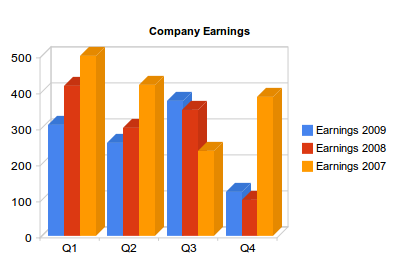
More Columns for Our Column Chart!

The data table for a column chart doesn’t have to be as simple as in the previous example. We can have bars representing the earnings for each quarter in the last three years, for example. In that case the data
table would look like so:

Quarters Earnings 2009 Earnings 2008 Earnings 2007
Q1 Q2 Q3 Q4
308 257 375 123
417 300 350 100
500 420 235 387

The only code we have to change from our first example is the DataTable object, to add two more columns and more data in each row:

//create data table object
var dataTable = new google.visualization.DataTable();

//define columns
dataTable.addColumn('string','Quarters');
dataTable.addColumn('number', 'Earnings 2009');
dataTable.addColumn('number', 'Earnings 2008');
dataTable.addColumn('number', 'Earnings 2007');

//define rows of data
dataTable.addRows([['Q1',308,417,500], ['Q2',257,300,420],['Q3',375,350,235],['Q4', 123,100,387]]);

The rest of the code does not change. The generated chart is:

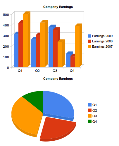
But, what if now we want to use a pie chart to represent part of this data? We cannot use the same data table as we did before, because pie charts need a two-column table (slice label and value). There is an easy way to obtain a different table from an existing DataTable object and use it to feed a chart: data Views.


Using Data Views

Views are a way to adapt our table for a different visualization. If we now want to display, in the same page, a pie chart showing the quarterly earnings distribution for last year, the table we need is only this:

Quarters Earnings 2009
Q1 308
Q2 257
Q3 375
Q4 123

A data view (DataView object) allows you to use only a subset of the original data. You can reorder or duplicate columns and rows or introduce columns with calculated values.

First, create the View object:

var view = new google.visualization.DataView(dataTable);

A data view is initialized with the original table and then we use the DataView methods to hide, show or filter columns or rows ( setColumns(), hideColumns(), setRows(), hideRows(), getFilteredRows, getColumnRange, etc ).

We can filter the original table to get only the first two columns (columns 0 and 1) using setColumns():

view.setColumns([0, 1]);

Now we can draw the pie chart using this view as a data table:

secondChart.draw(view, options);

Remember that we have to include the piechart package with google.load(), and we have to create the pieChart object with:

var secondChart = new google.visualization.PieChart

Now we can see both charts generated using the same data table:


Introducing Events

Events provide an easy way to connect your visualizations with other elements on your page. Visualizations can trigger some events, and you can register a listener to react to that event and perform some action. The event model is similar to the browser event model. Once again, we have to look at the documentation to check the events triggered for each visualization.

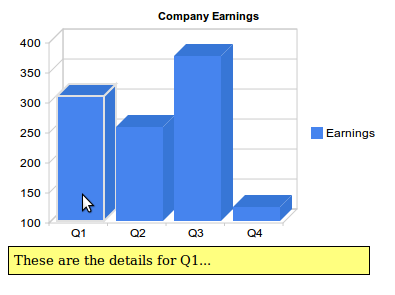
To show how events work, let’s return to our first example, the simplest column chart:

This graph triggers events on mouseover, on mouseout and on select. That means we can make it much more interactive than it is by default.

Since this graphic shows earnings for a company, it could be interesting to show a message with a brief explanation of the most important achievements or sales for each quarter when the user places the pointer over a column (onmouseover event).

Our callback will be showDetails(), and we register it for the onmouseover event:

google.visualization.events.addListener(chart, 'onmouseover', showDetails);

The first parameter is the variable that contains our chart object.

We will also need to hide the message when the pointer goes out of the column so we need another function to be called when onmouseout event triggers:

google.visualization.events.addListener(chart, 'onmouseout', hideDetails);

Within the <body> or our HTML page we have to define four divs with the messages:

    <body>

        <!--Div for our chart -->
        <div id="chart"></div>

        <!--Divs for our messages -->
        <div id="details0">These are the details for Q1...</div>
        <div id="details1">Here you have the numbers for Q2...</div>
        <div id="details2">Explanations for the third quarter...</div>
        <div id="details3">Q4 was as expected...</div>

    </body>

And then the callback functions just show or hide the corresponding message:

    function showDetails(e) {
        switch (e['row']) {
            case 0: document.getElementById('details0').style.visibility='visible';
                break;
            case 1: document.getElementById('details1').style.visibility='visible';
                break;
            case 2: document.getElementById('details2').style.visibility='visible';
                break;
            case 3: document.getElementById('details3').style.visibility='visible';
                break;
        }
    }

    function hideDetails(e) {
        switch (e['row']) {
            case 0: document.getElementById('details0').style.visibility='hidden';
                break;
            case 1: document.getElementById('details1').style.visibility='hidden';
                break;
            case 2: document.getElementById('details2').style.visibility='hidden';
                break;
            case 3: document.getElementById('details3').style.visibility='hidden';
                break;
        }
    }

Our functions accept a single parameter: the event fired. This object has all available information about the event details.

To know what bar we are over, we check the ‘row’ property of the event object. This information refers to the rows and columns of the DataTable object, but we know that row 0 corresponds to Q1, first column, and so on.

Note: Not all events pass the event object. Sometimes you have to use methods to get the information you need, read the visualization documentation to know how to get the information relative to the event fired.

The following listing include the complete code for this example. I have included a short internal CSS snippet to hide the message divs, and provide minimal formatting.

<html>
    <head>
        <title>Google Chart Tools Tutorial</title>

        <style type="text/css">

            #details0, #details1, #details2, #details3 {
                visibility:hidden;
                background: #FFFF7F;
                border: solid 1px;
                width: 350px;
                padding: 5px;
                font-size:smaller;
                position:absolute;
                top: 250px;

            }

        </style>

        <!-- load Google AJAX API -->
        <script type="text/javascript" src="http://www.google.com/jsapi"></script>
        <script type="text/javascript">
            //load thee Google Visualization API and the chart
            google.load('visualization', '1', {'packages': ['columnchart']});

            //set callback
            google.setOnLoadCallback (createChart);

            //callback function
            function createChart() {

                //create data table object
                var dataTable = new google.visualization.DataTable();

                //define columns
                dataTable.addColumn('string','Quarters 2009');
                dataTable.addColumn('number', 'Earnings');

                //define rows of data
                dataTable.addRows([['Q1',308], ['Q2',257],['Q3',375],['Q4', 123]]);

                //instantiate our chart objects
                var chart = new google.visualization.ColumnChart (document.getElementById('chart'));

                //define options for visualization
                var options = {width: 400, height: 240, is3D: true, title: 'Company Earnings'};

                //draw our chart
                chart.draw(dataTable, options);

                //register callbacks
                google.visualization.events.addListener(chart, 'onmouseover', showDetails);
                google.visualization.events.addListener(chart, 'onmouseout', hideDetails);
            }

            function showDetails(e) {
                switch (e['row']) {
                    case 0: document.getElementById('details0').style.visibility='visible';
                        break;
                    case 1: document.getElementById('details1').style.visibility='visible';
                        break;
                    case 2: document.getElementById('details2').style.visibility='visible';
                        break;
                    case 3: document.getElementById('details3').style.visibility='visible';
                        break;
                }
            }

            function hideDetails(e) {
                switch (e['row']) {
                    case 0: document.getElementById('details0').style.visibility='hidden';
                        break;
                    case 1: document.getElementById('details1').style.visibility='hidden';
                        break;
                    case 2: document.getElementById('details2').style.visibility='hidden';
                        break;
                    case 3: document.getElementById('details3').style.visibility='hidden';
                        break;
                }
            }

        </script>
    </head>

    <body>

        <!--Div for our chart -->
        <div id="chart"></div>

        <!--Divs for our messages -->
        <div id="details0">These are the details for Q1...</div>
        <div id="details1">Here you have the numbers for Q2...</div>
        <div id="details2">Explanations for the third quarter...</div>
        <div id="details3">Q4 was as expected...</div>

    </body>

</html>

And this is the result:

Once again, check the live demo to see the interactivity.
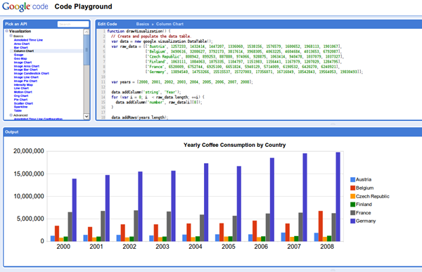

The Playground

As with the static images, there is a Google Code Playground where you can play with your visualizations and parameters, and view the results:


Conclusion

Hopefully, this should be enough to get you started with Google Chart Tools. Once you get the hang of it, you’ll find that a huge level of flexibility is available to you in your web applications. Thanks for reading!


How to Create a Nuclear Disaster Landscape – Basix

As designers we are often asked to create fictitious landscapes for whatever project we are working on. Creating an image such as this usually takes a combination of careful image selection and knowledge of Photoshop’s tools and techniques. In today’s tutorial we will demonstrate how to create a nuclear disaster landscape using a dozen or stock photos.


Resources

The following images and resources were used in this tutorial. They can be seen in the image below.


Step 1 – Adjust the Background

First, Open of the Road image.

Use a gradient map by going to Layer > Adjustement Layer > Gradient Map to darken this photo a bit. Use the settings below:

The resulting image should look something like this.


Step 2 – Add the Car

Now, open the Car Stock Image and copy and paste it into your working document. Name the layer “Car.” Use any method to remove the Car/Truck from its background.

At this point we also need to adjust the “Car” layer’s Brightness/Contrast. Go to Image > Adjust > Brightness/Contrast and set to -10/+5.


Step 3 – Add a Shadow Under the Car

To create a shadow for the car, Duplicate the “Car” layer and place the layer under the “Car” layer. Name the new layer “Shadow Car.” Cmd-click to select the pixels of the “Shadow Car” layer and fill it with black by going to Edit > Fill > Black with 100% Opacity. Set this layer’s blending mode to Soft Light and move it slightly under the car as shown.


Step 4 – Adjust the Car Windows

In this step we will make sure that we can see the background through the windows of the car. To do this, take the Rectangular Marquee tool and make a selection of the background layer directly behind the windows. If you need to, feel free to lower the opacity of the Truck to ensure that you are selecting the right spot. Paste this selection directly above the “Car” layer and hide it.

Make a selection of the windows of the car as shown below. Once your selection has been made unhide the selection of the background that you just made, make an inverse selection of the windows and press Delete. This should remove the excess area from your new windows.


Step 5 – Add a Skeleton Inside the Car

To add the skeleton, extract it from its background and then copy and paste the end result into your working document. Resize and position it as shown below. Place it above the “Car” Layer and Delete the excess areas. Lower the Opacity a bit and name this layer “Skeleton.”


Step 6 – Add a Pool of Gasoline

Paste the Gasoline photo into your working document. Resize, position and transform as shown below. Use a soft brush to erase the parts that you do not need. Now adjust the Brightness/Contrast. Name this layer “Pool of Oil.”


Step 7 – Add the Dead End Sign

Paste the Dead End Sign into your working document and extract it from its background. Place it as shown below. Use the Burn Tool to darken the right side of the sign. Name this layer “Panel.”


Step 8 – Add a Skull Heap

Paste the Skull Heap image into the document. Extract it from its background as shown below, flip, and position it appropriately. Use the Burn tool to darken it a bit and name the layer “Skull Heap.”


Step 9 – Add Shadowing Under the Skull Heap

Add a shadow to the heap using the same technique that we used in Step 3. Name the shadow layer “Shadow Heap.”


Step 10 – Add Cracks to Road

We want our road to look a bit less pristine. To break up the pavement we will use these Brushes. Select a black brush and place a crack as shown below.


Step 11 – Add Color and Contrast

To add some color to add a new adjustment layer by going to Layer > New Adjustment Layer > Color Balance > -15/+10/+10.

Now add some Contrast by going to Layer > New Adjustment Layer > Brightness/Contrast > 0/+15.


Step 12 – Add a Nuke

Copy and Paste the Nuclear Missile into your working document and extract it from its background as best as you can. Resize and place it as shown below. Name this layer “Nuke.”


Step 13 – Add an Explosion Under the Nuke

Now copy and paste the Explosion photo into your working document. Use a soft eraser to remove the unwanted areas of the explosion and place it as shown below. Name this layer “Explosion.”


Step 14 – Add the Shockwaves

As you know an explosion would cause some shockwaves. You can add the shockwaves by copy and pasting a photo with some nice waves into the document and by erasing the unwanted areas. First do this on the left side and then do it on the right as well. Name each side “Left Water” and “Right Water” respectively.


Step 15 – Adjust the Shockwaves

Adjust the color of the waves using the Color Balance Adjustment under Image > Adjust > Color Balance and set to +19/-16/-8. Do the same for the "Right Water" layer.


Step 16 – Add a Nuclear Reactor

Now extract the Reactor from its background and paste it into place. Name it “Nuclear Reactor.”


Step 17 – Adjust Shading on Reactor

Use the settings below to adjust the lighting of the reactor using the Burn and Dodge tool.


Step 18 – Add Cracks on the Nuclear Reactor and Darken Vegetation

Using the same technique you used in Step 10, use the crack brushes that you downloaded earlier to apply some cracks to the reactor.

Now grab a black brush, lower the opacity to 76% and change the brushes blending mode to Color. Use the brush to darken the vegetation.


Step 19 – Add Lights and Smoke to the Roof

Find a photo of fire similar to the one placed on the roof below. Use a soft eraser to remove unneeded areas.

Next go to Filter > Distort > Motion Blur > set the Angle in the direction of your fire (in my case > 0), and the Distance to 24.

Next, take the Eraser Tool (E) and use a soft brush with low Opacity to erase all except the source of light, like this :

Name this layer "Roof Light 1", duplicate it, then go in Filter > Distort > Motion Blur, same Angle as before, but this time enter a Distance of 144. Replace it and lower the Opacity to 70%.

Duplicate “Roof Light 1” and name the new layer "Roof Light 2", set Opacity to 100%, place it next to “Roof Light 1” as shown.


Step 20 – Add Lights and Smoke on the Hood and Bumper

Use the same technique outlined in Step 19 to place some lights on the hood and bumper as shown below.


Step 21 – Add the Plane

Copy and paste the plane photo into your working document and extract it from its background. Resize the image and place it as shown below. Now apply a Brightness/Contrast adjustment to this layer using the following settings -20/+10.

Apply some shading to the plane using the Burn and Dodge Tools. Name this layer “Plane.”


Step 22 – Add Flames to the Plane

On a new layer, brush a strong yellow color using a soft brush over the smoke. Lower the Opacity to 36%. Name the new layer “Flames Plane.”


Step 23 – Add Nuclear Detonation

Create a new layer and fill it with black. Name the new layer “Halo,” and set the opacity to 40% . No go to Filter > Render > Lens Flare and use the settings below.


Step 24 – Touch Up the Detonation

Take a large soft white brush and paint over the flare that we created in Step 23.


Step 25 – Darken the Edges

To darken the edges of the image create a new Levels Adjustment by going to Layer > Levels. Use the settings below. After that add a layer mask to the adjustment layer and take a soft black brush and paint the middle as shown. Set the layer’s opacity to 66% and its blending mode to Soft Light.


Step 26 – Add Grungy Effect

Now let’s add a layer of grunge to our composition. To do this, find a grungy texture and place it on the topmost layer. Set it to Overlay and lower the opacity to 10%. Name it “Grungy.”


Step 27 – Final Adjustment

Now add one last final adjustment layer. Go to Layer > Adjustment Layer > Color Balance and set to -10/5/+10.


Final Image

Take a look at the final image below.


An Introduction to Illustrator’s Color Tools

You may know about RGB and CMYK, but how about LAB or HSB? With all these color choices and ways to use them it’s often easy to get confused. In this introduction to Illustrators color tools you will learn about the different color spaces, how they work and what tools you can use to get the most out of them. Let’s get familiar with the powerful color tools that Illustrator offers!

Continue reading “An Introduction to Illustrator’s Color Tools”