Google Chart Tools provide several ways to easily add charts to any web page. Charts may be static or interactive, and in this tutorial, we’ll learn how to use both of them.
Static vs Interactive Charts
There are two different types of graphs that Chart Tools can generate: image charts (static graphs) and interactive charts.
- Image Charts.- Use the Google Chart API.
- Interactive Charts.- Use the Google Visualization API.
Image Charts are quite easy to use, however, interactive charts are far more flexible, because they can trigger events which we can use to interact with other elements in the page.
First, The Super-Easy Way
Yes, there is a super-easy way to include a chart in your page – as easy as writing a URL like this:
http://chart.apis.google.com/chart?cht=p3&chs=450x200&chd=t:2,4,3,1&chl=Phones|Computers|Services|Other&chtt=Company%20Sales&chco=ff0000
if you copy and paste this url in your browser, you’ll see the following:
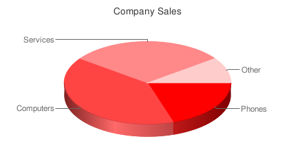
You can place the image anywhere in your page using the URL as the src attribute of an image tag:
<img src='http://chart.apis.google.com/chart?cht=p3&chs=450x200&chd=t:2,4,3,1&chl=Phones|Computers|Services|Other&chtt=Company%20Sales&chco=ff0000'>
That’s the Google Charts API. Request are sent as GET or POST URLs, and the Google charts server returns a PNG image in response. The type of chart, data and options are all specified within the querystring of the URL. The API defines how to do that. Let’s review the different options.
http://chart.apis.google.com/chart?
This is the base URL; we’ll use it for all image chart requests. The rest are parameters in the form name=value separated by &.
Mandatory Parameters
There are only three mandatory parameters: cht, chs, and chd. The rest are optional.
cht=p3
This is the chart type. We are using a 3D pie chart which is p3. You can visit the chart gallery for all available chart types.
chs=450×200
This is the chart size in pixels (width x height).
chd=t:2,4,3,1
This is the data to display in the chart. The first letter (t) indicates the data format. In this case, we are using basic text format which is a list of comma separated values.
Optional Parameters
Each chart type has a few optional parameters to configure some aspects of your graph: title, labels, font types, colors, gradients, etc. This is what we have included:
chl=Phones|Computers|Services|Other
Chart labels for each pie slice.
chtt=Company%20Sales
Chart title.
chco=ff0000
Chart color in rrggbb hexadecimal format.
If you specify one single color, the slices will have different gradations. You can also specify a gradient with two colors (chco=ff0000,00ff00) or a color for each slice (chco=ff0000|3355aa|8322c2|112233).
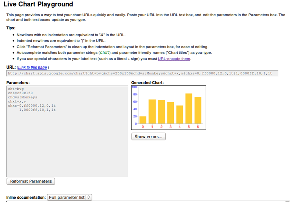
This is it for image charts. There isn’t much to it! There are a lot of different chart types available, and, if you play with the parameters, you can get some really nice results. The Google Live Chart Playground is an excellent tool to do this. You play with parameters and see the changes in the generated image – an easy way to fine-tune the url for your graph!
Interactive Charts
To include interactive charts in your web pages, you have to use a different API: the Google Visualization API. In this case, the interface is not a URL. You’ll have to use a JavaScript library, and write a few lines of code – but nothing difficult.
There is a gallery of ready-made visualizations (graphs) that you can use. You can also create and share your own graph, but the visualizations in the gallery will probably cover most of your needs for displaying data.
The level of interactivity depends on the particular visualizations you use. Usually, the graph will react in a certain way when clicked (showing a tool tip or animating), but the really powerful feature is that they can trigger events and you can register callbacks to perform any action related to that event. Examples of events can be selecting a bar or a pie slice, mouseOver, mouseOut, etc.
We’ll use local data to feed the visualizations in our examples, but you can obtain your data in any other way. A common option would be to retrieve the data from a database using AJAX. You can even use the Visualization API; it also defines a way to request and offer (for servers) data in a format which can be immediatly used in any visualization, but we won’t cover that here.
Formatting the Data
It doesn’t matter how we get our data, but all visualizations need to receive it in a DataTable object. It’s basically a table with rows and columns. Each column is defined with a particular data type (and an ID and a Label which are optional).
To reference a particular cell in the table, you use the pair (row, column). Row is always a number, starting a zero. Column can also be a zero-based number or an optional ID.
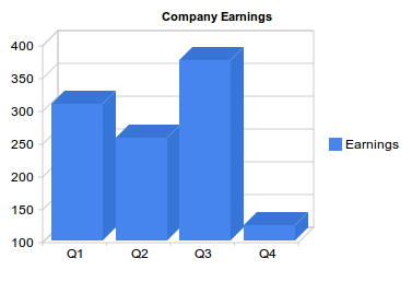
If we want to display the earnings of our company in 2009 in a column chart, we have to prepare the data in the following way:
| Quarters 2009 | Earnings |
|---|---|
| Q1 | 308 |
| Q2 | 257 |
| Q3 | 375 |
| Q4 | 123 |
Two columns: the first one (with type ’string’) is the label for each bar in the chart, and the second one (with type ‘number’) is the value for that bar. We have four rows which means well have four bars to display.
How do we put that in a DataTable object? This is the code to do so – each line is explained later:
//create data table object
var dataTable = new google.visualization.DataTable();

//define columns
dataTable.addColumn('string','Quarters 2009');
dataTable.addColumn('number', 'Earnings');

//define rows of data
dataTable.addRows([['Q1',308], ['Q2',257],['Q3',375],['Q4', 123]]);
First we create our DataTable object with:
var dataTable = new google.visualization.DataTable();
Then we define the two columns in our table using the method addColumn(). The first value is the type and the second value is the optional label.
dataTable.addColumn('string','Quarters 2009');
dataTable.addColumn('number', 'Earnings');
And finally, we define the data rows using the addRows() method.
dataTable.addRows([['Q1',308], ['Q2',257],['Q3',375],['Q4', 123]]);
Each row is an array, and all data is also enclosed in another array.
Rows can also be defined one row at a time:
dataTable.addRow(['Q1',308]);
or even one cell at a time:
data.setValue(0, 0, 'Q1');
Here, the first two numbers are the row and column, respectively.
This is the way to create DataTable objects. Every visualization needs to be loaded with data in this format. That doesn’t mean that the table is the same for every visualization. The particular number and type of columns and rows has to be checked in the documentation for each chart.
Visualizing our Data as a Column Chart
For this first example, we’ll use a Column Chart to present our data. In the Google Visualization Gallery, we can click any chart type to see documentation and examples.
To use any visualization, we have to load the Google AJAX API before; it provides the core functionality needed in many other google APIs.
<script type="text/javascript" src="http://www.google.com/jsapi"></script>
Now we can load the Visualization API using the google.load() function (from the AJAX API):
google.load('visualization', '1', {'packages': ['columnchart']});
The second parameter, ‘1,’ refers to the version of the API to load (‘1′ means the current version). ‘packages’ is an array with all the visualizations we are going to use. In this case, we’ll use only one: the column chart.
At this point, we have the necessary libraries to create our DataTable object and display our graph, however, we need to be sure that the visualization is completely loaded, otherwise we’ll get JavaScript errors and our graph won’t display.
The way to do this is by registering a callback. The function will be called when the visualization (API and package) is loaded.
            //set callback
            google.setOnLoadCallback (createChart);
Function createChart is where we create our data table and our chart. The final, complete code, is:
<!DOCTYPE HTML PUBLIC "-//W3C//DTD HTML 4.01//EN" "http://www.w3.org/TR/html4/strict.dtd">
<html>
    <head>
        <title>Google Charts Tutorial</title>

        <!-- load Google AJAX API -->
        <script type="text/javascript" src="http://www.google.com/jsapi"></script>
        <script type="text/javascript">
            //load the Google Visualization API and the chart
            google.load('visualization', '1', {'packages': ['columnchart']});

            //set callback
            google.setOnLoadCallback (createChart);

            //callback function
            function createChart() {

                //create data table object
                var dataTable = new google.visualization.DataTable();

                //define columns
                dataTable.addColumn('string','Quarters 2009');
                dataTable.addColumn('number', 'Earnings');

                //define rows of data
                dataTable.addRows([['Q1',308], ['Q2',257],['Q3',375],['Q4', 123]]);

                //instantiate our chart object
                var chart = new google.visualization.ColumnChart (document.getElementById('chart'));

                //define options for visualization
                var options = {width: 400, height: 240, is3D: true, title: 'Company Earnings'};

                //draw our chart
                chart.draw(dataTable, options);

            }
        </script>

    </head>

    <body>

        <!--Div for our chart -->
        <div id="chart"></div>

    </body>
</html>
The chart object is created with this line:
var chart = new google.visualization.ColumnChart (document.getElementById('chart'));
The argument is the DOM reference to the element containing the visualization. In this case, we have a <div id=”chart”></div>.
Then, we define the options we want and draw the chart:
 var options = {width: 400, height: 240, is3D: true, title: 'Company Earnings'};
 chart.draw(dataTable, options);
Our graph looks like this:
Note: All images here are static to make the tutorial available regardless of your browser or your JavaScript settings. Review the live demo for the interactive version.
And a Pie Chart Too
The advantage of having a clearly defined data format is that once you know how to create and populate a DataTable object, you know how to feed any visualization. You just have to check the documentation to see the particular table (number and type of columns) you have to build.
For a pie chart, we can use the exact same table we have now. Let’s add a pie chart in the same page.
We have to add our new package in the google.load() line:
google.load('visualization', '1', {'packages':['columnchart','piechart']});
and extend our createChart function with these two lines:
var secondChart = new google.visualization.PieChart (document.getElementById('secondChart'));
secondChart.draw(dataTable, options);
The complete code is:
<!DOCTYPE HTML PUBLIC "-//W3C//DTD HTML 4.01//EN" "http://www.w3.org/TR/html4/strict.dtd">
<html>
    <head>
        <title>Google Charts Tutorial</title>

        <!-- load Google AJAX API -->
        <script type="text/javascript" src="http://www.google.com/jsapi"></script>
        <script type="text/javascript">
            //load the Google Visualization API and the chart
            google.load('visualization', '1', {'packages':['columnchart','piechart']});

            //set callback
            google.setOnLoadCallback (createChart);

            //callback function
            function createChart() {

                //create data table object
                var dataTable = new google.visualization.DataTable();

                //define columns
                dataTable.addColumn('string','Quarters 2009');
                dataTable.addColumn('number', 'Earnings');

                //define rows of data
                dataTable.addRows([['Q1',308], ['Q2',257],['Q3',375],['Q4', 123]]);

                //instantiate our chart objects
                var chart = new google.visualization.ColumnChart (document.getElementById('chart'));
                var secondChart = new google.visualization.PieChart (document.getElementById('Chart2'));

                //define options for visualization
                var options = {width: 400, height: 240, is3D: true, title: 'Company Earnings'};

                //draw our chart
                chart.draw(dataTable, options);
                secondChart.draw(dataTable, options);

            }
        </script>

    </head>

    <body>

        <!--Divs for our charts -->
        <div id="chart"></div>
        <div id="Chart2"></div>

    </body>
</html>
And the generated charts:
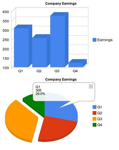
Note: check the live demo for the interactive version.
This was easy in this case, because both visualizations used the same table columns and rows. But there are visualizations that need more columns or columns of different types, and you cannot use the data table directly. However, you can solve this by generating a different view of the original table to feed a visualization. We’ll review that shortly.
More Columns for Our Column Chart!
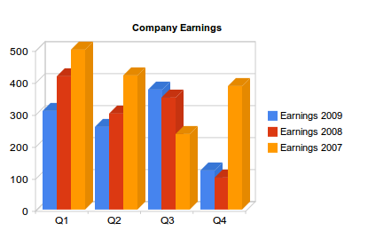
The data table for a column chart doesn’t have to be as simple as in the previous example. We can have bars representing the earnings for each quarter in the last three years, for example. In that case the data
table would look like so:
| Quarters | Earnings 2009 | Earnings 2008 | Earnings 2007 |
|---|---|---|---|
| Q1 | Q2 | Q3 | Q4 |
| 308 | 257 | 375 | 123 |
| 417 | 300 | 350 | 100 |
| 500 | 420 | 235 | 387 |
The only code we have to change from our first example is the DataTable object, to add two more columns and more data in each row:
//create data table object
var dataTable = new google.visualization.DataTable();

//define columns
dataTable.addColumn('string','Quarters');
dataTable.addColumn('number', 'Earnings 2009');
dataTable.addColumn('number', 'Earnings 2008');
dataTable.addColumn('number', 'Earnings 2007');

//define rows of data
dataTable.addRows([['Q1',308,417,500], ['Q2',257,300,420],['Q3',375,350,235],['Q4', 123,100,387]]);
The rest of the code does not change. The generated chart is:
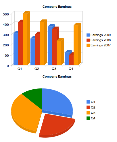
But, what if now we want to use a pie chart to represent part of this data? We cannot use the same data table as we did before, because pie charts need a two-column table (slice label and value). There is an easy way to obtain a different table from an existing DataTable object and use it to feed a chart: data Views.
Using Data Views
Views are a way to adapt our table for a different visualization. If we now want to display, in the same page, a pie chart showing the quarterly earnings distribution for last year, the table we need is only this:
| Quarters | Earnings 2009 |
|---|---|
| Q1 | 308 |
| Q2 | 257 |
| Q3 | 375 |
| Q4 | 123 |
A data view (DataView object) allows you to use only a subset of the original data. You can reorder or duplicate columns and rows or introduce columns with calculated values.
First, create the View object:
var view = new google.visualization.DataView(dataTable);
A data view is initialized with the original table and then we use the DataView methods to hide, show or filter columns or rows ( setColumns(), hideColumns(), setRows(), hideRows(), getFilteredRows, getColumnRange, etc ).
We can filter the original table to get only the first two columns (columns 0 and 1) using setColumns():
view.setColumns([0, 1]);
Now we can draw the pie chart using this view as a data table:
secondChart.draw(view, options);
Remember that we have to include the piechart package with google.load(), and we have to create the pieChart object with:
var secondChart = new google.visualization.PieChart
Now we can see both charts generated using the same data table:
Introducing Events
Events provide an easy way to connect your visualizations with other elements on your page. Visualizations can trigger some events, and you can register a listener to react to that event and perform some action. The event model is similar to the browser event model. Once again, we have to look at the documentation to check the events triggered for each visualization.
To show how events work, let’s return to our first example, the simplest column chart:

This graph triggers events on mouseover, on mouseout and on select. That means we can make it much more interactive than it is by default.
Since this graphic shows earnings for a company, it could be interesting to show a message with a brief explanation of the most important achievements or sales for each quarter when the user places the pointer over a column (onmouseover event).
Our callback will be showDetails(), and we register it for the onmouseover event:
google.visualization.events.addListener(chart, 'onmouseover', showDetails);
The first parameter is the variable that contains our chart object.
We will also need to hide the message when the pointer goes out of the column so we need another function to be called when onmouseout event triggers:
google.visualization.events.addListener(chart, 'onmouseout', hideDetails);
Within the <body> or our HTML page we have to define four divs with the messages:
    <body>

        <!--Div for our chart -->
        <div id="chart"></div>

        <!--Divs for our messages -->
        <div id="details0">These are the details for Q1...</div>
        <div id="details1">Here you have the numbers for Q2...</div>
        <div id="details2">Explanations for the third quarter...</div>
        <div id="details3">Q4 was as expected...</div>

    </body>
And then the callback functions just show or hide the corresponding message:
    function showDetails(e) {
        switch (e['row']) {
            case 0: document.getElementById('details0').style.visibility='visible';
                break;
            case 1: document.getElementById('details1').style.visibility='visible';
                break;
            case 2: document.getElementById('details2').style.visibility='visible';
                break;
            case 3: document.getElementById('details3').style.visibility='visible';
                break;
        }
    }

    function hideDetails(e) {
        switch (e['row']) {
            case 0: document.getElementById('details0').style.visibility='hidden';
                break;
            case 1: document.getElementById('details1').style.visibility='hidden';
                break;
            case 2: document.getElementById('details2').style.visibility='hidden';
                break;
            case 3: document.getElementById('details3').style.visibility='hidden';
                break;
        }
    }
Our functions accept a single parameter: the event fired. This object has all available information about the event details.
To know what bar we are over, we check the ‘row’ property of the event object. This information refers to the rows and columns of the DataTable object, but we know that row 0 corresponds to Q1, first column, and so on.
Note: Not all events pass the event object. Sometimes you have to use methods to get the information you need, read the visualization documentation to know how to get the information relative to the event fired.
The following listing include the complete code for this example. I have included a short internal CSS snippet to hide the message divs, and provide minimal formatting.
<html>
    <head>
        <title>Google Chart Tools Tutorial</title>

        <style type="text/css">

            #details0, #details1, #details2, #details3 {
                visibility:hidden;
                background: #FFFF7F;
                border: solid 1px;
                width: 350px;
                padding: 5px;
                font-size:smaller;
                position:absolute;
                top: 250px;

            }

        </style>

        <!-- load Google AJAX API -->
        <script type="text/javascript" src="http://www.google.com/jsapi"></script>
        <script type="text/javascript">
            //load thee Google Visualization API and the chart
            google.load('visualization', '1', {'packages': ['columnchart']});

            //set callback
            google.setOnLoadCallback (createChart);

            //callback function
            function createChart() {

                //create data table object
                var dataTable = new google.visualization.DataTable();

                //define columns
                dataTable.addColumn('string','Quarters 2009');
                dataTable.addColumn('number', 'Earnings');

                //define rows of data
                dataTable.addRows([['Q1',308], ['Q2',257],['Q3',375],['Q4', 123]]);

                //instantiate our chart objects
                var chart = new google.visualization.ColumnChart (document.getElementById('chart'));

                //define options for visualization
                var options = {width: 400, height: 240, is3D: true, title: 'Company Earnings'};

                //draw our chart
                chart.draw(dataTable, options);

                //register callbacks
                google.visualization.events.addListener(chart, 'onmouseover', showDetails);
                google.visualization.events.addListener(chart, 'onmouseout', hideDetails);
            }

            function showDetails(e) {
                switch (e['row']) {
                    case 0: document.getElementById('details0').style.visibility='visible';
                        break;
                    case 1: document.getElementById('details1').style.visibility='visible';
                        break;
                    case 2: document.getElementById('details2').style.visibility='visible';
                        break;
                    case 3: document.getElementById('details3').style.visibility='visible';
                        break;
                }
            }

            function hideDetails(e) {
                switch (e['row']) {
                    case 0: document.getElementById('details0').style.visibility='hidden';
                        break;
                    case 1: document.getElementById('details1').style.visibility='hidden';
                        break;
                    case 2: document.getElementById('details2').style.visibility='hidden';
                        break;
                    case 3: document.getElementById('details3').style.visibility='hidden';
                        break;
                }
            }

        </script>
    </head>

    <body>

        <!--Div for our chart -->
        <div id="chart"></div>

        <!--Divs for our messages -->
        <div id="details0">These are the details for Q1...</div>
        <div id="details1">Here you have the numbers for Q2...</div>
        <div id="details2">Explanations for the third quarter...</div>
        <div id="details3">Q4 was as expected...</div>

    </body>

</html>
And this is the result:
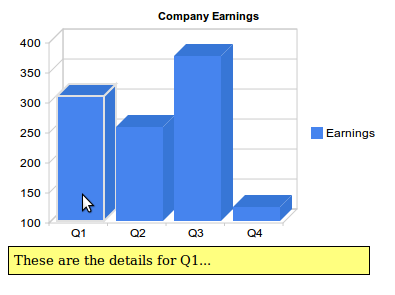
Once again, check the live demo to see the interactivity.
The Playground
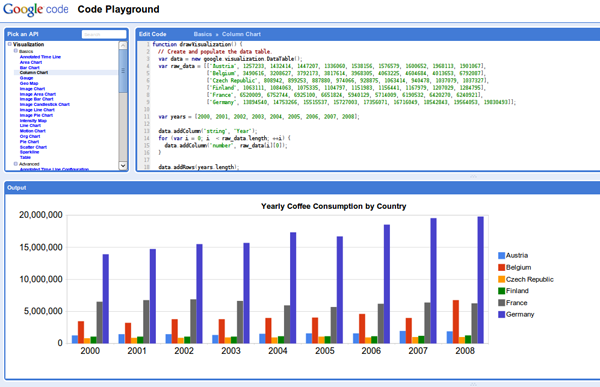
As with the static images, there is a Google Code Playground where you can play with your visualizations and parameters, and view the results:
Conclusion
Hopefully, this should be enough to get you started with Google Chart Tools. Once you get the hang of it, you’ll find that a huge level of flexibility is available to you in your web applications. Thanks for reading!