Discover Pro Tools LE

We continue our series on Digital Audio Workstations, or DAWs, which allow musicians to record, edit and play back their music. This week we look at Digidesign’s Pro Tools.

This article was previously published on the AudioJungle blog, which has moved on to a new format in 2010. We’ll be bringing you an article from the AudioJungle archives each week.</blockquote

If you’re thinking about getting into home recording, Pro Tools is worth considering as one of your alternatives. Besides having a long experience in audio software, and a large market share in the industry, Pro Tools is also available for both Windows and Mac OSX. It isn’t the cheapest option, costing from around $300USD (depending on which hardware options you choose), so if you’re on a tight budget, it may not be for you.

Pro Tools is actually a family of products ranging from software that suits the home hobbyist right up to full-scale commercial studios. Pro Tools LE is the product most suitable for home recording, and the one we will focus on in this article. Some of you may be using Pro Tools M-Powered, which is basically the same product adapted to M-Audio hardware.

History and Background

Pro Tools is made by Digidesign, a division of Avid Technology, a well-respected US company that create creative software, and particularly specialise in video and audio production. Avid Technology were created in 1987, and focused on pro video software. They acquired Digidesign in 1994 to add pro audio to their lineup.

Digidesign had got into digital recording software very early on, releasing Sound Tools for the Apple Mac in 1989. They called the program “the first tapeless recording studio”. In 1991 they released Pro Tools, an integrated software and hardware system. We will talk more about the hardware side of things soon.

This was a significantly better product and featured more voices, ProDECK and ProEDIT software, MIDI, and automation. Currently (twenty years later!) Pro Tools is at version 8.

Pro Tools Hardware

In last week’s article on DAWs we pointed out that a digital audio workstation is not just software, but also hardware. This is especially true of Pro Tools.

When you purchase Pro Tools, you are not buying just a software box. You buy hardware – an audio interface – that comes with the Pro Tools software. There are lots of hardware options, depending on your needs.

Hardware comes into the equation with Pro Tools in four main contexts:

HD Systems

Pro Tools HD is the high end program in Digidesign’s range, and relies very heavily on specialized digital sound processing hardware which takes the work away from the host computer and gives it to powerful chips on expansion PCI cards.

LE Systems

Pro Tools LE (the consumer product we are focusing on) relies on the host computer’s CPU to do all of the work, but requires the use of a specialized sound card for audio to digital conversion. Because Pro Tools LE does not work with a normal sound card, the Pro Tools audio interface also acts as a copy protection mechanism.

The cheaper range of interfaces are part of the Mbox 2 Family, and are external devices that connect to the host computer via USB2, though some models have Firewire options. The devices are quite portable, and there are four main models:

  • Mbox 2 Pro: a FireWire-powered audio/MIDI workstation that delivers high-definition sound, and 6×8 simultaneous channels of analog and digital I/O.
  • Mbox 2: a compact, USB-powered audio/MIDI workstation that provides 4×2 simultaneous channels of analog and digital I/O, high-quality sound, and zero-latency monitoring.
  • Mbox 2 Mini: a very compact, USB-powered audio workstation that delivers high-quality sound and 2×2 simultaneous channels of analog I/O.
  • Mbox 2 Micro: the most portable USB-powered system that provides editing, sequencing, and mixing, and a high-quality audio output (no audio inputs).

The Mbox 2 and Mbox 2 Pro also come with a large collection of professional-grade plug-ins. You can learn more about these devices on Digidesign’s Mbox 2 Family page.

The more professional range of interfaces are the 003 Family, and aim to attain the same quality as commercial studios. You can learn more about these devices on Digidesign’s 003 Family page.

M-Audio Products

Avid aquired M-Audio in 2004, and soon afterwards created Pro Tools M-Powered, which brought Pro Tools functionality to M-Audio audio interfaces. Compatible M-Audio products now include a copy of Pro Tools M-Powered.

Control Surfaces

Digidesign also create control surfaces to provide hands-on control of track volume, panning, plug-ins, playback, and other vital recording, mixing, and editing operations. The main options include an eight-fader control surface, and a large 24 channel mixing desk. Learn more from Digidesign’s Control Surfaces page.

Pro Tools 8 Features

The Pro Tools 8 Features page lists the main software features as follows:

  • A Well-Stocked Studio
    Pro Tools 8 comes with over 70 virtual instruments, effects, and utility plug-ins, and over 8 GB of audio loops.
  • More Tracks Than Ever
    Pro Tools LE and Pro Tools M-Powered users now get three times more audio tracks (up to 48 simultaneous stereo or mono tracks) than previously to create larger, more complex mixes.
  • Score Your Music
    The new Score Editor lets you view, edit, arrange, and print MIDI data as music notation, allowing you to compose music using the notation tools or transcribe MIDI data in real time.
  • Complete MIDI Sequencing and Production
    The new MIDI Editor window includes a comprehensive array of new MIDI editing features, tools, and functionality that make it easier than ever to compose with virtual instruments and sound modules.
  • Stretch Your Pitch
    Transpose a region to a different key or fix its pitch in real time with the new Elastic Pitch.
  • Comp Tracks to Perfection
    With the new track compositing workflows, you can craft the perfect performance from multiple takes faster and easier.
  • Extended Hardware Control
    Pro Tools 8 deepens its ICON console, control surface, and M-Audio peripheral integration, letting you map plug-ins directly to your controller and more.

User Comments

What do users of Pro Tools think of the product? Here are some comments by users and reviewers that I found around the Net. If you are a Pro Tools user, I’d love to hear from you in the comments too.

  • “For years, Digidesign have been doing almost exactly the opposite to most other companies in the music industry: namely, trying to turn an audio application into a sequencer. And while Pro Tools 7 and its point-one incremental successors finally got the company’s flagship product into a position where sequencing was a bit like cutting steak with a butter knife (you could do it, but it probably wouldn’t be much fun), Pro Tools 8 has a clear mission: to make Digidesign a serious contender in the music-creation market.” (Mark Wherry)
  • “I really like it so far, the included plugins are way more useful than older versions of PT. It is really really nice on the eyes too, very smooth looking. no problems so far!” (Brendan27)
  • “So, here’s my real opinion. Pro Tools 8 is amazing. It is a major leap forward for Digidesign, and a necessary jump to leapfrog Logic and DP, both in GUI looks and MIDI functionality. Literally, it looks a lot like Logic now (when you make the tracks dark grey) or like Digital Performer (when you make the tracks light grey). Gone are the familiar white background on the edit window and stale grey mix window. Say hello to color! Seriously, the interface looks much more modern, with 3D buttons and rounded corners. The Color Palette window gives you a lot of control over the intensity of the colors too… ranging anywhere from muted pastels to bright ‘bag of Skittles’ technicolor.” (David Franz)
  • “PT 8 has a spooky kind of dark halloween Logic rip off feel to it and I am not sure if I am liking the new look at all. PT 8 has got a beautiful new lick of paint but the selection of dark browns and greens just reminds me of logic 8… Here, like in Logic everything is crammed onto the page like an overproduced Timberland track. Taking a look at the positives it is very nice to see how much more power is now available to the PT user… I as an LE chap am very impressed with the higher track count. Secondly I can now run 10 plug ins simultaneously on my mono/stereo inserts should I need to be a fat greedy plug-in pig beast. The new midi editor is very sweet and allows midi manipulation to happen at a touch.” (Dav Nagle)
  • “Pro Tools is your choice, if you have the money and are allowed to spend it. Simply the most professional system you can get today, yet easy to learn and very straightforward to use.” (Music-Software-Reviews.com)
  • “In a nutshell Pro tools 8 is empowering and it’s more of a one stop shop than ever. Improved midi performance, state of the art design, a super plugin database, awesome virtual instruments. yep sold me. A definite thumbs up!” (Mike de Velta)


Psdtuts+ Presents – Exclusive Wallpaper By Saad Moosajee


Another extremely talented designer by the name of Saad Moosajee has volunteered to create an exclusive wallpaper for the readers of PsdTuts+. This month’s exclusive wallpaper features a typographical approach to the Tuts+ logo. Saad uses some unique looking techniques to give the simple Tuts+ logo some color and energy, so download the wallpaper and then view some of Saad’s other art.


About the Artist


About the Artwork

When creating this wallpaper, I wanted to give a minimalistic feeling so that it flowed naturally on the users desktop, while also giving the focal point some complexity so that the viewer would not get bored after looking at it for a few days. To do this I created each letter individually via the 3D software Cinema 4D.

I chose this particular color scheme because my last few works have been a little dark, so I thought doing this rainbow-esque combination would be more unique. I completed this wallpaper over the period of two weeks, as I wanted to make sure each letter fit the picture before continuing on to the next.


Some of Saad’s Other Work

XX

361


Special Thanks to Saad

Once again I’d like to thank Saad for participating and giving the readers an awesome new wallpaper for their desktops. Please make sure to visit Saad’s portfolio’s and check out some of his great art.

Also stay tuned for some more exclusive high quality wallpaper projects in the near
future!

Working Like A Great Chef

A good chef can make great meals out of top-shelf ingredients. But great chefs turn average, ordinary produce into delicious dishes. Anyone can throw a filet mignon on the grill and end up with a great meal; the challenge lies in who can impress their customer with the less-prized cuts; the blade steak, the shoulder steak or the rump roast.

Are you the type that needs the very best resources to produce great work? Or, are you the kind that can turn limited, low-cost resources into a fantastic end product?

Great work is easily done with a big budget, the best technology, and a generous timeline stretched out in front of you. But, are you the “Jack-of-all-trades” that can maintain the same quality of work under more pressing conditions? If so, consider your work truly great.

Quick Tip: Why You Should Consider Lightroom

Photoshop is the most powerful photo manipulation software ever made. Nearly every designer and photographer around the world relies upon Adobe’s design software for some aspect of their work. But today I’m going to make the case for choosing Lightroom over Photoshop. You might just find that it becomes your best friend.


Comprehensive Interface

Lightroom has a comprehensive interface where things aren’t hidden (yet manages not to feel crowded). If you take a look at Lightroom’s home screen, you’ll find that all your photos, adjustments and options are right in front of you rather than being hidden in complex menu entries.


Built-in Photo Organizer

Lightroom is also a photo organizer. In Photoshop, you can indeed open multiple files and manipulate/edit them simultaneously, but it doesn’t have any photo organizer built-in. Lightroom, on the other hand, has a full-featured photo organizer that enables you to view and manage all the images on your computer.


Dedicated Develop Center

Lightroom has a dedicated “Develop” center. Take a flashback to the era of film cameras where the photographer had to develop the photographs in a dark room by applying various chemicals. Adobe has maintained the legacy, bringing you into a digital development center for your photographs. Equally useful, but far less fiddly!


Before and After Comparisons

For a photographer, it is imperative to view how a photograph looks before and after a particular effect is applied. In Photoshop, there is no dedicated before and after shortcut. Lightroom makes this side-by-side comparison easy.


Non-Destructive Editing

Everything you do in Lightroom is done virtually. Every enhancement, every brush stroke you make – every adjustment is virtual and you can reverse it at any point of time. Some people relate this to the layers feature of Photoshop. Let me tell you, this is completely different.

Suppose you enhanced one of your images in Photoshop. Now, in order to reverse the effects, you can just Undo it. But only while Photoshop is running. The moment you exit the program with/without saving your work, Photoshop forgets what all was there.

But Lightroom doesn’t. And here comes this awesome and handy feature. It doesn’t matter if you exit Lightroom or even shut your computer down. Lightroom remembers everything, and you can reverse it at any point of time. All your originals remain intact and you can export your edited photographs from Lightroom whenever you feel like.


Better Export Options

Since Photoshop is not solely for Photographers, it comes with the burden of many, often irrelevant, export options. But with Lightroom, you’re presented with a more useful set:

  • Group photographs to export in a single folder
  • Use recurring file names to avoid confusion
  • Burn images to DVD directly
  • Export as .dng files
  • Apply user presets to the export options

  • It’s About Being Appropriate

    At the end of the day, Photoshop is a perfectly good tool for all your photography needs. It includes (almost) every feature of Lightroom, and is immensely powerful. If you’re looking for something that’s more specific to your needs as a photographer, and makes the whole post-processing workflow simpler and more appealing, Lightroom is absolutely worth checking out.

What is a Dream Job?

We are always rolling the idea of a “dream job” around in our heads. Whether you’re sagging your head on a slow workday or sweating bullets during a hectic one, thoughts of your perfect job will cross your mind. What is a “dream job” anyway? It’s different for everyone, but it usually comes to us as an ever-changing counterpoint to our current job: If you’re bored by your current job, you dream of an active, fulfilling one. If you’re overloaded with work, you dream of a slower, simpler workday. If you have no autonomy at your current job, you dream of being an entrepreneur empowered with control over your own destiny.

But, despite all of these passing, changing thoughts, few of us have paused and allowed our dream job the consideration it deserves. Ask yourself: Have you given any real thought or definition to your dream job? Would you recognize it if you saw it? Would you be ready to pursue it if it appeared? If you struggle with any of the answers, perhaps you should stop, sit down, and give the matter your full attention.

Make it “Tailor Made” and “Built to Last”

First, be honest with yourself. Don’t just regurgitate some generic version of an ideal job to yourself. Those clichéd versions of dream jobs are certainly not for everyone: Would you be ready for the punishing daily workouts and strict diet of a pro athlete? Would you enjoy getting up at 3:30 am seven days a week as a news anchor? Would you really want to be a rock star if you have stage fright? Probably not. So, instead of grabbing a shrink-wrapped “dream job” off the shelf or cobbling disjointed fragments like “high pay” and “lots of travel” together, think it all the way through.

Second, Don’t let short-term events have too much of an influence on your version of “the perfect job.” The question is not “how could your week be better?,” it’s “how could your career be better.” If this week was stressful, it doesn’t mean that your “dream job” is being a yoga instructor. If you struggled with some unbearable clients and coworkers recently, it doesn’t mean that your ideal job is void of all interpersonal contact. You’ll need a long-term perspective to envision your true dream job.

Dreaming of Being The Boss?

Many quickly conclude that they want to be an executive of some sort. They see all of the perks of the executive level, but they never see the hardship or risk involved in such a position. While you may want some more autonomy at your job, an executive might want less at his. An executive will never admit it, but they may be envious of those in the company who have clear, distinct duties and a supervisor to make all of the difficult decisions.

I’m sure you want the big office and the expense account, but do you want the rest it as well?

Dreaming of Owning Your Own Business?

Many of us look around our current workplace and see a lot of room for improvement. We think: “This could be better. I would do things differently.” This naturally leads to visions of starting a similar business that runs flawlessly, complete with brilliant, happy employees, healthy profits and great prospects on the horizon. If you are going to take the plunge, it’s certainly a good vision to strive for. But, are you ready for the hurdles and headaches along the way? Starting a business can be seriously stressful. You have to put your whole livelihood (and your pride) on the line. If you fail as an employee, being fired is basically the worst-case scenario. But, if a business owner fails, they’re usually deep in debt, jobless, demoralized and reeling from the aftermath.

Starting your own business is a noble pursuit, but you have to pursue it wholeheartedly. Is it truly your “dream job”?

Dreaming of Doing Nothing?

At particularly stressful positions, the “dream job” becomes no job at all. If your workload is ballooning out of control and your duties barely fit into daylight hours, you might crave large amounts of downtime. This need for personal time can affect your idea of a “dream job” for obvious reasons; your ideal scenario is a blank schedule. The question is, is your dream job truly “nothing”?

A few days, or even a few weeks of “nothing” is almost always welcome. But, in larger doses it can be worse than your all-too-busy job. Gallup polls show that busy workers are generally more satisfied than bored ones. Boredom is also used as a punishment in prison. Are you sure you want a long, sustained period of “nothing to do”? Give it some real thought before you settle on “nothing” as your dream job.

Dream jobs don’t always miraculously appear, but you’ve got to be able to recognize yours if it does. Defining your dream job may yield a new understanding of your long-term plans and your career path. After all, it’s hard to know if you’re “going in the right direction” if you haven’t picked out a point on the horizon.

33 Awesome Typography Pieces

Ahh… another week, another roundup! This week were rockin some typography yet again. We have some truly inspirational pieces here in this article that I think you are going to really enjoy. Dig in!


Inch By Inch

Foundations

Relient K Typography

The Future of Publishing- created by DK (UK)

CREATIVE CALL / CONVOCATORIA

Blank Canvas

Music Machine

Slamdance Opening

Little Bites

Pause – Ideas in Motion

Melbourne Writers Festival

Nike AirMax

NBC Rebrand

Road Less Traveled

Tom Tom’s Last Words

Streetlight Manifesto – Birds Flying Away

Reclaim your mind – Terence McKenna (intro)

Mother To Son

Honestly | y?c???

The Roots

INTERIEUR · intro

Domenica Premiere – Teaser

Mister Eleven

Space and Air

Letras del tesoro

Africa Community Projects – Animation

Canadian Cancer Society: Relay For Life

God-o-nomics

Kinetic Typography – Idiocracy

playground sessions 3 – spot

5Nations Squash Championships 2010

The Pacific Opening Titles

Chuck Main Titles

If you enjoyed this post, please give it a vote on Digg or a stumble to say thanks!


Quick Tip: How to Tame the Gradient Mesh


The Gradient Mesh can be one of the hardest tools to control. Even professional Illustrators can be heard crying out in frustration at its seemingly random actions. You can overcome these feelings of frustration by learning some techniques that will make your job easy and fun. This quick tip will teach you two handy mesh taming techniques that will save you time and help you overcome the "Gradient Mesh blues".

Continue reading “Quick Tip: How to Tame the Gradient Mesh”

Exclusive Freebie Pack – Vintage Pistols


We have a new set of vector illustrations available exclusively from Vectortuts+ as freebie for anyone to download. Crafted by Iaroslav Lazunov, you will find a great selection of vector illustrations in this set depicting vintage pistols. These designs are perfect for web layouts, book covers or editorials. Learn more at the jump!

Continue reading “Exclusive Freebie Pack – Vintage Pistols”

Workshop #82: The Challenge by Sigmund Dol

At Audiotuts+ we irregularly put up a reader track for workshopping and critique (find out how to submit a track). This is how it works: you upload your song, and every week or so we’ll publish one here and step away from the podium. The floor is yours to talk about the track and how the artist can fix problems in and improve upon the mix and the song.

This track has been submitted for your friendly, constructive criticism. They have put their track (and their heart and soul) in your hands to learn and get useful feedback.

  • Do you enjoy the song or track itself? Does it have potential?
  • Can the arrangement be improved?
  • How did you find the mix? What would you do differently?
  • What do you enjoy about the rhythm track? What can be done to improve it?
  • Is the choice of instruments relevant and effective for the style/song?
  • Are the lyrics (if any) effective? Does the style, arrangement and genre of the song suit them?
  • Can you suggest any specific techniques that might improve the track?
  • Do you have any other constructive feedback?

The Challenge by Sigmund Dol

Description of the track:

“The Challenge” is an short instrumental track, created to serve as a supporting background music for a film trailer. I would appreciate any comment on mixing, sound, general feeling. Thanks a lot.

Download audio file (TheChallenge.mp3)

Terms of Use: Users can stream the track for the purposes of giving feedback but cannot download or redistribute it.

Have a listen to the track and offer your constructive criticism for this Workshop in the comments section.


Submit Your Tracks for Workshopping

Need constructive criticism on your own tracks? Submit them using this form.


Perspective Basics: A Draw-Through Technique, With a Spaceship – Basix


In today’s tutorial you will learn how to polish your knowledge of perspective with a simple but very useful technique widely used by concept artists and professionals in the entertainment industry. Let’s get started!


Step 1

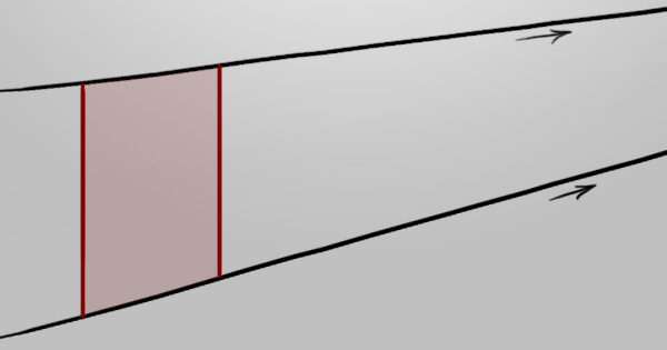
Even without special equipment and measurements, we can easily repeat a quadrilateral towards a vanishing point. Let’s start off with a basic scenario that will evolve a little as we proceed.

Assuming you know the basics of one, two, and three-point perspectives, we’ll begin with a rectangle drawn in one-point perspective – aiming to repeat it towards the vanishing point.


Step 2

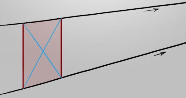
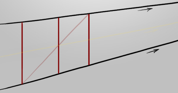
Draw a cross using the corners to establish the center of the rectangle.


Step 3

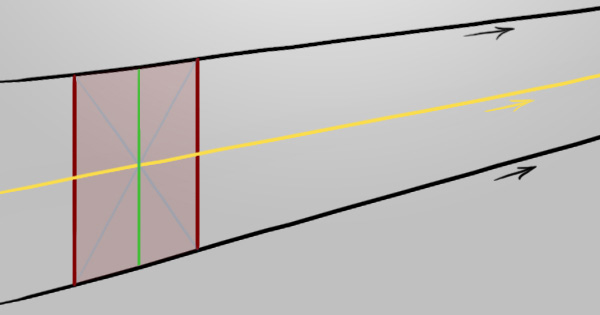
Using this center point, we now know where the center of the x-axis would be (green), but more importantly the center of the y-axis (yellow).


Step 4

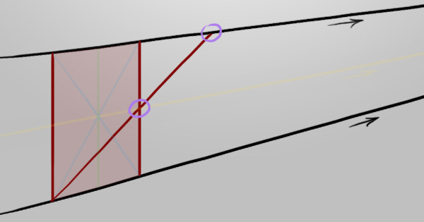
Starting from the lower left corner we can strike a line through the center of the y-axis we just established, stopping at the vanishing point line (black). Starting from the upper left corner would work the same, as long as the line passes through the middle.


Step 5

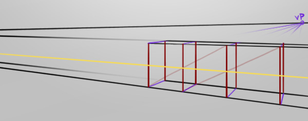
Can you see what just happened? We successfully found the corner of the next rectangle. Draw a line directly downwards to finish the rectangle off, like in the example below. This technique is extremely useful and could be used in one-point perspective drawing things such as walls, floor tiles, cabinets, etc.


Step 6

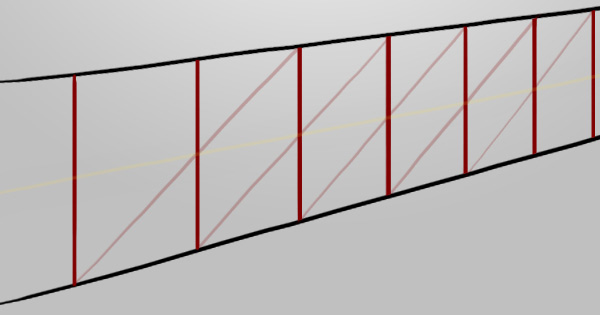
As long as we have the corner, we can repeat this technique as much as we like, eventually ending up very small near the vanishing point. There are obviously digital transform tools and such to achieve this effect much quicker but this makes for another check-box in your skills list, especially when working on paper.


Step 7

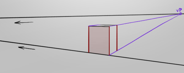
Let’s try that technique with a second vanishing point (two-point perspective). As you can see in the example below, there’s a purple vanishing point (to the right) and a black vanishing point (off the image, to the left).


Step 8

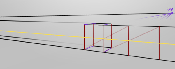
Again, if we find the center of the y-axis (yellow), we can use that information to strike a line from a corner through it to reveal where the next shape’s opposite corner would be. Any combination of corners and center lines work but only for their individual sides, so try it out for yourself!


Step 9

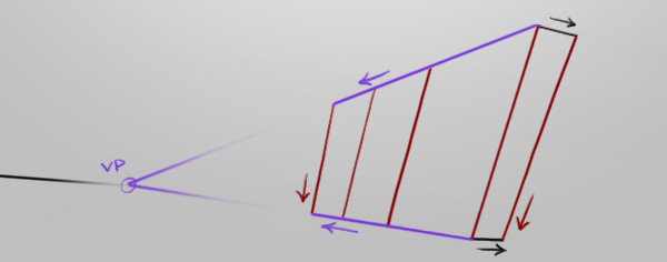
If we continue the black lines, we can use the purple vanishing point to see when the purple lines at the bottom collide with the black vanishing point’s line. This gives us the information to map out what these repeating shapes look like on the other side.


Step 10

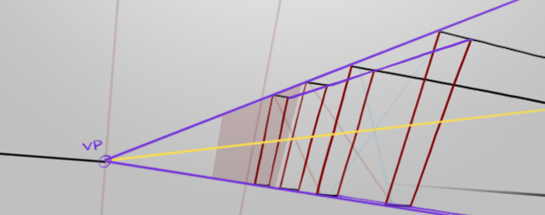
Now let’s jump to a three-point perspective. The rule for joining the corners of the vertical lines (red) still applies, as the center line (yellow) can still be drawn with an initial cross (faded blue).


Step 11

As demonstrated, this technique can be used to repeat geometry very effectively and in large scales, accurately as well. Just don’t get your axes all mixed up! If it helps, then by all means visually differentiate the separate axes like the example below.


Step 12

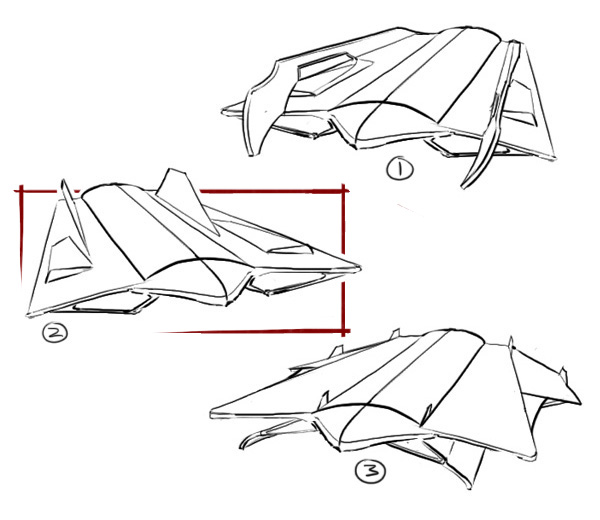
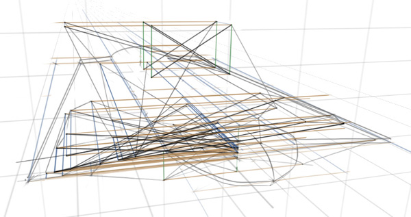
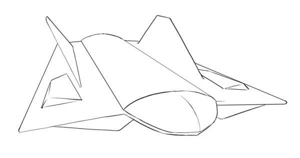
Now that we’ve learned that simple technique, we’ll use it to draw a spaceship :) This is just to show accuracy though, so don’t judge the design. (If the accuracy doesn’t impress you however, that’s clearly because I’m doing it strictly to show off the design) So, let’s pick a thumbnail and get drawing! I think design two has some nice clear forms.


Step 13

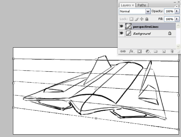
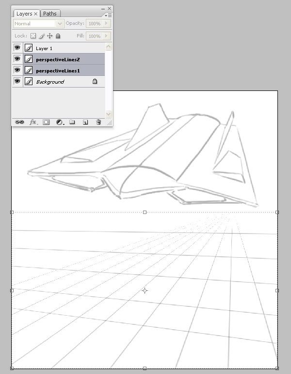
To make things easier, the perspective lines will be drawn as a consistent reference. In the example, I’ve drawn some thin lines with the Brush Tool (B) on a New Layer (Ctrl+Shift+N or Cmd+Shift+N) and used the Transform Tool (Ctrl+T or Cmd+T) to lift a corner up, mimicking the existing yet rough perspective in the drawing. The lines can be kept straight while drawing by holding down Shift.


Step 14

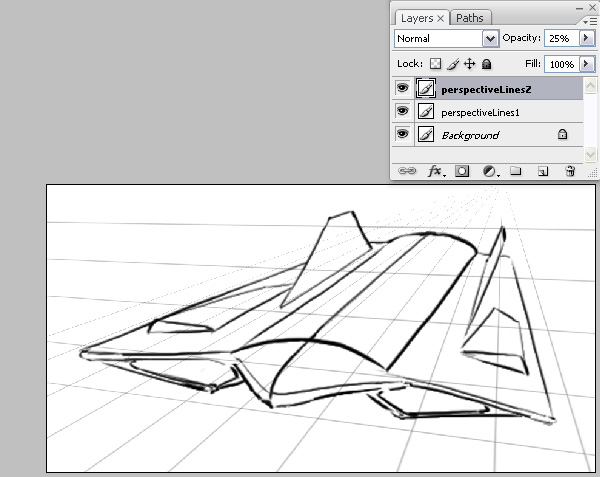
The same is done for the second vanishing point and both opacities are lowered in the Layers Palette (F7) giving us a clearer view of our own line art.


Step 15

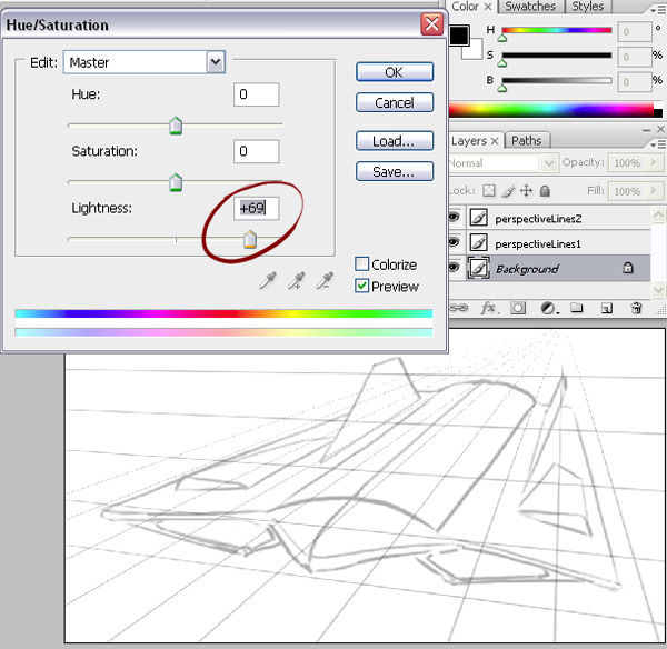
The sketch is still too apparent and would interfere heavily with my weak and precious drawing to come. Use the Hue/Saturation (Ctrl+U or Cmd+U) window to slide the Lightness values higher.


Step 16

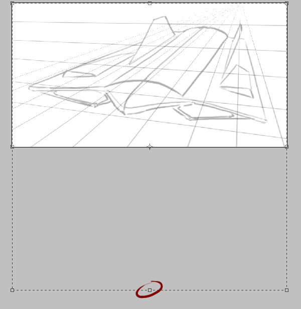
The canvas feels quite limited so let’s use the Crop Tool (C) to extend the canvas space. In the example below I’ve dragged across the entire image with Left-click and then dragged the center-bottom control point lower, pressing Enter to perform the crop.


Step 17

Let’s drag the perspective lines down with the Move Tool (V) and draw on top of those. We can keep the rough sketch above as a visual reference. If you’ve got multiple layers to handle like in the example, you can hold Ctrl or Cmd and Left-click the layers you want to highlight to move.


Step 18

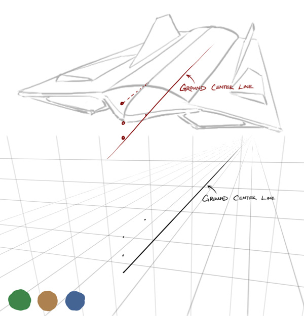
When drawing complex shapes, it is often crucial knowing where on the ground it is for reference. We’re essentially mapping out a lot of the actual spaceship’s virtual form, not just simply the lines we can see.

Let’s dot in the height of the ship’s nose and neck. By following the axis, we can see the spatial relationships of the dots. I’ve added a third vanishing point as well as some colours to differentiate the three axis.


Step 19

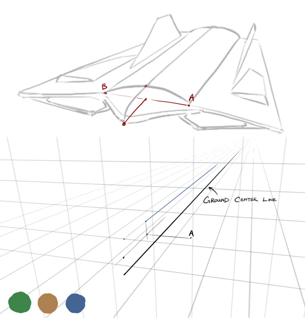
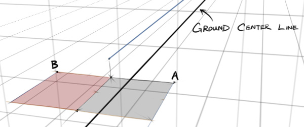
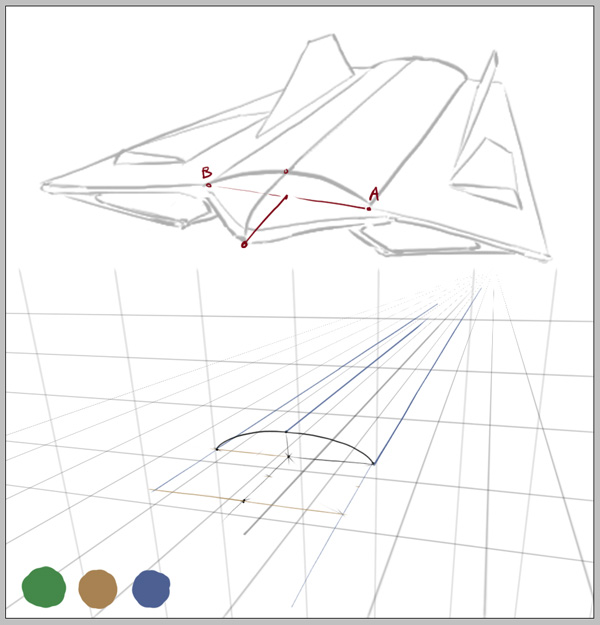
Let’s focus on establishing the points in the example labeled ‘A’ and ‘B’. We can estimate ‘A’ judging from the sketch above, but what will be challenge is finding out where to dot in ‘B’. This is where we’ll use the new technique we just learned.


Step 20

Let’s extend a line from ‘A’ to show the blue axis associated with it (blue line). Then we’ll pick a point from the noise that’s of equal height to ‘A’ and extend a line from it to show its brown axis (brown line). Now we have another corner and a perfect square.


Step 21

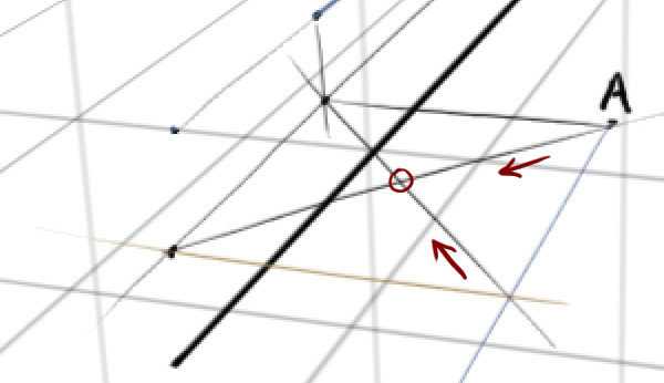
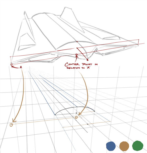
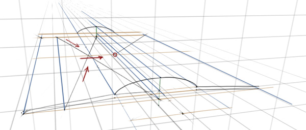
This square is touching the center line, now all we need to do is repeat this square towards the brown vanishing point once to reveal where the symmetrical equivalent to point ‘A’ would be. Does this feel familiar? Let’s make a cross using the four corners.


Step 22

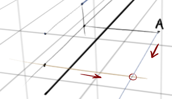
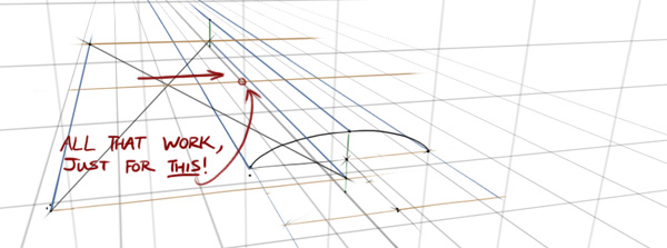
We have the middle point we need (circled red).


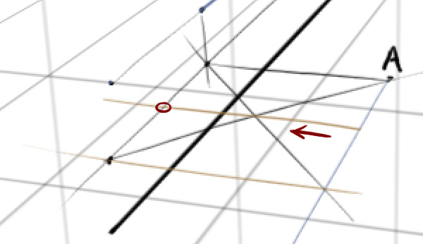
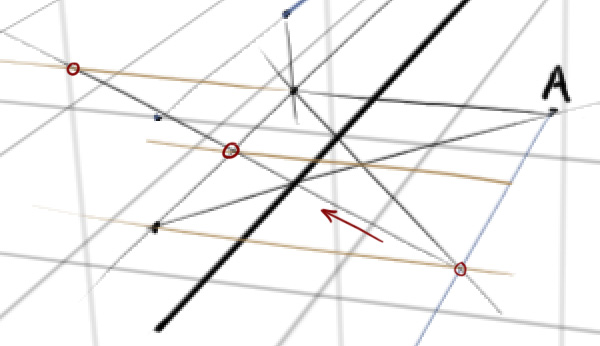
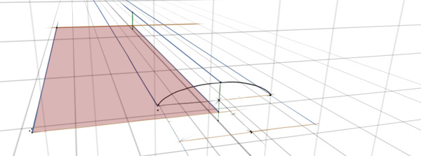
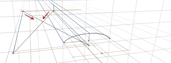
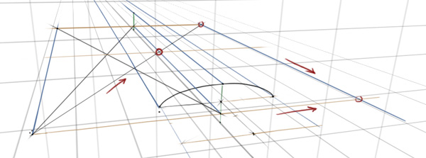
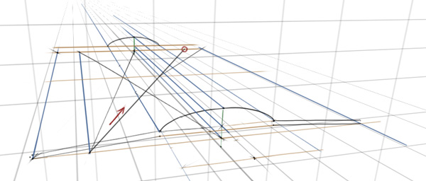
Step 23

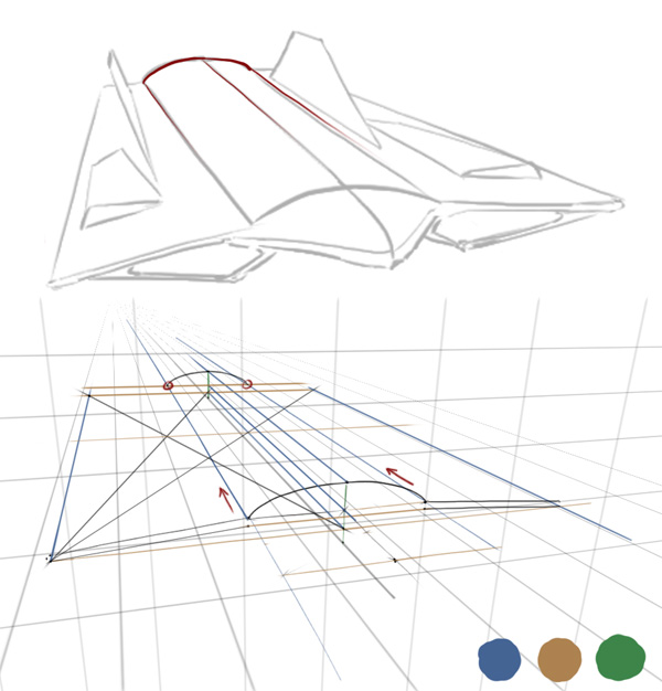
Now strike a line from a corner through that middle point until it touches the same brown vanishing point line as ‘A’, as shown in the example. When it touches, we can repeat the square shape and thus, we have B.


Step 24

We can draw in the shape of the fuselage because we have the three points. Very nice.


Step 25

Yes. Very nice, moving on…


Step 26

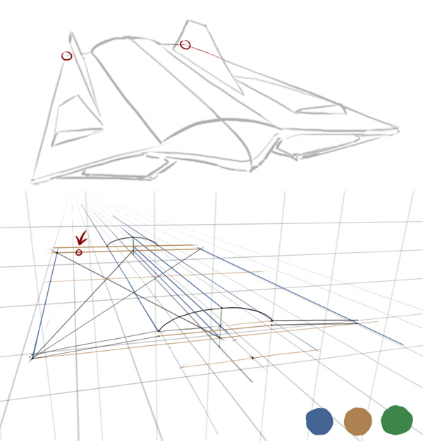
Let’s do a similar process for the upper tip of the wings now. I’ve flipped the canvas in the example because I find it more convenient to strike lines in that direction. You can do this by choosing Image > Rotate Canvas > Flip Canvas Horizontally.


Step 27

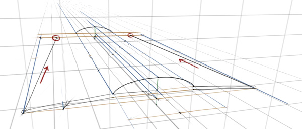
We’ll extend the lower left corner upwards along the blue axis towards the vanishing point, then along the brown axis until it hits the center line. Now we have a square once again. Remember, it is very important that the heights of the corners are symmetrically consistent, otherwise the new point on the other side of the center line will be miscalculated.


Step 28

The same simple steps as before – make a cross with two lines using the four corners, like in the example below. Make sure it’s fairly accurate.


Step 29

Now we have a center point, we’ll run a line through it along the brown axis to find the mid-point, which in the example, is on the center line.


Step 30

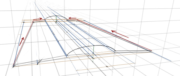
From the lower left corner, we can draw a line through that mid-point we just revealed until it hits the brown line at the back of the spaceship. Using that point we can extend a line from it along the blue axis until it hits the brown axis of the original corner again.


Step 31

With the three main points that we established on Step 24, we can run a line on the blue axis from each point until it hits the back of the spaceship (brown line). The point representing the upper tip of the fuselage stops when it collides with the height (green axis).


Step 32

The back of the spaceship isn’t as wide as the front, so we’ll place a point it where it looks ideal, then begin the technique to reveal the point on the other side of the center line.


Step 33

A little quicker this time. Find the center point. Find the mid-point on the side.


Step 34

Run a line through it.


Step 35

Now we have the upper points for both outer ends of the wings, we can join them together.


Step 36

Then the back-end points to the fuselage.


Step 37

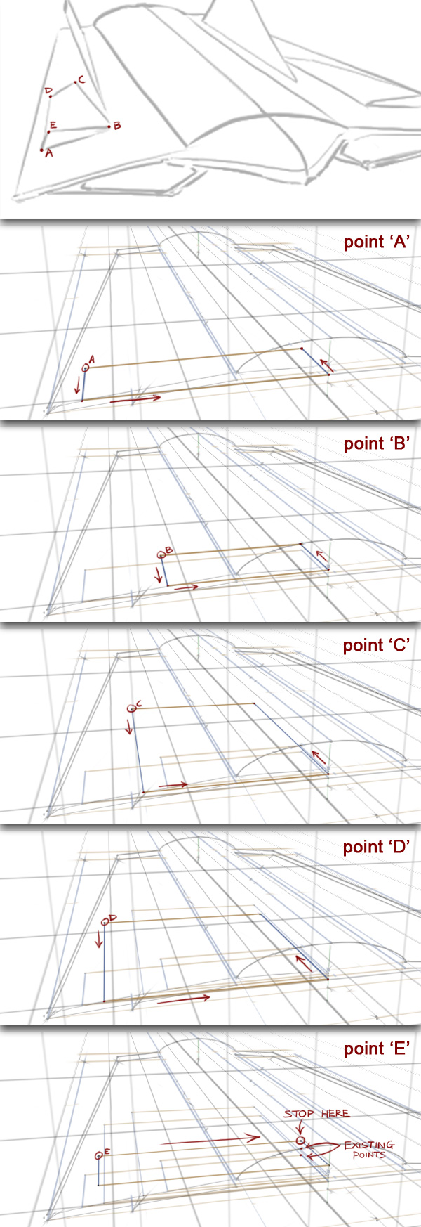
There’s some small air intakes on the wings which will be trickier but will follow the same rules. The points just need to be drawn one by one, starting with ‘A’. We have to make sure the boxes for each point are in line with the center line.

For points ‘A’ to ‘D’, we’ll extend a line along the blue axis until it hits the brown line. ‘E’ is a different height so we can’t just run a line along the wing like the others. Instead we’ll draw a line along the brown axis straight towards the center line.

Things are about to get pretty messy, so I’d highly recommend either using layers for your guides or erasing them after you’re done with it.


Step 38

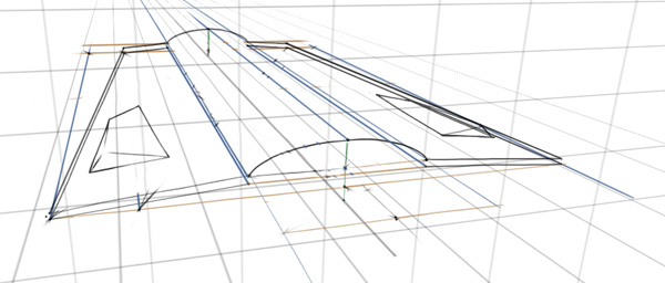
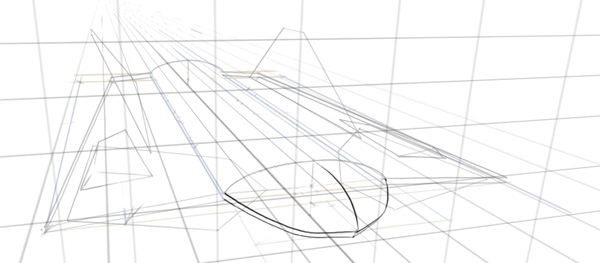
From the 5 points we just established, we can dot-to-dot them together.


Step 39

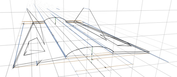
Then using the same technique, we can establish the points for the wings, too.


Step 40

And the large air intakes under the wings :)


Step 41

We’ve already dotted in the point for the tip of the nose, now it’s just a case of joining them. We could place dots around the first curve and match them perfectly on the other side of the center line using the same technique as before, but you’re getting pretty good at that now :)


Step 42

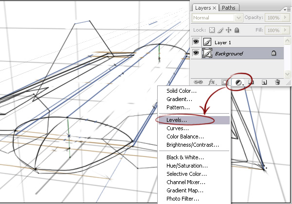
It’s getting a little too messy now. Let’s grab all the scruffy guide lines and lighten them. Select the layer with the scruffy lines and click the Create New Fill Or Adjustment Layer icon, then choose Levels.


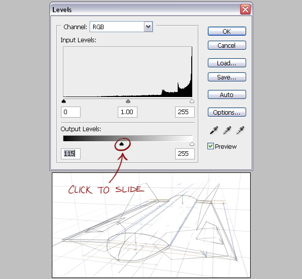
Step 43

In the Output Levels section, slide the black triangle to the right to lighten the darker values until it’s light enough to draw a cleaner revision over the top. If the result isn’t being previewed as you make the change, you may have the Preview option unchecked or you may have accidently made a selection prior to this step. Use Ctrl+D or Cmd+D to deselect the current selection.


Step 44

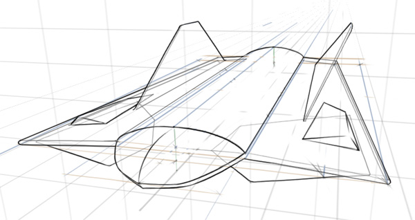
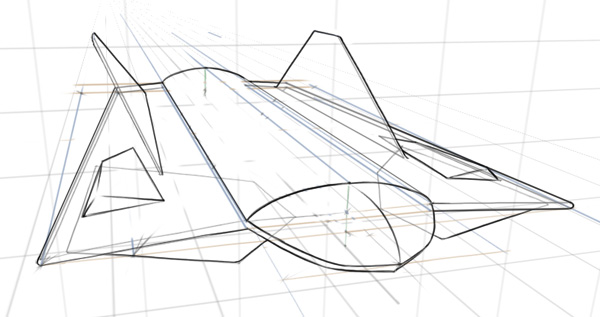
With the old lines in, we can trace over it on a new layer with some nice, clean line art. If it suits your purpose though, you can leave the underlying line art in, maybe lower the opacity a little for a rough blueprint-esque look.


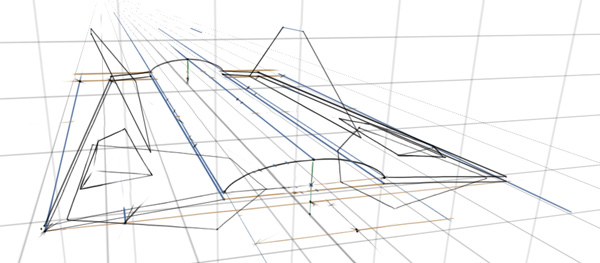
Step 45

You may have noticed, I erased the box guide lines earlier for the air intakes and elevons as the images would otherwise have been extremely cluttered, like this!


Step 46

Thank Photoshop for layers.


Step 47

As you can imagine, with this clean sketch you can take it further to more polished levels. It’s often very useful to have a clean line-art, working great with tasks such as vector tracing and shading with selection tools.


Conclusion

Be it for a design, illustration or just for leisure, you can use this new technique to assist you with your work. If you were trying to communicate designs quickly it wouldn’t be realistic to try and incorporate this technique perfectly every time. But I hope that learning this may improve your overall work flow where you need it :)

I hope you’ve learned something in this tutorial – feel free to comment any questions or share your own samples!

Finalizing Your Fridays

The week is coming to a close…only a few hours left.  You’re either madly rushing to get the things done you set out to do this week, or are in the midst of planning what you’d like to accomplish next week.  (Or perhaps you’re doing both.)

Not everyone finishes up their work week on a Friday, but a lot of people do.  Well, in theory they do.  They do in that they leave what’s left from the past week and slide it over to the next.  And the next.  And so on.

How many things are left as “open loops” on your to-do list when Friday draws to a close?  How many tasks are left unassigned?  Are you leaving this week with a sense of completion and ready to go into the next week with a fresh set of goals and accomplishments to achieve?

Do you “finalize” your Fridays?

Quick Tip: Did Internet Explorer get the Box Model Right?


The CSS standard states that borders and padding should be applied on top of the specified width of an element. As such, if I have a 200px div, and apply 40px worth of borders padding, total, the width of the element will then be 240px. This makes perfect sense; however, Internet Explorer actually did things differently. They adopted a model where the maximum width is the one you set. The borders and padding are then factored into that width, reducing the content area. As a result, the width of the element never exceeds what you specified: 200px.

As we mostly work with extremely sensitive floated layouts, where even the addition of a 1px border can break the design, I wonder: did Internet Explorer get it right?


Box Sizing

“The box-sizing CSS property is used to alter the default CSS box model used to calculate widths and heights of elements. It is possible to use this property to emulate the behavior of browsers that do not correctly support the CSS box model specification.”

This means that, if you should decide that you want to mimic Internet Explorer’s original interpretation of the box model, you can. The default value for box-sizing is “content-box.” This simply means that the width and height of an element do not include the borders and padding (or margins).

By changing this value to “border-box,” the width and height values then include the borders and padding.

#box {
 width: 200px;
 height: 200px;
 background: red;

 padding: 10px;
 border: 10px solid black;

 -moz-box-sizing: border-box;
 -webkit-box-sizing: border-box;
 box-sizing: border-box;
}

Because we’ve declared box-sizing with a value of “border-box,” the final width of the #box element, styled above, will be 200px.

Especially for floated layouts, this can save you a lot of headaches! But with that said, I’m still undecided. What are your thoughts on Internet Explorer’s interpretation of the box model?

Time-Saving Tips for Life Stuff

From reading the posts and comments throughout WorkAwesome, it seems that a common complaint of many of the writers and readers is a lack of time. Hopefully this is because you are too busy with work and raking in the financial benefits that come with this.  Perhaps you’ve got a busy life – and you can use some tips to save time doing the things you don’t enjoy, so you can spend more time doing the things you’d rather be doing.  Or, maybe you really enjoy your World of Warcraft – but your spouse would rather you do a few things before you go dragon hunting.

So – here are a few ways to save time in your day.

Cooking

I found this great site – NoTimeToCook – complete with quick videos so you know what it should look like as you go. (Check out the Ghetto Tamale – a Doritos and ramen noodle masterpiece)

Cleaning

This Squidoo lens gives some easy tips to keep your home clean –  but my preference is to hire someone.  They can do it faster, better, and cheaper than you can.  If you are billing out at $25 per hour, and it takes you 4 hours per week to keep your house clean (yeah – right!) – I can almost guarantee that you can find someone close by that can do a better job, in half the time, for $20 per hour at most.  Unless you need it as an excuse as to why you didn’t get your project done on time!

Yardwork

Apparently there are people out there that find yard work fun. I also understand there is therapy for them.  For the rest of us, here’s a list of tips to use to make it as enjoyable as possible.  If you have to have a yard, try and design it to be as low maintenance as possible.  Or have kids, but that sounds like a much more expensive option.

I am currently using my free time to spend finding ways to work less and enjoy life more.  Check out Tim Ferris’s 4 Hour Work Week – and stop wasting time on things you don’t like to do.

What are you doing to find more time to commit to your passion, vocation, or vice?

Inspiration: 40 Unique Footer Designs


Footer is a very important part of web design. So today we have collected 40 fantastic footer design under three section Illustrated, Minimal and Use of texture.

Illustrated


1. readymadedesigns


2. blog.singularitydesign


3. rubbik


4. juliafreidank


5. rubidine


6. foxtie


7. jeannieweb


8. snailbird


9. deanoakley


10. thepixel


11. morphix


12. rusted-ink


13. cooltribe


14. bimbisicuramente


15. nybbletech


16. yuruinspires


17. launchmind


18. ormanclark


19. answerjam


20. prismtone

Minimal


21. skylaranderson


22. fubiz


23. quake.focus27


24. projectfedena


25. ogvidius


26. kyee


27. yaronschoen


28. markpalmamedia


29. yudisign


30. lauraalter


31. webjunkiexl

Use Of Texture


32. floridaflourish


33. texturelovers


34. ectomachine


35. sunrisedesign


36. energycell


37. ecoki


38. thinkdesignblog


39. storypixel

So You Think You’ve Finished Mixing? A Guide to Preparing Your Mix for Mastering

You know what it feels like to finish a mix. Having spent hours, possibly days, perfecting your track to the nth degree, it feels great to finally have a song to be proud of after all the hard work and effort.

But what if you took your mix just that little bit further. Before the crucial mastering stage, there are some very simple, and often overlooked, practices and techniques which can be applied to your mix in order to make sure your track stands out from the crowd and better yet, your final master is as good as it possibly can be.


Step 1: Check Your Levels

Once you’ve finished your mix the first place to start is to take a look at the levels on your master bus. (Technically, you should be monitoring this all throughout the mix but we’ll assume that hasn’t happened). All major DAWs contain a basic meter on the master bus channel. Reset your meter and do a whole pass of the track to check exactly where your song peaks (i.e., where the level reaches it’s highest point during the pass). Typical mastering engineers want roughly 3 dBs of headroom on the mix to give themselves the most flexibility – this is especially true if you are working in 16bit rather than 24bit.

If you find yourself with excessive levels on the master bus (or even clipping) there are a couple of options to try. If you have maintained respectable levels on each individual channel, lower the overall level by simply reducing the master fader a few dBs as appropriate, ensuring the integrity of your mix stays intact. However you may only be temporarily fixing problems that lie deeper in your mix session.

If you find that individual channel levels are to blame, it’s probably a better idea to reduce channel levels equally and individually so by the time the audio reaches the master bus there are no level issues – i.e., you’ve reached an acceptable master bus level completely naturally. Remember to maintain respect with any particular routing you have used – e.g., don’t reduce a bus as well as your respective channels as this will throw the balance out.

If the levels still look unusually active, delve a little deeper and check if any individual plugins are clipping. If a plugin has been set to force hot levels out to your DAW, there’s a good chance clipping will occur. (Some analogue clipping can sound great, but digital plugin clipping is the total opposite – you really don’t want this on your mix!) Most plugins have an input/output level trim so if a channel looks to be overworking itself, check the inserts for any clipping and adjust accordingly.

A channel may clip and affect your master bus level if an Insert is forced to process to an extreme. Above, the “In” meter shows the input channel level is acceptable, however when the EQ plugin kicks in you can clearly see the level clipping upon outputting.

To demonstrate just how easy it is to accidentally clip a channel, here is an example of a quiet synth part meant to “pad” out a song. This kind of part can easily get lost in a mix, as that’s the parts purpose:

Download audio file (synth.mp3)

As you can hear, it sounds totally fine. However, it’s very easy to accidentally clip something which is quiet in the mix, particularly if it’s been recorded hot. Here’s the same synth part, but with an inserted EQ plugin with a clipped output:

Download audio file (synthclipped.mp3)


Step 2: Check the Inserts on the Mix Bus

There is a lot of healthy debate over the dos and don’ts of inserting effects onto the mix bus. It’s quite easy to overload the bus to help the track shine (especially if you’re doing quick mixes to send to a band for approval, for example) but be very careful of wandering into the mastering engineer’s domain.

Some mixers feel they need to limit the creative control of the mastering engineer by overly processing the master bus (perhaps with mastering-style EQ or limiting) and this is sometimes for a perfectly rational reason, especially if a top-line reputation is involved.

Regardless, I would never recommend adding a limiter to your mix bus. Quite often, digital limiters don’t offer the same sonic finesse of analogue limiters used by most mastering engineers (particularly in the higher frequency spectrum) and you’ll be depriving a mastering engineer of an essential part of their job. Let them do what you’ve hired them to do.

That said, it’s very common to subtly process your master bus – generally this is to help “glue” your mix and add a little sparkle and consistency. One common approach is to gently process a mix through the classic SSL bus compressor to give your mix extra unity and to utilise its iconic individual “sound”.

By all means, experiment and have a play around with your master bus but make sure you use inserts with caution. Always question why you’re adding an insert to the bus – if you have any doubt, you probably shouldn’t do it!


Step 3: Don’t Dither!

I’ve already mentioned how careful you need to be when adding inserts onto the master bus – however if you do decide to add a little “fairy dust” to your mix then be aware that some plugins could apply a dither algorithm. The plugin should have an option to turn this off, so make sure that dither is always switched off unless you are reducing your bit rate on mix-down.

If you’ve recorded at 24bit I would recommend bouncing your mix at this bit depth ready for the mastering engineer and not to worry about the dithering process. Dithering is a vital part of mastering but let your mastering engineer apply this at the final hurdle and certainly don’t do it for him during the mix bounce.


Step 4: Check Your Mix in Mono

If there’s one process for you to try it’s this one. Checking your mix in mono is vital and truly under-valued – there are countless reasons why your mix may end up being heard in mono.

If your song is broadcast on the radio, often it will be in mono if the signal is particularly weak. Even advanced technology still utilises mono signals – most radio iPhone applications broadcast in mono, unbelievably! When listening in mono, your track could run into major phases issues when processing reverb or delay and sometimes the effect can be totally lost.

To demonstrate, here is a guitar part with a delay effect in stereo:

Download audio file (guitarstereo.mp3)

And here is the exact same part, heard now in mono:

Download audio file (guitarmono.mp3)

As you can hear, the delay effect has been completely destroyed on the second example. Would you be happy with the mono sonic representation? Obviously there will have to be a degree of compromise but this will naturally vary mix to mix, especially if the effect is essential to your “mix vision”.

The TT Dynamic Range Meter is a great free plugin which monitors the dynamic range of your master bus. In addition, it can process a mix in mono. Simply place the meter on your master bus and click the mono button. (You can download the TT Dynamic Range Meter for free at http://www.brainworx-music.de/en/downloadrequest).

Above all, it’s essential to make sure your mix translates throughout multiple scenarios so spend time making sure your mix works as best as possible in mono – you never know who could be listening!

The free TT Dynamic Range Meter is a great way to visually check the dynamic range of the mix and includes a handy mono button at the bottom.


Step 5: Check Your Imported Samples

Have you imported any samples into your project? Most DAWs can cope with audio files of multiple bit depths, as they will usually be converted during the import process. (If not, make sure they are!) However it’s useful to check the bit depths of your imported samples in advance. It is common practice to record and mix at 24bit but sometimes you may find you want to use samples at 16bit – however this doesn’t mean you shouldn’t use them.

It’s important to note that converting a 16bit sample to 24bit will not make the initial sample any better in quality, however it ensures that any processing or plugins you use on the 16bit sample are operating at 24bit, which will give a higher fidelity value to the sound, post-processing.

Above is an example of the Pro Tools “Import Audio” function. Here, a snare sample is at 16bit 44,100Hz whereas the project is operating at 24bit 48,000Hz. As a result, Pro Tools will convert the audio to match the project sample rate and apply all further processing to the snare sample at 24bit 48,000Hz.


Step 6: Don’t Get Caught Short!

Imagine this. You’ve secured your first major mix job with a major label. You’ve worked until the early hours for days on end polishing the mix. Eventually, it’s submitted, you’re paid, deadline achieved! Two weeks later you get a late night call from the label, “We need a new radio edit with a more upfront vocal. It needs to go to the radio plugger tomorrow.”

A good mix engineer is always aware a mix recall may need to happen – so make sure you’re not caught short and you’re well equipped to deal with the scenario. Print the audio of any plugins you’re thinking of uninstalling. Did you use any outboard gear? If so, get a print of it just in case. Perhaps take a picture of the settings. Upgrading your OS? Will your plugins still work?

Make sure you’ve got the means to cope with any recalls that need to happen. Generally though, once something is released you’ll not need to worry!


Step 7: Some Final Advice

Here are some quick tips that really can make all the difference:

  • Rest your ears! You will find that sleeping on a mix after a hard days work will often open your ears up and give you a fresh perspective. If possible, it’s always worth revisiting a mix the next day before you really do call it ‘finished’!
  • Check your export marker points! It seems obvious but it’s a common mistake. Don’t start the export the precise moment the song kicks in. Give the mastering engineer a few seconds to manoeuvre. The same applies to the ending. Unless it’s for creative reasons, make sure you export to the very end of your track – double check any overhanging effects!
  • Get to know your mastering engineer! It’s always great to get a working relationship going. Send them the song in advance and if possible, get their opinion on the mix. Any mastering engineer worth their salt will always hear your mix with the master in mind and may be able to point out where you could improve your mix in order to get the best out of the mastering session.

Conclusion

Reading this tutorial you’ll have noticed the emphasis placed on respecting the mastering process. It’s often overlooked in our ambition to make mixes sound as professional as possible from the offset.

If there is anything to take away from reading this tutorial it’s that you should always mix with the mastering engineer in mind. Remember, if you’re beginning to question any of the finishing touches you’re adding then you’re almost certainly in the mastering engineers territory. However, if you have a vision or direction for your mix then this must be incorporated at the mix stage; no matter how good a mastering engineer might be, he can’t fix your mix.

And as luck would have it, that’s our job!