iPhone-controlled 3D display, via ping pong balls and air pumps

I’m not quite 100% sure what this is — it’s supposed to be a “floating forecaster,” some sort of 3D display for weather information, but to me it looks more like 30 air guns with ping pong balls sitting in them. I don’t really see how the “weather” part of the display works, but what’s really cool is that the whole thing is controlled by an iPhone. It looks like you touch whichever part of the grid you want to raise or lower, and then move your thumb up or down to set the ball at a certain level.

With a little more software work, there’s probably a lot more that could be done here, just creating patterns by swiping across the screen, or even running a game like Pong as the balls raise and lower across the grid in sequence. But as an art installation, it’s pretty neat as is. Check out the full video after the break.

Thanks, William!

TUAWiPhone-controlled 3D display, via ping pong balls and air pumps originally appeared on The Unofficial Apple Weblog (TUAW) on Tue, 24 Aug 2010 10:00:00 EST. Please see our terms for use of feeds.

Read | Permalink | Email this | Comments

TUAW’s Daily App: Piczle Lines

Piczle Lines is pretty much the perfect iPhone game. It’s a quick, pick-up and play puzzle affair, with a Japanese puzzle style that is easy to learn but gets twistier and tougher as it goes along. It’s well-polished, with a cute story mode and extra puzzle packs to play and buy as you go along. And oh yeah, it’s free to download and start playing.

You should probably be headed over to the App Store by now, but just in case you want to know more, Piczle Lines has you assembling (very low resolution) “photos” by drawing out various colored lines. The start and end of each line are marked by numbers saying how many line segments the lines take up, so your job is to connect the lines in just the right way, recreating whatever pictures you come up with.

Gameplay is simple and easy — the app tracks your movements very well, and undoing a line is as simple as tracing it back the way it came. The game starts out very easily, with obvious solutions to the puzzles offered, but it gets tough quickly, as vast line segments must be drawn exactly the right way to match up the numbers on either side. Piczle Lines is a lot of fun, very well made, and the fact that it’s a free download (with extra puzzle packs to buy if you happen to complete the main set of 20 puzzles) is just icing on the cake.

TUAWTUAW’s Daily App: Piczle Lines originally appeared on The Unofficial Apple Weblog (TUAW) on Tue, 24 Aug 2010 08:00:00 EST. Please see our terms for use of feeds.

Read | Permalink | Email this | Comments

12 people charged in iTunes royalty fraud

I guess with all of the money flowing around iTunes, sooner or later someone would have to try to steal some of it. Twelve people have been charged in the UK with basically laundering money through iTunes — they were allegedly uploading their own tracks onto the music sales service, then buying those same tracks with stolen credit card numbers. The fraudsters nabbed over $300,000 worth of royalties in just a four month period between September 2008 and January 2009.

The Register doesn’t note how the 12 (who come from a surprising number of various jobs and backgrounds) came up with this idea, or how they got caught, although there was an investigation underway by the FBI. iTunes wasn’t the only service defrauded — Amazon was reportedly used for some of the transactions as well.

The suspects are scheduled to appear on bail next month, and I’m sure both Apple and Amazon have taken steps to make sure this doesn’t happen again. Even so, out of all of the millions if not billions of dollars running through iTunes, if this $300,000 is all of the theft they need to worry about, Apple’s doing pretty well anyway.

[via MDN]

TUAW12 people charged in iTunes royalty fraud originally appeared on The Unofficial Apple Weblog (TUAW) on Tue, 24 Aug 2010 07:00:00 EST. Please see our terms for use of feeds.

Read | Permalink | Email this | Comments

How to easily create charts using jQuery and HTML5

Step 1: Preparing files

Here we go! The first thing to do is obviously to create a directory on your Mac (or PC, nobody’s perfect ;) ). You should name it chart for example. Once done, download the required Javascript and CSS files and save it on your hard drive.

Now, create a new html document, named charts.html. Copy the html structure below, and paste it into your newly created charts.html file.

<!DOCTYPE html>
<html>
<head>
	<meta http-equiv="content-type" content="text/html;charset=UTF-8" />
	<title>Charts!</table>       

</head>

<body>

</body>
</html>

Did you notice that I used the <!DOCTYPE html> doctype? It is the right doctype to use, as the javscript code we’ll add later will turn a html table into a HTML 5 canvas.

Step 2: Adding data

Now that we downloaded the javascript files and created an html document, it’s time to add data. Copy the code below and paste it within the <body> and </body> tags of your charts.html file.

<table>
	<caption>Visits from August 16 to August 21</caption>
	<thead>
		<tr>
			<td></td>
			<th scope="col">Monday</th>
			<th scope="col">Tuesday</th>
			<th scope="col">Wednesday</th>
			<th scope="col">Thursday</th>
			<th scope="col">Friday</th>
			<th scope="col">Saturday</th>
			<th scope="col">Sunday</th>
		</tr>
	</thead>
	<tbody>

		<tr>
			<th scope="row">CatsWhoCode.com</th>
			<td>12541</td>
			<td>11204</td>
			<td>11354</td>
			<td>10058</td>
			<td>9871</td>
			<td>8254</td>
			<td>5477</td>
		</tr>
		<tr>
			<th scope="row">WpRecipes.com</th>
			<td>9855</td>
			<td>8870</td>
			<td>8731</td>
			<td>7488</td>
			<td>8159</td>
			<td>6547</td>
			<td>4512</td>
		</tr>
		<tr>
			<th scope="row">CatsWhoBlog.com</th>
			<td>3241</td>
			<td>2544</td>
			<td>2597</td>
			<td>3108</td>
			<td>2114</td>
			<td>2045</td>
			<td>950</td>
		</tr>
	</tbody>
</table>

Of course, feel free to add your own data to make the example more interesting for you.

Step 3: Let the magic happen

Alright, now we have a bunch of downloaded files and an html document. It’s time to merge them all together and finally generate the chart.
Unzip the downloaded file and open the extracted directory. Copy the following files into your chart directory.

  • charting/css/basic.css
  • charting/css/visualize.css
  • charting/css/visualize-light.css
  • charting/js/visualize.js

Once done, we obviously have to link the css and javascript files to our document. Paste the following after the <title> tag of the document:

<link href="basic.css" type="text/css" rel="stylesheet" />
<link href="visualize.css" type="text/css" rel="stylesheet" />
<link href="visualize-light.css" type="text/css" rel="stylesheet" />
<script type="text/javascript" src="http://ajax.googleapis.com/ajax/libs/jquery/1.4.2/jquery.min.js"></script>
<script type="text/javascript" src="visualize.js"></script>

It’s time to give life to our chart. Paste the final piece of code after the script calls:

<script type="text/javascript">
	$(function(){
		$('table').visualize();
	});
</script>

Once you saved the file, your HTML table should be displayed along with a good looking chart. If you don’t want the table to be visible, simply hide it using the display:none css property.

Additional explanations

Generating bar charts is definitely great, but what if your preference goes to a pie chart? No problem, visualize.js allows 4 different type of charts: Bar, area, pie and line.

Changing the default type is pretty easy: Just add the type parameter as shown below:

$('table').visualize({type: 'pie'});

Cool, isn’t it? Visualize.js accepts even more parameters to make sure your chart will look exactly how you want. Here are the parameters which can be used:

  • type: string. Accepts ‘bar’, ‘area’, ‘pie’, ‘line’. Default: ‘bar’.
  • width: number. Width of chart. Defaults to table width
  • height: number. Height of chart. Defaults to table height
  • appendTitle: boolean. Add title to chart. Default: true.
  • title: string. Title for chart. Defaults to text of table’s Caption element.
  • appendKey: boolean. Adds the color key to the chart. Default: true.
  • colors: array. Array items are hex values, used in order of appearance. Default: [‘#be1e2d’,’#666699′,’#92d5ea’,’#ee8310′,’#8d10ee’,’#5a3b16′,’#26a4ed’,’#f45a90′,’#e9e744′]
  • textColors: array. Array items are hex values. Each item corresponds with colors array. null/undefined items will fall back to CSS text color. Default: [].
  • parseDirection: string. Direction to parse the table data. Accepts ‘x’ and ‘y’. Default: ‘x’.
  • pieMargin: number. Space around outer circle of Pie chart. Default: 20.
  • pieLabelPos: string. Position of text labels in Pie chart. Accepts ‘inside’ and ‘outside’. Default: ‘inside’.
  • lineWeight: number. Stroke weight for lines in line and area charts. Default: 4.
  • barGroupMargin: number. Space around each group of bars in a bar chart. Default: 10.
  • barMargin: number. Creates space around bars in bar chart (added to both sides of each bar). Default: 1

That’s all for today. Have fun with the charts :)

Like CatsWhoCode? If yes, don’t hesitate to check my other blog CatsWhoBlog: It’s all about blogging!

How to easily create charts using jQuery and HTML5

Free 3D Matchmoving Alternative For After Effects

Matchmoving has been discussed a lot these days and it has become accessible for more and more people. With the introduction of programs like Syntheyes, PFTrack, and The Foundry’s CameraTracker plug-in the reconstructing of a 3D camera move has been made easier. A lot of people however are not aware of other solutions that are available, like free software. Voodoo Camera Tracker is one of those pieces of software and today I´ll be showing you how to solve your shot and then create some awesome 3D stuff within After Effects!


Tutorial

Introduction To Matchmoving

For those of you who don´t know what matchmoving is, let me just explain it very quickly. When a director wants to have a 3D object integrated into a shot, the computer needs to know how to camera has moved on the set, what focals have been used, the focus distances, lens distortion and more metadata. Otherwise it´s impossible for the computer to know from what angle the 3D geometry should be rendered. Motion tracking is the process of recreating the original camera move that was created on set with software. This data can then be exported for 3D programs like Maya, 3dsMax but also for compositing programs like Nuke and AE. Today we will be taking a look at how to completely recreate a 3D camera movement and then export that to AE. As mentioned however, tracking programs can be expensive so until you have a budget set aside for them, this could be a temporary solution. The result may not always be as smooth as the result you would have using commercial software, but it’s still pretty cool! So let´s go ahead and get started.

Step 1

To get Voodoo Camera Tracker, the software we´ll be using to solve the cam movement, go to this page and download the software. You can also find some for info and examples on the site so if you are interested just go ahead and browse some stuff.

Step 2

Just open up the software by executing the exe. Now, due to the fact that Voodoo only supportes the file formats .tga, .png and .jpg we´ll have to go in AE and export our footage as a sequence. This can be done in multiple formats but I like to use jpg because of the high compression quality. In AE, drop your footage into a new comp and cut it as you want. Now in the top menu go to Composition -> Add to Render Queue or hit Control, Shift, + and then / on your keyboard. Now go intro the Output Module Settings and change the file format to whatever you like (in my case JPEG Sequence). Make sure you don’t render all the pics on your desktop because you want to organize everything in a folder. Just create a folder and hit the render button.

Step 3

Now in Voodoo go to File -> Open -> Sequence or hit Control S on your keyboard. Now browse for your footage. As you may notice, the program automatically detects the amount of frames. Just browse for your first frame, select it and you’ll see a certain frame range. Be really sure to check this back in AE, you don’t want anything to go wrong. Do not click the OK button yet! First we’ve got to do something quite important. As you go to the Move Type tab you can choose between free move or rotation (camera on tripod). Just apply the correct setting so that it matches your scene. Now you can hit the OK button.

Step 4

Now first you’ve got to do something really important. Before even start tracking what you must do is hit Control I or go to File -> Open -> Initial Camera. Here you can define your camera settings. First of all the focal length. This is really important as Voodoo makes weird tracks when not defining a proper focal length. To check this just look at the lens you’re using: the information should be on it. For the film back, just choose a preset from the preset list. Now that is done we can go ahead and hit the track button at the right button on the screen. This will probably take a long time if you have a shot with much depth and a lot of movement. So the interesting thing about Voodoo is that both the tracking and solving is done in one proces. When using most commercial software you first have to let it track the points in the scene and then make a calculation based on those points, the solving. As you watch the scene being tracked slowly you notice the points in the scene. Voodoo now recognizes points in your scene. Camera tracking works like this: when a point in your scene moves to the left, the software knows that the camera is in real life moving to the right. This applies to all axes.

Step 5

As the tracking is finally done you can still see the green dots. All these dots represent an actual point in your scene. This comes in really handy when we want to place some 3D geometry in the scene, we can look for a null object (the green points) close to where you want the geometry to be and then just copy the position and scale and then adjust the position. As you go to View -> 3D Scene Viewer you can see the scene in 3D and the position of the camera in comparison with the scene. This is quite amazing I think. What you can do now is add some geometry within Voodoo to make sure the track is proper. Go to View -> Modeling Tools. Select the cube and use the transform buttons to position the cube where you want it to be. Play the animation to see if everything works. Now that everything moves along fine we can go ahead and export our scene. This tutorial will focus on AE but you can also export to Maya, 3dsMax and more and use 3D objects from that software and then composite that in AE. For now, let’s just go to File -> Save -> Maya Script. This is because AE can also read .ma files.

Step 6

Now let’s open up After Effects. First import your exported targa, png or jpeg scene or work with your original project. Make sure you have a composition with only your footage on the timeline. Now import the motion tracking data. When importing you’ll see two things. First of all the Square Tracking Data. This contains the composition with the tracking data and the camera. The Tracking Data comp is just contains the Square Tracking Data as Pre-Comp, you can delete this composition. Now go into the Square Tracking Data comp and copy the camera to the main comp with the footage. Now you are ready with the basic setup. We can now add some wicked 3D stuff within AE!

Step 7

Now the tricky thing is to position the object right. In this example we are going to use a standard solid. Try to make the solid 3D. As you can see the plane disappears. This is because of the initial position of the Voodoo scene and the camera position. To view the camera position select the VoodooCam_Shape layer and hit P on your keyboard. You can see the camera is not in the exact middle of the scene. So as we move our solid forward on the Z-axes we can now see the plane. Try to play around with the position of the plane, having the position of the camera in mind. You should also dramaticly decrease the scale of the plane. A normal scene should have similar parameters like you can see in the animation below. You can also see that as I move the plane backwards it actually moves along with the ground.

End

This is pretty much the technique behind the preview you’ve probably seen at the top of the page. You can now start experimenting with cool things such as making text 3D and aligning textures with the ground plane. In the example below you can see another tracking scene with some stock footage from Action Essentials 2 from Videocopilot. As you can see I’ve put a burnmark texture on the ground and I’ve also added some foreground smoke. Now we’ve come to the very end of this tutorial. To get started I’ve provided some tips below. Thanks for reading and try to stand out and be creative!

  • With Videocopilot’s Optical Flares you can link a flare to a 3D light as seen in the preview
  • Adding both foreground and background objects increases the depth of the scene making it feel really 3D.
  • To add shadows just duplicate the object and rotate it so that it aligns with the ground (or a wall or anything). Now fill it with a black color and apply a Gaussian blur.

Additional Resources


Quick Tip: Create a Conical Gradient with Adobe Illustrator, in Two Minutes!


Unfortunately, Adobe Illustrator doesn’t come with a conical gradient setting, although some vector programs, such as Corel Draw do. Using features and tools found in Adobe Illustrator, you can create an adjustable conical gradient to use in your work, and it only takes two minutes!

Continue reading “Quick Tip: Create a Conical Gradient with Adobe Illustrator, in Two Minutes!”

How to Create a Three-dimensional Airplane with Adobe Illustrator


In this tutorial you will learn how to create a detailed three-dimensional image of an Airplane based on two two-dimensional plans. The knowledge acquired will help you to simulate a three-dimensional image of many different complex objects.

Continue reading “How to Create a Three-dimensional Airplane with Adobe Illustrator”

Beginning with the End in Mind: A Basix Guide to Mixing

So where do you go now? You had a song. You recorded all the parts. You even added in some additional overdubs and vocal harmonies. Now all your tracks sit there in your software program waiting for your next move.

You managed to record all your tracks pretty decently and they really sound good, each in their own right. But when everything is playing back all at once, it just really seems overwhelming. All your tracks competing for the same space. Some instruments are louder than others and they all seem to standing in the same place shouting for your attention. It’s time to start mixing.

But where do you start? Where do you go? Where does everything belong? In the following Basix tutorial I’m going to go into the absolute basics of mixing a song. Nothing fancy, just the building blocks of mix engineering.

Let’s do some construction analogy. If you want to build a house, you don’t start with the fancy chandeliers and swanky kitchen interior. You start digging out for a foundation. If you are an architect you you probably don’t start off by designing the Sagrada Famila, you start off by designing simple houses and structures (and if you actually are an architect I welcome you to your new hobby…). Similarly, with mixing, we don’t start off with fancy reverb mixing tricks or complex side-chain triggering. We start off with the Basix.

Pareto’s principle is as follows: 20% of the work results in 80% of the outcome. Sounds pretty nice doesn’t it? What this means is that if we use just a few simple mixing guidelines, and given that the tracks were recorded well, we end up with almost a perfect mix without having to resort to complex modulation effects and automation.

I’m not saying that you shouldn’t familiarize and understand the more advanced mixing techniques out there, but for the purpose of starting a mix we don’t want to think about that. It’s like when you have too much on your to do list and because you don’t know which task you should start on you end up doing none of them. So by starting with an idea of where you want to go, it’ll be easier to get there. Begin with the end in mind, follow a path instead of getting lost in the woods.


And What Are the Basics Actually?

  • Levels – Volume, mate. Volume. Some things belong in the background, some things stay at the forefront.

  • Panning – Stereo anyone? I know everybody will say that you should check your mix in mono and all that, but that doesn’t mean stereo panning isn’t hugely important for spreading things out.

  • Compression – Here is a visual, text based representation of a sentence that could use some compression. If I wErE tO wRiTe WitH TOO mUcH DYNaMic RaNge It WOULD be HarD To rEAd. So by compressing certain parts we keep them at a steady level that doesn’t waver too much in dynamic range. Of course, some instruments need less compression than others, but understanding compression and using it correctly is key.

  • EQ – Problematic frequency ranges, dull instruments, tinny guitars and boxy drums. This can all be fixed with EQ. It is the No. 1 mixing tool you use to sculpt your mixes.

  • Depth – If you are a one man band, you can play a multitude of instruments in the exact same place. If you are a band with multiple instruments and players, they are going to be scattered around a room. There is a reason drums are usually positioned behind the singer at a concert. It’s because the drums aren’t supposed to be in the front. By using processors such as reverb and delay we can create depth and space in a mix, and making it sound like there is actually a band spread out on stage.

Those are the basics. These are the mixing techniques and concepts you need to be most familiar with in order to succeed as a mixing engineer. Many of these concepts intertwine and can be used together to create more complex mixing tricks but having an understanding of each one helps you see how they react to each other.


Basic Misconceptions and Questions

1. Basic Levels in the Digital World

On a side note, before you start mixing at all, be sure to check your levels regularly. If you are mixing something that will ultimately make it to a mastering engineer, be sure to allow for sufficient headroom on the master buss. Turn all your faders down to zero and when you start putting up the volume of the individual faders it’s a much better idea to keep the fader levels low but the master volume of your interface or monitors louder.

If you start mixing and down the line you see your master buss peaking and not having any headroom, select all the faders and lower all the levels until you see the master buss showing normal levels. You want the peaks to always be below -3dB, and lower is better. Use a multi-meter or level meter of some sort on the master buss to see the peak level and the average RMS level.

2. Levels of the Drum Kit

For example, let’s start with the drum kit. We want the kick drum nice and juicy so we throw the fader all the way up and go to work on it. Chomp, chomp. A little bass boost there and some EQ and that compression ratio is good and bam, we’ve got it! Nice and punchy kick drum. Now let’s add the snare, and then the bass and we need the space around the drum kit so we add in the overheads. Ah… now the kick drum sounds a little buried. We’ll just push the fader up a little more, that’s it. Much better.

Now we add the guitars and vocals and keyboard stabs and suddenly our bass guitar needs more volume so we add more gain to the compressor. Ah… but now it’s getting in the way of the kick drum, so we need to add more volume to that fader. But wait – we can’t push it up any further. What should we do now?

Mixing isn’t about adding more volume to each element until you’ve balanced them off. It’s about balancing the volume of instrument in a certain volume area. You don’t have an endless amount of headroom in your software, so rather than pushing up the faders until they can’t go any farther you should mentally define a specific area of the faders where you need them to be balanced.

Like I said before, aim for the master buss to be at most at -3dB peaks, and therefore you need to mix the rest of the instruments much lower on their own respective faders. It’s a simple math problem: 10 instruments at a high volume equal a really hot master fader, but 10 instrument with the same balance but a lower level equal a manageable master fader.

3. Who Are the Middle Men?

When panning, some things belong in the middle, and some things can be spread out in the stereo spectrum. Anchor elements such as the lead vocal, snare, bass and kick drum should usually be squared off in the middle, tying all the other elements together.

The snare drum is the defining element of the drum kit, supplying the steady backbeat. Therefore you want all that energy to be in the middle, driving the song forward.

The main vocal is the center of attention, and thus must be placed in the center in order to shine as much as possible.

The kick drum and bass are foundation instruments that give the track a solid grounding, and by placing them in the center you lay the groundwork for all the other instruments on top, to the sides and up above.

4. Bass-ic Panning

The reason the bass drum and bass guitar are usually panned to the center is because of their low frequency content. Since they have so much power in the bass frequency range it can often screw up the phase perception of bass instruments if you pan them out of the center.

If one speaker has more bass information than the other, it can easily screw up your low end. That’s why it’s usually a good idea to anchor them in the middle, giving each speaker the same amount of bass to work with. Also, since it’s hard to pinpoint where low frequencies are coming from, it’s best to keep them in the middle.

5. Why EQ? – Or EQ for EQ’s Sake

Like I said before, EQ is your greatest friend. EQ is to the engineer what the paintbrush is to the painter and is the most crucial tool to shaping the way you want your mix to sound.

However, many beginners slap an EQ on everything and twiddle the knobs aimlessly, thinking that just because there is some EQ on the mix it must sound better. Believe me, I used to be this guy, looking at my audio program and fiddling with all the Hertz, thinking I was making it sound better when in reality I didn’t have a clue.

EQ, even though you can experiment with the various cuts and boosts and frequency ranges is best used when you have a basic understanding of where you are going. Listen to each instrument or sound objectively and think what it might need. Does it lack some punch or is it ill defined and bassy?

Before you even slap an EQ plug-in on your track, think about what you want the finished track to sound like. There are certain frequency areas that have specific sounds. I’ve gone into this in detail before, and you can read about recognizing frequencies or using the audio equalizer for more information.

Bottom line? Don’t EQ for EQ’s sake. Although it’s great to experiment, I do feel that a general understanding of the inherent characteristics of frequencies is vital for efficiently EQing your tracks.

6. Compression Before EQ or the Other Way Around?

I’m going to assume that you don’t know that it matters which processor comes before another. Depending on which processor comes first, it will interact differently to those that come after.

Guitar players know that putting an overdrive pedal before their distortion will sound different than putting a distortion before the overdrive. The are two different effects and the result will either be a distorted overdrive signal (which usually sounds fuzzier), or an overdriven distortion, which can sound harsher and chunkier (and in my book way better).

If you put a compressor before an EQ it will first even out the dynamics of the signal, flattening it if you will, and then you can apply EQ to a more stable signal; whereas adding EQ before compression and boosting various frequency ranges will result in your compressor being more sensitive to those boosted area.

Here is a general guideline: If are going to drastically EQ, boost a lot and so forth I would recommend applying compression before the EQ. But if you want to compress drastically but only clean up the EQ a little bit you can apply the compression after the EQ. Think about what you are going to be doing with each processor and then experiment.

7. Compression for Compression’s Sake

I was recently mixing a few guitar tracks. These guitar tracks all sounded really great in their own right, crystal clean and sparkling with just a hint of tube overdrive to give them that bluesy warmth.

I thought to myself that these were pretty decent guitar tracks and they didn’t need any processing, just some tiny buss compression to make them sound more like a whole. But when I grouped all the guitars to one track and was going to apply a little compression I accidentally started off with a preset that added way too much compression, at least number-wise and what I was seeing on the meters. But what I was hearing was a whole different story.

For some reason, that compression push shone a light to all the little nuances of the guitar playing, making it sound even better than I ever would have thought. The only downside was because the compressor was squashing the signal the noise floor was much too close for comfort, as you could hear the hiss from the guitar amp. But the beautiful pro outweighed the hissy con, so I kept it that way.

Moral of the story? Accidents happen, and sometimes they can sound beautiful. And sometimes you might need to compromise a little audio fidelity for a better sounding performance. If you compress too much you raise the noise floor of the signal, but in this case the little extra noise was bearable.

8. Are You Making These Time-based Effects Mistakes?

Here’s a nugget of wisdom: Don’t use time-based effects such as reverb and delay as insert effects. Huh?

Let’s separate them. Inserts are the processors you put directly onto a track, such as a compressor or EQ that you want to change the ORIGINAL source. Bus effects, effects returns and sends are all part of the jargon when you SEND a COPY of your signal that you have already processed with INSERT effects (EQ, Compression) to a separate bus, or auxiliary track to be effected in some way with TIME-Based Effects.

EQ and compression don’t add any delay or shifts the signal in time in any way. They change and process the original in real time. But time-based effects are used when you want to reproduce and add a separate, delayed (or reverbed or chorused or flanged) signal alongside the original source.

Now, using time based effects is a great way to add extra space to your mixes, thicken up an instrument or give a part a different character. And, just like with EQing before compressing and the other way around, it matters which time based effect comes first. Modulation effects have shorter delay times (around 30ms) but delays can have much longer times.

Lastly, reverb is more of a “space” creator than a signal repeater. Adding delay before reverb, for instance, will delay the reverb from starting but putting a delay after a reverb will repeat the reverb sound. My last basix tut, “How the Hell do I use Reverb Anyway?!?” touches upon the subject of reverb in-depth so those of you who want to gain more knowledge in the matter are advised to read up there.

9. Deep and Dry

Now, depth. How do you achieve depth? Without depth it’s like having everybody stand a the exact same distance away from you and trying to talk to you at the same time. Who are you going to listen to then?

The same happens when you have a mix without depth. Elements might not be occupying the same stereo space since you’ve already panned them around, and they might not be at the same volume, which is one way of achieving a certain level of depth. Obviously louder instruments sound relatively closer than quieter ones, but the still kind of sound like they are equidistant from each other.

Will Walker has a very nice series of tutorials about 3D mixing where he goes into the aspects of looking at a mix from a three-dimensional angle. You think about levels and EQ as up and down, panning as left to right but reverb, delay and effects as front to back.

You need to apply space to your instruments to create a sense of 3D, or depth to your mixes. If you are sending a certain instrument to a reverb you can leverage the amount of depth you want by leveling off the dry (original signal) with the wet (reverbed signal). If you have much more of a really wet reverb in your mix than the actual instrument itself, it will sound further away. By adding more of the effected sound you are essentially drowning it, or pushing it into the space you have created with your reverb.

Of course, you can still achieve depth without drenching your mixes in reverb, and that’s where we come back to leveling off our wet and dry faders. You can add a roundness and space to an element by adding some reverb but keeping the reverb in background. By adding some reverb here, more there and even more to these parts you are positioning your elements front to back. Kind of like placing chess pieces on a chess board.


Conclusion

Do you remember how cool that scene was in Minority Report where Tom Cruise just flung computer windows across the screen with his hands? Throwing some profile that way, opening up a new one and deftly placing it somewhere else in one fell swoop? Or that scene in Iron Man II where he strips apart that virtual model to find the blueprints of an unknown element? That’s what I would like mixing to be. If you could just surround yourself with all the instruments in a virtual reality setting and you could just place them front to back or left to right depending on what you needed.

Think about that next time you are struggling with finding where your mix is going. Think about where you want your elements to be from the start and then try to manoeuvre them into position as deftly and swiftly as possible. Knowing the basics of where you want to go, using the fundamental mixing principles that you learn at the beginning you can put your mix into a desirable position as quickly and as easily as possible. Only then can you try out all the other advanced mixing tricks.


Workshop #111: The Soul of Kisna by Musicoholicated

At Audiotuts+ we regularly put up a reader track for workshopping and critique (find out how to submit a track). This is how it works: you upload your song, and every week or so we’ll publish one here and step away from the podium. The floor is yours to talk about the track and how the artist can fix problems in and improve upon the mix and the song.

This track has been submitted for your friendly, constructive criticism. They have put their track (and their heart and soul) in your hands to learn and get useful feedback.

  • Do you enjoy the song or track itself? Does it have potential?
  • Can the arrangement be improved?
  • How did you find the mix? What would you do differently?
  • What do you enjoy about the rhythm track? What can be done to improve it?
  • Is the choice of instruments relevant and effective for the style/song?
  • Are the lyrics (if any) effective? Does the style, arrangement and genre of the song suit them?
  • Can you suggest any specific techniques that might improve the track?
  • Do you have any other constructive feedback?

The Soul of Kisna by Musicoholicated

Artist’s website: soundclick.com/muzicoholicated

Description of the track:

This is a world fusion instrumental. The song is built around the flute riff from the movie ‘Kisna‘ (2005). The whole thing has been made from scratch.

Download audio file (muzicoholicatedKisnaTheSoulofKisna.mp3)

Terms of Use: The track can be downloaded and is free to be used for non-commercial purposes.

Have a listen to the track and offer your constructive criticism for this Workshop in the comments section.


Submit Your Tracks for Workshopping

Need constructive criticism on your own tracks? Submit them using this form.


Create a Cosmic-Inspired Dreamy Scene in Photoshop


In today’s tutorial we will demonstrate how to use stock photography, 3d elements, and various techniques to create a cosmic-inspired dreamy scene in Photoshop. Let’s get started!


Resources Used

The following images were used during the production of this tutorial.


Step 1

Let’s start by creating a new A4 document in Photoshop. I want to design the composition for print, so it’s best to work with large files and high quality resources. If you want a new poster in your room, consider doing the same.

dream1

Step 2

With black as the foreground color, press Alt + Delete to fill the background layer. There are several techniques to create a space looking background filled with stars. For example you could use the noise filter and play with levels. But I think that brushes give more control on how stars will look. Also by using brushes options you are able to create stars of different size and opacity with just a few clicks. Having said that, create a new layer and grab the brush tool. Set white as foreground color and choose a 25px round brush with hardness 0%.

dream2

Step 3

Go to Window > Brushes and apply the following settings:

dream3a

Now you can freely give life to your stars. You don’t need to do much more than click on the canvas. Feel free to re-size brushes or use several layers with different opacity levels to make them more realistic. All these features can be controlled with brushes options.

dream3b

Step 4

It’s time to add some clouds. Create a new layer and go to Filter > Render > Clouds. Set the layer to screen in order to remove black areas, reduce opacity to around 30% and use the erase tool – or a mask if you prefer – to remove clouds from the edges of the canvas, so that they are concentrated into the center of the composition.

dream4


Step 5

I want to create a space scene, with a galaxy in the center. Instead of using a stock image of a nebula, we can try creating it with some Photoshop tricks. Create a new layer and fill it with black. Then grab a large soft brush and paint a white spot into the center.

dream5

Step 6

Go to Filter > Liquify. Then, select the Twirl Clockwise tool and click over the spot to create a kind of spiral. The best way to use this tool is to click and drag, creating small circles. If you only click without moving the mouse, nothing will happen.

dream6

Step 7

Press Cmd/Ctrl+T to activate the transform tool and stretch and rotate the spiral. In case you want to make it softer, eliminating those inner black lines caused by the liquify filter, apply a Gaussian blur (Filter > Blur > Gaussian blur) with a low value (around 3px).

dream7


Step 8

Finally, set the layer blending mode to screen.

dream8

Step 9

The galaxy looks too "clean". If you look at a photo of a nebulae, there are concentrations of materials similar to condensed clouds. So the first thing to do is to use a grunge texture. Download this Grunge Texture and drag it on the canvas. Press Cmd/Ctrl + Shift + U to desaturate it, and set the layer to overlay with opacity 15%.

dream9

Step 10

Download this photo of clouds and paste it into your document.

dream10

Step 11

Set the layer to overlay and use the eraser tool to eliminate the left part of the cloud so that you will retain only a kind of "trail" going away from the nebula. Now that the background is almost complete, you can select all the layers from the layers window, press Cmd/Ctrl + G to group them and title the group "background".

dream11

Step 12

It’s time to put in the main character of the composition. I’ve used this nice portrait downloaded from Shutterstock. I know, many of you may protest because I’m using a premium image. The reason is that final result depends on the quality of the resources used, and it’s very difficult to find an expressive face surfing through sites that offer free images. Anyway you could consider using a picture of a friend (if possible a friend with a Quentin Tarantino’s style look) or use any type of image you prefer. You will be able to continue following the tutorial without problems. As you may have noticed, after extracted the dude using the pen tool, I’ve eliminated some areas that were exuberant in my opinion.

dream12

Step 13

Select the dude layer and press Cmd/Ctrl+ Shift + U to desaturate the image. It’s my habit to always work with low saturated images. Those who have followed my tutorials on WeGraphics may have noticed that I love to colorize the work at the end of the process using layer adjustments and brushes. It’s surprising how the appeal of an image can be transformed at any time of the process using Photoshop color tools.

dream13

Step 14

Here are 2 classic steps used to increase color contrasts and enhance the details of an image. First duplicate the dude’s layer (Cmd/Ctrl + J) and set the duplicated layer to overlay with opacity around 60%. Secondly duplicate again the original dude layer and move it at the top of the three layers. Go to Filter > Other > High-pass, enter a value around 10 pixels and set the layer to overlay.

dream14a
dream14b
dream14c

Step 15

At this point, without a specific reason, I decided to create a hole on the forehead of the dude. There is always a point of the process when you need the help of your creativity. Until now I didn’t know exact goal of this piece but after taking a look at what I had, I decided this was the best next step.

Now let’s create the hole. Create a new layer and grab the pen tool in paths mode, and create a sort of square in perspective as shown in the screenshot below.

dream15

Step 16

Press Cmd/Ctrl + Enter to activate the selection. Make sure to have a dark grey (#323232) as foreground color and press Alt + Delete to fill the selection.

dream16

Step 17

Apply the following layer styles to the shape.

dream17a
dream17b
dream17c
dream17d

Step 18

Press Cmd/Ctrl + J to duplicate the layer, then remove all the layer styles. Then move the duplicated layer bottom-right. We will use it to give depth to the hole.

dream18

Step 19

The duplicated shape is too light, so add a black color overlay to darken it.

dream19

Step 20

Now with the duplicated shape layer selected, Cmd/Ctrl + Click on the original shape in order to make a selection of its pixels, and add a layer mask by pressing the "add layer mask" button at the bottom of the layers window. In this way you will eliminate the area of the shape above that exceeds the one below.

dream20

Step 21

Select the original shape, then grab the pen tool in paths mode and make a selection as shown below. We will add now some shadows to create the 3d effect. Remember, you have to click Cmd/Ctrl + Enter to turn the path created with the pen into a selection.

dream21

Step 22

At this point, use the burn tool to darken the left corner.

dream22

Step 23

Press Cmd/Ctrl + D to deselect and use the burn tool to darken the bottom-left area of the shape.

dream23

Step 24

The hole looks more realistic if we make something coming out of it. Download this crow image and paste it onto your canvas.

dream24

Step 25

The crow is too dark. If you zoom out you’ll notice that it’s difficult to distinguish. Go to Image > Adjustments/Brightness and increase brightness to 70. Now it looks better.

dream25

Step 26

As before, let’s apply another layer mask, this time to the crow. Cmd/Ctrl + Click on the shape layer (the original one) and add the mask. You can now select all the dude’s layers and group them (Cmd/Ctrl + G).

dream26

Step 27

We can now add some interesting details. Let’s start from a custom brush. Create a new 1000 x 1000 pixels document and use the Polygon tool to create a black triangle. Then go to Edit > Define brush preset to create the brush that we will use later. You can now delete this document and switch to the main canvas.

dream27
dream27b

Step 28

Select the brush we just created and apply the same settings we used before with the stars. In this way the brush will give you a kind of animated effect, with different angles and opacities. Create a new layer below the dude’s group and play with the brush.

dream28

Step 29

Go to Filter > Blur > Radial blur and enter the following settings.

dream29

Step 30

Repeat Steps 28 and 29 with a round brush.

dream30

Step 31

There’s a hole in the forehead of this crazy man. But why? Maybe because of a floating cube that has gone through his head? I want to create a semi-transparent cube, not a flat one, so I can put something inside it that will be visible. It comes naturally to me to open Cinema4D to create the cube. In case you don’t have Cinema4D, the cube can be download in the source file or you can download it here.

Otherwise open Cinema 4D and go to Object > Primitive > Cube and rotate the cube so that its angulation will match the one of the hole.

dream31

Step 32

Double-click on the material window to create a new material, and then double click on the new material to open the Material editor. Add Transparency and Glow with the following values.

dream32
dream32b

Step 33

Drag the material over the cube to apply it. Press Cmd/Ctrl + R to render the cube. Ok, looks nice. A similar cube can be created in Photoshop. It depends by your workflow. I personally find it easier to create the 3d cube in Cinema4D in 2 minutes.

Now, before saving, set up the render settings. Go to Render > Render settings and follow the instructions in the screenshot below. Remember to check Alpha Channel, that we will use in Photoshop to extract the cube from the background.

dream33a
dream33b
dream33c

Step 34

Now go to Render > Render to picture viewer and save the file as a tif. Open it with Photoshop. In the Channel window you can notice a separate channel. Cmd/Ctrl + Click on it to select the cube, copy (Cmd/Ctrl + C) and paste it (Cmd/Ctrl + V) into the main canvas.

dream34

Step 35

Duplicate the cube and move the duplicated below. Go to filter > Blur > Motion blur.

dream35

Step 36

With the eraser tool, eliminate the upper part of the motion effect.

dream36

Step 37

Grab the line tool (2px weight) and create 4 lines in correspondence with 4 edges of the cube.

dream37

Step 38

Then, use the eraser tool – 0% hardness – to gently erase the ending points of the lines.

dream38

Step 39

At this point you are free to decide what to put inside the cube. I like the idea of an astronaut in mission (impossible).

dream39

Step 40

The point now is how to modify the astronaut so that he looks inside the cube? Grab the pen tool in "shape layers" mode and create 3 shapes that cover the 3 front faces of the cube.

dream40

Step 41

Now add the following styles to the shapes. The only thing that you have to change for each shape is the gradient overlay angle.

dream41a
dream41b
dream41c

Step 42

Reduce the opacity of the 3 layers so they will look transparent. Finally apply the Surface filter to the astronaut (Filter > Blur > Surface blur).

dream42

Step 43

Using the same method, I’ve added a second cube (and a second astronaut of course).

dream43

Step 44

Create a new group, title it "adjustments" and put it at the top of all the other layers and groups. Here we will add 2 layers that will give color to the entire composition. Keep in mind that this group will be always on top of the others, and, every time you want to modify color combinations, you simply have to play with these layers.

Go to Layers > New adjustment layers > Gradient Map and add a gradient going from blue (#13055c) to orange (#ff5400). Set the layer to overlay with opacity 50%.

dream44

Step 45

Now add a curve adjustment layer. Here I’ve played with curves until I’ve achieved a good color combination. There’s no secret recipe for this. Simply play with options and don’t worry if you obtain something totally different. Follow your taste.

dream45a
dream45b
dream45c

Step 46

Create a new group below the "Adjustments" one and title it "colors". Set the blending mode of the group to overlay. It’s my habit to use some layers set to overlay to change the color of specific areas, and put these layers on top of the others. For example if I want to enhance the center, I will paint over it using a white soft brush – with the layer set on overlay.

In this case I’ve used blue to paint over the edges. I had the impression that a dark color would have directed the user attention to the center. Secondly I’ve painted over the face using a large soft orange brush, and over the nebula with a yellow brush.

dream46

Step 47

We are near the end, don’t worry. Create a new group below the "colors" one, and title it "light effects". Switch the blend mode to Color dodge. Then create a layer inside it and create some spots over the areas you want to enhance. Create several spots on different layers and play with their opacity. The aim of this step is to make the composition more vivid. Focus you attention on the points that you consider more important – the face, the cubes, the nebula – and click over these.

dream47

Step 48

Inside the "light effects" group, grab the Ellipse tool and create a stretched ellipse. Place it at the bottom of the hand. Do the same with the bottom of the head.

dream48

Step 49

We can now add the last details. The first thing I want to enrich is the background. Download this free sample of 3d abstract renders published on WeGraphics. Paste them onto the canvas immediately above the background group. desaturate them (Cmd/Ctrl + Shift+Alt + U) and set their layer blending mode to overlay.

dream49

Step 50

We will need Illustrator for 2 minutes. Open a new document in Illustrator and create a circle with 1pt black stroke and no fill color.

dream50

Step 51

Go to Effect > Distort&Transform > Transform and apply the following settings.

dream51

Step 52

Copy and paste the illustrations in Photoshop (as smart objects in order to prevent scalability), and add the following styles.

dream52a
dream52b

Step 53

The last touch (I promise!). I’ve written “This is not real”, thus underlining the sense of the entire composition. The font used is Republika. To give more style to the text, I’ve duplicated it and applied a soft motion blur to the duplicated text.

dream53

Final Image

We’ve finished guys! We could have added more details, but I think it’s sufficient for the purposes of this tutorial. I hope you have learned something new, and that you like the end result!

dream_preview

Beginner’s Guide to Augmented Reality – Part 2

Welcome to Part 2 of my Beginner’s Guide to Augmented Reality, I hope you finished off the first part of this tutorial, or at least downloaded and read the source files (otherwise you may get a bit confused with what’s going on).


Quick Recap

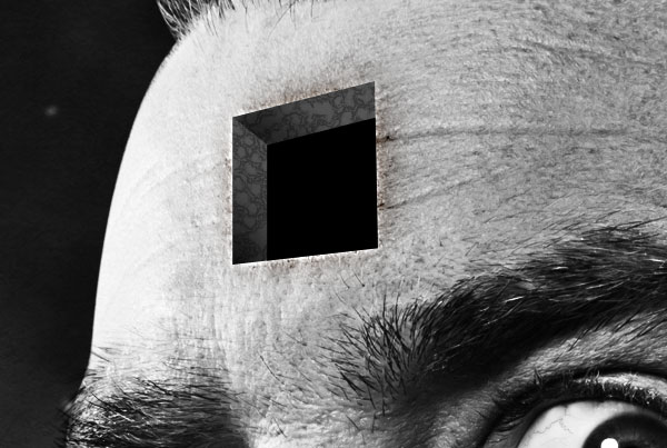
Last time we looked at setting up a simple AR environment, creating a cube, applying materials to the cube and the “hole in the wall” effect.

Today we will be building on that knowledge and creating the final as shown in the demo. To create that final effect, we need to know how to render spheres, animate objects, play sound effects and finally, render 3d objects. Rendering 3D objects in the palm of your hand is the main reason why Augmented Reality has become a big hit this year, especially when you create some of the more interesting shapes or animate them. If you are in the UK you may have seen The Gadget Show recently where they featured Augmented reality and had an animated version of Suzi Perry that you could hold in your hand. Very nice.

So let’s get down to business. I’ll be starting with the world and stars render first of all, then moving on to animating the shapes and finally creating the cow. Open up your files from last time and let’s get creating.


Step 1: Download the World

source: Nasa

Source: NASA Visible Earth. Credit: Reto Stöckli, Robert Simmon.

Download the 2048x1024px version of the image above from the NASA Visible Earth page and call it map.jpg. Place it into the following folder: deploy > assets. This is the same folder where you saved the images for the inside of the cube in the last part of the tutorial. This lovely image of the world came from NASA. They take good photos don’t they?


Step 2: Creating a Sphere

In your code, navigate to where we set up the “hole in the wall” effect for Marker 0 last time. Just after the “hole in the wall” code, add in the following code:

var Earth:Sphere = new Sphere(earth, 40);
Earth.z=200;
dispObj.addChild(Earth);

Step 3: Mapping the World

Now that we have set up a sphere, it needs a texture. This is done in the exact same way as mapping a texture to a cube. Notice how in the set up for the sphere, it’s looking for something called “earth” this is our texture variable.

Navigate in the code to where we set up materials before. Add to that code the following line:

var earth : BitmapFileMaterial = new BitmapFileMaterial("assets/map.jpg");

Just the same as the others.
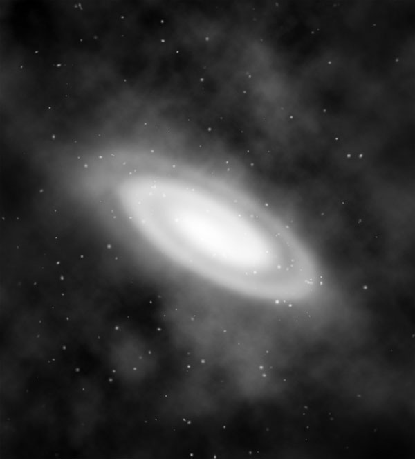
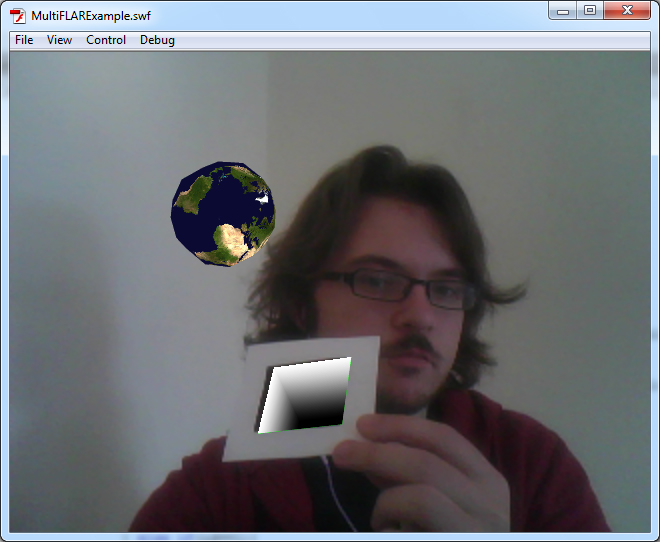
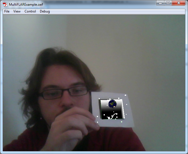
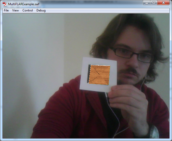
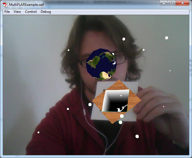

Step 4: Test it!

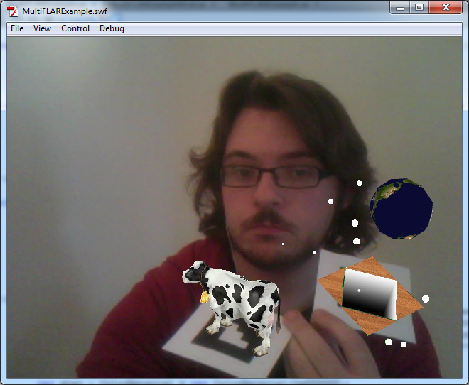
When you test it, you should see something like the following image (but of course without that handsome devil holding up the marker for you):

source: A very white room

Just as last time, you’ll need to download the marker image and print it off with plenty of white space around the edges.


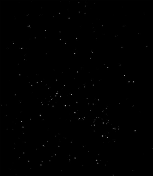
Step 5: Stars in Your Eyes

Now what would a space image be without some stars? Let’s add some in shall we? This is possibly the most tedious part for me to write up since all the stars need to be individually positioned. But you cheeky rascals get the benefit of copy and paste.

Add in the following code after the earth render code:

var star1:Sphere = new Sphere(star, 4);
star1.z=65;
star1.x=84;
star1.y=164;
dispObj.addChild(star1);

var star2:Sphere = new Sphere(star, 3);
star2.z=246;
star2.x=32;
star2.y=64;
dispObj.addChild(star2);

var star3:Sphere = new Sphere(star, 2);
star3.z=163;
star3.x=78;
star3.y=98;
dispObj.addChild(star3);

var star4:Sphere = new Sphere(star, 4);
star4.z=120;
star4.x=164;
star4.y=157;
dispObj.addChild(star4);

var star5:Sphere = new Sphere(star, 2);
star5.z=148;
star5.x=-164;
star5.y=-157;
dispObj.addChild(star5);		

var star6:Sphere = new Sphere(star, 3);
star6.z=46;
star6.x=-36;
star6.y=-156;
dispObj.addChild(star6);

var star7:Sphere = new Sphere(star, 5);
star7.z=40;
star7.x=-16;
star7.y=-84;
dispObj.addChild(star7);

var star8:Sphere = new Sphere(star, 5);
star8.z=59;
star8.x=-84;
star8.y=30;
dispObj.addChild(star8);

var star9:Sphere = new Sphere(star, 4);
star9.z=87;
star9.x=-134;
star9.y=84;
dispObj.addChild(star9);

var star10:Sphere = new Sphere(star, 2);
star10.z=49;
star10.x=10;
star10.y=18;
dispObj.addChild(star10);

var star11:Sphere = new Sphere(star, 5);
star11.z=94;
star11.x=-84;
star11.y=41;
dispObj.addChild(star11);

var star12:Sphere = new Sphere(star, 3);
star12.z=54;
star12.x=91;
star12.y=-46;
dispObj.addChild(star12);

var star13:Sphere = new Sphere(star, 2);
star13.z=180;
star13.x=88;
star13.y=-130;
dispObj.addChild(star13);

var star14:Sphere = new Sphere(star, 4);
star14.z=102;
star14.x=134;
star14.y=-13;
dispObj.addChild(star14);

var star15:Sphere = new Sphere(star, 1);
star15.z=61;
star15.x=-35;
star15.y=145;
dispObj.addChild(star15);

Phew, that”s quite a lot. Of course, you can add more if you want more stars. Or just use a loop an array to add an arbitrary number.


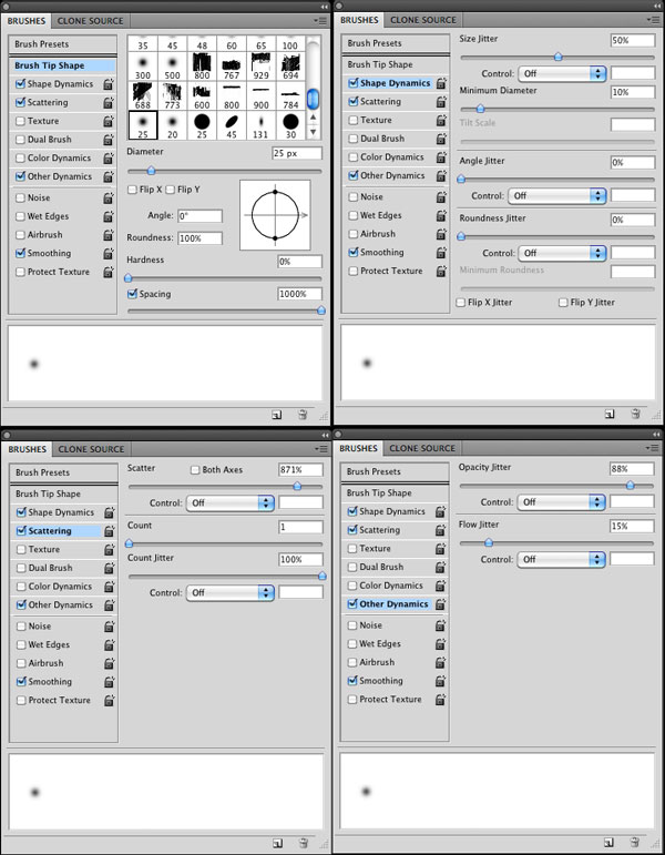
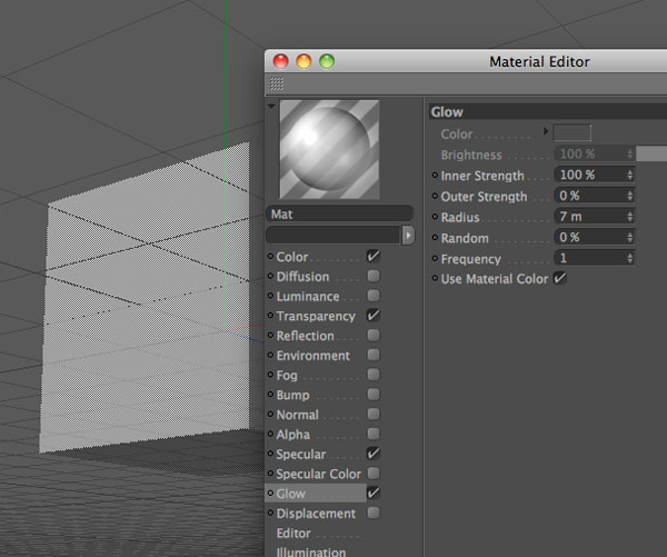
Step 6: Color the Stars

Now we need to add a material for the stars. Add the following with the other material code:

var star : ColorMaterial = new ColorMaterial(0xFFFFFF);

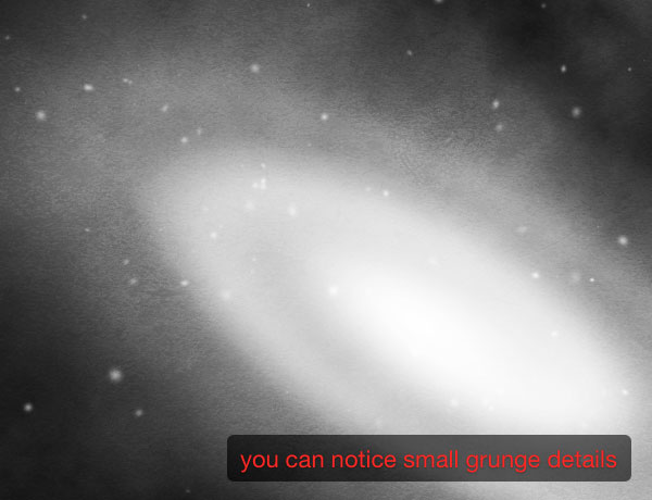
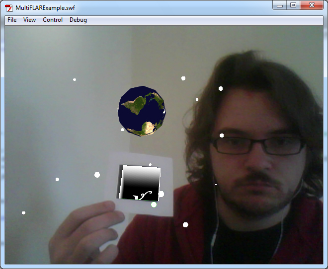
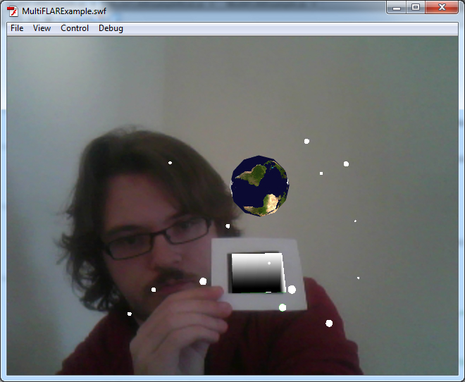
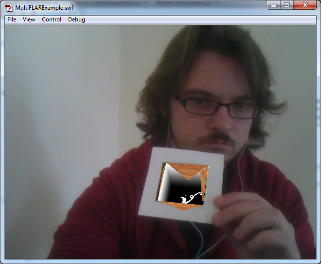
Step 7: Testing Time!

Test the flash movie and hopefully you’ll see something like this:

source: A very white room

Step 8: Trapped in a Box

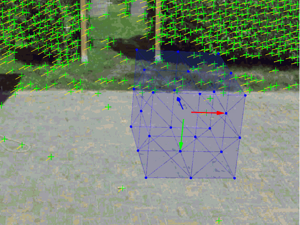
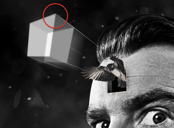
Wouldn’t it be cool if, say, we could have the space scene we just created, be trapped in a little box held within the marker and then explode out? Well you’re in luck, and probably saw the outcome as that’s exactly what we are going to do.

It’s fairly simple to animate things in AR. Especially if you just want to move them from one point to another like we want to. To do this, we need to download some extra classes for Flash. GreenSock do a very nice series of animation libraries that help us easily move objects from one point to another.

Head over to greensock.com and download the AS3 TweenMax library.


Step 9: Importing a new Library

Once you have downloaded the TweenMax library, you need to extract the .zip file and place the greensock folder into src > com of our project. This is where the squidder library is also kept. Extract here and all will be just swell.

Now move back over to Flash. Add the following line at the top of your code with the other import lines:

import com.greensock.*;

Now you have access to the GreenSock library.


Step 10: Animating the Earth

Find the code where you set up the Earth variable. Replace it with the following code:

var Earth:Sphere = new Sphere(earth, 1);
Earth.z=-40;
TweenMax.to(Earth, 4, {scaleX:40, scaleY:40, scaleZ:40, z:"200", delay:4});

What I’ve done here is alter the Earth’s starting point and size so that it’s very small and inside the box. TweenMax is a great animation class. Here we set up which variable to animate (Earth), how long it will take in seconds (4), by how much it should scale up the variable, its z point and finally how long it should wait before animating. This is set to 4 so that we can animate other things first.


Step 11: Animating the Stars

Replace all your star setup code with the following:

var star1:Sphere = new Sphere(star, 1);
star1.z=-40;
TweenMax.to(star1, 4,{scaleX:1, scaleY:1, scaleZ:1, x:"84", y:"164", z:"65", delay:4});
dispObj.addChild(star1);

var star2:Sphere = new Sphere(star, 1);
star2.z=-40;
TweenMax.to(star2, 4,{scaleX:3, scaleY:3, scaleZ:3, x:"32", y:"64", z:"246", delay:4});
dispObj.addChild(star2);

var star3:Sphere = new Sphere(star, 1);
star3.z=-40;
TweenMax.to(star3, 4,{scaleX:2, scaleY:2, scaleZ:2, x:"78", y:"98", z:"163", delay:4});
dispObj.addChild(star3);

var star4:Sphere = new Sphere(star, 1);
star4.z=-40;
TweenMax.to(star4, 4,{scaleX:4, scaleY:4, scaleZ:4, x:"164", y:"157", z:"120", delay:4});
dispObj.addChild(star4);

var star5:Sphere = new Sphere(star, 1);
star5.z=-40;
TweenMax.to(star5, 4,{scaleX:2, scaleY:2, scaleZ:2, x:"-164", y:"-157", z:"148", delay:4});
dispObj.addChild(star5);

var star6:Sphere = new Sphere(star, 1);
star6.z=-40;
TweenMax.to(star6, 4,{scaleX:3, scaleY:3, scaleZ:3, x:"-36", y:"-156", z:"46", delay:4});
dispObj.addChild(star6);

var star7:Sphere = new Sphere(star, 1);
star7.z=-40;
TweenMax.to(star7, 4,{scaleX:5, scaleY:5, scaleZ:5, x:"-16", y:"-84", z:"40", delay:4});
dispObj.addChild(star7);

var star8:Sphere = new Sphere(star, 1);
star8.z=-40;
TweenMax.to(star8, 4,{scaleX:5, scaleY:5, scaleZ:5, x:"-84", y:"30", z:"59", delay:4});
dispObj.addChild(star8);

var star9:Sphere = new Sphere(star, 1);
star9.z=-40;
TweenMax.to(star9, 4,{scaleX:4, scaleY:4, scaleZ:4, x:"-134", y:"84", z:"87", delay:4});
dispObj.addChild(star9);

var star10:Sphere = new Sphere(star, 1);
star10.z=-40;
TweenMax.to(star10, 4,{scaleX:2, scaleY:2, scaleZ:2, x:"10", y:"18", z:"49", delay:4});
dispObj.addChild(star10);

var star11:Sphere = new Sphere(star, 1);
star11.z=-40;
TweenMax.to(star11, 4,{scaleX:5, scaleY:5, scaleZ:5, x:"-84", y:"41", z:"94", delay:4});
dispObj.addChild(star11);

var star12:Sphere = new Sphere(star, 1);
star12.z=-40;
TweenMax.to(star12, 4,{scaleX:3, scaleY:3, scaleZ:3, x:"91", y:"-46", z:"54", delay:4});
dispObj.addChild(star12);

var star13:Sphere = new Sphere(star, 1);
star13.z=-40;
TweenMax.to(star13, 4,{scaleX:2, scaleY:2, scaleZ:2, x:"88", y:"-130", z:"180", delay:4});
dispObj.addChild(star13);

var star14:Sphere = new Sphere(star, 1);
star14.z=-40;
TweenMax.to(star14, 4,{scaleX:4, scaleY:4, scaleZ:4, x:"134", y:"-13", z:"102", delay:4});
dispObj.addChild(star14);

var star15:Sphere = new Sphere(star, 1);
star15.z=-40;
TweenMax.to(star15, 4,{scaleX:1, scaleY:1, scaleZ:1, x:"-35", y:"145", z:"61", delay:4});
dispObj.addChild(star15);

This will animate your stars from a hidden start point to their final positions. Again, I’ve altered the stars’ z-positions so that they start inside the box.


Step 12: Test it!

Let’s test the Flash movie again. You should have a nice animated transition from nothing to the earth and stars exploding out of the box we trapped them in.

source: A suspiciously white room

Step 13: It’s all a Cover up!

For the box lid that will open up and have the Earth and stars explode out, we will use four images. I use a wooden panel look for my box but feel free to create your own. Here are the images I made, download these and save them into deploy > assets.

source: I made this.

Save as top.png

source: I made this.

Save as bottom.png

source: I made this.

Save as left.png

source: I made this.

Save as right.png


Step 14: Create the Box Lid

Beneath where we set up the stars, add the following code:

var top:Cube = new Cube( new MaterialsList( {all: Top} ) , 80 , 0 , 80 );
top.z=0;
top.y=40;
TweenMax.to(top, 2,{rotationX:-180, delay:2});
dispObj.addChild(top);

var bottom:Cube = new Cube( new MaterialsList( {all: Bottom} ) , 80 , 0 , 80 );
bottom.z=0;
bottom.y=-40;
TweenMax.to(bottom, 2,{rotationX:180, delay:2});
dispObj.addChild(bottom);

var left:Cube = new Cube( new MaterialsList( {all: Left} ) , 80 , 0 , 80 );
left.z=0;
left.rotationZ=90;
left.x=-40;
TweenMax.to(left, 2,{rotationX:180, delay:2});
dispObj.addChild(left);

var right:Cube = new Cube( new MaterialsList( {all: Right} ) , 80 , 0 , 80 );
right.z=0;
right.x=40;
right.rotationZ=90;
TweenMax.to(right, 2,{rotationX:-180, delay:2});
dispObj.addChild(right);

This sets up all the parts that make up the box lid, positions them correctly and animates them. Great stuff.

Each “cube” is set to have a depth of zero (the third argument in the constructor), so they appear to be flat planes.


Step 15: Lid Material

In the material section, add the following code:

var Top : BitmapFileMaterial = new BitmapFileMaterial("assets/top.png");
var Bottom : BitmapFileMaterial = new BitmapFileMaterial("assets/bottom.png");
var Left : BitmapFileMaterial = new BitmapFileMaterial("assets/left.png");
var Right : BitmapFileMaterial = new BitmapFileMaterial("assets/right.png");

Now the lid will look the part. I’m sure you noticed that the left and right images are rotated and then I rotate them back again in the code in Step 14. You are probably wondering why I did that instead of just leaving the images as they were. Well, there’s a reason for that. They won’t work correctly unless you rotate them. It’s an odd bug, but the images turn up backwards when rendered and when you apply an animation to them they go the wrong way. Rotating them first and then back in the code makes them work as they should. It’s quite odd, but there you go.


Step 16: Testing!

Now all the parts are ready for another test, it’s all coming into place. I’m sure you’re making all sorts of oohing noises right now. Marvelous.

source: The whitest of white rooms

Step 17: This Needs Some Drama

If you’re like me, you’re looking at this thinking, wow that’s great, but it really needs some more drama. Well we’re going to do just that. Let’s add some dramatic music when the box opens.

Go to the Hollywood Edge sound effects library and download BrightPad.wav. (It’s not included in the Source download.) I’ve converted this to an MP3 called “dramatic.mp3″ but you can follow these instructions while keeping it as a WAV.

Save it to the folder deploy > assets.


Step 18: Adding in the Sound

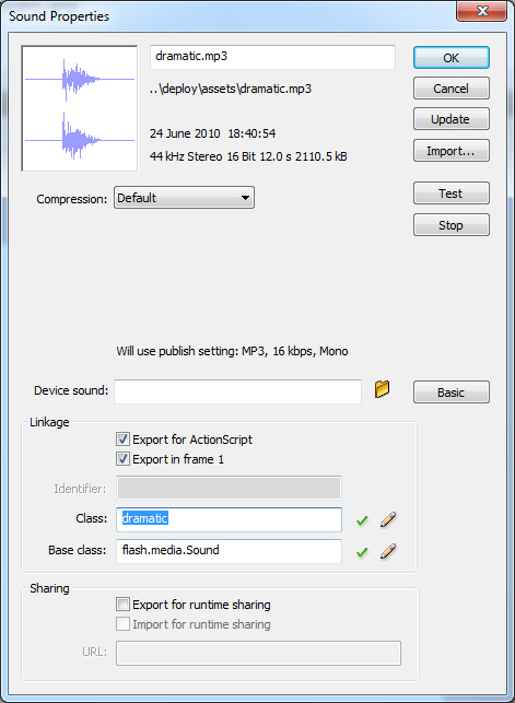
Open up the .fla file and go to File > Import > Import to Library. Import dramatic.mp3.

Open up your library and you should see your newly imported file sitting right there.

Right-click on it and click on Properties. Check the “Export for ActionScript” box. The class box should now become active; type in it “dramatic” without the quotes.

source: Flash cs4. A property menu

Step 19: More Coding

Return to the .as file. At the top of the file, find the import code. Add the following import code:

import flash.media.SoundMixer;
import flash.media.SoundChannel;

A little further down, there are some private vars. You may remember this from last time when we set up the green cube. Add the following code to the private vars:

private var drama:dramatic = new dramatic();
private var dramaChnl:SoundChannel = new SoundChannel();

Now what we have done here is to set up the sound file “dramatic” and a sound channel. The sound channel allows starting and stopping of the sound through code.


Step 20: Playing the Sound

Since we only want the sound to play once (when the box opens and not every time we show the marker) you need to put the following code with all the shape set up code. I put mine just after I set up the box lid.

dramaChnl = drama.play(0,1);

This plays the sound once when the lid opens.


Step 21: Testing!

The sound should now play and hopefully it will feel very dramatic indeed.

You should feel very pleased with yourself right now, you have created something you can impress your friends with.


Step 22: Cows!

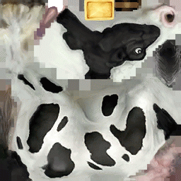
Now we get to the part where we render a 3d cow that you can hold in your hand. First of all, you need to download the following two files, save them in the usual place:

source: Not a real cow skin

The texture, which you should save as Cow.png and the cow model file which you need to save as cow.dae.


Step 23: Setting up the Cow

At the top of your file, you need to add an import. Add the following line:

import org.papervision3d.objects.parsers.Collada;

Find the private vars a little further down and add the following:

private var cowSkin: BitmapFileMaterial;
private var cowMat: MaterialsList;
private var cow: Collada;

Step 24: More Setting Up

We are going to load the cow up onto a second marker. This is to show you that this method of loading different objects onto different markers is fairly robust and can handle not only shapes but 3d complex objects too.

Remember in the previous part of the tutorial, we had four markers on a single sheet of paper, and created different colored cubes for each marker? We’re going to re-use that code to let us use a separate marker for the cow and the Earth.

Navigate through your file until you find else if (id ==1){ – the check for the second marker.

Replace everything within the two curly brackets with the following code:

cowMat = new MaterialsList();
cowSkin  = new BitmapFileMaterial("assets/Cow.png");
cowMat.addMaterial(cowSkin,"all");

//Create the new Collada Object with cowMat
cow = new Collada("assets/cow.dae",cowMat);
cow.rotationX = 90;
cow.scale = 0.5;
dispObj.addChild(cow);
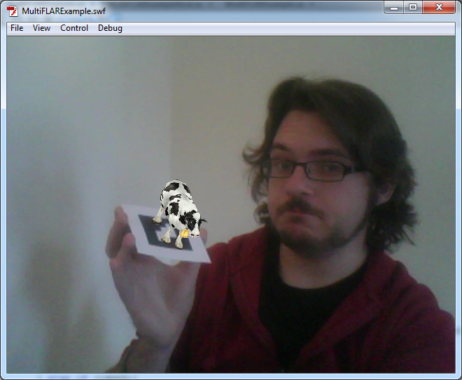
Step 25: Testing!

Yes, more testing already, wasn’t that quick. Download and print out the second marker. If all goes well, you should be the proud owner of a new little 3d cow. Congratulations!

source: This room is oh so white

Step 26: Is That Cow on Moo-t?

It’s great that we have such a nice looking cow, but wouldn’t it be better if the cow were to moo?

Go to this directory of files from a CD called, The Best Of Tucows, Volume 2 – and download MOO.WAV. (It’s not included in the Source download.)

Save it in the usual place as moo.wav.

Head on over to your .fla file and import the file to your library. Just like you did with the last sound file you imported, open up its properties, tick Export for ActionScript and change its class to mooSnd.


Step 27: Moo-sic to my Ears

Navigate to the private vars and add the following lines of code:

private var moo:mooSnd = new mooSnd();
private var mooChnl:SoundChannel = new SoundChannel();

Now, for this marker, I want the sound to play every time the cow appears but to only play once. To do this, you need to add the code to play the sound in a slightly different place than we did last time.

Find this line in your code:

private function _addCube( id:int , index:int ) : void {

We want to add our code just after this. By taking the following out of the shape set up code, it will play every time that ID is found rather than when the shape is set up, which only happens once.

Add this code:

if(id==1){
	mooChnl = moo.play(0, 1);
}

Conclusion

Test the file for the last time and the cow should moo. You can even use both markers at the same time and be super swish.

source: One handed, oooh yeah.

I hope you’ve enjoyed this two part tutorial on Augmented Reality and hope that you can go off now and create some very cool things.

Creating a Next-Gen Video Game Hot Rod: the Complete Workflow – Day 9

Today, one of our most popular tutorial series ever comes to an end, as we present the final part of Laurens Corijn’s incredible 9-day Hot Rod tutorial. In this part, Laurens takes us through how to finalise the remaining textures and take our model to completion!

This tutorial is Day 9 in a series – Go to Day 1, Day 2, Day 3, Day 4, Day 5, Day 6, Day 7 , or Day 8.


Video 1

Download

Note: click the ‘Monitor’ icon to view tutorial in full-screen HD.


Video 2

Download

Note: click the ‘Monitor’ icon to view tutorial in full-screen HD.


Video 3

Download


Video 4

Download

Note: click the ‘Monitor’ icon to view tutorial in full-screen HD.


Video 5

Download

Note: click the ‘Monitor’ icon to view tutorial in full-screen HD.


Video 6

Download

Note: click the ‘Monitor’ icon to view tutorial in full-screen HD.

We hope you enjoyed the series, and we’d love to see your results in the comments!

This tutorial is Day 9 in a series – Go to Day 1, Day 2, Day 3, Day 4, Day 5, Day 6, Day 7 , or Day 8.


Don’t miss more CG tutorials and guides, published daily – subscribe to Cgtuts+ by RSS.

Maximize Your Android Cell Phone Battery Life

No matter how great and feature-rich a phone is, once the battery goes down, it is as good as the toy you bought your kid for a few bucks. It is no surprise that most of the modern phones can’t boast of the battery power our good old phones, sans all the multi-media features, used to have.

So, if you’ve got a shiny new Android phone and love playing with it, it’d be a prudent to step to acquaint yourself with some tips that could maximize its battery life. The How-to Geek blog has a comprehensive article that should help you with the process. Check out the following guide to Android cell phone battery life extension.

Complete Guide to Maximizing Your Android Phone’s Battery Life