Mastering Elements Part 2: The Mastering Equalizer

As many of you will know by now mastering is a subject with many facets. Learning how to successfully treat your tracks after your mix is complete generally requires a good amount of experience but some solid technique will get you going in the right direction.

To get this essential theory embedded I have decided to chop a typical mastering chain into nice bite-sized pieces. This way we can focus on each processor one at a time. At the end of the series we’ll look at the whole chain in action. This tutorial concentrates in the all important equaliser and it’s role in a typical mastering session.

I have not supplied any audio examples here as the clips in the previous part of this series were pretty hard to tell apart if I’m honest. I plan to show the full mastering chain action in the final part of this series.


Step 1: Picking the Right EQ

When it comes to picking the right EQ for your mastering chain many of you may be looking for a dedicated mastering processor. Although there is hardware and software products that are labelled as such, the truth is any decent EQ plug-in can be used. Obviously sonic integrity is paramount here so the best you can afford is usually a good guideline to stick to. Saying that there are some really excellent equalisers that won’t break the bank.

Although ‘dedicated’ mastering EQs can include some very handy features for shaping your final mix, what we are looking for here is a clean interface, pristine signal path and plenty of flexibility. For those of you new to the area of mastering a spectrum analyser can always be useful as well.

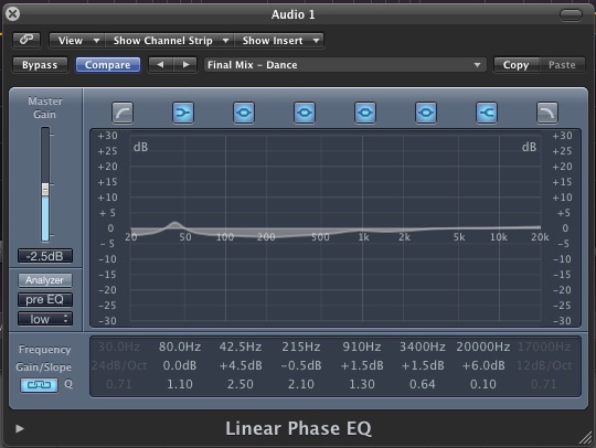
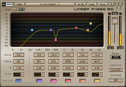
Logic’s linear phase EQ is more than capable of performing mastering equalisation.

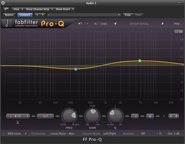
It’s highly likely that you already have something in your plug-in collection that meets these criteria. You may even have something bundled with one of your DAWs thats up to the job. Logic’s ‘Linear Phase EQ’ for example is certainly suitable. If you are finding it difficult to come up with the goods you might want to take a look at something like Fabfilter’s excellent ProQ plug-in. This features everything the budding mastering engineer will need and it’s very reasonably priced too.

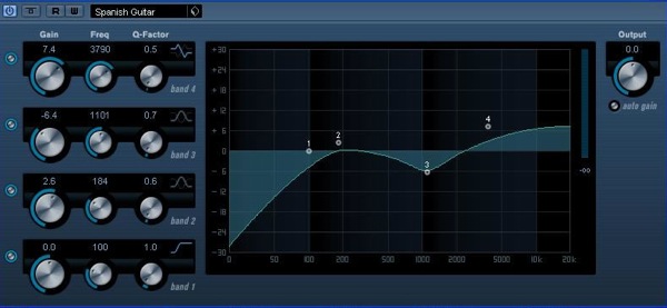
Fabfilter’s Pro Q is a great choice for the budding mastering engineer and has a rich feature set.


Step 2: Modes, Latency and Physical Models

Before we get into any EQ techniques let’s have a little look at the various options a lot of more advanced plug-ins may offer.

The first thing to think about is the algorithm our EQ is using. Now most run of the mill EQ plugs will use something called phase distortion to create their final effect, this process essentially adds noise to the signal and is a pretty brutal way of enhancing a sound. The upside is that it can often add character and induces extremely low latency values due to the small amount of CPU resources this process uses.

Most stock DAW EQ plug-ins will not be linear phase and will introduce some level of distortion.

This sort of rough and ready EQ is just fine during the mix stage, especially on non crucial elements. In fact these plug-ins can reduce CPU usage and help keep latency to a minimum, so usually its a green light. When it comes to mastering we might want to be a little more selective and a more refined approach is often needed.

You may have heard of linear phase equalisers. Without going too heavily into any maths, these plug-ins use a process that create absolutely no phase distortion when applying equalisation. This means they are perfect for mastering duties but the extra number crunching does mean high latencies and CPU loads. Of course during mastering this rarely an issue as all your mixing and performance has been completed.

Linear phase EQs offer a totally transparent result.

So long story short, if you have the option, go for a linear phase EQ plug-in as opposed to a bog standard stock version. Most DAWs include them and plug-ins like Fabfilter’s Pro Q that I recommended in the previous section have an option to engage linear phase processing.

There are some situations when you may want to consider using an EQ that actually compromises your signal path somewhat, now I know this goes against the grain but stay with me. Some equalisers use physical modelling to recreate the sound of specific hardware and this modelling gives us the ‘warm’, ‘phat’ sound we love but in reality these qualities are just the sound of random anomalies and saturation (i.e. distortion) introduced by the modelling algorithms.

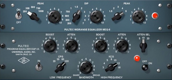
Using physical modelled equaliser plug-ins can add character and warmth to your master.

So the question you have to ask yourself is do you want a coloured, characterful equaliser or a clean, transparent one. The choice is very much a creative one and the results are subjective but if you are in any doubt here I would advise a nice clean linear phase model. When it comes to mastering transparency is generally the better option.


Step 3: Less Is More

When it comes to enhancing or attenuating frequencies in our master less really is more. Not only should you be using small amounts of EQ but also low ‘Q’ values. This means we are working with large, broad brush strokes and ultimately we should be able to manipulate our master without over colouring it or any frequency becoming hyped or over cooked.

There are generally no hard and fast rules in mastering but as a guideline if you are adding more than about 3-4dB in any one frequency band you may want to think about why. It’s highly likely that the need for extreme equalisation in the mastering stage means that something is wrong at mix level. Remember in most cases you can go back and alter things and this is often a much healthier approach than adding large amounts of processing.

Adding and subtracting around 2-3dB as far as you want to go when mastering.

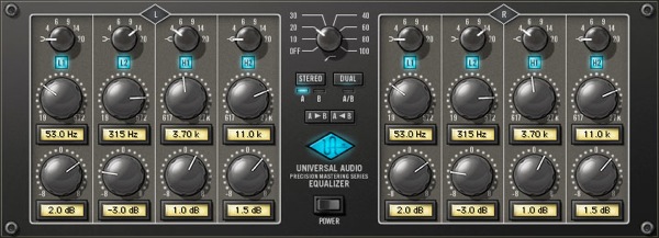
Some dedicated mastering EQs only supply limited scope for adding processing in watch band for this very reason. If you look at Universal Audio’s precision mastering EQ for example, you’ll notice that not only do the gain knobs move in 0.5 dB increments but there is only the option to add up to 8dB in each band. This is nothing compared to the 20dB+ some modern EQ plug-ins are capable of.


Step 4: Nice Curves

As well as small amounts of boost and cut you should also try to stick to low ‘Q’ values when mastering. This means gentle sweeping curves and avoiding any unnecessary peaks. This subtle approach combined with small amounts of boost gives us equalisation at its most transparent.

These settings will ensure you change the qualities of groups of instruments as opposed to one specific area. This will not only blend instruments but also add extra cohesion to your mix which is always welcomed at this stage.

Low Q points mean that larger areas are effected and the result is more transparent.


Step 5: The Final Cut

One part of mastering equalisation that is hugely important is the use of a solid high pass filter. This is something that a lot of novices forget and it can effect your final outcome in a few ways, none of them good.

Even the largest sound systems go down to around 30Hz and this is low, very low. Your average nearfield and even mid-field motors will go down to around 40Hz and active subwoofers to about 30-35Hz. With all this in mind it’s usually pretty sensible to filter off any subsonics below around 30Hz, if you feel this is too high then move down to 25Hz. But make sure that you remove some of these super-low subs.

Cutting very low frequencies can give you a more concise low end mix and allow other processors to work at full effect.

Low frequency energy this far down moves extremely slowly and although you can’t hear it can push a huge amount of energy into mastering processors, forcing them to deal with it. This can cause general mayhem all the way down your signal path but is especially troublesome to the final brick wall limiter, robbing it of the ability to produce that all important loudness.

So make sure you have a high pass filter in place and if you are concerned with these frequencies re appearing later in your chain, after some heavy processing there is no harm in inserting another down the line.


Quick Tip: How to Record Loops from Reason

Sometimes you just don’t want to work with MIDI. I must admit, I’m not the biggest fan of midi notes. Having too many synths open at one time eats up your CPU power and looking at long bars of MIDI notes is just much less flattering than the audio waveform. Maybe I’m the only one who likes the form of a waveform but anyway, sometimes it’s just better to render your MIDI to audio.

In the following quick tip I’m going to go through a very basic process of recording a loop into a Logic Pro audio track from Reason’s Dr. Rex loop player. This doesn’t only come in handy with recording loops, but is actually more convenient when you want to play through any of the synths available in Reason but record them into Logic.


Step 1: Logic Pro & Reason

To make sure you are using Reason as a slave to Logic you must first open up Logic Pro and then open up Reason. After you open up both programs go ahead and create a new session for both programs. When you create a new session in Reason it usually creates a session with the 14:2 mixer already set up. Insert the Dr. Rex loop player and select a loop from your loop library. Don’t worry too much about the routing to the mixer. Just make sure that the loop is coming out of the master bus of the mixer.

Hit the preview button and make sure that your loop is playing by watching the meters. You shouldn’t be hearing anything yet.


Step 2: Route Reason to Aux

Now we are going to create an aux track in Logic. We need to set the input of the aux track to the master bus of Reason. In the mixer window of Logic Pro create a new aux track by selecting Options>Create New Auxiliary Channel Strip. Now we have an aux track to feed our loop into.

Select the input of the aux track and find the Reason folder in the input window that pops up. Since the loop is coming out of the mixer’s L/R main bus we can just select the RW:Mix L/R for now. If you were routing a keyboard synth of some sort to a different channel in Reason that you wanted to record you would have to select the appropriate channel. But for now, L/R works nicely.

Notice in the picture that the channel fader is turned all the way down. This is a common stupid mistake that everybody makes when they wonder why there is no sound. For some reason we always forget to check our volume knobs.

Be sure to turn it up before you take the next step.


Step 3: Send Your Loop to an Audio Track

Now, if we have the loop running in reason and everything patched correctly with the fader up we should be hearing the loop come through into Logic. Because this is an aux track we can’t just hit record and be done with it. We need an audio track to record audio. Therefore, we use the sends on the aux track and send the loop to a bus. Select Bus 1 and turn the send to unity gain. The easiest way is to click the send button while holding down the ALT key. That way it instantly pops up to unity gain.


Step 4: Inputting Your Audio Track

Now we need an audio track that can receive this audio. Create a new audio track and select its input to Bus 1.

Now we should have an aux track that’s being fed by Reason. From the aux track we send the loop to an audio track via a send. By selecting the same bus as the send in the audio track we can receive the audio from the aux, hit record and end up with our loop in audio form.


Conclusion

Recording loops like this might sound fairly basic but it can come in handy for a lot of things. It’s also very convenient to record any synths, pianos or other sounds from Reason into Logic so you can concentrate on processing everything using only one computer program, focusing your efforts and saving your processing power at the same time.


12 Books That Audiotuts Readers Love

Making music can be both intuitive and technical, emotional and rational, so there is always something to learn. In a recent Open Mic, Audiotuts readers shared which books have been most useful in their musical education.

Here is a list of 12 books – actually there are more, since some recommendations are sets of books – that were recommended in the comments to that Open Mic. With the comments, I’ve included a brief summary of each book, and a link to Amazon (or elsewhere) where you can buy the book. Buying from Amazon helps support Audiotuts in a small way.


1. Bobby Owsinski’s Audio Books

Bobby Owsinski’s books are well-known. We gave a copy of each book away earlier in the year, and many of you expressed your appreciation for his books in the comments of those competitions. Learn more about them from Bobby’s site.

Bobby’s books include:

Comments from our Open Mic:

  • “Bobby Owsinski’s books are the absolute best for me. I always find them a good read.” (Robert)
  • “Bobby’s The Mixing Engineer’s Handbook is a great read as well.” (Björgvin)

2. “The Golden Ears Audio Ear Training Program” by Dave Moulton

An audio ear-training course for recording engineers, producers and musicians.

Buy it at KIQ Productions.

Comments from our Open Mic:

  • “I’ve been looking at the Golden Ears program from Dave Moulton and I have to say it’s helping here and there in different situations in sessions.” (Robert)
  • “Yeah, I’m a big fan of the Golden Ears program. They’ve helped me out immensely, although I haven’t gotten the chance to complete it. Those last few chapters look intimidating though, recognizing reverb and delay times.” (Björgvin)

3. “Modern Recording Techniques” by David Miles Huber & Robert E. Runstein

“The authors, both industry professionals, explore everything from microphone placement and studio design to desktop CD recorders and signal processing.” (Book News, Inc.)

Comments from our Open Mic:

  • A favorite book of Björgvin.

4. “Behind the Glass” by Howard Massey

In this prime collection of first-hand interviews, 37 of the world’s top record producers share their creative secrets and hit-making techniques – from the practical to the artistic. George Martin reveals the technical and musical challenges of working with The Beatles, while Phil Ramone, producer for such artists as Billy Joel, discusses studio wall treatments. Offering real-world advice on everything from mics to mixing to coaching a nervous singer, producers interviewed include Arif Mardin (Aretha Franklin), Brian Wilson (The Beach Boys), Alan Parsons (Pink Floyd) and more.

There are two books in the series:

Comments from our Open Mic:

  • “Howard Massey’s Behind the Glass I & II are inspiring to say the least.” (Björgvin)
  • “Anyone thinking about recording popular music should read “Behind the Glass”. (Sam)
  • “Behind the Glass by Howard Massey – a must read.” (The Modest Brothers)

5. “The Hal Leonard Recording Method” by Bill Gibson

Bill Gibson has created the only full recording course you’ll ever need, in plain-English, with easy-to-understand explanations of the entire recording process using both classic equipment and the latest state-of-the-art recording technology. Each of the six books has hundreds of pages of text, full-color photographs and illustrations, plus dozens of audio and video examples to aurally and visually illustrate everything taught across the entire course.

The series of books includes:

  1. Hal Leonard Recording Method Vol.1 Microphones and Mixers
  2. Hal Leonard Recording Method Vol.2 Instrument and Vocal Recording
  3. Hal Leonard Recording Method Vol.3 Recording Software and Plug-ins
  4. Hal Leonard Recording Method Vol.4 Sequencing Samples and Loops
  5. Hal Leonard Recording Method Vol.5 Engineer and Producing
  6. Hal Leonard Recording Method Vol.6 Mixing and Mastering

You can also purchase these books together as a 6-pack:

Comments from our Open Mic:

  • “The Hal Leonard Recording Method by Bill Gibson are amazing guides too, for easy to understand information.” (Björgvin)

6. “Mixing Audio: Concepts, Practices and Tools” by Roey Izhaki

Mixing remains one of the most illusive arts of recording practice and can take a life time to master. Looking at practices, concepts, tools and mixing instruments the author provides a comprehensive insight to the art and science of mixing.

The book is accompanied by the website www.mixingaudio.com, featuring a sample chapter, illustrations, audio and a user forum.

Comments from our Open Mic:

  • “I’ve always been fond of ‘Mixing Audio: Concepts, Practices and Tools’ by Roey Izhaki. It’s not terribly in-depth, but gives a good foundation and pretty much instantly made my mixes better. It gave me a better understanding of how certain things work (compressors, expanders, modulation, etc.) which definitely helped more than simply knowing what they do and how to use them (if that makes sense).” (David)
  • “Great book. It helps me clarify and learn a lots of things. The compression part really helped.” (LC)
  • The Modest Brothers also recommend this book.

7. “Mastering Audio: The Art and the Science” by Bob Katz

“In the book’s 22 chapters and 13 appendices, Katz presents a text that is clear and easy to understand with just enough mathmatics and ‘technical jargon’ to explain the technology behind the theory, philosophy, and methodology of the mastering processes, but without overwhelming the reader.” (Ron Streicher, Journal of the Audio Engineering Society)

Comments from our Open Mic:

  • “My number one choice is easy: Mastering Audio: The Art and Science by Bob Katz. Lots of fundamentals, certainly not just for mastering engineers.” (ngarjuna)

8. “Mixing With Your Mind” by Michael Paul Stavrou

“Two years in the writing, 20 years in the making. At last, Stav’s book of Closely Guarded Secrets of Sound Balance Engineering. Browse through the pages, have a look and a sniff.”

Foreword by Sir George Martin: “a remarkable insight into the most important piece of equipment in the recording studio – the human brain.”

Buy it at www.mixingwithyourmind.com.

Comments from our Open Mic:

  • “I’m currently enjoying ‘Mixing With Your Mind’ by Michael Paul Stavrou. Interesting ideas and a slightly different approach to the norm. Not finished yet, but quite inspiring.” (Pipecock Jackxxson)

9. “Quick Guide To Analogue Synthesis” by Ian Waugh

Even though music production has moved into the digital domain, modern synthesisers invariably use analogue synthesis techniques. The reason is simple – analogue synthesis is flexible and versatile, and it’s relatively easy for us to understand. The basics are the same for all analogue synths, and you’ll quickly be able to adapt the principles to any instrument, to edit existing sounds and create exciting new ones.

Comments from our Open Mic:

  • “A book that catapulted me over some of the hurdles of my understanding of music production was the ‘Quick Guide To Analogue Synthesis’ by Ian Waugh. If anybody reading this is really new to production and are just messing with samples, get looking into simple guides to analogue synthesis because this fundamental knowledge is the the key to making original sounds.” (Phil Blunt)

10. “Good Vibrations: A History of Record Production” by Mark Cunningham

From Elvis Presley’s “Heartbreak Hotel” through “Telstar”, Pet Sounds, Sgt Pepper’s Lonely Hearts Club Band, The Dark Side of the Moon, “Bohemian Rhapsody”, “Vienna”, “Two Tribes”, Zooropa, Older, to Britpop albums from Oasis, Kula Shaker, Cast and Radiohead, Good Vibrations follows the development of popular music recording from the perspective of the producers, engineers and session players.

Comments from our Open Mic:

  • “Absolutely love Good Vibrations by Mark Cunningham a history of record production with great recording techniques.” (The Modest Brothers)

11. “Temples of Sound: Inside the Great Recording Studios” by Cogan and Clark

All great music has a birthplace. Temples of Sound tells the stories of the legendary studios where musical genius and a magical space came together to capture some of the most exciting jazz, pop, funk, soul, and country records ever made. From the celebrated Southern studios of Sun and Stax, to the John Coltrane/Miles Davis sessions in producer Rudy Van Gelder’s living room, to Frank Sinatra’s swinging cuts at state-of-the-art Capitol Records, each of the 15 profiles in this book brings great music to life at the moment of its creation. With a trove of never-before-seen photographs and fascinating, all-new interviews with the musicians and producers who made the records, Temples of Sound is a rich inspiration for music fans.

Comments from our Open Mic:

  • “Temples of Sound by Cogan & Clark – another great one on the original techniques used in studios.” (The Modest Brothers)

12. “Production Mixing Mastering with Waves” by Anthony Egizii

Master the signal process techniques and learn the tricks for professional production in contemporary musical styles, including: R&B, Rock, Country, Alternative and Urban. This book offers a complete interactive training course featuring a 7 CD set of session files for use on Mac or PC with these popular applications: Pro Tools, Logic Audio, Cubase, Nuendo, and Sonar.

Comments from our Open Mic:

  • Recommended by The Modest Brothers.

Thanks to everyone who participated in the Open Mic and gave these recommendations. Have you read any of these books? Did we miss your favorite book? Let us know in the comments.


7 Free Digital Recording Apps for Windows

Being a musician can be expensive. With musical instruments, equipment and software you normally get what you pay for, and we want to sound good! So we pay, and pay big. But it’s good to know you can get some things for free.

This article was previously published on the AudioJungle blog, which has moved on to a new format in 2010. We’ll be bringing you an article from the AudioJungle archives each week.

Joel previously wrote an article called “8 Free, Cross-platform Apps for Musicians“, listing some really useful music utilities and programs that you can get at no cost. Many of you are Windows users, and pointed out that there is some useful Windows software that was not included in the article because it doesn’t cross-platform. Well, this article is for you!

Of course, Windows has its own problems when it comes to recording music. It can slow down over time, is susceptible to malware that slows it down further, and doesn’t have the best latency out of the box. Next week we’ll look at some ways of tuning your Windows box for the best results.

In the meantime, here are 7 digital audio recording apps for Windows:


1. KRISTAL Audio Engine

License: KRISTAL Audio Engine is free for personal, educational and non-commercial use. A commercial license is available. Website: www.kreatives.org/kristal.

From the website, “KRISTAL Audio Engine is a powerful multi-track recorder, audio sequencer and mixer – ideal for anyone wanting to get started with recording, mixing and mastering digital audio. It is designed as a modular system. The main application provides a mixing console, while the audio sequencer, live audio input and so on are loaded as separate Plug-Ins”

The program records up to 16 tracks at a maximum of a 192 kHz sample rate. It supports WAV, AIFF, FLAC, and OGG Vorbis audio formats. It includes plug-ins for sequencing, effects (including KristalMultiDelay, KristalChorus, KristalReverb, Kristalizer), and for using VST effects in realtime.

The program is no replacement for a high end DAW, but should get you started in the world of recording digital audio.


2. Wavosaur Free Audio Editor

License details on the website are sketchy, but the program is free to use. Website: www.wavosaur.com.

From the website: “Wavosaur is a free sound editor, audio editor, wav editor software for editing, processing and recording sounds, wav and mp3 files. Wavosaur has all the features to edit audio (cut, copy, paste, etc.) produce music loops, analyze, record, batch convert. Wavosaur supports VST plugins, ASIO driver, multichannel wav files, real time effect processing. The program has no installer and doesn’t write in the registry. Use it as a free mp3 editor, for mastering, sound design.”

I haven’t tried the program, so it’s difficult for me to compare it with KRISTAL. I’d be interested in your comments. The specs on the features page indicate it may be a better program. Like KRISTAL, it has a sample rate up to 192 kHz and support for VST effects, but there is no mention of a track limit like KRISTAL has.


3. Audacity

License: GPL (open source). Website: audacity.sourceforge.net.

This well-known program was mentioned in Joel’s article, and also deserves a mention here. It’s an awesome light-weight dedicated audio editor capable of editing multiple tracks. It supports Ogg Vorbis, MP3, WAV or AIFF sound files.

From some of the comments left on Joel’s article, it sounds like some of you use Audacity for just about everything. It’s the Swiss army knife of audio apps. I used it to MP3 my cassette collection years ago.


4. trakAxPC

License: Seems to be free of cost for any use. Website: www.trakax.com/software/pc.

Their website boasts, “TrakAx empowers you to create professional music and video mixes in an easy-to-use and fun environment. Whether you are creating a music track for your MySpace page or a video for YouTube, TrakAxPC is the most powerful FREE application on the web.” Features include beat matching, a drag-and-drop interface for mixing and adjusting tracks, and video editing features. Audio formats supported include WAV, MP3, OGG, and WMA.

Trakax.com’s website is very slick. If the software is comparable, it may just deserve a place in your software toolkit. It may be a great DAW to get started on. The site also sells royalty-free loops, beats and tracks for a price.


5. Aktiv MP3 Recorder

License: The software is listed as the “free version”, which is confusing, since I can’t find a version you pay for on the site. Website here.

This software doesn’t seem as professional as the other programs, and is described like this on the website: “Aktiv MP3 Recorder is an all-in-one audio software built to convey CDs, tapes, DVDs, live performances, TV, Internet radio, video games and any other sound source into audio files stored on your computer. The program supports a large variety of popular formats such as MP3, WMA, OGG, VOX, AU, AIFF.”

The program seems to be designed with home audio in mind: particularly converting records, tapes and TV shows to digital audio. It includes “smart silence detection”, which should help break music from records and tapes into multiple MP3 files automatically. The program may also be useful to musicians, especially those looking for a simpler program. If you try the program, let us know how useful you find it.


6. AVS Audio Editor

License: The software is listed as a “free download”. There is a registration cost to be able to use “all of their software”, but I don’t think that needs to be paid to use this program alone. Website: www.avs4you.com/AVS-Audio-Editor.aspx.

Update: WARNING! In the comments to the original article, Josh clarifies that the “free” version watermarks the output, and that the paid version only works on one computer and is not transferable. In my opinion these are deal breakers. Use at your own risk!

This program seems quite similar to Audacity. It is described on the website as a “feature-rich audio production software. AVS Audio Editor supports all key audio formats. It makes the program the complete tool for audio production. AVS Audio Editor will be interesting for professionals and amateurs, it is very easy to use, it enables you to perform a lot of operations without any difficulties.”

The program includes effects and support for VST effects, no limit to the number of tracks, and support for MP3, WAV, PCM, WMA, OGG, OGM and others. As a basic editor, it looks quite promising.


7. Quartz AudioMaster

License: Freeware. Website: Digital Sound Planet’s Quartz page isn’t behaving, but you can download the program from the Shareware Music Machine.

Software description: “Quartz AudioMaster Freeware is a powerful though easy-to-use multitrack recorder and MIDI sequencer, and the best way to try the Quartz Audio Family software concept for FREE. It is intended for people who want to record, compose, mix, play and share music using a computer and a sound card. It features 4 stereo audio tracks, 16 MIDI tracks, effect plug-ins, per-track EQ, Aux buses, Video sync, Score, GM/GS/XG and “Piano roll” editors and all the functionalities required to easily share musical projects across the internet up to its multitrack compressed file format.”

The program looks fairly full-featured, and includes MIDI sequencing. Some users report some lag (I assume with MIDI), but overall seem happy with the product.

Windows may complain about a missing wmdvi.dll file. The missing file can be downloaded from here.


7. Quartz Studio Free

License: Freeware. Website: Digital Sound Planet’s Quartz page isn’t behaving, but you can download the program from the Shareware Music Machine.

Another program from Digital Sound Planet’s Quartz range, but this time for those looking for a much simpler interface.

Software description: “Quartz Studio Free is an easy to use multi-track digital audio recorder, perfect for quick creation of music tracks or audio assembly and…. Free ! Moreover, it features the basic functionalities required to use the Digital Sound Planet Virtual Studios – also Freely available registering on the Digital Sound Planet site. The program also includes, among other features, 4+2 audio tracks, real-time processing effects (Reverb et Chorus) on each track, along with volume and pan, audio track data editing functions, a spacialization interface, Skin change, etc.”

Honorable mention: If you don’t mind spending a little more than zero, REAPER is an excellent multi-track audio and MIDI recording app with a non-commercial license for only $50. It’s not free, but it’s great value.

This article only scratches the surface of free music-related apps available for Windows. I’ll post a follow-up article in the future. Some cross-platform apps that work in Windows mentioned in Joel’s article that I haven’t repeated here include Traverso DAW and Frinika.

Feel free to mention your favorite free apps in the comments.


Workshop #64: After They Have Gone by Mothers Bad Son

At Audiotuts+ we irregularly put up a reader track for workshopping and critique (find out how to submit a track). This is how it works: you upload your song, and every week or so we’ll publish one here and step away from the podium. The floor is yours to talk about the track and how the artist can fix problems in and improve upon the mix and the song.

This track has been submitted for your friendly, constructive criticism. They have put their track (and their heart and soul) in your hands to learn and get useful feedback.

  • Do you enjoy the song or track itself? Does it have potential?
  • Can the arrangement be improved?
  • How did you find the mix? What would you do differently?
  • What do you enjoy about the rhythm track? What can be done to improve it?
  • Is the choice of instruments relevant and effective for the style/song?
  • Are the lyrics (if any) effective? Does the style, arrangement and genre of the song suit them?
  • Can you suggest any specific techniques that might improve the track?
  • Do you have any other constructive feedback?

After They Have Gone by Mothers Bad Son

Artist’s website: soundclick.com/mothersbadson

Description of the track:

I composed this song using an online “studio” called Jam Studio. Once I had the basic structure down I recorded the tracks in my home studio and mixed it down. I believe I ended up with 10 audio tracks and 4 MIDI tracks.

I have dedicated it to every musician, singer and recording artist that has passed before us, giving us songs that we will listen to forever.

My wish is for someone to play this song in 50 years and relate to its message long after I’m gone.

BTW a video of this song is here.

Rick Hansen
aka Mothers Bad Son

Download audio file (Aftertheyhavegone.mp3)

Terms of Use: Users can stream or download the track for the purposes of giving feedback.

Have a listen to the track and offer your constructive criticism for this Workshop in the comments section.


Submit Your Tracks for Workshopping

Need constructive criticism on your own tracks? Submit them using this form.


How to make a Reverse Glass Effect

Some sounds are ubiquitous standbys, familiar friends that even define and carry the name of a music genre. Others are rare sounds that catch your ears and surprise you. This tutorial is about one of those effects, it will show you how to make a “reverse glass effect” inspired by a sound from the soundtrack of Halo.

To be specific, the track I’m referring to is “Orbit of Glass” from the Halo 2 Soundtrack.


Step 1: Oscillators

We’ll begin by designing a stabby, high-pitched synth sound. Then we’ll play a pattern, render the audio file with reverb, and reverse it. This will be the result:

Download audio file (10revglass.mp3)

First, Load ZebraCM. This is a freeware synth that comes with Computer Music Magazine.

This is the default patch:

Download audio file (01revglass.mp3)

We’ll turn the volume of the first oscillator off, and change second oscillator’s waveshape to “12″, which is a rich-sounding waveform with a little bit of bite.

For a thicker sound, I’ll change the unison to Quad, and to make it higher, I’ll change the pitch by 36, using the Tune knob.

Download audio file (02revglass.mp3)


Step 2: Filter

Next we’ll work on the filter. ZebraCM’s KeyFollow feature makes the filter’s cutoff change according which key you’re playing, but we don’t want this in this situation. Let’s turn the KeyFollow knob to zero to make the filter cutoff sit permanently in one place. We’ll also change the Filter type to LP Middrive, and adjust the cutoff to 20. We’ll need to turn up the volume of the oscillator as well.

Download audio file (03revglass.mp3)

We want to adjust the sound so that it fades from bright to dim, but not as fast as it does now. We also want to make the sound a bit sharper, so that when it’s reversed it will have that “glassy” sound. We have to think backwards and adjust our parameters so that when played backwards it will start out dim, move quickly to a sharp sound and then fade slightly and abrubtly, much like the sound you get when sharpening knives. By default, the filter cutoff is linked to Envelope 2, and we’ll take advantage of it.

With this in mind, let’s adjust the Attack to 13, Decay 40, Sustain 60, and Release 40. I also recommend reducing this envelope’s Velocity knob, so that our note velocities don’t affect the filter envelope.

Download audio file (04revglass.mp3)


Step 3: Volume Envelope

We’ll shape the volume envelope similarly. Adjust the Attack to 16, Decay 35, Sustain 40, and Release 25. Also, let’s set this envelope’s Velocity knob to 100 to make the velocity-volume relationship stronger.

Download audio file (05revglass.mp3)


Step 4: Pattern

Now we’ll work on the pattern. The next steps we’ll take will change the sound dramatically, and it’s difficult to imagine how a pattern will be transformed by them. The best way to find a pattern that works is trial-and-error. I’ve found that the best patterns that work in this context are ones that move up or down a scale quickly and have a feel of acceleration or deceleration. I’ve also noticed that having a melodic zig-zag in faster parts is easier on the ears in this situation. Here is the pattern I made:

Download audio file (06revglass.mp3)

For those following along, this is at 100bpm. We’ll need to reverse the pattern so that we can bounce the sound with reverb and then later we’ll reverse that audio file to get the note order back to normal. Fortunately FL Studio has a flip tool (keyboard shortcut ALT+Y). Be sure to uncheck “Preserve start times”.

Download audio file (07revglass.mp3)


Step 5: Reverb

A bit of reverb is essential for this effect. It smooths the transition from silence and adds something special when the effect is reversed. Let’s load EpicVerb and start with the default patch. We’ll need quite a bit of the effect, so turn the DRY:WET balance to 50-50. Also increase the Predelay to 50ms, and increase the Time to around 1600 ms.

Download audio file (08revglass.mp3)

Now we can bounce the audio file. I recommend selecting the timeline in a way that gives the reverb effect some time to fade out.

If we bring the resulting file into the project and reverse it, here is the result:

Download audio file (09revglass.mp3)


Step 6: Spot Delay

It has the sound we’re going for, but it has a rather abrupt ending. We can fix this by using a technique called Spot Delay. To do this, we’ll need to link this audio clip to a Mixer channel, and then set up a Delay on a Send track. We’ll want to set the Dry Knob to zero, because we’ve already got the audio file sending to the Master track.

Next, select the audio file’s mixer track, and the send knobs should appear. Adjust the first send knob to hear the Delay effect. This knob allows us to send audio to the delay plugin.

Download audio file (10revglass.mp3)

Right now, the track is sending audio the whole time, but we can use automation to send only the parts we want. In this situation, all we wanted was to make the sound fade smoother, so let’s automate this knob to send only the end of the audio clip to the effect. Let’s also have a little bit of the beginning as well.

Download audio file (11revglass.mp3)


Final Tips

The Spot Delay technique can be useful in many situations. For example, you can send certain words in a sentence to the delay plugin or send only the snares in a complete drum mix, by opening and closing the send knob.

For a stereo effect, set up copies of the synth with slightly different pan settings and have the synths play different parts of the pattern.

To speed up the process of finding good note patterns in Step 4, consider bouncing three patterns at once (any more than that and it can be difficult to remember which is which with all the double reversing going on).

For a “glassier” sound, use very high notes and extreme high-pass filtering. This, plus a lot of delay feedback, was in the Halo sound.

Download the Play Pack for this tutorial (528 kB)

Contents

  • FL Studio Source Files


Quick Tip: Import From Audio File

Here’s a quick tip for a really obscure but quite helpful feature in Logic if your collaborating with someone on a project based in Logic.

Introduction

I totally stumbled on this the other day with a client who bought in some stems for a programming job. Unfortunately I found this after we’d finished!

The jist of this is that if somebody sends you just a raw .WAV or.aif file that’s been ‘Bounced’ in Logic you can extract some very useful information about the project it came from!

Step 1: Somebody Sends You An Audio File!

I get this all the time! Somebody sends or brings in a rough mix of a track to add some guitar or programming to, I either have to work out the tempo by hand or phone them to get it. To make matters worst it might have a load of tempo changes in it!

I can’t tell you the amount of times this has happened. Lining up bars with peaks in the audio file only to find it goes out half way through. This isn’t such a problem with live instrument takes as you can turn the click off and just play to the track, but for programming!!! Nightmare!

lineup

Now as most of my clients use Logic anyway I think this might be a thing of the past thanks to a nifty little feature that must have crept in to Logic without me knowing!

It’s called Import from Audio File.


Step 2: Get The Project Tempo Information

Import the .WAV or .AIF file into a new project. You can do this any way you like. In this case I’ve got a drum track about 40 seconds long. Now I don’t know any thing about this file. What’s the BPM? Does it have any tempo changes? What key is it in??? (Just kidding!)

outoftime

Logic defaults to 120bpm like most other programs. Listening to these drums against the click it becomes apparent very quickly it’s not at 120bpm!

Download audio file (outoftime.mp3)

If this track was bounced in Logic as a .WAV or .AIF (which it was) I can simply select the audio file and choose Options -> Tempo -> Import Tempo Information From Audio File.

importTempo

Bingo! Now you can see in the Tempo list all the information Logic embedded in the Bounce. As you can see there’s a lot of subtle hidden changes and a rall (rallentando) at the end. Try working that one out!

tempoStuff

Now when I play back the track it’s bang on!

intime

Download audio file (intime.mp3)


Step 3: Import the Marker Information

You can do the same for any embedded markers. This time select the audio file and choose Options -> Marker -> Import Marker From Audio File.

importMarker

And there you have it! Done!

markerResults


Dealing With Time Signatures

As of yet there is no way to import time signatures via the audio file, which is a shame. This would be incredibly useful, even more so than markers.

I’m sometimes presented with film cue stems that are laden with signature changes. I often get the Logic arrangement too, so thankfully now I can Import them via the ‘Selective Track Import’ function. Just choose File -> Import, select the Logic file you wish to import from and using the Browser choose ‘Global’.

sigImport

Selective Track Import, it’s really handy if you have the project file!

Before this was available it was a case of either copy and paste everything from one Arrange to another. Signature, Tempo, Markers, audio and MIDI. Or rebuild or Replace the environment of the Logic song. Why? Well everyone sets up Logic differently. Working with an unfamiliar Default layout or environment can waste a lot of time working out Ports, Outputs, ergonomics etc. Either way was a hassle!

For instance my setup use ‘Outputs 3-4′ as the main outs (Don’t ask! It’s a MOTU thing!!). The first thing I have to do it’s set all outs to ‘Stereo Out’ if it’s somebody else’s project file. Boring! Plus I just really like working in my default setup because I know exactly where everything is! OCD maybe!

If all you have is a rough mix/idea as an audio file to work with your going to be in for a bit of setup time! Being able to extract ‘the lot’ (signature, tempo, marker) from that file would be a true timesaver!! It would make collaborating in Logic super easy. Think of the size difference between an entire Logic project and a WAV file!


Conclusion

It’s worth noting you can export this data out to an audio file too without bouncing. Have a look at the file menus above. Next time your collaborating or adding tracks to a song made in Logic this might come in handy. You just never know!


How to Use Glitch Techniques

This tutorial is an overview of different glitch techniques to spice up your music, we will go over stutter, stretch, algorithmic cutting and other glitch editing techniques used to create complex effects simply.

For this tutorial we will be using Logic Pro, but the plug-ins we are going to be looking at are available for both Windows and Mac operating systems, so the information will still be relevant. We will look at four different plug-ins popular for glitch and learn how they process audio.

To install audio units (if no .dmg is provided) all you have to do is drag and drop the .component file, into a folder named components. The folder components can be found here: User–>Library–>Audio–>Plug-Ins–>Components.


1. LiveCut

First we will look at algorithmic beat slicing using LiveCut made by Smartelectronix, it is a free plug-in available for both mac and windows operating systems. Download it for free here: mdsp.smartelectronix.com/livecut.

Step 1

Open a new project file, I am using an empty template to begin, create a new audio track, click on one of the empty insert boxes, and go down to audio units –> MDSP@Smartelectronix –> LiveCut.

Step 2

Pick any sound file you want and drop it onto the audio track, here I have used a 90bpm hip-hop drum loop, set the loop points and have a listen.

Download audio file (livecutdefault.mp3)

Step 3

LiveCut has rearranged the loop automatically, how cool is that? There are different algorithms such as warp which emulates the non-linear glitch techniques made famous by the label of the same name, and a squarepusher algorithm which emulates how squarepusher chops up drum loops.

Download audio file (livecutwarp.mp3)

Step 4

There is also an awesome effects section which can create some really interesting glitchy sounds, what I like to do is bounce down a section and take the parts from the loop I like and sequence the audio myself, as because it is random you have no control of the placement of the glitch.

Download audio file (livecutwarp2.mp3)


2. Super Trigger

Next we will look at algorithmic beat slicing using Super Trigger made by Bram@smartelectronix, it is a free plug-in available for both Mac and Windows operating systems. Download it for free here: www.smartelectronix.com/~bram/plugins.php?id=6.

Step 1

We will continue to use the same loop for this example so all you need to change is the plug-in. Click on one of the insert boxes, and go down to audio units –> Bram@Smartelectronix –> SuperTrigger.

Step 2

This is a very simple algorithmic cutter, but can be very useful to chop up drums and make fast alterations to your original loop. The tape stop effect is especially nice in this plug-in.

Download audio file (supertrigg.mp3)

Step 3

Again this is an algorithmic loop slicer, so to get the best results it is useful to bounce to audio and chop and take the segments you like to re-trigger in a fashion that suits you.

Download audio file (supertrigg2.mp3)


3. Buffer Override

Next we will look at stutter techniques using BufferOverride made by Destroyfx, it is a free plug-in available for both mac and windows operating systems. Download it here: destroyfx.smartelectronix.com.

Step 1

Load the plug-in, this may be a slightly different process if you are using something other than Logic. Click on one of the insert boxes, and go down to audio units –> Destroy Effects–> BufferOverride.

Step 2

This is a very simple plug-in that can create some crazy sounds, there are two main controls on the front of the interface, buffer divisor and buffer size. Move the buffer divisor control and take a listen to the effect is has.

Download audio file (bufferunsync.mp3)

Download audio file (bufferslow.mp3)

Step 3

Pretty wild! This is a really useful plug-in for making quick glitch on, you can also hook the buffer divisor to be controlled by MIDI data such as a rotary knob on a keyboard using the MIDI learn function.

Step 4

You can create a more tame effect by clicking the tempo sync button in the top left of the plug-in window, now the buffersize will change to buffers per beat, have a listen…

Download audio file (buffersync.mp3)


4. Effectrix

Next we will look at a rather complex plug-in called Effectrix. This is the only plug-in that you will have to pay for, but it is well worth it if you like your glitch effects. Again it is available for both Mac and Windows operating systems. You can find it here: www.sugar-bytes.de/content/products/Effectrix/index.php?lang=en.

Step 1

First load the plug-in. Click on one of the insert boxes, and go down to audio units –> Sugar Bytes–> Effectrix.

Step 2

This plug-in has many effects, but we will only be looking at a few, specifically the glitch effects available. The first one we will start with is the stretch effect, this is a very simple but powerful sound design tool, the effect has two main parameters: Time and Grainsize. Take the time parameter all the way down to zero and adjust the grainsize.

Download audio file (drumstretch.mp3)

Download audio file (voice.mp3)

Recognise that effect anywhere? This is a lovely technique for create anything from a build-up or drop to ambient weirdness, I especially love putting vocals through it.

Step 3

The next effect I will show you is the reverse function, this pretty self-explanatory but it is a very fast alternative to manually processing the audio.

Step 4

The scratch function is a handy little tool useful for vinyl scratch type effects, it has five main parameters, that allow control over the forward and backward spin the slopes of the two respective spins, and the overall loop size of the scratch.

Download audio file (scratch.mp3)

Step 5

The loop function is very useful in producing fast stutter glitch effects, and all parameters in Effectrix can be modulated by the step sequencer below the main matrix of effects. Select the parameter you want to automate in the assign section of the modulator tracks, in this instance the size, and draw in how you want it to be effected over time.

Download audio file (loopup.mp3)

Step 6

The X-loop function is amazing for producing crazy build-ups or breakdown sounds. The X-loop function takes a loop of the audio you feed into it and can either speeds the loop up or slows the loop down. This effect is similar to modulating delay times on effects boxes such as the Roland space echo.

Download audio file (x loop.mp3)

Download audio file (loopfiltrup.mp3)

I suggest playing with these audio units for yourself, as the sounds covered here are just a starting point for your exploration into the exciting world of glitch.


How to Create a Hyper-realistic Flashlight

In this tutorial you will learn how to create a hyper-realistic illustration of a flashlight. This style of illustration is particularly popular for icons and technical illustrations. Although this tutorial is more advanced than others, don’t let that dissuade you from giving it a go, you will find it’s written in an easy to understand format and the results will be worth the perseverance.


Step 1

Open a new 1280px by 1024px document. Load this photo from Stock.xchng inside your document. Resize it so it fits your Artboard. You can select the photo than click on the Transform button from the top bar and insert the numbers shown in the image below. Use this only if you want to use the exact size and position that I’ve used. In most of the pictures below, I lowered the opacity of the flashlight image to 30% so that you can distinguish the shapes. When I normally work I leave the opacity at 100%. Experiment and see which is best for you. Create a new layer and name it "IMAGE" and place it in the bottom of the Layers palette. Move the flashlight image inside the "IMAGE" layer and lock the layer. That way you won’t select or move accidentally the image.


Step 2

Select the Pen Tool (P) and create the shape of the entire flashlight. Try to pay extra attention at the areas zoomed in the picture below. Name this shape "FLASHLIGHT".


Step 3

Duplicate "FLASHLIGHT" then select the Pen Tool (P) and create a shape like the one shown in picture #1. Select this shape and the duplication of "FLASHLIGHT" then click on Intersect button from the Pathfinder palette. Name the resulting shape "Section1".


Step 4

Duplicate "FLASHLIGHT" and "Section1". Select the Pen tool (P) and create a shape like the one from picture #1. Select this shape and the duplication of "FLASHLIGHT" then click on Intersect button from the Pathfinder palette. Move the resulting shape below the duplication of "Section1" then select both shapes and click on Minus Front button from the Pathfinder palette. Name the resulting shape "Section2".


Step 5

Duplicate "FLASHLIGHT" then select the Pen Tool (P) and create a shape like the one shown in picture #1. Select this shape and the duplication of "FLASHLIGHT" then click on Intersect button from the Pathfinder pallete.Name this shape "vvv" and duplicate it. Reselect the Pen Tool (P) and create a shape like the one shown in picture #4. Select it along with the duplicate of "vvv" and click on Intersect button from the Pathfinder pallete. Name the resulting shape "Section6". Duplicate "Section6" and move iv above the original "vvv" shape. Now, select these two shapes and click on Minus Front button from the Pathfinder palette. Name this new shape "Section5".


Step 6

Duplicate "FLASHLIGHT" and "Section5". Select the Pen tool (P) and create a shape like the one from picture #1. Select this shape and the duplication of "FLASHLIGHT" then click on Intersect button from the Pathfinder palette. Move the resulting shape below the duplication of "Section5" then select both shapes and click on Minus Front button from the Pathfinder palette. Name this new shape "Section4".


Step 7

Duplicate "Section5" and "Section2". Select the Pen tool (P) and create a shape like the one from picture #1.Select this shape along with "FLASHLIGHT" then click on Intersect button from the Pathfinder palette. Move the resulting shape below the duplications of "Section5" and "Section2" then select these three shapes and click on Minus Front button from the Pathfinder palette. Name the resulting shape "Section3".


Step 8

Select the Rounded Rectangle Tool and create a squeezed circle like the one shown in picture #1. Rotate it, play a little with the anchors point and the handles, until you get a shape like the one from picture #4. Finally name this shape"Section7".


Step 9

Now you should have 7 shapes in your Layers palette.


Step 10

Create a new layer and name it "SECTION1". Move the "Section1" shape inside this layer then fill it with R=40 G=40 B=40.Now you need to add the gradient shown in image #2. You can go to the Appearance palette. and from the flyout menu choose the Add New Fill option. This will add a new fill for your shape. I don’t use to do it that way. Whenever I want to add multiple fills to a shape I use to make as many copies as I need. You can try it both ways and decide which one is the best for you.


Step 11

Create a new layer and name it "SECTION2". Move the "Section2" shape inside this layer then fill it with the color and the gradients shown in the image below.


Step 12

Create a new layer and name it "SECTION3". Move the "Section3" shape inside this layer then fill it with the color and the gradient shown in the image below.


Step 13

Duplicate "Section3" and name this new shape "Section3.RedStroke". Fill it with none then add a 1pt stroke (Align Stroke to Centre), color R=236 G=28 B=36. Turn off the visibility for all the other shapes left in "SECTION3" layer. Duplicate "Section3.RedStroke" and for the moment turn off the visibility of this duplicate. Select the Direct Selection tool (A) and click on the top line of "Section3.RedStroke" then hit the delete key from you keyboard. Repeat this step only this time click on the bottom line. Now you should have only two lines, one to the left and the other to the right. Select them and go to Object > Blend > Make. Go to Object >Blend > Blend Options (or double click on the Blend Tool) and set the blending steps to 70. Select this Blend then go to Object > Expand. Next, turn on the visibility for the "Section3.RedStroke" duplication and delete the left and right lines. Increase the length of the remaining lines, then select them and go to Object > Blend > Make. Go to Object > Blend > Blend Options (or double click on the Blend Tool) and set the blending steps to 50. Select this Blend then go to Object > Expand.

Now you should have two groups of strokes. One group of vertical strokes and another of horizontal strokes. Select both groups then go to Object > Expand. Select the resulting shapes and click on Unite button from the Pathfinder palette. Again, select the resulting shape, add a discrete 0.3px Rounded Corners (Effect >Stylize > Rounded Corners) effect then once again go to Object > Expand. Turn on the visibility for "Section3" then duplicate it. Select this duplication along with the shape you’ve just created and click on Intersect button from the Pathfinder palette. Name the resulting shape Grid, fill it with R=26 G=26 B=26 and with the gradients shown in pictures below.


Step 14

Create a new layer and name it "SECTION4". Move the "Section4" shape inside this layer then fill it with the color and the gradient shown in the image below.


Step 15

Create a new layer and name it "SECTION5". Move the "Section5" shape inside this layer then fill it with the color and the gradient shown in the image below. Select the Pen tool (P) and create a shape like the one shown in image #4. Fill it with R=32 G=32 B=32 add a 35px Gaussain Blur lower it’s opacity to 30% and change the blending mode to Multiply. Also with the Pen tool (P) create a shape like the one shown in image #5, fill it with R=6 G=4 B=2 add a 35px Gaussain Blur lower it’s opacity to 80% and change the blending mode to Multiply. Select these two shapes and go to Object > Blend > Make. Go to Object > Blend > Blend Options (or double click on the Blend Tool) and set the blending steps to 2. Finally duplicate "Section5", move this new shape in the top of the layer and fill it with the gradient shown in image #7.


Step 16

Select the Pen tool (P) and create a path like the one shown in image #1. Fill it with none but add a 2pt stroke, color R=0 G=0 B=0. Select this path then go to Object > Expand. Make a copy of "Section5", select it along with the expanded stroke then click on Intersect button from the Pathfinder palette. Squeeze a little the shape as shown in the zoomed images below. Add the gradients shown in last images. Create a thin line like the one shown in the last image and fill it with R=148 G=146 B=151.


Step 17

Duplicate "Section7". Select this duplication along with "Section6" then click on Minus Front button from the Pathfinder palette. Create a new layer, name it "SECTION6" and move the resulting shape inside this layer then fill it with the color and the gradients shown in the images below.


Step 18

Inside the "SECTION6" layer, create two thin shapes like those shown in the images below. Follow the colors and the effects shown below.


Step 19

Create a new layer and name it "SECTION7". Move the "Section7" shape inside this layer then fill it with the color and the gradient shown in the images below. Pay attention at the gradients from image #2 and #5, you’ll have to lower the opacity.


Step 20

Select the Rounded Rectangle Tool and create a squeezed circle like the one shown in picture #1. Rotate it and place it as shown in image #2. Duplicate "Section7" , select it along with the circle then click on Intersect button from the Pathfinder palette. Fill the resulting shape with R=166 G=168 B=171. Create a smaller circle then repeat the steps above. Duplicate the bigger circle, you’ll need this duplicate later. Now, select the original big circle and the small one and click on Object > Blend > Make. Go to Object > Blend > Blend Options (or double click on the Blend Tool) and set the blending steps to 90. Finally move the duplication of the bigger circle above the blend and fill it with the gradients below.


Step 21

Duplicate "Section7". Select the Pen tool (P) and create a shape like the one shown in image #1. Select it along with the the duplication of "Section7" then click on Intersect button from the Pathfinder palette. Fill the resulting shape with R=35 G=31 B=32. Create some other shape and fill them with the colours shown in the image below.


Step 22

Duplicate "Section7". Make sure that this new shape is placed in the top of "SECTION7" layer than fill it with the gradients shown in the images below. Don’t forget to lower the opacity of these fills as the pictures show.


Step 23

Return to the "SECTION4" layer. Inside this layer, with the Pen tool (P), create a new shape like the one shown in image #1. Duplicate "Section4". Select this duplication along with the newly created shape then click on Intersect button from the Pathfinder palette. Name the resulting shape "Bar" and fill it with the color and the gradients shown in the images below.


Step 24

Duplicate "Bar". Select the Pen tool (P) an create a new shape like the one shown in image #1(this shape should have a thin area where it intersect with "Bar"). Select this new shape along with the duplication o "Bar" then click on Intersect button from the Pathfinder palette. Fill the resulting shape with R=40 G=40 B=40 and with the gradients shown in the image below.


Step 25

Use the same technique to create a right and a middle thin line. Fill them with the colors and the gradients shown in the images below. Also, with the Pen Tool create two thin lines like those shown in the last image and fill them with R=227 G=229 B=223.


Step 26

Select the "SECTION4" layer and click on Create New Sublayer button from the Layers palette. Name this new layer "BUTTON". Select the Pen tool (P) and inside this layer create two shapes like those shown in image #1 and #2. Name the shape from image #2 "Button" and duplicate it. Select this duplication place it above the shape created in picture #1 then select both shapes and click on Minus Front button from the Pathfinder palette. Fill the resulting shape with R=88 G=89 B=91 and add the Inner Glow shown in image #1. Next,fill it with the gradients shown in the image below.


Step 27

Create two copies of the "Button" shape. Move the second copy a few pixels down as shown in image #2.Select these two shapes and click on Minus Front button from the pathfinder palette. Fill the resulting shape with the color and the gradients shown in the image below.


Step 28

Fill the original "Button" shape with the color and the gradient shown in the image below. Make sure this shape is placed in the bottom of "BUTTON" layer.


Step 29

Create a new layer, name it "FLASHLIGHT" and move all the layers except "IMAGE" layer inside this layer. Now,the flashlight is done. You can continue with the shadows and the background.


Step 30

Select the Pen tool (P) and create a shape like the one in image #1 fill it with R=187 G=189 B=191 apply a 55px Gaussian Blur and lower the opacity to 45%. Also with the Pen tool (P) create a new shape like the one in image #2 fill it with R=109 G=1110 B=112 apply a 45px Gaussian Blur and lower the opacity to 60%. Create a new shape like the one in image #3 fill it with the gradient apply a 15px Gaussian Blur and lower the opacity to 80%. Create one last shape like the one shown in image #4 fill it with the gradient then apply a 30px Gaussian Blur. Create a new layer and name it "SHADOWS" and move below "FLASHLIGHT" layer. Finally move all the shadow shapes inside this layer.


Step 31

Select the Rectangle tool (M), create a rectangle like the one shown in image #1 and fill it with R=208 G=210 B=211. Make a copy of this shape and for the moment turn off it’s visibility. Again, with the Rectangle tool (M) create a shapelike the one shown in image #2. Fill it with R=241 G=241 B=242. Select this small rectangle and the large rectangle and go to Object > Blend > Make. Set the steps of this blending to 33. Turn on the visibility of the copy of the large rectangle move it above the blending fill it with the gradient shown in image #4 and don’t forget to lower it’s opacity to 50%. Reselect the Rectangle tool (M) and create a new rectangle in the top area of your artboard(image #5). Fill this shape with R=208 G=210 B=211 and with the gradients shown in images #6 and #7.


Conclusion

To take your illustration even further you can try and changing the background colour and altering the reflections and luminosity to match. Now your illustration is done.


Best of the Vector Web – April 2010

One of my favorite things about April is the warmer weather. I can finally put the winter months behind me, break out my spring attire, and get outside to play. However, as nice as it is to be able to be outside, the design community has managed to stay inside long enough to produce some really nice tutorials, freebies and articles for the month of April. Please take a moment to review our picks for Best of the Vector Web, April 2010.

Tutorial Wrap

  • Design a Stylish Wallet Icon in Illustrator

    Icon design is an art in itself. Creating a graphic that looks good blown up is easy, but producing one that looks good small can be difficult. This tutorial from Cute Little Factory demonstrates how to create a stylish wallet icon in Illustrator and is a fantastic introduction to icon design in Adobe Illustrator.

    Visit Tutorial

  • Create a Grimy Text Treatment with a Pen Tablet

    Tablets really are an essential tool for any designer who wants to learn about illustration. There are some effects that simply cannot be reproduced using any other method. This tutorial from our friends at Vectips demonstrates how to create a grimy text treatment using a pen tablet and some traditional drawing techniques.

    Visit Tutorial

  • How to Create a Baroque Pattern in Illustrator

    Baroque patterns are some of the most used and recognizable types of patterns. They are often used to produce an elegant or regal look. While they are quite amazing to look at, they can also be quite difficult to produce. This tutorial from We Graphics demonstrates how to produce a simple vector baroque pattern in Illustrator.

    Visit Tutorial

  • Illustrator Tutorial: Vector Plasma Television

    As designers we occasionally need icons to symbolize electronic devices such as mobile phones, headphones, or televisions. This tutorial from Vector Diary demonstrates how to produce a vector plasma television icon using Illustrator.

    Visit Tutorial

  • Retro 3D Arcade Text Effect in Illustrator

    Drawing text using perspective can be a difficult effect to achieve. Our brains are so used to seeing perspective in our daily lives that even a minor error in our drawing can be noticeable. This tutorial from Tutorial 9 demonstrates how to produce a retro 3D arcade text effect using Adobe Illustrator.

    Visit Tutorial

  • Create Dynamic and Textured 3D Text with Perspective in Photoshop and Illustrator

    As you already know, Adobe Illustrator comes with some pretty handy 3D tools to help us with our illustrations. While these 3D tools are quite nice, they aren’t meant to replace more powerful 3D graphics applications such as 3D Studio or Maya. This tutorial from Naldz Graphics demonstrates some truly useful techniques that combine Illustrator with Photoshop to produce results that look pretty darned close to those of more powerful 3D graphics applications.

    Visit Tutorial

(FREE!) Download Picks

  • iPad Vector GUI Elements: Tabs Buttons Menus Icons

    As you know the iPad is the hottest new electronic device since the iPhone. As designers we have to constantly keep up with and adapt to new technology. This free set of GUI Elements for the iPad by Icon Library will make an excellent addition to your design arsenal, especially if you plan to design graphics for the iPad.

    Visit Download Site

  • Free Travel Icons from IconShock

    One can never have too many high quality icons in their design arsenal. This set of free travel icons from Icon Shock and Vandelay Design will make an excellent addition to your design arsenal. Each icon was expertly designed and available as a vector for all of us to enjoy!

    Visit Download Site

  • 27 High Quality Paintbrush Style Illustrator Brushes Part 2

    I have always enjoyed creating free Illustrator brushes for my readers to enjoy. During the months of April I released a really nice set of 27 paintbrush style Illustrator brushes on Colorburned that can be used to give your designs a sketchy hand drawn look.

    Visit Download Site

  • Magic Patterns – Free Resources for Photoshop and Illustrator

    Our friends at Pehaa are always creating new and unique vectors for us all to enjoy. This month Pehaa released a really nice set of magic patterns that can be used in our work for absolutely free. Definitely give this set a look and a download.

    Visit Download Site

  • Vector Skulls

    Designers can never have too many vector skulls in their arsenal. I’ve never actually known why that is but for some reason, designers love skulls. This set of human vector skulls by the T-Shirt Factory can be downloaded on QVectors for free.

    Visit Download Site

Vector Articles and Inspiration

  • 7 Awesome Rules for Designing a Perfect Logo

    Have you ever wondered how to design a perfect logo? Logo design is an art but there is also a bit of science involved. This article from 1st Web Designer illustrates 7 rules for designing a perfect logo.

    Visit Article

  • Should We Reevaluate, Redefine or Continue Regurgitating The ‘Design Blog’?

    Has the design community grown too bloated? Is it too difficult to find high quality content amongst the sea design blogs out there? This thought provoking article from BK Mac Daddy discusses some of the issues confronting the design blog community today.

    Visit Article

  • Choosing Your First Full Time Position Wisely

    Just like any other profession, in the design field, it is important to choose your employment wisely. Jobs can often be stepping stones to even better jobs but they can also be anchors that hold you in place. Figuring out which jobs are which can be tough. This article from Design Informer discusses how to choose your first full time position.

    Visit Article

  • Ginger Monkey’s New and Beautiful Work

    Tom Lane, the guy behind Ginger Monkey, has produced some incredible works of art for big clients such as Sony Erickson, Mercedez-Benz, Coca-Cola, BT, BMW, Miller and many others. This article from our friends at Abduzeedo showcases the beautiful work of this Bristol, UK based artist.

    Visit Article

  • Design Inspiration: Showcase of Beautiful Typography and Text Effects

    One can never have too much inspiration when it comes to typography and text effects. This article from DesignM.ag showcases some beautiful typography and text effects to inspire you for your next project.

    Visit Article


Profile: Getting to Know Russell Tate

Australian illustrator Russell Tate is your buddy. In fact, he’s probably everyone’s buddy. He’s the guy that you always hope will show up to the party because he’s just so gosh darn funny and always has a smile on his face. And if you’re lucky, he’ll bring one of his old-timey Japanese toy robots along.

Stereotypes

One of my favorite questions to ask designers is what stereotypes are true and which are false, at least in their minds. I’ve gotten a range of answers over time, but Tate’s answer stands out…and begs for some cheekiness. “None of us like the typeface COMIC SANS.” Yes, the all caps was all him. Because of this, this interview will be converted to Comic Sans before I send it to him for a sneak-peek. Based on the fact that he followed up with an email with the subject line of “…see what I mean! [comic sans typeface joke]” (brackets were all him) I knew it was something that had to be done.

You can only be young once, but you can always be immature.

“You can only be young once, but you can always be immature.” The next line was that he doesn’t drop eggs over the handrail at the mall but my money is on the fact that he used to. His illustrations- both past and present- give you a sense that he truly embraces his inner child, and that is what sets him apart.

In the Beginning

As an adventurous kid growing up in England, Tate never veered from his creative path. One of his earliest memories of being creative is as a 13-year old, sitting in the back garden during summer break with a pad and paper copying album sleeves by Illustrator Roger Dean.

His formal art education consists of a year at St. Albans College of Art in England to prepare to continue on for an art degree. Unfortunately though, his application to the prestigious St. Martins School of Art in London was denied. We all know that’s not the end of the story, of course. Eventually Tate turned to freelancing as a Graphic Designer and the world is much more colorful and interesting because of it.

russell_tate_portrait_2

Change is Good

In addition to the website for his design/illustration company MT-Generator.com.au, Tate also keeps RussellTate.com, which is…100% Russell Tate. Every level of this animated machine is a curiosity. I wonder if there is any rhyme or reason to what he decided to link to, but that’s distinctly Tate and that alone makes it okay. Here are a few hints: clicking on the red bird at the top brings you to a very large version of that bird and clicking on the fourth rectangle down will bring you to the vast and eclectic library of his work spanning his entire career in illustration.

coke_RT

At 49, he’s spent the better part of 20 years creating these distinctive designs. Everything wasn’t always about illustration, though. There were some Billboards, Catalogues, CDs, Brochures, Logos, Posters and Point of Sale thrown in for good measure. Chances are if you don’t know him for his illustrations, you probably know him from one of those other things.

So how does one go about making such a career change? The answer is simply by seeing people be bad at what they do. In other words, really bad or “really woeful” as he puts it. As with many artists, there were some self-doubts lurking around prior to taking this fateful leap. Then one day he saw the offending art and that changed everything. He says it was at this point he picked up the phone and called this particular publication saying, “Hello, today I have made a career change and decided to become an illustrator, can I come and show you some work?”

characters

The Finer Things

Life isn’t all about art for Tate, though. He shares his existence with his wife Kath and three kids: Jackson, a surfing 15-year old, 12-year old Riley who loves basketball and Charlotte, the 7-year old creative with an affinity for stealing Dad’s tape and marker pens. One can picture him adding that antidote with a sly smirk, as I’m not so sure he’s capable of anything outside of the smile spectrum.

Other than his “domain” at the front of the house that is decorated with Japanese kid masks, his toy robots and a 1960’s Pepsi machine allegedly stocked with Grolsch and Coronas, his home is reasonably decorated with family things like a PS3 and the occasional spot of glue on the floor from Charlotte’s latest craft project.

His personal life seems pleasantly ordinary with dinner and a movie topping his list of favorite things to do on date night. A cheeky “not sure what my wife does” was quickly followed up with “(joke: we go together).” I have a sneaking suspicion that that comment in and of itself was a joke. He and Kath, a Stylist and Ceramicist, met when they were working in the same building in Carnaby St. London in the ‘80s. They were both working at magazines at the time; he at a music one and she at a girl’s one. She had seen him riding his skateboard to work a few times and wondered who he was. Friends got them together at a party because they were both “too shy to make a move.” But have no fear, guys. According to Tate, “chicks dig skaters!”

goodweekend_RT

The Robot Did It

The toy robot hobby is no surprise. Many of his illustrations have a bit of a robotic quality to them and many are of robots. One such example is titled “Robot Catalogue” which he created for a client in the US. This piece was for the cover of a catalog of “rare (and sometimes expensive) Japanese tin toys from the 1950-60’s.” So what came first, his love of the robots or his illustrations? Maybe we’ll leave it at one of those unanswerable “chicken or the egg” arguments.

Needless to say, Tate gets his inspiration from everyday life – though more like it’s seen through the fresh eyes of an eight-year old.

It should be mentioned that the section of the interview where Tate talks about his robots contains the most explanation points. When asked what the rarest and most interesting robot he had was, I can picture the answer, if being asked face-to-face, would’ve been instantaneous and may have even elicited a physical reaction like jumping out of the chair or raising his fist in the manner of a super hero. The answer, for those interested is the “Yoshiya Mighty Robot(!), which has been known to sell for as much as $5,000 USD. Not that he paid that much, he assured me.

His dream robot, a “very primitive, key wound” toy containing “crappy revolving ribbons in the head” is named Moon Robot. He’s loosely based on Robbie the Robot from Forbidden Planet. Tate sent along a picture, and when compared to his “Robot Catalogue,” it’s easy to see a bit of a resemblance, even if it is only the use of the same shades of red and blue.

Needless to say, Tate gets his inspiration from everyday life – though more like it’s seen through the fresh eyes of an eight-year old. It’s probably this freshness that, over the years, has won him clients such as McDonalds, Coca-Cola, Volkswagen, M&M, Telstra, Optus and Amber Bitter Beer. Though he’s old school in the sense of where he didn’t immediately get behind the use of computers in his line of work in the early 1990s, (“The laser proofs weren’t very accurate”) today he can’t imagine giving up Cmd-Z (“no way!”). That last part was written with a sly smirk, I’m sure.

robot_catalogue_RT


How to Create a Shiny Bucket Icon

In this tutorial you will learn how to make a realistic vector bucket icon. You will learn to use the 3D Revolve function, how to add realistic light effects and how to draw different objects to form a composition.


Step 1

First thing you have to do is open a new document at 500×500 px. Using the the Pen Tool (P) make a shape like the one in the next image and fill it with a color (I chose blue).


Step 2

Now, go to Effect > 3D-Revolve and press OK. Leave the settings as default.


Step 3

Select the object after revolving and go to Object > Expand. Ungroup the shapes (Shift+Control+G) and select each side. Fill the shapes with a single color and Merge them.


Step 4

Select the hidden shapes behind the ones that can be seen and delete them.


Step 5

Draw a shape, like the one in the image, using the Pen Tool (P). Select the ones that I selected and Trim (in the Pathfinder menu). Ungroup and delete the shape you created with the Pen Tool.


Step 6

Duplicate the bucket body and make this copy smaller.


Step 7

In this step we will apply gradients to each part of the bucket. I made a stroke around each part of the bucket and a gradient style to see which ones fits. You don`t have to do this, you can use the same gradients I’ve applied to each part.


Step 8

Draw a handle using the Pen Tool (P) and apply a gradient that’s the same as the image below.


Step 9

In the next few steps we will make the screw. Make a circle and fill it with a gradient that’s the same as the image below. Make sure the circle is slightly distorted on the sides, this will keep with the perspective of the bucket.


Step 10

Duplicate the last circle created and make it smaller, fill it with black and reduce the opacity to 40%.


Step 11

Duplicate the white layer again, send it forward and make it smaller than the black one. Apply a gradient that’s the same as the image below.


Step 12

Now let`s make the screw holes. Using the Pen Tool (P) draw an X shape like the one in the next image. Fill it with black.


Step 13

In this step we will make the screw 3D. Using Pen Tool (P) make an arrow shape. You need to make 3 shapes like that. Apply radial gradient to each arrow (white inside the radial and black outside).


Step 14

In this step we will make the handle more realistic and give it the 3D feeling. Draw a shape that’s the same as the image below using the Pen Tool (P) and add the same gradient to it.


Step 15

In this step, we will make a lighting effect for the handle. Using the Pen Tool (P) draw a shape that’s the same as the image below, and make it white. Then duplicate it. Select the shape resulted from duplicating and add a black and white gradient to it.
Select both shapes – the white one and the one with gradient – and go to Transparency > Make Opacity Mask.


Step 16

Take the Pen Tool (P) and draw a shape that’s the same as the image below, send it backward, fill it with black and reduce the opacity to 40%. This will be the shadow on the bucket crown.


Step 17

Now we will make the handle shadow on the bucket. using Pen Tool (P) make a shape that’s the same as the image below, fill it with black and reduce the opacity to 40%. The shadow will come from the left side, so the shadow will be above the first half of the handle
and under the second half of the handle.


Step 18

To make the bucket more realistic we will make 2 shapes on the bucket crown. Draw the shapes using the Pen Tool (P) that are the same as the image below. Fill the left one with a dark gray and the right one with a light gray.


Step 19

Use the Pen Tool (P) to make a shape that’s the same as the image below, and make a layer mask. Set a black to white radial gradient, with white inside and black outside.


Step 20

Using the Pen Tool (P) make a shape that’s the same as the image below, send it backward until it appears under the crown and in front of the bucket. Fill it with black and reduce the opacity to 20-30%


Step 21

Duplicate the body of the bucket, distort it a little and move it to left. Add layer mask and make the gradient linear with white in the left side, black in the right side. Drag the gradient from left to right.


Step 22

Draw a circle under the bucket, slightly distort it to make it look more realistic. In this case distort it selecting the upper path with the Direct Select Tool (A) and drag it upwards like you can see in the next image. Go to Effect > Stylize > Feather and change the number to 13. Press OK. If the shadow is to dark, fill the circle with gray.


Step 23

Useing the Pen Tool (P), draw some files.


Step 24

Now we will apply a gradient to the file. I’ve applied a stroke to the file to see it better, you don`t have to do this. Apply a gradient that’s the same as the image below.


Step 25

Select the Pencil Tool (N) and draw some lines. This will make the writing on the file.


Step 26

Duplicate the file and send it backward. Rotate the copy and move it to the left. Then using the Pen Tool draw a folded page and apply the same gradient.


Step 27

In this step we will make file’s shadows. Using the Pen Tool (P) draw shapes that are the same as the image below, fill them with black and reduce the opacity to 30%. Send the shadows backward to be behind each file.


Step 28

Set the stroke and use the Pen Tool (P) to draw a paperclip.


Step 29

With the Pen Tool (P) draw some abstract shapes, this will represent the paperclip shadows. Move them away from the paperclip.


Step 30

Now let`s make the DVD and it’s cover. Start with a circle, fill it with dark gray and the stroke with a lighter gray. Go to Object > Expand and Ungroup.


Step 31

Duplicate the stroke and make it smaller, fill it with a darker gray.


Step 32

Duplicate the dark gray circle, make it smaller than the duplicated stroke and fill it with the same gradient that’s in the image below.


Step 33

Now select the dark gray circle and fill it with the gradient in the following image. After you’ve set the colors of the gradient, drag the gradient sliders from the top right to bottom left.


Step 34

Draw a white circle in the middle of the DVD circle.


Step 35

Using the Pen Tool (P) draw the cover of the DVD and apply the same gradient that’s the same as the image below.


Step 36

Duplicate the cover, send it behind the DVD. Fill it with the same color as the image below.


Step 37

Using the Pen Tool (P) draw the corners of the cover in a darker colour to the previous shape. To make it look more realistic add the 3D effect.


Step 38

Using the Pen Tool (P) draw the shape that will form the shadow from the crown of the bucket. Draw a shape that’s the same as the image below, fill it with black and reduce the opacity to 20-30%


Step 39

Using the Pen Tool (P) draw the shadows of the DVD, fill them with black, reduce the opacity to 20-30% and send them behind the cover.


Step 40

Draw the shadow cast by the DVD and its cover ontop of the files. Fill it with black, reduce the opacity to 20-30% and send it behind the cover and the DVD.


Conclusion

So there you have it, your very own bucket icon. You can apply these techniques to other objects and create an icon set or customise the contents of the bucket for different applications. Think about the items you see around the office and try and replicate them using the same techniques you’ve learnt in this Tut. Have fun!


How To Design a Sweet Linework & Typography Combo

In this tut, we’ll create a quick sketch similar to the style made famous by the ridiculously gifted guys at Mulheres Barbadas. We’ll scan our sketch in, ink it up in Flash, move it over to Illustrator for coloring, add some nice typography and finish in Photoshop for some subtle grunge. A graphics tablet of some description will make this tut (and probably your life in general) 90% more satisfying, but isn’t essential – if you’re nifty with a mouse you’ll have no troubles inking up your sketch tablet-less-ly. Let’s get started!


Step 1

The most involved part of this otherwise simple tutorial is the sketch. Everyone has a different style, so we won’t be telling you what to draw or how to draw it, that’s up to you! That said, there are some things to bear in mind that will help make your project great! To begin this tutorial, have a think about what purpose you want this artwork to serve. If it is for a client, what will your design promote/advertise/represent? What kind of people will be seeing it? Does it compliment the product or service it is associated with? In our case, this work was done for Sticks Clothing, a music/skating clothing label in Australia. So our drawing needed to appeal to young skaters.

Once you’re clear on the answers to these questions, it’s time to start brainstorming what’s going to fill your page. What elements are you going to include? We chose to use some pop culture elements (chucks, tv, spray can etc), unusual looking characters, recognizable objects (playing cards, toothbrush, trees, tentacles etc), and some patterns, which make for great white-space fillers! (bubbles, noodles, swirls etc).


Step 2

Equipped with a solid idea of what elements to use, all that’s left is layout! This just involves arranging your elements in an interesting/clever manner. This is where you can get really inventive with your use of patterns; use them carefully around your larger characters and objects to eliminate awkward white space (note: not all white space is awkward, but that’s for another tut!), and fill in shapes. This is our finished sketch below. As is apparent, it really doesn’t have to be perfect – as long as you are happy with the form and layout, linework and finer details can be added in the following steps.


Step 3

Now we need to get your sketch from paper to screen. As you would expect, the most efficient way to do this is simply to scan your art onto your computer. Scan your artwork at A4 (Letter) size and about 150dpi. Bring your scanned document into Photoshop. This is where we’ll prepare your linework for inking. At the moment, you’ll find that after the scan your white paper has become an ugly grey and your lines could be clearer and more distinct. This is easy fixed. First of all, save your image as a PSD file. Next, desaturate your image by pressing Command+Alt+U. We are eliminating the color from the image so we can just work with tones. Create a Brightness/Contrast adjustment layer (Layer>New Adjustment Layer>Brightness/Contrast) with the Use Legacy option ticked, and increase both the brightness and the contrast until your image looks like the one below- the paper should disappear into white and your lines should be nice and clear. Play with the levels until you are satisfied.


Step 4

Once your linework is crisp and clear, we are ready to start inking! We chose to do this part of the process in Flash, as the brush engine is relaxed and fun to work with. That said, Illustrator or Photoshop can be used to achieve much the same results. It’s up to you! The principles remain the same regardless of which program you choose. Let’s keep moving- open up Flash, create a new Flash File (note it doesn’t matter which version of Actionscript you choose) and import your image (Command+R). In the dialogue that appears, ensure that the layer containing your artwork is ticked, and also tick the option at the bottom that says "Set stage size to same size as Photoshop canvas". Hit OK. Your sketch should appear on the stage. Name your layer "sketch", and ensure you save your Flash file before continuing.


Step 5

At the moment, our sketch is too bold to easily ink over, so we will convert our image to a Symbol and adjust it’s Alpha level. Do this by selecting your sketch with the Move Tool (V) and hitting F8 to convert it to a Symbol. Name it "sketch" and choose Graphic as the Type. Press OK.


Step 6

Again, ensure that your new symbol is selected (V) and bring up the Properties panel (Command+F3). Open up the Color Effect section and from the Style dropdown, select Alpha. Set this slider to about 20 – 30%. Now your sketch is completely ready for inking!


Step 7

Zoom in one or two levels using the Magnify Tool (Z), select the Brush Tool (B) and choose a nice thick brush size. We’ve used a zoom level of 200% and the brush size fourth from the top. Click on the button labeled "Use Pressure" (marked below) if you have your tablet handy. Now it’s a matter of drawing over your sketch to create lovely strong black linework. Use the tablet to create tapering lines as shown below; this gives your linework more body, and makes it far more visually interesting. Begin by outlining your main areas of detail.


Step 8

Use the Eraser Tool (E) to refine your lines. Give nice sharp points to the ends of your tapering lines, and clean any haggard areas, as shown below. The light blue represents erased areas.


Step 9

Once you’ve laid your basic, thicker lines, start filling in smaller areas. It’s a good idea in Flash to zoom in (400 – 600%) and use a slightly smaller brush size for finer details, but always remember to refer back to 100% to ensure your lines are not too thin.


Step 10

When you’ve finished all your linework, hide the sketch layer, sit back, and take a good look at the masterpiece you’ve created! The hard stuff is over, now we are going to prepare for coloring…


Step 11

Head up to File>Export>Export Image… choose your save location and select Adobe Illustrator (*.ai) as your file type. Save and close your Flash file. Start Illustrator and open up your newly saved *.ai file. You’ll see a mess of linework, as the original sketch has been brought over along with the linework. Simply delete your sketch and you should be left with nice, clean, vector linework. Save the file. Now we are going to add color. We have a choice between using Live Paint (K), or the Pen Tool (P). We opted for the Pen Tool to save fiddling around, because of the large areas of color we’ll be creating. We picked two bold colors and selected specific areas of our artwork that best suited those colors (we used Magenta: R=255, G=0, B=120 & Green: R=220, G=255, B=0). See the result below.


Step 12

Lets ease the stark contrast between the black lines and white background. Create a shape using the Pen Tool (P) around the entirety of the artwork. Give this a nice beige color (we used R=247, G=243, B=220). Next give your lines a fill color of (R=50, G=50, B=50). The result is much easier on the eyes.


Step 13

That’s the color all done! Now we will add some nice typography, using a great font called ChunkFive. This font can be found at a brilliant website called The League of Moveable Type. Think of something witty you want to say in 3 – 6 words. We used the phrase "Why We Do What We Do" for Sticks’ Why? page on their site. Type out your words and position them roughly how you want them to appear.


Step 14

Press Command+Shift+O to turn your text into outlines. This will make the words easier to resize and position. Adjust your phrase until it is uniform and balanced, as below.


Step 15

Next use the colors from your artwork to color your text. Be inventive with which colors you choose for which words. Experiment until you’re happy with how it looks! You can also position the letters closer to each other to eliminate the annoying gap between letters (See W+H & W+E).


Step 16

Your text is done! It’s time to move over to Photoshop for the finishing touches. First create a new document in Photoshop. You can create any size you like, but we made ours 1500×1070px and 150dpi. Head back to Illustrator, select and group (Command+G) your text, copy (Command+C) it and move back to Photoshop to paste (Command+V) it. Select Paste as Smart Object. Do the same for your linework. Position your two smart objects on the canvas. Feel free to use the below image as a guide.


Step 17

We are very near completion, be strong! Now we need to prepare a nice, subtle grungy background. We used a concrete texture from vertx.ca – another fantastic resource for such images is CG Textures. Take your chosen texture, bring it in to Photoshop, desaturate it, tweak the Brightness and Contrast until you have something akin to the image below…


Step 18

Save your background texture and import it into your artwork file (File>Place). Decrease its opacity to about 30%, or to taste. Set the Blending Mode of your text and artwork layers to Multiply. Add, using the Shape Tool (U), a period at the end of your phrase. Finally, create a new layer above your background and below the artwork and text. Set its Blending Mode to Overlay and, using a large soft brush (about 10% opacity), lightly paint some black around the edges to bring out the texture more. Here’s the final result!


Conclusion

This is a very versatile way of presenting your sketched creations. Below are some more examples from the Sticks Clothing site… visit the site for wallpapers of the artwork displayed here. Thanks so much for reading this tut, hope you enjoyed the process!


Product Development and Design Process, Powww! Zing! Bamm!

Hello, my name is Adam Clark and I am a product designer for the gift and home décor market. For the past six years, I have designed and developed products that have been sold nationwide in many well-known retail stores. Many of my friends and fellow designers always ask me what exactly do I design and how do I do it? So follow me as I explain what is involved in the product development and design process.


The Product

In this article, the products I will be designing and developing will make a complete bath line. My target market will be youth boys. The products that make up a complete bath set are:

  • Wall Border
  • Shower Curtain
  • Lotion Pump
  • Tooth Brush Holder
  • Soap Dish
  • Shower Hooks

Remember that most retail buyers will only accept presentations with complete lines and not select odd ball items. They do this because it is much easier to market and sell a complete set rather than mix and match products. It also makes your presentation look more professional, and shows your product line is well thought out.


The Research

Before I begin any product design I always do my research. Since I will be designing products for the youth boy market I need to narrow down the age group so I can develop the most age appropriate product. The best selling age group for youth boys is the ages from six to twelve years old. I want to target this age group because it will give me the best chance for my products to fly off the shelf. Next, I need to decide if I want to pick a theme for my product line or do I want to design a pattern?

In this article I will be developing a themed bath line because, well, it’s a lot more intriguing and I usually will only develop a patterned line if I know that’s what the buyer is looking for. Now, I will do some cruising on the net looking for different ideas for my target theme. I will look at different retailer’s websites that sell similar products and try to get inspired by the products they currently sell.

Sometimes I will also check out the clothing department to see what my target audience is wearing. Don’t worry if this doesn’t come to you right away, take your time and pick a theme that you feel is best. It has taken me anywhere from one day to two weeks to decide on a theme. Remember that you want to have a fresh idea, but you also want to develop a product that mom and dad have no problem buying!


Sketching it Out

After doing some research I have decided my theme will be “Comic Books.” After choosing my theme, then it’s time to make some quick rough sketches to get some ideas of how to portray my theme into the product. I sketch out each product in many different views, angles, and layouts. Remember that the product has to be functional as well. I always sketch the image to be portrayed in 3D because you want your image to pop off the page and get your buyer excited. Plus, 3D images look more professional and give your buyer a better feel for the design than a flat 2D image.

After I have quickly sketched out some rough ideas to my liking, then I will make a clean and final sketch of each product. These sketches will be the exact images I will bring in to Illustrator to start bringing the product to life. Here are some of my final sketches!

IMAGE-1
IMAGE-2
IMAGE-3

From Sketch to Vector

After I complete all of my final sketches, it’s time to bring each individual image into Illustrator and begin to create outlines. First, I make a quick outline of each design to see if it proportioned correctly. Remember that these are actual functional products, so you need to be precise with your ideas. Here are some of my outlines:

IMAGE-4
IMAGE-5

Here you can see in my sketches that I have called out the dimensions and different functionalities of the product. The dimensions and functionalities are not only for my satisfaction, but it reinforces the goal of the project, which is to turn these designs into actual working products and not just concept designs.

Also when presenting to the buyer he or she may ask you what the dimensions and the functionalities are. Many times, the buyer already knows how much retail space they have available. So, it is helpful to know the dimensions of the product you are presenting. However, be flexible. Let the buyer know that you will be happy to modify your design and dimensions to fit into the space they have available.


Fill’er Up!

The next stage of the development process is to pick out the colors or pantones I want to use. Here in our studio we have a variety of pantone books, but when developing bath products we tend to use the textile pantone book, but it’s not necessary. After I have chosen the colors I want to use, I then begin to fill in the outlines like so:

IMAGE-6
IMAGE-7

These will be the base colors of the designs so they need to complement each other, and be an actual color that your manufacturer can match to or re-produce. As you can see, I have chosen some basic primary colors to give it that overall comic book feel.


Illustrator to Photoshop

Now this is one of my favorite parts in the product development process. We are now going to bring our products to life with Photoshop! Bring each individual color filled product into Photoshop. Since we sketched our designs in a 3D view, now we need to add the shadows, highlights, glares, and what I like to call Bling to help portray our 3D image. Like so:

IMAGE-8
IMAGE-9
IMAGE-10

I picked one to two light sources for each design. The material I want my products to be made out of is polyresin. Polyresin is a high gloss material that is commonly used for bath products. It is low in cost which will help in the overall price to produce the products.

Since polyresin can have a glossy look, I need to apply that glossy shine to my designs as well. Another benefit to polyresin is it can be easily molded, which gives you more flexibility in your design. So, if you have designed very detailed concepts, when it comes time make your products the manufacturer will be able to capture all that detail during production. Here is another example of products that were designed to be made out of polyresin and the concepts I created before production.

IMAGE-11

Presentation

At last, my designs are fully completed and brought to life. So, now I need to bring them all together in an awesome presentation so that they can be presented to the buyer.

First I will need to make a slick. A slick is a presentation background designed especially for product design presentations. The slick should have your logo or name on it as well as the product’s name. Whenever possible, I will make a logo for my product line. It makes for a more complete product line presentation and the buyer can get some advertisement ideas while viewing the design. Plus it’s just the cherry on top for a good design.

IMAGE-12

As you can see, I used a black to light gray gradient for my background, if you have used any 3D programs you have probably seen this background in the program’s standard working screen. I also kept my personal logo small and out of the way in the bottom left hand corner so that it doesn’t distract any attention away from the product design. When laying out your products on the slick you want to be careful not to have any weird empty spaces or products in areas that don’t make sense.

As you can see the border is along the top while all the accessories are at the bottom. I put some drop shadows and some reflective shine on the accessories giving them some depth and overall visual appeal. This also makes the accessories pop giving you a more 3D look to it. Finally, I added a tooth brush to the tooth brush holder to show the functionality and some soap bubbles to the soap dish for a little extra flare.

And there you go, a full bath line design ready for presentation!


At the End

There is so much more that goes into developing and designing a full product line, but hopefully you were able to get the logistics of it. A lot of designers don’t take advantage of product designing as a lucrative income or don’t know that they could develop products as easily as this.

If you are interested in developing products of your own contact a licensing agent who can give you more information in getting your presentations in front of actual buyers. Product development is very rewarding because you get a sense of satisfaction seeing the product you designed show up on the shelves of big name retailers and it’s also good for your wallet!


Inspiration: Fashion-Centric Vector Illustrators

Most people turn to Photoshop if the project they’re working on needs high-level editing on details such as facial features, lighting and shadows. However, if you’re looking to create detailed, scalable illustrations, Adobe Illustrator offers a superb selection of vector-based tools, such as the Pen and Pathfinder. For this reason, many fashion artists and illustrators are turning to vector to create their work. This compilation showcases a selection of thirty incredible, intricate and high-quality vector images with a strong focus on fashion. They have been produced by various artists and illustrators from all around the world, most of which work in the fashion industry. Take a look, this set is sure to inspire.


Arthur Mount

Arthur Mount is an award-winning illustrator based in beautiful Portland, Oregon. He received a BFA in Drawing from CCA in 1995 and has been working as an illustrator ever since. His work has appeared in various publications from all around the world, including US, Canada, Japan, South Korea and a large portion of Europe. He received the D&AD Silver Pencil in 2005.


Nina Edwards

Nina Edwards is an illustrator and specializes in advertising, fashion artwork, editorial design and publishing. As well as using Adobe Photoshop and Illustrator for her digital artwork, she can be found working with watercolor paint.


Christophe Lardot

Christophe Lardot is a fashion illustrator who tends to make use of thin stroked lines and simple, bright color schemes. The quality in some of the linework is wonderful, especially in the flowy dress in the above example of work.


Kun-Sung Chung

Kun-Sung Chung studied illustration at the Ontario College of Art and Design in Toronto and graduated in 2001. He was inspired by many subjects during this period. Since then, the fashion industry caught his attention, and after studying Graphic Design in Korea for 4 years, has been able to combine his skills in digital media, photography and painting to create colorful fashion illustrations with a clean yet sexy look.


Irene Maria Jacobs

Irene Maria Jacobs is a very successful graphic designer and illustrator, and has a huge list of well-known companies in her client list, such as Vancouver 2010, Vodafone, Vibe Magazine, ESPN NY, Toyota, MTV, Hedkandi and Mens Health NY. The list is growing, and you can quite clearly see why from the elegant and detailed illustratation above.


Jens Rotzsche

Jens Rotzsche is an experienced illustrator and specializes in contemporary vector graphics and lifestyle/pop illustrations. Born in 1965, Jens skipped studying art at college or university and jumped right in at the deep end to take on an apprenticeship as a theatre painter in the Staatstheater of Kassel, Germany, in 1983. He was working independently by 1992, and began to explore graphic design, computer animation and commercial illustration in the following years.


Herman Yap

Herman Yap (aka Heage) started his career as a Graphic Designer in 1998. His keen interest in illustration did not stop at work, and many of his pieces have been featured in newspapers, magazines, and various other publications. A lot of his work elaborates on memories of people and places he has seen.


Lucy Truman

Lucy Truman is an illustrator who epitomizes chic stylish glamour and idealistic living, drawing inspiration from several sources such as modern architecture, retro interiors and 1950’s-60’s popular culture. Some of her clients include Marie Claire, You Magazine, Independent on Sunday and The Daily Mail. She is typically known to produce illustrations for pretty and feminine products with a fashionable twist.


Jacquie O’Neill

Jacquie O’Neill has a large and varied client base from both the UK and US and it’s easy to see why with her extensive experience in packaging illustration as well as editorial, publishing and advertising design. She is a freelance illustration and works from her own studio on the beautiful Cornish Coast.


Zed

Zed was that guy in school who was always drawing. At the age of 21, he used his illustration skills to create artwork for a local newspaper whilst he was living in London. Back in Brazil, his work appeared in award-winning comics; he also worked on movie animations, clothing, book illustrations and album artwork. His main focus, however, is editorial and advertising illustration. He has worked for various clients such as Playboy, Red Bull and MTV.


Amy De Wolfe

Amy De Wolfe has been a freelance illustration and graphic designer for over four years. She is inspired by the people and sights of the city, and uses that inspiration to capture the look and feel of all that is vibrant about life in the modern world. She has worked for a range of clients, including Woman, We Go Eco and Storieboards.


Mats Bergen

Mats Bergen seems like a very secretive individual and doesn’t share much about his life on his web portfolio. We do know, however, that he lives in Vienna, Berlin, and uses bold, vivid colors in his illustrations to bring them to life.


Morgan Jones

Morgon Jones (aka Phunky Venom) is a 22 year old Graphic Designer from Wolverhampton. He recently graduated from University with a First Class with Honours and is now venturing into the big bad world of design and illustration.


Svetlana Makarova

Svetlana Makarova has a very clean but elegant feel to her work, making use of subtle gradients and fine, detailed lines to make her illustrations incredibly detailed.


Becky Coyle

Becky Coyle is a designer who is currently working in the cut-throat world of web design. She also works as a freelancer on a whole range of projects from illustration (as seen above) to brochure design.


Juan Camilo

Juan Camilo is a very talented individual, and can be found taking part in various projects making use of a handful of great skills such as Graphic Design, Illustration and Three-Dimensional Artworking. He is a student at Universidad de Bellas Artes.


Helen Huang

Helen Huang started showing her passion for art before she could remember her life. She was born and raised in China before she moved to US to explore the other side of the world. By day the is a full time designer at an interactive advertisement agency in Los Angeles, and at night she wanders in her fantasy art world, trying to capture every inspiration she has to help share her vision with the world.


Merwe

Merwe is a superb illustrator and makes use of various vector elements in all of her work. She tends to stick to the fantasy side of the world, using flowly lines and strong colors.


Natalie Walsh

From her youngest days (age 10) selling knitted cat toys on consignment and earrings at the Palace of Fine Arts, San Francisco native Natalie Walsh has shown an inclination towards the artisanal and creative. After exploring textiles, stained glass, jewelry and photography, she graduated from the Textiles and Apparel Design program at Cornell University. She is now working as an Art Director having won awards for her fantastic illustrations which have appeared on everything from iPod covers to snowboard skins.


Yana Moskaluk

Yana Moskaluk is a Russian illustrator currently living in Moscow and has a very unique and interesting style to her work.


We want to know what your favorite illustration in this showcase is, and why – let us know in the comments section at the bottom of this showcase!

You may like…