Build Some Sturdy Steel Structures – Day 1

In this two part tutorial we’ll explain how to make a logo with a 3D simulation of a steel structure using Cinema 4D and establish the movement. Tomorrow we’ll be bringing our renders over into After Effects to put it all together.


Preview

Want access to the full AE project files and assets for every tutorial on Aetuts+, including this one? Join Ae Premium for just $9/month. You can view the final effect preview video below.

Tutorial

Download Tutorial .flv

File size 359MB


30 Photography Magazines Worth Subscribing To

As both free and premium online content grows in popularity, the world’s love of printed magazines has declined dramatically. Consequently, it becomes harder and harder for fans of print to find quality sources of information on their favorite subjects.

Today we bring you thirty bonafide printed photography magazines from around the world that you can still subscribe to today. They range dramatically in price, frequency and content focus to appeal to photographers from all across the talent spectrum!

Before we get started, it’s worth noting that these prices are these are the best estimates we could find. Subscription costs vary dramatically depending upon what country you’re in, so it’s worth checking with your local magazine shop or newsagent!


Popular Photography

“Ready to take better pictures? Want to buy smart, when it comes to digital and film cameras, lenses, printers, and other essential gear? Popular Photography & Imaging is packed with great photos, how-to tips, lab tests of the latest equipment, and expert advice on getting the most out of every shot.”


Outdoor Photographer

“Outdoor Photographer contains practical information and tips regarding photographing nature, wildlife, sports, and landscape. Regular columns cover developments in 35mm and digital photography, camera accessories, film, lenses, outdoor gear and apparel, travel, ecological concerns, and workshops. Much of the information is highly technical, with discussions of lighting, exposure, filters, setup, and the right gear to take on location. Every issue also contains travel articles and a “Favorite Places” column that details great spots for outdoor photography, including how to get there, what to take, and the best times to visit.”


Shutterbug

“Shutterbug is a photo magazine for advance amateur and professional photographers. Sections include techniques features, equipment reviews, electronic imaging and video, classic collectibles, plus darkroom articles and Help!, a question and answer column.”


Practical Photography

“Practical Photography magazine is the perfect read for anyone wanting to get more from their Digital SLR. It teaches you all the camera skills you need, inspires creativity, and keeps you informed of the latest photo gear launches. It’s ideal for anyone who is passionate about taking better photographs.”


Black & White Magazine

“Black and white photography magazine. Includes developments in photography, an opening shot, information on the market scene, a visual section, the printed page section, special features, photographer spotlights, positive and negative section, exposure section, book reviews, and a closing shot.”


Black & White Photography

“Black & White Photography strikes a balance between inspiration and information, traditional and digital for the monochrome photographer. Each issue features stunning images from some of the finest names in black & white; regular features include guidance on printing technique, equipment tests and reportage, with plenty of opportunity for readers to see their own work in print.”


British Journal of Photography

“The British Journal of Photography contains features, profiles, equipment reviews, classifieds, a discussion forum, technical tips, and, of course, lots of photographs.”


Digital Photography & Design

“This is a specialist quarterly publication dedicated to the rapidly expanding world of electronic imaging, manipulation and design. Each issue highlights the world of professionals in both high-end commercial applications as well as the burgeoning consumer market.”


Outdoor Photography

“Outdoor photography magazine is dedicated to those who gain inspiration and pleasure from the British countryside and wildlife. The magazine is full of BIG photography, informative and reliable articles and exclusive opportunities for your participation and involvement.”


Better Photography – India

“Better Photography is an Indian magazine completely devoted to the art and science of photography. It features interviews, critiques, technical tips, instruction, and in-depth reviews”


American Photo

“This magazine is for men and women interested in creative photography. It profiles the personalities behind the lens and their contributions to art, history, fashion, journalism, and advertising. American Photo often features reviews of exhibitions and books, readers’ photos and requests and picture portfolios and stories on working professionals.”


Aperture

“Aperture Magazine has been described by leading professionals as “the most serious and the most valuable periodical in the photographic world” and “a permanent testimonial to the great photographers of our time” and “essential for anyone who takes photography seriously.” The printing and binding are of exceptional quality and the paper is extra heavy coated stock.”


Digital SLR Photography

“The UK’s biggest photography magazine, providing you with the very best techniques, advice and images from the photo world.”


Digital Photographer

“Aimed at digital enthusiasts and professional photographers, Digital Photographer features the latest high-end kit reviews, expert interviews, practical shooting advice and image-editing tutorials to help you become a better photographer. We also showcase a selection of images from DP readers every month – the ideal launch pad for your career.”


I-MAG PHOTOGRAPHY

“Philippines’ No. 1 magazine on the art and craft of photography. For those who want to know more about photography and photographers, I-MAG PHOTOGRAPHY delivers.”


Professional Photographer

“Professional Photographer is filled with the essential tools pro shooters like you need to succeed. Our business and marketing articles will help you manage your business efficiently and effectively. Product and technology reviews keep you up-to-date on the latest equipment, and the image-based profiles and features will inspire you to new heights.”


Focus Magazine

“Focus Magazine is the world’s premiere magazine for collecting fine art photography. No other magazine offers more content, more interviews, more in-depth information and more galleries announcing their latest exhibitions.”


Nature’s Best Photography

“Nature’s Best Photography print magazine is a large-format, award-winning, showcase of nature as recorded by the world’s leading professional photographers, naturalists, adventurers, as well as new, emerging photographers. You will find images and the stories behind the shots on topics such as: wildlife, landscapes, plant life, travel, how-to photo tips, inspirational essays, and winners from our international photography competitions!”


Photo Technique

“With full respect for the photographic history and practices that have come before us, and dedicated to the vast array of exciting contemporary practitioners, we welcome you to a rejuvenated photo technique magazine. It is our philosophy that the photographic medium has never existed on the basis of unrelated techniques or unskilled aesthetics. For that reason, we incorporate the technology and methodology used in creating photographs into two categories. The first is a series of portfolio/article combinations that demonstrate both the means and the end result. The second is expanded technical articles intended to completely follow a process in detail, rather than offer short snip-its or tips.”


Amateur Photographer

“Amateur Photographer is the most authoritative and influential photographic magazine in the UK. With its unique weekly format, it is the first for news and equipment tests. Regular features on reader portfolios, darkroom, digital, black & white and photographer profiles ensure all areas of photography are covered. If you love photography you can’t afford to be without a weekly dose of AP inspiration.”


Digital Photo Pro

“The guide to advanced technology and creativity.”


Digital Photo

“You #1 guide for better digital photography.”


View Photography Magazine

“View photography magazine is a Belgian magazine, independent in its choices and editorial structure. The idea came a few years ago. And in 2005 the magazine was founded by Stephan De Broyer, the Chief Editor. Ever since View is a platform for contemporary photography but also an open door on cinema image creation, through which the reader discovers the different faces of the big screen and its protagonists.”


Foam magazine

“Foam Magazine serves as exhibition space that embraces every aspect of photography: from documentary to fashion, from contemporary to historical, from world-famous photographers to young talent. Each issue features a specific theme that unites 8 diverse portfolios of 16 pages. Each portfolio is printed on a different type of paper.”


D-Photo

“D-Photo delivers the latest news and reviews to New Zealand photographers, with in-depth and easy-to-use guides to help improve your shots. Featuring hints and tips from pros, inspiring spreads by the greatest photographers and prize-winning showcases of readers’ shots, D-Photo gives you the complete picture.”


Blind Spot

“Blind Spot is a triannual art journal that publishes unseen work by living photographers. In Blind Spot, images are given primacy and published collaboratively rather than curatorially, unaccompanied by introductory, biographical or explanatory text. Blind Spot is not about photography, our content is photography”


Nature Photographer

“Nature Photographer is a “how–to” magazine, published in print form three times a year covering all four seasons—Spring, Summer, Fall and Winter. The Spring issue is published each March, the Summer each July and the Fall/Winter a larger combo issue each November. The magazine is intended for nature photographers and nature enthusiasts who range from beginners to professionals. We will help you channel your intense interest in nature photography into more successful trips into the natural world, whether they be for the day, weekend, holidays or vacations. This is the magazine for those of you interested in photographing the wilderness—in far-off destinations, in local parks or in your own backyard.”


EOS Magazine

“If you have an EOS camera, whether you are a first-time buyer or an experienced user, we will help you master the camera controls and improve your pictures. Every 84-page issue of EOS magazine is packed with techniques, know-how, advice and inspirational images, all tailored to your EOS camera”


8 Magazine

“Produced Biannually, 8 Magazine brings you stories that challenge and inspire. See for yourself why 8 is regarded as the most exciting photojournalism and documentary photography publications today. Now in its eighth year of publishing, 8 Magazine represents the very best in photojournalism, writing, design and print, and follows a graphic format that uses the medium of the printed page to its fullest.”


Photography Monthly

“A strong photographic brand for 2009 and beyond, delivering targeted content using entertaining, informative and innovative editorial concepts. Consumers of both on and offline products choose Photography Monthly due to its consistent high quality editorial delivery, coherent message and lively approach, which always recognises and celebrates the reader’s enthusiasm for the subject.”


Conclusion

We hope this list will provide you with enough printed tutorials, reviews, inspiration and interviews to keep you flipping pages for years to come. Let us know in the comments below if you currently read any of the magazines above or any others dedicated to photography.

Also feel free to chime in on whether or not you think printed photography magazines have a hopeful future or will become more and more obscure in the years to come!

Everything You Ever Wanted to Know About Live Sound – Audio Premium

In this week’s Audio Premium content, Björgvin Benediktsson takes us through how to set up for a live concert from start to finish.

To learn more about what you get as part of Audio Premium, read this. To take a peek inside this tutorial, hit the jump!

From an empty arena to a full blown show. We’re at an empty sports arena. Normally a place where the athlete rules supreme. Tomorrow will be a whole different ball game. Athletes won’t be running around the arena nor will there be any cheering for victory. The only cheering that will be going on is the loud roar of an audience screaming for more of their favorite band. Tomorrow this arena will be packed with people looking at a huge stage filled with amplifiers and instruments. Hundred watt P.A. speakers will be pumping out rock music at ear splitting levels while the crowd jumps up and down in sync with the pulsating bass coming out of the subwoofers. But today, this arena is empty. Nothing except a few roadies surveying the situation, deciding on the best way to put up the show of a lifetime.

Table of Contents

  • Setting Up the Stage
  • Flying Up the System
  • Active or Passive Speakers
  • Front of House
  • Testing Out a System
  • Back of House/Monitor Mixing Position
  • Miking Up the Stage
  • Backline
  • Dealing With the Artist
  • Conclusion

Existing Premium members can log-in and download. Not a Plus member? Join now.


Workshop #68: Cold Morning by Evan C

At Audiotuts+ we irregularly put up a reader track for workshopping and critique (find out how to submit a track). This is how it works: you upload your song, and every week or so we’ll publish one here and step away from the podium. The floor is yours to talk about the track and how the artist can fix problems in and improve upon the mix and the song.

This track has been submitted for your friendly, constructive criticism. They have put their track (and their heart and soul) in your hands to learn and get useful feedback.

  • Do you enjoy the song or track itself? Does it have potential?
  • Can the arrangement be improved?
  • How did you find the mix? What would you do differently?
  • What do you enjoy about the rhythm track? What can be done to improve it?
  • Is the choice of instruments relevant and effective for the style/song?
  • Are the lyrics (if any) effective? Does the style, arrangement and genre of the song suit them?
  • Can you suggest any specific techniques that might improve the track?
  • Do you have any other constructive feedback?

Cold Morning by Evan C

Artist’s website: myspace.com/djevanc

Description of the track:

Chill house track with a nice guitar solo in the breakdown. Very relaxing but with a nice energy. (I think so at least.) :) Please enjoy and give me your feedback.

Download audio file (ColdMorningMP3.mp3)

Terms of Use: I allow download of this track for personal and entertainment use.

Have a listen to the track and offer your constructive criticism for this Workshop in the comments section.


Submit Your Tracks for Workshopping

Need constructive criticism on your own tracks? Submit them using this form.


Learn the Essentials of Particle Flow – Basix

In this Basix tutorial we will discuss in an informal manner everything you need to know about the essential operators and workflow within Particle Flow. We will learn what each setting does inside the basic operators, and create a small mortar explosion, precisely controlled with various methods, as well as completely procedural.

Video 1

Download

Note: click the ‘Monitor’ icon to view tutorial in full-screen HD.


Don’t miss more CG tutorials and guides, published daily – subscribe to Cgtuts+ by RSS.

Open Mic: Tell Us About Your Effects Setup When You Play Guitar Live

A few days ago we had a look at 12 Rocking Guitar Effects Videos on YouTube. Tell us about your effects lineup when you play live.

Each Tuesday we open our mic to readers and lurkers alike to come out of the woodwork and tell us your thoughts and opinion, your experiences and mistakes, what you love and what you hate. We want to hear from you, and here’s your chance.


Do you use individual pedals, a multi-effects unit, or some combination? How have you mounted and routed your effects? Are you satisfied with the result?

What is your favorite effects unit? What patches do you use most often? What have you learned by putting your setup together? How much time do you spend tweaking?


10 sites developers should have in their bookmarks

Mysql Format Date

MySQL Format Date helps you to format your dates using the MySQL DATE_FORMAT function. Just select a common date format and then change it to your suit your needs. The MySQL DATE_FORMAT code will be generated at the bottom of the page which you can then copy into your query.
Visit site: http://www.mysqlformatdate.com

Script Src

Are you tired of hunting the Internet in order to find the script tag for the latest version of the Javascript library of your choice? ScriptSrc.net has compiled all the latest versions of jQuery, Mootools, Prototype and more in a single page which lets you copy it in your browser clipboard with a single click.

Visit site: http://scriptsrc.net

Em Chart

I never been a fan of ems in CSS files, but sometimes you have to deal with it. In that case, Em chart will translate ems to pixels so you’ll save time and hassle.

Visit site: http://aloestudios.com/tools/emchart

Twitter API Explorer

If you’re using the Twitter API in the site you build, you’ll for sure enjoy this very handy website which allow you to search through the Twitter API. Even better, the website can generate ready-to-use code snippets. A real time gain for you and your clients!

Visit site: http://twitapi.com/explore

Browser Sandbox

Cross browser compatibility is definitely one of the biggest problems a web developer has to face in his daily job. The browser sandbox lets you run any Windows browser from the web. The only bad thing is that you must run a Windows machine: The app does not work on Macs and GNU/Linux.

Visit site: http://spoon.net/browsers

PHP Forms

Web forms are one of the most important part of a website, but creating them is also very time-consuming. So, what about using a website that can speed up your form development for free?
PHP forms allows you to create advanced forms that can fit the needs of most websites.

Visit site: http://www.phpform.org

.htaccess editor

A .htaccess file is a must have for any website. Don’t know how to write one? No problem, just visit this site to create your .htaccess file using a wizard. It doesn’t allow very advanced stuff, but the results are great for 95% of the websites you’ll make.

Visit site: http://www.htaccesseditor.com/en.shtml

Smush it!

Images may be worth a thousand words, they’re also well known to use a lot of bandwidth. Images can be optimized for the web using programs like Photoshop; but if you don’t own a copy of this software or simply don’t have a clue how to do it, smush.it is what you need.
Brought to you by Yahoo developers network, Smush.it is an online tool that will reduce your image size without reducing their quality. For WordPress users, a very handy plugin for your favorite blogging engine is available here.

Visit site: http://developer.yahoo.com/yslow/smushit/

CSS Compressor

Especially on site with many different page layouts, CSS files can become huge and use a lot of server bandwidth. This tool, named CSS Compressor, can consequently reduce the size of any CSS file by removing comments, indentation and more.
Even better, compression level can be configured to fit your needs.

Visit site: http://www.csscompressor.com

Test everything

This site is a definitive must-have for your bookmarks: As the name says, Test everything allows you to test lot of things such as XHTML and CSS markup, PageRank, back-links, and a lot more.

Visit site: http://tester.jonasjohn.de

Like CatsWhoCode? If yes, don’t hesitate to check my other blog CatsWhoBlog: It’s all about blogging!

10 sites developers should have in their bookmarks

Quick Tip: Create Metallic Text on a Concrete Background

In today’s quick tip tutorial I will demonstrate how to create some cool metallic text on a slick concrete background. This can be done in just a few steps so let’s get started!


Step 1

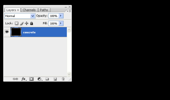
Create new document, 1280 x 1024 and name the default layer "concrete."


Step 2

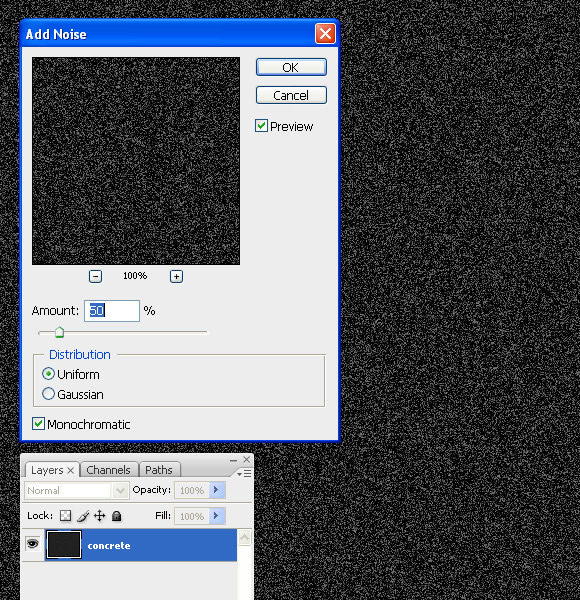
Go to Filter > Noise and apply the following settings.


Step 3

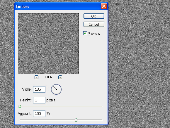
Go to Filter > Stylize > Emboss and apply the following settings.


Step 4

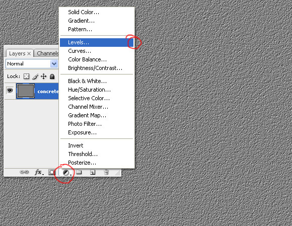
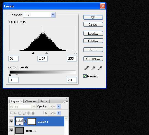
Add a Level Adjustment by clicking on the icon in the bottom of the layer palette.


Step 5

Apply the following settings.


Step 6

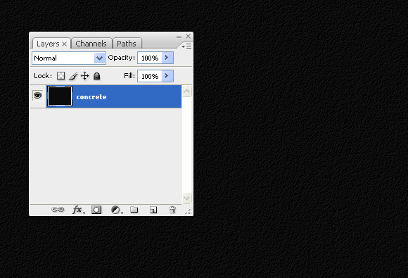
To make this more realistic press Cmd + Shift + E to merge all layers.


Step 7

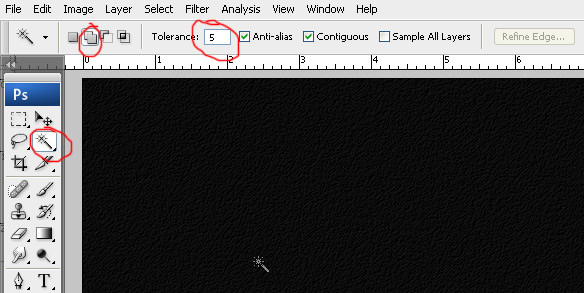
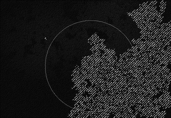
Press "W" to select Magic Wand. Set Tolerance to 5. Click on second icon to activate "add in selection option"


Step 8

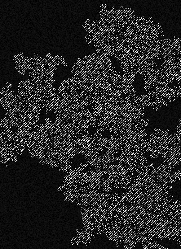
Now click anywhere on the document to get a random selection.


Step 9

Once you have your selection, pick the dodge tool "Range: Highlights" and "Exposure: 100%" and randomly paint inside selection. You should now have something like the image below.


Step 10

Repeat Step 9 a few more times with different selections and brighten up selected areas using the dodge tool.


Step 11

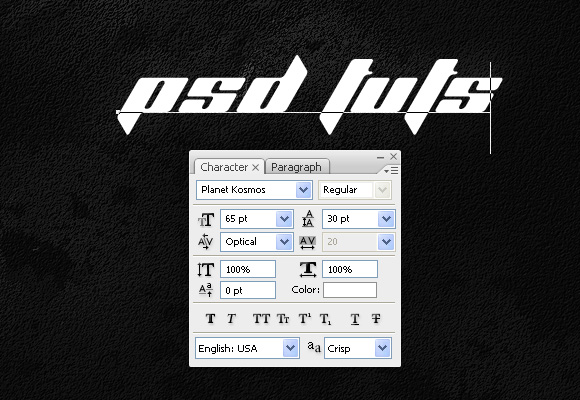
Now press "T" to select the type tool. Type out whatever text you like. I chose the Planet Kosmos font.


Step 12

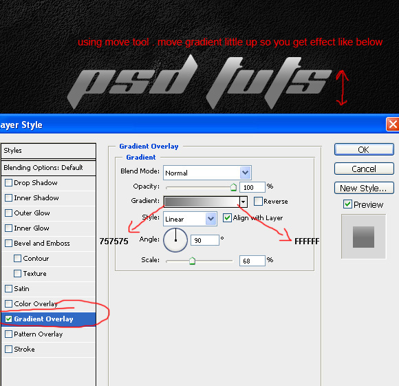
Go to Layer > Layer Style > Gradient Overlay and apply the settings below.


Step 13

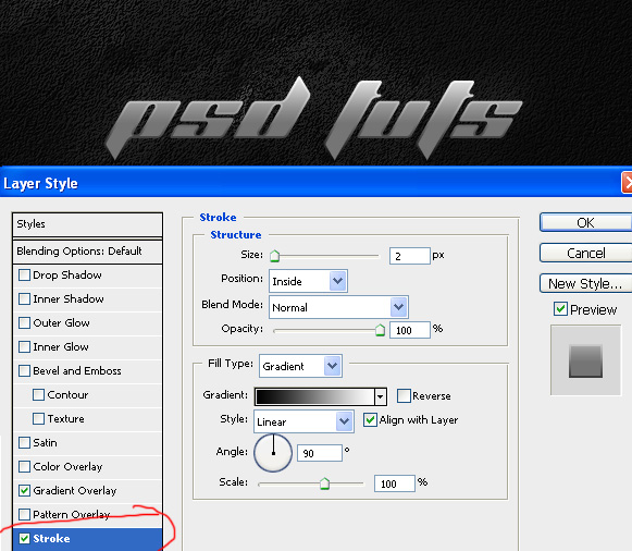
Add a Layer Style using the following settings.


Step 14

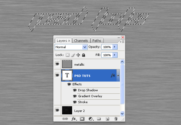
Download this metallic texture and paste into your document. Then, make a selection of your text.

preview

Step 15

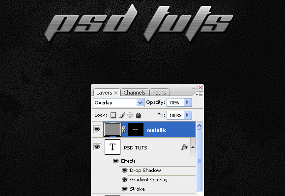
Press the layer mask icon to add a mask onto the metallic layer and set its mode to overlay and opacity to 70%. That’s it! You are finished!

preview

Final Image

Take a look at the final image that we will be creating.

preview


Establishing Perspective in Your Drawings – Basix

In this tutorial, we will look at photographs as well as drawn examples to familiarize ourselves with the basic principles of perspective and how it can affect your drawings.


Step 1

Perspective can be used to suggest the illusion of 3D elements on a 2D canvas. When perspective is ‘off’ in a drawing, even untrained eyes will notice. Using basic perspective techniques will allow you to manipulate your compositions to your favour; even giving fictional drawings a sense of realism.

Let’s make a New (Cmd+N) canvas and get started. I’ve drawn a figure to spice up the canvas a little.


Step 2

We’ll begin with a ‘one-point’ perspective. A drawing anywhere on Earth would likely have a ‘horizon line’ in it, whether it is off the canvas or not. In the example below we’ve got a very standard horizon line near the center of the image. In addition to a horizon line, we need a ‘vanishing point’. When drawing one-point perspective, we have one vanishing point where all the z-axis lines join up, shown in the example below as ‘VP’, with the horizon line illustrated as ‘HL’. All lines going in the same direction (parallel) would follow the line angles converging towards the vanishing point.


Step 3

If we were to draw a box and prism, the x-axis and y-axis would be drawn as normal (black squares in the example), but lines going along the z-axis would follow the perspective lines angled towards the vanishing point.


Step 4

Changing the horizon line can give our composition some more ground space to view and may be more effective in situations where we would depict land masses or communicate designs from a more top-revealing angle. The vanishing point stays in the same x-axis position on the horizon line, moving upwards with it as shown in the example.


Step 5

If we try moving the horizon line down, it can present an opportunity for portraying tall details such as skies, birds, skyscrapers, aircraft, or just about anything else you can imagine. This will give the composition less focus on the ground and a more human point of view should the horizon line be at eye-level such as street or roadside drawing.


Step 6

Can you guess where the horizon line and vanishing point is?


Step 7

Sorry, that was a waste of a step. Even without the forms though, we can see where the lines eventually converge to – the vanishing point. We can’t establish the horizon line very well from looking at the piece, but as you can see, it gives us a more top-down view.


Step 8

You may have noticed, that the further from the vanishing point we go (in this case, lower down), the more top-down the view becomes, seemingly flattening the shape faces slightly.


Step 9

If we take it a step further to the point where the lines appear to barely even converge towards a vanishing point, it may appear almost completely top-down like a building plan. Generally you probably won’t come to draw with this view as often as the previous ones but knowing how the top-down effect kicks in can really help when exploring your own views in your perspective-driven designs.


Step 10

You might be wondering how I’m drawing these lines. We’ll draw a two-point perspective now just to see how! We learned earlier that one-point perspective is one vanishing point; therefore we’ll draw a second vanishing point here to make this a two-point perspective.

We’ll start to draw the second vanishing point now. As with the first vanishing point, this will be on a New Layer (Cmd+Shift+N) to let us manipulate the rest of the image. I’ve started with a normal hard circle brush at 4px, holding Shift before painting the line (red) to snap it to a common angle – in this case directly downwards.


Step 11

I want to spike out some lines but as a right hander I’m not very good at drawing from top left to bottom right or vice versa. Therefore to speed things up, the canvas is flipped by choosing Image > Rotate Canvas > Flip Canvas Horizontal. You may have noticed that it’s bound to the hotkey F1 in my example, which would be by default assigned to an external Photoshop Help link. You can assign hotkeys this one by choosing Window > Workspace > Keyboard Shortcuts & Menus and clicking the Keyboard Shortcuts tab.


Step 12

Wow that’s not a straight line. It’s OK if it something goes wrong, it’s just us practicing twice as much as everybody else. If it does turn out like a curve graph from a science experiment, just undo it (Cmd+Z) and try again. The other vanishing point is on a new layer, which gives us the option to hide it while we work on this second vanishing point.


Step 13

Eleventh time’s always a charm.


Step 14

If at first you don’t succeed, use the Free Transform Tool (Cmd+T).

You may rotate the line by Left-clicking the mouse when the cursor changes upon hovering just outside a corner of the Free Transform bounding box.


Step 15

Finish some more lines until you are comfortable with it. We’ll flip the canvas back by clicking Image > Rotate Canvas > Flip Canvas Horizontally. I’ve also lowered the opacity of the two vanishing point layers to make it easier to see what we’re about to do.


Step 16

The lines going into the distance (red) go towards the first vanishing point as with the one-point perspective drawing (step 3).


Step 17

Look at the dotted red lines in the example; we can see where the corners of the next face would be (circled). Here’s where your psychic projection powers come in – some imagination here helps to picture where the lines and face would go. If it looks correct in your head, you’re probably on the right track.


Step 18

If we proceed to draw the parallel lines (red) going towards the second vanishing point (VP2), we’ve got a perfect join to the previously circled corners – the two ends of the previous dotted line.


Step 19

This technique works even on complicated symmetrical shapes, provided there are parallel lines. If we look at the example below-from the initial corner circled in red-we can simply follow it along the first perspective lines (black) until it hits the other vanishing point (labeled "collide" in example), from which it will then follow the second vanishing point’s perspective lines (red) back down, stopping at the point where it is horizontally parallel alongside the horizon (pink). I made it sound much more complicated than it is, check out the image.


Step 20

Doing this for all the points gives us perfect locations for each corner.


Step 21

Complete the dot-to-dot process but notice that the verticals (pink) still angle perfectly upwards, everything facing the sky in two-point perspective is a vertically straight line, anywhere on the page (as long as it was built to face upwards like a traditional building or cabinet edge).


Step 22

If we add any more lines along the x-axis or z-axis, they must follow to the appropriate vanishing points, as shown in the example.


Step 23

Often when putting both vanishing points in the same canvas, it creates a very tight view like in the example below.


Step 24

To counter this, it is a good idea to throw one of our vanishing points much further down the line so the perspective isn’t as strong and we can see the object in a very different way. Since we can’t see the vanishing point, it’s harder to draw correctly. An efficient way to draw a set of lines here are to simply draw a set of horizontal lines first to manipulate. Remember to hold Shift when brushing to snap your initial direction until you finish the stroke.


Step 25

Then, using Free Transform (Cmd+T) and Left-Clicking the corners, distort the lines as you see fit.

Important: At least one horizontal line (red) must align with the horizon line (green) otherwise the perspective won’t work.


Step 26

Now we’ll draw a similar shape, except without the wide-angle lens effect that closer vanishing points bring. Pushing our vanishing points further out like this replicates how our eyes perceive images much more realistically. Remember that the z-axis lines (red) go towards one vanishing point and the x-axis lines (blue) go towards the other – in this case, the imaginary vanishing point off the canvas.


Step 27

Very nice. This low horizon line could reinforce a low point of view such as buildings being seen from human eye-height.


Step 28

Let’s try raising the horizon line to see how that affects our composition.


Step 29

The lengths of the verticals practically stay the same in the example but the locations of the vertical lines change slightly to conform to the perspective lines.


Step 30

Again, the z-axis and x-axis follow the conventions of pointing towards their vanishing points.


Step 31

This high horizon line strengthens the illusion of looking down at the object and could be effective in displaying a view from a high point such as a hotel balcony.


Step 32

Now let’s try a three-point perspective. This will be exactly the same as two-point perspective with an additional vanishing point that isn’t on the horizon line. We’ll start off with a standard box in two-point perspective.


Step 33

Using the same technique as Step 24, create some lines that suggest a very high vanishing point such as in the example below.


Step 34

This new vanishing point represents the angles that verticals in our drawing follow.

If there were multiple grounded boxes in a three-point perspective drawing, there can be a new set of x-axis and z-axis vanishing points for each differently rotated box. However, notice that the verticals will always without fail, follow the same vertical vanishing point provided they are facing upwards the same in real life. This will apply when you’re drawing standard buildings, walls, cupboards, etc.


Step 35

We can simply erase the vertical lines and re-draw them from the bottom to follow the direction of the third vanishing point in the sky. With three-point perspectives, there are excellent senses of scale as with real life where distant objects decrease in scale.


Step 36

As you can see, raising the horizon line is very effective with a low third vanishing point, creating a slight vertigo sensation to the composition. You could imagine taking this a step further by pulling the vanishing point closer to the horizon line, giving it a more extreme perspective. Using it in moderation though such as in the example below is a very effective way to give your drawing a tasty nuance of perspective.


Step 37

Look, look. Cool, huh? Above all, try it out yourself!


Step 38

Let’s have a look at how perspective can be spotted in photos. Thankfully in this photo there is a gridded floor which makes it easier to spot the x-axis and z-axis lines in the floor. As a standard-looking photograph it likely has a third perspective but it is very hard to spot with few clues to verticals in the scene.

Source: Photographer’s portfolio


Step 39

In this street shot, the windows of the building to the left (green) gives us an excellent set of lines to measure the z-axis (going forwards into the street). The wall to the right (green) also has neat inlets to help us see where that same vanishing point would be.

Source: Photographer’s portfolio


Step 40

The building looks right-angled, so if we assume that the constructers did a fantastic job building it with a 90-degree angle, the windows to the left (yellow) and other side of the wall to the right (yellow) show us the direction of the x-axis. There is also a very prominent third vanishing point in the sky. We can establish this because of all the tall buildings giving away the angles of the verticals in the image. This perspective is similar to the one we tackled in Step 35.


Step 41

In this photo, the most obvious vanishing point is probably the one just off the top of the screen. The road and long buildings (green) give away this vanishing point easily.

Source: Photographer’s portfolio


Step 42

The x-axis is a little harder to spot but with help of the parallel trio of larger buildings to the left (yellow), we can see how the vanishing point is very far away to the right, barely showing signs of converging. There is also a hint of a third perspective (pink) if we look at the verticals on some of the larger buildings and the two buildings to the top right of the photograph.


Step 43

A lot of the buildings here are non-parallel like the cubes in Step 34, but the sides of the streets (green and yellow) have their individual angles that give away their z-axis quite easily as highlighted in the example.


Step 44

Notice again that the verticals, however, all follow the same third vanishing point because although they are rotated diversely, they all have verticals facing the same direction.


Step 45

Let’s do a simple drawing that incorporates some of the things we’ve learned. Here, lines along the x-axis are shown in red and the y-axis in blue. We haven’t drawn the z-axis lines yet because that’s the depth; where the shape goes into the distance and we haven’t utilized that vanishing point yet, though it can be seen in the example. We’ll do each axis of lines on a New Layer (Cmd+Shift+N or Cmd+Shift+N) to give us more working flexibility.


Step 46

Time to add some depth with lines pointing towards the third vanishing point (green).


Step 47

Now to establish a width we’ll draw the rest of the lines (red and blue), where we can then get rid of the excessive z-axis (green) lines.


Step 48

Assuming the green lines are on their own layer, in the Hue/Saturation (Cmd+U or Cmd+U) window, turn the lightness of the layer down to zero and it should turn black.


Step 49

Then finally some eye-candy colour behind the line-art.


Step 50

Maybe throw in a background, some pretty polishing touches and voila! A super quick perspective drawing, fully acceptable in a professional environment. That is, if the company you work for consists of just you.


Conclusion

It is very easy to spot perspectives in parallel structures wherever they are. You can see how basic perspectives can be drawn easily once the foundations are memorized in here (I’m pointing to my head at the moment… Which co-incidentally has an external hard-drive taped to it). People who look at your drawings have been used to seeing human perspective since they were born, so sloppy perspective will throw them into an unstoppable trance (sometimes). If that doesn’t happen then they will just notice ’something off’ about your drawing. So learn these basic-level perspective principles and practice drawing some buildings. Just make sure that your lines are drawn to the appropriate vanishing points. Start off with some squared chairs and tables!

I hope you’ve learned something in this tutorial – feel free to comment any questions or your own samples!

Subscribe to the PSDTUTS RSS Feed for the best Photoshop tuts and articles on the web.


Soak Your Logo With CC Glass

Somebody grab a towel cause we got a damp tutorial on our hands. We’ll be using inverted mattes to create a sopping wet logo that’ll leave you drenched.


Preview

Want access to the full AE project files and assets for every tutorial on Aetuts+, including this one? Join Ae Premium for just $9/month. You can view the final effect preview video below.

Tutorial

Download Tutorial .flv

File size 44.8MB


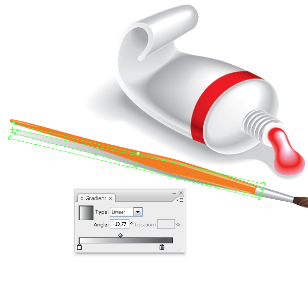
How to Create a Tube of Paint and a Brush, Using Adobe Illustrator

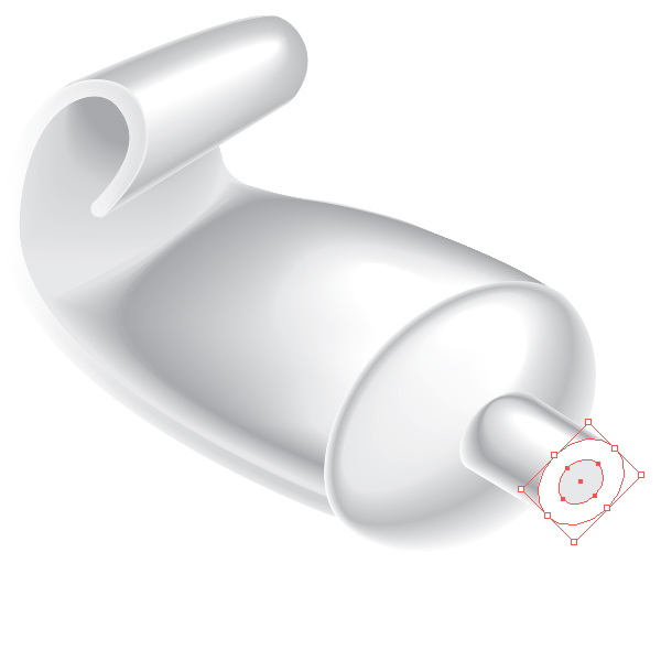
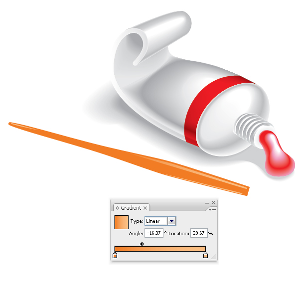
In this tutorial we will learn how to create objects with shadows and penumbras using the Blend Tool. These techniques will help you bring any flat two-dimensional object to life by using lighting and shadow effects to create the illusion of volume and perspective.


Step 1

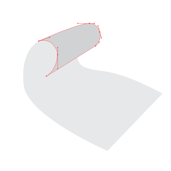
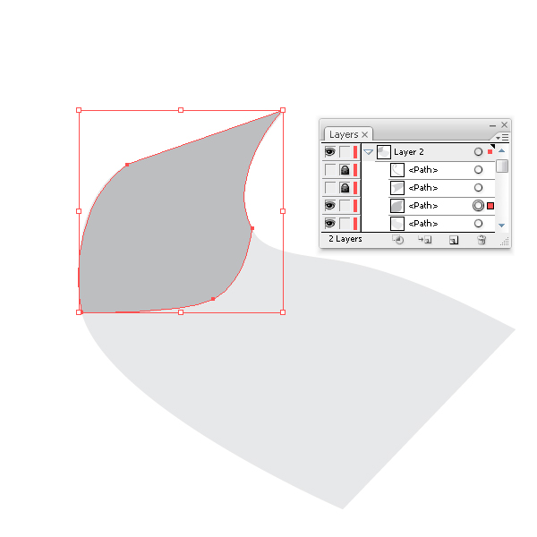
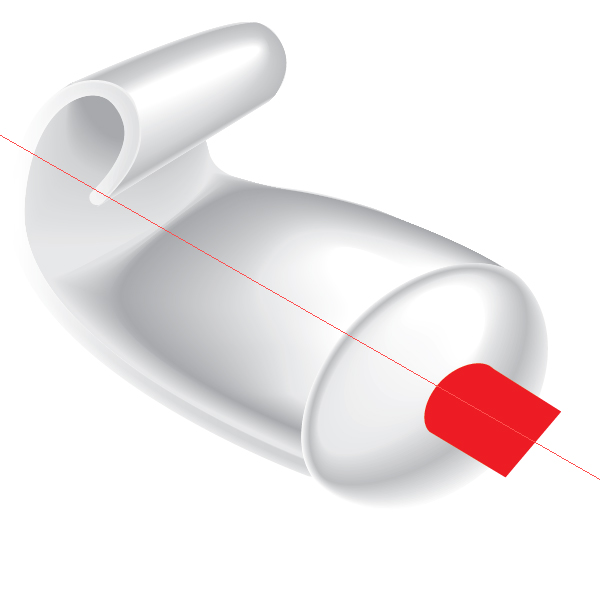
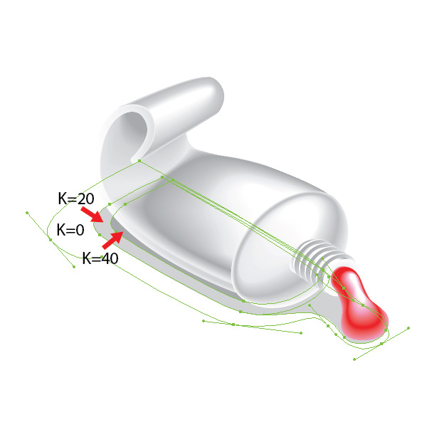
Launch Adobe Illustrator and create a new 800 by 800 pixel document. Take the Pen Tool (P) and create the shape of a tube. The tube will consist of several parts: the front, middle, upper, and lateral. Fill the created shapes with grey color without stroke. The shapes of the middle and upper part of the tube are shown on the pictures below.


Step 2

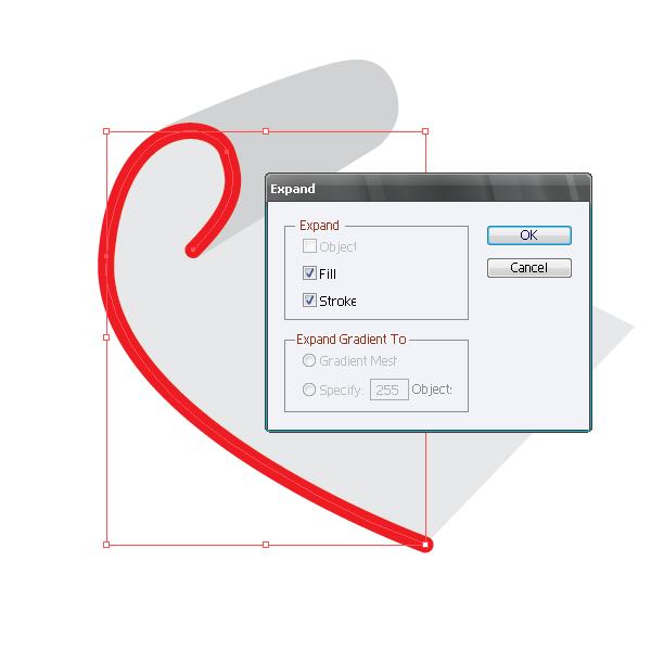
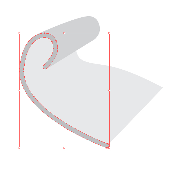
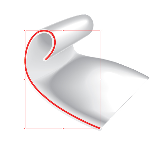
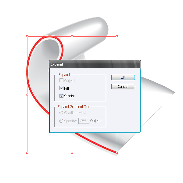
Now create the lateral part of the tube. Using the Pen Tool (P), create a curved line without fill, choose line width according to the size of a tube and set in the Stroke palette. Keeping the curved line selected go to Object > Expand, then ungroup.


Step 3

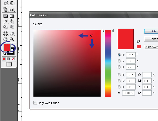
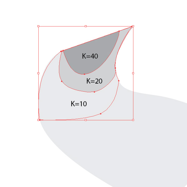
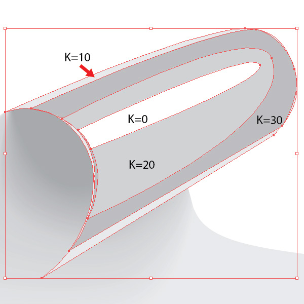
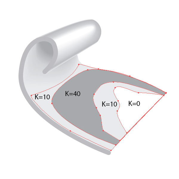
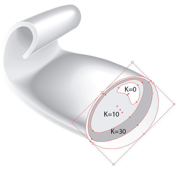
The tube of paint will be aluminium, so while creating under tints we will work with different shades of grey color. If you have to work with the shades of another color, you can open a dialog box Color Picker of the basic color, double-clicking on the Fill icon, and choose a color, moving on the color field to light or dark shades. We will use CMYK color model in this tutorial. This model is used in printing. We accept that the shadow is grey (K + 40), penumbra is grey (K = 20) and (K = 10), reflex is white (K = 0). Initially it is important to identify basic colors and their shades, and it is convenient for us to place them in the Swatches palette. Create shadows on the inner bent surface of the tube. Create three shapes, using the Pen Tool (P)

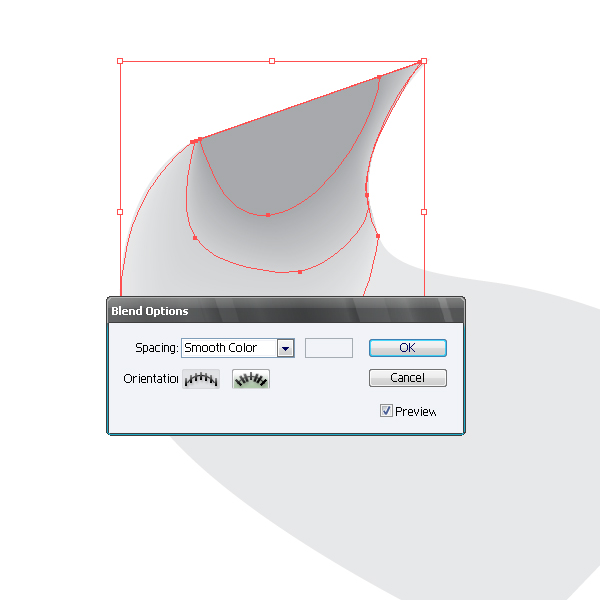
Now go to Object > Blend > Make … with the settings as on the picture below. The settings of the Blend can be always changed going to Object > Blend > Blend Options.


Step 4

Using the technique mentioned above, create a play of colors on the upper part of the tube.


Step 5

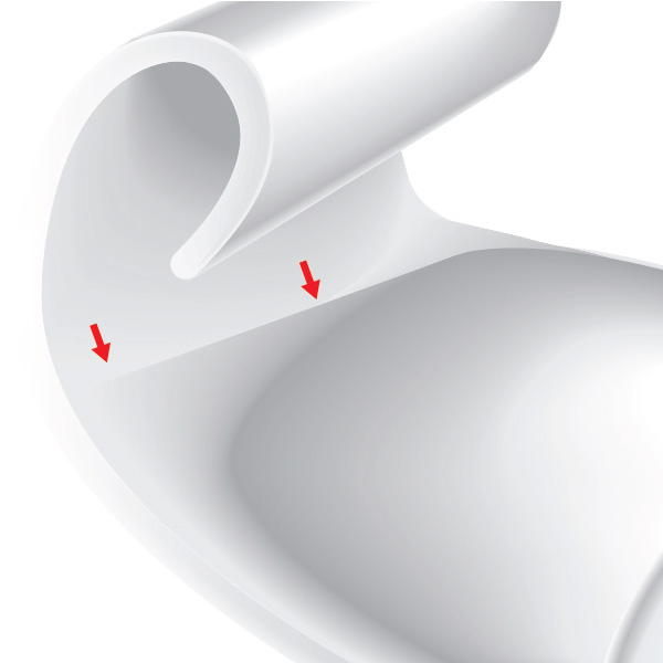
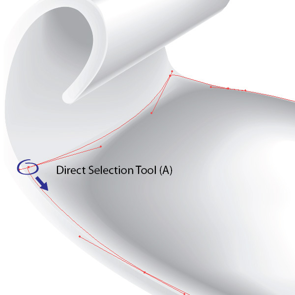
By analogy create a play of colors on the surface of the middle part of the tube. The drawback of this method of creating shadows is that the using of the Blend with the objects that are very different in shape may cause the emergence of artifacts. Therefore you often have to edit original shapes of the already finished Blend, using the Direct Selection Tool (A).


Step 6

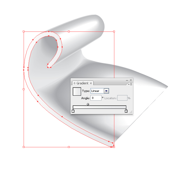
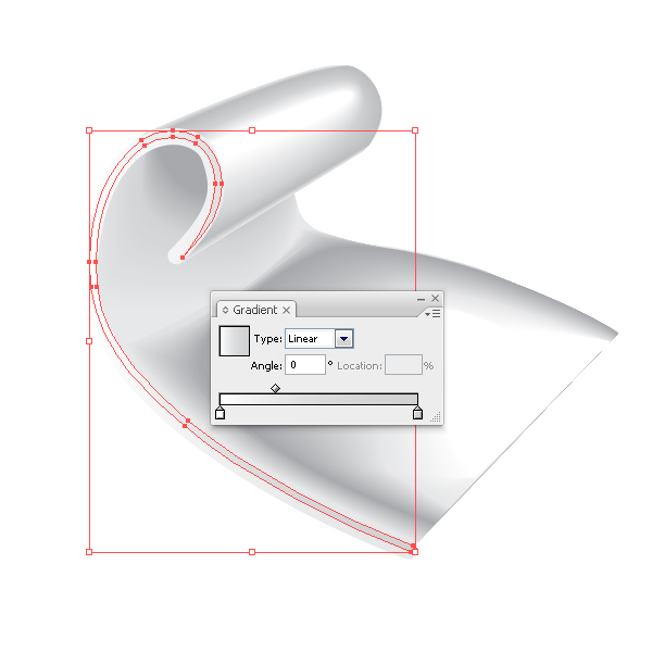
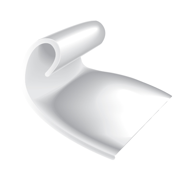
Fill the lateral surface of the tube with a linear gradient from white to light grey color. Take the Pen Tool (P) and create a new shape, using the technique described in step 2. Fill the new shape with linear gradient from white to light grey color. Select both shapes of the lateral part of the tube and apply the Blend.


Step 7

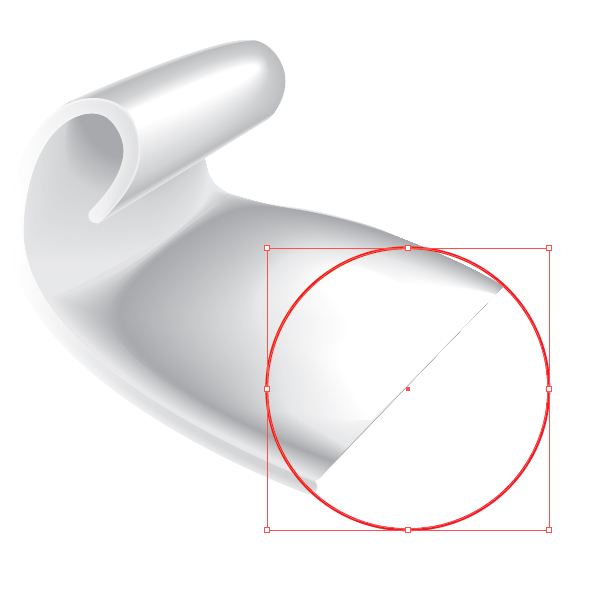
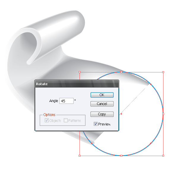
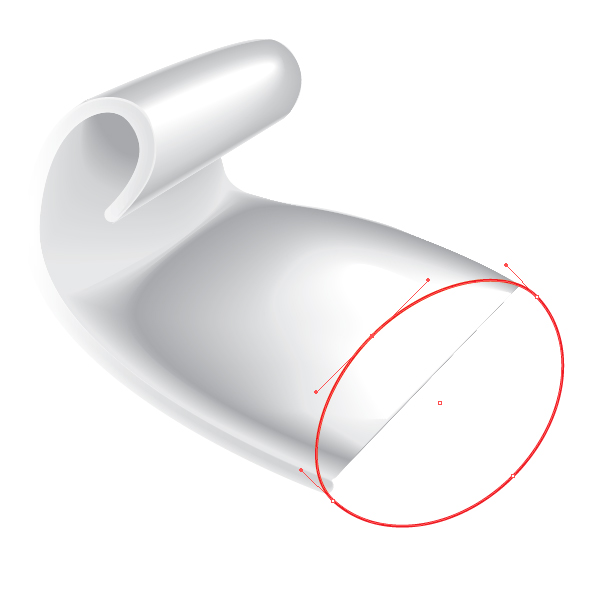
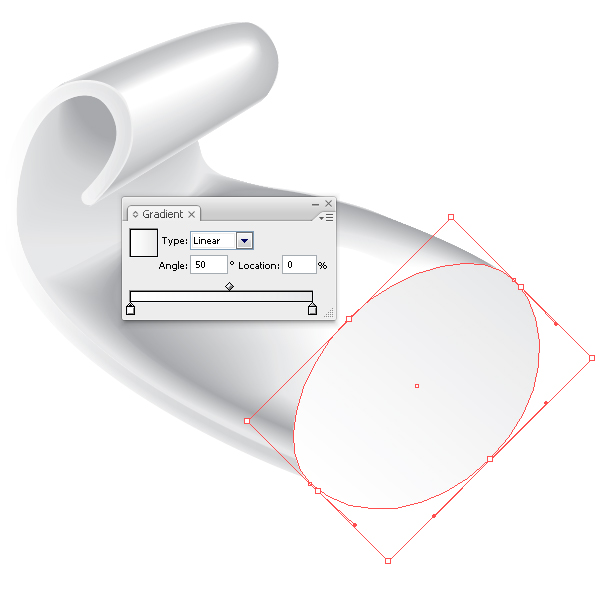
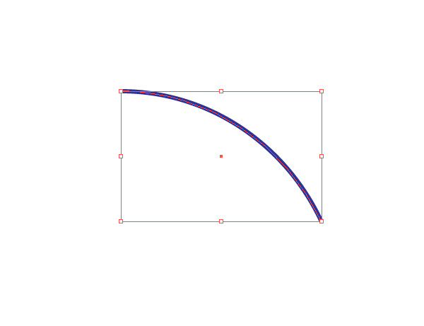
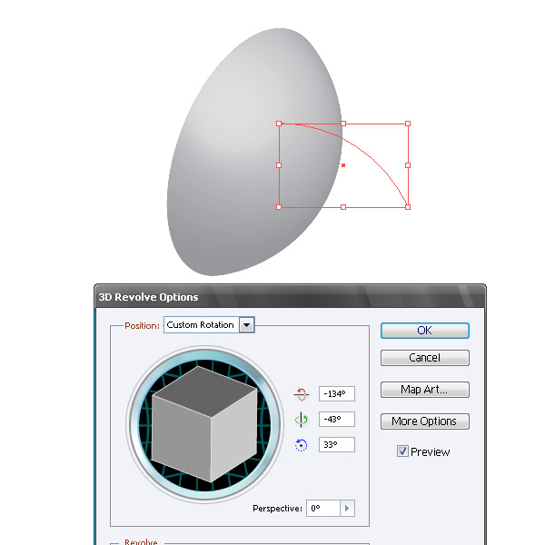
Now create the front part of the tube. Create a circle using the Ellipse Tool (L). Now rotate the circle by 45 degrees clockwise, to do so go to Object > Transform > Rotate… with the settings shown on the picture below. Deform the ellipse using the Direct Selection Tool (A) as shown on the picture below. Now fill the shape with linear gradient of light grey to white color. When you have to portray three-dimensional objects (3D) it is more convenient to work as from life. If you do not have such an opportunity, means of Adobe Illustrator will help you to simulate the 3D object. Check this out in our example. The front part of the tube presents the part of a sphere. Simulate it. Create a circle using the Ellipse Tool (L), and cut out a segment using the Scissors Tool (C)

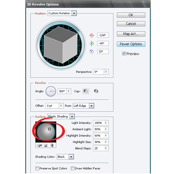
Now select the segment of the circle and go to Effect > 3D > Revolve … and turn the object to simulate the location of the created object. With the help of this effect you can also simulate the play of colors on the object by clicking on the More Options button in the dialog box 3D Revolve Options, you will have the access to the management of light.

Now you can use the created model as a visual aid while creating your object. I personally do not like to use a 3D object as part of the created picture. It is not convenient for us to edit such objects and the presence of such objects in the document overloads your computer’s memory, besides it unjustly increases the size of the file. But that is a matter of taste.


Step 8

Using the techniques mentioned above, create shadows, penumbras and lights on the front part of the tube.


Step 9

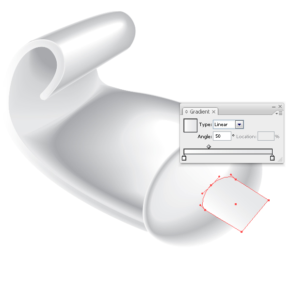
Get down to the creation of the thread on the front part of the tube. Take the Pen Tool (P) and create shape of the tube neck. For the right direction it is convenient for us to use the guide, which is rotated along the axis of the tube. I usually turn the guide with the Rotate Tool (R). Fill the created shape with linear gradient of light grey color. Create a play of colors on the tube neck.


Step 10

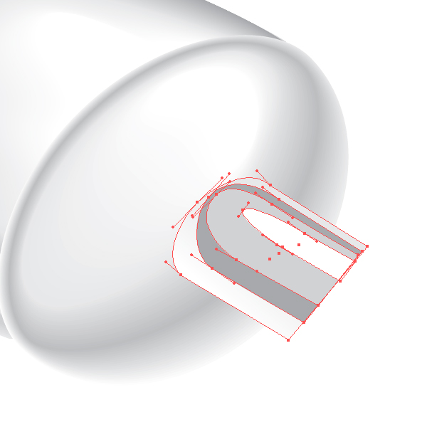
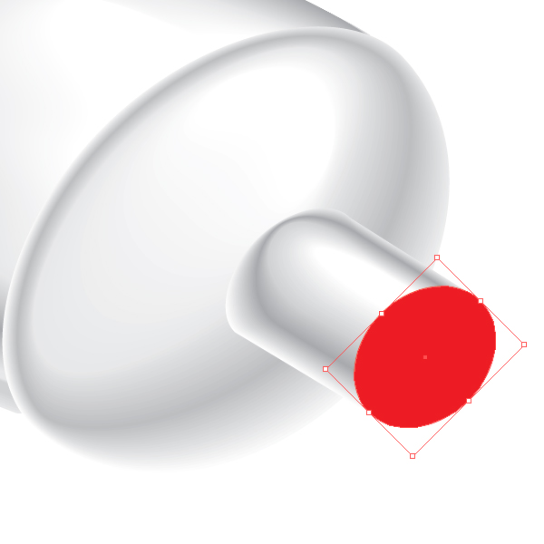
Create the front part of the neck. Create two concentric ellipse (centres of the ellipse have the same coordinates) using the Ellipse Tool (L). Fill the larger ellipse with white color, and the smaller one with light grey. Select both ellipses and apply the Blend.


Step 11

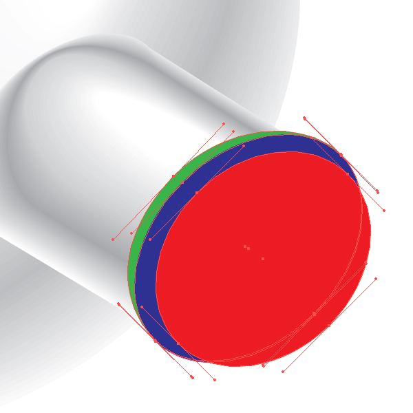
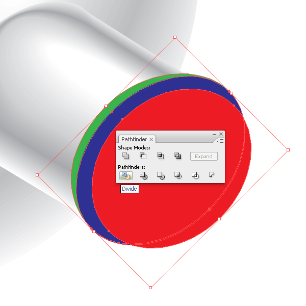
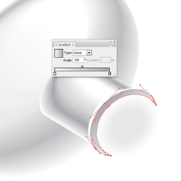
Create the thread. Create three ellipses, pay attention to the fact that red ellipse has the same sizes and coordinates that the larger ellipse created in the previous step. Select three ellipses and click on the Divide from pathfinder box. Now ungroup all the items and delete unnecessary objects. Fill the front part of the thread (blue shape) with linear gradient of light grey color, and fill the lateral part (green shape) with white color. Group up the thread elements and shift them slightly towards the tube.


Step 12

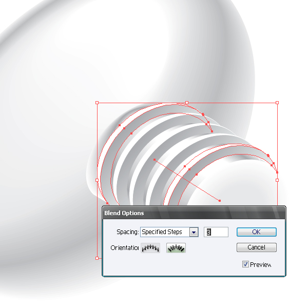
Copy the group (Command + C), paste it back (Command + B) and post a copy as shown on the picture. Select the two thread turns and apply the Blend with the settings shown on the picture below.


Step 13

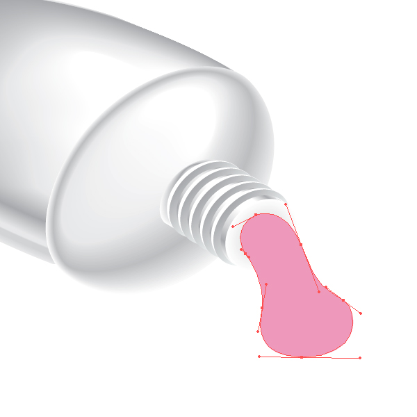
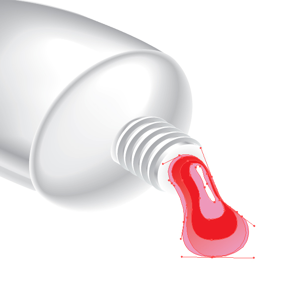
Create a drop of paint. Take the Pen Tool (P) and create shape of a drop. Create a few more shapes and apply the Blend. You can experiment with the colors in this step, remember that the shapes included in the Blend, may be filled with a solid and gradient fill. Name the layer we worked with – Tube.


Step 14

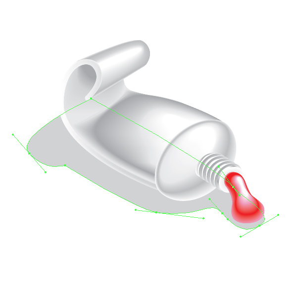
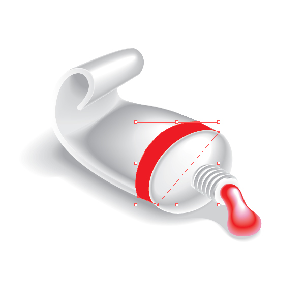
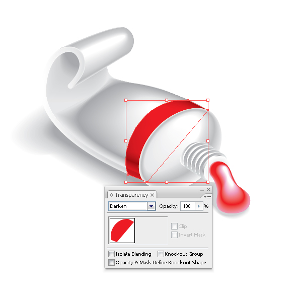
Create shades under the tube. Create a new layer below the layer Tube and name it – Shadow. Take the Pen Tool (P) and create shape of shadow and penumbras. Select the created objects and apply the Blend. Proceed into the layer Tube. Create a red shape with the Pen Tool (P). Keeping it selected change the Blending Mode in the Transparency palette.


Step 15

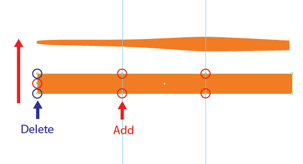
Create a new layer above all the layers and name it – Brush. Create a brush. Take the Rectangle Tool (M) and create a rectangle with the orange filling. Now add a few smooth anchor points using the Pen Tool (P) and transform the shape of the rectangle into the shape shown on the picture below. Place the brush in the composition. Create three reflexes using the Pen Tool (P). Fill the reflexes with the linear gradient from orange to light orange.


Step 16

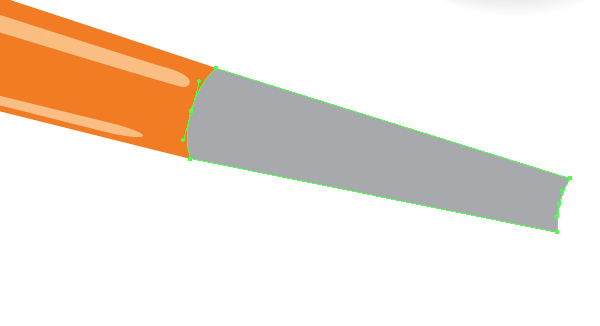
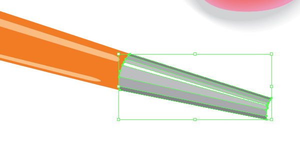
Now create a metal part of the brush. This technique does not differ from one of creating a tube.


Step 17

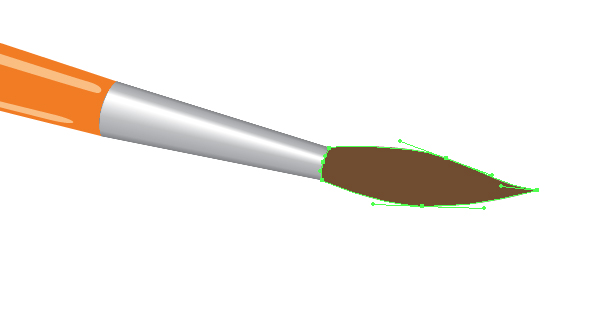
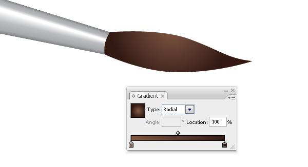
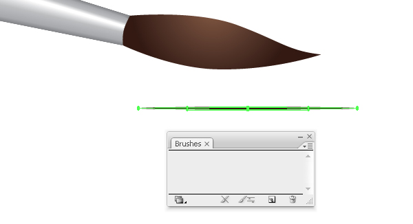
Create the hair part of the brush. Using the Pen Tool (P) draw the shape shown on the picture below. Fill the shape with the radial gradient from brown to dark brown. Now add the hairs. Create Art Brush. Take the Ellipse Tool (L) and create an ellipse as shown on the picture below. Fill the shape with white color and drag into the Brushes palette, choose New Art Brush in the open dialog box.


Step 18

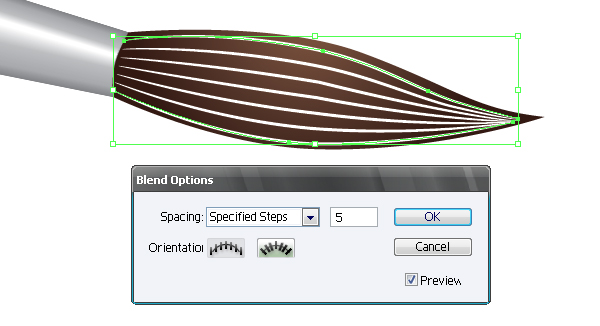
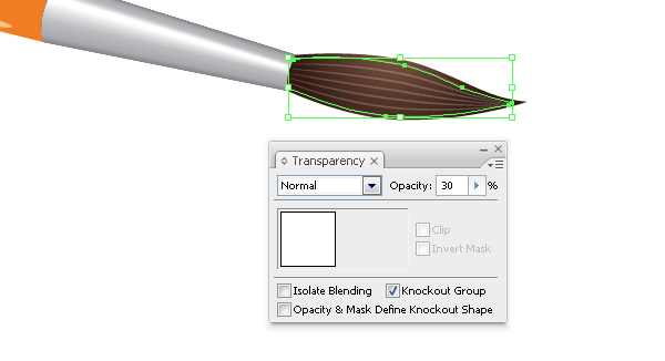
Using the Pen Tool (P) create two hairs and apply the created brush to them. Select both hairs and apply the Blend with the settings shown on the picture below. Set 30% Opacity in the Transparency palette.


Step 19

Now create the shadow of the brush, duplicate the shape that you created in Step 15, rotate it using the Rotate Tool (R), and fill it with a linear gradient from grey to white.


Conclusion

So, we have created a tube of paint and a brush. You can take this tutorial further and create an entire set of paint colours or try and make a tube with its cap on. Remember that there are other drawing tools besides the mouse, Goodluck everyone.


Essential Synthesis Part 1: Synth Noise Effects

If you are reasonably new to synthesis or find yourself relying on presets too often then it’s always a good idea to get some solid synthesis technique nailed down. If you are brand new to the subject you might want to check out my two part video guide to subtractive synthesis in the ‘Basix’ section. You can find them here.

Back when I first got familiar with synthesis I was taught that if you are able to create a group of basic sounds from scratch, then it’s very likely you can create any sound you like. We were often given this sort of test to check we were up to speed and ever since I have passed this technique on to my students.

These basic sounds included one patch from each major group including, a solid synth bass, a string, a pad, a synth lead, a percussive sound of some sort and a noise based synth effect (such as a helicopter or waves). I’ll split these sounds up into separate tutorials and demonstrate how to construct them step by step. At the end of each tutorial load up the initial patch I supply and try to recreate the sound yourself.


Step 1: Noise-Based Effects

A really straight forward way to get familiar with your synthesiser is to make some effects based patches. There are a few ways to produce pitchless effects using subtractive (or virtual analog) synths, we can use self oscillation or noise oscillators. Both approaches can work well but in this case we are going to use a noise generator as our initial sound source.

The effects produced can vary wildly depending on what sound shaping tools we employ and I’ll try to demonstrate a few different variations here. I am using the ES2 synth that is bundled with Logic Pro 9 but the techniques I use here can be used in any subtractive synth with a noise oscillator (and thats most of them!). So let’s get into and start to construct our patch.

White noise can be pretty harsh but is a great foundation for FX patches.


Step 2: A Blank Initialised Patch

If any of you have followed my other synthesis based tutorials on the site (and there is a few!!) you will know that I favour starting with a blank, initialised patch. I have done that here and the blank patch is available in the download pack, so you can all start from the same point when you build your own effects.

The blank patch just consists of a single saw wave, open low pass filter with no resonance. The envelopes are set with full sustain, no attack or release and there are no modulations dialled in. I use this sort of start point regardless of the synth I am using so hopefully you will be familiar with it in future tutorials.

The initial patch in Logic’s ES2.

Download audio file (2.mp3)

The initialised patch.


Step 3: Bring the Noise!

So to get things going we need to start of by instantiating a noise oscillator. Every synth has a different interface and a different way of presenting its parameters, this often means that certain oscillators allow specific waveforms to be loaded. This is certainly true in the case of the ES2 and only the third oscillator slot here supplies a noise generator.

To ensure that we hear the noise generator use the triangular mixer and move it to the lower position. This will essentially isolate the third oscillator. Now select the noise function using the waveform selector. On playback you should now hear a basic noise based waveform.

The ES2’s noise oscillator is activated and mixed.

Download audio file (3.mp3)

The untreated noise oscillator.


Step 4: Initial Envelope Programming

When working with noise based patches you can take things in pretty much any direction you like and as with any patch any decision you make after choosing your raw oscillators will massively effect your final outcome. In this case I’m going to demonstrate a simple effect that resembles the seashore. I’ll then show how, in a few moves, you can transform the sound into something more ‘hi tech’.

To get this wave/seashore like effect the first thing we have to do is emulate its dynamic signature. After picking your oscillators this is always one of the first things you should try and visualise as it will help you develop the patch. In this case we need to use a long attack and release for our wash effect.

The amplitude envelope is set up.

Download audio file (4.mp3)

The wave effect takes shape.

By simply adding these envelope tweaks the single noise oscillator is changed to something that resembles a seashore (a synthetic one at least!). This really is the essence of this exercise and I’m hoping to show you that sounds can be drastically altered and moved from one basic group (lead to pad to effect) to another with only a few tweaks. Once you have these basics down you can quickly switch from patch to another.


Step 5: Adding Filter Settings and Effects

To add an extra touch of realism to the sound lets look at some filter and effects settings. To start with a moving, non resonant low pass filter helps add the feeling of movement. I have used one of the ES2’s filters and mapped it to envelope number 2 using the mod matrix. (For more info on how a mod matrix works you can take a look at my tutorial here.)

A simple low pass filter is used here.

… and then mapped to a second envelope.

This second envelope is pretty much matched with the amplitude envelope but with slightly longer attack and release times. This causes the filter cutoff to fade in and out a little as the sound develops. A final touch was to add some stereo delay, this just brings some space to the patch, reverb can work very well here too.

The filter envelopes settings.

Download audio file (5.mp3)

The new filter setting.

So there you have it, a basic noise/wave effect in only a few simple moves. In reality the basis of any patch is only this many tweaks away from my initial patch and therefore only a few tweaks away from any other sound. Once you start to look at synthesis in this light it opens up a whole new world of programming possibilities.

Delay is also added for some extra space.

Download audio file (5b.mp3)

The sound with delay.


Step 6: Some Variations

If you are after something a little more complex here are a few sounds I made using just a few extra tweaks.

A synthetic ‘helicopterish’ is made with only a few tweaks of the mod matrix and LFOs.

Download audio file (6.mp3)

The ‘helicopterish’ patch.

This is then transformed into a steam turbine with a few more minor tweaks.

Download audio file (6b.mp3)

The steam effect.


Memories Photography Competition: Voting Round 3

A huge thank you to everyone who entered our recent photography competition. We’ve received some absolutely phenomenal photos, and we’re showcasing the final 50 entries today! Read on to view the images, and find out how to choose the winner.


The Voting Process

We’ve gone through all the submissions received, and picked around 150 that we feel are worthy of putting to a reader vote. If yours wasn’t included, we hope you won’t be discouraged and will try again next time!

Voting will take place in three parts of around 50 images each, with the 10 highest rated photos of these three rounds going into a “final”.

This is the third and final round. Later this week, we’ll be closing the polls and posting up a “final vote”. We’ll showcase the top 10 images from all three voting rounds, and let you choose the one that will win overall!

Spend some time looking over the following photos and, when you’ve decided which you’d like to win, scroll to the bottom of the page to cast your vote! You’ll be able to vote once for each round, and again in the final!


The Competition Finalists – Round 3 of 3


Entry Number: 1

Two boys are playing with toys in their classroom. We have to educate children by showing them animated videos based of their syllabus will easily understand by them.


Entry Number: 2

This image reminds me of all my great visits, in essence it reminds me of travel. Most notably our annual trip to the south of Italy to see family and friends.


Entry Number: 3

The dusted piano of my mother – if she opens it and begins to play she falls back in her younger years and she feels like a teenager (again)… You could call her piano her youth water but it doesn’t wipe out her first wrinkles – no, it’s just “the youth water” for her feelings which getting free with it.


Entry Number: 4

Mother and son – The relationship stronger. Trust, affection, spontaneity. Never forget the mother’s lap, his arms, hugging… And we know that we’ll never be forgotten, we have a person willing to do anything for us. It’s great to have a mother. Really great.


Entry Number: 5

This image shows the bike path from Battery Park to the World Trade Center. What makes this an eerie memory is that at the end of the bike path is what would have been the entrance to the World Trade Center. The only thing you can see now are the clouds that fill the center. What once held two of the most historic buildings at the end of this path is now surrounded by office buildings.

I remember going down this path a lot when I was younger. There were many skaters, strollers, and businesspeople walking down this path to head to the World Trade Center. After the tragic events of 2001, you can see the result. There’s hardly anyone who travels down this path. This is what makes it an eerie memory.


Entry Number: 6

We don’t know to enjoy the time when the easiest things are so difficult for us. Instead, we remember all the difficulties we approached with no thinking.


Entry Number: 7

Everything in my life has been set to music. I can remember the first time I heard songs from Backstreet Boys to Coldplay. And then on another level, I’ve played flute for seven years and piano for eleven years. In high school, I did marching band for a very competitive high school and I can remember the hours we would spend outside in 100 degree weather marching in a parking lot while my director would yell through speakers.

I learned everything I ever needed to learn about perseverance and made the closest friends I ever needed in marching band.


Entry Number: 8

This memory goes beyond my own memories. The subject of this picture is Marilu, my mother’s first porcelain doll. For my mother, this doll represents the perfect scent of her childhood. The memory of her parents, the old happy days are condensated in this porcelain face.

This image is plenty of memories for me too. Suddenly, the remembrance of my grandmother’s old house appears to me. I lived there until my eight years old and I remember the doll as an immanent and mysterious presence. By then, it wasn’t a toy anymore. It was a relic. And it remains the same way nowadays, like a silent witness of the passing days. Now it’s my baby niece who stares the same face.

An image that pass through three generations of memories, and goes on.


Entry Number: 9

Represents my momeries of the university. The light past getting darker in my mind. But some silhouettes will remain forever.


Entry Number: 10

“Old is Gold” – Film has recorded memories for many years now. Many photographers feel a sense of nostalgia just seeing a roll of negatives as it reminds them of their days in the darkroom. I still enjoy using film thanks to my high school B&W photography class. The more I see this picture the more I really appreciate it because it has countless hidden meanings in it.

When taking this photo I didn’t even realize the frame number that is shown (13). You will notice that part of the film was exposed and part hasn’t. Taking the frame number into account this picture reminds me of the endless number of times I’ve been frustrated over a shot not coming out the way I’d like. Though when a shot does come out great, it really is like gold.


Entry Number: 11

On our first trip out of Argentina, we found a spectacular and very unique place. Colonia del Sacramento, in Uruguay was what we where expecting. I love taking photographs, travel, walk around different cities, towns and places. Meet people, talk with them, and try to gees the spirit of each place.

Smell the trees, touch the walls, and hear all the noises around me. I feel like I´m travelling through time, when I left my house. Colonia was for us, very special. A place with magic and colors in every step we took. This picture is from a street called “Calle de los Suspiros” (Sigh St.). It is called like that, because in the past, there was a port at the end of that street. Ships from many countries arrived there and the crew went into to that small town, crossing athis street. Along “Calle de los Suspiros” women offered their services and company. The sailors walked that block sighing for those women.

Today is a very romantic and beautiful place. With a mixture of past and present, with colors that represent the passion of the past.


Entry Number: 12

I collect photos of feet from around the world. It’s been so long since i started it that now i can track back to all the places i’ve been just by looking at them. Why feet? because they carrie us around… step by step trough out life.

This particular ones belong to a fisherman in Bangladesh, they not only represent a very beatifull memory of a boat ride, but most importantly they can tell us stories of the sea, memories of a rough life…


Entry Number: 13

There is a belief that we all carry not only the memories of our own experiences but the memories of our past lives and ancestors. My first entry, Sit Still, is meant to invoke the memories of Native Americans and their memories of their first colonizers.

This photos was staged as Native American woman being sat down to have her photo taken. The hand on her shoulder is guiding her and restraining her at the same time. She is wild and anonymous, wearing a mangled men’s warbonnet. Her identity is not shown because like memories, some details are lost or forgotten in the recurrence.


Entry Number: 14

This photo was taken at the end of a magical day of cycling near a little village called Bellagio on Lake Como, Italy. Here I was with two of my best mates by my side about to crest the final climb of our ride that day. And not just any old climb either… the famous Madonna Del Ghisallo church and cycling museum are at the top (you can see the cross on the church at the top left of the photo). It gave me goosebumps at the time and still does when I look at the photo and reflect back on the moment.

A little background: The photo was taken during a 3 week dream holiday to France and Italy last year. None of us had been to this special place before and it was the realisation of a goal that we all shared… to ride the climb and visit the old cycling church with so much history and explore the museum. A treasure trove of memories for all of us.


Entry Number: 15

I found these guys at a mate’s place, discarded in the middle of the sand pit- abandoned by his two sons, presumable at the promise of something more immediately exciting. I started playing around with different shots, manipulating difference figures until I realised that all I was doing was playing out various Comboys & Indians scenarios; essentially what the boys were doing, only I was recording my childish actions for posterity.

This shot still reminds me of that point of realisation, and how we never actually lose that sense of escapism we enjoyed in our childhood, it just needs to be drawn out of us occassionally.


Entry Number: 16

Every time I look at this picture I can’t help but smile. This picture represents spring to me, my favorite season of the year. It seems like every year, no matter what heart-ache I go through or no matter how stressed out with school I am, when spring comes along all, it all seems to melt away.


Entry Number: 17

This is one of my favorite pictures that I’ve taken. To me it signifies the times where I should of been more focused on the simpler things in life instead of worrying about the huge things right in front of me that I had no control over.

My brother has had many problems throughout his life, and I was always left worrying about his safety and how he would turn out. But I’ve realized that all I can really do is set a good example and pray that God is looking out for him.


Entry Number: 18

Although this is one of the newer photo’s I’ve taken, it will definitely be a memory for me. The day I shot this I was supposed to do a photo-shoot with a bunch of people, but they ended up all bailing on me.

So I decided to just go ahead and go out by myself and I actually had a really great time and got some cool pics. Moral of the story… Sometimes it’s nice to just outside with your camera and let your imagination go wild!


Entry Number: 19

This picture is of one of the battlefields of Gettysburg. I was able to capture this scene while on a break from driving across the country on a Symphonic Band tour that I was a part of through my University. It reminds me not only of the great time I had on that tour and the friendships I made, but also of the soldiers who lost their lives right there in that field, fighting for the freedom and rights of others.

During the tour I was able to get know a young woman who I admired, and eventually became friends with. When I look at this photo, it reminds me of the good times on tour getting to know her. And then I start to think about the battle, visualizing the fighting, and thinking about what it would have been like for the soldiers to leave the young women they loved to go fight in a brutal war.

Having my own pursuit of a woman tied to this scene gave me a new perspective, a better appreciation for what all soldiers sacrifice for causes greater than themselves.


Entry Number: 20

When I’m considering of memories, I always hear the voice of older people who tell me stories when there were young. It’s amazing how detailed these stories are although there are more than 50 years old. The same happens to me when I look at old photographs from my family. It’s amazing how expressive stories they can tell you. Photographs and old people are databases of memories.

But memories can only be perceived when something changes. When we recognize that maybe our appearance or the place where we lived in our childhood change or when we watch old photographs and start to remember our past, memories come into our head. They are like visions, sounds or smells and each person has it´s own.


Entry Number: 21

Memories. The joyful memories of the day my son was born are still vivid, yet the hard work, nerves and pain of that day are already starting to fade. What kind of memories will he cherish? A stroll on the beach, the wind blowing through his hair, his first love, his grandchildren… Will he remember that same moment in time, where time does not exists?


Entry Number: 22

I wish our mind could hold a lot more of childhood memories. They are the most pure and innocent part of our life and we can remember so little of it. Those colorful and most carefree times of our life are lost forever and will always remain as a missing piece of our lives.


Entry Number: 23

The old Nikon FG was my first film camera which I’m still using it until now to do create some black and white effect. It was given by my father in law before he died in 2002. He took a lot of pictures with this camera since he bought it in the early 1980. The picture is represent a memory of my father in law that I’m still taking care of his camera by cleaning it up very often, use it and store it as he did.


Entry Number: 24

This photo reminds me of my Dad, (who passed away a few years ago). He use to take me fishing early in the morning in this area before the wind ‘got up’, when I was young. I remember mornings like this when the water was like a mirror. I think this is when I started to develop my passion for landscape photography, it was so calm, quiet and serene. This photo holds special memories for me.


Entry Number: 25

This is a picture from my recent trip to Ghana, West Africa. It is also in the northern part of Ghana. This is in what is known as a witches camp. It is sort of like a refugee camp for women who have been accused of witchcraft.

When I took this picture, we were asking the group of women about their life stories. This woman was reflecting on the question and thinking about her life, along with what she wanted to tell us about it. Along with this trip being an incredible memory for me, this photograph captures the woman thinking about her life and what has transpired over the years.


Entry Number: 26

This is a photograph from a trip to Ghana, West Africa that I was a part of this past fall. My group was visiting a Shea Butter Women’s empowerment micro-finance operation. I turned around and saw this girl staring at us. She watched us for a while as we asked questions about the process of making Shea Butter lotion.

This took place in northern Ghana, and from my understanding is that they do not necessarily see a lot of white people (my group was almost all white). Most places we went the kids would be extremely excited to see us and almost immediately come running over. I was struck by the reserved nature of this girl. She almost seemed indifferent to us being there. Overall the trip was incredible and will be a memory for me for the rest of my life.


Entry Number: 27

I took these images in a shopping mall when I left my son alone and hid somewhere to capture these precious expressions of being lost and left alone. I never wanted him to pose for camera; I needed very natural expressions on his face, that’s why I played this trick and it worked luckily. He was very scared and cried a lot at the end when he found me. This is one of unforgettable memories in my life.


Entry Number: 28

This photo represents the simplicity of being a child. Blowing bubbles as a grown up brings back the same memories and care-freeness that you feel when not having to worry about a mortgage or paying taxes. I think the fact that bubbles are so light and float with the wind makes us wishful that we could be the same way, and to just escape our world and troubles.

But the hurdles we encounter keep us grounded and develop us into intricate creatures. The community center I volunteer at held an Easter fun day and the kids went on an egg hunt and played bean bag toss for prizes. I hope that I never forget what it’s like to be a child – to trust others no matter what, to love unconditionally and to not be afraid to get dirty.


Entry Number: 29

The Dudes, as I like to call this photo. It’s taken in the summer of 2009 when I was in France with friends. We traveled around the west coast of France for surfspots and enjoying the holidays.
As I saw my friends walking next to each other I just had to make a shot. So I run away in front and tried to shoot them. It really reminds me off the great trip we had. So for me it is a memory to treasure.


Entry Number: 30

A balloon in the sky, always brings back childhood memories of joy, whenever we saw a balloon up in the air we thought of how great it was to fly and admire the view from above. This also, is taken at Disneyland Paris, so for anyone who’s been there it could bring back memories of happy moments.


Entry Number: 31

Sometimes the limit between memories, dreams and reality is particularly small. No post production, just a big puddle which mirrored the image of my friend.


Entry Number: 32

Memories are not always clear. We do not remeber everything, just the most important thing. Big piece of cardboard cut and some play with silhouette.


Entry Number: 33

Sometimes it’s difficult to separate good memories from bad memories. Unfortunately sometimes they win the day, so you would just turn off the volume and remember good things.


Entry Number: 34

When I was little I really, really wanted to fly up in the sky. Not only did I want to fly but I really wanted to be an astronaut. Ever since, I’ve been obsessed with anything sci-fi or space related, only because it helped me imagine a world beyond our own. This picture of my girlfriend reaching for the moon signifies what remember feeling as a child.

Obviously, I am not an astronaut and probably never will be. That hasn’t kept me from looking up at the sky though. Now as a photographer, I find myself looking at the clouds and sky more often than most would, while remembering how my passion for the skies all started.


Entry Number: 35

I find that as humans, our memory is not as good as it should be sometimes. I forget things all the time and have realized that memories are best kept when written down. Hence the ever-so-humble pen in this photograph. Pens stand by and are always ready to be used and abused. Everything we use them for aids our memory.

The pen takes a huge load off of our shoulders. Sadly, I feel that the pen itself will soon be a memory. As technology advances and pens become obsolete, I urge you to never forget how to write that handwritten letter that has the potential to send a stronger message than a typed one ever could.


Entry Number: 36

“My Inner Child?”


Entry Number: 37

Summer. Freedom. Driving. Uninhibited. Friends. Hitching. Camping. Cooking. Music. Love. Singing. All those unplanned moments. Late night campfires. Drumcircles on the beach. This picture is a memory of my road trip summer, colorful, dreamy, warm, lonely at times, but never dull.


Entry Number: 38

I created this image as in homage to the childhood adventures that I had in the woods in the summer. The neighborhood children would gather and slowly creep into the woods, our feet sinking down into the mud and cracking small branches and twigs. There was always such a feeling of mystery surrounding the woods. Our parents never came with us; it was a place that became our Neverland. This image is about visiting past memories, trying to recall and re-experience times long past.


Entry Number: 39

My parents have been travelling by airplane since I can remember. So some of my early memories are from spending time in a lot of airports. The people moving, the smells, the feeling that you are going to some place different or even returning home. I took this photo in the Paris airport, and the girl playing with some strange young man through the window reminded me of those times of early travelling with my parents.


Entry Number: 40

In San Pedro de Atacama, in the Chilean northern desert, clean running water and reliable food supplies are something that was unheard of just a few years ago. Now tourists enjoy all the luxuries they are accustomed to, while memories of what was a real danger not so long ago fade away, together with the street signs that reminded you what to do to avoid trouble.


Entry Number: 41

Memories are made of Paper and Music. The photo represent a “cinematic like” point of view of what memories can be, such as a music album or a photo-album, and how they can evoke other memories only looking this objects.


Entry Number: 42

This last weekend I went backpacking. We went to an old ranch in the Superstition Mountains in Arizona. The ranch house was built in 1912. Pictured is the front door. To me, this picture brings back the memory of the brave men and women that settled the American west.


Entry Number: 43

This image reminds me of when I was young without a care in the world,unaware of the hate, lies, and dilemmas that surround us. Every waking day was an adventure waiting to begin, whether real or constructed in my mind. Love was in abundance, love was simply pure….but as I grew realities came into play.

Every time I take a look at this picture it reminds me that sometimes we can still close our eyes, dig a little deep and bring out that young kid in our hearts, as we know somewhere within, these things still do exit. The inner child in me still plays a big role in my life.


Entry Number: 44

This is how I want to remember my wife, my muse. In thirty, forty, fifty years when we are both older and hardened by the years, we’ll have this reminder of youthful beauty and romanticism. The flower is pretty too. Taken inside the Princeton university campus in early Spring of 2010.


Entry Number: 45

On 9 November 2009 we celebrated 20 years of the fall of the Berlin Wall. Bornholmer Strasse was the first checkpoint that opened that night in 1989. My family and I were living just a stone-throw away, in fact I was looking at that checkpoint every day from our living room window.

Going back to the place where history was written 20 years ago was a very emotional moment for my father, myself and thousands of people with us that were listening to the words of German chancellor Angela Merkel, former Russian president Michael Gorbatschow and former Polish president Lech Walesa.


Entry Number: 46

There is a very real innocence with children. The way children reach out for our help, our guidance, is something that is so special, no parent could ever forget. As children glow older, they reach out to us less and less, and our memories of when they did become that much more sacred.

This photo represents every time a child has reached out to an adult, and that adult took their hand in turn and led them. Every memory in every parent’s mind that can never be taken away.


Entry Number: 47

When I first took this picture, I had a specific scenario in mind. It is of me and one of my dearest friends meeting for the last time before we move away to college, and as we leave, we both reminisce of the day we met each other at the same location. This picture was posed but was meant evoke the feeling of sadness that is always associated with the parting of close friends.

In a memory, you don’t always remember every single aspect of what actually happened; you only remember the parts that mattered to you. That is why I implemented this idea within the photo by making only the significant subjects clear and the rest blurred. Our former selves are also translucent symbolizing the fact that they aren’t truly present at that moment and that this memory, which we once held so dear, is now destined to fade.


Entry Number: 48

Growing up, my dad worked 7 days a week, 12 hours a day, in a busted up factory on the corner of my street. During the summer, my mom and I would take him a cold Pepsi during his lunch break and sit out on a rotted, old picnic table just beside the smoke stacks.

I’ll never forget how dark and swelteringly hot those buildings were or how happy he was to see us pull up every day. Whenever I pass by a factory, I always think back to those summer lunches.


Entry Number: 49

We never forget – we simply move from remembering the split second event to remembering the years in witch we shined, and we sigh at the mental picture of our ineffable treasure.


Entry Number: 50

Thousands of photos are being made today, thousands of moments are fading out in digitals. Creative abilities have no border today, like the butterfly flies the way of its dream. But its hard through all this thousand of choices chose the real one, the moment full of life and emotions, the moment of your real dream.

The new generation won’t know about film, won’t appreciate each printed photo and won’t try to penetrate its depths. And when I look through the photo, which was made my father’s “Zenit”, the memories in my heart alive, the brightest memories of my childhood and youth. And it does not matter how far the progress will lead, the only what matters, is the way you chose to go to your dream.

I am very grateful “Zenit” gave me the chance to chose my way, where the memory of my family forever alive.


Cast Your Vote

Which image did you like best in round 3?online surveys


Coming up Next…

Stay tuned to the site, because we’ll have the grand final coming up later this week. The top ten photos from each voting round will be put to a final poll to determine the winner!

Build Your Own ActionScript YouTube Player

During this tut we’ll take a look at using the YouTube API to build a custom YouTube player with ActionScript 3.0.


Final Result Preview

Let’s take a look at the final result we will be working towards:


Step 1: File Setup

Here’s how this is going to work:

  • We’ll create a YouTube player wrapper that will receive the video’s ID
  • We’ll create a document class to instantiate the player and set its controls
  • We’ll build the player’s UI with the design tools in Flash IDE and reference them in the document class

For this we’ll need the following files:


Step 2: Stage Setup

Open up Main.fla and edit the stage to make it 500×440 with 30 frames per second. Set the document class to “Main.”


Step 3: Layers Setup

We only need two layers for this tutorial: the player holder, which will be populated by our YouTube player and the controls layer, which will have all the buttons used to control the player. In this case we’ll have a “play/pause” a “mute/unmute” a progress bar(represents amount loaded) and a fullness bar (represents the playhead time).

I’ve added a bunch of other frames just for graphical appearance, you don’t really need those.


Step 4: Controls

These are simple movieclip symbols with the instance names “play_mc” and “mute_mc”, “progress_mc” and “fullness_mc.”


Step 5: Player Holder

The player is also a simple black shape converted to a movieclip with the instance name “holder_mc.”


Step 6: YoutubePlayer Class

Open YoutubePlayer.as and build a skeleton base class that extends a MovieClip class

package
{

	public class  YoutubePlayer extends MovieClip
	{

		public function YoutubePlayer() {

		}
}

Step 7: YoutubePlayer.as Imports

We need to import the following classes:

	import flash.display.MovieClip;
	import flash.display.Loader;
	import flash.events.Event;
	import flash.system.Security;
	import flash.net.URLRequest;

Step 8: YoutubePlayer.as Variables

..and then setup the following variables (all the code in the coming steps is commented):

		var player:Object; //the object which will have the player loaded to
		var loader:Loader; //the loader which will load the player
		var id:String; //the video's id
		var playerStatus:String; //returns the players current playing status
		var progressRatio:Number; //returns the ratio difference between the bytes loaded and the bytes total, from 0 to 1, (useful for the progress bar)
		var fullnessRatio:Number; //returns the ratio difference between the playhead and the total seconds, from 0 to 1, (useful for the fullness bar)
		var ismuted:Boolean; // returns true if player is muted

Step 9: YoutubePlayer.as YoutubePlayer()

When instantiated we need the video’s id passed to the YoutubePlayer() function:

		public function YoutubePlayer($id:String) {
			Security.allowDomain("www.youtube.com"); //allow access from youtube
			id = $id //sets the id
			loader = new Loader(); //instantiates the loader
			loader.contentLoaderInfo.addEventListener(Event.INIT, onLoaderInit); //After loading, calls onLoaderInit
			loader.load(new URLRequest("http://www.youtube.com/apiplayer?version=3")); //starts loading process
		}

Step 10: YoutubePlayer.as onLoaderInit()

Here’s the onLoaderInit() function, called after the loader is instantiated (see previous code block).

		private function onLoaderInit(event:Event):void {
			addChild(loader); //adds the loader to stage
			loader.content.addEventListener("onReady", onPlayerReady); //called when the player is ready
			loader.content.addEventListener("onError", onPlayerError); //called when the player has errors
			loader.content.addEventListener("onStateChange", onPlayerStateChange); //called when the playing state is changed
		}

Step 11: YoutubePlayer.as onPlayerReady()

If everything’s gone OK so far, the onPlayerReady() function is called:

		private function onPlayerReady(event:Event):void {
			player = loader.content; //sets the player
			player.setSize(400, 225); //sets the display size
			player.loadVideoById(id) //loads the video by the id
			addEventListener(Event.ENTER_FRAME, updatePlayer); //updates the player
		}

Step 12: YoutubePlayer.as Other Useful Events()

These traces come in handy for debugging:

		private function onPlayerError(event:Event):void {
			trace("player error:", Object(event).data);
		}
		//I could have used this to update the playerStatus variable but I wanted to show you another method
		private function onPlayerStateChange(event:Event):void {
			trace("player state:", Object(event).data);
		}

Step 13: YoutubePlayer.as Wrappers

These are the wrappers for external controlling:

		public function playVideo() {
			player.playVideo()
		}

		public function pauseVideo() {
			player.pauseVideo()
		}

		public function stopVideo() {
			player.stopVideo()
		}

		public function muteVideo() {
			player.mute()
		}

		public function unmuteVideo() {
			player.unMute()
		}

Step 14: YoutubePlayer.as updatePlayer()

Just one last function and the class is done:

	public function updatePlayer(e) {

		ismuted = player.isMuted() //returns true if muted

		//sets the progress ratio
		progressRatio = player.getVideoBytesLoaded() / player.getVideoBytesTotal()

		//sets the fullness ratio
		fullnessRatio = player.getCurrentTime()/player.getDuration()

		//sets the playerStatus for outside use
		switch(player.getPlayerState()) {
			case -1:
				playerStatus = "unstarted"
				break;
			case 0:
				playerStatus = "ended"
				break;
			case 1:
				playerStatus = "playing"
				break;
			case 2:
				playerStatus = "paused"
				break;
		}
	}

Step 15: Main.as Imports

Hopefully you already know how to build a basic document class (though if not, check out this quick introduction). Inside, import these classes:

	import flash.display.MovieClip;
	import flash.events.Event;
	import flash.events.MouseEvent;

	import YoutubePlayer;

Step 17: Main.as Main()

Here’s our Main() function.

	public function Main() {
			addEventListener(Event.ADDED_TO_STAGE, init); //prevents calls to stage before it's ready
		}

Step 16: Main.as Init()

One question you might be asking is, “How do I know the video’s id?”

It’s very simple: take the url of the film you’re after “http://www.youtube.com/watch?v=fJGLAo_7F_I”, for instance; the video id is the 11 digit number carried by the v var – in this case “fJGLAo_7F_I”.

	private function init(e) {
			removeEventListener(Event.ADDED_TO_STAGE, init); //removes the previous listener
			youtubeplayer = new YoutubePlayer("txqiwrbYGrs"); //instantiates the player with this video id

			//sets up the buttons
			play_mc.buttonMode = mute_mc.buttonMode = true;
			play_mc.addEventListener(MouseEvent.CLICK, playPausePlayer);
			mute_mc.addEventListener(MouseEvent.CLICK, muteUnmutePlayer);

			holder_mc.addChild(youtubeplayer) //adds the player to the player holder

			//resets the fullness and progress
			fullness_mc.width = 1
			progress_mc.width = 1

			//updates the fullness and progress
			addEventListener(Event.ENTER_FRAME, loop);
		}

Step 17: Main.as playPausePlayer()

Here’s the function for our simple button that uses “playerStatus” to toggle between playing and paused:

	private function playPausePlayer(e) {
		if (youtubeplayer.playerStatus == "playing") {
			youtubeplayer.pauseVideo();
		}else {
			youtubeplayer.playVideo();
		}
	}

Step 18: Main.as muteUnmutePlayer()

Similarly, here’s the function for our button that uses “ismuted” to toggle between mute and unmute:

	private function muteUnmutePlayer(e) {
		if (youtubeplayer.ismuted) {
			youtubeplayer.unmuteVideo();
		}else {
			youtubeplayer.muteVideo();
		}
	}

Step 19: Main.as loop()

Let’s figure out how the film’s progress is doing..

		//multiplying the ratio by the total width of the bars will give us the desired length since the ratio goes from 0 to 1
		private function loop(e) {
			fullness_mc.width = youtubeplayer.fullnessRatio * 350
			progress_mc.width = youtubeplayer.progressRatio * 350
		}

Conclusion

As you can see, it’s fairly simple to create a basic youtube player in AS3, be sure to check out the Player API reference for a list of functions and parameters you can use to extend this one.

I hope you liked this tutorial, thanks for reading!

Rethinking Forms in HTML5

While there are many changes for the better in the HTML5 specification, there is no better bang for the buck for the data driven website than the transformation of forms. These simple changes will transform how you enter, validate, process, and even display inputs. You will be able to create more usable web applications with less code and less confusion.


Introduction: What’s in Store?

“In the recent past, the majority of innovation in forms have come from the use of JavaScript, rather than old fashioned HTML. While there is nothing wrong with using JavaScript to enhance forms, it does bring its own usability along with many development headaches.”

HTML 5 is still undergoing changes before it is finalized. If you look at the spec, you will see that there is still a last call for comments along with statements, such as, “Implementers should be aware that this specification is not stable.” Furthermore, particularly for the purposes of this tutorial, focusing on the changes to forms, browser implementation is spotty to say the least. That said, the changes on the horizon are worth examining today. While the changes are major in scope, the implementation for developers look to be rather easy. In this tutorial, we will take a high level overview of these ground breaking changes, and think about how they will impact the nature of user input.

In the past, changes to forms have been relatively minor. If you go back to the HTML 3.2 spec, which was finalized in 1997, you will see the same basic form inputs that you use today. Select, textarea, radio, checkboxes and text were available then. A generation of web developers have grown up writing to these same standards. While later versions of the specification brought changes to forms, such as the fieldset, label, legend, and form actions such as onsubmit or onchange, the way we deal with user input has remained somewhat static. In the recent past, the majority of innovation in forms have come from the use of JavaScript, rather than old fashioned HTML. While there is nothing wrong with using JavaScript to enhance forms, it does bring its own usability along with many development headaches. For instance, there are many different ways that we can validate forms using JavaScript, but what happens when a user does not have JavaScript enabled? We further have to apply logic to our server side scripts. In the end, we have a not so consistent way of handling user input. HTML 5 doesn’t address every innovation headache for forms in the past 13 years, but it does give us plenty of tools to
make our jobs much easier, and allows us to produce much more consistent forms.

There are three basic changes that we should examine. First, we will look at the changes to the input elements, such as “autocomplete” or “autofocus”. The second is changes to the input states, and there are quite a few! Finally, we will examine the new form elements. It is important to restate that the specification is in flux; so I wouldn’t be surprised if, in the future, there are subtle changes to what we are discussing. That’s what makes this fun!


Changes to Input Elements: A Whole New Playground.

Input elements are those items that you place in inputs to explain what the input is doing. For instance:

    <input name="form_text" id="form_text" type="text" value="foo" size="10" maxlength="100">

In the example above, the input attributes are value, size, and maxlength. These have been around for quite some time. HTML 5 doesn’t change the concept of having input elements, but rather adds quite a few more. There does appear to be at least one subtraction, or rather substitution, and that is the change of “disabled” now appears to become “readonly.” The spec does not go into detail to the change, but if I was a betting man, the change would allow event handlers, such as onblur, to fire – which a disabled element prevents.

The new attributes include “autofocus”, “autocomplete”, “list”, “required”, “multiple”, “pattern”, “min and max”, “step” and “placeholder”. I think of these as two different flavors of elements. The first flavor enhances the experience for the user, while the second enhances the development experience. What I mean by this, is “autofocus”, “autocomplete”, “list”, “multiple”, and “placeholder” helps the user experience in selecting items, or perhaps by giving a description of what the form input is looking for, or by aiding in completing the form. “required”, “min and max”, “pattern” and “step” add to the development experience by saying what should be in the form itself.

Autofocus

What each of these new attributes do is relatively easy to understand. For instance:

    <input name="form_text" id="form_text" type="text" value="foo" autofocus>

Above, the autofocus element focuses the text input on page load. This means that as soon as the page loads, this text input is ready to take an entry. You can start typing right away, as this element has the focus of the document. Something that we used to do in JavaScript in a line or so, can now be done with a single word.

Autocomplete

    <input name="form_text" id="form_text" type="text" value="foo" autocomplete="off">

In the above example, by turning off “autocomplete”, you keep the browser from filling in the form field from a previous value. Nothing bugs me more than seeing my credit card number come up in a form as soon as I type a digit. The default for autocomplete is to be on, so the only time you need to use this element is when you want to prevent the form field from completing from previous entries. It adds to the user experience by keeping sensitive information from just “popping up”.

List

    <input name="form_url" id="form_url" type="url" list="url_list">
    <datalist id="url_list">
        <option value="http://www.google.com" label="Google">
        <option value="http://www.nettuts.com" label="NetTuts">
    </datalist>

The list attribute is very cool. Essentially, you provide a datalist, and it will create a drop down from your text input. Think of it as a natural auto complete. Take it a bit further, and instead of having to add a JavaScript library for a quick look up, based on key entries, you could easily just add an “onchange” event handler, with an AJAX post, and you end up with a drop down that gets more specific as the user types into the box. With HTML 5, this functionality an be created with just a few lines.

Multiple

    <input name="form_url" id="form_url" type="url" list="url_list">
    <datalist id="url_list">
        <option value="http://www.google.com" label="Google">
        <option value="http://net.tutsplus.com" label="NetTuts+">
    </datalist>

The multiple attribute allows you to select multiple items from your datalist. For instance, you might have a form which sends messages from your website. By using the multiple element, you can allow the user to select multiple recipients to send that message. Again, this is something we can accomplish with a bit of JavaScript now, but with HTML 5, we only have to add a single command to the form.

Placeholder

    <input name="form_text" id="form_text" type="text" placeholder="Type Here">

The placeholder attribute is something we have been doing for years with a touch of JavaScript. What this does is, as soon as the input is focused, “Type Here” will vanish. If there was no change to the text on blur, then “Type Here” will reappear. Once again, we are taking some JavaScript out of the picture to enhance the user experience.

These next new attributes all enhance our development. With the exception of “step,” each aid in the validation of user inputs.

Required

    <input name="form_text" id="form_text" type="text" value="foo" required>

The “required” attribute is exactly as it sounds. I, the developer of this webpage, require you to fill out this form prior to hitting submit. This is the basic form validation that we use today with JavaScript. What took a library before to add a required entry, now takes a single word in the form.

RegEx

    <input name="form_text" id="form_text" type="text" value="foo" pattern="[0-9][A-Z]{3}">

Of all the new form attributes, this is the one that I am most excited about. “Mr. Form, let me introduce you to my good friend, Regex.” That’s right, we can validate form entries based on regular expressions. While this one is going to be mystifying at first, as you learn regular expression, the possibilities of validation now become limitless.

Validation

    <input name="form_range" id="form_range" type="range" min="1" max="10" step=".5" value="5" >

I have lumped the final three into one example, as they all deal with number validation – or the range of numbers that we can include.

  • Min is the minimal value that an input will take.
  • max is the maximum input value the input will take.

Each of these are dealing with numerical values. Don’t confuse them with “maxlength,” which deals with the number of characters an input will take. The “step” element is just as it sounds. As you select a numerical value, step it up by .5 or down by .5 — meaning this input type will have the possible values of 1, 1.5, 2, 2.5, and so on.

As of right now, to the best of my knowledge, browser support is somewhat spotty on these attributes. Here’s a quick chart showing what I was able to find on the implementations.


Changes to Input Types: A Whole Lot of Love.

There are eight new input types, not counting all the new date and time types, which for our purposes, I am lumping into one. It’s important to note that the browsers which have not implemented the new input types will degrade to a type of text on each that I have tested. What the new input types bring is an ability to validate user input based upon the type that you are using. There is also more validation to come which I will be discussing in the next two sections. Each of the new input types allows us to separate from a text field to something more specific. For instance, to take integer or float values prior to HTML 5, we mostly used an input type of text. Just from the annotation, it is counter intuitive for beginners. By being more specific, we then have better visual control over our interface, as the more specific the element in HTML, the greater control you have from within the CSS, and the easier it is to define those visual elements. In addition, with the new specific input types, browsers are now able to fine tune what the input range should be. Finally, with the advent of mobile computing, we are able to make web application form elements which can be styled to look like natural applications, or can shape the “keyboard” that we are using.

Let’s look at number handling first:

Numbers, Integers and Floats

    <input name="form_range" id="form_range" type="range" min="1" max="10" step=".5" value="5" >

    <input name="form_number" id="form_number" type="number" min="1" max="10" >

Each of these input types allows us to play with numbers, and when we post the forms, we should be sure that we have those float values for our server side processing without the added JavaScript validation. Simply put, for each of these types, we are expecting to get numbers back within the range that we define and with the step that we want. The difference between the two types is how they are displayed. While I am waiting to see implementation on the number type, I would expect either a roll, or a text box, or possibly a type of a select with numbers. The range type is a bit different, in that it looks like a sliding value, similar to what you would expect to see for a volume control.

Dates and Times

    <input name="form_date" id="form_date" type="date">

    <input name="form_month" id="form_month" type="month">

    <input name="form_week" id="form_week" type="week">

    <input name="form_time" id="form_time" type="time">

    <input name="form_datetime_local" id="form_datetime_local" type="datetime-local">

Another big relief to standardize your backend development is the new date and time input types. From the Opera implementation that I have seen, each shows a calendar drop down, which allows your user to select a date. Again, we can validate on our webpage that the input is in the format that we are expecting. Each does exactly what you would think; you are selecting a month, week, day, or time. The one that is a little different is the datetime-local, which is showing the date and time without your timezone offset. For instance, if you are selecting a flight, the datetime-local would show the time and date in the city that you are going, which is not necessarily the timezone that you are currently in.

Urls, Emails, Telephone, and Color

    <input name="form_url" id="form_url" type="url" list="url_list">
    <datalist id="url_list">
        <option value="http://www.google.com" label="Google">
        <option value="http://net.tutsplus.com" label="NetTuts+">
    </datalist>

    <input name="form_email" id="form_email" type="email" list="email_list" multiple>
    <datalist id="url_list">
        <option value="[email protected]" label="Jane Doe">
        <option value="[email protected]" label="John Doe">
    </datalist>

    <input name="form_telephone" id="form_telephone" type="telephone">

    <input name="form_color" id="form_color" type="color">

Each of these input types are descriptive. The URL and Email types both have the validations of valid url patterns and valid email patterns. The telephone does not, however, conform to any specific pattern. It just strips line breaks. If you want to enforce a validation pattern on the telephone field, you can always use the pattern element. Each of these elements minus color will also take the list atttribute, minus color. Color is the oddball of the bunch; I can see it’s practical use, where you can select a color from a fancy pull down that shows colors, and enforce the text entry of something like #000000, but it doesn’t really fit the rest of the changes, in my opinion. It’s like playing “which one is not like the others.”

Like the attributes, the input type browser implementation is quite spotty. My iPhone seems to support more of these than Safari, which is a bit funny to me. This is the best that I could find, as to support.


Changes to Form Elements: Not Quite as Drastic

The number of changes to the form elements is not as drastic as input attributes and types. That said, there are a few new elements to be aware of. We have already covered “datalist” – it is how we define what will be selected from a list element call – but we haven’t seen “keygen”, “output”, “progress”, or “meter”. Outside of “keygen”. these aren’t quite as self explanatory as the new attributes. Let’s dig into these just a bit.

Keygen

    <keygen name="key">

This one is a bit confusing. It does not generate a public key for you. Instead, it is a key pair generator control. Once the form is submitted, it packages the key pair to store the private key in the local key store, and sends the public key back to the server. It will generate the client certificate and offer it back to the user to download. Once downloaded and stored with the private key, you can then authenticate services, such as SSL or certificate authentication

Output

    <input name="number_1" type="number"> + <input name="number_2" type="number"> =
    <output onforminput="value = number_1.valueAsNumber + number_2.valueAsNumber"></output>

Think of the output element as a text area on steroids. What you can do is calculate from two number type text inputs and output that calculation without ever submitting the form back to the server. If you just return false onsubmit, in the above example, it will calculate number_1 plus number_2, and provide you the answer. Like many things discussed in this tutorial, this is something that we can accomplish today with JavaScript, but this really lessens the amount of code that we need to write in the future.

Progress and Meter

    <progress id="p" max=100>0% </progress>

    <meter min=0 max=20 value=12 optimum=10>12cm </meter>

The final two new elements are progress and meter. They are similar, but with one difference. Progress is meant to be used to measure the progress of a specific task. For instance, if you might have five more pages to complete before a survey is done, you would show the progress element in that area. The meter, on the other hand, is a measurement of something. You might want to show the remaining disk space a user has left. You would use the meter to display that measurement. There are new boundary elements, such as low, high and optimum. These supersede the min or max elements; so if they exceed them, they become the new lower and upper limits of the form.

Like the rest of the HTML 5 form changes, browser implementation is poor at the moment. Here’s what seems to work, and what doesn’t (at the time of this writing).


Conclusion

From what I can see, there is no reason to not start using HTML 5 forms. The input elements and types all degrade nicely, even in IE6, where they are either ignored as elements, or degraded to text inputs. We are going to have to wait a while for the validation attributes to become a reality, but with that said, there are still some uses today without those advantages. For instance, the iPhone modifies the keyboard if you are using the url, email, or number types. The range input type is already supported in WebKit browsers, so you could be the first kid on the block with a number slider that works without JavaScript. The spec is rapidly finalizing, and browsers are catching up rather quickly to the paradigm shifts. There is no time like the present to at least begin playing with these new toys! What do you think?