100 Spellbinding Silhouette Shots to Inspire & Amaze

To follow up our recent tutorial on shooting amazing silhouettes, we wanted to empower you with plenty more inspiration to go out and shoot your own. Here’s our collection of 100 spellbinding silhouette shots spanning all kinds of different methods and concepts.

Though these shots are all about shadow, pay close attention to how each photographer uniquely uses light to tell a major part of the story.


Danisarda

Tooley

Gilderic

Bobeirasa

Picsbycam

Cayusa

Sixtus

Spodzone

Saguaro Pictures

Kiwanc

Topaz-mcnumpty

Gjeewaytee

Storymary

Art Rock (Hennie)

Pagedooley

pchweat

Owen’s

Topaz-mcnumpty

Kyle May

remuz [Jack The Ripper]

tanakawho

~Prescott

Matt Lehman

unclefuz

thirtyfootscrew

Adam Dale

Rockets & Love

Peter E. Lee

m for matthijs

Harvest Zhang

Stéfan

jcoterhals

shoothead

jeffk42

Jonathan Camuzo

J.Salmoral

oet G r u n n !

ecatoncheires

Fovea Centralis

Steve Kay

peymuspawer

gadl

Alarzy

Miss Barabanov

Hugo |-|

StefanosP

mrhayata

Cheddarcheez

Anna Gay

davedehetre

nathansnider

D’Arcy Norman

Michael Sarver

vladeb

yaruman5

Pink Sherbet Photography

greekadman

Gonzo Carles

jfgornet

Daniel Y. Go

culpfiction

iandavidmuir

versageek

an untrained eye

~Bob~West~

azmanaziz

fishbulb9

theilr

jelleprins

A. Papushoy

Janielle Beh

Dude Crush

ChrisGoldNY

Bob the courier

perledivetro

VancityAllie

Janielle Beh

DaveFayram

Sabrina Campagna

peter pearson

…-Wink-…

aouniat

SemperNovus

Jerome Rothermund

Misguided_photo

Joming Lau

ozgurmulazimoglu

scott.tanis

mikebaird

miguelteixeira

Paul Stevenson

beatlesfan94

theilr

Express Monorail

Morgales

Phae

newlight2

isabel bloedwater

andrew.stichbury

jasonr611


Share Your Silhouettes!

Looking through the examples above, I’m amazed at how it’s possible to use such similar concepts to accomplish drastically different moods and attitudes in your photography.

Use the comment section below to leave a link to your own silhouette shots and be sure to let us know how you captured it!

Quick Tip: Getting Started With Landscape Photography

Landscape photography is one of the most difficult types of photography to master. However, by sticking to a few basic rules, you’ll walk away with a set of landscape photos to be proud of. This pocket-sized guide is designed to outline the basic rules to help you develop in this particular field of photography.

Time of Day

Before you even start to think about which camera to take the photograph with, which camera settings to change, or whether you want that elegant tree to be incorporated into your frame, the most important aspect is to take your photograph at the right time of day.

By far and away, the best time of day to photograph landscapes is a few minutes before, during and after dawn, the reason being that the light is at its softest during this time frame.

Light is at it’s harshest during a perfectly bright, sunny and clear day. If taking a photograph under these conditions, in the middle of the day, a super-vibrant shot will be taken.

As the sun starts to go down, the light starts to soften once again, optimizing the conditions for gorgeous photography.

Get the Camera Setting Right

Changing a few camera settings before taking a shot can make all the difference between an average and a perfect photograph:

  • Select a Small Aperture: This ensures that you get a shaper shot with the whole scene in focus – remember that a small aperture equates to large f-number. An added benefit of doing this is that most lenses will produce sharper results with less distortion.
  • Low ISO Setting: This ensures that crisp detail in your image will be maximised, but might lead to a slower shutter speed and the need for a tripod.
  • Set the White Balance Manually: Setting the white balance manually before taking a photograph is one way of preventing a nasty unnatural colour cast. This is because of the lack of white objects in many landscape scenes.

Don’t Rush

One of the most attractive aspects of landscape photography is that there is no need to rush. You will have plenty of time to decide how you want to frame the shot. There is also the potential to re-visit the spot at a later date or time of day to try and improve your photograph. This works particularly well if you want to capture the scene in a completely different light – during a storm, for instance.

Experiment With HDR

Once at home there are a number of ways that you can optimize your photograph – HDR is one of these. By combining different exposures, you can create an image to get maximum detail and correct exposure in every section – for example, a detailed sky and foreground. People have mixed opinions about HDR images, but it’s a fun technique to try.

In summary; take your time to frame an image well at the correct time of day, alter a few camera settings, take a tripod with you, return to the same location in different weather conditions if possible, and don’t be afraid to experiment with techniques such as HDR when back at your computer. These are all ingredients that should get you off to a great start. Here are a few further resources that you may find useful:

Quick Tip – Increase Efficiency using Traffic Lights in Cinema 4D

Traffic lights are a little feature of Cinema 4D that allow you to hide and unhide objects. This Quick Tip will teach you some lesser known methods of using them to speed up your workflow..

Video 1

Download

Note: click the ‘Monitor’ icon to view tutorial in full-screen HD.


Don’t miss more CG tutorials and guides, published daily – subscribe to Cgtuts+ by RSS.

One Developer’s Switch from PC to Mac

If you’ve watched/read my latest tutorial and screencast, you may have noticed a change: I’ve switched from Windows to Mac. If you’re curious about this change, wonder no more. I’ll tell you why I made the change and give you some reasons you might consider switching, as well as what trip-ups you might run into in the process.


The Story

Before I get into why I switched, there’s some background you need to know. A year or three ago, you’d be hard pressed to find a more dedicated self-ordained Windows evangelist. I even wrote a lengthly piece about Mac vs. Windows and how I thought Windows had a stronger position (thankfully, that was only published on Google Docs, so no one can ever find it, as it was obviously biased). Over time, a few things happened. First, a couple of my cousins—shoutout to Britt and Matt—came in possession of a couple of MacBooks. Since I see them rather regularly, there was no shortage of opportunities for them to tout their new tools.

Have you ever tried to resist brainwashing?

The next big shift was dabbling in several dynamic programming languages, like Python and Ruby. It seems that it’s always easier to start up with these languages if you’re using a Unix-based OS. While it’s definitely not impossible on Windows, they don’t seem to integrate with the OS in the same way they do with Unix flavours.

Of course, there were better reasons than peer pressure (more on that in a minute). However, when my Windows 7 Release Candidate ran out, I gave myself an ultimatum: either buy Window 7 and secondary monitor, or get a used Mac. After a week or so of deliberation, I found myself in a miniature Starbucks in downtown Toronto, buying a 20-inch iMac off a third-year psychology student.


The Reasons Why I Switched </span

So what came out of those few weeks of deliberation? Here’s why I switched:

1 Unix

Probably the biggest motivation to switch was the fact that Mac OS X is built on Unix. Being a real geek, I’m reasonably comfortable with the terminal; if you’re the same, you probably know that a Unix shell offers a lot more power than the Windows command line. Yes, I’ve tried Cygwin, but it’s not quite the same (and I never actually got it to work on Window 7 RC). Then there are Ruby and Python, so much more at home on Unix. And of course, there are so many other low-level benefits to running Unix.

So why didn’t I just switch to Ubuntu? Well, Ubuntu is really nice, especially the latest release, but it really just didn’t work for me, not for a full time gig.

2 Hardware

Hardware

This one’s a no-brainer: Apple just makes their hardware better than most of the competition. I know that beauty is in the eye of the beholder, and that all that’s beautiful is not aluminium. However, I like Apple’s minimalistic stance. And of course, it’s what insides that matters most, and Apple does an excellent job there, too. There’s a catch to Apple hardware, though, and we’ll talk about that later.

3 Software

Software

The final reason was simply this: there’s a lot of great software for Macs that doesn’t have a good Windows counterpart. There are two cases I ran into. First, there’s nothing on Windows that does as well, or at all, what I’ve found in a Mac app. Example: I use Simplenote a lot on my iPod Touch; there are four or five Mac apps that sync with Simplenote; before I switched, I had to use a perl script to do this on Windows. (Now, Uri Fridman has made Notes, which is based on Notational Velocity, and will soon support Simplenote sycing! Check out his site for other great nuggets; Codex is another of my favourites). Then, there are programs that do the right things, but aren’t as aesthetically pleasing and user-friendly as the Mac apps. For example, I use Evernote a lot; their Windows client does as much (and a bit more, I think) as their Mac client, but it’s just not as pretty.

However, there’s a catch on the software, too.


The Good What I’m Liking

So now that I’ve switched, here are my favourite things about the Mac; some may seem rather insignificant, but when your working full-speed and don’t want to break that flow, little things matter a lot.

1 The Terminal

The Terminal

I’ve already pointed out that the Terminal was part of my first reason for switching; it’s every bit as glorious as I expected it to be, and has motivated me to use it more that I have on Windows. Anyone who has used the Command Line on Windows and Terminal on Mac will know exactly how much better a Unix shell is.

2 Languages Preinstalled

I was surprised and delighted to find that my Mac came with Ruby, Python, Perl, and even Java (which I need for university) already installed.

3 Mounted Drives on the Desktop

Drives

This is a feature of Unix that I’ve always loved and could never find a way to duplicate on Windows. Not huge, I know; but, huge.

4 Quicklook

Quicklook

Another tiny feature that saves me a second-and-a-half, dozens and dozens of times a day. I’m working mainly with text files, but for everything from code to Word docs, I’m just a tap on the spacebar away from inspecting the contents of that file. Only gripe: I can’t copy from the quicklook panel.

5 Time Machine

Time Machine

It’s kind of a hassle to do backup and restore on Windows. With Time Machine, it’s easy and fun. I do wish I had a bit more control over what it backs up and how often (without the numerous hacks), but for daily backup and revisions, it works flawlessly and easily.

6 Installing Apps

Installing Apps

Installing apps on Mac is much different from installing them on Windows. They both use extremely different methods; and overall, I think the Mac does it much more smoothly.


The Bad What I’m not Liking

But all’s not perfect in any OS; here’s what’s bothering me about the Mac:

1 The Trash

The Trash

I really don’t get the philosophy of the trash on the Mac; I know you’re not supposed to use the Trash as a holding place for the files you’re not sure about, but why can’t I delete individual files? Why? Here’s a scenario I’ve had: I wanted to get rid of several gigabytes of files, in multiple folders that I’d just zipped into an archive; so, I moved them all to the trash, and then opened the trash to get rid of them permanently. First, I wanted to sort the files by the date/time they were moved to the trash, but that’s not a feature Jobs would ever need, and so I can’t do it. That’s when I found I couldn’t delete individual items; just all or nothing. Mighty inconvenient, if you ask me. I should have used the Terminal to terminate them.

2 Too Few USB ports

My 20-inch iMac has fewer USB ports than my Dell Laptop did; it only has 3; my Inspiron 1520 had 4; how do you explain that? Then, the old USB extender I was using on Windows doesn’t appear to work on the Mac; not Mac’s fault necessarily, but certainly less than ideal.

3 “Enter” doesn’t open the file/folder

This one is just a matter of muscle memory, but it’s rather annoying. On Windows, hitting enter opens a file or folder; on Mac, the enter key renames the item in question. To open it, I’ve got to use two keys: cmd + o. On the same note, it now takes two keystokes to send files to that crooked Trash: cmd + delete instead of just delete.

4 Home and End Keys

This has to be the most frustrating part about the Mac. On Windows, the home key places your cursor at the front of the current file; the end key places it at the end. However, on a Mac the respective commands are cmd + left-arrow and cmd + right-arrow. This has been pretty hard to get used to; and, since I’m in text editors a lot of the time, hitting home and end (which, by the way, bring you to the top or bottom of the file but does not move your cursor) has been a dizzying experience.

5 Keyboard shortcuts

Keyboard

I know I’ve already talked about two specific keyboard shortcuts that bother me, but keyboard shortcuts in general have been hard. It’s mainly because the cmd key takes the place of the ctrl key in the shortcuts, but it takes the place of the alt key on the keyboard. So if you’ve used Windows for a long time, caveat emptor.


The Other What I’d also like to mention

I’ve shown you what’s good and what’s bad, but there are a few things I have to mention that don’t really fit into either of those categories. Welcome to miscellaneous.

1 Closing Windows / Programs

One of the biggest differences between Windows is Mac what happens when you close a window; on Windows (and with a name like that, they should know how to deal with it) the program closes; on Mac, the window closes but the program continues to run. I think the idea here is that it will be quicker to open just a window instead of the whole app next time you need to open it. This is nice for the most part, but I think some apps of a certain nature should really and truly exit when you close their windows. And some do, like System Preferences. I really wish Preview did this. This is one of those fundamental feature of Mac OS X that really takes a paradigm shift to properly grok.

2 Knowing what’s going on

I’m familiar with Windows, to say the least. I had my A+ certification, which deals mainly with Windows, so I have a pretty good idea of what’s going on under the covers when working on Windows PC. I really miss this intimate knowledge of the system when working with a Mac. I know it’s not an unsolvable problem, but it’s been pretty different to not have that background knowledge. For example, I was recently surprised to find that Time Machine has maxed out my external hard drive; it turned out that iTunes copies all the imported media into the iTunes folder, so I had a two copies of the entire library being backed up. Like Sir Francis Bacon said, “Knowledge [about how the system works] is power.”

3 The software catch

There’s a ton of great software for Mac; however, it seems that the moving from Windows to Mac also requires a move from free software to quality software. Now, I know there’s quality, paid-for software for Windows, and free software for Macs. However, for every quality, paid-for app on Windows, there are five or six free ones that will do the same job decently. On Mac, the same isn’t quite so true. It seems that Mac developers just put a lot of thought and sweat into their products.

4 The hardware catch

Like I’ve said, Apple makes great hardware. However, one thing I know I’m going to miss is the ability to upgrade it. Apple does make it easy enough to add RAM. But when I’m ready to upgrade my hard drive, well, it will be scary at best. But I’d gladly sacrifice the single-piece back-side of my iMac for an easy-to-access hard drive slot.

5 Switching?

Throughout this article, I’ve talked about switching to a Mac. And yes, I’ve switched to a Mac as my main workhorse. But my trusty old Dell hasn’t gone anywhere. It’s still in good use, and syncing services like Evenote and Dropbox (referral link) more than ever.


The Resources What I’ve found Helpful

Switching operating systems is a pretty big change; here are the resources that have been the biggest help to me while doing so; don’t forget to let me know about other great sources in the comments!


A Very Important Conclusion

Switching to Mac has in no way made me an Apple fanboy or a Microsoft hater. I couldn’t say it better than this:

“Mac vs PC debates make me want to throw up. Does your OS of choice work for you? Great, problem solved!”
Drew Douglass


Developing a Passion for Illustrative Lettering

Since you were a wee little tyke, you probably were taught that letters are for reading. We all have spent countless hours learning how to write letters, form words, and eventually read big huge books. Which obviously is a very much needed skill for our topic at hand, but in-order to develop a true passion for illustrative lettering you have to see letters.

In this article I’d like to present some thoughts and theories that I use for creating illustrative lettering. I will show samples and explain a bit of the background info to further emphasize my thoughts. The goal is to simply supply some insight and hopefully a bit of inspiration.

Continue reading “Developing a Passion for Illustrative Lettering”

Creative Sessions: Illustrative Lettering Launch

Our first creative session on Character Illustration was a runaway success. This month we’re covering Illustrative Lettering, which touches on numerous creative fields. Historically, one could look to calligraphers, hand painted signage, and more. Even with early printed books it was small print runs and hand set type. In this session, you’ll learn how professional illustrators are inspired by lettering traditions from the past, and how they integrate this into their digital workflow.

Continue reading “Creative Sessions: Illustrative Lettering Launch”

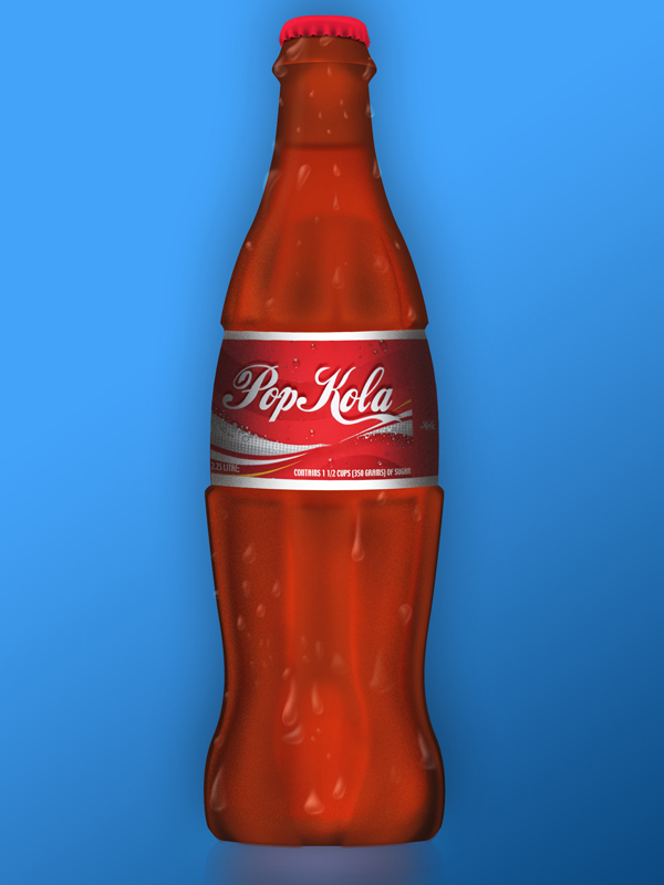
Create a Realistic Soda Bottle in Photoshop

For many, the complexity of Photoshop’s tools can be a bit intimidating. If used properly however, almost anyone can create realistic and impressive-looking graphics. In today’s tutorial we will demonstrate how to create a stylish soda bottle using some easy-to-learn techniques.


Step 1

Create a new document 600 x 800 pixels with a Resolution of 72 dpi. With the Pen tool, draw the outline of half the bottle. I recommend grabbing an image of a bottle to use as a reference. This tutorial does not use any outside images or resources but it may help to use an image of a bottle to get an idea of how the outlook will be.

Now create a selection of the path you just created by Cmd + click on the layer in the Paths palette. You can fill this selection with any color you want, depending on what kind of bottle you are creating. But in this case I filled it with #872a12.


Step 2

Now duplicate the layer by right clicking on it in the Layers palette and clicking Duplicate Layer. Take the new layer and press Cmd + T to Free Transform it. Move it over to the right side of the original layer and continue to stay in Free Transform mode. Right-click on the screen and Flip Horizontal. Press Enter to exit Free Transform. Now highlight the 2 layers and press Cmd + E to merge them together. Call this Layer Outer Bottle Shape.


Step 3

We are going to start making highlights and shadows on the bottle to give it more of a 3D look. For the top part of the bottle grab the Elliptical Marquee Tool and drag it out near the top of the bottle, as shown in the image below. Take the Burn tool and bring down the Exposure to around 20% and set the Range to Midtones. With a very soft brush start brushing the inside of the selection and create a soft line across the top of it.

Now inverse the selection by pressing Cmd + Shift + I. Take the Dodge tool with the same hardness of 0 and brush across the selection as shown in the 2nd image below. This will give the bottle a nice ridge effect. You can touch up this area by also using the Dodge tool on the other side as well.


Step 4

Start adding some highlights along the side of the bottle. First grab the Burn tool with a soft brush. Exposure set to around 20% and Range set to Midtones. Start brushing along the side of the bottle to give it a nice shadow. Take the Dodge tool with the same settings and brush on the inside of where you used the Burn tool.


Step 5

Duplicate the layer and name it Noise. Add some noise by going to Filter > Noise > Add Noise. Set the Amount to around 12%, with Gaussian and Monochromatic checked. Set the Blending Mode of this layer to Overlay and bring the Opacity down to around 15%. If you feel there is too much noise on the bottle you can take a soft Eraser brush with low Opacity and erase some of the noise away. This will give it a nice subtle textured look.


Step 6

Let’s add some liquid inside the bottle. Go back to the first layer called Outer Bottle Shape and duplicate it, call this layer Liquid. Cmd + T on the new layer to enter Free Transform mode. Hold down Alt + Shift and slightly bring down the size. Press the Down Arrow key a few times to align the Liquid layer near the bottom of the bottle.

Now take the Rectangular Marquee Tool and delete the top part of the Liquid layer, as shown in the image below. Drag out the selection over the area that you want deleted and hit the Delete key.

We will now add a gradient overlay to this layer. With the Liquid layer still selected, go into the Layer Style window. To do this you can either double click on the layer or go to Layer > Layer Style > Gradient Overlay. The only settings you will need to change are the colors. Set the Blending Mode of this layer to Overlay and bring the Opacity down to around 30%.


Step 7

Create a new layer on top of the Liquid layer and name it Liquid Top. Grab the Elliptical Marquee Tool and drag it out over a small area above the liquid, as shown in the image below. Fill it with a dark color (#791c0c) and add a Gaussian Blur. Filter > Blur > Gaussian Blur. Set the Radius to 2 pixels. Bring the Opacity down to around 70%.


Step 8

Now we’ll start creating the outter ridges of the bottle. Create a new layer called Ridge and with the Pen tool draw where you think the ridge on the bottle will be. This would be a good time to consult your reference image as to where the details and textures are. Make a selection of the path and give it a Feather of 1. Select > Modify > Feather.

Fill with a lighter color, keep the selection highlighted and grab your Burn tool. Start brushing the edges of the selection with the Burn tool but try not to overdo it. Also make a nice highlight with the Burn tool at the bottom of the selection to make it look like the ridge is sticking out. Do the same with the Dodge tool except use the brush down the middle of the selection.

To make it look like the ridge is attached to the bottle, erase the top of the selection with a very soft brush. The Opacity of the brush should be about 40%.


Step 9

Repeat Step 8 by creating more ridges along the bottle until it looks similar to the image below. If you want your layers to stay organized, you can put all of the Ridge layers into a Folder and name it Top Ridges.


Step 10

Now it’s time to create the bottom ridges of the bottle. Repeat Step 8 except in this case these ridges will extend out to the bottom of the bottle. When using the Pen tool, draw the ridge to stay consistent with the flow and shape of the bottle.

When you are done creating the highlights and shadows of the first ridge, duplicate the layer. Ctrl + T the layer and move it over to the right side of the bottle, then right-click on it and Flip Horizontal. When creating the middle ridge, use a soft Eraser brush with low opacity to erase away the bottom of the layer.


Step 11

Now add some more glare and highlights to the bottle. Duplicate the Outter Bottle Shape layer and call it Highlights. Take your Dodge tool and raise the Exposure to about 25% or 30% with a soft brush. Start painting the bottle down the middle and a bit on the sides. Now take the Burn tool and do the same thing around the sides and bottom of the bottle.


Step 12

Now it’s time to create the cap for the bottle. Create a new layer called Cap. Use the Pen tool to draw out a selection on top of the bottle. Fill the selection with a red color, I used #ce1831.

To create the small ridges in the cap use the Dodge and Burn tools. With the Dodge tool selected use a very small brush with a Hardness of about 20% and create the outter ridges of the cap, shown in image below. Do the same thing with the Burn tool to create the small inner ridges.

Take the Dodge tool and create a very soft highlight on top of the cap. Create a new layer under the Cap layer and name it Shadow. Take the Brush tool with a color of Black and hardness of 0. Paint in behind the cap and turn down the opacity to about 70%.


Step 13a

Now it’s time to create the condensation (bubbles). To do this, we will create a new brush preset. Create a new document 300 x 300 pixels with a Resolution of 72. Create a new layer and call it Bubble. With the Elliptical Marquee Tool create a circle the size of the document. Remember to hold down shift when creating the circle to make it perfect. Fill the selection with white.

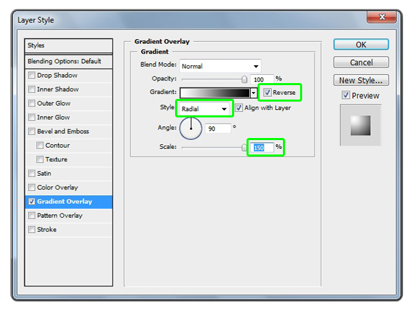
Let’s apply a few Layer Styles to this Bubble layer. Layer > Layer Style > Gradient Overlay and add the following settings in the image below. When you are applying the Gradient Overlay take the cursor over the Bubble image and move the gradient to the upper left area of the bubble.

Then add an Inner Glow layer style with the same settings as the image below.


Step 13b

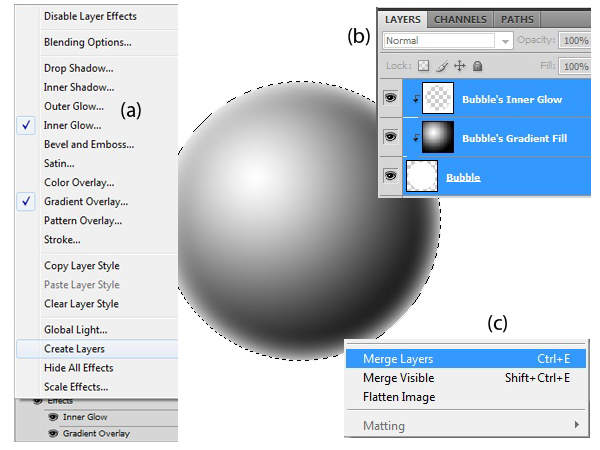
On the Layer Palette, right-click on the Effects of the Bubble layer and choose Create Layers (a). This will turn the Layer Styles to Layers. Then select all of the layers (b) and merge them together by pressing Ctrl + E (c).


Step 13c

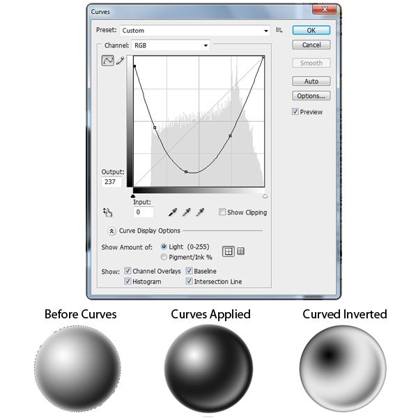
Now we’re going to change how the bubble looks. Go to Image > Adjustments > Curves and change the settings similar to the image below. Once you have applied the Curves to the Bubble layer go to Image > Adjustments > Invert.

To turn this Bubble layer into a Brush Preset, go to Edit > Define Brush Preset and name it Bubble.


Step 14

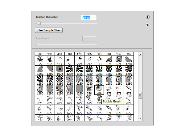
Now go back to your original document and select your new Bubble Brush that you have just created. Create a new layer and use a small brush size of around 10 pixels and a color of white. Start brushing in the bubbles onto the bottle. Try not to make all of the bubbles the same size. Use the ‘ [ ‘ and ‘ ] ‘ keys to quickly change the size of the brush.

Now take the Smudge tool with a Strength of around 25% and start brushing away some of the bubbles. This will give the bubbles a cool drip effect.

When you are done, set the Blending Mode to Overlay and duplicate the layer. Set the new layer’s Blending Mode to Normal and bring back the Opacity to about 33%.


Step 15a

Now it’s time to add a label. I created a custom label but you can use whatever you want. Make sure the label is approximately the same size as the middle indented area of the bottle.


Step 15b

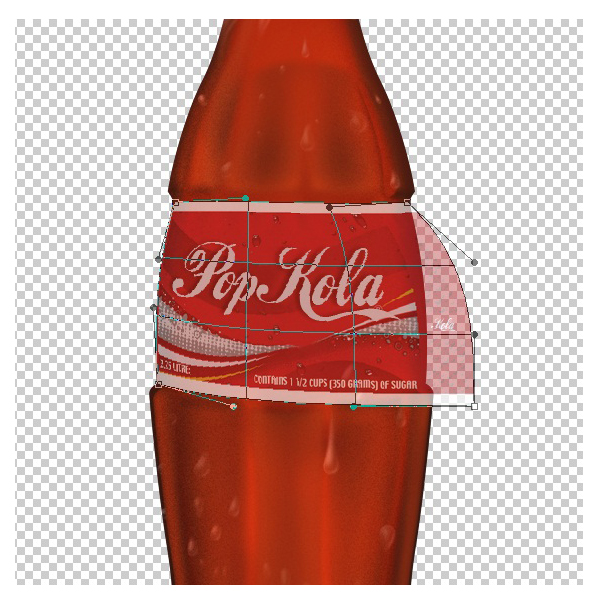
Click on the Label layer and go to Edit > Transform > Warp. Bring back the Opacity of the layer to about 50% so you can see the bottle. Grab each corner of the Warp window and bring it in, adjust it until the label fits perfectly onto the bottle.

Once the label is nicely fitted to the bottle use the Burn and Dodge tools to give the label some nice highlights and shadows.


Step 16

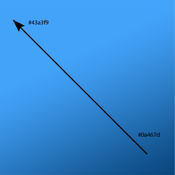
For the background I just used a simple gradient of dark to light blue.


Step 17a

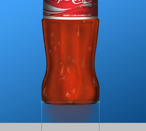
Finally, I added a reflection to the bottom of the image. Duplicate the Outer Bottle Shape layer and bring it to the bottom on the layers palette. Rename this layer Reflection. Press Cmd + T and right-click on it, Flip Vertical. Press the Down Arrow keys until it is placed just underneath the bottle image and press Enter to exit Free Transform.

Now take the Eraser tool with a soft brush and erase away some of the edges. Turn down the opacity to around 60%


Step 17b

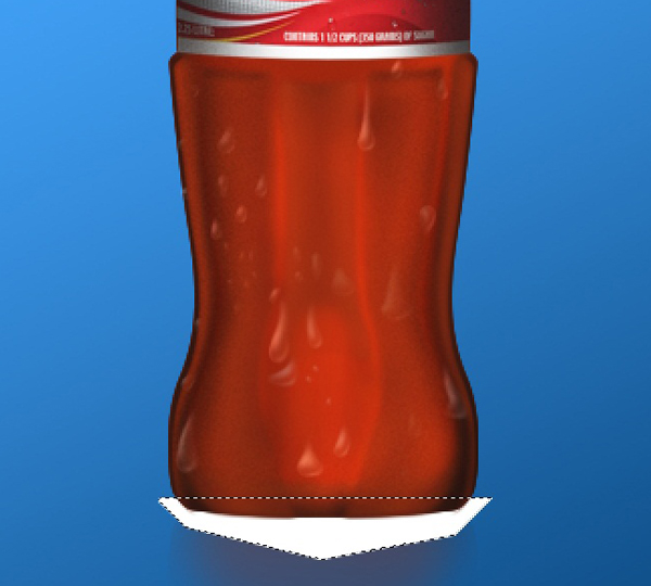
Next make a new layer above the Reflection layer and name it Reflection Blur. Take the Polygonal Lasso Tool and create a quick shape around the bottom of the bottle, shown in the image below. Ctrl + D to Deselect it and go to Filter > Blur > Gaussian Blur. Give it a Radius of 12 pixels and set the Blending Mode to Overlay and set the Opacity to about 50%.


Conclusion

The more you use tools like Pen, Dodge, and Burn the better you’ll become with them. Hopefully this tutorial has given you some practice and has inspired you to create different types of objects using similar styles and techniques.


Dress Up Your Desktop with a Sharp Dual Screen Wallpaper

These days you’d be hard pressed to find someone in the creative industry who doesn’t use dual monitors. If you’re one of these people, why not dress your space with a custom made wallpaper? It’s easy to do and proudly claims your desktop as your very own. In this easy to follow tutorial, you will learn how to make a dual screen wallpaper and how to use cel-shading illustration techniques to bring a hand drawn image to life.

Continue reading “Dress Up Your Desktop with a Sharp Dual Screen Wallpaper”

Audio Reactant Time Remapping

In this tutorial, we’ll learn how to do some experimental animation on a footage based on music. For this effect we’ll dive into learning time remapping, waveform and a bit about expressions as well.


Preview

Want access to the full AE project files and assets for every tutorial on Aetuts+, including this one? Join Ae Premium for just $9/month. You can view the final effect preview video below.

Tutorial

Download Tutorial .flv

File size 120MB


Using the New Deco Drawing Tool in Flash CS5 – Basix

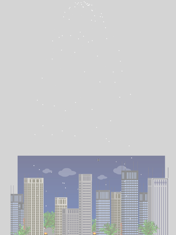
In this tutorial we’ll use the new features of Flash CS5’s Deco tool to create an animated cartoon backdrop.


Adobe Flash in Creative Suite 5 has been furnished with some great updates and enhancements. Adobe Flash CS5 includes brand new features for both designers and developers such as the new Code Snippet panel, integration with Flash Builder and the new Spring for Bones tool.

One of the new features in Flash CS5 is the Deco drawing tool (although, actually, the Deco tool is not a new feature as it was first added to Flash CS4.) It allows you to create drawings and animation based on dynamic shapes and colors. It is one of the smart tools that can save time and effort by creating drawing objects and animation using ready symbols and objects, or loading custom symbols from the library.

In Adobe Flash CS5, the Deco tool has been improved to include new shapes and functions as we will see in this tut. The example we will cover should provide in depth understanding to the Deco tool by creating an animated cartoon background with the Deco tools. Almost all the work in this example is done using the Deco tool and its functions. However, the aim of this example is to show how to use the Deco tool and understand its functions through creating Flash animated backgrounds or other designs and using objects that you will take from the Deco list of objects.

This tut will demonstrate just how much time and effort can be saved by utilizing the Deco tool. While the cartoon background example below takes hours to create using the drawing tools in Flash along with some drawing skills, we can create this example in less than an hour using the Deco tool, and we don’t need any drawing skills.

You need to have basic knowledge of Flash tools, since I will dig directly into the Deco tool, showing how to customize it to create the background and the animation. However, let’s start with Step 1..


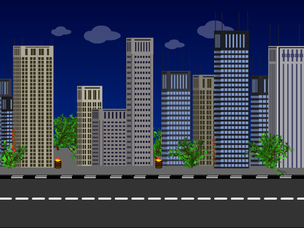
Final Result Preview

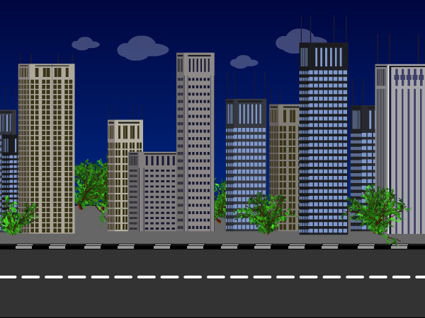
Let’s take a look at the final result we will be working towards:


Step 1: Build the Scene Base

We will start by creating the Flash document, preparing it before we start to add the Deco tool objects.

Create a new Flash document with the dimensions 600px X 450 px. Add a rectangle with the same dimensions as the document and fill the rectangle with a linear fill (like the figure below) to create the effect of dark sky.

””

Step 2: Road and Buildings

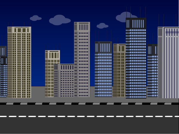
Now we will create the road background, using the Line tool, create the outline shape of the road and fill it with gray colors to simulate real tarmac. Then create clouds using the Oval tool and the final result should look as follows:

””

Now, we will start using the Deco tool to create the buildings to go by the road sidewalk we created above. You can set the skyscraper type you like to use or use random buildings. Also, you can set the size of the buildings.


Step 3: Random Buildings

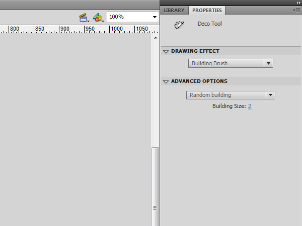
Select the Deco tool or press the key U on the keyboard. In the Properties panel, select “Building Brush” from the Drawing Effect drop-down list. Then, go to the Advanced Options choose “Random building” and set the size to 2.


Step 4: Construction

Click on the road, then drag to the top and release the mouse to create the first building. Repeat the above step to create other buildings on the road as seen in the figure below

In the following steps, we will use the Tree Brush to create trees on the sidewalk and use the Flower Brush to create flowered branches over some buildings. With this brush, you can set the size of the tree and its branch, leaf and flower/fruit colors.


Step 5: Tree Brush

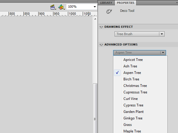
Create a new layer over the buildings layer. Select the Deco tool. In the properties panel, choose Tree Brush from the drop-down menu and in the Advanced option, select “Aspen Tree.”


Step 6: Growth

Click on the sidewalk between buildings to create the trees. Make sure to drag for a few pixels to create small trees. The longer you drag, the bigger the tree size becomes. The final effect after adding the trees, should be as below:


Step 7: Flowers

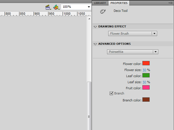
Now, select the Flower Brush, then from the Advanced option choose “Poinsettia.” Set the size of the Flower and leaf to 50% and make sure that the Branch checkbox is checked


Step 8:

Drag up the screen to create branches of flowers. They should be tall to display them as a branch. If the resultant branch is too large you can select it and reduce its size. Then place the resized flower branch on the buildings as seen in the figure below:

The following steps explain how to create animated barrels of fire. We will also use the Fire Animation brush which allows you to create animated vector fire. You can set the size of the fire, speed and the frame duration. Additionally, you can set the flame color and spark.


Step 9: Great Barrels of Fire

Create a new symbol by going Insert > New Symbol or use the shortcut Ctrl+F8 (Command+F8 in Mac) and set it as movie clip.

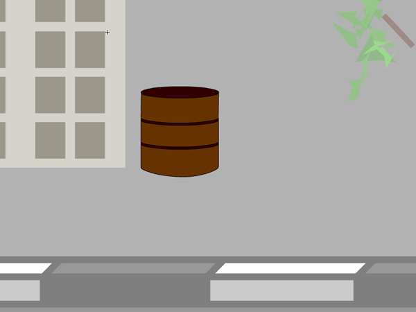
In the active layer, create a circle to represent the top of the barrel and another one to make the bottom of the barrel. Drag two lines between them and complete the barrel fill with intermediate lines to look like the example below:


Step 10: Fire Animation

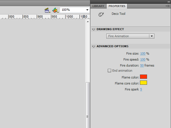
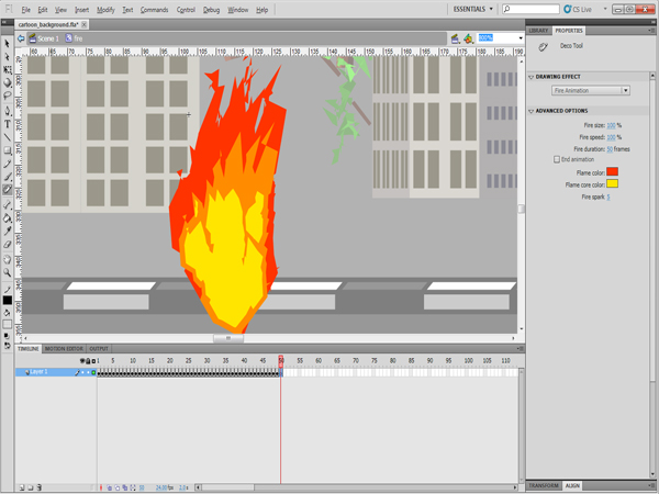
Create a new layer to hold the fire animation. Select the Deco tool or press U in keyboard, choose Fire Animation from the drop-down list in the Properties panel and set the fire animation to 50 frames.


Step 11: Applying Fire

  • Click and hold on the screen to start the fire’s animation.
  • Currently, the created fire animation starts small and get bigger till the end of the animation. This will create an unwanted cut in the looping animation. To solve this, we will remove the starting frames for the fire. In the timeline, select all the frames where the fire is still growing. In this example, we selected the first 15 frames. Right-click the timeline and choose Remove Frames (or press Shift+F5).
  • Make sure that the barrel has the same number of frames as the fire animation.

Step 12: Reposition

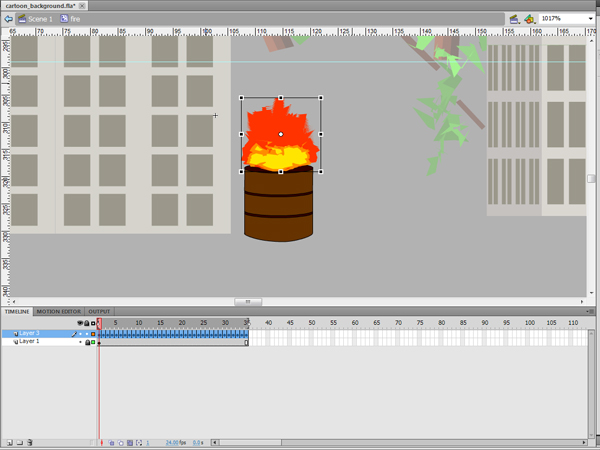
Now we will change the size and position of the fire to make it appear like flames are rising out of the barrel:

  • To change the size of the fire to fit with the barrel, select all the frames and click the Edit Multiple Frames icon below the timeline.
  • Click the Onion Skin icon on the bottom and choose Onion All from the list.
  • Select the Free Transform tool and make sure that all the frames are selected.
  • Resize the fire ball to fit into the barrel.

Step 13:

Go back to the main stage and add the fire barrel movie clip on the stage next to the buildings as seen in the figure below. You can test the movie by pressing Ctrl+Enter (Command+Enter in Mac)


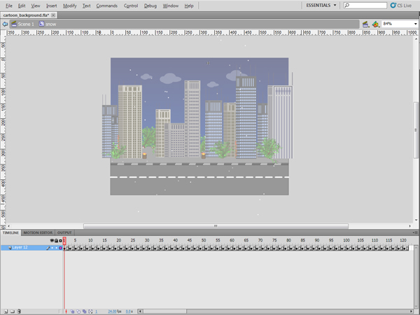
Step 14: Creating Snow

While the Deco tool does not provide all the possible brushes or shapes, you can customize it based on your needs using the symbols or the colors you would like to display. Now, we will use the Particle System which allows you to create flowing animation such as snow falling, fireworks and other effects that depend on small particles exploding from a source.

This brush is based on two particles which can be default symbols or you can use symbols from the library. Also, you can set other options such as the length of the animation, rate per frame and other options as we will see below:

Create a new symbol using Insert > New Symbol or use the shortcut Ctrl+F8 (Command+F8 in Mac) and set it as a movie clip. Go back to the stage and drag the newly created empty symbol from the library to the stage, then double-click the symbol to enter its editing mode


Step 15: Particle System

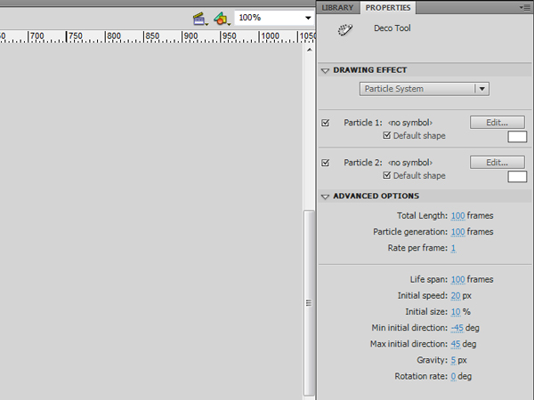
Select the Deco tool or click the U key on keyboard and choose Particle System from the Drawing Effect drop-down list in the Properties panel. Select both Particle 1 and Particle 2, set their color to white to simulate the snow falling and use the Default shape. Set the other values as follows:

  • Set the Total Length and particle Generation to 100 frames
  • Rate per frame: 1
  • Life span: 100 frames
  • Initial speed: 10px
  • Initial size: 10%
  • Gravity: 5px

Step 16: Generation

Now, click the top of the stage to have the particle system fall from top of the stage to the bottom. You will notice that the particle animation is generated and the frames are created.


Step 17:

The snow animation starts small and get bigger till the end of the animation. This (as with the fire) will create an unwanted cut in the looping animation. To solve this, we can again remove the starting frames for the starting snow particles. Select the frame up to the point where the snowfall covers all the stage. In this example, we’ll select the first 40 frames. Right-click and choose Remove Frames or press Shift+F5.

If you notice that the animation is moving fast, you can add an extra frame after each keyframe by selecting the keyframe and pressing F5.


Step 18: Adding Lightning

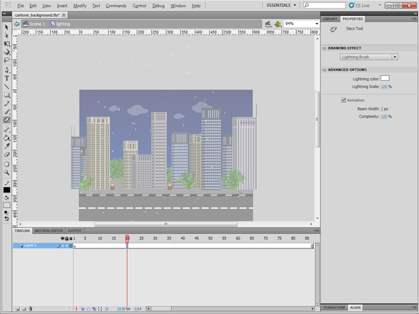
Let’s add some lightning effects using the Lightning Brush. This lightning should animate and appear randomly. You can set loads of options with this brush such as the color of the lighting, its scale, beam width and complexity. Also, you can choose whether or not it should be animated.

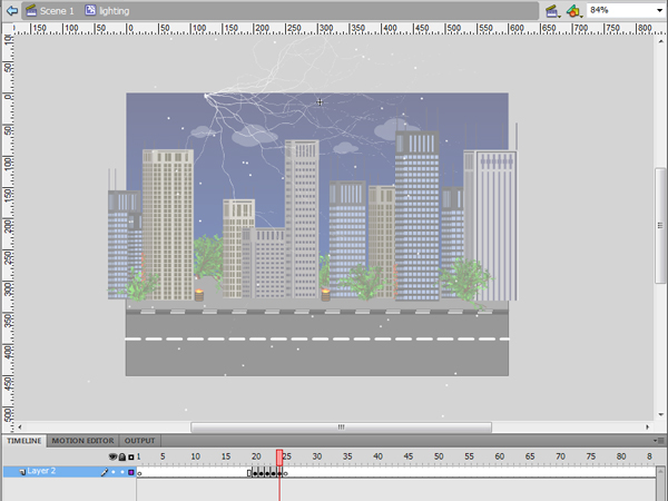
Create a new movie clip symbol and add it to the stage behind the buildings layer. In the movie clip symbol, press F7 to create an empty frame in the beginning of the movie clip and go to frame 20.


Step 19: Lighting Brush

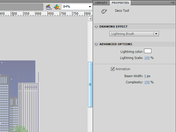
Select the Deco tool and from the Properties panel choose Lighting Brush. Keep the settings the same, just change the color to white and check the Animation checkbox.


Step 20: Complexity

Point your mouse cursor at the top left of the stage, click and hold your mouse until the lightning reaches the desired complexity, then release the mouse. Press F7 after the animation to add a blank frame after it.


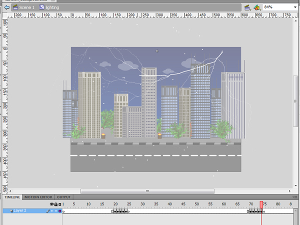
Step 21: More Lightning

Go to frame 70, repeat the above steps to create more lightning on the right hand of the stage with different complexity and press F7 after the animation to remove the lightning from the stage.


Step 22: Test

You can test the movie by clicking Ctrl+Enter (Command+Enter in Mac) or choose File > Publish to export the movie as SWF and HTML files.


Step 23: Optimization

Generally, the files that uses the Deco tool generate large size SWFs because the Deco tool generates the brushes and the animation as ungrouped shapes and frame-by-frame animations. These two methods increases the total size of the file. However, it is best practice to optimize the file after reaching the required results. There are some tips to decrease the file size as below:

  • Converted frequently used objects, such as the similar trees and fire barrels, into symbols; this will make Flash count them as one symbol no matter how many times the symbol is used.
  • Break apart the overlapped groups to minimize the hardware processing needed to load it as well as the SWF size.
  • Try to use motion tweening when possible as frame-by-frame animation increases SWF size.

Conclusion

In the above example, we learnt how to use the Deco tool to create an animated cartoon background. This saves time and does not require special cartoon or drawing skills. You can discover the rest of brushes available in the Deco drawing tools, see how to use them and the different options associated with each one.

I hope you liked this tutorial, thanks for reading!

WordPress hack: Insert comments programatically

The following code can be pasted anywhere on your theme files.
Once this code is executed, it will add a new comment into WordPress database. The returned value is the comment ID, or 0 if a problem happenned.

$data = array(
	'comment_post_ID' => 1,
	'comment_author' => 'admin',
	'comment_author_email' => '[email protected]',
	'comment_author_url' => 'http://www.catswhocode.com',
	'comment_content' => 'Lorem ipsum dolor sit amet...',
	'comment_author_IP' => '127.0.0.1',
	'comment_agent' => 'Mozilla/5.0 (Macintosh; U; Intel Mac OS X 10.6; fr; rv:1.9.2.3) Gecko/20100401 Firefox/3.6.3',
	'comment_date' => date('Y-m-d H:i:s'),
	'comment_date_gmt' => date('Y-m-d H:i:s'),
	'comment_approved' => 1,
);

$comment_id = wp_insert_comment($data);

Looking for WordPress hosting? Try WP Web Host. Prices starts at $5/month and you can try it for free!

WordPress hack: Insert comments programatically

Introduction to Digital Photography: Part 1

In this three part series of videos, we are going to look at the fundamentals of photography. These videos will endevour not only to explain what various camera functions do, but also illustrate them clearly and explain how we can use them creatively in a real world situation.


Video Outline

Here’s a quick look at what to expect in the first instalment of this series. If you’re relatively new to photography, or just want to hone your basic skills once again, it should offer a brilliant place to start.

We’ll be exploring the basic functions of a camera (shutter speed, aperture, etc), explaining them in real-life examples, and taking a look at how to minimise camera shake.

  • Why Use Manual Settings?
  • Shutter Speeds Explained
  • Shutter Speed Demonstrated (Visual Effects Of Shutter Speed)
  • Creative Use Of Shutter Speeds Demonstrated
  • Aperture Explained
  • Aperture Demonstrated
  • Creative Use Of Aperture (Depth of Field Demonstrated)
  • Shutter Speed and Aperture Together
  • Camera Shake Explained & Guide To Avoiding It

Watch the Video

Using Pedal Points – Basix

The pedal point is a common compositional device with a range of useful purposes. In this tutorial we’ll learn what a pedal point is and how it can be used for a variety of functions. We will study examples all the way from Bach to Hans Zimmer and see how different composers make use of pedal points to achieve similar goals.

A pedal point is a sustained tone, usually (but not necessarily) in the bass, which remains constant while other elements change pitch above or around it. It’s said that the term “pedal point” literally refers to the pedals of an organ, which the player could press and hold down with their foot while playing moving lines on top.

Another way to think of a pedal point is a drone.

The basic functions of pedal points can be split into two categories: creating stability, and creating tension. In this tutorial we’ll focus on the first and more common function.


Gladiator

A well known example comes from Hans Zimmer’s score to Gladiator.

In this often copied cue, titled “Wheat”, there is a constant A in the low strings which creates a dark and ominous feeling. Above this low A the voice and stringed instruments play pitches from the mysterious Spanish-Gypsy mode. The dark tones of the scale and the mournful vocal line create a sad and dark atmosphere that is firmly grounded by the low A pedal.

The constant low A makes the exotic scale more grounded, but much more importantly it creates a sense of static motion. At this point in the scene Maximus is remembering his home. There is no “action” on screen, only his daydream, and so the music should not necessarily “go” anywhere. The pedal point fulfills this purpose, allowing the score to create the mood and setting without forcing any sort of dramatic direction on the scene. A rising bass line might create tension and suspense, more active harmonic changes might create dramatic shaping and emotion, but the pedal point avoids these things from happening.


Mozart

While a pedal point makes for a great dramatic device, it can also be just as useful in more straightforward musical examples, such as in the opening to this Mozart sonata.

Download audio file (1_Mozart.mp3)

This piece begins with what is called a “tonic pedal”, so named because the pedal point is the tonic of the key (the tonic is the “home” or root pitch of the scale, such as D in D major of G in G minor).

The chord progression of this opening statement is an elaborated I IV V I, but notice that the bass maintains a constant F. Although it is a non-root chord tone of IV, F is a completely foreign pitch in the V chord of C7. The constant and stable F in the bass is being used to show the significance of F and establish the sonata’s tonality. By the end of this phrase there is little question in your mind that F is the home pitch. With that idea firmly planted in your ear, Mozart can then go on to explore different harmonic areas around this home base of F throughout the rest of the piece.


Wagner

Another example of a tonic pedal to introduce a piece, this time to an even more extreme extent, is in the prelude to Wagner’s Rheingold. The basses hold down a constant low Eb for the entire prelude, over 4 minutes (I’ll admit it requires quite a bit of patience to listen to, although it’s nothing compared to the 4 days it takes to see the entire Ring cycle!).

The dramatic purpose of this piece is to depict the motion of the Rhine river. Clearly harmonic color is not the focus here but rather the constant motion of the arpeggiating instruments above the drone. The Eb pedal creates a constant and steady framework for the rest of the orchestra to “flow” over top of. Although the river is in a constant state of movement, the actual concept of the river is solid and steady, which is being reflected and held down by the pedal point.


Bach

A tonic pedal can also be used to create stability and rest at the end of a piece. If a tonic pedal introduction establishes home and then moves out into more interesting harmonic areas, the tonic pedal in the ending signals a return to home and the motion coming at last to rest.

The ending of Bach’s well known Prelude in C Major from the Well Tempered Clavier ends with such a tonic pedal. The last 4 measures all resting on C. Even though the progression above the pedal is C7 – F – G7 – C, the constant C pedal in the bass creates an overall sense of rest and stability. Especially listen for the dissonant rub of the pitch B from the G7 chord, fighting to resolve to the home pitch of C.

Download audio file (2_Bach.mp3)

Pedal Points Not in The Bass

In all of the examples we’ve looked at so far the pedal has been in the bass, but this is not the only way to create stability with a constant tone.

Jimmy Eat World’s Hear You Me is an example of a song with a constant pedal point but a moving bass line (pay no attention to the visual part of this video…)

Although the bass moves E B C# A, there is always a steady E (the tonic of the key) in an upper voice. Although the effect here is not the same kind of stability as Gladiator or the Wagner, the constant E does create an interesting sort of tension as it moves in and out of being consonant and dissonant.

This type of upper pedal point is a common feature of this style and is usually achieved by always keeping the same open string on the guitar in every chord. The same effect (on the same open string of high E) is used in the verse from Fuel’s Shimmer.

A Word of Caution

“But the use of a pedal point to conceal the poverty of the harmony or the absence of a good bass line is not justified. Unfortunately most of the pedal points of mediocre composers are of this kind. This is the poorest of homophony.” – Arnold Schoenberg

In other words, the pedal point is not an excuse to be lazy. Like all aspects of composition, you shouldn’t use the technique unless you are trying to achieve one of the specific purposes which it can serve.

If you need to intentionally create static motion a pedal point might be a good way to go. If you are just looking for an easy way to kill some musical time, you might want to think again.

Remember that the primary function of a pedal point is stability. Unless that is your specific purpose, you very easily run the risk of being boring and having your music sound like it’s not going anywhere. In general the pedal point lacks emotional depth and direction when over used.


Creating a Next-Gen Video Game Hot Rod: the Complete Workflow – Day 8

Finally, it’s time to start texturing your Hot Rod model. Using the finished normal maps, we will bake out Ambient Occlusion with Vray, which we will then be able to use as a base to start texturing. We will fully texture the wheels and get about halfway with the chassis in this part. A lot of important aspects of texturing will be covered, such as hand painting as much as possible, layer management, non-destructive workflow, and creating additional maps such as specular and glossiness

This tutorial is Day 8 in a series – Go to Day 1, Day 2, Day 3, Day 4, Day 5, Day 6, or Day 7.


Video 1

Download

Note: click the ‘Monitor’ icon to view tutorial in full-screen HD.

Video 2

Download

Note: click the ‘Monitor’ icon to view tutorial in full-screen HD.

Video 3

Download

Note: click the ‘Monitor’ icon to view tutorial in full-screen HD.

Video 4

Download

Note: click the ‘Monitor’ icon to view tutorial in full-screen HD.

Video 5

Download

Note: click the ‘Monitor’ icon to view tutorial in full-screen HD.

This tutorial is Day 8 in a series – Go to Day 1, Day 2, Day 3, Day 4, Day 5, Day 6, or Day 7.


Don’t miss more CG tutorials and guides, published daily – subscribe to Cgtuts+ by RSS.