Top 50 Web Graphics, Admin Skins and Scripts to Accelerate Development


As the Beatles so elegantly wrote, we could all use a little help from our friends to get by. And when it comes to design and development who couldn’t use a friend to speed things up? Thanks to our sister sites ThemeForest, GraphicRiver and CodeCanyon, there are plenty of web graphics, admin skins and scripts to drop in to your work. Best of all they are all made by our massive community of authors. Today across Tuts+ we’re celebrating and showcasing the quality of marketplace goods to bring over the Tuts+ masses to browse the plethora of super work on sale. So without further ado, here they are!

1. Admin Skins


Complete Liquid Admin Control Panel

Complex Liquid Admin template contains a login page as well as a modular content page that includes all the elements you could possibly need in your admin. From these elements you should be able to generate pretty much any required page!


Flexy

Advanced and easy to use administration theme which comes in 7 different colour variations. The theme is liquid, which means the width of the content area adapts to your browsers window size.


Admintasia

Admintasia is a complete backend administration user interface that has the flexibility to house any kind of application. It loads last, it’s intuitive and easy to use, it uses only three small images and it also looks good.


Simpla Admin

Simpla Admin is a professional template with a beautiful and user friendly interface. With various smart and intuitive jQuery functions, navigating the interface is a breeze.


Profi Admin

Profi Admin is a clean and simple style template but it’s complexity and expandability goes beyond expectations. The big visual menu creates the intuitive navigation while the tabbed and the hidden submenu expands the structure to 3 menu levels. Inspired by the WordPress Administration layout.


Cleanity Complete Admin

This professional looking and highly flourished skin is suitable for almost any kind purpose. Cleanity is a compilation of all features you might need on an administration theme.


Boxie Admin

Simple, stylish and modern template for your website’s administration


Wide Admin

Wide admin is a powerful lightweight backend interface application, ready to use for any software / CMS you want.


Quik v1 Admin Skin

Quik is a simple skin for use on little back end applications. It’s just a clean way of presenting say a CMS or some other little app to a client. The general admin template, includes a table style, error and alert styles, a sidebar, tabs, form fields and some general text styles.


Meta Admin

Advanced yet easy to use administration panel template. It includes 4 color schemes (blue, green, grey, red) and is divided in a login page and a content page that includes all the the elements you could possibly need in your admin. From these elements you can generate any required page.


2. Web Graphics


Web Ribbons & Corner Graphics

These ribbons are specially designed for the websites which are indeed of High Quality corner graphics and Featuring ribbons on the websites or products highlighting and need of some cool graphics like seal icons ribbons on featured products or some highlight banners and money back guarantee ribbons etc


Clean Web Navigation Menu

Cool, clean and contemporary Web navigation menu using Arial font. I have used Arial because it is freely available across all operating systems, but you can change the to whatever you want! Menu comes in three flavors! File includes a fully layered Photoshop PSD version and a fully editable Fireworks vector PNG file.


Shoppify Buttons

Set includes 5 buttons with icons: – Buy now (with price tag) – Download – FREE Trial – Take a Tour – Live Demo


Badges and Sale Tags for Online Shop

Attractive Online Shop Badges and Tags for your Online Shop, Make your Products/Promos Speak More


Light Arrow Buttons

This is a pack of arrow buttons for web sliders, scroll boxes, or anything that needs arrows!


Stylish Menu For CSS Sprites

This is a very Stylish menu including a fully layerd PSD file, it could be used for a CSS Sprite menu or whatever type of menu.


Great Web boxes

2 Different designs 3 different color scheme (you can create many more)


Web Pricing Tables & Premium Buttons

These boxes are specially designed for the websites which are indeed of web 2.0 styled pricing tables boxes or featuring any tables or comparision tables on the websites and need of some cool graphics like download now or register now buttons, banners and signup buttons etc.


Clean Navigation Menu

Fully-editable, fully-layered Photoshop file. You can very easily change the gradient of the menu.


Web Elements – Volume 1

A detailed, large collection of layered, grouped and named web elements that can be easily edited.


Shadows Pack for Web Boxes

Spice up your plain html container with a simple but stylish web2.0 style shadow!


Tags Stickers and Labels

This set of tags, stickers and labels features 100% photoshop paths, NO raster layer at all. ensures easy scalability and editing.


10 Styles of Login/Signup

These Login/Signup screen elements are designed in Adobe Photoshop CS4 , and to be used for your projects of web application and or website. You can modify or can change their colors according to your project theme. Each Login/Sign-up design is layered and categorized in layer groups.


We’re on a Break

Unique style of under maintenance screen, a full layered Photoshop file, very easy to edit text.


Clean Web Menus

This is a fully-editable, fully-layered Photoshop file for clean, stylish web menus.


Premium Gold and Platinum Seals

Gold and Platinum Seals for everyone, maybe used for web and for graphics too, as it’s dimension is 2267 by 1442, now that’s large baby! -Includes the item preview and 2 ready-made PNG file, that was created using the save for web feature of photoshop at 15% of actual size.


User Interface Elements – Simple White

Easily customizable web design / application / user interface elements in one consistent, clear style.


Web Photo Frames

Give the smaller photos on your site a Polaroid look with a sexy spin. This set of web photo frames gives the photos on your website a clean border with the option of a title.


Delicious Buttons

Fully editable .psd vector buttons with 2 stylish colours (green and gray).


Web 2.0 Buttons, Social icons & Product Showcase

Website and internet Web 2.0 Buttons, both normal and rollover are included(except small button – no rollover state). buttons contains texts and icons.


3. 404 Pages


AK – 404 Error Pages

These template pages can use for 404 errors on your web site. It comes by 8 different themes.


404 Idea Style

Beautiful 404 Error Page inspired by Idea Template. Site links included for better user experience.


Sleek Server Error Pages

This is a clean, web 2.0 design for website / server error pages. It is flexible and very easy to customize. It comes with 5 of the most common error pages (404, 403, 401, 500 and 503) but it’s very easy to add more if needed. All


404 Pingu

Funky Pingu 404 page. Suitable for every website. Give it a try!


Oops…404 Page Template

This is a nice, clean modern and solid template for your 404 page. It is designed to go straight to the point.


Modern Error Page Template

These template pages can be user for any HTTP errors on your website. It comes in 5 color variations (purple, blue, red, green and orange) and 5 error codes (401, 403, 404, 500 and 503).


Smart 404 Page

A Simple 404 Error Page in 6 Different Color Variations with there respective psd’s.


Fancy Jquery 404 Error Popup

This is a JQUERY script that is simple, unobtrusive, no need extra markup and is used to display 404 error in fancy popup box on the current page instead of redirecting to 404 page.


Powerful Errors – PHP/Ajax error template

This is a very useful and adaptable error template which features jQuery animation and effects as well as an Ajax Error Report form in PHP.


Creative 404 Error Page

Error pages are often overlooked by many designers. No more ugly 404/503/500 pages! Produce the wow effect.


3. Scripts


Twitter Reactions

Twitter Reactions is a quick and easy method of displaying Tweets on a website that mention that particular page. It is a simple script that can be easily integrated on any website as long as your have access to the source code.


Sexy Slider

SexySlider is a JQuery plugin that lets you easily create powerful javascript Sliders with very nice transition effects. Enhance your website by adding a unique and attractive slider.


jSocial

With jSocial you can easily place social share buttons under your articles and pages on your website. This script uses the jQuery framework and works completely client side. So you can use it on static and dynamic webpages.


Sticky Nav Menu

If you’ve ever seen those neat little bars that stick to the bottom of a website – like the one at Envato.com – this mimics that functionality.


FeaturedBox

With this script you can make a nice interactive slide gallery like you find on every big site these days. Because the script is highly customizable you can use this script for lots of purposes.


Put Me On The Map

Put Me On The Map is simple JavaScript component that marks a location on The Google Maps based on its street address. This is a useful component for any “Contact Us” page on your website to mark exactly where you are located.


Smart Menu

Smart Menu is simple JavaScript driven menu, which is written on top of jQuery framework.


My Video Channel

My Video Channel is a jQuery based script which makes it possible to display a list of YouTube videos from a specific user and play them in your own website.


Flickr Import

Flickr Import is an extremely lightweight, quick and robust tool to display photos from Flickr onto your website.


tweetGrab

tweetGrab is an unobtrusive jQuery plugin and a jQuery-ed WordPress plugin that simplifies and enhances the process of embedding and referencing individual Tweets, @user feeds, #hashtag feeds, $ticker feeds, and general search results.


Got something to sell? Become an Author!

Authors on the Envato Marketplaces earn literally thousands of dollars a month. The absolute highest selling author makes over $25,000 every month. Of course he’s got more talent in his left thumb than most of us can dream of, but even so regular authors can still earn a good income on the side. Best of all it just keeps trickling in, no matter what you are doing, no matter where you are. So if you think you have the skills and know-how to make files like the ones showcased here, head over and become an author!

Basic Page Numbering with InDesign CS5


Most of us have experience using the Adobe Suite, but how much do you know about InDesign? This powerful program has an entire host of features that you wont find in Illustrator or Photoshop, it’s for this reason that it has remained one of the most popular programs for graphic design and typography. The thought of learning InDesign may seem daunting to some, but there’s some really useful functions that are easy to learn and will save you hours of work. In this tutorial you will gain experience working with the page palette and special characters to make a basic page numbering system. You will also learn a few shortcuts that will help you work faster with InDesign.

Continue reading “Basic Page Numbering with InDesign CS5”

Quick Tip: Create a Barcode Sticker in Photoshop


In today’s quick tip tutorial you will learn how to create a barcode sticker and a paperboard background texture. Let’s get started!


Step 1

First, we will set up our brush preset for the barcode. Create a new document with a width of 1 px and a height of 100 px. Now pick the paint bucket tool and fill the document with black. Go to Edit > Define Brush Preset, choose a name for your brush and click OK.


Step 2

Create another new document, I chose 600 x 400 px for width and height. Select the brush tool and open the brush preset panel. Scroll down and select the brush preset you just created. Switch to the brush panel, make sure "Brush Tip Shape" is selected on the left-hand side and change the "Spacing" value to about 120 %. (Tip: By changing the spacing value you can determine how close the lines of the barcode will be together) Next, click on "Scattering" just below "Brush Tip Shape" and increase the count jitter value to 100%.


Step 3

Now make sure the foreground color is set to black, and paint from left to right while holding the shift key, which straightens your barcode line automatically. Select the text tool and add some random numbers below the barcode. Press Cmd + T and increase the vertical scale just a little bit.


Step 4

Switch the foreground color to white, pick the rounded rectangle tool with a radius of 4 px and draw a sticker-like shape around the barcode. Drag this shape layer behind the text and the barcode.


Step 5

Double-click on the shape layer and add the following layer styles (leave unmentioned parameters at defaults):

  • Drop Shadow: Opacity: 25%, Distance: 2px, Size: 3px;
  • Bevel and Emboss: settings see image;
  • Gradient Overlay: settings see image;
  • Stroke: Size: 1px, Color: #d6d6d6;

Step 6

Now we are going to create the paperboard texture. Create a new layer, drag it behind the others, and fill it with black. Go to Filter > Noise > Add Noise with an amount of about 65% and check "Monocromatic". Then, make sure that the foreground color is set to white and the background color to black, go to Filter > Sketch > Torn Edges and apply it with the settings as seen on the image below.

Press Cmd + L to access the levels adjustments and drag the left handle of the "Output Levels" to about 115. Press Cmd + U, make sure "Colorize" is checked and apply the following values: Hue: +40, Saturation: +49, Lightness: -39. Then, apply the "Add Noise" filter again with an amount of about 7%. Go to Blur > Gaussian Blur and apply it with a radius of 0.3 px.


Step 7

Create another new layer filled with black, change the foreground and background color to white and black again, and apply the "Add Noise" filter with an amount of 120%, then again the "Torn Edges" filter with the following settings: Image Balance: 1, Smoothness: 11, Contrast: 19. Set the layer’s blending mode to "Screen" and lower the opacity to about 50%. So far, you should have something like the image below.


Step 8

To add a little bit more depth, create another new layer, fill it with white and apply the "Add noise" filter with an amount of about 120%. Go to Filter > Sketch > Bas Relief and apply it with the settings as seen on the image. Set the blending mode to "Overlay" and lower the opacity to 25%.


Conclusion

Congratulations, you are done! I added a simple vignette effect to my final result as you can see here.

Here are some additional examples that I created using this technique.

Creating Typography Inspired by the Seventies and Eighties


Typography from the 70s and 80s is inspirational to both designers and illustrators. It often takes on a storytelling role in it’s design. With the tools that you and I have available to us today, we can be inspired by the work that has been done in the past, but try to push forward into new territories. Software like Illustrator, Photoshop, and Cinema 4d really allow me to create illustrative typography quickly and explore many options – which is always good when dealing with clients. I’d like to share with you some tips and observations I have made from doing numerous retro typography illustrations.


Inspiration

Inspiration for retro typography can be found online relatively easy these days. I do searches for old album covers as well as movie posters from the 70s and 80s. Used book stores or music stores are often filled with inspirational artwork and designs. I found all of these amazing examples of type artwork in the same store one night.

80s-typography

Originality

Retro typography has been very popular over the last couple years because there are some amazing artists like Ronald Ashburn and Sakke Soini breaking new ground with their techniques. I think the key to having some success in this style of typography is to bring something new to the forefront of your designs. Study what has been done, but look for ways to use modern tools to be creative rather than just recreate.

Finding inspiration from more obscure sources always helps with originality as well. If you are being inspired by the ACDC logo, then there’s a good chance people will notice it and your work will get lost in the comparison to the original. I saw this Petra album created in the late 70s and was blown away by the detail and the concept. The lighting effects look as if Chuck Anderson got ahold of them and the flying spaceship-guitar looks as if it should have been created in Cinema 4d. Truly amazing work!

petra

My concept for this Lil’ Wayne tee was a direct inspiration from the Petra album cover. I modeled the boombox spaceship so that I could use it from multiple angels – something that would have taken me forever to try to accomplish by hand.

lil_wayne

Font Choice

I noticed in my research and the retro artwork that grabbed my attention, most of the fonts were custom illustrated. The fonts take on a form of illustration rather than design/layout. Whether it was KISS and their bling type logo treatment or Shaun Cassidy and his continuous line drawing font (both shown above), there was a lot of detail and storytelling happening in the lettering. Chrome is a popular method for making your text feel very retro. I love this font treatment for the cover of Michael Jackson’s Sega video game debut.

mj

The detail in this font for MJ inspired my Vertigo artwork/typeface. This Vertigo poster was also used in Owl City “Fireflies” video – which was very retro in theme.

final

Texture and Colors

I love how an old album cover shows its age with colors that fade and scuff marks. That is a big part of how I treat my artwork. Adding the right type of wear and tear contributes so much to the retro vibe.

The blacks are never black anymore. The colors are slightly faded and don’t really pop like they once did. Adding a worn in texture can be a tough step to take. It’s easy to feel done with your design without including those details. I remember the first time I treated my artwork with a retro texturing. I was very nervous that I was ruining the artwork and the client would never go for it. Now it is a go-to technique that is often requested.

age

I used very similar texturing techniques for the following: Wolfmother, Owl City, and Carlos Whittaker type-artwork pieces.

wolfmother
owl-city
carlos

Final Thoughts

Computers and Software allow us to experiment quite a bit more than the artists of the 70s and 80s. It’s important to keep originality at the forefront of your concepts in order to stand out. Look for ways to be inspired by artwork from the past, but use technology to your advantage. See where you can push your limits and add something to what has been done before.


45 Beautiful Springtime Photo Manipulations


As the symbol of youth and beauty, artists have always portrayed spring organically, with bright colors, beautiful women, and flowers. Spring brings love and happiness, fills our hearts with joy and since spring has been with us for a while now, we thought we would show you some excellent spring-related photo manipulations to inspire you.


Spring…by Tysmin


Spring by Elanordh


Spring Eye by Violakaia


Spring by Sunstone72


The Voice of Spring by Healersmoon


Spring by Patrick Boyer


Spring – Breathe by Sxd-gfx


Calling on Spring by Kattnboys


Spring Awaits by Ceara-finn24


Waiting for My Spring by SheerHeart


Spring by Dedgirl72


The Coming of Spring by Saphia


Spring by Kayceeus


Spring Fae by SilentPlea


Spring Awakening by Drezdany


Spring Fancy by Kattnboys


Spring Tale by Agatha24


Follow Mr Winter by Copy of Me


Spring Beauty by 3ddream


Victorian Spring by FroweMinahild


Spring Blossom by mMissHeroin


Spring Night by Yayoi-Matsunaga


Reflect of Spring by Atumbleweed


Spring Will Come by Daywishes


Spring is coming by Rosiehardy


Spring Break by Cristian Toffolo


Spring by Helleana


Gardens of Spring by Cosmosue


Passage to Spring by Saiaii


Spring by FFrederik


Spring Comes by Ioneek


Ode to Spring by Iza87


News of Spring by InertiaK


Spring Twilight by Frostmaster


The Spring by M4gik


Tinted with Spring by Lizeth


Winter in Spring by MilkyBerry


The Prince of Spring by Rewston


Into Spring by KedtheMidnightWalker


Time for Spring by Schneeengel


The Spring by Audream9


Double Pact by Detail24


Spring by Morten Winther


A Child’s Eye by Valse-des-ombres


Spring by EscorpioTR

Rockstar Presentations: Tips, Techniques and Terrible Truths — Out Now!

Rockable Press has just released Rockstar Presentations: Tips, Techniques and Terrible Truths by author Joseph Lewis. Only $15 in PDF format and $19 for the paperback, this book will guide you through everything you need to know to get started in the world of presentation-giving and hone your skills as an engaging speaker.

Lewis is an experienced writer and veteran of presentations, and is one of our own WorkAwesome writers since launch who has posted regularly on the subject of delivering effective presentations.

Hit the break for more about the book.

From the back blurb:

In Rockstar Presentations, author Joseph Lewis shares tips, tricks and wisdom on public speaking with no fear, no cue cards and no worries!

Whether you’re giving a blockbuster keynote or teaching a handful of co-workers how to do something cool, this book was written for you.

You’ll learn:

  • Why everything you’ve heard about avoiding stage fright is wrong
  • How not to fail at PowerPoint
  • The secret techniques separating awesome presenters from the rest
  • How you can use the same strategies employed by Abraham Lincoln and Winston Churchill to give great presentations

There’s 138 pages of distilled knowledge in this book, but we haven’t stopped there: we’ve thrown in three PowerPoint presentation templates, created by Lewis, to get you jumpstarted on the road to effective presentations.

Click here to buy the book. For immediate notification of future launches and a limited-time discounts for new books, sign-up for the Rockin’ List today.

Quick Tip: Making a Fancy WordPress Register Form from Scratch


In this tutorial, I will guide you through the process of making a beautiful “Register” form, using Fancybox, jQuery, and, of course, WordPress. As you’ll find, the process is really quite simple.

Step 1. The Markup

First, let’s place our button at the top of the page, replacing the default description in the theme.

<div id="registration"><a class="show register-button" href="#register-form">Register</a></div>

Notice that in the register button, the href (#register-form) is the same ID as the form below. We’re also using the class “.show” to call FancyBox with jQuery.

We need our base; let’s create our markup. Open header.php, and place this following snippet anywhere you’d like.

<div style="display:none"> <!-- Registration -->
		<div id="register-form">
		<div class="title">
			<h1>Register your Account</h1>
			<span>Sign Up with us and Enjoy!</span>
		</div>
			<form action="" method="post">
			<input type="text" name="" value="Username" id="" class="input"/>
			<input type="text" name="" value="E-Mail" id="" class="input" />
				<input type="submit" value="Register" id="register" />
			<hr />
			<p class="statement">A password will be e-mailed to you.</p>
			</form>
		</div>
</div><!-- /Registration -->

Note that I’m using display:none to hide the form initially.


Step 2. CSS

The CSS is rather simple; I’m merely styling a quick form design in PhotoShop.

The form, minus the styling, looks like so: (note that I’ve removed the display:none in the markup to check my styles)

Let’s next begin styling our box.

div#register-form {
	width: 400px;
	overflow: hidden;
	height: 230px;
	position: relative;
	background: #f9f9f9 url(images/secure.png) no-repeat 260px 40px;
	font-family: Helvetica Neue, Helvetica, Arial !important;
}

Continuing on, I’ll now style the text inputs, adding some fanciness.

div#register-form input[type="text"] {
	display: block;
	border: 1px solid #ccc;
	margin: 5px 20px;
	padding: 9px 4px;
	-moz-border-radius: 4px;
	-webkit-border-radius:4px;
	width: 200px;
	font-family: Helvetica Neue, Helvetica, Arial !important;
}

div#register-form input[type="text"]:hover {
	border-color: #b1b1b1;
}

div#register-form input[type="text"]:focus {
	-moz-box-shadow: 0 0 3px #ccc;
	-webkit-box-shadow: 0 0 3px #ccc;
}

Now, I’ll style the button, adding a hover state, and replacing the default button with an image.

div#register-form input[type="submit"]#register {
	background: url(images/register.jpg) no-repeat;
	border: 0;
	clear: both;
	cursor: pointer;
	height: 31px;
	overflow: hidden;
	position: relative;
	left:295px;
	text-indent: -9999px;
	top:42px;
	width:92px;
}
div#register-form input[type="submit"]#register:hover {
	background-position: 0 -32px;
}

Finally, we add some general styling.

div#register-form span {
	display: block;
	margin-bottom: 22px;
}

div#register-form div.title {margin-left:15px}
div#register-form div.title h1,
div#register-form div.title span {text-shadow:1px 1px 0px #fff}
div#register-form div.title h1 {
	margin:7px 0;
}

p.statement {
	position:absolute;
	bottom:-2px;
	left:10px;
	font-size:.9em;
	color:#6d6d6d;
	text-shadow:1px 1px 0px #fff;
}

Voila! we have our form. Now, let’s move forward with the jQuery functionality.


Step 3. jQuery

First, we need to include jQuery within WordPress. To achieve this, we need to place the following chunk of code before the <head> tag within the header.php file. Remember, as WordPress itself utilizes jQuery, we don’t want to potentially load it twice!

<?php wp_enqueue_script("jquery"); ?>
<?php wp_head(); ?>

Download Fancybox and place it in your WordPress folder. To organize things a bit more, I’ve created an “Includes” folder.

Next, open your footer.php file, and place the following before the end of the </body> tag

<link rel="stylesheet" type="text/css" href="<?php bloginfo('template_url'); ?>/includes/fancybox/jquery.fancybox-1.3.1.css" media="screen" />
	<!-- Javascript -->
<script type="text/javascript" src="<?php bloginfo('template_url'); ?>/includes/fancybox/jquery.mousewheel-3.0.2.pack.js"></script>
<script type="text/javascript" src="<?php bloginfo('template_url'); ?>/includes/fancybox/jquery.fancybox-1.3.1.pack.js"></script>

And now, let’s call the fancybox method; paste this after the code above and before the closing body tag.

		jQuery(document).ready(function() {
			jQuery(".show").fancybox({
				'titleShow'		: 'false',
				'transitionIn'		: 'fade',
				'transitionOut'		: 'fade'
			});
		});

We’re done! Our form has been created; we lastly just need to pass the necessary WordPress information to make it function properly.


Step 4. WordPress

There is nothing fancy here; we only require two WordPress snippets, hidden within the wp-login.php file.

The first snippet:

<?php echo site_url('wp-login.php?action=register', 'login_post') ?>

And:

<?php do_action('register_form'); ?>

The final code should look like so:

<div style="display:none"> <!-- Registration -->
		<div id="register-form">
		<div class="title">
			<h1>Register your Account</h1>
			<span>Sign Up with us and Enjoy!</span>
		</div>
			<form action="<?php echo site_url('wp-login.php?action=register', 'login_post') ?>" method="post">
			<input type="text" name="user_login" value="Username" id="user_login" class="input" />
			<input type="text" name="user_email" value="E-Mail" id="user_email" class="input"  />
				<?php do_action('register_form'); ?>
				<input type="submit" value="Register" id="register" />
			<hr />
			<p class="statement">A password will be e-mailed to you.</p>

			</form>
		</div>
</div><!-- /Registration -->

Please note that it’s really important, and necessary, to have user_login as a name and as an ID in your text input; the same is true for the email input. Otherwise, it won’t work.

And with that, we’re done!

Conclusion

With a touch of code, and some tweaks, we’ve managed to build a great looking “Register Form” for our users. What do you think?

HVMC: an Introduction and Application


This tutorial is an introduction to the Hierarchical Model View Controller(HMVC) pattern, and how it applies to web application development. For this tutorial, I will use examples provided from the CodeIgniter from Scratch series and demonstrate how HMVC can be a valuable modification to your development process. This introduction assumes you have an understanding of the Model View Controller (MVC) pattern. We suggest you read our introduction to MVC to get acquainted with the topic before tackling this tutorial.


What is HMVC?

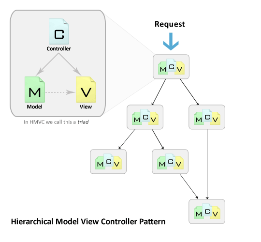
HVMC is an evolution of the MVC pattern used for most web applications today. It came about as an answer to the salability problems apparent within applications which used MVC. The solution presented in the JavaWorld web site, July 2000, proposed that the standard Model, View, and Controller triad become layered into a “hierarchy of parent-child MCV layers“. The image below illustrates how this works:

Each triad functions independently from one another. A triad can request access to another triad via their controllers. Both of these points allow the application to be distributed over multiple locations, if needed. In addition, the layering of MVC triads allows for a more in depth and robust application development. This leads to several advantages which brings us to our next point.


Why should I use HMVC?

Key advantages to implementing the HMVC pattern in your development cycle:

  • Modularization: Reduction of dependencies between the disparate parts of the application.
  • Organization: Having a folder for each of the relevant triads makes for a lighter work load.
  • Reusability: By nature of the design it is easy to reuse nearly every piece of code.
  • Extendibility: Makes the application more extensible without sacrificing ease of maintenance.

These advantages will allow you to get M.O.R.E out of your application with less headaches.


Setting up HMVC in CodeIgniter

To add extra depth to the CodeIgniter from Scratch series, we will be viewing today’s examples in CodeIgniter. I will lead us though the steps needed to get CodeIgniter working with HMVC. Once we’re done with that, I’ll provide a couple of examples. Let’s begin!

Preface

To run web applications, you need a web server on your computer if you are not working remotely. Here are recommendations with links to installation instructions:


Step 1. Download and Install CodeIgniter

Go to codeigniter.com and click the “Download CodeIgniter” link. If you know how to install it and want to skip past this step click here

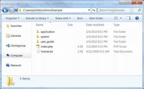
Extract the contents of the zip file to your web server’s document root.

Rename the “CodeIgniter_1.7.2” folder to “hmvcExample“.

Move the “hmvcExample/system/application” folder to “hmvcExample/application“. This is common practice with CodeIgniter. The purpose of doing this is to separate the application from the core of the framework. We should now have a directory that looks like the image below:

Open “hmvcExample/application/config/config.php” in your editor of choice.

Edit the site base url to match the location of your install. In my case I would change

$config['base_url'] = "http://example.com/";

into

$config['base_url'] = "http://localhost/hmvcExample/";

Save your changes and close “hmvcExample/application/config/config.php

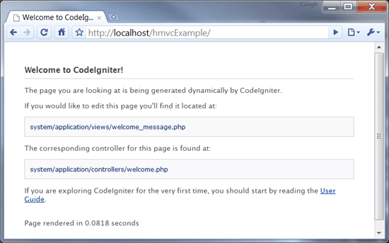
Test that we have a working version of CodeIgniter. Open your browser and check your “http://yourhost/hmvcExample/”.
You should be greeted with the “Welcome to CodeIgniter” screen below:

That’s it! You have successfully downloaded and installed CodeIgniter. Now we will move on to making it work with the HMVC extension.


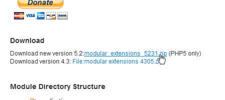
Step 2. Download and Install HMVC Extension

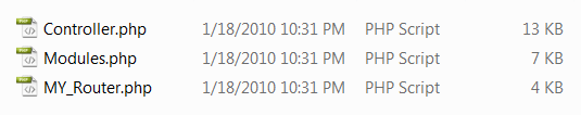
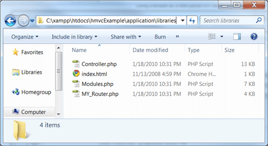
Download version 5.2 of the modular extension from the CodeIgniter Wiki.

In the contents of the zip file are three php files:

Move these three files into the “hmvcExample/application/libraries/” folder.

Recheck your browser. You should still see the Welcome to CodeIgniter screen.

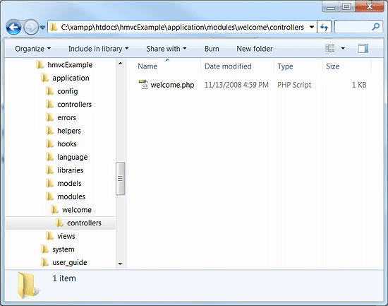
It’s time to add the modules. Create the following directory structure “application/modules/welcome/controllers/“.

Move the “application/controllers/welcome.php” to “application/modules/welcome/controllers/welcome.php“.

Recheck your browser. You should still see the Welcome to CodeIgniter screen.

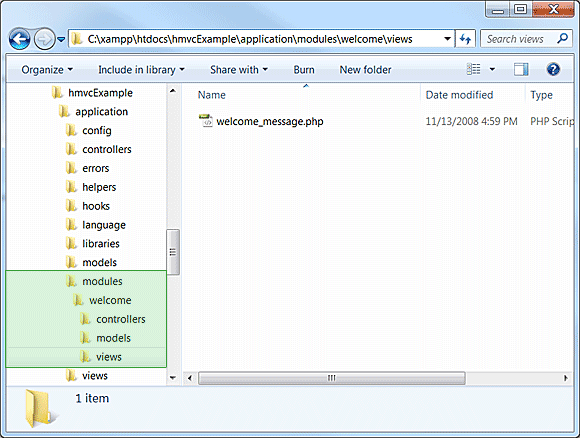
Create the folder “application/modules/welcome/views/

Move the “application/views/welcome_message.php” to “application/modules/welcome/views/welcome_message.php“.

Do a final check on your browser. You should still see the Welcome to CodeIgniter screen.

That’s it! Modular Extensions is installed correctly.


Login Module Example

Now that we have our HMVC enabled instance of CodeIgniter, I will demonstrate some short examples. For our first example I will show how you can apply user access restrictions to pages or entire modules.

Download and unzip CodeIgniter from Scratch Day 6 source files into your web server. You should end up with a folder called “ci_day6/” alongside our “hmvcExample/

Create the “login” module in our “hmvcExample/application” directory. It should end up looking like this

	hmvcExample/application/modules/login/controllers/
	hmvcExample/application/modules/login/models/
	hmvcExample/application/modules/login/views/

Create the “site” module in our “hmvcExample/application” directory. It should end up looking like this

	hmvcExample/application/modules/site/controllers/
	hmvcExample/application/modules/site/models/
	hmvcExample/application/modules/site/views/

TIP: When working with modules I keep a folder named RENAME with the three empty folders controllers, models and views. This saves me a little bit of time anytime I wish to create a new model.

Now we copy over the login module files from “ci_day6/” to our “hmvcExample/“.

	ci_day6/application/controllers/login.php
	ci_day6/application/models/membership_model.php
	ci_day6/application/views/login_form.php
	ci_day6/application/views/signup_form.php
	ci_day6/application/views/signup_successful.php

Copy/Move each of the above files over as listed below

	hmvcExample/application/modules/login/controllers/login.php
	hmvcExample/application/modules/login/models/membership_model.php
	hmvcExample/application/modules/login/views/login_form.php
	hmvcExample/application/modules/login/views/signup_form.php
	hmvcExample/application/modules/login/views/signup_successful.php

Next we copy over the site module files from “ci_day6/” to our “hmvcExample/“.

	ci_day6/application/controllers/site.php
	ci_day6/application/views/logged_in_area.php

Copy/Move each of the above files over as listed below

	hmvcExample/application/modules/site/controllers/site.php
	hmvcExample/application/modules/site/views/logged_in_area.php

The last files to copy over are the global views and CSS and image files. The asterisk (*) denotes folder and all its contents including sub folders

ci_day6/css/*
ci_day6/img/*
ci_day6/application/views/includes/*

Copy each of the above folders and all their content over as listed below

hmvcExample/css/*
hmvcExample/img/*
hmvcExample/application/views/includes/*

Open “hmvcExample/application/config/autoload.php” and edit it to look like the this:

$autoload['libraries'] = array('database', 'session');	// Need to Autoload DB and Session

/*
| -------------------------------------------------------------------
|  Auto-load Helper Files
| -------------------------------------------------------------------
| Prototype:
|
|	$autoload['helper'] = array('url', 'file');
*/

$autoload['helper'] = array('url', 'form');		// Need to autoload url and form.

If you have not already done so from step one, open “hmvcExample/application/config/config.php” and edit it so that the base url is set to your appropriate location.

$config['base_url'] = "http://localhost/hmvcExample/";	// web address. WARNING keep trailing /

Open “hmvcExample/application/config/database.php” and add the appropriate links to your database.

$db['default']['hostname'] = "localhost";		// location of DB server
$db['default']['username'] = "YOUR USERNAME HERE";	// username you use to connect
$db['default']['password'] = "YOUR PASSWORD HERE";	// associated password
$db['default']['database'] = "ci_series";		// The database you want to use

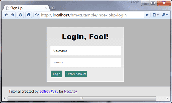
Open your browser to test that the login page displays “http://localhost/hmvcExample/index.php/login

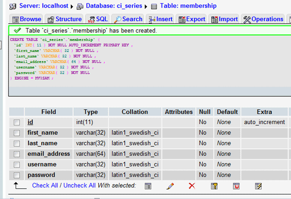
Now to make this login function, we need to create the membership database table. For this, we need to create a table in your PHPMyAdmin.

Select or create your “ci_series” database.

In the sql tab paste the sql code below into the textarea and click go

CREATE TABLE  `ci_series`.`membership` (
`id` INT( 11 ) NOT NULL AUTO_INCREMENT PRIMARY KEY ,
`first_name` VARCHAR( 32 ) NOT NULL ,
`last_name` VARCHAR( 32 ) NOT NULL ,
`email_address` VARCHAR( 64 ) NOT NULL ,
`username` VARCHAR( 32 ) NOT NULL ,
`password` VARCHAR( 32 ) NOT NULL
) ENGINE = MYISAM ;

With the membership table created, we click on the create account link on the login page and add a user to the database.

Login in as the user and confirm that you are now in the “site/members_area” of the site. It should look similar to the image below:

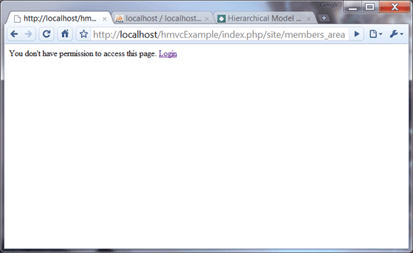
Click “logoff” link and try to manually go back to the members area. you will see that you no longer have permission to do so.

So we have our triads grouped, but we are still not quite in HMVC mode yet. In the site controller we find a function called is_logged_in().

	function is_logged_in()
	{
		$is_logged_in = $this->session->userdata('is_logged_in');
		if(!isset($is_logged_in) || $is_logged_in != true)
		{
			echo 'You don\'t have permission to access this page. Login';
			die();
		}
	}

This is a login related function. In MVC mode, this is required because site cannot access login. With HMVC we can fix this.

Cut the is_logged_in() function out of “applications/modules/site/controllers/site.php

Save site.php without the is_logged_in() function.

Open “applications/modules/login/controllers/login.php“.

Paste the is_logged_in() function into the class.

Save login.php

Open “applications/modules/site/controllers/site.php“.

	function __construct()
	{
		parent::Controller();
        $this->is_logged_in();
	}

In the __Construct() function, we make the HMVC call to login’s is_logged_in() function, as seen below:

	function __construct()
	{
		parent::Controller();
        // Format: modules::run('module/controller/action', $param1, $param2, .., $paramN);
        modules::run('login/is_logged_in');
	}

MVC 101 Complete

There you have it! We have successfully altered day six code into HMVC format. The site module now requests the login check instead of having to use its own. While outwardly we observe no difference, the site design has fundamentally been changed. All login functions are now where they belong: inside the login triad. This may seem like a lot of work with small reward but it is not so. Any login changes can be made once. The internal structure of the triad can be edited without having to change the entire application in response. Code replication for other controllers is no longer required. Last but not least, all the related code is in one handy location. This tiny step may not WOW you but when we delve deeper into bigger, complex applications, the M.O.R.E. apparent it will become how effective the HMVC pattern is.


Members Section Example

We are now going to uncover more of HMVC’s power. We just demonstrated how to call a module from a controller. There are other places you can do that as well. HMVC was build with the User Interface (UI) in mind. We get to call modules from our views as a result. This is where the power of HMVC can really shine.

When calling HMVC from a view you will use the same modules::run(). There is only one requirement when doing this. The resulting output from the call must be a html snippet and not a complete view. This is because we are already inside a view at the time we call the run function. We will see this in action down the page as we edit the site module views.


Step 1. Edit Login Controller

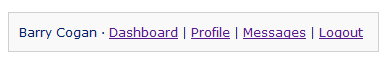
We are going to create a block which appears on the top of every page with our user’s name, important links, and logout option. Widgets like this are commonplace on sites today. The image below illustrates the end result.

Open “applications/modules/login/controllers/login.php“.

    function cp()
    {
        if( $this->session->userdata('username') )
        {
            // load the model for this controller
            $this->load->model('membership_model');
            // Get User Details from Database
            $user = $this->membership_model->get_member_details();
            if( !$user )
            {
                // No user found
                return false;
            }
            else
            {
                // display our widget
                $this->load->view('user_widget', $user);
            }
        }
        else
        {
            // There is no session so we return nothing
            return false;
        }
    }

Paste/Write the code above into the login controller.

cp() receives information from the membership_model function, get_member_details(), which we create in the next step. If a user is found we will display the view snippet detailed in step three. From there we should get the desired block illustrated above.

Save the changes you made to login.php


Step 2. Edit Membership Model

You will notice that we called a get_member_details() from the membership_model. This function gets our user information from the database and will be accessed from a few different sources. We are going to work on that now.

Open “applications/modules/login/models/membership_model.php“.

	function get_member_details($id=false)
	{
		if( !$id )
		{
			// Set Active Record where to the current session's username
			if( $this->session->userdata('username') )
			{
				$this->db->where('username', $this->session->userdata('username'));
			}
			else
			{
				// Return a non logged in person from accessing member profile dashboard
				return false;
			}
		}
		else
		{
			// get the user by id
			$this->db->where('id', $id);
		}
		// Find all records that match this query
		$query = $this->db->get('membership');
		// In this case because we don't have a check set for unique username
		// we will return the last user created with selected username.
		if($query->num_rows() > 0)
		{
			// Get the last row if there are more than one
			$row = $query->last_row();
			// Assign the row to our return array
			$data['id'] = $row->id;
			$data['first_name'] = $row->first_name;
			$data['last_name'] = $row->last_name;
			// Return the user found
			return $data;
		}
		else
		{
			// No results found
			return false;
		}

Comment your code! It’s best practice and will help you and others understand what you wrote.

Line 01: The function call has a default variable $id. This allows us an option of finding a user by ID rather than by username. This made optional by setting it to false in the declaration.

The rest of the function is straight forward and well commented. We query the membership table for a user via username or ID. The result is saved to the $data array and returned. All other outcomes return false.

Save the changes you made to membership_model.php


Step 3. Create User Widget View

The third and final piece to the widget we are creating is the xhtml snippet, which we can put into any other view. This is called by the login controller’s cp() function which we just wrote.

Open “applications/modules/login/views/user_widget.php“.

<code style="font-family: Monaco, Verdana, Sans-serif;
                 font-size: 12px;
                 background-color: #f9f9f9;
                 border: 1px solid #D0D0D0;
                 color: #002166;
                 display: block;
                 margin: 14px 0 14px 0;
                 padding: 12px 10px 12px 10px;">
	<?php echo $first_name.' '.$last_name; ?> &middot;
	<?php echo anchor('site/members_area', 'Dashboard'); ?> |
	<?php echo anchor('site/profile/'.$id, 'Profile'); ?> |
    <?php echo anchor('site/messages/'.$id, 'Messages'); ?> |
	<?php echo anchor('login/logout', 'Logout'); ?>
</code>

Note: It is not a good practice to use inline styling. I opted to put this one instance of inline style for the sake of remaining on topic.

This styled code block takes the information passed from the cp() function. We generate the links using CodeIgniter’s URL helper’s anchor() function. More information about the user guide can be found on codeigniter.com.

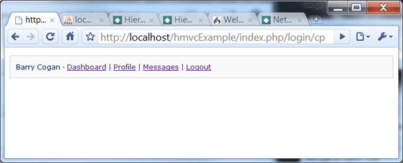
After working on those three files we will test the “login/cp” page. We should see something like the image below. Note: You need to be logged int to see it. Be sure to do so before checking the page or you will see nothing.


Step 4. Edit Site Controller

The links in the snippet to profile and messages will return an error for the moment. This is ok because we have not created those functions yet. Lets do that now.

Open “applications/modules/site/controllers/site.php“.

<?php
class Site extends Controller
{
	function __construct()
	{
		parent::Controller();
	}

	function members_area()
	{
		modules::run('login/is_logged_in');
		$this->load->view('logged_in_area');
	}

__construct()
For the purpose of this example we shall remove the

modules::run('login/is_logged_in');

from the function so that we can make specific parts private and have other parts public.

members_area()
We want only logged in users to access the members dashboard area. So we will use the modules:run HMVC function and call the is_logged_in check from the login controller. We then load the logged_in_area view file which will be edited further down the page.
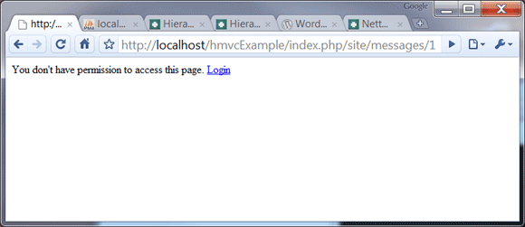
	function messages()
	{
		modules::run('login/is_logged_in');
		$this->load->model('login/membership_model');
		$user = $this->membership_model->get_member_details($this->uri->segment(3));
		if( !$user )
		{
			// No user found
			return false;
		}
		else
		{
			// display our widget
			$this->load->view('member_messages', $user);
		}
	}

messages()

Like members_area(), we only want logged in users so we have included the is_logged_in check. We have already written the code on how to get user details from the database so we will load the login model, membership_model. This will allow us to get the user information via the get_member_details() function. The third URI segment being passed into that function is an id for the user we wish to get messages for. For example, if the url was:


http://localhost/hmvcExample/index.php/site/messages/43

Then our function get_member_details() would be receiving “43″ as an input variable. Depending on the result of get_member_details(), we are either shown the view: member_messages or we get nothing (as a result of a failed query).
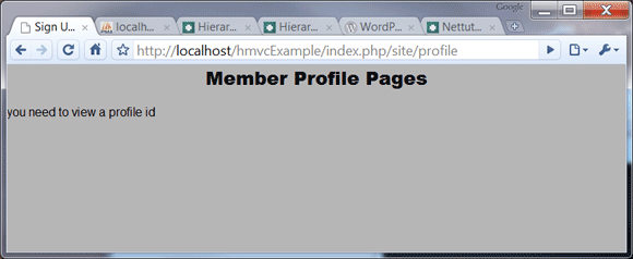
	function profile()
	{
		$this->load->model('login/membership_model');
		$user = $this->membership_model->get_member_details($this->uri->segment(3));
		if( !$user )
		{
			// No user found
			$data['main_content'] = 'member_profile';
			$data['notice'] = 'you need to view a profile id';
			$this->load->view('includes/template', $data);
		}
		else
		{
			// display our widget
			$user['main_content'] = 'member_profile';
			$this->load->view('includes/template', $user);
		}
	}
}

profile()
Just like any social network; we want the profile pages to be public. So we have not included the is_logged_in check. Just like messages, we call the login triad’s membership_model and query the database for our desired user. In this case, if no user is found, we quit a bit more gracefully. We also notify the visitor that an id needs to be specified. With a successful result, we see the member’s profile.


Step 5 Edit Logged In Area View

Open “applications/modules/site/views/logged_in_area.php“.

<!DOCTYPE html>
<html lang="en">
<head>
	<meta http-equiv="Content-Type" content="text/html; charset=utf-8">
	<title>untitled</title>
</head>
<body>
	<?php echo modules::run('login/cp');?>
	<h2>Welcome Back, <?php echo $this->session->userdata('username'); ?>!</h2>
     <p>This section represents the area that only logged in members can access.</p>
</body>
</html>

Overwrite the contents of the file with the code above.

Line 08: HMVC is put into action here. Our view calls the “login/cp” function, and echoes out the html snippet exactly where we tell it. Notice how we didn’t have to prepare anything ourselves? It’s all handled internally by login for us. Handy isn’t it?

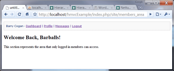
Save the changes you made to logged_in_area.php. Your finished page should display like:


Step 6. Create Member Messages View

Create a new view: “applications/modules/site/views/member_messages.php“.

<!DOCTYPE html>
<html lang="en">
<head>
	<meta http-equiv="Content-Type" content="text/html; charset=utf-8">
	<title>untitled</title>
</head>
<body>
	<?php echo modules::run('login/cp');?>
	<h2><?php echo $first_name; ?>'s Messages</h2>
     <p>This could be where the messaging system gets displayed</p>
</body>
</html>

Write or paste the code above into the newly created file.

This view is pretty much just a clone of the members area to test that login holds on multiple pages. There is one difference: we fished some information from the login module’s membership_model. This is shown as the $first_name variable.

The point of getting user information here would be to pass it on to a module which would return a snippet with the user’s messages.

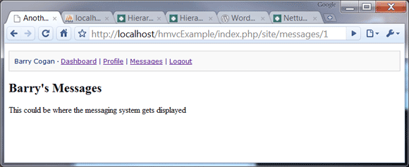
Save the changes you made to member_messages.php. Your finished page should display like:


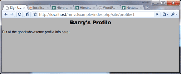
Step 7. Create Member Profile View

Create a new view: “applications/modules/site/views/member_profile.php“.

	<?php echo modules::run('login/cp');?>
    <?php if( isset($notice) ): ?>
    <h2>Member Profile Pages</h2>
    <p><?php echo $notice; ?></p>
    <?php else: ?>
	<h2><?php echo $first_name; ?>'s Profile</h2>
     <p>Put all the good wholesome profile info here!</p>
	<?php endif; ?>

Write or paste the code above into the newly created file.

We have an if statement which detects whether a user was found or not. If not, we get brought to an error page stating we need an ID to view a profile.

Again, we retrieve the user information. Just like messages we would use this to retrieve the user’s friend list, latest blog entry, and activity feed, etc.

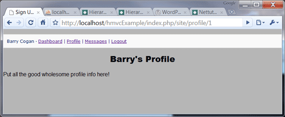
Save the changes you made to member_profile.php. Your finished page should display like:

What Happens When We Logoff?

Because we want the profile pages to be public, it should still display. Minus the user widget of course.

When logged in, and we go to profile without a third uri segment we see our own profile. Logded off, we will be shown the error below.

We should not be able to view the message or dashboard. When we check the messages page we are greeted with this:

We’re Done

That’s it! We have added more depth to our initial example and demonstrated the different ways to use HMVC.

  • Call modules::run() from a controller.
  • Echo modules::run() from a view to display a HTML snippet.
  • Load a model from another module.

I hope this has been an enlightening experience. HMVC is an extraordinary pattern which makes applications more robust. It is well worth the investment. Give it a try. I promise you won’t ever want to go back to vanilla MVC!

Resources: 400+ Foliage Vectors


You can never have enough vector resources, especially when it comes to foliage elements such as leaves, branches and floral patterns. They can be used in so many different design projects, from minimalistic and elegant wedding invitations to dark and grungy concert posters. It’s for this reason, we have rounded up a collection of almost 400 individual vector resources, including vector packs, brush packs, seamless patterns and frames. Enjoy!

Continue reading “Resources: 400+ Foliage Vectors”

Create Your Own “Green” Earth Day Animation – AE Premium

Earth day is long gone now, but every day is a good day for earth day. In this tutorial you will learn how to simulate a water drop rolling down a leaf in a very convincing manner. With some nice depth of filed and time re-mapping to add a touch of realism, this should prove to be a very useful technique that can be used in numerous designs such as a beverage commercial, with a water drop rolling down the beverage bottle.

Premium Tut Preview

This is a Premium Tutorial. To view you must Join Premium.

Once you’ve joined, log-in to the Tuts+ Dashboard with your username and password to immediately access your Premium Content. Navigate to Ae Premium via ‘Premium Categories’ in the sidebar. You’ll be able to grab the tutorial videos, project files and assets in the members’ area.


How to Create a Live Performance Rig in Logic Pro – Part 1 – Audio Premium

In this week’s Audio Premium content, Toby Pitman teaches you how to make a live performance rig in Logic Pro similar to the Sonifi iPhone app. While this tut is quite Logic-centric, it does include a pack of 20 remix loops that will be of general interest.

To learn more about what you get as part of Audio Premium, read this.

This is one monster tut! It includes:

  • A double-length Premium tut. That’s four times longer than a standard tut!
  • 4 video walkthroughs, totaling over 30 minutes in total.
  • 20 remix loops. You will find a “Remix Loops” folder in the Playpack.

If you’re a Logic Pro user who has been thinking of signing up for Premium, this might be the week to jump! The final part (or two) will come out next month.

In this the first of a two part series I’m going to show you how to build a live performance rig in Logic Pro. The idea is to mimic the feature set of BT’s Sonifi iPhone app, although as you’ll find out that’s just the tip of the iceberg!

The other day I purchased electronic music maestro BT’s Sonifi app for my iPhone. It’s a rather cool remix tool that let’s you switch loops and control FX using the touch screen. It also has a really cool ‘Stutter’ type glitch effect which can be triggered by shaking the phone. I thought to myself (while scratching my chin), “I wonder if you could make this using just Logic Pro?”

Table of Contents

  • What is Sonifi?
  • Setting up the Project
  • The Touch Tracks Object
  • Audio vs MIDI with Touch Tracks
  • EXS24 Import and Setup
  • Setting Up Touch Track Regions
  • Assigning the Touch Track Regions
  • Groups and Beat Syncing
  • Testing Your Masterpiece!
  • Folders vs Regions
  • Working With Multiple Channels
  • Live Performance Benefits
  • What’s In Part 2!

Existing Premium members can log-in and download. Not a Plus member? Join now.


Open Mic: Tell Us About the First Concert You Went To

I’m curious to hear about the first music concert you went to, and how influential it was in you becoming a musician. What do you remember about your first concert?

Each Tuesday we open our mic to readers and lurkers alike to come out of the woodwork and tell us your thoughts and opinion, your experiences and mistakes, what you love and what you hate. We want to hear from you, and here’s your chance.


How old were you when you went to your first concert? Who was playing? What do you remember most about it? How did it inspire you?


Workshop #71: Wolves by Subcirrus

At Audiotuts+ we irregularly put up a reader track for workshopping and critique (find out how to submit a track). This is how it works: you upload your song, and every week or so we’ll publish one here and step away from the podium. The floor is yours to talk about the track and how the artist can fix problems in and improve upon the mix and the song.

This track has been submitted for your friendly, constructive criticism. They have put their track (and their heart and soul) in your hands to learn and get useful feedback.

  • Do you enjoy the song or track itself? Does it have potential?
  • Can the arrangement be improved?
  • How did you find the mix? What would you do differently?
  • What do you enjoy about the rhythm track? What can be done to improve it?
  • Is the choice of instruments relevant and effective for the style/song?
  • Are the lyrics (if any) effective? Does the style, arrangement and genre of the song suit them?
  • Can you suggest any specific techniques that might improve the track?
  • Do you have any other constructive feedback?

Wolves by Subcirrus

Artist’s website: subcirrus.com

Description of the track:

Song I made several years ago using only an older Korg Triton Pro. Melodic, Tranquil, Electronic. Luv Yall.

Download audio file (Wolves.mp3)

Terms of Use: Users can stream the track for the purposes of giving feedback but cannot download or redistribute it.

Have a listen to the track and offer your constructive criticism for this Workshop in the comments section.


Submit Your Tracks for Workshopping

Need constructive criticism on your own tracks? Submit them using this form.


9 Ways To Improve Your Writing

Does a blank page scare you? It doesn’t matter if it is created by a word processing application, sitting in a typewriter or resting under your pen. Can you fill that void?

Don’t be ashamed if you are nervous. It happens to a lot of people who don’t consider themselves very good writers. The good news is that not a lot of readers are critics. They’re not reading to find fault or grade you on word choice. Unless you are in school.

So let’s work on your writing. The best way to improve it is to write. Just do it. Here are some things to keep in mind that will help:

1. Create an outline

This forces you to think about what you want to write and organize it. You don’t need to put a lot of detail into it. At the least, list your major points. Think about what it would take to fill those short lines in. Revise and/or reorder if need be. When you are done, you have a blueprint that guides you through your writing.

2. Solve a problem

Your readers want to learn how to solve a problem. They want information. The reason you are writing is to fill that need. It’s not about proving how well you can write. Concentrate on what the reader wants to know instead of impressing them. Worry about offering complete information not words.

3. Start in the middle

The beginning or introduction of any piece of writing can be tricky. It is intimidating to come up with the perfect opening. Even trickier is working the transition from introduction to your main points. So cut right to your arguments or information. Concentrate on that and conclude quickly. Then go back and write the introduction that fits into the whole writing.

4. Respect your readers’ vocabulary

This is not about dumbing it down. Use their language. Not only does it keep your words within their world, but it creates a bond between you and reader. They assume you are one of them because you are using words they would use. They will feel more comfortable with you and your words.

Be careful not to break that bond by using jargon. These are the acronyms and terms specific to your field or industry. It’s especially dangerous because jargon may be a natural part of your language. Just about all subcultures use specific words as a shorthand. It makes it more efficient with your group. But it creates barriers between you and people outside your area. If you are explaining something to your readers, the chances are good they’re not going to understand your jargon.

5. Don’t fall in love with your words

This reinforces previous points. Unless you are writing poetry, your readers aren’t looking for lovely language. There will be times that you impress yourself with your wonderful words. But if those words don’t help your readers understand your point, you should edit them out of the piece. Remember, readers want words they know and solutions.

There will be sentences or paragraphs that don’t cut it. They miss the mark and need to be erased. But many writers look for ways to keep the cleverly-crafted passages. You may have invested your heart and soul into those words but they are not necessary. Delete them.

6. Be concise

This is the classic “use one word instead of two” advice. Tight language is easier to read and will move the reader along more quickly.

7. Write it as long as it needs to be

This is NOT an exclusion to the previous rule. The total length of your piece depends on many factors such as how complicated or technical it is. You don’t want to cut it short if you haven’t gotten to your point. Yes, cut out unnecessary words but don’t stop writing necessary ones until you’ve made your points.

8. Respect your readers’ time

This IS an exception to the previous rule. If your readers tend to have little time to dedicate to reading, then you need to fit your work into their schedules.

9. Don’t worry about grammar so much

Unless your audience is made up of high school composition teachers, a lot of the commonly held grammar rules aren’t so important. Start your sentences with “but” and end them with prepositions if need be. Don’t go wild though. Some grammar taboos can allow your writing to flow better. Concentrate on whether your word choice makes it harder to understand your writing or not.

Why you need to do this

Writing is choosing words. It doesn’t matter if you are typing or speaking. You are choosing words. The better you write, the better you will communicate. The Internet gives us more opportunities to communicate in many forms. But at the heart of it all is writing.

Improve your writing and you improve your communication. Then you improve your ability to interact with people and get work done. This could be the most important factor when your bosses are deciding on your promotion.

Good luck.

Countdown in Style With an Airport Terminal Timer

In this tutorial we’ll make a reusable countdown timer with a dynamic target date that can be set via XML. We’ll animate the numbers flipping down in the style of an old airport or train station status board. We’ll cover code, graphics creation and animation. What are you waiting for..?


Step 1: Set Up Your Flash File

Create a new Flash file (Actionscript 3) with these settings: 500×300, black background, and 30 fps.

Flash file setup

Step 2: Create the digit_bottom MovieClip

Create a new MovieClip called ‘digit_bottom’ and draw a rounded rectangle inside it approximately 36px wide by 50px tall. (A quick way to draw a rectangle with precise dimensions is to select the rectangle tool and Alt-click on the stage.)

Give the rectangle a gradient fill from #111111 (top) to #333333 (bottom) and a 2 px outline colored #333333.

Background image or animation

Step 3: Position the Rectangle

Position the rectangle so that the registration point of the MovieClip (the little ‘+’) is exactly halfway between the top and bottom and the left edge. If you made your rectangle 50px tall, then the y value should be -25.

Rectangle Properties

Step 4: Add the Number

Create a new layer and add a dynamic text field called ‘t_num’. Choose a font that has an airport or train station feel to it (like Helvetica, DIN, or Interstate). I’m using Helvetica Bold.

Set the Paragraph Format to centered, and remember to embed the fonts for the numbers 0–9.

Position the text field so it’s centered on the background rectangle.

Number text field

We’re going to be using this MovieClip as the base for another graphic, so take a moment to make sure it looks good.


Step 5: Add a Mask

Create a new layer on the timeline of the digit_bottom MovieClip and call it ‘mask’. Copy the rounded rectangle and Paste in Place on the mask layer (Edit > Paste in Place, or Command-Shift-V).

Select the top half of the mask rectangle and delete it.

Right-click the mask layer, choose Mask and make sure that it is masking all of the layers below it.

Create the Mask

Step 6: Create the digit_top MovieClip

Go into the Library, duplicate the digit_bottom MovieClip and name the new copy ‘digit_top’.

This MovieClip will be virtually identical to the digit_bottom clip, except the mask will be showing the top half of the graphics instead of the bottom.

Delete the graphics currently on the mask layer. Copy the rounded rectangle and again Paste in Place on the mask layer. This time select the bottom half and delete it.

The only other adjustment you might want to make here is to adjust the color of the text and the shading of the background rounded rectangle. I made the graphics in my digit_top clip a bit darker to simulate light coming from the top.

digit_top and digit_bottom clips

Step 7: Create the Digit MovieClip

Create a new MovieClip named ‘Digit’. Drag in the digit_top and digit_bottom MovieClips and position them both at 0,0. Give them the instance names ‘top1′ and ‘bottom1′.

Now copy both of the MovieClips (digit_top and digit_bottom), create a new layer, and Paste in Place a copy of each. Name the new copies ‘top2′ and ‘bottom2′.

You should now have 4 MovieClips inside your Digit MovieClip: 2 copies of digit_top and 2 copies of digit_bottom. I’ll explain why we’re setting it up like this in the next step.


Step 8: Animation Strategy

We have to do a bit of animation trickery to get the flipping numbers effect we want. Take a look at the diagram below of our Digit MovieClip (I’m rendering it in 3D just so you can see the layering more easily):

Digit Animation Diagram

Animation Step 1:

We start out with the bottom2 clip flipped upside down (using the scaleY property) and placed behind the top2 clip. At this point the 2 clips that are visible are top2 and bottom1. The numbers on these two clips correspond to each other, so they form a complete digit.

Animation Step 2:

Now we flip down the top2 clip to the center of the digit. At this point scaleY will be zero, so the clip won’t be visible. At the same time, we’re also flipping down the bottom2 clip, but this one we’ll flip all the way to the bottom. Since it’s behind top2, it won’t show until it flips past the halfway point. Now the 2 visible clips are top1 and bottom1. The numbers on these two clips don’t match, but that’s okay because this step only lasts for a brief moment.

Animation Step 3:

The top2 clip stays in the center as bottom2 continues to fall all the way down to the bottom. Once it’s in place the numbers on the visible clips (top1 and bottom2) again match to form a complete digit.

Animation Step 4:

At this point we’ll relayer and reset the positions of the 2 hidden clips to get ready for the next flip. Notice how the clips are in the same positions as Step 1, only reversed.


Step 9: Create the Clock MovieClip

Now that we have the individual Digit MovieClip set up, let’s build the clock.

Create a new MovieClip on the stage called ‘Clock’ with the instance name ‘clock’. Inside the new MovieClip place 9 copies of your Digit MovieClip; 2 for seconds, 2 for minutes, 2 for hours, and 3 for days. Give each digit an instance name. From left to right name them ‘digit0′, ‘digit1′, ‘digit2′, and so on.

Add some colons to separate the MovieClips and labels for each section. The design is up to you. I added a dark rounded rectangle as a background for my clock.

Lastly, add a dynamic text field called ‘t_date’. This is where we’ll show the target date the clock is counting down to. Remember to embed the font for this text field if you’re not using a system font.

Clock MovieClip

Step 10: Create the Digit Class

Create a new Actionscript file called ‘Digit.as’ and add this code to create the empty shell for the class:

package {

	import flash.display.MovieClip;

	public class Digit extends MovieClip {
		private const TOP:int = 0;
		private const BOTTOM:int = 1;

		private var _currentDigit:Array;
		private var _nextDigit:Array;
		private var _number:String = "0";

		// CONSTRUCTOR
		public function Digit() {
			_currentDigit = new Array( top1, bottom1 );
			_nextDigit = new Array( top2, bottom2 );

		}

	}

}

This doesn’t do much yet. We’ve got a couple of arrays to hold the 2 sets of digit_top and digit_bottom MovieClips. I’ve set up 2 constants, TOP and BOTTOM to help keep track of the top and bottom clips within those arrays. The _number variable will hold the digit that’s on display at any given time.

(Note: I’m using the underscore in my variable names to indicate private variables.)

Find your Digit MovieClip in the Library and assign this class to it in the Linkage settings.

Digit Class Linkage Settings

Step 11: Import the TweenLite Library

We’re going to be using the TweenLite library to animate our Digit MovieClip.

Download the AS3 version of the TweenLite library here.

Place the ‘com’ folder in the same directory as your main Flash file (or in your source path, if you’ve set up a different class path).

Add these two lines at the top of your Digit class, just below the MovieClip import:

import com.greensock.*
import com.greensock.easing.*

We’re barely going to scratch the surface of what TweenLite can do in this tutorial. For more information check out the TweenLite Documentation.


Step 12: Program the flipTo Animation

Add this function to your Digit class:

public function flipTo(num:String):void {
	_number = num;
	_nextDigit[TOP].t_num.text = num;
	_nextDigit[BOTTOM].t_num.text = num;

	// flip down the top of the digit to the halfway point
	TweenLite.to(_currentDigit[TOP], .15, {scaleY: 0, ease: Linear.easeNone});
	// flip the next digit bottom down
	TweenLite.to(_nextDigit[BOTTOM], .3, {scaleY:1, onComplete: flipComplete,  ease: Bounce.easeOut});
}

Here’s what’s happening, line by line:

  • This function accepts a String that will hold the digit we’ll be flipping to. The first line just sets our _number variable to hold that digit.
  • Next we set the text fields in the TOP and BOTTOM MovieClips in our _nextDigit array to display that same digit.
  • Then we use TweenLite to tween the scaleY property of the TOP MovieClip of the _currentDigit to 0. This gives the effect that it’s ‘falling’ toward the center of the digit.
  • The last line is another tween, this time animating the BOTTOM clip of the _nextDigit from the the top of the digit down to the bottom. Again we’re using the scaleY property to simulate this effect, but this time from -1 to 1. Since it’s tweening twice as far as the TOP clip, we give it twice the amount of time (.3 seconds instead of .15). When this tween finishes it will call a function called ‘flipComplete’. We’ll write that function in the next step.

Take another look at the diagram in Step 8 if you’re confused about the animation here.


Step 13: Add the flipComplete() Function

Add this function to the Digit class just below the flipTo function:

private function flipComplete():void {
	// swap digits
	var next:Array = _currentDigit;
	_currentDigit = _nextDigit;
	_nextDigit = next;

	// reset layering
	reset();
}

Once the flip animation completes we’ll run this function. It swaps the _currentDigit and _nextDigit arrays. After that’s done it calls a function named ‘reset’ to reset the clip layering and positions for the next flip. Let’s write that function now.


Step 14: Add the reset() Function

Add this function to the Digit class:

private function reset():void {
	addChild(_nextDigit[BOTTOM]);
	addChild(_currentDigit[TOP]);

	// flip up the next bottom to be behind the current top
	_nextDigit[BOTTOM].scaleY = -1;
	_nextDigit[TOP].scaleY = 1;
}

The first two lines in this function pop the _nextDigit BOTTOM and then the _currentDigit TOP to the top of the display list. I usually just use addChild() to do this because it requires less typing than using setChildIndex().

After the clips are re-layered, we set the scaleY properties so they’ll be ready for the next flip. This means changing _nextDigit[BOTTOM] from 1 to -1 and _nextDigit[TOP] from 0 to 1.

Again, check the diagram in Step 8 if you’re getting lost.


Step 15: Add to the Constructor

One thing we forgot to do is position the clips properly for the first flip animation. We can do that easily by adding a call to the reset function right in the Digit class constructor:

// CONSTRUCTOR
public function Digit() {
	_currentDigit = new Array( top1, bottom1 );
	_nextDigit = new Array ( top2, bottom2 );

	reset();
}

Step 16: Add the number() Function

One last thing we’ll need in our Digit class is a way to access the private _number variable from outside the class. We’ll add a simple accessor function:

public function get number():String {
	return _number;
}

Step 17: Create the Clock Class

Create a new ActionScript file named ‘Clock.as’. Paste in this code:

package {

	import flash.display.MovieClip;
	import flash.events.TimerEvent;
	import flash.media.Sound;
	import flash.utils.Timer;

	public class Clock extends MovieClip {
		private var _clockTimer:Timer;
		private var _targetDate:Date;

		// CONSTRUCTOR
		public function Clock() {

		}

	}

}

Not much here yet. Just importing some of the classes we’ll need. I also have a couple of private variables. _clockTimer will count down the seconds for us, and _targetDate will hold the date that we’re counting down to.


Step 18: Add the set() Function

Add this function to the Clock class just below the constructor:

// set the target date and start the countdown timer
public function set(date:Date):void {
	_targetDate = date;

	_clockTimer = new Timer(1000) // tick every second (1000 milliseconds)
	_clockTimer.addEventListener(TimerEvent.TIMER, update);
	_clockTimer.start();

	// display the target date above the clock
	t_date.text = _targetDate.toLocaleString().toUpperCase();

	// update the clock once here so it starts with the correct time
	update();
}

This is the function that we’ll use to set the target date for the clock. It accepts a date (of course) and assigns that to the _targetDate variable. It then instantiates our _clockTimer. The _clockTimer will call the update function once per second to update the digits.

After starting the timer, the function sets the t_date text with the target date. The toLocaleString() function ensures the date is displayed in the user’s local time zone.

The last line of this function calls update once to set the clock to the proper time. Otherwise it would display “000 00:00:00″ for one second until the first timer event.


Step 19: Add the update() Function

This function is a bit long because it’s where most of the work gets done. Add it to your Clock class:

private function update(e:TimerEvent = null):void {
	var now:Date = new Date(); // get the current time

	// find the difference (in ms) between the target and now
	var diff:Number = _targetDate.valueOf() - now.valueOf();
	if(diff <=0){
		// TIME'S UP!
		// do something cool here
		_clockTimer.stop();
		_clockTimer.removeEventListener(TimerEvent.TIMER, update);
		diff = 0;
	}

	// convert to seconds
	diff = Math.round(diff/1000);

	// number of days
	var days:int = Math.floor(diff/ (24 * 60 * 60));
	diff -= days*(24 * 60 * 60 );

	// number of hours
	var hours:int = Math.floor(diff / (60 * 60))
	diff -= hours*60 * 60;

	// number of minutes
	var min:int = Math.floor(diff/ 60);
	diff -= min*60;

	// seconds are all that remain
	var sec:int = diff;

	// create an array of strings to hold the number for each value
	var diffArr:Array = new Array(String(days), String(hours), String(min), String(sec));
	var diffString:String = ""
	var len:int = 3; // the first value (days) has 3 digits. All the rest have 2
	for each(var s:String in diffArr){
		// pad the string with a leading zero if needed
		while(s.length < len){
			s = "0"+s;
		}

		len = 2; // all the other values are 2 digits in length
		diffString += s; // add the padded string to the diffString
	}

	// go through each character in the diffString and set the corresponding digit
	for(var i:int = 0; i< diffString.length; i++){
		if(diffString.substr(i, 1) != this["digit"+i].number){
			this["digit"+i].flipTo(diffString.substr(i, 1));
		}
	}

}

This function accepts a TimerEvent as its parameter. The default value for this parameter is null. This allows us to call the function without sending a parameter, as we’re doing in the set function.

The first line of this function gets the current date and time as a Date object. Next, we find the difference between the current date and the target date (line 37). If the difference is 0 or less, then it’s past the target date, so we stop the _clockTimer (lines 38-44).

Since the difference in time between now and the target is calculated in milliseconds, we need to convert that into a nice readable display of days, hours, minutes, and seconds (lines 46-62). The math here is pretty simple as long as you know that there are 1000 milliseconds in a second, 60 seconds in a minute, 60 minutes in an hour and 24 hours in a day.

On line 65 we store all those values as elements in an array. Starting on line 68 we loop through each element and add it to a String of characters called ‘diffString’. While doing this we also add leading zeroes where necessary (line 71). So if our values for the clock were 30 days, 5 hours, 56 minutes, and 6 seconds the diffString would look like this: “030055606″.

The last thing this function does is loop through the characters in the diffString (using the charAt() method). For each character in the string we check to see if it’s different from the number currently displayed on the corresponding digit. This is easy because of the way we named our digit instances. If the number is not the same as the one currently displayed we tell that digit to flip to the number in the diffString.


Step 20: Add Sound

Find (or create) a good ticking sound that will play every time the clock updates. Import it into the Library of your Flash file and set the class name to ‘TickSound’ in the Linkage settings.

Tick Sound Linkage Settings

Add the _tickSound variable to the top of your Clock class just below the two other variables:

private var _clockTimer:Timer;
private var _targetDate:Date;
private var _tickSound:Sound = new TickSound();

And play the sound inside the update function:

_tickSound.play();

Step 21: Add the Main Document Class

Our countdown timer is complete, we just need some way to set the target date. Create a new Actionscript file called ‘Main.as’ with this code:

package {

	import flash.display.MovieClip;

	public class Main extends MovieClip {

		public function Main() {

			// set the target date for the clock
			var targetDate:Date = new Date();
			targetDate.setTime( Date.UTC(2010, 4, 28, 20, 00) );
			clock.set(targetDate);
		}
	}

}

All this does is set the target date for the Clock instance on the Stage. I’m using setTime() and Date.UTC() to convert the date to Universal Timecode. This way the date will be correct when it gets converted back to local time on the user’s computer. Also, remember that the months are zero-based. So, the month 4 is actually May, not April.

In your Flash file set the Document class to ‘Main’.

Set the Document Class

If you need a refresher on using the Document Class check out this Quick Tip.


Step 22: Test

Test your movie now and everything should work. Try changing the target date in the Main class and see how the countdown changes.

One potential downside to how we’ve set this up is that the target date is hard-coded in our SWF. That’s fine, but it would be cool if we could dynamically load the date so that we could reuse the countdown for different things.

Let’s see what we can do about that…


Step 23: Create the XML File

Create a new XML file in the same folder as your Flash file called ‘targetDate.xml’ (an XML file is just a plain text file). Add this to the XML file:

<targetDate>
	<year>2011</year>
	<month>3</month>
	<day>25</day>
	<hour>20</hour>
	<minute>21</minute>
</targetDate>

Using this format for our target date is pretty bloated (there is more markup than there is actual data), but it will keep things very clear for the purposes of this tutorial.


Step 24: Load the XML

Now let’s make some changes to our Main document class. Replace everything in that file with this code:

package {

	import flash.display.MovieClip;
	import flash.net.URLLoader;
	import flash.net.URLRequest;
	import flash.events.Event;

	public class Main extends MovieClip {

		// CONSTRUCTOR
		public function Main() {
			// load the XML
			var xmlLoader:URLLoader = new URLLoader();
			xmlLoader.addEventListener(Event.COMPLETE, onDataLoaded);
			xmlLoader.load( new URLRequest("targetDate.xml") );

		}

	}

}

You’ll notice we’ve imported some additional classes to help us load the XML file. In the constructor function we’re creating a new URLLoader instance to load the file for us. We attach an event listener that will call a function named ‘onDataLoaded’ when the file is finished loading.


Step 25: Add the onDataLoaded() Function

Add this function to the Main class:

private function onDataLoaded(e:Event):void {
	var xml:XML = new XML(e.target.data);

	var targetDate:Date = new Date();
	targetDate.setTime(Date.UTC(int(xml.year), int(xml.month), int(xml.day), int(xml.hour), int(xml.minute) ));

	clock.set(targetDate);
}

This function creates a new XML object from the file we loaded. We then create a new Date object from the values in the XML. We’re again using setTime() and Date.UTC() to convert the date to Universal Timecode. The final line is the same as before, it just sends the target date to our Clock instance.


Step 26: Wrap Up

That’s pretty much it for this one. There are a couple of enhancements you might like to make though:

  1. Depending on what you’re using the countdown for, you might want to do something special for the user when the countdown hits zero. You’d add this to the Clock class in the part of the update function that checks if the timer is at zero.
  2. As I mentioned, the format of our XML is pretty wasteful as it is. You might rather just pass in the date as a string via FlashVars, use a different data format (like JSON), or just reformat the XML to be a bit more compact.

Good luck! As always, post a comment and let me know what you think.