Interview with Maxim Mitenkov AKA Vimark


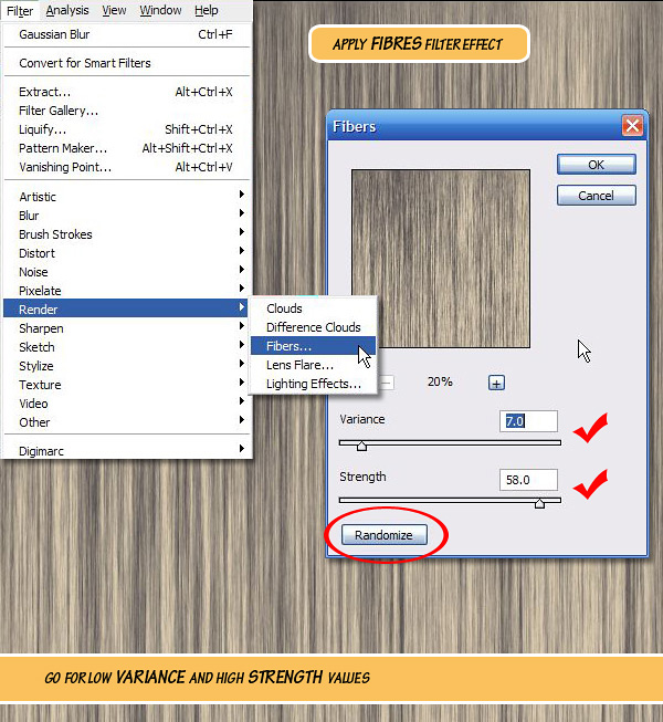
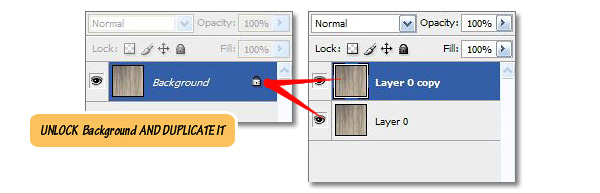
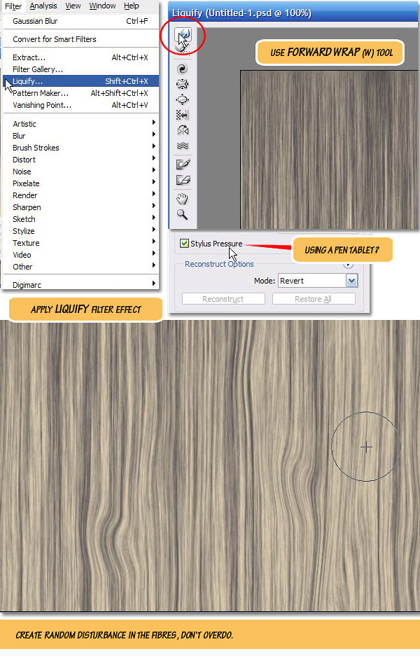
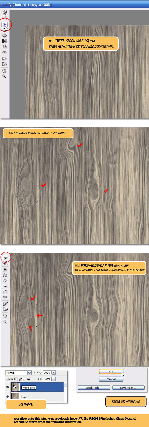
Maxim Mitenkov is a designer from Belarus known for his mystical photo manipulations. Today, we will discuss how Maxim got his start as a designer, his inspiration, his technique, and style.

Q Hello, welcome to the PSDTUTS! Please, introduce yourself, tell us briefly about yourself, where are you from, and how did you start in digital art?

Hi everyone! My name is Maxim Mitenkov, better known in network as Vimark. I live in the city of Minsk, Belarus. I have been a digital artist since 2006 when I signed up for the site worth1000.com. Before that I was involved in the "domestic market" where I created illustrations for flyers, logos and corporate identity elements. Before that, I was studying and teaching. I am self-trained, learned mostly from books (design essentials, coloring, composition, etc.), online tutorials and guru advice.

Worth1000 gave me the opportunity to participate in competitions. These were illustration and corporate style contests. There I learned to work logically and purposefully. In addition, it helped to systematize knowledge and to optimize the work, since there were only a few days given for the development of the contest project. During those days you had to introduce an idea and implement it. I won a couple of contests, ;) . Basically this is how I started. Now my gallery is located on Deviantart. I am there for more than 2 years. I work rather for pleasure. ;)

Q How would you describe your work, your style – your approach to design and illustration?

Mostly I work in the genre of photo manipulation. My work is my hobby: I get to work only when I have ideas, when I “feel” the them. My illustrations are full of fantasy and surrealism. There are works done in bright colors, and ones done in dark colors. This is a reflection of my mood. In my works I try to express a different perspective, from an outside point of view. It is hard to say that works have a certain style, only the viewer can determine that. I just try to make my works look as it is.

QCould you tell us briefly about your career? What is your favorite project? Tell us about your current or upcoming projects.

I never really thought about my career. I did illustrations for rock bands. The "Random Reality” project came out to be quite an interesting one. I was in it for several months. As a result there appeared three interrelated illustrations. Briefly, this project was born in the elevator and is about the ride in an elevator. The idea was that if you type a certain key combination on the keyboard of the elevator, it can take you to a different reality. So later the first poster became the album cover for metal band GranDesign – "Time Elevation", and the second poster got Daily Deviation on deviantart. I should say I love all my projects. I work beyond the pale, everything is given to imagination. I work, when I’m ready (the ideas). I am currently working on the project "Invasion". It is about the invasion of another reality into ours, or vice versa – our reality into another. This is sort of yin-yang.

QTell us about the programs you work in. Give some tips you want to share with us.

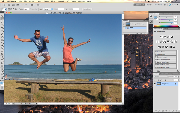
I spend a great deal of my time in Photoshop (I started in version 5). I am ok with everything in the program: it has a logical interface, elaborate features and settings. I use 3Dmax and CorelDraw too. I think that in order to work comfortably with any software product you need to understand the philosophy of the program and then it will go easy enough. I do not like giving advice. The main thing is that you have to trust and believe in yourself.

QCould you tell about your workflow, what does it look like, what steps does it consists of?

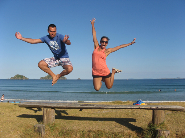
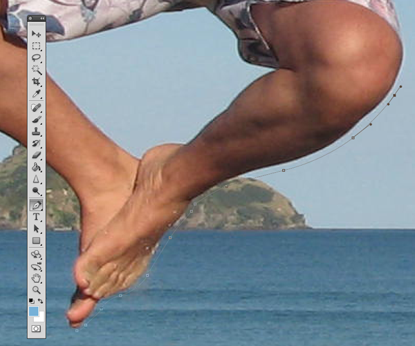
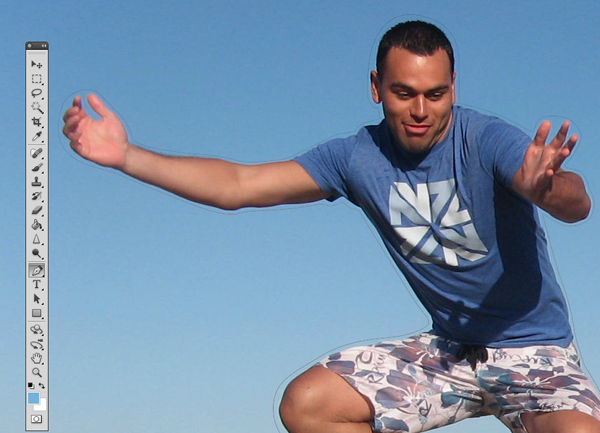
A workflow consists of three steps (probably like with anyone else): the search for ideas and details enhancement, search for necessary materials, idea’s implementation. I let the process of search for ideas take it course. I do not force myself: moreover I just wait for the idea to come itself. Usually, it hovers around in my head, do not miss it! Then I think it over, bring it in the head to more sharp-cut shape. After that, I look for the materials needed for its implementation. To do this I use my photos (I have been into photography not long ago, but I have a large base of my shots from trips, hikes, etc.). I take some additional pictures, use stock photo resources. I go through several stages, when I create an illustration, I try not to finish the work in one go. It is necessary for excess removal and for getting back to work with fresh mind. You may have to give up some of the ideas, as they stop “shining” in the process of implementation.

QI know that many of your works are used without your consent, how do you fight against this. Can you recommend something for designers, who find themselves in the same situation?

Yes, this is a big problem. It is quite difficult to monitor each theft. In such cases I try to contact the thief and ask him not to do so again. Only together can we fight theft, this is how it works on Deviantart. If the work is stolen, and someone finds it, the author almost immediately became well-known. And then comes along the fight with a thief.

QWhat are your favorite web sites that you visit before starting a new project? What pulls your attention to them? What makes them unique?

Most often I use stock site sxc.hu in my work. I participate in this project myself (there are more than 400 pictures of mine). Main advantages: high resolution imaging, satisfactory image quality, minimal restrictions for use. Web site administration selects images, monitors the quality. Thus, everyone who is involved in this project has his or her own benefits. Designers receive the necessary material, photographers promote their works. In addition, there takes place communication, constructive criticism.

QYour works are unique. Can you tell us what inspires you? Can you give a particular example of how the idea of making an artwork was created?

Thank you for the kind words. Ideas are born when and where they want, sometimes even in the most unexpected places. Conversation, words, music or view out of the window sometimes lead to the creation of an idea. For example, it happened with the project named – “F ** ck off”. I was coming back from work very tired. On my way I saw the statue on the square. Its head was stained with pigeons. "How much can you take?" – came to my mind. And here where the idea was born. What if one day the statue tired of nasty birds will gave the answer. Patience must be exhaustible. So this is how the work appeared, which, in my opinion, represents the readiness to fight. As the saying is – the spark can cause the flame!

QTime is the topic of many of your works, what inspires you to create these projects?

Time. This topic is very tremendous and significant for everyone. Time affects everyone. Once I wanted to stop time, and there appeared «Stop time» artwork (by the way it’s one of my first more or less serious works). It seemed to me after that that time is running out, and so there appeared «Time is gone» artwork. Recently, I wondered how time is being made, and as a result there appeared artwork – «Creation of time». This project is not completed yet. It seems to me that I will return to it not once in my creativity.

QWhat is the most important thing you have learned after you started doing design? How does it help you now?

Trust yourself and believe in yourself. I like the Archimedes quote: "Give me a place to stand, and I shall move the world."

QHow do you see yourself in 5-10 years in the design industry? What are the goals you want to achieve by this time?

I really would like to participate in exhibitions. I hope that by that time interest to my work will allow me to exhibit my works. Besides I really want to try a hand in traditional art for example, in painting. But time and money is not enough for this. But the most important thing is not to lose the desire to create.

QThanks for the interview. It was a pleasure talking to you. A few final thoughts. What would you wish the designers reading this interview?

Thank you too. I wish more ideas! Big and bright ideas, which do not let you sleep and give you the desire to create.


Maxim Mitenkov on Web

How Far Ahead Do You Plan?

Its been made pretty clear that an integral part of being awesome at being productive is doing some planning. When, where and what method you use are questions only you can figure out through trial and error.

Once youve stopped trying and (hopefully) erring, you can dig a little deeper and look further into the future. Thats when the real meat of goal-setting comes into play. Thats when life gets interesting…and more fulfilling.

How far ahead do you plan? How many weeks, months, years? Do you plan activities, events and goals? How far down the rabbit hole do you go?

An Introduction to Texturing, Lighting and Rendering Architectural Exteriors – Day 2

In the field of Architectural Visualization, realism must always be the 1st goal that we strive to accomplish. In this 3 day tutorial series, you will gain a solid introduction to valuable lighting and texture mapping techniques that can be used to achieve realistic architectural renderings.

This tutorial is Day 2 in a series – Go to Day 1


Video 1

Download

Note: click the ‘Monitor’ icon to view tutorial in full-screen HD.

Video 2

Download

Note: click the ‘Monitor’ icon to view tutorial in full-screen HD.

Video 3

Download

Note: click the ‘Monitor’ icon to view tutorial in full-screen HD.


This tutorial is Day 2 in a series – Go to Day 1


Don’t miss more CG tutorials and guides, published daily – subscribe to Cgtuts+ by RSS.

Looking Back and Looking Forward

The weekend is a time to take care of yourself – whether it be catching up on household projects, spending time with family and friends or taking the time to rest and simply enjoy the fruits of your labor.

It is also a time to reflect on the week gone by and prepare for the week ahead.

Since you were a child you have (likely) known that you should look both ways before crossing the street.. You should treat your planning in a similar manner. Look both ways before going ahead. Know where you have been and where youre headed – or like to be headed.

Looking back on your past successes and shortcomings will work for you going forward. The weekend is the perfect opportunity to take the time to do that.

Failing to do so may not be as destructive as what could happen if you cross a street without looking…but it can definitely make for a less productive week.

The iPad: The Ultimate Productivity Device?

Friday was the launch date of Apple’s iPad device outside of the United States and early reports suggest that sales are likely to be as “brisk” as they were when the American public had first dibs.

Now that the device has made its way into nine additional countries, many wonder if part of the appeal of the device is its inherent appeal to be used to maximize productivity. With Apple themselves marketing their iWork suite as productivity apps and The Omni Group focusing their energy on bringing all of 5 of their productivity apps to the platform, it’s clear that the iPad is being positioned as a device geared towards fostering productivity.

(That said, it’s also being touted as a cutting-edge gaming device.)

Whether the iPad becomes the “go to” device for people wanting to be awesomely productive or if it’s just a flashy new gadget (re: distraction), one thing is certain – it is going global.

Is the iPad the ultimate productivity device?  What do you think?

The Ins and Outs of Working With Available Light

In this article we’ll be taking a look at how you can work with available light, making the most of the natural illumination around you. We’ll consider direction and colour, as well as how you can make the most of overcast days.


What is Available Light?

Available light is the natural light that is available to make an exposure. Flash lights, strobes, or other lighting systems are not called available light. These are called artificial light. Natural light varies from one time of day to another and from one place to another, and it also varies throughout the seasons and different weather. These changing light qualities drastically alter the mood of a picture, giving it a warm feeling, a cool feeling, casting soft shadows, or casting hard shadows.

Light mainly has 3 important characteristics: brightness, color, and direction. Or as some like to think of it as quality, quantity, and color.


Light Direction

Available light can hit a scene in many directions. If the sun is low in the sky, either early in the morning or in the late afternoon, your subject can be frontlit, backlit, or sidelit. On an overcast day, light can be diffused through the clouds in the sky. At midday, light is vertical.

In general the best time to shoot is early morning shortly after sunrise, or late afternoon shortly before sunset. Try to avoid shooting at midday for the vertical light casts hard shadows on your scenes, eliminating subject characteristics and details.

Front lighting is achieved when the sun is positioned to your back, in front of your subject. This will cause your subject to be lit from the front, and in most cases to be evenly illuminated. And that is why many photographers feel it is the easiest kind of lighting to shoot with, in terms of metering. The best time for frontlit photographs in terms of light quality and color, is during the first hour after sunrise, and during the last few hours of day light.

Backlighting occurs when you place the sun in front of you, to the back of your subject. This way your subject is lit from the back, and can often yield interesting results since your subject is often captured as stark, dark shapes in your images, and can often be represented as amazing silhouettes.

However, if you want to shoot your subject against a backlit background but you still want it represented with clear details rather than as a silhouette, all you need to do is move in close to your subject and take a reading of the light falling on it, hold that reading, and then move back to your desired position, adjust the composition, and then make your exposure.

Side lighting occurs when the sun is to the side of both you and your subject. Some say this is the most interesting and dramatic type of lighting, since it casts nice shadows bringing more volume and depth to the scene, and adding striking emphasis on texture and details.

But photographers also claim this could be the most challenging type of lighting, because of the combination of light and shadows. The shadows in an underexposed sidelit photograph become excessively dark, producing a wonderful illusion of three-dimensionality. So make it a habit while capturing sidelit shots to make an exposure at the correct indicated reading, plus an additional exposure at a -1 underexposed reading as this can yield compelling results many times.


Light Color

Light color varies according to the time of day, and the weather. Midday time offers harsh, white colorless light. The overhead position, and the colorless quality of light at this time of day yields emotion and drama lacking shots, which is why many experienced photographers prefer to shoot early morning and late in the day.

Just before dawn in good weather, the light available offers cool blue and magenta hues, or rosy pinks and vivid reds. Right at sunrise, this light changes to warm orange, overlaying scenes and subjects with lovely hues of orange and golden tint. About one hour prior to sunset and lasting up to sunset, this color change occurs in reverse. Meaning, color changes from warm golden orange hues, to blue magenta hues, rosy pinks, or vivid reds.

It’s a good practice to familiarize yourself with the color of light. For, as I’ve mentioned earlier, both early morning and late evening light casts warm golden orange hues on scapes. But if you observe light regularly, you will get to notice that early morning light is a bit cooler than the warmer orange-golden light that covers scapes in the early evening.

Furthermore, snow and fog are monochromatic, thus they tend to often call attention to photographed subjects, such as pedestrians with bright colored umbrellas for instance. It also makes a good practice to learn to observe the changes in light color throughout the changing seasons. For example, the vertical, harsh high summer midday sun differs a great deal from the low angled winter sun. The clear light on a spring or autumn day offers lovely delicate tones and hues.

Light color is significantly affected by temperature, and is measured in degrees on the Kelvin scale which is a scale that describes the hues of each color temperature and the light source that is commonly known to produce such a light color.

Higher color temperatures starting at 5,000K or more are commonly called cool colors, and are known to have blueish white tones. Lower color temperatures varying between 2,700K and 3,000K are called warm colors and are known to have yellowish white through red tones.

Here are some typical color temperatures, along with their associated sources, and a preview of each light color for your reference:

  1500K Candlelight
  2680K 40W incandescent lamp
  3000K 200W incandescent lamp
  3200K Sunrise/sunset
  3400K Tungsten lamp
  3400K 1 hour from dusk/dawn
  4500-5000K Xenon lamp/light arc
  5500K Sunny daylight around noon
  5500-5600K Electronic photo flash
  6500-7500K Overcast sky
  9000-12000K Blue sky

Overcast Days

As I’ve mentioned earlier, midday is a pretty bad time of day to go out shooting, but if it’s an overcast day with cloudy skies you can work wonders with your camera. The softer diffused light from the clouds helps to richen colors, bring out contrast, and create great exposures.

Overcast rainy days are also wonderful for capturing people, since you need not worry about harsh under-eye shadows. One thing you need to stay away from during overcast days though is woods and landscape shooting, for the inclusion of huge dull white grey skies won’t do you much good against the soft, green vivid trees and plants.


Conclusion

In photography, available light refers to any source of light that is not set by the photographer. This includes the sun, the moon, lightning, etc. Use of available light may pose a challenge for a photographer since it cannot be directly manipulated. It is heavily influenced by the time, location, or even orientation of a photo shoot, and it can also produce a color cast with color photography.

Despite the challenges, if you familiarize yourself with available light, what it’s all about, and how it works, you’re well on the way towards taking stunning photographs. So keep your eyes and your mind open and be ready to create magic, natural images!

28 Tracking and Matchmoving Tutorials

    Man, its been over a year since the last tracking tutorial roundup. This time around were gonna check out all kinds of different tutorials for all tracking apps, whether or not they utilize After Effects or not. You might not have the apps, but a lot you can get Personal Learning Editions and trials from so make sure you check it out!

    • Video Copilot – 3D Ledge

      This tutorial uses some basic AE tracking from markers on a green screen to create the illusion that Sam Loya is sitting on the edge of a building contemplating a jump.

      View Tutorial

    • Video Copilot – 3D Light Casting

      Andrew uses some reverse motion tracking in this tutorial to stabilize and then set the footage back to normal to make this lightball look properly composited in the scene.

      View Tutorial

    • RGTV – Building an Airport Scene

      Mathias Mohl shows you how to create an airport scene by compositing several elements together and motion tracking the scene with Mocha and his own MochaImport script.

      Part 1 Part 2

    • Martin Brennand – Mocha v2 Quick Start

      Martin shows you the new features in the newest version of Mocha as well as walking you through the new and improved interface.

      View Tutorial

    • Martin Brennand – Top 5 Mocha Workflow Tips

      This applies to Mocha, MochaAE, and Mocha for Final Cut. These are some of the best workflow tips that you can implement. Work faster and smarter!

      View Tutorial

    • Martin Brennand – Unlink Tracking Techniques to Solve Panning Camera

      Sometimes it is difficult to track things that are long pans or moves, for this you need to use some handy techniques like the ones in this tutorial.

      View Tutorial

    • Chris Heur – Roto Workflow to Convert 2D To 3D

      Chris Heur of Free Fall FX shows you how he used Mocha to transform an old film like Nosferatu into a 3D anaglyph movie.

      Part 1 Part 2

    • Martin Brennand – Tracking Foreground Obstructions with Mocha Shape

      You are always going to run into situations where you might have someone walk in front of your object or fingers playing with a cell phone. This tutorial will help you get past those.

      Part 1 Part 2

    • Ben Heusner – Roto Techniques for Mocha, Mocha Shape and AE

      Ben from Curious Turtle (who has some awesome training available) shows you how to use Mocha to speed up roto with less keyframes and procedural mattes.

      View Tutorial

    • Ben Heusner – Workflow for Logo Replacement

      Ben shows us a way to replace the logos on some objects using the planar tracker in Mocha as well as a few of the roto tools.

      View Tutorial

    • Ben Heusner – Exporting Track Mattes to AE

      Ben shows us how to stabilize within Mocha and export track mattes back to After Effects.

      View Tutorial

    • Layers Magazine – Mocha AE v2

      Layers Magazine takes a look at the new version of Mocha that ships with AE CS5 and shows you how to take a piece of footage, track it, and blur it to your liking, for some depth of field effects.

      View Tutorial

    • Brad Zimmerman – Match Moving with PFHoe

      In Episodes 90 and 91 of Church Media Design TV, Brad takes a look at tracking motion in PFHoe and inserting some 3D text into your scene.

      Part 1 Part 2

    • Jacob Owens – Double Stuffed Tracking Walkthrough

      Recapping on some of our older tutorials, Jacob walks us through using Mocha to create those awesome looking HP ads.

      View Tutorial

    • Mathias Mohl – Tracking a Head Wound

      Another older tut from the vaults, Mathias shows us another use with his MochaImport script to track a wound to a person walking by the camera.

      View Tutorial

    • Adam Everett Miller – Basic Match Moving with PFHoe

      Adam shows you how to work in the interface within PFHoe and track some basic stuff into a scene with minimal effort.

      Part 1 Part 2

    • Greyscale Gorilla – Make the JibJab Effect using After Effects and the Tracker

      The title kind of says it all doesn’t it? Basically learn how to track your subject and then insert a head to make a JibJab effect!

      View Tutorial

    • Chris Martin – Match Your 3d Animation to Live Action Footage using Syntheyes, C4D, Realflow, and AE

      In this CGtuts+ tutorial, Chris takes a load of programs and matchmoves 3D text into place, uses RealFlow for the dynamics and composites in After Effects.

      View Tutorial

    • ProJuice.org – Thought Bubbles

      Using the basic AE tracker, learn how to track a thought bubble to walk with someone while they think about whatever their minds wish.

      View Tutorial

    • AE Apprentice – Motion Tracker and Stabilizer

      From Trish and Chris Meyer’s book this is one of the video tutorials explaining the motion tracker and stabilizer tools.

      View Tutorial

    • CGSwot.com – The UFO Hoax

      If you want to convince your friends and family that there really are aliens in the backyard, watch this and it will seem like a piece of cake!

      View Tutorial

    • Eran Stern & Artbeats – Bionic Lab

      Using Mocha, Eran shows you how to replace a screen quickly and then add in some graphics and compositing.

      View Tutorial

    • Eran Stern & Artbeats – Crime Avenue

      This tutorial uses some PFHoe to match some stock footage of a city with the text inside of After Effects.

      View Tutorial

    • Levi Borland – Rapid Cellular Regeneration

      Levi shows you how to recreate that Heroes type of effect where Claire heals herself. This uses basic motion tracking within After Effects.

      View Tutorial

    • Jeff Foster – Believable Hand Held Motion Tracking

      This is a little old, but Jeff Foster was so impressed with Mocha in AE, that he decided to make a tutorial about how well it works replacing things like the sides of trucks.

      View Tutorial

    • Chris Martin – Spooky Wall Tracking

      Chris shows you how to take some ordinary live action footage, track it with Syntheyes and insert some CG elements.

      View Tutorial

    • Chris Martin – Tracking the COW

      Here is another video tutorial showing you how to use Syntheyes along with Cinema 4D to matchmove some elements into a live action scene.

      View Tutorial

    • Carl Larsen – Horizon Replacement with Mocha

      Carl shows us how to replace a horizon with a bunch of seals by tracking the rocks and replacing the background.

      View Tutorial

    • If you enjoyed this post, please give it a vote on Digg or a stumble to say thanks!


Workshop #76: Hanging With the Cool Kids by Jrgbeatz

At Audiotuts+ we irregularly put up a reader track for workshopping and critique (find out how to submit a track). This is how it works: you upload your song, and every week or so we’ll publish one here and step away from the podium. The floor is yours to talk about the track and how the artist can fix problems in and improve upon the mix and the song.

This track has been submitted for your friendly, constructive criticism. They have put their track (and their heart and soul) in your hands to learn and get useful feedback.

  • Do you enjoy the song or track itself? Does it have potential?
  • Can the arrangement be improved?
  • How did you find the mix? What would you do differently?
  • What do you enjoy about the rhythm track? What can be done to improve it?
  • Is the choice of instruments relevant and effective for the style/song?
  • Are the lyrics (if any) effective? Does the style, arrangement and genre of the song suit them?
  • Can you suggest any specific techniques that might improve the track?
  • Do you have any other constructive feedback?

Hanging With the Cool Kids by Jrgbeatz

Artist’s website: www.soundclick.com/jrgbeatz

Description of the track:

Production project I have been working on. Hasn’t yet been fully mastered but looking forward to some feedback.

Download audio file (HangingWiththeCoolKids.mp3)

Terms of Use: This track is available for download.

Have a listen to the track and offer your constructive criticism for this Workshop in the comments section.


Submit Your Tracks for Workshopping

Need constructive criticism on your own tracks? Submit them using this form.


Quick Tip: Remove a Person From a Photo With Photoshop CS5’s Content Aware Feature


With the launch of the new Adobe Suite of programs comes the long awaited Adobe Photoshop CS5. Packed with new features to speed up your workflow it truly is the most advanced edition of Photoshop to date. One of the new features we will be looking at today is called Content Aware. This feature allows you to quickly fill in a selection with surrounding content making it look like a part of the original image. In this case we will choose to remove a person from a photo, this can be done in less than five minutes. With the additional image enhancements this tutorial will take you less than 10 minutes to complete.


Original Image

Before we begin, download the image that we will be working with. As you can see, there are two individuals in this photo. In today’s tutorial, we will use Photoshop CS5’s Content Aware Feature to remove the man on the left.


Step 1

Using the content aware tool on different images produces different results. An image with a gradient background such as the sky in this image is quite tricky to work with. Open beach.jpg in Photoshop.


Step 2

We are extracting the person on the left from this photo. Using the Pen Tool, (P) Begin by making a path around the subject. The nice thing about using content aware is that you do not have to be exact when making a selection. In fact, do your best not to cut too close to the subject.

Notice in the image below how far I am drawing the path from the subject. Try to keep this distance all the way around. If you go too close, Content Aware will take pixels from the subject. If you cut too far it will take pixels from the woman on the right.


Step 3

Once you complete the path around the subject, turn it into a selection. This can be done by right clicking on the path and selecting Make Selection.

A dialog box will pop-up, make sure the feathering is set to 0px. Leave all other options as they are. Click OK.


Step 4

Now we have an active selection around our subject. In this step we will make the subject disappear from the image using Content Aware Fill. To do this, go to Edit > Fill.

A dialog box will pop-up, make sure the Content Aware option is selected. Blending mode is set to normal and the opacity is at 100%. Hit OK.

You can cancel the selection at any time by making another selection or just clicking anywhere else on the page with any selection tool.


Step 5

In this step we will remove some of the other artifacts in the image using the same process. The content aware tool did miss a spot where the subject’s foot originally was. To do this, draw a rectangle around the area using the rectangle selection tool. And use the content aware fill as we have done in the previous steps.

Now let’s remove the people towards the right of the image. Create a rectangle selection around them and use the steps we just demonstrated to remove them.


Step 6 (Optional)

Using the Crop Tool (C) lets crop the image so that the focus is drawn to the woman jumping. To do this, just crop out an area of the image that you would like to keep. Beware of the shadow that is left behind from the person that we have removed. You can use the Content Aware feature to remove this shadow but I have decided to crop it out altogether.

Click the checkmark at the top to keep this area. Photoshop will discard the content that is outside of your crop area.


Step 7 (Optional)

In this step we will enhance the photo by giving it a more vibrant look. The colors currently appear somewhat dull. There are many ways to accomplish this but we will use Color Curves. To do this, go to Image > Adjustments > Curves, (Cmd + M). A dialog box will pop-up and we will select each of the channels, R, G, B and work on them separately. Select the Red channel from the dropdown menu.

We are going to make two points on the graph. One in the bottom of the top right square, and one in the top of the bottom left square.

Once you have made these points, make sure you enter the values for each. For the top right point the Output value is 199, and the input value is 185. For the bottom point the values are 56 and 68, respectively. You can play around with these setting and adjust them to whatever you feel is appropriate. Repeat this for each of the colors, Green and Blue.


Final Image

Your image should now look something like the one seen below. As you can see, we have removed the man on her left with very little effort using Photoshop CS5’s new Content Aware Feature.

Create a Wooden Texture in Photoshop Optimized for 3D Rendering – Basix


There are a lot of techniques out there to create wooden textures in Photoshop. Photoshop is a powerful application and it enables you to produce wooden textures photographically and from scratch. In today’s tutorial we will demonstrate how to create a wooden texture from scratch using some of Photoshop’s handy filters. You can then use this technique to create textures for your 2D or 3D projects.


Step 1

Start with a New Document  800×800 px. Leave everything else as is.


Step 2

Set Background and Foreground colors. Foreground should be a desaturated woody orange and background should be a dark shade of brown close to black.


Step 3

Go to Filter > Render > Fibres. Keep number of threads low by reducing the Variance value and keep them straightened by a high Strength value. Feel free to hit the Randomize button if you are not satisfied with the initial look. Zoom In [+] and out [-] in the preview window for better guidance.


Step 4

After getting a satisfactory grain double-click on the "Background" layer to unlock it. Press Cmd+[J] to duplicate the layer. This is to preserve the original grain pattern in case something goes wrong.


Step 5

Go to Filter > Liquify or Press Cmd+Shift+[X]. In the Liquify panel/window use the Forward Wrap [W] tool to paint mild disturbances in the grain layer. Enable the Stylus Pressure option if you’re using a pressure sensitive Tablet (like WACOM).


Steps 6 – 9

Use Twirl Clockwise[C] tool to paint twirls over expanded areas created by the Forward Wrap [W] tool. Pressing [Alt] key reverses the twirls. Use Forward Wrap [W] tool again to rearrange the look and size of the twirls. Hit OK button to commit changes done in Liquify window. Finally Rename the layer to "wood base". Now we are going to turn this layer into a grainy coarse surface.

NOTE: Wood grain creation technique source: Luke Ahern [3D Game textures, Focal Press, 2006]


Step 10

Open the Filter Gallery (Filter > Filter Gallery) and go to Glass effect in the Distort category, apply it with the following settings: Distortion: 4, Smoothness: 4, Texture: Frosted, Scaling: 100%, Value of Distortion/Smoothness may have to be changed if texture size is different from the one I used (800×800). Hit OK to exit the Filter Gallery window and press [CMD]+[Shift]+[F] to bring in the Fade dialog box. Select Darken as Fade blend mode and tweak Opacity if necessary.


Step 11

If you remember all of this is happening in the "wood base" layer. Keep the layer selected and apply another filter: Filter > Filter Gallery > Texture > Mosaic Tiles. With default settings the result will look very awkward but once you split the first two sliders (Tile Size to min: 2 and Grout Width to max: 15) in opposite directions the result may surprise you.

Now crank-up the Lighten Grout slider to a high value and you have a cool wood texture in your screen. We are wanting for a neutral look (diffuse only) wood texture, so Fade the effect to Darken and remove all the shininess. Also tweak Opacity if needed.


Step 12

Duplicate [Cmd]+[J] the "wood base" layer and put it into a new Group called Group 1. This is again to preserve the texture.


Step 13

Inside this new Group, create a Gradient Map adjustment Layer as the top layer.


Step 14

Double-click on the Gradient Map icon to open the Ramp (not shown, use background-foreground gradient type), double-click on it again to open the Gradient Editor. Keep the Color Start (background color) untouched and saturate the Color Stop (foreground color) a bit.


Step 15

Change the Blending mode of this Gradient Map layer to Color Dodge, as you can see, initially the result won’t look all that spectacular.


Step 16

Below the Gradient Map layer, create a new adjustment layer Exposure.


Step 17

Tweak the sliders in Exposure adjustment layer as shown to get a desired look. Adjust the Exposure (highlights) slider first, and then adjust the Gamma Correction (midtones) and finally the Offset (brightness offset).


Step 18

Duplicate the "wood base copy" layer once more and rename it to "blur."


Step: 19

To the layer "blur" apply Filter > Blur > Gaussian Blur effect with a Radius value of 1.5 px. This value may vary depending on the document size.


Step 20

Fade the Gaussian Blur effect to Darken to give it an ambient occlusion/dirt look. If the image had more contrast the resulting texture would look like Japanese style anime.

Here is an example of ‘anime look.’


Step 21

Go back to the Exposure adjustment layer and tweak the values (mainly Exposure:) to improve the brighter areas.


Step 22

To ‘dramatize’ the effect we can go one step further and add some more contrast to the texture. Inside Group 1, add a new Black and White adjustment layer. Crank up the Reds and Yellows (as these two colors define the brighter areas of our image) and set the blending mode to Soft Light.


Final Image Preview

Take a look at some of these alternative examples.


3D Renders

This texture can easily be applied to a 3D rendering.

Evolving Your Illustrative Typography, Through Experiments and Techniques


To grow and develop your illustrative typography style first involved letting go. Don’t get overly concerned with your style early on. Give yourself the time needed to experiment. Try different techniques, different mediums, different approaches. Give yourself the space to make mistakes and learn from them. By practicing your illustrative lettering with craft personal projects you’ll gain experience with your tools. Over time, you’ll develop methods and techniques that will help you to deliver consistent professional results.


About Illustrative Typography

Basic typography is found in any form of communication. From the many fields it encompasses, there’s a new trend that’s becoming increasingly popular. Illustrated type stems from traditional typography and is not a dismissal of the old. It is built upon the fundamental rules of type and seeks to bring it to another level by merging letter with image. It uses the simplicity and straight-forwardness of writing while offering visual impact to an otherwise bare message. This relationship is what illustrated typography is all about.


Developing Your Illustrative Typography Style

As creative people, we are aware of many styles, a handful of which we particularly like and use as a source of inspiration for our work. People that we perceive as successful in their field have somehow managed to use these influences to find their own manner of creating – one which represents themselves. Their unique style has made them popular and easily recognized. It’s safe to say that developing your own style is a crucial part of artistic development.

Style is Always Evolving

The best way to find your style is to fist stop trying so hard to find your style. Allow me to explain. When starting out, too many people worry too much about having a unique style. They mistakingly think that having one means doing the same thing over and over again for different clients. In fact, your style evolves over time, and it’s not at all a bad thing. It’s necessary and completely unavoidable, so embrace it.

Your Choice of Tools and Resources Affects Your Style

Another thing you need to understand about your style is that it’s enabled and shaped by the tools and resources you have at your disposal. Take any cuisine for instance. A country’s style of cooking is marked by the natural ingredients that are found within.

Creating your own style works much in the same way. Everything you create is enabled by the tools you have, and limited to the resources you can use. For instance, I wouldn’t be able to create realistic, paint-like typography without Cinema 4D’s Metaball tool and materials. Readily available resources will shape and form your technique, so what you need to do is experiment widely with the tools you have.

Experiment Widely

Try different techniques, different mediums, different approaches to the same problem. Don’t limit yourself to the computer; use traditional methods too. In time, you will gain experience and will inevitably want to elaborate the topic. Bit by bit, you will stick to a tried and tested method you will have developed all on your own. Looking back, your entire process of personal development has been nothing more than a series of involuntary choices built on top of each other.

Don’t be afraid to break out of the mold. Keeping to a style should make people recognize and remember your work, and not confine you to a strict visual guideline. Remember, experiment widely.


The Importance of Personal Work

Big improvements often come after failure. The lesson I learned here is to not get carried away visually, and focus more on the functional aspects of typography.

We’ve already determined that in order to develop a style, you need to experiment. The best way to do this is through personal, non-commissioned work. That way, you have no limitations or preset requirements and can afford to make big mistakes.

The point of any experiment is, obviously, to gain experience. The first stage is to think of a technique you want to try out. Let’s take one of my own experiments as an example. I learned online how to sweep a rectangle object along a path to create complex 3D swooshes. I set out to apply this technique to typography, and used the Sweep NURBS tool in C4D to create the word “Enough,” from the phrase “Can’t get enough of this.”

The problem? Many people haven’t been able to even understand the words in the illustration. I probably would give up trying to read the thing myself, if not knowing the words from memory. Big improvements often come after failure. The lesson I learned here is to not get carried away visually, and focus more on the functional aspects of typography.

Use the momentum of creativity to experiment, but stop right away when you think you’ve made a mistake and improve.


Striking the Right Balance

The secret to a functional typographic illustration is maintaining a balance between an ease of understanding and convincing graphics. From my experience, favoring clear readability over bold imagery is the better choice, especially in commercial projects, where the message must be easily understood.

Choose a Good Font

The easiest way to insure good readability is to build your illustration on an existing font. You can create a custom face, customize an existing typeface, or simply build the image directly on top of a font you selected for the project. Use the characters as a guide and keep all modifications within the outer edge of the original face in order to get easily distinguishable letters.

Utilize Space and Context in the Background

Another aspect of a good mix is the interaction between type and background. Richly detailed typography usually demands a simple background. As with traditional typography, illustrated type requires white space. Inactive regions will keep your design clean and prevent it from being cluttered. Many designers actually prefer the simple black or white background. My personal preference is to create an environment that is closely related to the type. It’s meant to solidify the concept and put everything in context.


The Future

Within the context of digital tools, illustrated typography feels young and vibrant. While there is a deep tradition within graphic arts of using image and type together to communicate, new tools and techniques will continue to push the styles within which we communicate. Highly stylized illustrative type is quite popular right now, from magazine covers, to New York Times headlines, and movie titles, we’re seeing an awesome amount of high quality material on a regular basis. What we have here is more than a simple fad though. It’s something one can base a career on. Give yourself the time needed to develop your skills with illustrative typography, as it’s an evolutionary process learned one project at a time.


Working for the Weekend?

Not that silly of a question,  really.

Even if you put in a 9 to 5 work week, it’s entriely possible that it doesn’t end there.  Some people work straight through the week.  Some take other days off during the week because they can simply get more done on the weekend.  Others have part-time passions that they pursue on what would normally be considered “days off” – myself included.

So do you work over the weekend?  Do you put in a full day when you do?  Leave a comment to let us know!

What Fuels Your Productivity?

As we approach the end of a week (for many of us), it’s time to take it easy over the weekend…get in a little rest and relaxation.

But once the weekend is gone you’re right back at it again. This patterns repeats itself, week in and week out. It’s not necessarily monotonous, it just…well…is.

Clearly, you have to have something that you’re doing all of this for. Is it the knowledge that another weekend is just around the corner that keeps you motivated? Is it that long-awaited beach holiday? Is it the satisfaction of knowing you’re the best at what you do?

What fuels your productivity – and why?

Quick Tip: The Multi-Column CSS3 Module


For over six years, CSS3 columns have been available to us; yet, strangely, they’re rarely utilized. Because they currently are only supported in Mozilla and Webkit-based browsers, this means that – again – no support in Internet Explorer. But that’s okay! The world will not end if IE users see one longer paragraph. I’ll show you how to use this helpful module in today’s video quick tip.

Final Product
#container p {
	-webkit-column-count: 3;
	-webkit-column-gap: 10px;

	-moz-column-count: 3;
	-moz-column-gap: 10px;

	column-count: 3;
	column-gap: 10px;
}

  • column-count: The desired number of columns for the element.
  • column-gap: The padding between each column.
  • column-rule: The divider for each column; can be used to specify a border.
  • column-width: Used to specifically state the width of each column.

Please note that we must prefix each property with the -webkit or -moz, accordingly; so: -webkit-column-count.

Do you use CSS columns in your projects? If no, why not?

Magento for Designers: Part 4


Magento is a stunningly powerful e-commerce platform. In this miniseries, we’ll learn how to get started with the platform, getting to know the terminologies, setting up a store and all related aspects of it and finally learn how to customize it to make it our very own.

In this fourth part, we’ll lay the groundwork for our theme which we’ll be building completely from scratch. Excited? Let’s get started!


The Full Series


A Quick Recap

In the last parts, we learned how to get your Magento store from installed to ready for deployment including how to set up your products, product categories, taxes, shipping, payment gateways and many more.

We also took a look at the basics of Magento theming. We learnt the general idea behind Magento themes, the various terminologies behind it and the basic structure of a theme.


Goals for our Theme

Our goal for building this theme is fairly straightforward: to practically understand how to build a Magento theme. With that in mind, I’m going to keep the theme as simple as possible.

  • Everything but the bare essential features stripped out
  • No images other than the product images and the logo
  • Single column to keep it visually simple

What are We Building Today?

Since the Magento coding process is reasonably complicated for someone used to WordPress, we’re going to take it extremely slow. Today, we’ll build just the core part our theme, the skeleton that gets used in each view of the site. I’ll also explain the general principle behind the process so we can move on to each individual view in future parts.

The source files, both the front end and back end, are included but try to not use it just yet. We’ll be defining just the core parts without defining what content is to be displayed, how it should be displayed and where the content is to be pulled from. So, if you try to use this right now, you’re going to see a bunch of gibberish since Magento pulls in all absent files from its default theme thus completely ruining our look. So my advice is, wait for a bit.


The Basic Template

The basic template looks like so. We have a generic logo up top along with a simple menu which lets the user access his account, wish list and cart along with letting him checkout or logout.

Below that, we have a utility bar that contains a breadcrumb style navigation to let the user know the contextual hierarchy of the site. We also let the user search through our store through the search input on the right.

The content area is currently empty since its contents will vary depending on which view Magento is loading. So we’ll keep is empty for now and handle it later when we’re building each individual page.

The footer is fairly generic with a link to report bugs and copyright information.


Step 1 – The HTML

We’ll first look at the HTML for the theme’s skeleton. I’m assuming you’re fairly fluent in HTML and CSS so I’ll skip to the more important parts.

<!-- Lumos! :)  -->
<!DOCTYPE html>
<html lang="en-GB">
<head>
<title>Cirrus - Magento Theme</title>
<link rel="stylesheet" href="css/cirrus.css" />
</head>

<body>
<div id="wrapper" class="border">

<div id="header">
<div id="logo"><img src="images/logo.gif" /></div>
<div id="hud">
<h3>Welcome, Sid</h3>
<ul class="links">
            <li><a href="#" title="My Account">My Account</a></li>
            <li ><a href="#" title="My Wish list">My Wish list</a></li>
            <li ><a href="#" title="My Cart">My Cart</a></li>
            <li ><a href="#" title="Checkout">Checkout</a></li>
            <li><a href="#" title="Log Out" >Log Out</a></li>
    </ul>
</div>
</div>

<div id="utilities">
<div id="breadcrumbs">Home » State of Fear</div>
<div id="header-search"><input type="text" class="border" value="Search our store" /></div>
</div>

<div id="content" class="product">
<h1>Content here</h1>
</div>

<div id="footer" class="border">
Help Us to Keep Magento Healthy - Report All Bugs (ver. 1.4.0.1)
© 2008 Magento Demo Store. All Rights Reserved.
</div>

</div>
</body>
</html>

First up, note that I’ve wrapped everything under a wrapper div to make it easier to manage things. Also note that the header, content and footer section get their individual blocks.

The search input is fairly useless at this point. We’ll hook it up properly during when we’re integrating with Magento. Same with the various links. Currently, I’ve put them there as placeholders. Once we dig into Magento, we’ll get them working.


Step 2 – The CSS

* {
	margin: 0;
	padding: 0;
	border: none;
	outline: none;
	color: #333;
	font-family: "Lucida Sans Unicode", "Lucida Grande", sans-serif;
	font-size: 14px;
	list-style: none;
	line-height: 1.3em;
}

a {
	color : #7db000;
}

h1, h2, h3, h4 {
	font-weight: normal;
}

h1 {
	font-size: 32px;
	margin-bottom: 10px;
}

h2 {
	font-size: 24px;
	margin: 10px 0 12px 0;
}

h3 {
	font-size: 20px;
	margin-bottom: 5px;
}

h4 {
	font-size: 20px;
}

.border {
	border: 1px solid #666;
}

/* Base Elements */

#wrapper {
	width: 920px;
	margin: 10px auto;
	padding: 20px;
}

#header {
	margin: 0 0 20px 0;
	overflow: auto;
}

#content {
	margin: 20px 0;
	overflow: auto;
}

#footer {
	padding: 10px;
	border: 1px solid #E1E1E1;
	background: #F3F3F3;
	text-align: center;
}

/* Header content */

#logo {
	float: left;
}

#hud {
	float: right;
	width: 320px;
	height: 50px;
	padding: 10px;
	border: 1px solid #E1E1E1;
	background: #F3F3F3;
}

#hud li a {
	float: left;
	font-size: 12px;
	margin: 0 10px 0 0;
}

#utilities {
	clear: both;
	margin: 20px 0;
	overflow: auto;
	padding: 7px 10px;
	border: 1px solid #E1E1E1;
	background: #F3F3F3;
}

#breadcrumbs {
	float: left;
}

#header-search {
	float: right;
}

Nothing fancy here. Very basic CSS to place the elements in position and style it just a tiny bit. Let’s move on.


Step 3 – Creating our page.xml File

This part is a little tricky so stay with me here. Magento uses XML files to handle a page’s layout and also to define which elements are available to be rendered. The aim is that instead of mucking around with arcane code, you can just edit the XML file and be done with it without worrying about dependencies.

Each view/screen/module gets its own XML file along with a master file to define the general layout of the site. That master file is the page.xml file we’re going to create now.

The complete file for today looks like so. I’ll explain each bit part by part below.

<?xml version="1.0"?>
<layout version="0.1.0">
    <default translate="label" module="page">
        <label>All Pages</label>
        <block type="page/html" name="root" output="toHtml" template="page/1column.phtml">
		<block type="page/html_head" name="head" as="head">
                <action method="addCss"><stylesheet>css/cirrus.css</stylesheet></action>
            </block>

            <block type="page/html_header" name="header" as="header">
				<block type="page/template_links" name="top.links" as="topLinks"/>
				<block type="page/html_breadcrumbs" name="breadcrumbs" as="breadcrumbs"/>
                <block type="core/template" name="top.search" as="topSearch"/>
            </block>

            <block type="core/text_list" name="content" as="content"/>

            <block type="page/html_footer" name="footer" as="footer" template="page/html/footer.phtml"/>
        </block>
    </default>
</layout>

Disregard the initial XML and layout version declarations. They’re of no significance to us now.

<block type="page/html" name="root" output="toHtml" template="page/1column.phtml">

First, we create a master block for all the data. Consider this the equivalent of the wrapper DIV element we used in our HTML. Next, we instruct it to use page/1column.phtml as the template for our page. Don’t worry, we haven’t created the file yet. We’ll do so later in this tutorial.

<block type="page/html_head" name="head" as="head">
       <action method="addCss"><stylesheet>css/cirrus.css</stylesheet></action>
</block>

Next, we define the elements to be included in the head section of the page. Magento, by default, includes a load of CSS and JS files but we won’t be requiring any of their functionality today. So, we’ll just include our CSS file.

<block type="page/html_header" name="header" as="header">
				<block type="page/template_links" name="top.links" as="topLinks"/>
				<block type="page/html_breadcrumbs" name="breadcrumbs" as="breadcrumbs"/>
                <block type="core/template" name="top.search" as="topSearch"/>
            </block>

We’re defining what goes into the header of our site. We want the menu/links at the top as well as the breadcrumbs and the search.

<block type="core/text_list" name="content" as="content"/>

We’ll need the content part, of course, so we’re including the content part. We won’t define anything about this section here since Magento just loads up all the necessary content into this block.

<block type="page/html_footer" name="footer" as="footer" template="page/html/footer.phtml"/>

And finally, we’ve included our footer. We also tell Magento where to load its template from.

You’re probably wondering why we specify a template path for some blocks whilst omitting it for others. It’s a rather higher level topic but did you note that each block has a type attribute? When it’s type matches one of those predefined by Magento, you need not specify a template. It’s auto loaded. Nifty, no?

And with this, our base page.xml file is complete.


Step 4 – Creating our Skeleton Template

Ok, now that we’ve specified our layout we can move on to creating the 1column.phtml file that we specified in the XML earlier.

This file is nothing but a skeleton template which calls in the header, content area and footer as needed. Our file looks like so:

<!-- Lumos! :)  -->
<!DOCTYPE html>
<html lang="en-GB">
<head>
<?php echo $this->getChildHtml('head') ?>
</head>

<body>
<div id="wrapper" class="border">

<?php echo $this->getChildHtml('header') ?>

<div id="content" class="product">
<?php echo $this->getChildHtml('content') ?>
</div>

<?php echo $this->getChildHtml('footer') ?>

</div>
</body>
</html>

This is pretty much our original HTML file except that we use the getChildHtml method to acquire each block’s content. The template needs to be pretty page agnostic as it’s the master page from which each page is rendered.


Step 5 – Creating the Templates for our Blocks

Now comes the slightly hard part: cutting up our core HTML blocks by functionality, creating the required templates files for each functionality and then populating those files.

We’ll tackle each in order of appearance

head Section

getChildHtml(‘head’) maps directly to page/html/head.phtml. Our file looks like so:

<title><?php echo $this->getTitle() ?></title>
<link rel="icon" href="<?php echo $this->getSkinUrl('favicon.ico') ?>" type="image/x-icon" />
<link rel="shortcut icon" href="<?php echo $this->getSkinUrl('favicon.ico') ?>" type="image/x-icon" />
<?php echo $this->getCssJsHtml() ?>
<?php echo $this->getChildHtml() ?>
<?php echo $this->getIncludes() ?>

You’ll see that we let Magento dynamically create the titles. Other than that, do notice the getCssJsHtml method being called. This method imports all the CSS and JS files that we specified in the page.xml file.

Page Header

getChildHtml(‘header’) maps directly to page/html/header.phtml. Our file looks like so:

<div id="header">
<div id="logo"><a href="<?php echo $this->getUrl('') ?>" title="<?php echo $this->getLogoAlt() ?>" class="logo"><img src="<?php echo $this->getLogoSrc() ?>" alt="<?php echo $this->getLogoAlt() ?>" /></a></div>
<div id="hud">
<h3>Welcome</h3>
<?php echo $this->getChildHtml('topLinks') ?>
</div>
</div>

<div id="utilities">
<?php echo $this->getChildHtml('breadcrumbs') ?>
<?php echo $this->getChildHtml('topSearch') ?>
</div>

We use Magento’s API to acquire the logo first. Then to further modularize things, we get the HTML for the breadcrumbs, links and the search function.

Note that the name is purely semantic. As you can see, you’re not limited to the header in it’s purest, strict technical sense. You can also tack on other elements as needed.

Page Footer

getChildHtml(‘footer’) maps directly to page/html/footer.phtml as specified in the XML file. Our file looks like so:

<div id="footer" class="border">
<?php echo $this->__('Help Us to Keep Magento Healthy') ?> - <a href="http://www.magentocommerce.com/bug-tracking"
onclick="this.target='_blank'"><strong><?php echo $this->__('Report All Bugs') ?></strong></a>
<?php echo $this->__('(ver. %s)', Mage::getVersion()) ?> <?php echo $this->getCopyright() ?></address>
</div>

With the footer, you’re free to include any info you deem fit. I just included the default content since I couldn’t think of anything clever to say there.

With the core elements finished, we can move on to the smaller functional blocks specified in the header section now i.e. the breadcrumbs, links and the search feature.

Top Links

getChildHtml(‘topLinks’) maps directly to page/html/template/links.phtml. Our file looks like so:

<?php $_links = $this->getLinks(); ?>
<?php if(count($_links)>0): ?>
<ul class="links"<?php if($this->getName()): ?> id="<?php echo $this->getName() ?>"<?php endif;?>>
    <?php foreach($_links as $_link): ?>
        <li<?php if($_link->getIsFirst()||$_link->getIsLast()): ?> class="<?php if($_link->getIsFirst()): ?>first<?php endif; ?><?php if($_link->getIsLast()): ?> last<?php endif; ?>"<?php endif; ?> <?php echo $_link->getLiParams() ?>><?php echo $_link->getBeforeText() ?><a href="<?php echo $_link->getUrl() ?>" title="<?php echo $_link->getTitle() ?>" <?php echo $_link->getAParams() ?>><?php echo $_link->getLabel() ?></a> <?php echo $_link->getAfterText() ?></li>
    <?php endforeach; ?>
</ul>
<?php endif; ?>

I know it looks a little complicated, but all it does is loop through an array of links and then spit it out, whilst adding a special class if it’s the first or last item in the list. If you’d prefer, you can scrap all this, and just hard code your top menu.

Breadcrumbs

getChildHtml(‘breadcrumbs’) maps directly to page/html/breadcrumbs.phtml. Our file looks like so:

<?php if($crumbs && is_array($crumbs)): ?>
<div id="breadcrumbs">
        <?php foreach($crumbs as $_crumbName=>$_crumbInfo): ?>
            <?php if($_crumbInfo['link']): ?>
                <a href="<?php echo $_crumbInfo['link'] ?>" title="<?php echo $this->htmlEscape($_crumbInfo['title']) ?>"><?php echo $this->htmlEscape($_crumbInfo['label']) ?></a>
            <?php elseif($_crumbInfo['last']): ?>
                <strong><?php echo $this->htmlEscape($_crumbInfo['label']) ?></strong>
            <?php else: ?>
                <?php echo $this->htmlEscape($_crumbInfo['label']) ?>
            <?php endif; ?>
            <?php if(!$_crumbInfo['last']): ?>
                <span>» </span>
            <?php endif; ?>
        <?php endforeach; ?>
</div>
<?php endif; ?>

As with before, it merely loops through the crumbs to render the text. The naughty bits in there checks whether the crumb is a link, to format it as such, and check whether it’s the final element so it doesn’t have to render a separator. There’s nothing else to this block.

Search

getChildHtml(‘topSearch’) maps directly to catalogsearch/form.mini.phtml. Our file looks like so:

<div id="header-search">
		<form id="search_mini_form" action="<?php echo $this->helper('catalogsearch')->getResultUrl() ?>" method="get">
        <input id="search" type="text" name="<?php echo $this->helper('catalogsearch')->getQueryParamName() ?>" value="<?php echo $this->helper('catalogsearch')->getEscapedQueryText() ?>" class="input-text border" />

</form>
</div>

Magento does all the weight lifting here. All you need to do is call the proper API method for the URLs and such.

If you’ve noticed that the string passed on to the getChildHtml method maps directly to the as attribute used in the page.xml file, then congrats, you’re an astute reader and you get a delicious cookie!


What We’ll be Building in the Next Part

Now that we’ve built a very strong core, we can now move on to building the individual views of the store. In the next part, we’re going to build one of the core views of any store, the product view. Stay tuned!


The Last Word

And we are done! Today, we took the first step in creating our custom Magento theme, Cirrus. Hopefully this has been useful to you and you found it interesting. Since this is a rather new topic for a lot of readers, I’ll be closely watching the comments section so chime in there if you’re having any doubts.

Questions? Nice things to say? Criticisms? Hit the comments section and leave me a comment. Happy coding!