To grow and develop your illustrative typography style first involved letting go. Don’t get overly concerned with your style early on. Give yourself the time needed to experiment. Try different techniques, different mediums, different approaches. Give yourself the space to make mistakes and learn from them. By practicing your illustrative lettering with craft personal projects you’ll gain experience with your tools. Over time, you’ll develop methods and techniques that will help you to deliver consistent professional results.
About Illustrative Typography
Basic typography is found in any form of communication. From the many fields it encompasses, there’s a new trend that’s becoming increasingly popular. Illustrated type stems from traditional typography and is not a dismissal of the old. It is built upon the fundamental rules of type and seeks to bring it to another level by merging letter with image. It uses the simplicity and straight-forwardness of writing while offering visual impact to an otherwise bare message. This relationship is what illustrated typography is all about.
Developing Your Illustrative Typography Style
As creative people, we are aware of many styles, a handful of which we particularly like and use as a source of inspiration for our work. People that we perceive as successful in their field have somehow managed to use these influences to find their own manner of creating – one which represents themselves. Their unique style has made them popular and easily recognized. It’s safe to say that developing your own style is a crucial part of artistic development.
Style is Always Evolving
The best way to find your style is to fist stop trying so hard to find your style. Allow me to explain. When starting out, too many people worry too much about having a unique style. They mistakingly think that having one means doing the same thing over and over again for different clients. In fact, your style evolves over time, and it’s not at all a bad thing. It’s necessary and completely unavoidable, so embrace it.
Your Choice of Tools and Resources Affects Your Style
Another thing you need to understand about your style is that it’s enabled and shaped by the tools and resources you have at your disposal. Take any cuisine for instance. A country’s style of cooking is marked by the natural ingredients that are found within.
Creating your own style works much in the same way. Everything you create is enabled by the tools you have, and limited to the resources you can use. For instance, I wouldn’t be able to create realistic, paint-like typography without Cinema 4D’s Metaball tool and materials. Readily available resources will shape and form your technique, so what you need to do is experiment widely with the tools you have.
Experiment Widely
Try different techniques, different mediums, different approaches to the same problem. Don’t limit yourself to the computer; use traditional methods too. In time, you will gain experience and will inevitably want to elaborate the topic. Bit by bit, you will stick to a tried and tested method you will have developed all on your own. Looking back, your entire process of personal development has been nothing more than a series of involuntary choices built on top of each other.
Don’t be afraid to break out of the mold. Keeping to a style should make people recognize and remember your work, and not confine you to a strict visual guideline. Remember, experiment widely.

The Importance of Personal Work
Big improvements often come after failure. The lesson I learned here is to not get carried away visually, and focus more on the functional aspects of typography.
We’ve already determined that in order to develop a style, you need to experiment. The best way to do this is through personal, non-commissioned work. That way, you have no limitations or preset requirements and can afford to make big mistakes.
The point of any experiment is, obviously, to gain experience. The first stage is to think of a technique you want to try out. Let’s take one of my own experiments as an example. I learned online how to sweep a rectangle object along a path to create complex 3D swooshes. I set out to apply this technique to typography, and used the Sweep NURBS tool in C4D to create the word “Enough,” from the phrase “Can’t get enough of this.”
The problem? Many people haven’t been able to even understand the words in the illustration. I probably would give up trying to read the thing myself, if not knowing the words from memory. Big improvements often come after failure. The lesson I learned here is to not get carried away visually, and focus more on the functional aspects of typography.
Use the momentum of creativity to experiment, but stop right away when you think you’ve made a mistake and improve.

Striking the Right Balance
The secret to a functional typographic illustration is maintaining a balance between an ease of understanding and convincing graphics. From my experience, favoring clear readability over bold imagery is the better choice, especially in commercial projects, where the message must be easily understood.
Choose a Good Font
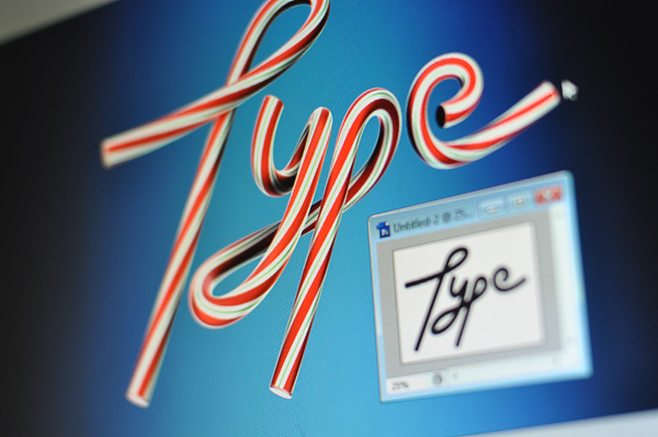
The easiest way to insure good readability is to build your illustration on an existing font. You can create a custom face, customize an existing typeface, or simply build the image directly on top of a font you selected for the project. Use the characters as a guide and keep all modifications within the outer edge of the original face in order to get easily distinguishable letters.
Utilize Space and Context in the Background
Another aspect of a good mix is the interaction between type and background. Richly detailed typography usually demands a simple background. As with traditional typography, illustrated type requires white space. Inactive regions will keep your design clean and prevent it from being cluttered. Many designers actually prefer the simple black or white background. My personal preference is to create an environment that is closely related to the type. It’s meant to solidify the concept and put everything in context.
The Future
Within the context of digital tools, illustrated typography feels young and vibrant. While there is a deep tradition within graphic arts of using image and type together to communicate, new tools and techniques will continue to push the styles within which we communicate. Highly stylized illustrative type is quite popular right now, from magazine covers, to New York Times headlines, and movie titles, we’re seeing an awesome amount of high quality material on a regular basis. What we have here is more than a simple fad though. It’s something one can base a career on. Give yourself the time needed to develop your skills with illustrative typography, as it’s an evolutionary process learned one project at a time.