Inspiration: 26 Beautiful Photo Manipulations of Women


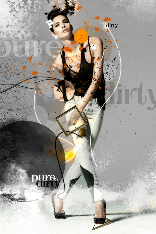
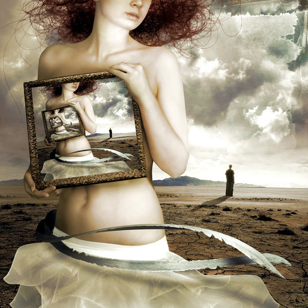
Throughout history the female figure has appeared prominently in art and design. Tools such as Photoshop and Illustrator have given artists the ability to create female-based renderings in new and creative ways. Today, we have 25 beautiful photo manipulations of women to show you. Enjoy!


Suenio en Una Tarde Invernal by ELYPhAS


Mother-Nature-is-Crying by Thebadwolves


Mother’s Land by Arahna-Ua


Soccer Women by S-pov


Midnight Bliss by Drew Williams


The Siren by Adam Spizak


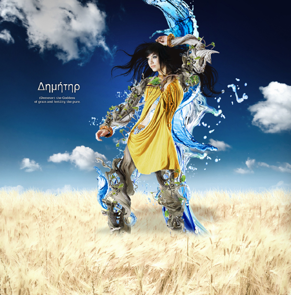
Demeter by Tehacesequence


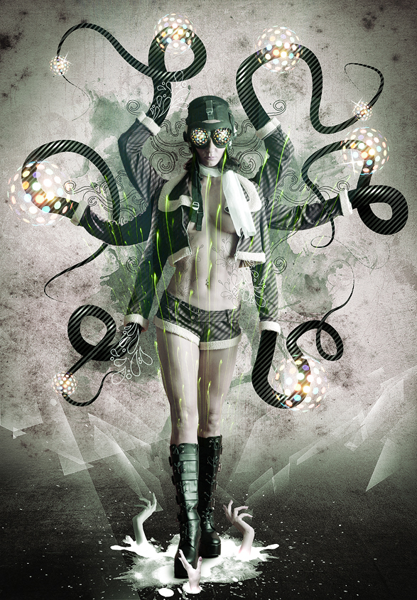
Bitch by D4m


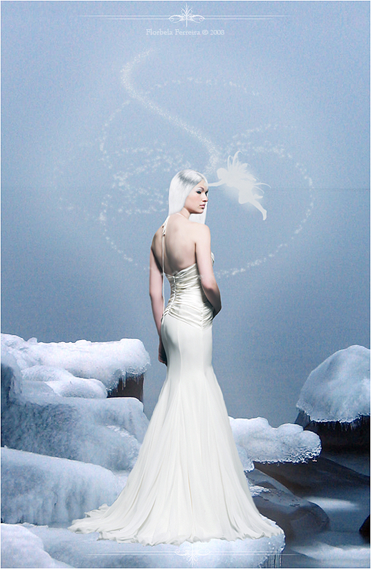
Ice Woman by Florbela-Ferreira


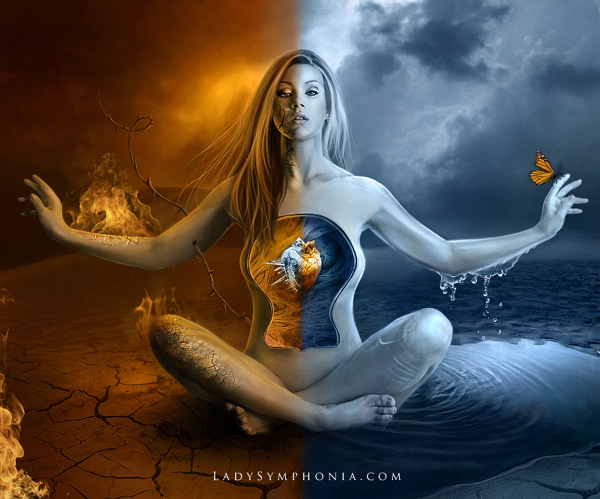
Inner Conflict by Lady-Symphonia


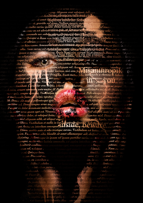
Woman’s Letter by Misanthropics


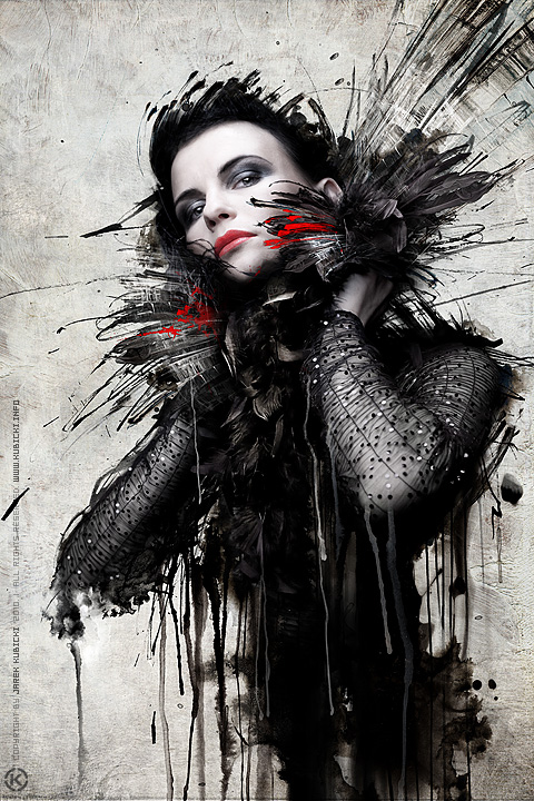
60562 by Kubicki


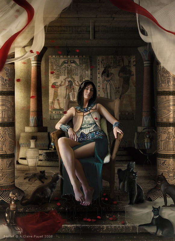
Bastet by Eireen


The Red Woman by Zepaulo


Freedom by Rgquarkup


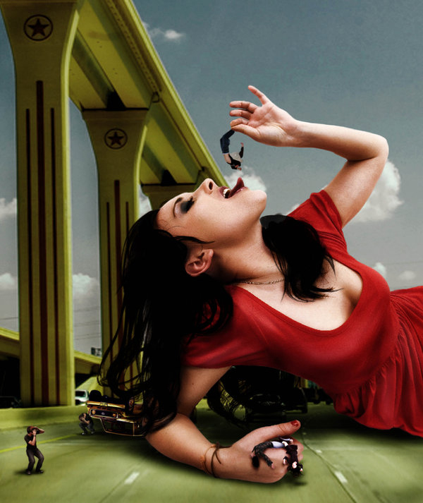
Attack of the 70 Feet Woman by Ifux


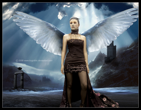
Venus by Trygothic


Underworld by Sagim


Dress by Razoomanet


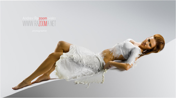
Milk 300 by Razoomanet


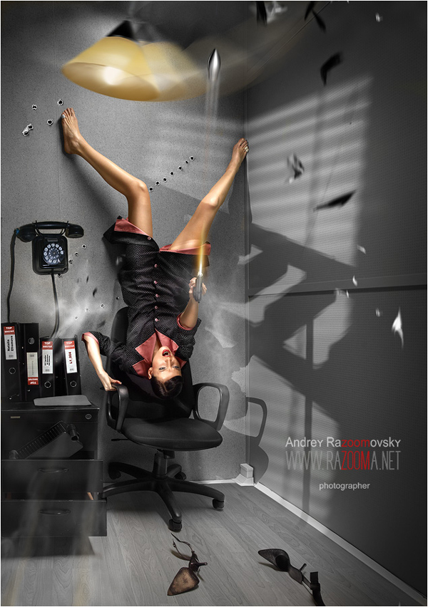
Razoom – Games 0006 by Razoomanet


Beauty Division #2 by Dévil (e)m


Beauty Division #2 by Dévil (e)m


1598 by Razoomanet


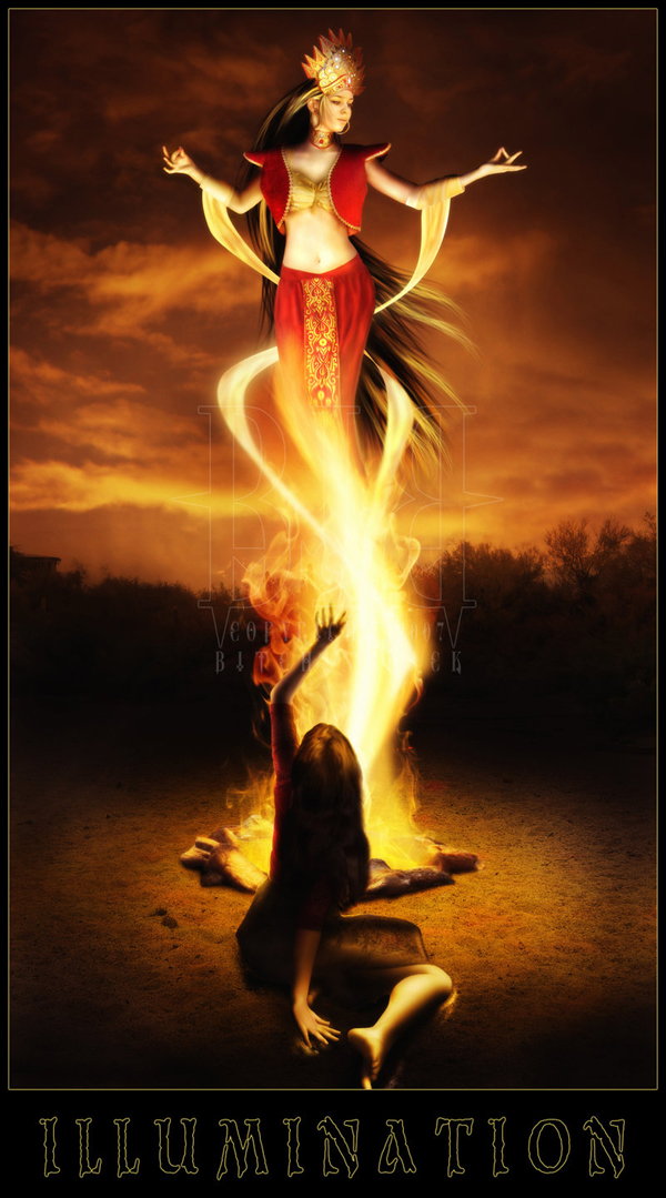
I L L U M I N A T I O N by Bitchinblack


Feelings by Nooneordinary

Workshop #105: Fight the Fight by Dark Disco Club

At Audiotuts+ we regularly put up a reader track for workshopping and critique (find out how to submit a track). This is how it works: you upload your song, and every week or so we’ll publish one here and step away from the podium. The floor is yours to talk about the track and how the artist can fix problems in and improve upon the mix and the song.

This track has been submitted for your friendly, constructive criticism. They have put their track (and their heart and soul) in your hands to learn and get useful feedback.

  • Do you enjoy the song or track itself? Does it have potential?
  • Can the arrangement be improved?
  • How did you find the mix? What would you do differently?
  • What do you enjoy about the rhythm track? What can be done to improve it?
  • Is the choice of instruments relevant and effective for the style/song?
  • Are the lyrics (if any) effective? Does the style, arrangement and genre of the song suit them?
  • Can you suggest any specific techniques that might improve the track?
  • Do you have any other constructive feedback?

Fight the Fight by Dark Disco Club

Artist’s website: darkdiscoclub.com

Description of the track:

Heavy, creepy, noisy jam.

Download audio file (FightTheFight.mp3)

Terms of Use: Users can stream the track for the purposes of giving feedback but cannot download or redistribute it.

Have a listen to the track and offer your constructive criticism for this Workshop in the comments section.


Submit Your Tracks for Workshopping

Need constructive criticism on your own tracks? Submit them using this form.


The Mixing Magician: Adding Subtleties Without the Audience Noticing – Audio Premium

In this week’s Audio Premium content, Björgvin Benediktsson teaches you how to use effects to enhance the music rather than obviously draw attention to themselves. If you’re aiming to be an audio wizard, this tut has a lot to teach you.

To learn more about what you get as part of Audio Premium, read this. To take a peek inside this tutorial, hit the jump!

Mixing isn’t about cramming as many plug-ins into a mix as possible. It’s not about showing off all the effects you have in your arsenal and putting a different setting on each track. Mixing, in the end, is always about the song. As a mixing engineer it is your job to take the song that was recorded and make it into an even shinier production. You want the band to really shine and be happy with the end result. You don’t want the reaction to be: “Wow, he sure piled on the effects didn’t he?” You want each instrument to sound great in its own right but not dominating the rest of the mix.

The trick is to be able to use any effect you want to get the job done, but without anybody noticing. You want that guitar to sound absolutely amazing but when you turn off all the processors and effects that are making that part sound so good, suddenly it sounds weak and dull. Mixing music is an art, and you should be able to use any tool at your disposal to sculpt the work of art a musician has given you.

In the following Premium tutorial I’ll be going into some subtle uses of modulation effects, using EQ to create pseudo stereo as well as some other assorted mixing tricks.

Table of Contents

  • The Most Commonly Used Effects
  • Using Groups with Compression
  • Subtle A.D.T. With Stereo
  • Blending In With Modulation
  • Subtle Distortion
  • Shelved Reverbs
  • Let the Light Shine on the Simple Vocal
  • Conclusion

Existing Premium members can log-in and download. Not a Plus member? Join now.


Create a Futuristic Music Player Interface in Photoshop


When I first saw the Encide Battlebay, I was astounded at the amazing detail and creativity that was put into each piece. That was the moment I decided to learn how to create futuristic interfaces. It took a lot of trial and error, but I created something worthwhile. This tutorial requires extensive knowledge of shading and lighting, as well as a lot of time. If there’s one thing I learned, it’s that lighting is the most critical aspect of these types of pieces. In today’s tutorial I will show you how to create a futuristic non-functional interface.


Step 1 – Setting up the Workspace

Create a document approximately 1000px by 800px, you can adjust this at any time later. I used a dark gray background.


Step 2 – Orb

On most interfaces, you’ll find beautiful orbs as the centerpieces. I like to create orbs by starting with the elliptical marquee tool and creating a gradient, then filling it with an inner glow to add depth.


Step 3 – Shading

Add some more depth by creating a layer mask (Cmd/Ctrl + Alt + G) and set the layer to Overlay. Now use a 60px soft brush to add some shading to the lower parts of the orb. To create a lighting effect I also used a dark-blue brush and brushed in 3 points of the bottom lower part. The effect is subtle but very important.


Step 4 – Lighting

Now add some lighting. Remember to keep using layer masks. Add three white 60px soft brushes on top of the 3 dark blue spots from the last step. Set them to overlay. Next just add a low-opacity white grunge/spatter brush of your choice for detail.


Step 5 – Orb Ring

Select the original orb. Go to Select > Expand 4px. Now do it again. Select > Expand 8px. You should have the smaller circle on top of the larger one. Now make layer masks and shade both of them in, creating a metallic texture with a 50px soft brush, using only black and white.


Step 6 – Low-Opacity Circles

Go back to the orb and add 1, 2, 3 px circles. They are for gloss and detail.


Step 7 – Highlight

Get a 60px brush and highlight the light parts of the rings, to enhance the lighting effects. Set them to overlay.


Step 8 – Doodad

Great! We’ve finished our super cool orb. Now add whatever doodads you want to it.


Step 9 – Orb Plate

Now it’s time to create the foundations of our interface elements. Create a circle behind the orb. Now make a layer mask and decorate it with whatever lighting effects you desire. Just be sure to use 60px soft brush.


Step 10 – Orb Plate Details

Duplicate the circle you just made and set another layer mask on it. Make this color slightly lighter, and then add a 10px white circle shape on top of it. Then for more lighting create another layer and brush where you want lighting. Set it to overlay. Then add shading to it so it looks like the orb is on top if it.


Step 11 – Orb Plate Base

For more depth, use the technique from the last step to create a more neutral plate.


Step 12 – “Wing” Base

Make a basic shape for our left "wing." Use the pen tool to get as close as possible to the shape below.


Step 13 – Lighting, Shading, Glass

Now use layer masks again to add lighting and shading to the piece. It should be lighter on the top with a bit of highlight on the bottom. Always use soft brushes when you do shading. Then use the pen tool to add two "glass" streaks. Use a soft brush to smooth out the edges.


Step 14 – Indent Lines

Add an indent line in preparation for our side orb. Indent lines are easy, just make a path with the pen tool, stroke it with a 2px white soft brush, move the path to the right 1px (use arrow keys) and stroke it with a 2px black soft brush. Delete the path, then use the transform tool and make the lines skinnier to 1px. This is how I achieve the illusion of .5px indent lines.


Step 15 – Side Orb

Don’t be afraid to do your own experimenting with the side orbs – just make sure they look good.


Step 16 – Top Wing

Now let’s work on enhancing the wing. To give it a more 3D appearance use the pen tool and select a portion of the top. Fill it in with the paint bucket tool and create a layer mask.


Step 17 – Top Wing shading

Now shade the top portion of it to make it appear more 3D.


Step 18 – Bottom Plating

Before we move on to the top make sure to clean up the bottom section of the interface as well. Add another shape similar to the shape of the wing and shade it.


Step 19 – Vents

There are many ways to make vents. In this tutorial I used the pen tool and filled the selected area. Next I used metal brush pack for texture. Use these settings for your vent.


Step 20 – Flames

You can’t have any vents without sick flames. Here I used two effect brushes and combined them.


Step 21 – Duplicate

Great job, now we’re finished with one half. Duplicate it and flip it horizontally. Make sure the wings are Symmetrically spaced.


Step 22 – Crack

First create any random black shape.


Step 23 – Crack

Set the shape to overlay. Add a layer mask and white brush from the inside to look like a light source is leaking out.


Step 24 – Crack Lines

Use the pen tool to create little jagged lines. Stroke it using a 1px black soft brush. Duplicate it, nudge it to the left and add white color overlay to it.


Step 25 – Shards

For this I just added random shapes and put a gradient overlay that matched the color of the glass.


Step 26 – Indent Lines

Let’s add some sophistication. Use the methods mentioned above to create indention lines along your interface.


Step 27 – Playback Buttons

Create the base of our play button, and then add a simple gradient to it.


Step 28 – Playback Buttons Continued

Duplicate the shape, change the gradient to a much darker color, and then add a 1px inner white stroke. Duplicate that shape again and make it slightly smaller. Add a blue gradient to it. Put some brushes and lighting as layer masks. Set them to overlay. Then add a 5% opacity gloss. Finally add the play icon.


Step 29 – Buttons

Now duplicate it twice and make them approximately 20% smaller. Move them to the back to add some depth.


Step 30 – Wiring

Create a wire base by using the pen tool and stroking the path with a 20px hard brush. Copy this shape. Open up a new layer and set it to layer mask. Add lighting to give it a more 3D appearance. Now get the first copy of the wire shape, and overlay it with the color white, set it over the base layer, reducing the opacity to 10%. Using the same “indent” methods above, add the signature lines to the wiring. When you’ve finished with one wire, recreate it 3 more times, placing it behind your buttons to appear as if they’re holding them up.


Step 31 – Drop Shadow

Open a new layer under your interface and brush around with a 40px black soft brush to add depth and separation from the background.


Step 32 – Shading

Now open a new layer. Get a 20px black soft brush and set the layer to overlay. Brush your interface to give it depth. Again, this is where understanding of lighting & perspective comes into play.


Step 33 – Lighting

Much like the step before, use a 20px white soft brush and set it to overlay. Brush the interface to give it depth.


Step 34 – Finishing Touches

Add gradient overlays to give it the desired color compositions, be sure to make them light or low opacity as to not change the overall color scheme of our piece. Congratulations! If you’ve stuck with me this far, pat yourself on the back. This is an advanced piece which requires a lot of patience and practice.
Inspiration: 26 Beautiful Photo Manipulations of Women


Throughout history the female figure has appeared prominently in art and design. Tools such as Photoshop and Illustrator have given artists the ability to create female-based renderings in new and creative ways. Today, we have 25 beautiful photo manipulations of women to show you. Enjoy!


Suenio en Una Tarde Invernal by ELYPhAS


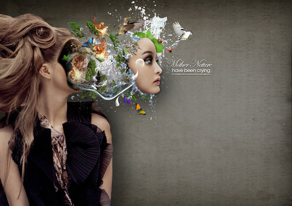
Mother-Nature-is-Crying by Thebadwolves


Mother’s Land by Arahna-Ua


Soccer Women by S-pov


Midnight Bliss by Drew Williams


The Siren by Adam Spizak


Demeter by Tehacesequence


Bitch by D4m


Ice Woman by Florbela-Ferreira


Inner Conflict by Lady-Symphonia


Woman’s Letter by Misanthropics


60562 by Kubicki


Bastet by Eireen


The Red Woman by Zepaulo


Freedom by Rgquarkup


Attack of the 70 Feet Woman by Ifux


Venus by Trygothic


Underworld by Sagim


Dress by Razoomanet


Milk 300 by Razoomanet


Razoom – Games 0006 by Razoomanet


Beauty Division #2 by Dévil (e)m


Beauty Division #2 by Dévil (e)m


1598 by Razoomanet


I L L U M I N A T I O N by Bitchinblack


Feelings by Nooneordinary

Overview Of The Foundry’s New “CameraTracker” Plug-in – Part 1

In the AE Part 1 of this 3 Part Series we will learn about The Foundry’s new CameraTracker, We’ll look at how it can be used to extract 3d data from shots, which can assist us in placing 3D assets into scenes. Additionally, we’ll cover how to use the AEtoC4D Script to export our 3D data to Cinema4D.


For Part 2, head over to CGtuts+ where we’ll export our scene to Cinema4D so we can build the 3D lightrays in true 3D space.


Tutorial

Download Tutorial .flv

File size 162MB


Quick Tip: How to Create a Stylized Wave using Adobe Illustrator


In this tutorial you will learn how to create some stylized waves, using the Pathfinder, Envelope Distort with Mesh and various Gradients. You will also learn how to use Scatter Brushes to create the foam effect. Let’s begin!

Continue reading “Quick Tip: How to Create a Stylized Wave using Adobe Illustrator”

Create a Classic American Diner with Perspective Drawing Tools


With the release of Illustrator CS5, Adobe introduces the new Perspective Drawing tool set, which allows you to create images in accurate 1-, 2- or 3-point perspective. Perspective Drawing alleviates tedious measuring and scaling, letting you concentrate on artistry, not arithmetic. In this tutorial, you’ll learn how to set up a Perspective Grid and use the Perspective tools to draw and modify shapes. You’ll learn how to use and edit Symbols and live text, all in perspective. We’ll also review best practices for perspective drawing.

Continue reading “Create a Classic American Diner with Perspective Drawing Tools”

Mastering Elements Part 3: Multi-band Compression

As many of you will know by now mastering is a subject with many facets. Learning how to successfully treat your tracks after your mix is complete generally requires a good amount of experience but some solid technique will get you going in the right direction.

To get this essential theory embedded I have decided to chop a typical mastering chain into nice bite-sized pieces. This way we can focus on each processor one at a time. At the end of the series we’ll look at the whole chain in action. This tutorial looks at multi-band compression and what it can do for you during a mastering session.


Step 1: Multi-band Processing

If you’re not familiar with multi-band processing it may seem a little daunting. For most beginners the sight of the average multi-band compressor plug-in is enough to send them running to the hills. In reality it’s not as complex as you may think and these processors can be extremely useful.

Most DAWs now include some kind of multi-band processor (usually a compressor/expander) as standard. Although they may differ in look and layout, they all carry out pretty much the same function. If up until now you have felt that these processors are a little complex in nature it’s time to dive in head first, as they can be extremely useful.

Cubase 5.5′s multi-band compressor.

Simply put, if you can use a compressor then a multi-band version should present you with no problems. The average multi-band compressor is really no more than a number of compressors (often three or four) housed in the same plug-in. Each one of these compressors is then focused on a specific frequency band, decided by the user.

Ableton Live’s multiband dynamics plug-in.

This frequency dependent compression gives you the ability to home in on specific instruments or areas of your mix and boost or attenuate them in a very accurate fashion. This sort of treatment often gives you a much more transparent result than equalisation.

In the following steps we’ll look at the most common techniques for using these processors in a typical mastering environment. I’ll be using Logic Pro’s ‘Multipressor’ but any multi-band processor should be fine.

Logic Pro 9′s Multipressor plug.


Step 2: Isolating Frequencies

The first thing to master here is isolating specific frequencies. Most multi-band compressors have moveable ‘bands’. These bands have upper and lower limits and a clear read out of the frequency you are using. This system is often combined with the ability to solo and bypass each band, so homing in on specific instruments should be pretty straight forward.

To demonstrate this I have used an existing loop and homed in on the snare. In the following clips and screenshots you can see the process used.

The loop used was produced entirely in Record 1.5 and imported in to Logic Pro 9.

Download audio file (2.mp3)

The loop as exported from Record 1.5.

The Multipressor is then used to home in on the frequency where our snare’s ‘snap’ resides.

Download audio file (2b.mp3)

The snare’s frequency is isolated.


Step 3: Subduing Mix Elements

With the frequency of our snare identified we can start to treat it. First let’s look at reducing its bite with compression. Simply bring the threshold down to a point where gain reduction occurs when the snare hits. No you can tweak the attack and release times to create a transparent compression effect.

It really is this easy. Once your compressor is firing correctly, you may want to fine tune the ratio and threshold amounts but you should find it very straight forward to treat your chosen area. This is just like using a standard compressor, same parameters, same results… just frequency dependent.

The snare is compressed.

Download audio file (3.mp3)

The loop with the softer snare sound.


Step 4: Boost and Control

Another great way of using these processors is to boost certain frequency zones. Of course this can be achieved with an equaliser but using a multi-band compressor you retain a huge amount of dynamic control.

Download audio file (4.mp3)

First the low end is targeted.

Download audio file (4b.mp3)

…Then the high end.

To demonstrate this technique I have boosted the high and low frequencies in level. I then applied enough compression to reduce these bands to around their original level. This may seem counter productive but it effectively reduces the dynamic range of your chosen band and ultimately makes it appear louder.

The low and high end are boosted and controlled simultaneously.

Download audio file (4c.mp3)

The final treated loop.

Download audio file (4d.mp3)

And with a bit of limiting for volume.


Quick Tip: MIDI Translation – MIDI to Keystrokes

There are certain function and keyboard shortcuts a musician would like to use during a mixing or a live session that are not MIDI mappable. In this tutorial I am going to show you a way of mapping virtually any keyboard shortcut to your MIDI controller extending the functionality of your live set or mixing session.

We are going to use a program called Bome’s MIDI Translator. The classic edition of the software is free for personal use (PostcardWare). For more info on what PostcardWare is click here. You can download Bome’s MIDI Translator Classic from here. There is a Pro edition of the software with more capabilities. The classic version will do for our purposes. The is also a beta version for OS X that Mac user can use.

Continue reading “Quick Tip: MIDI Translation – MIDI to Keystrokes”

Create a Futuristic Nonfunctional Interface in Photoshop


When I first saw the Encide Battlebay, I was astounded at the amazing detail and creativity that was put into each piece. That was the moment I decided to learn how to create futuristic interfaces. It took a lot of trial and error, but I created something worthwhile. This tutorial requires extensive knowledge of shading and lighting, as well as a lot of time. If there’s one thing I learned, it’s that lighting is the most critical aspect of these types of pieces. In today’s tutorial I will show you how to create a futuristic non-functional interface.


Step 1 – Setting up the Workspace

Create a document approximately 1000px by 800px, you can adjust this at any time later. I used a dark gray background.


Step 2 – Orb

On most interfaces, you’ll find beautiful orbs as the centerpieces. I like to create orbs by starting with the elliptical marquee tool and creating a gradient, then filling it with an inner glow to add depth.


Step 3 – Shading

Add some more depth by creating a layer mask (Cmd/Ctrl + Alt + G) and set the layer to Overlay. Now use a 60px soft brush to add some shading to the lower parts of the orb. To create a lighting effect I also used a dark-blue brush and brushed in 3 points of the bottom lower part. The effect is subtle but very important.


Step 4 – Lighting

Now add some lighting. Remember to keep using layer masks. Add three white 60px soft brushes on top of the 3 dark blue spots from the last step. Set them to overlay. Next just add a low-opacity white grunge/spatter brush of your choice for detail.


Step 5 – Orb Ring

Select the original orb. Go to Select > Expand 4px. Now do it again. Select > Expand 8px. You should have the smaller circle on top of the larger one. Now make layer masks and shade both of them in, creating a metallic texture with a 50px soft brush, using only black and white.


Step 6 – Low-Opacity Circles

Go back to the orb and add 1, 2, 3 px circles. They are for gloss and detail.


Step 7 – Highlight

Get a 60px brush and highlight the light parts of the rings, to enhance the lighting effects. Set them to overlay.


Step 8 – Doodad

Great! We’ve finished our super cool orb. Now add whatever doodads you want to it.


Step 9 – Orb Plate

Now it’s time to create the foundations of our interface elements. Create a circle behind the orb. Now make a layer mask and decorate it with whatever lighting effects you desire. Just be sure to use 60px soft brush.


Step 10 – Orb Plate Details

Duplicate the circle you just made and set another layer mask on it. Make this color slightly lighter, and then add a 10px white circle shape on top of it. Then for more lighting create another layer and brush where you want lighting. Set it to overlay. Then add shading to it so it looks like the orb is on top if it.


Step 11 – Orb Plate Base

For more depth, use the technique from the last step to create a more neutral plate.


Step 12 – “Wing” Base

Make a basic shape for our left "wing." Use the pen tool to get as close as possible to the shape below.


Step 13 – Lighting, Shading, Glass

Now use layer masks again to add lighting and shading to the piece. It should be lighter on the top with a bit of highlight on the bottom. Always use soft brushes when you do shading. Then use the pen tool to add two "glass" streaks. Use a soft brush to smooth out the edges.


Step 14 – Indent Lines

Add an indent line in preparation for our side orb. Indent lines are easy, just make a path with the pen tool, stroke it with a 2px white soft brush, move the path to the right 1px (use arrow keys) and stroke it with a 2px black soft brush. Delete the path, then use the transform tool and make the lines skinnier to 1px. This is how I achieve the illusion of .5px indent lines.


Step 15 – Side Orb

Don’t be afraid to do your own experimenting with the side orbs – just make sure they look good.


Step 16 – Top Wing

Now let’s work on enhancing the wing. To give it a more 3D appearance use the pen tool and select a portion of the top. Fill it in with the paint bucket tool and create a layer mask.


Step 17 – Top Wing shading

Now shade the top portion of it to make it appear more 3D.


Step 18 – Bottom Plating

Before we move on to the top make sure to clean up the bottom section of the interface as well. Add another shape similar to the shape of the wing and shade it.


Step 19 – Vents

There are many ways to make vents. In this tutorial I used the pen tool and filled the selected area. Next I used metal brush pack for texture. Use these settings for your vent.


Step 20 – Flames

You can’t have any vents without sick flames. Here I used two effect brushes and combined them.


Step 21 – Duplicate

Great job, now we’re finished with one half. Duplicate it and flip it horizontally. Make sure the wings are Symmetrically spaced.


Step 22 – Crack

First create any random black shape.


Step 23 – Crack

Set the shape to overlay. Add a layer mask and white brush from the inside to look like a light source is leaking out.


Step 24 – Crack Lines

Use the pen tool to create little jagged lines. Stroke it using a 1px black soft brush. Duplicate it, nudge it to the left and add white color overlay to it.


Step 25 – Shards

For this I just added random shapes and put a gradient overlay that matched the color of the glass.


Step 26 – Indent Lines

Let’s add some sophistication. Use the methods mentioned above to create indention lines along your interface.


Step 27 – Playback Buttons

Create the base of our play button, and then add a simple gradient to it.


Step 28 – Playback Buttons Continued

Duplicate the shape, change the gradient to a much darker color, and then add a 1px inner white stroke. Duplicate that shape again and make it slightly smaller. Add a blue gradient to it. Put some brushes and lighting as layer masks. Set them to overlay. Then add a 5% opacity gloss. Finally add the play icon.


Step 29 – Buttons

Now duplicate it twice and make them approximately 20% smaller. Move them to the back to add some depth.


Step 30 – Wiring

Create a wire base by using the pen tool and stroking the path with a 20px hard brush. Copy this shape. Open up a new layer and set it to layer mask. Add lighting to give it a more 3D appearance. Now get the first copy of the wire shape, and overlay it with the color white, set it over the base layer, reducing the opacity to 10%. Using the same “indent” methods above, add the signature lines to the wiring. When you’ve finished with one wire, recreate it 3 more times, placing it behind your buttons to appear as if they’re holding them up.


Step 31 – Drop Shadow

Open a new layer under your interface and brush around with a 40px black soft brush to add depth and separation from the background.


Step 32 – Shading

Now open a new layer. Get a 20px black soft brush and set the layer to overlay. Brush your interface to give it depth. Again, this is where understanding of lighting & perspective comes into play.


Step 33 – Lighting

Much like the step before, use a 20px white soft brush and set it to overlay. Brush the interface to give it depth.


Step 34 – Finishing Touches

Add gradient overlays to give it the desired color compositions, be sure to make them light or low opacity as to not change the overall color scheme of our piece. Congratulations! If you’ve stuck with me this far, pat yourself on the back. This is an advanced piece which requires a lot of patience and practice.

Open Mic: What Advice Would You Give Someone Choosing An Instrument?

If someone asked you for advice when choosing their first musical instrument, what advice would you give them?

Each weekend we open our mic to readers and lurkers alike to come out of the woodwork and tell us your thoughts and opinion, your experiences and mistakes, what you love and what you hate. We want to hear from you, and here’s your chance.


How important is it to choose the right instrument when starting to learn music? Is it OK just to pick up the first instrument that comes along, or should some thought go into the decision?

How did you decide on your first instrument? Was it the right choice? Can others learn from your experience?

What advice would you give a friend if they asked you for advice choosing an instrument? What clarifying questions would you ask them? Are there any general principles that could lead someone to the right choice?