6 Free Adobe Photoshop Alternatives for the Mac

Post image for 6 Free Adobe Photoshop Alternatives for the Mac

gimp-logo

Gimp is a free open source image editing program available for just about every platform which includes the Mac, Linux, and Windows. It’s arguably the best free alternative to Photoshop. What makes Gimp so popular is the large user base who are very knowledgeable.

gimpshop-logo

GimpShop
is a version of Gimp which was created to act and feel like Photoshop. If you’re a seasoned Photoshop user then Gimpshop was made for you to feel right at home.

seashore-logo

Seashore is also open source like Gimp but unlike Gimp it’s only available on the Mac. Based on the Mac Cocoa framework this image editor features most things you would expect from a great image editor like textures, gradients, and multiple layer support.

chocoflop-logo

ChocoFlop image editor uses Apple’s CoreImage technology. One of the features of this editor is how lightweight it which makes it super fast even on older Mac hardware.

iphoto

iPhoto is a free basic image editor from Apple available for Mac users. Not really for a power user but its good for basic stuff like adjusting brightness, scaling, cropping, and fixing red-eyes and managing your images on a Mac.

preview-logo

Preview on the Mac is more than just a image viewer, and it’s good for basic image editing. To see what it can do when viewing an image inside Preview go to Help > Preview Help.

How to add Applications to the Dock

Post image for How to add Applications to the Dock

How to add applications, programs, files or folders to the Dock on the Mac.

Add items you use the most onto the Dock for maximum work efficiency. A general rule of thumb is all your apps/programs on the left hand side and files/folders on the right hand side.

Locate the item you want to add to the Dock. It can be applications, files, or folders from the Desktop or somewhere in your directory of folders.

Click and drag the icon to the Dock.

Click and Drag to the Dock

Another way to add an application to the Dock is when you’re using the program simply right click (or “Control” and click) the icon on the Dock then scroll to “Options” and “Keep in Dock”.

Adding Application to the Dock

How to remove applications from the Dock

Post image for How to remove applications from the Dock

How to remove applications, files, and folders from the Mac dock.

Find the icon you wish to remove from the Dock.

Click, hold then drag the icon away from the Dock towards the desktop and then release the mouse button. The icon will be deleted with a puff of smoke.

dock-removing-application

Another way to remove an icon from the Dock is to right click (Control+Click) on the application icon and go to “Options” and “Remove from Dock”. You can also get to that menu by clicking and holding the icon for about 2 seconds.

dock-remove-application

*Applications being used cannot be removed from the Dock.

How to rearrange Dock Icons

Post image for How to rearrange Dock Icons

How to rearrange icons on the Dock

The Dock is very customizable, I already showed you guys how to add and remove icons from the Dock so today we’ll rearrange icons on the Dock so we have each icon in the order that we want.

From the Dock “Click, hold and drag” the icon to the spot you’d like and then release the click to drop the icon in place.

Moving icons around on the Dock

The only rule for moving icons around the Dock is applications stay on the left side and files/folders goes on the right side. If you look closely at the Dock you’ll notice a dotted line, this is the divider that keeps apps on one side and folders on the other.

dock-divider

Using Ruby on Rails to Create A Twitter-Like Message Form

ruby_on_rails_logo_3This tutorial will show you how to create a twitter message form that counts down the 140 characters and also allows you to input a message within the URL of the webpage as well. What’s cool about Ruby on Rails is instead of writing javascript to recalculate the message length, we’ll use Rails to automatically generate the correct javascript so that each time the field changes, the count is recalculated all through the controller object. Download the project code here.

Firstly, I’ll assume you have ruby on rails installed and have create a new project. You’ll also need a basic knowledge of how Rails works, and how Rails utilizes the principle of Model-View-Controller (MVC). Having said that, create a new project and create a new controller file called message_controller.rb. We’ll first take care of an initial message specified in the URL of the page. Add this code to the file:

class MessageController < ApplicationController

  def index
    if params[:txt]
      @txt = params[:txt]
    else
      @txt = "";
    end
    @count = 140 - @txt.length()
  end

end

The index method first check to see if a message was specified in the URL. If the a message was specified, then it sets the @txt instance variable to the string. If not, then the variable is set to an empty string. The count is also calculated here for the initial web page view.

Now we need to set up the view for the message controller, create a message folder in the views folder and create a new file called index.rhtml in this new folder. Copy this code to the file:

<h1>Message</h1>

<% form_tag :action => 'stuff' do -%>
	<%= text_field_tag :message_field,value=@txt %>
<% end -%>

<div id='count'>
	<%= @count %>
</div>

<%= observe_field(
	:message_field,
	:url =>{:action =>"update_message_length"},
	:frequency=>1,
	:with => 'message',
	:update=>:count ) -%>

The parts to focus on here are the text_field_tag and the observe_filed method. The div count is where the remaining count will be displayed. Looking at the text_field_tag, :message_field is the id of the tag, and the value is set to the @txt that was declared in the Message Controller. The observe_field method will automatically generate the javascript ajax code that will update the count tag. The parameters follow as such:

  1. :message_field – indicates which field is observed
  2. :url – Decides which action is sent to the message controller. (More on that latter)
  3. :frequency – Every time the field changes, make a AJAX request
  4. :with – this will help us get the text in the field
  5. :update – decides where the contents of the AJAX response goes

At this point we need to go ahead and add the “update_message_length” method in the message controller. This function will be called every time the filed value is change as specified by the observe_field method. Append the following function to the controller:

  def update_message_length
    pop = params[:message]
    count = 140 - pop.length()
    render :text =>  count
  end

This function gets the message include in the message parameter, and sends out the new count. One small, but vital part not to forget is to create a layout file that includes the needed javascript framework so this is included. Create a new file in the view/layouts folder called: message.html.erb. Add this code to the file:

<!DOCTYPE html PUBLIC "-//W3C//DTD XHTML 1.0 Transitional//EN"
       "http://www.w3.org/TR/xhtml1/DTD/xhtml1-transitional.dtd">

<html xmlns="http://www.w3.org/1999/xhtml" xml:lang="en" lang="en">
<head>
  <meta http-equiv="content-type" content="text/html;charset=UTF-8" />
  <title>Posts: <%= controller.action_name %></title>
  <%= stylesheet_link_tag 'scaffold' %>
  <%= javascript_include_tag :defaults %>
</head>
<body>

<p style="color: green"><%= flash[:notice] %></p>

<%= yield %>

</body>
</html>

Thats its! Now if you go to the URL http://localhost:3000/message, you’ll get a blank field, or you can include an initial message by http://localhost:3000/message?txt=message+here. Incase you have a flaw in your project, or are lazy, here is a copy of the working project.

Follow Up To Text Image Headers Tutorial

The first tutorial I published on CSS was a “trick” to essential hide the text generated from the HTML file and replace it with an image. Let me clarify what I mean by “trick” because its not meant to decieve anyone. It’s a non-obvious way of achieving two competing goals: displaying graphical representation of text while not compromising the HTML text mainly for Google. If you’re a web designer, you’ll know of the limitations to HTML and CSS and what may make a better user experience isn’t always good for Google. CSS and HTML is not only limited by the font selection, but something like a logo in which specicial types faces are created cannot be created through CSS. Using an image with an alt attribute just doesn’t seem like a good solution for a h1 headline tag either. For something like a screen reader, or viewing plain HTML, using the text is a better solution than the alt attribute of an image.

Now don’t get me wrong, this technique can be used for evil by hiding keywords to try to bolster search engine rankings on Google. I don’t know exactly how Google creates the ranking, but I do know that h1 headline serve as a key part in determining page rank for keywords. So who uses the negative text-indent trick? Google themselves use images for there main logo, but both Apple.com and Digg.com use negative text-indent to hide lot things. Apple hides their top navigation bar, and homepage featured items. Digg hides the h1 tag which states their name. (If you want to see for yourself, I’d recommend checking Apple homepage because you can see the relavent css directly in the source of the webpage. With Digg, you have to navigate your way through the file references.) Google doesn’t seem to penalize either of theses two sites. You might say that these guys are too big to be penalized, well in that case, this website, Tutorial Dog uses the negative text-indent and the site ranks on the first page for the keyword  “javascript image gallery”.

Inadvertent Discovery While checking out Digg.com to see if they use negative text-indent, I discovered that they combine all their images for the site into one large gif image. They then direct the CSS file to specific sections of the image to show different images using the ‘background-position’ attribute. Why would they imbed all images into one document? For a site like Digg, which recieves millions hits daily, by combining the images into one file, their servers receive less of a usage because many image files aren’t requested from the server. Once this large image file is requested and sent, the web browser can reference the file to generate the page. To further illustrate why this is better, think of moving a bunch of boxes. Digg likens the large image file to one large box. In this case, while this box may be bigger and weight more, you only have to move it once to get all of the required materials to the receiver. With a bunch of small images, you will have to move a bunch of boxes one at a time. This technique probably won’t be worth your while to implement for your web designs, because it will take more time for what its worth. Digg, because they deal with large traffic, finds that this technique optimizes their page serving ability.

Javascript Dock Carousel Using Mootools (Part 1)

Follow part 2 of this tutorial here. This tutorial will take you through creating the initial mockup in Photoshop, and creating a usable carousel that imitates the Mac OS X Leapard dock. This tutorial we’ll acquiant you well with creating a slick button, and using the shape tools. We want to deal with shape layers instead of pixel because of the non-destructive nature of shapes. Non-desctructive shapes means you can edit and scale without distortion.

Step 1

Create a photoshop and create a new document 540px x 308px. Fill the background with #232323.

Take the Rounded Rectangle Tool, set it to a 5px radius and create an object that is 350px by 50px. Make the color of this shape layer #303030. Make sure you have the tool set to the “Shape Layers” option instead of the paths option. That way, you are creating non-destructive shapes so you can go back and edit & reference them later without compromising distortion. Next, type out “CAROUSEL” (or whatever you like) at the top of the document with the color #080808. Find a good serif font like “Myriad Pro”. Apply the Inner Shadow below layer style to the text.

image
image

Step 2: Buttons

Next, we need to create buttons that will move the carousel from left to right. First, create a 20px circle shape with the color #232323 using the ellipse tool. Apply the following Bevel & Emboss and Gradient Overlay layer styles.

image
image
image

Now create a new white layer for the reflection. Start by creating another circle shape, and use Direct Selection Tool to mend the shape into the shape you see below. Move the handles (the line that is asymptotic to the path) of each point to change the curvature of the path. Set this layer to blending mode Overlay, and an opacity of 82%.

image

Next we need arrows to specify the direction. Take the pencil tool set to a 1px brush, and create a arrow out of pixels ontop of the button. Apply the following Drop Shadow and Inner Shadow to give the look that the arrow is imbedded in the button.

image
image

Finally for this step, group these three layers in a group and duplicate the group. Then with the group selected in the layer palette, Edit >> Transform >> Flip Horizontal. Place the buttons on either side of the stage.

image

Step 3: Stage

image

Now we’ll recreate a the Leopard dock. Fist we need the Leopard wallpaper. Place the image inside the Photoshop document, and use the shape made in step one to mask of the wallpaper layer. To do this, select the shape, and right click and pick “Make Selection”. Now with the selection, make a mask on the wallpaper layer. Click the little link connecting the mask to the image, to disassociate the mask with the layer, so you can move the image around without moving the mask around with it. Place the wallpaper in the correct place.

image

The next step is to create the shelf, create a white rectangle shape, and use the Direct Selection Tool to select the corners, and transform the shape to give it the perspective of a shelf. Again, we want to use the path of the original stage layer. This time though copy that path and paste the path into the shelf layer. With both paths selected, click the “Intersect Shapes area” button. Set the opacity of the stage to 51%.

image

Finally, we need to create a swoosh across the stage. Again, we want to create a shape, this time, use the pen tool to create the shape over the stage. Set the opacity of this layer to 14%.

image

Step 4: Icons

This step is more for mocking up the final product which we’ll be finished in Part 2, but drag 32px icons onto the dock. Space them appropriately.

image

When creating the icons for Part 2, we need to make sure that the icons are transparent and that the size of the icons are 40px or greater. To get best looking transparent icon, make sure you use the PNG-24 setting in the Save to Web palette. This will create the best looking transparent icon. If you export with GIF, you tend to get more jagged edges that look bad.

Step 5: Slicing and Exporting for the Web

Next we need to slice up the document to get it ready for the web. There should only be 4 slices in this document: the two buttons, the stage and the text. You can name each slice by taking Slice Selection Tool and double clicking on a slice. A panel will pop up with input to rename the slice, that way when you export, it will automatically name the images.

image

Now that you’ve sliced the image, go to File >> Save to Web… You can change the export setting for each slice, but for this particular document leave each slice as a gif. For more info on exporting, check out this article that walks through exporting for the web in Photoshop. When you go to save, make sure you change the option “Slice:” from “All Slices” to “All User Slices” so you don’t have unnecessary slices.

Javascript Dock Carousel Using Mootools (Part 2)

This tutorial is the second part of a tutorial that will build a javascript carousel that imitates the Mac OS X dock. In part one, we build a mock up in Photoshop and exported the nessecary images. In this part, we’ll take those images and build it into a HTML & CSS. Then we’ll use javascript to make if interact.

Demo Files

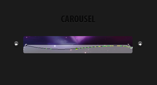
Step 1: The HTML To keep things organized, we’ll seperate the files into there own folders. So we’ll have a “js” folder to keep all the Javascript files, an “images” folder to hold all the webpage images, and a “icons” folder to hold the icon images. What needs to be in the HTML? Well, the links to move the stage left and right, the stage and all the icons and finally the text image. The “wrapper” class you will see later enables the icons on the next slide to hide. The icons are there own list elements.

Javascript applications run better with specialized Java hosting. It ensures smooth, error free work of Java based websites or any Java script for that matter.
<div id="stage-container">
  <img src="images/text.gif" alt="image" width="111" height="24" />
  <a id="moveleft">Left</a>
  <a id="moveright">Right</a>
  <div id="wrapper"><ul id="items">
  <li><a><img src="icons/1.png" alt="image" width="32" /></a></li>
  <li><a><img src="icons/2.png" alt="image" /></a></li>
  <li><a><img src="icons/3.png" alt="image" /></a></li>
  <li><a><img src="icons/4.png" alt="image"/></a></li>
  <li><a><img src="icons/5.png" alt="image" /></a></li>
  <li><a><img src="icons/10.png" alt="image"/></a></li>
  <li><a><img src="icons/6.png"/></a></li>
  <li><a><img src="icons/7.png"/></a></li>
  <li><a><img src="icons/8.png" /></a></li>
  <li><a><img src="icons/9.png" /></a></li>
  </ul></div>
 </div>

Now lets set up the header of the HTML document. We wan’t an XHTML tranistional document so that all the javascript is compliant and works. We need to reference the Mootools library, and the javascript that makes the stage work as well as the css file. We’ll deal with getting those files later.

<script src="js/mootools-12-core.js" type="text/javascript"><!--mce:0--></script> <!-- MOOTOOLS 1.2  -->
<script src="js/mootools-12-more.js" type="text/javascript"><!--mce:1--></script> <!-- MOOTOOLS 1.2  -->
<script src="js/dock.js" type="text/javascript"><!--mce:2--></script> <!--   IMAGE GALLERY   -->

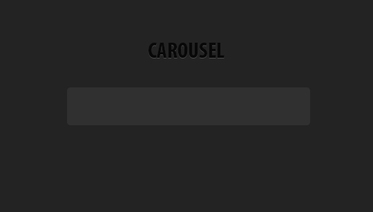
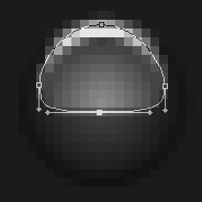
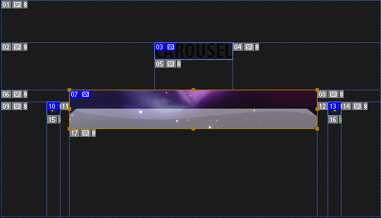
Step 2: The CSS The trickiest part of the CSS is understanding the fact that we’re making the ul extend beyond the ‘div id=”wrapper”‘. The image below explains how the tags appear with the CSS. The ul element extends because the class “items” has a width of 5000px, and the “wrapper” id has an overflow of hidden. The buttons are floated on either side of the stage, and the text is hidden with the text-indent attribute. To get a tag to conform to specified widths and heights, we use the ‘display: block’ attribute.

image
body{
background:#232323;
color:white;
}
#stage-container{
margin: 50px auto;
width: 420px;
}
#stage-container .text{text-align: center;}
#stage-container a{outline: none;}
/* — STAGE — */
#stage-container #wrapper{
overflow:hidden;
margin: 0px auto;
width:352px;
height:55px;
background: url(images/stage2.jpg);
position: relative;
}
#stage-container #items{
margin:0px;
padding:0px 6px;
list-style:none;
width:5000px;
position: relative;
}
#stage-container #items li{
float:left;
list-style:none;
margin-right:5px;
padding: 6px 6px;
margin-top: 5px;
}
/* — BUTTONS — */
#stage-container #moveleft{
float: left;
background: url(images/left.gif);
}
#stage-container #moveright{
background: url(images/right.gif);
float: right;
}
#stage-container #moveright,#moveleft{
height: 20px;
width: 20px;
display: block;
z-index: 10;
text-indent: -3000em;
margin-top: 18px;
}

Step 3: The Javascript First, we’ll be using the newly released Mootools 1.2 for this javascript. Mootools is a “compact, modular, Object-Oriented JavaScript framework designed for the intermediate to advanced JavaScript developer. It allows you to write powerful, flexible, and cross-browser code with its elegant, well documented, and coherent API.” We’ll be utilizing the scroller class and the Fx classes to achieve the entire effects on the icons. Like almost all mootools scripts, we need to enclose the javascript in a dom ready action. What this does is not let the javascript work until all the javascript is completely loaded by the user.

window.addEvent(’domready’, function() {
// Your code here
});

The first part of javascript just deals with moving the stage left and right. We need to tell the javascript where to slide the stage, if it can slide the stage left or right and how much to slide. When a button is clicked it triggers an event to move the slide left or right depending on which is clicked. The slides must figure out though if it can move left or right. We don’t want to move left if there is no icons to the left of the current slide. These issues are what the variables at the top of the javascript deal with.

The image in step 2 will help illustrated how the javascript is working. The unordered list element (ul id=”items”) is being shifted left and right by the javascript (thats why is larger than the stage). The shift is triggered by a hyperlink tag (’a’).

var slides = 2; // CHANGE THIS TO THE NUMBER OF SLIDES
var pos = 0; // default setting, start at the first(0) pixel
var offset = 346; // How many pixels the slider should move to get to the next slide
var currentslide = 1; // first slide is the default slide
var items = $('items'); // items variable for the id 'items' in the html
var fx = items.effects({
duration: 800,
transition: Fx.Transitions.linear
}); // the way the items transition is described here
/* Scroll Object Initialized */
var scroll = new Fx.Scroll('wrapper', {
offset:{'x':0, 'y':0},
transition: Fx.Transitions.Elastic.easeOut
}); // the scroll stage is set up here, and each movement will be 'Elastic'
// other tranistions could be linear, quadratic, ect.
/* Trigger to move the slide left */
//when the #moveleft link is clicked, this tells the scroll to move left
$('moveleft').addEvent('click', function(event) {
event = new Event(event).stop(); // don't go to the actual link described in the href
if(currentslide == 1) return; // can't go more left than the first
currentslide--; // currentslide is one less than before
pos += -(offset); // slide the stage left by the offset's size
/* lower the opactiy, slide, then raise back opacity */
fx.start({
'opacity': .3 // the opacity of the icons will become 30 %
}).chain(function(){
this.start.delay(800, this, { 'opacity': 1 }); // bring the icons back to 100% opacity
scroll.start(pos); // move the stage to the new position
});
});
$('moveright').addEvent('click', function(event) {
event = new Event(event).stop();
if(currentslide >= slides) return;
currentslide++;
pos += offset;
fx.start({
'opacity': .3
}).chain(function(){
this.start.delay(800, this, { 'opacity': 1 });
scroll.start(pos);
});
});
scroll.toLeft(); // We'll initalize the stage to left most position
Javascript Visual of Events

The next part of the Javascript strictly deals with what happens when you move the cursor over an icon. We want to make the icon bigger. When the cursor leaves the icon, we need to readjust the icon to different size settings.

$$('.icon').each(function(item){  // for each icon, apply the follow events
item.addEvent('mouseover', function(event) { // when the icon is moused over, enlarge it
var fx2 = item.effects({
duration: 200,
transition: Fx.Transitions.linear
}); // initialize the icon transition properties
fx2.start({
'width': 40,
'height':40,
'margin-top': '-2',
'margin-left': '-5'
});
});
item.addEvent('mouseleave', function(event) { // when the icon is left by the mouse, reset icon
var fx2 = item.effects({duration: 200, transition: Fx.Transitions.linear });
fx2.start({
'width': 32,
'height':32,
'margin-top': '0',
'margin-left': '0'
});
});
});

Conclusion Thats all that’s need to create a dock carousel. The icons in the demo are kindly provided by Jonas Rask and Devin Ross. I’ve implemented the dock in the resources section of Tutorial Dog were you can download icons that I’ve created.

New Beginnings…

Its been a while folks. Almost a year now. But its time to start to get the wheels moving on this great site, because you need it! Now even though its been almost a year since the last tutorial was published, Tutorial Dog has seen traffic continue to come at a steady rate which makes a comeback all the more necessary. The site also has stayed relevant with many commenters (thanks) giving input on many hot button articles of the site.

Tutorial Dog Traffic Figure 1. Traffic Since May 2008

And I felt the previous design lacked on at making this important enough. This new site focuses on the readability and how to display images in a book-like fashion. Garretdimon.com primarily inspired me to rethink the way to present content, and expanding the design outside of the structure of a box. By creating a gutter of free space on the right side, I can display images and information in an interesting visual way. Like so…

All there is left to do is to publish new material. If you haven’t done so already, subscribe to the RSS feed and stay tuned. I’ve got a lot of ideas, so we’ll have to see what materializes. If there is anything specific you’d like to learn more about, leave a comment below.

Design Video Round #2

In the Hip-Hop edition of the Design Video Roundup, we’ll be diving deep into the world of hip-hop and design. Also, we dive into more animated typography, and Photoshop tutorials.

Pulp Fiction Typography Video

Another animated typography video, this time it’s done with one of my favorite movies Pulp Fiction. Nothing beats Sam Jackson with a Jheri Curl. I must warn, the contents of the video is a little explicit.

Music Video

This isn’t the most relevant video, but the music video has some cool animation effects with the boom box in the beginning plus the music is pretty good, and the breakdancing animals really are funny.

Design Code Rap

Now you probably think it’s another one stupid video like Ridin Nerdy, but this rap isn’t that wack. It’s pretty informative if ya listen closely.

Add Focus To Your Photo & Grab Attention

This is the video to the photoshop tutorial I wrote a while back.

Create a Leopard OS ‘X’

Statistically the most popular article on Tutorial Dog, garning over 43, 000 pageviews and 6,000+ video views.

Presidential Pattern in Photoshop – McCain vs Obama

In this Photoshop tutorial, we’ll dive into a pattern inspired by the artwork in the Stephen Colbert bookI Am America (And So Can You)” (the book has some very good illustrations). The tutorial will cover creating vector artwork from a photograph, taking the vector artwork and making a repeatable pattern and then creating a groovy wallpaper that utilizes the pattern. For the pattern, we’ll pit Barack Obama versus John McCain. As one reader pointed out in the last tutorial which featured only Barack Obama, we’ll feature both canidates in the upcoming Presidential election.
Download PSD Files

Step 1: Gather resources

First we need to acquire two profile photos of Barack Obama and John McCain. These two photos will help create vector illustrations of the candidates. For creating a wallpaper texture, we need a good paper texture.

Step 2: Setting up the photos to vectorize

We need to create simple two tone vectors for Obama and McCain and to help us in creating the vector we’ll use the Stamp filter (Filters >> Sketch >> Stamp). I removed the background quickly using the magic wand tool, and then applied the stamp filter. The purpose of using the stamp tool is to provide a rough estimate of where the paths need to follow along.

Stamp Filter

Step 3: Create vector paths

Democratic Debates

To actually create the paths, I used Adobe Illustrator instead of Photoshop. (I find Illustrator better for hardcore use of the pen tool, but if you are more comfortable with Photoshop, it’ll do the job too.) I took both photos as well as both photos with the stamp filter applied, brought it over to Illustrator, and created pen paths using the photos as a guide. I provided some detail for the jacket and tie, but for the most part, you want make the area below the neck a long rectangle. Since the Obama’s photo had him wearing a suit and tie and I want some conformity, I copied the vector and added McCain’s head to the suit and tie. I used the dark colors from the palette below I found on Colour Lovers and made the Obama vectore blue: #2140A2 & McCain red: #BB1A1A.

Using Illustrator: If you are going to use Illustrator for creating the vectors, copy and paste the four images (photos and stamped photos) from Photoshop into an Illustrator document. I made sure that each photo was on it’s own layer, and locked each of these layers. I created the Obama and McCain vector paths on their own separate layers as well. It’s a good idea to place the photos on their own locked layers because you won’t be able to edit the images in Illustrator, and you will be able to quickly turn off a photo layer at will. I created the silhouettes of the characters using a 2 pt stroke path, then create shapes filled with the correct color to show details for the candidates hair, eyes, mouth and chin.

Vector Obama McCain
Vector McCain Obama

Step 4: Creating the Pattern

Now we want to bring the vector paths back into Photoshop to create the pattern. I created a large document (3500 square pixel to be exact) so that there was space to create the pattern and also have high resolution vectors. Copy and paste Obama and McCain to their own separate layers as “pixels” (making sure they were of equal size proportions). I applied an outside stroke using Layer Styles to each candidate so that the pattern could smoothly transition from one vector to the other. Started to create the pattern by duplicating the layers and placing each vector layer above the next. Once you have a few repeats in the column pattern, duplicate the column, and make another row so that they are next to each other, but offset the pattern so that Obama and McCain are directly looking at each other.

Stroke Layer Style

If you’ve ever made a complicated and precise pattern, you’ll know that to make the pattern repeat correctly, you’ll need to pick a spot in the pattern, and then find that exact same spot in the pattern again. What helped me was to use the guides to dissect Obama & McCain at their noses. (To make a guide by clicking on the document ruler and drag out onto the document) To start the pattern on the left, I aligned a guide snug against the beginning of McCain’s nose. I could easily place the right end guide by finding the beginning of McCain’s nose horizontally to where it touched the other guide. For the top and bottom guides, I again used their noses to find the area of repeat.

Using the guides helped properly align the pattern as well. When I created the pattern initially, some of the face offs (when the two where looking directly at each other) where slightly off because I began manually repeating the pattern. Using the guides help reveal and solve the problem. Once you properly align the pattern and created guides, take the rectangular marquee selection tool, and create a selection along the guides. To make the pattern, go to Edit >> Define Pattern…

To apply the pattern to a layer, take the paint bucket tool, and set the fill to ‘Pattern’ and pick the pattern just made.

Define PatternPaint Bucket Pattern

Step Five: Creating the Wallpaper

I created a new document at 2560 px by 1600 px dimensions. Since I wanted to tilt and reduce the pattern size, I created another 12000 x 12000 px document (yes those dimensions are correct) and filled the document with the pattern. Once Photoshop filled the document with the pattern (it took a while on my machine) I brought the layer over to the wallpaper sized document and rotated and reduce the layer.

Wallpaper 1

I took a photo of aged paper and put it on top of the pattern layer. I duplicated the paper layer and set one layer to Blending mode Lighten at 9% opacity and Multiply at 46% opacity.

Wallpaper with texture

I then created a white layer above the pattern set to Soft Light blending mode at 28% opacity. What this does is make the colors in the pattern look more faded and worn. Then I created a new layer to darken the outer edges of the wallpaper. To give the effect of light shining in the middle, I added a radial gradient set to Overlay at 10%.

Wallpaper and Layers

Final Result

Wallpaper Final

Design Videos Roundup #1

You know, sometimes I just don’t like to read. Sometimes I just like to sit and watch something rather than dig myself in text. This article hopes to fulfill that video thirst in you life in the matters of design. In our first installment, we’ll take you from lectures on mootools to moving text to time lapse art creation. Hope you enjoy, and if you have a video you know is good, please leave a comment.

Science Machine

This first video is a time lapse of the creation of an illustration called “Science Machine”. The work is amazing & concept is equally amazing. The art mixes all types of science and life in all forms.

Mootools Presentation

Next up is a more technical video of someone explaining the Mootools framework and its competitors ect. Not as cool as the first video, but still worth the watch if you’ve got time.

Who’s on First? Typography

This next video is a video of a cool use of typography and video. It takes a famous skit, and makes the text come alive while the audio is playing.

Photoshop Banner

I made this video well after I published the tutorial, but nevertheless it is still worth watching.

iPod Graffiti Tutorial

This is a nice tutorial on creating your own iPod graffiti photo like the commercial with Eminem from back a way.

Barack Obama’s Coldplay iPod + iTunes Commercial in Photoshop

Obama Preview This Photoshop tutorial will guide you through creating an effect in the vein of the most recent Coldplay iTunes commercial. The Coldplay commercial uses colorful backdrops, with various textures, smoke and lighting effects. For this tutorial, we’ll take a photo of Barack Obama, mask it, create a silhouet and create the colorful background. This tutorial includes a download to the PSD file so you can see how the layers are set up.
Download the Final PSD

Step 1: Obama I start out with a 1200 px x 800p x document with a black background. For the tutorial, I’ll use a photo of Barack Obama on Flickr. First, we’ll need to take the photo and strip Barack of the background. To do this, create a mask for the photo layer, and blacken out the mask layer with a hard brush around Obama. Once you’ve completely masked out Obama, bring the layer over the 1200 px by 800px document. Desaturate the layer by going to Image >> Adjustments >> Desaturate. Next you need to take a large soft black brush with a low opacity and darken his appearence. It’s up to you to decide how dark you want certain areas, but I wanted to make his hands and shirt appear lighter, so I made sure not to darken these areas too much. You’ll want to keep one side of Obama’s face brighter than the rest so that it appears light is hitting that area.

Barack Obama

Step 2: Color Background The next step involves creating the lighting behind the person. While you may be tempted to use radial gradients, I found using a soft low opacity brush did the best job. You want to keep the hardness of the brush to 0% and the opacity between 5% and 15%. Don’t be afraid either to keep all colors on one layer. The colors were the basic CMYK colors of Cyan (#019CFA) Magenta (#EB00C0) and Yellow (#F5DC08).

Colorful Background

Now that there is vibrant colors behind Obama, create a new layer above the colors layer. Take a white low opacity brush again, and lighten up the most vibrant part of the previous layer. This helps give a more realistic feel to the lights.

White Colors

Take a white brush again and on a new layer paint softly the area above Obama’s shoulders. Then set the blending mode of this layer “Overlay” and duplicate the layer. What this does is create the appearance of a burst of light directly behind Obama. As a final measurement to liven up the background, create a new layer filled with white, and set the blending mode to Overlay. Set the opacity of layer to 45%.

Whiten Background
Burst of Light

Step 3: Background Texture For this next step, we’ll require the two free Watercolor Textures from GoMedia’s Arsenal website. You can find the watercolors under “Freebies”. Desaturate the red and yellow watercolor ( Image >> Adjustments >> Desaturate ) and invert ( Image >> Adjustment >> Invert ). Set the blending mode of this layer to “Screen” so only the light shows through. Reduce the size and place the texture at the bottom left of Obama. For the blue texture, desaturate the layer, and set the blending mode to “Multiply”. Rotate and place this layer at near the top portion of Obama.

Texture

Step 4: Background Dots First create a new layer above everything but the photo of the person. This step will deal with using the brush tool and it’s settings. Set the brush to a diameter of 9 and a hardness of 100%. In the Brushes palette, set the Size, Scattering and Opacity Jitters up to 100%. Also set the spacing to 1000%. This will change the settings of the brush to create non-uniform circles randomly around the document. Once you’ve create a decent amount of circles around the lights, set the layer to blending mode “Overlay” and duplicate the layer.

Brush Settings 1Brush Settings 2Brush Settings 3Dots

Step 5: Smoke

On a new layer, take a small semi-soft white brush and make a scribbled line. Apply the Wave filter (Filters >> Distort >> Wave); the settings below worked for me. The take the Smudge Tool at 60% Strength and begin to smudge the line in an upwards direction. You can move around a whole section, but a key to creating a more flame look, only smudge the upper half of and particular section the scribble.

ScribbleMotion FilterMotion Filter Effect

I used the eraser tool to remove and darken some parts of the smoke. The next step is to give some color to the smoke via Hue / Saturation menu. Choose the colorize option, and move the saturation and Hue to the right, and the lightness to the left.

Hue Saturation

Another Way to do this by using stock photography of smoke. I took a stock photograph of smoke against a black background, and like the texture behind the Obama, you can set the blending mode to screen to get rid of the black background. I used a black brush to darken the smoke at the edges, and resized and changed the coloring.

Original SmokeSmoke Photo 2

Conclusion That’s all folks. If you give this tutorial try yourself, please feel free to leave a comment with a link to the image below. You can find the little Obama logo on his own download webpage. I’m including the PSD for this tutorial as well.

Final Result

Draw in Photoshop Using A Tablet

In this Photoshop tutorial, you’ll learn how to set up Photoshop so that it can use the tablets input, create an outline from a photo, color and shade all using the tablet. The tutorial includes a time lapse of the process I took to creating the final product.
Wacom BambooA graphic tablet allows you to take Adobe Photoshop to a new level. You can take advantage of the brush tool and it’s powerful ability to imitate different traditional mediums of art and human input. For this tutorial, I’ll be using a Wacom Bamboo tablet. It’s Wacom’s (Wacom is the industry standard supplier) most inexpensive tablet ($79), but still does a good job. Tablets can range from the Bamboo which has only pressure sensitivity, to monitor tablets with pressure & tilt sensitivity. The monitor tablets are relatively expensive investments though. If you’ve never used a tablet before, it will take some time getting acquainted. One thing that would throw me off was that when I draw, I like to rotate the paper to draw straighter, but that doesn’t fly on a tablet because the cursor becomes disoriented on a non-monitor tablet.


Start Large, then downscale. The most important thing to know BEFORE you start, is to start BIG. Working on a large document will allow you to zoom better but more importantly downscale all the minor imperfections you would see at a larger size. Start at least twice (four times is optimal) the size of what you expect to be the final image size.

Step 1: Outline

For this tutorial, I’ll draw Kobe Bryant from an image. One great thing is you can draw an outline right on top of the image. Create your document (remember 2x or 4x it’s intended size) and import any reference images making sure you resize the image to take up the appropriate space in the photoshop document.

Kobe Photo

Setting Up the Brush with Tablet

The first thing you’ll want to do is create a new layer for the outline. To set up the brush controls, take a hard round brush (the size depends on the size of the document). To enable the tablets input, we need to access the Brush palette ( Menu Bar >> Window >> Brushes ). First set the spacing to 1% under the “Brush Tip Shape” option. Next enable the “Shape Dynamics” and set the Size Jitter control to Pen Pressure & the Roundness Jitter control to Pen Tilt. Since my tablet doesn’t have tilt support, you see a caution sign next to the tilt control. The tilt isn’t necessary, and you may even want to remove it even if you have the ability.

Brush Spacing Brush Shape Dynamics
The brush settings

Tracing Tips: Now that you’ve set up the brush, you can trace out the photo. If you pay close attention to the video, during the tracing stage, I traced the outline two different ways. The first way which you see in the beginning, I made the outline of thick solid lines. Later on, I switched up and made the brush size smaller and created more swift short strokes to get a smoother and accurate line. I then took the eraser and cleaned up the up the line. The reason I switch to a more sketching type approach was because the lines I was creating with on solid line was not coming out as I intended. (Thats why you see me undo a lot in the beginning.) Lock this layer so that you don’t alter it in later steps.

Outline

Step 2: Coloring

Once you’ve completely traced the image, create a new layer for each color you intend to use. Put these layers below the outline layer, and fill in the drawing. Naming each layer is a good idea so that your organized. I use only a few colors because I’ll add depth in the next step. Keep within the lines!


Color the outline on different layers.

Step 3: Shadow & Highlight

Again, create a new layer above both the outline and the color layers. For this step, we’ll be dealing with soft brushes with low opacity, because you want to avoid sharp lines in the shadow. Generally, when I add depth the opacity of the brush is 3-5% and no greater than 12%, . To add a shadow, use a black brush and a white brush for highlights. The photo was a great reference to know where the shadows and highlights where. Keep in mind that you can always undo, and just mess around and see what you come up with. The time drawing I made in the time lapse took 5 and a half hours to create start to finish.

Highlights and shadows
The shadows and highlights.

Adding depth to the face

The face of the subject is trickiest part of this tutorial. If you look at a face, there are a lot of bumps & curves and thus a lot of subtle places to shade. For the eyes, there is a shadow cast under the eyebrows, and light on the top of the eyelid, then shadow on the lower eyelid followed by light cast on the cheek. There is light shining on the forehead, the nose, the top of the lip under the nose and the top of the chin.

Places where to shadow & highlight
Places to shadow and highlight on the face

Conclusion

There you have it. All you have to do now is tie up and lose ends and downscale your drawing. When you downscale, you’ll suddenly know why I told you to start big.

Kobe Bryant DrawingPenny Hardaway Wallpaper