Entertain yourself with this tutorial on creating a glossy yo-yo icon. You will learn how to combine different gradient and object effects to make a hyper realistic and shiny plastic surface. The result is a perfectly rendered and appealing icon that can be made in just one hour!
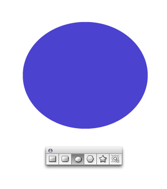
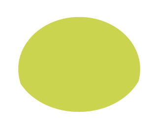
Step 1
Start by using the Ellipse Tool (L) to draw an oval.
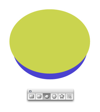
Step 2
Draw another oval on top that is slightly wider. I’m using two different colors so you can easily tell where the new oval begins. However, you can use one color when you create your own ovals.
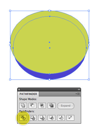
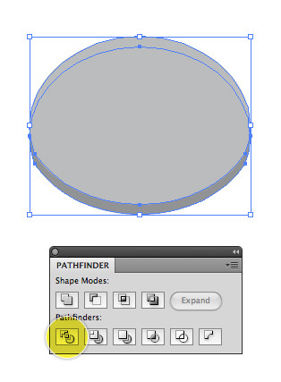
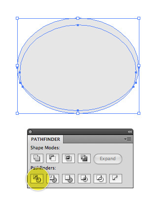
Step 3
Select both ovals and in the Pathfinder click Divide. Go to Object > Ungroup to ungroup the objects.
Step 4
Delete the shapes besides the one shown below.
Step 5
Copy and paste the shape and rotate it upside down to make the bottom half of the yo yo.
Step 6
Using two new copies of the shape, layer them on top of each other in a slightly staggered format and in the Pathfinder click Divide.
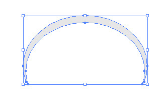
Step 7
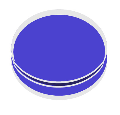
Ungroup your objects again and get rid of everything else besides the shape below. This shape will be the center dark area between the yo yo halves.

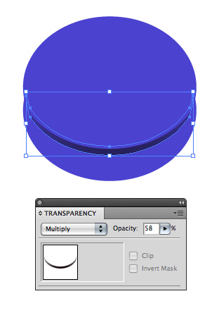
Step 8
Give the center dark area a dark black to gray gradient and in the Transparency palette set the mode to Multiply. Change the Opacity to about 60% too. Place the shape in between the top and bottom half of the yo yo.
Note: Re-stack the order of the yo yo shapes by going to the Object > Arrange menu.
Step 9
We’ll make a reflection for the top of the yo yo by again using two new shapes and in the Pathfinder clicking Divide.
Step 10
Ungroup your shapes and get rid of the extra shapes so you’re only left with the shape shown below.
Step 11
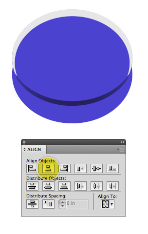
Place the reflection over the top of the yo yo. Note: use the Align palette to ensure everything is perfectly centered.
Step 12
Create a reflection for the bottom half of the yo yo by using the same method.
Step 13
Add individual reflections to the center area of the yo yo as well.
Step 14
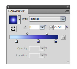
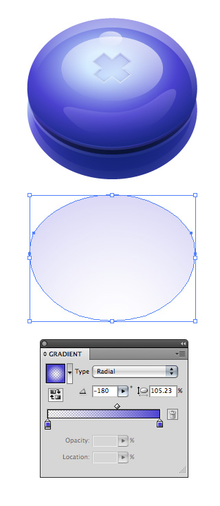
Define a radial gradient that goes from a light blue color to a medium blue color and finally to a lighter blue color. Three gradient steps is important as to achieve a smooth and dramatic range of color.
Step 15
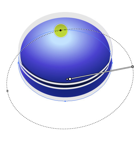
Using the Gradient Tool (G) add a radial gradient to the top half of the yo yo. Drag the highlighted area inward to condense the shape of the gradient. Instead of a perfect circle an oval works much better in achieving the overall shading that looks best. In my illustration, the light source is coming from the upper left so the side of the yo yo facing closest to the viewer should be darker.
Step 16
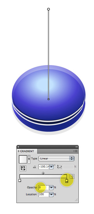
Define a swatch that goes from white to transparent and give the top reflection a linear gradient.
Step 17
Give the other
reflection areas a similar linear gradient. These reflections help the overall realism of the yo yo as objects in real life have reflective light, which is what these areas suggest.
Step 18
Draw an oval and give it a radial or linear (your choice) gradient. If you use a radial gradient make sure the center area is lighter as opposed to the outside edges as the top of the yo yo should appear somewhat flat.
Step 19
Give the backmost edge a separate reflection by using the Pen Tool (P) and drawing an arc shape and filling it with a linear gradient too.
Step 20
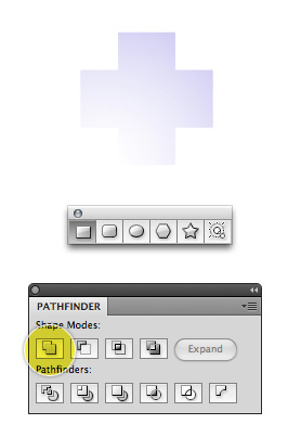
To create the plus sign, first draw two rectangles, align them using the Align palette and merge them by clicking Unite in the Pathfinder. Give the plus sign a linear blue to transparent linear gradient.
Step 21
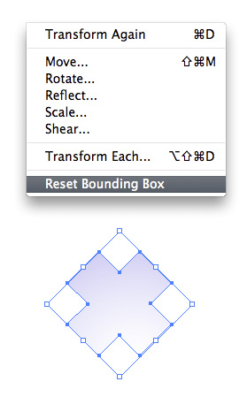
Rotate the plus sign using the Selection Tool (V.) Hold down the Shift key to easily rotate the plus sign to the angle shown below. After you’ve rotated your plus sign into the orientation shown below, go to Object > Transform > Reset Bounding Box.
Step 22
Using the Selection Tool, condense the plus sign down.

Step 23
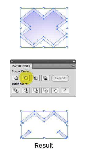
Make two new copies of the plus sign and overlap them as shown. In the Pathfinder click Minus Front. The resulting shape you’re left with will be only the edges of the plus sign. Note: the stacking order of your shapes determines whether the top or bottom shape will be subtracted from the other shape. Go to the Object > Arrange menu to adjust your stacking order if need be. Layer the resulting shape over the original plus sign.
Step 24
This is what your illustration should look like right now.
Step 25
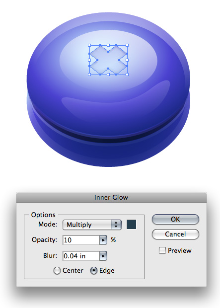
Give the plus sign an inner glow by going to Effect > Stylize > Inner Glow. Select Multiply for the mode and choose a blue color. Enter an Opacity of 10 and give it a Blur of your choosing.
Step 26
To create the reflection on the table use the basic yo yo shape and give it a radial gradient (with the center point being somewhat translucent.) Adjust that Opacity of the entire shape in the Transparency palette if suitable.
Step 27
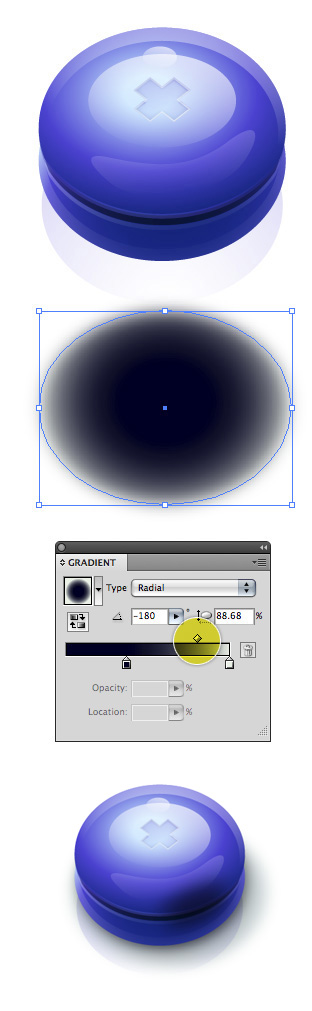
Create the drop shadow by giving an oval a radial gradient with the center point being the darkest area. Adjust the balance of the color so that transition is more toward the edge than the center, as highlighted below. Set the shadow’s mode to Multiply in the Transparency palette so it blends with the reflection of the yo yo. Shown last, give the side of the yo yo that’s closest to the viewer a shadow by blurring an oval shape by going to Effect > Blur > Gaussian Blur. Again, set the shape to Multiply so it blends well with the objects behind it.
Step 28
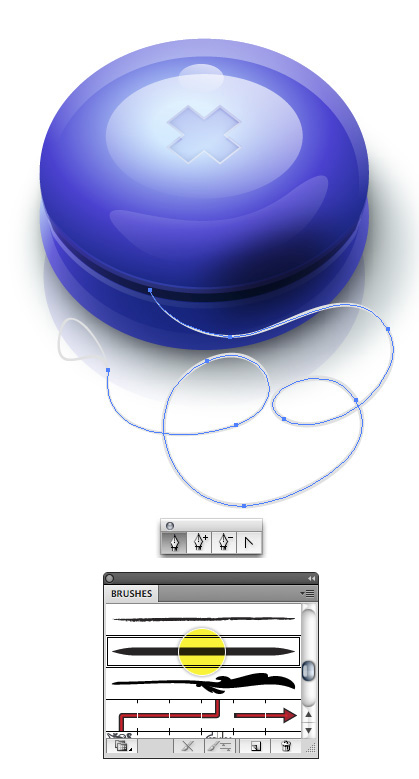
To create the string I’ve used a Wacom tablet which affords me the opportunity to draw a line with a varying thickness but if you do not have a Wacom tablet simply draw a nice curvy shape with the Pen Tool (P.) After that, in the Brushes palette select the option shown below and change the thickness of the stroke to about .25.
Step 29
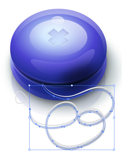
Duplicate the string, change it to black (you can optionally expand the string which will eliminate the ability to manipulate its curvature, but it’s not required) and give it a Gaussian blur by going to Effect > Blur > Gaussian Blur. Set the shadow to Multiply in the Transparency palette so it blends well with the objects below it.
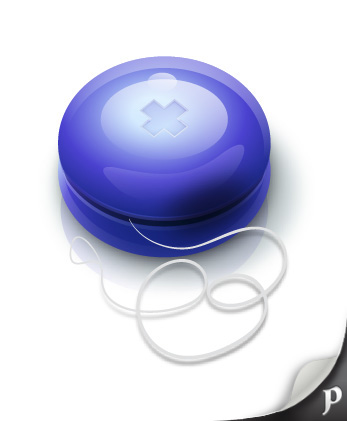
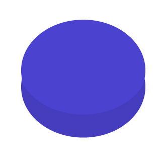
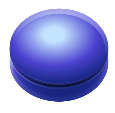
Conclusion
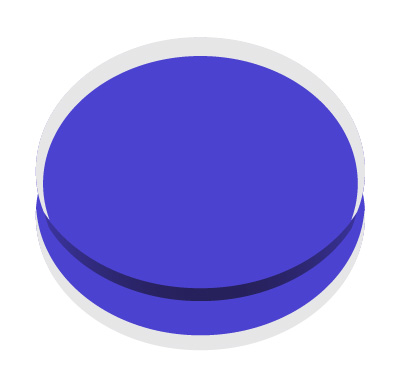
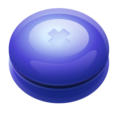
This is what the final icon looks like! As you can see, with the right combination of gradients and effects you can create images that pop from the artboard and are convincingly realistic. The trick is to always remember your light source and perspective, the rest will fall into place. I hope you’ve enjoyed this tutorial.