Digital Archiving Workflow for Beginners

In this video, we take a look at how best to import, convert, rename and archive digital photography files. Solutions for backing up images and working with a Digital Asset Management system are also explored. It’s a great introduction to your media workflow!


Watch the Video


What to Expect

Today we’re looking at how to store, backup, and protect your images while keeping them easy to find at a later date. Here’s a quick look at what to expect:

  • Importing
  • Converting to Adobe DNG
  • Renaming Files
  • Keywording
  • Archiving to DVD and Hard Drive
  • Digital Asset Management Software

It’s worth noting that this is the setup that works for me. It might be a little overkill for your needs, but I hope that you’ll find the video useful and pick up a few new ideas!


What is Your Workflow?

Does your digital archiving workflow include a few different or original steps? We would be fascinated to hear how you manage the process – feel free to share in the comments!

100 Beautiful Examples of Backlit Photography

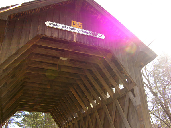
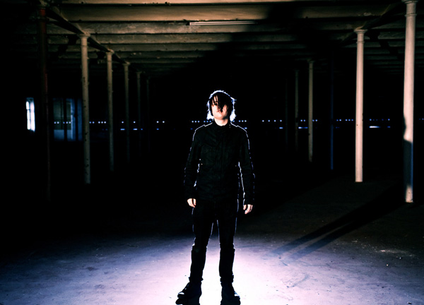
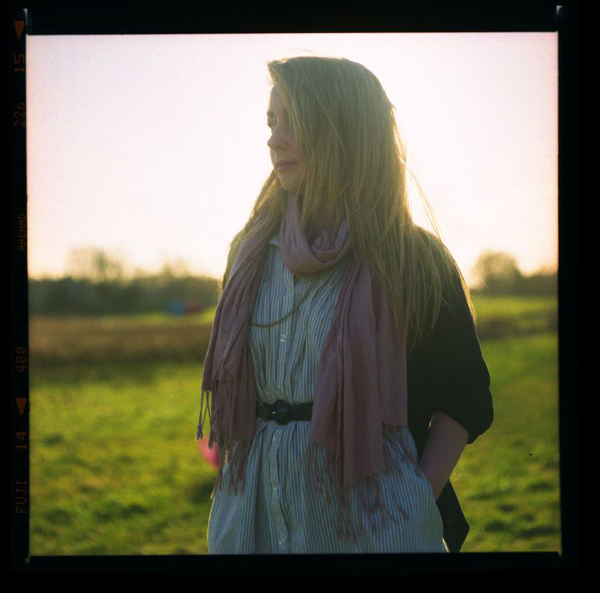
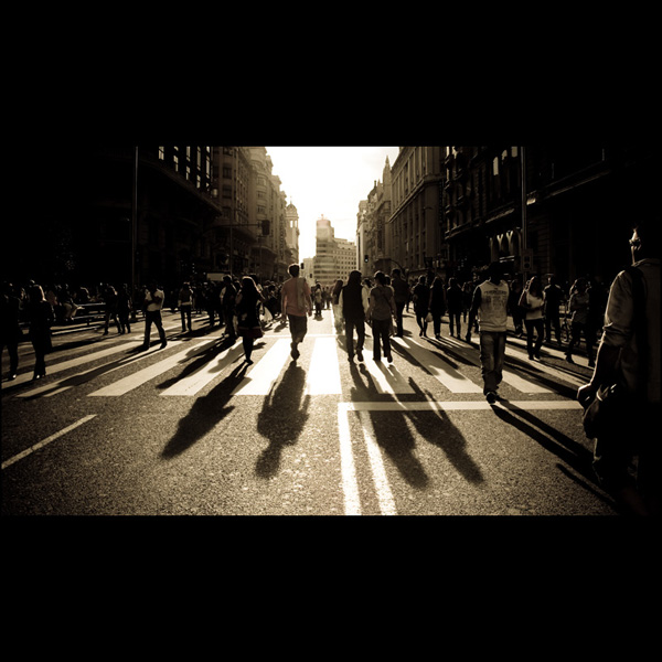
Recently, we looked at how to set up amazing silhouette shots using strong backlighting. Today we’ll see that silhouettes are just one possibility for what to do with a good backlight. Creative backlighting seems to be extremely common in nature photography, but can produce excellent effects in other areas like portraiture as well. Here are 100 beautifully backlit photos to give you some ideas for how to setup your own unique shots!

Backlit White Rose

Backlit

backlit in tgv

Backlit Frangipani Leaves

Backlit Palms

Backlit Grasses

Backlit traffic

Backlit Cactus

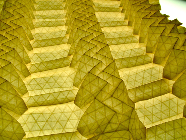
volumetric tessellation without a name

backlit baby cones

Ollie Backlit

thorn flakes

Backlit Golden Retriever

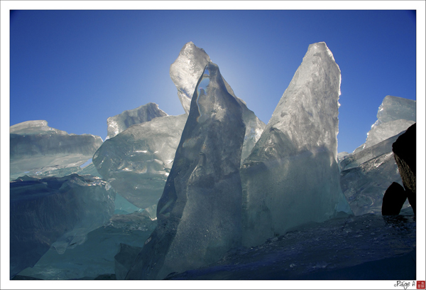
Backlit Snow

Backlit Iris leaves

StephenMcleod

backlit aloe plant

backlit straws

Backlit Clouds

MIT Backlit Stairs

Backlit Blinds

backlit palms

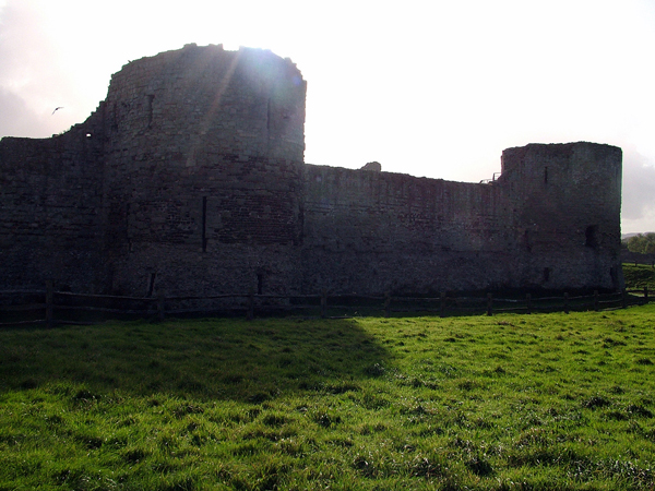
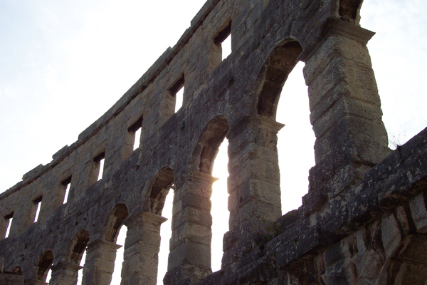
Pevensey Castle, backlit

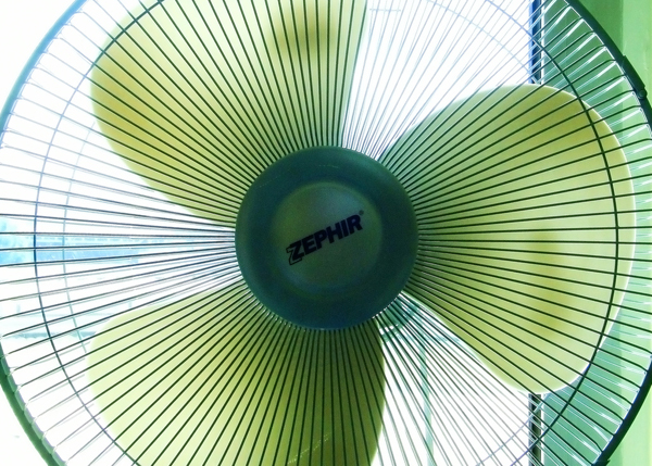
Backlit Fan

Backlit Flowers

Swiss Chard Backlit

backlit bridge

Backlit Pink Morning Glory Interior

Seagull Backlit

Temple blossoms backlit

Backlit Grass

Love like a sunset

your portrait

amanda eastside portrait

biomimicry

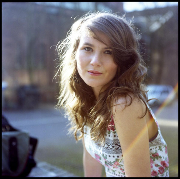
Backlit Girl

Cara

Shine

incense

Sunwashed Hair

Road flares

Soaring

Mathias

and listen

Leanne

chris13

twenty third and valencia

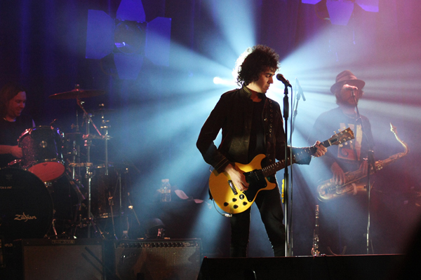
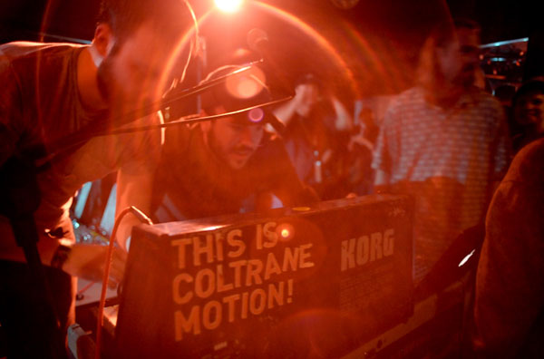
Za – Le concert au Sentier des Halles

my former moustache backlit

window portrait

Backlit / Processed

hicken & Liver?! Oh Boy, My Favorite!

Me-Shell

The Lunatics 1

Fluture de Noapte || Nocturnal Butterfly

I love backlighting

JD Backlighting experiment

Seasoned Love

Cropped

100 años de cosas

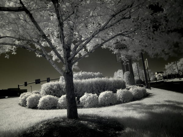
mer backlit b&w

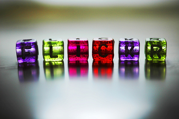
F L I C K R

Mi corazón, ardía como el Windsor…

Autumn

Brilliant Flag

Mirada

Day 63 – Ice, Ice, Baby

local glacier #2

backlighting

Jumma Masjid

Fountain Glow

Backlit Man

Pires e a nova câmera

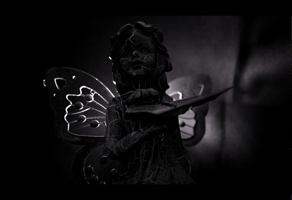
Fairy Down

Backlit Horse

Stonehenge

La alegría del canto

backlighting

Ryan

Dangled

backlighting

Cacti

Eerie

Shaver

New Life 2

Sympetrum éclaireur

Bajo el puente

Backlighting 1

grass (2)

365 Outtake

Aphid’s delight

365-44 (Feb 14)

Lens III

Iffa_Closeup_Sepia

backlit

Adam

Backlit

Backlit

il tunnel

Backlit


Share Your Backlit Photographs!

There are definitely some trends that emerge when you browse backlit photography on Flickr. Glowing hair, sun flares and translucent leaves are all popular subjects that you should consider experimenting with in addition to coming up with your own new and creative ideas.

Use the comment section below to leave a link to your own backlit shots and be sure to let us know how you captured them!

How to Shoot With an Extremely Shallow Depth-of-Field

So you’ve saved every penny, and your piggy bank is full to bursting. It’s time to cash that in money and buy a new lens. And what better choice than a fast prime lens? These offer plenty of benefit’s, and we’re going to dive into one of those benefit’s today: that shallow, professional and silky shallow depth of field.


Getting In-Depth with Depth-Of-Field

I’m about to get all Mr. Wizard on you, so hold on tight. I’magine a lens in profile. It looks sort of like football or a pointy oval. If you cut that shape in half between those two points, you would have two shapes that look like triangles. Now think back to those early school days. What are triangle-shaped pieces of glass called? If you said “prisms”, you get a gold star and a extra five minutes at recess. Check out what I’m talking about in the illustration below.

Now think about what a prism does. It creates rainbows from white light. It essentially “pulls” light apart. That’s almost the opposite of what a camera is trying to do, it’s trying to focus light and keep it together.

Using a wide aperture reveals those narrower, pointy parts of the lens. When you’re stopped down, you’re only using the center part which isn’t shaped as much like prism. The more your lens looks like two prisms, the more things will be out of focus, and the less depth-of-field you’ll have.

And who doesn’t want that shallowness? In fact, we pay big bucks to get it. By understanding how depth-of-field works and the concepts above, you’ll really be able to handle that pricey lens. And you’ll be able to better understand the other topics we’re going to cover.


From A Distant Land

There are three things that affect your depth-of-field. The first is aperture, which we just talked about. The second thing is distance. If you have an old manual focus lens with distance markings on it, you’ll see that the short distance markings cover much more area than the longer distances.

The 1 meter marking might be two centimeters away from the 2 meter marking, but the 10 meter marking might only be half a centimeter away from the 20 meter marking. The reasoning behind this is hard to explain and involves a graphing exponential curves, but it’s connected with the fact that the further away you are from something, the more depth-of-field, you’ll have.

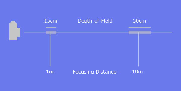
If you’re shooting a lens at f/2 and your subject is 1 meter away, the distance your depth-of-field is covering may only be 15 cm. But if you’re focusing on something 10 meters away, you might have a range of 50 cm. Basically, the greater the distance, the greater the depth-of-field. You can see an illustration of this concept below.


The Two-Thirds/One-Third Rule

As I hinted at above, depth-of-field is a definable range. At a certain distance with a certain f/stop, you might have 30 cm of depth in focus. Keep in mind that two-thirds of this depth extends behind your subject (the thing your focusing on), and one-third extends in front of it.

For example, lets say you’re focusing at 90 cm and, due to your lens, you have a depth-of-field of 30 cm. Everything from 80cm to 110 cm will be in focus. 20 cm behind of your subject, 10 cm in front. Two-thirds, one-third. See the illustration below to visualize this idea.

Sidenote

For those of you who have advanced degrees in physics, you may have connected the two-thirds/one-third rule with distance. You get less depth-of-field at closer ranges, which is why the depth-of-field doesn’t extend as far in front of your subject as it does behind.

This isn’t an important connection to make or understand, it’s just interesting. If you look at the chairs in the photos below, you can see how this idea might affect your images.


Length Matters

The last thing that affects your depth-of-field is the focal length of your lens. The longer the focal length, the less depth-of-field. If you have a 50mm lens set at f/1.4 and an 85mm lens set at f/1.4, and they are both focused on thing at the same distance: The 85mm lens will have a shallower depth-of-field. This phenomenon is related to how optics are set-up and again, physics.

It’s just important to note that a longer lens inherently has a shallower depth-of-field than a short lens. The image below was made with an 85mm lens set at f/1.4. I was pretty far away, and yet the depth-of-field was shallow enough to create a cool effect.


Chromatic Aberration

Back to the prism issue for a moment. Because lenses with wide apertures are shaped more like prisms, they are more likely to suffer from chromatic aberration. Chromatic aberration is literally the “pulling apart of colors that I mentioned early. Modern lens coatings and aspherical lens shapes help cut down on this, but it’s still a risk, especially in older lenses.

Chromatic aberration can make things on one color appear foggy or sometimes make them appear slightly shifted in position. The pinks of the flowers and the light green leaves at the top of this image have a slight haze around them due to chromatic aberration. They are not out of focus, but they are a much different color than the surrounding background color, which emphasizes the aberration.


Flare

Lens flare is a little more commonly encountered than chromatic aberration. Flare occurs when a light source is directly hitting your lens. It might not even be in the image, it might be just out of frame. It cause circles or streaks of light to appear in the final image. Point a wide angle lens at the sun, and you’ll see what I’m talking about.

This problem is also related to the prism issue, and wide aperture lenses are much more prone to flare than lenses with smaller apertures. Lens coatings help, but the best solution for flare is a lens hood. While hoods dont help if the light source in your frame, they do a great job of blocking that light coming from just outside the image.

A completely unrelated benefit is that they protect you lens from unintentional bumps and drops as well. The images below has a huge amount of flare, this is due to the wide aperture of the lens, and the wide angle of the lens. Wide angle lenses are more prone to flare as well.


Focusing in Brackets

Focusing a lens at f/2.8 can be difficult. The ultra fast lenses, like the f/1.2 and f/1.4, can be so touchy that autofocus systems can have trouble with them. Autofocus works best in high contrast situations, so in low contrast scenes it might be necessary to do a little bracketing.

Most people know about exposure bracketing, and the perfectionists among us might even dabble with white balance bracketing. Focus bracketing follows the same process. This technique will only really work with stationary or mostly stationary objects. Just use your autofocus to start. Once it’s locked on, just turn it off. Manually back the focus up a little, shoot, and then go a little past where it was before, and shoot again.

We are talking about half a millimeter in both directions. Less is more with this one. If you look closely at this photo, the nose of the dog is in focus, but the eyes are just a little off. If I bracketed my focus, I probably could have corrected this.


What Do I Do With It?

There are many reasons for using a shallow depth-of-field. The most common is a compositional technique called selective focus. This brings attention to something in a cluttered situation by making it the only thing in focus. This can be used to clean up cluttered backgrounds. But using a shallow depth-of-field while it’s snowing or raining, allows you to essentially make the precipitation disappear.

Another thing is using a shallow depth-of-field when there are small light sources in the background like traffic lights or holiday lights. The depth-of-field will turn these lights into beautiful glowing orbs. But using a shallow depth-of-field can also give your images a dream-like quality or make them appear nostalgic like the image below.


Some Gear Recommendations

Most of the photos shown in this tutorial were shot with a Nikon 50mm f/1.2 and a Nikon 85mm f/1.4. These are both manual focus lenses and, needless to say, they are a pain to focus on a Digital SLR.

If I had unlimited funds, I would purchase a new ground glass screen for my camera. If you’re camera allows you to interchange these, you can buy one with split-screen rangefinder patch or other good focusing aides. If you have manual focus lenses, read through your manual to decide what the best settings for focusing your lenses.

When you purchase your lenses, I highly suggest getting the brand-name, dedicated lens hood. Most lenses come with them, but the high-end lenses always at least offer them as an accessory. An after-market lens hood will usually involve using your filter threads, which will make it hard to use filters.

So if you havent made the plunge, start saving your pennies, because it is totally worth it. And after reading this, you won’t be dummy about using shallow depth-of-field…

Profiling MySQL Queries with phpMyAdmin: New Premium Tutorial


I’ve used phpMyAdmin for over a decade. In my early years with the tool, I simply needed something that could show me table structure and quickly give me the data inside. As my needs have grown, so have the tools included with phpMyAdmin which keeps me coming back as my primary MySQL tool, even with optimization. Become a Premium member.


What You’ll Learn:

  • Optimization techniques
  • MySQL Profiler
  • Capture queries by using MySQL’s log files
  • JOINS
  • EXPLAIN
  • …and plenty more
Example
Example

“I have had the pleasure of working with several different databases. Each have their drawbacks, and each have their strengths. When given a choice, I tend to migrate back to MySQL, despite me being too cheap to purchase the MySQL Enterprise. Instead, I make due with phpMyAdmin as my main profiling tool. It works well for me, but I had to do quite a bit of research to understand what I am looking at while profiling my applications. I am hoping to pass this along in a way that can be understood by the beginner, up to the seasoned pro.


Join Net Premium

NETTUTS+ Screencasts and Bonus Tutorials

For those unfamiliar, the family of TUTS sites runs a premium membership service. For $9 per month, you gain access to exclusive premium tutorials, screencasts, and freebies from Nettuts+, Psdtuts+, Aetuts+, Audiotuts+, Vectortuts+!, and CgTuts+. For the price of a pizza, you’ll learn from some of the best minds in the business. Become a Premium member.

e

The Best of Tuts+ – June 2010


June was a stellar month for Tuts+. Mobiletuts+ had recently launched and started off with some great iPhone and Andriod development tutorials. Creative Sessions focused on Digital Illustration this month and started gearing up for July’s Interface Design session. During June a survey was run across all of Tuts+ to give our readers the opportunity to provide some feedback, over 7000 people participated and one was lucky enough to win a $250 Amazon Voucher. Here’s a small sample of the best from Tuts+ this month!

Activetuts+ – Flash, Flex and Actionscript Tutorials

  • Personal Portfolio Flash Template – Active Premium

    It’s time for some more Active Premium goodies, exclusively available to Premium members. This time, an XML-based Flash Personal Portfolio template is waiting for you to download; read on to check out the demo and find out more about subscribing to Active Premium!

    Continue Reading

  • Advanced Character Customization for Flash Games

    In this tutorial, we’ll delve into Flash game character customization. The result can be used to provide players with the ability to create a unique character, beyond the basic dress-up options of most games. We’ll learn how to let the user add custom colors to different parts of our character, how to add hand-drawn designs to the character’s clothing, and how to modify a basic walking animation that uses the player’s changes.

    Continue Reading

  • Interview with Chris Gross, Plus (Winner Announced) SourceMate License Giveaway!

    SourceMate is a new plugin for FlashBuilder which promises to add a lot of “missing” features some of us have taken for granted in other IDEs.Read on to hear SourceMate Architect Chris Gross answer some questions about the product, plus find out how you can win a free license!

    Continue Reading

Aetuts+ – Adobe After Effects Tutorials

  • Create A Growing Text Animation – Quick Tip

    This is a quick tutorial showing an animation idea if you ever need to animate lots of photos with tag lines. I’ll touch on “Beam” and “Auto-Trace” within After Effect and get you started on creating your own beautiful project!

    Continue Reading

  • Fluidic Designs Using Particular

    This tutorial is based on the Hyundai i45 tv commercial. The effect is rain falling in the shape of various designs, onto a vehichle. The tvc uses a real-world rain rig with a computer driven water delivery system, however we will be showing you how to create the same effect using only After Effects and Particular.

    Continue Reading

  • 41 MORE Killer Typography Works

    I know, I know, I am a day late, but I have quite a good reason… Thank you all for the well wishes, and since I love our readers so much, I was able to finish up this week’s article just for you guys. It’s another roundup of some amazing works of typographical art, that I really think that you are gonna like! You might see that I included one from the comments of last week, so if you have something that you think is worthy… stick it in the comments!

    Continue Reading

Audiotuts+ – Audio and Production Tutorials

  • How to Make the Synth Sound from Lady Gaga’s “Just Dance”

    In this tutorial we are going to cover how to create Lady Gaga’s famous synth sound from “Just Dance”. Despite all the advancements in sound synthesis, sometimes the best sounds are the ones that are most simple. In fact the basis for the entire sound is one simple square wave!

    Continue Reading

  • Open Mic: Tell Us About the Tuts You’d Like to See on Audiotuts+

    What specific topics would you like to see covered in tutorials? Do you prefer written tuts, screencasts, or a mix? And what general areas would you like to see covered: DAW techniques, music theory, how to play an instrument, how to create specific sounds, how to make money with music, something different? Do you have any other suggestions? What can we do to keep you happy and make your day?

    Continue Reading

  • So You Think You’ve Finished Mixing? A Guide to Preparing Your Mix for Mastering

    You know what it feels like to finish a mix. Having spent hours, possibly days, perfecting your track to the nth degree, it feels great to finally have a song to be proud of after all the hard work and effort. But what if you took your mix just that little bit further. Before the crucial mastering stage, there are some very simple, and often overlooked, practices and techniques which can be applied to your mix in order to make sure your track stands out from the crowd and better yet, your final master is as good as it possibly can be.

    Continue Reading

Cgtuts+ – CG and 3D Tutorials

  • Model and Texture a Water Tower in 3ds Max – Day 1

    In the first part of this tutorial, the modeling and texturing process is covered in detail, starting with the creation of a proxy model inside of 3ds max. During this stage we will block out the tower structure using simple geometry and then go through the process of adding resolution and detail, creating an aged weathered look. We’ll make use of some simple poly modeling techniques as well as Max’s paint deformation tools to create the desired effect.

    Continue Reading

  • The Cgtuts+ E3 Games Roundup!

    Being in the CG realm of creativity, I know a lot of you are probably really into games, and probably even have worked on a few of them. I decided to make a nice list of a lot of the games mentioned or announced this past week at the E3 conference, so you can stay up to date, whether or not you followed it.

    Continue Reading

  • Composite a 3D object into video footage with Boujou, Maya and After Effects

    Matchmoving is a visual effects technique that allows the insertion of computer graphics into video footage. In this tutorial we’ll start by taking a look at how we can track our footage using Boujou. We’ll then jump into Maya and use that tracking information, along with a custom HDR image, to create and render a 3D object which we can insert into the scene. We’ll then use After Effects to composite the 3D object into the original video. The techniques used in this tutorial can be applied to almost almost all of your 3D integration shots.

    Continue Reading

Mobiletuts+ – iPhone, Android, Windows and Blackberry Mobile Development Tutorials

  • Introduction to iPhone SDK Development

    Mobiletuts+ will be covering all major mobile platforms – iPhone, Windows, Android and Blackberry. This tutorial looks at development with the iPhone SDK. You will learn information about the iPhone platform, how to setup and configure your development environment, and the steps necessary to create a simple fortune cookie application!

    Continue Reading

  • Introduction to Android Development

    Mobiletuts+ will be covering all major mobile platforms – iPhone, Windows, Android and Blackberry. Today we’ll be taking a look at Android development: explaining why people have choosen to work with Android and providing an overview of the Eclipse IDE and its Java, DDMS and debugging perspectives. Finally, you’ll learn how to get started making your first Android app!

    Continue Reading

  • HTML5 Apps: Positioning with Geolocation

    At the heart of every location-based application is positioning and geolocation. In this tutorial you will learn the geolocation capabilities of HTML5 and the basic principles needed to take advantage of them in your next HTML5 app!

    Continue Reading

Nettuts+ – Web Development Tutorials

  • The 10 HTML Tags Beginners Aren’t Using

    Let’s go back to the basics for this one. Everyone reading this at least knows what HTML is. I believe that, no matter what experience level someone has, reviewing the foundation can help increase knowledge. It also helps to hone skills, especially with the constantly evolving technologies that drives the Internet.

    Continue Reading

  • Inspiration: 40 Unique Footer Designs

    For this week’s stream of inspiration, we’ve collected forty fantastically creative and unique footer designs.

    Continue Reading

  • How to Authenticate Users With Facebook Connect

    Lately, there’s been quite a fuzz about lazy registration. It turns out that the less the user has to think, the higher the conversion rates are! What a thought! If everybody seems to have a Facebook profile, why not add a one-click user registration? I’ll show you how to do that today.

    Continue Reading

Phototuts+ – Photography and post-processing Tutorials

  • 7 Items You Never Thought to Bring to a Shoot

    Today, we’re taking a look at some of the less-obvious items that you may not consider bringing to a photo shoot. Some are tiny things, others are big – all of them will help to make any photography shoot go far smoother!

    Continue Reading

  • The Ultimate Beginner’s Introduction to Exposure

    Today we’ll be walking through the concept of exposure, right from the beginning. This article won’t befuddle you with complicated numbers and jargon, but it will help you feel more confident with your photography and understand a core concept that’s a vital piece of the photography jigsaw.

    Continue Reading

  • DIY: How To Make a Professional Softbox for Under $2

    Nowadays a softbox needn’t be all that expensive – you can get nice results for $100 or even less. But what if there’s a way of making it much cheaper, with the same results? That’s what we’ll be explaining in this DIY tutorial; how to make a softbox with professional results for less than $20.

    Continue Reading

Psdtuts+ – Adobe Photoshop Tutorials

  • Create a Cosmic Love Goddess With Photoshop CS5

    Photoshop CS5 includes several new features to help improve your workflow. In today’s tutorial we will demonstrate how to create a cosmic love goddess using some of Photoshop CS5?s new tools including the Refine Edge Feature which really helps to streamline the process of masking and removing objects from their background.

    Continue Reading

  • Design a Multimedia Website Layout in Photoshop

    First impressions do count! Stunning our viewers with a visually compelling portfolio is one of the most important things that a designer can do to court a new client. Today we will demonstrate how to use photos, brushes, and textures, and 3D objects to design a creative multimedia website layout in Photoshop. Let’s get started!

    Continue Reading

  • More Than 620 Bokeh Background Textures

    As I’m sure you already know, textures can come in very handy; whether you’re using them to subtly add interest to your work, or in full-blown, award-winning photo manipulations. Bokeh is the term used to explain the blur, or the aesthetic quality of the blur in photography, and is usually seen in good quality macro shots, in the areas that lay outside the depth of field.

    Continue Reading

Vectortuts+ – Adobe Illustrator and Vector Tutorials

  • Create a Detailed, Vector-based iPhone Illustration, Part 1

    In this tutorial you will learn how to create a photo-realistic iPhone illustration and every single icon you can find on the iPhone touch screen. That’s 18 icons! With so many fantastic tips and tricks we’ve broken the tutorial into two parts, in part two you will learn how to make the remainder of the icons and finish your illustration. Let’s get started!

    Continue Reading

  • Quick Tip: A Simple Way to Create Vector Fog

    In this tutorial, you will learn how to make a simple yet effective smoke-like illustration. Using this technique you can make smoke, fog and clouds in just a few easy steps. Let’s get started!

    Continue Reading

  • Inspiration: 35 Amazing Vector Landscapes

    Landscapes aren’t necessarily the first thing that come to mind when one thinks of vector artwork. After all, landscapes are often very nuanced and hold a wide variety of shapes, colors, and patterns that can be difficult to mimic in a vector image. But that doesn’t mean there aren’t some incredibly talented vector artists out there creating beautiful landscapes, some of which are almost photo-realistic (especially if viewed from a distance).

    Continue Reading

Creative Sessions

  • Realistic Vecyor Motorcycle Portaits

    Every semester, in my Illustrator classes, my students always want to know how I create the Motorcycle Portraits I am known for. I often give them a brief explanation, but I have never really sat down and described the process in detail…until now. My approach to getting a “realistic” look in my work is a bit tedious, but I think you will agree that the end results are well worth it. Enjoy!

    Continue Reading

  • The Making of Lost – Part 1

    A key to succeed in following this tutorial series is to experiment. I will be teaching the basic techniques but in order to create a strong composition and attractive shapes, you will need to alter the settings, change/redo splines and experiment with other effects. Patience and determination are mandatory skills for any artist. So let’s get started!

    Continue Reading

  • Scratching your Niche Market

    As opposed to discussing just the specific techniques used to target a precise niche market, I would like to start off with a few overarching thoughts. I will cover some basic, yet very useful principles to keep in mind for the bigger picture (Get it? ‘Bigger picture,’ like your career – hehe), and then supply a case study of how I have used them in my work.

    Continue Reading

FreelanceSwitch – Freelance Jobs & Freelancer Directory

  • 18 Smokin’ Hot Business Card Designs

    A good business card design is an essential tool in any freelancer’s arsenal. When you’re at a function networking, meeting new clients, or your work comes up in a conversation, your card is the anchor to make sure the discussion doesn’t come to nothing.

    Continue Reading

  • 5 Ways to Fire A Client

    There are just some clients who you no longer want to work with. It could be that the client in question is difficult to work with or it could be more a matter that you’ve moved on from the type of work you’ve been doing for that client. Whether you’ve only done a little work for the client or you’ve been together a long time, it’s never easy to fire a client. Not only do you have to get past the freelancer’s natural reluctance to give up money, but you’ve got to make the break in such a way that the client will still speak positively about you to other prospective clients.

    Continue Reading

  • 15 Inspiring Home Offices

    Is there such a thing as the perfect home office? From my personal opinion, I’d say that your own office is the perfect one. Then again, this all depends on what we have, what we use and if we’re pleased with it. I’m not even close to satisfied with my office yet, but I’m working on it.

    Continue Reading

CodeIgniter from Scratch: Security


In this fourteenth episode of the series, our subject is ‘Security.’ We will go over topics such as: password encryption, message encoding/decoding, XSS filtering, output filtering, sql injection, session security, private controller methods and more.


Catch Up


Day 14: Security

Premium Members: Download this Video ( Must be logged in)

Thanks for watching! Any questions/thoughts?

Web Dev Q&A #1: Callbacks, LESS, and Floats


Today marks the first entry in a new “Web Dev Q&A” series. I’m often emailed concerning various web development related questions. Though some are more specific than others, many of these, I’m sure, would appeal to all of our readers. As such, each week or so, we’ll post a new batch of question and answers from the community, in both article and video form, for your convenience.

This week, we discuss JavaScript callback functions, a LESS compiler, and those tricky CSS floats.


1. JavaScript Callback Functions?

“Hi Nettuts+: is there an easy way to create callback functions with regular JavaScript, similar to what we can do with jQuery?”

Of course. This is any easy one. For example, let’s create a generic function.

function doSomething(name) {
   alert('Hello, ' + name);
}

doSomething("John and Kate Plus 8");

When called, as expected, the browser will alert “Hello, John and Kate Plus 8.” Now, if we want to pass a callback function as well, as the second parameter of the “doSomething” function, we can simply pass an anonymous function.

function doSomething(name, cb) {
   alert('Hello, ' + name);
}

doSomething("John and Kate Plus 8", function() {
   alert('this callback function will only run after doSomething has');
});

Notice how we’ve added a second argument to the doSomething() function: “cb.” You’re free to label this how you wish, though it’s common to keep it as “cb,” which refers to “callback.” Now, that anonymous function will be represented via this variable.

The last step is to simply call it at the bottom of the function.

function doSomething(name, cb) {
   alert('Hello, ' + name);
  cb(); // now run the callback function
}

doSomething("John and Kate Plus 8", function() {
   alert('this callback function will only run after doSomething has');
});

2. LESS Compiler for Coda?

Dear Nettuts+: I loved your LESS.js video, but don’t want to use it for production. Is there an app for Coda that will automatically compile my code instead?

Sure thing. The best solution I was able to find is called LESS.app.

LESS APP

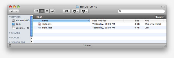
After you download it (free), you simply drag your project folder into the app, which instructs it to watch all .LESS files. At this point, you can continue working on your project, per usual. Every time you save, the compiler will run, which generates/updates an automatically created style.css file. When you’re finished developing your app, you only need to change your stylesheet references from style.less to style.css, accordingly. Easy! Now there’s no reason not to take advantage of LESS — unless you’re using a different solution, like Sass.

Generates CSS FIle

3. Where’s my Background?

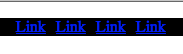
“Hey Nettuts+: So I have a navigation menu with a list of horizontal links; but when I set a background color to the menu, nothing shows up? How come? Here’s my code:”

<!DOCTYPE html PUBLIC "-//W3C//DTD XHTML 1.0 Strict//EN"
	"http://www.w3.org/TR/xhtml1/DTD/xhtml1-strict.dtd">

<html xmlns="http://www.w3.org/1999/xhtml" xml:lang="en" lang="en">
<head>
	<meta http-equiv="Content-Type" content="text/html; charset=utf-8"/>

	<title>Menu Problem</title>
	<style type="text/css">
		#nav {
			background: black; /* why doesn't this show up? */
		}

		#nav li {
			float: left;
			padding-right: 10px;
			list-style: none;
		}
	</style>	

</head>

<body>
    <ul id="nav">
		<li><a href="#">Link</a></li>
		<li><a href="#">Link</a></li>
		<li><a href="#">Link</a></li>
		<li><a href="#">Link</a></li>
	</ul>
</body>
</html>
Where is the background color

Okay, this is a common confusion. The reason why the background of “black” isn’t showing up is because you’ve floated all the list items to the left. When you do, it causes the parent element (#nav) to collapse. There are two solutions:

1. Set “overflow: hidden;”

“Overflow:hidden” is a nifty little trick that was only discovered in the last several years, around 2005. By applying a value of “hidden” or “auto” to the “overflow” property, it seems to remind the parent element that it’s supposed to be wrapping its children! The logic is a bit odd, I admit; however, none the less, it works.

#nav {
	background: black;
	overflow: hidden; /* ta da! */
}
Fixed

2. Clearfix

Setting “overflow” works 80% of the time, though, there might be times when we need to overlap the boundaries of the parent element, in which case “overflow: hidden;” will chop the image/element off. The second solution is to use the popular “clearfix” method. You’ll use this one often, so I recommend that you go ahead and save the code to your favorite snippet management tool, like TextExpander, Texter, or Snippets.

First, return to your mark-up, and apply a class of “clearfix” to the parent element.

<ul id="nav" class="clearfix">

Next, let’s add the appropriate styling for this class. The general functionality is that we use the “after” psuedo class on the parent element to apply content, and then subsequently clear that content — which essentially mimics adding <div style=”clear:both;”></div> to the bottom of your mark-up. However, this method is smarter, and doesn’t ruin our beautiful, semantic mark-up.

.clearfix {
	*zoom: 1; /* triggers has haslayout in older versions of iE
}
.clearfix:after {
	content: " ";
	display: block;
	clear: both;
	visibility: hidden;
	font-size: 0;
	height: 0;
}

“hasLayout is important because it forces the element to have a rectangular shape.”

As you can see, we use “:after” to add a blank space after all of the floated content. We then set the display to block, and clear it, which forces the parent to wrap the floated children. Lastly, we set some general visibility, font-size, and height rules to ensure that this code doesn’t affect our layout in some browsers.

Worth noting is the “*zoom: 1″ declaration at the top. The “zoom” property allows us to trigger IE’s proprietary “hasLayout” property. hasLayout is important because it forces the element to have a rectangular shape. This means that the content of the element cannot flow around other boxes, which will often cause major layout issues with your website. When Microsoft’s proprietary property “hasLayout” is equal to true, the element “has layout.” Luckily, we can trigger this by adding specific properties to our selectors, including “zoom.” Other hasLayout triggers, to name only a handful, are:

  • float: left/right
  • display: inline-block
  • position: absolute
  • height: any value (not auto)
Fixed

Conclusion

That’ll do it for this flagship “Web Dev Q&A” entry. If you have a “not-too-complicated” web development question for us, you can:

  1. Email [email protected], and write “Web Dev Q&A” as the subject of the email.
  2. Tweet us @nettuts, and hash “#askNettuts”.
  3. Leave a comment under any “Web Dev Q&A” posting with your new question.

Thanks for reading and watching!

Landing Page Design Job

I am requiring a landing page for a product named :C*P*A P*I*R*A*T*E as well as accompanying graphics. . similar content to http://cbp*irate.com/
This project include:
-A high quality landing page similar content to http://cbp*irate.com/ , it should fit the niche (CPA and the headers and footers should be something related to pirates (i don’t want the exact one as CBpirate you should be creative)The poduct is about making money from CPA.
-Some Affiliates materials (2 x(468×60) banners+ 2 (250×250) banners + 4 (125×125) banners+ 2 ebook covers (And other animated banner for every size)
I need this to be a very clean design and I will need to see previous examples. Please message me with your previous work and if you can do a mock up for me.