Quick Tip: How to Make a Glossy Web Style Rounded Button


Have you ever wondered how to make a glossy web button? In this Quick Tip you will learn how to create a simple button with recessed text, in just 11 easy steps. The best thing is, once you’ve made the first one, you can make an entire set in no time!

Continue reading “Quick Tip: How to Make a Glossy Web Style Rounded Button”

From Sketch to Vector, Simple Illustration That’s Not So Simple – Basix


Simplified, clean and minimalist illustration is becoming popular again. This style of illustration is interesting, not only visually but also technically. Successfully achieving this style is less about rendering skills and more about design elements and principles such as balance, harmony, color, proximity and contrast. In this Vector Basix tut you will learn how to take design from a sketch to vector and how to make a minimalist illustration of your own.

Continue reading “From Sketch to Vector, Simple Illustration That’s Not So Simple – Basix”

Open Mic: Tell Us Your Favorite Key

I once wrote a song about dropping a piano down a mine shaft. It was in Abm. But seriously, when you’re playing music, what is your favorite key?

Each Tuesday we open our mic to readers and lurkers alike to come out of the woodwork and tell us your thoughts and opinion, your experiences and mistakes, what you love and what you hate. We want to hear from you, and here’s your chance.


Most guitarists love sharp keys, while many keyboard players prefer flats. Everyone is different.

What is your favorite key and why?


How to Mix Top Line Synth Parts

One of the key parts of making your mix work as a single entity is carving space for each element to live in. In the past I have completed tutorials on mixing bass and drum parts, here we’ll be taking a look at how you can help your synth top lines sit with the rest of your instrumentation.

I have constructed a small mock project and written a step by step a account of how I married the new top line part with the other instruments in the track. I don’t expect the music is going to win any awards here but I hope that it helps demonstrate how easy it is to transform something average into something usable.

I have used Reason 4 here but you should be able to easily translate all of the techniques used to any other major DAW. As usual comments and questions are more than welcome.


Step 1: The Original Project

Ok, so here is the original loop we’ll be using. It’s constructed using about four different parts including drums, percussion, keys and bass. This combination makes for a reasonably full sonic spectrum and the balance is decent enough to producing a pleasing result.

At this point a synth lead is a perfect accompaniment and is a great alternative to a guitar or wind solo. Synth top lines are also much more convenient to record and edit, given that most of us are mixing entirely ‘in the box’. All this said it’s important that enough time is spent preparing our new part so that it marries well with the rest of the mix.

Obviously the following steps only represent one way of producing and mixing a synth lead, this is certainly not intended to be a definitive guide in any way.

The loop in action.

Download audio file (1.mp3)

The loop with no top line synth yet introduced.


Step 2: Our Initial Top Line Recording

The next step was for me to choose a lead sound and I decided to go with a preset from Reason’s excellent ‘Thor’ synth. With the new patch in place I recorded a very simple, rough lead part. At this point things don’t sound too hot, everything is pretty much in key but the timing is a little sloppy and the sound really doesn’t sit well in the mix.

Let’s move on and look at ways we can improve the situation.

The basic top line MIDI pattern I recorded.

Download audio file (2.mp3)

The top line in its raw state, sounding rather rough!


Step 3: Timing and Programming

Before we add any processing to the sound it’s best to pay some attention to it’s timing. As I mentioned earlier my playing was pretty sloppy and leaves a lot to be desired, this not only sounds messy but also makes the sequence stand out from the rest of the mix.

Of course sometimes you will want to apply some groove and swing to your part and this is really personal preference and also can be pretty dependant on what groove you are already working with. In this case however everything was already pretty straight up as far as groove goes, so I felt that some simple 1/16th quantisation would really help.

Although this simple move does help to tidy things up I also took a look a the way the sequence was programmed (or in this case played!). I wanted to make sure that the sequence flowed and felt fluid. This really just involved changing the length of notes until I was comfortable with the overall feel. As I had the Thor set to ‘legato’ mode and automative portamento any overlaps created a nice glide effect here.

The top line pattern now quantised and edited.

The sequence now felt a little tighter and touch closer to what I originally envisaged but the actual sonic character of the part was still lacking and the whole thing felt a little dull. Let’s look at what I did next to combat this issue.

Download audio file (3.mp3)

Some quantisation and editing applied.


Step 4: EQ and Filtering

One of the most important processes when persuading any sound to sit in it’s own space in the mix is equalisation. When treating sounds that live in the higher end of the frequency range, such as this top line, we should be thinking about filtering out any low end. In fact here I removed everything from about 300 Hz.

This technique really has two effects, first up the sound no longer clashes with any of the other instruments fundamental frequencies making it clearer and more defined. Secondly my removing lower frequencies and increasing the sounds level you are effectively boosting the high end and in turn making the sound brighter.

Reason’s MClass EQ removing low end.

To be 100% honest, the EQs in reason are slightly limited, in as far as they don’t actually feature variable high and low pass filters. But saying that, Thor does feature excellent variable state filters. In this instance I used a health mix of the MClass EQ and the Thor’s high pass filter model. You can hear from the example that this processing has really helped the sound on its way.

Thor’s powerful variable state filter in high pass mode.

Download audio file (4.mp3)

The top line with some eq and filtering applied.


Step 5: Patch Edits, Effects and Modulation

With the basics of timing and equalisation in place we are ready to start adding some decorative touches to our sound. Before I started adding any effects I edited the patch slightly to open the sound up a little. I added some extra release to the amplifier stage to make its response a little smoother and also softened the filter section up a touch. This generally made the sound easier to listen to.

The synth patches amp envelope was softened…

… As was it’s filter settings.

Download audio file (5.mp3)

The edited patch.

I then moved onto some processing. I have opted for a full blown effects chain which starts with some valve saturation courtesy of the Scream 4 processor. This adds some grit and also a bit of volume.

Next up I used a simple unison unit for some extra width (this is preceded by the equaliser from step 4). The unison is then fed into a reverb and delay. These are both mixed in very small amounts and add space and dimension to the sound, sort of an essential element for a synth lead in my opinion!

The effects chain used.

To top all of this off I added some very light modulation data to the patch. This was achieved by recording small movements of the mod wheel at key moments in the sequence. As the patch was already set up to create a vibrato effect when it received this data it was a pretty straight forward process. This extra performance effect added a nice touch and made the whole thing a little more varied.

Some vibrato was added using the mod wheel.

Download audio file (5b.mp3)

The patch with effects and modulation.


Step 6: Layering and Mixing

Our sound now sits in the mix considerably better than it did when first recorded. Some may feel that the sound is a little overly effected, of course this is subjective and really down to taste. If you feel you want more control over the direct, dry qualities of the original lead you can try using layering.

I simply copied the MIDI pattern onto a new channel, created a new synth, chose a relatively dry synth patch and mixed in a small amount. This adds a certain depth to the sound and claws back some of the definition after all the processing has been applied to our core patch.

The MIDI part duplicated.

Download audio file (6.mp3)

The patch layered…

Download audio file (6b.mp3)

…and in isolation.


Quick Tip: Create Your Own Leather Texture Using Filters – Screencast


In today’s screencast we will revisit a quick tip tutorial by Mohammad Jeprie and will demonstrate how to create a leather texture from scratch using Lighting effects, Noise, and Stained Glass Photoshop filters.

Here is a link to the written version of the tutorial Quick Tip: Create Your Own Leather Texture Using Filters

Design a Multimedia Website Layout in Photoshop


First impressions do count! Stunning our viewers with a visually compelling portfolio is one of the most important things that a designer can do to court a new client. Today we will demonstrate how to use photos, brushes, and textures, and 3D objects to design a creative multimedia website layout in Photoshop. Let’s get started!


Resources

The following resources were used in the production of this tutorial:


Step 1

Create a 960px by 620px canvas in Photoshop. This is a good resolution for websites as most screens can accommodate it.

Press Cmd + R to add the ruler and draw some guides to mark the limits for the main content area. These will be useful to center your design.


Step 2

Now that the main content area is properly delimited, let’s resize the canvas to 1224px by 620px (Image > Canvas Size) to create a bigger background. This spill-over area will be useful for visitors with large screens and create a ‘borderless’ look.


Step 3

The last step in preparing our document is to add a guide in the center. This guide will be handy when you have to center the design elements. A quick way to find the center is to create a new layer and press the Cmd + T shortcut keys to activate "Free Transform".


Step 4

Let’s make the cloud platform on which the main design will sit. Make a grey gradient background. Layer > Layer Style > Gradient Overlay. Gradient #434344 to #EAECEC. Leave all the other settings as default.


Step 5

Create a new layer “Clouds”. Load your Clouds brushes and paint in white a few clouds of various shapes, sizes and opacity until you’ve achieved a similar result as shown below.


Step 6

Create a second layer “clouds 2″, add a few clouds in the center.


Step 7

Create a third layer “clouds 3″. This time use the Abstract glow brushes, the 2nd brush, size 420px. Flip it, press Cmd + T > Flip Horizontal. This will help in giving the clouds a more wispy and ethereal look.


Step 8

Now we’ll create a big 3D “M” for “Multimedia”. You could substitute your company’s initials here.

Open up Illustrator and paste the cloud background that you just created into a new layer. Use it as guide to design the 3D “M”. Type the letter “M”: font Handel Gothic Ex, 181pt, white; you can substitute any other wide thick font. To give the text a 3D effect, go to: Effect > 3D &gt Extrude & Bevel. See image below for the settings.


Step 9

Copy the 3D “M” and go back to Photoshop to paste it in your document. Rename the layer to “m”. We’ll now apply some effects and textures to make it more realistic and interesting. First apply the following Layer Style to layer “m”.


Step 10

Create a New Folder “m textures”. Select the letter “M” with the Magic Wand Tool and with this selection, add a Layer Mask to the folder. We will now have all our textures for the 3D “M” inside this folder.

Use “texture 4.jpg” from the Rust Textures pack. Copy, paste and call the layer “texture”. Duplicate it and scale the duplicated layer “texture2″ down to 12.5%.


Step 11

Adjust the Layer Opacity to 40% and change its Blending Mode to Color Burn for both layers.


Step 12

Add another texture layer “texture3″ using “metal_plaque_bump_seam.jpg” Armored Metal Textures. Adjust the Layer Opacity to 26% and change its Blending Mode to Hard Light. Shift the layer around until you are satisfied with the texture’s position.


Step 13

Use a Soft Round brush with Opacity of about 30% to apply a shadow below the “M”. Use the Smudge Tool to adjust and create a slanted shadow as below.


Step 14

Add your company name, in this case “Multimedia”. Use Heritage Extra Bold, 32px, black. Next add a faint shadow below it.

Duplicate the layer, rename it "multimedia shadow". Cmd + T to access the Transform Tool, right click and select Flip Vertical. Add Motion Blur. Change the Layer Opacity to 50%. Add a Layer Mask and finally, apply a gradient to fade out the bottom.


Step 15

Now we’ll create the cityscape for our Multimedia world. You can use Cityscape Brushes for the buildings. Download a few abstract render packs : Render Pack Textures 1 and Render Pack Textures 2 for the textures. First use the brushes to draw a few buildings. Draw each building on a separate layer, between layers “clouds” and “clouds2″.


Step 16

Resize, position and cut out part of the buildings that you don’t need.


Step 17

For each building, create a New Folder which will contain their respective textures. Using the same method to apply texture for the letter “M”, select each building, one at a time, with the Magic Wand Tool and add the selection as a Layer Mask to the folder. Set the folder layer’s Blending Mode to Lighten.


Step 18

Now apply the abstract textures to the cityscape as below. Move, rotate, resize the textures until you’re satisfied with the effects.


Step 19

It is a good practice to clean up and organize your layers. Though a bit tedious at first, this practice will actually save you precious time when searching for files, let’s say a month later. Place all the buildings layers in a new folder “Buildings”. Bring this folder down between layer “clouds” and “clouds 2″.


Step 20

Use your cloud brushes to paint a few small clouds on layer “clouds2″ to cover up the buildings’ base.


Step 21

Let’s add our multimedia props: Classical camera, Director’s chair, TV camera, Laptop, Microphone, Hotair baloon 1, Hotair baloon 2, Small Tree. For each of these objects extract their background by using the Magic Wand Tool (W) and then click on the button Refine Edge to adjust the edges. To remove any remaining rough edges, use the Eraser Tool (E) with a small round brush.


Step 22

Resize and then apply Filter > Smart Sharpen (Cmd+F) to each object. Position them as below.


Step 23

Add shadows to the chair, TV camera, laptop, microphone, camera and car by following the same techniques used for the letter “M”. For the tree, use natural brushes and adjust the shapes using the Smudge Tool.


Step 24

Spring cleaning time! Link up each object layer with its respective shadow layer so that it will be easy to turn each object on and off as needed. To do this, Press Shift + click on both layers. Right click and select Link Layers. Then place all the props layers in a new folder “Props”.
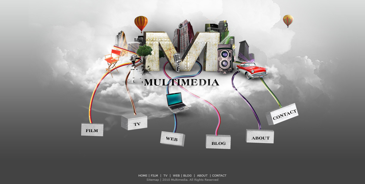

Step 25

When designing a homepage, the interactive elements play a major role in determining the website’s success. Therefore we should make our main buttons enticing and prominent for users to want to click them. We’ll create 3D boxes that are connected with the cityscape through colorful wires. They will represent our different page sections. Here’s a preview of what you’ll be designing.


Step 26

Go back to Illustrator to draw the 3D boxes and colorful wires. Use the Rectangle Tool (M) to draw 6 white boxes of different width depending on the length of the text the box will contain. Example “Web” will have a smaller box and “Contact” will have a wider box.


Step 27

Apply Effect > 3D > Extrude & Bevel for each box. See image for each box’s effect settings, from left to right.


Step 28

Copy over the artwork you created in Photoshop so far and paste it in a “background” layer as a guide. Draw a few lines with either the Pen Tool (P) or the Pencil Tool (T), whichever is easier for you.


Step 29

We’ll now make some rainbow brushes. Use the Rectangle Tool (M) to draw a rectangle. Then copy and paste four to five rectangles one beside each other vertically. Change their colors. Select all the rectangle and use Align Left to align them.


Step 30

Make a few rainbow variations. Here are some samples.


Step 31

To make the brush, select a rainbow cluster, drag and drop it into your Brushes Panel. Select New Art Brush. Name your Art Brush “Rainbow1″ and keep the default setting with a horizontal right direction.


Step 32

Now apply your rainbow brushes to the different lines.


Step 33

Copy and paste each rainbow wire(line) individually in Photoshop. Paste the layers in front of the buildings but behind your props and the letter “M”. Apply a Layer Mask on the wire layers and use the Cloud brushes to make part of the wires transparent.


Step 34

To give the wires a 3D look and make them shinier, apply a Bevel & Emboss Layer Style with similar settings as shown below. Each wire requires some slight settings tweaking to achieve the desired look.


Step 35

Copy and paste the 3D boxes from Illustrator into individual layers.


Step 36

Apply texture “metal_plaque_bump_seam.jpg” from Armored Metal Textures, using the same techniques as in Step 10 and Step 17. Set the texture layer’s Blending Mode to Hard Light with Opacity 26%.


Step 37

Add text to the boxes. Use Heritage Extra Bold, 14px, black. Rotate the text where needed to follow the angle of the boxes.


Step 38

Clean up your layers and organize the buttons into folders, if you haven’t already done so.


Step 39

The last step!! Add the footer and you’re done! Use Verdana, 10px, #cccccc for the first line and #999999 for the bottom line. These are safe web colors.


Conclusion

I hope you found this tutorial helpful. Do share your opinions, ideas, and I will be glad to help you if you have questions. Be creative and explore the techniques you’ve learned here – I can’t wait to see what you come up with!

CRELoaded Shipping…switches to Express instead of 1st Clas by mannastudio

CRELoaded Store…v. 6.2 Pro We have a client that has an issue with shipping in their store. Upon checkout, even if the user chooses First Class for shipping, it reverts to Express upon checkout. This is a huge problem when ordering, say a gift card… (Budget: $30-250, Jobs: OSCommerce)