How to Take a Break

Knowing when to take a break is importnat, but a lot pf people don’t know how to take a break.   Some would say that surfing the internet for a few minutes between articles will do the trick.  Others profess that getting up and going for a walk fills the time nicely.  While these ideas may seem on track, that’s not entirely the case.

A break is defined in several ways, but the one we’re going to focus on is:

A pause or interval, as from work.
It’s important to remember that you really do need to press the “pause” button when you take a break.  That means if you work on a computer all day, you should get and get away from it during the break.  If you work inside, go outside.  If you work in solitude, find interaction of some sort.  A break should not only be that interval you take to get away from your work, but give you a chance to break the pattern you have while working.
How you take your break is as important as when.  Do it right and you’ll come back recharged every time.


Rock-Solid WordPress 3.0 Themes using Custom Post Types


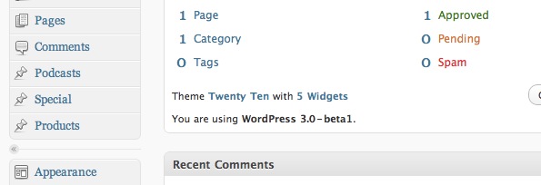
The WordPress community is buzzing with excitement over the soon-to-be-released WordPress 3.0. Currently in Beta 2 now, WordPress 3.0 will have a lot of exciting new features , such as a new default theme and better menu management. Quite possibly the most exciting of these features is custom post types. In this tutorial, we’ll talk about creating and using custom post types to make a rock-solid theme.


What is a Custom Post Type?

Well, according to the WordPress Codex:

“Post type refers to the various structured data that is maintained in the WordPress posts table. Custom post types allow users to easily create and manage such things as portfolios, projects, video libraries, podcasts, quotes, chats, and whatever a user or developer can imagine.”

Essentially, it allows us developers to make new kinds of posts similar to the post and page types, which all appear in the main navigation in the WordPress admin. There are several advantages to this; most notably, we no longer need plugins to create special types, we can build a theme that relies less on custom fields (as we know them), and they make managing the site easier for clients and non-technical users. Instead of telling them to create a “post” and make sure to fill in all kinds of custom fields for say, music, we can simply tell them to click “Music” to add a new music post.

Let’s Get Started!

In this tutorial we will:

  • Create a Custom Post Type for Products with our own inputs
  • Create a custom “taxonomy” for the type.
  • Create a theme template to go along with the new type.

Register the Custom Post Type

All of this will be done from within our theme’s functions.php file. I’m modifying the default 3.0 theme, TwentyTen.

The first thing we will do is tell WordPress that we want to register a new custom type. Here’s the code:

	add_action('init', 'product_register');

	function product_register() {
    	$args = array(
        	'label' => __('Products'),
        	'singular_label' => __('Product'),
        	'public' => true,
        	'show_ui' => true,
        	'capability_type' => 'post',
        	'hierarchical' => false,
        	'rewrite' => true,
        	'supports' => array('title', 'editor', 'thumbnail')
        );

    	register_post_type( 'product' , $args );
	}

The first line is a hook to tell WordPress that we want to call the function product_register() during initialization. It’s in that function that we register the new post type.

The function register_post_type() accepts two arguments: the name we want to give our post type, and a list of arguments used to create that post type, which we put in an array called $args. You can read exactly what all of the arguments are here, but I want to point out the important ones.

  • label & singular_label: These are the labels as we want them to appear in the WordPress admin. ‘label’ will show up in the admin nav and anywhere that references multiple entries of that type (Edit Products, for example). ’singular_label’ will show up when one of that type is referenced (Add Product, for example).
  • capability_type: This tells WordPress which native type (post, page, attachment, revision, or nav-menu-item) the custom type will behave as. By making it a ‘post’ type, we can do things like add it to a category.
  • rewrite: Tell WordPress if (or how) to apply permalinks formatting. You can send a boolean as we did, or any array of arguments to apply a custom permalink format to the type.
  • supports: This is everything on the add/edit page that will show up. We want to have a title, editor(the content), and thumbnail images. Next, we will add our own custom inputs by cleverly masking custom fields as input fields for our custom type.

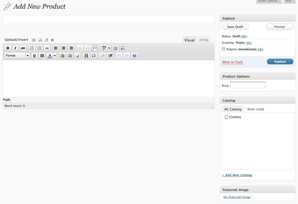
Adding Our Own Inputs

Let’s add our own custom inputs for our new type. Since we can now create new post types, we can make the custom fields more streamlined for users that might not be as familiar with WordPress as we are. It’s worth noting here that this functionality has been available since 2.5 and up until this point, has been used primarily by plugin developers. Here we are going to add a price field.

<?php
	add_action("admin_init", "admin_init");
	add_action('save_post', 'save_price');

	function admin_init(){
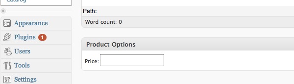
		add_meta_box("prodInfo-meta", "Product Options", "meta_options", "product", "side", "low");
	}

	function meta_options(){
		global $post;
		$custom = get_post_custom($post->ID);
		$price = $custom["price"][0];
?>
	<label>Price:</label><input name="price" value="<?php echo $price; ?>" />
<?php
	}

function save_price(){
	global $post;
	update_post_meta($post->ID, "price", $_POST["price"]);
}
?>

Once again, the first couple of lines are hooks to tell WordPress when we want to use certain functions. The first line says that when the admin panel is initialized, call the function that we wrote, admin_init(). This function tells WordPress to add an area called “Product Options” to any posts of type ‘product’, and to use the function meta_options() to print the form fields. You can read more about add_meta_box here. meta_options() will then get any preexisting custom values and print the form field. The second action line states that when a post is saved, call our function save_price(), which uses update_post_meta() to add or update a custom field called ‘price’.

Custom Categories and Edit Columns

Our last step in creating a completely custom type is giving unique names to its category and edit column labels. First, the custom category name, or ‘taxonomy’.

register_taxonomy("catalog", array("product"), array("hierarchical" => true, "label" => "Catalogs", "singular_label" => "Catalog", "rewrite" => true));

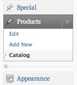
The function we use is register_taxonomy(), which you can find in the codex here; it has been available since 2.8. It’s essentially saying that we want to create a new category type called ‘catalog’ which we will associate with the ‘product’ type. The last argument is an array of information similar to what we saw the register_post_type() function. When all is said and done, we will have the term ‘Catalog’ appear beneath our Products menu in the WordPress admin and it will behave like Post Categories do.

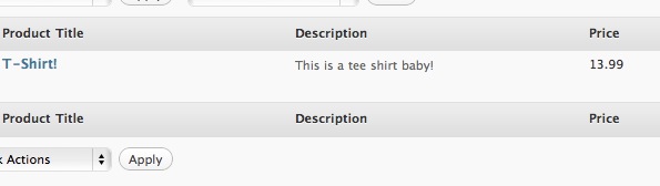
Next, we want to create a custom set of columns for our Product type.

add_filter("manage_edit-product_columns", "prod_edit_columns");
add_action("manage_posts_custom_column",  "prod_custom_columns");

function prod_edit_columns($columns){
		$columns = array(
			"cb" => "<input type=\"checkbox\" />",
			"title" => "Product Title",
			"description" => "Description",
			"price" => "Price",
			"catalog" => "Catalog",
		);

		return $columns;
}

function prod_custom_columns($column){
		global $post;
		switch ($column)
		{
			case "description":
				the_excerpt();
				break;
			case "price":
				$custom = get_post_custom();
				echo $custom["price"][0];
				break;
			case "catalog":
				echo get_the_term_list($post->ID, 'catalog', '', ', ','');
				break;
		}
}

The first two lines are hooks to tell WordPress that we want custom columns for the ‘product’ type. The first line says that when printing columns for the product type, use the ones defined in the function prod_edit_columns().

In prod_edit_columns(), we have a key-value array where the keys are used to reference certain post information, which we define in the second function, prod_custom_columns(). The values in that array are the column headings. You might notice that prod_edit_columns() lists five columns, but we only describe display information for three in prod_custom_columns(). ‘cb’ and ‘title’ are part of a set of default keys that WordPress already has associations for. WordPress doesn’t know what the other three are, so it’s up to us to define them.


Making the Theme Template

Not too shabby, right? And now we are finally up to the fun part- the theme template. To make a theme template for a custom post type, we simply name the template single-<post-type-slug>.php and add it to our theme. In our case, this would be single-product.php. Here I will show you a snippet of that page that displays all of the information we’ve added to our custom post type:

<?php the_post(); ?>

<?php
	$custom = get_post_custom($post->ID);
	$price = "$". $custom["price"][0];

?>

<div id="post-<?php the_ID(); ?>" <?php post_class(); ?>>
<h1 class="entry-title"><?php the_title(); ?> - <?=$price?></h1>

<div class="entry-meta">

	<div class="entry-content">
		<?php the_post_thumbnail(); ?>
		<?php the_content(); ?>
	</div>
</div>

I’ve added this code to the Twentyten theme in WordPress 3.0 Beta, as it’s the only theme that supports the new functionality- namely the menu system. I copied the single.php template, renamed it single-product.php and replaced everything in the ‘content’ div with the code above. To test my code, I went to Themes->Menus and added our new type to my site’s navigation. Then, I clicked through to our custom post type.

Wrapping Up

As I said previously, WordPress 3.0 is still in beta (you can get it here); so there are still some bugs to work out and some things may change in the final version. The best thing you can do is get in there and play with some of the new features to familiarize yourself with the updates/changes. From what I’ve seen so far, things are looking pretty good!

What’s Your Favorite Motivational Quote?

Getting productive – and awesomely so – isn’t easy by any means.  Some people use music to get them going; some people use a combination of the aforementioned with a Diet Coke.

A popular way to get clear and then get going is through the inspiration that comes from motivational quotes.

Do you use motivational quotes to get moving?  What are some of your favorites?

Creative Illustrative Lettering Challenge – Part 2

This session we proposed a challenge to two illustrators. We asked each of them to take our own “tuts+” brand name and illustrate it with a creative lettering solution. Learn how each of them went about solving this, and the concepts they worked with to bring about the final work. In this Part 2 of this challenge, we’ll look at Jacob Bian’s solution and how he uses figures, motion and depth within a 3D scene, to transform this brief into a creative work of art.


About this Challenge

Inspiration for doing this challenge came from the awesome “tuts+” solution presented in the post PsdTuts+ Presents: Exclusive Wallpapers By Tim and Bram Vanhaeren. We decided to give two illustrators a creative illustrative lettering challenge that involved illustrating the “tuts+” name.

In part one we looked at how Wojciech Pijecki solved the same brief over on Psdtuts+. Now let’s take a closer look at the brief and then look at the solution from Jacob Bian here on Cgtuts+.


Creative Brief for this Challenge

For this challenge, we kept the brief simple, which would allow for the illustrators to really go in a creative direction that inspires them:

Take the name “tuts+” and illustrate it creatively with an illustrative lettering solution. For the theme we’d like to show creativity being released or realized.

We also sent along some basic formatting requirements as well: “For format it should be made reasonably large scale, but display well at 600px wide. We’ll then link to the larger version for viewers to see. Also, please include a written description of how you solved the creative brief and present your solution.”


Jacob Bian’s Solution

600

Jacob’s Description of His Creative Solution

The goal of the piece is to illustrate the abstract concept of releasing creativity. My focus is to portray “release” and “creativity” not as objects or actions, but as moods and themes of the piece.

Instead of illustrating the concept based on an original font, I decided to use the Tuts+ logo and to add meanings to the shape of the logo, extending these meanings to develop an entire theme that uses straight, defined edges, yet together forms a strong composition.

To achieve that purpose, I have intentionally created interaction between elements. This creates a theme of community in the piece, which visualizes the purpose of the Tuts+ network.

I began with creating the 3D text; I assured that the elements were sharp edged yet smooth and precise. Then I began setting up the scene, I intentionally created a scene with closed/limited space to create a contrast between the unleashing/exploding text and the closed space, strengthening the concept of release.

The human figures were then added in. This created a contrast between the sharp edges of the text and the smooth curves of the human figures. Now the image strongly reflects the theme of creativity. I believe I have achieved the purpose, no objects or action portrayals were used specifically representing the themes – yet the piece screams the themes and moods of release and creativity.

I experimented with a unique color scheme in this piece. Using three adjacent colors was a great risk to take. If one color does not appear properly due to lighting and reflection, the scheme will completely lose its meaning. To avoid that, before I started developing the materials, I developed a color palette that shows the color I’m about to use. This allows me to confirm that all colors rendered agree with my initial vision for the piece. Then I started developing a variety of different materials according to the scheme and applied them to the objects where they would best show their texture and color.

Post production was done in Photoshop, to ensure that the details of the piece are visible, I rendered three images with slightly different settings, hiding some objects to eliminate unneeded shadows.

The brief for a typography project can always be analyzed beyond what is written. In this case, the piece would benefit from a connection to its client, the Tuts + network itself. To achieve that purpose, I have intentionally created interaction between elements. This creates a theme of community in the piece, which visualizes the purpose of the Tuts+ network.

This piece uses simple techniques to create motion and depth, painting an active scene. I believe I have achieved every requirement in the creative brief while giving the piece artistic value through the application of my own style.


Quick Tip: Check Flash Player Version Using ActionScript 3

In this Quick Tip, I’ll show you how to get and display the Flash Player Version using ActionScript. Let’s take a look!


Final Result Preview

Here’s the final result we will be working towards:


Step 1: Brief Overview

Using the Capabilities class, we’ll get the Flash Player version and Operating System then display them in a series of TextFields.


Step 2: Set Up Your Flash File

Launch Flash and create a new Flash Document.

Set the stage size to 300×100px.


Step 3: Interface

This is the interface we’ll be using, a simple background with six TextFields, three static, three dynamic. Don’t forget to add the instance names shown in the image.


Step 4: ActionScript

This is the class that does the work, it’s basically a common class structure, the constructor sets the Capabilities returned values to the TextFields in stage.

package
{
	import flash.display.Sprite;
	import flash.system.Capabilities;

	public class Main extends Sprite
	{
		public function Main():void
		{
			playerVersion.text = Capabilities.version;
			osVersion.text = Capabilities.os;

			/* This is a shorthand if statement, the regular if would look like this:

			if(Capabilities.isDebugger == true)
			{
				debugger.text = "Yes";
			}
			else
			{
				debugger.text = "No";
			}
			*/

			debugger.text = Capabilities.isDebugger ? "Yes" : "No";
		}
	}
}

Step 5: Document Class

Remember to add the class name to the Class field in the Publish section of the Properties panel.


Conclusion

Now you know how to check and display the Flash Player version, useful in many ways, especially if your application requires a newer version and you want to display a message to alert the user.

I hope you liked this Quick Tip, thank you for reading!

Modelling 101: Tips for Dealing With an Inexperienced Model

Whenever I organise a shoot, I try to find models who know what they are doing. That said, you will always come across someone who you would love to strut their stuff for you, but isn’t quite sure how to. I like to give my models a ‘Modelling 101′ before I get started. Not only does this give them some ideas of what to do, it also relaxes them a little as they are no longer diving into doing something they know nothing about!


1. Be Confident

Any photographer will tell you that, as a model, confidence is the key. Nothing stands out in a photo more than a model who is shy or uncomfortable. Getting a model to be confident is one of the hardest things to do, as it’s generally an internal issue rather than something objective (such as holding your body a particular way).

In any shoot I take up to 2000 photos, sometimes more. After processing them, I come out with maybe 100-150 high-quality, usable photos. An awkward or unexperienced model will always try (and fail) to make every shot perfect. Let them know that any bad shots will without doubt be censored, so there is no reason to be worried about that.

nell at bondi

Nothing throws a model off more than having an unwanted audience. Shooting in a quiet location is also another easy way to get your model more comfortable, as it will be just you, and him/her. If you’re already good friends, that’s another plus.

It can also help to have one of their friends there with them! I always let my models know they can invite a close/arty friend to help out with the shoot. That way, they are more comfortable and you get an assistant!

Finally, don’t get lost in the camera. Despite the results, your model is still a human. You are not photographing an object, and they need attention and feedback! Tell them how wonderful they are, or take a break every 20 minutes to sit down and run through the best shots. This not only boosts their confidence by seeing good photos of themselves, but also allows time to think of more poses or work out new compositions.


2. How to Hold Their Body

The beautiful thing about the human body is that it gives us so many different ways to show beauty via different positions, angles and poses. There are, however, some surefire ways to ensure that the shots you do get exemplify this, rather than disadvantage them.

Crossed legs is one of the oldest tricks in the book. There is no doubt that having spread can give a feeling of power, however most times it can just make the model look fat (especially if you’re working with the more curvy body types!). Whilst a model is walking around a location or set, ask them to try to place one foot in front of the other whilst walking. Let them get the hang of it before you start taking some serious shots, so that you’ve got the slim look and they appear natural whilst doing so.

crossed legs on a rock

Another old but effective trick of modelling is to try to keep their hands occupied at all times, or at least giving the arms some shape! If you want to shoot without any props, ask your model to bend their arms instead of keeping them straight- these kind of shots come out static and plain.

Taking props to a shoot is one of the best ways to ensure both variety and aesthetics. If your model is playing with an object, it opens up a whole new range of candid shots- most of which will be quite satisfying! Take for example you’re at a green, overgrown location with a stream. Imagine your model bending down looking into the water. Now imagine the model looking into the water, leaning over holding a nearby branch, or placing leaves in the water. Suddenly an action is involved, and the shot has more character!

jess in the water

If the model is a lovely lady, ask them to twist or bend their abdomen- this disrupts the boring flow of a straight line down the body and can also give you some very sexy shots. If a male, get them in positions that flex muscles in natural but effective ways. as well as that, make sure they always place their weight to one side whilst posing!

meike in studio

3. It’s All in the Face

Facial expression is one of the biggest influences to the mood of a photograph. The most subtle differences can make your model appear angry or happy. Unexperienced models will smile with every shot, and I hope that this would be something you pick up early on in the shoot!

A frown will, without fail make the shot inquisitive, just as a giant smile with make it a happy shot! Variety is extremely important, especially if you’re taking photos for a studio (who will look for variety as well as beauty!). Sporting the same facial in each shot can get very boring, and there are much smarter ways to carry a theme throughout a series of photos.

Mix it up a little. Being over the top can produce rich results, but can also lead to fake-looking photos. Subtle differences bring out the individuality in each face, so exploit them! Get your model to show the camera why their face is unique and special.

meike happy in studio

Hand in hand with facial expression is telling your model where to look. Covered in a recent article, the eye contact of your model is extremely important. In this article, David showed us the three types of gazes: direct, in-frame (between subjects), and out of frame.

The model’s line of sight can dramatically change the mood of the photo, and the audience interaction with the photo. A model looking right into the camera pulls us in and talks to us, while anywhere else we’re observing. This ties in with facial expression as, if a model is smiling at an object, he/she is going to come across as content with it.

Any emotion on a face will be directed where the model is looking. Use this to your advantage – a smile at a toy will make a child seem happy, whilst a pained expression at the camera makes us sympathise. It’s all up to what you want to convey.

Jess on a rock

4. Trust the Photographer!

Lastly, tell them to trust you. You are the one seeing the frame through the camera, not them. They need to know that what you’re shooting is producing good results, and if you ask them to move in a way they might find ugly, tell them that from your point of view it looks beautiful.

Ultimately the photo will come from where you are, not where your model is. You might see a curve that they can’t, so you need to let them know what looks good!

trust my camera

Those are the top 4 tips I always offer my models before starting a shoot. Of course, it always helps to get to know a model a little before hand so they are more comfortable strutting your stuff.

Never forget to compliment your model, smile at them and tell them when you get a beautiful shot!

Find Your Inner Zen at Work

You may have tasted Nirvana at last night’s yoga class, but by 9 A.M. the next day you’re as tense as ever. If only there was a way to experience that kind of renewal and relaxation throughout the work day.

The good news is that you can. Try these yoga-inspired strategies to help transform your work day into a more positive experience.

Set an intention

In the beginning of yoga class, the instructor will often encourage students to set an intention. An intention can be something simple like strength or peace or joy. When you find yourself struggling, you can always return to your intention. It’s a reminder of your deeper purpose. Knowing your intention allows you to find meaning in the present moment and to make the most of the here and now.

Setting an intention is also a great way to start your work day. So often we arrive at work already frazzled, and then we jump into our email and become more frazzled. As we move from task to task, it’s easy to lose sight of the bigger picture and to sink into a downward spiral of exhaustion. Taking the time to think about a specific intention can provide a sense of clarity and calm. It reminds us that the point of work isn’t just getting through the day or earning a paycheck.

Intentions are especially helpful when you start to feel jaded at your job. Maybe you’re not so turned on by your daily to-do lists. There may be days when you’d rather be sick than go to work. But you always have a choice. You can resist the whole experience or go with it and make the most of it. When you create your own personal goals, you always win. You’re always learning and growing no matter what happens.

Take a deep breath

Focusing on breathing is a powerful way to find renewal during a stressful day. The next time you’re feeling anxious, instead of running to the vending machine, griping to a co-worker, or procrastinating on the internet, just take a deep breath. And another one. Focus on your breathing until you can sense an inner calm and quiet. It’s such a simple technique, and it’s always available to you.

Breath work is a powerful stress management technique because it reminds you that the solutions you are looking for aren’t outside yourself. You already have them inside of you. You don’t have to seek affirmation elsewhere. You can be secure and complete just the way you are. Letting go of your anxiety and tapping in to your inner strength will allow you to stay confident and energized at work.

Stretch

When you find yourself hunching over and stiffing up, take a stretch break. Stretching increases blood flow and wakes up tense muscles, helping to renew you mentally and physically. Although you can stretch at your desk, you may want to go a step beyond that. Part of the monotony of office life is being stationary all day. Getting out of your chair can be a huge source of relief.

Take a ten minute break and go for a walk around the block. Find a nice spot under a shady tree. Try a few different stretches until you find one that really feels good. You don’t have to do anything elaborate if you don’t feel like it. Just relax. Do whatever feels good. Let your stretch breaks be a little reward for all your hard work.

Physically stretching your body is a great way to get energized, but the very idea of “stretching” can also revolutionize the way you approach work. If you’re stuck in a rut, think about ways you can stretch yourself mentally to keep growing and changing in a positive way. Are there different challenges you can take on or new co-workers to befriend? Staying open to new possibilities will help keep your job fresh and fulfilling.

Focus on the present

You may be surprised how often your mind checks out during the day. Here’s a clue: do you look at the clock every few minutes? Counting down the hours until closing time may be hard to resist, but if you feel like your day really gets started after five o’clock, you’re missing out on a lot of your life.

Instead of making the most of the present moment, you wish yourself elsewhere. You may think: I’ll be happy when I’m finally at home, drink in hand, watching 30 Rock. I’ll be happy when I go on vacation. I’ll be happy when this huge project is finally done. I’ll be happy when I get a promotion. Don’t make yourself wait that long. Be happy now. Focus on the present, no matter how humble and ordinary it may seem. Give yourself that gift.

Accept who you are

Yoga isn’t about being the best; it’s about being your best. And that means different things every day. Sometimes you can stand on your head; other days you’d rather stick with child’s pose. And that’s okay. Don’t beat yourself up when you experience ups and downs in your career. Comparing yourself to others and holding yourself to impossible standards will only wear you out. Be kind to yourself.

Create a Stylish Animated Logo with Cinema 4D and After Effects – Basix

In this Basix tutorial, we will be creating a stylish animated motion graphic by blending 2d and 3d elements. We will start by making the 3d cubes animation in Cinema 4d, and then import it into After Effects to finish the composition and make some final adjustments.

Video 1

Download

Note: click the ‘Monitor’ icon to view tutorial in full-screen HD.

Video 2

Download

Note: click the ‘Monitor’ icon to view tutorial in full-screen HD.

Don’t miss more CG tutorials and guides, published daily – subscribe to Cgtuts+ by RSS.

Enter A 3D Samurai Chamber – Day 1

In this tutorial, we will build an entire 3D samurai chamber entirely within After Effects. From there we’ll animate a camera to fly through it as we light the whole scene. Finally, we take a look at depth of field. So there is a lot to cover!


Preview

Want access to the full AE project files and assets for every tutorial on Aetuts+, including this one? Join Ae Premium for just $9/month. You can view the final effect preview video below.

Tutorial

Download Tutorial .flv

File size 332MB


Workshop #75: Alert Invasion! by CCS-Crou

At Audiotuts+ we irregularly put up a reader track for workshopping and critique (find out how to submit a track). This is how it works: you upload your song, and every week or so we’ll publish one here and step away from the podium. The floor is yours to talk about the track and how the artist can fix problems in and improve upon the mix and the song.

This track has been submitted for your friendly, constructive criticism. They have put their track (and their heart and soul) in your hands to learn and get useful feedback.

  • Do you enjoy the song or track itself? Does it have potential?
  • Can the arrangement be improved?
  • How did you find the mix? What would you do differently?
  • What do you enjoy about the rhythm track? What can be done to improve it?
  • Is the choice of instruments relevant and effective for the style/song?
  • Are the lyrics (if any) effective? Does the style, arrangement and genre of the song suit them?
  • Can you suggest any specific techniques that might improve the track?
  • Do you have any other constructive feedback?

Alert Invasion! by CCS-Crou

Artist’s website: www.ccs-crou.info

Description of the track:

Alert, Invasion! is our very first full electro-style home-made track. The voice (with a vocoder effect) and, in particular, the lyrics (in French) are the heart of that eco-friendly song, supposed to make you laugh… and think. More information about our song on our website and our forum (for the translation of the lyrics).

Download audio file (CCSAlertInvasion.mp3)

Terms of Use: Users can stream the track for the purposes of giving feedback but cannot download or redistribute it.

Have a listen to the track and offer your constructive criticism for this Workshop in the comments section.


Submit Your Tracks for Workshopping

Need constructive criticism on your own tracks? Submit them using this form.


Psdtuts+ Present – Exclusive Wallpapers From Intrinsic Nature


Five talented designers from the online design collective Intrinsic Nature have volunteered to produce a set of exclusive wallpapers specifically for the readers of PsdTuts+. They have created some amazing wallpapers for just about anyone’s preferred style, so check out this post, download some wallpapers and then go check out Intrinsic Natures latest design pack.


About Intrinsic Nature

Intrinsic Nature is an online art group consisting of a select community of creative minds from around the world. Every few months, Intrinsic Nature releases a public showcase of exclusive art in what they call their "Experiments".

This talented group of designers work hard to produce quality art, so make sure to support their website by checking out their Experiments.


Exclusive Wallpaper – BMX Created by Anthony Harmon


Exclusive Wallpaper – The Variable Created by Diego L. Rodríguez AKA Paranoid Park


Exclusive Wallpaper – Cherry Cocktail Created by Dominique Fung


Exclusive Wallpaper – Settle for Fantasies Created by Reichull AKA Macabre


Exclusive Wallpaper – Anasazi Created by Ed Lopez AKA Edlo


Make Sure to Check Out Intrinsic Nature’s Latest Experiment Out Now!

This month, the talented folks over at Intrinsic Nature released their 8th Experiment and it is a phenomenal pack. It consists of 58 illustrations from 36 talented designers so you definitely have to check this pack out. And if you haven’t already done so make sure to bookmark their website for updates and new experiments.

Below is a small sample of the amazing art you will find in this new Experiment, so make sure to check the whole thing out here.


Special Thanks to Designers at Intrinsic Nature

I’d like to give a special thanks to each designer who submitted a wallpaper, as well as Glenn from Intrinsic Nature for helping make this possible. So once again, please support this great design collective by checking out their incredibly talented artists.

Also stay tuned for some more exclusive high quality wallpaper projects in the near future!

Quick Tip: How to Smooth Skin Without Losing Texture in Photoshop


There are several ways to smooth skin in Photoshop. All to often, however, skin can appear too smooth, fake, and synthetic. Today I will demonstrate a straightforward technique to help you smooth skin fairly quickly while preserving the texture of the pores. Let’s get started!


Final Image Preview

Take a look at the final image that we will be creating.


Original Image

Before we begin, let’s take a look at the original image.


Step 1

First, open your image and duplicate your background layer. Simply drag the layer onto the new layer icon in the bottom right of the layer palette. Now set the blending mode of this newly created layer to "Vivid Light."


Step 2

Now, let’s invert this layer. Do this by pressing Cmd + I or Image > Adjustments > Invert. Then, apply a Gaussian Blur by selecting Filter > Blur > Gaussian Blur. Applying a blur filter to an inverted picture will make it look shaper. Use the slider until you can see the pores on her face.


Step 3

Now let smooth the skin! Go to Filter > Other >High Pass. Move the slider until you are happy with the smoothing. You may notice some ghosting and other weird stuff around the eyes – just ignore it for now. Concentrate on the cheeks, forehead and nose.


Step 4

Almost done! Create a new mask for the layer and fill it with black to hide the image. Switch your color to white, select the mask and start drawing on the skin with a soft brush. Start at the cheeks, move over to the forehead, the nose and stop on the chin. If the effect is too strong for your liking, just lover the opacity of the brush and you’re good to go!


Final Image

We’re finished! I hope that you learned a few new techniques here. If you have a different approach, let me know in the comments!

Create A Wooden House Icon in Photoshop


You might be surprised what you can do with Photoshop’s drawing tools, a few textures, and a basic understanding of light and shadow. In today’s tutorial we will demonstrate how to create a wooden house icon in Photoshop by applying textures to basic shapes.


Resources

The following resources were used during the production of this tutorial although you are free to use any other textures you have at your disposal.


Step 1

In new document, create a new layer, draw as shown in (1a). Press Command + J to duplicate this layer and press Command + T, right click the mouse on image and choose Flip Horizontal to reverse the second layer. Position it as shown in (1b). Then press Command + E to merge the two layers into one, rename the new layer “H1”.


Step 2

Press Command + T. While holding “Command” edit “H1” as shown below (2a). Then press Command + J to duplicate “H1”, rename new layer “H2” and place is as shown in (2b).


Step 3

Create a new layer on top and call it “h2.” Draw as shown below.


Step 4

Create a new layer on top and call it “Left roof 1”, draw as shown in (4a). Then press Command + T, while holding “Shift” + “Alt” make it larger (4b).


Step 5

Create a new layer under “left roof 1”, call it “left roof 2” and draw as shown in (5).


Step 6

Continue drawing the roof as shown below.


Step 7

Create 2 new layers, one “door” and one “window”. Draw as shown below.


Step 8

Now let’s add some texture to the house. Open a wood texture. Any will do but mine came from bigstockphoto.com.


Step 9

Apply a layer style to “H1 texture” and use the settings below.


Step 10

Apply a layer style to “h2 texture” and use the settings below.


Step 11

Now apply the following layer styles to “left roof 1”, “left roof 2”, “left roof 3” and “right roof 1”.


Step 12

Create a new layer under “left roof 1”. Select it and “left roof 1” then press Command + E to merge these layers to one. Keep its name “left roof 1” (12a).

While holding “Command,” click on “left roof 1” to obtain its selection. Go to menu Select > Modify > Contract, set Contract By: 1 px. Then press Command + Shift + I to reverse this selection. Choose Dodge Tool (smooth brush, 35px) and draw as shown in (12b).


Step 13

Repeat Step 12 for “left roof 2”, “left roof 3” and “right roof 1.”


Step 14

Press Command + J to duplicate “left roof 1”, rename new layer “light roof 1” and fill it with white as shown in (14a). Make a selection as shown in (14b). Press Command + Alt + D and set Feather Radius to 20px then press Delete. Change its Blending Mode to Overlay (14c).


Step 15

Press Command + J to duplicate “light roof 1”. Rename new layer “light roof 2” and reduce Opacity to 50%.


Step 16

Select “left roof 1”, “left roof 2”, “left roof 3”, “right roof 1”, “light roof 1” and “light roof 2”, press Command + E to merge these layers to one. Rename new layer “roof”. Open the wall texture image (from bigstock.com), copy and paste it on top of “roof”. Select wall texture layer while holding “Command” click on “roof” to obtain its selection. Press Command + J to duplicate this selection, rename new layer “roof texture” (16a). Then change its Blending Mode to Multiply and reduce Opacity to 30% – 40% (16b).


Step 17

Add a wood texture layer to the door call it “door texture 1” (17a). Apply a layer stle and use settings as shown in (17b).


Step 18

Add one more wood texture layer for the door (on “door texture 1”), call it “door texture 2” (18a).While holding “Command” click on “door” to obtain its selection. Then while choosing Marquee Tool (M) press up key and down key and position as shown in (18b). Press Delete (18c) and remove “door” (we don’t need it).


Step 19

Choose the Dodge Tool and the Burn Tool (smooth brush, about 10px – 35px) and apply shading as shown on “door texture 2”.


Step 20

Add a wood texture layer for the window (on “window”), call it “window texture” and use the techniques outlines in Steps 18 and 19.


Step 21

Create new layer under “roof” and call it “roof shadow 1”. Choose the Brush Tool with black (set as in (21a)) to draw the shadow (21b).


Step 22

Create a new layer beneath all the other layers and call it “pillar” and draw as in (22a). Then add a wood texture for the pillar, call new layer “pillar texture”(22b). Apply a layer style and use settings as shown in (22c).


Step 23

Create a new layer on top of “pillar texture” and call it “house shadow 1”. Choose Brush Tool with black color (set as in (21a)) to draw the shadow (23a). Then on “pillar texture”, use the Burn Tool to draw as shown in (23b).


Step 24

Create a new layer under “pillar”, call it “house support 1” and add a wood texture as in (24a). Go to menu Image > Adjustments > Brightness/Contrast, set as in (24b). While holding “Command” click on “house support 1” to obtain its selection. Then choose Brush Tool with black color (set as in (21a)) to draw the shadow inside the selection (24c).


Step 25

Add one more wood texture for the house support. While holding “Command” click on “house support 1” to obtain its selection. Go to menu Select > Modify > Expand, set Expand By: 3px to get the larger selection. On the wood texture, press Command + J to duplicate the selection. Rename new layer “house support 2”.


Step 26

Perform the following steps.


Step 27

On “house support 1”, use the Brush Tool and draw a shadow as shown below.


Step 28

Create a new layer under “house support 2”, call it “house support shadow” and draw as in (28a). Then create a new layer under “pillar”, call it “house shadow 2” and draw as in (28b).


Conclusion

Hope you learned something new and had fun. The final image can be seen below.