How to Hone Your Business Skills with a Cribbage Board

One of my favorite ways to kill some time and unwind is by playing cribbage on my iPhone. It’s an addictive way to clear my head.

Oh, it’s not all fun and games. There are some valuable business skills to be learned:

  • Pay attention to your numbers: When I pick my cards, I need to add up all my possible points. More often than not I keep the four cards that add up to the most points.
  • Take risks: OK, I don’t always play the highest points. That’s because if I get the right start card or my opponent puts the right cards in the crib, I could clean up. Sometimes it works. Sometimes I have to make the best out of a busted strategy.
  • Analyze the competition: I pay attention to what my opponent plays. Analyze its strategy and adopt what works.

What do you learn about work and business from games?

Awesome Links #8: Personal Productivity Tools, iPad Apps and More

Are Multiple Twitter Accounts Good or Bad?
This post draws on a variety of sources and weighs the pros and cons of having multiple Twitter accounts, particularly for business purposes.

100 Ways to Increase Your Website Traffic
Quite possibly the most comprehensive list of website-boosting strategies we’ve ever seen, ranging from the obvious (“network, network, network”) to the off-beat (“fake a hacker attack”).

The best goal is no goal
The author discusses how not having goals can actually be liberating.

7 iPad Apps That Help You Budget and Improve Your Lifestyle
Sure, you want to kick butt at work, but these apps will help improve your lifestyle and stick to a budget so your hard-earned dollars will go further.

The 10 People You Need in Your Professional Network
Mentors are great, but you’ll need more than that achieve professional success. This Forbes article explores other people (including the mentor) you should have in your network.

6 Personal Productivity Tools Guaranteed to Up Your Game
From our sister site, FreelanceSwitch, comes this collection of web tools designed to help you be more productive. Freelancer or office worker, we think you’ll find this useful.

How Do You Handle Layoff Rumors?

You’re at work and you accidentally overhear a conversation between your boss and his boss.  You learn that they need to lay off one person in your division in order for the company to stay viable.  They’ve got to decide between laying you off or laying off your teammate.

Your teammate is good – very good – and you are one of the few in the office that knows that he’s about to be a father for the first time.

Do you:

  • Let your teammate know what you’ve heard?
  • “Accidentally” let your boss know about the coming child, and remark about how work quality can decrease in proportion with lost sleep?
  • Sabotage your teammates current project?
  • Update your resume, contact a recruiter and/or your competitors in your industry to start your new role on a new team?
  • Talk to your boss about taking a leave of absence while business is slow and work on your own freelance projects or take the vacation you’ve always wanted?
  • Provide your boss with an alternative to layoffs altogether (your department takes a 5% cut in pay, but everyone gets to keep working)?
  • Wait and see – let the best man win?

Though the economy is starting to stabilize, this question isn’t outlandish right now.

How would you handle it?

Making Your Passion a Higher Priority

Many of us are working at jobs that aren’t exactly horrible but they’re not quite our dream job, either. We might be harboring our own secret goal or ambition, but put it aside for the sake of a steady paycheck, benefits, and a sense of reasonable security.

But the more we ignore that persistent little tug that might be pointing us in a different direction, the stronger it gets. Eventually, you’ll have an important decision ahead of you—continue on the path you’re traveling, or at least consider pursuing that long-suppressed goal that’s never totally gone away.But really? There’s no reason why you can’t do both—at least initially. Maybe you’ve always wanted to start your own landscaping business. Or maybe you’ve been working in finance for a decade but always wanted to be a pastry chef. Or maybe you’ve always dabbled in art and want to turn it into a serious hobby and try selling some of your paintings. Go for it. You may not be ready (financially or otherwise) to jump right in and pursue your passion full-time, but there’s no reason why you can’t do it at all. It takes time to build up new pursuits, especially if you plan to launch a business. It takes time to build up a customer base, marketing efforts, and of course, profit.

Your true passion can bring a sense of peace and satisfaction that you may not be getting from your day job. Many of my fellow bloggers talk about finding a good work/life balance or making the most of your free time. Relaxing and unwinding are important, but it’s just as important to make time for the pastimes that truly bring you joy, whether it’s a serious hobby, side business, or taking steps toward a career change (i.e. going back to college or some other kind of re-training). If you’re bored in your job or generally feeling uninspired, think about why. It might be a good time to dust off those old ambitions and see if you still have the same passions that you once did. If you do, don’t wait—what do you have to lose?

Start slowly if you need to. Below are a few tips for including your true passions into your everyday routine:

Give yourself permission to pursue what you want to do.

One of the first things you need to do is to convince yourself that you deserve something just for you. It’s so easy to get caught up in all of the demands on our time—work, family, volunteering, friends, etc. But where do we fit in? When is it okay to just do what we want to do? When is the last time you made time for really working in your garden or baking those yummy cakes all of your friends raved about? You might be dismissing your pursuits as “silly” or a waste of time, but if it’s something that really makes you happy (and is potentially lucrative), what makes it a waste of time?

Make time.

Once you’ve ‘fessed up to the fact that you’ve wanted to try clowning for years and you’d love to perform at kids’ birthday parties, your next challenge is doing something about it. What can you cut back on (or cut out of) your currently jam-packed schedule so you can spend more time improving your juggling and balloon-animal-making skills?

Do some research.

Find out what you need to make your venture a reality. Get online and dig in. Talk to the professionals. Get prices for anything you’ll need—supplies, equipment, office space, employees, etc. Find out how much time this type of venture will take to get off the ground. Will you need any kind of training or additional education? Do some serious homework before investing a substantial amount of time or money.

Take your pursuit seriously.

This ties in with giving yourself permission to do what you want to do. If you take your venture seriously, others will follow your lead and take it seriously, too. It will take some time for your friends and relatives to stop thinking of you as an accountant and consider you a web designer, but keep it out in front of them and they’ll come around. Of course, it might not go over so well if you ditch them completely so you can focus solely on your new venture, but again, finding an effective work/life balance is important.

Spread the word.

Marketing time! Even if you plan to keep working full-time as an accountant and have your web design business on the downlow, you still need to start getting your name out there so potential clients can find you. Get some business cards printed and start a website. You’re taking your painting hobby one step further and looking for commission work? Start entering art shows or contact galleries to ask about displaying your work.

And finally…

Don’t forget to include your spouse in your decision-making process, especially if you plan to invest a considerable amount of money into your project. They need to know what to expect if you’re planning on shaking up your regular schedule.

What about you? Is your true passion a serious hobby or side business? How do you incorporate it into your everyday life?

Phototuts+ Reader Survey

Our recent Tuts+ Survey showed that many of you have feedback on how we can make Phototuts+ better for you. Now is your chance to let us know what you want from Phototuts+. Please take a few minutes to complete our reader survey.

All questions are optional. You only need to provide a response when you have something to say.

You’ll have the chance to tell us what you like, don’t like, and to make suggestions for the site. Every completed survey will be read, and your feedback will lead to real, tangible changes in the kinds of content we publish.

Thank you!

Take the Phototuts+ Reader Survey!

60+ Awesome Aviation Photographs (And How to Shoot Your Own!)

Enthusiastic aircraft photographers can often be found at any flying display, and with their trusted telephoto lenses are able to get glorious photography from up in the sky. Planes come in all shapes and sizes, and this article shows you a selection of inspiring photos along with offering some brilliant tips on how to capture your own awesome plane and aircraft images!


Aviation Photography

The definition of aviation photography is simply “the photography of planes either in flight or on the ground”. As with most forms of photography it is a specialist subject and requires a lot of thought to get correct. There are many different types of aircraft photography including air to air, ground to air and ground static:

Air to Air photography – This is simply capturing an aircraft in flight, while you yourself are on a separate aircraft not far from the subject. Unless you own your a plane, this type of photography is often too expensive or near impossible to capture as an amateur. Points to keep in mind are the sun’s position and the weather!

Ground to Air photography – Ground to air is simply shooting a photo from the ground at a plane in the air. This is the type of aviation photography you will most commonly see.

Ground-Static photography – Taking photos of static aircraft from the ground. This is the other common type you will often see.

Remote Photography – A camera is mounted to the aircraft and fired remotely. The disadvantages include that the composition of the photo has to be completed before the flight.

This article has examples of all these different types from amateur photographers to professional military photographers. See if you can point out the different types in this article.


40 Inspiring Examples

Credit goes to the original photographers, please click on each of the pictures to view more of the photographer’s work and see an enlarged version of the photo!

Michal ‘cyrjo’ Podkowa – Another Plane

Doncon402 – Aircraft at St Maarten

Doncon402 – Aircraft at St Maarten

Silverdragon – You to close

Matt.hintsa – Extremely Loud and Incredibly Close

Sandwedge – Up Up Up

Radaroneone – Peachtree Dekalb Airport 2010

Radaroneone – ShawFast 2010

Brokk66 – Airshow

Lotrdeana17 – Skydive

*Lotrdeana 17 was the woman in the image. The photographer is unknown.

Ninja06 – Backseater Panavia Tornado

Lin Pernille – Love is in the air

J.C. Ledbetter – Chicago

Antoine – Airshow over Lake Geneva

Antoine – Airshow over Lake Geneva 2

AndreMaillet – HDR T-33

Philippe Pennec – Vatry 0029

Department of Defense Public Domain – Silhouette of an Aircraft

Department of Defense Public Domain – Supersonic

Department of Defense Public Domain – Military Jet in flight

United States Air Force – Midair refuel

*This photo is under public information and allowed to be distributed, credits go to http://www.af.mil.

United States Air Force – A burst of power

*This photo is under public information and allowed to be distributed, credits go to http://www.af.mil.

Toosas – Red Arrows V

Vallo Pooler – Jet

Dalyjk – Spitfire air to air

Deepest wonder – Airshow

John Miles – Flight

Cal Gecko – Old plane

Department of Defense Public Domain – MOROCCAN PROBE

Amab7 – Skydiving

Itagua – Red Arrows

Mitchell Steinhardt – Form Up

Mike Lynaugh – F15 Stike Eagle

Mike Lynaugh – USAF Heritage Flight – Andrews AFB 2008

Indigo76 – A Six Pack of Bad Asses

Indigo76 – Into the Wild Blue Yonder

Carlsilver – Silhouette Plane 2

Csipesz – Red Bull B-25 Mitchell 5

Buddystyle – Smoke on

AJcsF – Breitling team – I

{Away until inspiration comes} – Miniature Airport

TailspinT – F-15E Strike Eagle

MATEUS – USS Harry S. Truman

Marcos Vasconcelos – F/A – 18F HORNET

Two Big Paws –RAAF F/18 Hornet

Fly for fun – Wide Angle approaching Providence, RI

Stuck in customs – Connecting the community

Shortbread1015DT – The reds

Vissago – 2008 MCAS Miramar Air Show

Alive in Calgary – Miss Mitchell

Matt.hintsa – C-17 Globemaster

Berry Photography –Biggin Hill International Air Fair 2009 Virgin Atlantic 747-400 & Red Arrows

Archangel 12 – RNLAF Open Day 09

C. Strife – Sweetness and Light

Monkeyleader – Red Arrows at dusk

Monkeyleader – Red Arrows

USAF

USAF

USAF

Matt.hintsa – Roaring Hornet

[bastian.] –Into the sun

Kanegen –Tokyo Haneda International Airport

Nixter – Breakout

Nixter – Downward


Quick Tips

1. Use a telephoto lens for ground to air shots

If you can afford anything between 200-400mm you will really see the benefits (anything else and the photos will be tiny!).

Canon have a fabulous range of professional lenses available, starting at around $550 and ranging up to $15,000.

I would recommend the Canon 100-400mm at the retail price of $3000 for anyone truly interested in the subject. Sigma’s 50-500 mm Super Telephoto Zoom Lens is fantastic lens for both brands at the much cheaper price of $1300.

If you already own a 200mm lens and don’t want to buy a new one, why not look into purchasing a teleconverter? These can often double the distance of your lens, a 2X converter can turn your 200mm into a 400mm.

2. Get to an air event early

You can take static ground pictures without huge crowds of people walking past and in front of the planes. If you plan to do anything involving HDR, this is a must. Also you can get a better place in the stands (or find a place with more space and better lighting). Often you want to position yourself with your back to the sun.

3. Research your subject

You only have seconds to get your settings correct. Research before can help overcome this. Simple tips like checking the weather and also having a look at other photos of the same subject can help you understand what settings you need.

4. Don’t forget the people

Including the people at an airshow along with the planes adds that extra depth to an image. This rule also includes the pilots! If you can get pictures of pilots entering the plane, then do so!

5. Keep your finger down

Keep your finger on the shutter, pan with the aircraft and shoot multiple shots. Also while the planes are in the air – no chimping! (Read number 6 here for a full explanation!)


Thanks For Reading!

I hope you enjoyed looking through these images – Feel free to share links to other inspiring images – your own, or other’s – in the comments.

10 Ways to Shoot Stunning Portraits With Only One Light

We’re here today to talk about shooting high quality, lit portraits with only one strobe or flash. Maybe your budget doesn’t allow you to purchase multiple lights for portraits. Maybe you have to travel light and don’t have the space for two flashes. Maybe you just want a challenge. Whatever the case is, you can produce a wide variety of lighting scenarios using a single flash. I’ve included 10 clearly explained examples in this tutorial that you can apply to your own situations.


Recommended Gear

To complete these tutorials, you’ll need a mix of the following equipment:

  • Your camera and lens to start with. All of these portraits were made with a Nikon D700 using a 24mm, 50mm or 85mm lens.
  • A stand-alone flash unit (that means no pop-up flashes) that can be adjusted manually.
  • Something that allows you to fire the flash without it being on the camera. This might be a special cord, or it could be a wireless system. I use a Cactus wireless flash trigger, which will work with almost any shoe-mount flash.
  • A convertible photo umbrella for some of the images. “Convertible” mean that the inside of the umbrella is shiny, but the black cover on the outside can be removed.
  • Though not used in this tutorial, a reflector disc or board could be substituted in many places.
  • A couple of light stands to hold your flash and umbrella or reflector properly

Outside vs. Inside

This tutorial will utilize two broad techniques. We will work outside balancing light from the sun with light from a flash, and we will work inside using just a flash.

While you can balance “ambient” light with light from a flash when working inside, this has not been done in any of these portraits. So let’s start outside where the sun will substitute for having a second flash.


Example 1. Simple Fill Light

In this first example, it is evening and the sun is shining toward the subject from her left. As you can see in the example below, half of her face is in shadow and light is very flat. The background is very busy and distracts from the subject. This wide overview shows both the subject in natural light and the light stand holding a flash. The flash has no modifiers and is pointed straight at the subject.

The Finished Portrait

In order to use the flash correctly, I found the exposure for the ambient (natural) light. I then under exposed it by one stop, and adjusted my flash to match. This sets the subject apart from the background by making it darker. The fence is also illuminated. Because the flash is relatively far away from the subject, it covers a wide area.

Because the light from the sun is still hitting her, and the flash is directed more toward the shadowy side of her face, the light appears very even. This technique is good for obtaining clear, easily identifiable images. Viewers would be able to identify the subject even in a wallet-sized print.


Example 2. Simple Rim Light

You’ll notice in the set-up photo below, that I have repositioned the flash behind the subject. The sun will act as the main illumination for the image, and the flash is going to act as our rim light. Rim lights illuminate the edges of the subject and are usually brighter than the main light (in this case, the sun). Unlike the last portrait, I am not underexposing the ambient light. In fact, I’m over exposing the flash to create highlights.

The Finished Portrait

Pay special attention to the subject’s shirt and hair. The far right edge (from the viewer’s point-of-view) of both are almost white. Because the flash is behind the subject, but not directly behind, the light falls just around the edges. You can also see this effect on the fence post in the foreground, and just slightly on the subject’s face.


Example 3. Diffused Rembrandt Lighting

Rembrandt lighting is when the light is 45 degrees to the side of the subject and 45 degrees above the subject. Many of Rembrandt’s painted portraits were lit in this manner.

For this image, I have also added the umbrella. The flash is in the umbrella pointing at the middle of it which causes the light to be softer and cover a larger area, but it also causes it to be less powerful, which is why the flash is so much closer to the subject than in the previous photos. You can see that the ambient light is hitting very little of the subject’s face.

The Finished Portrait

As you can see, the right side of the subject’s face and body (from our point-of-view) is still illuminated by the sun, but the sun is by no means our primary light source. The flash is filling in all the shadows that were there and also evening out the exposure of the wood around her.

The sun is doing wonders for the subject’s hair and creating a warm tone on her leg, but isn’t doing much for her face. In terms of exposure for this image, I exposed for the highlights on the subject with the leg and arm being lit by the sun, and allowed the rest to fall into shadow. I then cranked up the flash until I achieved the exposure I wanted.


Example 4. Hair Light

When using the sun as your main source of light, we already talked about how the flash can be used as a general fill light or a rim light. It can also be used as a hair light. As you can see the in the set-up photo below, the sun is directly facing the subject. It’s so bright that she’s squinting. Her face is naturally lighter than her hair color, so in order to even out the exposures between her hair and her face, I pointed a flash at it.

The Finished Portrait

To achieve the type of light I was looking for, I decided to remove the cover from my convertible umbrella. So instead of the flash shooting it’s light into the umbrella and the light reflecting off of it and then hitting the subject, the light is coming through the white portion and being diffused in a different way.

You can see how the light from the flash hits her hair and creates a pleasant sheen in the finished portrait below:


Example 5. Sunglasses Inside

Now let’s move inside. In the rest of the examples, all of the light that makes up the image will be provided by the flash. While I am using ambient window light to create the set-up photos, the windows are in no way affecting the outcome of the image.

The flash is exponentially brighter than the light coming from the windows and overpowers it completely. In the set-up image below, you can see that I’ve had the subject put on her sunglasses and look directly at the same lighting set-up I used for the hair light above.

The Finished Portrait

The final product is very similar to a famous portrait of a rock star. I believe it was Slash, but I cannot verify that. If someone knows of the portrait I’m talking about, please post a link in comments!

Anyway, the reflection of the umbrella creates an interesting image in the sunglasses, and the lighting makes the colors of everything really pop.


Example 6. Flash in the Back, Reflector in the Front

Let me make this clear, the umbrella in this set-up image is empty. I am simply using it as a reflector. In fact, a reflecting disc or even a large white piece of poster board would have worked better in this situation.

The light from the flash is coming over the top of the subject’s head and then bouncing off the umbrella and hitting her face. The idea with this arrangement is to create a rim light in the background and use the reflected light as my main source of illumination.

The Finished Portrait

As you can see in the final image below, her face is softly lit with the reflected light and her hair is picking up the direct flash from behind. The hair is a little too bright for my tastes. If I could do this photo again, I would have the subject tilt her head differently to make the highlight on the top of her head smaller.

Another option would have been to lower the flash further behind her head, so it wasn’t hitting so much of the top. Learn from my mistakes and pay close attention to how much rim light your flash is creating.


Example 7. Dramatic Overhead Lighting

This is a more specialized technique. I wouldn’t suggest using it often because it can be a bit cliché. It can lend a certain isolation or religious overtone to your imagery. It can also be used to completely black out a background.

You can see in the set-up that the flash is almost directly above the subject’s face, and just slightly in front of it. In almost all cases, the subject needs to look up or else shadows will darken her eyes and her nose would cast an unflattering shadow as well.

The Finished Portrait

As you can see, the portrait has a very dark background. And it does create a “floating head” effect because the neck is completely in shadow. I chose to keep the neck in the frame so the subject’s necklace would be visible. But when using this technique, it’s easy to compose the shot so only the face is visible.


Example 8. The American Apparel Look

If you’ve seen ads for the clothing store called American Apparel or certain trends in other fashion commercials, then you’ve seen shots using this technique. In this set up you’ll see that the subject is very close to the wall. The flash is in the umbrella and I used a wide angle lens. I stood directly under the umbrella and used a wide angle lens. I set my flash to a low-medium power for this shot because it was so close to the subject.

The Finished Portrait

The final effect for this image is a little hard to describe. Notice the vignette around the edges of the frame. You can also see that the light source (the big umbrella) being bigger than the subject, and so close, allows there to be virtually no shadows. The overall impression is half police lineup, half point-and-shoot snap shot.


Example 9. Everything In Close

This technique is similar to the “Flash in the Back, Reflector in the Front” set-up, but the flash is directly behind the subject. Like that technique, the umbrella is empty and could just as easily be substituted with a reflector.

The umbrella is directly in front and above the subject instead of to the side. And this technique utilizes the close proximity of the flash and umbrella like the technique above. I was situated close to the subject as well with a 50mm lens.

The Finished Portrait

The light in this image is very soft. The high angle and proximity of the umbrella allows it illuminate the face and act as a hair light at the same time. The flash positioned behind the head gives the very edges of the hair a glowing look.

This set up does the opposite of the “Dramatic Overhead Lighting” when done next to a wall. It makes it completely white. You will also notice in the finished image that the light on her hand is a little too bright.

This could be solved in two ways. One, have her tilt her hand in a different way. Two, move her hand further away from the light in some way.


Example 10. Up Against The Wall

Suppose you don’t have a reflector or umbrella. A white or light-colored wall can be used to make a dramatic portrait with just one light. You’ll notice that the flash is bare again and has been moved farther away. The wall is acting as a reflector, but the versatility and simplicity of this technique is what makes it so valuable.

The Finished Portrait

As you can see, the face is nicely lit and background is very dark. Because almost everywhere you go, you could set up a portrait like this, I want to share some variations with you. You can slow your shutter speed way down to 1 or 2 seconds to allow the background to become visible again. This would create more of an environmental portrait. You can also move the subject into a corner to create a solid white background.


Final Conclusion

Fancy studio strobes with softboxes and umbrellas and seamless backdrops are great. But if you don’t have the money, the room, or the strength in your back to carry all the gear, just remember that you can create stunning portraits using a single light and some smart tricks.

Thanks for reading. And go search Google for the that famous rock star portrait!

25 HTML5 Features, Tips, and Techniques you Must Know


This industry moves fast — really fast! If you’re not careful, you’ll be left in its dust. So, if you’re feeling a bit overwhelmed with the coming changes/updates in HTML5, use this as a primer of the things you must know.


1. New Doctype

Still using that pesky, impossible-to-memorize XHTML doctype?

<!DOCTYPE html PUBLIC "-//W3C//DTD XHTML 1.0 Transitional//EN"
	"http://www.w3.org/TR/xhtml1/DTD/xhtml1-transitional.dtd">

If so, why? Switch to the new HTML5 doctype. You’ll live longer — as Douglas Quaid might say.

<!DOCTYPE html>

In fact, did you know that it truthfully isn’t even really necessary for HTML5? However, it’s used for current, and older browsers that require a specified doctype. Browsers that do not understand this doctype will simply render the contained markup in standards mode. So, without worry, feel free to throw caution to the wind, and embrace the new HTML5 doctype.


2. The Figure Element

Consider the following mark-up for an image:

<img src="path/to/image" alt="About image" />
<p>Image of Mars. </p>

There unfortunately isn’t any easy or semantic way to associate the caption, wrapped in a paragraph tag, with the image element itself. HTML5 rectifies this, with the introduction of the <figure> element. When combined with the <figcaption> element, we can now semantically associate captions with their image counterparts.

<figure>
	<img src="path/to/image" alt="About image" />
	<figcaption>
		<p>This is an image of something interesting. </p>
	</figcaption>
</figure>

3. <small> Redefined

Not long ago, I utilized the <small> element to create subheadings that are closely related to the logo. It’s a useful presentational element; however, now, that would be an incorrect usage. The small element has been redefined, more appropriately, to refer to small print. Imagine a copyright statement in the footer of your site; according to the new HTML5 definition of this element; the <small> would be the correct wrapper for this information.

The small element now refers to “small print.”


4. No More Types for Scripts and Links

You possibly still add the type attribute to your link and script tags.

<link rel="stylesheet" href="path/to/stylesheet.css" type="text/css" />
<script type="text/javascript" src="path/to/script.js"></script>

This is no longer necessary. It’s implied that both of these tags refer to stylesheets and scripts, respectively. As such, we can remove the type attribute all together.

<link rel="stylesheet" href="path/to/stylesheet.css" />
<script src="path/to/script.js"></script>

5. To Quote or Not to Quote.

…That is the question. Remember, HTML5 is not XHTML. You don’t have to wrap your attributes in quotation marks if you don’t want to you. You don’t have to close your elements. With that said, there’s nothing wrong with doing so, if it makes you feel more comfortable. I find that this is true for myself.

<p class=myClass id=someId> Start the reactor.

Make up your own mind on this one. If you prefer a more structured document, by all means, stick with the quotes.


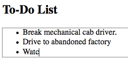
6. Make your Content Editable

Content Editable

The new browsers have a nifty new attribute that can be applied to elements, called contenteditable. As the name implies, this allows the user to edit any of the text contained within the element, including its children. There are a variety of uses for something like this, including an app as simple as a to-do list, which also takes advantage of local storage.

<!DOCTYPE html>

<html lang="en">
<head>
	<meta charset="utf-8">
	<title>untitled</title>
</head>
<body>
	<h2> To-Do List </h2>
     <ul contenteditable="true">
		<li> Break mechanical cab driver. </li>
		<li> Drive to abandoned factory
		<li> Watch video of self </li>
	 </ul>
</body>
</html>

Or, as we learned in the previous tip, we could write it as:

<ul contenteditable=true>
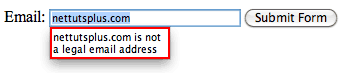
7. Email Inputs

If we apply a type of “email” to form inputs, we can instruct the browser to only allow strings that conform to a valid email address structure. That’s right; built-in form validation will soon be here! We can’t 100% rely on this just yet, for obvious reasons. In older browsers that do not understand this “email” type, they’ll simply fall back to a regular textbox.

<!DOCTYPE html>

<html lang="en">
<head>
	<meta charset="utf-8">
	<title>untitled</title>
</head>
<body>
	<form action="" method="get">
		<label for="email">Email:</label>
		<input id="email" name="email" type="email" />

		<button type="submit"> Submit Form </button>
	</form>
</body>
</html>
Email Validation

At this time, we cannot depend on browser validation. A server/client side solution must still be implemented.

It should also be noted that all the current browsers are a bit wonky when it comes to what elements and attributes they do and don’t support. For example, Opera seems to support email validation, just as long as the name attribute is specified. However, it does not support the placeholder attribute, which we’ll learn about in the next tip. Bottom line, don’t depend on this form of validation just yet…but you can still use it!
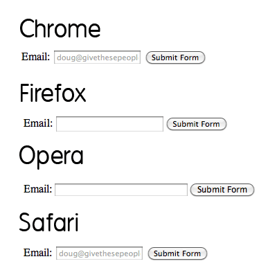

8. Placeholders

Before, we had to utilize a bit of JavaScript to create placeholders for textboxes. Sure, you can initially set the value attribute how you see fit, but, as soon as the user deletes that text and clicks away, the input will be left blank again. The placeholder attribute remedies this.

<input name="email" type="email" placeholder="[email protected]" />

Again, support is shady at best across browsers, however, this will continue to improve with every new release. Besides, if the browser, like Firefox and Opera, don’t currently support the placeholder attribute, no harm done.

Validation

9. Local Storage

Thanks to local storage (not officially HTML5, but grouped in for convenience’s sake), we can make advanced browsers “remember” what we type, even after the browser is closed or is refreshed.

“localStorage sets fields on the domain. Even when you close the browser, reopen it, and go back to the site, it remembers all fields in localStorage.”
QuirksBlog

While obviously not supported across all browsers, we can expect this method to work, most notably, in Internet Explorer 8, Safari 4, and Firefox 3.5. Note that, to compensate for older browsers that won’t recognize local storage, you should first test to determine whether window.localStorage exists.

Support matrix

via http://www.findmebyip.com/litmus/

10. The Semantic Header and Footer

Gone are the days of:

<div id="header">
	...
</div>

<div id="footer">
	...
</div>

Divs, by nature, have no semantic structure — even after an id is applied. Now, with HTML5, we have access to the <header> and <footer> elements. The mark-up above can now be replaced with:

<header>
	...
</header>

<footer>
	...
</footer>

It’s fully appropriate to have multiple headers and footers in your projects.

Try not to confuse these elements with the “header” and “footer” of your website. They simply refer to their container. As such, it makes sense to place, for example, meta information at the bottom of a blog post within the footer element. The same holds true for the header.


11. More HTML5 Form Features

Learn about more helpful HTML5 form features in this quick video tip.


12. Internet Explorer and HTML5

Unfortunately, that dang Internet Explorer requires a bit of wrangling in order to understand the new HTML5 elements.

All elements, by default, have a display of inline.

In order to ensure that the new HTML5 elements render correctly as block level elements, it’s necessary at this time to style them as such.

header, footer, article, section, nav, menu, hgroup {
   display: block;
}

Unfortunately, Internet Explorer will still ignore these stylings, because it has no clue what, as an example, the header element even is. Luckily, there is an easy fix:

document.createElement("article");
document.createElement("footer");
document.createElement("header");
document.createElement("hgroup");
document.createElement("nav");
document.createElement("menu");

Strangely enough, this code seems to trigger Internet Explorer. To simply this process for each new application, Remy Sharp created a script, commonly referred to as the HTML5 shiv. This script also fixes some printing issues as well.

<!--[if IE]>
<script src="http://html5shim.googlecode.com/svn/trunk/html5.js"></script>
<![endif]-->

13. hgroup

Imagine that, in my site’s header, I had the name of my site, immediately followed by a subheading. While we can use an <h1> and <h2> tag, respectively, to create the mark-up, there still wasn’t, as of HTML4, an easy way to semantically illustrate the relationship between the two. Additionally, the use of an h2 tag presents more problems, in terms of hierarchy, when it comes to displaying other headings on the page. By using the hgroup element, we can group these headings together, without affecting the flow of the document’s outline.

<header>
	<hgroup>
		<h1> Recall Fan Page </h1>
		<h2> Only for people who want the memory of a lifetime. </h2>
	</hgroup>
</header>


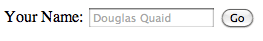
14. Required Attribute

Forms allow for a new required attribute, which specifies, naturally, whether a particular input is required. Dependent upon your coding preference, you can declare this attribute in one of two ways:

<input type="text" name="someInput" required>

Or, with a more structured approach.

<input type="text" name="someInput" required="required">

Either method will do. With this code, and within browsers that support this attribute, a form cannot be submitted if that “someInput” input is blank. Here’s a quick example; we’ll also add the placeholder attribute as well, as there’s no reason not to.

<form method="post" action="">
	<label for="someInput"> Your Name: </label>
	<input type="text" id="someInput" name="someInput" placeholder="Douglas Quaid" required>
	<button type="submit">Go</button>
</form>
Required and Placeholder Attributes

If the input is left blank, and the form is submitted, the textbox will be highlighted.


15. Autofocus Attribute

Again, HTML5 removes the need for JavaScript solutions. If a particular input should be “selected,” or focused, by default, we can now utilize the autofocus attribute.

<input type="text" name="someInput" placeholder="Douglas Quaid" required autofocus>

Interestingly enough, while I personally tend to prefer a more XHTML approach (using quotation marks, etc.), writing "autofocus=autofocus" feels odd. As such, we’ll stick with the single keyword approach.


16. Audio Support

No longer do we have to rely upon third party plugins in order to render audio. HTML5 now offers the <audio> element. Well, at least, ultimately, we won’t have to worry about these plugins. For the time being, only the most recent of browsers offer support for HTML5 audio. At this time, it’s still a good practice to offer some form of backward compatibility.

<audio autoplay="autoplay" controls="controls">
	<source src="file.ogg" />
	<source src="file.mp3" />
	Download this file.
</audio>

Mozilla and Webkit don’t fully get along just yet, when it comes to the audio format. Firefox will want to see an .ogg file, while Webkit browsers will work just fine with the common .mp3 extension. This means that, at least for now, you should create two versions of the audio.

When Safari loads the page, it won’t recognize that .ogg format, and will skip it and move on to the mp3 version, accordingly. Please note that IE, per usual, doesn’t support this, and Opera 10 and lower can only work with .wav files.
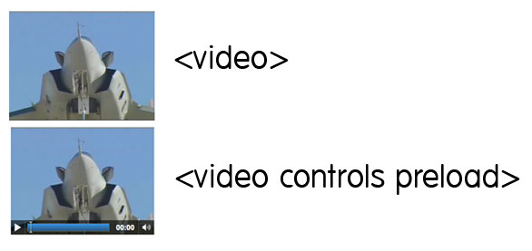

17. Video Support

Much like the <audio> element, we also, of course, have HTML5 video as well in the new browsers! In fact, just recently, YouTube announced a new HTML5 video embed for their videos, for browsers which support it. Unfortunately, again, because the HTML5 spec doesn’t specify a specific codec for video, it’s left to the browsers to decide. While Safari, and Internet Explorer 9 can be expected to support video in the H.264 format (which Flash players can play), Firefox and Opera are sticking with the open source Theora and Vorbis formats. As such, when displaying HTML5 video, you must offer both formats.

<video controls preload>
	<source src="cohagenPhoneCall.ogv" type="video/ogg; codecs='vorbis, theora'" />
	<source src="cohagenPhoneCall.mp4" type="video/mp4; 'codecs='avc1.42E01E, mp4a.40.2'" />
	<p> Your browser is old. <a href="cohagenPhoneCall.mp4">Download this video instead.</a> </p>
</video>

Chrome can correctly display video that is encoded in both the “ogg” and “mp4″ formats.

There are a few things worth noting here.

  1. We aren’t technically required to set the type attribute; however, if we don’t, the browser has to figure out the type itself. Save some bandwidth, and declare it yourself.
  2. Not all browsers understand HTML5 video. Below the source elements, we can either offer a download link, or embed a Flash version of the video instead. It’s up to you.
  3. The controls and preload attributes will be discussed in the next two tips.

18. Preload Videos

The preload attribute does exactly what you’d guess. Though, with that said, you should first decide whether or not you want the browser to preload the video. Is it necessary? Perhaps, if the visitor accesses a page, which is specifically made to display a video, you should definitely preload the video, and save the visitor a bit of waiting time. Videos can be preloaded by setting preload="preload", or by simply adding preload. I prefer the latter solution; it’s a bit less redundant.

<video preload>

19. Display Controls

If you’re working along with each of these tips and techniques, you might have noticed that, with the code above, the video above appears to be only an image, without any controls. To render these play controls, we must specify the controls attribute within the video element.

<video preload controls>
Options

Please note that each browser renders its player differently from one another.


20. Regular Expressions

How often have you found yourself writing some quickie regular expression to verify a particular textbox. Thanks to the new pattern attribute, we can insert a regular expression directly into our markup.

<form action="" method="post">
	<label for="username">Create a Username: </label>
   	<input type="text"
	   name="username"
	   id="username"
	   placeholder="4 <> 10"
	   pattern="[A-Za-z]{4,10}"
	   autofocus
	   required>
	<button type="submit">Go </button>
</form>

If you’re moderately familiar with regular expressions, you’ll be aware that this pattern: [A-Za-z]{4,10} accepts only upper and lowercase letters. This string must also have a minimum of four characters, and a maximum of ten.

Notice that we’re beginning to combine all of these new awesome attributes!

If regular expressions are foreign to you, refer here.


21. Detect Support for Attributes

What good are these attributes if we have no way of determining whether the browser recognizes them? Well, good point; but there are several ways to figure this out. We’ll discuss two. The first option is to utilize the excellent Modernizr library. Alternatively, we can create and dissect these elements to determine what the browsers are capable of. For instance, in our previous example, if we want to determine if the browser can implement the pattern attribute, we could add a bit of JavaScript to our page:

alert( 'pattern' in document.createElement('input') ) // boolean;

In fact, this is a popular method of determining browser compatibility. The jQuery library utilizes this trick. Above, we’re creating a new input element, and determining whether the pattern attribute is recognized within. If it is, the browser supports this functionality. Otherwise, it of course does not.

<script>
if (!'pattern' in document.createElement('input') ) {
	// do client/server side validation
}
</script>

Keep in mind that this relies on JavaScript!


22. Mark Element

Think of the <mark> element as a highlighter. A string wrapped within this tag should be relevant to the current actions of the user. For example, if I searched for “Open your Mind” on some blog, I could then utilize some JavaScript to wrap each occurrence of this string within <mark> tags.

<h3> Search Results </h3>
<p> They were interrupted, just after Quato said, <mark>"Open your Mind"</mark>. </p>


23. When to Use a <div>

Some of us initially questioned when we should use plain-ole divs. Now that we have access to headers, articles, sections, and footers, is there ever a time to use a…div? Absolutely.

Divs should be utilized when there’s no better element for the job.

For example, if you find that you need to wrap a block of code within a wrapper element specifically for the purpose of positioning the content, a <div> makes perfect sense. However, if you’re instead wrapping a new blog post, or, perhaps, a list of links in your footer, consider using the <article> and <nav> elements, respectively. They’re more semantic.


24. What to Immediately Begin Using

With all this talk about HTML5 not being complete until 2022, many people disregard it entirely – which is a big mistake. In fact, there are a handful of HTML5 features that we can use in all our projects right now! Simpler, cleaner code is always a good thing. In today’s video quick tip, I’ll show you a handful of options.


25. What is Not HTML5

People can be forgiven for assuming that awesome JavaScript-less transitions are grouped into the all-encompassing HTML5. Hey — even Apple has inadvertently promoted this idea. For non-developers, who cares; it’s an easy way to refer to modern web standards. However, for us, though it may just be semantics, it’s important to understand exactly what is not HTML5.

  1. SVG: Not HTML5. It’s at least five years old.
  2. CSS3: Not HTML5. It’s…CSS.
  3. Client Storage: Not HTML5. It was at one point, but was removed from the spec, due to the fact that many worried that it, as a whole, was becoming too complicated. It now has its own specification.
  4. Web Sockets: Not HTML5. Again, was exported to its own specification.

Regardless of how much distinction you require, all of these technologies can be grouped into the modern web stack. In fact, many of these branched specifications are still managed by the same people.


Thanks for reading! We’ve covered a lot, but have still only scratched the surface of what’s possible with HTML5. I hope this served as a helpful primer!

Connect Your Scale Relative To The Camera’s Position

Relativity

Either of two theories developed by Albert Einstein…

The Special Theory of Relativity, which requires that the laws of physics shall be the same as seen by any two different observers in uniform relative motion, or The General Theory of Relativity, which considers observers with relative acceleration and leads to a theory of gravitation….


Welp… This tutorial is has nothing to do with either of those. This tutorial is about a wonderful, powerful and highly useful set of four expressions that will control the X, Y, Z scale value, separately or together of any layer in relativity to it’s distance from the camera.


Tutorial

Download Tutorial .flv

File size 174MB

Additional Resources


Quick Tip: How to Make Running Headers in Adobe InDesign


There are running headers in dictionaries, telephone lists, catalogues, guides and many other publications that need to inform the first and last instance of a list of terms on each page. That quick and useful way of finding words can be made with InDesign in a simple way, by uniting text variables with paragraph and character styles. Let’s see how!

Continue reading “Quick Tip: How to Make Running Headers in Adobe InDesign”

Getting Carried Away with Balloon Lettering


If there are balloons near by, you’ve probably had or will be having some fun. I love balloons! So in this tutorial I will cover the process of creating some illustrative shiny balloon lettering. You will also learn how to create rounded, semi-transparent, bubble letters that will make up the basis of the balloon lettering. Let’s have some fun!

Continue reading “Getting Carried Away with Balloon Lettering”

Workshop #102: Ramayana by Fliperama

At Audiotuts+ we irregularly put up a reader track for workshopping and critique (find out how to submit a track). This is how it works: you upload your song, and every week or so we’ll publish one here and step away from the podium. The floor is yours to talk about the track and how the artist can fix problems in and improve upon the mix and the song.

This track has been submitted for your friendly, constructive criticism. They have put their track (and their heart and soul) in your hands to learn and get useful feedback.

  • Do you enjoy the song or track itself? Does it have potential?
  • Can the arrangement be improved?
  • How did you find the mix? What would you do differently?
  • What do you enjoy about the rhythm track? What can be done to improve it?
  • Is the choice of instruments relevant and effective for the style/song?
  • Are the lyrics (if any) effective? Does the style, arrangement and genre of the song suit them?
  • Can you suggest any specific techniques that might improve the track?
  • Do you have any other constructive feedback?

Ramayana by Fliperama

Artist’s website: myspace.com/fliperamamusic

Description of the track:

I started doing electronic music a little time and would be grateful to receive constructive criticism and suggestions about this song. Thanks.

Download audio file (FliperamaRamayana.mp3)

Terms of Use: Users can stream the track for the purposes of giving feedback but cannot download or redistribute it.

Have a listen to the track and offer your constructive criticism for this Workshop in the comments section.


Submit Your Tracks for Workshopping

Need constructive criticism on your own tracks? Submit them using this form.


Best of the Web – July 2010


The month of July 2010 included some exceptional content for our readers. This month’s articles, freebies, and tutorials covered a wide variety of topics including logo design and typography. Let’s take a look!


Tutorial Wrap

  • Creating a Recycle Bin Icon

    Our first tutorial of the month is for the icon lovers. This is a fairly simple tutorial that will show the reader how to create a semi-realistic looking 3D recycling bin. The tutorial uses very basic techniques to get the main shape of the bin down and then from there its just using transform tools, as well as layer styles. So check out this simple tutorial if you are interested in making an icon.

    Visit Tutorial

  • Make a Fake Studio Shoot

    This is one of the more interesting tutorials we’ve seen in a while. This tutorial shows us how to create a realistic looking photo shoot from scratch in Photoshop. The tutorial shows how to combine various stocks to make it look like there is actually a photo shoot going on, I recommend everyone check this great tutorial out because it teaches a bunch of valuable techniques and the result looks very interesting as well as realistic.

    Visit Tutorial

  • Cosmic Scene Tutorial

    This tutorial focuses on the basic aspects of space imagery. This is a very popular type of style to create among designers so the author of this tutorial illustrates the basics of creating one of these scenes. The result isn’t the best space scene you will ever see but it is good for a starter tutorial, once you have this mastered you could move on to something more complex and realistic.

    Visit Tutorial

  • Eat With Caution Tutorial

    Properly blending stocks is something every designer should know how to do and this tutorial helps Photoshop first timers deal with this essential technique. The result isn’t amazing but the basics are definitely covered in this tutorial and this is another great one for the people who like to experiment with new styles.

    Visit Tutorial

  • Simple Fruit In Photoshop

    One of the wonders of Photoshop is that you can use its tools to create almost anything from completely nothing; and this tutorial demonstrates just that. The author explains how to create 3 types of fruit from nothing and using basic Photoshop tools, if you decide to follow this tutorial you will be creating an Orange, Banana, and Grapes.

    Visit Tutorial

  • Creating Abstract Portrait

    We wrap up the tutorials with another interesting one and something for the more advance Photoshop users out there. This tutorial focuses on creating abstract portraits from simple sketches. The reason this tutorial is more on the advanced side is because of its Illustrator use but if you are up to it then go ahead and sketch something out, then bring it to illustrator and finish up in Photoshop. This is a definitely a unique tutorial that is worth a look.

    Visit Tutorial


(FREE!) Download Picks

  • Jacob Bain Wallpaper

    Our first freebie is a nice wallpaper for those in need of a change on their desktop. This wallpaper was made by designer Jacob Bain and it features some very cool futuristic 3D imagery. So check it out and download it in any resolution you can dream of including the iPad and new iPhone resolutions.

    Visit Download Site

  • Huge Collection Of Twitter Icons

    This is a great freebie for all the twitter’ers out there. This collection gathers up 40+ high class twitter icon sets which range from many different styles that make for great icons. So if check some out if you are in need of them.

    Visit Download Site

  • Blue Metal Textures

    Here we have another set of Bittbox’s great texture Tuesday features. This week we have a pack of some great blue metal grunge textures. As always they are high quality, so make sure to add them to your texture collection if you have one.

    Visit Download Site

  • Paint Blobs Brush Pack

    This freebie is a great high quality brush pack, this pack features 9 great blob brushes that you can use in any of your illustrations. These brushes come in fairly large sizes so quality shouldn’t be an issue. So download these brushes and add them to your next piece.

    Visit Download Site

  • Free Fresh Fonts

    We can’t have a freebie’s post without showing the readers some great fonts. Abduzeedo has featured 4 very unique fonts that should definitely be added to your font folder. There isn’t much else to say but check them out now because you are bound to love at least one of them.

    Visit Download Site

  • 32 Sets of Paint Brushes

    Our last freebie of the month is a big one. The author of this post rounded up 31 packs of different Photoshop brush sets. These brushes come in many different styles like simple small strokes to splatters and abstract grunge. So run through this roundup and download the ones that interest you.

    Visit Download Site


Article Wrap

  • The Basics of Copyright

    We will start off our article roundup by showing the readers an article on the basics of Copyright. This 2-part article goes into some detail on the basics on what the copyright law is and how it applies to designers. This is a great read for all people who don’t quite understand how it works.

    Visit Article

  • Biome, The Making of a Typeface

    This article is for all the font fans out there. Biome is a typeface that was created by Carl Crossgrove and he featured an article on its creation from start to finish. This is definitely an interesting read into the mind of someone who creates fonts, it is also interesting in seeing the process of creating a typeface. So if you find this interesting then give it a read.

    Visit Article

  • Super Mario Artwork

    If this next article doesn’t bring some bit of nostalgia to you then you either grew up in a different era or have just been sleeping your whole life. This roundup shows some of the best and most creative Super Mario illustrations out there in the design world. This bit of inspiration should definitely get some ideas flowing in the heads of the readers so make sure to check it out.

    Visit Article

  • State of the Union: Grunge Design

    The Grunge style has definitely been overused in the design community and this article gives us some insight into the history of this style and how it has developed into what we see in today’s illustrations. The author gives some classic examples of the evolution of grunge artwork commenting on the changes. This is a great history lesson for designers so make sure to read all of this one.

    Visit Article

  • FIFA World Cup Logo

    4 years from now this logo will be plastered everywhere in preparation for the 2014 World Cup in Brazil. This article talks about how this specific design was chosen to be main logo of the World Cup that will be held in Brazil in 4 years. Another interesting read if you are into logo design so be sure to read this one.

    Visit Article

  • 40 Web Designs That Use Textures Masterfully

    And to wrap it up we have a last bit of inspiration for the readers. This roundup focuses on web designs that utilize textures the best, 40 websites are featured which the author claims to use textures “masterfully”. You guys can check them all out and be the judge of that.

    Visit Article

Quick Tip: Vibrato for Guitar

In this video quick tip for guitarists, we will take a look at how to apply vibrato to your notes. While the technique is relatively simply, the use of vibrato can often be overlooked by beginners especially. With a little practice you can start to achieve some great vocal-like effects and add the feel and depth to your playing just as all the guitar gods do!