Creating a Newsletter in Word in 10 Steps

In my past articles, I’ve discussed how to create several customizations with your Microsoft Office suite.  Creating a newsletter in Word is a simple 10-step process. Here’s how to do a newsletter in Word:

Step 1

Open up a new document in Word & by clicking on the Microsoft Icon on the top left.

Step 2

Click on the Page Layout Tab and select the Columns Icon. There choose Three Columns.

Step 3

Next thing, double click on the Header Section and add a title. Set the font to bold and relatively large.

Step 4

Add a rectangle via the Insert Tab > Shapes. We will set this shape behind the title and give it a color.

Step 5

I chose a blue color and placed the shape behind the text. You can do so by rich clicking on the shape and in the pop up window select Order and Place Behind Text.

Step 6

Now add some text. Since we added three columns, we already have a nice looking layout.

Step 7

Let’s add some headers and sub headers. Add a header before your text in a nice big font. I chose Arial Black, 24pt. In word you have preset Style for headers, sun headers and so on. You can save your own style too. To do so, just highlight the text, right click and in the pop up window choose Styles > Save Selection as a new Quick Style.

Step 8

Add another sub title (e.g. a quotation). Quotations stand out nicely in a newsletter and highlight a message well. Repeat step 7 and add this to the quick styles so you can add it at any time.

Step 9

Let’s add a picture. Enter with the cursor at a point between the text where you would like to add an image. The add a paragraph and select the Insert Tab, choose Picture and browse to the image you would like to add.

Step 10

This is what we have so far. I added a footer the same way I added a header in step 3.

Conclusion

I fancied up the newsletter a bit by adding a First Edition Tab, a by-line and some vertical lines. All elements are easily added via the Insert Tab. In case you have more to say, just add another page, the header and footer will stay, so will the columns and your newsletter will look continues. Now if you like, you can convert it into a PD via the Acrobat Tab in Microsoft or print it out on your desktop printer.

So far I’ve offered four tutorials on how you can customize Microsoft Office for your own needs – and there’s more to come. However, if there’s a piece of software that you’d love WorkAwesome to post a walkthrough of or would like more tips and tricks that you can use with Microsoft Office, leave a note in the comments.

What’s Your #1 Question About Increasing Productivity?

When I worked in an office several of my co-workers asked me how I managed to keep my desk organized and clean at all times, how I managed to whip together all sorts of travel plans without a headache, and even whether I actually got any work done with my flexible work schedule (my time of arrival was 10-ish and I even did my grocery shopping during the workday).

As a WorkAwesome writer, I try to write about what I think is useful to my awesomely dedicated readers based on experience – and on whatever I come across in my daily life.  I’m no productivity oracle but I want to help answer reader questions about increasing productivity.  You can always email me with your questions, but for now . . .

If you rubbed your monitor and I floated out in a poof of smoke as your little productivity genie, what 1 question would you ask me?

Is Talent All You Need To Succeed?

Talent is considered an innate, natural ability. You’re born with it or without it, and supposedly you can neither gain it nor lose it. Talent isn’t learned or developed; it’s discovered by the lucky owner or by the observant talent scout.

Skills, however, are developed. Skill is acquired through training, so unlike talent, we do have some general control over how skillful we are. You can gain skill as quickly as you can learn, and you lose it as quickly as you forget.

Managers often follow a “hire for talent, train for skill” philosophy, leading us to believe that talent is more valuable than skill. What hiring managers often overlook is that highly-developed skills, besides being extremely valuable, are indicative of a strong work ethic. Skills are a testament to a person’s dedication; talent is nothing more than a gift supposedly given at birth.

If you’re wondering if you can succeed on talent alone, ask the talented writer who never got around to finishing his book, or the gifted athlete who missed too many practices to retain his high-paying contract. They’d tell you that the recipe for success has more than one ingredient, and that talent is nothing without the support of skill and dedication.

Perfecting the Art of a Two Minute Tone Job

Let’s set the stage. You’re a professional photographer on assignment in a far off land. Suddenly, you find yourself in the middle of a disaster. Photo editors from around the world are contacting you for images, and they want them yesterday. To make matters worse, your laptop battery barely has enough charge to make it though a YouTube video. What do you do? Well, you’ve got to tone your photos fast. Really fast!


When You Just Can’t Take Your Time

When I was in college studying photojournalism, we were transitioning from film to digital. Our professors told us not to rush into switching our cameras, and to reinforce this, they told us toning a photo on a computer should take you just as long as making a print in the darkroom.

They said this to encourage us to be precise and careful when toning images on a screen. Little did we know that once we were all working in the professional world, we’d be transmitting images straight to the web with laptops from our cars. Deadlines are always getting tighter, and because of this I’ve developed a quick toning process that will work for 90% of the images I shoot.


The Tools

Under normal circumstances, you want to take your time and utilize the proper Photoshop tools for the job. But we’re in a war zone with a satellite phone. We want a hammer and some duct tape, not a needle and thread. So we’re going to be using three tools to get our images in shippable shape. Levels, Hue/Saturation and the Lasso Selection tool.


Using Levels

Most people who know Photoshop well, will tell you that the Curves tool gives you more control and is better to use than Levels. That’s true, but Levels is easier to use and in my experience in Curves, half way through toning, I often just want to start over. It’s easy to get off track.

For this workflow, we are only using Levels to adjust exposure and contrast. We’ll be adjusting color issues with different tools. Below is the unedited image that I’ll be using Levels on.

Understanding Each Pointer

Start with the highlights pointer on the right. Look at the histogram and drag the highlights pointer into where your histogram starts to rise. There may be blips on the far right, but ignore those. Next, adjust your midtones with the middle pointer. For this, look at your image, if it’s a little dark move the pointer right, and visa versa.

The shadowy parts of your image are controlled by the left pointer. You can’t make them brighter, so moving it to the right will make more things darker. Slide this at least to where your histogram starts to rise as well. Go back to the middle slider and tweak the midtones to your liking. Here’s a look at the levels adjustment after I finished.

The Results

Low resolution web images don’t need hours of work because, no matter how hard you try, your image will look different depending on the quality and type of screen the viewer is using. Newsprint, the low quality paper most newspapers use, is also quite forgiving because of the printing process and how the paper holds ink. They’ve called you, you’re dodging bullets, and you don’t need museum-quality archival prints. As you can see, the final image is more than acceptable for publication.


Hue/Saturation

I personally believe that Hue/Saturation is the most important tool in Photoshop. I use it on almost every image I tone. It can be used to correct for mixed lighting, bad white balance, flat grey tones and a bunch of other problems. There are four things you need to know about in the Hue/Saturation tool to get you going. Below is an unaltered image I’ll be using to demonstrate this tool.

Hue

The Hue slider is the first of the three sliders in the box. For our purposes, hue mean color. By moving this slider, you are shifting the color. Think about the rainbow or a color spectrum. First comes red, then orange, yellow, green, blue, indigo, then purple.

This slider moves things along this color spectrum. Move the slider slightly to the right, and the reds in image will turn orange, the oranges will turn yellow, and so on. Below, you’ll see how the colors have shifted in this way.

Saturation

The next slider is Saturation. I think of saturation as richness or fullness. If you crank this slider all the way to the right, your image will look neon. If you move it all the way in the other direction, you will have pulled all the richness and color out and made your image look black and white.

In the image below, I stopped just short of both ends. The left side of the image is now under saturated, and the right side is over saturated.

Isolating Colors

At the very top of the Hue/Saturation box, you’ll see the “Edit:” and then a clickable drop-down menu that is set on “Master.” Being set on Master means your adjustments apply to all colors, but if you select one of the colors from the drop down menu, you can make adjustments only to that color.

Once you’ve selected one of those colors, you also have the option of moving your mouse over to the image (it will look like an eyedropper), and fine tuning your adjustment by manually picking a spot on the image that contains the color you want to work on.

In the image below, I chose “Blues” from the drop-down menu, and over-saturated the sky. I then opened Hue/Saturation up again, selected “Greens” and used my eyedropper to select the grass, then desaturated it.

A Practical Example: 1

The above examples were extreme and altered an already publishable image. In the image below, I isolated the yellows and oranges in the image to correct for the extremely yellow lighting in the image. The white balance settings on your camera only go so far sometimes. The left side of the image is unedited, the right side shows the changes made with the Hue/Saturation tool.

A Practical Example: 2

Now let’s use the tool to add Saturation and bring in the sky. In order to do this, I chose the yellows from the drop down menu to bring out the leaves. I did the same for the greens to bring out the bushes.

I then used the eyedropper to select the color of the sky, which turned out to be cyan, not blue. So I slightly shifted the color back to blue, using my hue slider, and then bumped up the saturation. You’ll commonly find that grass and leafy plants may look green, but are actually yellow, and that skies look blue, but are actually cyan. Shifting these colors using the hue slider can really improve the final look of your images.


The Lasso Tool

The lasso selection tool is the final thing you need. It doesn’t do anything by itself, but it allows you to utilize both levels and hue/saturation on specific parts of your image rather than the whole thing. The lasso tool paired with Photoshop’s feathering feature can easily replace the dodge and burn tools and allow you to correct specific areas of an image.

It’s an undervalued tool because people think they need to draw neat, tidy lines around things. Feathering, a sort of blurring of the edges of your selection, allows you to be less precise, but at the same time it makes your adjustments look more natural. Below, you’ll see the image I plan to adjust using the lasso tool.

Making Your Selection

As you can see in the image, the main subject is exposed very well. But the surrounding background is a little dark. There are certain parts of this image that I want to bring out a little. You can see that I’ve made three selections.

Usually I would make each of these separately and adjust them individually, but there are now incoming mortar shells bombarding the hotel, so we need to move quickly. You can also see that my selections are a little wobbly and not very exact… we’re being bombed, what do you expect?!

Feathering The Selection

Feathering is something that’s done to a selection to make your alterations fade into the surrounding area. After you apply the feather, you’ll physically see your selection change. The edges will seem rounder.

To apply a feather, look in your top menu, and click on “Select” then “Modify” then “Feather.” It will ask you what radius you want. This all depends upon the resolution of your camera and the size of your selection.

For the selections below (this image was taken with a 12 megapixel camera), I used a 100 pixel radius. The radius determines how far from your original selection your alterations will blend. If the alterations don’t seem to be working, lessen your radius. If the drop off of your alteration looks too drastic, then increase your radius.

Making Your Alterations

For the image below, I went into levels and made my changes. I started with the midtones pointer, and used it to brighten everything up. Because the midtone adjustment washed out the shadows a little bit, I darkened them back up by moving the shadow pointer to the right.


Bringing It All Together

For the next series of images, we’re going to run through the entire process. Some images, might not need all of these steps, but I found one that can use all of them. Here’s the unedited image.

Levels

This image has some dramatic light in it, so we don’t want to over do it with levels. I chose to brighten up everything slightly, and as you can tell the histogram has heavy shadows, so I left those alone.

This is the result after performing the levels adjustment. Total time 20 seconds.

Hue/Saturation

There are a couple different issues going on with this image. First, the dress has a slight “neon” tinge. To correct this, I chose “Reds” from the drop-down menu. I moved the saturation slider to -29. At this point, the tone seemed a little off, so I adjusted the hue slider to +3, which moved the color from more of a pink color back to red.

You can see the results of this adjustment below. I think we might be pushing one minute now, and that’s a good thing, because I think I hear insurgents on the roof and earthquake has knocked out the power.

Lasso

Now, I’m going to bring out the tones in those pillows and adjust her face a little bit as well. For the pillows, I’m using a selection with a 120 pixel radius. I’m going to do each selection separately, but I want to show you both of them in the same image. Again, I’m going to do two separate tone adjustments, one for each selection.

For the face and arms, I’m using a 70 pixel feather. I then did a level adjustment which significantly brightened the highlights, slightly raised the midtones and darkened the shadows a touch. I also went into the Hue/Saturation tool and increase the saturation that was lost in the initial adjustment. I changed the saturation to +17, and the hue to -2. You can see the result below.

For the pillows, I used a radius of 100 pixels for the feather. For the levels, I raised the highlighters pointer about a third of the way to the left. That’s it for the levels. I then wanted to make that bright pink pillow a little less intense because I thought it was a little distracting. So, I selected “Reds” from the drop-down menu, then used the eyedropper to specifically select that color (which turned out to be actually be magenta). I lowered the saturation to -38.

You can see the final image with all of the adjustments below. Total time, around two minutes!


Conclusion

So the next time you’re photographing polar bears, the piece of ice you’re sitting on breaks off, and you’re slowly drifting farther and farther away from your Wi-Fi station, you’ll be able to transmit those images quickly.

Or maybe you just like spending your time taking pictures instead of editing them. Either way – now you’re prepared!

50 Examples of Remarkable Photography in the Rain

Just because the sun isn’t shining, you can still get creative with your photography! The lighting may not be perfect, but rain, snow, and sleet introduce a whole new range of challenges and opportunity for capturing wonderful images. Grab your umbrella, and join us after the break for some stunning examples of rain photography, and a few tips on how to shoot your own!


4 Tips For Shooting in the Rain

Hit the Streets

When the rain starts falling, the streets take on a completely different appearance. The umbrellas come out, overcoats are thrown on, and people hurry to their destination. You’d think that this might lead to a dreary, uninteresting scene, but this isn’t necessarily the case!

You can capture the classic “sea of umbrellas” shot, focus in on individual people, or increase your shutter speed to better illustrate the idea of everyone rushing to get out of the rain.

Alternatively, try a different perspective as in the image below. Find a high vantage point, and just wait for a scene full of bright, vivid umbrellas!


Get Outside, and Get Wet!

The classic portrait is often taken in perfect lighting conditions, with carefully chosen lighting, and a beautifully made-up model. Throw that over-used scenario out the window, and head out into the rain!

People behave incredibly naturally when out in a torrential downpour; they giggle, cringe, and embrace the surreality of the situation. It’s the perfect chance to capture natural expression, and a memorable portrait.

Of course, you may be lucky enough to capture someone really appreciating the rain. The below image exudes relief, thanks, and praise that rain has come to this person’s world:


Get Cosy

If you’d prefer not to get completely drenched, we’ll let you off with this option – stay inside, open the curtains, and stare out a rainy window. Everyone can empathise with this wonderful, cosy feeling, and it’s the perfect backdrop to a moody portrait of someone looking into the distance.

If you’d prefer not to go with such a cliché, try photographing another object with a “rainy window” backdrop to convey a different set of emotions. It’s an easy way to experiment with rain photography, without the inconvenience of actually being in the rain…


Above All, Keep Your Camera Dry!

However carried away you become with the wonder of a downpour, don’t forget that your camera won’t appreciate the rain as much as you do! Make sure that you have someone holding an umbrella for you, or buy a waterproof case for your Digital SLR (there are plenty of different ones available!)


50 Remarkable Rain Photography Examples

Raining….

Rain Photography

A walk in the rain

Rain Photography

Soho ghostly meetup

Rain Photography

Whitechapel

Rain Photography

Rach in the rain

Rain Photography

Umbrella Day

Rain Photography

Stormy Days

Rain Photography

A Magical Main Street

Rain Photography

Tango Sepia

Rain Photography

Art 38 Basel

Rain Photography

Amsterdam

Rain Photography

Ombrelli per una mostra su Amedeo Modigliani

Rain Photography

A Buddha in the Rain

Rain Photography

Road man

Rain Photography

When it rains…

Rain Photography

Rainy and hot

Rain Photography

Walking in the Rain

Rain Photography

Paper Boats

Rain Photography

Catching the rain

Rain Photography

Prairie Magic

Rain Photography

Pink Rain

Rain Photography

Sun.. stay here.. Please!

Rain Photography

Rain

Rain Photography

Walk on a rainy day

Rain Photography

something coloured in front of a grey sky

Rain Photography

Falling rain on leaves in the gutter

Rain Photography

In the Rain in Tokyo

Rain Photography

Nothing gonna stop me now

Rain Photography

Islington

Rain Photography

Rainy walk

Rain Photography

Hit, Miss, Hit

Rain Photography

British summer

Rain Photography

de dos en dos

Rain Photography

Still More Rain On Yonge

Rain Photography

Fall(en) Leaf

Rain Photography

Rain

Rain Photography

Spiders Web

Rain Photography

City rain

Rain Photography

[no rain]

Rain Photography

Fake Rain Drops on a Leaf

Rain Photography

Walking home in the rain

Rain Photography

Frozen Time

Rain Photography

Shrimpboat After the Rain

Rain Photography

Hawaiian Rainy Bokeh

Rain Photography

Rain Kiss

Rain Photography

premisas y conclusiones

Rain Photography

And It Could Rain For Days

Rain Photography

It’s going to rain

Rain Photography

Descending Temple Steps

Rain Photography

Share Your Own Rain Photographs!

I hope you’ve left feeling inspired to get out in the rain, and take your camera with you. We’d love to see some of your own images shot in the rain, so feel free to leave a few links in the comments below!

The Theory and Psychology of Framing Your Image

Today, we’re taking a look at the theory and psychology behind the size, framing, and visual weight of different elements in your photographic composition. You’d be surprised how much there is to learn about this choice, and the impact your decision can have!


Introduction

Photographs are our visions, created within the viewfinder, composed and registered with a click of a button. Sometimes this initial composition is the final composition, and sometimes it’s not. Sometimes we compose our scene with the intent of creating our final vision right at that moment, whereas sometimes we compose a scene with the intent of later cropping or extending our vision.

Most 35mm format photos are taken tightly, composing for the final image. Large formats however, allow us to crop and recompose without jeopardizing the quality of our image. And finally, square formats are less convenient for final compositions and are often later cropped to more desirable ones.


Frame Dimensions and Direction

Unlike other forms of graphic art, a photograph has always been bound by spatial dimensions that are limited to the image frame. And more often than not, those dimensions guard and eventually influence the composition of our scenes.

Up until the whole evolution of digital photography, the most common image frame format was that of a 3:2 width to height ratio, which is the standard frame format of a 35mm film with dimensions of 36x24mm. With the advancement of digital photography, the more natural frame format of a 4:3 width to height ratio was soon adopted in low to medium level consumer cameras. This allowed for a more horizontally expanded, naturally viewed image frame especially on computer screens and standard size print paper.

The 35mm film format was subtly transferred into digital photography creating something of a gap between the professional/serious amateur photographer, and other photographers. And its long lived popularity is just a little evidence of how easily our sense of visceral composition adapts.

Horizontal or Vertical?

Our natural vision often suggests a horizontal view (because of the way we naturally observe with our eyes) which may be the most influential reason why photographs are often composed horizontally rather than vertically. Another, less fundamental, reason is the ease of hand holding a camera in a horizontal manner due to build and design.

When a subject is vertically elongated, it makes more sense and is more naturally perceived by human vision when framed vertically. If our scene or subject expands horizontally (or equally in both directions), it is more naturally perceived by human vision framed horizontally.

Positioning Within the Frame

Furthermore, when an object is framed horizontally, it is more convenient for the viewer’s eye to be composed off-center, slightly leaning more to one side of the frame. And when an object is framed vertically, it is more convenient if the subject was placed off-center either to the top or the bottom of the frame, with the lower placement being more suitable and natural since it suggests and conveys stability rather than causing a feeling of somewhat downward looking, head lowered sensation.

If a vertical subject is horizontally framed, it is often composed towards either end of a horizontal frame so as to motivate the eye to move horizontally along the frame.

Within a square frame, however, this becomes more complicated because of the frame’s lack of directional emphasis. Only few cameras actually offer a frame of 1:1 width to height ratio, and it is common for photographers of such a frame shape to compose their scene leaving loose or unused ends for vertical or horizontal cropping later on.

Since most subjects are not naturally square, a square frame offers a challenge for a successful composition. Since most landscape shapes are often conceived and framed horizontally, a square frame might impose a challenge for controlling an image’s visual flow.

A square frame could, however, sometimes offer an interesting or even refreshing change from the more familiar vertically or horizontally elongated frame shapes. It can even be a more convenient format for symmetrical subjects (such as in the photo below by Elena Erda).

It is important to keep in mind that these ideas are suggestions, rather than actually rigid rules that must always be followed.


Subject Placement Within the Frame

With a Single Subject

When there’s just a single subject to be framed, it might seem logical to place it dead centre – with equal empty space around it in all directions. Sometimes this actually works, but the problem with this kind of framing is predictability. It’s always worth looking away from this option, and experimenting with positioning the subject at different sides of the composition to see which works best.

This becomes more important if the subject is relatively small in size compared to the full surrounding space. When the subject is off-center, it creates tension within your image. This tension can be described as a physiological force, which in photography gives an extra edge to your photos, conveying excitement and creating drama.

If your subject is off-center, it gives off the feeling that it’s either striving towards the center to once again become balanced in a logical place, or that it is trying to move even further away from the center towards the edge of the photograph. Fairly high level theory, I agree, but worth considering!

With Multiple Subjects

If there are other subjects to be framed as well, your composition needs to balance these subjects within the frame. I want to show you an example illustrating what I’m talking about, and I really couldn’t think of any better example than Trey Ratcliff’s famous photo: The Lonely Trinity.

In this picture, you can clearly see how Trey brilliantly balanced his photo by arranging the three main elements of his image in a triangular way, having every two opposite subjects balance each other out, ending up with a pleasing composition:


Visual Weight

When viewing a photograph, you usually look first at what interests you the most. That said, there are a few undisputable facts that are known to govern what interests viewers the most and what grabs their attention (and in what sequence).

Of course, figuring out how people view a scene is a complex process, but there is a general consensus over what attracts the eye first- either because we tend to relate to these emotionally and personally, or because we unconsciously rely on them to get a feeling or reaction.

For example, faces are known to be the most attracting visual element – in particular the eyes and the mouth. After all, these are what we look at for guessing how people feel, what they think of a particular situation, or how they’re going to react.

After that, writing tends to attract the eye the most. Writing conveys a high level of information about a specific situation. Even if written in a foreign language, writing still adds a great aesthetic quality to a work of art simply because of the fact that it represents an informational source or element.

Next comes other elements in the frame, determined by their prominence and the space given to them within the composition.


Conclusion

A visual work of art has always been, and always will be, subject to individual interpretation. Perhaps no artist will ever be able to perfectly direct their audience in the right direction.

What a photographer can do, to help viewers understand the sense of art in their work, is give them a little incentive or push in the right direction by observing and understanding the visual weights of different elements. Using these carefully can help a photo tell a story, engage an emotion, or draw all the readers attention to one particular point.

Building Persistant Sticky Notes with Local Storage


HTML5 local storage is like cookies on steroids; it’s incredibly simple to use and yet still so powerful. In this tutorial, I’ll show you how to create “sticky notes” functionality, that allows your users to take persistent notes while browsing your site.


Step 1: The HTML

Because of the dynamic nature of this project, there isn’t really much to code in the way of regular old semantic markup. We’ll just simulate a web page by putting together some filler content:

	<!DOCTYPE html>
	<html>
	<head>
		<meta charset='utf-8' />
		<title>HTML 5 complete</title>
		<link rel="stylesheet" href="default.css" />
		<link rel="stylesheet" href="stickies/stickies.css" />
		<!--[if IE]>
		<script src="http://html5shiv.googlecode.com/svn/trunk/html5.js"></script>
		<![endif]-->
	</head>
	<body>
		<article>
			<header>
				<h1> Sample Article Title</h1>
			</header>
			<p>Lorem ipsum dolor. . . </p>
			<!-- a few lorem-ipsum paragraphs later . . . -->
			<footer>
				<p>Copyright 2010 Andrew Burgess</p>
			</footer>
		</article>

		<script src="http://ajax.googleapis.com/ajax/libs/jquery/1.4.2/jquery.min.js"></script>
		<script src="http://ajax.googleapis.com/ajax/libs/jqueryui/1.8.2/jquery-ui.min.js"></script>
		<script src="json2.js"></script>
		<script src="stickies/stickies.js"></script>
		<script>
		</script>
	</body>
	</html>

There are a few important things to notice here: we’re including two CSS files: the first one is the simple styling for the page, which we’ve called default.css. Then, we’ve got a special CSS files for styles relating to our sticky notes; it’s called stickies.css, and as you can see, it lives in the “stickies” folder. At the bottom, we’re including four scripts:

  • jQuery, from Google’s CDN
  • JQuery UI, from Google’s CDN
  • JSON2, from Douglas Crockford
  • Our own stickies.js, which lives in the “stickies” directory

Then, we’ve got an empty script tag that we’ll use to start the engine a bit later.

And that’s it for HTML!


Step 2: The CSS

The contents of default.css is incredibly simple:

	body {
		margin:0;
		padding:0;
		background:#ccc;
		font:14px/1.5 "Helvetica Neue", Helvetica, Arial, san-serif;
	}
	article, footer, header { display: block; }
	article {
		width:880px;
		background:#fff;
		margin:auto;
		padding:40px;
	}
	article header {
		color:#474747;
		border-bottom:1px solid #474747
	}
	article footer {
		font-size:90%;
		color:#ccc;
	}

That’s it; now, there’s the CSS from stickies.css to look after … but we don’t have that markup yet. So let’s start some JavaScript, and when that’s done, we’ll look at the CSS for the sticky notes.


Step 3: The JavaScript

Here’s the skeleton for our JavaScript application:

	var STICKIES = (function () {
		var initStickies = function () {},
			openStickies = function () {},
			createSticky = function (data) {},
			deleteSticky = function (id) {},
			saveSticky   = function () {},
			markUnsaved  = function () {};

		return {
			open   : openStickies,
			init   : initStickies
		};
	}());

We’ve got a few interesting techniques going on here. First is the self-involking function: it might look like we’re assigning a function to the variable STICKIES, but if you look closely at the end of the function, you’ll see that we’re running it right away. As a hint—to remind us that this isn’t a normal function—we’re wrapping the entire function in parentheses. So, STICKIES isn’t a function, it’s the returned value from that function, which is an object, in this case.

That brings us to the next technique: closure. Notice that of the six functions we create, only two of them are exposed to the user (really, only one is necessary for the usage we’re planning; if we wanted to build support for creating notes into your website, we could expose the createSticky and deleteSticky). Even though the self-involking function finishes executing before we even use the methods, we’ll be able to use the other functions that we’ve defined.

Okay, let’s move on to the content of these function.


initStickies

We’ll start by looking at the initStickies function:

	var initStickies = function initStickies() {
		$("<div />", {
			text : "+",
			"class" : "add-sticky",
			click : function () { createSticky(); }
		}).prependTo(document.body);
		initStickies = null;
	},

This is pretty simple. We’ll be using jQuery to create elements quite a bit, and we’re using some special syntax in v. 1.4: that’s passing an object literal with the specs for the element as a second parameter to the jQuery function. Here, we’re creating a button to create a new note. That mean we need a new div; we’re setting the text to ”+” and giving it a class “add-sticky”; then, we’re setting a click handler to call the createSticky method (it’s important to call createSticky from inside a function, and not have the click handler call directly to createSticky; this is because createSticky can take a single parameter, and we don’t want that to be the event object). Finally, we’re prepending this div to the body. We end by setting initStickies to null; yes, we’re essentially getting rid of the function that we’re running. This assures us that this function will only be run once; we don’t want the user of our API to inadvertantly add multiple “add note” buttons to page.

openStickies

Let’s move on to the next method, openStickies:

	openStickies = function openStickies() {
		initStickies && initStickies();
		for (var i = 0; i < localStorage.length; i++) {
			createSticky(JSON.parse(localStorage.getItem(localStorage.key(i))));
		}
	},

We start by running initStickies … but what’s with the fancy syntax? Well, you’re probably familiar with && operator: the boolean AND operator. You’d usually use it to check multiple conditions in an if-statement. Here’s what it actually does: it evaluates the first expression, and if that comes out true, it will go on to evaluate the second expression. In this case, if initStickies has not been set to null yet, we’ll run the function. This avoids the error that would come from trying to run a null variable as a function.

Next, we’re looping over each item in localStorage. Here’s what we do in that for-loop (from inside to outside):

  • localStorage.key() is a great function that returns the key name of localStorage value; it takes a number as a paramter. It’s a great way to loop over each item in localStorage.
  • Once we have the key for a stored item, we can pass it to localStorage.getItem() to get its value.
  • Then, we pass that value to JSON.parse(); this comes from Crockford’s library. Because we’re storing a few values for each note, we’re using JSON.stringify() on the other end to turn an object into a JSON string, which we store. Here, we’re converting it from a string back into an object.
  • Finally, we pass that object to createSticky(), which turns it back into a sticky note.

createSticky

Now, let’s look at that createSticky method.

	createSticky = function createSticky(data) {
		data = data || { id : +new Date(), top : "40px", left : "40px", text : "Note Here" }

		return $("<div />", {
			"class" : "sticky",
			'id' : data.id
			 })
			.prepend($("<div />", { "class" : "sticky-header"} )
				.append($("<span />", {
					"class" : "status-sticky",
					click : saveSticky
				}))
				.append($("<span />", {
					"class" : "close-sticky",
					text : "trash",
					click : function () { deleteSticky($(this).parents(".sticky").attr("id")); }
				}))
			)
			.append($("<div />", {
				html : data.text,
				contentEditable : true,
				"class" : "sticky-content",
				keypress : markUnsaved
			}))
		.draggable({
			handle : "div.sticky-header",
			stack : ".sticky",
			start : markUnsaved,
			stop  : saveSticky
		 })
		.css({
			position: "absolute",
			"top" : data.top,
			"left": data.left
		})
		.focusout(saveSticky)
		.appendTo(document.body);
	},

Yes, it’s long, but it’s not going to be too hard. First, notice that this function takes a data object; as we just saw in openStickies, we’re passing the stored data to this function. However, if we aren’t passing in any data (i.e., we’re creating a brand new note), we’ll create the default note object. Since all notes have to be created at one point, all notes will start with this configuration. Notice that for the note id, we’re using +new Date(); that prepended unary plus operator converts the date we get from new date to a number, so this statement results in a number representing the number of milliseconds since January 1, 1970. Obviously, this number will be continually changing, so it’s a great way to uniquely identify each note.

The rest of the function is a long string of chained jQuery methods. Before we go through this, notice that we’re returning the result. If we exposed this method to developers using our mirco-API, it would return a reference to the sticky note div element.

So, here’s what’s going on:

  • First, we create the div that is the shell of the sticky note. Using that helpful jQuery 1.4 syntax, we give it a class of “sticky” and the id from the data object.

  • Then, we prepend a div to that one; this div gets a class “sticky-header”. div.sticky-header then gets two spans appended to it. The first, span.sticky-status, gets a click handler that calls the saveSticky function. However, that’s actually a hidden feature: this span will display the status of the sticky: saved or unsaved. There will be a few ways the sticky saves its data to localStorage; it’s possible that the user will think that clicking ‘unsaved’ will save the note, so we’ll provide them with that functionality. The second span, span.close-sticky, will be the delete button: when the user clicks it, we’ll remove the sticky from localStorage, via the deleteSticky method. We pass that method the note id.

  • Next, we’re appending another div to the main div.sticky; notice that we set the html property to data.text; when we save the note’s text, we’re using jQuery’s html() method, because using text() gets rid of line-breaks. We also set contentEditable:true on this div, because it’s the content of the note. As such, it also gets the class sticky-content. Finally, when a key is pressed on this div (meaning the user is changing the content), we want to mark it as unsaved, so we’ll call that function (which we’ll make soon).

  • Now, we’re using the jQuery UI draggable feature to make our sticky note moveable. In our parameter object, we’re using the handle property to make our notes only movable from the header bar. The stack property is a selector for the draggable elements to want to “stack”; by setting this, the currently dragged note will always come to the top. Finally, when we start dragging the note, we want to mark it as “unsaved” (because we have to save its coordinates, too), and when we stop dragging, we’ll save that sticky.

  • Next, we’re setting some styles for our div.sticky; we position it absolutely, and then set its top and left values to the ones in the data object. This way, the note will keep its position as well as its content when we refresh the page.

  • Finally, we’ll set an event handler for when we focusout of the sticky (essentially, click outside it after clicking inside it): we want to save the sticky. Lastly, we’ll append it to the body. For reference, here’s the html structure that we should have generated:

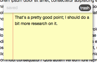
<div class="sticky ui-draggable" id="1281194825332" style="position: absolute; top: 40px; left: 40px;">
	<div class="sticky-header">
			<span class="sticky-status"></span>
			<span class="close-sticky">trash</span>
	</div>
	<div contenteditable="true" class="sticky-content">
		Note Here
	</div>
</div>

And that’s our createSticky function.

deleteSticky

Now we have the deleteSticky function; it’s really simple:

	deleteSticky = function deleteSticky(id) {
		localStorage.removeItem("sticky-" + id);
		$("#" + id).fadeOut(200, function () { $(this).remove(); });
	},

As you recall, the deleteSticky function takes the id of a note as its parameter. localStorage.removeItem() is the method of the hour: we pass it the key to a locally-stored value to remove that key-value pair (Notice that when we store the note data, we’re prepending “sticky-” to the id). Then, we find the element with the given id, fade it our, and remove it. Note deleted!

saveSticky

Second-to-last might be the most important method today: saveSticky: this is the glue that makes it all work.

	saveSticky = function saveSticky() {
		var that = $(this),  sticky = (that.hasClass("sticky-status") || that.hasClass("sticky-content")) ? that.parents('div.sticky'): that,
		obj = {
			id  : sticky.attr("id"),
			top : sticky.css("top"),
			left: sticky.css("left"),
			text: sticky.children(".sticky-content").html()
		}
		localStorage.setItem("sticky-" + obj.id, JSON.stringify(obj));
		sticky.find(".sticky-status").text("saved");
	},

The first line is a bit of resolution: there are three different elements we can call this function from. First, we’ll “jQuerify” this into that; then, if the element has either the “sticky-status” or “sticky-content” classes, we’ll get the parent div.sticky; if it doesn’t have either of those classes, then it’s div.sticky itself, so we’ll just use that.

Then, we need to get the values we want to store. As you can see, we’re getting the id, offset from the top and left, and the html of the child .sticky-content; remember, we’re using html() instead of text() because we want to keep the line breaks. Then, we use localStorage.setItem to store the data. Remember, it takes two parameters: the key and the value to store. Since localStorage only stores strings, we use JSON.stringify() to convert the object to a string.

Lastly, change the sticky status to “saved.”

markUnsaved

We’ve got one last function, which is just a helper function:

	markUnsaved = function markUnsaved() {
		var that = $(this), sticky = that.hasClass("sticky-content") ? that.parents("div.sticky") : that;
		sticky.find(".sticky-status").text("unsaved");
	}

Again, we have to start by resolving the reference to div.sticky; once we do, we can simply find the status span and set the text to “unsaved.”

Believe it or not, that’s all the JavaScript.


Step 4: The CSS, Revisited

Now that we know what our sticky note markup is, we can style it. It’s pretty simple; but look it over, and I’ll make a few comments at the end:

	:focus {
		outline:0;
	}
	.add-sticky {
		cursor: default;
		position:absolute;
		top:1px;
		left:1px;
		font-size:200%;
		background:#000;
		color:#fff;
		border:2px solid #fff;
		border-radius:40px;
		-webkit-border-radius:40px;
		-moz-border-radius:40px;
		text-align:center;
		line-height:25px;
		width:30px;
		height:30px;
	}
	.add-sticky:hover {
		background: #474747;
	}
	.sticky {
		width:300px;
		background:#fdfdbe;
		box-shadow:3px 3px 10px rgba(0,0,0,0.45);
		-webkit-box-shadow:3px 3px 10px rgba(0,0,0,0.45);
		-moz-box-shadow:3px 3px 10px rgba(0,0,0,0.45);
	}
	.sticky-content {
		min-height:150px;
		border-left:3px double rgba(238, 150, 122, .75);
		margin-left:30px;
		padding:5px;
	}
	.sticky-header {
		padding:5px;
		background:#f3f3f3;
		border-bottom:2px solid #fefefe;
		box-shadow:0 3px 5px rgba(0,0,0,0.25);
		-webkit-box-shadow:0 3px 5px rgba(0,0,0,0.25);
		-moz-box-shadow:0 3px 5px rgba(0,0,0,0.25);
	}
	.sticky-status {
		color:#ccc;
		padding:5px;
	}
	.close-sticky {
		background:#474747;
		float:right;
		cursor:default;
		color:#ececec;
		padding:1px 5px;
		border-radius:20px;
		-webkit-border-radius:20px;
		-moz-border-radius:20px;
	}

There are a few points of interest here:

  • Some browsers put an outline around elements with contenteditable=true when you’re editing the content. We don’t want that, so we’re getting rid of it with our :focus declaration.
  • The “Add Sticky” button is positioned in the upper-left corner; it looks vaguely similar to the “Add Dashboard Widget” in Mac OS X.
  • We’re using the border-radius and box-shadow CSS3 properties (and their appropriate vendor-prefix incarnations).
  • We’re also using rgba() for our shadow colours. It takes four parameters: the red, greed, and blue colours, and the alpha (transparency) value.

Other than that, it’s just your standard CSS. Here’s what a styled note should look like:

Note

Step 5: Starting The Stickies

Now that we’ve made our API, it’s time to get it started; we can do that from the extra empty script tag in our index.html file:

	STICKIES.open();

Conclusion: The Final Product

Well, we’re done! Here’s the final product in action:

That’s all I’ve got for today; how do you plan to use HTML5 local storage to spice up your web projects? Let me know in the comments!

Who Needs University? The Best Nettuts+ Screencast Training Courses


Education is expensive…very expensive! But, luckily, 95% of the tutorials and courses on Nettuts+ are free! And, should you require more training, a Tuts+ premium subscription is extremely cheap, at only $9 per month. Whether you’re hoping to learn jQuery, WordPress, CSS, Tumblr, PHP, CodeIgniter, or JavaScript, we’ve got you covered! Further, if screencasts are your thing, you’re particularly in luck, thanks to our in depth video courses, listed below!


1. Diving Into PHP

Diving Into PHP

Just as with the “jQuery for Absolute Beginners” series, you’ll start from scratch and slowly work your way up to some more advanced PHP topics; this is another incredible series that first aired on the ThemeForest Blog.

The Complete Series


2. Magento for Designers

Magento for Designers

Magento is a stunningly powerful e-commerce platform. In celebration of ThemeForest’s new Magento category, this mini-series will you teach how to get started with the platform: you’ll get to know the terminologies and learn how to set up a store and all related aspects of it; finally you’ll learn how to customize it to make it your very own.

The Complete Series


3. JavaScript from Null

JavaScript from Null (Premium)

Thanks to the wide adoption of libraries like jQuery and Mootools, JavaScript’s popularity has skyrocketed in the last few years. However, in the process, an interesting thing occurred: many newer developers are learning these libraries without taking the time to actually learn about raw JavaScript techniques. What percentage of jQuery users don’t know how to fade out an element with only raw JS? My guess is that it’s much higher than many would think.

If you want to truly understand the library you’re working with, and improve your skill-set, it’s vital that you learn the fundamentals of raw JavaScript. And this series will teach you what you need to know!

The Complete Series


4. Tumblr Theme Design – Start to Finish (Premium)

Tumblr Theme Design – Start to Finish (Premium)

Tumblr’s popularity over the last year has increased exponentially. The reason why is quite simple: Tumblr is flexible, powerful, and, most importantly, a pleasure to work with. Unfortunately, there aren’t many training resources available for the platform yet. In this video series, we’ll go through the process of taking a Tumblr theme, designed in Photoshop, and converting it into a fully working theme – in just a few hours.

The Complete Series

If you’re not already a Nettuts+ Premium member, you’ll want to sign up to get this course. You can view an introduction to it here.

  • Chapter 1: Intro
  • Chapter 2: Slicing the Design
  • Chapter 3: Creating the Markup and Adding the Tumblr Template Tags
  • Chapter 4: Adding the CSS
  • Chapter 5: Configuration Options
  • Chapter 6: @Font-Face and Custom Fonts
  • Chapter 7: Slide-out Panel – HTML and CSS
  • Chapter 8: Slide-out Panel – jQuery

5. CodeIgniter from Scratch

CodeIgniter from Scratch

After numerous requests, we launched a new screencast series on Nettuts+ that will focus exclusively on the CodeIgniter PHP framework. Over the course of 15 videos (so far!), you’ll learn how to use this framework.

The Complete Series


6. Regular Expressions for Dummies

If there’s one topic that most people agree is difficult to get into, it’s regular expressions. But fear not: you’ll get comfortable using this sometimes-confusing technology with these five screencasts.

The Complete Series

You can see the whole series here, and this is what you’ll get:


7. CSS: Noob to Ninja (Premium)

This exclusive premium video series will take you from a state of absolute CSS “noobness,” all the way up to ninja-status, capable of taking advantage of the latest CSS3 techniques. The series begins with the basics: the syntax, properties, etc. However, each new video expands upon the previous, as you work your way up and improve your skills.

The Complete Series

This series is for Premium members, but if you aren’t familiar with CSS, there’s no better way to learn! Get it here!

  • Part 1: Preparation
  • Part 2: CSS Properties
  • Part 3: Typography
  • Part 4: Floats
  • Part 5: Positioning
  • Part 6: Semantics, List Items, and Menus
  • Part 7: CSS Organizational Techniques
  • Part 8: Rounded Corners, Box Shadows, and Text Shadows
  • Part 9: CSS3 Gradients
  • Part 10: Custom Fonts with @font-face
  • Part 11: Taking Advantage of CSS Frameworks
  • Part 12: Extending CSS with LESS

8. jQuery for Absolute Beginners

jQuery for Absolute Beginners

So, everywhere you look, you see “jQuery this” and “jQuery that.” For the last year or so, this library has been the darling of the JavaScript world. But do you feel that you just can’t seem to learn the dang thing? Do you hate how the existing tutorials assume that you know WAY more than you actually do? If this rings true for you, I can help: check out the jQuery for absolute beginners series that first showed on the old ThemeForest Blog, and has since joined the Nettuts’ arsenal.

The Complete Series


9. WordPress for Designers

If you want to get into the WordPress community, we’ve got a great way to start: the WordPress for Designers series, from the old Themeforest Blog. You’ll learn everything from installing the platform to slicing a PSD file and turning it into a complete theme.

The Complete Series


10. The Ultimate Guide to Creating a Design and Converting it to HTML and CSS

The Ultimate Guide to Creating a Design and Converting it to HTML and CSS

This was a multi-part series across the Tuts+ sites, which demonstrated how to build a beautiful home page for a fictional business. We learned how to create the wireframe on Vectortuts+; we added color, textures, and effects on Psdtuts+; and we took our completed PSD, and converted it into a nicely coded HTML and CSS website.

The Complete Series


You’ll be a Pro in No Time!

Well, now you’re well on your way to becoming a well-trained web developer. What’s your favorite tutorial here on Nettuts+? Let us know in the comments!

If you enjoyed these screencasts over the last year or so, and would like to give back to Nettuts+, please do consider signing up for a Premium Tuts+ subscription. In addition to helping us out, you’ll gain access to source files, extra advanced tutorials and video series, and freebies…from all of the Tuts+ sites!

How to Separate Green Plant from Background in One Minute

Sometimes we need to separate quickly the image of a tree or shrub from background, this tutorial can achieve acceptable results in a few steps. If you want to get high quality result, then it is better to use classical methods for separating complex objects from the background.

12

So let’s start by finding photography of tree which we’re planning to separate from background. For this purpose I used this picture. Open up the picture and start with the tutorial.

01

As we can see the picture is blurred a little bit. It will be better if we will remove this defect by applying Filter > Sharpen > Sharpen.

02

Now move to the next step: we need to separate tree from the background. Apply Filter > Extract (or press Ctrl+Alt+X). Set the following settings for the filter in the open window:

03

With Edge Highlighter Tool create selection as on the picture below. If you made wrong line, you can remove it with Eraser Tool. Now fill in the area which you want extracting to do this select the Fill Tool on the left hand toolbar and simply click inside of the drawn outline.

04

Now press OK in the top right of the window and you should go back to the normal Photoshop window, and if you did the last steps correctly you will have an image without a background.

05

Ok, move to the next step. Select the Eraser Tool and hard round brush about 5 pixels to make small clear work only on trunk area.

06

After that create new layer under the current and fill it with white color. Then go back to tree layer and move it to the middle of canvas with Move Tool.

07

Then go back to upper layer and continue with our tutorial. Select the Clone Stamp Tool and select on of standard brushes from Photoshop brush palette to edit crown of a tree.

08

After that change brush size to 25 pixels. Hold down the Alt key — the cursor will change to a target. Click the point you wish to use as a sampling point. This will be used as the reference point for cloning. Click and draw where you want the cloned image to appear. As you draw, a cross will appear on the original image while a corresponding circle appears where you are drawing.

09

Process all the areas of the crown on the same way, don’t forget inner parts also. See the difference now?

10

To finish off the tutorial get out the Eraser Tool and hard round brush different size to remove separate leaves on background.

11

That´s it! Very quickly and simply! Hope this Photoshop tutorial vas useful for you.

12


How to create bullets in Photoshop

In this easy tutorial I’m going to show you how to create bullets in Photoshop. You can see my result image below, which you’re going to be making something very similar to!

final

1. Creating a background

First thing’s first, create a new document with a size of about 500 x 300 pixels with a black background.

1

2. Creating a bullet

In a new layer draw a eclipse using eclipse tool. Color used on eclipse tool is #907D44. Right-click the eclipse layer and select option Rasterize Layer (CS5).

2

Cut half of the eclipse as seen on the picture guide below:

3

3. Style your bullet (Layer Styles)

Right-click the layer and go into the Blending Options and apply Inner Shadow, Inner Glow and Gradient Overlay layer styles to this layer.

4

5

6

7

4. Final steps

Apply Filter > Sharpen > Sharpen More and duplicate layer from step two.

On new layer select entire bullet and go to Filter > Blur > Gaussian Blur.

8

Right-click on duplicated layer and go into the Blending Options and apply Color Burn and Opacity level at 44%.

9

10

Merge both layers into one and after that duplicate it several times. That´s it.

final

If you need help with the tutorial, you can leave a comment using the link just below. If you would like to receive updates from PhotoshopStar, please consider subscribing today.


Creating Northern Sky in Photoshop

Now I’m planning to provide a tutorial to you how to create the effect of the Northern Sky step by step. This is not so difficult but very interesting tutorial.

Creating Northern Sky in Photoshop

Start with finding appropriate pictures which we can use for creating effect in this tutorial. You can use Google Images to find the pictures or can use my picture of winter landscape and picture of night sky with many stars. Open up the pictures.

Creating Northern Sky in Photoshop

Now duplicate picture of starry sky to the canvas with winter landscape and hide upper layer for temporary (click on the eye, which indicates layer visibility).

Creating Northern Sky in Photoshop

Move to the layer with landscape and press Ctrl+J (or you can use Layer > Duplicate Layer) to duplicate it, then move a little bit down similar to the position which you can see on the picture below.

Creating Northern Sky in Photoshop

Then create new layer with Shift+Ctrl+N. Use the Polygonal Lasso Tool to create selection as on my picture below, then use the Paint Bucket Tool to fill selected area with color of #555297.

Creating Northern Sky in Photoshop

Don’t remove selection on this step. Create new one layer again, select the Gradient Tool and fill selected area with linear gradient using colors of #fcef8f and #ea83f6.

Creating Northern Sky in Photoshop

Create linear gradient similar to the screenshot which you can see on the picture below:

Creating Northern Sky in Photoshop

After that apply Layer > Layer Mask > Reveal Selection to apply vector mask and fill selected area with linear black-and white gradient:

Creating Northern Sky in Photoshop

Remove selection with Ctrl+D. After that go back to the hidden layer and make it visible again, then change blending mode to Screen for this layer.

Creating Northern Sky in Photoshop

Then load selection with Select > Load Selection, then use Layer > Layer Mask > Reveal Selection to apply vector mask and after that apply linear black to transparent gradient.

Creating Northern Sky in Photoshop

Then create new layer and fill it with any color you want, it doesn’t matter now. After that apply Gradient Overlay (link to 10) layer style for this layer.

Creating Northern Sky in Photoshop

See the result on the picture below:

Creating Northern Sky in Photoshop

Create a new layer above and merge it with previous to get all layer effects in one layer. Then use Lasso Tool and create selection like on the picture which you can see below. Apply Select > Modify > Feather to blur selection about 20 px.

Creating Northern Sky in Photoshop

Again apply Layer > Layer Mask > Reveal Selection to apply vector mask one more time.

Creating Northern Sky in Photoshop

Get out the Brush Tool (Opacity: 7%) and soft round brush to add strokes somewhere on visible area to increase opacity effect on it.

Creating Northern Sky in Photoshop

On this step this Photoshop tutorial can be done, but I would like to show you more techniques how to add more interesting gradients to Northern Lights. Now apply Gradient Overlay (link to15) to this layer (use standard Spectrum gradient).

Creating Northern Sky in Photoshop

After applying blending option your picture should look similar to mine:

Creating Northern Sky in Photoshop

After that create a new layer above and merge it with previous to get all layer effects in one layer. Then apply Filter > Blur > Motion Blur with next presets:

Creating Northern Sky in Photoshop

After applying filter change blending mode to Pin Light for this layer.

Creating Northern Sky in Photoshop

On this step we are finally done with our Photoshop tutorial. The result looks great as for me!

Creating Northern Sky in Photoshop


How to Put Lightning inside the Bottle

This Photoshop tutorial can make everyone who wants to know how to create lightning in a bottle and you will be very surprised to learn how it is quickly and easy.

18

Before starting this tutorial go thru Google Images to find some appropriate picture of bottle to work with. Open up the picture and start with our tutorial.

01

Use the Pen Tool to create shape around bottle reflection as shown on my screenshot below: 02

After that open Paths Palette and click on Load path as a selection button on the palette bottom. 03

Press Ctrl+J to duplicate selected area. Then apply Image > Adjustments > Hue/Saturation to add some electric hue to the reflection.

04

Remove selection with Ctrl+D.

04.2

Now move to the next step. I would like to add glow from the bottle. Create a new layer and use Pen Tool again to create shape similar to bottle shape like on the picture below:

05

Open up Paths Palette again and click Load path as a selection button on the bottom and fill selection with color of #383cc6.

06

Go back to Layers palette. Remove selection with Select > Deselect (or press Ctrl+D). Then duplicate layer with Ctrl+J and apply Filter > Blur > Gaussian Blur for copied layer:

07

See the result below:

08

Go to layer under and use Select > Load Selection to select this layer.

09

Then we can delete this layer, we don’t need it more. Go to copied blurred copy and press Delete button to clear selected area on this layer.

10

Time to add the lightning in a bottle. Create a new layer again, then use the Rectangular Marquee Tool to create selection as on my picture below:

11

Press D button to set up foreground and background colors as black and white. After that use the Gradient Tool to fill selection with black to white gradient.

12

13

Then apply Filter > Render > Difference Clouds:

14

Remove selection with Ctrl+D and invert colors by using Image > Adjustments > Invert: 15

Then apply Image > Adjustments > Levels to change brightness and contrast for the future lightning. 16

To finish off the tutorial I would like to change color of lightning. We can do this by using Image > Adjustments > Hue/Saturation with next parameters:

17

After that change blending mode to Screen for current layer. That is it for now. We are done with our tutorial. Looks very professional isn’t it?

18

Open up Paths Palette again and click Load path as a selection button on the bottom and fill selection with color of #383cc6.


Creating Football Fan from Orc

Creating Football Fan from Orc

This simple tutorial is dedicated to the event that is happening in the world now — 2010 FIFA World Cup. I’d like to show you how to turn any character into a football fan.

To begin with we should select the appropriate image to make our tutorial on. You can try search in Google Images, or take my image of Orc.

Creating Football Fan from Orc

Let’s begin with the clothes. For example, we use an image of a football, you can find it using search in Google Images, or use my image. Further we open the image of the ball and place it on the document with our future fan.

Creating Football Fan from Orc

We apply Hard Light Blending Mode to the layer with the ball.

Creating Football Fan from Orc

Now let’s deform the ball a little. With help of Edit > Transformer > Scale we miniaturize the ball.

Creating Football Fan from Orc

Then using the Rectangular Marquee Tool we select the lower part of the ball, as shown in the screenshot below:

Creating Football Fan from Orc

And delete using Delete button.

Creating Football Fan from Orc

With the help of Edit > Transformer > Warp deform along the shape of a helmet.

Creating Football Fan from Orc

After that using the Polygonal Lasso Tool we select the unnecessary parts and delete them with the help of Delete. As a result we get a helmet painted like a football.

Creating Football Fan from Orc

Now using the Eraser Tool we remove the coloring of the ball from the helmet border and rivets. We select a hard-edged brush, opacity 100%, change the diameter according to the situation.

Creating Football Fan from Orc

Usually fans make up into colors of their country flag, but as in this tutorial the method is just shown, our fan won’t belong to any country. Let’s continue working with the ball, and decorate the parts of the clothes on the same principle.

Creating Football Fan from Orc

It’s worth changing Layer Blending Modes on different parts and choose the one that looks better, in this case it’s better to apply the Soft Light Blending Mode.

Creating Football Fan from Orc

We duplicate the given layer by pressing Ctrl+J.

Creating Football Fan from Orc

Let’s choose one more detail.

Creating Football Fan from Orc

On the football colored belt in the Overlay Blending Mode. Further we use bright colors: red, green, yellow, white and blue, select the Brush Tool and choose Rough Round Bristle in the standard Photoshop palette. Then press F5 and change the parameter Spacing settings (nested in the Brush Tip Shape menu) for 50%, opacity 100%, diameter can be changed at will. In order for the makeup to look realistic, it should be applied slightly chaotically, not trying to line straight, and if you write any text on clothes or body, you should just “draw” it, i.e. not to use the type, but apply it using brush.

Creating Football Fan from Orc

The letters will obtain arbitrary incline, it looks very natural, and it concerns the whole makeup.

Creating Football Fan from Orc

It’s also necessary to use any typical objects, for example, a whistle. You can take my image (link to Whistle.jpg) or find in Google Images. Place the whistle, cut out with the help of the Polygonal Lasso Tool, upon our picture.

Creating Football Fan from Orc

Miniaturize it using Edit > Transformer > Scale and place upon the orc’s belt.

iniaturize it using E

Now we should fasten the whistle to the belt.

Creating Football Fan from Orc

With the help of the Polygonal Lasso Tool we cut out the ring from the picture of orc to fasten the whistle. Rotate the ring using Edit > Transformer > Rotate.

Creating Football Fan from Orc

Then using the Eraser Tool we clean up part of the whistle under the ring.

Creating Football Fan from Orc

Now the whistle is hanging on the belt, but to look more natural, the whistle should cast a shadow, so we apply the Drop Shadow (link to 21) Layer Style.

Creating Football Fan from Orc

We get such an effect:

Creating Football Fan from Orc

It looks better now, but still lacks shadow casting on the whistle itself, so we apply the Inner Shadow (link to 23) Layer Style.

Creating Football Fan from Orc

The result will be the following:

Creating Football Fan from Orc

It’s time to add text. Select the Horizontal Type Tool and write the phrase, as it’s shown below. Select Wide Latin type (14 pt, Crisp) and write an inscription with any color.

Creating Football Fan from Orc

Further we adjust the following settings for the Layer Style:

Drop Shadow

Creating Football Fan from Orc

Inner Shadow

Creating Football Fan from Orc

Gradient Overlay

Creating Football Fan from Orc

Pattern Overlay

Creating Football Fan from Orc

Stroke

Creating Football Fan from Orc

The colors that are used in the gradient are showed below:

Creating Football Fan from Orc

As a result the text in the picture looks like this one:

Creating Football Fan from Orc

In the end we got an interesting tutorial, dedicated to the Football World Cup. Feel free to experiment with any pictures!

Creating Football Fan from Orc


The Effect of Music Notes on Flowers

This tutorial shows how to apply any design on flower petals in Photoshop. As an example we can use the design of a stave for applying it on the tulip-petals.

The Effect of Music Notes on the Flowers

At first we should find an appropriate photo to work with. You can use search in Google Images or feel free to use my picture with the image of tulips. Open up the picture and start the tutorial.

The Effect of Music Notes on the Flowers

It is worth improving the quality of the image a little, before we start applying the effects. For this purpose we apply Filter > Sharpen > Smart Sharpen with the following parameters:

The Effect of Music Notes on the Flowers

Then we should improve the contrast using Image > Adjustments > Brightness/Contrast:

The Effect of Music Notes on the Flowers

In the upshot we’ll get the following result:

The Effect of Music Notes on the Flowers

Now we should match the design to apply on the flower petals. I decided to take a picture of a stave (link to Stave.jpg). Let it be any fragment from any musical composition. We open this picture.

The Effect of Music Notes on the Flowers

Then we copy the notes on the main canvas with tulips, or just drag it using mouse.

The Effect of Music Notes on the Flowers

The size of the music sheet is too small for a tulip-petal, so we copy it using Ctrl+J and lower it a bit, place it so as it would be a uniform sheet, and merge the layers with the notes using Ctrl+E.

The Effect of Music Notes on the Flowers

Then we change the layer mode for the layer with notes for Darken. As a result white color was excluded, we see only notes and flowers.

The Effect of Music Notes on the Flowers

To expand the image we use Edit > Transform > Warp, with the help of this tool we deform the music sheet approximately to the form of a tulip-petal.

The Effect of Music Notes on the Flowers

Then using the Polygonal Lasso Tool we create petal-shaped selection.

The Effect of Music Notes on the Flowers

After that we use Shift+Ctrl+I to invert the selection, as it showed on the picture below:

The Effect of Music Notes on the Flowers

We press the Delete button to delete everything that is contained within the selected area and remove the selection using Ctrl+D.

The Effect of Music Notes on the Flowers

Then we use the Eraser Tool, choose a brush with soft edge, 50 pixels in diameter, transparency 50% and slightly erase the notes along the edges of the petal. After that we use Filter > Sharpen > Sharpen for the layer with notes:

The Effect of Music Notes on the Flowers

As there is dew on the tulips, for more natural effect in the places, where we see the drops, we should deform the notes a bit. For this purpose we use the Polygonal Lasso Tool (Feather 4 px) to create selection of the areas, that should be deformed.

The Effect of Music Notes on the Flowers

For the selected area we use Filter > Distort > Spherize with the following parameters:

The Effect of Music Notes on the Flowers

On the same principle we deform the image for the rest of the drops on petals. We get an interesting dew effect on the notes.

The Effect of Music Notes on the Flowers

The rest of the petals are processed in the same way.

The Effect of Music Notes on the Flowers

As a result we got a wonderful tutorial on design overlay on flower petals. Feel free to experiment and you will get an excellent effect!

The Effect of Music Notes on the Flowers