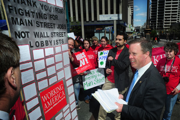
Let’s set the stage. You’re a professional photographer on assignment in a far off land. Suddenly, you find yourself in the middle of a disaster. Photo editors from around the world are contacting you for images, and they want them yesterday. To make matters worse, your laptop battery barely has enough charge to make it though a YouTube video. What do you do? Well, you’ve got to tone your photos fast. Really fast!
When You Just Can’t Take Your Time
When I was in college studying photojournalism, we were transitioning from film to digital. Our professors told us not to rush into switching our cameras, and to reinforce this, they told us toning a photo on a computer should take you just as long as making a print in the darkroom.
They said this to encourage us to be precise and careful when toning images on a screen. Little did we know that once we were all working in the professional world, we’d be transmitting images straight to the web with laptops from our cars. Deadlines are always getting tighter, and because of this I’ve developed a quick toning process that will work for 90% of the images I shoot.
The Tools
Under normal circumstances, you want to take your time and utilize the proper Photoshop tools for the job. But we’re in a war zone with a satellite phone. We want a hammer and some duct tape, not a needle and thread. So we’re going to be using three tools to get our images in shippable shape. Levels, Hue/Saturation and the Lasso Selection tool.
Using Levels
Most people who know Photoshop well, will tell you that the Curves tool gives you more control and is better to use than Levels. That’s true, but Levels is easier to use and in my experience in Curves, half way through toning, I often just want to start over. It’s easy to get off track.
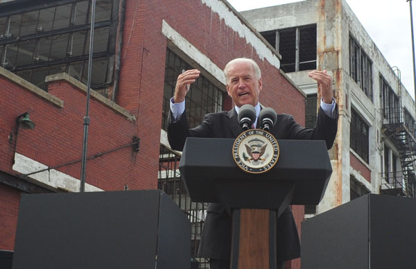
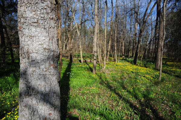
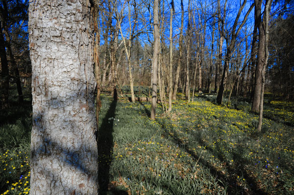
For this workflow, we are only using Levels to adjust exposure and contrast. We’ll be adjusting color issues with different tools. Below is the unedited image that I’ll be using Levels on.
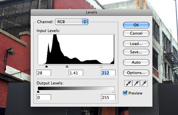
Understanding Each Pointer
Start with the highlights pointer on the right. Look at the histogram and drag the highlights pointer into where your histogram starts to rise. There may be blips on the far right, but ignore those. Next, adjust your midtones with the middle pointer. For this, look at your image, if it’s a little dark move the pointer right, and visa versa.
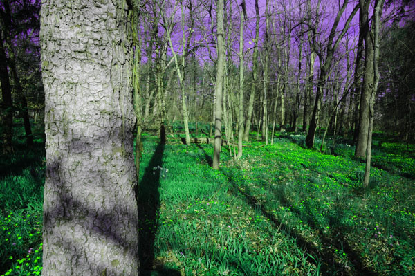
The shadowy parts of your image are controlled by the left pointer. You can’t make them brighter, so moving it to the right will make more things darker. Slide this at least to where your histogram starts to rise as well. Go back to the middle slider and tweak the midtones to your liking. Here’s a look at the levels adjustment after I finished.
The Results
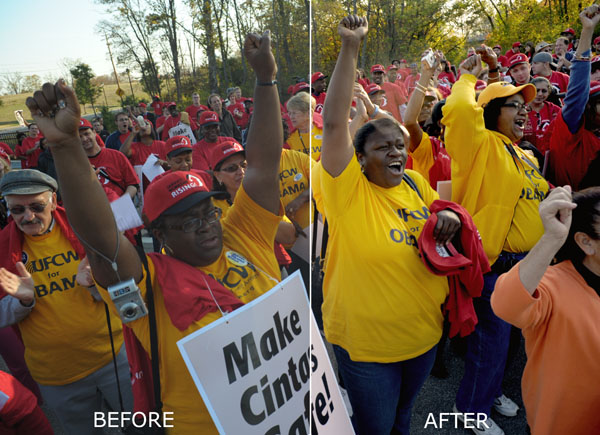
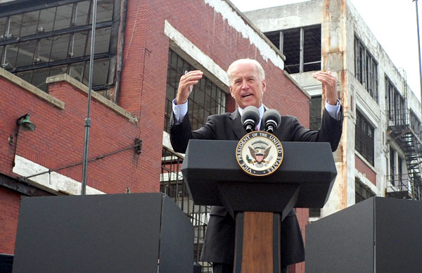
Low resolution web images don’t need hours of work because, no matter how hard you try, your image will look different depending on the quality and type of screen the viewer is using. Newsprint, the low quality paper most newspapers use, is also quite forgiving because of the printing process and how the paper holds ink. They’ve called you, you’re dodging bullets, and you don’t need museum-quality archival prints. As you can see, the final image is more than acceptable for publication.
Hue/Saturation
I personally believe that Hue/Saturation is the most important tool in Photoshop. I use it on almost every image I tone. It can be used to correct for mixed lighting, bad white balance, flat grey tones and a bunch of other problems. There are four things you need to know about in the Hue/Saturation tool to get you going. Below is an unaltered image I’ll be using to demonstrate this tool.
Hue
The Hue slider is the first of the three sliders in the box. For our purposes, hue mean color. By moving this slider, you are shifting the color. Think about the rainbow or a color spectrum. First comes red, then orange, yellow, green, blue, indigo, then purple.
This slider moves things along this color spectrum. Move the slider slightly to the right, and the reds in image will turn orange, the oranges will turn yellow, and so on. Below, you’ll see how the colors have shifted in this way.
Saturation
The next slider is Saturation. I think of saturation as richness or fullness. If you crank this slider all the way to the right, your image will look neon. If you move it all the way in the other direction, you will have pulled all the richness and color out and made your image look black and white.
In the image below, I stopped just short of both ends. The left side of the image is now under saturated, and the right side is over saturated.

Isolating Colors
At the very top of the Hue/Saturation box, you’ll see the “Edit:” and then a clickable drop-down menu that is set on “Master.” Being set on Master means your adjustments apply to all colors, but if you select one of the colors from the drop down menu, you can make adjustments only to that color.
Once you’ve selected one of those colors, you also have the option of moving your mouse over to the image (it will look like an eyedropper), and fine tuning your adjustment by manually picking a spot on the image that contains the color you want to work on.
In the image below, I chose “Blues” from the drop-down menu, and over-saturated the sky. I then opened Hue/Saturation up again, selected “Greens” and used my eyedropper to select the grass, then desaturated it.
A Practical Example: 1
The above examples were extreme and altered an already publishable image. In the image below, I isolated the yellows and oranges in the image to correct for the extremely yellow lighting in the image. The white balance settings on your camera only go so far sometimes. The left side of the image is unedited, the right side shows the changes made with the Hue/Saturation tool.
A Practical Example: 2
Now let’s use the tool to add Saturation and bring in the sky. In order to do this, I chose the yellows from the drop down menu to bring out the leaves. I did the same for the greens to bring out the bushes.
I then used the eyedropper to select the color of the sky, which turned out to be cyan, not blue. So I slightly shifted the color back to blue, using my hue slider, and then bumped up the saturation. You’ll commonly find that grass and leafy plants may look green, but are actually yellow, and that skies look blue, but are actually cyan. Shifting these colors using the hue slider can really improve the final look of your images.
The Lasso Tool
The lasso selection tool is the final thing you need. It doesn’t do anything by itself, but it allows you to utilize both levels and hue/saturation on specific parts of your image rather than the whole thing. The lasso tool paired with Photoshop’s feathering feature can easily replace the dodge and burn tools and allow you to correct specific areas of an image.
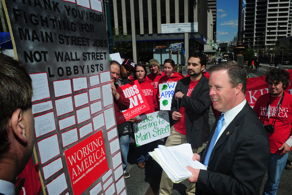
It’s an undervalued tool because people think they need to draw neat, tidy lines around things. Feathering, a sort of blurring of the edges of your selection, allows you to be less precise, but at the same time it makes your adjustments look more natural. Below, you’ll see the image I plan to adjust using the lasso tool.
Making Your Selection
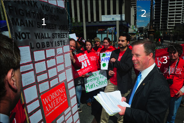
As you can see in the image, the main subject is exposed very well. But the surrounding background is a little dark. There are certain parts of this image that I want to bring out a little. You can see that I’ve made three selections.
Usually I would make each of these separately and adjust them individually, but there are now incoming mortar shells bombarding the hotel, so we need to move quickly. You can also see that my selections are a little wobbly and not very exact… we’re being bombed, what do you expect?!
Feathering The Selection
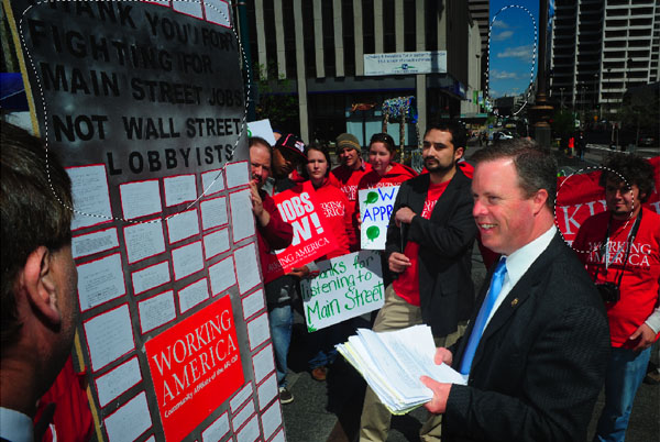
Feathering is something that’s done to a selection to make your alterations fade into the surrounding area. After you apply the feather, you’ll physically see your selection change. The edges will seem rounder.
To apply a feather, look in your top menu, and click on “Select” then “Modify” then “Feather.” It will ask you what radius you want. This all depends upon the resolution of your camera and the size of your selection.
For the selections below (this image was taken with a 12 megapixel camera), I used a 100 pixel radius. The radius determines how far from your original selection your alterations will blend. If the alterations don’t seem to be working, lessen your radius. If the drop off of your alteration looks too drastic, then increase your radius.
Making Your Alterations
For the image below, I went into levels and made my changes. I started with the midtones pointer, and used it to brighten everything up. Because the midtone adjustment washed out the shadows a little bit, I darkened them back up by moving the shadow pointer to the right.
Bringing It All Together
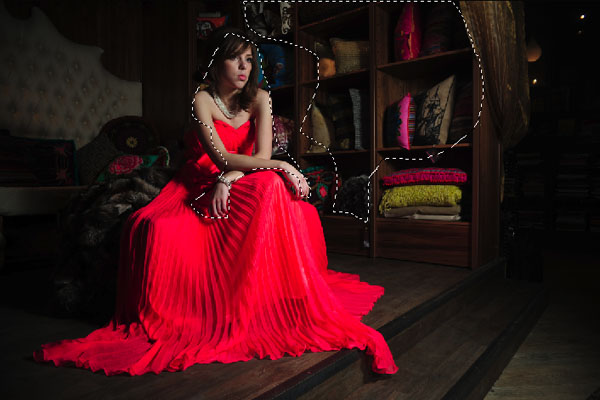
For the next series of images, we’re going to run through the entire process. Some images, might not need all of these steps, but I found one that can use all of them. Here’s the unedited image.
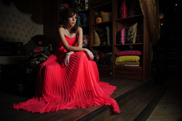
Levels
This image has some dramatic light in it, so we don’t want to over do it with levels. I chose to brighten up everything slightly, and as you can tell the histogram has heavy shadows, so I left those alone.
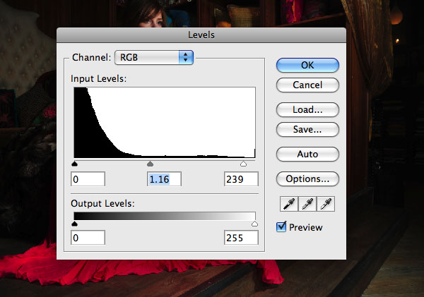
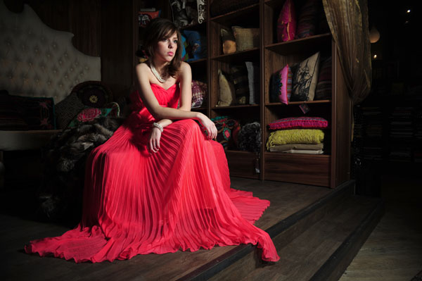
This is the result after performing the levels adjustment. Total time 20 seconds.
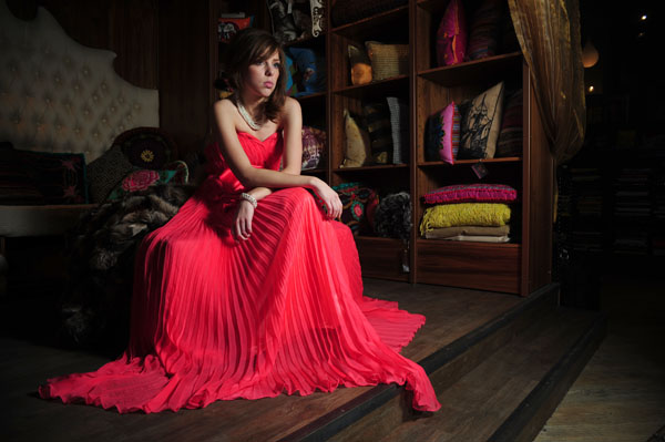
Hue/Saturation
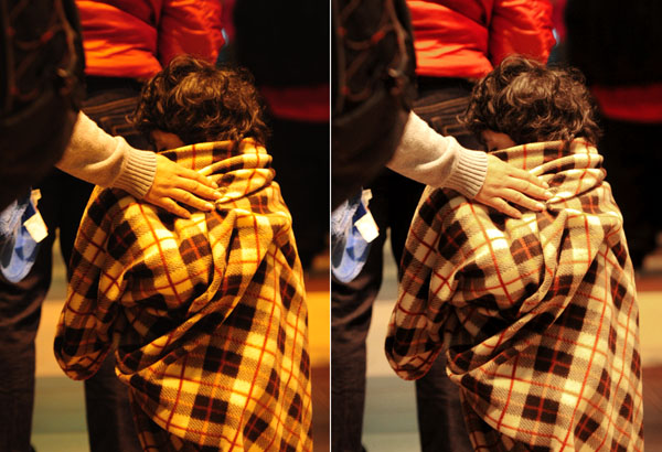
There are a couple different issues going on with this image. First, the dress has a slight “neon” tinge. To correct this, I chose “Reds” from the drop-down menu. I moved the saturation slider to -29. At this point, the tone seemed a little off, so I adjusted the hue slider to +3, which moved the color from more of a pink color back to red.
You can see the results of this adjustment below. I think we might be pushing one minute now, and that’s a good thing, because I think I hear insurgents on the roof and earthquake has knocked out the power.

Lasso
Now, I’m going to bring out the tones in those pillows and adjust her face a little bit as well. For the pillows, I’m using a selection with a 120 pixel radius. I’m going to do each selection separately, but I want to show you both of them in the same image. Again, I’m going to do two separate tone adjustments, one for each selection.
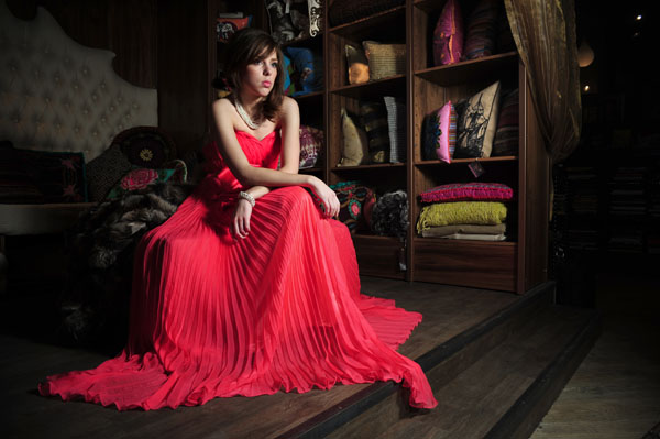
For the face and arms, I’m using a 70 pixel feather. I then did a level adjustment which significantly brightened the highlights, slightly raised the midtones and darkened the shadows a touch. I also went into the Hue/Saturation tool and increase the saturation that was lost in the initial adjustment. I changed the saturation to +17, and the hue to -2. You can see the result below.
For the pillows, I used a radius of 100 pixels for the feather. For the levels, I raised the highlighters pointer about a third of the way to the left. That’s it for the levels. I then wanted to make that bright pink pillow a little less intense because I thought it was a little distracting. So, I selected “Reds” from the drop-down menu, then used the eyedropper to specifically select that color (which turned out to be actually be magenta). I lowered the saturation to -38.
You can see the final image with all of the adjustments below. Total time, around two minutes!
Conclusion
So the next time you’re photographing polar bears, the piece of ice you’re sitting on breaks off, and you’re slowly drifting farther and farther away from your Wi-Fi station, you’ll be able to transmit those images quickly.
Or maybe you just like spending your time taking pictures instead of editing them. Either way – now you’re prepared!