In this tutorial you will learn how to illustrate your own eBook Reader, using Rectangle, Pen and Offset Path. If you have Adobe Illustrator CS5, you can also learn the new features, the Perspective Grid Tool and Perspective Selection Tool.
Blancer.com Tutorials and projects
Freelance Projects, Design and Programming Tutorials
Tutorials,freelance,projects,joomla,php,mysql,wordpress,blancer.com
In this tutorial you will learn how to illustrate your own eBook Reader, using Rectangle, Pen and Offset Path. If you have Adobe Illustrator CS5, you can also learn the new features, the Perspective Grid Tool and Perspective Selection Tool.
If your goal is to learn to program or play drums in a wide variety of genres, Mike Elliott is writing the manual for you. This week he continues the Latin section with Brazilian rhythms. Each tutorial is incredibly detailed, and contains all the diagrams and audio examples you could wish for. And Mike doesn’t just show you the patterns, he explains how they work.
To learn more about what you get as part of Audio Premium, read this. To take a peek inside this tutorial, hit the jump!
Welcome to the third drum based tutorial in the series that will show you what the beats are and how to make them sound good. In this tutorial we are going to continue to cover Latin drums but now in the Brazilian style.
Brazilian music is one of the two main categorizations of Latin music; the other being Afro-Cuban which we covered last time. Just like in Afro-Cuban music, the drums are one of the key components and you need to know which beat to insert depending on the context of the music. Remember, Brazilian music is at its core dance music just like Afro-Cuban.
So if you want to use these grooves in a more traditional sense, know what beat goes with what dance or context. If you just want to add some Samba, Bossa, or Baiao grooves to your repertoire, now is your chance to learn too! The last time we talked we built beats from smaller elements that when summed together formed our bigger beats; this tutorial will do so as well. With that all in mind, get ready to jam!
Here’s the kind of music you’ll be able to create once you harness the knowledge inside:
Download audio file (example.mp3)
Existing Premium members can log-in and download. Not a Plus member? Join now.
Quantizing is often used to adjust the timing of notes in a MIDI performance, but in this tutorial we’ll be looking at how to use quantizing to adjust the velocity of notes. This will be useful because it will allow us to easily apply velocity zig-zags to shuffles and drum rolls, while retaining the velocity changes that are already there.
First, open a Sampler channel, fill in all the steps, and send it to the piano roll. If the piece you’re looking to adjust is at a slower or faster pace than sixteenth notes, you’ll need to adjust the notes accordingly.

Next, adjust the notes so that the offbeat hits are at the lowest velocity possible, and leave the onbeat hits unchanged. The reason we change the velocity so much is because we want our quantization profile to be extreme. A quick way to do this would be select all the notes you want to change (hold CTRL + Shift to select multiple notes), and then use the Scaling tool (Alt+X).

Lastly, save this this as a score file, and save it to the quantization folder. You might want to name it something like EveryOtherShuffle.


Now our score file is ready to be used as a groove template.
Load RD_Shaker from the Packs \ Legacy \ RealDrumkits folder in FL Studio’s browser, and create a pattern such that each step is filled. You could fill in the steps and send it to the piano roll like we did in Step 1.

Next, use keyboard shortcut ALT+Q for Quantize, and using the Groove Template folder icon, select the file you made in Step 1.

From here, we can use the VOL knob to adjust the velocity of the off-beat hits. When the knob is turned all the way left, there is no velocity change, and when the knob is turned all the way to the right, the velocity is all the way down. Because we used extreme settings in our quantization profile, we have a large range of possibilities available to us. Use the space bar to play the pattern and adjust the VOL knob as you listen. This profile will be useful to us at any tempo and even with swung beats. If we were applying this to a swung beat and we did not want the timing to be changed, we could turn down the Start Time and Duration Knobs.

This quantization profile is very versatile because it can also be used on a pattern that already has velocity changes in it. Let’s undo what we did and adjust the velocities for more variation.

Next, use the keyboard shortcut ALT+Q for Quantize, and adjust the velocities of the offbeats using the VOL knob. Note how it applies a velocity zig-zag to what was previously there. I had the pattern play twice to make it easier to hear the changes.

Finally, I wanted show how this could be used in making a snare roll. Load RD_Snare 9 from the RealDrumkits Folder, and create a 2-bar pattern. To draw a straight line of velocities, you can drag a right-click across the velocities.

We can also apply a velocity zig-zag to a drum roll. As you can see, velocity quantization profiles can be useful for a variety of situations.

A good advertisement will draw a prospective customer’s attention towards your product. That is what every business really wants, aside from you actually purchasing their product. In this article we will round up 20 great ads that cover many different styles but all have one thing in common, that is they connect to their audience.
The average consumer isn’t going to spend more than a minute reading or staring at an advertisement they see on a webpage or on a billboard. The average time a person spends on an ad outside is 1.7 seconds, and 15 seconds on the Internet. The Internet has transformed us into fast browsers who skim through articles (hopefully not this one) and quickly glance at product advertisements they see every day. Our attention span has drastically decreased since the Internet came into play and because of that, ads now have to get their point across quickly through something that is pleasing as well as amusing to the eye. Aesthetically creative ads will get a prospective customer engaged in whatever you are selling or saying.
In our society we are bombarded every day with ads for everything under the sun. On average, we see 3,000 ads daily. Because of this we subconsciously ignore them unless we see something we like. Some ads don’t necessarily want to sell you anything, they rather raise awareness; but the same formula goes for them as well. In this article I present 20 ad’s that I believe have successfully shown the prospective consumer their product/message in a quick manner and in a pleasing artistic environment. As we will see from the ads featured, the design is only part of what you will need to create the perfect ad.
This ad works because of its clever play on a classic movie scene, which also ties into their product. The scene from The Matrix is pixilated which prompts the consumer to wonder why and then see their quote promoting their product. Simple and to the point with an interesting art direction. This advertising campaign also redid some other classic films like India Jones, so check out the rest of this set.

This ad puts forth an idea that King Oscar’s fish products are as fresh as they can possibly get. This idea is then executed by blending a fish and one of their canned products showing the consumer they will be buying a fish straight from the ocean. This simplistic image gives off just enough to tell the consumer what the deal is with their product.

This clever Pepsi ad speaks volumes to the consumer; at first glance it gives the impression that Pepsi Cola is the preferred choice of even the straws. And then after that it subliminally pokes fun at one of Pepsi’s competitors by using their color-way for the other can as well as their classic design. This is a very clever ad on many levels.

“The transit is a forest. Be on top of the food chain” Starts off this ad, a clever quote compares the streets and highways of the world to a jungle, so in that case why not be the quickest in the jungle like the cheetah which we see displayed in the middle of the ad built out of this companies motor parts. While you might not quickly grasp their message the imagery does pull you in long enough to understand it.

This is a very funny ad with as simple of a design as it can get. The consumer is instantly drawn in by the bold writing and the starting of an expletive and the notices the cut off with the Geek Squad logo and the quote “Fixed before it gets nasty”. This is only one part of a series of many curses, so you can check out the rest of these smart ads.

This is another ad that shows what simplicity can do for your company’s message. A simple image with an extremely bright idea gives the consumer all they need to figure out what you are selling.

This ad may take a bit more time to understand than the rest but the design itself can keep a consumer interested. The large finger and the iPhone in the corner can quickly help the viewer connect the dots with the sinking Titanic ship and show that we can have all our favorite movies right on our iPhones.

This is one of those ads which was mentioned in the introduction, something that isn’t necessarily selling something but rather giving of a message for a cause or a movement. Well this ad’s imagery gets the viewer involved enough to look towards the bottom and read about how counterfeiting finances organized crime.

Like stated earlier, ads can give off strong messages as well. In this ad we see a damaged human leg, but instead of bones and blood it looks more like a crashed car. This clever message shows us just what its quote says, "…Car accidents don’t just happen to cars".

Here is another ad that has a lot going on but still is able to get its message across fairly easily. We will first notice the dinosaur in the trashed living room but then see the girl pointing at the TV, which will give us the impression that Panasonic’s 3D televisions are extremely realistic. The great art direction leads to the consumer understanding what product is on display almost instantly.

Our next ad puts a very clever twist on a product. We all instantly recognize the Wi-Fi symbol but then notice it is built from famous monuments across the world, once we look further down we notice the product which is giving us Wifi. Once again it is something that says a lot without having to clutter up a whole canvas with different designs.

Obviously Ford wants you to see that wires are bad, showing us 15 different types of wired knots and then ending with an amusing quote on the bottom of the ad “Do knot forget: Bluetooth comes with every new Ford Model”. This is a very smart approach, showing the consumer a common problem that they might have experienced and then giving them a solution in a very amusing way.

This ad gets a strong message across in a graphic way. The blood spatter draws the viewer in and shows them that it is coming from the telephone, leading them to picture something gruesome happening to whoever the man is talking to. And then the quote puts it all together that you shouldn’t be on the phone while driving.

Band Aid is showing just how flexible its fabric is in this ad. This amusing ad shows that this band-aid does not even snap on the finger of The Hulk who is at the center of this image. It works because it’s simple and it shows you all that is needed and nothing more, its flexible, so buy it!

The art direction and illustration in this ad is fantastic, it gives us two separate pictures that are each on a different spectrum and blends them together through a common value which in this case is the internet. The idea is once again simple and not too complicated, and it gets its point across that the Internet is sometimes dangerous so protect yourself.

This is one of the more elegant ads featured in this list because of its soft colors and simplicity. It gets straight to the point and that’s it, nothing more to it. A very solid advertisement that is the perfect example of a simple idea illustrating a whole concept to the consumer.

We first see the image of the large wooden cow being dragged by soldiers, most people will attribute this to the Trojan Horse and then wonder what is inside it, at that point the quote tells us all we need to know, “Watch out for unpleasant surprises”. This ad is different yet it is clever enough to keep a consumer interested for an extra few seconds to get the point and acknowledge the product being displayed.

Now this ad is a little iffy if you do not recognize who the voodoo doll is, but if you do then it is a great ad and it is directed to the core music audience. This original ad shows us a popular music icon as a voodoo doll, which leads us to ask why and see the bottom quote which is emphasizing to not pirate music. Clever ad that might not hit everyone but if it does it definitely gives off its point.

This ad is idealistically similar to the Fedex one I mentioned earlier, it takes a different approach but the idea still hits hard in a very interesting way. 2 Hands, 2 different types of currency, being transferred along through Western Union. Great idea with simple execution makes for a quick ad that gets a message across with ease.

Our last advertisement is raising awareness by showing off a very impressive illustration, which grabs the attention of a viewer. Once they are done looking at this fantasy tornado destroying a city they read the quote and learn about what is going on. This is a case where impressive illustrations can grab viewers in and show them what you want them to see.

If this article has got you inspired to create your own advertisements then go ahead and check out the following roundup of some of the best advertisement & poster tutorials on the net!


Let’s cut to the chase with this one: our friends at Powerflasher are giving away ten FDT Pure 3.5 4 licenses to Activetuts+ readers this week. All you need to do is spread the word on twitter!
Find out quickly how you can be one of the lucky winners – these will fly off the shelves!
Update: As Powerflasher are so close to releasing the latest version, all winners will now receive a copy of FDT4 Pure!
It’s really easy.

Powerflasher is working on the greatest release in the FDT history.
FDT 4 increases your coding comfort and productivity even further with the some additional amazing new features, including the Profiler, Project Templates, Launcher Chain, Dependency Visualizer, Font Library Creator, Advanced Formatter, Faster Compiler and Additional Flex Support. Visit the FDT website for a complete and up to date feature list.

We have recently open FDT 4 Beta program to everyone, take advantage and register to download the latest release!
Thanks to Bruno at Powerflasher for sorting us out with prizes and thanks to Jesse for hooking us up!
Entries close on Friday 24th September at midnight Pacific Time. The ten winners will be contacted and given a unique code with which they can purchase their copy before September 30th. Good luck!
Please note: Envato staff and people who have written more than two tutorials/articles for a Tuts+ site are not eligible to enter.
Yesterday, Carlos examined the Google AJAX API and Flash. Today, we’re going to look at creating a Silverlight Translator Application using the Microsoft Translator service. We’ll begin with interface design (in Photoshop) and move into implementation using Silverlight 4 (including its most recent features) as a web application framework.
We’ll be using Photoshop and Expression blend as user interface design tools and Visual studio as development environment.
Here’s a quick breakdown of what’s covered in this tutorial:
Note: For a solid foundation in working with Silverlight, check out Mike Taulty’s An Introduction to Microsoft Silverlight 4.
Silverlight is a browser plug-in that extends the web development experience far beyond the limitations of plain HTML and JavaScript. It is very similar to Adobe Flash. In Silverlight applications, user interfaces are declared in Extensible Application Markup Language (XAML) and programmed using a subset of the .NET Framework. You can therefore use any .NET Language like C# or VB.NET to start implementing your programs.
As Silverlight uses XAML for creating user interfaces you can use Expression Blend to design your application interface. That’s because Blend is a user interface design tool developed for creating graphical interfaces for web and desktop applications. It’s called Blend because it blends the features of these two types of applications.
Design is a plan for arranging elements in such a way as best to accomplish a particular purpose
– Charles Eames
Because interface is very important for any application we will cover the detailed steps of creating our interface.
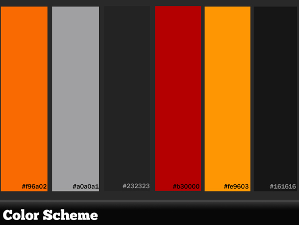
Before we start designing our interface we’ll need to look at the overal visual effect. I made this color scheme:
The first step is to set up your document. We’re going to be designing an interface for a Translator application so it won’t be too big. We’ll go for 640 x 468px.
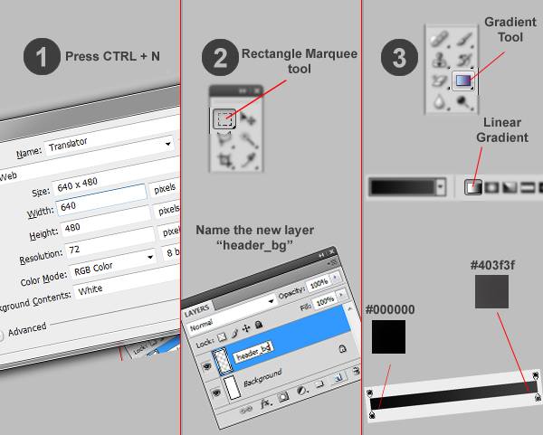
Fire up Photoshop and press the shortcut keys CTRL + N to create a new document. Choose 640 x 468px as the dimensions then click OK.
Create a new layer and rename it “header_bg” then create a selection of 640 x 44px (or whatever you feel is good) in the head of the image using the Rectangle Marquee tool.
Then choose the Gradient tool and be sure that it’s a Linear Gradient as in the image above.
Choose the Horizontal Type tool and write “{T}ranslator” with these settings:
Then choose the “Add A Layer Style” tool from the Layers menu and click the Gradient Overlay option. Change the gradient as in the image. Then use the Horizontal Type tool and write “T” and as in the last step change its Gradient Overlay option and replace it in the correct position as in the image.
Use the Type tool again and type “it translates for you” then change its layer name to “slogan”. After that, select all layers you have created and press CTRL + G to group them, renaming the group to “header”.
Here is the background used in the application. Right-click it and “Save As” so you can use it in your app.

Choose the Rectangle Marquee tool and create a rectangle at the bottom of the image with a height of 52px. Then choose the Gradient Tool and, with the same settings we created the header with, make a gradient such as you see in the image. I placed some of images like the Activetuts+ logo and features images in mine; you can find them in the source download.
Make sure that you have created a new group of all these layers and called it “footer”.

In the following few steps we will design the UI Elements, like buttons and text boxes.
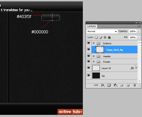
We’ll start with our buttons. Create a new layer, call it “Copy text_bg” and make a selection of 800 x 24px. Then click Select > Modify > Smooth and set the Sample Radius to 3px. Now select the gradient tool and with same gradient as the header make a gradient like that in the image:
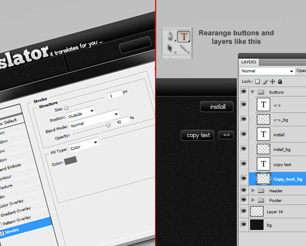
Double-click the layer and choose “Stroke” then set its value to what you see in the image. Select the Horizontal Type tool and write “Copy text” and place it over the button. Duplicate the “Copy text_bg” layer by dragging and dropping it to the new layer button and type “Install” then place it over the button. Duplicate “Copy_text_bg” again and rename it to “” which stands for invert languages and press CTRL + T to resize it as you see in the image.
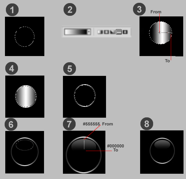
Make a new layer, select the Elliptical Marquee tool and create a circle, then choose the Gradient tool. Make sure it’s a reflected Gradient and create a gradient as in the image. Then click Select > Modify > Contract, set the value to 2px and create a new layer. Then with the Brush tool and color value of #000000 make the selection dark colored. Now make an Oval selection and choose the Gradient tool; make sure it’s a Linear Gradient whose color values are #555555 and #000000, then make a gradient like the image.
Because Blend doesn’t support some Photoshop features like gradients and strokes we need to rasterize all layers with such effects. To do that select the “header_bg” layer and right-click it, then choose “Convert to Smart Object” then right-click again and choose Rasterize Layer. Repeat these steps to the layers “{T}ranslator”, “T” and slogan.
As we are covering the process of creating an application from start to end we will discuss the process of creating the application’s icon.
Make a new Photoshop file of 430 x 330px by pressing CTRL + N, then make a new layer and name it “border”. Create a selection of 247 x 242px, smooth the selection by clicking Select > Modify > Smooth and type 30. Then click Select > Redefine Edge with Smooth of 20 and Contract/Expand of +100%.
Next, make a gradient as in the image, then click Select > Modify > Contract and type 20, then press Delete. Double-click the layer and mark Drop Shadow with opacity of 54%. Create a new layer and name it “inside” then make a selection inside the border and make a gradient like what you see in the image. Double-click the layer and make a stroke of 2px. Now click the Horizontal Type tool and write “Translator” with the font type ChunkFive and size of 24pt. Also, type “{T}” with the same font but with size of 110pt.
You don’t need to convert your icon to .ico format, just save your icon in .png format with sizes of 280 x 280px, 48 x 48px, 32 x 32px and 16 x 16px and Visual Studio will do the rest!
To start implementing the Translator you need to make sure that you have installed Web developer features when you installed your Visual Studio. Then you’ll need to download and setup Silverlight 4 tools which you can get from http://bit.ly/Silverlight4tools and Silverlight 4 Developer Runtime, which you can get here.
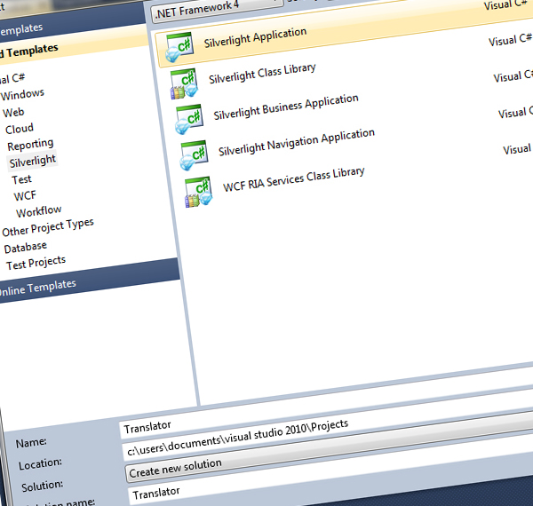
After creating the interface and making it ready to use in Blend we will go to Visual Studio and make a prototype for the project to start our implementation process. Fire up your Visual Studio, click File > New > Project and choose Silverlight then choose Silverlight Application. Click OK for the next window.
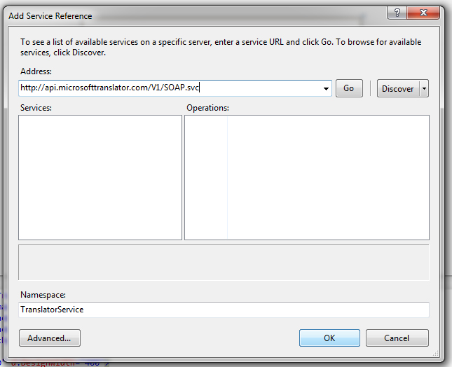
Click Project > Add Service Reference and paste the service url http://api.microsofttranslator.com/V1/SOAP.svc with Namespace as TranslatorService. To use the Bing Translator Web Service you will need an AppID. So go to http://www.bing.com/developer/appids.aspx?FORM=PMPD and create a new AppID for your Translator.
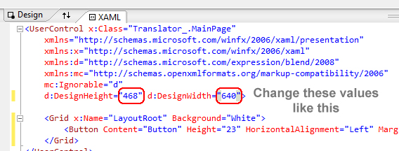
As we mentioned before, the application will be 640 x 468px so we need to resize it.
Now click View > Toolbox (or press CTRL + W + X) to make the Toolbox menu appear. Drag and drop “button” from the Properties menu, change its name and text to “Translate”. Repeat the process and create “Copy text”, “install” and “” buttons.
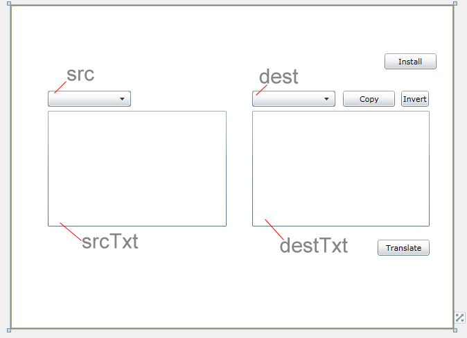
From the Toolbox drag and drop two Text boxes then rename them to “srcTxt”, which will handle the Source Text our user will enter, and “destTxt”, which will output the translated text. Then, drag another two comboboxes and rename them to “src”, which will have all source languages that the user can choose from, and “dest”, which is the language the user wants to translate to. After that, rearrange the elements as in the image.
Now we will start implementing the program. Double-click the Translate button then Visual Studio will open the Source Code of the application. Add the Translator Service Namespace by pasting this code after the last Namespace.
using Translator.TranslatorService;
In the snippet below, the first line creates an instance called “client” from the LanguageServiceClient class. The second creates a variable of type String called “AppId” to refer to the Application ID needed by SOAP Service. The last two lines are the result groups that returned from the SOAP calls and they are in the form of ObservableCollection.
TranslatorService.LanguageServiceClient client = new TranslatorService.LanguageServiceClient();// instance of LanguageServiceClient.
string AppId = "6CE9C85A41571C050C379F60DA173D286384E0F2";// This AppId is created for my name
System.Collections.ObjectModel.ObservableCollection<string> results;// The result languages names returned by the SOAP Searvice.
System.Collections.ObjectModel.ObservableCollection<string> langcodes;// The result languages codes returned by the SOAP Searvice.
Silverlight calls the webservices in Asynchronous Modes only. Hence we need to handle the events to fetch the values. We have to get the results inside those event definitions. Following are the delegates for events which we can give in the Page load event. Also we have to call the Comboboxes’ load events to load the languages.
 InitializeComponent();
//Event Handlers
client.TranslateCompleted += new EventHandler<TranslateCompletedEventArgs>(client_TranslateCompleted);

client.GetLanguageNamesCompleted += new EventHandler<GetLanguageNamesCompletedEventArgs>(client_GetLanguageNamesCompleted);
client.GetLanguagesCompleted += new EventHandler<GetLanguagesCompletedEventArgs>(client_GetLanguagesCompleted);
//For filling the comboboxes and Language codes
client.GetLanguageNamesAsync(AppId, this.Language.IetfLanguageTag);
client.GetLanguagesAsync(AppId);
As we mentioned before, we need to handle each event as we’re working in Asynchronous mode. This is the first event which called client_TranslateCompleted() it will handle the complete translation event and if there are no errors in the process of returning the translation it sets the destTxt combobox text value with the resulting translation.
//Get the translated text
protected void client_TranslateCompleted(Object sender, TranslateCompletedEventArgs e)
{
	if (e.Error == null)
	{
		destTxt.Text = e.Result;
	}
}
This event, called client_GetLanguagesCompleted, retrieves the possible languages that the SOAP Translator Service offers – but in a form of code that is understandable for the Service – and sets them to the String langcodes. This is set after checking for errors.
//Get Languages
protected void client_GetLanguagesCompleted(object sender, GetLanguagesCompletedEventArgs e)
{
	if (e.Error == null)
	{
		langcodes = e.Result;
	}
}
This event gets the name of each language. To clarify, the code for the English language is “en” and the name, of course, is “English”. If there are no errors when getting language names it sets the string “results” with these language names. Then it sets the two comboboxes with the language names.
//Fill the comboboxes

protected void client_GetLanguageNamesCompleted(Object sender, GetLanguageNamesCompletedEventArgs e)
{
	if (e.Error == null)
	{
		results = e.Result;
		this.src.ItemsSource = results;
		this.dest.ItemsSource = results;
	}
}
Now we will implement the last thing to accomplish our goal. This function’s operation is to start the translation process. It checks the two selected items in comboboxes, makes sure that they are not yet empty then calls the Asynchronous Translation function and passes the neccesary arguments to it. These arguments are the Application ID and the Source Text that needs to be translated, plus the language of this Source Text and the language of the Desired Translated Text.
private void PerformTranslation()
{
	if (src.SelectedItem != null && dest.SelectedItem != null)
	{
		client.TranslateAsync(AppId, srcTxt.Text, (langcodes[src.SelectedIndex].ToString()), (langcodes[dest.SelectedIndex].ToString()));
	}
	else
		MessageBox.Show("Please select languages first !");
}
As we’ve finished implementing the Translation Service we need to get it work. So we need to handle the Translate button click event. It’s really simple it just calls the PerformTranslation() function to start its work. To do that just go to the design view and double-click the Translate button.
//Translate on button click
private void button1_Click(object sender, RoutedEventArgs e)
{
	PerformTranslation();
}
The Invert button performs a simple swapping of selected languages in the comboboxes. It creates a String called tmp to store the values in the source combobox when it takes the value of the destination combobox, then puts its value in the destination combobox.
private void Invert_Click(object sender, RoutedEventArgs e)
{
	if (src.SelectedItem != null && dest.SelectedItem != null)
	{
		string tmp = src.SelectedItem.ToString();
		src.SelectedItem = dest.SelectedItem.ToString();
		dest.SelectedItem = tmp;
	}
}
Silverlight 4 came with a lot of new useful features. One such example is the Clipboard API which provides methods for grabbing content that can be temporarily held in the machine’s “clipboard” and manipulated if need be.
private void CopyText_Click(object sender, RoutedEventArgs e)
{
	Clipboard.SetText(destTxt.Text);
}
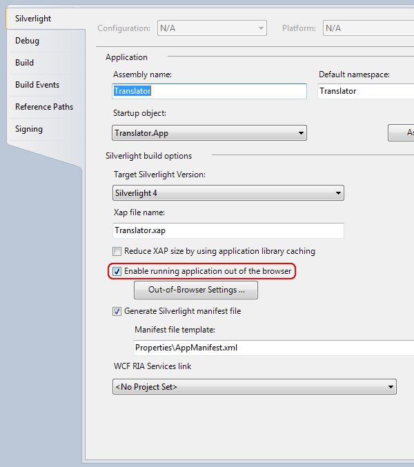
Another new feature of Silverlight 4 is ability to run Silverlight applications Out-of-Browser. That’s because the .NET Common Runtime (CLR) now enables the same compiled code to be run on the desktop and Silverlight without change. This feature can be implemented by clicking Project > (Application name) Properties then the menu in the image will appear. Click Enable running application out of the browser.
You can access this feature now by right-clicking the app; you will find Install this application. However, we want to add a button to handle this feature so we’ll make an install button and the following is the code for its click event:
private void install_Click(object sender, RoutedEventArgs e)
{
	if (!Application.Current.IsRunningOutOfBrowser)// asks if the application is not installed
		{ Application.Current.Install(); }// install application
}
Now if you press CTRL + F5 to build the application, it will be built but a warning message will appear. So to debug your application right-click on the web service in the Solution Explorer, which is Translator.Web, then click Debug > Start new instance. Test your application.
As we finished implementing our application we will start implementing our interface. Open Blend and a splash screen will appear. Choose Open Project from it, then navigate to the project files and open the Solution file which is called “Translator.sln”.
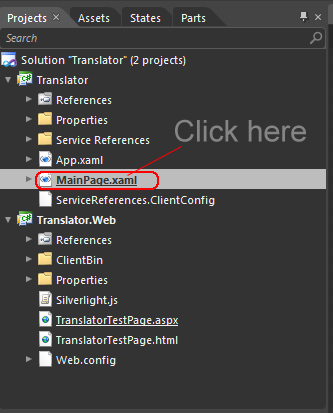
From the Project tab double-click on MainPage.xaml then click File > Import Adobe Photoshop file then navigate to our PSD file and open it.
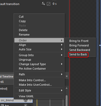
All of our images will be imported to our project file but will be on the top of our Buttons and boxes. In the Objects and Timeline tab right-click on PSD_Source and choose Order > Send to Back.
Blend provides a really useful feature; the ability to customize any user interface element as you want. To do that, select any textbox and right-click it, then choose Edit Template > Edit a Copy, mark Apply to all, then click OK.
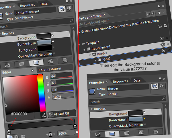
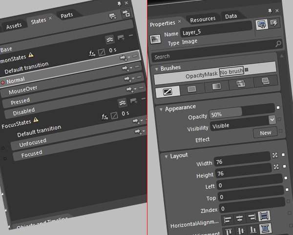
From the Objects and Timeline tab, navigate to contentElement as in the image. Now from Properties tab change the Background color like the image. Now we are editing in the textbox; to go back to the workspace click on srcTxt as shown in the image. Now select the two textboxes and change the Foreground color to #A3A3A3, then go to the Properties menu, scroll to the Text tab and change the font to Franklin Gothic Medium and size to 16pt.
Right-click any button then choose Edit Template > Edit a Copy and mark Apply to all. Then navigate to BackgroundGradient in the Object and Timeline tab. In the Properties, change the Fill color to gradient, such as in the image from Step 29.
Next, navigate to Background in the Object and Timeline tab and in the Properties tab change the Background color value to #494949.
Right-click any combobox then choose Edit Template > Edit a Copy and mark Apply to all, then right-click DropDownToggle and choose Edit Template > Edit current.
Click on BackgroundGradient and from the Properties tab change the Fill color to gradient. Go back by clicking DropDownToggle from the upper menu then navigate to BtnArrow, which is inside DropDownToggle. From the Properties tab change the Fill color to #8D8D8D. Now go to [TextBlock] which is inside ContentPresenter and change the Fill color to #8D8D8D.
Next, go to PopupBorder and change its Background color to #FF1D1D1D. From the States tab click MouseOver, go to Objects and Timeline, click BackgroundGradient and change the gradient color to what you feel looks good.
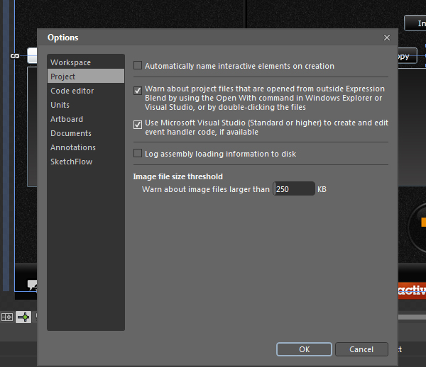
To edit your source code using Visual Studio just click Tools > Options > Project then mark Use Microsoft Visual Studio…
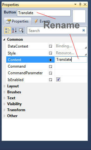
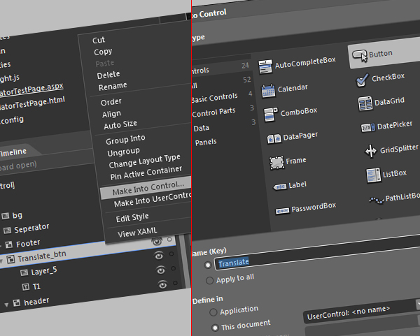
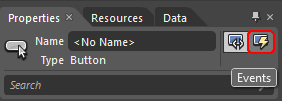
From the Object and Timeline tab right-click Translate_btn then click Make into Control and choose button. Name it “Translate”.
From the States tab click on “Normal” then from the Properties menu change the Opacity value to 50%. Again, from the States tab, click on “Mouse over” and change the Opacity to 70%. Lastly, click on Unfocused from the States tab and change the Opacity to 30%.
Now delete the old Translate button and go to the events by clicking on it. In the click box type Translate_Click.
In the Project tab right-click on src_blend_images and choose Add Existing Item then add all PNG icons. After that double-click on any button’s event for Visual Studio to load. Click Project > Translator Properties then click Out-of-Browser Settings and add the icons from src_blend_images.
In this tutorial we covered the entire process of creating a Translator application. We also took a look at Microsoft Bing Translator Service and made use of it. I hope it was useful and enjoyable.
If you’ve ever tried to shoot a car chase scene, you know how hard it is to get everything set up right. Besides being extremely difficult to reset your shots, getting the perfect angle and nailing your timing can be next to impossible unless you can find a deserted road somewhere. With this tutorial, you’ll be able to pull off shots that are guaranteed to impress (cause they’re not real). Half of the tutorials are available in AE Premium, the other half of the series is available through CG Premium… enjoy!
In this complete tutorial, we will take you through the process of creating a CG Street Race shot, using a background footage plate and various 3D elements. We will start by preparing the footage for use in tracking the camera movement. We will then track the footage using Boujou tracking software. Once tracked, we will take the 3D camera data into 3D Studio Max and create a basic proxy scene and animation. We will then import hi res 3D car models into 3D and link them to our proxy animation. We will also light the scene to help blend the 3D assets into the BG footage. Once the 3D assets are ready, we will render out the elements using multipass rendering and bring them into After Effects for compositing the shot. You will learn how to layer multipass renders and how to use layer modes for the various elements. Then we wil apply various post production treatments including post-motion blur, color correction and audio. Once you have stepped through the entire process, you will be left with a believable CG shot, for use in your showreel or projects….
This is a Premium Tutorial. To view you must Join Premium.
Once you’ve joined, log-in to the Premium Dashboard with your username and password to immediately access your Premium Content. Navigate to AE Premium via ‘Premium Categories’ in the sidebar. You’ll be able to grab the tutorial videos, project files and assets in the members’ area.
Don’t miss more CG tutorials and guides, published daily – subscribe to Cgtuts+ by RSS.
Do you ever email a co-worker who is just down the hall from you? It’s one thing if you are sending over an attachment or have a quick comment to make, but what about those other times when you end up having long discussions back and forth? It can feel strange, knowing you are both choosing to type responses into a screen rather than actually talk to each other face to face.
Email seems convenient, but sometimes it’s a counterproductive communication channel. When you rely on email, discussions that might have taken fifteen minutes can get drawn out over the course of an entire day (or days). Plus, it’s hard to build good rapport over email. No matter how many emoticons and exclamation points you add in there, you just can’t communicate tone in the same way as you do in person.
When you communicate with co-workers, do you mostly rely on email or is personal interaction preferred? Where do you draw the line?
In the constant quest that we undertake to showcase our work in a truly awesome way, personal branding is a topic that becomes more relevant daily. Who you are online is becoming less distinguishable from who you are in the real world. One of the best examples of personal brand management is Dan Schawbel, the brilliant mind behind Personal Branding Blog, founder of Millennial Branding, Personal Branding magazine, and the author of Me 2.0: 4 Steps to Building Your Future, a #1 international bestseller published in 4 languages and was rated the #1 career book of 2009 by The New York Post and the #1 Amazon bestseller in Japan.
Oh, and Dan just turned 27.
On top of writing for Mashable, BusinessWeek, The Wall Street Journal, Brandweek, and Advertising Age, Dan has been a regular tweeter of WorkAwesome articles, so we were thrilled at the chance to interview him in hopes that he might have a few nuggets to share with tour audience. Of course, he did beat us to the punch by interviewing Joel Falconer, the managing editor of the Envato business publications WorkAwesome, FreelanceSwitch, and The Netsetter.
We asked Dan what the readers of WorkAwesome will find useful in Me 2.0: 4 Steps to Building Your Future, and he shared that the second edition of Me 2.0 is scheduled for release on October 5. It has an extra 60 pages of content – including an entire chapter to help you use the top social networks in your next job search so you can target in on the exact position you want.
I had a marketing position right out of school, for just about a year at EMC Corporation, and I started playing with social media towards the end of that year. After I started a blog, the personal brand awards, and personal branding TV, I decided to do a magazine, which got me written up in Fast Company magazine. The PR group within EMC saw what was happening, and hired me to be the personal media specialist for EMC. It took me months to get my first position at EMC, but I didn’t even have to apply to become the social media specialist.
I never set out to make money with personal branding; it was more of a hobby. It was something I was doing during high school and college. I took the title of “Personal Branding Expert for Gen Y” because no one else was out there doing it yet.
Employers need to understand that employees want to build their own brand to share their expertise and build credibility in their chosen field. Since your employees are brand ambassadors, whether they like it or not – especially in a Web 2.0 world – allowing your employees to demonstrate that they are the best talent will showcase your company in the best light. Letting your employees build their brands, and get their name out there, is going to help your business be successful. In the future, job descriptions are going to have self promotional elements, as this benefits the employee and the employer.
When I first realized the value of personal branding, I wasn’t sure that I had the relevant experience to call myself an expert, so I told people I was “The personal branding spokesperson for Gen Y.” Over time, I realized that the people that were interested in what I had to say were not the Gen Y’s, but actually the boomers. And this revelation led to the title changing to “Your Personal Branding Expert”.
When you go into business, you start looking at the Return on Investment (ROI) of each venture, and Twitter and Facebook aren’t great marketing platforms. There are too many people, and it’s too hard to find the influential members that will help spread your message. Blogs let you narrow your niche, and speak directly to the people interested in hearing what you have to say, while allowing you to use the right keywords in order to be found in organic searches. Long tail will always prevail.
Within a corporation, you want to brand yourself as a team player and as someone who’s giving value. Be known as the “go to” person for your specific skill (so that you are needed), and this will increase the chances that you will progress within the company.
Concentrate and focus on one area that you know you can be the best at. Don’t try to be everything to everyone, and don’t feel like you can’t experiment. See what works, and what doesn’t work, and then focus on what does work and you will be successful.
You’d be amazed at what it’s possible to achieve using only one light or strobe. Although many of us may envy a full studio setup complete with all lighting configurations imaginable, it’s often something of an unrealistic dream! Today’s post is designed to inspire you to shoot with the equipment you have, and make the most of your simple lighting setup!
Every photo below was taken with just a single external flash or strobe (and, in some cases, a reflector as well). There’s no fancy multi-light trickery – just a simple setup, and some creative photographic thinking. Enjoy the images, and feel free to share your own in the comments!


Here are a few links, websites, and resources for finding out more about lighting in general!
I got an e-mail from Mike, telling me that he is in Hospital at the moment. So, he is unable to answer any questions in the forums or comments. I would like to wish him well and a speedy recovery. From what he says, he is on the mend so should be back real soon. […]
 Here’s another entry in our “Five Apps For” series, which identifies five iPhone/iPod touch apps that fill a specific niche, appeal to a particular crowd, or cover an area of interest. Enjoy!
As an aging child of the 70’s and 80’s (I’ll be 40 in January), I’m feeling nostalgic for the past while cozying up to my own mortality. Call it a mid-life crisis, regression or what have you, but I’m thinking about the old days. This Etch-a-Sketch iPad case kicked the process into high gear and got me thinking about contemporary versions of the games I used to love.
After scouring the App Store, I found the selection sadly lacking. Every app I found (with one notable exception) resembled its ancestor only superficially. Still, I present them for your consideration. Here are five apps for nostalgia.
Speak & Spell
Update: Reader Rockey04 has pointed out iSpeak and Spell ($0.99). Awesome!
Who remembers typing out bad words with the good old Speak & Spell from Texas Instruments? I don’t mean the 1986 model with that poseur membrane keyboard, but the ’78 model with big chunky keys and that unforgettable voice: “That is incorrect. The correct spelling of….”
While there’s no actual Speak & Spell app in the app store, there is Remix DJ : Speak EZ (Free). Its UI closely resembles that of the Speak & Spell and includes all of the original sounds, including that very same voice; over 200 samples in all. It’s meant for DJs to use as a virtual instrument (you can’t play any of the old Speak & Spell games), but for free it’s still fun to hear the old sounds. Remix DJ: Speak EZ is compatible with iPhone and iPod touch.
Click Read More to see our remaining four picks.
TUAW5 apps for nostalgia originally appeared on The Unofficial Apple Weblog (TUAW) on Tue, 21 Sep 2010 19:00:00 EST. Please see our terms for use of feeds.
Read | Permalink | Email this | Comments
 Given the number of things you have to keep track of in a day, sometimes a simple task manager — the kind that reminds you once and then waits until the next day to tickle you again — doesn’t seem adequate. If you wish you had a snooze button for your tasks, maybe Bugger (US$0.99) is worth a look.
Developer ZZTech built a tool to solve this problem, and it does the job pretty well (note that it requires iOS 4 and a backgrounding-capable device). You can create reminders for any future date and for an assortment of categories, then set a ‘bug level’ of every 10 minutes, 30 minutes, hourly, daily or weekly — and if none of those intervals suit you precisely, you can customize them. After the reminder trips, you’ll get on-device background notifications every time the clock ticks around until you either get ‘er done or delete the reminder.
There’s no sync to desktop or cloud task managers, and none of the power features of higher-echelon GTD tools, but in this case you probably won’t miss them. For speedy, gotta-finish task tracking, Bugger gets it.
We’ve got 10 promo codes for Bugger to give away, and all you need to do is leave a comment below telling us what task is most likely to slip your mind.
TUAWTUAW Giveaway: Bugger puts repeated reminders in your pocket originally appeared on The Unofficial Apple Weblog (TUAW) on Tue, 21 Sep 2010 18:00:00 EST. Please see our terms for use of feeds.
Read | Permalink | Email this | Comments
 Here at TUAW, we love enthusiastic readers. They tell us what they like and what they don’t like, and nothing could be more passionate than the recommendations for TeamViewer that appeared in the comments on a post I recently wrote about using iTeleport and LogMeIn to provide remote support. Given the enthusiasm, I decided to give TeamViewer a try.
Like most other remote computing solutions, TeamViewer is made up of two parts. There’s a computer-based server, available for both Windows and Macintosh, and clients including an iPad application. How much you spend on your setup depends on how you plan to use the application.
TUAWSharing screens with TeamViewer for iPad and Mac originally appeared on The Unofficial Apple Weblog (TUAW) on Tue, 21 Sep 2010 17:00:00 EST. Please see our terms for use of feeds.
Read | Permalink | Email this | Comments
