Category: Tutorials
Tutorials,freelance,projects,joomla,php,mysql,wordpress,blancer.com
Amazon plans three solar power projects in the US and Spain

Organize Your Office and Keep it Relevant
{excerpt}
Read More
The best laptops and 2-in-1s this holiday season

Amazon says Cyber Monday was its biggest shopping day ever

X-ray lasers can spot elusive electron motion

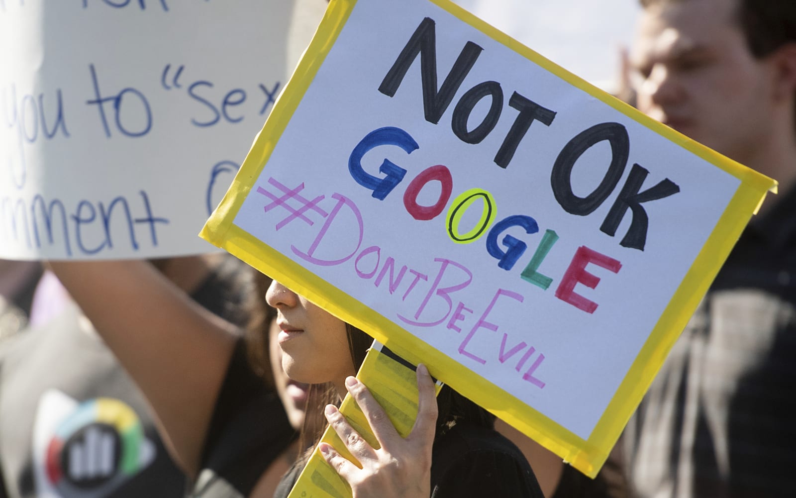
Fired Google employees will file federal labor charges against the company
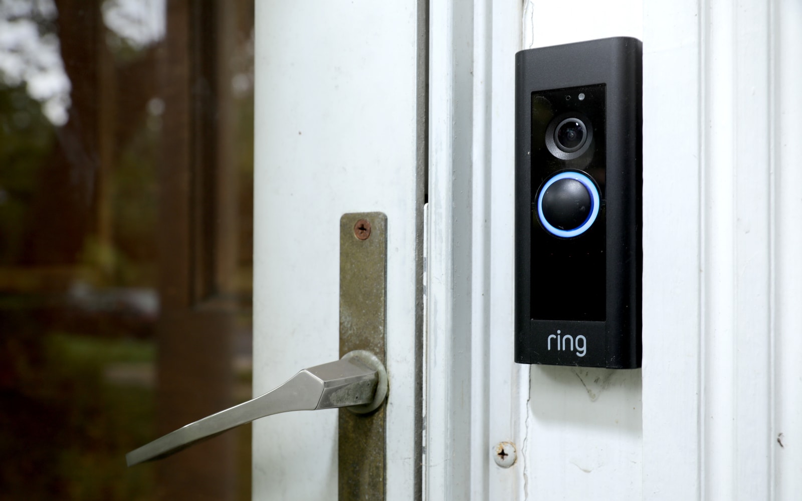
Ring gave police a detailed map of area doorbell installations
The Mercedes GLS is an exciting SUV (but you wouldn’t know by looking at it)

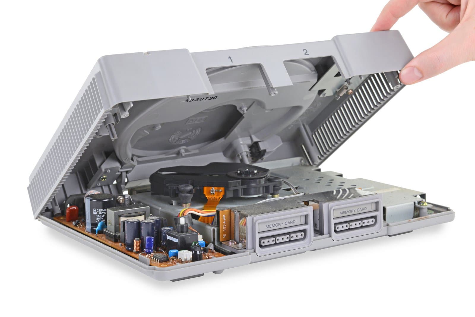
Take a look inside the original PlayStation on its 25th anniversary
25 Best New Event Flyer Templates for Photoshop & InDesign for 2020
Promote your next event with an amazing flyer! Check out this list of professional flyer templates!
25 Best New Event Flyer Templates
Event flyers aren’t just for graphic design experts. So no matter your experience level, you can now create phenomenal flyer event designs using high-quality assets from across the web.
That’s why we’re bringing you another awesome collection of goodies from Placeit, Envato Market, and Envato Elements.
Bring your audience together with incredible designs inspired by fun events, from art exhibitions to sports events and more. You’ll be able to customize these flyer templates in no time at all! Check them out!
Wine Tasting Event Flyer
Solid, bold colors, and high contrast make this design both trendy and classy at the same time! Jump into Adobe Photoshop and easily change the content to suit your project—or Adobe Illustrator, if you prefer! The included fonts are free for commercial use too!

Summer Event Flyer Invitation
Fun, colorful, and ready for the sunshine—this template is ready for your next summer party or event! This one is perfect for family reunions, vacations, and getting the word out about any fun in the sun.

Jazz Flyer Design
Check out this grid-based design, perfect for your next music event. However, this one is plenty adaptable and versatile. Swap out the imagery with your photos, and this composition could work for a whole host of different design situations!

Marathon Event Flyer
A perfect fit for marathons, runs, and other athletic events, this flyer is 100% vector, so jump right into the included Photoshop or Illustrator files, and adjust the content any way you like! This one could work for other active events too!

Ski Trip Event Flyer
Planning a wintry event? Check out this design! It has kind of a retro look and feel, doesn’t it? The solid, bold illustrations and the typography are such a cool throwback! Easily edit the included PSD files with your content in Adobe Photoshop.

Artist Event Flyer
Make a bold impact with a compelling art event flyer. This beautiful design features two colorful options with fully editable files. Easily edit the main model with one of your own pictures, or choose a stock from your favorite stock site. A helpful guide is also included for your convenience.

New Year Eve Flyer
Send out your invites now for a New Year’s Eve party to remember. This flyer template is great for club promotions and more. It features an exquisite, modern design with 3D elements like confetti, mirror balls, and 3D text. All the pictures are included, so you won’t have to switch anything out!

Boxing Event Flyer
If you’re hosting the next boxing event at your restaurant or club, make sure to grab this new flyer template! This template is easy to edit and includes all the elements you need for a powerful marketing campaign. Update it fast using Adobe Photoshop versions CS3 and above.

Football Event Flyer
Promote the next football event at your stadium with this electrifying event flyer. This template features a bold, sports-based design to inspire your audience to come to this event. Just swap out the main preview images for ones of your own in order to use this flyer right away.

Camping Adventure Flyer Bundle
Many exciting sports events are also held outdoors. So check out this fun, camping adventure flyer bundle for a brilliant flyer pack perfect for any outdoor sports enthusiast. This download comes with fully layered files available in both Photoshop and InDesign formats.

Fitness Universal Flyer
Do you love CrossFit or any of the latest fitness crazes? Then check out this universal fitness flyer to promote your next event. This design comes in four different colorful versions, with both female and male models. It’s fully editable and even includes access to all the free fonts used.

Dance Flyer Template
Showcase your love for dance with this fantastic event flyer template. This download comes with several print-ready formats in three different color versions. Edit the templates easily with the help of Adobe InDesign or Photoshop. A great choice for beginners!

Kids School Flyer Templates
Volunteer at your kids’ local school event by designing an amazing flyer! This high-resolution template comes with Photoshop and InDesign formats. It’s completely editable and print ready, so you’ll be able to change any element, including the text!

Fashion Sale Flyer
Sale event flyers are important templates for entrepreneurs and store owners. This modern design features a minimalist theme inspired by fashion. It comes in a standard A4 template size and features only free fonts. Edit it fast in Adobe InDesign. Check it out!

Creative Flyer Template
Stand out with a creative event flyer that’s sure to draw in a crowd! This amazing design features a print-ready format that is fully customizable and easy to use. Replace the main image with one of your favorite stocks to take this flyer to the next level!

Creative Abstract Flyer Template
Looking for an abstract design that is sleek and multipurpose? Then check out this incredible Photoshop flyer template. This template features professional and cleanly structured files with all the elements you need to customize it further. Add it to your collection!

Pub Happy Hour Flyer Template
Celebrate happy hour with a few close friends with this awesome flyer template. This template features both A4 and A3 sized files in a highly functional, print-ready format. All the text can be easily edited with the Type Tool, so you won’t have any worries there! Enjoy this design!

Christmas Flyer
Ready for the holidays? We hope this next event flyer will get you in that holiday spirit! This template was created with a beautiful gold theme, inspired by Christmas elements like ribbons and bows. You’ll also get access to several print-ready files that come in two stunning black and white versions.

The Clearance Sale Event Flyer
Launch a storewide sale event with a sleek and sophisticated flyer like this one. This download comes with three pages of Adobe InDesign templates you can easily customize in minutes. Enjoy the minimalist design with easily interchangeable elements for the text and image details.

Valentines Day Flyer
Throw a Valentine’s Day bash everyone will love with this lovely flyer template. This download includes one fully layered Photoshop file with a beautiful bright red theme for love. It’s available in a CMYK print-ready format and can be expanded to any size.

Strips Flyer Poster
Split up your model into a cool effect with this strips flyer poster. Easily modify the Photoshop file to gain access to a print-ready poster with free fonts inside. Although the original model image isn’t included, you can just swap it out with your favorite picture.

Business Event Flyers
Throw your next business conference or event with these stylish flyers. This incredible bundle pack comes with three design alternatives in a standard A4 size. You’ll be able to update them quickly with Adobe InDesign, and can even access this look in Microsoft Word!

Party Poster Maker
Create a super chill event flyer design with the online flyer maker from Placeit. Featuring a simple, geometric design with colorful details, this flyer makes it easy to switch out the background for any other preset. Download this template to customize it further with your own personal touch.

Fashion Week Online Flyer Maker
Enjoy fashion week knowing you’ve got a compelling flyer! This awesome design from Placeit is modern and perfect for any minimalist designer. Change the main colors to fit your brand and swap out the logos for your own. Easily edit this flyer in minutes!

Wedding Planner Flyer Template
Your special day deserves a gorgeous wedding invitation. Get the most out of your design with this exquisite look from the flyer maker over on Placeit. Swap out the text, icons, and background image for ones you prefer for a print-ready file that’s only eight dollars!

More Flyer Templates
Make your events the talk of the town with incredible, high-quality flyer templates. I hope these flyers have inspired you to promote your next event with style.
Want more flyers? Check out these collections and tutorials for more inspiration:
 FlyersHow to Create an Event Flyer Template in InDesignGrace Fussell
 Marketing35+ Business Flyer Templates (Creative Layout Designs & Industry-Specific Templates)Marc Schenker
 Poster DesignCreate a Mixed Martial Arts Event Flyer in PhotoshopWojciech Pijecki
 Flyers38 Stylish Flyer Templates (PSD Flyer Templates)Melody Nieves
 FlyersHow to Make a Business Flyer Template in PhotoshopMelody Nieves
Tried any of these assets? Let us know! Tell us your favorites in the comments below.
This has been a selection of premium resources perfect for the avid creator. For more event flyer templates, head on over to Placeit, Envato Market, and Envato Elements, or enlist the help of our talented designers at Envato Studio. Happy creating!

{excerpt}
Read More
What is Digital Accessibility in Multimedia?
{excerpt}
Read More
How to Improve the Accessibility of Fonts and Typography in Your Designs
Font types, font design and typography can have a huge impact on the legibility and visibility of designs for visually impaired viewers, a consideration that print and web designers often overlook.
Choosing the right type of font style to use on your print layout or website to improve accessibility doesn’t need to be difficult or to compromise the overall aesthetic of your design. Here, you can find out more about how different types of fonts and font design can affect visually impaired viewers, and how you can make instant improvements to your designs.

How Do Font Choice and Typography Affect Visually Impaired Individuals?
According to the World Health Organisation (WHO), at least 2.2 billion people have a vision impairment or blindness, which means that an astonishingly high percentage of 28.5% of the world’s population have some form of vision impairment.
-

How You Can Use Adobe Software to Improve Accessibility on Your Designs
It’s important that as many people as possible are able to engage successfully with digital designs. In this article, we look at some of the ways large… -

Building an Inclusive Web: Why Accessibility Matters
In this article I’ll share my point of view about why accessibility is important; from empathy and what is simply “good business”, through to selfishness and…
Visual impairment falls broadly into three categories, which have different or overlapping effects for how those affected interact with type-based designs:
Color blindness means that while the shape of text is not distorted, the color of text can be difficult to perceive, and the distinguishment between colors can be more difficult. Color-blind individuals can also be sensitive to color brightness.

Low vision (or low visual acuity) means that an individual can have partial sight in one or both eyes, blurry vision, tunnel vision, central field loss, and/or clouded vision. Designs with small-scale text or click targets can be difficult for affected users to read or see. While some individuals use specialist built-in browser zoom or screen magnifiers like ZoomText for browsing websites, many non-technical users are not aware of, or don’t know how to use, these extensions.

Blindness is the substantial loss of vision in both of the eyes. For printed and physical text, blind individuals have relied on Braille text, while blind internet users often turn to screen reader technology, which turns on-screen content into speech or shows it on a Braille display. The most popular screen reader software for Windows devices is JAWS (Job Access With Speech), while Apple users commonly use VoiceOver.

Other specific symptoms of visual impairment which can affect how individuals interact with text include:
- Visual snow, glare, ghosting, and cataracts—symptoms which can affect the clarity, position and number of occurrences (double vision) of text.
- Nystagmus, which is characterized by rapid, involuntary, oscillatory movement of the eyes, can give the impression that text is jumping around or disappearing.
- An obstructed visual field, which includes floaters, an obstruction to one side (retinal detachment or hemianopia), obstructed central vision (glaucoma), spotty vision (diabetic retinopathy), or obstructed peripheral vision (retinitis pigmentosa or macular degeneration), can limit the individual’s field of view, meaning that some parts of the text in a design might not be visible.
An Example of Accessibility and Inaccessibility in Practice
Let’s look at an example of how the choice of fonts and formatting of typography could affect the accessibility of a site for visually impaired individuals.
The New Yorker has been praised by type aficionados for its elegant use of typography. On the magazine’s website, the quirky and custom-designed serif font, NY Irvin, is balanced with geometric sans serif Neutraface and traditional serif Times New Roman.
As a publication with an intelligent reputation, The New Yorker has a text-heavy website, featuring a masthead and central headline teaser, alongside a number of other article titles around the periphery.

As stylish and aesthetically balanced as it might be, the typography presents a number of issues which commonly limit the accessibility of such sites to visually impaired users.
The New Yorker website performs poorly on three occasions, when faced with users with symptoms of low acuity (blur), ghosting, and a blocked visual field. These images were generated using the NoCoffee vision simulator, a browser extension which allows web designers to assess the accessibility of sites.
An individual with low acuity would struggle to read the text set at a smaller scale, such as the article teasers in the left and right columns, as well as body text in the headline area.

If an individual experiences ghosting (also known as double vision or diplopia), the website text becomes nearly completely illegible. The ornate style of the serif font is no doubt an exacerbating factor in this, as the shape of individual letters is not instantly perceptible when overlapping.

In the case of a partially blocked visual field, the fact that the layout is text-heavy and scattered around a wide area adds to the inaccessibility of the site. In the case of peripheral vision (commonly a symptom of either glaucoma or retinitis pigmentosa), the outlying articles become more and more difficult to see.

The website performs much better, however, on three other counts. If an individual has color deficiency (such as protanopia, red-green color blindness), only the images are generally affected, with the black text set against a white background proving to be a clear and legible color choice.

In the case of contrast loss, the high-contrast monochrome palette also counteracts the effect of visual ‘graying’. Users with cataracts, who commonly experience a clouded field of vision as a result, will also benefit from the high-contrast color of the text.

Based on all of these observations, the type designers behind The New Yorker are doing some things well for visually impaired users, but there are significant issues that could be changed to improve accessibility.
While the black-and-white contrast of the text improves readability, the choice of a stylized serif font, small sizing of text and the quantity and scattering of text around the layout equate to a design that’s high on style but low on accessibility.
6 Steps You Can Take to Improve the Accessibility of Type in Your Designs
Making the type on your print or digital designs more accessible isn’t difficult. Below are six steps you can take to improve the legibility and overall visibility of fonts and typography.
Use Common Sans Serif Fonts
Currently, Section 508 of the Rehabilitation Act of 1973 does not pin down the requirements for choosing accessible typefaces. However, the US Department of Health and Human Services has recommended the following fonts for PDF documents: Times New Roman, Verdana, Arial, Tahoma, Helvetica, and Calibri.
These fonts tick two accessibility boxes. First, they are sans serifs. Lacking the extra flourishes featured on serif fonts that can impair readability, sans serifs are generally much easier to read.
Secondly, these are common fonts, which as a result are less likely to be replaced on websites and are also processed more frequently by readers, making the style of the font more invisible and the text more readable.

Stick to One or Two Fonts in a Design
Multiple fonts can distract from the task of reading, which adds extra strain for a visually impaired viewer, so limit the number of fonts on a print or web layout to a maximum of two or ideally just one font.

Increase the Size of Type
Use a minimum font size of 12 pt for web and print designs, but aim for even larger to improve visibility. The British government website, for example, uses a minimum font size of 19 pt.
Ensure key titles, calls to action, and important items of information are set in a large font size.

Maximize Color Contrast
Make sure the contrast between text and the background is as high as possible. Setting black text against white, and vice versa, is the obvious choice, but using colors from opposite ends of the spectrum will also help to maximize contrast in the case of color blindness.
Tip: Use a contrast checking tool to ensure that the color choices you’ve opted for are as contrasting as possible.

Avoid Animations
Text that flashes, moves or disappears is not only potentially irritating for the majority of website users, but it can exasperate visual impairment issues, especially in the case of nystagmus (flutter).

Avoid Using Italic and UPPERCASE Styles
Skewing and compressing text, as is the case with italicized type, reduces legibility, as does setting text in all caps. If you want to distinguish certain parts of your text, opt instead for a bold weight or increased font size.

Avoid Using Novelty or Display Fonts
Novelty font styles tend to be more stylized than sans serifs and serifs, meaning that there is an extra layer of visual information to process. Extra texture, decoration or flourishes increase the complexity of the font and reduce legibility. For a visually impaired viewer, this adds another task on top of the strain of trying to reading the text.

When Designing Fonts, Aim for Clarity and Distinction
Font designers love to experiment with new type styles, shapes, textures and colors in their designs. While this can result in a unique and eye-catching font, it doesn’t necessarily mean the font is optimized for the visually impaired.
When designing your own fonts, aim to make the letters both clear and distinct from one another.
Improve the clarity of your letters by sticking to a clean, fuss-free sans serif style. Some lowercase letters like ‘d’ and ‘b’ can be easily confused, so make sure to create a distinction between letters that could be mixed up.

Conclusion: Improving the Accessibility of Fonts in Your Designs
By keeping accessibility requirements at the forefront of your mind while you design fonts or use them on print media or websites, you’ll ensure that your designs are going to be as accessible as possible for visually impaired users.
While legislation regarding font use on websites isn’t set in stone yet, pressure is growing on businesses to accommodate users with a visual impairment or other disability. Design is an area that can have a significant impact on the accessibility of media, so it’s increasingly important for designers to be aware of the needs of visually impaired individuals and to act on them in the work they produce.
To find out more about how to improve accessibility in your designs, check out these handy articles:
-
How You Can Use Adobe Software to Improve Accessibility on Your Designs
It’s important that as many people as possible are able to engage successfully with digital designs. In this article, we look at some of the ways large… -

Best Fonts for Dyslexia
About 17% of the world’s population are classified as dyslexic, so why aren’t we paying more attention to making design accessible to more people? -

A Guide to Creating Accessible Animations
Creating accessible animations is an important part of user experience. Motion on the screen can make people dizzy, nauseous, or worse. In this guide, I’ll… -

How We Test for Accessibility at Envato (Tools and Tips)
Tackling the challenge of creating an accessible website–or making an existing website accessible–can sometimes be a difficult task. In this post I’ll show…

{excerpt}
Read More
How to Make an Opener for YouTube Videos Using a Template for Premiere Pro
{excerpt}
Read More
3 Ways to Subtitle and Caption Your Videos Automatically Using Artificial Intelligence
{excerpt}
Read More