
Category: Tutorials
Tutorials,freelance,projects,joomla,php,mysql,wordpress,blancer.com
How to Make a Book Layout Template in InDesign

Want to make your own book writing template? In this tutorial, we’ll take a look at creating your own InDesign book templates, from creating and applying Master Pages to saving our work as an InDesign Template. We’ll start with a basic example and then apply these basics to a more interesting composition.
If you want to get a great end result without working through the tutorial, check out these useful InDesign book templates.
 InDesign Templates28 Best InDesign Book Templates (Layout & Cover Templates)Melody Nieves
 InDesign Templates50+ InDesign Templates Every Designer Should OwnGrace Fussell
Tutorial Assets
The following assets are used in this tutorial.
1. Book Design Basics You Should Know
Step 1
Before we jump into InDesign and creating our book layout design, let’s cover a few important book design basics that you’ll want to keep in mind. Consider this an introductory review; it might be a good idea to write these terms down and ask your printer about them. Different projects will have different requirements—if your printer suggests, for example, a 0.75″ gutter, you’ll need to know what that means!
First, let’s talk about Margins. Think of Margins like the border around your page. Once, a student of mine asked, “Why do you need margins at all?” I found the best way to explain this was to share a visual example.
Notice the difference, below, between a page with adequate margin space and one with little margin space at all. Not only would we run the risk of losing type to things like page cutting and folds, it’s just plain old hard on the eyes.

Step 2
The Gutter often refers to the space between your two pages in a two-page layout (or two-page spread).
So why would this space differ from the rest of your margins? Well, open up any book and take a look at the middle of it, between the two pages. Notice how some of the page space gets “lost” in the area where the page comes together. That’s why, in many cases, extra space here needs to be added to accommodate the space occupied when the book is bound together. Otherwise, the contents here would be closer than intended.

Step 3
Have you ever folded up several pieces of paper and noticed that they don’t line up perfectly when you do so? Each page ends up sticking out differently. That’s Creep.
The printer typically trims the pages, so they all align nice and neatly, rather than each of them extending in a varied way, like this.
Bleed, as ominous as it sounds, refers to the area of your work that will be trimmed off. For example, let’s say you have a layout where you want a full-page image with no visible margin. You’ll need to extend the work into the Bleed Area, so when the work is Trimmed, things will look as intended.
In the example, below, there is a 0.25″ Bleed outside the boundary of the document.

Step 4
Leading or Line Spacing refers to the space between your lines of type (not to be confused with Kerning or Tracking, which refer to spacing considerations for the words themselves).
As when we spoke about Margins earlier, Space is very important. It’s generally not a good idea, for example, to haphazardly pack content tightly with little regard for negative space.
Too little Line Spacing could make your content look cramped and hard to read. Too much Line Spacing and each line may look independent, rather than fluent. Find a happy medium.

2. How to Set Up an InDesign Book Template
Step 1
Now, let’s start out with a New Document in InDesign.
Note, we’re making a New Document and not a New Book. An InDesign Book file is a great way to combine multiple InDesign documents into one file (or book!). We’ll talk about that a little later on.

Step 2
There are a lot of options here, so let’s start at the beginning.
Choose your Height and Width. You can change the unit of measurement where it says Units. I’ve set my Units to Inches, and I chose to work with 6″ x 9″.
You can also choose your Orientation. However, note that InDesign will take note of your values and swap the orientation automatically to correspond with the values you’ve input.

Step 3
Choose the number of pages you’d like. It’s easy to add new pages once you’ve already created your document, if you change your mind.
Facing Pages refers to whether or not you’d like your document to be presented as a two-page spread. For this tutorial, we’ll do so. However, this option can also be changed after you’ve created your document.
You can also choose the page number you’ll start with—choose what’s best for your project on this. This is another option that can be changed after you’ve created your document.
We’ll use Primary Text Frames to help make our text flow from page to page, so make sure this is toggled on. If you forget to do it when you create your document, you can always add this later, as well.
We can use Columns to help organize our layout. Column Gutter, in this case, refers to the space between each column.

Step 4
Next, we can set our Margins. Note that the Link Icon here locks the values so they remain identical. Toggle it off if you’d like your margins to vary.

Step 5
Finally, we have our Bleed and Slug. Your printer may, for example, require a Bleed for elements that extend to the edge of the page. We could define that here, as a visual guide. For example, I print my own posters at home. When I do so, I always give myself a Bleed to work with, to account for minor variations when trimming.
But what’s a Slug? The Slug is also located off of the page, so you won’t see it in the finished product. It is generally for print information, and we won’t use it in this tutorial.
Since we’re starting with a simple book layout design, we’ll leave the Bleed and Slug set to Zero, for now.
Again, keep in mind that all of these values can be changed after your document has been created via File > Document Setup.

3. How to Use Master Pages in InDesign
Step 1
Now that we’ve created our Document, let’s get started with Master Pages.
First, make sure your Pages panel is open. This is where we can view our pages at large—all of them in a nice, visual overview. If you don’t already see this panel, you can find it via Window > Pages.

Step 2
At the very top of the Pages panel, we have our Master Pages. You will likely see [None] and A-Master, the defaults.
So, what are Master Pages, and why are they so useful? Think of it as your book format template—this page (or pages) won’t print. Instead, InDesign will use the Master Pages as a set of rules to apply to your active pages.
You don’t necessarily have to use Master Pages—if you don’t want one to apply to a particular page, you can choose [None], for example.
However, you can also use multiple, different Master Pages in one document. See how this can really come in handy? We could potentially make a whole collection of book design templates here and apply them to different pages.

Step 3
Let’s start out by editing A-Master. Double-Click on A-Master to start editing it.
If you want to double-check if you’re “inside” the A-Master and not one of your active pages, you can check the bottom of the screen. This dropdown tells you which page you’re currently viewing.

Step 4
While inside A-Master, you’ll notice InDesign has already placed a text box for us. It’s our Primary Text Frame, and this is where we’re going to put our body copy.
Notice that, by default, we have two large Text Frames that take up the space here defined by our single column and our margins. We could edit this in any way we like—resize it, move it, etc. However, for the purposes of this tutorial, let’s just leave it in this default appearance, for now.
Take note of the three highlighted parts of the work area, below:
The icon on the Text Frame indicates that this is a Primary Text Frame.
Looking at the Pages Panel, we are working on A-Master.
At the bottom of the work area, we can again verify that we are currently working on A-Master.

Step 5
Now, let’s add a Page Number to the footer area of our Master Page.
Thankfully, we don’t have to do this by hand for every page! InDesign can easily put an indicator here that will dynamically place the page number for us.
First, Create a New Text Frame by using the Type Tool. Click and drag to create the Text Frame. Don’t worry if it’s not perfectly placed. We can fix that later.

Step 6
Then, insert a Current Page Number Marker by going Type > Insert Special Character > Markers > Current Page Number
Tip: Make sure your Text Frame is selected, with the Type Tool, before doing so—InDesign can’t place this marker if you don’t tell it where to do so!

Step 7
Do this on both pages. You can alter the alignment of the Current Page Number Marker via the Paragraph panel. You can find that via Window > Type and Tables > Paragraph.
You can resize your Text Frames with the Selection Tool (located in the Tools panel)
In this case, I aligned the page number in the center, on both pages, to keep things simple.

Step 8
I also made some adjustments to my Margins. You can do so by going File > Document Setup. It’ll give you the same options as when we first created our document.
In working with my composition here, I decided I’d like a little extra margin space on the bottom, for the page number, and some extra margin space in the Gutter to potentially accommodate the fold.

Step 9
But let’s say we want the first page of each chapter to look a little different.
Let’s select A-Master and Right-Click (on PC) or Control-Click (on Mac), then select Duplicate Master Spread “A-Master”.
You’ll notice that this creates a new Master Page set for us called B-Master.

Step 10
Go inside of B-Master, just as we did with A-Master earlier.
I decided that I’d like the left page to be blank. I erased the Primary Text Frame from this side of my two-page spread.
Then, I decided to make the Primary Text Frame start lower on the right page. Use the Selection Tool to adjust the size of the Text Frame.
I want to place a header at the top of this page. This would be a great place to put something like the number or name of the chapter.
Use the Text Tool to Create a New Text Frame. Then, I can type anything I want in here. For the sake of this example, I made it say “Chapter One”.
I also wanted the text here to be different from the body copy, so it stands out. You can change the text in any Text Frame by using the Character and Paragraph panels. They are located within Window > Type and Tables.
Here is what my B-Master looks like.

4. How to Apply Master Pages
Step 1
Now that we’ve created a basic book layout template, let’s take it for a test drive!
If you need some body copy to experiment with, I recommend going to Lipsum.com—it will generate some dummy copy for you (or test words for you to experiment with). This will have a more natural text flow as opposed to typing gibberish.
I pasted a good 15+ paragraphs of Lorem Ipsum onto my first page—and then InDesign went ahead and created additional pages for me, to accommodate the length of the text. Handy, right?
Go ahead and browse through your pages—you’ll notice the page numbers are all there and correct too. Awesome, right?

Step 2
Let’s not forget about our B-Master! This is how we’d like the start of our chapter to look, after all.
To apply the B-Master to a page, simply click and drag it to the page(s) you’d like it applied to. It’s as simple as that!
Notice that the text flow is uninterrupted, even with the different Master Page applied.

5. How to Use These Book Layout Design Concepts
Step 1
So, now that we’ve created a basic book layout design and applied it to our document, let’s do something a little more interesting with what we’ve explored. Let’s create a more interesting and creative layout design.
No need to start a New Document—I’m just going to go ahead and Create a New Master Page. Duplicate A-Master—this will give us a new set of Master Pages called C-Master.
Remember to make sure you’re working “inside” of C-Master, as we make changes, and not on one of your active pages.

Step 2
Many books contain more footer (or header) information that just the page number. It’s not uncommon to see the title of the book and/or the author there, too. So let’s add that in here using the Text Tool.
Remember, you can change the type’s appearance via the Character and Paragraph Panels. You can also change the Text Color from the toolbar.
Since this is a page of body copy, we don’t necessarily want to get too wild with the design elements. Simple, clean, and easy to read is typically the way to go.
I did, however, experiment with a little use of line, using the Line Tool. Feel free to try it on your Master Page, too! I lowered the Stroke Width to 0.5 (the Stroke panel, via Window > Stroke) and the Opacity to 50% (the Effects panel, via Window > Effects), so these lines would stay nice and subtle.
Experiment with adding and moving around elements! Feel free to try your own ideas or you can follow my layout, below.

Step 3
I tried to think of a fun, yet supplemental way to incorporate a little whimsy here, without being distracting, so I thought… how about rainbow page numbers that gradually transition as you turn the page? Cool, right? And it’s simple too, using Master Pages.
Once I was happy with C-Master, I duplicated it three times. The only difference between these Master Pages is the color of the footer content. This meant that after I changed the text color, I had:
- C-Master, where the page numbers are red on the left and orange on the right
- D-Master, where the page numbers are yellow on the left and green on the right
- E-Master, where the page numbers are blue on the left and purple on the right
Here’s an example of what these page transitions would look like, together.

Step 4
In further experimenting with this aesthetic, I added some watercolor elements in the footer area. These Watercolor Rainbow Hearts are available on Envato Elements, if you’d like to experiment with them too!
If you’d like to insert imagery, go to File > Place to load up your image of choice. InDesign will then let you place it in a frame within your layout.
I added hearts of corresponding colors to the footers of each of my rainbow-themed Master Pages.

Step 5
Now, let’s do something interesting with the first page of the chapter.
Create one more duplicate of C-Master. This one will be called F-Master (if you followed along with my rainbow page numbers).
On the left page, I removed the Primary Text Frame and arranged multiple hearts. I might use this between chapters or if I plan to have content prior to a chapter.
On the right, I lowered the starting point for the text on the first page. I also added a small, decorative element above the start of the chapter.
Remember, we’re working inside Master Pages here—not inside the active pages.

Step 6
Now that we’ve made ourselves a fun book design layout, let’s go ahead and put it to use!
Looking at your Pages panel, let’s change the applied Master Pages here from A-Master and B-Master to our newly created Master Pages.
All you have to do is select the Master Page of your choice and click and drag to apply it to select pages.
Then voila! We’ve changed up our layout and applied our new template content.
Remember, you can always go back to your Master Pages and make changes! Very rarely do I get a design “just right” the first time; personally, my process involves a lot of experimenting and adjusting.

6. How to Create InDesign Books and InDesign Templates
Step 1
Note that, when you save your work, you can specifically save it as an InDesign Template or indt file, rather than an InDesign Document or indd file.
So, what’s the difference?
With an InDesign Template, you can start up a New Document, using this Template as your basis. Simply go to File > Open and choose your Template file.
When you choose your Template File, you can choose “Open Normal” or “Open Original”. See how this could come in handy?
When choosing “Open Normal” for an InDesign Template File, you’ll get a new, untitled document, based on your template.
When choosing “Open Original”, you’ll open the original Template File—so you can make changes to it.

Step 2
It’s important to note that a book is a big project. For example, I put together a process book once that was over 300 pages—and it was graphically intensive too. A file of that size can be a challenge to work with for a number of reasons.
That’s why InDesign Books can be a great tool to use for larger projects. For example, you could have each chapter of your book as an individual InDesign file. This could be far more manageable than dealing with hundreds of pages in one file. Then, you could compile them all in one InDesign Book—it’ll even sort out the page numbers across files for you.
While this functionality is not the focus of this tutorial, you can check out the feature via File > New > Book.

Step 3
Note that this does not open up a New Document—instead, you’ll see the Book panel. Here, you can add files, move files, and print files as one group.

And There You Have It!
We’ve created an InDesign Book Template!
A final tip before we say goodbye: communicate with your printer, especially if you’re publishing on your own. Ask questions and arm yourself with a knowledge of print-related terms. If you’re not sure of the best file specifications, like sizing, margins, and things like that—ask! Your printer should be happy to help you with this information, and it’s better to ask lots of questions at the start than to realize your file’s all messed up at the very end.
Thank you for following along, and good luck with your InDesign projects!

If you enjoyed this tutorial, here are some others that you might like!
 FlyersHow to Make a Simple Flyer in Adobe InDesignGrace Fussell
 Adobe InDesignLearn Adobe InDesign From Scratch in Our New CourseAndrew Blackman
 FlyersHow to Make an InDesign Flyer TemplateLaura Keung
 Adobe InDesignHow to Make an InDesign Catalog TemplateGrace Fussell
{excerpt}
Read More
12 Top 3D Text Animation Templates for After Effects
{excerpt}
Read More
100 Free Lightroom Presets (And How to Make Your Own)
{excerpt}
Read More
34 Best Pillow Mockups (Using a Pillow Mockup Generator)
Pillows, glorious pillows. What would we do without pillows to support our heads and necks and backs, or just to hug when we need comfort? And what a terrific canvas for designers and businesses to display their artwork and logos on.

If you’re looking for a high-quality pillow mockup to display your own artwork, you’re in luck. Today we feature 34 of the coolest pillow mockups from Placeit and show you how to use the Placeit Pillow Mockup Generator to upload your own fabulous designs.
How to Use a Pillow Mockup Generator
Before we share our favourite pillow mockups from Placeit, let me show you how the pillow mockup generator works.
1. Navigate to Placeit’s Pillow Mockup page.
Use this box at the top of the page to upload your design on one side and choose the colour of your pillow mockup on the other.

2. Select a Pillow Mockup You Like
Uploading your selected image will add it to the pillow mockup templates available at Placeit. Browse the templates and click on the one you like most. This will open the image in the pillow mockup generator.

3. Customise Your Pillow Mockup
Starting with the controls on the left of the pillow mockup generator, you can add text to your template if you like by using the Add Text button. Here, you can also change the font and the colour of the text to match your brand.

Under the Add Text button, you will the Upload Image button. Use this to change your design, make it bigger or smaller, or adjust it up or down as needed. In this example I added “40% off”.
4. Move to the Controls on the Right
Using the controls on the right, you can change the background of your image or even add a graphic or logo.
Above the background colour selector, you will see the pillow colour control. Here you can change the background colour of your pillow if you so desire.

5. Download Your Pillow Mockup
When you’re happy with your pillow mockup, you can download it for a small fee.

34 Best Pillow Mockups
1. Mockup of Hands Holding a Square Pillow

All eyes will be on your design with this amazing throw pillow mockup. The design features the hands of a young woman holding a pillow up high. Add your image, choose the background colour for your pillow, and just like that, your mockup is ready for use.
2. Young Woman Looking at the Camera While Lying Against a Square Pillow Mockup

Another awesome square pillow mockup. Shot through a window so that there’s a lovely reflective effect in the photo, this mockup shows a young woman sitting in a beautiful living room leaning lightly on a pillow. A great mockup for patterned pillow designs.
3. Pillow Mockup Resting Over a Patio Chair

Who could resist this lumbar pillow mockup with the terrific eye-catching colours in the photo’s background? Add your design to this simple, tasteful mockup and share it with your world.
4. Mockup of a Throw Pillow With a Woman Smirking on a Bed

This lumbar pillow mockup is just as engaging as the one before, but for different reasons. This one features a young woman leaning lightly on the pillow which faces the viewer directly so that your pillow design holds centre stage.
5. Square Pillow Mockup Standing Against a Transparent Background

The beauty of PNGs with their transparent backgrounds is that you can integrate them into any scene of your choosing. For those times when that’s exactly what you need, there is this mockup. An addition benefit of this throw pillow mockup is that you can use the controls to add a background of any colour you desire.
6. Pillow Mockup of a Woman Lying on a Sofa with a Book on Her Face

What better way to show off your lumbar pillow mockup than with this image, which shows a woman relaxing on a sofa, engrossed in a book that hides her face. The pillow mockup occupies centre stage in the image, so it’s guaranteed to keep your viewers’ eyes on your design.
7. Mockup of a Square Pillow Lying on a Wooden Surface

If you’re looking for a simple throw pillow mockup, this is it. It offers viewers a clear view of your design against a beautiful, natural wood grain, with no other competing elements in the photo to tease their eyes away from the main attraction.
8. Pillow Mockup Featuring a Pretty Woman Sitting at Home

This lumbar pillow mockup uses a different approach. It goes for a warm domestic scene with a young woman relaxing in a tub chair holding the pillow so that the design or logo is clearly visible.
9. Pillow Template Lying on a Gray Blanket in the Floor

Pillows and throws complement each other in any domestic scene, so it makes sense that this throw pillow mockup features a beautiful throw in the background, which will act as a great textural complement to your design.
10. Mockup of a Smiling Woman Holding a Pillow

This square pillow mockup is neutral enough to pair with any patterned design. Just add your design and select the background colour for the pillow if needed, and you’re done. Of course, you can always take things a step further by adding a graphic and additional text to the mockup.
11. Mockup of Throw Pillows Placed Over a Modern Sofa

This pillow on couch mockup offers the perfect modern domestic scene for your designs. What’s really cool about this particular template is that you can add a different design to each pillow if you care to, or you can use the same design but select a different colour background for each pillow, or you can… I think you get the picture.
12. Mockup of a Man Holding a Pillow While Petting a Dog

A throw pillow mockup with man and his best friend, this charming mockup is bound to attract a lot of eyes. Not just because of the super cute dog, but also because it does such a good job of creating a space for your design to shine.
13. Mockup of Four Pillows on a Leather Sofa

Now you can show off four different designs or four different versions of the same design with this pillow on couch mockup. The mockup features two lumbar pillow mockups and two square pillow mockups. They are carefully numbered so that you can control which design goes on which pillow.
14. Pillow Mockup Featuring a Woman Drinking Coffee at Home

This lovely lumbar pillow mockup shows a woman sitting next to a sofa, enjoying a warm drink with a pillow sitting on her thigh in such a way that your design will be shown clearly. This is a lovely domestic backdrop for your pillow designs.
15. Square Pillow Template Lying on a Surface With Three Colors

Show off your designs with this throw pillow mockup which shows a square pillow filling the frame and lying on a three-colour background of pastel pink, green, and yellow. A simple and eye-catching way to display your pillow designs.
16. Woman Covering Her Face With a Pillow Template

Looking for a pillow-case mockup? This fun template in neutral colours could be just what you need. It shows a young woman lying among throw pillows in bed holding up a large pillow so that it covers her face and the top half of her body. A lovely pillow-case mockup for displaying a wide range of designs.
17. Pillow Mockup on an Orange Sofa Near a Labrador Dog

A pillow on couch mockup to fall in love with! The lovely dog in this photo leads the eye into the image, and the pillow behind her then draws the eye to your design. The orange colour of the sofa warms up the image nicely so that the overall feeling of the mockup is homey.
18. Mockup of a Square Pillow Lying on a Pink and White Surface

A throw pillow mockup with a duo-coloured background, this is another simple mockup that will complement designs with lots of texture and colours. One thing to bear in mind is that the background colours can not be changed, so choose this one only if they will complement your design colours.
19. Mockup of a Smiling Woman Holding a Pillow at a Lounge

Happiness is infectious and attractive, and that’s a great reason to choose this pillow on couch mockup that features a smiling woman holding a pillow lightly on her lap. The angle of the pillow creates a nice dynamism in the image without compromising legibility (in the event that your design uses text).
20. Pillow Mockup Featuring a Customizable Background

We’ve featured a good set of simple square pillow mockups, so here’s a straightforward lumbar pillow mockup to balance things out. The example here shows a beautiful blue background, but you can change the background to any colour you so desire, or even make it transparent if you need that.
21. Pillow Mockup of a Couple Eating a Pie in the Bedroom

Couple goals? Maybe! What’s for certain, though, is that this throw pillow mockup has a lot of warm-hearted appeal. Wonder what kind of pie that is? Happy pie, maybe.
22. Pair of Square Pillows Mockup Lying on a White Sheet

Two is better than one, or at least in the case of throw pillow mockups. Use this template to upload different versions of one design—or different designs altogether.
23. Mockup of a Woman Holding a Pillow in Bed

This lumbar pillow mockup features an overhead shot of a young woman lying in bed holding a pillow. Probably a good mockup choice for funny or romantic designs or even company logos.
24. Square Pillow Mockup Featuring a Blue Single Sofa

There’s a certain elegance to this throw pillow mockup, which features a beautiful armchair next to a round table with a square pillow placed carefully so it faces the camera and thus the viewer. The soft light coming through the white curtains behind the scene adds a nice soft touch to the scene.
25. Pillow Mockup Featuring a Woman Hiding Her Face

This is a variation of the image above that changes the energy of the scene. The curtains are opened to reveal a bright, sunny day, and the young woman sits facing the camera but with a large square pillow obscuring half of her face and her torso. Her body language creates a bit of a sense of mystery and cheekiness while keeping the design front and centre in the image.
26. Mockup of a Pillow on a Chair

Show off your design with this square pillow mockup, which simply shows a large square pillow sitting on a metal chair. Upload your image, change the colour of your pillow, add text or not, and just like that you have a super simple mockup ready to download.
27. Pillow Mockup of a Woman Relaxing on Her Couch

Are you creating designs with a young demographic in mind? If so, this square pillow mockup is a great choice for you. It shows a young woman relaxing in an armchair while maybe listening to music. She is holding a square pillow in such a way that it faces the camera at an angle. This means that your design is not only visible but holds centre stage.
28. Mockup of Two Squared Pillows Placed Over a Couch

A terrific pillow on couch mockup with two pillows on a neutral coloured couch. This is quite an asset for designers because it means that the mockup can be used with designs in a wide variety of colours.
29. Square Pillow Mockup Featuring a Joyful Young Man Sitting on a Couch

If you’re after a pillow on couch mockup that includes a human presence, this might work for you. The smiling young man working on his laptop is a great backdrop for the plump square pillow in the foreground that is just waiting for your image.
30. Young Woman Waking Up Sitting Down With a Big Pillow Mockup

Looking for a pillow-case mockup? Then check out this mockup featuring a young woman stretching and rubbing her eyes as if she has just gotten out of bed. What’s great about this design is that with the pillow placed squarely on her lap in the centre of the image, all eyes will be focused on your design.
31. Closeup Template of a Pair of Pillows Lying on a Wooden Surface

Keep your friends close and your pillow-case mockup closer. This minimal mockup is all about your design. Probably not a good choice if your design features a lot of text, but a great option if it’s all about texture and colour.
32. Young Woman Lying Down on a Big Pillow Template

This overhead shot is a great choice for a pillow-case mockup. It shows a woman lying on a pillow but positions her carefully on the very corner of the pillow so that she does not obscure the design but rather allows viewers to see the design clearly.
33. Mockup of Two Pillows on a Leather Sofa

A pillow on couch mockup with a view. What could be better for creating content and atmosphere? A great mockup for contemporary designs.
34. Square Pillow Mockup Featuring a Woman Under a Christmas Tree

If you’re looking for a Christmas-themed throw pillow mockup, this is a great choice. Just upload your design, change the colour of the pillow if needed, add text if you choose, and in a matter of seconds you have a terrific mockup ready to download.
Try a Pillow Mockup Today
Why not select your favourite mockup, upload one of your designs, and share it with us in the comments below? We’d love to see what you come up with.
And remember, these 34 high-quality pillow mockups are only a fraction of the fabulous selections available at Placeit, so if you haven’t found exactly what you need here, head on over to the site and browse the large collections to be found there.
If you’re interested in other kinds of mockups as well, here are some great suggestions for you:
 Product Mockup21 Best Smartwatch Mockups (Using an Android and Apple Watch Mockup Generator)Nona Blackman
 Product MockupHow to Create a T-Shirt Mockup Using a T-Shirt Mockup GeneratorNona Blackman
 iPhone Mockup21 Best iPhone 11 Mockups (Pro & Pro Max)Nona Blackman
 Product Mockup32 Best Leggings Mockups Using a Leggings Mockup GeneratorNona Blackman
 Mockups27 Best Racerback Tank Top Mockups Using an Online Mockup GeneratorNona Blackman
 Mac21 Best MacBook & Laptop Mockup Templates (Including iMac & MacBook Pro PNG Mockups)Nona Blackman
{excerpt}
Read More
NBC’s Peacock streaming service might include live video

Valiant’s superheroes will get multi-platform video games

FBI program helps companies fool hackers with ‘decoy data’

Watch Boeing’s Starliner attempt a landing starting at 6:45AM ET

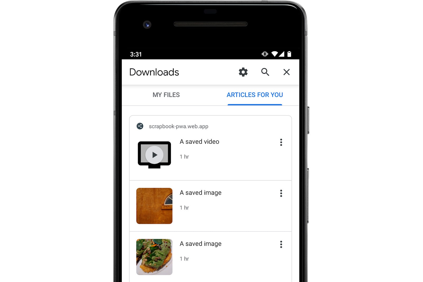
Chrome beta helps you find offline-friendly files in web apps
Navy bans TikTok from government-issued phones

‘Halo: Combat Evolved’ remaster for PC enters public testing in January

Tesla code hints Model 3 might get 100kWh battery and Ludicrous Mode

Hitting the Books: What it’d be like to live in a city owned by Twitter

The Morning After: Motorola delayed the new RAZR

Welcome to your weekend! I'm probably the only one with any holiday shopping left to do, so there's no way this gift guide is still useful for anyone else, right? Either way, it's right there if you need it. Sur…