{excerpt}
Read More
Category: Tutorials
Tutorials,freelance,projects,joomla,php,mysql,wordpress,blancer.com
How to Make a Vintage Pattern Brush in Illustrator

In the following steps, you will learn how to make a brush in Illustrator. For starters, you will learn how to set up a simple grid and how to prepare your document to create Illustrator brushes.
Next, using basic tools and vector shape-building techniques, you will learn how to create the body of a vintage brush. Moving on, you will learn how to create the corners for your vintage brush and how to use saved patterns to create Illustrator brushes. Finally, you will learn how to easily save Illustrator brushes and how to use them to create stylish Illustrator borders.
For more inspiration on how to adjust or improve your Illustrator brushes, you can find plenty of resources at GraphicRiver.
1. How to Create a New Document and Set Up a Grid
Hit Control-N to create a new document. Select Pixels from the Units drop-down menu, enter 850 in the width box and 480 in the height box, and then click More Settings. Select RGB for the Color Mode, set the Raster Effects to Screen (72 ppi), and then click Create Document.
Enable the Grid (View > Show Grid) and Snap to Grid (View > Snap to Grid). You will need a grid every 5 px, so simply go to Edit > Preferences > Guides & Grid, and enter 1 in the Gridline every box and 1 in the Subdivisions box. Try not to get discouraged by all that grid—it will make your work easier, and keep in mind that you can easily enable or disable it using the Control-“ keyboard shortcut.
You can learn more about Illustrator’s grid system in this short tutorial from Andrei Stefan: Understanding Adobe Illustrator’s Grid System.
You should also open the Info panel (Window > Info) for a live preview with the size and position of your shapes. Don’t forget to set the unit of measurement to pixels from Edit > Preferences > Units. All these options will significantly increase your work speed. Now that everything is prepared, let’s learn how to make a brush in Illustrator.

2. How to Create a Heart Shape
Step 1
Pick the Ellipse Tool (L) and focus on your toolbar. Remove the color from the stroke and then select the fill and set its color to black (R=0 G=0 B=0).
Move to your artboard and create a 20 px circle, holding the Shift key while dragging to create a perfect circle. Make sure that this shape stays selected, open the Appearance panel (Window > Appearance), and lower the Opacity to about 30%.
Duplicate this circle (Control-C > Control-F), select the copy, and place it as shown in the second image.

Step 2
Using the Move Tool (V), select the left circle and rotate it 45 degrees. Using the same tool, select the right circle and do the same thing.

Step 3
Disable Snap to Grid (Shift- Control-“) and enable the Smart Guides (Control-U). Go to Edit > Preferences > Smart Guides and be sure that the Anchor/ Path Labels box is checked.
Pick the Pen Tool (P) and start a new path from the point highlighted in the first image. Make sure that you’re getting the “anchor” smart guide and simply click on it. Go to the left side of the left circle and add the second point, as shown in the second image. Add a third point, as shown in the third image, and then close your path. Fill this triangle with black and lower its Opacity to about 30%.
Keep focusing on your triangle and switch to the Direct Selection Tool (A). Select the bottom anchor point and place it exactly as shown in the fourth image.

Step 4
Select the three shapes made so far, open the Pathfinder panel (Window > Pathfinder), and click the Unite button. Make sure that the resulting shape stays selected and focus on the Appearance panel. Increase the Opacity to 100%, remove the fill color, and select the stroke. Set the color to black and click that “Stroke” piece of text to open the Stroke fly-out panel. Set the Weight to 4 px and check that Round Join button.

3. How to Use the Heart Shape for the Vintage Brush
Step 1
Enable the Snap to Grid (Control-“). Pick the Ellipse Tool (L) and create an 8 x 22 px shape. Fill it with black and place it as shown in the first image.
Switch to the Rounded Rectangle Tool, create a 16 x 8 px shape, and place it as shown in the second image. Duplicate this rounded rectangle and place the copy as shown in the third image.
Using the Ellipse Tool (L), create four 6 px circles and place them as shown in the fourth image.

Step 2
Select all the shapes made so far and go to Object > Transform > Reflect. Check the Horizontal box and click the Copy button.
Make sure that the resulting shapes remain selected and go to Object > Transform > Move. Enter 0 px in the Horizontal box and 34 px in the Vertical box, and then click the OK button. In the end, things should look like in the third image.

Step 3
Select the two heart shapes and go to Object > Path > Outline Stroke.

4. How to Finish the Body of the Vintage Brush
Step 1
Using the Ellipse Tool (L), create a 12 px circle and place it as shown in the first image. Select this shape and focus on the Appearance panel.
Make sure that there’s no fill color and select the stroke. Set the color to black and open the Stroke fly-out panel. Increase the Weight to 4 px and check the Align Stroke to Inside button, and then go to Object > Path > Outline Stroke.
Pick the Rounded Rectangle Tool, create a 4 x 10 px shape, and place it as shown in the third image. Duplicate this shape (Control-C > Control-V), select the copy, and place it as shown in the second image. Select both rounded rectangles and go to Object > Transform > Rotate. Set the Angle to 90 degrees and click the Copy button.

Step 2
Select the five shapes highlighted in the first image and click the Unite button from the Pathfinder panel.
Using the Rectangle Tool (M), create a 12 x 24 px shape and place it as shown in the third image. Select this new rectangle, along with the black shape that lies below, and click the Minus Front button from the Pathfinder panel.

Step 3
Duplicate the shape made in the previous step (Control-C > Control-V). Select the copy, rotate it 180 degrees, and place it as shown in the first image.
Pick the Rectangle Tool (M) and create two 44 x 4 px shapes. Fill both shapes with black and place them as shown in the second image. All the shapes made so far will make up the body of your vintage brush.

Step 4
Select all the shapes made so far and duplicate them (Control-C > Control-V). Make sure that only the copies are selected and Group them (Control-G). Rotate this group 45 degrees and place it exactly as shown in the following image. This will only help for the following steps when you’re going to create the corner of your vintage brush.

5. How to Create the Corner of the Vintage Brush
Step 1
Select that half sliced shape and duplicate it (Control-C > Control-V). Place the copy as shown in the first image and then rotate it 180 degrees. Change its color to R=27 G=117 B=188 and then duplicate it. Select the new copy, rotate it 90 degrees, and place it as shown in the third image.

Step 2
Select one of the heart shapes along with all the smaller shapes around it (highlighted in the first image) and duplicate them (Control-C > Control-V). Place those copies as shown in the first image and change the fill color to R=27 G=117 B=188.
Select the circle highlighted in the second image and simply delete it using the Delete key on your keyboard.

Step 3
Make sure that all the blue shapes added in the previous step are still selected and go to Object > Transform > Rotate. Set the Angle to -90 degrees and then click the Copy button.
Select the newly made shapes and place them exactly as shown in the third image. Select only the small outer circle and place it as shown in the third image.

Step 4
Pick the Rectangle Tool (M), create a 40 px square, and focus on the Appearance panel. Remove the fill color and select the stroke. Set the color to black and increase the Weight to 4 px.
Place this new shape exactly as shown in the first image and go to Object > Path > Add Anchor Points. Pick the Delete Anchor Point Tool (-) and use simple clicks to remove the corner points. This should turn your rectangle into a diamond, as shown in the third image.

Step 5
Select the three shapes highlighted in the first image and go to Object > Transform > Rotate. Set the Angle to -45 degrees and click the Copy button.
Place the resulting shapes exactly as shown in the third image. Select the diamond shape, add a copy in front (Control-C > Control-F), and bring it to the front (Control-Shift-]). Select this copy along with the heart shape added in this step (highlighted in the fourth image) and click the Minus Front button from the Pathfinder panel.

Step 6
Select the diamond shape and change the stroke color from black to R=27 G=117 B=188.
Using the Ellipse Tool (L), create four 6 px shapes, fill them with R=27 G=117 B=188, and place them as shown in the second image.
Duplicate the two half sliced shapes (Control-C > Control-V) and place the copies as shown in the third image. Select these shapes and click the Unite button from the Pathfinder panel. Make sure that the resulting shape is filled with R=27 G=117 B=188.

Step 7
Select the six shapes highlighted in the first image and duplicate them (Control-C > Control-V), and then place the copies as shown in the second image.

Step 8
Focus on the diamond shape added in the previous step and pick the Direct Selection Tool (A). Select the two anchor points highlighted in the first image, go to the control panel, and enter 5 px in the Corners box.

Step 9
Pick the Rectangle Tool (M) and create an 84 x 4 px shape. Fill this rectangle with R=27 G=117 B=188 and place it as shown in the first image.
Pick the Rectangle Tool (M) and create a 4 x 84 px shape. Fill this new rectangle with the same color and place it as shown in the second image.

Step 10
Using the Ellipse Tool (L), create a 12 px circle and place it as shown in the first image. Select this new shape and focus on the Appearance panel.
Make sure that there’s no fill color and select the stroke. Set the color to black and open the Stroke fly-out panel. Increase the Weight to 4 px and check the Align Stroke to Inside button, and then go to Object > Path > Outline Stroke.

Step 11
Pick the Rectangle Tool (M) and create a 4 x 10 px shape. Fill this rectangle with R=27 G=117 B=188 and place it as shown in the first image.
Pick the Rectangle Tool (M) and create a 10 x 4 px shape. Fill this new rectangle with the same color and place it as shown in the second image.

Step 12
Select the two rectangles made in the previous step and click the Unite button from the Pathfinder panel.
Switch to the Direct Selection Tool (A) and select the four anchor points highlighted in the third image. Go to the control panel and enter 2 px in the Corners box.
Pick the Ellipse Tool (L) and create a 6 px circle. Fill this shape with R=27 G=117 B=188 and place it as shown in the fifth image.

Step 13
Select the two shapes highlighted in the first image and go to Object > Path > Outline Stroke.

6. How to Save and Use the Vintage Brush
Step 1
Select one of the blue shapes and go to Select > Same > Fill Color to quickly select all the shapes with a blue fill. Go to Object > Transform > Rotate, set the Angle to 90 degrees, and click OK.
Change the fill color to black and Group (Control-G) all the selected shapes. Open the Swatches panel (Window > Swatches) and simply drag your newly made group inside the panel to save it as a pattern. Deselect the group and select the pattern from the Swatches panel. Open the fly-out panel from the Swatches panel and go to Swatch Options…. Rename your pattern “Corner” and click OK.

Step 2
Now, let’s save the pattern brush. Open the Brushes panel (Window > Brushes), select all the shapes highlighted in the following image, and click the New Brush button. Check the Pattern Brush box and click OK.
Name your new brush (Vintage Pattern Brush) and select Tints from the Method menu, and then focus on the tile boxes. Open the Outer Corner Tile and Inner Corner Tile and select the Corner pattern from that list. Make sure that the rest of the attributes match the ones from the following image, and then click OK to save the pattern brush inside your list of Illustrator brushes.

Step 3
Now that you’ve learned how to make a brush in Illustrator, here’s how you can use your vintage brush to create neat Illustrator borders.
Create a path and focus on the Appearance panel. Make sure that there’s no fill color and select the stroke. Apply your Vintage Pattern Brush from the Brushes panel and set the color to R=27 G=165 B=168. Open the Stroke fly-out panel and increase or decrease the Weight value to adjust the size of the applied brush.

Congratulations! You’re Done!
Here is how your vintage brush should look. I hope you’ve enjoyed this tutorial and that it helped you learn how to make a brush in Illustrator. Don’t hesitate to share your final result in the comments section.
Feel free to adjust the final vintage brush and make it your own. You can find some great sources of inspiration at GraphicRiver, with interesting solutions to create Illustrator brushes or Illustrator borders.

Learn More About Illustrator Brushes
If you want to learn more about brushes, check one of the following tutorials:
 BrushesHow to Install and Use Brushes in Adobe IllustratorMary Winkler
 Blob Brush ToolHow to Create Hand-Drawn Frames in Adobe IllustratorMary Winkler
 Illustrator BrushesHow to Make a Pickle Pattern Brush in IllustratorDiana Toma
 Text EffectsUse a Pattern Rope Brush to Create a Rope Text Effect in IllustratorAndrei Marius
 Illustrator BrushesIllustrator in 60 Seconds: How to Install and Use a Custom Brush SetAndrei Stefan
 BrushesHow to Create a Confetti Brush in Adobe IllustratorSharon Archer-Thomas
 Pattern BrushHow to Create a Rainbow Text Effect in Adobe IllustratorAndrei Marius
 BrushesHow to Create a Bones Text Effect in Adobe IllustratorAndrei Marius
 Text EffectsHow to Create a Rocket Fireworks Text Effect in Adobe IllustratorAndrei Marius
 Graphic StylesHow to Create a Grunge, Vintage Text Effect in Adobe IllustratorAndrei Marius
{excerpt}
Read More
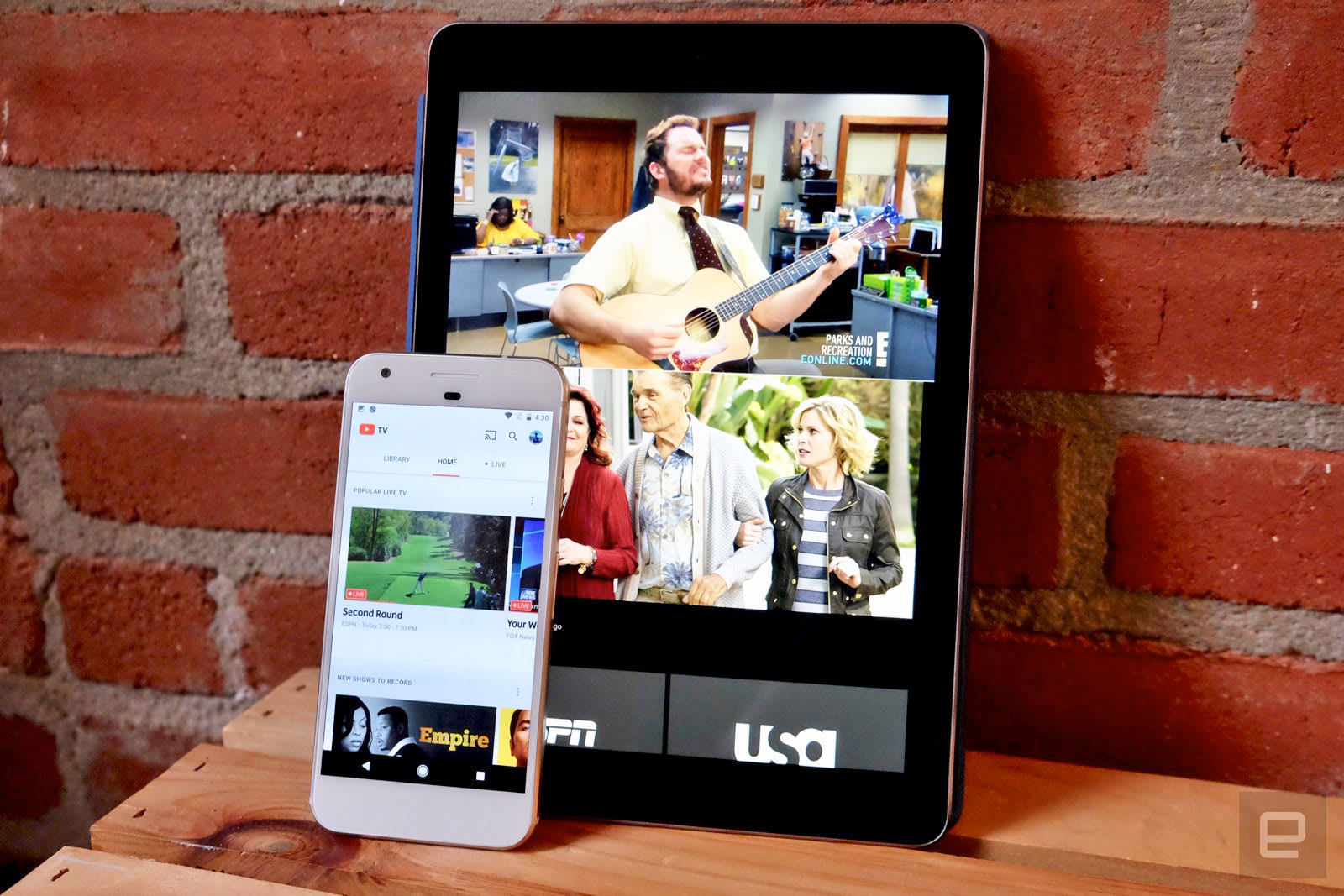
YouTube TV’s Live Guide now shows week-long schedules on desktop
What’s on TV this week: ‘The Mandalorian’ season finale

Ford’s next Focus RS may be a powerful hybrid

Congress worries sale of .org could harm non-profits
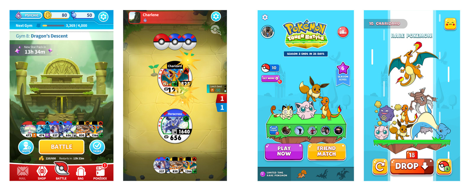
Pokémon games are available to play on Facebook
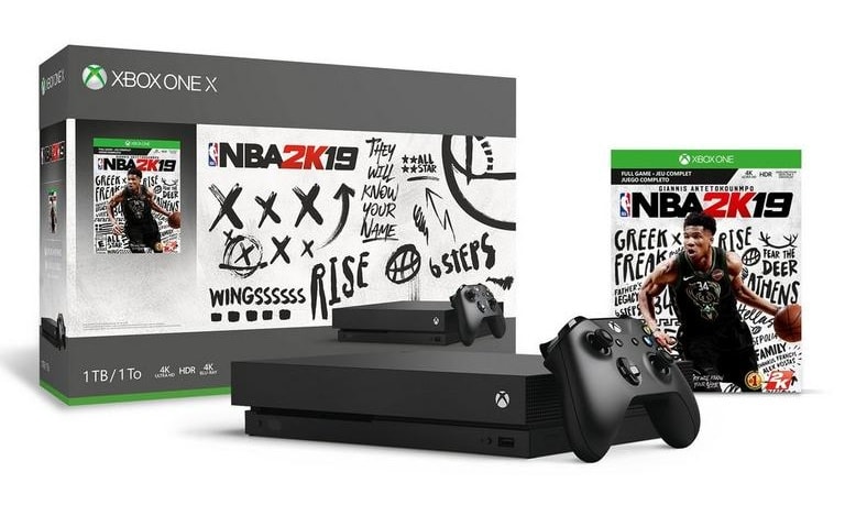
GameStop’s $250 1TB Xbox One X deal is as cheap as 4K gaming gets
Judge strikes down NYC law limiting Uber and Lyft driver cruising time

Tesla’s Holiday Update improves Camp Mode and driving visualization
How to Apply the Satin Setting to Layer Style Effects

While the Photoshop Satin effect is one of the less used layer styles, it can easily bring your artwork to the next level as long as you become familiar with the way it behaves.
The Satin layer style can be used to add a Photoshop satin texture or create a Photoshop satin background. So, if you want to learn how to add satin in Photoshop or create a satin texture in Photoshop, then this tutorial should be a great starting point.
Follow along with us over on our Envato Tuts+ YouTube channel:
The Uses of Satin
Satin is one of the more obscure settings within Photoshop Layer Styles, but if you know how to use it, you can create a few different effects.
In addition to creating a silk or satin look, it can also be used to add additional depth and even more realistic detail to glass and metal effects.

The Layer Styles Satin Dialog Box
Satin creates two copies of your layer, then offsets and blurs them to produce the final result. You may not be able to picture it, but it is easy to understand once you see it in action.
There isn’t much to the Satin dialog box, and we have seen most of these settings before. All that’s left to do is jump in and see how they interact with each other.

Blend Mode
The Blend Mode allows you to set the blending mode for your Satin, while the color box, as expected, allows you to choose the color.
A good place to start is Linear Burn using the color black, or Linear Dodge (Add) using the color white. This will allow you to see how Satin works, while at the same time applying the most realistic effect.
If you are unfamiliar with how all the different Blending Modes work, I highly recommend checking out the Blending Is Fun Basix tutorial.

In the following example, using a white color with Linear Dodge (Add) as the blending mode lightens our text, while using black with Linear Burn as the blending mode darkens it.

Opacity
Our good old friend, Opacity. A smaller number here makes for a subtler effect, and increasing the Opacity makes it more pronounced.

In the following example, you can see that a lower Opacity has a predictably subtler impact on our final effect.

Angle
The Angle spinner sets the angle at which our Satin effect is offset from the original shape. You can enter a number in the box, or drag the line around using your mouse.

The following example may not be the prettiest, but it clearly shows how adjusting the Angle can change the look of your style. Used in conjunction with other effects, changing the Satin Angle can help you get more realistic lighting.

Distance
The Distance slider changes the distance that the Satin gets offset from our original shape. This is extra helpful when you are trying to create reflections for glass styles.

In the following example, you can see how slightly increasing the Distance of our white Satin effect gives us bigger reflections on our glass text.

Size
The Size slider sets the blur size of the Satin. The larger the value is, the blurrier it gets. A modest Size value will typically yield the most realistic results.

In the following example, the lower Size setting gives the lighting on our cookie style a harder edge.

Contour
Contour curves change the falloff of the Satin effect. A linear or slight “S-curve” would be the best to begin with. More dynamic Contour shapes can help you get more interesting reflective effects.
The Anti-aliased checkbox will smooth out any hard edges when checked, and the Invert checkbox will flip your Contour upside down.

In the following example, you can see how changing our Contour gives us a more reflective-looking double highlight on our text.

Saving and Loading Default Settings
You can save and load default settings for each effect in the Layer Styles dialog box. When you click Make Default, Photoshop will store whatever settings are currently active as the new default settings for that effect.
If you click Reset to Default, on the other hand, Photoshop will then load whatever settings were last saved. This allows you to experiment and simply reload the default settings if you want to start over.

Expand Your Layer Styles Library
Want to build an extended Photoshop Layer Styles library, but don’t quite have the time to make them yourself? Well, if that’s the case then you should definitely head over to Envato Elements, where you’ll find a great selection such as these ones:
Holo Layer Styles
Give your artwork a fresh new take using this incredible holographic layer style pack, which is bound to turn heads.

Pressed and Embossed Book Cloth Layer Styles
Take your text to the next level using this incredibly realistic pressed and embossed book cloth layer styles pack. I guarantee that it will help you stand out.

Corsair and Pirate Layer Styles
Always dreamt of being a pirate? Well guess what, now you can using these handcrafted corsair and pirate layer styles.

Expand Your Photoshop Skills
Just started out using Adobe Photoshop and feel like learning more? Well, today’s your lucky day since I’ve put together a little list of tutorials that should get you going for the following days!
-

The A to Z of Adobe Photoshop
Adobe Photoshop CC (and versions before it) is filled with tools, panels, and effects meant to give users as much control as possible over their… -

Introduction to Photoshop Layer Styles
Photoshop layer styles are a popular way to add effects, such as drop shadows and strokes, to layers in a non-destructive way. With the right knowledge and… -

How to Create a ‘Stranger Things’ Inspired Text Effect in Adobe Photoshop
Learn an easy way to create a Stranger Things series inspired text effect, using only layer styles and some simple adjustments. -

How to Create a Stylized Chalk Text Effect in Adobe Photoshop
Use a texture, a couple of filters, and some drop shadow effects to create a super easy and quick stylized chalk text effect -

How to Create a Disney Frozen Inspired Text Effect in Photoshop
In this tutorial we are going to create a text effect inspired by the ‘Frozen’ Disney movies. The main concept is to show you how to create an ice texture… -

Quick Tip: Create a Glass Text Effect in Photoshop Using Layer Styles
In this quick tip tutorial we will show you how to create a glass text effect using layer styles in Photoshop. Let’s get started! -

How to Create a Cloud Effect in Photoshop
Learn how to create a cloud effect in Photoshop using a simple cloud brush and a sky texture with fluffy clouds. -

How to Create a Flame Text Effect in Adobe Photoshop
Use Photoshop’s Flame filter, along with blending options, filters, and adjustment settings, to create a blazing, fiery text effect. -

How to Create a 3D Gold Text Effect With Photoshop Layer Styles
In this tutorial, you will learn how to create a 3D metallic gold text effect using layer styles in Photoshop. -

100 Best Photoshop Text Effect Tutorials
Love text effects and text design? Dive into this massive list of 100 awesome text effect tutorials from Envato Tuts+ to inspire your next project!
{excerpt}
Read More
Twitter blocks animated PNGs to keep trolls from using them to trigger seizures (updated)
Believe it or not, the Wii U is getting a ‘new’ game
Apple Arcade standout ‘Assemble With Care’ is coming to PC next year
How to Remove "Powered by WordPress" From the Footer
{excerpt}
Read More