Category: Tutorials
Tutorials,freelance,projects,joomla,php,mysql,wordpress,blancer.com
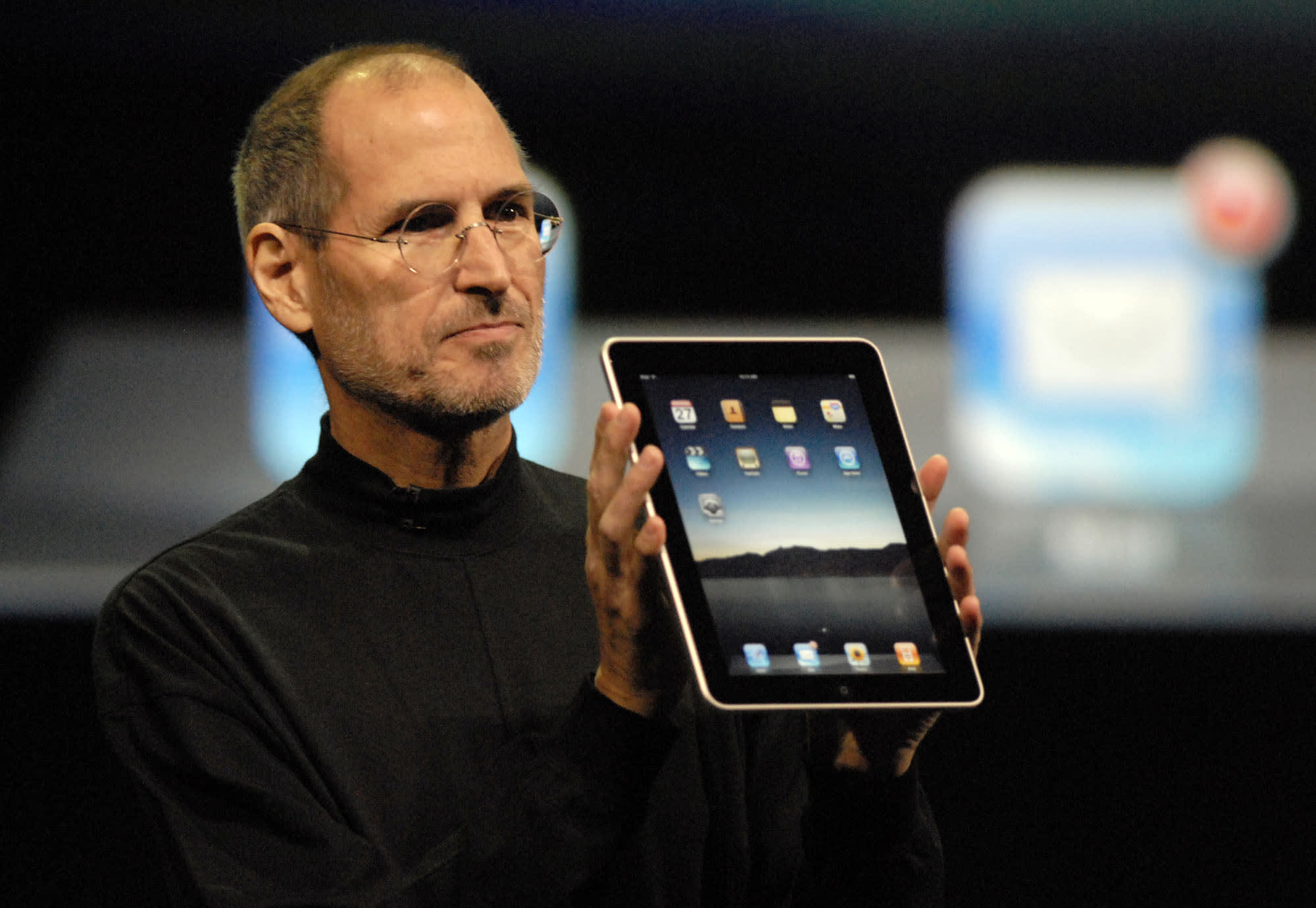
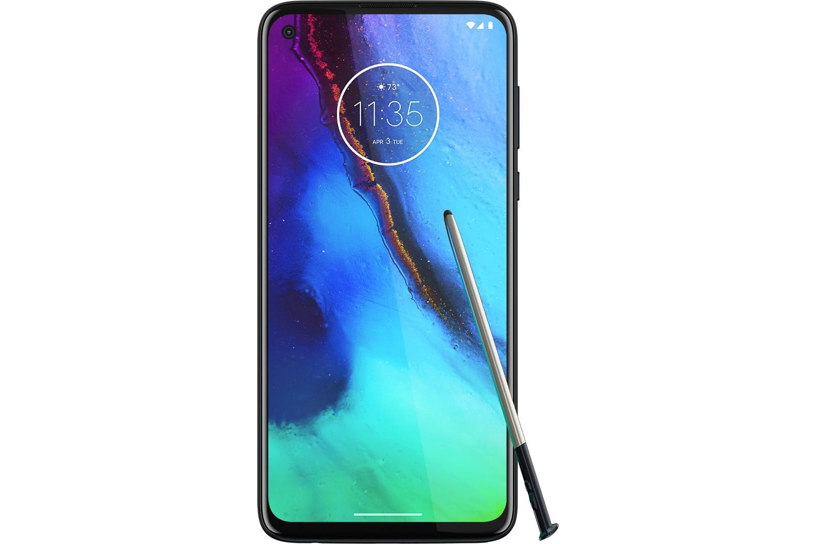
Motorola may be working on a pen-equipped Galaxy Note rival
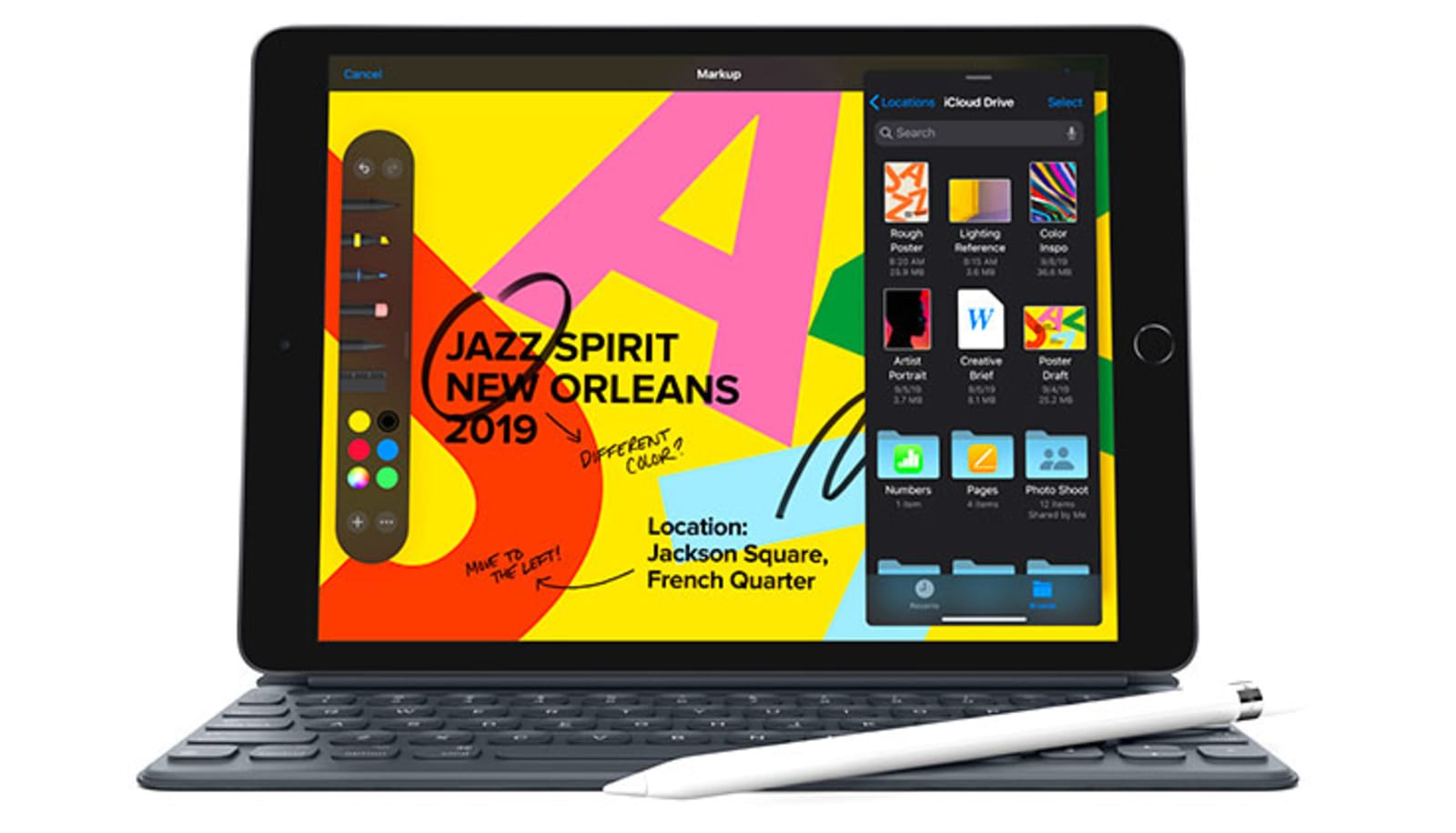
Apple’s latest iPad is back down to $250 in Amazon’s tablet sale
How to Create a Barber Shop Logo

In the following steps, you will learn how to create an old-school barber shop logo in Sketch.
For starters, you will learn how to create a custom artboard and how to set up a simple grid. Using simple shapes and paths and some stroke styling techniques, you will learn to create the main components of your barber shop logo. Moving on, you will learn how to add simple text and place it on a path.
Finally, you will learn how to import a vector outline and incorporate it into your old-school barber shop logo.
Cut out the hassle of creating logos and try a barber shop logo maker. Explore an amazing collection of barber shop logo ideas from Placeit to easily create your own barber shop logo!
What You Will Need
You will need the following resources in order to complete this barber shop logo design:
- Ponds Grunge font
- Barbershop vector set
1. How to Create an Artboard and Set Up a Grid
Step 1
Go to Insert > Artboard from the toolbar or menu (or press A). The Inspector will reveal a list of presets, but we’ll create a custom size artboard. Simply click and drag inside your canvas to create a new artboard.
Make sure that your artboard stays active, and focus on the Inspector on the right. Set the Width and Height to 850. Once you’re done, hit Escape to deselect your artboard.

Step 2
You’ll need a grid so that you can easily create pixel-perfect objects. First, go to View > Canvas > Show Grid (Control-G) to enable the grid.
Next, go to View > Canvas > Grid Settings… to edit your grid. Enter 10 px in the Grid block size box and 1 in the Thick lines every box to get a gridline every 10 px. Click the Dark Color box, set the color to black (#000000) and lower the Opacity (Alpha) to 10. Now that everything’s prepared, let’s start work on this barber shop logo design.

2. How to Create the Background and the Main Pieces of the Barber Shop Logo
Step 1
Go to Insert > Shape > Rectangle from the toolbar or menu (or press R). Create an 850 px square and make sure that it covers your entire artboard. Hold down the Shift key while dragging to create a perfect square. Go to View > Canvas > Show All Guides to enable the Smart Guides that will help you see when your shape is perfectly centered.
Make sure that your square stays selected, and focus on the Style section from the Inspector panel. Uncheck that little box to disable the existing Border and then change the Fill color to #E7C891.

Step 2
Go to Insert > Shape > Oval from the toolbar or menu (or press O). Create a 520 px circle and make sure that it stays selected. Hold down the Shift key while dragging to create a perfect circle.
First, focus on the top of the Inspector panel and use the X and Y input fields to position your selection on the artboard. Enter 160 in both boxes, and then move the Style section from the Inspector panel. Disable the Border and set the Fill color to #222129.

Step 3
Go to Insert > Shape > Oval from the toolbar or menu (or press O). Create a 500 px circle, make sure that it stays selected, and place it as shown in the following image. Once again, the Smart Guides will make this easier.
Go to the Style section from the Inspector panel, disable the Fill, and focus on the Border. Check the Inside button and increase the Width to 10. Enter 5.0 in the Dash and Gap boxes, and then click the color button and change it to #E7C891.

3. How to Add a Horizontal Ribbon to Your Barber Shop Logo
Step 1
Go to Insert > Shape > Rectangle from the toolbar or menu (or press R). Create a 540 x 80 px circle, make sure that it stays selected, and place it as shown in the following image.
Focus on the Style section from the Inspector panel, disable the Border, and change the Fill color to #E7C891.

Step 2
Make sure that the Rectangle Tool (R) is still active. Create a 20 x 30 px rectangle, make sure that it stays selected, and place it as shown in the following image.
Focus on the Style section from the Inspector panel, disable the Border, and change the Fill color to #222129.

Step 3
Double-click inside the rectangle made in the previous step to activate Edit mode. Select the top-right anchor point and remove it using the Delete key.
Hit Esc to leave Edit mode, and then hit Command-C to copy your selection. Hit Command-V to add a copy of your triangle, and place it as shown in the third image. Make sure that it stays selected, and go to Layer > Transform > Flip Vertically.

Step 4
Go to Insert > Shape > Rectangle from the toolbar or menu (or press R). Create a 10 x 20 px rectangle, make sure that it stays selected, and place it as shown in the following image.
Focus on the Style section from the Inspector panel, disable the Border, and change the Fill color to #222129.

Step 5
Double-click inside the rectangle made in the previous step to activate Edit mode. Select the top-left anchor point and delete it, and then select the bottom-left anchor point and drag it 10 px up, as shown in the third image.

Step 6
Select your three triangle shapes and duplicate them (Command-C > Command-V). Make sure that only the copies remain selected, and drag them to the left side of your design.
Go to Layer > Transform > Flip Horizontally to flip your selection, and then go to the top of the Inspector panel and click the Align layer to left button. In the end, things should look like in the fifth image.

4. How to Add the Central Pieces of Your Barber Shop Logo
Step 1
Go to Insert > Shape > Oval from the toolbar or menu (or press O). Create a 280 px circle, make sure that it stays selected, and place it as shown in the following image.
Focus on the Style section from the Inspector panel, disable the Border, and change the Fill color to #E7C891.

Step 2
Using the Oval tool (O), create a 260 px circle, make sure that it stays selected, and place it as shown in the following image.
Go to the Style section from the Inspector panel, disable the Fill, and focus on the Border. Check the Inside button and increase the Width to 10. Enter 5.0 in the Dash and Gap boxes, and then click the color button and change it to #222129.

Step 3
Using the Oval Tool (O), create a 220 px circle. Make sure that it stays selected and place it as shown in the following image.
Focus on the Style section from the Inspector panel, disable the Border, and change the Fill color to #222129.

5. How to Add Text on a Path
Step 1
Using the Oval Tool (O), create a 420 px circle, make sure that it stays selected, and place it as shown in the following image.
Go to the Style section from the Inspector panel, disable the Fill, change the Border color to white (#FFFFFF), and increase its Width to 5. Once you’re done, hit Option-Command-C to copy the Style attributes of your selection. You’ll learn how to easily paste these attributes to a new shape in one of the next steps.

Step 2
Make sure that your white stroked circle is still selected, and go to Layer > Path > Scissors. Use simple clicks to remove the top sides of your selected shape, as shown in the following images.

Step 3
Go to Insert > Text from the toolbar or menu (or press T). Click once on your artboard to create a text field and focus on the Text section from the Inspector panel.
Select the Ponds Grunge font, set the size to 65 and the Character spacing to 3, change the color to #FDEDD1, and then simply type “SHAVES & CUTS”.
Make sure that this piece of text stays selected and go to Text > Text on Path. Drag your text towards the white stroked path and let it snap into place. Remember that when you want to add text to a vector path, the path should be below the text in the Layer List.

Step 4
Reselect the white stroked path, go to the Style section from the Inspector panel and simply disable the Border.

Step 5
Using the Oval Tool (O), create a 340 px circle. Make sure that it stays selected, place it as shown in the following image, and hit Option-Command-V to instantly paste the Style attributes copied a few steps ago.

Step 6
Make sure that your white stroked circle is still selected, go to Layer > Path > Scissors, and delete the bottom sides of your selected shape, as shown in the following images.

Step 7
Go to Insert > Text from the toolbar or menu (or press T) and add a new text field.
Make sure that the Ponds Grunge font is still selected, set the size to 75 and the Character spacing to -4, keep the existing color (#FDEDD1), and then type “BARBER SHOP”.

Step 8
Make sure that your new piece of text stays selected and go to Text > Text on Path. Drag your text towards the white stroked path and let it snap into place. Now, your text will snap on the inner side of that path. To move it on the outer side of the path, simply go to Layer > Path > Reverse Order.

Step 9
Reselect the white stroked path, go to the Style section from the Inspector panel, and disable the Border.

6. How to Add Text and the Scissors Outline to Your Barber Shop Logo
Step 1
Use the Text Tool (T) to add the “EST.” and “1987” text. Use the same font, set the size to 40 and the Character spacing to 2, and change the color to #222129. Place this new text as shown in the following images.

Step 2
Copy the scissors outline from this Barber Shop vector set and paste it inside your Sketch document. Select it, click the Rotate button from the Toolbar, and rotate your selection as shown in the following image. Hit Esc to exit Rotate mode, and scale your selection to fit that dark inner circle, as shown below. Once you’re done, change the color of your scissors to #E7C891.

Congratulations! Your Barber Shop Logo Is Done!
Here is how your old-school barber shop logo should look. I hope you’ve enjoyed this tutorial and can apply these techniques in your future projects. Don’t hesitate to share your vintage barber shop logo in the comments section.
Feel free to adjust this barber shop logo design and make it your own. You can find some great barber shop logo ideas at GraphicRiver, with interesting solutions to improve your design.

Barber Shop Logo Ideas From Placeit
Cut out the hassle of creating logos and try a barber shop logo maker. Explore an amazing collection of barber shop logo ideas from Placeit to easily create your own barber shop logo!

Want to Learn More?
Check out the following logo design tutorials:
 Logo DesignCool Logo Maker: 20+ Minimalist Logo Designs to Customize (2018)Melody Nieves
 Logo DesignWhat Makes a Good Logo? 7 Top Logo Design Tips & GuidelinesNona Blackman
 Logo DesignThe Best Free Logo Design Template Kits (New for 2017)Melody Nieves
 Adobe IllustratorHow to Design Gradient-Based Logos in Adobe IllustratorDaniel White
 Text EffectsHow to Create a Quick Burnt Wood Text Effect in Adobe InDesignGrace Fussell
 TypographyHow to Create a Jack Daniels-Inspired Whiskey Label in Adobe InDesign & IllustratorGrace Fussell
 Logo DesignTypography in Action: Design Simple & Effective Type LogosGrace Fussell
 Logo DesignHow to Create a Nautical-Themed Logo in Adobe IllustratorAndrei Marius
 BrandingHow to Create Your Own Brand GuidelinesGrace Fussell
 TypographyHow to Create a Nautical Tattoo FontChris Carey
{excerpt}
Read More
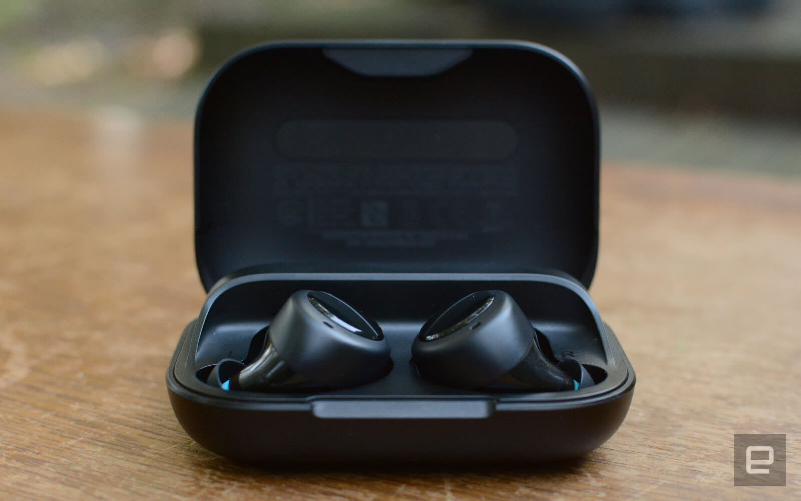
Amazon slashes Echo Buds to $90
12 Best CRM & Project Management PHP Scripts
{excerpt}
Read More
The Morning After: Be careful with Motorola’s Razr

Watch the first full trailer for Netflix’s divisive ‘Ghost in the Shell’ series

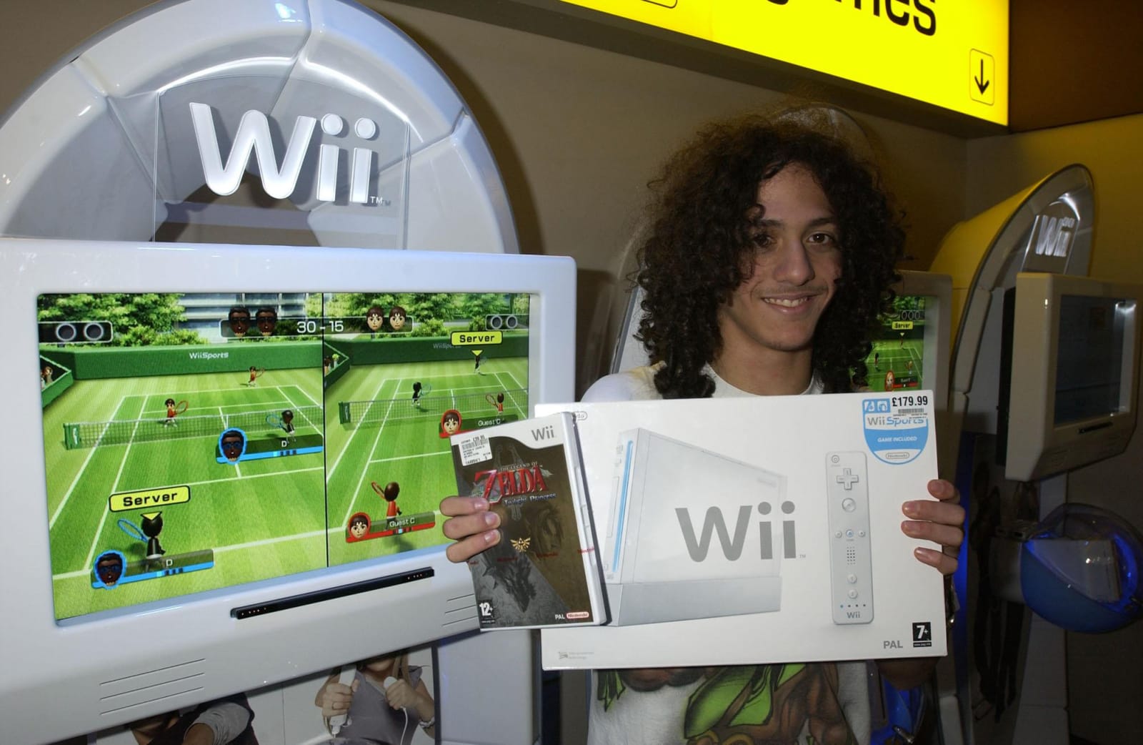
Nintendo will stop repairing Wii consoles in March
29 Best Phone Case Mockups (Using a Generator Without Photoshop!)

Are you trying to figure out how to create phone case mockups in Photoshop? Well, forget about Photoshop—we’ll show you how to create cool mockups in no time at all using a mobile case mockup generator. We’ll also show you 29 awesome cell phone case mockups you can customise with it.
How to Use a Mobile Case Mockup Generator
1. Navigate to Placeit’s Cell Phone Case Mockup Page

2. Select a Template You Like

3. Upload Your Design and Add Additional Text to the Template if Needed

4. Set the Background Colour if Needed

5. Download Your Cell Phone Case Mockup. It’s as Simple as That!

Now that you know how to use the mobile case mockup generator to create awesome phone case mockups, it’s time to take a look at the 29 best phone case mockup templates available at Placeit.
29 Best Cell Phone Case Mockups
1. Wallet Case Mockup of an iPhone X Featuring a Man Smiling

If you’ve ever seen a phone with a shattered screen, you know why this style of phone case is so popular, making this mockup phone case a great way to display your latest design.
2. iPhone 6s Case Mockup

A completely different style of case than the one above (and probably the most popular of all case styles), this mockup features an iPhone 6 against a transparent background, which allows you to place your mockup into any background easily.
3. Phone Case Mockup of an iPhone 6 Leaning Over a Null Background

If you want the transparent background but want a more dynamic image of a phone in its case, try this template, which features an angled view of a mobile phone complete with a shadow for added realism.
4. Wallet Case Mockup

A great mockup phone case of an everyday action, this template features a man putting his wallet phone case in the pocket of his jeans. To add your design to this mockup, just use the mobile case mockup generator to upload your image.
5. Mockup of a Woman With a Wallet Case

The thing that makes mobile phones so indispensable is their portability, and as big as the iPhone 7 Plus is, it’s still super portable. That’s why this mockup phone case of a woman putting her iPhone 7 Plus into her handbag is a great one for designers looking to show off their creations.
6. Mockup of a Woman Showing Her iPhone 8 Plus Wallet Case

This mockup phone case is just super, with its groovy and colourful background and image of a woman holding her iPhone up to the viewer. It’s as if she’s giving your awesome design a rousing endorsement.
7. Mockup of a Woman Holding an iPhone Case in Front of Her Face
Keep your design front and centre with this cell phone case mockup featuring a young woman with a mobile phone held in front of her to cover the lower half of her face.
8. Mockup of a Woman With Blue Eyes Holding a Phone Case

Here is a variation on the mockup above, featuring the same model. In this phone case mockup, the phone is only obscuring a small part of the model’s face, making the mockup less mysterious than the example above this one.
9. Mockup of a Hand Holding a Wallet Case for iPhone X

One of the things that’s really cool about this mockup phone case is that it not only gives your viewer a clear image of your design, but you can also change the background to any colour you like. You can even make it transparent for those times when you need to blend the mockup into another background.
10. iPhone Case Mockup Featuring a Woman Smiling at Her Phone

This mockup delivers a scene that is familiar to people all around the world—someone taking a photo with their mobile phone. Aside from this being a wonderful upbeat image, it’s also a great way to advertise your designs.
11. iPhone 6 Case Mockup in a Woman’s Pocket

For those times when you need a cell phone case mockup you can integrate into any scene of your choosing, there is this template with its transparent background, And if you like the mockup but would prefer a solid background, no problem. You can add a background of any colour to this image with just one click.
12. Mockup of an iPhone Case and a Woman Wearing a Brown Sweater

This is a beautiful phone case mockup of a very cheerful young woman holding her phone up to her ear as if listening to someone on the other end of the line. Though her hand obscures the lower part of the phone, the most important area where you design would be placed is unobstructed so viewers can see it clearly.
13. Phone Case Mockup of a Man Making a Call at a Park

Here’s the male model version of the mockup phone case template above. Upload your image and download your mockup in seconds.
14. Mockup of an iPhone X Wallet Case on a Three Colored Background

We’ve featured a good selection of cell phone case mockups with solid colour backgrounds, but here’s one that allows you to add three different colours to the background. How cool is that? Why not have some fun and jazz up your mobile phone case mockup with your favourite colours?
15. Mockup of a Woman Holding a Phone Case Near Flowers

This great image of a young woman surrounded by flowers, holding up her phone so your design would be clearly visible on the case, is a great choice of cell phone case mockup. Just upload your gorgeous image, and just like that you’ve got a terrific mockup ready for use.
16. iPhone Case Mockup Lying Over a Wooden Surface

A simple and no-frills way to display your designs is with this mobile phone case mockup, which features a simple display of two mobile phone cases lying on a wooden table. Upload your design using a mobile case mockup generator, and just like that you’ve got a great mockup ready for download.
17. Mockup of a Wallet Case for iPhone 11

All eyes will be on your design with this mockup for an iPhone 11 case. The mockup features the iPhone in its case sitting on a table in the foreground with the case open and facing the viewer.
18. Phone Case Mockup Featuring a Woman Wearing a Silver Ring

Maybe she’s taking a photo of her friend, maybe she’s taking a selfie, maybe she’s reading a text. Either way, this is a great mockup because it creates a photorealistic scene with a very clear view of the area of the phone where your designs will go.
19. Render Mockup of an iPhone Case Lying Over Another iPhone

Sometimes two is better than one. Upload your design to one mockup phone case, choose the colour of the other, and then choose the colour for your background—or go with transparent if you want to blend the mockup into another scene.
20. Mockup of an iPhone 6 Plus Case Over a Yellow and Blue Background

Why not use a split-tone background for your mobile phone case mockup? It’ll add some pizazz while keeping your design central to viewers. Go for it!
21. Mockup Featuring Three Different iPhone Cases

Why settle for showing off one design when you can show off three designs? What’s also cool is that you can add whatever colour you want to the background of the image.
22. iPhone Case Mockup Featuring a Pretty Woman Taking a Picture of a Cookie

Another ubiquitous modern phenomenon—the perpetual photographing of food, and a great cell phone case mockup which will keep your designs clearly in view.
23. Wallet Case Mockup of a Woman Checking Her iPhone 8 Plus

Maybe you like the image above but want a wallet case instead. Obviously, this isn’t the same image, but it does offer a very clear view of your design on a wallet case being used by someone deeply engrossed in their phone. Upload your design and see if this template works for you—or try the wallet phone case mockup below.
24. Mockup of an iPhone 7 Plus Wallet Case

We featured a couple of phone case mockups with transparent backgrounds, but for those looking for that style with a wallet case, here it is. This is a great template for focusing all the attention on your designs, and remember that if you decide that you prefer a solid colour background, you can select whatever colour you want in the colour picker section.
25. iPhone Case Mockup Featuring a Trendy Woman With Sunglasses

Looking for a cool and trendy lifestyle phone case mockup for your designs? Well, this is the template for you. It features a stylish young woman checking her phone against a city background, with her mobile held up so the area where your design goes is clearly shown. What more could you ask for?
26. Wallet Case Mockup Featuring a Charging iPhone X

This is a scenario that is familiar to most mobile phone users and therefore great as a cell phone case mockup. Use the mobile case mockup generator to upload your image, and your mockup is ready for use.
27. iPhone Case Mockup of a Man Taking a Photo at the Park

Lemme take a selfie! Or maybe he’s video chatting for the whole world to hear. What’s important is that this phone case mockup gives your design its proper place by keeping it front and centre of the image.
28. iPhone 6 Plus Case Mockup Against a Purple Background

Lovely purple and pink. Create your own analogous or complementary colour pairing with this duotone template. Then upload your designs to complete your own fabulous mobile phone case mockup.
29. Mockup of a Phone Case Over a Gradient Background

Finally, check out this solid background phone case mockup with a twist. After you upload your design, you can have a play with the background to see what two-colour combination you want to use to create a delightful gradient background that complements your design.
Take a Phone Case Mockup for a Spin Today
Have you found a cell phone case mockup template you love here? Why not add your design to a mockup and share it with us in the comments below?
And remember, all of these designs are super easy to create. Just follow the steps in the tutorial above, and your mockup will be ready to download in no time.
If you’re interested in other kinds of mockups, here are some articles with great suggestions for you:
 iPhone Mockup21 Best iPhone 11 Mockups (Pro & Pro Max)Nona Blackman
 Pillow Mockup34 Best Pillow Mockups (Using a Pillow Mockup Generator)Nona Blackman
 Product MockupHow to Create a T-Shirt Mockup Using a T-Shirt Mockup GeneratorNona Blackman
 Product Mockup30 Best iPad Mockup Templates (PSD & PNG) With Realistic ResultsNona Blackman
 Product Mockup22 Best Magazine Mockups Using an Online Generator (Cover, Layout, Flat, and More)Nona Blackman
 Mac21 Best MacBook & Laptop Mockup Templates (Including iMac & MacBook Pro PNG Mockups)Nona Blackman
{excerpt}
Read More
Typography and Fonts: Analysis and Interviews

What makes a really good font? How about typography—how do we, as designers, make our type work really well in a composition? Let’s take a look at what makes type tick—what makes a good font? How would you describe great typography?
We’ll examine those subjects and offer some food for thought. Then, stay tuned from some insights and inspiring works from several type designers. Their works really got me inspired, and I hope they inspire you too!
Ready to dig into some type? Let’s get started.

What Makes an Awesome Font?
There are so many wonderful fonts out there to choose from! But what makes a really great font work well?
Ultimately, the answer is going to depend on the project in question—we, as designers, need to arm ourselves with the visual communication skills to make the most informed choice. However, there are a few things we can universally consider, whether we’re choosing a font or designing one of our own:
How does the type visually communicate? This is more than what the words literally say. Shape, texture, and line can be very communicative. For example, check out Costa La Vista, a font duo by LeoSupply, below. I find the combination to be bold and energetic. I probably would not use this for something like a sympathy card, but it could work great for a party invite. Why? Because one font has a lot of fun, informal movement, while the other is bold and rather “loud”. They could be a great fit for a project with similar communicative goals.

Good Typography Is More Than Good Looks
Great typography is more than a stylish or trendy looking font, and it’s more than type that embodies a concept or aesthetic. That’s not to say the aesthetic of the font itself isn’t important—it most certainly is, and can be very communicative too—but there’s still more to digest here.
Personally, I feel that good typography should look and feel natural; it should be effortless for the viewer to consume. For example, if the type looks great but it hurts readability or legibility, we lose the primary function of the type.
It’s form, function, and ease of use—it should look good, it should work properly, and the experience should be effortless for the viewer.

We could go on and on about type’s anatomy and best practices—that could be a whole separate article—but I, personally, always like to keep these three tidbits in mind:
Legibility—how easy is it to read the type? For example, some fonts might not be as legible at smaller sizes, or too much space between the letters can make words read in a disjointed way.
Readability—likewise, how hard is it to read the type as a group? Does the line spacing or word spacing make the sentences feel disjointed? Or do they flow in a natural way that is easy to read?
Complements—do your type choices complement one another? Or do they fight each other for visual dominance?
However, again, we can’t neglect the importance of purpose. Your project and its goals are going to ultimately determine the best approach to these points, and others too.
As an example, take a look at the font Hastron, below, by Vunira. The font has been presented here with a sans serif typeface in a sample composition. Notice how the sans serif is smaller and a “background singer”, in the band that is this composition—it is supporting the star of this show.

Looking at an Example
So let’s take a look at some strong typography in action.
Generally speaking, when working with type, it’s a great idea to keep the Principles of Design in mind—they are typically our primary building blocks as designers. For example, take look at the example by Khurasan, below—notice how scale helps establish hierarchy, not only in the type, but in the entire composition.
Again, that’s not to say our type choices themselves don’t also communicate visually. They most certainly do! A clean sans serif typeface, for example, could be a perfect fit for something sleek and stylish, like a fashion show. On the other hand, a traditional serif typeface might be just the right fit for a formal invitation. There’s no definitive right or wrong answer there—and that’s where we, as designers, come in. We not only have to be great at composition, but we also have to think about the communicative aspects of our work.

New to the principles of design? Looking for a refresher? Here’s some info that might help you out!
-

The Principles of Design
Have you ever wondered what goes into the creation of a successful design piece? Here are some visual tools that can help you structure your design…
That said, I had the pleasure of speaking with a number of designers about their thoughts on typography and fonts. I think there’s a lot of value in listening and observing other creatives; we can learn a lot from one another!
Let’s take a listen to some of their insights and opinions—and take a look at their inspiring work too!
Julia Martinez Diana | Antipixel Type Studio
My name is Julia Martinez Diana, I’m a graphic designer graduated from the University of Buenos Aires (FADU, UBA). I’m the founder and designer at my independent type design studio Antipixel, with main focus on display handwritten typefaces. Some of my studio’s most popular type families are Austral Slab & Austral Sans, LeOsler, Escalope, the Aracne collection, and my latest, Pasto.
I have a particular interest in irregular and unique forms, therefore I invest a great deal of time in adding textures and layers to my compositions to give depth, making them interesting and different. This is where the Open-Type features come in handy, most of my typefaces have 3 alphabets that are automatically alternated to avoid repeating characters, enhancing the handwritten feel. Ligatures & Stylistic Alternates are normally included too.
Typography is one of the main components of graphic design. Not only [does] it help present the message, but it’s a visual content that complements the graphic universe itself. I have always enjoyed this about type, and my main goal is to consistently create typefaces that by themselves can transmit an idea, a message, and add up to the graphic universe of possible users.
I’m inspired by those beautiful glyphs hidden in every font family. I like to celebrate characters from other languages alphabets, stylistic alternates that let you customize your work, and even icons matching the font style. From an asterisk to an accented character, each glyph has a story to tell.
Firstly, good typography needs to have high-quality glyph construction & traces. Kerning is also essential since good spacing makes reading easier and gives visual order.
Additionally, I believe that language support is very important. At the moment of creating a typeface, I pay great attention to having a large glyph coverage. As a Spanish speaker, I have always given credit to those typefaces that include characters like “á” and “ñ”, so it is very important to cover a variety of glyphs that will allow people to use the type freely without having this kind of stepbacks.
For using type effectively, an important step of designing is choosing the right typeface/s since each project has its own personality. It has to be accordingly to the graphic style of that particular design, and be able to adapt to any possible usage amongst the project.
Here are some questions you could ask to evaluate if that type fits or not! Can it be used in small and large sizes, or do I need different typefaces for each instance? Does this type reflect the impact I’m achieving? Does it work along with the illustrations/images? Is the style of the font according to the message of the project?
Creating typefaces is a long and hard process that requires a lot of patience, but it can be achieved! Don’t give up!
It is super important to always work with a goal, to know where you are headed! You can start with some references, other designs you’ve liked, art pieces, color palettes, and anything that inspires you. After you design key characters, use them to create further glyphs to help create a consistent visual universe. Constants are very important in a typeface to help assimilate the information and perceive it as one graphic/type system.
But don’t limit yourself, be free, and go with your gut when you sense the characters are working together!
Check out more of Julia’s lovely type work here:
Ijajil
My name is Ijajil, I’m a 37 year old graphic designer & illustrator from Jakarta, Indonesia. I am currently working on projects for my client’s commission and for Envato Elements, focus[ing] on logo and font design.
I don’t have any formal design education background, I’m a self-taught person and I love challenging myself to develop. In 2006 I started my business as a website designer and got local clients under the name KreasiMalam. In 2012 I began to leave the website project and became an Envato author, focus[ing] on logo design and branding, I sold logo templates and corporate identity templates. In 2015 I started learning typography, especially lettering and font design.

Typography is very important in design to deliver a message. Being able to express and build mood from letters is a very pleasant thing. How we give [that] impression and mood [can vary in a] limited number of letters.
Inspiration can come from anything. I really love vintage typography from ephemera and product labels. I always start from scratch; pencil and paper are very effective tools. With pencil and paper you can explore and determine your style and to find out if your design is going to work or not, so that you can fix it easily before continuing to the next stage.

I think good typography is not only beautiful to look at or eye-catching, but can also express and convey the messages of a design, reinforce the meaning of the text, have good proportion and balance.
Good typography can also play a role in taking over attention or leading attention, functional, readable, understandable, can be applied to various media, also can change the feel of a space.
To use type effectively is to be concerned about typography principles such as kerning, hierarchy, spacing, alignment, color combinations, shapes, sizes, and letters combinations. If all of the principles can be fulfilled then good typography will be achieved.

The most important thing for designers is to learn the basics. Learn from calligraphy and hand lettering. Start with paper, pencil or brush. Be patient in practicing these basic things. Practice and repeat until you feel settled. By learning these basic things, you will also be able to find your style and develop it.

You can make a good work but it has to be unique and different, it is not an easy task. Don’t think about making works that “sell-out” but make unique and different stuff so people can recognize your works. Be original! Result takes time, so be patient in the process.
Be sure to check out more of Ijajil’s work here:
Vunira
I am a graphic designer since 2010, focusing on passive income selling in the marketplace, and currently I am building a small team to create design assets, and have several stalls in [many] design marketplaces.

Type designers take care of the details, so that we aren’t unnecessarily distracted by them. And good type designers relish those details. My role model from the world of typography is the Arabic calligrapher who wrote the Holy Qur’an by hand for many years, Uthman Taha.

Good typography is measured by how well it reinforces the meaning of the text, not by some abstract scale of merit. Typographic choices that work for one text won’t necessarily work for another. Corollary, good typographers don’t rely on rote solutions. One size never fits all. But, sometimes I interpret “GOOD TYPOGRAPHY” [as] easy to see, easy to remember, easy to read.

Be yourself, don’t be limited by one style, explore everything you want to do, until others know that you made the alphabet and numbers on their computer.
You can view more of Vunira’s work here:
Leonard | LeoSupply
I’m a self-taught font designer. Started with design back in 2009, first I started with Photoshop and photo manipulations, that was something I was intrigued by and that was a trigger for the learning of other design techniques in graphic design.

After this, I began watching tutorials, learning, and experimenting. I needed 4 years to come to learning font design, so in 2013, I created my first font. As I didn’t stop on fonts, now I have a big collection of created fonts, brushes and designs behind me that I sell or share with other designers.

Typography, as all other art directions, is a way of your own communication with people, no matter what words are on the ”paper” or ”display”, typography itself gives the message. What I enjoy the most about typography is that you could really change how will people communicate no matter what is on the ”paper”.

I really enjoy exploring, drawing and designing and generally find inspiration all around me but mostly on social media and by studying other font designers. Finding inspiration isn’t hard, what’s hard is transforming inspiration into artwork.

Typography that have wide application. For example, it is scary but also it can be funny. Also, the presentation of the typography is very important.
I don’t like to use more than 2 fonts in design work, also when I use 2 fonts, I always prefer high contrast between font styles, for example, Sans Serif Font – Handwritten Brush Font.
Also, don’t use fonts that are very common in the designs around you. Try to keep it original.

I would just recommend just to start to draw letters, [create] fonts, work and practice and soon you will know if is that for you. Every start is hard, of course.
Once you learn [to design] fonts you will have a really different approach to design and you will never see letters in a way you did before. 🙂
You can find more of Leo’s wonderful work here:
Syaf | Khurasan
My name is Syafrizal, I am a graphic design freelancer based in Aceh, Indonesia. [I]’ve loved typography from 2013 and just got really serious in this field in 2016. At the moment I have my own studio called Khurasan Studio with a few teams that focus on font design.

I really like the beauty and uniqueness of type and that is what makes me love typography. Every time I see beautiful typography, I always want to [recreate it] and then pour it in digital form. You can see [designers on] social media carve their brushes on the canvas and make a beautiful piece of writing, which is very interesting to me.

And if they can, why can’t I? That is the reason I study typography, because I want to be able to be like them. You can get inspiration to make fonts from anywhere, I get inspiration to make fonts through social media, Pinterest, and from the cover of [a] book—yes I often go to the bookstore just to look for inspiration through the cover of the book.

Before I make a typographic work, I first determine the theme for the font that I will make, whether it is the theme of Christmas, children, sports, or wedding themes. So determine the right theme at the beginning of the process, it’s very important. Because I often find fonts where the name, theme and form are out of sync, of course the font can be less attractive.

And then the other important thing is the font preview image that must be interesting, appropriate theme, and suitable when combined with the font. The average buyer is interested in seeing fonts with attractive preview images and not too similar to the display of other font images.

If you want to make your own font, do it. [It’s not a] problem [if] the results are not optimal because it is a process that we will definitely go through and we will enjoy going forward to be perfect. There is no instant process. You don’t need to hesitate and feel inferior to your custom font because there must be someone who uses it and likes it out there, so let’s be creative in making your own font.
And you can check out more of Syaf’s work here:
What Are Your Favorite Fonts and Why?
Let us know in the comments—what are some of your favorites? What do you look for, when you’re looking for new typefaces to add to your collection? And, if you’ve supported any of the wonderful artists here and used their typefaces in your design work, we’d love to see! Feel free to give us a sneak peek in the comments!
A very special thank you to Julia, Ijajil, Vunira, Leo, and Syaf for sharing their thoughts and their work with us today! I find your works very inspiring, and it’s a pleasure to listen to and learn from you.
Again, you can check out more of their work at these links! Please consider supporting their wonderful work:
Enjoyed this article? Want to dig into some more typography? Check these out!
 TypographyThe Ultimate Guide to Basic TypographyLaura Keung
 TypographyTypography: The Anatomy of a LetterMelody Nieves
 TypographyA Brief History of TypeGrace Fussell
 FontsHow to Combine Fonts, How Not To, and the Best Font CombinationsLaura Keung
 FontsThe Rise of the Sans SerifLaura Keung
{excerpt}
Read More
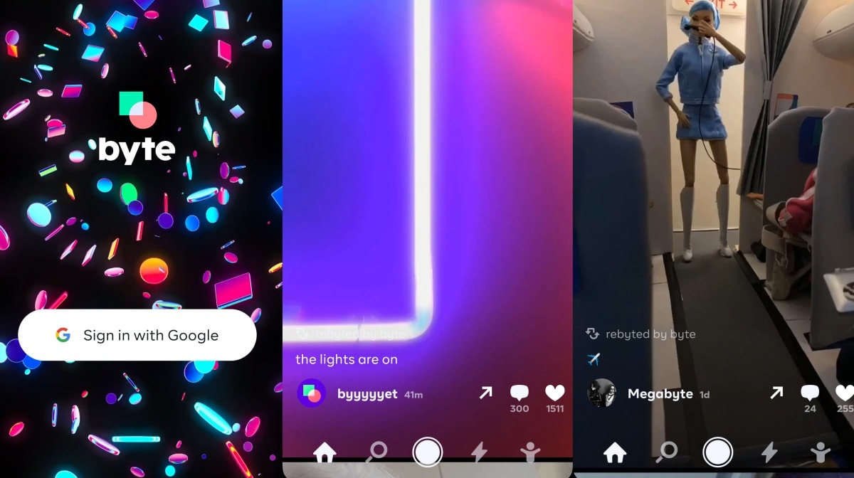
Vine co-founder launches a new 6-second video app: Byte
US Space Force logo unveiled with a clear Star Trek influence

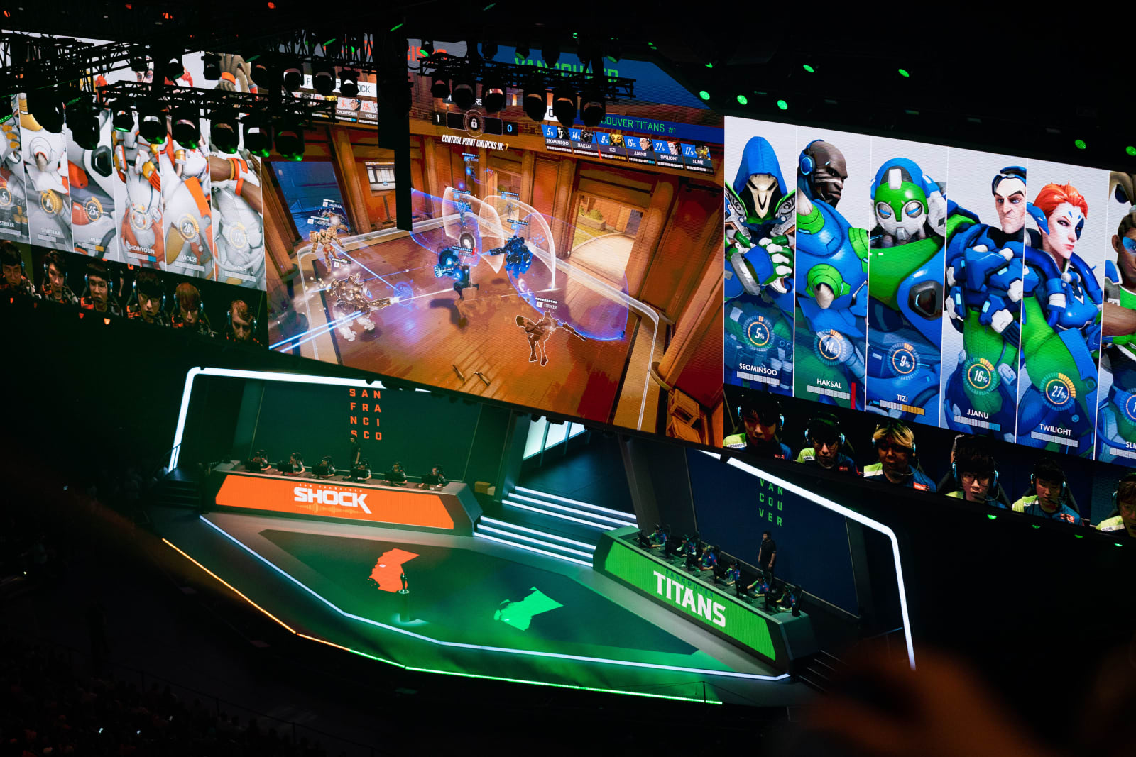
YouTube will stream the CoD and Overwatch leagues in 2020
Uber reaches its last major city in North America