
Every year, Pantone sets out on a mission to find a color worthy of carrying the title of “Color of the Year”. For 2018, the color is Ultra Violet, which is a beautiful blue-based purple that we’re going to be using ourselves to create this minimalist illustration.
As always, we’re going to be using some basic geometric shapes combined with some of Adobe Illustrator’s most basic tools.
You can always expand the project by heading over to GraphicRiver, where you’ll find a great selection of paint-themed assets.
So assuming you’ve grabbed a fresh cup of that hot cocoa, let’s get started!
1. What Are Pantone Colors?
If you’ve been dabbling in the world of design for some time, this probably isn’t the first time you’ve heard the term, but have you ever taken a moment and wondered what it actually means? Well, according to Pantone LLC, the term is defined as a “standardized color matching system” used by graphic designers in order to ease the process of identifying and cross-matching colors within different printing systems.
The way this is done is by creating Pantone color swatches, which are individually defined by a unique naming system that uses a numeric indicator (the number of the color—Pantone Red 032), followed by a suffix indicative of the type of paper stock on which it is meant to be printed (C for coated, U for uncoated, M for matte).
This way, designers can easily identify and reproduce exactly the same color, ensuring that the design maintains its original values from start to finish.
In the case of Ultra Violet, you might notice that we have a different suffix, “TCX”, which stands for Textile Paper Edition.
2. The Queen of 2018: Pantone 18-3838 TCX
Every time the calendar grows older, the people at Pantone take the time and energy to give a new color the title of “Color of the Year”, explaining not only the reasons behind their choice but also the values and message carried by it.
2017: Greenery
In 2017, that position was filled by Pantone 15-0343 (Greenery), which was a fresh yellow-green shade evocative of the first days of spring.

2016: Rose Quartz & Serenity
In 2016, for the first time we had not one but two shades to carry the title, Pantone 13-1520 (Rose Quartz) and Pantone 15-3919 (Serenity), meant to “psychologically fulfill our yearning of reassurance and security”.

2015: Marsala
2015 was the year of Pantone 18-1438 (Marsala), which was described as a seductive red-brown shade, meant to draw us into its embracing warmth.

2018: Ultra Violet
For 2018, the color is Pantone 18-3838 TCX, or Ultra Violet, which is a beautiful, provocative value meant to suggest “the mysteries of the cosmos, the intrigue of what lies ahead, and the discoveries beyond where we are now”.

As Leatrice Eiseman, the executive director of the Pantone Color Institute, puts it:
“We are living in a time that requires inventiveness and imagination. It is this kind of creative inspiration that is indigenous to PANTONE 18-3838 Ultra Violet, a blue-based purple that takes our awareness and potential to a higher level”.
And I do have to agree—the color does present itself as a symbol for experimentation and non-conformity, historically having been worn by unconventional artists such as Prince, David Bowie, and the brilliant Jimi Hendrix.
That being the case, I thought it would be a great idea to put our creativity to work by doing this minimalist project, where we’re going to play with this beautiful color.
3. How to Set Up a New Project File
Assuming you already have Illustrator up
and running in the background, bring it up and let’s set up a New Document (File > New or Control-N)
for our project using the following settings:
-
Number
of Artboards: 1 -
Width:
800
px -
Height:
600
px -
Units:
Pixels
And from the Advanced tab:
-
Color
Mode: RGB -
Raster
Effects: Screen (72ppi) - Preview Mode: Default

Quick tip: Now, as I pointed out a few moments ago, the Pantone Color system is mainly used for print, which of course uses a CMYK color space, so you might be wondering why we set our Color Mode to RGB. Well, usually when you attempt to use a CMYK-created color within an RGB document, you’ll notice obvious shifts between the two. Normally you would have to approximate the color using an intricate guide, but luckily for us, Pantone has put together an online color finder that gives you the RGB and Hex values for all of its colors, including Ultra Violet.
4. How to Set Up a Custom Grid
Even though today’s project is not an icon-based one, we’ll still want to create the illustration using a pixel-perfect
workflow, so let’s set up a nice little grid so that we can have full control
over our shapes.
Step 1
Go to the Edit > Preferences > Guides & Grid submenu, and adjust
the following settings:
-
Gridline
every: 1 px - Subdivisions: 1

Quick tip: you can learn more
about grids by reading this in-depth piece on How Illustrator’s Grid System Works.
Step 2
Once we’ve set up our custom grid, all we
need to do in order to make sure our shapes look crisp is enable the Snap to Grid option found under the View menu (that’s if you’re using an
older version of Illustrator).
Now, if you’re new to
the whole “pixel-perfect workflow”, I strongly recommend you go through my How
to Create Pixel-Perfect Artwork tutorial, which will help you widen your
technical skills in no time.
5. How to Create the Paint Stroke
We’re going to kick things off by creating
the paint stroke created by the roller, so assuming you’ve already set up the custom grid, let’s get started!
Step 1
Create a 96 x 240 px rectangle
which we will color using ultra violet (#5F4B8B) and then center align to the
underlying Artboard, making sure to
position it at a distance of 196 px from
its left edge.

Step 2
Start working on the paint drips by creating a 4 x 12 px rectangle (#5F4B8B), which we will position at a distance
of 64 px from the larger shape’s
bottom-right corner.

Step 3
Adjust the shape that we’ve just created, by setting the Radius of its bottom corners to 2 px from within the Transform panel’s Rectangle Properties.

Step 4
Add the taller drip using a 4 x
28 px rectangle (#5F4B8B) with a 2
px bottom corner Radius, which
we will position on the right side of the previously adjusted shape, at a
distance of just 4 px.

Step 5
Create the center section using a 4 x 8 px rectangle (#5F4B8B), which we
will position as seen in the reference image.

Step 6
Adjust the shape that we’ve just created, by removing a 4
x 4 px circle (highlighted with red) from its bottom edge using Pathfinder’s Minus Front Shape Mode.

Step 7
Add the side sections using two 4
x 4 px squares (#5F4B8B), from the bottom of which we will remove a 4 x 4 px circle, positioning the
resulting shapes as seen in the reference image. Once you’re done, select and
group all five shapes together using the Control-G
keyboard shortcut.

Step 8
Add the second paint drip using a 4
x 16 px rectangle (#5F4B8B) with a 2
px bottom corner Radius as your
starting point. Once you’re done, select and group (Control-G) all three shapes together before moving on to the next
step.

Step 9
Create the paint stroke’s darker section using a 4 x 96 px rectangle, which we will color using #332B4B and then
position on the right side of the larger shape. Once you’re done, select and
group (Control-G) all of the current
section’s composing shapes before moving on to the next one.

6. How to Create the Paint Roller
As soon as we’ve finished working on
the paint stroke, we can start working on the roller, which as you’ll see is
really easy to create.
Step 1
Create the sponge using a 32 x
112 px rectangle, which we will color using a complementary orange (#F7CB7F),
and then position on the right side of the paint stroke as seen in the
reference image.

Step 2
Add the paint using a 32 x 96 px rectangle (#5F4B8B), which we will center align to the previously created shape,
selecting and grouping the two together afterwards using the Control-G keyboard shortcut.

Step 3
Start working on the roller’s handle by
creating its guard using an 8 x 24 px rectangle
(#F7CB7F), which we will position at a distance of 64 px from the sponge’s right edge.

Step 4
Add the actual handle using a 52 x 16 px rectangle (#F7CB7F), which we
will position on the right side of the previously created shape.

Step 5
Create the rear end section using a smaller 8 x 8 px square, which we will color
using ultra violet (#332B4B) and then position as seen in the reference image.

Step 6
Separate the guard from the handle using a hard shadow, which we will
create using an 8 x 16 px rectangle
(#332B4B), which we will adjust by selecting its top-right anchor point using
the Direct Selection Tool (A), and
then pushing it to the left side by 4 px using the Move tool
(right click > Transform > Move
> Horizontal > -4 px).

Step 7
Add the vertical grip lines using three 4 x 16 px rectangles (#332B4B), which
we will horizontally distribute 4 px from
one another, grouping (Control-G)
and then positioning them 4
px from the shadow that we’ve just created.

Step 8
Finish off the handle by adding the little
insertion point using a 4 x 4 px circle
(#332B4B), which we will position at a distance of 4 px from the center of its right edge. Once you’re done, select
and group (Control-G) all its
composing shapes before moving on to the next step.

Step 9
Start working on the roller’s arm by creating
the main shape for its lower section using an 8 x 8 px square, which we will color using #5F4B8B and then
position on the left side of the guard.

Step 10
Select the Pen
Tool (P) and, using an 8 px thick
Stroke (#332B4B) with a Round Join, draw the arm’s main body, following the reference image
as your main guide. Take your time, and once you’re done, move on to the next
step.

Step 11
Finish off the arm, and with it the project
itself, by adding the left segment using an 8 x 8 px square (#332B4B), which we will position on the opposite
side of the sponge. Once you’re done, select and group (Control-G) all of the paint roller’s composing sections, doing the
same for the entire illustration afterwards.

Awesome Work! You’re Done!
There you have it, fellow Pantone lovers, a nice and easy tutorial on how to
create a cute illustration using the hottest color of 2018.
As always, I hope you’ve had fun working on the project and most
importantly managed to learn something new and useful along the way.
That being said, I’m looking forward to seeing
your final results, and if you have any questions, please post them within the comments
area and I’ll get back to you as soon as I can!

If you’re looking for more Pantone and color resources here on Envato Tuts+, why not check out the following awesome tutorials:
 PantoneQuick Tip: How to Create Pantone Colors in Your DesignsGrace Fussell
 Color TheoryAdvanced Color Theory: What Is Color Management?James Thomas
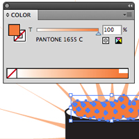 VectorQuick Tip: Quickly Convert CMYK to PantoneCheryl Graham
 Print DesignThe A to Z of Print DesignGrace Fussell
 Print DesignThe Beginner’s Guide to Prepping and Sending to PrintGrace Fussell
{excerpt}
Read More