Line art is the use of lines or stretched shapes to create an illustration or enhance its appearance. Within this technique there are a variety of styles that are often found within the vector art community. In this article, I will show you a variety of illustrations made from vector which contain line art and explain why this element works well. We’ll also read what the artists say about the pieces, which tools they use, and what advice they give to those wishing to venture into line art.
Line Art Only
Although you often find pieces are a balance between line art and color, to pull off an effective piece of line art to stand alone, you often have to put more creative lines into the piece. This could be using a variety of ways to shade the piece or even giving the lines themselves more character.
If you want to do an effective piece of line art by alone, ask yourself the question… would this piece look better with color? If it would look better with color and shading, then the piece may not be best as a standalone piece of line work.
Below are some examples of standalone lines which don’t rely on the introduction of color within the objects to enhance the piece:
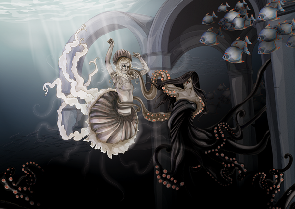
IMMENSE part 1 by Line Birgitte Borgersen aka brgtt
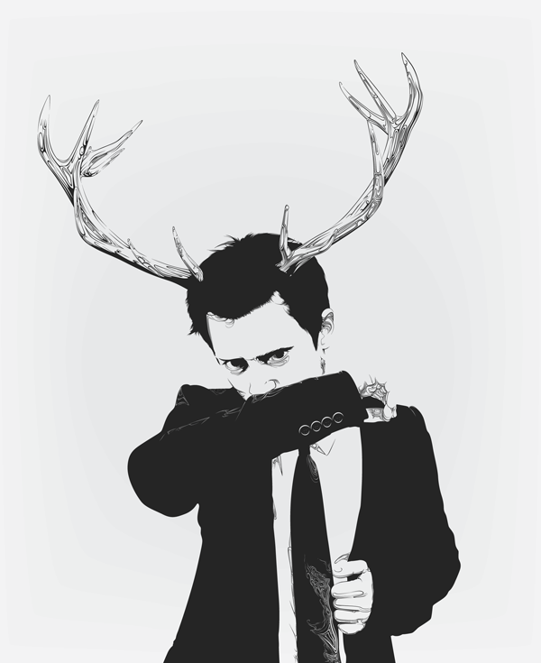
The use of creative line shading helps this piece. With it’s monotone palette, it relies strictly on the curves and delicate lines to shape the illustration. Using the lines not only to create shadow, it takes away some of the gray to show highlights, which can be seen in the tie and shirt.
The texture of the horns is brought into the style of shading for the model to help emphasize the bond between animal and man. Could this texture have been achieved better with the use of color?
Line tells us:
I used to do these scribbles that would turn into people or other stuff. Applying that old ‘trade’ to something new was a lot of fun. All the line art was actually made with the pen tool (in Adobe Illustrator), not with brushes, so it’s of course a completely different process than doodling around, but it’s the same feel; just feeling it out and seeing where it leads you.
MS by Dika Toolkit aka Toolkit04

Although there is color present in this piece, it still would be considered as standalone line art. The main focus of the piece is the line art and the additions of some color present merely helps to frame the piece and help give it a scruffy appearance.
The style of the line art here is a mix of chaos mixed with a bit of grunge, which is rather apt considering it’s a portrait of an alternative musician. This is a great example of when the line art style has been very well suited to the subject.
This piece differs from our first example in the way that the strokes are brought into the background of the piece. The lines are not just there to illustrate the focus of the piece, but also to enhance the background.
In some of Dika’s pieces, although the lines are digitally applied, he likes to mix a traditional appearance with a chaotic yet very digital clean look. Something which works very well for him.
Line Art and Comic/Cartoon Style Pieces
Often the style of the line art dictates the tone of a piece. This is very true within the comic and cartoon communities who use clean curves and straight lines. These technical lines are what remind us that we’re not looking at something real, but a graphic representation of a concept, character, or scene. The lines are often of equal width along each stroke and sometimes vary in weight, depending on which element is being illustrated.
The lines in some pieces of this style could be so smooth that it seems like the artist has put their work through several distort effects in their programs to achieve such symmetrical shapes and smooth curves. Could they have used “Zig-Zag” or “Round Corners” in Illustrator? Have they modified preset shapes? This adds to the cartoon theme, as real life has no such lines.
As with most line art, the style of the line dictates the mood or theme of the piece. A collection of lines that are predominantly curves could give the impression of an upbeat theme. Whereas, a collection of jagged/straight lines could give the impression of a negative emotional theme. These elements could be more played upon when creating line art for comic/cartoon pieces.
Micehead Quarters by recycledwax

Here we have an example where the colors of the piece aren’t directly dictating the tone, but it’s more the line style. It’s apparent from the line style (not just the actual illustration) that what we’re looking at is a cartoon. Although it is a restricted palette and may appear simple on first appearance, you then look at the clean lines used to illustrate the TV set, the mice and the remote.
Which elements would you see as being done by “hand” and which by effects in the artists program?
Furthermore, on close inspection you can see that for the finer details of the piece the line art stroke weights are subtly slimmer than those of the frame of the piece. This is a great technique and one which is often used. Consider, it would seem out of place if the small buttons of the remote were created with the same stroke weight as say the outline of the TV set.
Witch by Cristiano Siqueira aka CrisVector
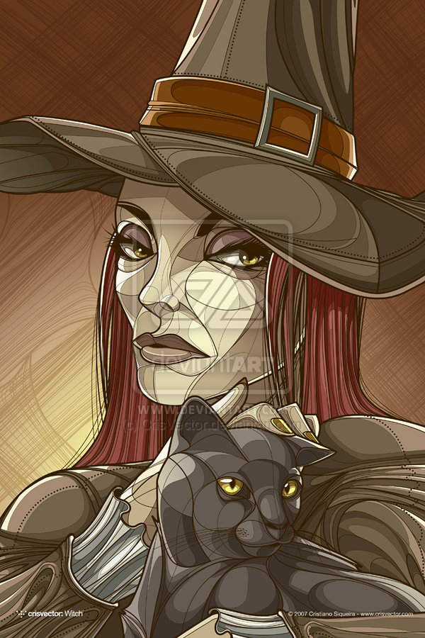
Some may think that a comic/cartoon line art piece would require minimal line work and this piece is a great example of how using complex lines, can add to the overall appearance and tone. Again as previous, we can see the variety of stroke weights in the different elements; however it’s even more apparent on the face. They are used in a way to slightly confuse us and make us think more about the piece. Consider that when you think of a stereotypical witch, you might imagine an old and haggard woman; the lines here give structure to the contours of the face, rather than the lines of wrinkles. This technique is then replicated in the contours of the cats face to give it more balance.
Cris tells us:
When I’m working with lines in my vectors, I try to follow some rules to get the best results. The first rule is to make the lines as smooth as possible. I do it by using less anchor points as possible when drawing curves. For example, I draw a circle using just 4 anchor points and it’s enough, for semi-circle forms, I use 2 points. Another useful tip is to play with different thickness for the lines. With this I can get a subtle shading where the thicker lines work as shadows.
It’s good to respect the original shape of the objects as well, placing the lines in the right place, trying to make the dimensions of the object more clear.
Even using just lines, it’s possible to make textures by placing the lines all together in a tight space or simple crossing them. Well done and place textures are the key for the realism. When I need to work with a big amount of parallel lines, I use much the blend tool.
Line Art and Reality
When mixing line art and subjects which are less cartoon looking in appearance, it can be hard to find the perfect balance. Do you want the piece to convince the viewer that what they are looking at is an illustration? Do you want your viewer to see the overall image first, then the line art, or will the line art be the first thing they see?
When we picture line art, we see it as perhaps bold black lines and of course reality doesn’t have those lines. How do you integrate those lines then into an illustration of a subject so it doesn’t clash, but more compliment the piece?
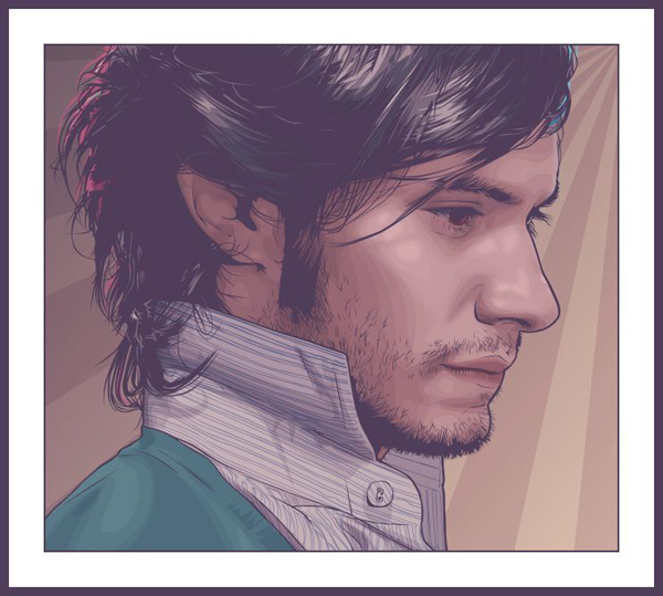
I’m free now what by Mário Fonseca aka theSIGNer
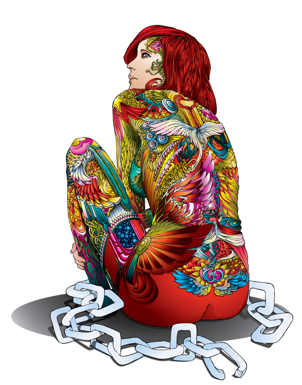
This piece represents such a great balance of the real subject of a person, even based on an image as reference, however the bold colors and intricate detailing of the tattoos tell us we’re looking at an illustration. It’s not meant to be real. It’s meant to be an illustration. It’s not trying to convince the viewer otherwise. It relies more on how the piece is colored, by way of gradients and curves to inform the viewer it is of a real person.
Mário tells us:
My process is simple but time consuming. I start by drawing by hand with pencils on a sketchbook, using the photo as reference. I draw the main structure and the outline first and when the proportions are almost correct I start to give it the theSIGNer look. I use only line, no shadows or fills on the sketch phase. When the pencil stage is finished I start inking the drawing with India ink pens. After that I scan the image, open it on Adobe Photoshop and layer it over the photo to correct anatomy and proportion mistakes. This is also when I use Adobe Illustrator. I discovered the “Live Trace” tool by chance and explored its functions and capabilities. I wanted to have a steady and clean line all over the drawing and “live trace” helps me do exactly that. I always use black outlines, giving it that comic book style look.
What makes this piece even more amazing is the fact that it has started out as a traditional piece and then was brought into vector. The vector element of it is used to enhance the theme and not be the default medium of choice.
twin androgyny by Jimmy Balia aka Phig
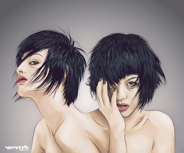
The shading on this piece suggests that the initial aim for the viewer to see it not so much of an illustration. It’s more detailed shading to show the shadows and highlights of the skin. The details in the hair instead of say a flat impression of hair. However on further inspection you see the lines defining parts of the skin and features, such as the lips. Did you see the overall concept first or the lines? The lines are used to almost exaggerate the creases and where bold shadows would be.
Jimmy tells us: “I need it to be like half-illustration. If I don’t do the line art, it will look like a realistic vector and lose the sense of illustration.”
The strokes used appear to be applied by a tapered brush in single strokes. These strokes are mirrored in the hair which brings together the mix of the line art and the more detailed shading. It works well because although bringing reality into line art is hard to do, this common factor in the elements of the piece makes sure the lines do belong in the piece.
Muted Color Line Art
This is a common style and one which can be achieved in a variety of ways. Often the line art of a piece is all given the same Blending Mode on top of the illustration to create a more merged appearance to the piece. Sometimes a small selection of layers covering the overall canvas is applied onto of the piece and then set to a complimentary color to help blend the color and the lines together. This helps create a look of muted color line art, of course these techniques are not the only ways to achieve this look.
Dance by Nastasia aka ssst
We know we’re looking at an illustration as the theme we see dictates that it’s not reality, the shading style is irregular yet stylish, so the line art isn’t the element here which tells us we’re looking at an illustration as it would be in a comic/cartoon themed piece. The line art isn’t carrying the piece. The line art here may take you a while to point out, but it is very present in every element of the vector.
Perhaps it’s the strong concept or the bold palette which prevents us from seeing the muted color line art here. It’s not your stereotypical black or even dark lines. It’s being used as a complimentary part of the piece.
Nastasia tells us:
The line art is the step that determines the final imagery for me. I draw my line art with the pencil tool set to a low width; I never use pure black lines because I personally find it too harsh on the eye.
I used transparency levels and changed the width of the lines in textured area’s. Setting your layer that contains your line art to multiply over your colors will make the line art and colors merge much more nicely.
In this method, the line art is more prominent in the lighter areas; however it’s almost hidden in the darker areas. This makes for an interesting balance and great to look at when you see the piece close up.
Gael Garcia Bernal by Jessica Finson aka verucasalt82
Jessica has spawned a lot of artists who have gained inspiration from her style of line art. Using a photo reference and then creating the line art on top. Then removing the original image and applying color. Finally adding layers of a complimentary Blending Mode on top to create an overall muted palette to compliment the muted lines.
Unlike the first piece, the line art in this piece is very much present. It’s bold and it’s used effectively in the hair for example. It’s used for the texturing on the facial hair. Such delicate lines used in a forceful manner.
If you’re a fan of these style strokes, you can download a set of brushes for Adobe Illustrator which she created.
Conclusion
There are a variety of styles within line art, some more obvious than others. Try to think about the overall impression you want to give to your viewer and what part the line art plays. Is it present to enhance the piece or is it there as the core element of the piece?
When looking for tutorials on a style, try to not look first of all at the program you’re using. You can often find out how to do these techniques from tutorials for other programs or even in a traditional field. Then try to apply them to the vector application of your choice.
Check out the following tutorials on Vectortuts+ and deviantART for more on specific vector line art techniques:
- Quick Tip – Using the Blob Brush and Eraser for Character Lines – Using the blob tool in Illustrator for line art, one of the many tools you could use. Others would include the Pencil Tool, Paintbrush Tool and the Pen Tool.
- How to Create a Rock Girl with “Beautiful Strokes” in Adobe Illustrator CS5 – Vector Premium Tutorial – This tutorial covers the Width Profile in AI to do line art with variable widths and the Pen Tool. These processes can also be applied to the Paintbrush Tool and Pencil Tool.
- How to Create a Cartoon Character with Expressive Lines – This tutorial covers creating line art from a traditional sketch.
- Illustrator’s Pen Tool: The Comprehensive Guide – This comprehensive guide aims to introduce or remind you of features, shortcuts, and methods for working with what is arguably Adobe’s most essential tool.
- Pen Tool Tutorial – Line art and Coloring tutorial for PS which can be used for similar Adobe Illustrator tools.
- lineart with the pen tool – Line art in PhotoShop using different line styles.
- More Links to a variety of walk throughs and tutorials for general line art on deviantART
Such a great post inspired people who read it..I’m waiting more good quality post from this, so bookmark!