In a previous tut I covered creating vector textures; but a common concern is that vector textures create extremely large files. In this tutorial I will outline the process of creating and using bitmap textures. This will help you cut the file sizes down without compromising your image.
Step 1
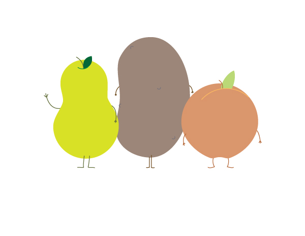
I thought that with the extremely large, and ever expanding waistlines of this country (USA), we all need to think about cutting down a bit; what better way than to use some healthy fruit & veggies to showcase the process. You have your basic, simple vector drawings of a pear, potato, and peach. They are nice, but could be nicer. Incorporating some textures will really help to give this illustration some visual interest.
Step 2
Texture Time. Step away (from the computer) and play. We’ll need a variety of textures; so don’t be scared to try a few different things. Look for a range of textures from super bold, with a lot of contrast to subtle.

Step 3
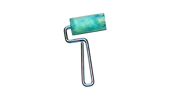
To make my textures, I’m using a small paint roller on different types of paper. Paper towel and crumbled paper are great to use.
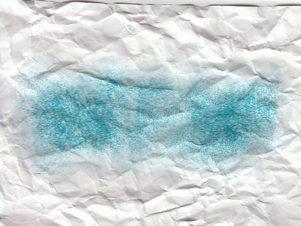
Step 4a
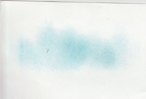
Scan the textures. Keep in mind which texture will coincide with each fruit or vegetable. The lightest, most subtle texture, will be used for the pear.
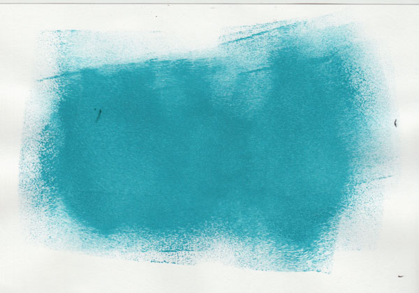
Step 4b
The medium texture is not too light and has a bit of contrast. Since peaches often are a splotchy combination of yellow and red this should work quite nicely.
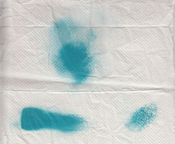
Step 4c
The potato calls for a rough, bold texture.
Step 4d
For the sake of variety here are a few extra textures, just in-case we need them.
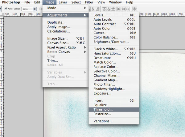
Step 5a
Convert the image to black & white pixel. The way I prefer to do this is to use the Threshold option in Photoshop. Go to Image > Adjustments > Threshold.
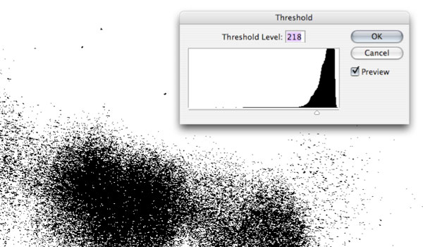
Step 5b
Use the Threshold slider to get the desired contrast. Click OK.
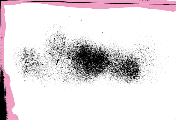
Step 5c
Clean up the edges of the texture image using the pencil tool set to white (I’m using pink for display purposes). Its not absolutely necessary but I prefer to keep things tidy.
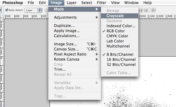
Step 6
Convert the color mode to Grayscale.
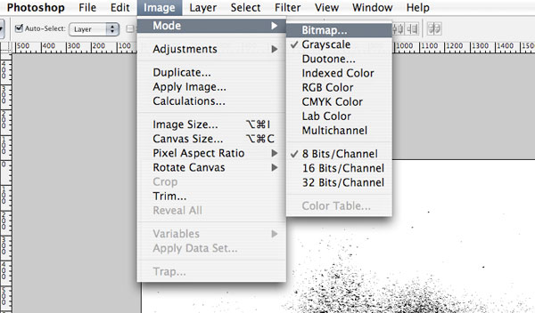
Step 7a
Next, go to Image > Mode > Bitmap
Step 7b
Depending on the resolution for the final artwork, decide the pixel per inch output.
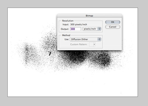
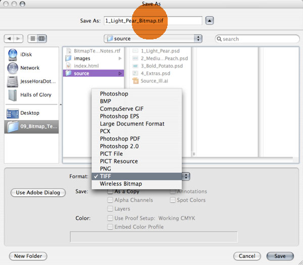
Step 7c
Save as a .tiff. I like to label the file ‘Bitmap’, to keep things organized.
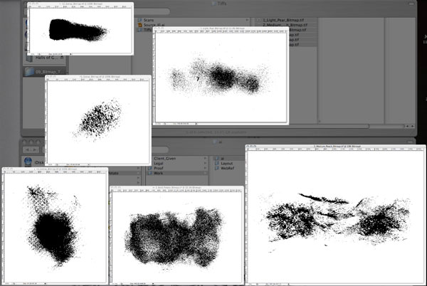
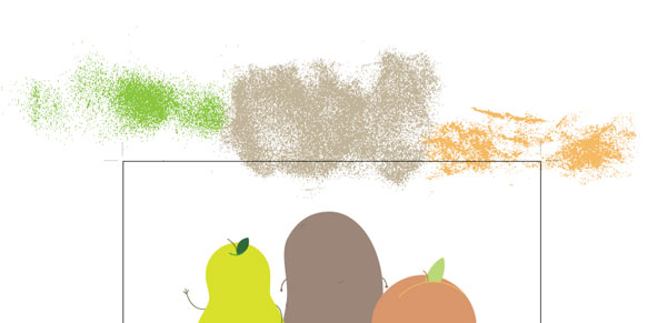
Step 8
Do this to each texture. The ‘extras’ file needs to be split into separate .tiff files. Crop and save each ’section’ as a separate .tiff file. Here is what I have, the 3 specific .tiff files and 3 additional ‘extras’ ready to go into Illustrator.
Step 9a
Next, open the original Illustrator file and go to File > Place and select the bitmap texture .tiff’s.
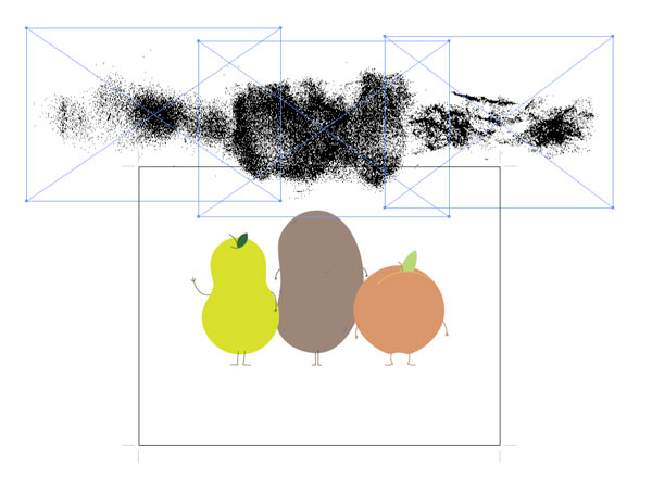
Step 9b
From here it’s easy, simply select the .tiff and choose a color from the swatch palette.
Step 10a
Using a simple clipping mask, integrate the textures into the illustration.
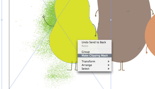
Step 10b
The beauty of tiffs, besides the file size being a fraction of what it would be if the textures were vector, is that you can work with .tiff exactly the same way you would if they were vector. Simply choose a swatch to change the color.
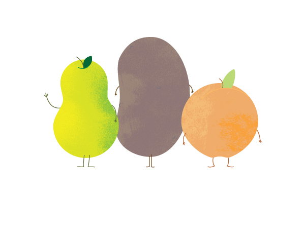
Step 10c
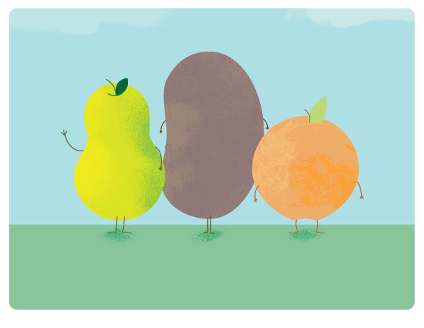
Just to make your illustration extra special, you could use additional textures to bring the entire illustration to life. I’ve used small textures as shadows on the ground and clouds in the sky.

Conclusion
I realize this is a Photoshop heavy ‘Vector’ tut, but with the main use of the tiff textures in Ai, it shows how to get the most out of Illustrators capability to use both raster images and vector shapes. While this is a simple process, it really helps to keep the file size down, and it looks delicious.