What makes a striking photo? Often, it’s merely ordinary things composed in an ordinary manner. That’s because they always tend to have a single theme or idea, and because clutter is kept to a minimum. They are simple, true, and sincere. Today we’re looking at the elements of design (line, shape, form, texture, color etc) that can turn a simple subject into a striking photo.
Successful photos rely on order, and the main elements that bring and emphasize order in a composition are: line, shape, form, texture, pattern, and color. Every photograph, intentionally or not, contains one or more of these element, which are known as the elements of design.
All of these elements have a huge impact on a photo, especially the line, texture, and color. Usually we recognize and utilize these elements unconsciously. This depends on the individual’s sensitivity to the different visual components out there, and is very much affected by the person’s memories and life experiences that are registered on their own personal mind tape.
Line
Out of the 6 elements of design, line is the strongest and most important and influential. Without line there can be no shape. Without shape there can be no form. Without form there can be no texture and there can be no pattern. Lines are powerful tools that can be used smartly to lead the viewers eyes towards the point of interest in a photograph, and alter the overall feeling and mood of an image.
Lines can be vertical, horizontal, diagonal, or curved. Lines can be short or tall, can be thick or thin. Lines can lead you away, or move you forward in an image. A line’s emotional effect on an image cannot be overlooked. They sometimes feel restful, soothing, rigid, active, guiding, or threatening.
Thin lines can be experienced by some as unstable, and by others as vulnerable. Thick lines can be experienced as rigid and dependant, or can be experienced as dominating or stern. Curved lines are often perceived as soft, soothing, settling, and relaxing. Jagged lines can be perceived as forceful, chaotic, sharp, and threatening.
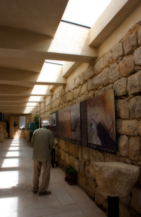
Vertical lines in a photograph tend to convey different moods, ranging from power and strength, to growth. Vertical lines can include strands of hair, poles, trees, buildings, and a lot of other different objects that expand vertically rather than horizontally.

Horizontal lines in a photo tend to cast a feeling of restfulness, permanency, and stability. If you want to further accentuate the restful, stable feeling of a horizontal line in an image, a good way is to use horizontal framing rather than vertical.
Layers of multiple horizontal lines in an image can create drama and rhythm, and can become the main interest of the image all by themselves. Horizontal lines can include horizons, seas, laying people, street sides, and almost anything that expands horizontally.
Diagonal lines work well to guide the viewers’ attention towards the main subject of your photo. They can convey a sense of action and render photos as dynamic and interesting. Diagonal lines can be the shape of a path, a line of trees, a fence, river or any other component of an image.
Shape
The second most fundamental element of design is shape, because shape is the principal element of identification. The most important thing to keep in mind when shape is the essential element in an image is that it is best defined when the subject is frontlit or backlit. For that shape to be successfully identifiable, it needs to be in strong contrast with its surroundings so that it is detached from the clutter around it.

Shapes in images can also be seen as silhouettes – these are best shot several minutes before sunset up to several minutes following it, as well as several minutes before sunrise up to several minutes following it. It is also worth mentioning that silhouettes are the purist and strongest of all shapes.
Form
Form is basically a three-dimensional shape, and is best accentuated by side lighting since it casts soft elegant shadows, and the difference between light and shadows gives a better illustration of the depth of an object and amplifies the sensual understanding of its meaning and message.

Texture
No design element is more capable of moving your deep emotions than texture. The challenge of seeing and capturing texture is mostly based on one element – light. Texture can be accentuated by the side light of early sunny mornings or early evenings, or by overhead light when the sun is vertical and high in the sky.

With the sun high in the sky, the roughness of the walls of buildings, or the wood textures of tree trunks, or any kind of texture along vertical surfaces is emphasized as the overhead light casts small shadows along those surfaces. While the impact is subtle, it adds more depth, interest, and reality to the shots.
Furthermore, it is worth noting that texture as a background can create an exciting and emotion-filled composition. And with the correct use of texture, pictures can become more alive and almost three dimensional.


Pattern
Life is full of patterns. It is all part of our cosmic existence, for without patterns our lives would be utter chaos. Most patterns we don’t recognize or we overlook because of our busy, routine-driven, daily lives.
Two techniques come into practice while working with patterns; you can emphasise the pattern, or you can break it:
Emphasising a pattern can accentuate a sense of size and expansion. The idea is to zoom in onto the pattern and fill the frame with it. Emphasized pattern can include faces amongst a crowd, a line of homogenous plants, bricks of a wall, etc

Breaking a pattern is all about finding an object that disrupts the continuous flow of a pattern. It can be an object that is in clear contrast with the rest of the objects; be it in shape, color, or even texture. You might need to handle your composition with extra care while trying to render a broken pattern, and the rule of thirds can come in handy in such situations.
For example, you can place your "odd" object along one of the thirds or on one of their intersecting points. You can also play with your depth of field. Have the contrasting item in sharp focus and the items around it fading slowly into the out-of-focus. Broken patterns can be found naturally, or some situations can be manipulated to disrupt readily existing patterns.


Color
Color is characterized by attributes such as value, hue, and saturation. Colors, and how they’re arranged, can either make or break a shot. Different colors can send out different messages, and they indeed have an important visual weight and impact on a photo.
Vibrant colors are energetic, interesting, and active. So are reds and yellows. Blues and greens are comforting and soothing. The path towards creating creative photos benefits from a high understanding of colors and their impact on an image, as well as a high awareness of colors surrounding you.
There are colors everywhere. Macro insect photography is filled with interesting colors. Nature, cities, people and their clothing, houses, streets, skies, beaches – everything around you is filled with color. You just need to be aware of it, and train your eyes to see it. Paying attention to color and it’s emotional messages and meanings is an important step towards photographic maturity.
It is worth mentioning that there are two types of colors; subtractive and additive. Each type has two sets of its own; primary colors, and secondary colors. Painting, photography, and printing use subtractive colors, and this is our concern in this post.
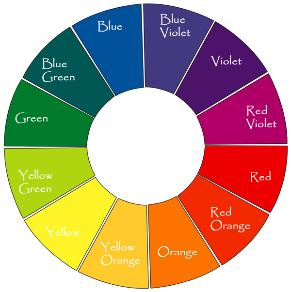
Red, blue, and yellow are called primary subtractive color, from these colors the secondary subtractive colors violet, orange, and green emerge. Mixing red and blue creates violet. Mixing blue and yellow creates green, mixing yellow and red creates orange. Mixing equal amounts of blue, red, and yellow produces black.
Pairs of colors that fall opposite to each other on the above color wheel are called complementary colors. These pairs complement and intensify one another when put together. Studying the color wheel can give you a better understanding as to how colors affect or complement each other, so that you can use this knowledge to better prevail the correct meanings and messages in your photography.
Note that yellow, red, and orange are considered to be warm colors. These are associated with sun and fire. Blue, violet, and green are considered cool colors. These are associated with snow, water, and shadows.


Conclusion
Elements of design are the most basic visual components of any composition. Understanding the elements of design, how they affect and complement each other, and what messages they convey is the way to step up with your photographic images and create stunning work that reaches out to people’s hearts and souls.
hese are the building blocks for creating your own work of art. Putting these elements together, and knowing how/when to use them will make your photos far more effective and purposeful. These elements are all around us, we just need to train our eyes to see and capture them, and our minds and souls to translate them into conveying our own emotions and ideas. Then, and only then, will our work become eye-catching and dramatic.