Fun with Canvas: Create a Bar Graphing Plugin, Part 2
In this two-part series, we’ll combine the versatile canvas element with the robust jQuery library to create a bar graphing plugin. In this second part, we are going to convert it in to a jQuery plugin, and then add some eye candy and additional features.
Concluding the Fun with canvas two-part series, today we are going to create a bar graphing plugin; not an ordinary plug in, mind you. We are going to show some jQuery love to the canvas element to create a very robust plugin.
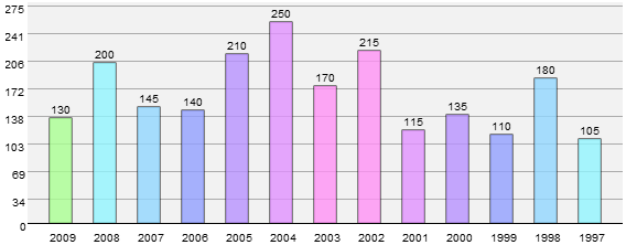
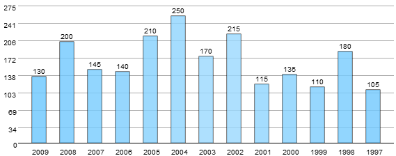
In part one, we looked solely at implementing the logic of the plug in as a standalone script. At the end of part one, our bar graph looked like so.
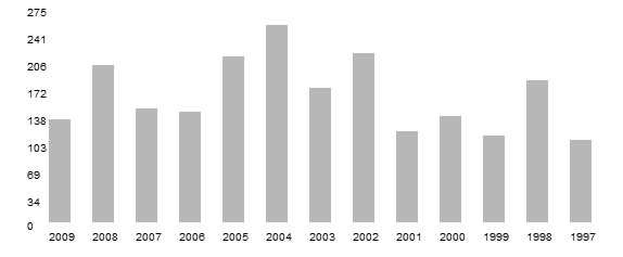
Result at the end of Part 1
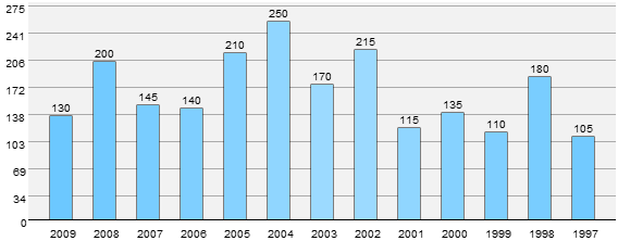
In this final part, we’ll work on converting our code and making it a proper jQuery plugin, adding some visual niceties and finally including some additional features. Ultimately, our output will look like so:
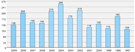
Finished product
All warmed up? Lets dive in!
Plugin Formalities
Before we start converting our code into a plugin we first need to look at a few formalities when it comes to plugin authoring.
Naming the Plugin
We begin by choosing a name for the plugin. I’ve chosen barGraph and renamed the JavaScript file to jquery.barGraph.js. We now enclose all the code from the previous article inside the following snippet.
$.fn.barGraph = function(settings) {
//code here
}
Settings contains all of the optional parameters passed to the plugin.
Working Around the $ Symbol Issue
In jQuery plugin authoring, it is generally considering a best practice to use jQuery instead of the $ alias in your code, in order to minimize conflicts with other Javascript libraries. Instead of going through all that trouble, we can just use custom aliases as mentioned in the jQuery docs. We enclose all our plugin code within this self executing anonymous function, as shown below:
(function($) {
$.fn.barGraph = function(settings) {
//plugin implementation code here
}
})(jQuery);
Essentially, we encapsulate all our code within a function and pass jQuery to it. We are free to use the $ alias as much as we want inside our code now, without having to worry about it potentially conflicting with other JavaScript libraries.
The Defaults
When designing a plugin, it is good sense to expose a reasonable number of settings to the user, whilst using sensible default options if the users uses the plugin without passing any options to it. With that in mind, we are going to enable the user to change each of the graph option variables I mentioned in this previous article in this series. Doing so is easy; we just define each of these variables as properties of an object and then access them.
var defaults = {
	         barSpacing = 20,
	 		 barWidth = 20,
	    	 cvHeight = 220,
			 numYlabels = 8,
			 xOffset = 20,
			 maxVal,
			 gWidth=550,
			 gHeight=200;
           };
We finally need to merge the default options with the passed options, giving preference to the passed ones. This line takes care of that.
var option = $.extend(defaults, settings);
Do remember to change the variables names wherever necessary. As in –
return (param*barWidth)+((param+1)*barSpacing)+xOffset;
…changes to:
return (param*option.barWidth)+((param+1)*option.barSpacing)+option.xOffset;
Refactoring
This is where the plugin is hammered out. Our old implementation could only produce a single graph in a page, and the ability to create multiple graphs in a page is the main reason we are creating a plugin for this functionality. Plus, we need to make sure that the user doesn’t need to create a canvas element for every graph to be created. With that in mind, we are going to create the canvas elements dynamically as needed. Let’s proceed. We’ll look at the earlier and updated versions of the relevant portions of the code.
Invoking the Plugin
Before we start, I’d like to point out how our plugin will be invoked.
$("#years").barGraph
   ({
		 barSpacing = 30,
        barWidth = 25,
		 numYlabels = 12,
   });
Simple as that. years is the ID of the table holding all our values. We pass in the options as needed.
Obtaining the dataSource
To start things off, we first need a reference to the source of data for the graphs. We now access the source element and obtain its ID. Add the following line to the bunch of graph variables we declared earlier.
var dataSource = $(this).attr("id");
We define a new variable and assign it the value of the passed element’s ID attribute. Within our code, this refers to the currently selected DOM element. In our example, it refers to the table with an ID of years.
In the previous implementation, the ID for the data source was hard coded in. Now we replace that with the ID attribute we extracted earlier. The earlier version of the grabValues function is below:
function grabValues ()
	 {
	 	// Access the required table cell, extract and add its value to the values array.
		 $("#data tr td:nth-child(2)").each(function(){
		 gValues.push($(this).text());
	 	 });

		 // Access the required table cell, extract and add its value to the xLabels array.
		 $("#data tr td:nth-child(1)").each(function(){
	 	xLabels.push($(this).text());
	 	 });
	 }
It is updated to this:
function grabValues ()
	 {
     	// Access the required table cell, extract and add its value to the values array.
	 	$("#"+dataSource+" tr td:nth-child(2)").each(function(){
		 gValues.push($(this).text());
	 	 });

		 // Access the required table cell, extract and add its value to the xLabels array.
		 $("#"+dataSource+" tr td:nth-child(1)").each(function(){
	 	xLabels.push($(this).text());
	 	 });
	 }
Injecting the Canvas Element
function initCanvas ()
	 {
		 $("#"+dataSource).after("<canvas id=\"bargraph-"+dataSource+"\" class=\"barGraph\"> </canvas>");

         // Try to access the canvas element
     	cv = $("#bargraph-"+dataSource).get(0);

	 	if (!cv.getContext)
	 	{ return; }

     	// Try to get a 2D context for the canvas and throw an error if unable to
     	ctx = cv.getContext('2d');
	 	if (!ctx)
	 	{ return; }
	 }
We create a canvas element and inject it into the DOM after the table, which acts as the data source. jQuery’s after function comes in really handy here. A class attribute of barGraph and an ID attribute in the format barGraph-dataSourceID is also applied to enable the user to style them all as a group or individually as needed.
Cycling through the passed elements
There are two ways you could invoke this plugin actually. You could either create each graph separately passing in only one data source or you could pass in a number of sources. In the latter case, our current construct will encounter an error and quit. To rectify this, we use the each construct to iterate over the set of passed elements.
(function($){
	$.fn.barGraph = function(settings) {

	// Option variables
	var defaults = {
	         // options here
           };

	// Merge the passed parameters with the defaults
    var option = $.extend(defaults, settings);

	// Cycle through each passed object
	this.each(function() {

	// Implementation code here
	});

	// Returns the jQuery object to allow for chainability.
	return this;
	}
})(jQuery);
We encapsulate all code after obtaining and merging the settings inside the this.each construct. We also make sure to return the jQuery object at the end to enable chainability.
With this, our refactoring is complete. We should be able to invoke our plugin and create as many graphs as needed.
Adding Eye Candy
Now that our conversion is complete, we can work on making it visually better. We are going to do a number of things here. We’ll look at each of them separately.
Themes
The older version used a bland gray to draw the graphs. We are going to implement a theming mechanism for the bars now. This, by itself, consists of a series of steps.
Ocean: The default theme
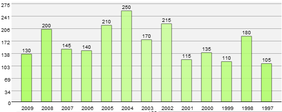
Foliage
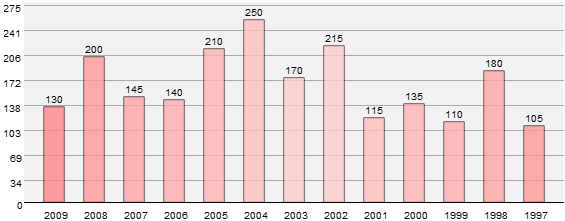
Cherry Blossom
Spectrum
Adding it to the Options
var defaults = {
             // Other defaults here
	 	 	 theme: "Ocean",
           };
We add a theme option to the defaults enabling the user to change the theme to any of the four presets available.
Setting the Currently Selected Theme
function grabValues ()
	 {
	 	// Previous code

		switch(option.theme)
		{
			case 'Ocean':
			gTheme = thBlue;
			break;
			case 'Foliage':
			gTheme = thGreen;
			break;
			case 'Cherry Blossom':
			gTheme = thPink;
			break;
			case 'Spectrum':
			gTheme = thAssorted;
			break;
		}
	 }
A simple switch construct looks at the option.theme setting and points the gTheme variable to the necessary colours array. We use descriptive names for the themes instead of generic ones.
Defining the Colours Array
// Themes
	var thPink = ['#FFCCCC','#FFCCCC','#FFC0C0','#FFB5B5','#FFADAD','#FFA4A4','#FF9A9A','#FF8989','#FF6D6D'];
	var thBlue = ['#ACE0FF','#9CDAFF','#90D6FF','#86D2FF','#7FCFFF','#79CDFF','#72CAFF','#6CC8FF','#57C0FF'];
	var thGreen = ['#D1FFA6','#C6FF91','#C0FF86','#BCFF7D','#B6FF72','#B2FF6B','#AAFE5D','#A5FF51','#9FFF46'];
	var thAssorted = ['#FF93C2','#FF93F6','#E193FF','#B893FF','#93A0FF','#93D7FF','#93F6FF','#ABFF93','#FF9B93'];
We then define a number of arrays, each holding a series of shades of a specific colours. They start off with the lighter hue and keep on increasing. We’ll loop through these arrays later. Adding themes is as simple as adding an array for the specific colour you need, and then modifying the earlier switch to reflect the changes.
The Helper Function
function getColour (param)
      {
         return Math.ceil(Math.abs(((gValues.length/2) -param)));
	  }
This is a tiny function which lets us achieve and apply a gradient like effect to the graphs. Essentially, we compute the absolute difference between half of the number of values to be rendered and the passed parameter, which is the index of the currently selected item in the array. This way, we are able to create a smooth gradient. Since we’ve only defined nine colours in each of the colours array, we are limited to eighteen values a graph. Extending this number should be fairly trivial.
Setting the fillStyle
function drawGraph ()
	 {
	    for(index=0; index<gValues.length; index++)
	      {
		    ctx.save();
			ctx.fillStyle = gTheme[getColour(index)];
	        ctx.fillRect( x(index), y(gValues[index]), width(), height(gValues[index]));
		    ctx.restore();
	      }
	 }
This is where we actually theme the graphs. Instead of setting a static value to the fillStyle property, we use the getColour function to retrieve the necessary index of the element in the currently selected theme’s array.
Opacity
Next up, we are going to give the user the ability to control the opacity of the bars drawn. Settings this is a two-step process.
With no transparency
With a value of 0.8
Adding it to the Options
var defaults = {
            // Other defaults here
	 	 	 barOpacity : 0.8,
           };
We add a barOpacity option to the defaults, enabling the user to change the opacity of the graphs to a value from 0 to 1, where 0 is completely transparent, and 1 is completely opaque.
Setting the globalAlpha
function drawGraph ()
	 {
	    for(index=0; index<gValues.length; index++)
	      {
		    ctx.save();
			ctx.fillStyle = gTheme[getColour(index)];
            ctx.globalAlpha = option.barOpacity;
	        ctx.fillRect( x(index), y(gValues[index]), width(), height(gValues[index]));
		    ctx.restore();
	      }
	 }
The globalAlpha property controls the opacity or transparency of the rendered element. We set this property’s value to the passed value or the default value to add a bit of transparency. As a sensible default, we use a value of 0.8 to make it just a tiny bit transparent.
Grid
A grid can be extremely useful in processing the data presented in a graph. Though I initially wanted a proper grid, I later settled for a series of horizontal lines lining up with the Y axis labels and completely threw away the vertical lines, since they just got in the way of the data. With that out of way, let’s go implement a way to render it.
With grid disabled
With grid enabled
Creating the lines using paths and the lineTo method seemed to be the most obvious solution for drawing the graphs, but I happened to run into a rendering bug which made this approach unsuitable. Hence I am sticking with the fillRect method to create these lines too. Here is the function in its entirety.
function drawGrid ()
      {
		  for(index=0; index<option.numYlabels; index++)
	      {
		   ctx.fillStyle = "#AAA";
		   ctx.fillRect( option.xOffset, y(yLabels[index])+3, gWidth, 1);
		  }
      }
This is very similar to drawing the Y axis labels, except that instead of rendering a label, we draw a horizontal line spanning the width of graph with a width of 1 px. The y function helps us in the positioning.
Adding it to the Options
var defaults = {
             // Other defaults here
	 	 	 disableGrid : false,
           };
We add a disableGrid option to the defaults, enabling the user to control whether a grid is rendered or not. By default, it is rendered.
    // Function calls
    	if(!option.disableGrid) { drawGrid(); }
We just check whether the user wants the grid to be rendered and proceed accordingly.
Outlines
Now that the bars all are coloured, it lacks accent against a lighter background. To rectify this, we need a 1px stroke. There are two ways to do this. The first, and easiest, way would be to just add a strokeRect method to the drawGraph method; or, we could use the lineTo method to quickly stroke the rectangles. I chose the former route since as before the lineTo method threw some weird rendering bug at me.
With no stroking
With stroking
Adding it to Options
First we add it to the defaults object to give the user control of whether this is applied or not.
var defaults = {
             // Other defaults here
	 	 	 showOutline : true,
           };
function drawGraph ()
	 {
	       // Previous code
			if (option.showOutline)
			{
			ctx.fillStyle = "#000";
			ctx.strokeRect( x(index), y(gValues[index]), width(), height(gValues[index]));
			}
			// Rest of the code
	      }
	 }
We check whether the user wants to render the outlines, and, if yes, we proceed. This is almost the same as rendering the actual bars except that instead of using the fillRect method we use the strokeRect method.
Shading
In the original implementation, there is no differentiation between the canvas element itself, and the actual rendering space of the bars. We’ll rectify this now.
With no shading
With shading
function shadeGraphArea ()
      {
	    ctx.fillStyle = "#F2F2F2";
	    ctx.fillRect(option.xOffset, 0, gWidth-option.xOffset, gHeight);
      }
This is a tiny function which shades the required area. We cover the canvas element minus the area covered by the labels of both axes. The first two parameters point to the x and y coordinates of the starting point, and the last two point to the required width and height. By starting at option.offset, we eliminate the area covered by the Y axis labels, and by limiting the height to gHeight, we eliminate the X axis labels.
Adding Features
Now that our graph looks pretty enough, we can concentrate on adding some new features to our plugin. We’ll look at each separately.
Consider this graph of the famous 8K peaks.
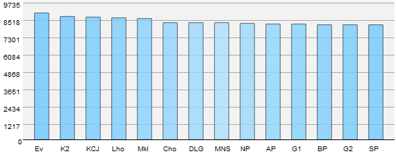
When the highest value is sufficiently high enough, and most of the values fall within 10% of the maximum value, the graph ceases to be useful. We have two ways to rectify this.
ShowValue
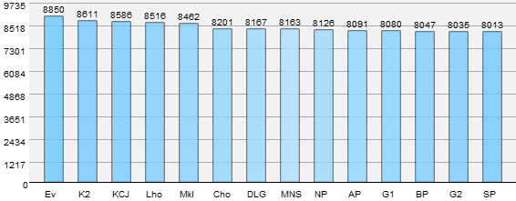
We are going to start with the easier solution first. By rendering the value of the respective graphs at the top, the problem is virtually solved since the individual values can be easily differentiated. Here is how it is implemented.
var defaults = {
             // Other defaults here
	 	 	 showValue: true,
           };
First we add an entry to the defaults object to enable the user to switch it on and off at will.
    // Function calls
	if(option.showValue) { drawValue(); }
We check whether the user wants the value to be shown and proceed accordingly.
function drawValue ()
      {
		  for(index=0; index<gValues.length; index++)
	      {
		      ctx.save();
			  ctx.fillStyle= "#000";
			  ctx.font = "10px 'arial'";
			  var valAsString = gValues[index].toString();
		      var valX = (option.barWidth/2)-(valAsString.length*3);
		      ctx.fillText(gValues[index], x(index)+valX,  y(gValues[index])-4);
			  ctx.restore();
		  }
      }
We iterate through the gValues array and render each value individually. The computations involving valAsString and valX are nothing but tiny calculations to aid us in the correct indentations, so it doesn’t look out of place.
Scale
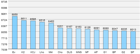
This the harder of the two solutions. In this method, instead of starting the Y axis labels at 0, we start a lot closer to the minimum value. I’ll explain as we go. Do note that, in the above example, the difference between subsequent values with respect to the maximum value is pretty insignificant and doesn’t show its effectiveness as much. Other data sets should give easier to parse results.
Adding it to Options
var defaults = {
             // Other defaults here
	 	 	 scale: false
           };
Updating the Scale Function
Since the scale function is an integral part of the rendering process, we need to update it to allow the scaling feature. We update it like so:
function scale (param)
      {
	   return ((option.scale) ? Math.round(((param-minVal)/(maxVal-minVal))*gHeight) : Math.round((param/maxVal)*gHeight));
      }
I know this looks a little complicated, but it looks that way only due to use of the ternary conditional operator. Essentially, we check the value of option.scale and if it says false, the older code is executed. If it is true, instead of normalizing the value as a function of the maximum value in the array, we now normalize it to be a function of the difference between the maximum and minimum values. Which brings us to:
Updating the maxValues Function
We now need to find out both the maximum and minimum value, as opposed to only the maximum we had to before. The function is updated to this:
function minmaxValues (arr)
     {
		maxVal=0;

	    for(i=0; i<arr.length; i++)
	    {
		 if (maxVal<parseInt(arr[i]))
		 {
		 maxVal=parseInt(arr[i]);
	     }
	    }
		minVal=maxVal;
		for(i=0; i<arr.length; i++)
	    {
		 if (minVal>parseInt(arr[i]))
		 {
		 minVal=parseInt(arr[i]);
	     }
		}
	   maxVal*= 1.1;
       minVal = minVal - Math.round((maxVal/10));
	 }
I am sure you could accomplish the same in a single loop without using as many lines of code as me, but I was feeling particularly uncreative at that time so bear with me. With the calculation formalities out of the way, we issue a 5% increase to the maxVal variable and to the minVal variable, we subtract a value equal to 5% of maxVal’s value. This is to ensure the bars don’t touch the top everytime and the differences between each Y axis labels is uniform.
Updating the drawYlabels Function
With all the groundwork done, we now proceed to update the Y axis label rendering routine to reflect the scaling.
function drawYlabels()
      {
		 ctx.save();
	     for(index=0; index<option.numYlabels; index++)
	      {
			  if (!option.scale)
			  {
		  		 yLabels.push(Math.round(maxVal/option.numYlabels*(index+1)));
			  }
			  else
			  {
				  var val= minVal+Math.ceil(((maxVal-minVal)/option.numYlabels)*(index+1));
		  		  yLabels.push(Math.ceil(val));
			  }
		   ctx.fillStyle = option.labelColour;
		   var valAsString = yLabels[index].toString();
		   var lblX = option.xOffset - (valAsString.length*7);
		   ctx.fillText(yLabels[index], lblX, y(yLabels[index])+10);
	      }
		   if (!option.scale)
		   {
	        	ctx.fillText("0", option.xOffset -7, gHeight+7);
		   }
		  else
		  {
		    var valAsString = minVal.toString();
		    var lblX = option.xOffset - (valAsString.length*7);
		    ctx.fillText(minVal, lblX, gHeight+7);
		  }
		  ctx.restore();
      }
Pretty meaty update if you ask me! The core of the function remains the same. We just check whether the user has enabled scaling and branch off the code as needed. If enabled, we alter the way the Y labels are assigned to make sure they adhere to the new algorithm. Instead of the maximum value divided into n number of evenly spaced numbers, we now compute the difference between the maximum and minimum value, divide it into uniformly spaced numbers, and add it to the minimum value to build our array of Y axis labels. After this, we proceed as normal, rendering each label individually. Since we rendered the bottom-most 0 manually, we have to check whether scaling is enabled and then render the minimum value in its place. Don’t mind the small numerical additions to each passed parameter; it is just to make sure each element of the graph lines up as expected.
Dynamic Resizing
In our previous implementation, we hard coded the dimensions of the graph, which presents significant difficulty when the number of values change. We are going to rectify this now.
Adding it to the Options
var defaults = {
            // Other defaults here
	 	 	 cvHeight: 250, //In px
           };
We let the user set the height of the canvas element alone. All other values are calculated dynamically and applied as needed.
Updating the initCanvas Function
The initCanvas function handles all the canvas initialization, and, hence, needs to be updated to implement the new functionality.
function initCanvas ()
	 {
		 $("#"+dataSource).after("<canvas id=\"bargraph-"+dataSource+"\" class=\"barGraph\"> </canvas>");

	 	// Try to access the canvas element
     	cv = $("#bargraph-"+dataSource).get(0);
	 	cv.width=gValues.length*(option.barSpacing+option.barWidth)+option.xOffset+option.barSpacing;
		cv.height=option.cvHeight;
		gWidth=cv.width;
		gHeight=option.cvHeight-20;

	 	if (!cv.getContext)
	 	{ return; }

     	// Try to get a 2D context for the canvas and throw an error if unable to
     	ctx = cv.getContext('2d');
	 	if (!ctx)
	 	{ return; }
	 }
After injecting the canvas element, we obtain a reference to the created element. The canvas element’s width is calculated as a function of the number of elements in the array – gValues , the space between each bar – option.barSpacing, the width of each bar itself – option.barWidth and finally option.xOffset. The graph’s width changes dynamically based on each of these parameters. The height is user modifiable and defaults to 220px with the rendering area for the bar’s itself being 220px. The 20px is allocated to the X axis labels.
Hiding the Source
It makes sense that the user might want to hide the source table once the graph has been created . With this in mind, we let the user decide whether to remove the table or not.
var defaults = {
            // Other defaults here
			 hideDataSource: true,
           };
if (option.hideDataSource) { $("#"+dataSource).remove();}
We check whether the user wants to hide the table and if yes, we remove it completely form the DOM using jQuery’s remove method.
Optimizing our Code
Now that all the hard work has been done, we can review how to optimize our code. Since this code has been written entirely for teaching purposes, most of the work has been encapsulated as separate functions and moreover they are a lot more verbose than they need to be.
If you really want the leanest code possible, our entire plugin, excluding the initialization and computation, can be rewritten within two loops. One looping through the gValues array to draw the bars themselves and the X axis labels; and the second loop iterating from 0 to numYlabels to render the grid and the Y axis labels. The code would look a lot messier, however, it should lead to a significantly smaller code base.
Summary
That’s it folks! We’ve created a high level plugin completely from scratch. We looked at a number of topics in this series including:
- Looking at the canvas element’s rendering scheme.
- Some of the canvas element’s rendering methods.
- Normalizing values enabling us to express it as a function of another value.
- Some useful data extraction techniques using jQuery.
- The core logic of rendering the graph.
- Converting our script to a full-fledged jQuery plugin.
- How to enhance it visually and extend it even further feature-wise.
I hope you’ve had as much fun reading this as I had writing it. This being a 270-odd line work, I am sure I left out something. Feel free to hit the comments and ask me. Or criticize me. Or praise me. You know, it’s your call! Happy coding!