Follow this quick tip and you will learn how to draw a folder starting from a single path with the help of the 3D Extrude&Bevel effect. You will play with multiple appearances, effects and shadows and you will use the Halftone Pattern effect to create a different texture for the folder icon. Let’s begin!
Step 1
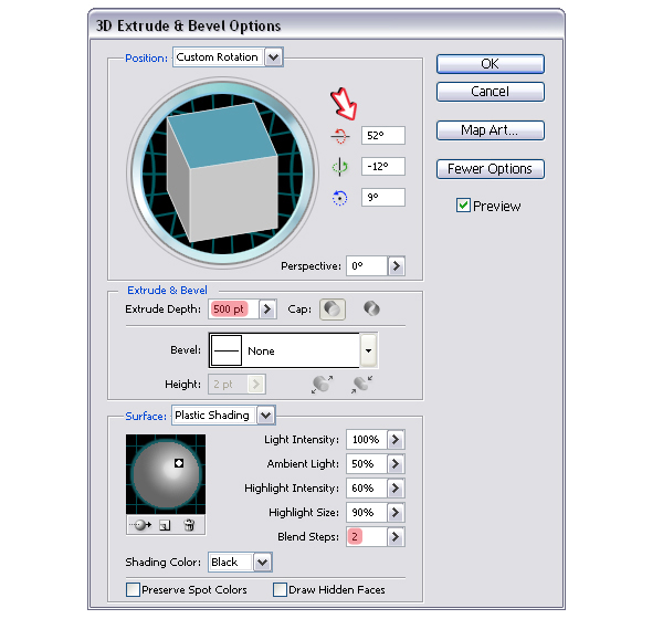
To create the folder you just need a simple path. To obtain it, first take the Rounded Rectangle Tool, click on your artboard and enter the values you see below. Next, use the Add Anchor Point Tool (+) to add another point then switch to the Scissors Tool (C) and click on the two indicated points to cut the path. Select any color stroke, increase the weight to 9 pt and press the Round Cap option. Now that you have the path, go to Effect menu > 3D and apply the Extrude&Bevel effect to obtain the folder.
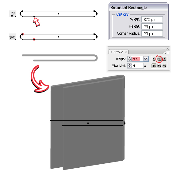
Here are the settings made in the Options window. It’s important to select only 2 Blend Steps because after expand we need as little shapes as possible to compose the folder.
Step 2
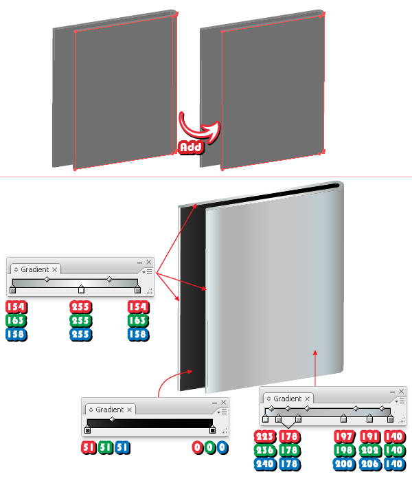
After you choose Expand Appearance from the Object menu, select only the two front shapes from the group, using the Direct Selection Tool (A) and click Add to shape area > Expand from the Pathfinder Panel to unite them. The next thing you have to do is color all the shapes as indicated.
All the gradients shown below are linear.
Step 3
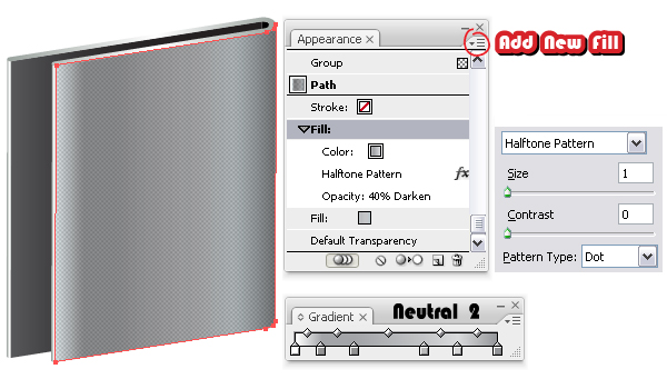
Having the front shape selected, go to the Appearance Panel, open the fly-out menu and select Add New Fill. Change the gradient to Neutral 2 that you can find in the Swatch Libraries menu under Gradients > Neutrals. Usually on a metal surface the Grain effect looks great but this time we will use something different. Go to Effect menu > Sketch and apply the Halftone Pattern effect. Set the values as shown and choose Dot as the Pattern Type. Change the Blending mode to Darken and reduce the Opacity to 40%.
Tip:You can also create a mask to be sure that the edges are sharp after you applied the effect. To do that, Copy and Paste in front this shape and first remove all the appearances. Now, select both the original front shape and the pasted one and go to Object menu > Clipping Mask > Make.
Step 4
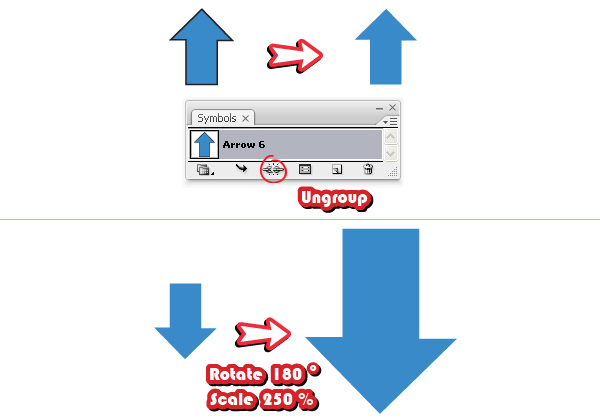
We will continue with the folder later, now let’s create the download arrow. Go to the Symbols Panel, open the Symbol Libraries menu and under Arrows find Arrow 6. Drag it into your working area, press the Break Link to Symbol button then select Ungroup from the Object menu. Remove the stroke then rotate it 180 degrees. At this point the arrow is too small therefore go to Object menu > Transform and Scale it about 250%.
Step 5
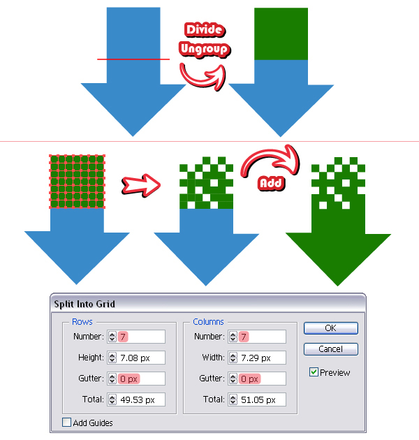
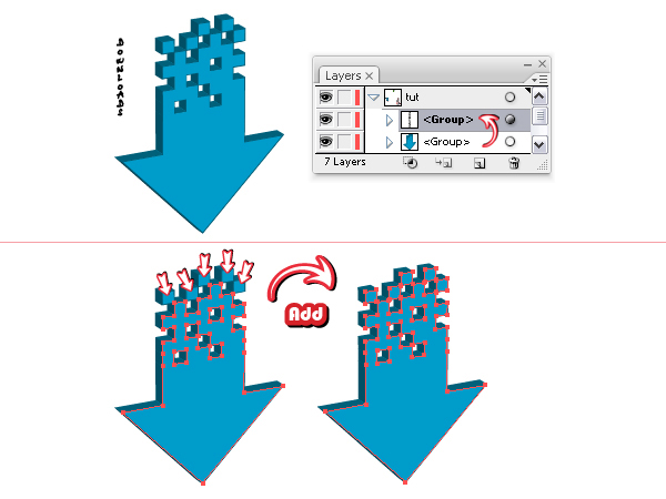
Take the Pen Tool (P) or the Line Segment Tool (Backslash) and draw a straight path over the arrow, like in the image. Select both the arrow and the path and click Divide from the Pathfinder Panel then Ungroup from the Object menu. Having the top green shape selected, go to Object menu > Path > Split into Grid. Here choose seven Rows, seven Columns and zero for the Gutter value. Delete some of the resulting squares then select everything and click Add to shape area > Expand to obtain the arrow shape that we need.
Step 6
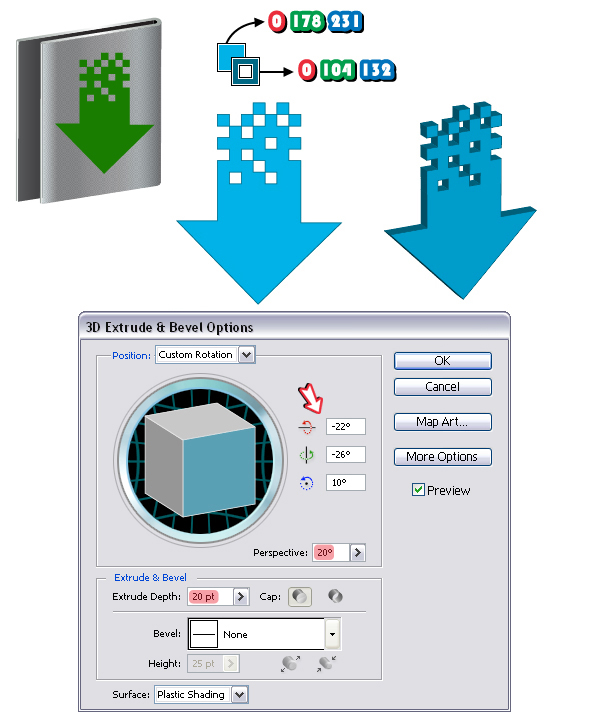
Before going further, move the arrow on top of the folder and scale it as much as you want. Set the fill and stroke colors as indicated then apply again the 3D Extrude&Bevel effect using the values shown below.
Step 7
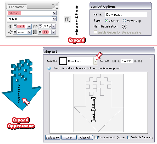
Take the Vertical Type Tool and type "Downloads" using a font called Hellphabet that you can find here. Choose Expand from the Object menu then drag the text into the Symbols Panel. Go back to the arrow, open the 3D Extrude&Bevel Options window from the Appearance Panel and press the Map Art button. Here select the text symbol from the list and apply it on the front surface. When you are done choose Expand Appearance from the Object menu. You will see later why we did this.
Step 8
Now, use the Layers Panel to find the text that should be there inside the arrow group. Once you have found it, drag it out of the group, above it. You will need it later, so put it aside for now and let’s continue with the arrow.
Select all the shapes of the lighter blue color, more precisely the bigger one selected below and also the five squares indicated and click Add to shape area > Expand from the Pathfinder Panel to unite them all in a single front shape.
Step 9
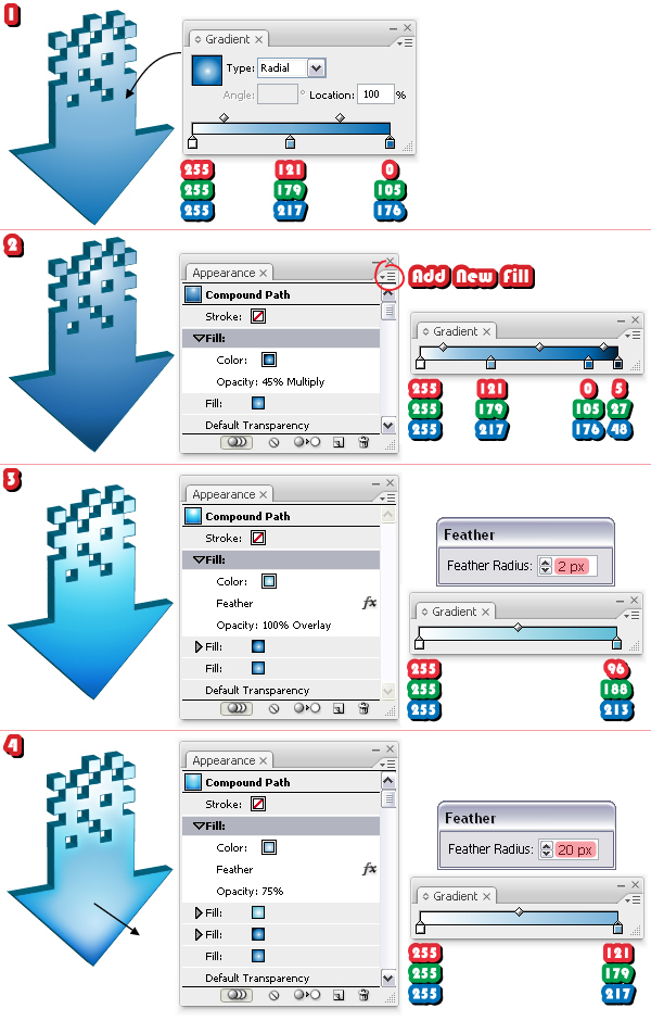
Fill the resulting front shape with the gradient shown (1) then open the fly-out menu in the Appearance Panel and add a new fill. Change the gradient to the one shown, set the Blending mode to Multiply and lower the Opacity to 45% (2). Add another fill and change the gradient to the third one shown. Having this fill selected go to Effect menu > Stylize and apply the Feather effect then set the Blending mode to Overlay (3). Add the last fill, change the gradient, apply again the Feather effect and reduce the Opacity to 75%. Use the Gradient Tool (G) to adjust the last gradient and you are done.
All the gradients shown below are radial.
Step 10
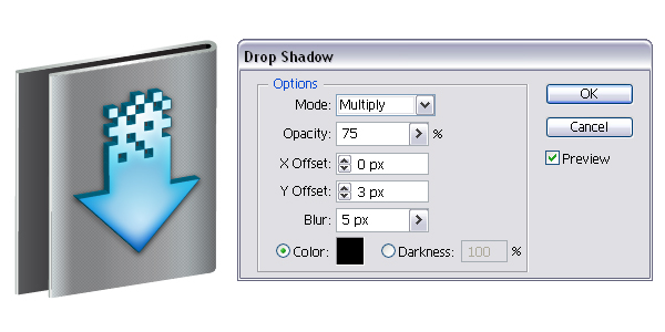
Move the arrow on top of the folder then go to Effect menu > Stylize and apply the Drop Shadow effect.
Step 11
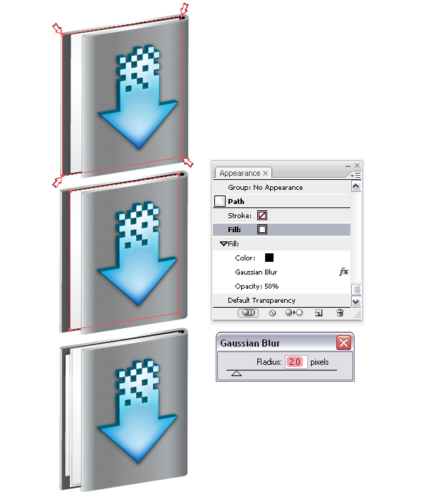
To create the pages inside you can use the darker back shape of the folder. Copy and Paste it in front then take the Direct Selection Tool (A) and move the corner points to make it smaller. Remove the gradient and select white as the fill color. To add a subtle shadow, add a new fill behind the white, change the color to black then go to Effect menu > Blur and apply a 2 px Gaussian Blur. Reduce the Opacity to 50%. The other two pages are made in the same way.
Step 12
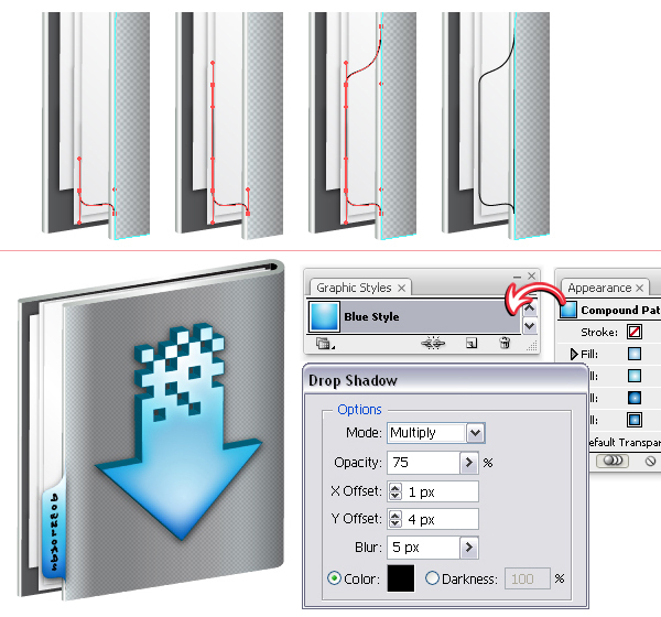
Now let’s create the label on the left side. Follow the sequence of images and using the Pen Tool (P) draw the label shape like in the image. Make sure you always drag the handles vertically. Select the front shape of the arrow then from the Appearance Panel drag the thumbnail into the Graphic Styles Panel to save the style you created at step 9. Now, apply the same style for the tag then take the text group that I said to keep at step 8 and place it on top. All that remains to be done at this step is to select the tag and from the Effect menu > Stylize to apply the Drop Shadow effect.
Note: If you have typed the text directly on the label, the perspective would have been wrong. This is the reason why I mapped it on the arrow, to give it the proper perspective. It could be mapped on the folder also, at the beginning of the tutorial. The difference might not seem big but the details always matter.
Step 13
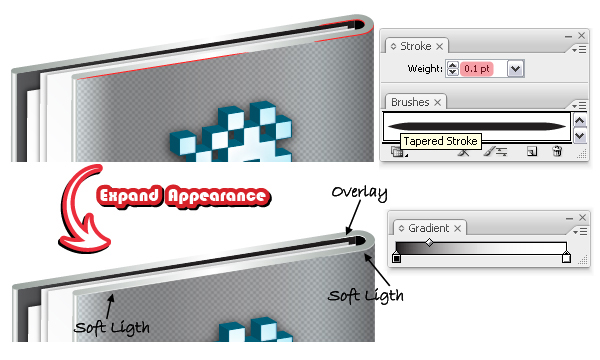
Follow the edges of the folder and draw with the Pen Tool (P) the red paths you see below. Stroke them with a brush called Tapered Stroke that you can find in the Brush Libraries menu under Artistic > Artistic_Ink. Change the Stroke weight to 0.1 pt then from the Object menu choose Expand Appearance. The two resulting shapes from the right are filled with a linear gradient from black to white and the one from the left is filled with white. Set the Blending modes as indicated.
Step 14
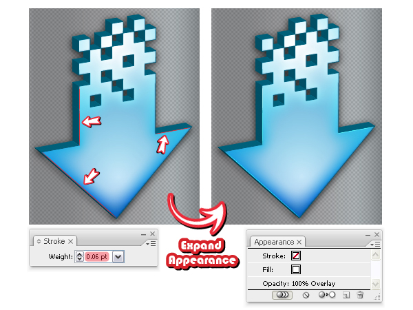
Let’s create some highlights on the arrow also and after that you are done. First, draw with the Pen Tool (P) the red paths you see below between the corner points of the front shape of the arrow. Use the same Art brush and select a 0.06 pt Stroke weight. Expand them, fill them all with white and set the Blending modes to Overlay.
Final Image
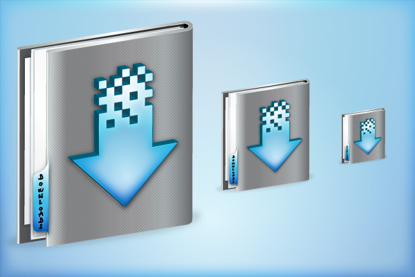
Here is the final image of the Downloads folder. If you want to scale the icon, make sure you first select Expand or Expand Appearance, depending on the case, for every stroke and effect applied.
{excerpt}
Read More