In this tutorial we are going to create fun, realistic, animal textured, 3D typography in Photoshop using CS5′s Repousse tool. Let’s get started!
Tutorial Assets
The following assets were used during the production of this tutorial.
- Leopard Texture
- Zebra Image
- Snake Image
- Reptile Eye
- Elephant texture
- Elephant trunk
- Hat
- Cat image
- Horse Image
- Tiger Image
- Frog Image
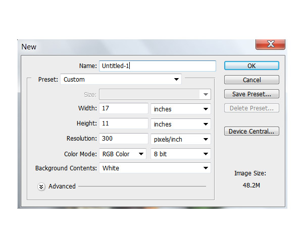
Step 1 – Document Setup
Open a new Photoshop file that should be 17 inches width and 11 inches high with a resolution of 300 pixel/inch.
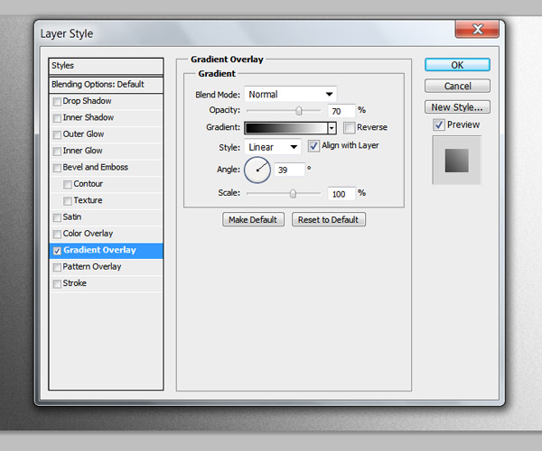
Step 2 – Background
First we a re going to create a simple background. I want the final background to be really bright so I can show off the letters properly but it would make it a little bit hard to work on, so I’m just going to put a subtle gradient that we can take out later.
Unlock the background layer by clicking twice on it and open the layer style menu. Select the "Gradient Overlay" option and select a gradient that goes from Black to White to an angle of 39° approximately and reduce the opacity to 70%.
Create a new layer on top of that and using the Bucket tool (G) set your foreground color to black and fill the layer. Then go to the menu Filter > Noise > Add Noise and use an amount of 20% with Distribution on Uniform and the Monochromatic option checked.
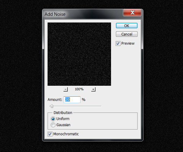
Go to Image > Adjustments > Invert (Command/Ctrl + I) and set the layer blending mode to multiply.
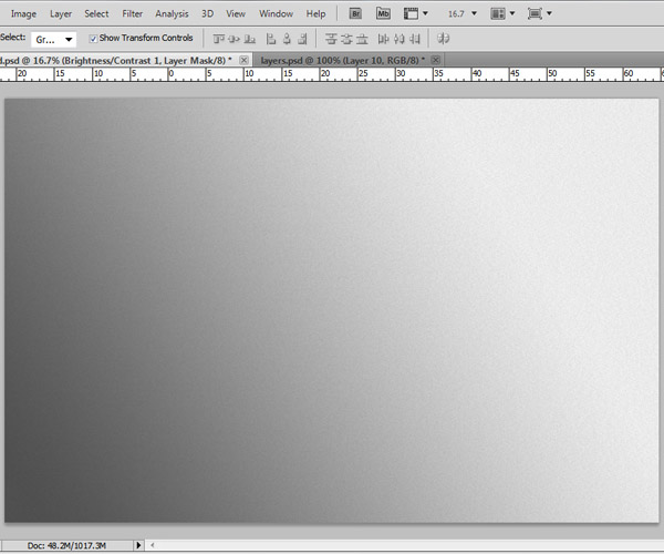
Your background is set and should look something like this:
Step 3 – Text rendering
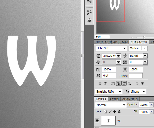
Select the text tool (T) and write the first letter of your text. We will be doing this letter by letter so we can give a different perspective to each one once we render them with the Repoussé tool. The font I’ll be using for this tutorial is called Hobo Std with the size of about 380 pt (Change the size depending on the document size you are working on).
Step 4
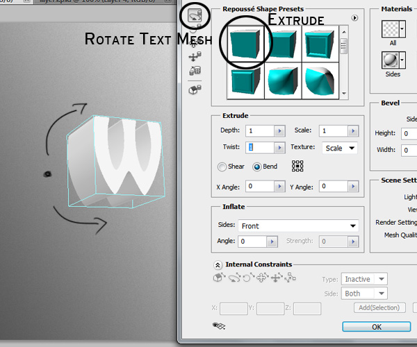
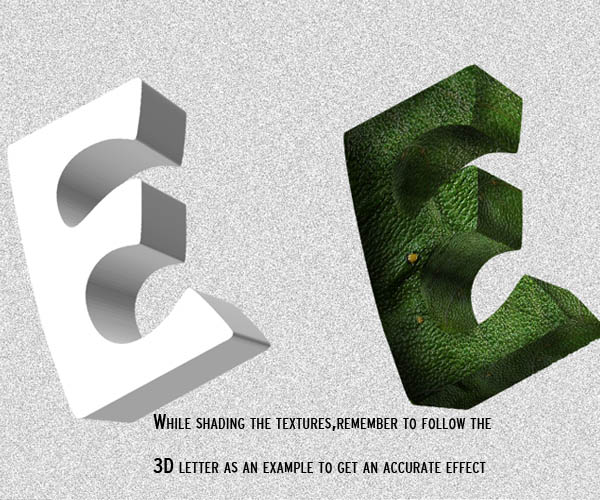
Once you have positioned your text layer, go to menu 3D > Repoussé > Text layer. Make sure you select the "extrude" shape preset and rotate your 3D letter to a nice perspective using the rotate text mesh tool. We are going to leave all the other options to their default settings. All the 3D letters will be the base of our work so take your time while positioning them and rendering.
Basically we are going to do the same for each letter in your word. Each time changing a little bit the perspective of the letter. You don’t have to worry about light sources right now, we are going to fix that once we start wrapping our textures around the letters.
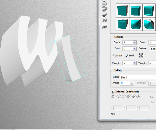
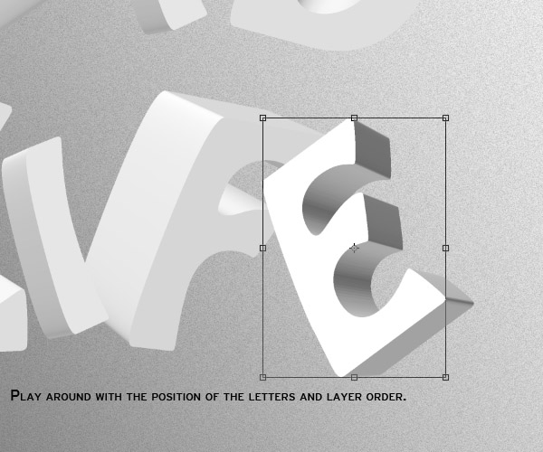
Feel free to play around with the position of each letter. As you can see here, I put the "L" in front of the "I" and "D" to give more variation and depth.
I suggest you save each word letters in different groups to keep things organized.
Step 5
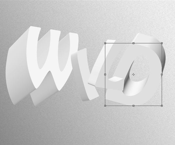
Do the same thing for the second word. Remember to keep rotating and playing around with the positions of the layers so they don’t look all the same. Create a new group for every word you make.
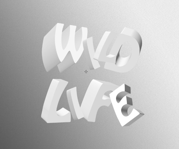
After you are done with each word, they should be separated in different groups to keep things organized for the next step. Your image with the rendered letters should now look something like this:
Step 6
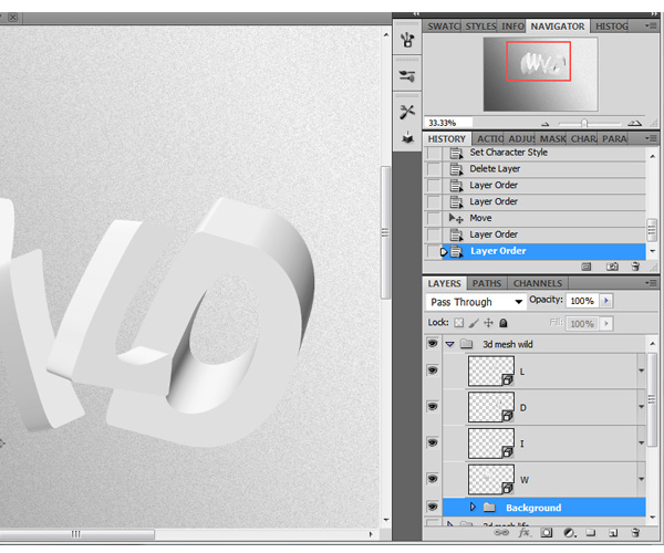
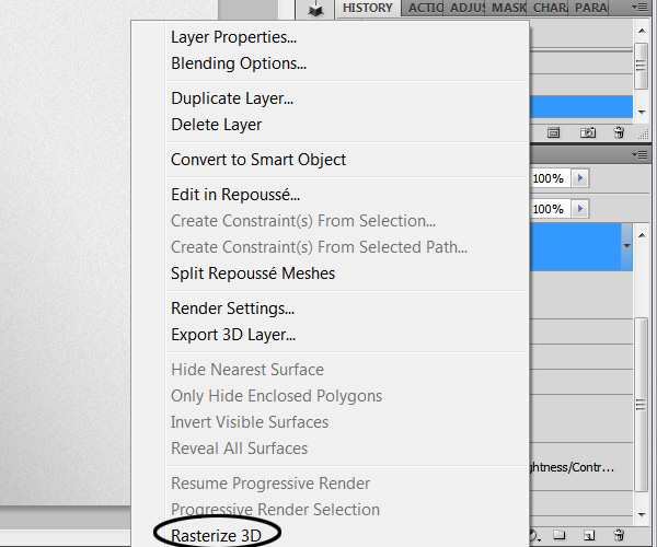
Copy the folders of your 3D letters and rasterize each one of them by right clicking next to the thumb of the layer and selection the option "Rasterize 3D", this will make it easier to work with them. If you wish, you can keep the original 3D words so you can go back to them in case you need to.
Step 7
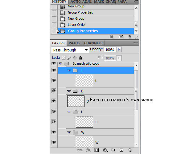
We will be using many clip masked layers and adjustment layers so I highly recommend you put each letter in its own group.
Step 8 – Preparing the letters
For this effect to work, first we need to isolate every side of the letter so we can wrap the textures according to the letters perspective. This process might be a little boring at first but in the end we will get a cool realistic animal texture effect.
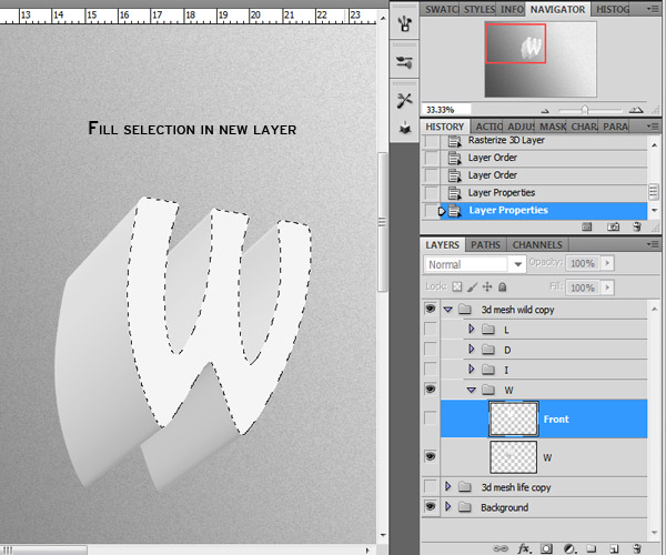
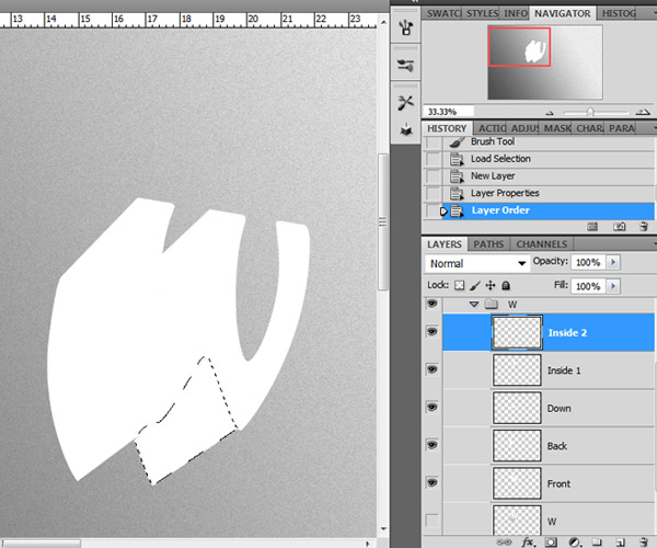
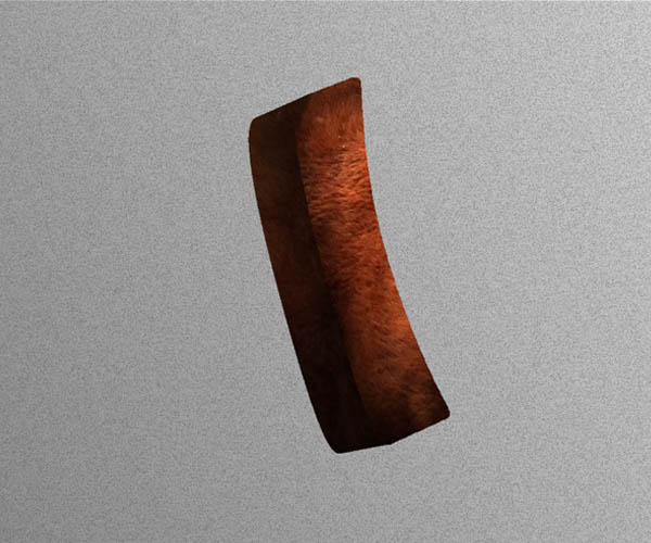
We are going to start with the letter "W". There are many ways we can isolate the sides of each letters. Right now we are going to use two methods. Using the Magic Wand tool (W) and the Pen tool (P).
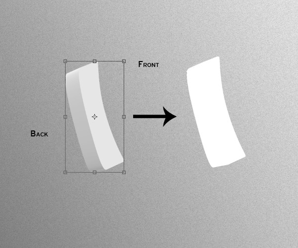
Select the Magic Wand tool (W) and click on one side of the letter. Once the selection is made, create a new layer and fill the shape with color white (ALT + BACKSPACE). Rename the new layer with whatever side of the letter you selected. In this case the "Front, "then we’ll go with the "Side" the "Back" and so on.
De – select the shape (Command/Ctrl + D) and go back to the "W" layer then select a new side with the magic wand tool, create a new layer and fill it with white. Repeat this same process for each side.
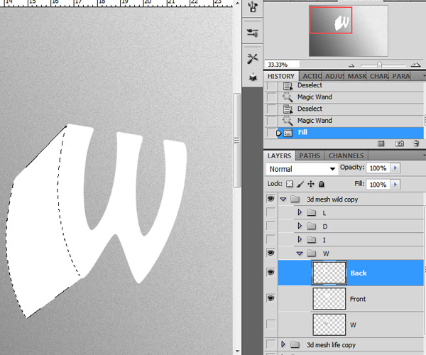
You might need to change the "Tolerance" value of the magic wand tool depending on how the selection is made. If the tool does a smaller selection than you wanted, select a tolerance value higher to the one you have set until you eventually make a selection of the whole shape.
It’s best if we fill all the sides with color white, that way we can quickly see if we missed texturing any spots on the letter.
Once you have all the sides of the letter isolated, you can turn off the layer visibility of the original 3D shape.
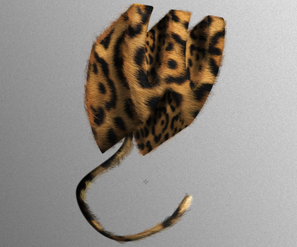
Step 9 – Texture Wrapping
Download the
Leopard fur texture and drag it to your document. We are going to duplicate it several times to wrap on each shape of the letter and we are going to link each of the texture layers with clipping masks. Drag the texture layer on top of the shape. While holding ALT and click between the two layers to create a clipping mask.
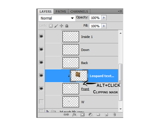
Now, using the transformation tools change the texture to match the perspective and position of the letter.
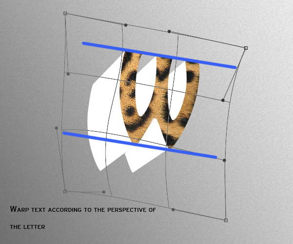
One of the best tools to wrap the text is the "Warp" option. Duplicate the text layer and clip mask one to each of the shapes and transform it accordingly.
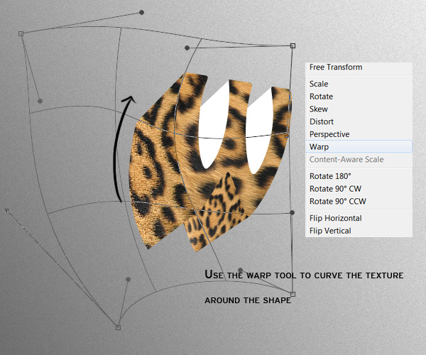
It may take you some time to get the perspective right but it’ll get easier as you do it.
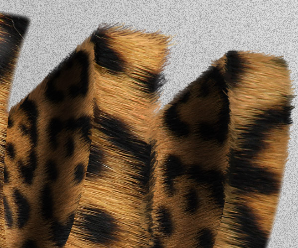
Once you’ve got all sides with the texture clip masked to each shape, your layers and 3D letter should look something like this:
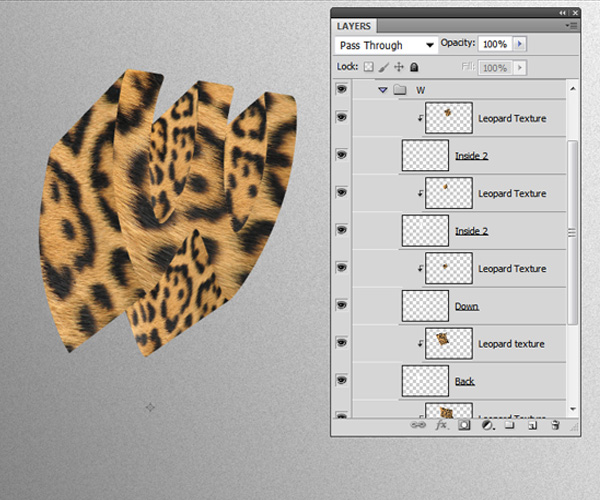
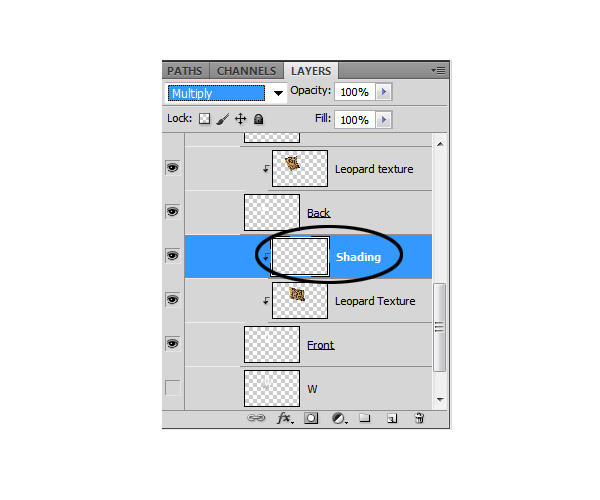
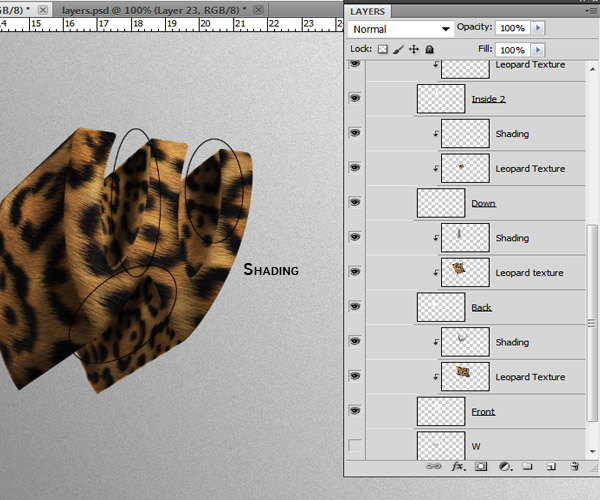
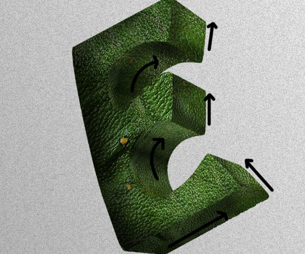
Step 10 – Shading
No we are going to apply shading to each side of the letter to add depth and realism. Create a new layer on top of the texture layer set its blending mode to "Multiply" and clip mask it.
Grab the Brush tool (B) with a basic circular tip of 0% hardness and about 150 pixel width with the brush opacity set to 30%, set your foreground color to black. Chose your light source (in this case I decided the light would come from the center part of the canvas on the upper side) and soft brush shades and shadows according to your light source.
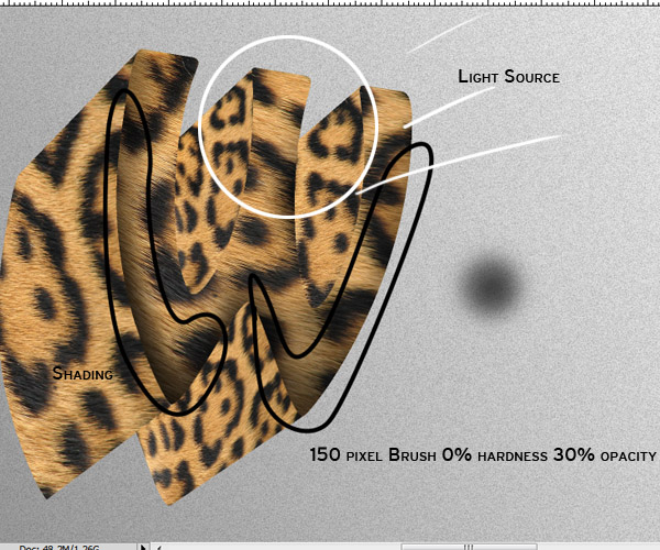
Brush as many times necessary on each side of the letter.
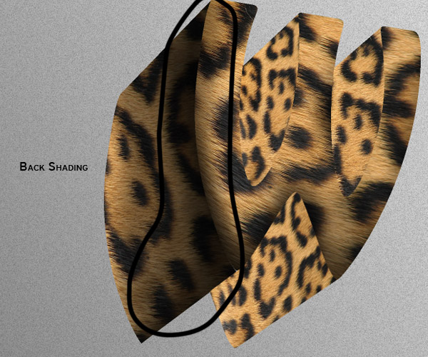
Your layers and shading should now look something like this:
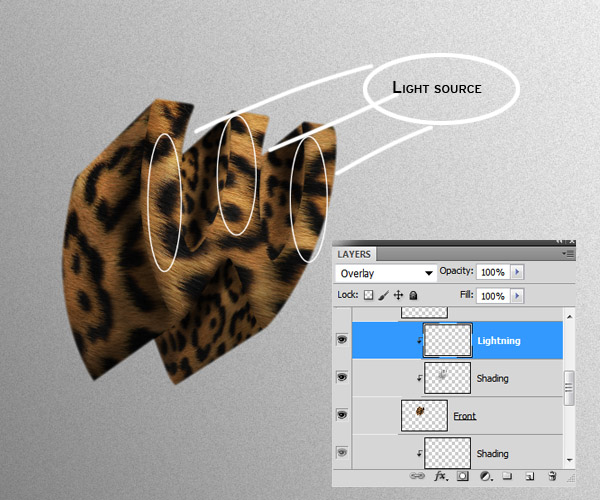
Step 11 – Lightning
Now that the shading on the letter is done, we need to enhance the parts where the light hits our shape. To do this, clip mask a new layer on top of the shading layer of the shape you want to add light.
In this case I’m just adding light to the front part of the letter. Set the layer’s blending mode to "Overlay" and using the same soft brush we used for the shading, now we are going to start painting with white.
Step 12 – Hair
The hair or
"fur" is very important for making this look realistical and overall add depth to the typography. Create a new layer on top of all the layers in your group. You don’t need to clip mask this one.
Grab the brush tool and select a hard round brush of about 3 pixels wide and 100% opacity. We need this to be really thing to get as much detail as possible. On the brushes menu make sure to check the "Shape Dynamics" option and set the Size Jitter Control to "Pen pressure."
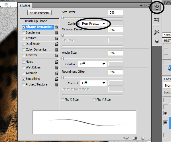
As you can see on the brush stroke preview, setting the control to pen pressure will make the stroke fade at the beginning and the end. I am using a graphics tablet to do this so the pressure dynamic will be better. In case you don’t have a graphics tablet, you can always use the Pen tool to draw tiny paths, then stroking them and duplicating them so you can fill the entire silhouette of the letter with hair easier.
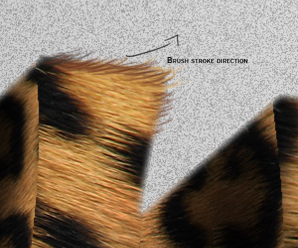
Start by holding ALT + Click on a color of the texture to enter a "quick eyedropper" mode and sample it (I suggest you start with the darker tones first) start doing quick short strokes around the edges of the letter following the direction of the hair in the texture.
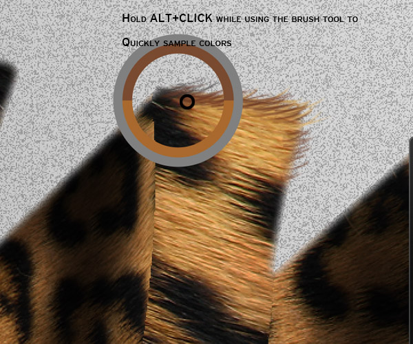
As you progress, keep sampling colors in regular basis (from the darkest to the lightest) taking in mind the colors on the texture to make a nice blending.
Take your time while doing this step. The more detail and variation of color you make the more realistic it will be.
Once you have all the edges covered with the painted hair, change the size of the brush to 1 pixel. Select a medium tone color and scribble some lines randomly around it.
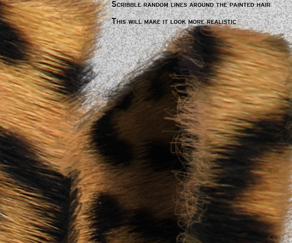
Keep working the hair until the edges are completely filled.
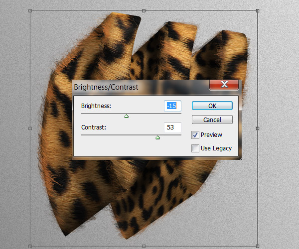
Step 13
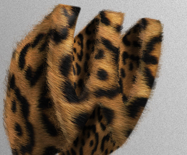
Now we are going to add some contrast to the image. When you are happy with the result of the previous steps, you can duplicate the "W" group and then Merge it (Command/Ctrl + E) to apply the next contrast settings:
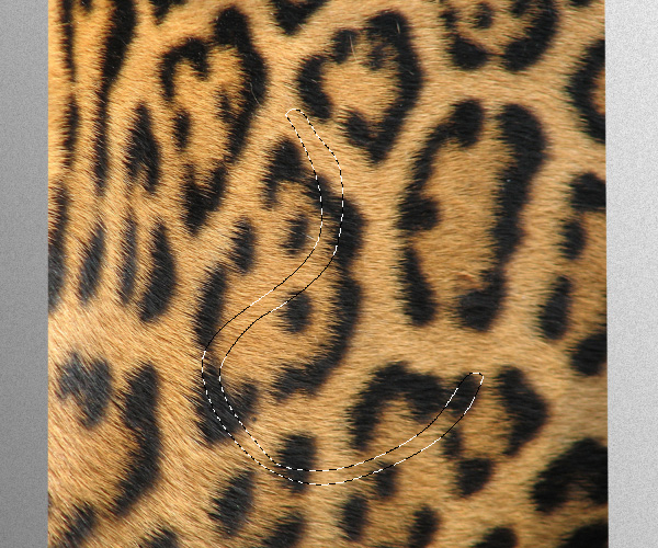
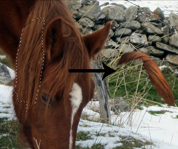
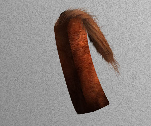
Step 14 – Tail
Little details like putting tails and eyes in this kind of manipulation really makes it pop and gives it a very organic look.
On the original texture image, Using the Pen tool or the Polygonal Lasso tool (L) draw a swirly shape and copy it into a new layer.
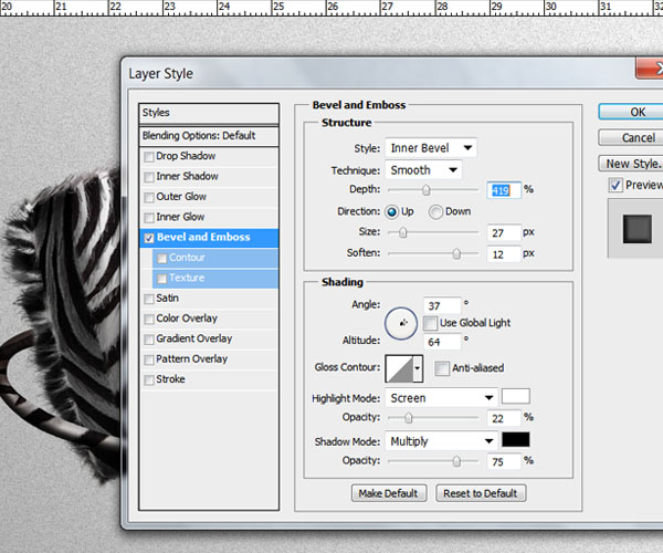
Now we need to give volume and shading to the tail. Go to the layer style menu, check on the Bevel and Emboss option and apply the next settings:
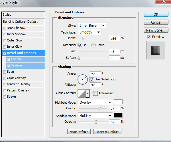
These settings will apply some shading and lights to the tail and give it some volume. Additionally you can clip mask a new layer and paint some more shadows and highlights like we did in the previous steps.
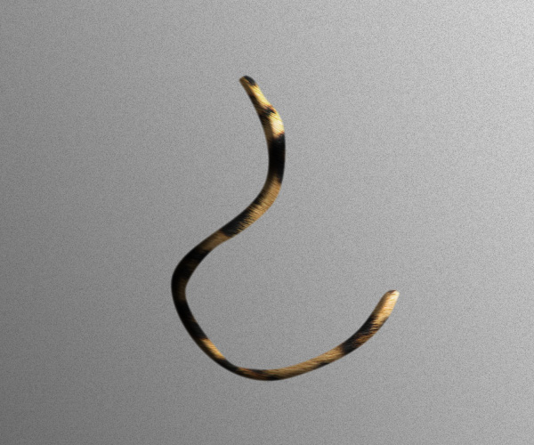
We also need to paint some hair. Use the same technique as we did with the letter edges.
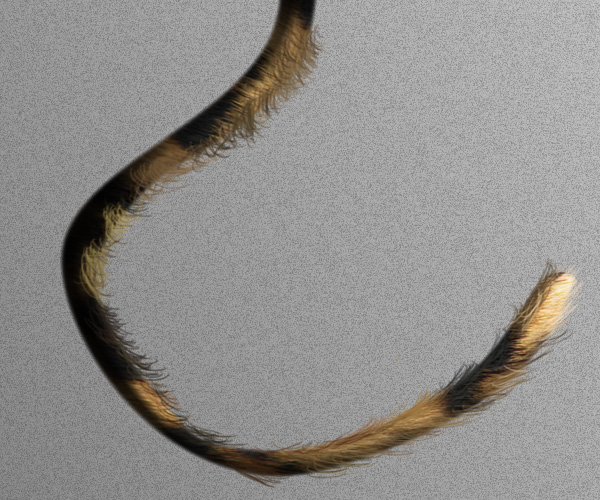
You can also put the tail layers into a different group. This should be below our letter so the tail hides behind it.
Step 15 – Letter "I"
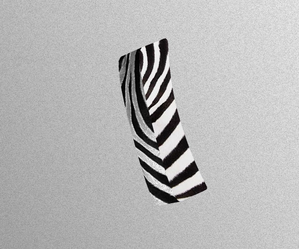
Just like we did before with the letter "W" we need to isolate both sides of the letter "I".
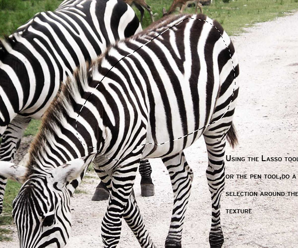
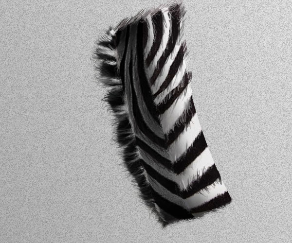
Drag the Zebras stock image to your document. Using the pen tool or the polygonal lasso, draw a big selection of the zebra skin and copy it to a new layer. This will be the texture we’ll be using for this letter.
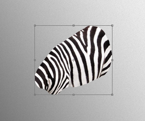
Using clip mask again, wrap the texture around the shapes. Be careful not to modify this one too much because we want to keep the zebra pattern as recognizable as possible.
Once you have the texture, its time to do the shading and paint highlights. Create a new layer, clip mask it to the texture and shade accordingly.

We also need to paint some hair around the edges. The difference is that this time, we need to paint the hair a little bit shorter than with the leopard letter. Use a hard round brush of about 2 pixels wide and sample the colors from the texture.
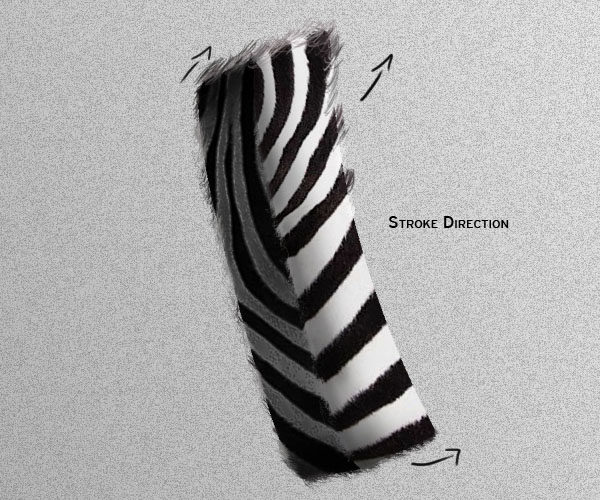
Since the texture looks a little bit flat the way it is right now. We need to paint also some hair details inside the letter. Use a 1 pixel and 2 pixel brush for this.
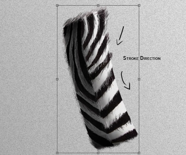
Step 16
For the detailing of this letter, go back to your original stock image and do a selection of the back hair of the Zebra. Use a feather radius of 3 pixels for the selection, and copy the hair into a new layer.
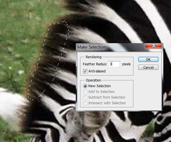
Place it behind the letter and paint some hair on it like on the step before. It should look something like this:
Step 17 – Zebra Tail
On the Zebra texture layer, draw a selection of another swirly shape (try to make each different from the other ones) and copy it to a new layer. Put this layer on top of the letter layers.
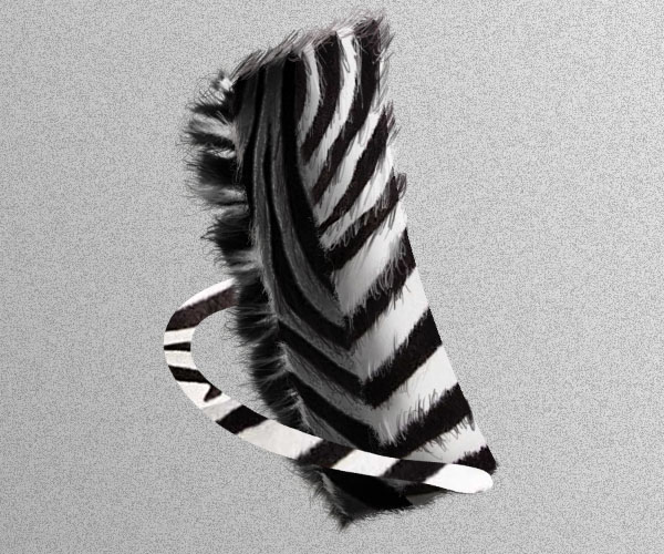
Clip mask a new layer and add shadings and highlights using a soft round brush.
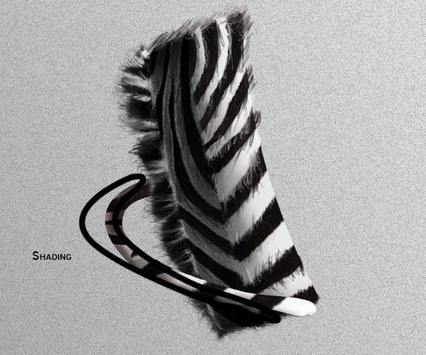
Open the layer style menu and use the next Bevel and Emboss settings to give volume to the tail. (Experiment with this values for different results)
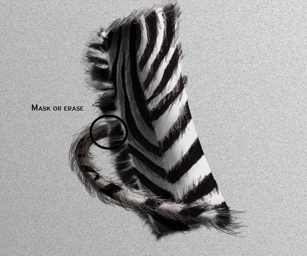
On a new layer, paint some hair to finish it off. Also mask or erase with a soft brush, a bit of the tail where it meets the back hair so it gives the appearance of the tail coming from behind to the top.
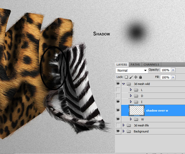
Step 18
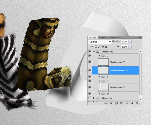
Create a new layer between the "I" and "W" groups. Here we are going to paint the shadow that falls on the "W" by the letter "I". Grab a soft round brush of about 200 pixels wide with an opacity of about 30% and brush over the letter
"W" where the shadow should be:
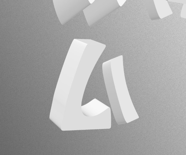
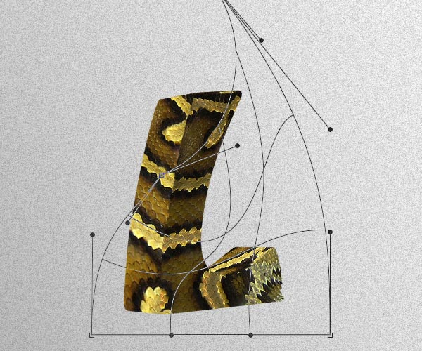
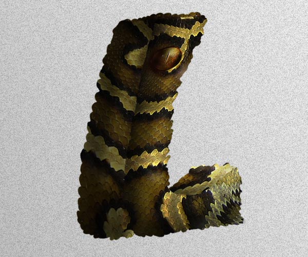
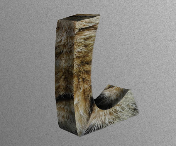
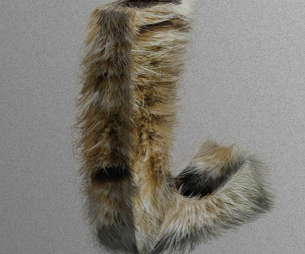
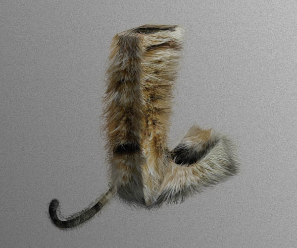
Step 19 – Letter "L"
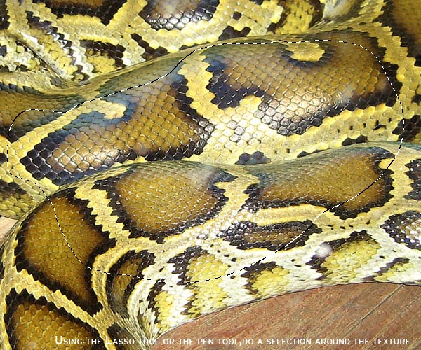
Start off by isolating each side of the letter into separate shapes. Then drag to your document the Snake skin texture, do a selection on the skin like before and copy it into a new layer.
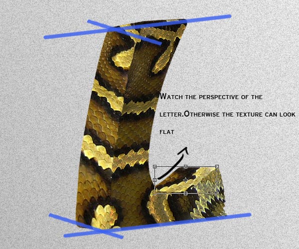
While clip masking the texture to the shapes, try following the texture patterns ans shapes. Experiment with different positions to see what would fit best. As you can see on the example below, I tried to make the pattern flow along the letter instead of just clipping the texture randomly:
With a texture like this it can easily look very flat if you don’t transform the texture according to the perspective of the shapes in the letter.
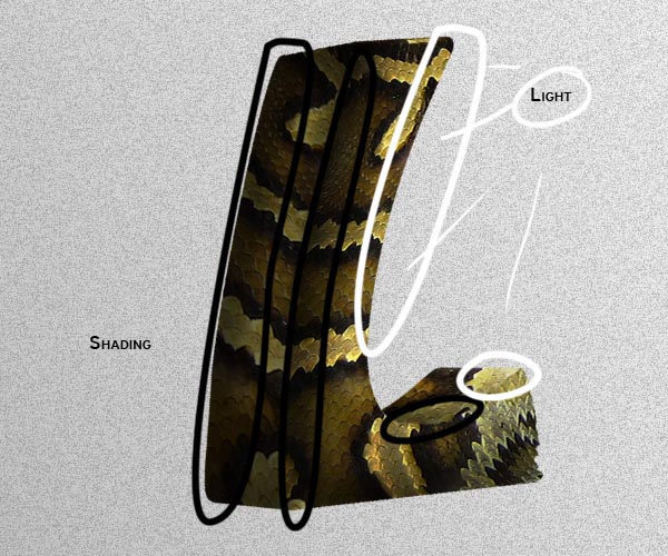
Add the Shading and lights like we did with the letters before:
Step 20 – Snake eye
Take the Reptile Eye stock image and drag it to your document. Using the pen tool, extract the eye from the image. Flip it horizontally, transform it to match the perspective of the letter and place it on top of the front shape layer.
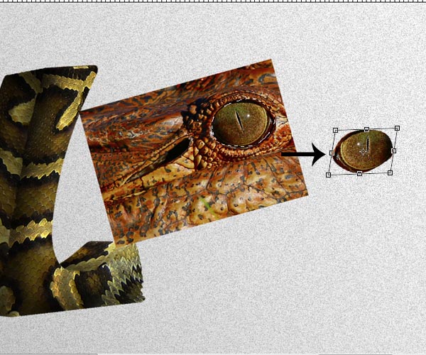
Now we are going to Dodge and Burn (O) it to match the light of the shape. Grab the Burn tool and select a soft round brush of about 30 pixels wide with the range of the Burn tool set to midtones and the Exposure to 25%. Brush around the darker areas to create some shading on the eye.
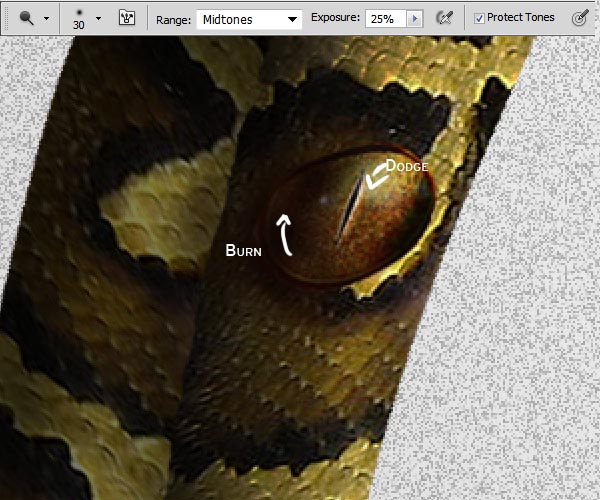
Now select the Dodge tool and do the same to create highlights.
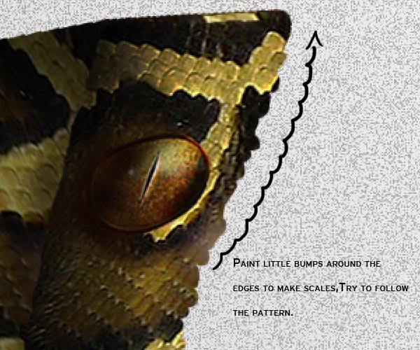
Step 21 – Detailing
Now we are going to add some detailing to the letter, to enhance further it’s animalistic reptile – like look.
Select a hard round brush of about 10 pixels wide and opacity set to 100%. Select the layer of the shape we clipped masked the textures on. Paint little bumps around the edges following the pattern of the scales. You’ll see the texture also acting on this new painted bits. If at any moment there are uncovered spots by the texture you can always transform it a bit more to cover everything up.
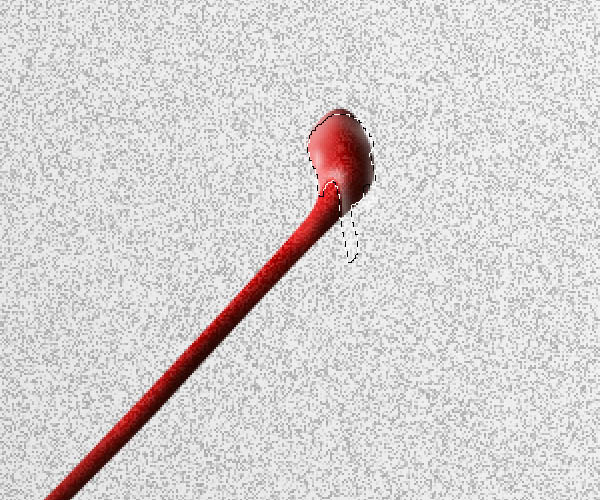
Step 22 – Shadows
Since this letter is positioned in front of other two letters we need to paint the shadows that fall over them. Create a new layer below the "L" group and use a soft round brush with color black and low opacity to paint the shadows on the letters just like we did back on Step 18.
Here is a look at the layers panel so far.
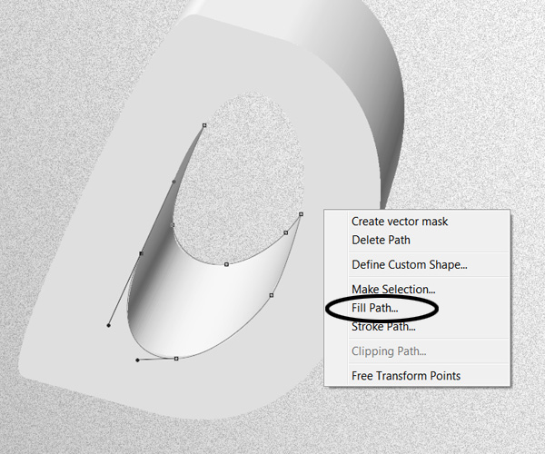
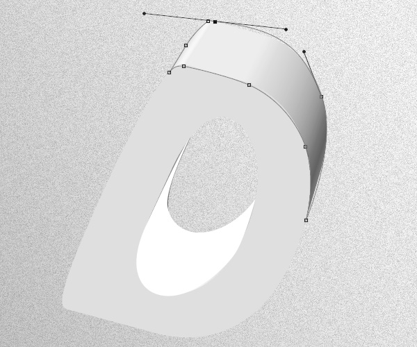
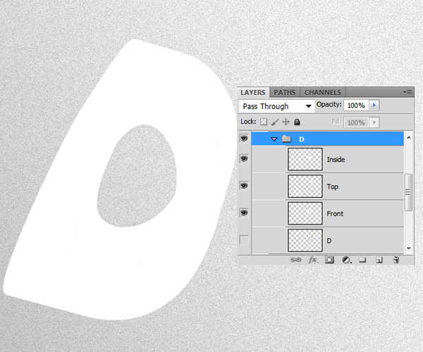
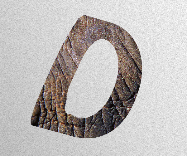
Step 23 – Letter "D"
Star by extracting each side of the letter in it’s own layer. In this case as well as on some other letters, using the magic wand tool might not work well. In this cases use the pen tool to draw a path along the shape and the filling it.
You might need to do this in letters that have a lot of shadows and curves.
Step 24 – Texturing
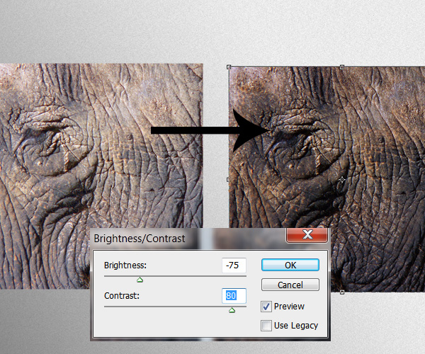
Take the Elephant texture stock image and apply the next Brightness and Contrast settings:
Just like we did on the previous steps, start clip duplicating and clip masking the texture layer to each of the sides of the letter.
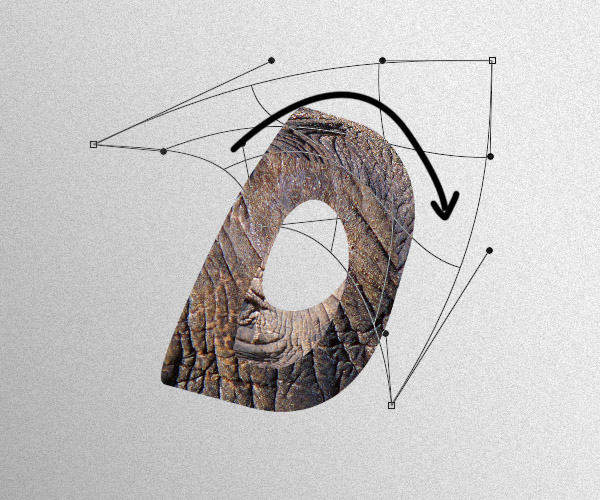
Be careful and take your time to morph the texture especially on the round areas.
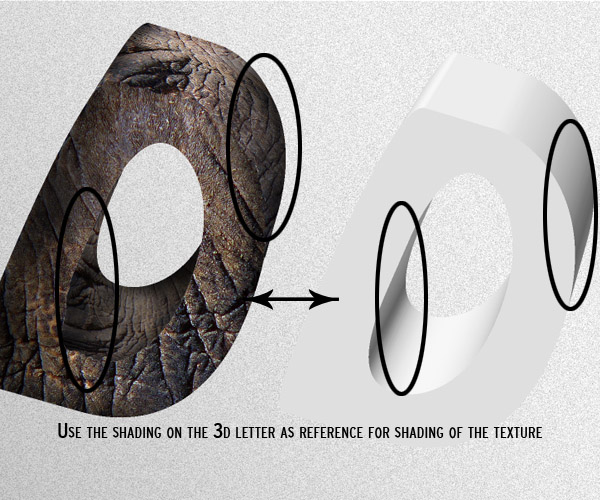
While doing the shading on the textures, take as a reference your first 3D shape, that way you can apply lights and shadows in a more accurate way.
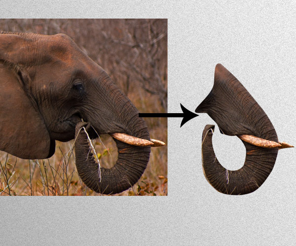
Step 25 – Elephant Trunk
Drag the Elephant head Stock to your document, flip it horizontally and using the pen tool extract the trunk of the animal.
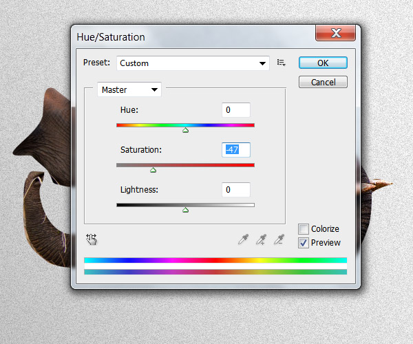
The image is a bit saturated at the moment and it will not blend with the rest of the textured layer properly. Go to the Hue and Saturation menu (Command/Ctrl + U) and desaturate the image.
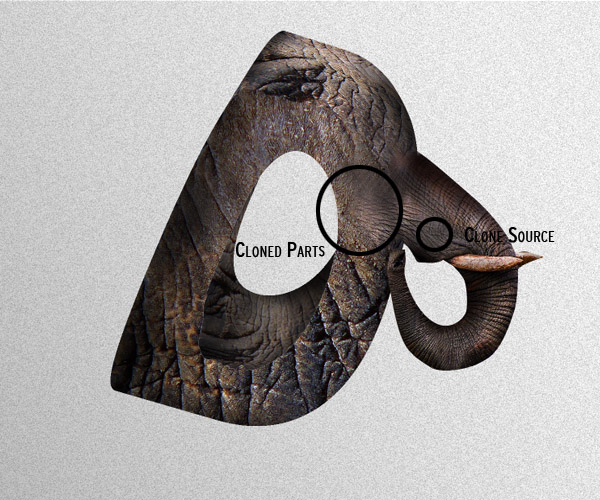
Now that the saturation is fixed, we need to cover up the little parts grass on the trunk, to do this, we are going to use the Clone stamp tool. Select it (S) and choose a soft round brush; while holding the key ALT, sample a part of the trunk that’s similar to the part we want to patch, once sampled, brush slowly over the grass bit, sampling from a different source every time you need it.
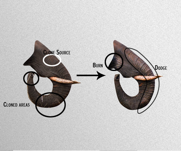
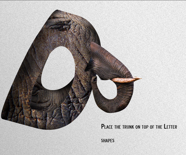
Using the dodge and burn tools, enhance the lights and shadows on the image. Place the trunk layer on top of the textured letter, we are going to start working on the blending of the trunk.
Add a layer mask to the trunk layer and using a soft brush, mask the edges of the trunk so it fades with the body of the letter.
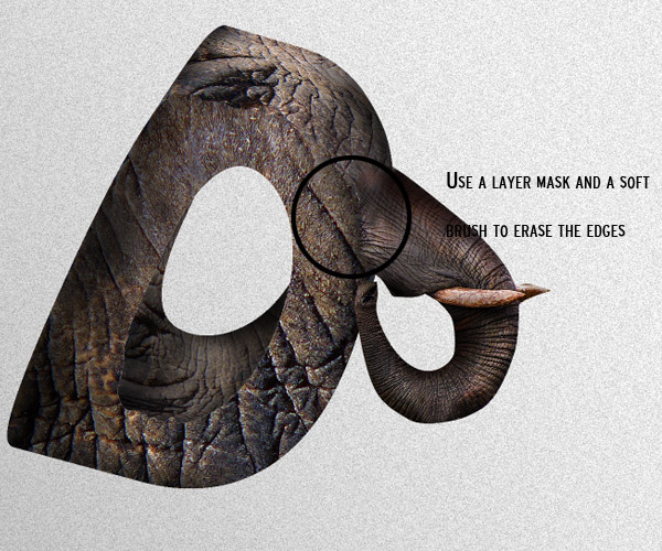
Using the Clone stamp tool with a soft brush, clone parts of the trunk into the body of the letter to get a better blending effect.
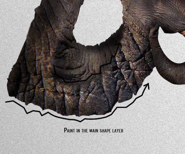
Step 26 – Detailing
Using the same technique as in Step 21, place yourself on any of the main shapes, and using a brush, paint along the edges with a hard brush following the pattern of the texture. Do this on the edges of every shape layer.
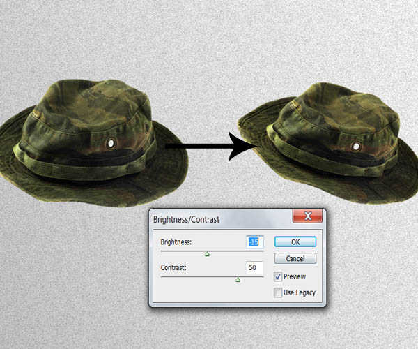
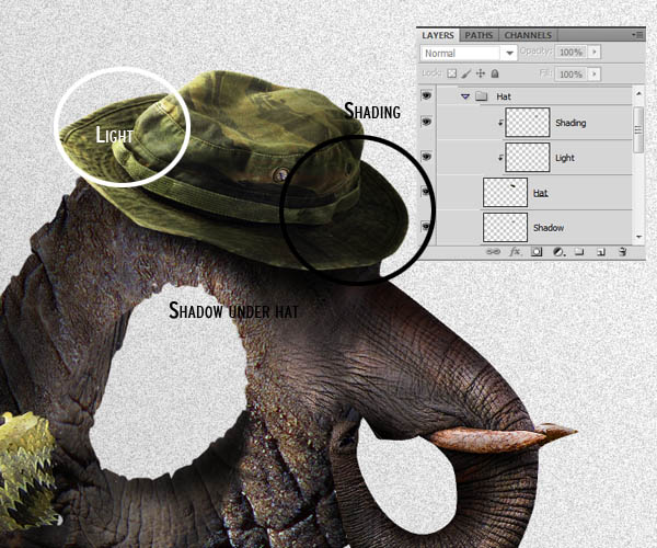
Step 27 – Hat
Take the Hat stock image and drag it to your document. Extract it then from its background then apply the next Brightness and contrast settings:
Place it on top the elephant textured letter. Create new layers and clip mask them to it to paint some shadows and highlights respectively. (You can also use the Burn and Dodge tools).
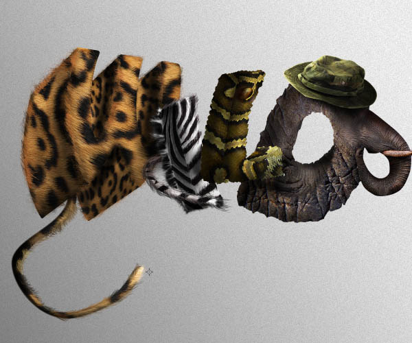
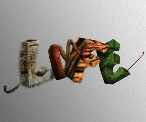
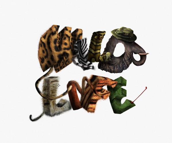
This is how your text should look like now after finishing the first word:
Now you are ready to create the next set of letters using the same techniques described in the previous steps. From now on, I´m only going to mention how to create the specific details for each of the new set of letter and skip the steps of isolating each part of the letter, shading and texturing since they’re the same for each letter.
Step 28 – Letter "L"
In this letter we will be using a Cat image stock as texture.
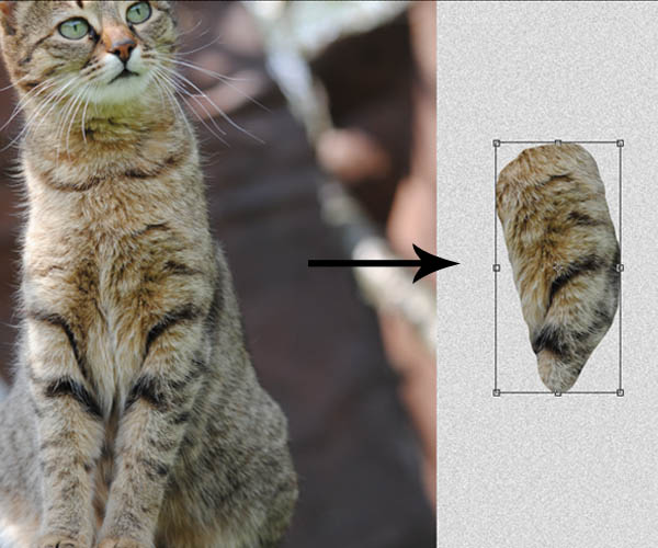
The painting of the fur and wrapping of the texture will be somewhat similar to what we did with the letter "W".
When you start painting the fur on this one, make sure you give it longer strokes, to match the length of the fur on the cat. Start the strokes almost at the middle of the texture, this will also help with the blending. Also keep in mind the variation of the colors.
Don’t forget to add little details on your letters, for instance, the cat tail. (Same process as step 14).
Step 29 – Letter "I"
This letter will be similar to what we did on the first letter "I" but In this case we are not going to paint any hair on it since the
Horse stock image already had a very nice texture.
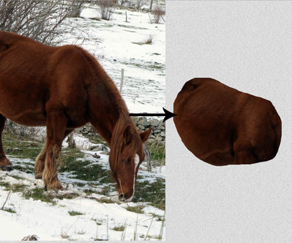
For the tail, I selected a part of the hair from the horse stock and placed it on top of the letter.
Then paint some hair with large strokes to improve the blending with the shape.
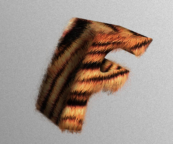
Step 30 – Letter "F"
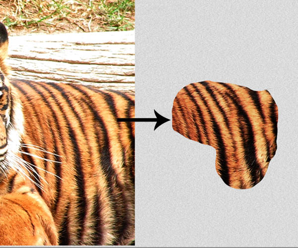
The next to letters might be the most difficult ones to texture mainly because of the large numbers of sides they have. Remember to use the original 3D letter as reference for the shading and lightning. Since we are using a Tiger stock image as texture, we’ll make this layer like we did with the letter "W" and the second "L" with the cat fur texture.
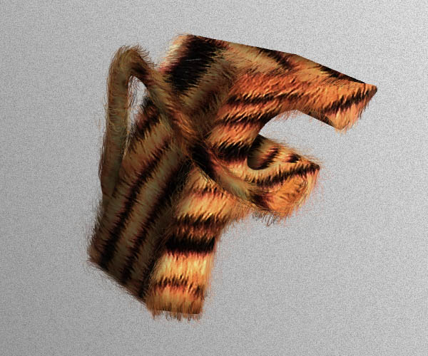
Create new layers between the letter groups to paint the shadows cast on the shapes.
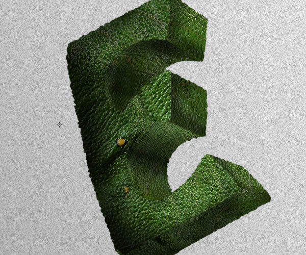
Step 31 – Letter "E"
This letter will be very similar to the snake textured one since we are using a Frog image.
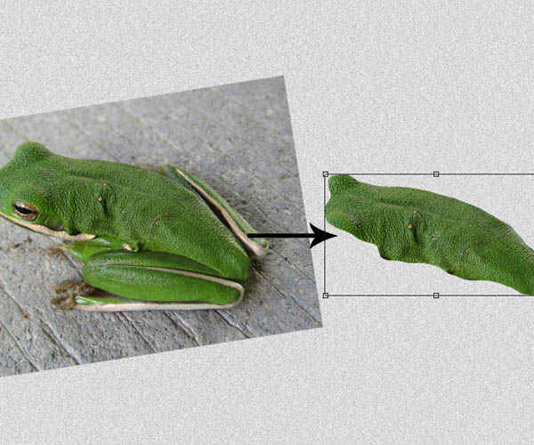
This will be perhaps the most difficult letter to texture because of the number of sides and curved shapes, so take your time to morph the texture carefully.
Paint also over the main layers to make scales around the edges of the letter just like in step 21.
Step 32 – Tongue Detail
Grab the pen tool and draw a path in a new layer like the example below the fill it with a bright color red.
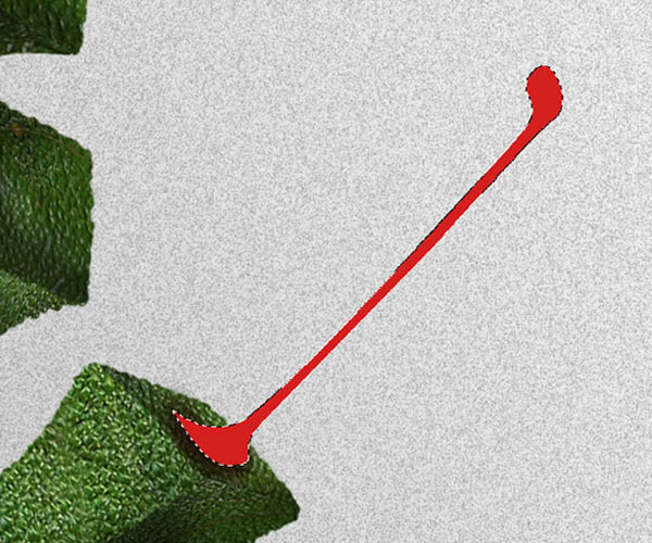
Clip mask a layer to this shape and paint over with a soft round brush some shading and highlights. Below, paint a shadow that’s going to help blend with the Letter:
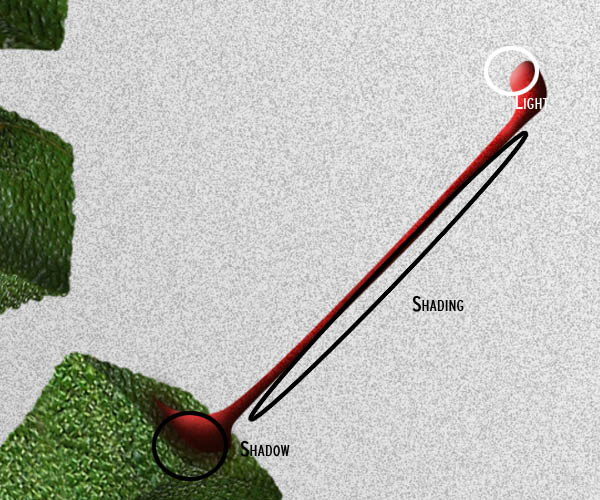
Using the Polygonal Lasso tool, draw a swirly selection on top of the tongue shape. With a soft round brush at low opacity (about 20%) and color white, brush gently inside the selection. Just paint softly over the edges to make a saliva effect on the tongue.
Step 33 – Shadows
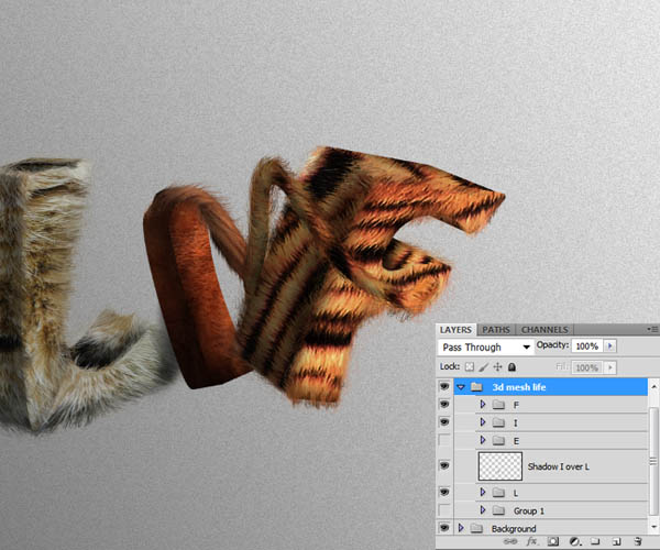
Create a new layer between the "F" and "E" layers and paint the shadow that falls on the letter.
The second word of your typography should look now something like this, with all the texturing and shading applied:
Step 34
At this point you can take out the gradient layer we put in step 2 to help us have some contrast between the background and the shapes we were working on, leaving an almost white background with noise.
Step 35 – Text shadow
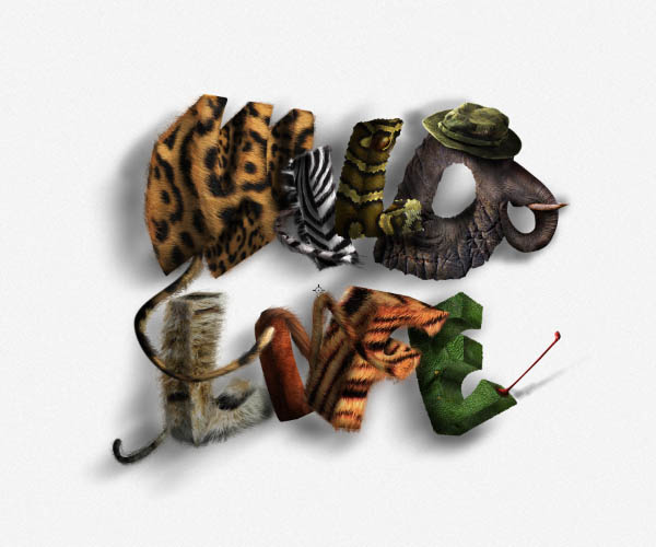
Create a new layer on top of the noise layer of your background and using a soft round brush with color black set to about 20% opacity, Paint shadows under the text based on your light source:
Step 36 – Final Adjustments
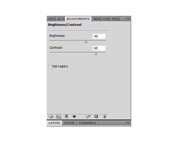
To finish things off, we are going to add a Brightness and contrast adjustment layers to enhance highlights, shadows and color saturation. Go to Layer > New Adjustment layer > Brightness and contrast and set the next values: (this layer should be on top of all the layers).
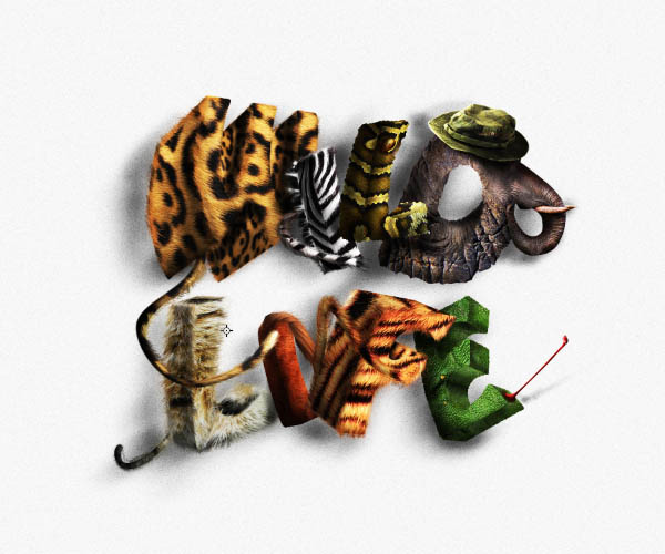
Your text should now look something like this with the new adjustment layer:
Final Image

{excerpt}
Read More