CorelDRAW is considered top, both for vector editing and prepress solutions. Its unique capabilities exceed the typical vector designing software, places it deep in the heart of the user who tried it and understands it. In this article I will not discuss the ease you can use VBA with, nor the multi-page capabilities that makes it an excellent DTP software. We won’t even talk about the pioneering concept of adding a mail-merge sub to a design program, to allow you to auto-numbering forms all the way to change the details of a company’s cards for each one of the employees with almost no effort, almost a decade ago.
We are going to talk about is the page and layout setup, as well as the very sophisticated pagination system inside the printing environment. And we are going to do that step by step, while working on a two sided business card with a map.
Step 1. Start a New Document
Go File > New or press Command + N.
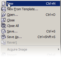
This will start a new document based on your system’s defaults preferences. In my case it started an A4 document with its units set to millimeters.
In most of the cases though it will be Letter, set to inches. This is just a starting point for the options here.
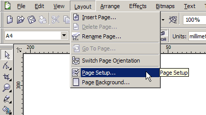
Step 2. Set the Dimensions at the Page Setup Dialogue
After you have decided about the dimensions of your design, it will be very good practice to change the page to match your final product. This will help you put all your items in place, control the surrounding spaces (padding), allow for bleed limits in case you need them, and setup the imposition layout at the time of printing. So go to Layout > Page Setup.
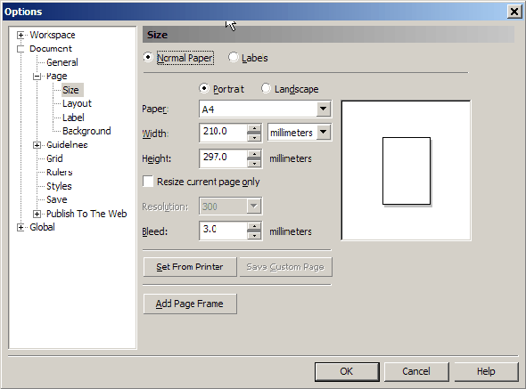
In this dialog, which is part of the Options tool, we can set the dimensions of our card. Let’s talk a bit about the Page Setup, the options given here, and the opportunity. In this case 90 mm by 55 mm, which is one of the standard sizes for business cards.
Step 3. Allow Bleed
If we have to prepare the final product for prepress, it is a good idea to setup a bleed limit. We can do that at this point.
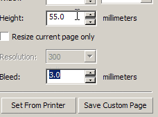
Bleed limits are a value best discussed with your printing office. It has to do with the precision of their guillotines, the accuracy of their cutting personnel, etc. Generally it ensures that your work will go right through the edge of your artwork after trimming. A very good limit is 3mm, but as I said you better discuss that with your printing office.
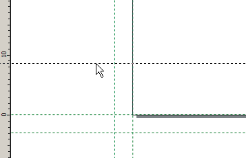
Step 4. Add Guidelines
We will need at least one set of guidelines to mark the edges of our artwork.
I suggest using another set to point where the bleed limit is, but you can omit those and let your design flow freely outside the edges of the card as far as needed.
To add prefixed guidelines we Right-click one of the rulers and hit the Guidelines item. Again the dialogue opened is part of the Options tool. On the left part of the dialogue under the Guidelines group is the Presets option.
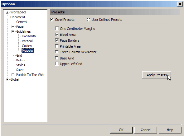
There are a variety of presets, but all we are interested now is the Bleed Area and the Page Borders, so click check on them and hit OK. It is considered a very good practice to manually save your file every few steps. At this point I would suggest you hit Command + S to save your work. Name your file “EmfasisCard.”
Step 5. The Object Manager
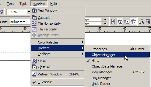
Another feature of CorelDRAW that we are going to need is the Object Manager. Choose Window > Dockers > Object Manager. This will launch a docker, which in most cases will dock at the right of your workspace.
There are a few tweaks that we will have to do here. Make sure that both Edit Across Layers and Layer Manager View are enabled and that the Show Object Properties is disabled.
Step 6. How to Create a Layer
The concept of layers comes from traditional designing on a (usually inclined) design board where artists used to add layers over layers of tracing papers one on top of the other to help them work on different aspects of the same artwork. The same concept applies to almost all design software nowadays and CorelDRAW is not an exception.
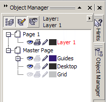
At the bottom left of the Object Manager docker there are two buttons.
Both will add a layer. The right one will add a Master layer, a layer which will maintain its contents and run across all the pages (if more than one). The left one will add a plain layer, which will run across all pages again, but without keeping its contents.
Step 7. Rename a Layer and Move it on the Stack
We just need a New Layer. The added layer now is selected and on top of the previous one. It is always an excellent practice to rename your drawing layers with a key name of what they contain. If you are designing a map for example and a layer holds all the highways, you should name it “Highways,” and with another that has the rivers simply name it “Rivers.”
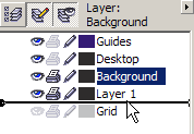
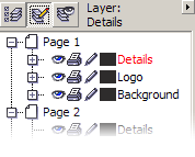
The one we just created will contain a little background artwork so guess how we will name it. You guessed correct. Right click on the name of the layer and select rename. Change the name to “Background” and hit enter. Click-drag the layer under the “Layer 1.” We should also rename the “Layer 1″ to “Details.”
As you noticed there are three little symbols next to each layer. An eye, indicating whether the layer is visible or not, a little printer that lets us know if the layer is printable or not, and a small pen locking and unlocking the layer to edit. As you can see system’s layer Guides and Desktop are visible, editable, but not printable. The layer Grid is also invisible. We are going to be using this features of the layers a lot so make a mental note of them.
Step 8. Add a Guideline Manually
Let’s place the background artwork. Just a simple rectangle, with a radial gradient fill, that goes from blue to white. We will do that by selecting the Rectangle tool, which is located at the tool bar on the left of your screen, but before that we need to set the height of the rectangle and we will do this by setting a guideline at the specified position. Click-drag from the top ruler a line all the way around 8 mm from the bottom of your card.
Double-click on the guideline we just inserted. At the emerging dialogue the entire set of your document’s guidelines will appear with the one you just clicked-on selected.
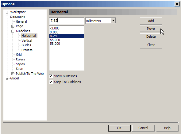
At the text box type 7.62 mm (0.3″ inches) and hit Move. This will move the guideline at the desired position. After that we have to make sure that our objects will snap on the guidelines. There are several ways to achieve that, the simplest being View > Snap to Guidelines. For now make sure all other Snap options are disabled.
Step 9. Draw a Rectangle
Now we can draw our shape. Select the Rectangle tool from the tool box. Click at the outside corner where the 7.62 mm guideline meets the left vertical bleed line and drag all the way to the bottom right corner where the right vertical and the bottom bleed line crosses.
Remember that everything outside the printable area is (as it states) not going to be printed. The actual dimensions of our shape is 3mm + 90mm + 3mm wide and 3mm + 15mm height. Yet after the card is trimmed only 90×15 will remain.
Step 10. Coloring the Shape
The location of your palette might be at the right of your workspace, next to the dockers. To expand the entire palette and be able to access all of its colors click at the little arrow at the bottom of the color column.
All shapes you draw in CorelDRAW by default have no fill and a black hairline (0,073mm / 0.003 inch) outline. Let’s paint our rectangle a light blue-ish color and give it a radial gradient. With the shape selected, left-click the Sky Blue color as shown. This will fill our shape. Now press G to select the gradient tool. Click + Drag inside the filled area to the desired direction of the gradient. This is what I came up with.
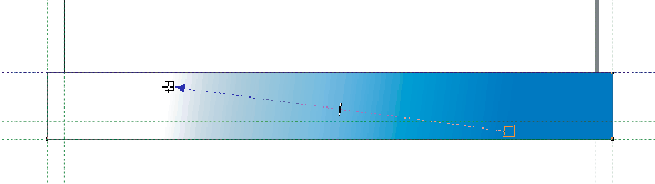
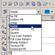
Now at the left side of the properties bar, the drop down menu lets you choose from a variety of filling types, select Radial.
Now click at the circle or the radius of the gradient and drag the gizmo to the right to achieve an effect like this. Again in reality this is more of a technical guide, rather than an artistic tutorial, so feel free to experiment.
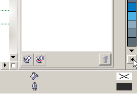
Step 11. Changing the Outline Color
Changing the outline color in CorelDRAW is very simple. With our shape selected, Right-click at the color palette on the Ice Blue color next to the one we filled our rectangle. To change the fill you select a color with your left mouse button. To change the outline, you use the right. Simple as that.
Step 12. Changing the Outline Properties
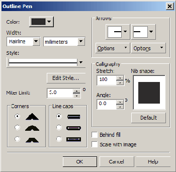
The default outline CorelDRAW adds when you create or draw a shape is rarely useful, but it is always a start. You can change the thickness of the outline using various methods. From the Property Bar, you can either select a predefined value or type your own. You can access the Outline properties dialogue from the Tool Box (the short-key of which is F12). Now at the Width text box type 0.2 and hit enter.

Step 13. Import a Logo to a Separate Layer
Since this tutorial is not a design how-to, but simply offers some general information about setup and prepress, we are not going to deal with design at all here. So I am going to import a simple logo that I made for this instance.
As I said earlier it is an excellent practice to keep all your assets in separate layers. So create a new layer the way it is described in Step 6. Name it “Logo” and drag it lower in the stack, between the layers “Details” and “Background.”
You should also lock the layers “Background” and “Details,” as described in Step 7, by clicking the little pen-symbol next to them.
Make sure the layer “Logo” is active, by clicking on its name once and going to File > Insert. From the Files of Type drop down menu select CDR – CorelDRAW, locate the file named “EmfasisLogo.cdr” and press Import. Now your cursor changed to something like this:
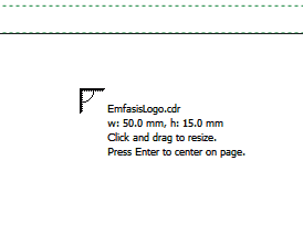
You’ll see a small placeholder with information regarding the filename you attempting to import, the width and height dimensions, 50 x 15 mm in this case, as well as some quick tips. We will take the advice no 2 and hit enter. This will import our logo at the center of the document.
Now let us take a small tour of our working environment and see what is going on. First at the left side of the status bar, we see a lot of useful information, such as:
- The precise dimensions (50.000 x 15.00)
- The absolute position of our object, (45.00; 27.500)
- Our cursor’s current positions (56.337;12.994)
- The type of object and the layer it resides on (a group of four objects on layer “Logo”)
- and some tips (…)
On the right side of the status bar we can see the fill and outline colors of our object, as well as its outline thickness. Since our object is a group of objects and several fills and outlines, it shows nothing.
Step 14. Positioning Objects on Your Page
Let’s now resize our logo and place it on its final position. With the object selected go to the Property bar and make sure the little lock for the proportional dimensioning is locked (unchecked).
In the width text box type 40.00 and hit enter. Proportionally reduced, the height from 15.00 is now 12.00 mm. Make sure your Snap to Guidelines option is on (View > Snap to Guidelines) and drag your object at the top right page corner to snap at the page border guidelines. You’ll feel the drag as you approach a few pixels away.
Now let’s move it a bit and place it at its final position, that being 8mm from the top and 6mm from the right. We can do that either by using the keyboard arrows or from the Transform docker. We can also do it by calculating its final exact position and give the final x, y values at the Property bar, but let’s not make it too complicated. With nothing selected go to the Property bar and locate the Nudge Offset text-box next to the Units drop down menu.
Change its value to 8.00 mm, select the logo and hit the down arrow once. Next deselect, change the Nudge Offset value to 6.00 mm, select your object again and this time press the left arrow key. We’ve come that far, we better save; hit Command + S to save your job. Just in case.
Step 15. Copy an object from Inside a Group Without Ungrouping
Check your status bar, it says that you have a Group of 4 Objects on Logo. Now, without necessary ungrouping, we need to go lower in the stack. Select and make a copy of the white mirrored ‘f’ shape. To do this, with your object selected press the Command key and left-Click at the white ‘f’ once.
Check your status bar again. Now it informs you that you have a Child Group selected. With the Command key still pressed Click once more. The status bar now says that you have a Child Curve selected. Press Command + C to copy and Command + V to paste. Although this curve is on top of the other, it is not part of the group. Press P to position this little shape at the center of your document, fill it with yellow and forget about it for now.
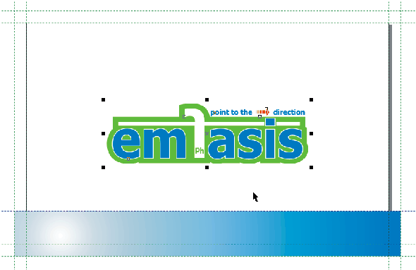
Step 16. Add Some Shadow
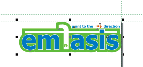
To start, we have to go closer; with the logo selected press Shift + F2. This will Zoom To Selection. Ungroup it either by pressing Command + U or by locating and clicking the Ungroup button and the Property Bar.
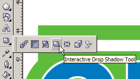
With the logo Ungrouped select the top subgroup, the one saying “emfasis,” and its green background. Go to your Tool Bar and select the Interactive Drop Shadow Tool.
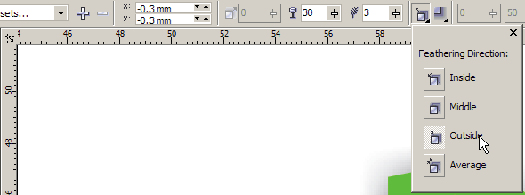
Click + Drag just a little to any direction simply to make a start. The direction and the distance is not really important, since we are going to alter the shadow’s Offset, Opacity, Feathering and Feathering Direction from the Property Bar.

Go to the Property bar and at the x; y Offset change the value to -0.3 for both coordinates. Change the Opacity to 30, the Feathering to 3 and from the Feathering Direction drop down menu select the Outside option.
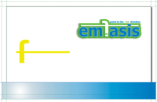
Press the Esc key to deselect and Shift + F4 to Zoom to Page. Your card should look like this:
Step 17. Curve Shaping
Select the yellow mirrored ‘f’ we centered on the page earlier and press Shift + F2 to Zoom to selection. From the Property Bar press the horizontal Mirror button to flip it over.
Now, either by pressing Command + K (or by going Arrange > Break Curve Apart), split the curve to its three consisted shapes. The little line at the left and the mirrored “Ph” which lays inside the leg of the “f.” Now your Status Bar warns you for having five Objects Selected. Those are the body of the “f,” the little yellow line on the left, the “h,” the “P,” and the little hole at the “P.”
Select the little line and hit the Delete key. Now go to View > Wireframe to see only the outlines of our project, locate and select the mirrored “Ph” by dragging a rectangular selection around them. Get rid of them and go View > Enhanced for the colored version of the card again.
With it selected, go to the Property Bar, make sure the Non-proportional Scaling/Sizing Ration lock is unchecked, and at the Objects Size text boxes give a height of 14.5 mm. To shape the curve we will have to manipulate/shift the Nodes and we will do that with a little help of the Arrow keys. First we have to specify the step or Nudge Offset as better known to CorelDRAW.
As we did earlier, with nothing selected from the Property Bar, type 1 in the Nudge Offset text box. Then double-click a ruler and in the Rulers dialog change the value for Super Nudge and Micro Nudge to 10 respectively. Super Nudge is the times the step/Nudge Offset will be multiplied when pressing Shift + Arrow key. Micro Nudge is the times the step will be decreased by pressing Command + Arrow. Hit Enter to accept changes.
Double-click on the ‘f’ to go to Shape Tool mode. From here we can work with the nodes of the shape. Select the left farthest 2 nodes of the horizontal line of the ‘f’ and press the Right Arrow five times, Shift + Right Arrow once and Command + Right Arrow five times again. As you understand, that moved the two nodes 15.5 mm to the right. Now select the two right most nodes and move them 5 mm to the right again. Finally, select the eight nodes describing the entire horizontal line and move them 3.3 mm downwards.
Press Shift + F4 to zoom out and see the entire art board. Select the yellow ‘f’ and drag it to snap to the left page border guideline and to the one we placed at 7.62 mm.

Change the Nudge Offset to 6 mm again and move it two steps up and one step to the right. Now your card should look like this.
I strongly advise to Save (Command + S) at this point.
Step 18. Some Text at the Logo Layer
Let’s put a small one-liner underneath the company’s logo. From the Tool bar select the Text tool. Your Property Bar has changed, providing a set of text tools, which looks like this:
Here we can see the that the only active fields are the font name and size, font characteristics such as bold, italic or underline, the Horizontal Alignment, and at capital inclined ‘F,’ which will open the Character Formatting docker. Click once at your art board to insert the cursor and type “Not just another way of promotion.”
Now at the status bar there is information displayed, about the default font and the active layer. Make a note that clicking once starts the Calligraphic Text tool; by clicking and dragging you insert a Paragraph text box, which we will cover another time.
As expected the alignment is left. Either go to the Horizontal Alignment on the Property Bar and change it to Center, or simply, as your cursor is already inside the text click Command + C and watch the Horizontal Alignment tool change. Change the typeface to Calibri either from the Property bar or by selecting the entire line and pressing Command + Shift + F, which will open the font drop down menu close to the mouse pointer.
Similarly we will change the font size to 6pt either by the Property Bar or by having selected the entire line, again, hit Command + Shift + P now to open the font size box next the mouse pointer. While the text is still selected, hit Command + T to open the Character Formatting docker and at the Range Kerning text box type 40% and hit Enter. Press Command + T again to lose the new docker, and Command + Spacebar to exit the text editing. Make this text red, as described in step 10.
Now we have to place it underneath and at center of the logo. Select the text
line and with the Shift key pressed select the logo as well. Go Arrange > Align and Distribute > Align and Distribute.
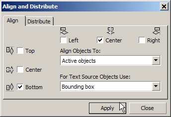
At the emerging dialogue select Bottom and Center, press Apply and then Close. Keep in mind that CorelDRAW, when you try to align one or more object[s] to another, the last you Shift + Select retains its position. Besides, by default all alignment is in relation to Active Objects. Therefore the text line will move to align to the bottom and center of the logo and not vice versa.
Alternatively, you can hit B and C for bottom and center alignment respectively. Move it 1.8 mm downwards and .6 mm to the left as described in step 17, by using the arrows alone or in combination with Command or Shift keys to control the offset.
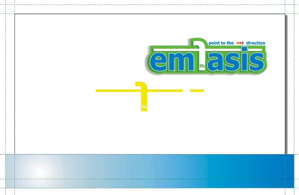
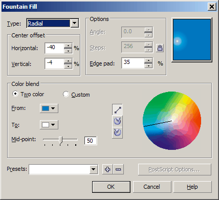
Select the yellow “f” again and fill it with the Sky Blue color. Give it a gradient to white, as described earlier and press F11 to enter the Gradient Fill dialogue. Enter these values:
- Type: Radial
- Center Offset Horizontal: -40
- Center Offset Vertical: -4
- Edge Pad: 35
- Mid-Point: 50
This is what the card should look like so far.

Step 19. Beyond CMYK, or Going X Color Separation
Since the idea is a full color card with a spot color, we need to tell to the printing office what will be spot colored and most important what color! If we had left the yellow at the “f,” it would be processed as part of the rest of the artwork palette. When separated it would come with the Yellow plate. In fact whatever color we had it will be processed and printed as CMYK. That is because the default palette we used is generic CMYK.
We could choose to work with Pantone colors. In this case actually, that would be feasible, provided we use only 3 flat colors, blue, green, red and black for some shading and lettering.
We could use our Pantone book and select the exact spot colors we want, but that would be a simplistic solution. Unless our client has a very strict color scheme for their identity, or we are using less than 4 colors in our project, the best practice is to use CMYK for the basic processing, and if in need be a Pantone to make the spots.
That of course means that there are going to be five films for traditional offset printing or just five plates for CTP (Computer to Plate). If you don’t already own a Pantone color guide, it is highly recommended to get your hands on one – ASAP.
Nevertheless, what we are going to do is add a silver shadow to the “f,” and after we insert the client’s details, we’ll make the preceding dots and the name on the card silver as well.
Step 20. Add the Client’s Details
Let’s add some details for the owner of the card. First we have to unlock the “Details” layer and select it. We want to make sure that the text we will insert will go there.
Insert a Calligraphic Text cursor somewhere under the red “NOT just..” and
type the following:
- +99 888 777 666
- 1a’ learning downtown
- 9595 guideville
- tutorland
You can insert the little bullet by typing Alt +0149 on the NumPad. This will work in most cases, but it depends exclusively on the font family. Press Command + R to Right align the text and Shift + Select the logo as well. Press R to right align it to the logo. Shift + Select the logo to deselect it. At the property bar, in the y Object(s) Position type 14 mm. and press the Esc key to deselect all.
Now under the yellow “f” insert a new text cursor and type, “[email protected].” Command + Spacebar to finish editing the text; Shift + Select the yellow “f” and L to left align them together. Shift + Select the “f” again to deselect it and Shift + Select the addresses. Press B to bottom align and you’re done. With all your text is selected, give them a 90% black fill and press the Esc key to deselect all.
Locate the x y pair of the Duplicate Distance at the Property Bar and type 0.3 and -0.3 for the x y values respectively. This tells CorelDRAW where to place a duplicated object. 0.3 mm left and down in our case. Now select the “f” symbol, press the Right Arrow key to move it upwards by 6mm, Shift F2 to Zoom to Selection and Command + D to duplicate. With the new object is selected, press Shift + F11 to enter the Uniform Fill dialogue.
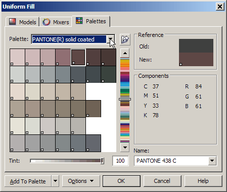
Select the Palettes tab and at the Palette drop down menu select PANTONE(R) solid coated. At the Name text box type “877″ and press Enter. Either from Arrange > Order > To Back of Layer, or by pressing Shift + PgDn, send it to the bottom of the stack. By default CorelDRAW places new objects on top of the others on the same layer.
From your Tool Bar select the Shape Tool or just hit F10. Select the addresses and you will notice that there are nodes under each letter. Carefully select the nodes under the dots and fill them Pantone 877 C as well. Now we need to add the name and the title. Make the layer Details not editable. Select the layer Details and by inserting a new Calligraphic text cursor, type: “Johnie Doe.”
Fill it with Pantone 877 C, and from the Property Bar, first at the Object’s Position x y pair give the values 22;29 respectively, and then apply the following properties: font Calibri, size 11, Bold and Italic.
Fill it with Pantone 877 C, and from the property bar at the Object’s Position x y pair give the values 22 and 29 respectively.
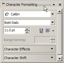
Add another Calligraphic text cursor and type, “chief assistant.” This time press Command + T to access the Character Formatting dock and give the following values:
- Calibri
- Bold-Italic
- 11.0 pt
Fill this with 90% black and again from the property bar, at the Object’s Position x y pair this time give the values 22 and 24.
Give yourself a break at this point and press Command + S to save again. This is what we have done so far.

Step 21. Add a Second Page to Your Document
CorelDRAW gives the designer a very strong set of tools. The multiple pages option can transform CorelDRAW from a vector designing software into a very powerful desktop publishing utility. But to unfold the full potential of this aspect is apparently out of the scope of this tutorial. At this point, all we want is just to add another page simply because our card is double-sided and we need a fresh art board within the same document to design it.
First, you have to make sure that at the Property Bar and Set Default or Current Page Size and Orientation pair of options, the top one is selected. This means that each new page will maintain the characteristics of the previous and by changing dimensions or orientation to one, they all will change. If the bottom one was selected, each page can have its own specifications. A powerful tool, worthy to reserve our interest – for future, further analysis.
Having checked that, we can now add a new page by going to Layout > Insert Page where we can access the Insert Page dialogue, which offers us some options.
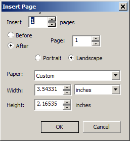
Or from the bottom right of our working area we press the little Plus sign next to Page 1 indication, and we can add just one page.
Step 22. Import Contents to the Second Page
Make sure you have the second page active and go to File > Insert, or Command + I. Verify that at the Files Of Type drop down menu the CDR – CorelDRAW is selected; Locate the file called, “EmfasisMap.cdr” and hit Enter to insert it at the center of the page.
Things worth noticing are the unique, clear environment of the new page, the default settings that remained for the size, the guidelines, the bleed limit, the default font and font size, etc. But the real power lies in the Layout Positioning tool of the Print Preview environment, which we will examine shortly.
Step 23. Things Worth Mentioning
What do the three control buttons on the Object Manager docker do?
Well first deselect the Edit Across Layers and the Layer Manager View options.
The Show Object Properties is pretty much self explanatory. By having this button set you can view the attributes of each and one of the objects on your document. Let’s see what that means.
Click on it to activate it. Then click on the little Plus sign next to Page 1. It will unroll to show you the all layers involved with Page 1. Now press the Plus sign in front of the “Logo” layer. Roll your mouse over the items lower on the stack to activate the pop-up messages explaining the properties of each object.
To get a better idea, roll you mouse at the left border of the docker, just before the roll bar and when your cursor changes to a Double Arrow click and drag to the left to expand the docker until all the text on the dock is visible.
The reason it’s suggested that this will be off in most cases is that it creates a mass of information that you do not need all the time. When you need it, it’s there. The Edit Across Layers button allows you, even if you have activated one layer, to still be able to work on other unlocked layers. Let’s experiment with that for awhile.
Deselect the Show Object Properties button. Make the layers “Logo” and “Background” editable.
With the layer “Details” active, try to select the top-right logo, which belongs to the “Logo” layer, or the bottom rectangle, which belongs to the “Background” layer. You will notice that despite the respective layers that are unlocked you cannot access their contents unless you select their layer.
Now click the Edit Across Layers button and try the same. Interesting, Ehr? Of course, if you had the layers locked, you wouldn’t have access to their contents whatsoever. This is a very useful option, so let’s leave it on.
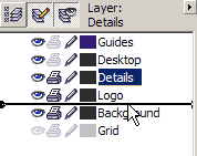
Now make active the Layer Manager View option. Having this activated, you can only see the layers of the page you are currently working on. Not every page in the document.
Why do we need that? Well imagine working on a 32 page newsletter with dozens of groups of objects and text-box flows in each page. You get the idea of how complicated the Object Manager would be. When you need to access content properties of a different page you simply go to that page.
And where would that be helpfully deactivated? When you need to locate a white object which sits on a white background for example. Or when you need to Drag + Drop objects from one layer into another on the same page. I bet you can find a few reasons of your own. I usually have it on.
What is the ‘stack order’ and how is that helpful?
Stacking order is the order the objects appear on a layer or in a page. Having nothing selected and with the Edit Across Layers and the Layer Manager View options set, press the Tab key once. The first object selected is the first in the stack. As you continue pressing the Tab key, you go lower on the stack. To make this absolutely comprehensible, deselect the Layer Manager View from the Object Manager docker, and with nothing selected press the Tab key once.
The object selected is the client’s email address. Press the Tab key again. The next object selected is the client’s addresses and telephone text box. If you continue pressing the Tab key, the objects are going to be selected by the reverse order they where designed (last designed first in the stack) and by the order they reside inside their layers. From top layer to the bottom.
Why is that helpful?
Well it is always helpful to know in what order you have placed particular parts of your design. Say you are a keyboard guy like me and you use the mouse or other pointing devices for designing purposes only. Logically thinking, layer order should be
- Logo
- Details
- Background
The logo is on top, the Details are in the middle and the background lays at the bottom of all. As a matter of fact let’s make it that way. Click + Drag the layer “Details” under the layer “Logo.”
Make the layers “Details” and “Background” non-editable. Press the Tab key as many times required to make a full revolution of all the objects on the “Logo” layer. Observe you Status Bar to see when the selection changes layer. You will notice that the first object selected is the last object we created at this layer; the client’s title. Go to Edit > Select > Select all Objects; then Arrange > Order > Reverse Order.
The spot color shadow of the “f” came up-front. To fix this select it and press Command + PdDn once. This will take it one level lower in the stack, just underneath the gradient version of it.
Hit the Esc key to deselect all and play with the Tab key once more. Now you will notice that the red one-liner is the fourth in the stack. Select it and press Command + PgUp two times. This will bring it one level lower of the Emfasis logo. Press Esc again to deselect and in same way arrange the stack to be:
- Emfasis logo
- One-liner
- Client’s name
- “f” logo
- Client’s title
When you are in need to code a VBA application, your items now are in the right order for a loop to find them and act on them. Fat chance? OK. If you need to change the color of the one-liner, you will know that by pressing the Tab key twice you have access to that object.
What is the arrow button on the Object Manager Docker?
The little arrow button on the Object Manager docker gives you access to all the above options in a more compact way. It is as simple as that. No new aspects are introduced, nor new options are available.
Step 24. Prepare for Printing
Since we did not design this card just for the kick of it, we need to be able to print it in respectable quantities also. Whether we are planning to print on our own printer and cut by hand, or we are going to send it to a Print Shop, some Pre-Press decisions have to be made:
- What is the maximum size the printer is capable of?
- How many items can we print on a single sheet?
- Do we have to print both sides or not.
- Which way will we flip our pager, portrait or landscape?
- Can the cutting equipment support our previous specs?
- Are there any special reasons we need to reconsider our previous decisions?
Well, say:
- My printer’s maximum printing area is A4 plus.
- I have to print both sides.
- I will flip the paper portrait since it is inserted portrait.
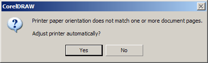
That considered my 90×50 mm card can go two times across five times longwise 180 by 275 mm on 210mm by 297mm A4 paper. Press Command + P or go File > Print. At the popped-up message regarding the Orientation notice, click Yes.
At the emerged dialogue, and since you are going to print at your own printer, select it. Now take a mental note at what is happening here.
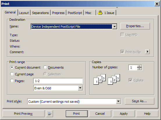
My Active printer is: Device Independent PostScript File, meaning that I am going to print on a file, which will be PostScript. A closer look at the dialogue shows that we will print the Current document, as in oppose to the rest of the options provided, and the Print style will be: Custom (Current settings not saved); just because we agreed with the Orientation notice.
From the Layout tab of this dialogue enable the Bleed Limit text box and give it a value of 3mm.
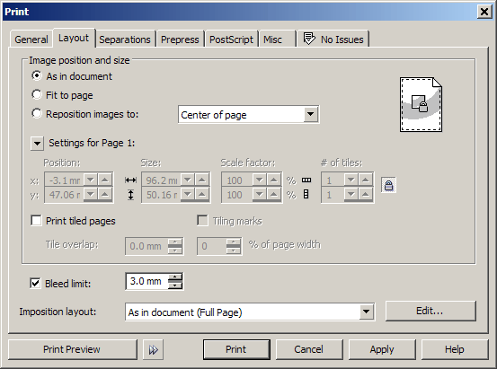
Now click on the Print Preview button, at the bottom left of this dialogue.
This tool can easily be classified as separate software. As a matter of fact we have come across some solely Pre-Press pagination utilities, where you should import multiple EPS or PS files and paginate them, with less than half the power the Preview tool CorelDRAW provides.
The true power of this lurks underneath this, what it seems to be, very self explanatory new environment. But let’s see some of its tools. Click the Imposition Layout Tool at the tool box (second on the column). Now there are new options in the Property bar.
At the first Drop down menu there are some predefined layout options, which will arrange the pages in such a fashion that will assist you or your printing office to flip (and/or turn) the paper on the machine in order to print on the back side and collate, depending on the type of the job you are running. For instance, if you want to print an A5 booklet on A4 papers then the spreads need to be printed should be a derivative of four. The first page should be at the same spread as the last. A solution for this is already predefined in CorelDRAW, and we’re going to use that for now.
Following the Plus (+) and Minus (-) buttons will allow you to add or delete a preset.
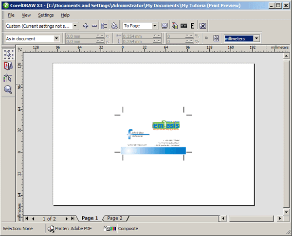
To start, go to Pages Across/Down text box pair and type 2 for horizontal and 5 for vertical. This will add pages to the Signature.
Click the Template/Document button in the property Bar to take a quick look at the results. What we need now is to make all the pages at this 2 x 5 layout the same.
So from the What to Edit drop down menu select the Edit Page Placements option. The property bar has changed again and now click at the Cloned Auto-Ordering option. Click on the Pick Tool from the Tool bar and note that there are two layout signatures at the bottom of your Preview.
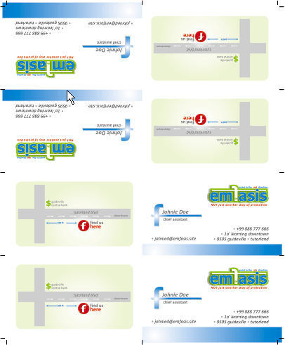
Signature 2 has the same setup only with the second page of your card. The map.
Click the Marks Placement Tool of your tool bar and from the new Property Bar select the Print Crop Marks option. Let’s take a closer look at where the crop marks are placed and the Bleed allowance we selected earlier here and at step 3 when we setup the page bleed.
Click on the Zoom Tool of your tool bar, and with the magnifier cursor draw a rectangle around the bottom left card of your Signature.

As you can see the bottom left crop marks allows 3mm bleed. The crop marks between the pages do not. If we need to allow bleed there as well for the sake of better trimming control, what we will have to do is to select the Imposition Layout Tool. And from the What to Edit drop down menu of the property bar, after selecting the Edit Gutters and Finishing option give a value of 3mm to the Gutter Size text box, as the vertical gutter. Now select a horizontal gutter and give the same value to this as well. But since 5 vertical cards of 55mm = plus 4 vertical gutters of 3mm = 12mm plus the size of the top and bottom, crop marks, we probably have to forget this option whatsoever. By the way the size of the crop marks is 4.2mm.
Now click at the Pick Tool; press F3 to zoom to signature and you are ready to print either by pressing Command + P or by clicking at the little printer at the Standard Toolbar.
Step 25. Prepare For the Service Bureau
Commercial designers usually do professional printing. Usually Offset.
Large quantities are far cheaper to print at a print shop than a desktop printing device. Also, you should not forget that in this job we have used a fifth color, a Pantone silver, which is impossible to reproduced by a home printer. In this case we will have to send our job either to a service bureau, which will use an imagesetter to create films for use at a lithographic reproduction system in order to separate the five described colors: Cyan, Magenta, Yellow, Black, and the 877C Pantone Silver that will be a plate on its own.
The process from Design to Image setting and finally Offset Printing is called PrePress. Prepress is a three step process. All the necessary actions a designer has to do preparing the artwork, the image setting to produce the films, and the corresponding plates, this is Prepress.
Since most of the service bureaux of our trade use some sort of unique setup, it is better to contact them and get advice on how to prepare the artwork.
What we can do now is give a generic idea of what, in most cases, fit to all requests from the bureaux. Even though there are a lot of imagesetters on the market, most of them use some level of PostScript (PS) language to interpret the produced final image into something recognizable by the machine.
Things to Consider About Your Printer
1. What we call images, are halftones in commercial printing.
2. LPI or DPI?
Make all conversions to DPI for Desktop printing on Inkjet or PS printers, but when planning to go commercial keep in mind that at the print shop they use halftoning and having LPIs in mind is better.
3. What is the Service Bureau LPI capabilities?
Well this is easy. You call them and ask their capabilities. For our example we’ll say that they print at 175 LPI.
4. Resolution of the digital images?
When digitizing, you need to consider the Nyquist Theorem, which more or less in simple English says that LPI = PPI / 2 (I prefer 2.2 actually, which produces a better quality image).
So if you are designing for a newspaper, which usually prints at 85 LPI you need to scan to 170 DPI. Less DPI will not use the maximum of the printer’s capability, thus reducing the quality. More will exceed its capabilities and would be a loss of efficiency, and usually will make the process unnecessary slower, and results in a larger file.
A rule of thumb is for low resolution printers (less than 300dpi) PPI = DPI, = 300 – 320 PPI for medium resolution printers (300dpi) PPI = 1/2DPI = 150 – 240 PPI and for high resolution (720dpi plus) PPI = 1/3 DPI = 240 – 360 PPI.
A. Final size in PPI.
Say that your image will be printed on a LaserJet printer, it is 4" x 6" and the printers capability is 2400dpi, so the width of your image in Pixels have to be width 4" x 300 PPI by 6" x 300 PPI (1200px x 1800px).
B. All computers do not have all fonts installed.
It is an excellent practice to convert all your text to curves prior to sending your job to another computer, unless you are absolutely certain that you share the same fonts. Even for proofing reasons.
Imagine sending a document to a client. You have used a Script font. Their computer substituted the font to what it considered best and they did not notice the dialogue. They print, approve and save the printout to their file. You now send the same file to your Service Bureau where their computer substituted the same font with a totally different one, unnoticed again. What a mess.
Although CorelDRAW can embed the fonts into the document preserving their rights by using TrueDoc, the best thing to do is to take the possibility of such an error completely out. So before sending:
- Edit > Select All > Objects.
- Arrange > Ungroup All.
- Edit > Select All > Text.
- Arrange > Convert to Curves to each page of your document.
C. Prepare a mock-up
Always prepare a mock-up for the printing shop, as close to the desired outcome as possible and describe all the important issues you think are not obvious in the sample.
Step 26. So let’s Prepare the File for the Service Bureau
Although there are not obvious halftone images with our card, DPI, PPI and LPI considerations have to be made.
Shadows in CorelDRAW are rectangles with a gradient fill and a lens effect. Even if we do NOT have to, it is good if we do convert them to images. The less the filters the less the processing during PostScripting.
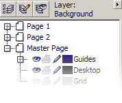
Make sure that only the layer “Logo” is editable, as described at the last paragraph of step 7, and the other layers are locked. Click on the layer to select and press Shift + F2 to zoom to the selection.
In your status bar read that you have selected a Group of 6 Objects on “Logo.” Arrange > Ungroup All. You can separate the shadow from the objects one by one, clicking to select the shadow of each object; your status bar will say Drop Shadow Group on Logo.
Command + K or Arrange > Break Drop Shadow Group Apart to ungroup a shadow from its object. Or you can select all by Arrange > Select All > Objects and either Command + K or Arrange > Break 6 Objects Selected Apart. Starting from the bottom one, select each shadow and go to Bitmaps > Convert to Bitmap, and give the following values to the appeared dialogue:
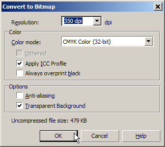
Why 350 DPI you ask? The service bureau prints at 175LPI and we said that LPI = DPI/2 or simpler DPI = 2*LPI. We have enabled the Apply ICC profile to make sure that the same color profile used for the vector objects is going to be used for the halftone as well. And we also need the Transparent Background enabled for self-evident reasons.
Press the Esc key to deselect all. Unlock all layers and Edit > Select All > Objects to select everything from this page. Arrange > Ungroup All. Edit > Select All > Text and Command + Q or Arrange > Convert to Curves to convert all text to lineart.
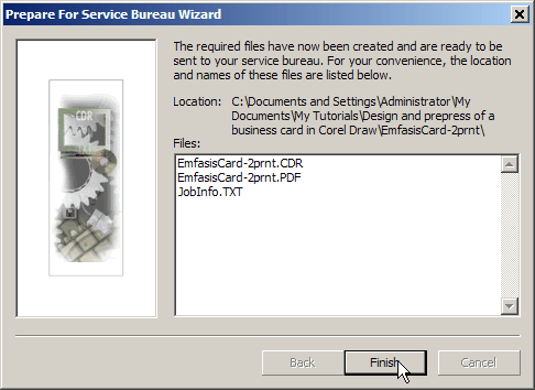
Do the same to the back side of the card as well. Remember that you cannot change any text to this document now, so File > Save As this file with a different name. I suggest “EmfasisCard-2prnt.cdr.”
Now make sure all layers we have created are Printable and Visible, but Locked for Editing and File > Prepare for Service Bureau.
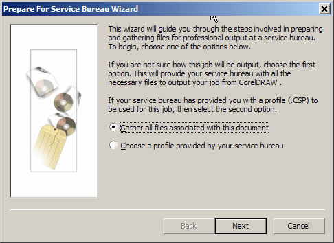
Since we do not have a profile from the bureau our next step is to prepare that.
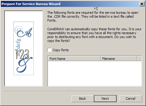
Since we do not have any fonts let’s prepare that.
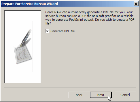
Since PDF is a very handy format make sure to enable this one. CorelDRAW will create a directory at the location where your original file is and will name it the name of the file in discussion.
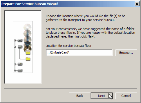
Confirm the final dialogue, which shows you the total files included.
Despite the fact that CorelDRAW has already generated a PDF file, it is better to create your own to attach with the job.
Now File > Publish to PDF. Make sure the PDF Style is PDF for Prepress and click the Settings button at the lower right corner of this dialogue. At the Prepress tab, enable the Bleed Limit text box and give it a value of 3mm. You should also enable the Crop Marks check box. At the Objects tab make sure the Compression Type is set to None and all downsampling options are disabled. Since we do not have any fonts, the right side of this tab is not our concern. Now press OK and Save.
Also in most Offset printing shops the draw paper is from the landscape side. This is due to the way registration pins are placed inside most of the machines. So it will be very helpful, and in some cases even cheaper for you, if you prepare a layout to create only one set of films and plates.
If you have an Adobe PDF printer driver installed on your computer, go
File > Print select the Adobe PDF printer and go into the Print Preview environment.
From the Imposition Layout Tool, at the Property Bar, give the values 2 and 4 to the Pages Across/Down text box. Click on the number at the first page and as it already is 1, press the Tab key to continue to page 2, which happens to be 2 as we need it as well. Press Tab key again to go to page 3 and type 1. Tab key again and type 2. Tab key and type 2 now because at the bottom half of the signature we need to place what is going to be printed at the back of the top half. Tab key again and type 1. In the same fashion change the other two pages as well.

Place your mouse cursor over the little red arrow above the page number and it will turn to a round arrow. Click once to rotate the page by 180º. You can also do that from the Page Rotation drop down menu at the Property Bar. Continue this to rotate all four pages of the top half of the Signature. Select the Pick Tool from your tool box and your signature must look like this now:
Locate the “JobInfo” TXT file where you have to write all the details for your work.
- Date.
- Your name and contact details.
- Name of the Job.
- Name(s) of the files included.
- The dimensions of the final job.
- The number of sides.
- The number of folds if any, which way to fold and how folds are marked at the art board.
- The quantity to be printed and how you want them packed.
- The Palette in use (CMYK, DIC, Pantone, Other or combination).
- Extra features if any (perforation, embossing, spot varnish, spot foil, etc).
- Any other information might be required (delivery date, invoicing details, etc).
CorelDRAW already created a rough template of this, but my suggestion is to use something like the one included with this tutorial.
I can’t stress enough how important a mock-up is. Even if you have to print two sheets, cut them and stick them together to make a double sided card, you should do it.
Step 26. Conclusion
CorelDRAW is a great tool to design with. Of course all design software are just tools and you can’t be Michelangelo by using his brushes.
No tool is a substitute for the talent and skill, which comes with passion and hard work. But using the right tool for the right job is essential.
A good designer needs to have an educated idea about how his/her design will be reproduced. Although you don’t have to master each step of each of the reproduction processes, what you should have is an understanding of the process. So have fun.
{excerpt}
Read More