Deep down inside every designer loves a good ol’ fashion logo. In-fact, as a kid you probably redrew the Nike or Lacoste logo over and over, just for fun. Or was that just me? So when a start-up business owner of an athletic training company approached me to help with their identity I was super excited about the opportunity. In this case study I will cover the process that I went through to the create the logo as well as a few of the identity pieces.
Final Identity Preview
A preview of the final “ELITE” identity is below. Read on to get a more in-depth understanding of the process involved.

Project Outline
The Elite Sports Training mission statement reads “athletic performance institute driven to help prepare young athletes to live and compete to their full potential.” Basically, they will help athletes, of any sport or skill level, train to improve their athletic skill.
With the client on this project being a young, new business it was important for them to not come off as amateur. They wanted the visual identity to feel strong, established and trustworthy. They didn’t want the brand to be too ‘cool or hip‘ it was more important to be serious, almost ‘corporate,’ without being boring or lackluster.
Concept
Take notes, lots and lots of them. After quite a few conversations with the client discussing the core values and purpose of the company and how to best represent it visually, there were many words that words that I had chicken-scratched down in my notes. Some of the ones that jumped out to me were: Sport, Dedication, Integrity, Dominate, Improve, Excel, Lead, Grow, Perform, Better, Build, Value, Prepare, Purpose.
On identity projects, I always try to collect words and/or phrases that embody the company because it always helps spawn ideas and/or visuals. From the big collections of words, I tried to narrow it down to one or two words that really ‘sum up‘ the company so that I can try to build concepts around them. The two words that really seemed to resinate with me, as well as with the client, were ‘Sport‘ and ‘Improve.’
So after another round of discussion and concepting it was decided that the concept/direction was to represent the company with a combination of multiple sports icons and strong, bold typography. The sport icons, very simply, represent the purpose of the company. And the strong, bold typography is consistent with the ‘strong‘ and ‘powerful‘ expectations of the client. Also, having multiple sport icons showcases that the company is fluid and it embraces all sports.
The idea is that the icons could be interchangeable, depending on the execution. For example, if there is a ‘Speed Training‘ session that will benefit basketball players, sprinters and hockey players; the icons could be a basketball, running shoe and hockey stick. The identity would have a format, but could be customized depending on the implementation. But, that will be further down the line, as the company grows and expands to cover additional sports training, for now we will start with four sport icons.
Sketch
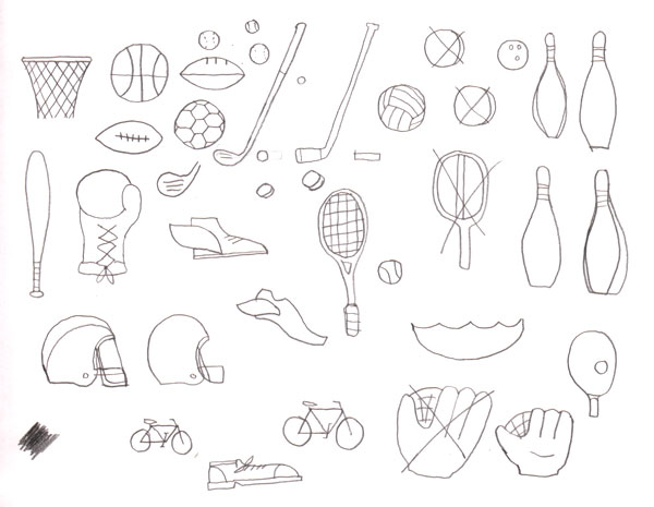
Now that I have a clear understanding of the project at hand and have established the ideas that I am going to move forward with its time to put the pencil to the page. I will start off with the concept of multiple sports icons. Since I know the end goal of this is going to be crisp, clean icons created in Adobe Illustrator, the sketches can be very quick and crude.
The main thing is to get the basics down on the page, to simplify each icon and not worry about specific details. Here are a few of the initial sketches:
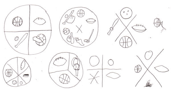
Also, the way that the icons are handled needs to addressed, so I sketch out a few ideas for the way to layout and display the icons:
Icon Design
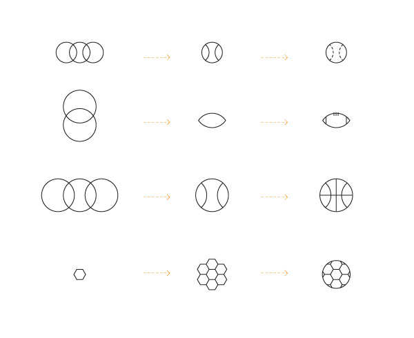
I will start with the four icons for basketball, football, baseball and soccer, because these will be used for the ‘main‘ icon lock-up. These were chosen because they are the four most popular sports, well at least in America.
When designing icons, the key is simplicity. I generally like to start with basic geometric shapes to create the shape/form of the icon. From there I will add the fewest amount of lines possible to render the icon. Using the Pathfinder Palette and turning on Smart Guides will make things a lot easier. Also, I use the same line-weight throughout so everything stays consistent.
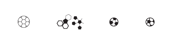
Its also important to experiment, or play around with the shapes and proportions to see if there are any issues. I often use Dribbble to get feedback on projects that I am in the process of working on. After spending countless hours looking at the minute details of a project, it is a good way to get a fresh set of eyes to look at everything as a whole.
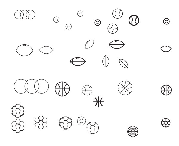
For example, someone commented that they thought the soccer ball looked a bit like a flower. Another person noted that they thought a soccer ball really should have the black parts to make it easily recognizable. Both really good feedback, which I took into account later on.
Type Design
Having established a good start to the design of the icons, I move on to initial work for the typography. Knowing that the client specifically requested bold, strong letters – nothing fancy or overly designed – I will look at a ton of typefaces and see if anything jumps out to me. Starting with some of the classic typefaces like Gotham, Helvetica, Futura, etc… and moving into some more modern typefaces like Black Slabbath, I look at a ton of type.
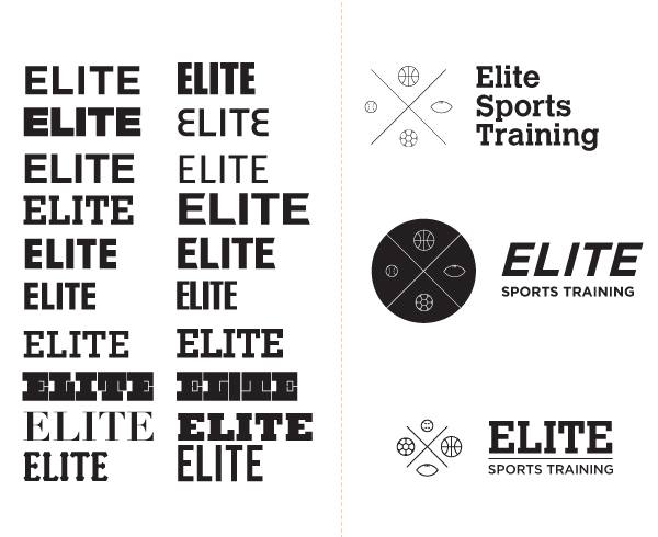
Once I see something that is working well, I will try a few initial lock-ups integrating the icons. At this stage I want to explore a few variations for the type, without going too far. So, something as simple as italics seems to work well to imply motion and moving forward. Also, integrating a simple line seems to help ground everything.
Refine
Having established a good start to the design of the icons, I move on to initial work for the typography. Knowing that the client specifically requested bold, strong letters – nothing fancy or overly designed – I will look at a ton of typefaces and see if anything jumps out to me. Starting with some of the classic typefaces like Gotham, Helvetica, Futura, etc… and moving into some more modern typefaces like Black Slabbath, I look at a ton of type.
Also, as noted previously, the soccer ball icon needs some refining. Now, the geometry of a soccer ball is sort of amazing, google it. There is no geometrically perfect way to show the pattern of a soccer ball in two dimensions, so I had to ‘fudge‘ it a bit, and go strictly by how it looks visually. I was happy with the result, as was the client.
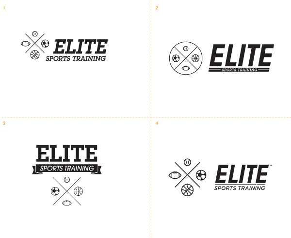
Now that I have the icons solidified it’s time to put in some time on refining the logo lock-ups. Here are four of the presented logo variations:
During this process there are many, many little scraps and pieces that get created and deleted. Below is a look at pieces from my artboard. Does everyone’s artboard look like a natural disaster, or is that just me again?

Finalize
After even more conversations (or rather cordial arguments), explanations and further refining sessions, here is the chosen direction. The end goal was achieved, a solid combination mark where both the word-mark and symbol could be used separately.

Flesh Out
After so many conversations with the client, I got a good feel for the company and the client’s wants/needs as far as the identity. Gaining this insight made the rest of the project progress fairly effortless.
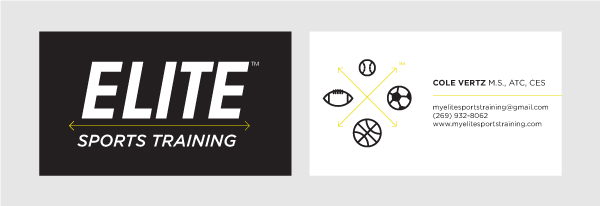
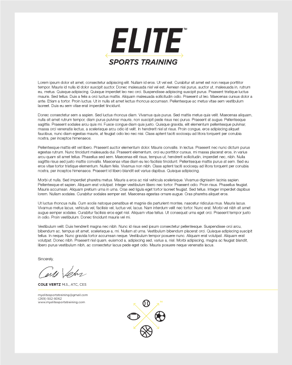
The additional identity pieces are business cards, letterhead and envelope. Since the overall look/feel is simple and clean, it really was all about taking the time to crank everything out. One of the hardest things for me personally to do on a clean, simple piece like this is to pull back, and not try to do too much.
Business Card
Letterhead
Envelope with mailing address sticker (front) closure sticker (back)

Final Identity
That pretty much covers the process of the Elite Sports Training logo and identity project. The final image is below.
{excerpt}
Read More