A few times a each month we revisit some of our reader’s favorite posts from throughout the history of Vectortuts+. This tutorial by Jonathan was first published on November 25th 2009.
Handle color changes and variations with ease by following this intermediate level tutorial. This is a special tutorial sponsored by Astute Graphics that incorporates the use of their high-quality Phantasm CS range Illustrator Pugins. We’ll work with Phantasm’s color shifting tools: Hue/Saturation and and Shift to Color, while we learn to contrast shapes when composing natural, vector scenes!
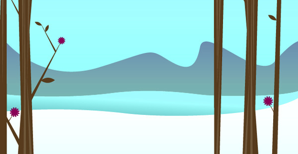
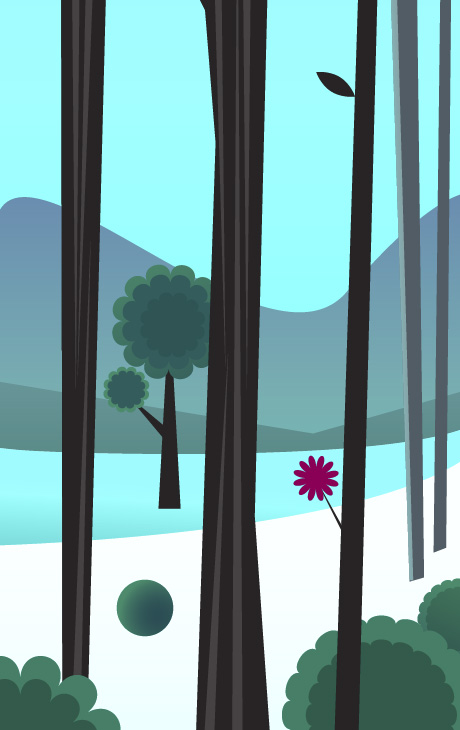
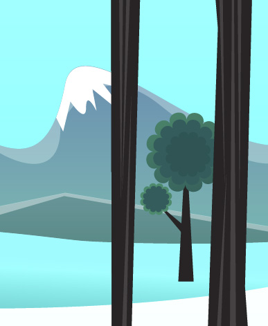
Final Image Preview
Want access to the full Vector Source files and downloadable copies of every tutorial, including this one? Join Vector Plus for just 9$ a month.
Tutorial Details
- Program: Adobe Illustrator CS4 and Phantasm CS range (Designer, Studio or Publisher) Plugin
- Difficulty: Intermediate
- Estimated Completion Time: 1 Hour
Here is the illustration I’ll be creating. Click here to see the larger version. And keep in mind, while I’m using Phantasm CS Studio in this tutorial, the options we’ll be covering are available in any version of Phantasm CS.

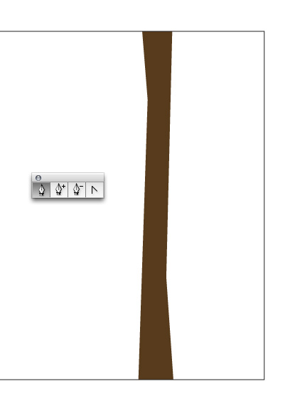
Step 1
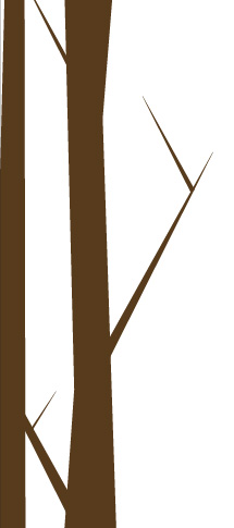
Using the Pen Tool (P), draw straight lines to create the basic shape of a tree.
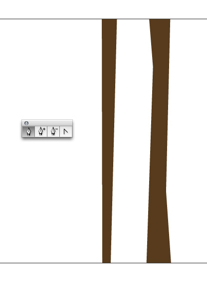
Step 2
Draw other tree shapes that are even more simplified and varied.
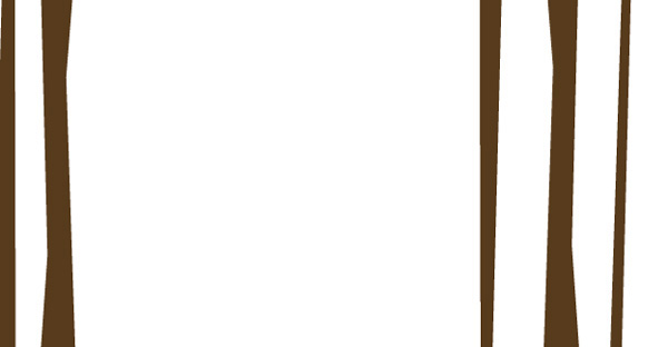
Step 3
An important concept to keep in mind when creating the first dominant shapes in your illustration is that these shapes will create the foundation and overall flow for the illustration. So, pay attention that the layout is looking good from the start.
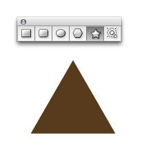
Step 4
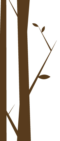
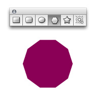
I can make branches that extend from the trees using triangles. To make a triangle select the Star Tool (found under the Rectangle Tool). With the Star Tool selected, click and hold down on your artboard, then press the down arrow until your shape has three points. In addition, and after your shape has three points, you can press and hold the Shift key to make the triangle sit perfectly flat. Release the mouse then release the keystroke you’re holding.
Step 5
Using the Selection Tool (V) squish the triangle so it’s much pointier. Place the triangles throughout the trees sparingly.
Step 6
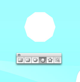
We’ll now use the Ellipse Tool (L) to create the leaves on the trees. Start with a simple circle.
Step 7
Grab the Convert Anchor Point Tool (Shift + C), then click the top and bottom points that make up the circle. This will immediately convert them into angles. After that, use the Selection Tool to squish the shape into that of a leaf.
Step 8
Place the leaves throughout the trees and on the branches.
Step 9
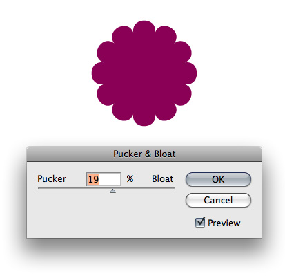
I’ll use the Polygon Tool to make the foundation of the flowers. Using the same technique that I used for creating the triangle, this time pressing the up key to give my polygon more sides.
Step 10
Select the polygon and go to Effect > Distort & Transform > Pucker & Bloat. Give the shape a Bloat of about 20.
Step 11
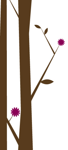
Place the flowers throughout the trees.
Step 12
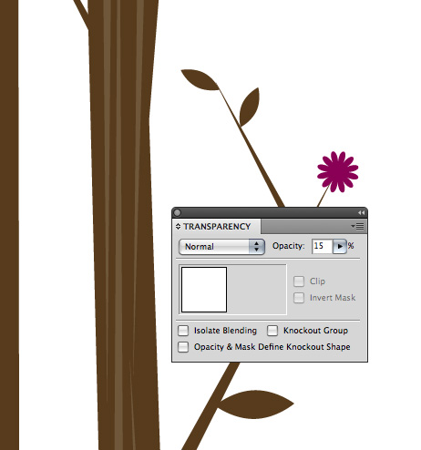
I’ll add a little more interest to the trees by giving them some subtle texture. I use a series of triangles to accomplish this. I adjust their transparency so they don’t stand out too much.
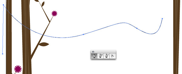
Step 13
Now that I have a bit of the foreground in place I can move on to adding some background elements to get a better idea of the landscape. Using the Pen Tool, draw a pleasing curved shape that will become the mountains.
Be patient and ensure you have a visually pleasing flow for the mountains. The curve of the mountains contrasted by the very angular shape of the trees complement each other. This complementary effect is in play throughout the entire illustration.
Step 14
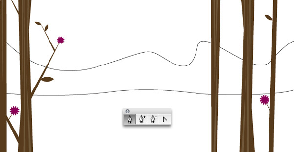
Finish drawing the shape of the mountain.
Step 15
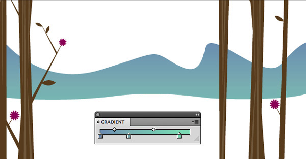
Give the mountain a tenuous blue to bluish-green gradient.
Step 16
There is no real process for creating the background elements. My shapes are more random than calculated. As long as you’re maintaining a nice harmony and flow for the elements then you’re good to go.
Step 17
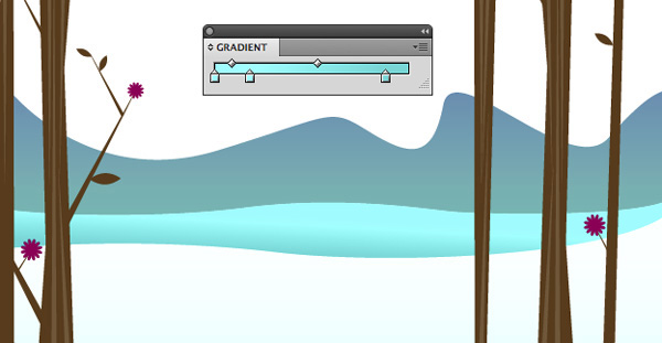
Add a blue box to the background to create the sky and send it to the back by going to Object > Transform > Send to Back.
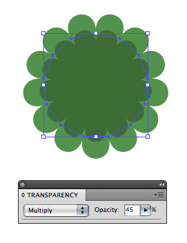
Step 18
The shrubs have been created using the base shape of the flower. To create a slight sense of volume, copy and paste the shape on top of itself. Scale the shape down slightly, set the Transparency to Multiply and bring the Opacity down to approximately 45.
TIP: Copy the shape and press Command +F to paste it directly on top of where it was copied from.
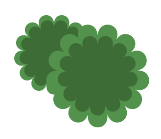
Step 19
Create bunches of shrubs, then place them throughout your illustration.
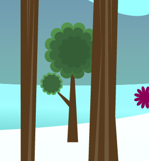
Step 20
Put some of the shrubs behind other elements to enhance the effect of depth.

Step 21
Certain trees have been created using the same shape as the flowers and shrubs. Using the same shape for various objects creates continuity but should be used in moderation. If your layout starts to look too repetitive draw new shapes for those elements.
Step 22
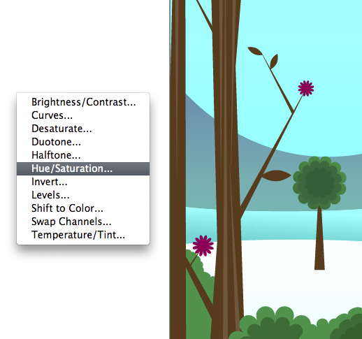
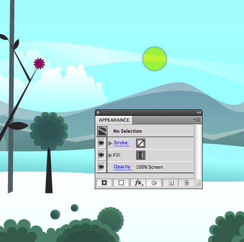
I’ve decided that I want to create even more contrast between the background colors and the trees so I’ll adjust the color of the trees to create a more dramatic landscape. One of the most effective ways to select objects that share a common characteristic is to select the first object, in this case, it’s the brown trees, then go to Select > Same > Fill Color.
Now that all your trees are selected, we’ll use the Phantasm CS range plugin to manipulate the color. Go to Effect > Phantasm CS > Hue/Saturation. This keeps the application Live as with all effects, and therefore editable. If you want to apply it permanently then go to Object > Filters > Phantasm CS > Hue/Saturation.
Step 23
I’ll simply change the brown to a much darker brown. To accomplish this, adjust the Lightness slider to the left as highlighted below. You can also apply the color change to either the fill or stroke of the object. Even though our trees only have a fill, we can leave that option checked in the dialog (the choice is yours.)
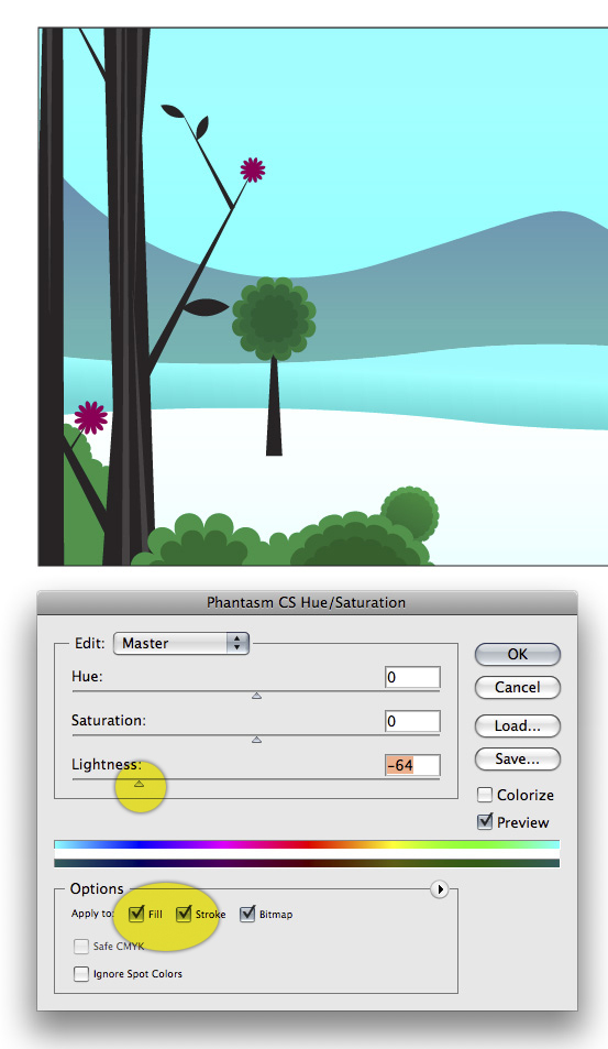
Step 24
Now, the trees have more of an impact on the overall illustration.
Step 25
Next will adjust the color of the shrubs and tree-tops to be a little more icy blue. Using the same selection technique that we used for the trees, select the shrubs and tree-tops then go to Effect > Phantasm CS > Shift to Color.
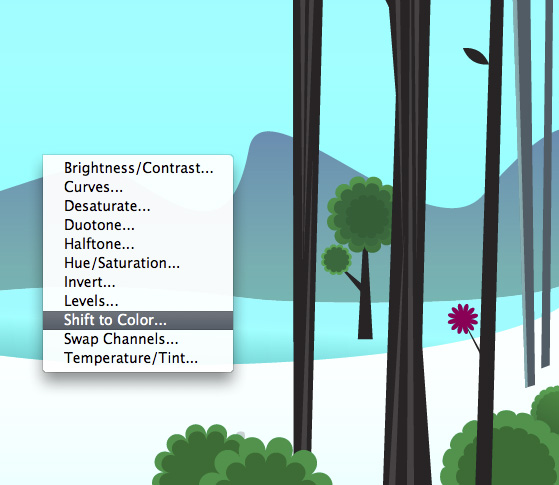
Step 26
I’m creating more of a monochromatic feel for the landscape so I’ll select blue for the Color and bring the Shift down to about 18%.
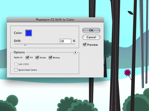
Step 27
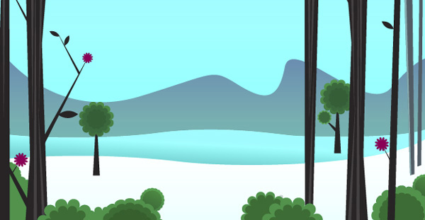
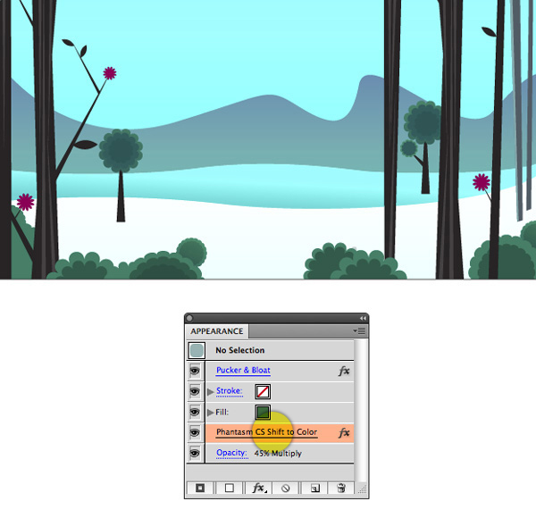
This is what your illustration should look like right now.
While shifting the color of the shrubs and tree-tops can be done without the use of Phantasm CS, the cool part about using the plugin is that the effects can be removed at any time. Similar to Photoshop, the effect is non-destructive. In the Appearance Palette you can remove the effect or turn it on and off at your leisure!
Step 28
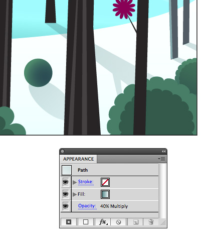
Use the Ellipse Tool to create a circle and give it a radial gradient to suggest that it has a shadow.
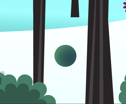
Step 29
I’ve decided to use a circle because this object should appear farther in the background – the detail that it shows should be reduced.
Step 30
Next we’ll create the illusion of snow on the top of the mountains. To do this, first copy and paste the mountains and work off to the side of your main illustration. Draw another shape over the top of the mountains that closely follows the top edge of them.
TIP: I find it easier to keep my main illustration intact and work on a copied version of a shape if I need to manipulate it with the Pathfinder.
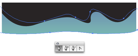
Step 31
Select both shapes and in the Pathfinder Palette click Divide.
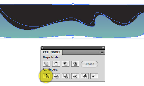
Step 32
Go to Object > Ungroup. Ungroup the objects until you can no longer ungroup them (this usually takes four applications of the ungroup command). Get rid of all the extraneous shapes other than the shape that you’ll use as the top of the mountain.
Step 33
Reposition the shape and adjust the color and transparency so it blends with the mountain behind it.
Step 34
To create the bright white snow on the top of the mountain, use the Pathfinder again. As before, copy the mountain shape and work off to the side of the main illustration.
Step 35
To create the clouds use the Ellipse Tool and overlap several circles in varying sizes.
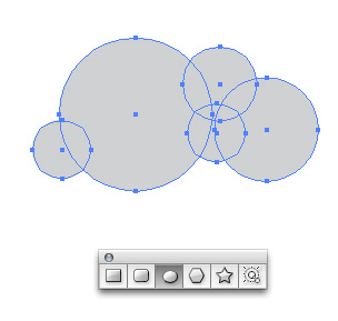
Step 36
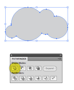
Merge all the circles together by clicking Unite in the Pathfinder Palette.
Step 37
Position the clouds in the background. Give them a black to white gradient and in the Transparency Palette set the mode to Screen. This will make the clouds fade from white to whatever color is behind them!
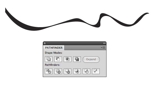
Step 38
Add more atmosphere (highlighted below) by drawing a random wave shape and again filling it with a black to white gradient and setting the mode to Screen in the Transparency Palette.
Step 39
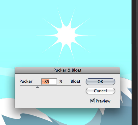
To create the sun draw a shape with many sides using the Polygon Tool.
Step 40
Go to Effect > Distort & Transform > Pucker & Bloat. Give your shape a Pucker of about -85%.
Step 41
Now that we have a source of light defined in the illustration we can take the detail one step further. For this illustration I’ve decided that I want to create a more whimsical use of light. While the objects near the left edge of the landscape cast shadows to their left, items near the right cast shadows to their right. In real life this is only the case when the light source is very close. Again, I’m going for a more whimsical effect so I’ll take some creative liberties with my illustration.
Draw elongated shadows that extend from the trees and shrubs.
Step 42
I don’t want the shadows to overpower the landscape so I’ll adjust the Opacity and give them a gradient that has more of a blue tint to it.
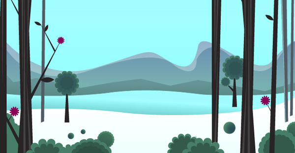
Final Image
You landscape illustration is now complete! This is what the final illustration should look like. Click here to see the larger version.
Subscribe to the Vectortuts+ RSS Feed to stay up to date with the latest vector tutorials and articles.