In 1938, Alex Steinweiss of Columbia Records invented the concept of album covers and cover art, replacing the plain covers used before. Over time, cover art became an important part of the music industry, both as cultural icons and as marketing tools. Since then, cover art has evolved with the advancement of technology. The format has changed as well. We no longer use 12” LPs. Today, cover art is designed mainly for CD covers and digital downloads. In this article we will feature some inspiring examples of typography in album covers from the 1960’s until today.
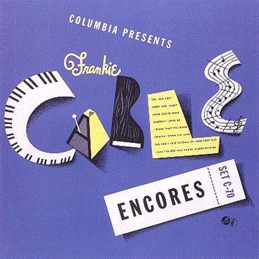
Alex Steinweiss Album Covers
Alex Steinweiss is credited with inventing the concept of album covers and cover art. This innovation replaced the plain covers used before. Steinweiss album covers include eye-catching graphics, vivid colors and amazing typography. His style of artwork is original and still regarded as icon of genre.


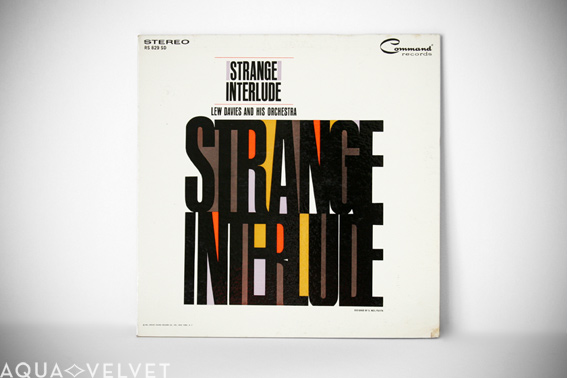
Strange Interlude: Lew Davies & His Orchestra
Strange Interlude album by Lew Davies and His Orchestra was released in the year 1961. The album cover designed by S. Neil Fujita has great typography with the overlap of colors in background and title in bold black letters.
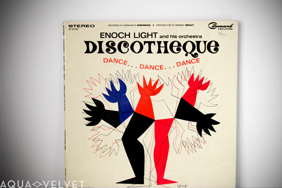
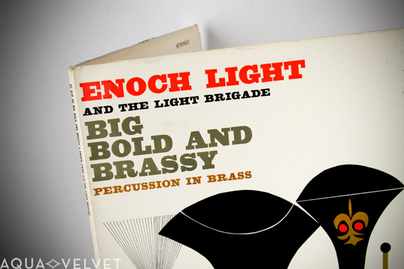
Enoch Light: Discotheque and Big Bold And Brassy
Album covers of Enoch Light’s Big Bold And Brassy and Discotheque has elegant typography fitting to the title of the album and musical genre. Both of them are inspirational examples of mid-century album covers and style of art prevalent in that era. Big Bold And Brassy album was released in 1960 and its cover was designed by S. Neil Fujita whereas Discotheque was released in 1964 and the cover art was designed by George Giusti.
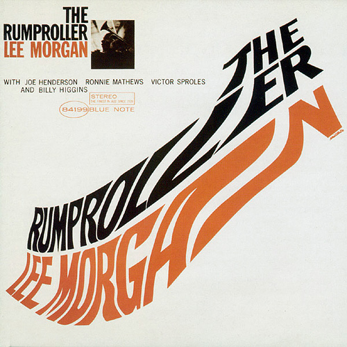
Lee Morgan: The Rumproller
The Rumproller is a jazz album released in 1965 by Lee Morgan. The distorted text resembling the shoe and the limited color palette in the design of the album cover is certainly eye catching. It was designed by Reid Miles.
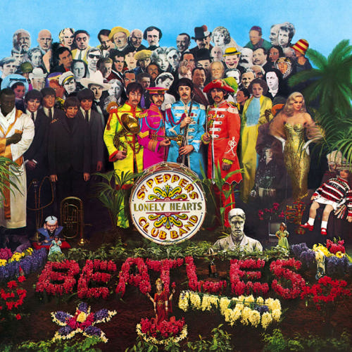
Beatles: Sgt. Pepper
This Grammy Award-winning 1967 album cover featured a colorful collage of life-sized cardboard models of famous people on the front of the album cover. It also featured The Beatles themselves in the guise of the Sgt. Pepper band. The idea was to create a scene that showed the Sgt. Pepper band performing in a park. In keeping with the park concept, the foreground of the scene is a floral display incorporating the word "Beatles" spelt out in flowers. It was probably the first time this had been done and it was a landmark album cover that changed it all graphically. Creativity zoomed after that release.
Blood, Sweat & Tears: Greatest Hits
Blood, Sweat & Tears (also known as "BS&T") Greatest Hits was released in 1972. The album cover has really incredible wood cut type treatment. The realistic shadows, lighting and texture gives it a unique look.

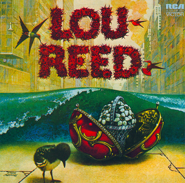
Lou Reed: Lou Reed
Lou Reed is a 1972 debut solo album of Lou Reed, an American rock musician. The album cover designed by Tom Adams is pretty cool and fanciful with equally beautiful flowery text.
Kiss:Kiss
Kiss is the debut album released in 1974 by band named Kiss. The album cover portrays the band members as demigods and the album’s name with flashy bling bling text positioned against black background.

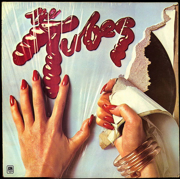
The Tubes (album)
The Tubes is the debut album of The Tubes a San Francisco-based rock band. This album was first released in the year, 1975. The cover art of this album is fabulous with woman ripping open the LP sleeve and the album’s name written in gel.
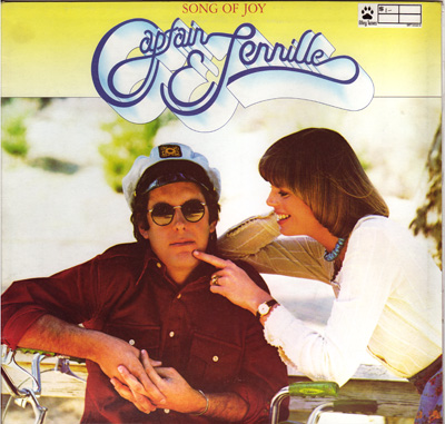
Captain and Tennille
Captain and Tennille are American pop music recording artists. The cover features their logo in beautiful 3D-ish script font. The album was released in 1976.
The Tomita Planets
The Tomita Planets is another brilliant example of typography from 70′s. The type work in the words, "Tomita" is incredible. The album was released in the year 1976.

XTC: Go 2
Go 2 is an interesting album cover, which was designed and executed by the art design group Hipgnosis. It was released in the year 1978. The cover consists of an essay about how album covers are used to attract buyers of the album. It definitely is one of the great original idea and promotional strategy to stand out from other album covers.

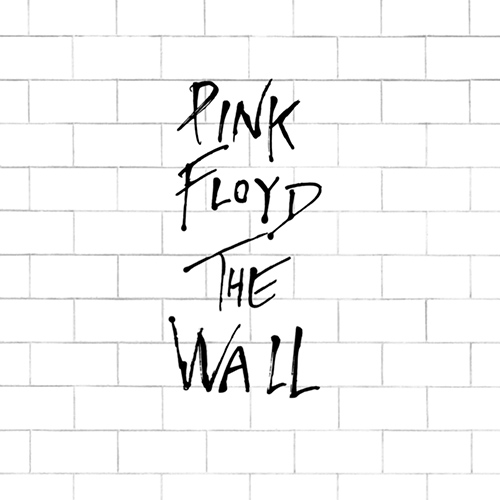
Pink Floyd: The Wall
The Wall was released in the year 1979 by English rock group Pink Floyd. The album cover has one of the most minimal designs. The hand written text and the white brick wall is based on the theme of the album, which depicts self-imposed isolation from society, represented by the metaphorical "Wall" of the album title.
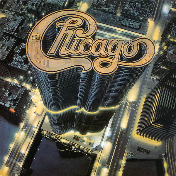
Chicago: Chicago 13
As the name suggests, Chicago 13 is the 13th album by rock band Chicago. It was released in 1979. The band rarely shows up in their cover art and one of the most recognizable things about the band is their logo. The skyscraper typography in the album cover is incredible, it decidedly pumps up to disco theme of the album and era.
Chicago: Chicago XIV
The thumb print typography treatment in Chicago XIV’s album cover is simply extraordinary.

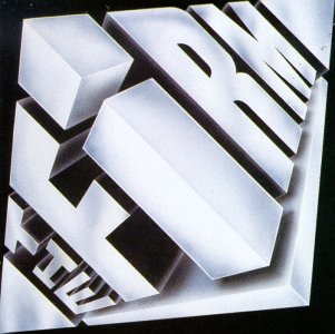
The Firm (album)
The Firm album, which released in 1985 features a brilliant 3-D typography in its album cover. The arrangement of the letters, their perspective and the cube shaped 3-D typography are very impactful.
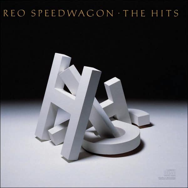
REO Speedwagon: The Hits
The Hits is a compilation album from REO Speedwagon. The album cover has the words "HITS" written in the pile of 3-D letters. It might look a bit kitsch today but it is quite innovative given the fact that it was created such long ago.
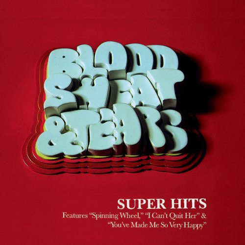
Blood, Sweat & Tears: Super Hits
Blood, Sweat & Tears released their Super Hits, a compilation album in 1998. The album cover has cool 3-D clay-like typography and attractive colors.
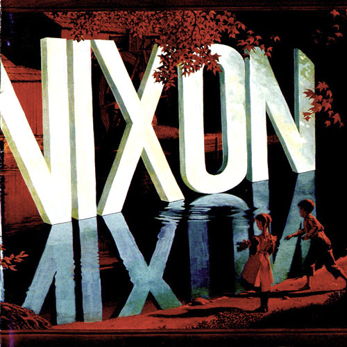
Lambchop: Nixon
Lambchop released Nixon in 2000. The album cover is a painting by Wayne White. It looks beautiful with 3-D style type art, it’s reflection and it is amazing how the words are painted over cheap, mass-produced lithographs.
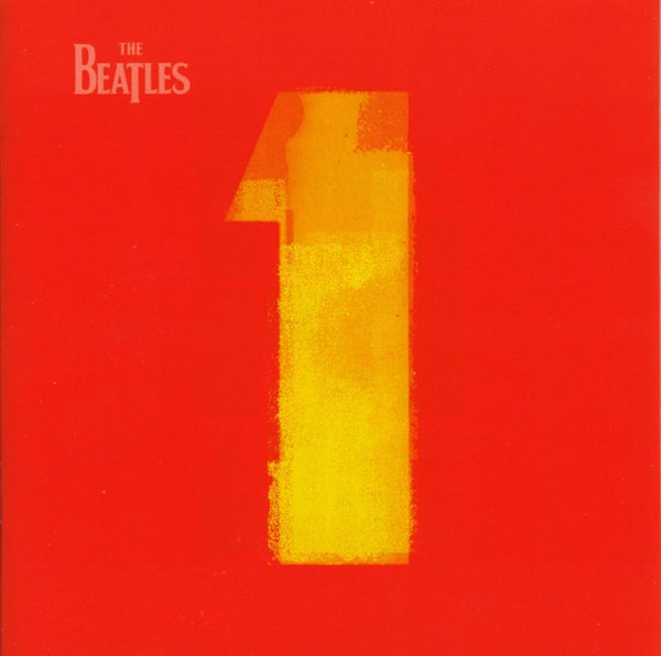
Beatles: 1
1 is a compilation album by The Beatles, released in 2000. The album cover is simplistic and attractive. It consists of cool pop-art yellow number one on a red background which cleverly emphasis on "1" icon which means compilation of number-one hits.
Daft Punk: Discovery house
Daft Punk mostly utilizes the band’s logo as the main graphic for their album covers by giving nice twist to their logo. Discovery house was released in 2001. The album cover has band’s logo with colorful and silvery neon like text effect which feels like there is some kind of disco lighting underneath. You can also find a font inspired by Daft Punk’s logo.

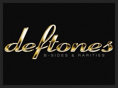
Deftones: B-Sides & Rarities
B-Sides & Rarities released in 2005 is a compilation album by the Deftones band. The album cover has band’s logo in cool golden text. And if anyone is wondering, the font used for the logo is Ribbon 131.
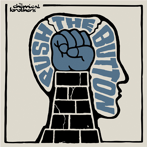
The Chemical Brothers: Push The Button
Push The Button was released in 2005 by The Chemical Brothers. The album cover has great illustrative style of typography and limited color palette. It gives the cover art 1960′s-style and feel. The cover was designed by Tappin Gofton. The typeface used in their logo is derived from Sho typeface designed by Karlgeorg Hoefer.
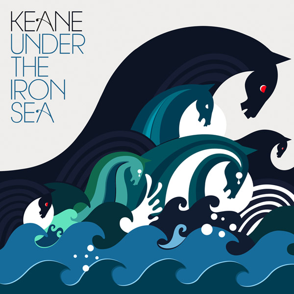
Keane: Under the Iron Sea
Under the Iron Sea is the album by English rock band Keane, released in 2006. The name of the album is based on a lyric appearing on one of the track in the album. The album cover has illustration based on the theme of the album and elegant typography. The typefaces were created specially for the cover and they look very elegant. The album cover was designed by Sanna Annukka.
Danko Jones: Sleep is the Enemy
Sleep Is The Enemy is a 2006 album by rock band Danko Jones. The album cover has impressive 3-D typography.

Spank Rock: YoYoYoYoYo
The album cover displays an effective typographic solution given the fact that the title of the album is actually just endless “Yo yo yo’s”. The album was released in 2006 by hip-hop group, Spank Rock.

Linkin Park: Minutes to Midnight
Minutes to Midnight was released in 2007 by rock band Linkin Park. This monochrome album cover has band’s logo in Futura Extra Bold typeface (modified) and it looks great.

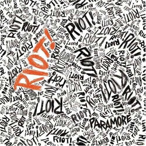
Paramore-Riot!
Riot! is the album by American alternative rock band Paramore. The album cover has cool playful hand drawn typography depicting the raw energy based on the theme of the album.
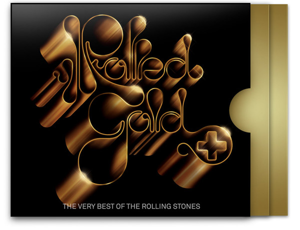
The Rolling Stones: Rolled Gold +
Rolled Gold+ was released by The Rolling Stones in 2007. The album cover designed by Alex Trochut has impressive gold illustrative typography which makes the cover unique and timeless.
Muscles: Guns Babes Lemonade
Album cover of Guns Babes Lemonade released in 2007 features another excellent example of typography. The variation of 3-D style in all the three version is pretty amazing.
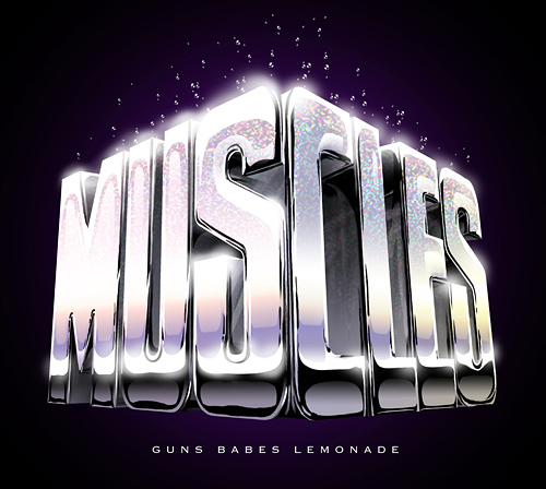
Below you can see two singles of the album, Sweaty and Ice Cream covers.


Stateless
Stateless is the self-titled album released in 2007 by Stateless. The Artwork for the album and singles was created by Non-Format and it has outstanding abstract typography. The tracks "Exit", "Prism #1" and "Bloodstream" were released as singles promoting the album also had similar typographic style.

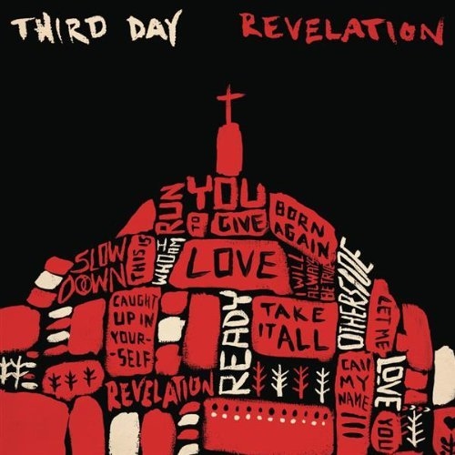
Third Day: Revelation
Revelation is album by the band Third Day, which was released in 2008. The album cover is unique with hand-written styled typography in dome shape blocks and limited color palette.
The Killers: Day & Age
Day & Age is the album by American rock band The Killers released in 2008. The album cover has fabulous mosaic styled art and typography painted by Paul Normansell. It was named as the best album cover of 2008 by Rolling Stone.

Coldplay: Viva La Vida
Viva la Vida was released in 2008 by rock band Coldplay. The album was named after a Spanish phrase that translates in English as "long live life". Lyrically, the album contains references to life, death and war. The cover artwork is an 1830 painting by Eugène Delacroix, entitled Liberty Leading the People. The title of the album was drawn using a white paint brush. The cover was designed by Tappin Gofton, the same designer who designed Push The Button album cover as featured above in this article.

Skunk Anansie: Wonderlustre
Wonderlustre is the album by British rock band Skunk Anansie released in September 2010. The cover has attractive digital art and great combination of thin and bold typography. The cover is designed by Shotopop.

You Get What You Give
You Get What You Give released in September 2010 is the album by the Zac Brown Band. The album cover has beautiful calligraphic typefaces on the textured background designed by Mark Machado better known as Mister Cartoon.

Elektronisk Tirsdag


The Legends: Play It For Today

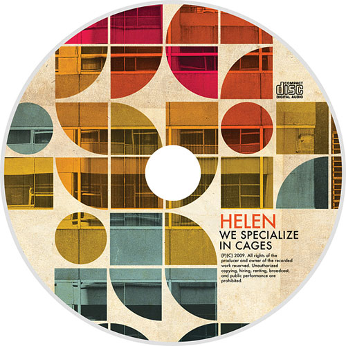
Helen

Eastern Skies

Cuba Gallery: Hidden Pictures

Digits: Hands Free

Vettig & Morsig: Space Invader
