In this tutorial you’ll see a collaboration between two vector artists. Ashley S. Benson will be responsible for the initial composition layout and coloring while Sharon Milne (me) will be refining and adding further detailing to the collaboration. You’ll learn techniques from both artists and learn some helpful collaboration tips.
Introduction
Let me introduce you to my collaboration partner Ashley S. Benson.
Ashley goes under the name Pixelledanddead and is a vector artist and designer. She begrudgingly resides in Phoenix, Arizona in the United States and has an impulsive affection for bright colors and vector art. In her spare time, she consumes vast amounts of skittles, and plots with her cat to take over the world, or at least Fiji. You can see her work via her deviantART account.
Ashley and I have been friends for a long time. We originally met due to our passion for vector art and have always wanted to collaborate on a piece together. However the major issue has always been that our styles have differed.
While mine has been of a limited palette and predominately using stock as a base, Ashley uses her own sketches and wild color schemes. The challenge was to find a happy medium, learn to compliment each others skill set, and grow from our experience of collaborating together.
Initial Collaboration Discussion
Before any collaboration, it’s worth laying some ground rules. While in this collaboration we are both comfortable with modifying and removing aspects of each others work, some artists might not appreciate this.
Looking upon our strengths, Ashley’s strength is being able to sketch a composition from scratch and put it together, where as mine is using stock which is present and adding to it.
Our initial thoughts are for Ashley to sketch and vector the bases of a powerful female character and then for myself to add further detailing and refine it. This will bring together our key strengths to help make the collaboration work.
So with this in mind, Ashley will begin her portion of the collaboration.
Ashley
Step 1
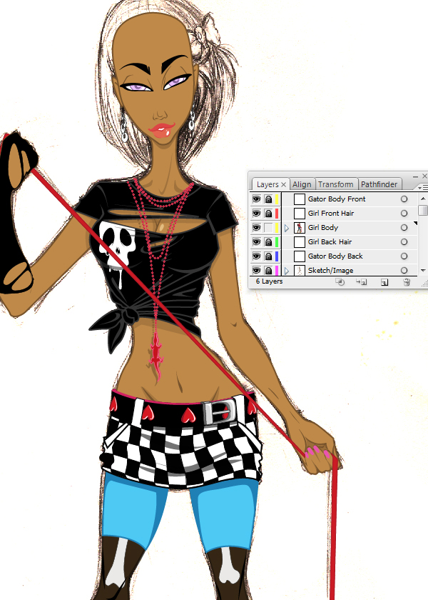
In this collaboration we’ll be working from the beginning of the project, ie: the sketch; to the final, which will result in a finished vector piece. We chose to go with a female figure as the main body of the piece; and an added element of the alligator to break up the negative space of the composition.
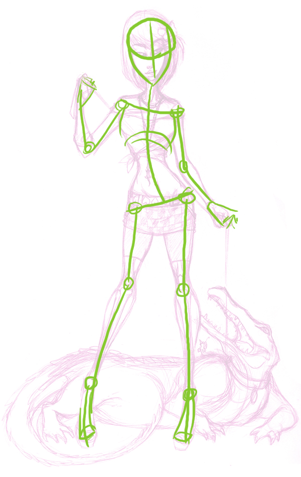
It’s good to set boundaries and limit what each member of your collab will be responsible for. In step 1, we’ve used a simple stick figure to plan out the pose. This one is just a little more detailed, with the addition of joints, hip positioning, and rib cage.
When sketching I personally work with 0.5 lead mechanical pencil; it’s a little bit thinner than the 0.7 lead, but I find it really helps to define features well. It also cuts down on a lot of smudging, which happens with heavily leaded areas of the composition. If there is consistent smudging, keep a piece of paper under your hand while you sketch.
When coming up with a standing character, it’s important to establish which leg the weight will be centered on. In this case, we’re putting the majority of the weight on the right leg.
Step 2
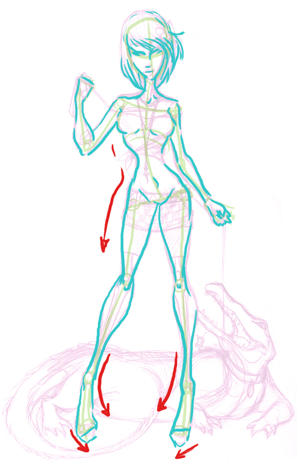
Now we focus on the shape of the body. Curves and circular patterns are necessary for a shapely body. The idea of movement and a recognizable silhouette will strengthen the overall composition. Even though the subject is standing, she has a flow moving from the tips of her hair to the toes of her feet.
Don’t focus on perfect lines; this should be a time to feel free to be a little messy with the sketch. A little mess actually encourages movement in the piece, and it will resonate through the entire composition as long as the repetitive lines are kept in the initial sketch.
Step 3
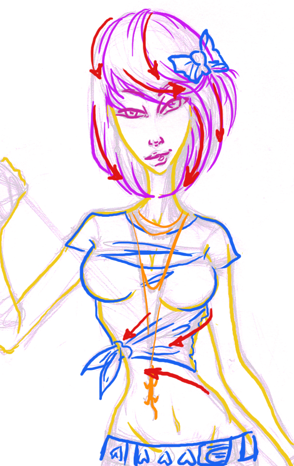
Now we’ll includes a pattern of colors to make it easier to focus on each aspect of the features and accessories. The face is a good starting point. This will help to define the mood of the character.
Since the sketch is done in pencil, it makes it easier to adjust the hands, or body positions to suit the face and the surrounding parts of the composition. Starting firstly with the nose, moving on to the mouth, and back up to the eyes, it’s best to spend time on the more difficult aspects of the face.
Hair is a strong asset in a sketch. When forming the hair, start from the crown of the head to the tips in a sweeping action. Add clothing, taking care to follow the contour of the body. When there is a tie or a knot against the skin, draw the fabric in a gathering motion.
Step 4
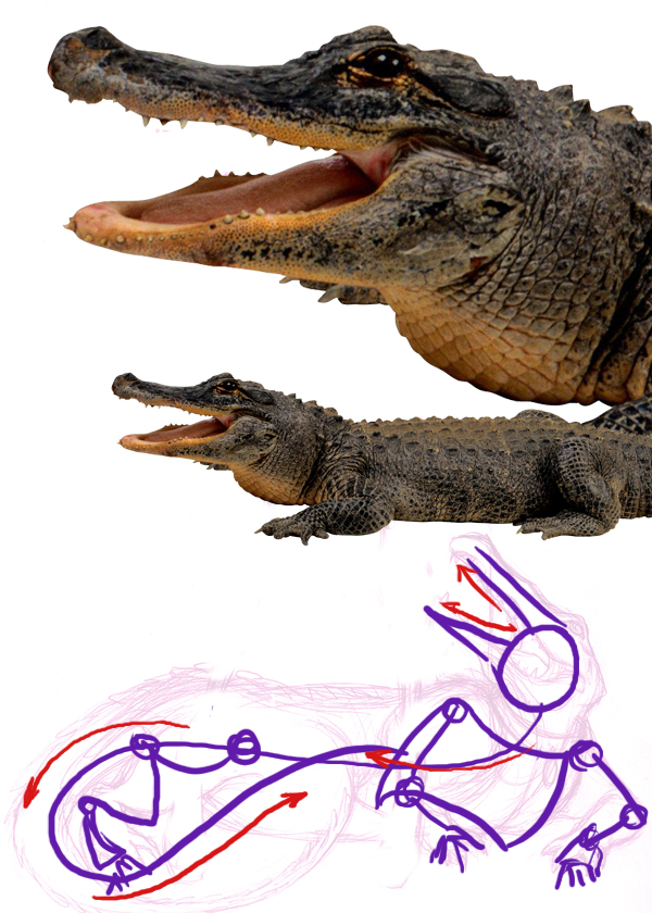
Let’s work on the alligator’s basic body construction. Combining stylization and reference materials; an original animal creation can be accomplished. DeviantArt is great a great website for finding reference material for sketches. This PNG was found in a search for alligators and AbsurdWordPreferred’s gallery was the perfect place to find a clean photograph.
It has great resolution, and it’s pretty much a free resource to use. It’s good to check the rules before using any stock though. In this rare instance the artist indicates (in their comment section below the reference material) that no credit is needed, and that it can be freely used.
Using the reference stock particularly for the head and legs, the stick figure is made similar to what was accomplished in step 1. This will become very important in the rough sketch of his body parts. The figure is broken down into segmented joints, head, rib cage, and hips. Having a general motion of how the tail and head relate to the other figure in the composition will also make it easier to present a reasonable flow to the other elements.
Step 5
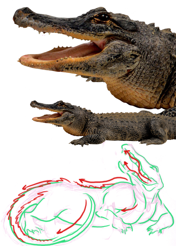
Now we’ll work on fleshing the alligator out, while giving him muscle definition in his arms and chest, and giving a rough idea of how the scales of his back and tail will look can be done with a slight reference to the stock being used. This is still a stylized creation, so parts can be exaggerated.
Be aware that his mouth isn’t straight forward like suggested in the initial stick figure sketch described in Step 4. He has ridge detail in the upper and lower jaw lines . In the PNG, he has a pouch under his neck, he’s not realistic in this sketch so it would look a little off to put the collar on him at the same position as his pouch of skin.
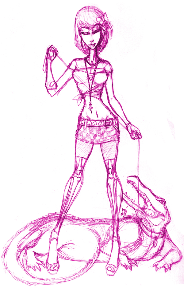
Step 6
We’ll work on completing the sketch in this step. Both of the characters have been accessorized with jewelry; and any unclear lines and contours have been more clearly defined. The sketch still retains most of the previous line work from step 2 onward, but the main lines will not be lost because they’ve been drawn and enhanced a few times during the entirety of the process. Movement is better conveyed as a result.
Step 7
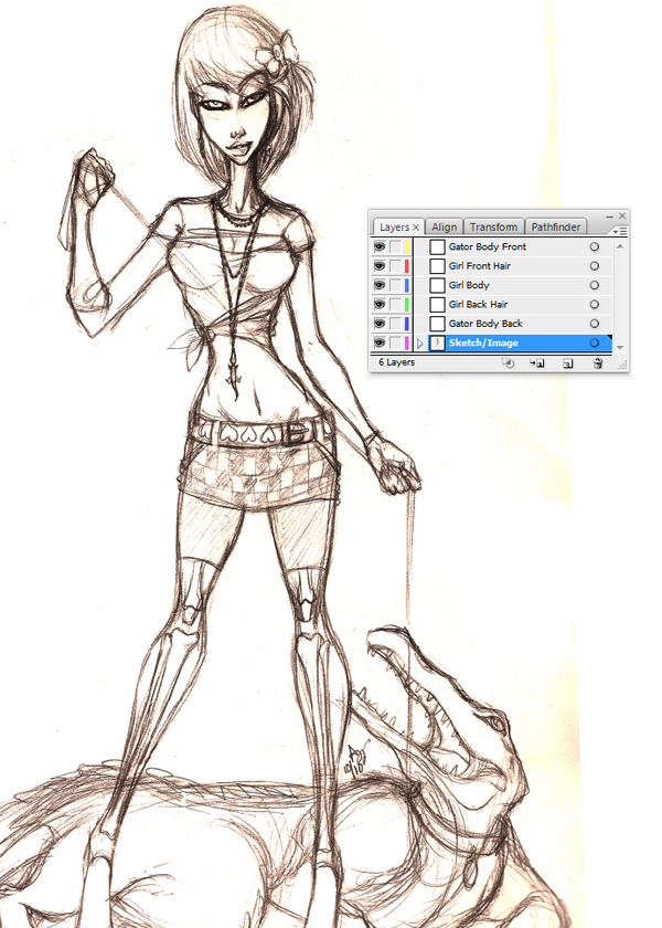
Now we’ll open the scanned artwork in Illustrator. Adjust the size of the intended sketch to a more comfortable size by opening Document Setup: File > Document Setup (Alt + Command + P). Scale the piece accordingly, simple scaling is the result of dragging from one of the corners holding the Shift and Alt keys to resize. This prevents having to adjust it horizontally or vertically during expansion.
Make the individual folders and label them accordingly. Clearly mark each folder for easy access to major parts of the composition: ie, front hair containing bangs or hair to overlap the body, the character’s body, etc. It makes since to pre-label and have them in more manageable portions.
Step 8
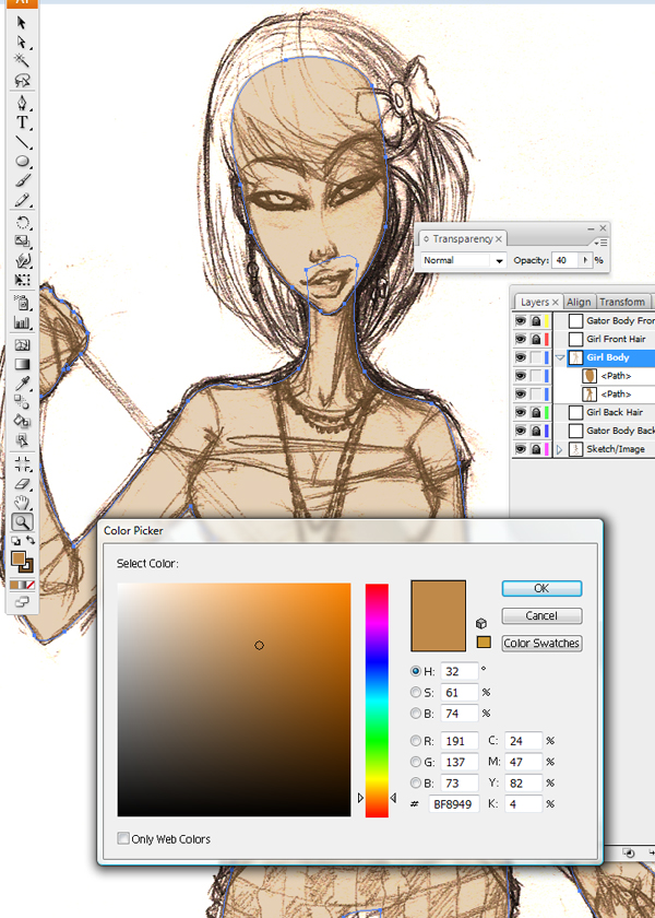
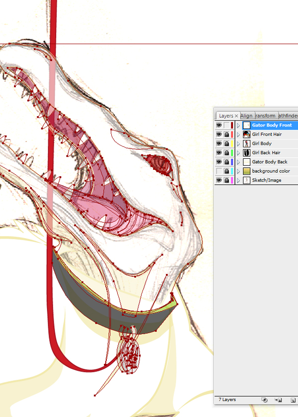
During basic coloring, pick hues for the body base and outer stroke line, which were created using our Pen tool (P). Curves are accomplished by holding down the Alt key as points are created to form the path.
The Color Picker is located in the Toolbar. Should this be accidentally deleted from the visible tools, retrieve it at the top of the program; Windows > Tools. By highlighting all of the main body parts, adjustments in color can be made consistently. The basic color for this African American female is R=191, G=137, and B=73.
Step 9
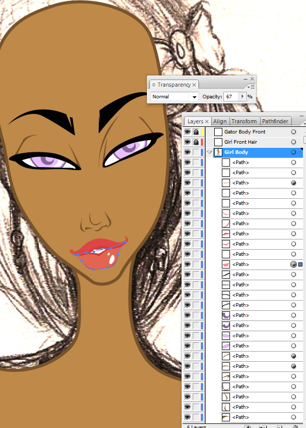
We’ll keep with the same ritual of working on the face first; adjust the coloring as needed or preferred. In this stylized approach, there is a stroke or outline around the main body parts, the head and body, but the features are done without the use of a stroke line.
This enables the features to be delicate and precise. If a stroke line was used in these general areas this could complicate and lengthen the time it takes to adjust the width to suit the size, should it be resized. As this is a huge headache with hundreds of paths created, it is not recommended to use a large number of paths that include stroke lines.
In this step, the lip color is being adjusted. It works well to change the opacity of the bottom lip slightly; it gives more definition to the entirety of the mouth. Multiple layering and lowering of opacities will create more shading and a fuller body part. Opacities set between 50-75 are generally preferred.
Step 10
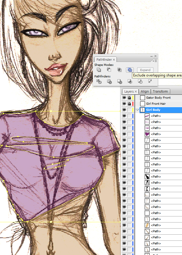
In step 10 the shirt designed with the Pen Tool (P) needs to have pieces within the path excluded. If for some reason the tab cannot be located, go to Windows > Pathfinder (Shift > Command > F9).
Step 11
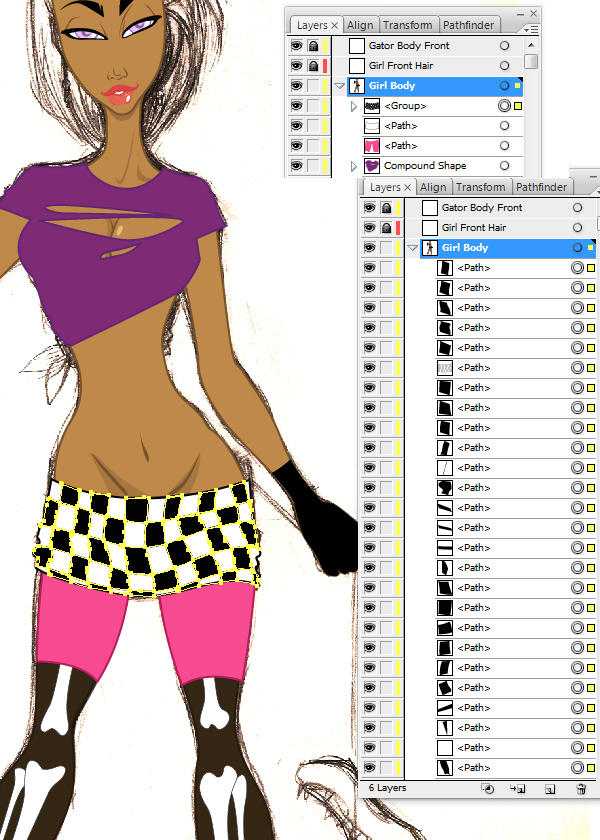
After completing the exclusion process on the shirt, it is beneficial to keep your folder cleared of unneeded clutter. By grouping smaller pieces together such as the checkered pattern in the skirt, there will be less time searching or changing the color of the checkered pattern if so desired.
Highlight all pieces and proceed to Objects > Group (Command + G). In the layers box, there is now a more manageable set of checker boxes and a neater folder over all. Leave the white skirt out of this grouping for any further editing desired.
Step 12
As mentioned previously, colors have been established but are easily readjusted. Accessories, embellishments, and light shading have been created with the Pen Tool (P) and opacity settings have been adjusted for the shading. An opacity setting of 43 is recommended. Elements in the “Girl Body” folder, have been completed, and work can progress in the new folders.
Step 13
In this step elements have been added to the “Girl Front Hair” folder, and the “Girl Back Hair” folder, created with the use of the Pen Tool (P). The bangs and bow are both in the “Girl Front Hair Folder” and the longer hair behind her neck is placed accordingly as well.
This particular style has been simplified in a solid color without a stroke line to give the collab partner more options. The hair can now be highlighted by the next person however they so choose. Also, to make it more manageable for the next person, group the orange streaks together (Command + G) to make re-coloring similar.
Step 14
Let’s move on to the supporting character after finishing the folders noted in step 13. The alligator is a simplified vectoring style, similar to the initial base for the girl. For the main body a stroke line is used and complimented with facial detail and body paths without a stroke line. This is done for the same reasons as described in step 9, sizing issues and coloring complications could arise.
Step 15
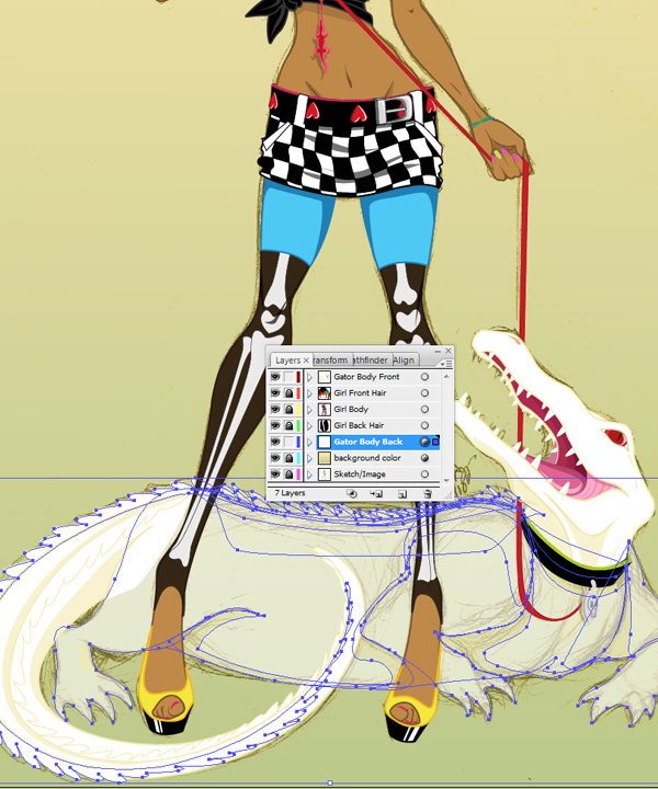
Working on the body of Bob, try to keep his tail in the same folder as the head. This allows the possibility of overlapping over the human figure’s leg with Bob’s tail to enrich the relationship of the two individual characters.
The overall alligator is plainly colored with simple shading and simple scaling on the back and tail. With a little more emphasis on his collar, mouth and eye the alligator is completed for the first phase of the collaboration. The comp is ready for the next collaborator’s techniques.
Sharon
Step 1
First thing I do is to open up Ashley’s portion of the collaboration in Illustrator, then Save as… to ensure it is the version which matches my version of CS. The reason being is that if I use transparent gradients and Ash is using a version predating CS4, the elements will end up being rasterized. This is something I do not want.
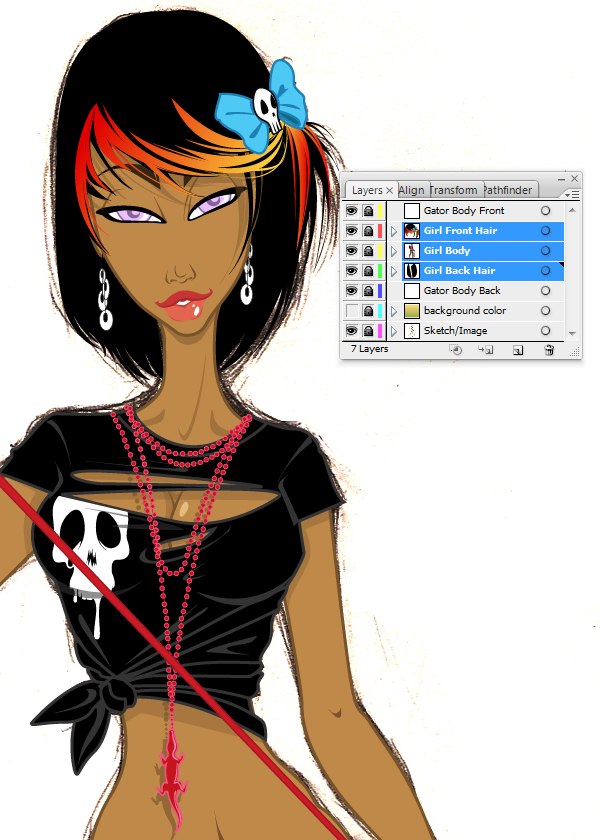
My initial instinct is to make the palette slightly limited. I’m loving the colors of black, red and yellow used in the design and want to take away some of the blue aspects.
Using the Direct Selection Tool (V) I can select the shape I wish to alter and then duplicate the fill, stroke, blending mode and opacity with the Eyedropper Tool (I).
Step 2
I’m going to create a New Layer below the “hair” layer and call it “Skin Shading.” This is so none of my shading will overlap onto the hair.
I’m going to add some depth to the skin by adding some subtle skin shading. To do this I’m going to use transparent radial gradients using the same color as the skin. Then setting the Blending Mode to Screen and the Opacity to 70%.
From past experience in doing portraits, I know highlights on the brow bone and cheek bones will help compliment a face. So applying these types of gradients on the face will shape it.
Step 3
I want to add the same amount of depth to the clothing, so I’m going to create a New Layer above the “Skin Shading” layer folder and call it “Clothes Shading.”
I’m going to use a white to white transparent radial gradient to add highlights to the black glove and top. Ashley has already drawn where the clothing folds are, so this makes it easier for me to place the highlights on the top. I then set the Opacity to 40%.
Step 4
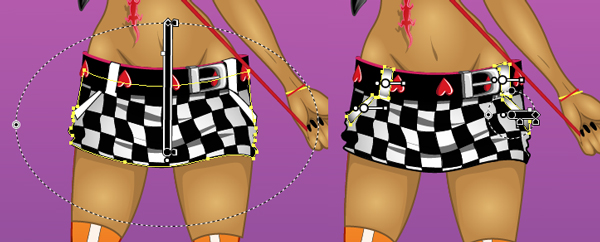
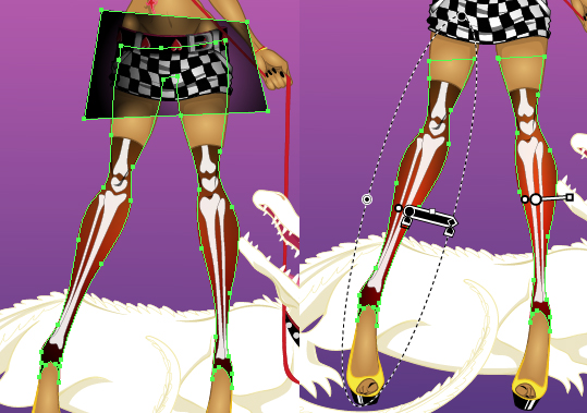
When it comes to adding depth with gradients in other areas, it’s not as easy. For instance with the skirt, I go into the layer folder and use the Direct Selection Tool (V) to select the overall skirt shape. Then Copy (Command + C) and Paste in Front (Command + F) the shape. This will then need to be dragged and dropped into the correct place otherwise it will cover other elements of the design (for instance the belt loops).
I apply a black to black transparent radial gradient with the center at 0% Opacity. Set the Blending Mode to Multiply and using the Gradient Tool (G), position the gradient so it appears the shadow is coming from the outside of the shape.
Using the same technique, I select the belt loops and pocket detailing and repeat to give them further depth.
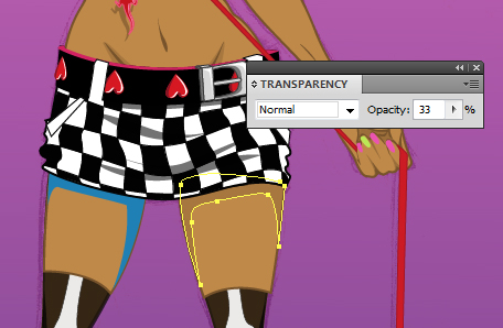
Step 5
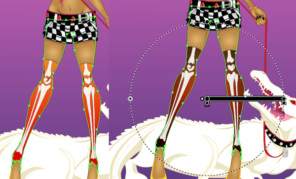
With the leg warmers when selecting the shape I note that it’s one whole shape. Applying a straight gradient onto this to add depth will apply it to the whole shape rather than treating the legs as separate shapes.
To get around this, once I’ve duplicated the shape I will need to use the Pathfinder options to minus front and then apply the black transparent radial gradient.
Step 6
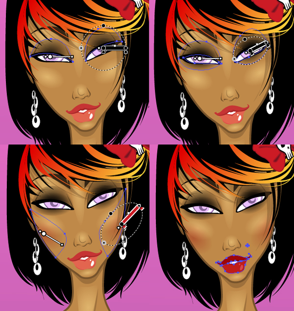
To add further detailing to the face, I’m going to add some cosmetics on her. First create a New Layer above the “Skin Shading” folder and rename it “Make Up.”
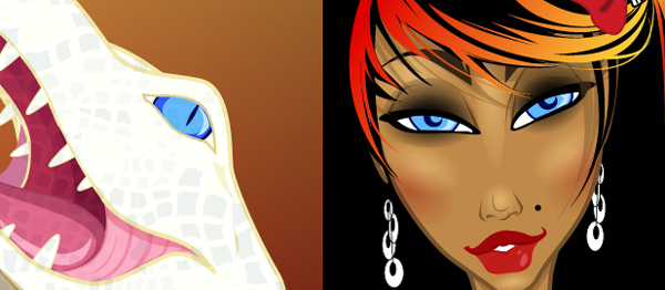
I’m going to give her smokey eye make up by adding black transparent radial gradients around the eyes and on the eyelid and setting the Blending Mode to Multiply. Then add red transparent radial gradients just below the cheekbone highlights and set it to Multiply at 40%.
Now I’m going to trace over the lips to add red to them to match the color scheme, but making sure the lower lip is lighter than the top. The best way to do this is to fill the shapes with red, setting them to Multiply and just decreasing the Opacity of the lower lip to 80%.
Now I add my own element of a beauty spot above the lips, which is an element I like to add to my own work.
Step 7
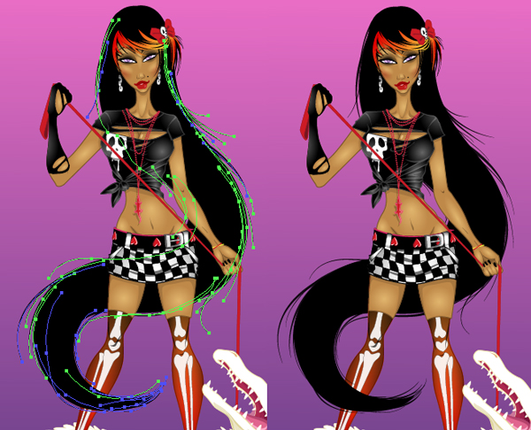
As I wish to add to the composition, I’ve decided I want to change the hair while keeping elements of the original hair design.
Create a New Layer behind the hair and girl and renaming it “Hair back.” I want the hair to mimic the tail of the gator to show some sort of connection between the characters. So I’m going to draw a large black shape that curves like the tail at the bottom with the Pen Tool (P). Create a New Layer above the main “hair” layer folder to add a further shape to overlap the hair curl over her leg.
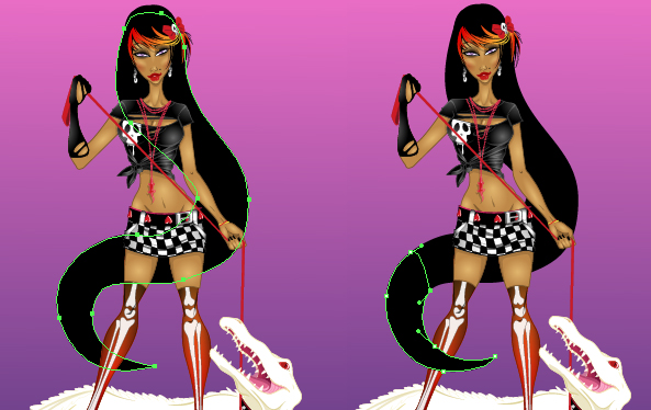
Step 8
Using the Width Profile 4 brush from this tutorial, I’m going to add stray hairs to match the style of the choppy fringe/bangs. Using the Paintbrush Tool (B) with a variety of stroke weights and on Multiply, add strokes in both of the layer folders for hair.
Step 9
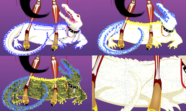
The Gator shapes are in two layer folders. Create a New Layer for a layer folder above each of them.
Going into the “Gator” layer folders, using the Direct Selection Tool (V) I’m going to select a shape that has the same fill color as the rest of the gater. Go to Select > Same > Fill Color, and then Copy (Command + C), Paste in Front (Command + F) and Group them (Command + G). Drag the two groups into the corresponding layer folders above.
Going into the Swatch palette, add the Alligator pattern by going to Open Swatch Library > Patterns > Nature then selecting the Nature_Animal Skins collection.
Apply this to the shapes and set the Blending Mode to Hard Light at 7% Opacity.
Step 10
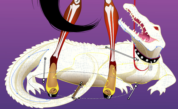
I’m going to add further depth to the Gator by adding some brown transparent radial gradients underneath and along the bottom of his chin, then setting the Blending Mode to Multiply.
Step 11
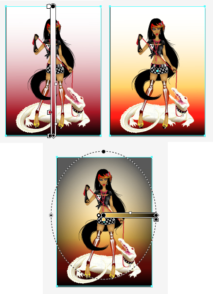
I’m going to amend the background of the design so it compliments the illustration’s palette. First using the Artboard Tool (Shift + O) I’m going to change the composition to Portrait. Then remove the shapes in the “Background” layer folder.
Using the Rectangle Tool (M) I’m going to add a white to red to black gradient in the background. Then a yellow rectangle set to overlay. Finally add a yellow to black vignette radial transparent gradient set to Multiply and Opacity at 65%.
Step 12
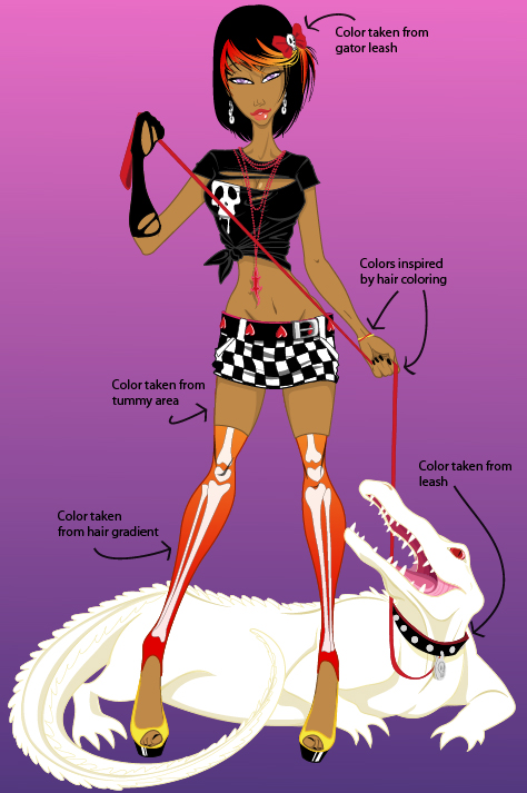
As a final touch, I’m going to change the color of the girl’s and gator’s eyes. I want them to be the same color to add a further connection between the characters.
As I’ve removed the blue from the original design, I’m going to change the color of the eyes to blue as a nod to the original.
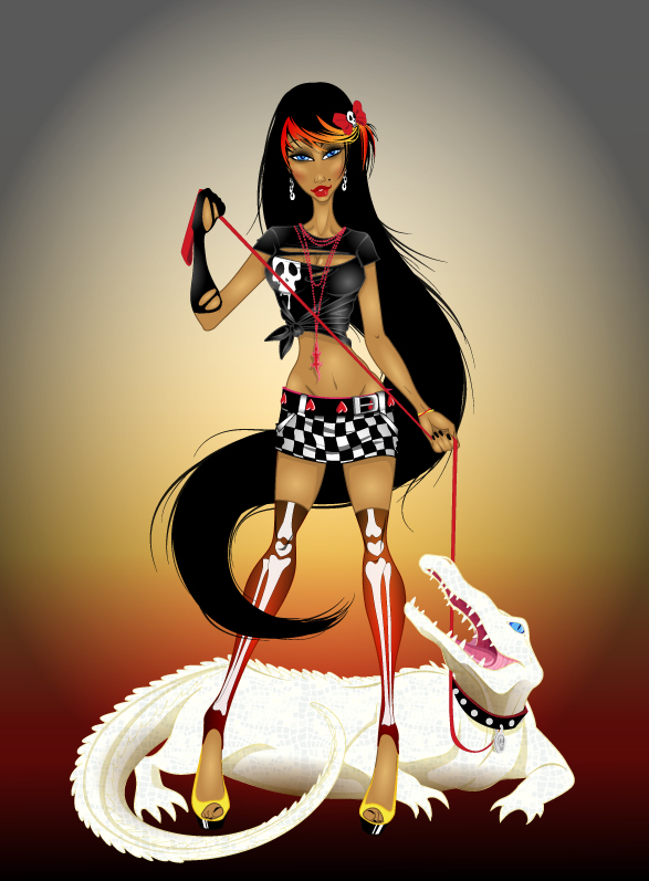
Conclusion
We’ve been able to work together to produce an illustration that reflects both of our skills. With contact over Skype we were able to double-check that the other was happy with any changes or elements we introduced.
If you’d like to find out more about collaborating and the benefits of collaboration, check out the following article: Benefiting From Collaborations in Vector Art.