Im having issues with one webstie that Im creating. It is a form created by Boostrap 5. Im trying to make it responsive as I can
The big problem that Im having is that I cant change the white corner of the next picture when I make the screen smaller.
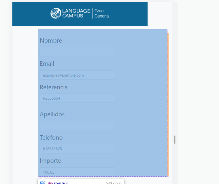
I know that my code is not perfect but I need to understound what is going on here. Thanks for all
HTML:
    <!DOCTYPE html>
    <!-- saved from url=(0031)https://payments.idiomasgc.com/ -->
    <html lang="es"><head><meta http-equiv="Content-Type" content="text/html; charset=UTF-8">

        <meta name="viewport" content="width=device-width, initial-scale=1">
        <title>Bootstrap demo</title>
        <link href="./Form_academia_files/bootstrap.min.css" rel="stylesheet" integrity="sha384-rbsA2VBKQhggwzxH7pPCaAqO46MgnOM80zW1RWuH61DGLwZJEdK2Kadq2F9CUG65" crossorigin="anonymous">
        <!-- Custom styles for this template -->
        <link href="https://cdn.jsdelivr.net/npm/[email protected]/dist/css/bootstrap.min.css" rel="stylesheet" integrity="sha384-EVSTQN3/azprG1Anm3QDgpJLIm9Nao0Yz1ztcQTwFspd3yD65VohhpuuCOmLASjC" crossorigin="anonymous">
        <link href="/Formulario_COPIA/Formulario/style_form.css" rel="stylesheet">
        <script src="comp.js"></script>
      </head>


      <body class="bg-light">

        <header class="p-3 text" style="background-color: #0f6796; height: 100%;">
          <div class="container">
            <div class="d-flex flex-wrap align-items-center justify-content-center justify-content-lg-start">
              <a href="https://payments.idiomasgc.com/" class="d-flex align-items-center mb-2 mb-lg-0 text-white text-decoration-none">
                <img class="img" src="/Formulario_COPIA/images/Logo_Academia.png">
              </a>
            </div>
          </div>
        </header>


        <div class="container formulario">
          <form method="POST" action="/Formulario_COPIA/Generar_Pago/generar_pago.php" onsubmit="return validarFormulario()">
              <div class="row g-3">
                <div class="col-md-6">

                  <div class="nombre">
                      <label class="texto" for="nombre" class="form-label">Nombre</label>
                    <input type="text" class="form-control" id="nombre" name="nombre" placeholder="" required>
                    <div class="invalid-feedback">
                      Se requiero un nombre válido.
                    </div>
                  </div>

                  <div class="email">
                    <label pattern="/^[a-zA-Z0-9.!#$%&’*+/=?^_`{|}~-]+@[a-zA-Z0-9-]+(?:.[a-zA-Z0-9-]+)*$/"
                    required class="texto" for="email" class="form-label">Email</label>
                    <input type="email" class="form-control" id="email" name="email" placeholder="[email protected]" required>
                    <div class="invalid-feedback">
                      Se requiere un email válido.
                    </div>
                  </div>

                  <div>
                    <label class="texto" for="referencia" class="form-label">Referencia</label>
                    <input type="text" class="form-control" id="referencia" name="referencia" placeholder="R2556554" required="">
                    <div class="invalid-feedback">
                      Se requiere una referencia.
                    </div>
                  </div>

                </div>

                <div class="col-md-6">
                  <div class="apellidos">
                      <label class="texto" for="apellidos" class="form-label">Apellidos</label>
                      <input type="text" class="form-control" id="apellidos" name="apellidos" placeholder="" required="">
                      <div class="invalid-feedback">
                        Se requiere un apellido válido.
                      </div>
                  </div>

                  <div class="telefono">
                    <label class="texto" for="telefono" class="form-label">Teléfono</label>
                    <input type="text" class="form-control" id="telefono" name="telefono" placeholder="612345678" required="">
                    <div class="invalid-feedback">
                      Se requiere un teléfono válido.
                    </div>
                  </div>

                  <div>
                    <label class="texto" for="importe" class="form-label">Importe</label>
                    <input type="text" class="form-control" id="importe" name="importe" placeholder="100.65" required="">
                    <div class="invalid-feedback">
                      Se requiere un importe.
                    </div>
                  </div>

                </div>

              </div>

              <hr class="my-4 barra">

              <div class="row">
                <div class="col-sm-4">

                </div>
                <div class="col-md-3">
                  <button class="boton btn btn-primary btn-lg" type="submit" >CONTINUAR</button>
                </div>
                <div class="col-sm-4">

                </div>
              </div>


          </form>
            <script src="./Form_academia_files/bootstrap.bundle.min.js.descarga" integrity="sha384-kenU1KFdBIe4zVF0s0G1M5b4hcpxyD9F7jL+jjXkk+Q2h455rYXK/7HAuoJl+0I4" crossorigin="anonymous"></script>
        </div>

      </body>

    </html>
CSS:
    *{
        padding: 0;
        margin: 0;
        box-sizing: border-box;
    }

    .texto{
        font-size: 25px;
        padding: 10px;
        margin-left: -10px;
    }
    .form-control{
        width: 60%;
    }
    header{
        height: 90px;
    }
    .barra{
        margin-right: 20%;
    }
    .formulario{
        margin: 0 auto;
        margin-top: 5%;
        margin-right: 5%;


    }
    .boton{

        margin: 0 auto;
        margin-left: -13%;
        height: 100%;
        width: 80%;

        background-color: #54b0df;
        border: 0px;
        border-radius: 100px;

        line-height: 1;
        letter-spacing: 1px;
        font-weight: 500;


    }
    .row{
        max-width: 100%;
    }
    .boton:hover{
       background-color: #f4bc27;
    }
    @media screen and (max-width: 760px) {
        .formulario {
          margin-left: 100px;
        }
        .barra{
            margin-right:
            40%;
        }
        .boton{
            margin-left: 0%;
            width: 60%;
        }
      }