Lowering Carbon Footprint, Increasing Productivity: From Paper to iPad

I’ve been a big proponent of using paper to plan out projects as well as tasks, but since picking up an iPad I’ve been shifting back into electronic organization.  I still love having a pen and paper handy, but I’m starting to find that with the right tools in play electronically I am producing more efficiently and effectively.  It boils down to a few things, really:

Ubiquitous Capture

While I don’t necessarily have to carry my iPad with me wherever I go, I generally have my iPhone with me.  With the synchronizing of common apps between the two devices, I no longer have to fiddle for a pad and pen – no matter how elegant they may be.  Before, I’d have to bring around my Hipster PDA (which, to be fair, I still have in my car just in case my 1st generation iPhone’s battery dies on me – and yes, I am going to upgrade) and then transfer what I captured there to my productivity program of choice.  No longer.  Now, I simply use a program like Note2Self if something comes to me quickly or go directly into my productivity app of choice and record it there.  By the time I get home I’ve either emailed the note to my self or have synced the task with my iPad (and MacBook Pro).  I’m never at a loss.  There’s nothing more ubiquitous than that.

The Right Tools

With my new Dodocase, my iPad is disguised as Moleskine.  I can carry it around with me and search for things quickly and easily.  I can move much faster and make the two-minute rule achievable on a consistent basis.

Besides a case that is functional, you’ll need to have software that is just as functional – likely more so.  Here’s what I’m currently using:

  • OmniFocus: Tried ‘em all…yet I keep coming back to OmniFocus.  It appears to be the heavyweight champion of productivity apps.  It’s the syncing that does it for me – and I’m beta-testing their web server now as well…which has worked like a charm. I’ve got a lot on the go and don’t mind that you have to wrap your head around OmniFocus before you can really make it what you need it to be.  There are other great apps out there in the native application realm (Things, The Hit List), the web app realm (Producteev2, Remember The Milk, Nozbe) and others that either work in tandem or do one thing really well (Evernote is one I sue for all the “other stuff”) but OmniFocus just keeps hooking me back in.  It’s that good.
  • Note2Self: This is great for those times that you need to quickly get something out of your head and don’t want to scramble to do so.  Just record your voice memo and you can email it directly to yourself (or to an assistant, someone you delegate to, etc.) straight away.  You can preset email addresses in the app and if you’re not in 3G range or just feel it can wait, you can save the note.  Simple and useful…that’s why I like it. (And it’s available for Blackberry and Windows Mobile as well.)

The transition hasn’t been completely smooth – setting up OmniFocus again to work just as I need it to has taken some time.  There’s plenty of ways to do it, and having a listen to the MacPowerUser podcast comparing OmniFocus to Things definitely helped.  So even though it took some time, it was time well spent.  Just as the money on my iPad was.

Not that I’m giving up paper completely.  I still use my trusty actual Moleskine for journalling.  For now.

5 Awesome Web Based Time Tracking Software Solutions

As a web worker, I understand the importance of time tracking. You’ll always find me urging people to track the time they spent working. Why? Well, there are distractions galore. There are social networking sites, YouTube, chat and what not. Hence, at the end of the day, I want to see how many hours I spent doing “real work.”

I prefer using cloud-based, or I should say online time tracking software. This list talks about some nice web based time tracking software applications which you might find useful. Check them out and offer any of your own recommendations below.

1. SlimTimer

SlimTimer is a brilliant online time tracking solution that lets you track time for different tasks, and also share them with coworkers. And it’s free to use.

2. Toggl

Toggl has a great interface, nice reporting features and also has desktop versions for all the major operating systems. It has both free and paid versions, but the free version should suffice for most of us.

3. RescueTime

RescueTime is a popular time tracking and productivity software for individuals and business owners, and we’ve discussed it here before. If you are only interested in a web based solution then the RescueTime add-ons for Firefox and Chrome should get the job done.

4. MakeSomeTime

MakeSomeTime is a cool time-tracking and invoicing tool for freelancers, and anyone who juggles more than one project at a time. The interface is simple and easy to comprehend. Check out Lifehacker’s detailed review on the tool.

5. Colorhat

Last but not the least, Colorhat is a simple online time tracking tool that helps you quickly analyze the time spent during the day through a graphical interface.

Is “The Office” Real?

For those that don’t watch the American television version of The Office, it is a situation comedy about a failing paper company led by a charming-but-impulsive regional manager. The show’s humor comes mainly from its wide variety of distinct characters (although typical office stories come into play as well), some of which seem like perfect office archetypes. Protagonist Jim Halpert is a rational, level-headed salesman who, after many attempts to bring sanity to his workplace, resigns to just enjoy the humor all around him. Jim can amuse, but there are others:

  • Dwight, a goofy, abrasive know-it-all with action hero aspirations;
  • Creed, a creepy, funny should-be-retired colleague whose ambiguous comments are often disturbing and funny;
  • Kevin, an accountant who, seems woefully inattentive and thick-headed given the nature of his work;
  • Ryan, the low man on the totem pole who has little else other than Machiavellian ambition and stories of past professional glory;
  • Angela, the peculiar, pet-loving enigma who has some strange habits that are impossible to ignore; and
  • Kelley, the customer service representative who, despite her profession, is prone to having wild, dramatic fits over the insignificant.

The show is full of office-related humor, and its meaningless meetings, inappropriate antics and professional blunders leave us saying:

“Wow, that is so true.”

But, is it? Are these characters real? Can you spot them at your job? Perhaps if you can’t spot them, could you be one of them? Let’s not kid ourselves; we can’t all be cool, collected, “Jim Halpert” types. Someone has to be the drama queen, the cutthroat, the dreamer, the know-it-all.

Are you one of them?  If so, which one are you?

Awesome Links #3: Beating the Heat, Cool Home Offices, Custom Toolbars

How to Stay Fit (and Cool) Despite the Summer Heat

The countries in northern hemisphere continue to grapple with scorching heat. Ask me, I’m in India and you really don’t want to know what the summers are like here. Hence, when I came across this guide by Lifehacker to beat the heat, I thought it’d be worth a share. If it’s cold where you are, this guide could prepare you for the upcoming summers.

Professional Time, Leisure Time, and Wasted Time

The Simple Dollar explores what’s the difference between professional time, leisure time and wasted time and how to measure them.

15 Inspiring Home Offices

A nice collection of 15 home office setups by our sister site, Freelance Switch. Which one’s your favorite?

SEO: The Free Beginner’s Guide From SEOmoz

A super-comprehensive and brilliant guide to SEO for beginners by SEOmoz. If you are just starting out with SEO then there’s no better place than this guide.

Create a Custom Toolbar In Windows To Quickly Access Programs & Files

If you are a Windows user then you will find this guide to creating custom toolbars by Guiding Tech useful. It’s a simple trick really that could save a lot of time on a day-to-day basis and make you more productive.

Blog Reading and Sharing: Power Tips for Google Reader

If you’re an avid blog reader, chances are you manage your reading through Google Reader. If you don’t, you probably should (we even advised you as much here). It’s one of the most popular RSS feed readers around, in part because of its ubiquity, but also because it’s a powerful application that is easy to configure. But Google Reader is more than just a blog repository. It’s a powerful tool for sharing, monitoring, networking, researching and even publishing. Here are some ways to make the most out of what Google Reader has to offer.

(Note: other feed readers like Netvibes may offer comparable functionality, but this post is written in the context of Google Reader.)

The Basics

Before diving into the fun stuff, let’s make sure you’ve got the basics under control.

  • Google Reader allows you to organize your subscriptions into folders, which can be helpful when it comes to prioritizing your reading.
  • If you want to save time by scanning subject lines rather than entire entries, choose List view rather than Expanded.
  • Find a great post? You can Like or Star the post. While your Likes can be seen publicly, Starred posts are private.
  • You can customize the Start Page you see when you load Google Reader if you want to prioritize a certain category of posts.
  • Looking for a snappier way to browse Reader? View your folders in Reader Play mode for a large, landscape-style, more visual format.

Sharing

For me, one of the core functions of Google Reader has become content sharing. Don’t keep the great blog posts you come across to yourself. Share them so the people who follow you can benefit from your subscriptions and you can give your followers a sense of your point of view. Consider it educational networking. If you have added context, reaction or even dissent to add, share with a note. Your Shared folder also acts as a great personal archive of posts that struck your fancy (if you’re not already marking those as Starred).

People can follow you and your shared items via your Google Profile (“http://www.google.com/profiles/yourgoogleusernamehere”), and your Shared items also show up in Google Buzz.

People You Follow

When Google introduced Buzz, the underpinnings of the new social network bled over into Reader, opening up the social aspects of Reader more broadly than they had been available before. The People You Follow category features shared posts by people who have connected with your Reader account via Google. It can be tempting to Mark As Read, especially when you’ve got full folders of your own blog subscriptions to catch up on, but it’s worth browsing through. You’ll probably pick up a new blog or two, a couple good ideas and a few insights into what interests your connections. You can also get a sense for the news and topics that are building critical mass among your peers and colleagues.

Social Media Monitoring

Sure, blogs spit out RSS feeds. But so do Twitter, Digg and Google blog search results. And tags from YouTube, WordPress, Delicious and Flickr. Google Reader functions very well as a poor man’s social media monitoring dashboard. If you’re monitoring feeds for multiple brands or terms, set them up in different folders. It’s a free, easy and efficient way to set up a listening station.

Send To

On each post, you have the option to Send To a customizable variety of social media services, like Twitter, Delicious, Facebook and more. This provides you with an easy way of further sharing out your great blog finds right from Reader. One of the social sharing options is the lightweight blogging software Posterous. Imagine a blog fed entirely by your shared reading materials. Some thought leaders like have created Twitter accounts dedicated to housing the content they share via Google Reader. If you feel that packaging your shared content would be valuable for your audiences, consider following one of these models.

Knowledge Database

Are you learning about a topic and need some supporting materials? Type a keyword into your Google Reader search box and see what posts – both from your subscriptions and those of the People You Follow – come up. You may find a recent post long since relegated to Read status has newfound relevance. The archives go back a decent chunk of time, too, so you’ll be dipping into a fairly deep well of collective knowledge.

Trending Topics

If you’re the self-aware type, Trends compiles all sorts of statistics about your Google Reader activity. You can go back and see just how thoroughly you’re reading through your blog subscriptions, get a sense for which subscriptions might have become irrelevant or dead weight, as well as see who among your contacts are the most prolific users of Reader. This might inform how you share content.

LinkedIn Clearinghouse

Many of us are looking for ways to use LinkedIn effectively by taking advantage of all its networking and knowledge opportunities. Google Reader can help with at least two of these. You can subscribe to a RSS feed of your contacts’ status updates and profile activity. This helps you stay up to date on your contacts if you can’t wait for the weekly LinkedIn network updates e-mail. The one downside is irrelevant and potentially duplicative content fed in via Twitter. In addition, if you’re trying to find a way to contribute to LinkedIn Answers but are having trouble fitting it into your workflow, try subscribing to feeds of questions from your areas of expertise. This way, you can browse the questions right from your Google Reader, click on the one you would like to answer and respond away.

Instant Blogrolls

Tired of maintaining your blogroll? Google Reader provides embeddable clips, showcasing recent posts from blogs in one of your folders, and blogrolls, a list of links to all the blogs in a given folder. Your clips and blogrolls sync with your blog subscriptions. You can also embed a log of your most recent shared items, via the Sharing settings page, if you want to enhance your site or blog with a glimpse into what’s on your mind and reading list. In all cases, Google Reader offers some light color customization options to allow you to match the embedded links to your blog or site.

Bundles

Like you can share individual blog posts, you can also share collections of blogs. When viewing a folder (not an individual blog) in Reader, click on the Feed Settings… drop down and select Create a bundle. Google Reader then allows to select the blogs from that category you would like to include in a bundle, with a custom title and description. The downside is that you can only create a bundle from within a folder, so if I wanted a thematic bundle such as “Favorite Boston Blogs,” which would span content from several of my folders, I can’t do that.

Serendipity

One of the wonderful thing about the social web is its serendipitous nature. If you’re looking for a new idea, wanting to learn something new or simply break out of your routine, click on Explore. The Browse for stuff dashboard offers more comprehensive options for finding feeds, people, keywords, as well as a selection of bundles, recommended feeds and blogs. Similarly, when viewing one of your favorite categories or blogs, click on the Feed Settings… drop down and select More Like This. Google Reader will suggest similar blogs you are not already subscribed to.

These are just some of the ways to maximize the functionality offered by Google Reader. How have you used Google Reader?

Do You Outsource or Delegate Work?

Remember when we talked about time management skills, where the last point was “delegate if you can” so that it could free up time for important work? Well, I’d go a step further and recommend that you learn how to delegate and outsource work as much as you can.

You’d be amazed to find how useful outsourcing could be once you get started with it. Of course, finding the right person for the job and then training him or her might be difficult, but once you’ve got someone taking care of things you don’t really want to do (for example, you’re a social media guy but you’re also doing coding and design stuff), not only you’d be more productive, you’ll make more money too.

And maybe you’ll get your weekends back.

So, do you outsource your non-core tasks? Or do you prefer to do everything on your own?

Breakfast, Brunch or Bust?

Diversity is a commonly used term in the workplace. We have different jobs, skills, backgrounds, ethnicities and personalities.

Breakfast choices can be just as diverse.  Your own diversity, for example, may be that the weekend is the only time you seem to eat breakfast!

During the work week, however, take a look to see what your office mates are eating first thing in the morning.  You can actually learn a lot about a colleague from their choice of breakfast. How many breakfast types are there? Let’s have a look at the typical menu:

  • Busy Breakfast: Coffee loaded with cream and sugar. Don’t spill any on that power-tie.
  • Health Nut: Granola, whole wheat toast, green tea, side of smugness.
  • Intern Breakfast: Cheetos, day-old bagel, chased with a Red Bull.
  • Scavenger Special: Leftover danishes from the 10am manager’s meeting, communal coffee, side of stolen snack from adjacent neighbor.
  • Belt-Buster: Scrambled eggs, bacon, bagel with cream cheese, topped off with a doughnut and an increased health insurance premium.

Can I take your order?

13 Steps for Creative Coastline Photography

This is our simple, thirteen step introduction to the world of beach and coastal photography, which can be an extremely varied and rewarding activity. Seasonal changes transform these natural locations from colourful postcard views to brooding winter scenes in a matter of months, but whatever the season, there’s always something to capture!


Step 1: Introduction

One of my favourite photographic locations is the beach. I’m not talking holiday snaps with the family – I’m thinking more creative landscapes and natural beauty. In the UK, we’re very lucky to have such vast and beautiful stretches of coastline only a short distance away and, even though I’ve visited many beaches with my camera, I always find something unique at each location.

Whether it’s the breathtaking skyline on a summer’s evening or an intricate rocky outcrop, there is never a shortage of things to capture.


Step 2: Finding Your Location

It’s always good to have a rough idea of what you’d like to shoot before heading out, you might even want to make a shot list. You’ll have to pick your location depending on what sort of coastline shots you’d like. There are many variables, large wide beaches, small quiet coves, private harbours, historic piers, chalky cliffs & rock pools filled with wildlife to name a few. Take a few minutes to browse online and you should be able to find the most suitable spot.

Original Image on Flickr


Step 3: Picking Your Moment

After choosing your location, you’ll need to consider carefully the time at which you’ll want to visit. A lot can vary between seasons and even between the time of day. Make sure you check the weather and tidal information, as both natural light and beach visibility will be dependant on these. The seasonal and light changes will have a dramatic affect on the shots you take.

Be prepared. Obviously on a warm summer’s day you’ll be wanting to enjoy the weather, but in the autumn/winter months you don’t put yourself in unnecessary danger and risk getting cut off by the tide or getting caught in a storm.

Original Image on Flickr


Step 4: Equipment

Travelling light is always a luxury, and for casual beach walks you could always just head out with your camera. But if you’re serious about getting your beautiful coastline shots you’ll need to carry a few bits of kit with you.

A tripod is always essential when working with water, whether you want to freeze it in motion, or want to smooth it out with a long exposure. With this in mind, it’s always good to have a few filters with you. A couple of Neutral Density filters make long exposure shots that much easier and, if you’re heading out to capture sunset, sunrise or a bright sky shot, a graduated filter will come in very useful.

It’s also very useful to have a zoom lens with you, as some areas of the coastline might be inaccessible or points of interest quite far away.


Step 5: Looking After Your Equipment

The last thing you want when you get home is a camera full of sand or sea water. Make sure you take a case or bag with you to store all your equipment – it’ll save you the headache of cleaning everything out when you get home.

Avoid putting anything down on the sand as you want to minimise the risk of sand scratching your lens. If you’ve got too much stuff to carry, take a friend or partner to help you out, but make sure you buy them an ice cream to say thanks!

It also goes without saying, but trying to change your camera lens with sand flying about on a windy beach is a recipe for disaster. Be super careful when changing lenses on the beach, and avoid it if at all possible.


Step 6: Sunrise/Sunset

If you’re aiming to capture a sunset or sunrise, make sure that you pick an appropriate beach. My particular favourite beaches are all west facing, which means the sun sets over the horizon, offering beautiful swathes of evening colour.

Obviously you’ll need to be facing east for a sunrise, which can often offer even more dramatic skylines than sunsets. You’ll just have to set your alarm a lot earlier than usual! As I mentioned earlier, a graduated filter will help to enhance the colours and drama of your sunrise and sunset shots.

Original Image on Flickr


Step 7: Seek the Sunshine

The sun is the our greatest light source, and on coastlines and beaches it can prove to be a particularly strong asset for a photographer. On bright days you can afford to select a quick shutter speed to capture movement or detail. Try facing in different directions – the angle you shoot at with regard to the light might mean that that extra bit of detail is revealed.

Shooting into the sun isn’t always recommended, but you might find interesting shadows are cast. You can also use the light creatively, as it reflects off the water or use it as a backdrop to create a silhouette.


Step 8: Silhouettes

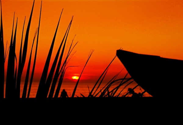
Some of my favourite coastal shots are of silhouetted objects on a bright sunny day. There is a multitude of subjects, such as rocky outcrops, family and friends, groyne posts and surfboards which can act as great shapes to cast into darkness in front of the bright shining sun.

Be careful not to overexpose the image by letting in too much light, and watch out when post processing that you don’t alter the light too dramatically as it can look really unnatural.

Original Image on Flickr


Step 9: Landscape

If you’ve decided to shoot a natural coastline, you can apply many of the same principals as you would with landscape photography. Take time to achieve the most dramatic composition. Can the rule of thirds be applied? Are there any strong diagonal lines? Is the horizon straight?

It’s also important, as mentioned earlier, to consider the light. Now, there’s not much you can do to change sunlight, but waiting that extra 15 minutes for those beams of sunlight to peak through the clouds may transform your seaside shot into a breathtaking coastal panorama.

Original Image on Flickr


Step 10: Foreground / Natural Objects

Within a large scale landscape shot, it may help to try to include something in the foreground to suggest scale. On a beach, that could be rocks, shells or an animal (or a person), which can really add to the depth of the image. You may, however, want to use these smaller points of interest as the focal point of your image.

It’s important to pay attention to detail. Look for interesting shapes and textures that you could highlight, think about the mix of colours and tones, as well as the possibilities of framing the object. Don’t just stick to the angle at which you first approached the object, have a walk around, are there any defining features to your subject that you can highlight?

Original Image on Flickr


Step 11: Structures

More often than not, the most popular beaches are located near ports, docks or tourist spots, which should mean that there are plenty of structures such as a pier or harbour to capture. Once again, it’s important to think about composition – it’s likely that in this situation, you shot will be busier than a coastal landscape shot, so think about how you can simplify the composition to enhance the drama of the shot.

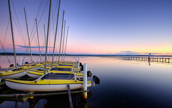
As the evening draws in, the street lamps and harbour lights will be turned on. These could be a hindrance, but think about the possibilities of using them to your advantage as they reflect in the water and bring a simple boat yard to life.

Original Image on Flickr


Step 12: Water

The sea is the reason that the coastline is so special, so it would be rude not to pay it some attention. If you feel like getting your feet (and tripod) wet, try standing in shallow water to capture the smooth lines of the horizon with the mixed tones of sea and sky without the intrusion of any land.

Alternatively, head up onto the shore and wait for the tide to come in to capture the waves crashing against the sea walls, use a quick shutter speed to capture the water flying up into the air. Maybe even select burst mode to ensure you get the shot you want, and make sure you keep an eye out for those extra large waves!

Original Image on Flickr


Step 13: Be Creative!

The most important thing is that you enjoy yourself. There are vast opportunities for capturing great coastline shots, whether you want a dramatic landscape or an evening harbour shot, make sure you travel prepared to avoid disappointment.

Don’t be afraid to be creative and try different techniques and angles, as you never know what you might find. It’s well worth visiting the same location a number of times as it will look very different at depending on the time of day and will vary through the seasons.

15 Wildly Convenient CSS Items from CodeCanyon


In addition to Premium WordPress Plugin, we, over at CodeCanyon, also recently launched a CSS category, specifically made for high quality, and super convenient items, such as three-level menus, CSS tabs, pricing grids, frameworks, etc. I’d like to show you a quick sampling of the best of what we have so far, after a couple weeks.


1. Griddler Pricing Grid I

Griddler Pricing Grid

“SaaS (Software as a Service) style HTML5 /CSS3 pricing grid that degrades well for unsupported browsers.”


2. CSS3 Buttons

CSS3 Buttons

“Create buttons by simply adding different classes to links, submits, and button elements.”


3. Droplink

Droplink

“Create a cool looking drop-down list of links. There are three examples included: one with text as main link, one with an image as main link, and one where each link has a small icon.”


4. Griddler Pricing Grid II

Griddler Pricing Grid II

“SaaS (Software as a Service) style HTML5 /CSS3 pricing grid that degrades well for unsupported browsers.”


5. CSS Pagination Pack

CSS Pagination Pack

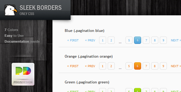
“Spice up your pages with these fresh looking pagination menus. No images have been used; only CSS! Seven predefined colors are provided with hover and active states! More colors will be added in the near future. These bars have been tested to work in all major browsers.”


6. CSS3 Tabs

CSS3 Tabs

“You might normally think of tabbed content as involving JavaScript. These tabs are 100% CSS and behave largely like any other tabbed content area you have come across, including the ability to link to specific tabs through hash tags in the URL.

This item includes twelve variations including color variations (Autumn, Business, MossyGarden), style variations (Buttons, Centered, Shadowy), and placement variations (Bottom, Centered, Right).”


7. CSS Framework + Form Elements

CSS Framework + Form Elements

“Create a blog, corporate website with multiple columns easily without having to remember so many grid classes.”


8. Sleek Borders

Sleek Borders

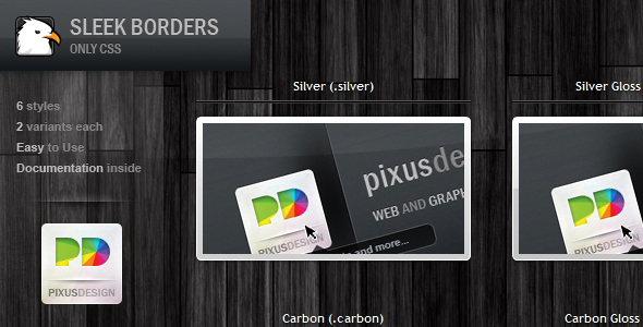
“This is a pack of twelve stylish borders for your images. Six styles are included with a gloss variant of each. Full documentation is included. You can also remove the images and use the borders as stylish containers.”


9. Fresh Tooltips

Fresh Tooltips

“Precisely designed and coded Fresh Tooltips. Great for any kind of website, very practical. The top one is 100% transparent black, which looks very very cool. Also perfect for learning—I’ve made lots of cross-browser research before I’ve done these, you won’t find better tutorial with such an amazing design than personally going through my code.”


10. Stencil CSS Framework

Stencil CSS Framework

“Small lightweight CSS framework. Includes base styling (CSS reset & typography), plus plugins to add many other features.”


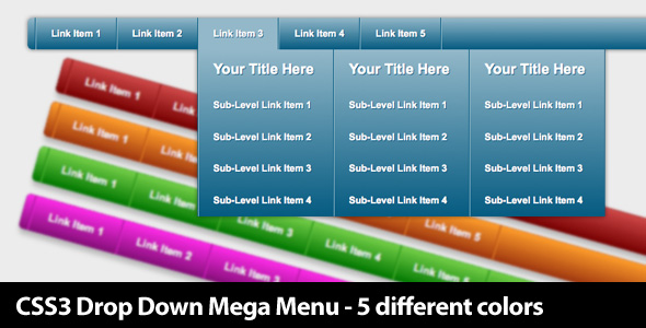
11. CSS3 Mega Menus

CSS3 Mega Menus

“This is a beautiful drop-down mega menu with five different colors scheme. (Blue, Red, Green, Orange, Purple)”


12. CSS3 Gallery

CSS3 Gallery

“CSS3 Gallery is created by purely using CSS – no images. It’s a different sort of web gallery, in which your images display in the screen of a computer LCD.”


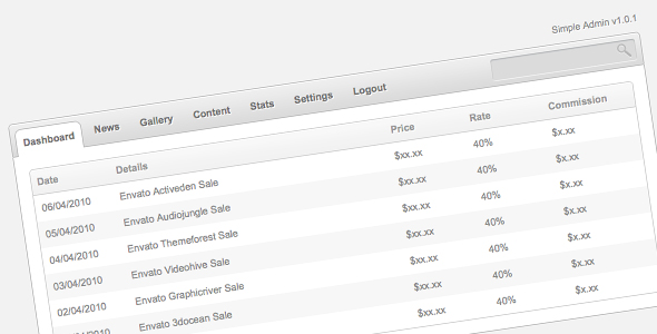
13. Simple Admin

Simple Admin

“This is a simple CSS admin panel template with horizontal navigation tabs and a search field. This is an ideal template for smaller admin panels or scripts that do not require more feature rich templates.”


14. Fancy 2-Line CSS Buttons

Fancy 2-Line CSS Buttons

“These 100% CSS buttons are sure to make your site stand out from the crowd. Your visitors will love to click on them too, with 2 lines of information and text driven icons, they’ll know exactly where they are going.”


15. Fresh Forms

Fresh Forms

“Precisely designed and coded Fresh Forms. Great for any kind of website, very practical. The top one is 100% transparent so you can also place it on texture background. Also perfect for learning—I’ve made lots of cross-browser research before I’ve done these, you won’t find better tutorial with such an amazing design than personally going through my code.”


However, the category is still a baby, at barely two weeks old. As a manager, I can’t wait to see what kind of submissions we’ll be receiving to this category by the end of the year. If you’re not yet an Envato marketplace author yet (why not), you can refer here for the details of signing up to sell your works.

Flexible, Mobile-First Layouts with CSS3


Some experts are projecting mobile devices to become the dominant medium for web browsing within five years, overtaking browsing on desktop computers. Regardless of how accurate this projection turns out to be, it is clear that formatting websites for mobile-friendly viewing needs to become a staple of web design and development. There are many ways to accomplish this, of course. However, CSS3 provides a fairly rich toolset for mobile-friendly formatting, relying on the client’s browser capabilities instead of back-end templating.


Step 1. Think Ahead

There are a few issues that should be thought about before diving right into styling a layout.

Mobile Web Browsing

First, what should one keep in minds when designing for mobile browsers? Well, here are a few things…

  1. Limit HTTP requests: data transfer over 3G can be quite taxing. This includes limiting images where possible (from the CSS, for example).
  2. Varying screen sizes: Mobile devices tend to hover around the 320-480 pixel screen widths but can vary greatly depending on the device. So, predefining widths in the CSS is generally a bad idea for things like paragraphs and DIVs.
  3. Optimize for a subset: There are TONS of mobile devices, browsers, OS’s, etc. Try to focus your testing on what you assume to be the most important. For me, this includes iPhone, iPad, Blackberry, and Android. This list should also include Windows Mobile but I simply do not have access to a Windows Mobile device.
  4. Hover must die: Okay, that’s a little dramatic. However, touchscreens don’t tend to support hover. So, when building menus, don’t hide things behind hover events. Hover should only be used to enhance some effects (like color changes) not deliver important content (like drop-down menus).

“The overall point is to know ahead of time what your site is likely to look like in various browsers before seeing it.”

Browser Support (on Desktops)

Secondly, keep browser support in mind. The proverbial “elephant in the room” is IE, of course. Good news, though! As it turns out, websites don’t really need to look exactly the same in every browser. As long as it doesn’t interfere with the content of the website, generally a browser not capable of processing CSS3 will still provide a more-than-acceptable experience. The overall point is to know ahead of time what your site is likely to look like in various browsers before seeing it.


Step 2. The HTML

The Body

“Keep the markup simple and clean.”

Not only do we want to produce valid HTML, we also want to simplify it as much as possible. While it has always been a good idea to keep HTML streamlined and free of unnecessary DIVs, it is even more important now with the rise in mobile web browsing. Also, a lot of the effects that required 7 nested DIV tags can now be reproduced with a little CSS3.

Since this is not an HTML5 tutorial, I’m going to stick with XHTML strict. With that in mind, a lot of the markup here can be made even cleaner using some HTML5 elements. So, here’s some HTML for a typical layout. We’ve got a page containing a header, footer, content area, and sidebar.

<body>
  <div class='pg'>
    <div class='head'>
      <h1><a href='#'>My Blog</a></h1>
    </div>

    <div class='pg-main'>

      <div class='entries'>
        <h2><a href='#'>An Entry About Something</a></h2>
        <p class='preview'>Lorem ipsum dolor sit amet, consectetur adipiscing elit. Fusce lorem elit, suscipit tempus pretium eget, varius ut erat. Donec lobortis est sit amet felis pellentesque vel egestas sapien iaculis. Maecenas eget quam nisi. Class aptent taciti sociosqu ad litora torquent per conubia nostra, per inceptos himenaeos. </p>
        <p>Mauris nunc metus, pellentesque eget porta ut, facilisis ut metus. Etiam dignissim egestas semper. Aliquam tincidunt tortor non mi ultricies quis interdum quam scelerisque. Aenean risus libero, aliquam vel rhoncus sed, elementum eu leo. Pellentesque vitae ante urna, ut rhoncus sapien. In iaculis tristique lobortis. Nulla feugiat elit at odio dictum dignissim. Fusce tristique lacus nec justo porttitor egestas. Etiam vitae arcu risus, at interdum lacus. Ut dignissim, dui eu imperdiet accumsan, dui mauris hendrerit leo, vel fringilla mi ipsum vitae orci. Nulla libero quam, euismod eget rutrum sed, ullamcorper vitae felis. Mauris aliquam dignissim interdum. Sed sagittis blandit urna, sit amet pellentesque lorem egestas sed. Nam adipiscing, lorem non ornare volutpat, turpis ante sagittis elit, ac hendrerit arcu nunc ut est. Vivamus at arcu felis, eget porta odio.</p>
        <hr/>

        <h2><a href='#'>An Entry About Something Else</a></h2>
        <p class='preview'>Maecenas vitae metus ac est lobortis tincidunt laoreet et enim. Maecenas purus magna, condimentum at mattis vel, pellentesque sed nibh. Curabitur scelerisque pulvinar ante, quis pellentesque enim faucibus ac. Etiam suscipit fringilla mi, et tempor mauris convallis sit amet. Phasellus eros dolor, tempus at pulvinar ac, mollis sed eros. Morbi viverra pellentesque tellus, et tincidunt lectus fringilla non. Donec quis turpis in nunc venenatis rhoncus eget eget felis. Donec ut malesuada lorem. </p>
        <p>Vivamus placerat bibendum placerat. Nullam pretium, nisl vitae sodales rhoncus, ante massa ultricies purus, ac blandit ante felis sit amet erat. Nullam cursus ornare placerat. Sed accumsan malesuada iaculis. Proin suscipit ultrices mattis. Sed semper facilisis est in luctus. Etiam et quam a ligula laoreet iaculis vel quis leo. Etiam et purus a quam vehicula feugiat. Praesent ac ligula mi. Donec ut sapien in nunc sagittis interdum ac a tortor.</p>
        <hr/>

        <h2><a href='#'>A Third Entry</a></h2>
        <p class='preview'>Maecenas vitae metus ac est lobortis tincidunt laoreet et enim. Maecenas purus magna, condimentum at mattis vel, pellentesque sed nibh. Curabitur scelerisque pulvinar ante, quis pellentesque enim faucibus ac. Etiam suscipit fringilla mi, et tempor mauris convallis sit amet. Phasellus eros dolor, tempus at pulvinar ac, mollis sed eros. Morbi viverra pellentesque tellus, et tincidunt lectus fringilla non. Donec quis turpis in nunc venenatis rhoncus eget eget felis. Donec ut malesuada lorem. </p>
        <p>Vivamus placerat bibendum placerat. Nullam pretium, nisl vitae sodales rhoncus, ante massa ultricies purus, ac blandit ante felis sit amet erat. Nullam cursus ornare placerat. Sed accumsan malesuada iaculis. Proin suscipit ultrices mattis. Sed semper facilisis est in luctus. Etiam et quam a ligula laoreet iaculis vel quis leo. Etiam et purus a quam vehicula feugiat. Praesent ac ligula mi. Donec ut sapien in nunc sagittis interdum ac a tortor.</p>
      </div>

      <div class='sidebar'>
        <h2 class='not-there'>Blog Menu</h2>
        <h3 class='subscribe'>Subscribe</h3>
        <ul class='subscribe'>
          <li><a href='#'>RSS</a></li>
        </ul>
        <h3>Social</h3>
        <ul>
          <li><a href='#'>Facebook</a></li>
          <li><a href='#'>Twitter</a></li>
        </ul>
        <h3>Categories</h3>
        <ul>
          <li><a href='#'>Something</a></li>
          <li><a href='#'>Nothing</a></li>
          <li><a href='#'>All Things</a></li>
          <li><a href='#'>No Things</a></li>
        </ul>
        <h3>Archives</h3>
        <ul>
          <li><a href='#'>June 2010</a></li>
          <li><a href='#'>May 2010</a></li>
          <li><a href='#'>April 2010</a></li>
          <li><a href='#'>March 2010</a></li>
        </ul>
      </div>
    </div>

    <div class='foot'>
      <p>© No one in particular 2010</p>
    </div>

  </div>
</body>

As you can see, it’s a pretty simple and typical blog layout with a few article and some menu options in the sidebar.

Viewport Metadata

In our head element, we will put all the typical pieces like stylesheets, content type, title, etc. However, there is one extra piece that we will include to smooth out mobile browsers.

<meta name="viewport" content="width=device-width; initial-scale=1.0; maximum-scale=1.0; user-scalable=0;"/>

This is a little metadata tag, suggested by Apple, to help iPhones render a page. It essentially auto-fits the page to the viewport and prevents zooming. Several other mobile browsers support this too, including Blackberry’s native browser. In my testing, keeping this tag doesn’t harm desktop browsing whatsoever. So, let’s just stick it in the head and forget about it.

Thinking About the Layout

This particular tutorial will focus on taking the above HTML and styling it into two layouts. One layout will be targeted at mobile browsing and one at desktop browsing. In practice, it will probably be useful to break such a layout into several different “targets.” However, for the sake of this simplicity, this tutorial will only focus on those two.


Step 3. The Mobile Styling

Disclaimer

The purpose of this tutorial is not to talk about rich typography or brilliant graphical design. So, the presentation here is kept very simple. What is important is the thought process that drives the stylesheet.

The Approach

The main thrust of all of this is to think about designing a mobile layout first. The reason for this is that its likely that whatever you come up with for a mobile devices will also work on a desktop. Then, instead of ending up with a thrown-together mobile layout and a brilliant desktop layout, you’ll start with a brilliant mobile layout and enhance it for desktop. This will also make sure that your website doesn’t lose its audience as the world goes mobile.

The Inspiration

This approach is inspired by Luke Wroblewski who spoke at An Event Apart in Boston this year. His presentation was centered around thinking “Mobile First”.

While this tutorial does not capture his presentation in any sort of entirety, one piece of it hit home more than the rest (for me). The current trend is design is to work on the desktop version of a website first, then strip it down and throw together a mobile website if there is time. Instead, we should start to design for the mobile world first, then change that design as desired for the desktop. The rational is essentially one of progressive enhancement… if the design is useful on mobile, it will work on desktop also. The reverse, however, is not usually true.

Some CSS

So, let’s think about mobile browsing for a moment. Long scrolling screens are difficult to deal with. So, let’s take the blog menu list items and make them easier to deal with.

.sidebar ul{
  border-left:solid 1px #ccc;
  padding:0 0 0 5px;
}
.sidebar ul li{
  display:inline;
  padding:0 5px 0 0px;
  border-right:solid 1px #ccc;
}

That should give us a nice, clean-looking menu with some pipe-looking separators. You’ll notice that I didn’t choose to move the menu away from the bottom of the screen. Menus at the bottom can be useful in mobile browsing. If you think about scrolling through a webpage, when you get to the bottom you’d have to scroll all the way back up in order to go somewhere else. Depending on the device, scrolling can be somewhat burdensome. There are pros and cons to this method but in this case, I think it works well.

However, I would like to move the RSS to the top banner, so let’s do that too.

h3.subscribe{
  display:none;
}
.sidebar ul.subscribe{
  position:absolute;
  top:25px;
  right:10px;
  border:none;
  color:#fff;
}
.sidebar ul.subscribe li{
  border:none;
}

Aside from that, the rest is pretty much just some font-sizing of the heading elements and coloring of the anchors. For the purposes of this tutorial, I included a CSS-reset at the top of the sheet just for simplicity. The full CSS sheet can be found in the source code for this tutorial.

As you can see, there isn’t really anything special about the mobile styling when approaching design from a mobile-first angle. Instead of thinking, “what do I want this to look like on my screen,” you think “how can I use styling to make this most useful on a mobile device.”


Step 4. The Desktop Styling

Media Query

In case you haven’t guessed it, this whole thing is going to end up being driven by CSS3 media query. In case you aren’t familiar, media query is a way for the stylesheet to flip declarations on and off based on various conditions. One such condition, and the topic of this sheet, is screen dimensions.

Again, the full CSS can be found in the source attached to this tutorial but let’s examine this for a moment:

.pg{
  width:800px;
  margin:0 auto;
}

In this case, we don’t really want an 800px page width unless we are sure the user’s browser window is at least 800px wide. Otherwise, we will end up with one of those annoying horizontal scrollbars.

So, we’re going to wrap that declaration (along with several others) inside a media query.

@media all and (min-width:800px){
  .pg{
    width:800px;
    margin:0 auto;
  }
}

That reads pretty easily, right? The “all” refers to “use this style for all types of media.” There are other things that can go here, such as “print” for printer but there isn’t a lot of consistent support. Anyhow, “all” will work just fine for this.

“Override” Previous Styles

We will put a lot of other stuff inside this media query too but the important thing to remember is to essentially override previous styles and add some new ones to achieve the new layout. This will allow browsers that do not support media query to simply fall back on the original styling. Even though they are optimized for mobile, there’s nothing wrong with displaying that layout on a less-capable desktop browser.

For example, we’ll move that sidebar out of the bottom and make the lists look like lists again.

@media all and (min-width:800px){
  .sidebar ul{
    border:none;
    padding:0;
  }
  .sidebar ul li{
    display:block;
    padding:0;
    border:none;
  }
  h3.subscribe{
    display:block;
  }
  .sidebar ul.subscribe{
    position:static;
    top:auto;
    right:auto;
    border:inherit;
    color:inherit;
  }
  .sidebar ul.subscribe li{
    border:inherit;
  }
}

That will put the sidebar off to the left (combined with a couple other floats found in the stylesheet) and place the subscribe back where it belongs for people browsing the site in atleast 800px width.

So, if you open up the source in a browser and resize it horizontally, you’ll be able to watch the layout flip between the desktop format and the mobile-friendly format

You may be asking yourself, why 800px? Is there anything magical about an 800px width? No. In fact, I would argue that it is too wide. With the introduction of “snap” in Windows 7, I would argue that 600px should be the new target width for a desktop website. That way, the browser can be “snapped” to the right or left on a 1280px screen and still maintain its layout. However, this is really neither here nor there. Just be aware that 800px isn’t anything special.

Browser Support

Important: The website will be styled as the mobile version in IE8 and below. Is this okay? I think so. Also, I’ve done this before and so far no one has arrested me. Plus, media query support is promised in IE9.


Step 5. Alternative Methods

This isn’t the only way to accomplish this. However, the purpose of this tutorial was to show a very practical use for media query and present some ideas of mobile layouts based on CSS only.

That said, here’s a few other ways to put together a mobile layout…

  • Serve different templates: If you have access to the templates for the site, a themeing system can usually be put in place where the requesting browser is detected, then a different HTML template is served based on the type of browser (mobile or not). This is usually accompanied by a separate set of CSS as well.
  • Subdomains: m., mobile., and .mobi tend to be the standards here, where an entirely different website is served. That said, it’s usually the same as “serve different templates” to avoid content duplication.
  • Fluid layouts: One can also make their layout completely fluid such that no matter what size the browser window, the content adjusts itself. In fact, the “mobile” stylesheet in this tutorial is a fluid layout. The nice thing about using media queries is that you can reduce the background-images and produce fewer HTTP requests.

There are likely several other methods of handling mobile web browsing but often it will come down to a hybrid of some sort. However, whether it’s a fluid layout with certain “kick” points based on media query or a subdomain redirection serving different templates, the important thing is begin planning mobile layouts ahead of time, so that your websites don’t become increasingly less useful over the next 5 years.

Professional Help File by csimone

I have a help file that needs to look more professional. I have original PSD’s from the file. The help pages are located at http://www.lookime.com/help_index.cfm Please bid only if you have done this kind of work before and you can actually complete it… (Budget: $30-250, Jobs: Flash, Graphic Design, Photoshop Design, Technical Writing, Website Design)