Friday Photo Critique #41

Friday Photo Critique is our weekly community project, where we publish a photograph submitted by one of our wonderful readers, then ask you all to offer constructive feedback on the image. It’s a great way to learn more about photography, express your viewpoint, and have your own image critiqued!


Quick Ground Rules

  1. Play nice! We’ve deliberately chosen photographs that aren’t perfect, so please be constructive with any criticism.
  2. Feel free to offer any type of advice – composition, lighting, post-processing etc.
  3. You can also link to photographs that you feel offer a great example of this type of image shot exceptionally well.

Without further ado, here is this week’s candidate for Friday Photo Critique!


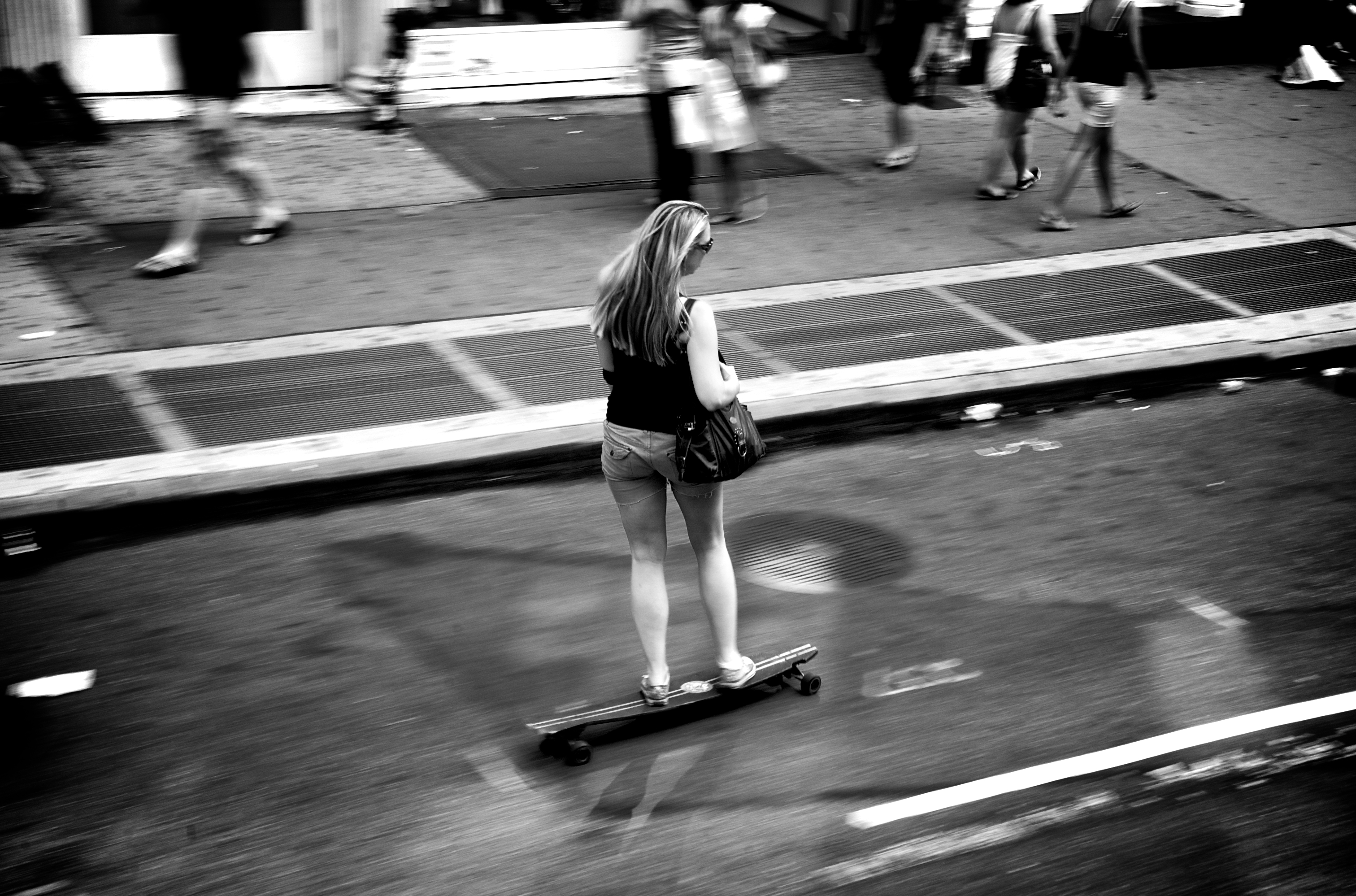
The Photograph

Photo Critique

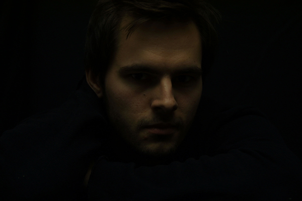
Photographer: Torgeir Sundli

Please let us know what you think in the comments – how would you have approached the scene or taken the photo differently? A massive thank you to everyone who commented last week.

The most constructive and helpful comments will be featured on the site. Interested in submitting your own photo? You can do so here!

The Complete Beginner’s Guide to Shooting Low Key

Recently, we took a look at how to create stunning high key images in a studio environment, producing bright images with an emphasis on beauty and clarity. Today we’ll jump to the other side of the lighting spectrum and examine what low key lighting is and how you can achieve it in your own work.


What is Low Key Lighting?

Low key refers to a style of photography that utilizes predominantly dark tones to create a dramatic looking image. Where high key lighting seeks to over light the subject to the point of reduced contrast, low key lighting intensifies the contrast in an image through intensely reduced lighting.

The key here is not just to produce a dark image but to use lighting very selectively so that only specific portions of the image are illuminated. Normally as a photographer, you spend your time trying to avoid harsh shadows, especially on faces and around the subject’s eyes. For this reason, shooting low key can actually be a fun change of pace.

Instead of avoiding intense shadows, you’ll have to consider them as the primary element of the composition; one that defines the mood of the entire photograph. The trick then becomes manipulating your lighting and the positioning of your subject so that the shadows fall in just the right spots to create the look you want.


Low Key Lighting In Art

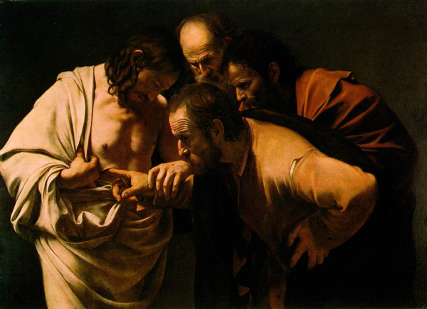
Artists recognized the power of low key lighting long before photographers came around. Painters during the Renaissance and Baroque periods often used a technique known as “chiaroscuro” to achieve a similar dramatic tone for their images. Chiaroscuro comes from the Italian “chiaro” meaning clear/light and “oscuro” meaning obscure/dark.

Chiaroscuro was used not only for drama but also to bring realism to a painting. The varied lighting creates a sense of three dimensional depth that can be quite stunning.

One of my favorite artists that utilized this technique was Caravaggio. He created several works, such as The Incredulity of Saint Thomas (seen above), that really capture the essence of what chiaroscuro was all about. Other great examples of artists who used this technique include Gerrit Van Honthorst, Tintoretto, El Greco and even Rembrandt to a lesser degree.


Low Key in the Studio

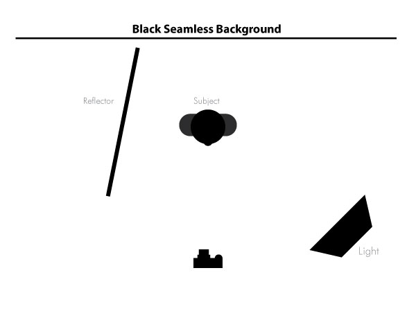
If you have your own photo studio, there are lots of ways to setup low key shots that will give you fantastic results. First, make sure you have a large black backdrop. As a general rule, try to avoid hitting with any lights in such a way that it shows texture, wrinkles, etc.

You can definitely have a low key portrait with other types of backdrops, but this will help you achieve that classy solid black look that comes to mind when you think of low key photography.

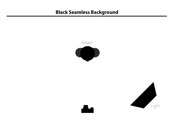
For an easy and affordable setup, position your subject a bit away from the backdrop and use a single flash off to one side. Also, make sure you turn the power way down on the flash so it doesn’t blow out your subject too much.

This should give you fairly dramatic results with all the lighting biased towards one side of the image as in the example below. Notice how a little bit of the backdrop is illuminated in this image. Depending on your specific preferences, this could be either desirable or something to watch out for and try to prevent.

If you want to provide a little backlighting, consider dropping in a reflector and/or placing another flash well behind the subject and off to the side. This will give you some nice hair light and can often create a sort of halo effect.

As always, don’t expect to nail it on your first shot. Play around with different locations for both your light and your subject as well as different intensities for your flash. Resist the urge to think too much about what you can pull back out of the image in Photoshop and try to create the results you want up front. Getting into this habit will force you to learn the ins and outs of your equipment better and reduce the time spent in post-production.


Low Budget Low Key

If you’re not lucky enough to have your own home studio, fret not. There are still plenty of ways to get a decent low key shot on a shoestring budget using only your camera and common household resources.

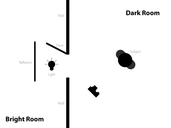
One trick that I’ve seen quite often is to use a two room setup with a door. The main room should be one that you can get completely dark, preferably with no windows or other natural sources of light. With the room as dark as you can make it, position your subject somewhere in front of the door.

Now setup a bright light in the other room, also in front of the doorway. The door serves as a way to block and control the light coming from the other room. To get the shot, just stand in front of the wall out of the way of the light coming in.

You might also want to setup some sort of reflector card behind the light as in the image above. You can use posterboard , paper or something else cheap that you have around that will bounce the light effectively.

Another take on this same setup is to use a window instead of a door. This is a little trickier as a window tends to light up the entire room but can be accomplished with great results under just the right conditions and by using a thick window shade to soften the light.


Outside Low Key

Another great way to get some nice low key shots without spending a fortune on lighting is to venture outside at night. Here nature takes care of the darkness element and you need only find a good light source.

Moonlight and streetlights are obviously great places to start. Parking lots are also perfect places to find drastically variable lighting conditions ideal for creating really dramatic shots.


Camera Settings

For low key shots, the camera settings can actually vary quite widely. The trick is to minimize the light entering the camera while not making everything too dark. To illustrate, let’s take a look at some actual shots along with their respective settings.

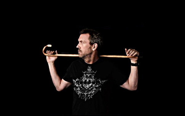
Here we see a nice solid black background and one primary light source. From the Flickr properties we can see that the exposure is at 1/80 sec, the aperture is f/6.3 and the ISO is at 100. Normally an ISO that low would produce an image that’s too dark under anything but decently bright conditions but here dark is exactly what the photographer wanted and the flash in conjunction with the reduced shutter speed served to fill out the areas that he wanted to expose.

The bonus of shooting at ISO 100 is that the image quality stays high and void of color noise, which has a tendency to really stand out against a black background. Let’s take a look at one more image and see if we spot any similarities.

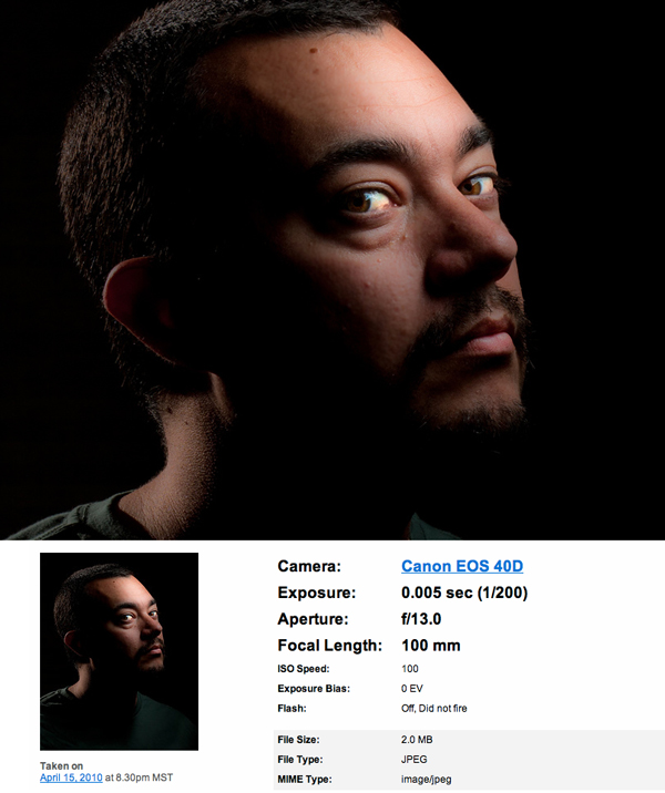
As you can see, even though this image is brighter, it was actually shot at 1/200 sec, significantly faster than the previous image. Although the aperture is letting in less light at f/13, the ISO is the same and it looks like there’s more available light in the scene. The extra light enables the photographer to shoot at a faster shutter speed while still pulling in plenty of detail.

The primary takeaway from these two images is to try your best to keep your ISO around 100-200 to keep the image both dark and noise-free. You’ll have to then play with your exposure and aperture to achieve the desired effect for your particular lighting setup.


Low Key Explored

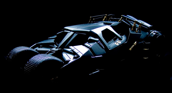
The example images above are primarily portraiture, but you should definitely not stop there in your experimentation with low key lighting. Low key is excellent for product shots and anything else you really want to make look cool and stylish. Here are a few more images to get you thinking outside the box.


Tumbler Batmobile

flickr pic

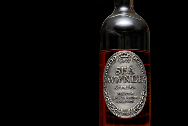
Serve Chilled

flickr pic

Cherry Tomatos

flickr pic

White flower in black background

flickr pic

On black_3535

flickr pic

budding

flickr pic

eat me

flickr pic

curl

flickr pic

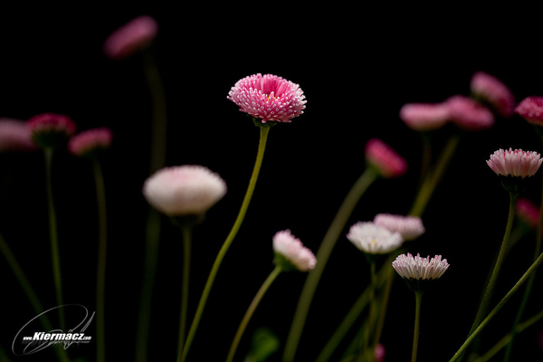
Pink Daisy

flickr pic


Conclusion

To sum up, low key lighting is a highly dramatic way of enhancing the contrast in an image that has roots tracing way back to the Baroque period and beyond. You can achieve this effect indoors with studio equipment or some ingenuity and outside at night in a dark area with a well-placed light source.

As always, we want to give you an opportunity to show off your work. Leave a comment below with a link to your low key shots along with a quick explanation of your lighting setup and camera settings.

Take Advantage of CSS3 to Achieve Subtle Design


I hear this CSS3 thing is all the rage. Resources are flying around the tutorial world and blogosphere providing brilliant examples of creative new ways to design using CSS3 modules. However, it’s easy to over-implement and lose the brilliant subtlety of great user interfaces. Here are three quick tips for using powerful CSS3 techniques in subtle ways.


Preface: It Doesn’t Take Much

People are able to perceive and distinguish very small changes.

The bottom line here is that people are able to perceive and distinguish very small changes that they may not consciously notice or be able to recall. I doubt that this is new information to anyone. It is one of the more well-known concepts put forth by sensation and perception studies. Sometimes, one thing may be pleasing over another. And sometimes, you don’t even know why.

However, keep in mind that web design is a conscious process. Subtle design can be difficult because it is easy to think “that just needs a little more.” Before you know it, the subtlety is lost.

With that in mind, I would like to present three CSS3 techniques that can be used to provide varying forms of subtlety for web design.


1. Transition

Transition is a powerful tool, providing a way for CSS to essentially animate from one endpoint to another. The syntax packs a fairly rich toolset: property, duration, and easing. Each of these pieces can be varied to provide different levels of subtlety. Often, it just takes playing – as effects often do. In other words, play with the values until it seems right. Just don’t drive yourself crazy. It’s easy to get lost tweaking even such a short list of variables.

Example: Color Transitions

It’s not uncommon for navigation items to change color when the mouse is hovering. Transition can make that color change a little smoother.

.nav li a{
	color:#282828;
	text-decoration:none;

	-webkit-transition:color .1s ease-in-out;
	-moz-transition:color .1s ease-in-out;
	-o-transition:color .1s ease-in-out;
	transition:color .1s ease-in-out;
}
.nav li a:hover{
	color:#808080;
}

The color change is not subtle here. It’s clearly noticeable. What is subtle is the smoothing of that color change.

The trick to keeping this subtle is the duration. If it’s too long, the effect will be far too noticeable. The navigation can quickly become burdensome to hover over and look amateurish.

View the demo.

Notes about the CSS

In case you haven’t delved into CSS3 just yet, it’s important to note the order in which the browser-specific declarations come. Actually, it’s just important to notice that the non-browser specific declaration comes last in the list. CSS takes the last declaration and makes it more important in the case of a conflict. Once an actual transition spec is released, presumably all browsers will implement the module without needing the proprietary prefix. Thus, your CSS becomes somewhat future-ready at no real cost to the current implementations.

Also, notice that the transitions are in the <a> element style, not its hover. This will provide the transition both on mouse-over and mouse-off.


2. nth-of-type (or nth-child)

The nth-of-type or nth-child selector allows patterns to be declared in a series of elements and apply styles accordingly. For example, in a table, nth-child could color every other row by using :nth-child(odd). Let’s look at an example that may not be quite as clear.

Example: Grouping

We’ll take a pretty standard navigation markup…

<ul class='nav'>
	<li><a href='#'>Home</a></li>
	<li><a href='#'>About</a></li>
	<li><a href='#'>Work</a></li>
	<li><a href='#'>Forum</a></li>
	<li><a href='#'>Blog</a></li>
</ul>

…and apply some styling.

.nav li:nth-of-type(odd){
	margin-top:5px;
}
.nav li:nth-of-type(even){
	margin-top:12px;
}
.nav li:nth-of-type(2n+2){
	margin-right:0;
}
.nav li:nth-of-type(2n+3){
	margin-left:8px;
	margin-right:25px;
}

This will create a staggered-looking menu with a few high items, a few low items, and a couple sets that look paired. The visual difference between this and an in-line menu is clear.

So what’s so subtle about it? The subtlety here is twofold.

  1. The higher items look more important. Perhaps this person wanted to showcase his or her portfolio and blog. Those, along with the Home link, have been pushed up to be slightly more prominent. People’s eyes will be drawn to those links first.
  2. Notice the grouping. About and Work have been grouped together, as have Forum and Blog. This styling groups similar pages in its navigation. Work and About are both viewable things pertaining to the person while forum and blog are more audience-driven and interactive.

So, perhaps a visitor first sees “Home”. That visitor will probably realize that he or she is already on the homepage. He or she may very well see “Work” next. *click*. After viewing some pieces of work, they may well have seen “Blog” next but perhaps the grouping ends up being stronger and their desire is pulled to “About”. The designer is now driving the visitor using a navigational layout. He or she has provided hints as to where visitors should go, sequentially.

Will this happen every time? Absolutely not. Will it happen sometimes? I would bet so.

That’s the point of subtlety. It doesn’t overwhelmingly influence the user, but it might provide some useful hints or motivations now and then.


3. Gradients

Here’s a simple way to introduce subtlety into a design. Ironically, it’s probably got the most complicated syntax out there. Not only that, but it also has significantly different syntaxes between browsers. Let’s take a look.

Example: Forms

Given a pretty simple contact form (email, message), here’s some styling:

form input[type=text],
form textarea{
	background-image:-webkit-gradient(
		linear,
		left bottom,
		left top,
		color-stop(0, rgb(255,255,255)),
		color-stop(1, rgb(248,248,248))
	);

	background-image:-moz-linear-gradient(
		center bottom,
		rgb(255,255,255) 0%,
		rgb(248,248,248) 100%
	);

	outline:none;
	border:solid 1px #ccc;
}

That’s quite a full declaration, isn’t it? And that only covers two browsers!

I’m not going to go into all of the syntax, because others have done that for me. Refer to “Understanding CSS Gradients” on Nettuts+ for a better understanding. When you’re finished, let’s talk about subtlety.

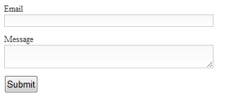
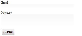
The gradient in these text areas is almost imperceiveable. However, if you play with the CSS and take out the border, I assure you it is there.

If you still can’t see it in that second image, take your head and move it to the side of your monitor, so that you are viewing the monitor at a pretty steep angle. See it now? If not, I refuse to be held accountable. I see it, so your monitor must be broken. :)

Anyhow, notice how close the rgb colors are in the css. The top of the text input and textarea are shaded ever-so-slightly. This is one example of very extreme subtlety. While filling out a form, it is unlikely anyone will ever notice this gradient. However, people may find your form just a little more appealing than others; even if they don’t know why.


Bonus: Browser Incompatibility

Well, we’ve almost made it through and entire CSS3 article without discussing browser issues. How did we manage that? For one thing, there wasn’t a lot of emphasis on code. More importantly, though, I was saving the best for last.

Subtle changes probably won’t be missed

If you take a look at the demo for this tutorial in a webkit browser, then compare that to a Firefox browser, you will notice some differences. If you step over to IE, you’ll notice even further differences. One nice thing about the use of subtlety is that if the subtle difference isn’t there, people probably won’t notice. In other words, the color change in the first example still works without the transition; it’s just a little less slick. If the only purpose of using nth-of-type was to group based on commonality, no visitor is going to care if that grouping isn’t there. The menu still works. And the gradient? Remember how hard you had to try to notice it even when being told exactly where it was?

That last demo example will definitely be noticed…

Make it an opportunity for creativity, instead of an insurmountable burden.

Probably the most rational opposition to the “different looks in different browsers” approach to web design is that many (perhaps most) clients will want the exact same website in any major browser. If there is no room for budging on this and you need to pay your electric bill, do whatever you need to in order to get that all-important rounded corner into all IE versions back to the dawn of time.

However, some clients can be educated and swayed as to some advantages of having one design in one place and another somewhere else. For example, accepting a slightly different appearance can dramatically cut down on HTTP requests and excess HTML elements, if a lot of images are being used to create borders and shadows and whatnot. Or, if you’re anything like me, you have some personal projects and enjoy a good challenge (like providing the same “experience” cross browser without always having the same layout). Or, maybe you have two different designs that you really like and can’t decide which one to implement. Here’s an opportunity to implement one in one browser and the other in another, driven out of a single stylesheet.

The overall point here is that browser incompatibility is a fact of the current web when trying to utilize CSS3. So, make it an opportunity for creativity, instead of an insurmountable burden.

But what is subtle about that last demo example?

The subtlety here isn’t exactly a design subtlety. Instead, it’s more of a designer subtlety. In my experience, most people only use one browser. Web professionals forget that sometimes, as we install three versions of five different browsers on every machine we come across.

So, if an IE-only user happens across your site and its content is clear and he or she enjoys the experience, you have succeeded in your design. If another user happens across your site in Chrome and enjoys their experience and the content is clear, you have succeeded in your design. And perhaps that visitor appreciated a few extra tid-bits. Kudos. Most importantly, though, if you ever get the opportunity to sit down and watch this happen simultaneously, you will have succeeded in having some subtle fun.

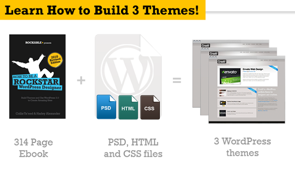
How To Be A Rockstar WordPress Designer: WordPress 3 Revision!


With the recent release of WordPress 3.0, Rockable Press has just released an updated version of How to be a Rockstar WordPress Designer by Collis Ta’eed and Harley Alexander.

The updated version is FREE for all those who have already purchased the first edition of the eBook. All they’ll need to do is use the email which provided them the link from when they first purchased the book, and follow the instructions included in the email on how to re-activate the link. Once that’s done they can then re-download their new version of the book.

If you don’t have a copy of the eBook yet don’t worry! Rockable is also offering a $10 Discount Voucher for all those who don’t have the book yet!

Rockable $10 Discount Code: WP3Launch – Expires Monday 26th July 2010

During the course of the book you’ll build THREE WordPress themes, a blog, a portfolio site and a general site with menus and submenus. Each theme demonstrates different aspects of WordPress theming and all three are packaged in with the book so you’ll have Photoshop, HTML, CSS and WordPress PHP files to refer to.

Join the Rockin’ List Today!

The Rockin’ List is our irregular mailout about new books and products, discounts and offers and Rockable news. Signing up to the mailing list will get you a free copy of the Rockstar Personal Branding minibook by Skellie

The Rockin’ Guarantee

Like all Rockable Books, this one comes with the 100% Moneyback Guarantee. If you’re not satisfied, we’re not satisfied.

Web Dev Q&A #2 – PHP Sessions, HTML5 Doctypes, and Form Styling


We’re back with the second entry in the Nettuts+ Q&A series. Today, we discuss the difference between LESS and Sass, how to pass server-side values to your JavaScript, how to work with PHP and cookies, and the HTML5 doctype. Here we go!


1. LESS and Sass.

Hey Nettuts+. I’m confused. What’s the difference between LESS and Sass? Are they the same?

There are advantages to using both; however, the truth is: both will get the job done wonderfully. It mostly becomes a case of preference, when it comes to the syntax and such. In the past, many preferred LESS, because it had a more friendly CSS-like syntax, though, as of Sass 3, they have a new syntax, known as SCSS (Sassy CSS), which is simply a subset of CSS3′s syntax.

The Envato devs use Sass. Other popular developer prefer LESS. I’d equate it to comparing the 960 CSS framework to Blueprint. They’re both great; so make up your own mind. There are no wrong answers!

Want to learn more about LESS on Nettuts+?


2. Server-side to Client-side

I’ve been trying to figure out how to pass the value of a PHP variable to my JavaScript. How do I do this? Thanks!

The quickest and easiest solution is to echo your desired variable from within your JavaScript. For example, you could query your MySQL database with PHP, and then pass the returned value to your JavaScript by doing something along the lines of:

<?php $myvar = 'some value'; ?>
<!DOCTYPE html>

<html lang="en">
<head>
	<meta charset="utf-8">
	<title>Tut</title>
</head>
<body>

<script>
	var myvar = '<?php echo $myvar;?>';
	alert(myvar); // some value
</script>
</body>
</html>

3. Custom Stylesheets with PHP

How can I choose a color scheme stylesheet for my website dynamically?

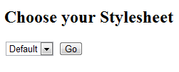
So you want to, for instance, choose red.css, or blue.css, and that would load a different color scheme for your website. Is that what you mean? There are certainly several ways to accomplish this task, and the correct choice will depend on if you’re using a framework, a CMS, MVC, etc. Let’s keep things simple, and as bare-bones as possible. We can use PHP sessions. First, we need to add a select box, for the user to choose their desired color stylesheet.

<!DOCTYPE html>

<html lang="en">
<head>
	<meta charset="utf-8">
	<title>Tut</title>
</head>
<body>
<h2> Choose your Stylesheet </h2>
<form method="post" action="">
	<select name="colors">
		<option value="default">Default</option>
		<option value="red">Red</option>
		<option value="green">Green</option>
	</select>
	<input type="submit" name="submit" value="Go" />
</form>
</body>
</html>
Custom stylesheets with PHP

Next, with PHP, we’ll listen for if the page has posted back — or if the Submit button has been clicked. With a simple page like this, we can use the helpful $_SERVER['REQUEST_METHOD'].

The “Request Method” determines which request method was used to access the page: ‘GET’, ‘HEAD’, ‘POST’, ‘PUT’”

At the top of your page, add the following:

<?php

if ( $_SERVER['REQUEST_METHOD'] == "POST" ) {
  // page has posted back
}
else {
  // user hasn't submitted the form
}

?>
<!DOCTYPE html>

Since we can now confirm when the page has posted back, we can then create a session, and store the value of whatever the user chose from the select box.

<?php
session_start();
if ( $_SERVER['REQUEST_METHOD'] == "POST" ) {
	$_SESSION['color_scheme'] = $_POST['colors'];
}
else {
      $_SESSION['color_scheme'] = 'default';
}
?>

Here, we’re first creating a new PHP session, with session_start(). Next, we create a new key, with $_SESSION, called “color_scheme.” Feel free to name this how you wish. By default, we set this to “default” (see the “else” statement). This means that, if the user hasn’t selected a stylesheet, we’ll use the default one. However, if they did make a choice, we need to determine which option from the select element they chose, and store it in a Session key.

Returning to the mark-up, you’ll find that we applied a name of “colors” to the select element.

<select name="colors">
	<option value="default">Default</option>
	<option value="red">Red</option>
	<option value="green">Green</option>
</select>

When the page posts back, the selected value of this select element will be available to us, via $_POST['colors']. For example, if I choose the “green” option, $_POST['colors'] will then be equal to “green.”

Without sessions and cookies, there would be no way to “remember” this user-selected value. That’s why they’re essential in this case. Now that $_SESSION['color_scheme'] stores our desired value, we only need to load the appropriate stylesheet.

<head>
	<meta charset="utf-8">
	<title>Tut</title>
	<link rel="stylesheet" href="<?php echo $_SESSION['color_scheme'];?>.css" />
</head>

4. Rounded Form Elements

Hi Nettuts+! How do I create rounded form inputs with CSS for all browsers?

So you want stylized, rounded inputs in all browsers, including Internet Explorer? Okie dokie. Consider the following simple mark-up:

<form>
	<label for="name">Name: </label>
	<input type="text" name="name" />

	<input type="submit" value="Go" />
</form>
Base markup

Using some simple CSS3, we can create rounded corners for those inputs. Because some browsers got a headstart on the spec, we need to use the -moz and -webkit vendor prefixes, as well as the official version of the “border-radius” property.

<style>
	input {
		border: 1px solid #666;
		-moz-border-radius: 4px;
		-webkit-border-radius: 4px;
		border-radius: 4px;
	}

	input[type=submit] {
		-moz-border-radius: 25px;
		-webkit-border-radius: 25px;
		border-radius: 25px;
	}
</style>
  • -moz: Mozilla browsers (Firefox)
  • -webkit: Webkit browsers (Safari, Chrome)
Rounded corners

By specifying atype attribute of submit, that last snippet will only target submit buttons, and will style accordingly.

That Blasted IE

Unfortunately, as you probably guessed, Internet Explorer is a jerk. While the upcoming IE9 has support for border-radius (without a prefix), the older versions are still at a loss. At this point, you have two choices:

  1. Ignore it. The world won’t end if your readers see 90 degree angles.
  2. Image Fallback. You can target Internet Explorer specifically, and apply a rounded background image.

Modernizr

I’m assuming the asker of this question requires consistency; so we’ll go with the second option. Let’s assume that you’re going to be working heavily with CSS3 and HTML5 in your project. In that case, rather than using an IE-only stylesheet, why not have some fun, and use the helpful Modernizr library?

First, download Modernizr, and reference the modernizr.js file within your project.

<head>
	<meta charset="utf-8">
	<title>Tut</title>
	<script type="text/javascript" src="modernizr-1.5.min.js"></script>
</head>

Next, apply a class of no-js to the Html element on your page.

<html lang="en" class="no-js">

When you view your project in the browser, Modernizr will apply a long string of classes to the Html element, which specifies exactly what your browser is capable of. Note that, obviously, this list of classes will vary, depending upon the browser.

Modernizr

This is a huge help! Now we can use the “cascade” effect to only target the form elements that are children of the html element with a class of “no-borderradius,” and style accordingly.

If the browser does not support a particular feature, the word “no” will be prefixed to the rule.

/* Only targets browsers which don't support border-radius */
.no-borderradius input {
	background: url(path/to/rounded/background/image) no-repeat;
}

And then we relax and have cake.


5. Doctypes

I noticed that you always use the HTML5 doctype. Don’t you think that’s dangerous, when all browsers don’t yet support HTML5?

No, it’s not dangerous at all. For those unfamiliar with the wonderfully simple HTML5 doctype, it’s:

<!DOCTYPE html>

Seriously…that’s it. That’s all there is to it. No more multi-line spats of attributes; just a plain-ole DOCTYPE – as it should be. In older browsers, this doctype will trigger them into standards-mode. …And if you’re still worried, note that even Google uses it! Need more? John Resig was talking about this 2.5 years ago!

“What’s nice about this new DOCTYPE, especially, is that all current browsers (IE, FF, Opera, Safari) will look at it and switch the content into standards mode – even though they don’t implement HTML5. This means that you could start writing your web pages using HTML5 today and have them last for a very, very, long time.”
–John Resig


Read Previous Q&A’s


Ask Nettuts+…

If you have a “not-too-complicated” web development question for us, you can:

  1. Email [email protected], and write “Web Dev Q&A” as the subject of the email.
  2. Tweet us @nettuts, and hash “#askNettuts”.
  3. Leave a comment under any “Web Dev Q&A” posting with your new question.

Thanks for reading and watching!

Need Job Leads ASAP. If You Can Post on CL, BackPage, Kijiji by msmith1255

I need jobs leads. If you can post on Craigslist, kijiji, backpage, or anywhere else to generate job leads then this is the job for you. You must be able to post all over the U.S.A. so you must have an IP solution, if you need one… (Budget: $250-750, Jobs: Craigslist, Data Entry, Leads)


Hiring FILIPINO ARTICLE WRITERS URGENT! by gelica2010

YOU MUST BE ABLE TO PROVIDE ME 10 400-600 WORD ARTICLES OR MORE DAILY. MUST BE ORIGINAL AND PASS COPYSCAPE. DO NOT BID IF YOU CANNOT WRITE AN ORIGINAL ONE. I’M CHECKING THE ARTICLES MANUALLY AS WELL. INITIAL PAYMENT WILL BE 400 PESOS PER 10 ARTICLES… (Budget: $30-250, Jobs: Article Rewriting, Articles, Excel, Research)


Copy buttons and simple graphics DESIGNERS ONLY by bestbuy612

1) do not send me pm with a list of sites you made. I don’t care I don’t want to see it. If you tell me you know php as well I will tell you to get fucked, I hate people wasting my time. This is for designers only!!!!!!! I had to reopen this project because of annoying pm… (Budget: $30-250, Jobs: Format & Layout, Graphic Design, Photoshop)


New Logo Design

I am looking for a new logo design. I have 2 examples of current logos but also have examples of how I would like the logo to be. It needs to be modern, funky and cool not look like a standard clipart logo.

The logo will need to be made in vector format so that it can me increased in size without losing any quality.

I will also provide current website link to help you get an extra feel for the business.

Any questions please PMB

Logo For Website

Hello Everyone

I am looking to get a logo created on a budget. I own a Virtual Tour company – www.virtual360s.com – and I am looking to get a logo created for my site. I am probably going with a template like this one – http://virtual360s.com/test/ – let me know what kind of ideas you have as well as what your pricing is.

Brandon