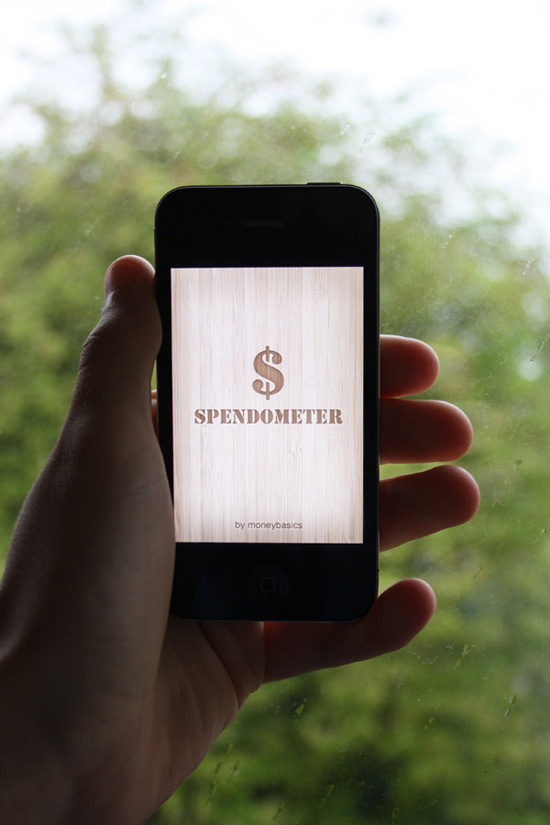
This tutorial series will demonstrate all the steps necessary for redesigning an iPhone application with Photoshop. You will learn many of the unique considerations and design patterns used when creating stand-out app interfaces. This tutorial is presented in two parts in collaboration with Mobiletuts+, where you will be able to find an increasing amount of mobile design related tutorials in the future. Read the second part of this series and download the interface PSD on Mobiletuts+.
The Spendometer Application
Welcome to the first part of our tutorial series on redesigning the Spendometer iPhone application! The application is a great little app that allows you to stick to a budget. As pulled from the Apple website, this is what the Spendometer does:
If you’re trying to stick to a budget, it’s a good idea to keep a record of everything you spend, but it’s hard work writing everything down in a notebook. The Moneybasics Spendometer is an application that makes day-to-day budgeting simple and practical. The Spendometer enables you to set yourself a budget, log your spending, and view your spending reports to see where, and how much, of your money has been spent so far in a given week or month, all whilst on the go. It also has a feature that helps you to keep track of your spending on a night out.
Every time you buy something, simply enter it into the Spendometer on your phone, and it will keep a record for you. You can set your own spending limits, and choose how your spending will be reported – weekly or monthly.
The Moneybasics Spendometer will provide you with the essential tool to ensure that you stay on top of your finances.
It really is a lovely little application that does fulfill its purpose well, but let’s all be honest, it could do with a little TLC from a design perspective. Below you can see the applications icon, and several screenshots of the application. The screenshots were taken using an iPhone 4 – as you can see, some areas are pixelated, meaning they have yet to update their application with high resolution graphics.
Icon Design
Launch Screen
Spendometer Screen
Reports Screen
Report Screen
Settings Screen
Set Budgets Screen
Some reading material before we start…
It is advisable to know a little about designing for the iPhone before we move along with this tutorial. Ideally, you should read the iPhone Human Interface Guidelines from Apple’s official developer site.
The Tutorial
As with all major designs, the first thing you should do is get a rough idea of what you want your design to look like. The best way to do this of course is by sketching. For big applications, many UI designers will draw pages and pages worth of ideas, annotations and brainstorms – as we already have a structure for the application we’re redesigning, we can move along with it pretty quickly.
Below are a few sketches I put together – these are very rough, and just general wireframe ideas I have in my head of what I want the design to resemble. Colors and styles can wait until we get to that stage later on!
The image I have in my head is a very simple to use, sleek, modern and textured interface. Something that will make people go “wow.” I also want it to be very minimal – the app is very simple, and therefore the design will be too. There is no need for unnecessary clutter.
Remember that you don’t need to follow this tutorial word for word – experiment with different things, and put your own creativity behind the techniques used. We’d love to see your results, so share your progress in the comments area.
One more thing before we start: I am writing this tutorial whilst designing, not after completing the design. I think it is important to show the creative process behind a design. Most tutorials are written after designs have been completed, and therefore you don’t see the designer’s mistakes, or how many attempts at something it took them to get something right. Every designer does this, just like any other job – people make mistakes, learn from those mistakes and only improve on things. So, if you see that you might be going back on yourselves while reading this tutorial, it’s because I’ve decided something needs changing! Let’s get started!
Step 1
The first step is to set up your document. We’re going to be designing for the iPhone 4′s new high-definition Retina display, which means designing at a much higher resolution than what we previously did with the iPhone 3GS.
Open up Photoshop, and go to File > New…. Name your new document something suitable, such as “Spendometer Redesign”. Enter your own dimensions (there is no pre-setting in Photoshop for the new display) for the iPhone 4 Retina display, we will be using 640×960 pixels, with a resolution of 326ppi (pixels per inch), which is the new standard. You can see my settings below.
Our next step is to place in some dummy shapes for the status bar (the bar with the phone info and time on), navigation bar (the bar beneath the status bar) and the toolbar (the bar at the bottom of the screen).
The best way to do this is to just insert a pre-existing screenshot of an application by going to File > Place.
You can now use the Rectangular Marquee Tool to select your different areas of the design and replace them with solid shapes. I’m just going to use black for now. Fill these in on new layers, and rename your layers to something suitable such as “Navigation Bar” and “Toolbar”. We’re going to create basic shapes, and add color and detail to them later on. You can also delete the majority of the screenshot we pasted in – the only bit I am keeping is the Status Bar as seen below.
We now have a blank iPhone canvas ready to begin designing. The next thing we want to do is make some new folders in our Layers window. We need several folders for several different screens:
- Launch Screen
- Spendometer Screen
- Reports Screen
- Report Screen
- Settings Screen
- Set Budgets Screen
The application itself does actually have a few more screens than this, but I feel a lot of them aren’t needed, so we will be reducing that dramatically, fitting more content onto the same screen. We’ll also be missing out a couple of screens that will pretty much replicate other screens – the only difference being titles!
Create a new layer folder in the Layers window for each one of the screens listed above. You can do it by clicking on the little folder icon in the layers window. We don’t need to place anything into these folders yet.
Step 2
I want to merge sleek and modern design with a little hint of texture. The texture of choice is going to be wood, this texture to be precise (well worth the $2-4). Once you have downloaded some textures, go ahead and place them into your document by going to File > Place…. Scale your texture down so it fits nicely into your UI design, and merge it with your background layer.
We want to brighten our texture up a little as we don’t want it to be quite so bold. Create a new layer directly above your wooden texture background, and fill it with white using the Paint Bucket Tool. Lower the opacity of the layer to 35% to add a white wash to your background, and then merge it down by hitting the Cmd+E (Ctrl+E) combination to apply the wash to our background.
Step 3
We’re also going to use a wood texture for our navigation bar and toolbar. From the same pack from GraphicRiver, select one of the other textures, and place it into your document. Resize it and place it over your navigation bar.
Once you’re happy with a certain position, click on your navigation bar layers thumbnail whilst holding the Cmd-Key to select your layers contents. Re-click onto your new wood texture layer, and go to Edit > Copy to copy your selection. Delete the texture layer, and then paste your selection on to a brand new layer.
It’s now time to add some styling to our navigation bar. Right-click on your new navigation bar layer and select Blending Options to open up the Layer Style window. We want to add a couple simple styles to our navigation bar that will dramatically increase the look of our bar.
First of all, let’s add a drop shadow. I have used a 90 degree angle with a 25% opacity – all the other options are set to default.
To give our navigation bar a little more depth, we’re going to apply a Bevel and Emboss style. This style has a very bad name for itself due to misuse, but really it is a great and very powerful tool saving you a lot of time. Apply a smooth inner bevel to your layer, using a depth of 100%, with a size of 196px and soften level of 16px. Reduce the highlight modes opacity to 20%, and the shadow modes opacity to 55%.
By applying these two simple styles, we are left with something that looks pretty smart!
Zoom right into your navigation bar, as it’s time to add a nice 1px stroke to the bottom side to increase the attention to detail levels. Create a new layer above your navigation bar, and then create a 1px width long selection using the Single Row Marquee Tool. Fill your selection with white.
Change the layers blending mode to Overlay, and lower the opacity to 70% to produce the following result.
For now that’s our navigation bar done – we’ll be coming back to it later to produce our headers typography styles.
Step 4
I’ve decided that having another wooden toolbar at the bottom of the app would be too “wood-heavy”, so instead we’re going to darken the bottom out a little, and just place our navigation icons there instead.
Select your toolbar layers content and then select the Eraser Tool. Select a soft eraser at 100px, and whilst holding the shift-key, erase the top area of your black toolbar. By holding the shift-key whilst doing this, you will be able to erase content in a straight line, rather than having full control over what you can erase.
Change your toolbar layers blending mode to overlay, and lower the opacity to 60%. This will give it a slightly burnt look giving us a nice background ready to place our icons on (once we design them). Now is about the right time to put our navigation bar and toolbar layers into their own separate layer folders.
Step 5
So we’re now ready to move on. We’re going to now get our launch screen designed, which will be the simplest screen in the application as it will not include any navigation or toolbars. Hide the navigation bar and toolbar layer folders, and create new (transparent) layer in your launch screen folder and call it “shadow”.
Fill your new layer with a dark solid color (I’m using #333333) using the Paint Bucket Tool. Select the contents of your status bar layer, and then click on your new launch screen layer and hit the delete-key to remove a small area of the grey layer to reveal the status bar.
Duplicate your layer so you have two of the same shape. On the new layer, go to Edit > Transform > Free Transform to bring up the transformation box on your new shape/layer. Whilst holding the alt and shift-key at the same time, scale your selection down. Holding the shift-key will keep the shape in proportion, where as the holding the alt-key will resize it equally around the edges. Make a selection of your new resized shape.
Delete your new shape (whilst still having the live selection) and then delete the selection from your original layer. You should end up with something looking like the following screenshot.
Go to Filter > Blur > Gaussian Blur and use a radius of around 50 pixels to give your shadow a smooth and smudged effect.
Using the same technique we used earlier, make a selection of the status bar, and remove any overlapping shadow from our shadow layer.
Duplicate our shadow layer once again. Change your bottom shadow layers blending mode to overlay, and its opacity percentage to 100%, and change your top shadow layers blending mode to normal, and its opacity percentage to 25%.
The next stage is to produce our typographic logo. We’re going to make it look as if the type has been engraved into the wood by using a handful of layer styles and techniques. Grab your type tool and layout some text. Make use of the type settings to align your text well.
Play around with some different typefaces until you feel it’s looking good. I’ve decided to use a combination of Stencil and Helvetica.
It’s now time to make our typography look like it has been engraved into our background. We will be making a lot of our typography look like this throughout the application design, specifically the icons and titles in the navigation bar.
This kind of effect calls for lots of layer styles. The first thing we must do however is change the color of our type. Using the Eyedropper Tool select a dark color from the background, and then apply that color to your typography.
Lower your type layers opacity to 50%, and then open up your text layers blending options. The first style we’re going to apply is an Inner Shadow, using the following settings:
The next style we’re going to apply is a very subtle drop shadow, using the following settings:
Finally, we’re going to add a stroke to our text, using the following settings (the color I have used is #E6D0B3).
Change your type layers blending mode to linear burn.
We’re going to make our inner shadow a little stronger/bolder. Duplicate your type layer, and change the blending mode to saturation – this will make it almost transparent, but allow any layer styles to still appear through. Open up the layer styles window, and completely remove the drop shadow and stroke styles. Click on your inner shadow tab, and change the settings to something similar to what you can see below.
Repeat the exact same step again, this time using the following settings:
As you can see, we have applied several more shadows to our typography, without effect the actual color due to simply changing the blending mode to saturation. The first additional shadow added a soft shadow around each of the edges equally, whereas the second additional shadow applied a strong and sharp shadow to just the top side of our type.
Our launch screen is looking pretty darn good, and it will look even better once scaled down on that high resolution retina display!
Step 6
Our next step is of course our Spendometer screen, which is the first screen to be displayed after seeing the launch screen. Using effects that we have just used in the previous step, set up your typography and apply a few nice layer styles to your Spendometer header in the navigation bar. It’s ideal here to make duplicates of your navigation bar; one for each screen. I have set the type layer to 90% opacity to let a little bit of the texture through, and have used the following layer styles. There is no need to create additional shadows for this type as it is much smaller.
I’ve decided that the navigation bar at the top of the design is looking a little too dark, either that or the typography is too light. To fix this, I’m going to lighten up the navigation bar a little. The easiest way to do this is by selecting your navigation bar layer, and then going to Image > Adjustments > Brightness/Contrast. Up your brightness to 60, and your contrast to 10.
Lower the opacity of our 1 pixel stroke beneath our navigation bar to make it fit in better with the new lighter navigation bar. I have lowered it to 40%.
To allow the texture of our navigation header text to show up a little clearer, I change the color of our type to a much lighter choice, and then set the layers blending mode to multiply – remember it’s all about experimentation – all blending modes react (very) differently depending on what color your base shape is.
Duplicate your text layer, and lower the opacity of it to 40%. This is to make our type a little darker, reverting it back to what it was like before but still allowing us to show more texture through without lowering the opacity.
You can now copy and paste your navigation tab layer folder into each of your different screen folders, and edit them to resemble the title of each screen, as seen below:
That is the header titles done for now – we may be visiting them again later. As you may have realised, designing for mobile devices has a lot to do with trial and error.
Step 7
Our next step involves setting up a white background ready to place more elements on top of it. This means we’re going to be covering up a lot of our wooden background, but in general viewing things on a white and non-textured background is usually a much more pleasant experience on the eyes.
Select the Rectangular Marquee Tool and choose a fixed size of 600x700px. Click any where one your canvas, and center your selection by using the arrow keys. It should be easy to arrange as there is exactly 20 pixels between the sides and the selection on each side (left, above and right).
Create a new layer in your spendometer folder, and call it something suitable such as “White Background”. Go to Select > Modify > Smooth and smooth your shapes using a radius of 5 pixels. Fill it with white.
Select the Elliptical Marquee Tool and drag out an equal selection. Position it over the bottom as seen below, and hit the delete key to remove a small selection of our white background.
Open up the layer styles window. We’re going to apply a number of effects to our white background. First of all, we’re going to add a stroke. I used the settings below, with the color #6C4C24:
Next we’re going to apply an inner shadow to add a little bit more depth to our background. The settings I have used can be seen below:
The final layer style we are going to apply is a drop shadow, using the below settings to make the white background stand out a little more from the whole application background:
Lower the opacity of the whole white background layer to around 75% to allow a tiny little bit of that wood grain to show through. Our final result (below) gives us a nice white canvas to place our applications elements onto, making it easy to read yet nice to look at.
We’re going to add a low opacity, 1 pixel black stroke to the bottom of main content layer. Duplicate your white background layer, and remove all the layer styles. Fill the shape with black and nudge it down one pixel using the cursor keys. Place it underneath your original white background layer. Make a selection of your original white background layer, and then click on your new duplicated layer and hit the delete-key. Lower the opacity to around 40%. You should end up with something similar to this:
That’s the end of part one, folks!
That’s the end of the first part of the tutorial. It is recommended that you export your file from time to time as a high resolution jpeg image and view it on your iPhones display to make sure it is looking good. This is how my launch screen is looking (we’ll test the other screens in the next tutorial!):
Part two of this tutorial is available on Mobiletuts+, and covers the rest of the application design. Hop on over to finish up the creation of the interface!
More Mobiletuts+ Design Content:
Want to Write For Mobiletuts+?
We are actively searching for designers to contribute their mobile design skills to our community. Contact us today if you are interested in writing paid content!