A Sneak Peak at Premium for Non-members

Week by week you’ve seen our Premium tut announcements. Perhaps you’ve wondered what it’s all about. Perhaps you’ve asked yourself why you would pay for content when we offer so much for free. Read on and find out! In this post we introduce you to our Premium program, and give you a sneak peak behind the scenes.

A Premium membership gives you access to material that can’t be accessed for free – content from seven different Tuts+ sites, including Audiotuts+. The content is twice as detailed as normal tutorials, and is generally written by industry professionals. Each Premium post is either a bonus tutorial, or source material like a loop or sample pack.

How much content are we talking about? Quite a lot, and it grows every week:

  • Total Premium tutorial: 374

  • Total Premium source files: 841
  • Total Premium material (combined): 1,215

Membership costs $9 a month, and comes with a money-back guarantee within the first month. Considering how much you get, that’s a bargain!

So what are you waiting for? Join now.

Still thinking? Here are some great reasons to subscribe to Premium:


1. Support Audiotuts+

Audiotuts+ is committed to bringing you excellent audio training virtually every day of the week – most of it for free. In doing so, we spend a lot of money – we pay our authors for every tutorial and every quick tip. Where does that money come from? Most of it comes from our Premium program.

The best way to support Audiotuts+ is with a $9 a month Premium subscription. We don’t expect everyone to subscribe, but if you love Audiotuts+ and want to contribute to its ongoing success, subscribing to Premium is the best way to do that.

And to all of our current subscribers – we appreciate your support!


2. Invest in Your Education

If you’re serious about mastering audio, investing in a Premium membership is a great idea. There are few industries where the techniques and methods of the professionals are so guarded in secrecy. We’ve lined up some of those professionals who are happy to break that unspoken oath of silence and teach you how things are done in some of the famous studios around the world.

If you don’t feel you can afford a Premium subscription on a long-term basis, why not subscribe for a few months. Six months or a year down the track you can resubscribe when you’re ready. And if Premium doesn’t measure up to your expectations, we’ll buy back your first month. That’s a no-questions-asked money-back guarantee.

Interested yet? Join now.


3. Accessing Premium Content

At the bottom of each Premium announcement post you’ll find a section where you can log in. Type your Premium username and password, and click “Sign In”.

You’ll be directed to the Premium site. View the Premium content for each Tuts+ site by clicking the site names and logos on the left. When in the Audiotuts+ area, you can switch between viewing bonus tutorials and audio packs by clicking the buttons near the top of the screen.

Premium content is currently read locally on your own machine. You can download a zip file containing the tutorial or audio pack by clicking the post’s title.


4. What Do You Get?

So far, Audiotuts+ Premium content is made up of 12 loop and sample packs, and 54 bonus tutorials. That 66 posts in total. Browse through them below – we’ve listed every one! If you have any suggestions of how we can improve Premium, let us know in the comments.

You’ll find lots of reasons to subscribe, from building up your loop and sample library, to sampling material from Bobby Owsinski’s renowned books. Most techniques work in any DAW, and are designed to give you the big picture, as well as some more intimate hints on the important details of producing music.

12 Premium Loop and Sample Packs

Most months we release a sample or loop package for Premium subscribers. You can use these samples and loops in as many projects as you like, commercial or personal, without having to pay for royalties or anything like that. Subscribing to Audio Premium will not only help you develop audio skills, it’ll help you grow your sample library — something that’s important for every producer worth their salt. So far we offer 405 source files in total!

  • 65 Drum & Bass Loops and Samples

    1. 65 Drum & Bass Loops and Samples

    Our inaugural Audiotuts+ Plus program content is here: 65 high quality drum & bass loops and samples in both WAV and MP3 format, by Scott Wills. If you’re in search of samples to help add depth to your drum and bass compositions, this is the sample pack for you!

    Visit Article

  • 50 Funky Guitar Loops Sample Pack

    2. 50 Funky Guitar Loops Sample Pack

    This week in Audio Plus we have 50 funk guitar loops from Audiotuts+ author Toby Pitman, available in both WAV and REX formats. Everything you need to add a bit of funk to your productions.

    Visit Article

  • Dark Space Ambient Sound FX

    3. Dark Space Ambient Sound FX

    Scott Wills‘ Dark Space Ambient Sound FX contains 50 WAV files in a pack of atmospheric and textured sound effects for ambient productions.

    Visit Article

  • 25 Abstract Textures and Drones

    4. 25 Abstract Textures and Drones

    This Premium Pack download contains 25 Abstract Textures and Drones from Audiotuts+ author Toby Pitman. They are ideal for all sorts of applications including Motion Graphics, Flash websites, game development and TV/Film scores. They are made entirely from scratch using a range of audio processing techniques.

    Visit Article

  • 47 Junk Percussion Samples

    5. 47 Junk Percussion Samples

    This week in Audio Premium we have 47 ‘junk percussion’ samples from Audiotuts+ author West Latta. The pack includes simple EXS24 and Kontakt banks for easy playability.

    Visit Article

  • 12 Ambient Field Sounds Pack 1

    6. 12 Ambient Field Sounds Pack 1

    This week in Audio Premium we have 12 ambient samples from Audiotuts+ author West Latta. The pack comes to a huge 300 MB of uncompressed audio – some of the samples are over a minute long.

    Visit Article

  • 42 Glitch and FX Samples

    7. 42 Glitch and FX Samples

    To make up for last month’s lack of sample packs, we bring you a great pack of 42 glitch and FX samples from Audiotuts+ author Toby Pitman.

    Visit Article

  • Graimbient Loops and Textures Pack

    8. Graimbient Loops and Textures Pack

    This week in Audio Premium we have a pack of 18 samples from Audiotuts+ author West Latta. The pack has great variety, and contains some weird but useful sounds.

    Visit Article

  • 14 Ethnic Loops From the East

    9. 14 Ethnic Loops From the East

    This week in Audio Premium we have a pack of 14 exotic loops from Audiotuts+ author West Latta. The pack features great percussion, and the sound of the East.

    Visit Article

  • 12 Action-Packed Score Drums Sample Pack

    10. 12 Action-Packed Score Drums Sample Pack

    This week in Audio Premium we have a pack of 12 long action-packed drum samples from Audiotuts+ author Toby Pitman. You’ll find something suitable for any score – from supercharged chase scene to thirsty marches across the dessert to climbing mountains in the Himalayas.

    Visit Article

  • Guelzo SFX Bundle

    11. Guelzo SFX Bundle

    When it comes to royalty free sound effects, you can never have enough. With over 60 royalty free sound effects ranging from various Ambiances to Hard Effects, the Guelzo SFX Bundle will help give you just a few more options ready at your disposal when the next project comes knocking at your door. (No pun intended.)

    Visit Article

  • The Poignant Piano Pack

    12. The Poignant Piano Pack

    This week in Audio Premium we have The Poignant Piano Pack from AudioJungle.net site manager and author Scott Wills, a collection of ten original compositions that can be used for film, video or Web. Ideal for end credits of a film, a reflective ambience in a slideshow, or just thoughtful and delicate background music for your project, these mostly loopable pieces will help add a delicate and retrospective moment to your next piece of work.

    Visit Article

17 Premium Tutorials by Bobby Owsinski

A long-time veteran of the music industry, Bobby Owsinski has produced and composed for records, motion pictures and television shows along the way. Bobby has served as the longtime producer of the annual Surround Music Awards, and is one of the executive producers for the “Guitar Universe” and “Desert Island Music” television programs. He’s just completed producing the latest SNEW album.

You’ve seen Bobby’s books being offered as prizes in our competitions, and many of you have expressed your appreciation for his work. Much of the material from Bobby’s Premium tuts comes from his audio books.

  • Working With the Intangibles of a Mix

    1. Working With the Intangibles of a Mix

    In this week’s Audio Plus content, Bobby Owsinski teaches us how to set about creating a mix that works beyond the basic techniques of getting levels right. This tutorial is about planning the mix and creating the balance that makes everything come together. Bobby is the author of many best-selling audio books including The Mixing Engineer’s Handbook — this is a tutorial of expert advice that’s not to be missed!

    Visit Article

  • Mastering: You Can Do It Yourself (With a Little Caution)

    2. Mastering: You Can Do It Yourself (With a Little Caution)

    In this week’s Audio Premium content, Bobby Owsinski brings us the first of two tutorials on do-it-yourself mixing — the common pitfalls and techniques you can use to make your own mastering efforts sound that much better than the average mixing engineer’s attempts. Bobby is the author of many best-selling audio books including The Mixing Engineer’s Handbook.

    Visit Article

  •  Mastering: You Can Do It Yourself (Part Two)

    3. Mastering: You Can Do It Yourself (Part Two)

    In this week’s Audio Premium content, Bobby Owsinski brings us the second of two tutorials on do-it-yourself mixing — this time looking at such topics as editing, fades, spreads, exporting and encoding. Bobby is the author of many best-selling audio books including The Mixing Engineer’s Handbook.

    Visit Article

  • Things You Don’t Think About During Mixing (But Should)

    4. Things You Don’t Think About During Mixing (But Should)

    In this week’s Audio Premium content, Bobby Owsinski brings us a tutorial that covers considerations to make during the mixing phase of your recording project that go beyond simply giving your track depth and contrast. Bobby is the author of many best-selling audio books including The Mixing Engineer’s Handbook.

    Visit Article

  • Build an Effective Room Treatment on the Cheap

    5. Build an Effective Room Treatment on the Cheap

    In this special Birthday Bonus tutorial, Bobby Owsinski teaches us how to treat a room acoustically without breaking the bank.

    Visit Article

  • Why Playing In The Studio Is Different From Playing Live

    6. Why Playing In The Studio Is Different From Playing Live

    In this week’s Audio Premium content, Bobby Owsinski explores the difference between playing music live and in a studio.

    Visit Article

  • Effects: The Subtle Side Of Mixing

    7. Effects: The Subtle Side Of Mixing

    In this week’s Audio Premium content, Bobby Owsinski explains when, why and how to effectively use effects while mixing.

    Visit Article

  • The Secret Of Recording Great Sounds

    8. The Secret Of Recording Great Sounds

    In this week’s Audio Premium content, Bobby Owsinski texplains how technique trumps equipment when it comes to capturing great sounds.

    Visit Article

  • Equalization Tricks That Everyone Should Know

    9. Equalization Tricks That Everyone Should Know

    In this week’s Audio Premium content, Bobby Owsinski covers some tricks, methods and principles that will help you EQ your tracks like a pro.

    Visit Article

  •  Getting The Best Out Of A Vocalist

    10. Getting The Best Out Of A Vocalist

    In this week’s Audio Premium content, Bobby Owsinski teaches you how to get the most out of a vocalist in a recording session.

    Visit Article

  •  Vocal Recording Techniques

    11. Vocal Recording Techniques

    In this week’s Audio Premium content, Bobby Owsinski takes us through some practical and insightful vocal recording techniques from his books.

    Visit Article

  • Recording The Drums – The Song’s Heartbeat

    12. Recording The Drums – The Song’s Heartbeat

    In this week’s Audio Premium content, Bobby Owsinski teaches you how to get more life out of the drums when you’re recording.

    Visit Article

  • Recording The Drums – The Song’s Heartbeat Part 2

    13. Recording The Drums – The Song’s Heartbeat Part 2

    In this week’s Audio Premium content, Bobby Owsinski continues his series on how to get more life out of the drums when you’re recording.

    Visit Article

  • Recording The Drums – The Song’s Heartbeat Part 3

    14. Recording The Drums – The Song’s Heartbeat Part 3

    In this week’s Audio Premium content, Bobby Owsinski continues his excellent series on how to get the best sound out of drums when recording.

    Visit Article

  • Recording the Drums – Part 4

    15. Recording the Drums – Part 4

    In this week’s Audio Premium content, Bobby Owsinski continues his series on how to record the drums.

    Visit Article

  • Recording the Drums – Part 5: It’s All In the Mix

    16. Recording the Drums – Part 5: It’s All In the Mix

    In this week’s Audio Premium content, Bobby Owsinski concludes his series on recording and mixing the drums. This final part is full of techniques, hints and tips from an industry professional.

    Visit Article

  • The Art Of Music Production – Part 1

    17. The Art Of Music Production – Part 1

    In this week’s Audio Premium content, Bobby Owsinski starts a new series on music production inspired by his new book “The Music Producer’s Handbook” and his decades of experience in the industry.

    Visit Article

12 Premium Tutorials by Ryan Leach

Ryan is a genius when it comes to explaining music theory, and has worked on some of the biggest television shows and movies in the business, including composing additional music for Cold Case, and offering technical assistance for The Dark Knight.

  • How to Set Up Your Workstation Template

    1. How to Set Up Your Workstation Template

    In this week’s Audio Plus content, Ryan Leach teaches us about creating workstation templates so you can get composing and recording quickly without getting bogged down in technical details. After an in-depth guide to planning your template, Ryan takes us through the process of setting the template up in Logic Pro (with instructions that can be easily adapted to other software).

    Visit Article

  • How to Create More Expressive MIDI Music

    2. How to Create More Expressive MIDI Music

    In this week’s Audio Plus content, Ryan Leach teaches you how to make those artificial sounding MIDI pieces come to life with a kit of effective techniques. While the screenshots for this tutorial are taken in Logic Pro, the content is not Logic-centric and is equally useful and valuable in any software that deals with sequenced music.

    Visit Article

  • How to Make Your Tracks More Interesting

    3. How to Make Your Tracks More Interesting

    In this week’s Audio Premium content, Ryan Leach teaches you how to create interest and variation in your tracks so that you can grab your listener’s attention and keep it.

    Visit Article

  • How to Write an Instrumental Underscore Track

    4. How to Write an Instrumental Underscore Track

    In this week’s Audio Premium content, Ryan Leach teaches you how to create an instrumental underscore for a film score.

    Visit Article

  • What’s New in Logic Pro 9 (and How to Use It)

    5. What’s New in Logic Pro 9 (and How to Use It)

    In this week’s Audio Premium content, Ryan Leach explores the new features of Logic Pro 9.

    Visit Article

  • An Introduction to Creating Beats

    6. An Introduction to Creating Beats

    In this week’s Audio Premium content, Ryan Leach teaches you how to put a good beat together by use of two examples—one using regular kit sounds, and the other with electronic sounds.

    Visit Article

  • How to Become a Better Musician in 2010

    7. How to Become a Better Musician in 2010

    In this week’s Audio Premium content, Ryan Leach inspires us to become better musicians in 2010.

    Visit Article

  • An Introduction to Modes

    8. An Introduction to Modes

    In this week’s Audio Premium content, Ryan Leach gives us an in-depth music theory tutorial, explaining what modes are and how to use them.

    Visit Article

  • The Contemporary Musician’s Guide to Counterpoint

    9. The Contemporary Musician’s Guide to Counterpoint

    In this week’s Audio Premium content, Ryan Leach takes us for a detailed tour through the world of counterpoint.

    Visit Article

  • Developing Motives (or How To Write A Symphony With Only Four Notes)

    10. Developing Motives (or How To Write A Symphony With Only Four Notes)

    In this week’s Audio Premium content, Ryan Leach takes us on a journey exploring motives – what they are, how to write them, and how to develop them. The tutorial is full of helpful examples, both notated and audio.

    Visit Article

  • Making the Most of Match EQ

    11. Making the Most of Match EQ

    In this week’s Audio Premium content, Ryan Leach teaches you how to quickly improve the sound of your tracks with Match EQ.

    Visit Article

  • An Introduction to Film Scoring

    12. An Introduction to Film Scoring

    In this week’s Audio Premium content, Ryan Leach gives us an overview of scoring for film. Check out Ryan’s experience in this area on IMDB.com.

    Visit Article

10 Premium Tutorials by Björgvin Benediktsson

Björgvin’s passion is for live music, and you’re more likely to see him twiddling knobs more than playing an instrument – though he plays guitar as well. An SAE graduate, he knows his way around most audio equipment.

  • How to Use Space Designer in Logic

    1. How to Use Space Designer in Logic

    In this week’s Audio Premium content, Björgvin Benediktsson teaches you how to use Space Designer in Logic.

    Visit Article

  • How to Use Loops for Soundtrack Post-production

    2. How to Use Loops for Soundtrack Post-production

    In this week’s Audio Premium content, Björgvin Benediktsson teaches you how to use loops for post-production of soundtracks. “Bear in mind that in the following examples I am using Logic, but you can use whatever DAW you want, if it has believable synths and you have enough loops.”

    Visit Article

  • Mixing for the ’80s

    3. Mixing for the ’80s

    In this week’s Audio Premium content, Björgvin Benediktsson teaches you how to take your music back to the ’80s. While the screenshots for this tutorial are taken in Logic Pro, the content is not Logic-centric and is equally useful and valuable in any software that deals with sequenced music.

    Visit Article

  • 5 Great Vocal Effect Tips

    4. 5 Great Vocal Effect Tips

    In this week’s Audio Premium content, Björgvin Benediktsson teaches you five techniques for enhancing vocals. While the screenshots for this tutorial are taken in Logic Pro, the content is not Logic-centric and is equally useful and valuable in any software that deals with sequenced music.

    Visit Article

  • 10 Things Everyone Should Know About Modulation Effects

    5. 10 Things Everyone Should Know About Modulation Effects

    In this week’s Audio Premium content, Björgvin Benediktsson takes us on a detailed tour through modulation effects.

    Visit Article

  • The Ultimate Guide to Stereo Microphone Techniques

    6. The Ultimate Guide to Stereo Microphone Techniques

    In this week’s Audio Premium content, Björgvin Benediktsson takes us on a tour of a dozen or so stereo microphone techniques.

    Visit Article

  • Everything You Ever Wanted to Know About Live Sound

    7. Everything You Ever Wanted to Know About Live Sound

    In this week’s Audio Premium content, Björgvin Benediktsson takes us through how to set up for a live concert from start to finish.

    Visit Article

  • An Awesome Guide to Guitar Mixing

    8. An Awesome Guide to Guitar Mixing

    In this week’s Audio Premium content, Björgvin Benediktsson teaches you the best techniques for mixing electric and acoustic guitar.

    Visit Article

  • Guitar Tones From the 1950s to the Millennium

    9. Guitar Tones From the 1950s to the Millennium

    In this week’s Audio Premium content, Björgvin Benediktsson teaches you how to recreate some of the best guitar tones from the last sixty years.

    Visit Article

  • The Mixing Magician: Adding Subtleties Without the Audience Noticing

    10. The Mixing Magician: Adding Subtleties Without the Audience Noticing

    In this week’s Audio Premium content, Björgvin Benediktsson teaches you how to use effects to enhance the music rather than obviously draw attention to themselves. If you’re aiming to be an audio wizard, this tut has a lot to teach you.

    Visit Article

7 Premium Tutorials by Joel Falconer

Joel was once the managing editor, and for some time continued contributing to Audiotuts+ as an author. His tutorials take an in-depth look of various DAWs, including Pro Tools, Logic Pro and Propellerhead Reason.

  • MIDI Editing in Pro Tools

    1. MIDI Editing in Pro Tools

    In this week’s Audio Premium content, Joel Falconer teaches you how to make the most of Pro Tools 8′s new MIDI editing features. While the tutorial is focused on Pro Tools, the concepts covered are relevant to those interested in using other DAWs for MIDI sequencing.

    Visit Article

  • The Recording Artist’s Workflow: From Writing to Mastering

    2. The Recording Artist’s Workflow: From Writing to Mastering

    In this week’s Audio Premium content, Joel Falconer teaches you how to optimize the process and flow of a recording project, enabling you to use your time in the studio more effectively.

    Visit Article

  • Understanding Your Mixer: The Channel Strip

    3. Understanding Your Mixer: The Channel Strip

    In this week’s Audio Premium content, Joel Falconer takes us through the workings of the channel strip of your mixer.

    Visit Article

  • In-Depth with Reason’s Sequencer Pt 1

    4. In-Depth with Reason’s Sequencer Pt 1

    In this week’s Audio Premium content, Joel Falconer begins an in-depth series on MIDI sequencers, using Reason as an example.

    Visit Article

  • In-Depth with Reason’s Sequencer Pt 2

    5. In-Depth with Reason’s Sequencer Pt 2

    In this week’s Audio Premium content, Joel Falconer In this week’s Audio Premium content, Joel Falconer concludes his in-depth series on MIDI sequencers, using Reason as an example.

    Visit Article

  • In-Depth with Reason’s Rack

    6. In-Depth with Reason’s Rack

    In this week’s Audio Plus content, Joel Falconer takes us on an in-depth tour around Reason’s rack.

    Visit Article

  • In-Depth with Reason 4's Matrix Pattern Sequencer

    7. In-Depth with Reason 4′s Matrix Pattern Sequencer

    In this week’s Audio Premium content, Joel Falconer takes us for a guided tour through Reason 4′s Matrix Pattern Sequencer.

    Visit Article

5 Premium Tutorials by Toby Pitman

Toby is a professional guitarist and drum programmer in the UK, and works for a major studio. His tutorials are always detailed and helpful, and often humorous. Toby also contributed some of the loop packs above.

  • Groove Templates and Quantizing in Logic Pro

    1. Groove Templates and Quantizing in Logic Pro

    In this week’s Audio Plus content, Toby Pitman teaches you how to use Logic’s quantize and groove templates features, so you can pull the music in time without sucking the life out of it. For non-Logic users, the tutorial covers the subject in a way that’s relevant for users of most audio software.

    Visit Article

  • How to Create a Live Performance Rig in Logic Pro – Part 1

    2. How to Create a Live Performance Rig in Logic Pro – Part 1

    In this week’s Audio Premium content, Toby Pitman teaches you how to make a live performance rig in Logic Pro similar to the Sonifi iPhone app.

    Visit Article

  •  Create A Live Performance Rig In Logic Pro – Part 2

    3. Create A Live Performance Rig In Logic Pro – Part 2

    In this week’s Audio Premium content, Toby Pitman continues his series on how to make a live performance rig in Logic Pro similar to the Sonifi iPhone app.

    Visit Article

  • How to Create a Live Performance Rig in Logic Pro – Part 3

    4. How to Create a Live Performance Rig in Logic Pro – Part 3

    In this week’s Audio Premium content, Toby Pitman concludes his very detailed and helpful series on creating a live performance rig in Logic Pro.

    Visit Article

  • The Art of Improvisation

    5. The Art of Improvisation

    In this week’s Audio Premium content, Toby Pitman waxes lyrical about the art of improvisation, and gives us some practical tips about how to develop our ability to improvise.

    Visit Article

3 More Premium Tutorials

  • How to Create the Elements of a Drum ‘n’ Bass Track

    1. How to Create the Elements of a Drum ‘n’ Bass Track

    In this week’s Audio Premium content, Andy Slatter shows you how to design a reese bass sound from scratch, how to make a custom drum kit and program a classic D’n’B drum pattern, and edit some vocals to produce a cool timestretched effect. While the screenshots of this tutorial are taken in Cubase 5, the techniques are transferable to other DAWs. The emphasis is more about the plugin synths and effects, which are all freeware.

    Visit Article

  • How to Edit for One-Shots In Edison/Slicex

    2. How to Edit for One-Shots In Edison/Slicex

    In this week’s Audio Premium content, Sean Duncan teaches you how to extract drum-type hits from a junk percussion recording session. Sean has also included a Junk Percussion Pack with 23 sounds.

    Visit Article

  • Making the Beat: Rock Drums

    3. Making the Beat: Rock Drums

    In this week’s Audio Premium content, Mike Elliott begins his in-depth series on creating drum beats, starting with Rock.

    Visit Article

So, how about it? Is Premium for you? Join now.


Workshop #108: Rain in the Canyon by Oakensong

At Audiotuts+ we regularly put up a reader track for workshopping and critique (find out how to submit a track). This is how it works: you upload your song, and every week or so we’ll publish one here and step away from the podium. The floor is yours to talk about the track and how the artist can fix problems in and improve upon the mix and the song.

This track has been submitted for your friendly, constructive criticism. They have put their track (and their heart and soul) in your hands to learn and get useful feedback.

  • Do you enjoy the song or track itself? Does it have potential?
  • Can the arrangement be improved?
  • How did you find the mix? What would you do differently?
  • What do you enjoy about the rhythm track? What can be done to improve it?
  • Is the choice of instruments relevant and effective for the style/song?
  • Are the lyrics (if any) effective? Does the style, arrangement and genre of the song suit them?
  • Can you suggest any specific techniques that might improve the track?
  • Do you have any other constructive feedback?

Rain in the Canyon by Oakensong

Artist’s website: oakensong.bandcamp.com/album/flutecore

Description of the track:

“Rain in the Canyon” is the first track on my CD Flutecore, which combines Native American flutes with lots of software synthesizers. The flute part to this track has no particular melody, and has probably half a dozen different delays on it.

Download audio file (01RainintheCanyon.mp3)

Terms of Use: Users can stream the track for the purposes of giving feedback but cannot download or redistribute it.

Have a listen to the track and offer your constructive criticism for this Workshop in the comments section.


Submit Your Tracks for Workshopping

Need constructive criticism on your own tracks? Submit them using this form.


Design a Coffee Shop Menu Layout from Scratch with Photoshop and InDesign – Part 1


Hi everyone, this time I’ve got for you a practical tutorial about creating a ready to print booklet menu for an imaginary coffee shop named "Violet Coffee." In this tutorial you’ll learn to mockup a ready to print background and a couple of additional objects, which will be imported later on in Adobe InDesign to finish the piece. Are you ready?


Before Getting Started

This tutorial aims to be a guide for those starting on print design, we will cover several important subjects, such as: document settings, dimensions, layout, bleed and margins, working with color, adding typography and even printing the piece.

I’ll divide it in two parts, this first one is about creating the background for the menu sheets and adding a couple of additional graphics using Adobe Photoshop, which will be imported later on into InDesign to finish the product. The second part is about adding the text elements in Adobe InDesign, mock-up a ready to print booklet style document and actually print it.

We will work within an imaginary scenario where a client "X" provide us a couple of pictures and a Word document with the coffee shop’s text and our job is to make it look nice for print.

Let’s get it started, the assets for this tutorial are:


Setting Up the Document

Remember, pen and paper first! Draft what you want to achieve and how you want to make it. Below there’s a quick draft that I did, which will be the starting point of the design. There will be two pages, front and back.

On the front page we will have the cover and back cover layout, and on the back page we will have the actual menu text. The design will be folded as a booklet. We will use violet and black colors for the background and mostly white text. The paper size may be variable, I’m thinking of a "double – letter" size, which means that each page will be an actual Letter size. It’s common to print the menus on big sizes, but depends on you. Once you have the idea of what you want to achieve, it’s time to move forward.


Step 1

We will create a single Photoshop document to mock up the backgrounds, create the image with the company name and add the cup of coffee.

Let’s start this adventure, open Photoshop and then go to File > New. First of all you need to decide which size of paper you want to use, this may vary depending on the client’s budget. This time we will start with a standard Letter Size of 8,5 x 11 inches. It’s very important to set up the resolution at this point, the minimal Print Resolution that works (in my experience) is 300 pixels/inch. And this time I’ll start working directly with CMYK Color Mode.

The cover and back cover of the booklet will be a unique piece of paper that will be folded after print. In order to make the background look nice and fluid (without undesired cutoffs), we will design it in a single document, which means duplicate the document width to convert it into a "Double Letter" piece of paper.

Duplicate the width size of the Letter paper to 17 inches (8,5 x 2). Once you double-check everything is correctly set up, hit OK.


Step 2

Now we’ve got the printable canvas, but we need to increase the design area a little bit with a security Bleed. Show the Ruler (Command + R) and add four Guides (click over the rule and drag) around the document borders, then go to Image > Canvas Size and increase the document size 1/8 inch at top, bottom, left and right. The quickest way of doing this is to add 1/4 inch (1/8 x 2) which means 0,25 inch to the canvas width and height as shown in the image below. Ensure the anchor point is located at the center and hit OK, you should have your canvas increased by 1/8 inch on all the borders.

Finally, add a Guide exactly to the horizontal center to divide the document into two columns. Use the rule to draw two more guides 1/8 inches to the left and right of the middle guide, to create something like a middle bleed area.


Designing the Background

Step 3

Let’s start with the actual graphic design. First of all we will create a Gradient Fill Layer, go to Layer > New Fill Layer > Gradient and set the following values to the gradient colors: Violet (C:80, M:100, Y:30, and K:25), and Black (C:70, M:70, Y:70, and K:95) which is a common version of rich black and works really good. If you want to know more about using black in print design, take a look at this link: The Ultimate Guide to Designing with Black. Be sure to set the Angle to 90 degrees.


Step 4

Now add some effects to the to the background. Create a new layer above the gradient background, set the Front color to: C:80 M:70 Y:60 K:80 and the Background color as White. Now go to Filter > Render > Clouds. Change the cloud layer’s Blending Mode to Overlay.

Then, go to Filter > Blur > Motion Blur, set the Angle to 90 degrees and Distance to 999 px. Finally adjust the Levels (Command + L) as shown at the bottom of the image below to finish the effect.


Step 5

Using the Pen Tool, draw a shape similar to the one shown in the image below. Fill the path with this color: C:10, M:15, Y:0, and K:0. To keep the layers organized I’m using Layer Groups, first create a folder named "Curves Right" and put all the curves of the right side of the canvas there.

After drawing the curve, go to Layer > Layer Mask > Hide All and fill it with a Horizontal Gradient (White to Black) making visible just a part of the left side of the curve. Finally change the curve Layer Opacity to 25% and set its Blending Mode to Color Dodge.


Step 6

Duplicate the Curve as many times as you want (hold the Alt key and Drag) and use the Transformation Tools to distort each duplicated curve in order to get something like the image below. You can add as many curves as you want. Try changing the opacity value on each one to obtain a nice effect.

Then select the "Curves Right" group and drag it to the right side of the canvas. Then duplicate the entire group (you can hold the Alt key and drag) and go to Edit > Transform > Flip Horizontal to reflect the curves, then select the new Group that you can name "Curves Left" and drag it to the left side of the canvas.


Step 7

Create a new layer above the "Curves." Use the Ellipse Tool (U) to draw a pink (C:5 M:55 Y:0 K:0) circle (hold the Shift key to make it perfect). Then go to Filter > Blur > Gaussian Blur you’ll be asked to Rasterize the Shape, do it; set the Radius to 50px and hit OK. Next, change the circle’s Blending Mode too and the Opacity to 25%, then place it somewhere over any of the curves.

Duplicate this layer as many times as you want, changing the Opacity value and resizing each copy a little bit. Try to get something like the bottom of the image below. Once you’ve finished, put all the layers into a folder named something like "Light Spheres."


Step 8

For this step you’ll need to open the Stars Brushes set. In a new layer paint some White (C:0, M:0, Y:0, and K:0 ) stars in random places, then add an Outer Glow Layer Style using the Screen Blend Mode, with a Size of 70px and this color: C:15, M:55, Y:0, K:0. Finally set the "Stars" layer Opacity to 70%.


Adding the Name

Step 9

The following step is adding the logo, of course this cannot be named logo, since an actual logotype is a more complicated graphic design piece, so I’ll call it just "company name." Use some guides to divide the left portion of the document in two, both vertical and horizontal. Then use the Type Tool (T) to type the word "VIOLET" in all caps and in White. I’m using the commercial font Avant Garde, but feel free to use any substitute (Futura, Century Gothic, etc). Use the Character values shown below. Then select the letter "O" and change its color to: C:10, M:85, Y:0, and K:0.

Finally, as an additional effect, add to the Text Layer a Gradient Overlay Layer Style (Gray to White) and set the Blend Mode to Linear Burn, Opacity to 75%, and Angle to 90 degrees.


Step 10

Now we will add a reflect effect to the text layer, for this duplicate the text layer, rasterize it (a quick way of doing it is creating a blank layer below it, then select both the copied layer and the blank layer and press Command + E to merge them) and then go to Edit > Transform > Flip Vertical. Place the copy just below the text. Finally, add a Layer Mask > Hide all to the copy and fill it with the Gradient Tool (Black to White).


Step 11

As a final touch, create a new Layer above the "Violet" text layer and use the Stars Brush set to paint some white stars on it. Change the Layer’s Opacity to 85%.


Step 12

Let’s type the word "coffee" in the lower right corner of the word "Violet." For this word you can use any script typeface (I’m using Edwardian Script). Now add a Gradient Overlay Layer Style using these colors: C:10, M:85, Y:0, K:0 and C:15, M:55, Y:5, K:0. Finally, put all the layers related to the company name in a Layers Group named "Logo."


Layer Comps

Step 13

Now we’ll set two Layer Comps in order to save two different versions of the design in two separate files using an Automated Script.

First show the Layer Comps panel, go to Windows > Layer Comps. Ensure the "Logo" folder is visible and on the Layer Comps panel click on the tiny New icon at the bottom, rename the new layer comp to "Cover." Then hide the "Logo" folder, and create a new Layer Comp naming it "Inner" this time. You can toggle the visibility of the layer comps to double-check everything is OK.


Step 14

Go to File > Scripts > Layer Comps to files. In the dialog, set the File Type as PSD, browse where you want to store the new files, name the resultant files with some descriptive prefix like "Violet," and leave all the other settings by default. When you hit on Run, Photoshop will automatically create a new file for each Layer Comp. The name of the new document will include the name of the Layer Comp.


Additional Graphic, a Cup of Coffee

Step 15

Open the cup of coffee image in Photoshop, double-click on the "Background" Layer to make it editable. Then use the Pen Tool in Paths mode, draw around the cup’s silhouette, once you’re finished with the path drawing, click on Exclude Overlapping Path Areas in the Options bar and draw a path inside the cup’s handler. Once you’ve got the paths drawn, go to Layer > Vector Mask > Current Path to convert the path to a vector layer mask extracting the cup from its background.


Step 16

You can drag and drop the coffee cup from its original document to our working document. Once you place it on the design, rasterize the layer if you want too, Option (Right) click on the Layer and select Rasterize Layer; name the resultant layer "coffee cup."

Then, using the same technique as in Step 10, add a reflection to the cup, but this time using a big, soft, black Brush (B) paint a little bit over the layer mask to soften the angular shades, as shown.


Step 17

As a little additional detail we will add a shadow to the cup. Use the Ellipse Tool to draw a rich black ellipse between the "coffee cup" and "coffee cup copy" layers. Then go to Filter > Blur > Gaussian Blur, set the Radius to 35 and hit OK.


Step 18

To keep the violet ambient add a Photo Filter Adjustment Layer above the cup, ensure the Clipping Mask option on the Adjustments Panel is selected and set this color to C:40, M:80, Y:0, K:0 and Density to 25%. Now put all the coffee cup related Layers into a Layer Group named "Coffee cup."


Step 19

Now we will add a little bit of Smoke to the coffee cup. Open the Smoke image from the assets and double-click on the "Background" Layer to make it editable. Hit Command + I to invert the colors of the image. On the Hue / Saturation adjustment window (Command + U) set the Hue value to -92 to make the smoke more violet.

Let’s extract the smoke from its background. In the Channels Panel (Window > Channels) duplicate the Red channel, hit Command + A and Command + C to save the copy to the clipboard, then delete the duplicated channel, click on the RGB channel again to leave the image with its default colors.

In the Layers Panel select the smoke layer and go to Layer > Layer Mask > Hide All, on the Layer Mask miniature, always on Layers Panel, Alt-click on the mask to show it, then Paste the clipboard on the visible Layer Mask. Then click on the actual layer miniature to see how it looks.


Step 20

Drag the smoke layer to our main document. Then rasterize it and name it "Smoke." Place it just above the cup of coffee. Add a Layer Mask to this layer and fill it with a White to Black gradient to hide the bottom of the smoke column. Use a soft black brush to paint over the layer mask to hide the top of the smoke column.

Finally, duplicate the "Smoke" layer, place the copy above the original layer and go to Filter > Blur > Gaussian Blur, then set the radius to 35%. This will add a nice glow to the smoke layer.


Step 21

Now, in order to increase the visual impact of the coffee cup, add some lights and stars, just like we did on the background at the steps 7 and 8. Finally, put all the layers related to the coffee cup, including the smoke, the lights and stars, into a new Layer Group named "Coffee."


Exporting the Additional Graphics

Step 22

Revising, we have two important layer groups for this step: "Coffee" and "Logo." Both will be additional graphics that we will import later on into the InDesign document, so we need to export each one as a different file. Let’s start with the "Logo" group, duplicate it (drag the group over to the New button at the bottom of the Layers Panel), select the "Logo copy" group and press Command + E to rasterize it. Do exactly the same with the "Coffee" Group.


Step 23

Select the "Logo copy" layer, then Option (Right) – Click on it and select Duplicate Layer, on the popup dialog, write a name for it and select Destination of New. This will create a copy of the logo layer in a document with the same width and height as the original. Use the Crop Tool to cut all the blank space on the copy, then save the document with some descriptive name like: "Logo.psd." Repeat the process with the "Coffee copy" layer.


Resultant Files

Step 24

That’s it with Photoshop, at this point you should have the following important elements to use them on the next part of this tutorial: two PSD files with the backgrounds, one for the cover and another for the internal pages. A PSD file including the Logo with a transparent background, and another document including the coffee cup with transparent background as well.

Now we are ready to create a printable document in InDesign and add the information provided by the client.


Conclusion

At this point we have a good looking background for our menu. Now jump to Part 2 of this tutorial over on Vectortuts+ where we’ll learn more about print design.

.

On Page Seo Using Paralel Plesk

I need an SEO expert, who will
add successfully h1, h2, h3, h4
meta tags, keywords, description
and images alt tags to a Site
which is using PARALLEL PLESK
…Control Panel.

The keywords etc will be mainly in
Greek language, and we’ll provide
everything necessary.

This is a simple mechanical data-entry
type of job with minimum effort.

Please include the code name “catering”
when replying, otherwise you’ll be ignored
no matter how great reviews you have.

Integrate Admin Theme Into Wor

I need a time and price quote for the following project:

DETAILS
I would like to use the following theme for the general structure of the admin section (i.e., the header and left-sidebar section):

* http://themes.mudodesigns.com/adminbase/
* http://themeforest.net/item/admin-base-stylish-admin-template/106032

For the inner content area of the ADmin Section I would like to use the functionality of this template:

* http://www.ait.sk/terminator/index.html
* http://themeforest.net/item/terminator-13-different-admin-backend-pages/117412

I also wish to use this theme to better organize the Write Panels and similar elements by organizing additional custom elements into different tabs [for example, all SEO and marketing Related custom fields could be in a ‘Marketing’ Tab].

I also have a number of plugins that I want to use in this project which need to be integrated into the Admin section. Included in this is restructuring the order and placement of the admin menus.

Finally, I want to combine all of this into a plugin so that I do not have to edit the core files and so that I can use this new admin menu with any theme that I want.

SCREEN SHOTS AND HELPFUL PLUGINS
http://screencast.com/t/ZGI2Mzg3Zj
http://screencast.com/t/MmU5MjE5
http://screencast.com/t/NDQ2NWQ5NG

http://wordpress.org/extend/plugins/admin-menu-editor/
http://wordpress.org/extend/plugins/adminimize/

Thanks and be well,

Moshe

As2 And As3 Game Developer

URGENT !!!

We are looking for AS2-AS3/CS4, AIR Game Developer who can developed and edit, custom the game, php will be plus.

Project scope :

we have source code of as2 and as3 same game we need to replace some part of the game from as2 to as3.

We will give more details, this modification work only.
Ask me details in pmb

happy bidding
We dont want :
Companies
Time waster
Fresher

We want
Experienced
Individual
Dedicated Developer

Authorize.net Integration

Wanted.

I need a reliable programmer who can connect
my cpa landing page with authorize.net via
aim or sim script.

This is a quick project. However, knowledge of
authorize.net, ssl, & cpa landing page are required.

Moreover, I would prefer a company or person that
can create a crm type software (ex. limelight crm)
in the near future in order to automate this process.

I will provide the finished landing page, order page,
and thank you page templates. You will make it work!

Professionals are most welcomed for future b2b relationship…

Port WordPress Db + New Theme

I have a relatively small existing WordPress website (ver. 2.9.2): 9 posts and 33 pages, that needs to be fully backed up and moved to a fresh install of WordPress (latest version).

See: http://www.speedprodigital.com/

This fresh install of WordPress has ALREADY been setup on another server. So the backup only needs to be restored to this new install of WordPress.

In addition to this, I would like to change the existing theme to a new theme template called “Unite”:

See: http://themeforest.net/item/unite-wordpress-business-magazine-theme/full_screen_preview/90959

This new theme has ALREADY been setup on the new WordPress install.

All content from the old site needs to be tweaked and formatted to look proper in the new theme. Think CSS tweaking and editing.

If you are interested in this project, please describe in your bid what you would do to backup and restore the WordPress database to ensure that the data gets converted from one WordPress install to the new one without problems.

Thanks for your time.

Beginner’s Guide to Augmented Reality

Augmented Reality has been cropping up a lot lately, especially Flash-based AR. I will guide you through how to create some simple yet neat effects that you can put on your own website.


Introduction: Augmented Reality

Augmented Reality has been judged as one of 2010’s hottest trends. The concept behind it is pretty simple, over lay the physical world with cool graphics that appear to occupy the same space as you.

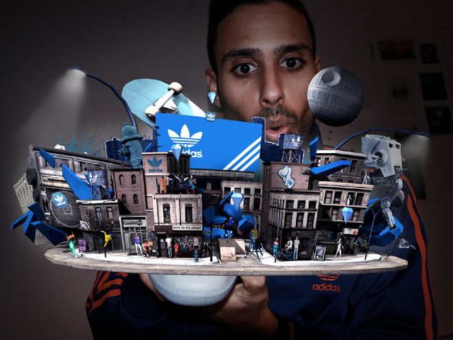
Lots of companies have used it as a great promotional tool. Adidas have recently put them on their shoes and made a very cool looking game.

source: http://www.wired.com/gadgetlab/2009/12/adidas-sneaker-augmented-reality/

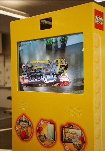
Lego use it as a way to visualize what their products will look like when you’ve finished building them.

source: http://www.virtualworldlets.net/Worlds/Listings/AugmentedReality/Lego.jpg

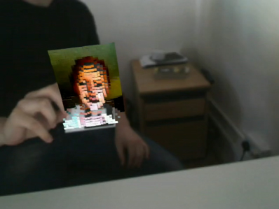
Some freelancers use it as a very cool business card and promotional tool. AR allows you to create a more impressive business card at no cost at all and you can fit way more info on it.

source: http://jamesalliban.wordpress.com/2009/06/03/ar-business-card/

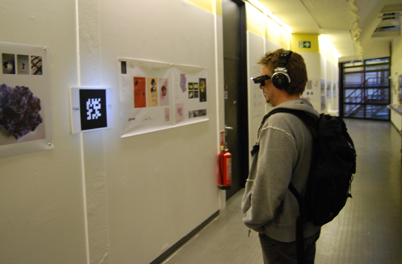
In January of this year, I completed a project for university where I created a wearable augmented reality system. It featured a virtual gallery which, as you walked around, told a very tragic story.

source: http://kablamo.co.uk

Check out the video on Youtube.

I approached creating AR from a design point of view, knowing very little about coding in AS3. I am here to share what I learned with you as I found it very difficult for beginners to learn anything about the subject. It was just a question of starting everything from scratch.

Now I’m sure you’re full of ideas of things to create, let’s create your first augmented reality project: adding depth to a flat piece of paper.


Introduction: flARToolkit

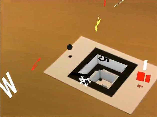
flARToolkit is the flash version of the C-coded augmented reality library known simply as ARToolkit. It was converted over by a very very skilled Japanese coder known as saqoosha. He does all kinds of crazy stuff with augmented reality and if you can read Japanese or are prepared to wade through lots of posts that barely make sense when translated, then you can learn a lot from him. He created the infamous ‘hole in the wall’ effect which is demonstrated in the New Years celebration project he created to welcome in 2009.

source: http://vimeo.com/2734815

More recently, he has demonstrated that you can link various markers together and other wonderful effects that I could only ever dream of creating.

source: http://vimeo.com/6262632

Step 1: Getting to the Source

Squidder.com modified an existing flARToolkit library, the flARManager class, to be able to handle events and multiple objects. Interestingly enough they post their source code and a so called ‘how to’ but never actually explain their own code. It took me some time to work out how to get multiple objects that could all be different. I should point out now that I am a designer first and coding resulted from wanting to make crazy things. I approached this wanting the end result to work rather than being concerned with best ways to code things.

Let’s download the code from their original post on the subject and give it a look over.

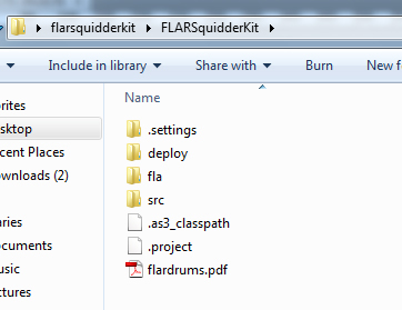
Download the file called “flarsquidderki.zip”, extract the .zip file and open up the main folder. Note, if you don’t extract the .zip folder, you won’t be able to open the .swf correctly or edit the files you need. So once you have done that, you’ll see 3 key folders: deploy, fla and src. You will also see a file called “flardrums.pdf”.

source: My hard drive

Step 2: Play Time

We have our markers for now, print them off so we can test it and see how the source currently works.

Open up the deploy folder and open the MultiFLARExample.swf. Accept the webcam and start playing with the markers.

source: My parents front room

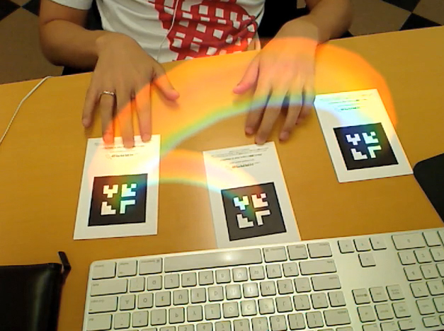
In a video demo that they created, you pass your hand over each marker individually and see how they make sounds when they disappear. This was written in by squidder. They added two events, MARKER_ADDED and MARKER_REMOVED. We will explore how to use these events later.

Now you know how it currently looks, let’s get down to modifying their source code to do some cool things of our own.


Step 3: There’s Coding to Do

For this tutorial, I assume you have basic knowledge of AS3 and class sheets.

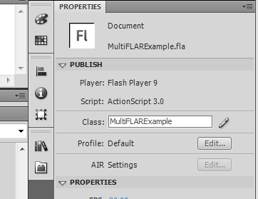
Open up the \fla\ folder and then double click on “multiFLARExample.fla”. In the properties panel you should see the class box filled in with MultiFLARExample. You’ll want to click the pencil icon next to the class box so that we can start looking at the code.

source: Flash

Step 4: MultiFLARExample

Straight away you’ll see the usual import code at the top and underneath that some basic variables for light sources.

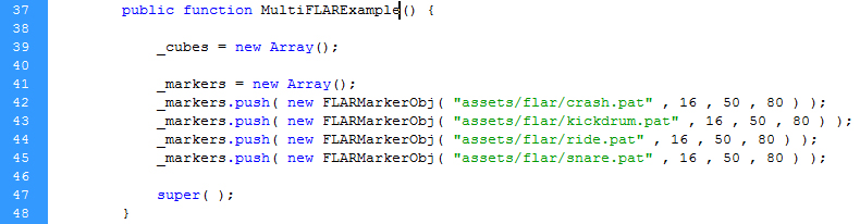
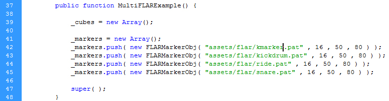
Next is an interesting part, the code that loads in the markers. As you can see, the markers are loaded into an array so that they can easily be called later on. Pay attention to the order they loaded in here. The first marker in the array gets the id of 0, the next is 1 and so on. We will be using these id’s later on.

source: Flash

Also look at private functions _addCube and _getFlatMaterial as these are the other two sections that we will be focusing on editing today. They’re pretty self explanatory in what they do, but they are oddly set up. They have been coded for simplicity in getting the same object in multiple colors, rather than lots of different objects, so we have to make a few changes.


Step 5: Ch-Ch-Changes

Okay, let’s change some code. Let’s alter it to a more usable state but for now we’ll keep the visual look the same. When I was figuring all this out, it was an odd relief to find out that it all came down to if statements in the end. If statements are just so magical and useful when it comes to coding things.

In the _addCube function replace this code :

var cube : Cube = new Cube( new MaterialsList( {all: fmat} ) , 40 , 40 , 40 );
					cube.z = 20;
					dispObj.addChild( cube );

with the following code:

if (id==0){

	var cube : Cube = new Cube( new MaterialsList( {all: fmat} ) , 40 , 40 , 40 );
	cube.z = 60;
	dispObj.addChild( cube );

} else if(id==1){

	var cube2 : Cube = new Cube( new MaterialsList( {all: fmat} ) , 40 , 40 , 40 );
	cube2.z = 0;
	dispObj.addChild( cube2 );

} else if (id==2) {

	var cube3 : Cube = new Cube( new MaterialsList( {all: fmat} ) , 40 , 40 , 40 );
	cube3.z = 20;
	dispObj.addChild( cube3 );

} else if (id==3){

	var cube4 : Cube = new Cube( new MaterialsList( {all: fmat} ) , 40 , 40 , 40 );
	cube4.z = 40;
	dispObj.addChild( cube4 );

}

Step 6: Test the Movie

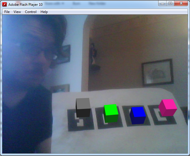
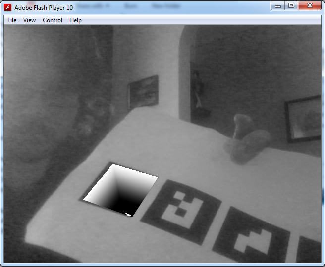
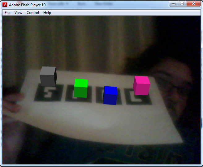
Now, this might seem like a convoluted way to deal with cubes, but it allows us to deal with each individual cube. For example, in the code above, I have altered the z axis of the cubes to demonstrate to you that the code is now handling each cube as its own object. Let’s try out the movie, you should have something to this effect:

source: My parents front room

Step 7: Explanations

Before we continue, let me explain the code you just put in. It’s pretty straight forward and if you have used papervision3D before you can skip this part.

var cube : Cube = new Cube( new MaterialsList( {all: fmat} ) , 40 , 40 , 40 );

Here we create a new variable, cube. This variable holds all the information needed to render a cube and determine how it looks. The MaterialsList part refers to the material used for the outside of the cube. As we want the same material on every side and that material is held in a variable created earlier in the code, we use {all: fmat}. I’ll talk more about the fmat variable later. Finally, the three 40’s, these are the dimensions of the cube, the width, height and depth. Of course they don’t have to all be the same even though this is a cube. You can use the cube method to create rectangular cuboid shapes if you so wish.

cube.z = 20;

This sets the z value of the cube. This is how high the cube sits above the marker. 0 is the center line of the cube and so setting it at half the shape’s height means that is sits exactly on top of the marker.

dispObj.addChild( cube );

dispObj refers to a display object that was created earlier in the code. A display object will render your object on the screen. You can load as many shapes as you want inside one display object, so we will load all our shapes into it for now.
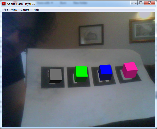
Brilliant, now that you know how it works, let’s continue editing the code. You don’t really need the _getFlatShadeMaterial function so let’s edit it all together shall we. Doing it this way also allows us to give a different material to each object.


Step 8: Pulling it Together

You’ll want to find this line in your code:

source: Flash

We are now going to edit the fmat variable so that instead of calling a function, it will call a new flatShadeMaterial where we specify the colors. Later on I’ll deal with other materials including bitmap materials.

Replace _getFlatMaterial(id); with:

new FlatShadeMaterial( _lightPoint , 0xff22aa , 0x75104e );

The three parameters set the lightsource for the flatShadeMaterial, the flat color, and also the shade color. Doing this will give our object a more realistic effect as we turn and rotate it in physical space.

Now, underneath that line we’ll want to add:

var fmat2 : FlatShadeMaterial = new FlatShadeMaterial( _lightPoint , 0x00ff00 , 0x113311 );
var fmat3 : FlatShadeMaterial = new FlatShadeMaterial( _lightPoint , 0x0000ff , 0x111133 );
var fmat4 : FlatShadeMaterial = new FlatShadeMaterial( _lightPoint , 0x777777 , 0x111111 );

Now that we have created a variable for each of our objects, we’ll want to change up the cube code I gave you earlier. Instead of just having fmat as the material for all of our cubes, you’ll want to change it to fmat, fmat2, fmat3 and fmat4 so that our cubes will appear different.

After you have done that, you can now finally remove the _getFlatMaterial function.

Delete the following lines of code:

private function _getFlatMaterial( id:int ) : FlatShadeMaterial {

	if ( id == 0 ) {
		return new FlatShadeMaterial( _lightPoint , 0xff22aa , 0x75104e );
	} else if ( id == 1 ){
		return new FlatShadeMaterial( _lightPoint , 0x00ff00 , 0x113311 );
	} else if ( id == 2 ) {
		return new FlatShadeMaterial( _lightPoint , 0x0000ff , 0x111133 );
	} else {
		return new FlatShadeMaterial( _lightPoint , 0x777777 , 0x111111 );
	}
}

Step 9: Test the Movie Again

And now let’s test again. If everything is done correctly, it should look exactly the same. What an achievement, eh?

source: My parents front room

It may not look like much, but we have just set up the foundation for creating lots of different looking objects.

Step 10: Materials

Okay, let’s get on to something a bit more useful. The bitmap material. Most people would want to put their own images into AR as a cool way to present their work; this is achieved by using an image as a material.

It’s fantastically simple. I have created the following image for you to use, since I’ll show you how to use bitmap material through a web link.

source: Photoshop

Firstly, you need to import the BitmapFileMaterial class. At the top of your code sheet where all the other classes are imported, add the following line:

import org.papervision3d.materials.BitmapFileMaterial;

and change your fmat material to the following:

var fmat : BitmapFileMaterial = new BitmapFileMaterial("http://kablamo.co.uk/artutorial/kcube1.jpg");

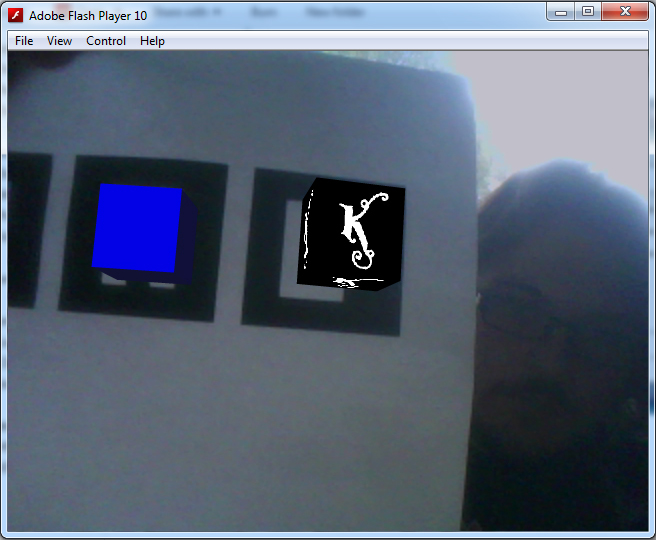
Now let’s test it, it should look just like this:

source: My parents front room

How simple was that?

Step 11: Making it Hole

Now that I’ve shown you how to make a cube that sits above the marker, let’s create a cube that sits below the marker to create the hole in the wall effect.

This effect was originally imagined and explained by saqoosha. Unfortunately, he explained it in Japanese and for papervision3d rather that for use with flARToolkit so a few changes were made.

You need to import these two classes:

import flash.geom.ColorTransform;
import flash.filters.*;

Add this line under _lightpoint with the other private variables:

private var _green:Cube;

and then under var dispObj : DisplayObject3D = new DisplayObject3D(); add the following:

this.viewport.filters = [
	new ColorMatrixFilter([
                    1, 0, 0, 0, 0,
					0, 1, 0, 0, 0,
                    0, 0, 1, 0, 0,
                    1, -1, 1, 1, 0
	])
];

Basically, what’s going on here is that you will have two cubes, one being green and the other forming the inside view. They will sit one inside the other. The viewport filter will mask out anything that is that particular color green, which is what we set the outside cube to, giving the effect that there is a hole in the marker.

Now we will create the two cubes.

Remove your existing cube code and replace it with this:

var hole:Cube = dispObj.addChild(new Cube(new MaterialsList(
		{all:new  BitmapFileMaterial( "assets/hole.jpg" ), bottom: new  BitmapFileMaterial( "assets/k.jpg" )}
	), 80, 80,80,1,1,1, Cube.ALL,Cube.TOP)) as Cube;

this._green = dispObj.addChild(new Cube(new MaterialsList({all: new ColorMaterial(0x00ff00)}), 80, 80,80, 1, 1, 1, Cube.TOP)) as Cube;
hole.rotationX = this._green.rotationX =90;
hole.z = this._green.z = -40;

Notice, for the materials we import in two .jpg files from the assets folder. This folder is located inside the main deploy folder, where the file MultiFLARExample.swf is found. You can either download the following images that I have created, or make your own.

source: Photoshop
source: Photoshop

Step 12: Test the Hole

Give it a test and you should have something like this:

source: My parents front room

Step 13: Making Mark-ers.

By now, you are probably fed up of holding up a ratty piece of paper with four markers up to the camera. You want to have your very own marker, so let’s make it. With a few online tools and Photoshop, you can have your own marker up in minutes.

First, let’s make your marker. You don’t need to use a barcode-like design like on the markers you are currently using, but, if you are using a lot of markers then the barcode is the best way to go. If you are using one or two then go wild with the design. For my marker design, I used the K from my website’s logo.

source: My parents front room

If you are doing it for a business card or some promotional material, think about how the marker looks as you can make some very nice looking markers that blend into the design more.

You need to set up your Photoshop document ready for marker creation. For a basic marker, create an 800x800px file with a 150px border all the way around. Or download this image below:

source: Photoshop

Step 14: Online Marker Generator

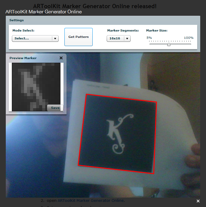
The white square in the middle is where you can put your marker design. Print off the marker and then pay a visit to the Online Marker Generator.

They have an online marker creator that takes your marker and makes a .pat file that works with your code. It’s quite odd, they have an upload option but I have never gotten it to work (printing out works just fine). There is also an AIR app that does just the same job but this is fine for now.
Set the marker segments to 16×16 and the marker size to 50%, show your marker to your webcam and when a red square surrounds your marker click on get pattern, if you are happy with how it looks in the preview window click save.

source: My parents front room

If your marker looks really odd in the preview or a red square doesn’t come up, you may need to re-design your marker. You also have to make sure that there is some white space around your marker as otherwise Flash won’t recognize it.

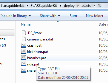
When the dialog box comes up, don’t just download this anywhere, you need to put the .pat file in a specific folder. Navigate to your flARToolkit folder > deploy > assets > flar and you should find four other .pat files there. Save your pattern there and remember what you called it. I called mine “kmarker.pat”

source: My hard drive

Step 15: Alter the Code

Back in flash, find this line:

source: Flash

And change crash.pat to whatever you named your marker as.

source: Flash

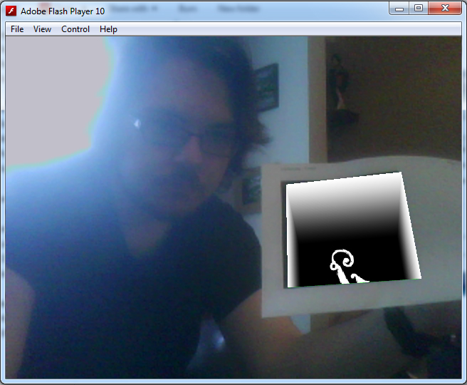
If you test your Flash file, you should find that your new marker picks everything up perfectly.

source: My parents front room

Conclusion

Thanks for reading this introduction to Augmented Reality. I hope you enjoyed it and that it’s made you curious about creating your own AR projects. In the next part of this tutorial, I will cover how to animate objects with TweenMax, making the markers a bit more play sound, importing 3D models and making everything prettier.

Rigging a Cartoon Bottle using Maya

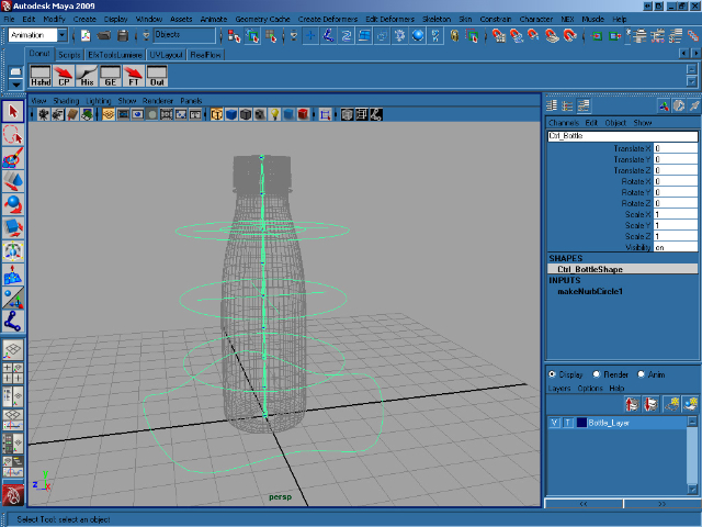
Animation can be a nightmare if you don’t have an easy to use, well-made rig to work with, and in this tutorial Donato Marotta shows us how to create just that using joints, locators, custom attributes, set driven keys, expressions and constraints in Maya!

The tutorial is laid out as follows :

  • From Step_1 to Step_6 I explain how to setup the scene before we start rigging.
  • From Step_7 to Step_26 we will create all controls, joints and the parental structure.
  • From Step_26 to Step_49 I will connect all joint and controls using constraints and expressions.
  • From Step_50 ti Step_66 we will insert the stretch and squash control, and finally skin the bottle!

Note: Click images to access high-res versions.

Step 1

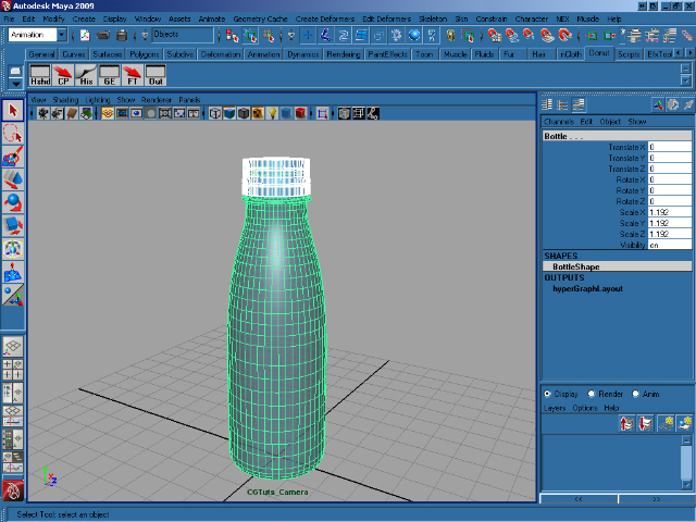
Create a new scene and import the bottle with stopper. Select the stopper, then hold down shift and select the bottle. Press P to parent the stopper to the bottle.


Step 2

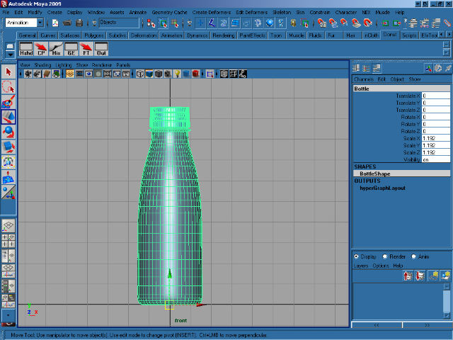
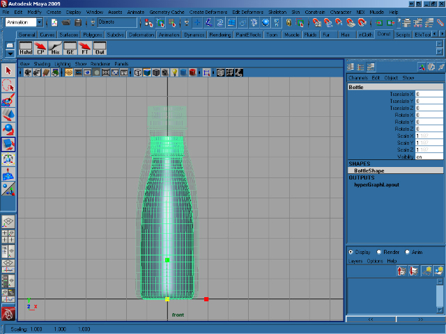
We need to move the bottle’s pivot point, so select the bottle in the front view and press ins on your keyboard. This allows us to move the object’s pivot using the transform gizmo. Move the pivot to the bottom of the bottle and when you’re happy with it’s position, press ins again. Finally, press W and move the bottle so that it rests on Y=0 as shown.


Step 3

Press R and scale the bottle proportionally so that it is eight units high, as shown.


Step 4

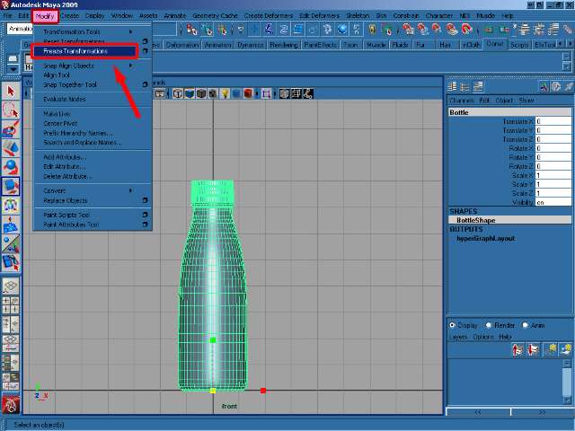
With our bottle in place, select Freeze transformations from the Modify menu.


Step 5

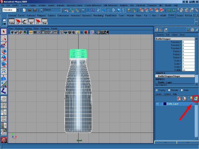
With the bottle and stopper selected, create a new layer and rename it to Bottle_Layer. Then add the selected objects to our new layer by clicking the button shown.


Step 6

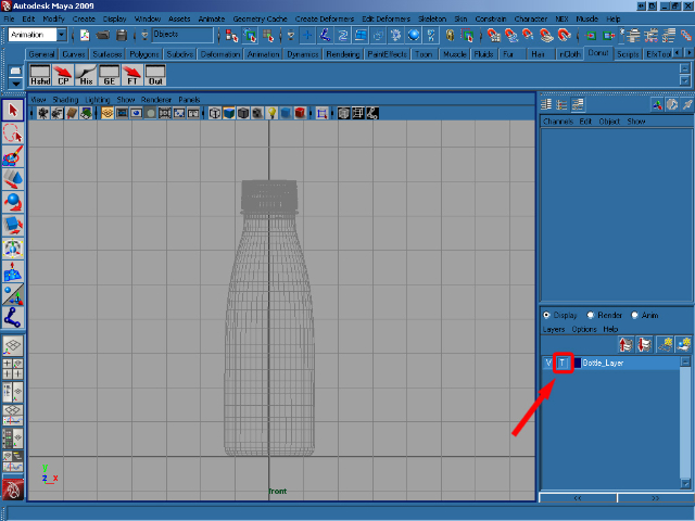
Click on the center square on the Bottle_Layer to template the bottle, which allows us to see it, but not select it.


Step 7

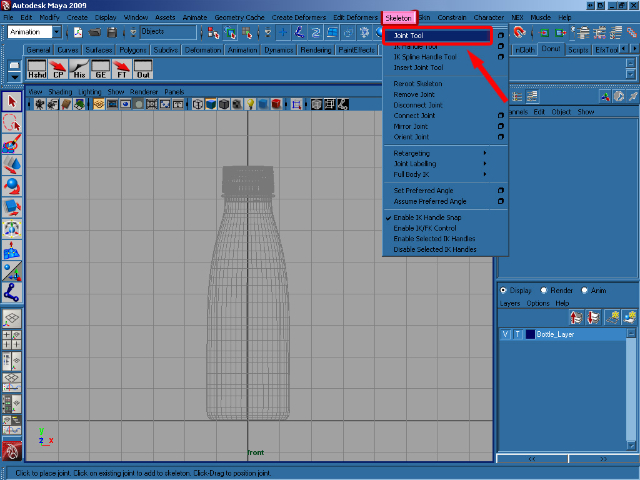
In the Animation menu click on the Skeleton/Joint Tool.


Step 8

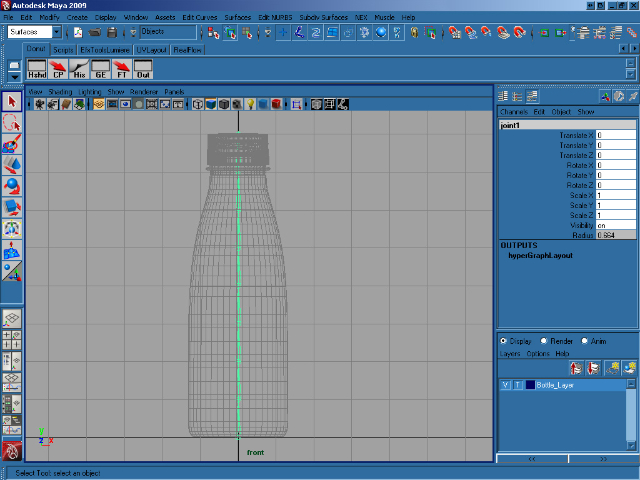
Press hold X to enable grid snap, and create eight Joint from the bottom to the top of the bottle – one on each of our grid squares. When you’re happy, press Enter to drop the tool.


Step 9

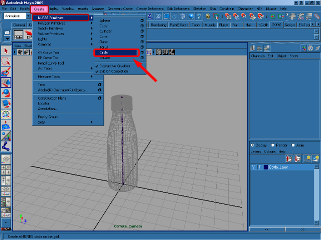
In the Create menu select NURBS Primitives >Circle.


Step 10

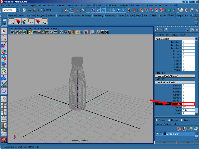
Create a circle with a Radius of 15.


Step 11

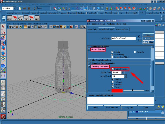
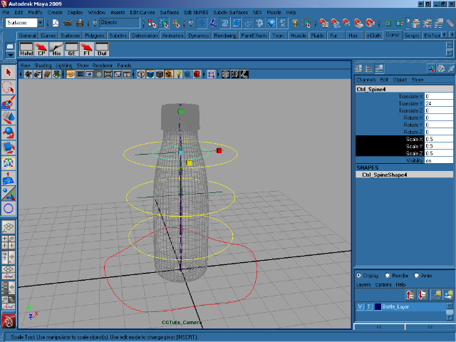
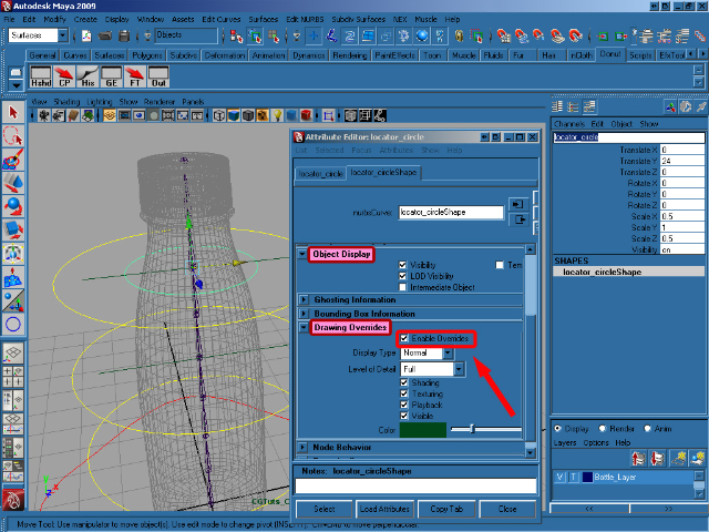
Press Ctrl+A to activate the Attribute Editor for the object, and then go to Object Display > Drawing Overrides > Enable Overrides and choose the Red color.


Step 12

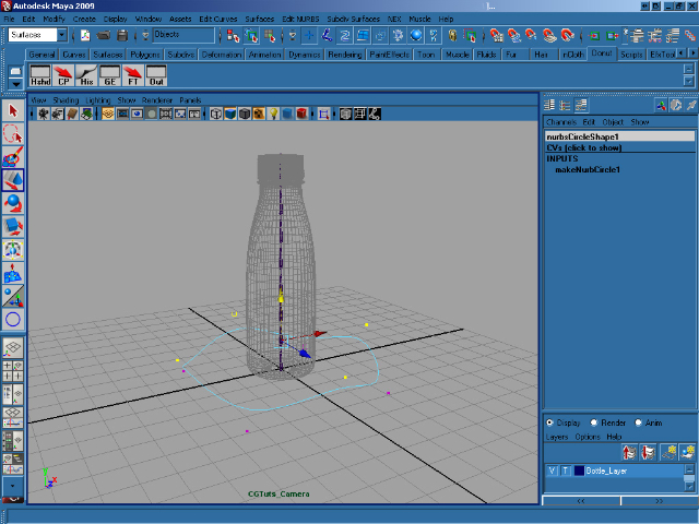
Now we’re going to modify the circle a little bit! Right click on it and select Control Vertex. Now grab the vertices one by one and move them into place (you can create any shape you want!) When you’re done, rename the circle as Ctrl_Bottle.


Step 13

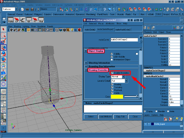
Now create another nurbs circle in the center of axis, with a Radius of 10. Then go to the Attribute Editor and make it yellow.


Step 14

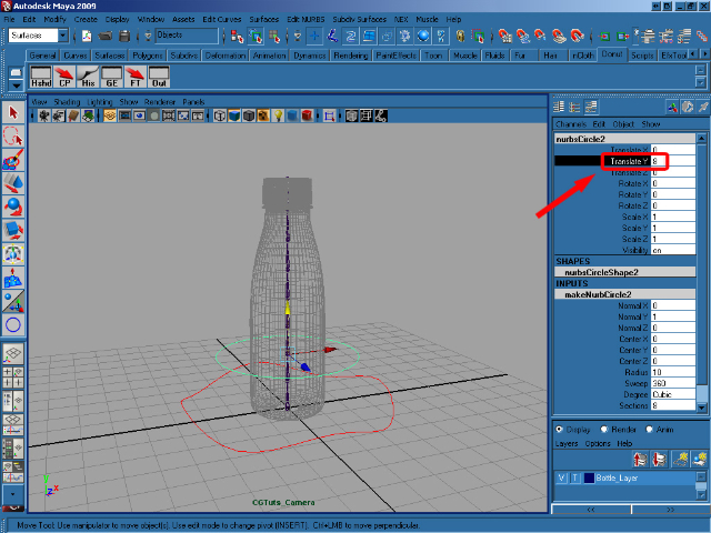
Move the last created circle to 8 on the Y axis, and rename it as Ctrl_Spine1.


Step 15

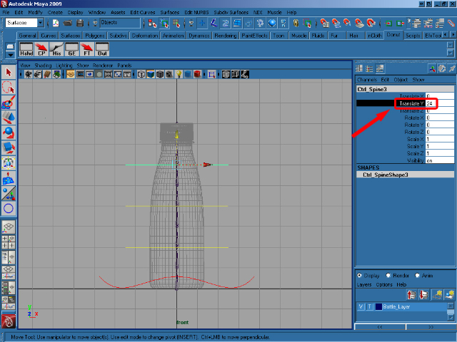
Duplicate Ctrl_Spine1 twice, and move the first to 16 and the second to 24 on the Y axis.


Step 16

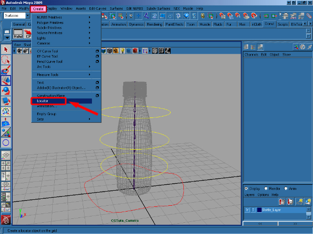
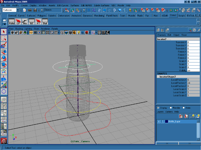
Select menu Create > Locator.


Step 17

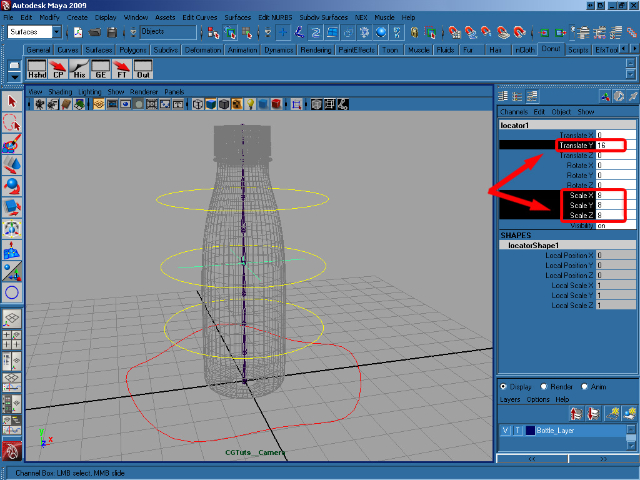
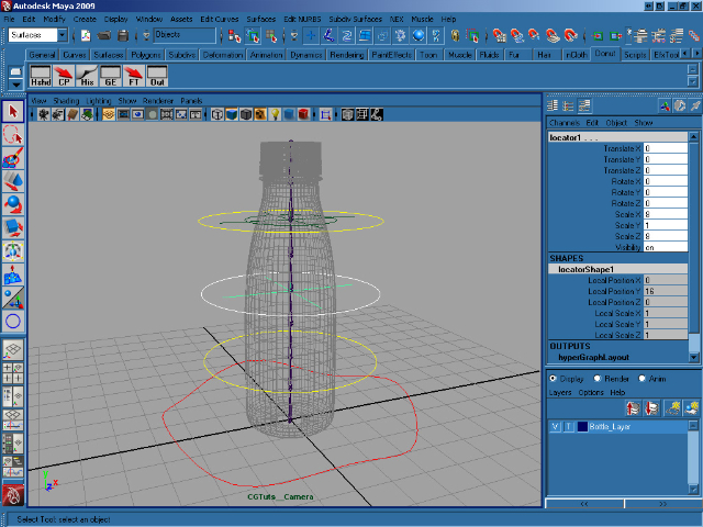
Scale the new locator proportionally to 8, move it to 16 on the Y axis and rename it to locator1.


Step 18

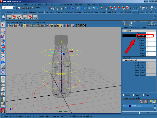
Duplicate the locator, and move the duplicate to 24 on the Y axis, to match the position of the circle. Rename it to locator2.


Step 19

Now select Ctrl_Spine3, duplicate it, and scale it proportionally to 0.5.


Step 20

Color the last duplicated Circle to match the color of it’s locator and rename it to locator_circle.


Step 21

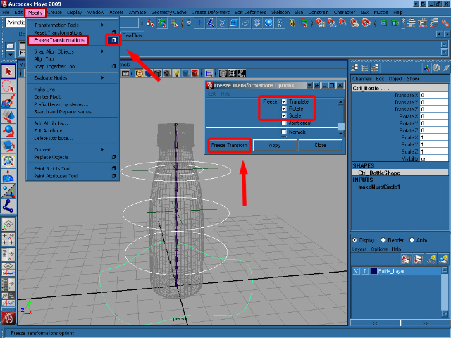
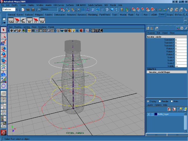
Now select all of the created controls except locator1 and locator2, and go to Modify > Freeze Transformation (Options). In the options, select Translate Rotate Scale and then click on Freeze Transform.


Step 22

Select Ctrl_Spine3, and holding down Shift select locator_circle. Now press P to parent them together.


Step 23

Select locator_circle, and again holding down shift select locator2. Press P to parent them together.


Step 24

More parenting! Select Ctrl_Spine2, hold shift and select locator1 and then press P to parent.


Step 25

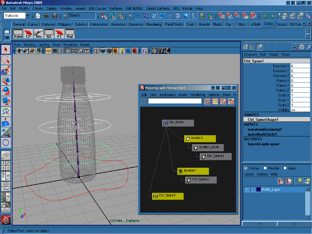
Now select locator2, hold shift and select locator1, Ctrl_Spine1 and Ctrl_Bottle. With all 4 selected, press P to parent. If you open the Hypergraph, it should look very similar to the image below.

Step 26

Now with our controls in place and set-up, we’ll start work on the joints. Select joint1, hold shift and select Ctrl_Bottle and press P to parent all of the joints to the main control, Ctrl_Bottle.


Step 27

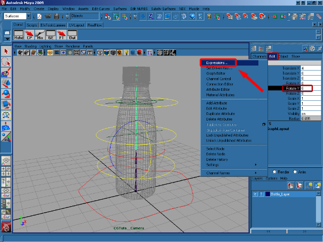
Select Joint4 and in the Channel Box select Rotate Y and at the top of the Channel Box go to Edit > Expressions to open the Expression Editor.


Step 28

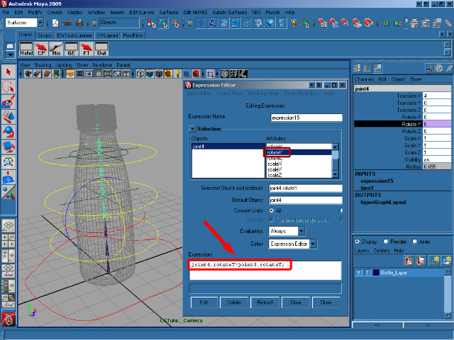
Add the following expression to rotateY and then click on Create :

joint4.rotateY=joint3.rotateY;


Step 29

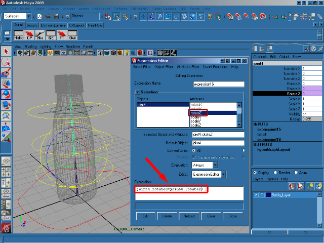
Now select rotateZ in the Expression Editor and add/create this expression :

joint4.rotateZ=joint3.rotateZ;


Step 30

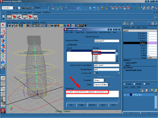
Select joint2, and then select rotateY in the Expression Editor. Add/create this expression :

joint2.rotateY=Ctrl_Spine1.rotateX/4;


Step 31

Select rotateZ and add/create this expression :

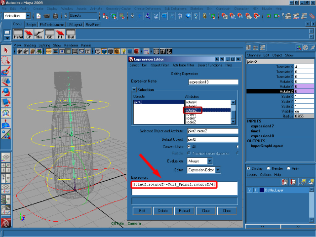
joint2.rotateZ=-Ctrl_Spine1.rotateZ/4;


Step 32

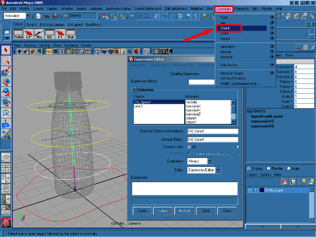
Select Ctrl_Spine1 and shift select joint3. In the Animation menu select Constrain/Orient.


Step 33

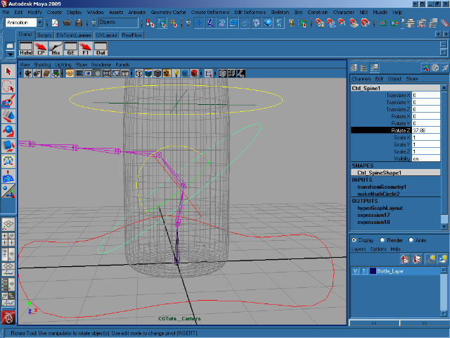
As you can see to the image below, rotating Ctrl_Spine1 correctly rotates the joints. Now it’s time to repeat the process for the other controls.


Step 34

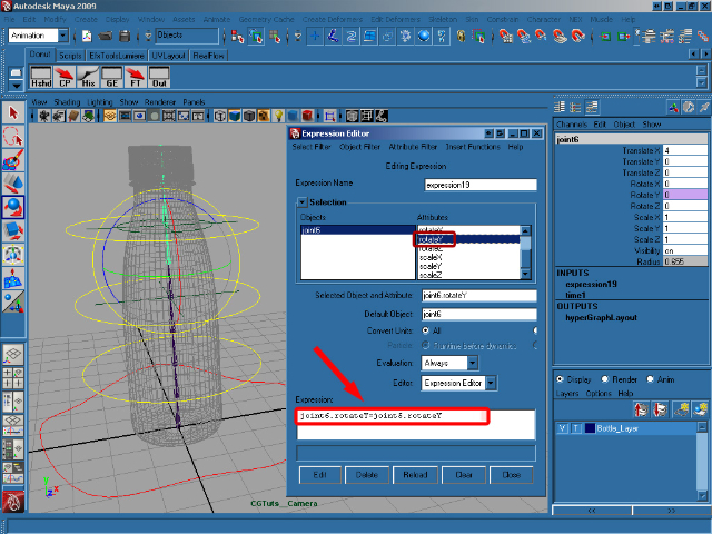
Select joint6 and then select Rotate Y in the Channel Box, open up the Expression Editor as before, and add this expression to rotateY, remembering to hit Create when you’re done :

joint6.rotateY=joint5.rotateY;


Step 35

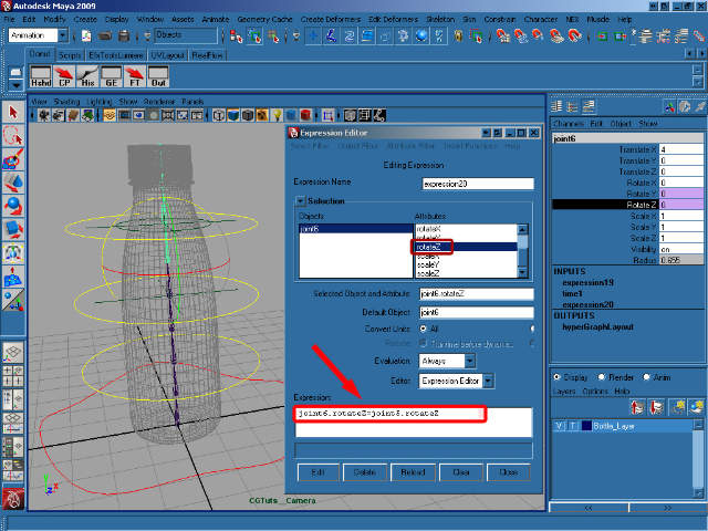
Select rotateZ in the Expression Editor and add/create this expression :

joint6.rotateZ=joint5.rotateZ;


Step 36

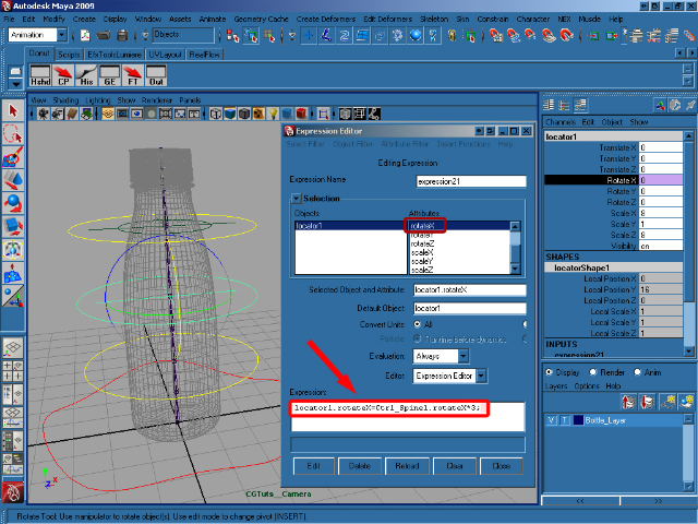
Select locator1 and then in the Expression Editor select rotateX and add/create this expression :

locator1.rotateX=Ctrl_Spine1.rotateX*3;


Step 37

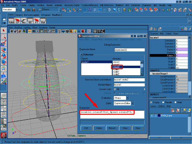
Select rotateZ and add/create this expression :

locator1.rotateZ=Ctrl_Spine1.rotateZ*3;


Step 38

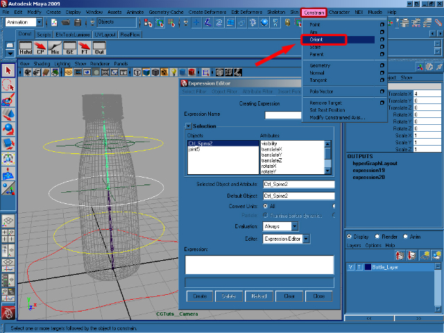
Select Ctrl_Spine2, shift select joint5 and select Constrain/Orient from the Animation menu.


Step 39

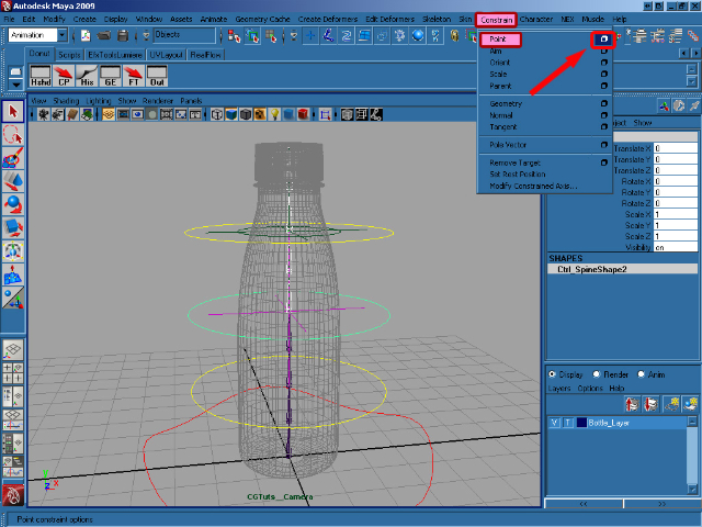
Select joint5, shift select locator1 and choose Constrain/Point (Options) from the same menu.


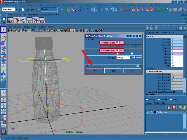
Step 40

In the Point Constraint Options, select Maintain offset and Constraint axes (All) and click on Add.


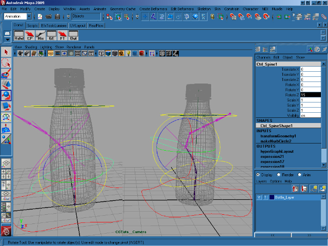
Step 41

As you can see in the image below, we can now rotate Ctrl_Spine1 and Ctrl_Spine2 separately, although the second is influenced by the first.


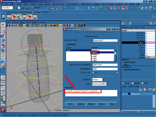
Step 42

Now select joint8, bring up the Expression Editor, select rotateY and add/create this expression :

joint8.rotateY=joint7.rotateY;


Step 43

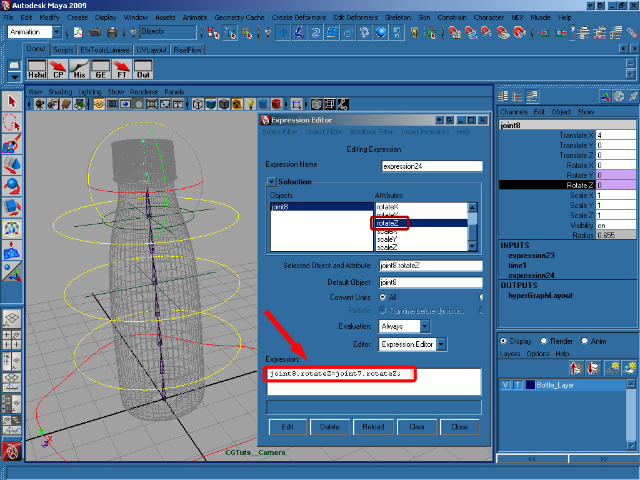
Select rotateZ and add/create this expression :

joint8.rotateZ=joint7.rotateZ;


Step 44

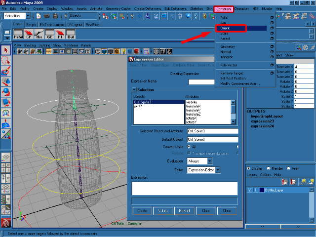
Select Ctrl_Spine3, shift select joint7 and select Constrain/Orient from the animation menu.


Step 45

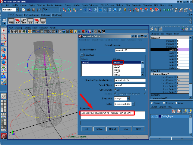
Select locator2, open the Expression Editor, select rotateX and add this expression :

locator2.rotateX=Ctrl_Spine1.rotateX*5;


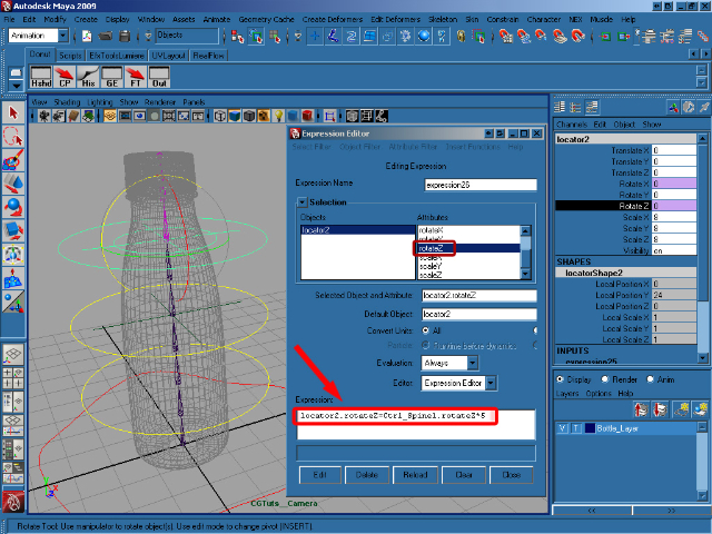
Step 46

Select locator2, then rotateZ in the Expression Editor and add/create this expression :

locator2.rotateZ=Ctrl_Spine1.rotateZ*5;


Step 47

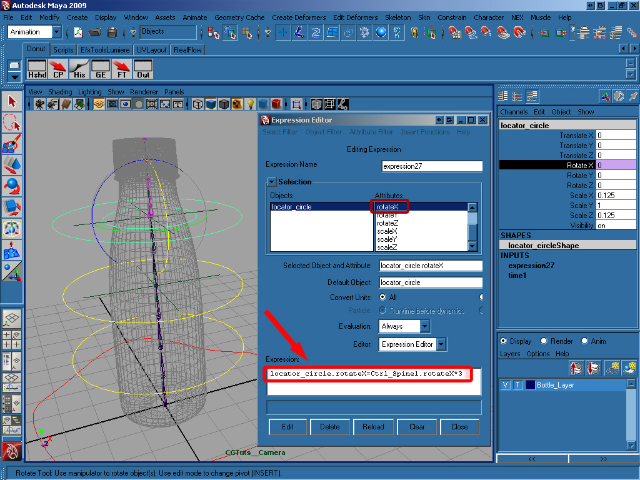
Select locator_circle, and add this expression to rotate X :

locator_circle.rotateX=Ctrl_Spine2.rotateX*3;


Step 48

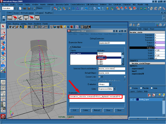
Select rotateZ and add this expression :

locator_circle.rotateZ=Ctrl_Spine2.rotateZ*3;


Step 49

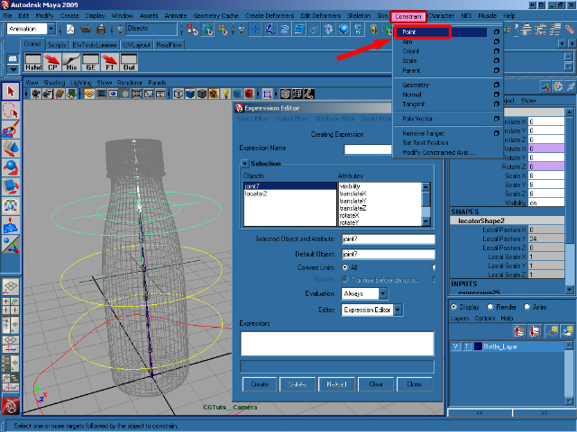
Select joint7, shift select locator2 and select Constrain/Point from the Animation menu.


Step 50

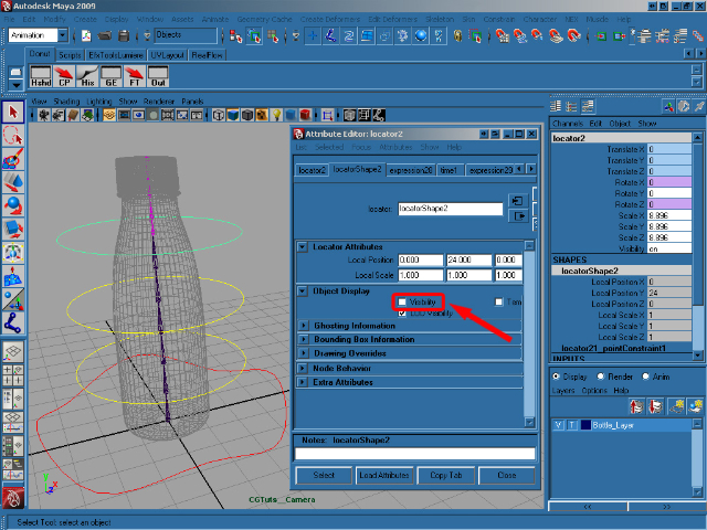
Select locator1 and open the Attribute Editor (Ctrl + A). In the Object Display Panel turn off the Visibility. Now do the same thing for locator2 and the circle_locator.


Step 51

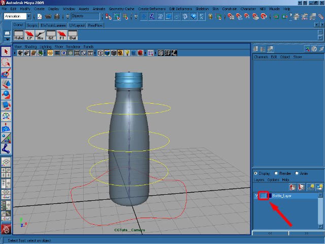
In the Layer Editor, click twice on the middle box on our BottleLayer make the bottle selectable.


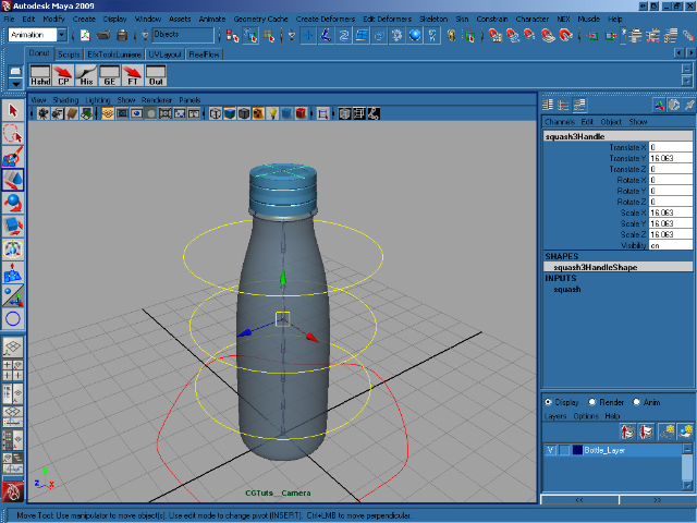
Step 52

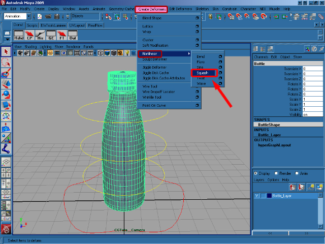
Select the bottle and, making sure you’re viewing the Animation menus, go to Create Deformers > Nonlinear > Squash.


Step 53

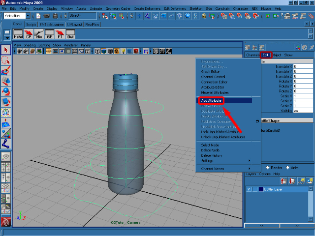
Select Ctrl_Bottle and in the Channel Box click on Edit > Add Attribute.


Step 54

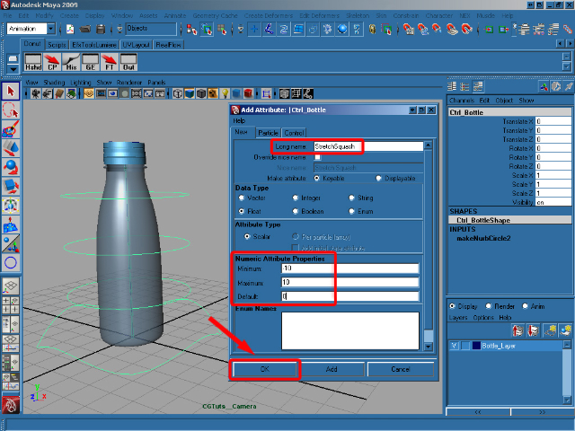
In the Add Attribute dialog, for Long name write Stretch Squash, in Data Type choose Float, in Numeric Attribute Properties insert a Minimum of -10 and a Maximum of 10, and finally add a Default of 0. Click on OK to add our new attribute.


Step 55

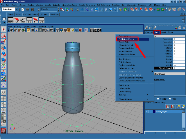
Now we have our new attribute, we need to make it do something! In the Channel Box select Stretch Squash and go to Edit > Set Driven Key.


Step 56

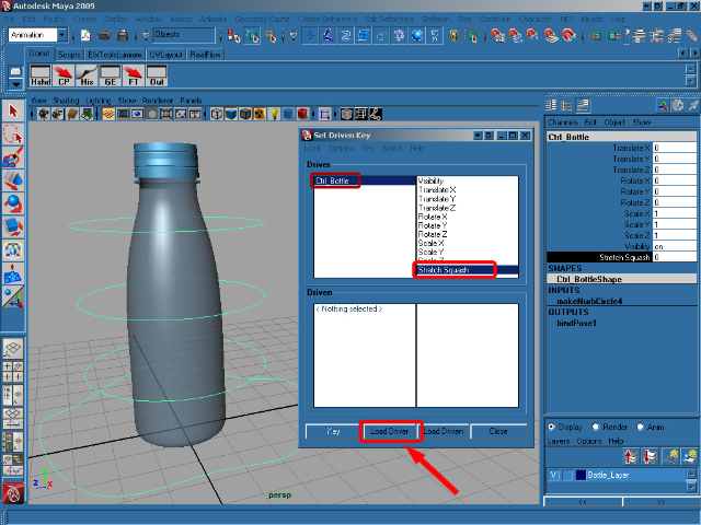
Select the Ctrl_Bottle and in the Channel Box click on our new Stretch Squash attribute. In the Set Driven Key window click Load Driver to add our Ctrl_Bottle in as our driving object. In the now-populated Driver box select Ctrl_Bottle and then Stretch Squash.


Step 57

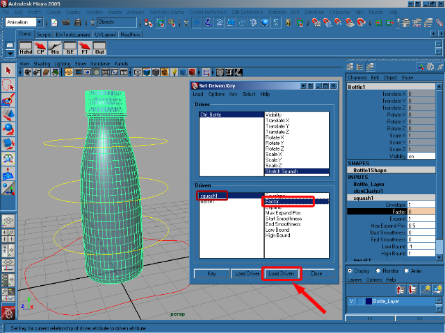
Now we need to choose the driven object. So select the Bottle and in the Channel Box select squash in the INPUTS section. Now click Load Driven in the Set Driven Key window to populate the driven section. Click on squash in the Driven Box and then select Factor. With our driver and driven attributes setup, we can now click Key to create our first connection.


Step 58

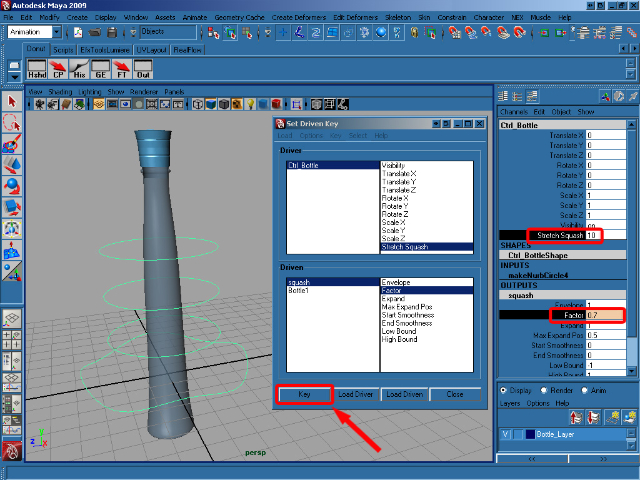
Now select Ctrl_Bottle and set the Stretch Squash attribute to 10. Select squash in the OUTPUTS section of the Channel Box and change the Factor value to 0.7. Back in the Set Driven Key window, click on Key to create another connection.


Step 59

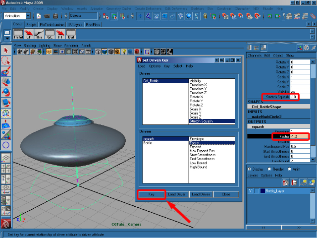
Set the Ctrl_Bottle‘s Stretch Squash attribute to -10, select squash in the OUTPUTS section and change the Factor value to -1.3. Now create our final key by clicking Key in the Set Driven Key window.

Step 60

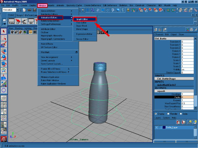
Set the Stretch Squash attribute back to 0 and close the Set Driven Key window. Go to Window > Animation Editor > Graph Editor.

Step 61

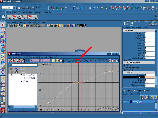
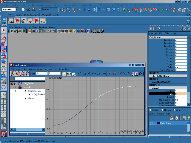
Select squash in the OUTPUTS section of Ctrl_Bottle to update the Graph Editor. Select all of the animation keys and press F to smooth them as you can see in the below image.


Step 62

With that done, now select just the middle key in the Graph Editor and, using the bezier handles sticking out of the key itself, adjust the animation curve to smooth things out fully as you can see below. Close the Graph Editor.


Step 63

Select the squashHandle and press Ctrl + H to hide it.


Step 64

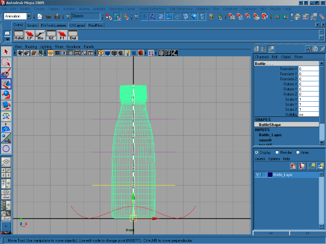
With our rig in place, and our squash/stretch complete, we now need to connect the rig up to the bottle geometry itself. Go to the front view and press 4 to switch to wireframe view. Select joint1 and Shift select the bottle.


Step 65

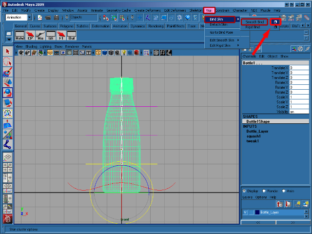
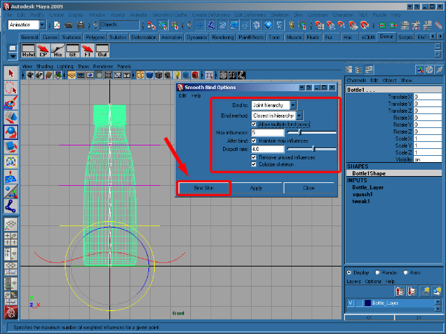
In the Animation menu click on Skin > Bind Skin > Smooth Bind (options).</p


Step 66

In the Smooth Bind Options windows set Bind to to Joint hierarchy, Max influences to 5, and then click on Bind Skin. Finally select Ctrl_Spine1, in the Channel Box, right-click Rotate Y select Lock Selected to disable editing for this channel, as it will be affected by our rig. Now repeat this lock for Ctrl_Spine2 and Ctrl_Spine3.


And that’s it, you’re ready to animate! Play around with the rig and see what you can come up with! I hope you enjoyed the tutorial, and if you have any questions just let me know in the comments.


Don’t miss more CG tutorials and guides, published daily – subscribe to Cgtuts+ by RSS.

Should You Switch to a Health Savings Account?

The high cost of health insurance has led to the expansion of an extremely popular type of healthcare plan called a High Deductible Health Plan (HDHP).  This type of plan, in conjunction with a Health Savings Account (HSA), is becoming the healthcare plan of choice in the United States.  It is clear that the enrollment trend is way up for this type of coverage.  At my place of employment, this option was added to our available healthcare choices, a couple of years ago.

In fact, a statement from an annual census by America’s Health Insurance Plans (AHIP), verifies this:

“The number of people with HSA/HDHP coverage rose to 10 million in January 2010, up from 8 million in January 2009, and 6.1 million in January 2008.”

Last year, due to a lack of truly understanding the plan, I chose to stick with my traditional plan.  Basically, I was nervous about switching to a plan that I really didn’t truly comprehend.  But, this year, after listening to coworkers who had made the switch the previous year, I took the plunge and switched over to this new option.

For those of you who are not familiar or simply do not understand this type of healthcare plan, here are some of the basics.

  1. A Health Savings Account (HSA) is a pre-tax account that employees and their family members can use to pay for qualified medical expenses, which can include prescriptions, vision care, dental care, etc.
  2. The employee chooses how much pre-tax money to contribute each year to this plan.  There typically is a maximum amount you can contribute each year.  This year, 2010, I elected to contribute $6000 to my Health Savings Account.  This was almost identical to the amount it would’ve cost me to stick with my traditional healthcare plan.  The $6000 is equally divided up into the number of paychecks I receive each year.  I get paid twice a month so, for me, I contribute $250 per paycheck.  Remember, all the money contributed is pre-tax, so it basically also lowers your tax liability, which is the same as a 401K contribution.
  3. In my plan, the employee (that’s me) will pay for the first $3000 of medical expenses and, after that, the plan will pay 80% of the expenses and the employee will pay 20%.  After the total amount of out-of-pocket expenses reaches a certain amount (for me it is $6000), the plan will pay the full amount.  The maximum annual contribution for a family in 2010 is $6150 if the employee is under 55 years of age.
  4. The employee, and spouse, if needed, will receive a checkbook and a credit card that will be used to pay for the qualified medical expenses.

Pros

  • This is, by far, the most important!  If you don’t use the full amount of your annual contribution, it is STILL YOUR MONEY!  This money will stay in your account and will roll over to the next year.  In the past, I have had pre-tax healthcare spending accounts which was “use it or lose it” in the year that you contributed.  As the balance of the account grows, you may open an investment account and transfer money into a mix of mutual funds, similar to a 401K.
  • If you have built up enough in your bank account, you can lower or curtail your contribution in the ensuing year.  As a result, you can free up some money for other expenses that you may have.  Or you can continue to contribute in a pre-tax manner, building up the amount in your account.
  • You tend to be a lot more discerning when it comes to your medical care.  Believe me, doctors do not like these types of plans, because they think that their patients may compromise their healthcare by neglecting to have procedures performed because of the cost.  I don’t look at it this way.  Instead of just going along with what the doctor suggests, I tend to ask more questions about what is being prescribed.  I think this is healthy (no pun intended).
  • If, by chance, you had to pay any qualified medical expenses out-of-pocket, you can pay yourself back later in the year when there are sufficient funds in your account.  In other words, as long as you have kept the receipts and can justify the payments, you can write yourself a check from your Health Savings Account.
  • The cost to contribute to this plan is roughly exactly the same as I would’ve contributed to my traditional health plan.  And the fact that if there is anything left over goes to me is the greatest advantage of this plan.

Cons

  • Probably the biggest negative about this new healthcare plan is trying to understand it fully.  As I mentioned earlier, I didn’t opt to switch over to this plan in the first year it was offered.  I didn’t because I simply did not understand its implications.  Educate yourself on what a High Deductible Health Plan is with a Health Savings Account.  It is a drastic change from your traditional healthcare plan.
  • You may not initially have enough money built up in your plan to pay a medical bill since you are responsible for the first $3000.  What you can do is write a check for as much as you have in your account and pay the remainder later when there is money in the plan.  This is a different mindset from paying bills on-time, as I have always done.  Healthcare providers recognize the popularity of Health Savings Accounts and certainly understand that there may not be enough funds at one point in time to pay a bill.
  • You will want to keep a detailed record of all of your medical bills and when you paid them.  I don’t necessarily consider this a hassle because I like to keep detailed records.  But, for most people, this may be considered painful.

I am just over six months into this new healthcare plan.  Currently, I have about $700 in outstanding medical bills that I have yet to pay.  But, I know that in a couple of months, the funds will be available to pay those bills.  This is a different mindset that I have had in the past about paying any bill.  I definitely think that the pros far outweigh the cons when it comes to switching to a Health Savings Account.  I am convinced that there will be money left at the end of the year that will still be my money that I can use in ensuing years.  If not, I also know that I will be fully covered and I will be paying basically the same as I would have with my traditional healthcare plan.

It is my suggestion that you get educated and learn about this revolutionary healthcare plan, especially if you are given this option through your employer.  If you do your homework, I am convinced that you will reach the same conclusion that I did.  It is time to switch.