Finish WordPress Live Video Project

since this project is 90% finished there are no fixed requirements

so what you will be required to do is to provide your bid for 10 hours of time to sit with me on gmail chat and take my instructions to fix small bugs and make small additions to the site

you must be an expert at php/mysql, ajax/javascript, css, web design, graphic design, and video streaming
…

you’ll be sitting with me in real-time, live while we finish the project

there is a project password which is “finishlive” that you will be required to PM me so i know you aren’t a robot

PM me to get the site URL

this needs to be done this week

work time will be during daytime or early evening hours GMT -8 or PST timezone

Real Estate Agent Website

HOMEPAGE – 522

Please take a look at this site. I need to have something similer.

If you go to the site you will see on the top left it says
Elli’s Toronto Real Estate Listings

1) All the listed house should come in Slide
2) Search full toronto MLS now.
Should come under.

3) news feed should have similer option. it should just show the headline and once click it should drop down and show the news

4) Search MLS is very importent. The code is available in the market. All the realestate in toronto take the codes from www.mls.ca
or you can collect the code from this site.

5) From the title ABOUT> 25 years Video can be removed.

Other features I need

1) Cross Browsing & Cross Resolution
2) Meta Tag & H1 Tag
3) Directory Listening
4) Keywords (i’ll provide you the keyword)
5) CMS is the most importent part I should be able to upload the featured listning manually and once needed delete them and put a sold icon on top once sold.

Recrate/decompile & Edit Flash 2

I need someone who can decompile/recreate a flash file, AS3, and edit it.
Simple edition, moving some objects, apply a video player, posting some info in a menu, and maybe some esthetic modifications. Decompiling/Recrating is the hardest thing here.
Only serious bidders to apply.
See the file in this address:
http://www.yoamoamericanways.com/americanWays.swf

Preferably if you know some PHP. Need it ready as SOON as possible.

Looking to work with a successful programmer in the future.
Urgent.
…

Streaming Flash Mp3 Player Modifications 2

We currently have a Flash MP3 player but we need streaming capability added to it.

We would like a Guru with good feedback only please.

We need to be able to specify a start time and have the player start playing at that point. Playback needs to be instant, or at least as quick as possible based on connection speed. Waiting for the complete MP3 to load (as in the current system we have) is not acceptable.

Support Activetuts+ and Tuts+ Premium!

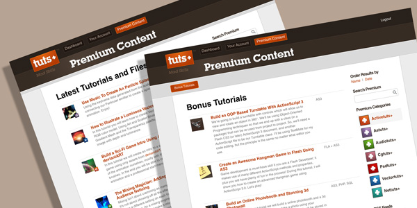
The Tuts+ Network publishes around 50 tutorials and articles every week and part of the reason we’re able do so lies with our Premium Membership service. If you haven’t yet heard, for $9 per month, you gain access to exclusive premium tutorials, screencasts, and freebies from Nettuts+, Psdtuts+, Activetuts+, Aetuts+, Audiotuts+, Vectortuts+ and CgTuts+ provided by some of the best minds in the business.

Read on to find out what Premium has to offer you and how you can support the Tuts+ Network!


What You Get

The Tuts+ Premium program is growing with every passing week, so what do you already get for your subscription? Sign up for just $9 per month and you get instant access to a massive 374 tutorials and 841 source files from the 7 Tuts+ Premium sites!

What do I get for my Premium subscription?

Active Premium

We kicked off Active Premium just a few months ago, but already have a stockpile of 12 awesome tuts for you to dive into. Here’s a quick look at some of the great Active Premium content on offer and a couple of cracking examples waiting in the pipeline..

Build an OOP Based Turntable With AS3

Read More

Packaging Silverlight Applications

Silverlight applications are simple in that there’s an HTML page that launches the plug-in and a packaging file format (XAP) for the code and resources themselves. Here, we take a quick look at how those applications are packaged and how we go from HTML page to running Silverlight code on the screen and also talk a little around how to include your own class libraries and resources such as images, videos, etc.


What’s Covered?

Here’s a quick breakdown of what’s covered in this screencast:

  • The XAP format
  • Running your app
  • Publishing your app to a web page / embedding the app in a web page (either ASPX or HTML)
  • Using multiple projects in one solution (separate projects for application proper and class library)
  • Using server-based images (external images) inside the app
  • Embedding images inside the XAP (two ways)

View Screencast

Don’t like ads? Download the screencast, or subscribe to Activetuts+ screencasts via iTunes!


Useful Links

Mike Taulty Microsoft (UK): http://mtaulty.com: [email protected]: twitter.com/mtaulty

Introduction to Smoke/Fire Simulation in Blender 2.5 – Day 4

In the next part of this invaluable in-depth series, Gottfried Hofmann, the man behind the official Blender smoke/fire documents, continues his look at smoke and fire simulation techniques within Blender 2.5. The 4th part of the series is all about working with optimized domains to improve your hi-res simulations. Prepare to be amazed at just what Blender can do for free!

Techniques covered in this forth video include :

  • How to expand your domain without changing the style of the sim
  • How to check out the style in a testbed-domain
  • How to perform test-bakes on crucial parts only

So let’s get going!


Video 1

Download

Note: click the ‘Monitor’ icon to view tutorial in full-screen HD.

The Screencast Key Status Tool used in this tutorial is available here.


This tutorial is Day 4 in a series – Go to Day 1, Day 2 and Day 3.


Don’t miss more CG tutorials and guides, published daily – subscribe to Cgtuts+ by RSS.

How to Stay Productive When the Internet Is Down

The Internet went down this morning at the home office. If I were in a deadline situation, I would have packed the laptop into the car and headed for the nearest caffeinated wifi hot spot. But I was under no pressure this morning and had hope the Internet downtime would be brief.

Under these circumstances, this is how I stay productive when the Internet is down:

Plan what to do when Internet is back up.

Sooner or later I can get back to work. So pull out the pen and paper (my task manager is in the cloud) and outline what I need to do later. This way I have a plan for what needs to be done when I’m ready.

Catch up on podcasts.

My iPod is packed with audio that I listen to when away from my computer. It includes everything from news shows to the official Toastmasters Podcast. Since I’m an optimist, I’m starting with the short ones. The internet shouldn’t be down too long.

Spend quality time with the family.

I get through one episode of Wall Street Journal on Small Business when I hear the family having fun downstairs. I know I’m supposed to show some discipline.

Screw it.

Time to come out of the freelancer cave and enjoy their company. This makes everyone happier when I have to get back to work.

Write offline.

After catching up with my loved ones, I’m still in the mood to write. So I keep the words flowing while the Internet can’t distract me. This blog entry is starting out as a list written long hand on a legal pad. This down time isn’t going to totally kill my productivity.

Make my phone calls.

Oh, yeah…this is what we did before e-mail was invented. I actually can use a cell phone to talk to people. These calls are on my schedule for later when I usually get sick of looking at a computer monitor. So let’s get them out of the way.

Read a book.

Now I’m really going retro.

I’m about to put down my pen and pick up a dead-tree version of Where Cool Waters Flow. I keep it handy for times when my cell phone or iPod is charging. You would think I would pick a business book about the Internet or changing the color of parachutes. But the subject is close to my heart and I actually am finding a way to relate it to business.

So when your Internet is down, what do you do to stay productive?

The Key to Forming a New Habit

Abandoning an old habit and forming a new one isn’t easy. Unless you really enjoy the new habit, it’d be very hard for you to form it. That’s what Leo Babauta of Zen Habits believes.

His article talks about why the most important thing in forming new habits is to simply enjoy them. He goes on to say that you should try to choose habits that you love. I found myself agreeing more with the second point where he mentions that even if the habit isn’t something you like, you should focus on its enjoyable aspects. That makes sense.

So, for example, if you don’t like waking up early, you could focus on things like a walk in the cool, fresh air, or an early morning game of badminton or tennis with friends. That could definitely help you get up early and form that habit.

The Importance of Enjoying the Habit

6 Ways to Get More From Your Commute Time

According to the United States Census Bureau survey, Americans spend more than 100 hours a year commuting to work. Australians don’t fare much better, as the average daily commute time ranges from 22 minutes up to 35 minutes. And if the infamous opening scene from Office Space is any indication, most workers don’t enjoy weaving in and out of traffic (or being crammed into a public transportation, as the case may be).

However, commuting doesn’t have to be a useless time suck, because there are plenty of productive uses for your commute time. Here are a few suggestions:

Read

One of the few things I actually miss about commuting is the amount of reading I used to get done sitting or standing on the subway. Depending on your preferences and tech accessories, you can catch up your RSS feeds on a smartphone, read the latest bestseller on your favorite e-reader, or go old school with a paperback or magazine. Choose something light-hearted if you need escapism or further your career with a business book. I’ve even seen people skimming legal briefs or reviewing notes for a presentation on the subway.

Listen

Maybe you’re someone who drives to work (please don’t try to juggle an e-reader and the steering wheel!) or perhaps you get motion sick trying to read on a moving vehicle. Listening to an audio book or a podcast may be an even smarter use of your time! Many libraries offer audio books to patrons, or you could sign up for an expensive membership like Audible. Many podcasts are available as free downloads. Alternatively, you could listen to some nice, soothing music to drown out the sounds of honking horns or chattering commuters and start your day off right.

Exercise

If you’re lucky enough to live within walking or biking distance from work, this is a great way to squeeze in a workout on nice days. Some companies even offer incentives to employees who bike to work, because it’s more eco-friendly than driving and means they don’t have to provide parking. Just make sure you bring a clean shirt or a towel so you won’t be hot and sweaty during that morning meeting! If your workplace has shower facilities, that’s even better. For those who can’t walk or bike to work, consider parking a few blocks from your office or getting off the subway or bus a few stops early so you can walk the rest of the way and explore the area around your office. You might discover a great new lunch spot or treat yourself to a cup of gourmet coffee.

Socialize

If you can’t walk, bike, or ride public transportation to work, then car-pooling is your next most eco-friendly option. It also gives you a chance to catch up with coworkers, neighbors, or friends and save on gas money. Whether you’re brainstorming for your next client presentation or merely comparing notes about the previous night’s episode of The Bachelorette, car-pooling let you connect with people outside the office and feel like part of a community. Plus, you may not need to spend as much time chatting during happy hour if you’ve already spent time before work chewing the fat.

Daydream

Sometimes you just need a few minutes to let your mind wander (but don’t let it wander off the road if you’re driving!). Daydreaming can help you find a fresh approach to a creative challenge or clear your head for the beginning of the day. Some find that people-watching (especially on public transportation) can keep the creative juices flowing and keep them entertained. Others prefer meditation or even the calming, repetition motions of knitting (just keep those needles to yourself).

Your turn! How do you spend your commute? Is there anything you would add to this list? Leave a comment, and let us know!

Olympus E-PL1: An Affordable Micro Four Thirds Camera

Touted as the most affordable addition to the Olympus Micro Four Thirds camera range, today we’re going to be taking a look at the Olympus E-PL1. It’s an attractive piece of kit with a feature set to match, but let’s see how it stacks up in our in-depth review!


Background

The Olympus E-P1 and E-P2 were Olympus’s first Micro Four Thirds cameras. They drew heavily on Olympus’s film camera heritage and, in particular, the half-frame ‘Pen’ camera. A combination of retro styling and high-quality materials pushes up the price and makes these cameras attractive to well-heeled connoisseurs but probably outside the price range of ordinary enthusiasts.

But the E-PL1 offers pretty well all the features found on the other two cameras, adds a built-in flash and costs a whole lot less. This is the camera that cost-conscious photographers are going to be interested in because it competes head-on with entry-level digital SLRs and mirrorless hybrid cameras from other makers.


Design and Handling

The E-PL1′s cheaper build quality is obvious straight away. It has a lighter, more plasticky feel than the metal-bodied E-P1 and E-P2. It’s slightly less wide, but slightly taller, and the extra height accomodates a pop-up flash unit at the left end of the top-plate.

On a compact digital camera, this might be irritating because this is right where you want to put your left index finger as you hold the camera. On the E-PL1, though, it’s less of a problem because your left hand is more likely to be cradling the lens.

The main mode dial has a pretty basic, functional look to it, but it has firm click-stops for the program AE, aperture-priority, shutter-priority and manual exposure modes, plus the movie mode, scene modes, art filter and iAuto settings.

The controls on the back look very plain and do have a somewhat cheap feel. Perhaps this is deliberate, in order to distance the E-PL1 from the more prestigious E-P1 and E-P2 models.

Actually, though, they do a very good job. There’s no control dial on this camera, so all adjustments are carried out with the four directional buttons and the central ‘OK’ button. Does this slow things down at all? Not really. The buttons are clearly labelled and have a positive action, and the advantage of this simple control system is that the E-PL1 is very straightforward and logical to use.

The four directional buttons act as short-cuts to the exposure compensation, flash mode, drive mode and autofocus settings and, if you press the central ‘OK’ button instead, the camera displays an on-screen menu overlay which lets you change the ISO, white balance, metering pattern and other common camera settings very quickly.

The more expensive E-P1 and E-P2 models have a more elaborate twin-dial control layout, but the E-PL1′s directness and simplicity is actually a lot more effective.

There’s a button on the back for shooting movies directly, whichever mode the camera’s in, though you’ll need to switch to continuous AF mode first if you want the camera to keep focussing while you’re filming. For more control over your movies, you turn the mode dial to the movie setting, where you can select a range of options including art filters and manual exposure control.

Again, all these adjustments are made using the four-way navigation buttons, and it’s so straightforward that you could start wondering whether cameras need control dials at all.


The Lens

The 14-42mm kit lens is less impressive, though. Optically, it’s fine, but it’s a ‘folding’ design which has to be unlocked before you can use it and then locked again when you put it away – note the ‘Unlock’ switch on the side of the lens in the picture above.

Presumably, Olympus has done this to make the camera more compact, but it does mean extra hassle when you want to use it. When the lens is locked, the camera is certainly much more compact, but when the lens is extended, it’s actually rather longer than most other kit lenses, and the folding mechanism itself does give it a distinctly loose feel. It doesn’t affect the performance, it just feels a bit weak.

This is not a cheaper version of Olympus’s 14-42mm Micro Four Thirds kit lens, by the way. It’s the same lens as the one supplied with the E-P1 and E-P2, though theirs may have a silver finish rather than black. Both are plastic, though.


Viewing and Focussing

The 2.7-inch LCD display is large enough, but it’s a shame Olympus doesn’t use one of the newer, high-resolution displays used by some of its rivals. 230,000 dots is adequate, but that’s all. The menus and icons look pretty crude too, especially when you compare the E-PL1′s interface to those on the latest D-SLRs from Nikon and Canon, for example.

There’s no viewfinder on this camera, but you can get a clip-on external viewfinder. This attaches to the camera’s accessory port on the back.

The autofocus isn’t that impressive either, at least not compared to Panasonic’s Micro Four Thirds cameras. There’s a lot of to-ing and fro-in as it zeroes in on the right focus point, even if the focus distance has hardly changed since the last shot you took.

Interestingly, one of the E-PL1 bundles includes an Olympus 40-150mm Four Thirds lens originally designed for Olympus’s digital SLRs. It fits on to the camera using an adaptor supplied with the kit, and this adaptor blends in so well wit the finish of the lens and the camera that you’ll quickly forget it’s there.

The 40-150mm lens’s autofocus is quite fast and smooth for a lens with this kind of range (equivalent to 80-300mm) and it’s light and easy to handle, though ours had a slight roughness in the zoom action which didn’t affect the performance. It does demonstrate how readily you can use Four Thirds lenses on these Micro Four Thirds bodies, though it doesn’t work the other way round – you can’t use a Micro Four Thirds lens on a Four Thirds SLR.

The E-PL1 has in-camera image stabilisation which should help cut camera shake with longer lenses like this one, though it doesn’t have the visual stabilising effect of lens-based systems. What this means is that the image still jitters about on the LCD as you take the shot, and this can make it harder to frame long-range subjects accurately.

Manual focussing is a bit of a weak point with Micro Four Thirds cameras too. These lenses don’t have distance scales, and it’s much harder to judge sharp focus on an LCD display than it is with the optical viewfinder of an SLR.


Picture Quality

The E-PL1 uses the same sensor and lenses as the E-P1 and E-P2 models, and there’s really no visible difference in the image quality. The Four Thirds/Micro Four Thirds sensor is smaller than the APS-C format sensors in most digital SLRs, but this doesn’t seem to make any difference to the definition, and the E-PL1 is suprisingly good at high ISOs, too.

The 334-zone ESP multi-pattern metering system seems to do a good job in a wide variety of conditions, including this scene with a bright, overcast sky and and deep shadows. The E-PL1′s i-Enhance feature helped it along by brightening the shadowed areas. There is some purple fringing around the leaves and the treetrunk, but considering the degree and strength of the backlighting, it’s not that much.

This i-Enhance feature adjusts the colours as well as the exposure, and it’s really heightened the depth and saturation of this commemorative plaque. The 14-42mm kit lens focusses right down to 0.25m, which is constant across the focal range, so it’s pretty good for close-ups like the one above.

But while this lens is sharp at shorter focal lengths, it does seem to lose definition at full zoom. The shot above was taken at 42mm, and the definition’s not that good. The slightly softness is unlikely to be down to camera shake since the shutter speed was 1/160sec.

The Art filters are effective, though, and the Grainy Film, Pop Art and Pin Hole effects are the strongest. It’s odd, though, that these are applied using a separate exposure mode. Wouldn’t it make more sense to be able to apply the filters whichever mode you were shooting in?

The Grainy Film filter used here is particularly striking. The grain effect is quite ‘digital’ and pixellated when you look at it up close, but from normal distances it looks fine. The huge contrast increase applied by this filter makes it a bit of a handful in contrasty lighting, and you have to accept that you’re likely to lose highlight detail, shadow detail or both, but if you pick your subjects carefully the graphic effect is powerful, and reminiscent of push-processed black and white film.

The Pop Art filter eally does make colours ‘pop’. It doesn’t work so well on natural subjects, which just come out looking overintensified and artificial, but for man-made subjects it can be really effective.

Some might find the Pin Hole filter (above) a little strong, but this too is very good at evoking a specific type of camera and mood. The heavy corner vignetting is only part of the effect – the filter also seems to increase the contrast and add a subtle warm/sepia tone to the image.

The E-PL1 offers all the manual controls of a digital SLR and pretty much the same level of image quality too. The 14-42mm kit lens might not be the best, but it’s pretty good as kit lenses go, and thanks to Olympus’s Four Thirds adaptor it’s possible to use not only the Micro Four Thirds lenses designed for this camera but Olympus’s back-catalog of digital SLR lenses too, and many of these are very good indeed.


Shooting Movies

Not every photographer wants to shoot movies, but it’s worth mentioning the E-PL1′s movie mode anyway because it does a lot more than you might expect. The Olympus shoots at standard HD 1280 x 720 resolution, but then cameras which can shoot full HD at 1920 x 1080 pixels aren’t that common anyway, full HD footage takes up a lot of space and requires more processing power to edit and, for most of us, the extra quality isn’t really necessary.

But anyway, the point about the E-PL1 is that it can shoot movies in fully-automated program AE mode or with full manual control over shutter speed, lens aperture and ISO. Throw in the fact that you can use manual focus and any number of interchangeable lenses, and it becomes apparent that the E-PL1 is also a real enthusiasts video camera too.


The E-PL1 Versus the Rest

The E-PL1 is affordable, takes good pictures and offers plenty of potential for keen photographers, but this section of the market is expanding rapidly, and it has plenty of competition.

It stacks up well against the Olympus E-PL1 and E-PL2 models because it does more or less everything that they do, adds a built-in flash and costs a whole lot less. But compared to the Panasonic GF1, it does feel a bit crude. The finish isn’t as good, the autofocus is slower and its expanding/collapsing lens is just a nuisance.

You can’t really count Panasonic’s other Micro Four Thirds model or the Samsung NX10 because although they are mirrorless hybrid cameras too, they’re styled like digital SLRs rather than compacts.

But the E-PL1 is also up against the new Sony NEX-3 and NEX-5. These are interesting because they use a larger APS-C sized sensor but the bodies are even smaller than the Olympus’s. The chief drawback with these cameras, though, is that the control layout is designed very much with novices and compact camera users in mind. Anyone hoping for the hands-on manual control of a digital SLR is going to be disappointed. The picture quality from these Sonys is great, but the E-PL1 is a better camera for enthusiasts.


Verdict

The Olympus E-PL1 is substantially cheaper than the more prestigious E-P1 and E-P2 models, and it really does feel it. At the same time, though, a more basic, simplified approach is very effective.

It does everything that its more expensive stablemates do, but in a more straightforward manner – and it has that built-in flash, which they don’t. If you’re looking for SLR-style control in a compact camera form, and you want value for money rather than prestige and style, it’s an excellent choice.

Pros

  1. Value for money
  2. Straightforward controls
  3. Lens choice (with Four Thirds adaptor)
  4. HD video and manual control

Cons

  1. Low-cost build quality
  2. Fiddly expanding/collapsing 14-42mm kit lens
  3. Sluggish autofocus

How to Create a Slider to Zoom Photos: New Premium Tutorial


If you’ve ever used a piece of software, like Picasa or iPhoto before, you’ll be aware of the fact that there is a slider at the bottom, which allows you to specify how large each photo should be. Move the slider up a few ticks, and all the photos will zoom in a bit. Thanks to the HTML5 and the new range input, we can mimic this effect rather easily. Along the way, we’ll also learn about a variety of awesome new CSS3 features, including transition, nth-child, rotations, scaling, and more.

Help give back to Nettuts+, and learn the latest techniques at the same time!


60 Second Preview of the Tutorial

Get the Flash Player to see this player.


You’ll Learn About:

  • The new HTML5 range input type.
  • The “change” and “mouseup” events
  • CSS3 rotation
  • CSS3 scaling
  • Local storage
  • CSS3 box shadows
  • CSS3 transitions
  • Writing clean object-oriented JavaScript
  • How to listen for a click event with only CSS.
  • And plenty more fun stuff!

Join Net Premium

NETTUTS+ Screencasts and Bonus Tutorials

For those unfamiliar, the family of TUTS sites runs a premium membership service. For $9 per month, you gain access to exclusive premium tutorials, screencasts, and freebies from Nettuts+, Psdtuts+, Aetuts+, Audiotuts+, and Vectortuts+! For the price of a pizza, you’ll learn from some of the best minds in the business. Gain access to this tutorial, as well as hundreds of others!

Nettuts joins the Smashing Network


A quick bit of news today to let you know that Nettuts+ has joined the Smashing Network which means you’ll now be able to see Nettuts+ posts appear on Smashing’s awesome Web Design Post Network section! The quality of sites in the network is simply phenomenal, and I’m thrilled that Vitaly and the crew are letting our tutorials reach even more people through their network.

If you’ve not ever flicked through the Smashing Network, I highly recommend heading over. The only downside is you usually end up with way more awesome articles than you could possibly read! :-)

Mastering the 960 Grid System


We’re already familiar with the 12- and 16-column variants of 960.gs, but did you know that a 24-column alternative exists too? In this article, you’ll master the 960 grid system by dissecting the 24-column version demo. If you’ve only used 960gs before for Photoshop mockups, consider this your lucky day. By the end of this article, you’ll be able to convert your designs to HTML and CSS in no time at all.


Introduction

A 960 Grid System Master—that’s what you’ll be after you’ve gone through this article. And, although we’re going to use the 24-column variant of 960gs, you’ll completely understand how the two older types (i.e., 12- and 16-columns) work too, by applying the same principles you’ll learn here. But first, take a good look at the 24-column demo in the 960gs site, as it’s all we’ll need in our leap towards mastery of this popular CSS framework.


A Look at the 24-Column Demo

We first need to check the HTML code of the demo, so view its source—if you’re using Chrome, Firefox, or Opera, just press ctrl+U; if you’re using Internet Explorer, change your browser! :) (on the Mac, use cmd+U for Firefox and opt+cmd+U for Safari and Opera; Chrome only does the right-click option). Keep the HTML source code window on your desktop, as we’re going to refer to it from time to time.

Next, you’ll need to download the 960.gs files (if you haven’t done so yet), and open the uncompressed CSS file 960_24_col.css. We must do this because the demo’s CSS is compressed, and will be difficult to inspect. (If you’re the masochistic type, feel free to use the demo’s CSS instead.

That’s pretty much all we need to prepare, aside from a semi-functioning brain. Now you’ll find that the demo page holds the key to completely understanding the grid system, and we’ll start by examining its three sections.


Inspecting the Framework: The Demo’s Three Sections

The three sections consist of the following:

1: Top Section

First, we have a top area that shows two columns for each row, where the left column grows wider as the right column gets narrower, until they are equal in size.

top section of the 24-column 960 demo

2: Middle Section

Next, we have a middle section that shows a 30px square progressively moving from left to right, while whitespace before and after it extends the row to take up the whole 960px width.

mid-section of the 24-column 960 demo

3: Bottom Section

Finally, there’s a bottom section that shows two rows of rectangles with different sizes, which split the 960px width in two halves.

bottom section of the 24-column 960 demo

Believe it or not, understanding completely what the assigned classes behind these columns do is all you’ll ever need to get a firm grasp of 960 grid system. Isn’t that great? Let’s examine each section further.


Top section: grid_1 to grid_24 classes

Peeking at the source code of this section shows us that, first, before any of the grid_xx classes were assigned, the class container_24 was given to the overall wrapping div:

<div class="container_24">
	<h2>
		24 Column Grid
	</h2>
	...
</div>
<!-- end .container_24 -->

The importance of this class cannot be overemphasized—it partly dictates the width of the columns where a grid_xx class is assigned. And as you might have guessed, it also “divides” the 960px width into 24 columns.

(Similarly, putting container_12 or container_16 at the top will “divide” the width into 12 and 16 columns, respectively. The word divide is in quotes because it doesn’t actually do that; you’ll see later how this process is achieved.)

Moving on, you’ll notice that the top-most row has a single div with a class of grid_24. The remaining rows in the top section have two divs each: the left divs range from class grid_1 up to grid_12, and the right divs range from grid_23 down to grid_12; the sum of the two classes in each row is 24.

<div class="grid_24">
	<p>
		950
	</p>
</div>
<!-- end .grid_24 --> 

<div class="clear"></div> 

<div class="grid_1">
	<p>
		30
	</p>
</div>
<!-- end .grid_1 --> 

<div class="grid_23">
	<p>
		910
	</p>
</div>
<!-- end .grid_23 --> 

<div class="clear"></div> 

<div class="grid_2">
	<p>
		70
	</p>
</div>
<!-- end .grid_2 -->


<div class="grid_11">
	<p>
		430
	</p>
</div>
<!-- end .grid_11 --> 

<div class="grid_13">
	<p>
		510
	</p>
</div>
<!-- end .grid_13 --> 

<div class="clear"></div> 

<div class="grid_12">
	<p>
		470
	</p>
</div>
<!-- end .grid_12 --> 

<div class="grid_12">
	<p>
		470
	</p>
</div>
<!-- end .grid_12 --> 

<div class="clear"></div>

This is how the assigned grid_xx classes would look like if we tried to visualize each div’s class name:

top section of the 24-column 960 demo with grid classes labeled

You might have noticed in the code that after the last div in a row, we have an empty div with a class of clear. Ignore it for now, we’ll deal with it later.

Next, let’s take a look at what happens behind the scenes, i.e., in the CSS, when we assign the container_24 class:

        .container_24 {
            margin-left: auto;
            margin-right: auto;
            width: 960px;
        }
        

As you can see, this class, which was assigned to the overall wrapping div of the document, centers our work area and gives it a 960px width. Easy enough.

Next, here are the grid_xx classes, which were placed on the main divs of the top section:

        .grid_1,
        .grid_2,
        .grid_3,
        ...
        .grid_23,
        .grid_24 {
            display: inline;
            float: left;
            margin-left: 5px;
            margin-right: 5px;
        }
        

We see that the grid_xx classes give the columns left and right margins of 5px each, which forms a 10px gutter when you place the columns side-by-side. This in turn is achieved by floating them all to the left.

Also, they are given a display of inline, to prevent the Double Margin Float Bug from being triggered in our dearly-beloved browser. (Apparently, it is triggered when you float an element that has margins assigned to it.)

top section: what the CSS does

Lastly, we have the descendant selectors formed by a combination of container_24 and grid_xx classes:

        .container_24 .grid_1 {
            width: 30px;
        }
        .container_24 .grid_2 {
            width: 70px;
        }
        ...
        ...
        .container_24 .grid_23 {
            width: 910px;
        }
        .container_24 .grid_24 {
            width: 950px;
        }
        

As you can see, these CSS declarations are the ones that actually determine the width of the columns where a grid_xx class is assigned. This is how assigning container_24 at the top “divides” the width into 24 columns— the pre-set width sizes are assigned according to which container_xx class a grid_xx class is combined with.

the container and grid classes in 24-col combined sets the width of the columns

For comparison purposes, here is how its counterpart CSS declarations in the 16-column variant looks like:

        .container_16 .grid_1 {
            width: 40px;
        }

        .container_16 .grid_2 {
            width: 100px;
        }

        .container_16 .grid_3 {
            width: 160px;
        }
        
the container and grid classes in 16-col combined sets the width of the columns

If you compare the HTML source code of the demo for the 12- and 16-columns with the 24-column demo, you’ll notice that there is no difference in how the grid_xx classes were assigned. And now you know why this is so—it’s not the grid_xx class that determines the width of the columns, but its combination with a container_xx class, as shown in the CSS above.

Another thing worth noting here is the actual size of each container when you assign a grid_xx class. Although it’s labeled 30, 70, 110, and so on in the demo, it’s actually 10px more because of the left and right margins on either side of the container.

actual size of the containers is 10px more than its label

As you can see,

  • grid_1 has a width of 30px + 10px horizontal margins (total width: 40px)
  • grid_2 has a width of grid_1 (40px) + 30px width + 10px margins (total width: 80px)
  • grid_24 has a width of grid_23 (920px) + 30px width + 10px margins (total width: 960px)

Seeing it this way satisfies the math we have for the width: that 24 40px-wide columns is equal to 960px (i.e., 40px * 24 = 960px).

This view more accurately shows what the CSS actually does to the markup. Although the container’s size is really just 30px, 70px, 110px, and so on (as it is labeled in the demo), it helps to know that the horizontal margins are the reason why the sum of the widths for each row do not equal to 960px. (It only amounts to 940px, except for the first row, assigned a grid_24, which spans 950px. The “lost” 20px for all the other divs is accounted for by the leftmost and rightmost 5px margins, and the 10px gutter between the 2 columns for each row.)

But here’s the more practical thing to remember: As long as you use the 24-column psd template when you create your designs (or the 12- or 16-column psd templates, for that matter), you can just count the number of columns you want for a particular design element, use that number for your grid_xx class, and the column is set. For example, if your logo takes up four columns, then give its containing div a grid_4 class.

Here’s an example of how to use it:

example application of grid_xx classes

Although the 960.gs site (shown above) actually uses the 12-column variant, we could just as well overlay the 24-column pattern on it and it will still fit the layout perfectly (because the 24-column version is, of course, just the 12-column version with columns divided by two).

As you can see, knowing that we have a 960px width divided into 24 columns makes life easier, as we only need to line up our design elements along the edges of the columns, count the number of columns they occupy, set that as our grid_xx class’s number, and we’re done.

But what if you want a lot of empty spaces in your design? Or what if you want to center a small design element, and just have white spaces around it?

Enter the prefix_xx and suffix_xx classes.


Middle Section: prefix_xx and suffix_xx classes

If you check the markup for the middle section, what you’ll see are variations of this code:

<div class="grid_1 prefix_xx suffix_xx">
    <p>
        30
    </p>
</div>
    

…where prefix_xx + suffix_xx = 23. (That is, 0 + 23, 1 + 22, 2 + 21, 3 + 20, and so on..)

What’s happening here?

First, you’ll notice that each row class assignments amount to 24 columns (grid_1 + combined values of prefix_xx and suffix_xx classes, which is 23).

Next, you’ll see that the prefix_xx classes are in ascending order (from 1 to 23) while the suffix_xx classes are descending (from 23 to 1). Also, when prefix_xx or suffix_xx has a value of 23, it doesn’t have a counterpart suffix_xx or prefix_xx class, because it no longer needs it (value is already 23).

Lastly, each of these units is 30px-wide, and as we’ve seen in the grid_xx classes above, they also have 10px horizontal margins.

classes added for the 30px boxes

We already know that assigning an element a grid_1 class gives it a 30px width and 5px paddings on either side. But what does the prefix_xx and suffix_xx classes do?

As you may have already guessed, they give additional left (prefix_xx) and right (suffix_xx) padding, increasing the size of a grid_xx class unit. Thus, prefix_1, prefix_2, and prefix_3 will give your element left paddings of 40px, 80px, and 120px, respectively; while the same amount of paddings are given to its suffix_xx counterparts, but in the opposite side.

.container_24 .prefix_1 {
    padding-left: 40px;
}
.container_24 .prefix_2 {
    padding-left: 80px;
}

...

.container_24 .suffix_1 {
    padding-right: 40px;
}

.container_24 .suffix_2 {
    padding-right: 80px;
}

For whitespace in your designs, just add the prefix_xx and suffix_xx classes. They lock up your content to a certain width (determined by the grid_xx class you assign), while the space on either side in filled up with padding.

additional horizontal paddings in grid_xx units

For a simple example, let’s pretend again that the 960.gs homepage is using the 24-column variant, and that the twitter-bird graphic is the logo of the site.

suffix class in use: 960 gs homepage

We can see that it occupies three columns, so we give it a grid_3 class. Let’s also assume that there are no other elements along its row. We would therefore also give it a suffix_21 class (3 + 21 = 24), since the additional padding needs to span the whole width.

Obviously, if there are other elements on that row, we need to adjust the suffix_xx class to create some space for another element that spans a few grid_xx classes (e.g. a search form). Also, depending on where your design elements are located relative to the left edge of the row, you might also need to add a prefix_xx class.

Always remember: the numbers used in the classes for each row (whether grid, prefix, or suffix) should be equal to 24.

Next, we’ll perform a bit of ‘magic,’ as the next set of classes allow your content to appear differently than what the markup predicts it would.


Bottom Section: pull_xx and push_xx Classes

For this section, if you’re not using Firefox at the moment, I’d like to ask you to switch to it temporarily, as you’ll understand the next concepts better with Chris Pederick’s Web Developer Toolbar (WDT) extension for Firefox. (If you haven’t installed it yet, now’s the time to download and install it. I understand there’s already a Google Chrome version of the WDT, but in my opinion, it’s nowhere near its Firefox counterpart.)

Once you’re running Firefox with the WDT already installed, go back to the 24-column demo page, and scroll down to the very bottom. You’ll see the two groups of boxes I showed you a while ago—different-sized, yet fitting together to form this last section of the demo.

Now check out the HTML code for this section:

<div class="grid_12 push_12">
    <div class="grid_6 alpha">
        <p>
            230
        </p>
    </div>
    <!-- end .grid_6 .alpha --> 

    <div class="grid_6 omega">
        <p>
            230
        </p>
    </div>
    <!-- end .grid_6 .omega --> 

    <div class="clear"></div> 

    <div class="grid_1 alpha">
        <p>
            30
        </p>
    </div>
    <!-- end .grid_1 .alpha --> 

    <div class="grid_11 omega">
        <p>
            430
        </p>
    </div>
    <!-- end .grid_11 .omega --> 

    <div class="clear"></div> 

</div>
<!-- end .grid_12 .push_12 --> 

<div class="grid_12 pull_12">
    <div class="grid_1 alpha">
        <p>
            30
        </p>
    </div>
    <!-- end .grid_1 .alpha --> 

    <div class="grid_11 omega">
        <p>
            430
        </p>
    </div>
    <!-- end .grid_11 .omega --> 

    <div class="clear"></div> 

    <div class="grid_6 alpha">
        <p>
            230
        </p>
    </div>
    <!-- end .grid_6 .alpha --> 

    <div class="grid_6 omega">
        <p>
            230
        </p>
    </div>
    <!-- end .grid_6 .omega --> 

    <div class="clear"></div> 

</div>
<!-- end .grid_12 .pull_12 --> 

<div class="clear"></div>

Compare it again to what you see on the demo page.

What’s happening here? Shouldn’t the first group of boxes (230-230-30-430) be shown before the last group (30-430-230-230), as in the markup?

Well, that’s the power of the push_xx and pull_xx classes. But before we go into them, go to the WDT, click the Information button, and choose Display Div Order, just to make sure that you’re correctly seeing how the CSS affects the markup.

web developer toolbar's display div order command chosen

Here’s a screenshot of what you should see:

bottom section with display div order command activated

I needed to show this to demonstrate that the two groups are divided into left and right sides, and not top and bottom. That perception error is easy to make (as I did) because: (1) we’re used to seeing div groups that stretch the whole 960px width; and (2) the two groups have similar-sized boxes that are easy to confuse with each other.

(Nathan Smith, the 960gs creator, could have probably used boxes with different sizes—e.g. 70-390-190-270 and 230-230-30-430—to achieve the same effect and would have avoided the potential confusion, but he didn’t….)

But now that you’ve seen how the first group (as it appears in the markup) was “pushed” and how the second group was “pulled” by these classes, check out the CSS to see how they’re doing it:

.push_1, .pull_1,
.push_2, .pull_2,
...
.push_22, .pull_22,
.push_23, .pull_23 {
    position: relative;
}

...

.container_24 .push_1 {
    left: 40px;
}

.container_24 .push_2 {
    left: 80px;
}

...

.container_24 .push_22 {
    left: 880px;
}

.container_24 .push_23 {
    left: 920px;
}

...

.container_24 .pull_1 {
    left: -40px;
}

.container_24 .pull_2 {
    left: -80px;
}

...

.container_24 .pull_22 {
    left: -880px;
}

.container_24 .pull_23 {
    left: -920px;
}
        

First, giving these two classes to HTML elements positions those elements relatively, so that we could move the divs to the left, right, top, or bottom relative to where it would normally occur in the document. (More on CSS positioning here.)

Next, in combination with the container_24 class, the pull_xx classes give the div a negative left padding, which makes it possible to “pull&#8221 the div’s content to the left. On the other hand, the push_xx classes, as expected, does the opposite and gives the div a (positive) left padding to “push&#8221 its content to the right (by giving way to the left padding).

bottom section with display div order command activated

“But why the hassle?” you might ask. “Why not just put them in the correct order in the markup in the first place, so you won’t have to use these unnecessary classes?”

Good questions. The answer lies in the pursuit of having semantic and accessible markup—our designs should not force the markup to a structure that doesn’t make sense or isn’t up to standards when the stylings are turned off. And CSS has been proven to handle such situations elegantly—it lets us achieve the look of our designs regardless of how the markup was written (well, largely).

In the 960gs site, Nathan Smith shows the header as a good example of how he used these classes:

960.gs header

On the surface, we might think the markup will show the Twitter logo first, then the Download link, and finally the 960 logo. But that wouldn’t be semantic—the title of the site (i.e. 960 logo) should come in first. And as you probably know, this arrangement also has SEO benefits. So, the markup for the header actually goes something like:

<body>
<div class="container_12">
    <h1 class="grid_4 push_4">
        960 Grid System
    </h1>
    <!-- end .grid_4.push_4 -->
    <p id="description" class="grid_4 pull_4">
        <a href="#">Download</a> - Templates: Acorn Fireworks, Flash, ...
    </p>
    <!-- end #description.grid_4.pull_4 -->
    

As you can see, the logo does come in first, and after it, the download link. (The markup for the Twitter logo is found after the footer, was given an id of twitter, and is absolutely-positioned. It wasn’t given a 960.gs class, so we won’t concern ourselves with it.)

You also saw in the markup (as predicted) that the logo was pushed and the download link section pulled. To visualize it more clearly:

960.gs header labeled with classes

And that’s how you use the push or pull classes—know that they either give your divs a negative or positive left padding, then “pull&#8221 or “push&#8221 your content according to the number of columns you need your content to be pulled or pushed.

There’s one last set of classes that are integral to 960.gs—and they let you create complex layouts. A column that spans several rows, for example. Let’s tackle them next.


alpha and omega Classes

If you’ve read tutorials or articles on 960.gs before, you probably already know by now that the alpha and omega classes cancel the horizontal paddings set by grid_xx classes. And most likely you also know that their primary use lies when you have grid_xx classes inside nested divs.

For the benefit of those who don’t know yet, let’s go to our CSS and see what these classes do to the elements they are assigned to:

.alpha {
	margin-left: 0;
}

.omega {
	margin-right: 0;
}
	

Pretty straightforward—they simply zero out the left (alpha) and right (omega) margins. And as we’ve seen a while ago, when we assign an element a grid_xx class, we automatically give it horizontal margins of 5px on both sides. With nested divs, we don’t want to double these margins, so we give an alpha or an omega class, or both, accordingly.

bottom section div group showing alpha and omega classes

A nested div that’s touching the left edge of its parent div would be given the alpha class. Similarly, the omega class is assigned to the nested div that’s placed on the parent div’s right edge. But what if we have a nested div that touches both edges of its parent div? That’s right, we assign both classes to it.

Let’s move on to an example so that you can see how it’s done.

Though not shown in the 960.gs demo, here’s an instance of how a complex layout is achieved with the aid of the alpha and omega classes (and nested divs with grid_xx classes):

blocks of content to demonstrate alpha & omega and nested divs

Here we have columns that span several rows on both sides, with rows and boxes in the middle. You can also visualize it as a typical 3-column layout; but for our example, we’re just using 15 columns. Of course, you can easily expand it to 24 columns.

The key to creating layouts like these in 960.gs is to:

  1. Remember that 960.gs makes the layout possible by floating divs to the left.
  2. Create your nested divs from those initial floated divs&#8212. This means you’ll have floated divs within floated divs.

Here’s one way of approaching our layout: group them into three columns first, and assign them the appropriate grid_xx classes:

blocks of content to demonstrate alpha & omega and nested divs

Next, assign the additional grid_xx classes for the nested divs (note that we don’t have any nested div for the right column):

blocks of content to demonstrate alpha & omega and nested divs

Since we have at least two levels of grid_xx classes inside nested divs, we also need to add the alpha and omega classes appropriately:

blocks of content to demonstrate alpha & omega and nested divs

The nested divs inside the left column touches both edges of its parent div, so we need to add both alpha and omega. The same holds true for the divs with grid_8 classes in the middle section. But each grid_4 div on top only has to have alpha or omega, since it only touches either the left or the right edge of its parent div.

As you may have concluded from this simple example, you can nest divs with grid_xx classes as deep as you want (if your design demands it), as long you correctly mark them up, and give them the right 960.gs classes, so that they are floated correctly and any excess margins are canceled.

And speaking of floats, the last group of 960.gs classes, though not unique to 960.gs, make it all possible—they clear the floats that are automatically created when you assign a grid_xx class.


Leveling the Field: The clear Classes

Earlier, we noticed this in the markup—every div that was given a grid_xx class, that was also the last div for its row, was followed by an empty div with a class of clear.

<div class="grid_5">
    <p>
        190
    </p>
</div>
<!-- end .grid_5 --> 

<div class="grid_19">
    <p>
        750
    </p>
</div>
<!-- end .grid_19 --> 

<div class="clear"></div> 

<div class="grid_6">
    <p>
        230
    </p>
</div>
<!-- end .grid_6 --> 

<div class="grid_18">
    <p>
        710
    </p>
</div>
<!-- end .grid_18 --> 

<div class="clear"></div>
    

The no-brainer reason for this is that we need to clear floated divs, because once we float them, they no longer take up space, causing the elements below it to be “pulled up,” which ultimately leads to a broken layout.

As we’ve seen in the demo, a solution for this potential problem is to place an extra non-semantic div with a class of clear, which does the following:

.clear {
    clear: both;
    display: block;
    overflow: hidden;
    visibility: hidden;
    width: 0;
    height: 0;
}
    

The code above is basically Nathan Smith’s own solution to the problem, as discussed in his blog. A lot of web designers don’t have any issues with it, except probably for standardistas who might cringe at the thought of using extra non-semantic divs in the markup for a styling problem.

Thankfully, Nathan Smith also included the clearfix solution in the 960.gs CSS, first discussed on PositionIsEverything.net. It does away with the extra div, as you can place it alongside the grid_xx classes and achieve the same effect:

<div class="grid_5">
    <p>
        190
    </p>
</div>
<!-- end .grid_5 --> 

<div class="grid_19 clearfix">
    <p>
        750
    </p>
</div>
<!-- end .grid_19 --> 

<div class="grid_6">
    <p>
        230
    </p>
</div>
<!-- end .grid_6 --> 

<div class="grid_18 clearfix">
    <p>
        710
    </p>
</div>
<!-- end .grid_18 -->
    

That’s the same example markup above with the extra divs removed, and the clearfix class added. It will do the same thing, so you can choose this method of clearing if you find it to your liking. Here’s the CSS for it:

.clearfix:after {
    clear: both;
    content: '';
    display: block;
    font-size: 0;
    line-height: 0;
    visibility: hidden;
    width: 0;
    height: 0;
}
/*
The following zoom:1 rule is specifically for IE6 + IE7.
Move to separate stylesheet if invalid CSS is a problem.
*/

* html .clearfix,
*:first-child+html .clearfix {
    zoom: 1;
}
    

The code might be a bit different from what you’re used to. This is because Nathan Smith based it on a blog entry by Jeff Star, which supposedly updates the original clearfix hack, to do away with code intended for a browser that’s now extinct (i.e. IE for macs), and tweaks it for newer ones (i.e. IE6 and IE7).


Conclusion

Using just the 24-column demo of 960.gs (and in some instances, the 960.gs site itself), I’ve shown you how each of its classes work and how you could use them in converting your 960-based designs into HTML and CSS.

Every section in the demo imparts lessons to be learned, and once you see what the classes do to your markup by examining the CSS, the mystery of 960.gs vanishes, and you gain a better understanding of what happens behind the scenes. You might even find new ways of using the classes, since you now know what they do.

Applying your newfound knowledge becomes easy, because once you’ve set your columns using 960.gs, you’ll just have to assign id’s to the divs (as the situation warrants) as hooks to further adjust the divs’ paddings or the sizes of its text inside.


Gorgeous Tuned Up Clock Radio Also Has an Alarming Price Tag

Product: Evoke Flow

Manufacturer: Pure

Wired Rating: 7

One day a boom box made sweet, sweet love to a lunch pail and this designer-sleek internet radio with a fancy OLED display was born of that union.

And it’s one bouncing baby of an audio device. First off, it’s beautiful. The four touch-sensitive buttons that adorn its handsome face glow green like props from Tron Legacy; in fact it’s almost impossible to walk past without tweaking them.

It’s also a great entertainer. Pure gives you access to a collection of over 15,000 stations from all over the world, working together with their website. After connecting it to Wi-Fi, I quickly found myself head-bobbing to Punjabi folk music and trying to decipher community news in Thai.

Did we mention it’s also annoying? Those gorgeous buttons are horribly underutilized. There’s no pause/play button to turn off the music; you need to shut down the radio itself. Plus the learning curve is steep — navigating through the radio’s overcomplicated menus is like playing Pictionary in the dark.

But once you learn how to properly operate the Flow, you’ll have an impressive amount of audio options at your disposal, including seamless streamed songs from your laptop’s iTunes or by directly connecting your iPod. There’s also a robust list of preloaded soothing sounds that can appeal to just about everyone ranging from a human heartbeat (you’re welcome mommy’s boys) to the roar of a 1979 Ferrari (hello gearheads).

Honestly, the best alarm clock is the one you hate. (Personally I need one that is the audio equivalent of a punch to the face.) But the Flow is a bit too polite for my taste. It begins with a whisper of “psst, please wake up” and progressively gets louder, but never reaches banshee decibels on maximum volume. Hitting the snooze button is satisfying but it presents a small target — nailing a bull’s eye in darts after you’ve had a few dozen beers presents about the same level of difficulty.

If you want a stunning clock-radio with great sound that also doubles as a conversation piece, the Flow is actually a decent choice. Especially if you’ve already transformed your bedroom into the interior of an art-deco space capsule, this pricey box will look great next to your sleeping pod.

WIRED Sleek and sexy touch-sensitive buttons and OLED face. Gives you a huge library for your ears, including podcasts, relax-sounds, Wi-Fi and FM stations and access to your iTunes. Better sound quality than most bedside devices.

TIRED Wonky interface takes time to master. Only portable with the proprietary ChargePAK E1. Alarm clock a bit too mild for our tastes. Static noise is pronounced when the volume is at max and the radio is on.

product image