Workshop #110: Time Traveler by Lelio Padovani

At Audiotuts+ we regularly put up a reader track for workshopping and critique (find out how to submit a track). This is how it works: you upload your song, and every week or so we’ll publish one here and step away from the podium. The floor is yours to talk about the track and how the artist can fix problems in and improve upon the mix and the song.

This track has been submitted for your friendly, constructive criticism. They have put their track (and their heart and soul) in your hands to learn and get useful feedback.

  • Do you enjoy the song or track itself? Does it have potential?
  • Can the arrangement be improved?
  • How did you find the mix? What would you do differently?
  • What do you enjoy about the rhythm track? What can be done to improve it?
  • Is the choice of instruments relevant and effective for the style/song?
  • Are the lyrics (if any) effective? Does the style, arrangement and genre of the song suit them?
  • Can you suggest any specific techniques that might improve the track?
  • Do you have any other constructive feedback?

Time Traveler by Lelio Padovani

Artist’s website: myspace.com/leliopadovani1

Description of the track:

Opening instrumental song from soundtrack of thriller movie “Il Solitario”, done at home on a MacBook Pro and little else. Any tips and suggestions welcomed…

Download audio file (Lelio_Padovani_Time_Traveler.mp3)

Terms of Use: Users can stream the track for the purposes of giving feedback but cannot download or redistribute it.

Have a listen to the track and offer your constructive criticism for this Workshop in the comments section.


Submit Your Tracks for Workshopping

Need constructive criticism on your own tracks? Submit them using this form.


Imitate Guitar Techniques With MIDI Part 2 – Glissando (3-4 Semitones)

Sampling, virtual instruments and MIDI keyboards give a lot of sonic options to today’s music producer. But it’s not always easy to reproduce the important nuances of musical instruments. Reproducing a lead guitar sound can be especially problematic – especially when it comes to string bending and sliding. In this tutorial, Oleg Berg continues his series of the best techniques to achieve those sounds.

Last time in Part 1 we spoke about the smallest glissando range – two semitones. Today, in Part 2, let’s discuss another range of sliding – glissando for 3-4 semitones. We’ll talk about it separately because some steps in this process are significantly different to those of a smaller glissando range. While certain actions are similar, I’ll describe the differences in detail.

Here are the examples sounds we showed you last week. As you work through this series with me, you’ll learn to produce these sounds too.

Download audio file (example-1.mp3)
Download audio file (example-2.mp3)

Well, are you ready? Let’s start!

Note: This tutorial is good for any MIDI editor you use. I tried to make it as universal as possible, mentioning the commands, controllers, and window names of most programs – they may differ by name, but their functions are similar. I also explain the distinctions of programs with alternative system of numeric values. This makes the tutorial longer – but this way you can use it for your preferred MIDI editor. That is why you’ll sometimes find screenshots from several programs at one step. Enjoy!

Step 1

Let’s start by playing a separate note for every fret the guitarist’s finger reaches when sliding. Our glissando will be 3-4 semitones (4-5 notes). The sound we get is not quite realistic, and that’s what we’ll be correcting later. Don’t forget to save the the initial file – we’ll to refer to the copy later in order to know time of “Note On” events.

Download audio file (2-1.mp3)

Step 2

In the previous tutorial when we spoke about 2-semitone sliding, the main note had pitchbend = 0. Pitch margin (Pitch Wheel Range = 2) was enough for us to shift the pitch we hear up or down two semitones while the note sounds.

Now when we want to shift the pitch four semitones up (for example, G-G#-A-A#-B), we’ll have to use the entire range of the pitchbend parameter in the Piano Roll window, from -8192 to +8191.

In the beginning (when the parameter value is -8192, which is 2 semitones lower) the note’s sound corresponds the note G. Similarly in the end, when value is +8191, 2 semitones higher, the sound must correspond the note B. In this case the main note will be A – all other notes’ pitches will be changed to correspond the pitch of this one.

Therefore, change the pitch of all notes to correspond the main note pitch (in our example – A). By the way I would not recommend you to listen to the results of this in between process – the sound on this stage is far from what we want to hear.

Step 3

Now we’ll combine the notes whose pitch was changed with the main target note. We’ll use the Glue or Merge Tool for it – this way we avoid the sound effect of guitar string pluck – we need this effect for the first note only.

The pluck comes from the contact of finger and string, so we need it only at the beginning of our fragment. Other notes come from changing the length of string, so we combine the notes as if the sound was extracted only once in the very beginning.

Step 4

Make sure that on the VST instrument or sampler you use the value of Pitch Wheel Range = 2, which means that maximum shift of the pitch wheel will result in changing note pitch to 2 semitones. Most (but, unfortunately, not all) instruments allow to adjust Pitch Wheel Range (look at the images below). Many VST Instruments (samplers) make the value we need (2) a default setting.

I explained this process in Part 1, but I want to remind you again. If you for some reason couldn’t find a way to change the Pitch Wheel Range, you can try another method. Select your guitar track and open the List Editor window (Event List). At the beginning of the track, enter 3 lines as in the image below (other columns – event time and MIDI channel number – may be different, of course).

There should be three controllers (not simultaneous, but one by one in small period of time) with numbers accordingly 100 (value = 0), 101 (value = 0), and number 6. The value of the last controller manages Pitch Wheel Range, in our case it has to be 2.

If you are lucky enough and your instrument supports specification General MIDI, it will recognize this message, “read” it, and the result will be our Pitch Wheel Range = 2. Of course, these messages should come before the notes to appear on the track. All these actions are possible for any pitch wheel range, for instance equaling 12 (an octave). However, the smaller the scale – the more precision for every graph. So, I recommend to choose PW range = 2.

Step 5

We repeat the fifth step from Part 1. In the Piano Roll window, at the left part for graphic editing, select Pitchbend (Pitch Wheel) from the dropdown list. This is the controller we need to help us change the pitch of note. Here is how it looks in different MIDI editors.

This tool will allow us to “create” new notes when there are actually no new notes, while the previous note is playing. Changing its pitch bend value will lead to increasing or reducing the pitch, as if the finger is moving to a different fret.

Step 6

This is the most important part of our process. We need to the draw points in the graphics editing section to assign the needed pitch to every fragment.

Remember that, for the horizontal axis, the points must precisely match the beginning (“Note On”) of 4-5 notes taking part in glissando. The vertical axis shows the value of Pitchbend controller for every point (note). The main target note of the glissando fragment will have the Pitchbend Value = 0.

If we are sliding for four semitones, then we have five notes in our glissando – one at the beginning, and one for every glissando semitone. In this case, the main target note is the one lying in the middle of the range – the third one. Here the middle note is A – the one exactly in the middle between G and B.

The glissando range we want is three semitones. There are four notes in total – for example B-C-C#-D – like in the second glissando fragment in our example.

There are no strict rules here. You can choose either of two middle notes – C or C#. The difference between these two choices lies in pitch bend values we assign to points on the graph.

Step 7

Continue drawing points on the graph, corresponding to the notes in our glissando fragment. In the previous tutorial, when we spoke about a short 2-semitone glissando, we had just one middle note. Now we have two or three notes in the middle, depending on the sliding range we choose – three or four semitones respectively.

Remember, the horizontal x-axis coordinates of our points should correspond the beginning of the notes – here we can refer to a saved copy of our fragment we made in Step 1 to know the time values (“Note On”). Unlike Part 1, here the last note in the glissando will not have zero value, as the main note in this case will be in the middle of fragment.

If you want the correct numbers:

  • The pitchbend values for the fragment containing a glissando for four semitones (G-G#-A-A#-B) will be -8192, -4096, 0, +4096, +8191, with A as a main note with zero-value.
  • For a 3-semitone glissando (B-C-C#-D) values can differ according to the main note with zero-value we choose.
  • If we select second note as main one (C), pitchbend values for the fragment will be: -4096, 0, 4096, 8191.
  • If we choose the third note as main one (C#), the values for all 4 notes will be -8192, -4096, 0, 4096.

    Step 8

    While drawing the points in our last two steps, you may have had no difficulties in choosing maximum or minimum values (-8192 or +8191) and the zero controller value. However, when you draw points for semitone value (±4096), you may face some problems. I have already discussed this in the Part 1 of the tutorial.

    Don’t worry if you have trouble precisely positioning the points. In reality, when a guitarist slides, an additional increase or decrease in string tension is inevitable – the surface of a fret board isn’t perfect.

    But, if you are a perfectionist and you like everything precise, you still can assign the absolutely exact numeric value. Refer to the instructions and screenshots in Part 1, Step 9.

    Step 9

    Now we repeat this for the remaining fragments. The last example includes four such fragments – two up for 3 and 4 semitones, and two down for 3 and 4 semitones. For each of them make the similar graphic work using techniques described above. In cases when we need inverse glissando direction, simply change positive pitchbend values for negative, and vice versa.

    Step 10

    This step is for those who want an even more realistic result.

    When we imitate a slide longer than three semitones (as in the following example) the length of time the main note increases. The longer the glissando, the stronger the imitation of the natural fading of string vibration amplitude.

    When the guitarist moves his finger on the guitar neck pressing a string, the string receives small portions of energy whenever he reaches the next fret (especially when sliding up). The string rings longer than it normally would.

    In our case, the instrument does not care if its pitchbend value changes (or the value of any other controller, except those that alter volume). The sound fades naturally.

    Still we can imitate the energy portions on every new fret we just spoke about. With every increase in pitch we just add our sound a little volume. For this we need to choose the expression controller (Controller #11). Let’s set this controller as a second one in the list of main parameters in the bottom part of the Piano Roll window on the left. All MIDI editors allow to do this.

    Now we can draw the volume increments, considering that the points where the pitch and volume increase must match. You can also copy the graph of pitch change and paste it in a new “expression” window. However, the vertical values of these points are up to you – here you’ll need to experiment using your experience and preferences.

    Download audio file (2-2.mp3)

    However, your sound might act differently when it is a semitone higher – it may sound like it’s louder as well. (Some sounds become brighter with a pitch increase.)

    In this case we need to reduce the note volume every time we increase its pitch. In every particular case, depending on physical parameters of instrument you use, you need to decide if an adjustment of the expression parameter is necessary, and whether it needs to be increased or decreased. Your taste and ears will help you make the right choice.

    Conclusion

    Well, that is all for today! We learned how to imitate a realistic guitar sliding technique with MIDI keyboards in any MIDI editor for range of 3-4 semitones.

    Combining these techniques to imitate sliding, bending, whammy bar and plucking – combined with virtual adjustment tools – can give your virtual guitar track some unbelievable realism. When used wisely, it can sound just as realistic as live guitar playing, and the listener won’t hear the difference. I’ve used this method thousand times and always heard many compliments to my guitarist =).

    Next time we’ll discuss the widest range of sliding – an octave. I hope I gave you some useful tips and you’ve enjoyed it. Use it to create your own live guitar tracks with MIDI editor.


Create a Moonlit Night Scene in Photoshop


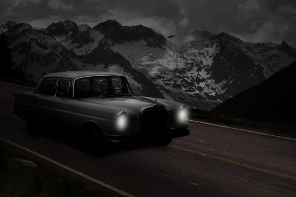
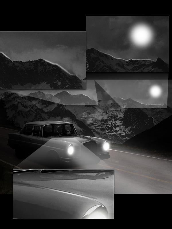
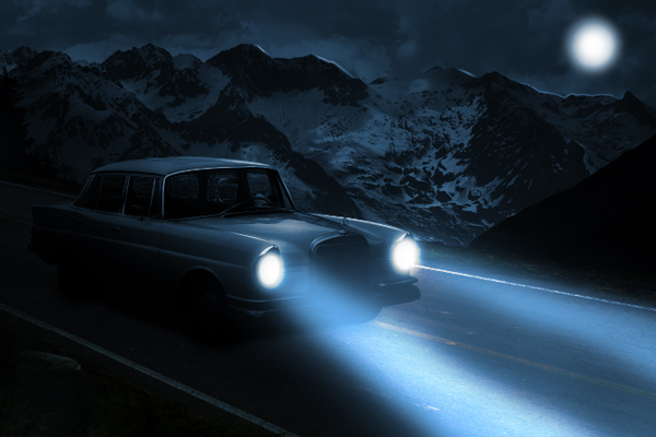
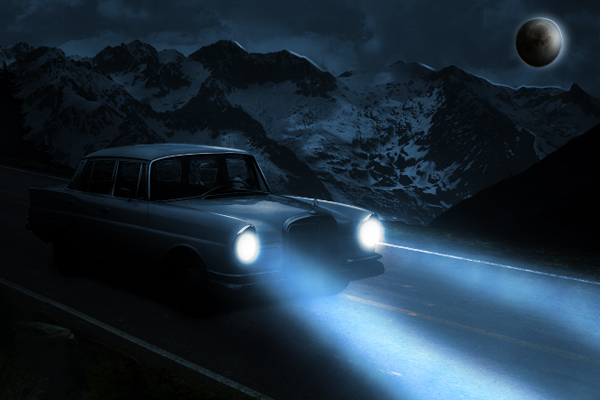
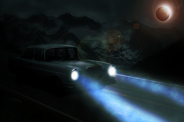
Photoshop is an excellent tool to combine several photos into one seamless image. In today’s tutorial we will use different tools and techniques to create an abandoned automobile in a moonlit night scene in Photoshop. Let’s get started!


Resources Used

You can download the following images from the links below. Just sign up for free to download the image.


Step 1

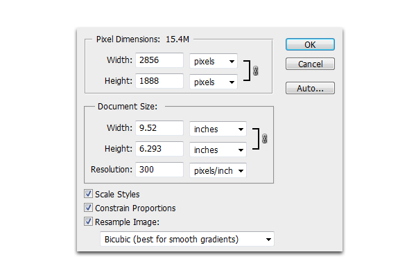
Create a new document 2856 x 1888 px in 300 dpi.


Step 2

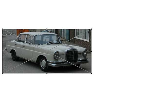
Next open Car.jpg and resize it by pressing Cmd/Ctrl + T. Place the car on the left portion of your canvass as shown.


Step 3

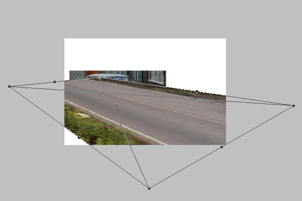
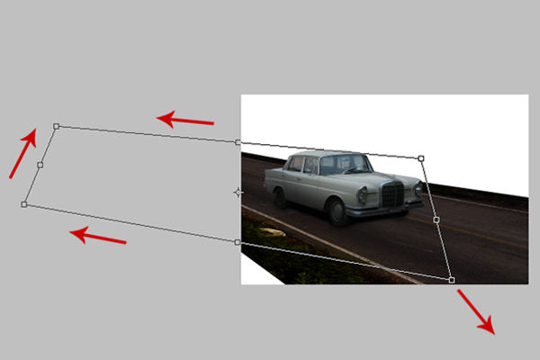
Open Road.jpg, then press Cmd/Ctrl + T. Once the resizing handles have been activated, right-click and choose Free Transform from the dropdown menu.


Step 4

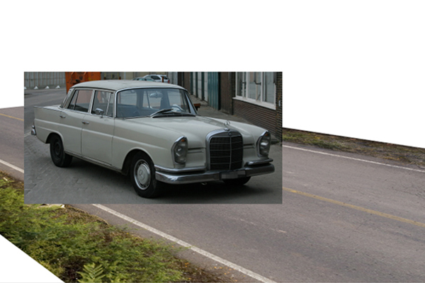
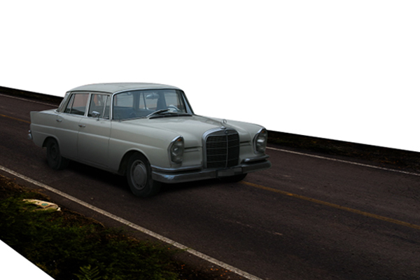
After that, make sure to place the Road.jpg’s layer below the Car.jpg as shown below. Make sure that the car’s perspective matches that of the road and vice-versa. Use the resizing handles, Cmd/Ctrl+T, just in case you still need to adjust the images.


Step 5

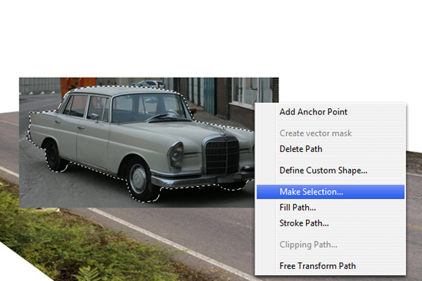
Next, use the Pen tool (P) to trace all the way around the car. Then, right-click and select Make Selection from the dropdown menu. Next, hold Cmd/Ctrl + Shift + I to inverse the selection, then hit delete.


Step 6

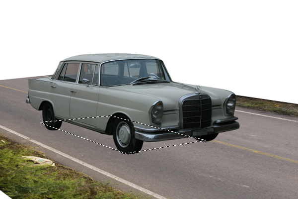
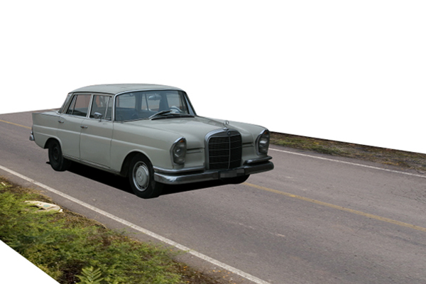
Next, create a new layer above Road.jpg layer and name it "Primary Shadow." Using the Pen tool (P), make a rectangular shape in line with the perspective of the road as shown. This will serve the primary shadow of the car.


Step 7

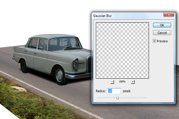
After that, go to Filter > Blur > Gaussian Blur and apply the settings as shown below for the "Primary Shadow."


Step 8

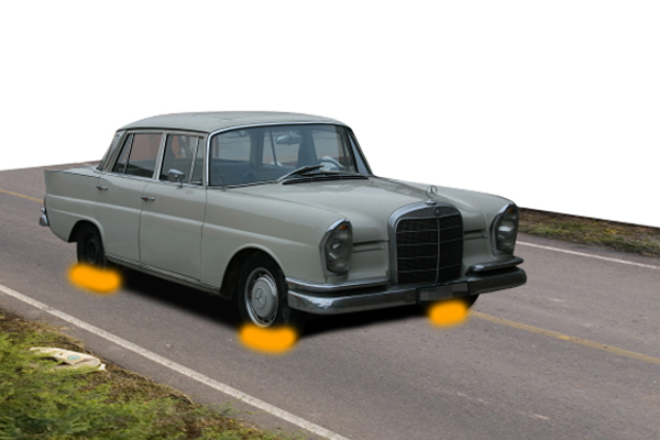
Next, select the Brush tool (B) with a size of 60 px, a Hardness of 20% and color #000000, brush the areas indicated below.


Step 9

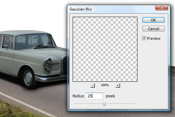
Next go to Filter > Blur > Gaussian Blur and change its radius setting to 25px.


Step 10

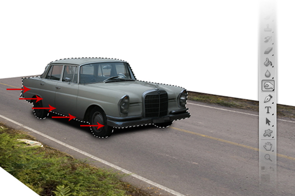
Use the Burn tool (O) to burn the indicated areas of the car using a mid-sized brush with a low level of hardness.


Step 11

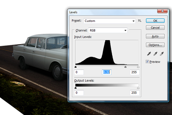
Next, let’s darken Road.jpg to match the darkness of the car . To do this, hold Cmd/Ctrl + L to activate the Levels window. In the Levels window, input the values indicated below.


Step 12

The next step would be to extend the road further backward. To do this, first duplicate Road.jpg by pressing Cmd/Ctrl + J in the Road.jpg’s layer. Next, press Cmd/Ctrl + T to activate the resizing handles. Once activated, right-click and select Free Transform from the dropdown menu. Adjust the road to fit to the perspective of the first road.


Step 13

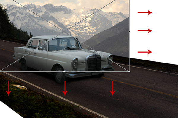
Now let’s add a background. First, open Mountain.jpg and place it below Road.jpg. Press Cmd/Ctrl + T to activate the resizing handles. Once activated, resize the image as shown below. After resizing, go to Image > Adjustments > Desaturate.


Step 14

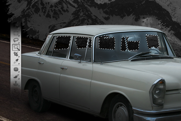
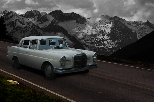
Use the Magic Wand tool (W) to select the areas shown below then hit delete.


Step 15

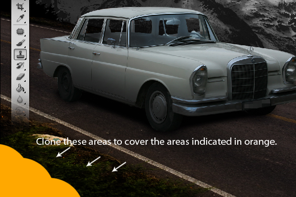
Next, use the Clone Stamp tool (S) to clone the areas indicated and transfer the cloned areas to the indicated areas in orange.


Step 16

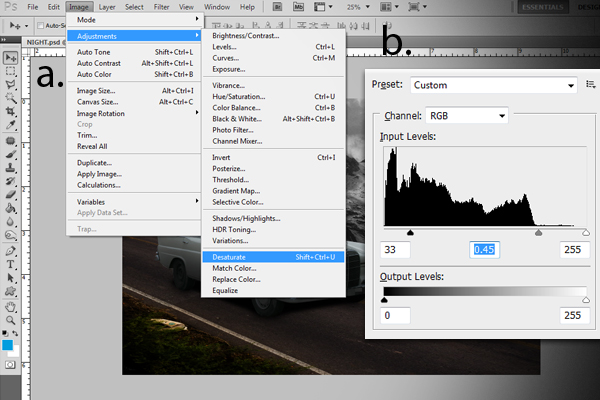
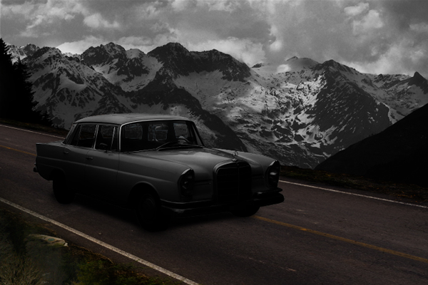
Next, go to "Car.jpg" layer, then go to Image > Adjustments > Desaturate, After desaturating, press Cmd/Ctrl + L to activate the Levels window. From the Levels window, change the values as indicated below.


Step 17

Create a new layer and name it "Black Shade." Using the Brush tool (B), set to 1400 px with 0% hardness and color #000000, brush the areas indicated below. After that, decrease its Opacity level to 62%.


Step 18

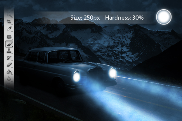
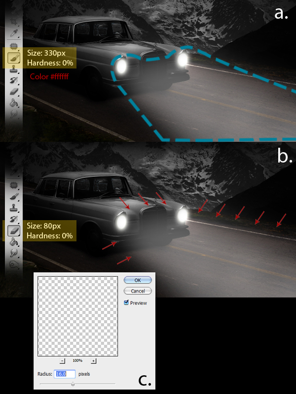
Now we’ll add the light effects for the car’s headlights. First add a new layer and name it "Base light", then using the Brush tool (B) set to a master diameter of 60 px, a hardness of 0% and color #ffffff, brush the inside parts of the headlights. After that, go to Filter > Blur > Gaussian Blur and change its radius value to 60 px.


Step 19

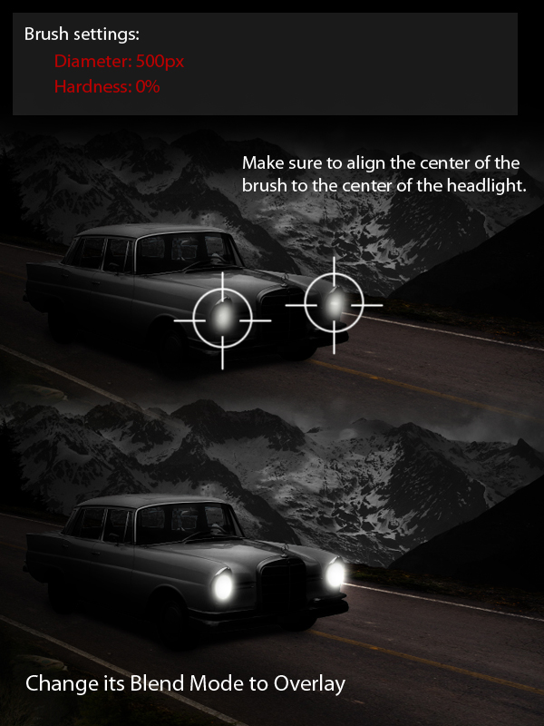
Next, add a new layer and name it "Secondary light", then using the Brush tool (B) set to a master diameter of 500px, a hardness of 0% and color #ffffff and paint as shown.


Step 20

Add a new layer and name it "Extended light-1" then using the Brush tool (B), brush the indicated areas as shown below, Then, using the Eraser tool (E), erase the indicated areas. Lastly go to Filter > Blur > Gaussian Blur and apply the indicated value. Decrease its opacity level to 40%.


Step 21

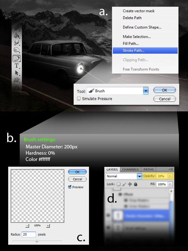
Now it is time to add more light coming from the headlights. First add a new a layer and name it "Extended light-2." Instead of using the Brush tool (B), we’ll be using the Pen tool (P). First, define a path from the headlight to the road. Next right-click and select Stroke Path from the dropdown menu. From the Stroke path window, select the Brush tool. Prior to doing this, make sure to change the brush settings with the values indicated. Next, go to Filter > Blur > Gaussian Blur and apply the values as indicated. Lastly, change the opacity level to 20%.


Step 22

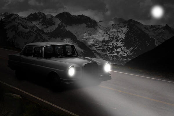
The next step is to add the moon. First add a new layer and name it as "moon." Using the Brush tool (B), set to a size of 200px, a hardness of 0% and color #ffffff, brush a small area in the upper right corner of our image, just as shown. After that go to Filter > Blur > Gaussian Blur and change the value of the radius to 18px.


Step 23

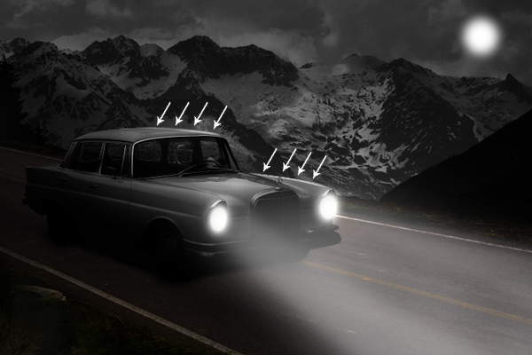
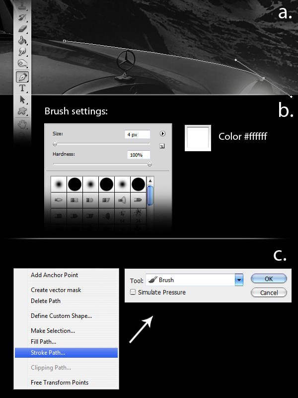
Next, add the surface reflection lights from the moon to the car’s body and also to the mountain ranges. To do this first add a new layer and name it as "Light lines." Using the Pen tool (P), define a path just like as shown in a. Make sure to change the brush settings with the values indicated in b prior to creating the path. After defining the path, right-click and choose Stroke Path from the dropdown menu. From the Stroke path window, select the Brush tool.

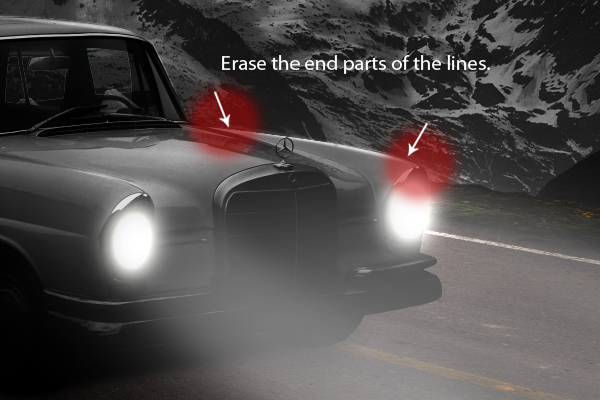
Finally, using the Eraser tool (E), erase the both ends of the lines.

Apply light using the same technique to other parts of the car where light might hit. Change the layer blending mode to Overlay.

Do the same for the mountain ranges. Set blending mode to Normal.


Step 24

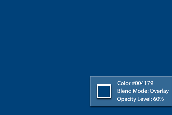
Next, add a new layer and name it "Blue tint." Using the Paint Bucket tool (G), fill the entire image with #004179. After that, set its Blending mode to Overlay and change its opacity level to 60%.


Step 25

Next, using the Brush tool (B) set the values as indicated below, brush a small spot over the moon.


Step 26

Next, duplicate "Extended light-2" and place it over the "Blue tint" layer. Increase its Opacity level back to 100% and change its Blending mode to Overlay.


Step 27

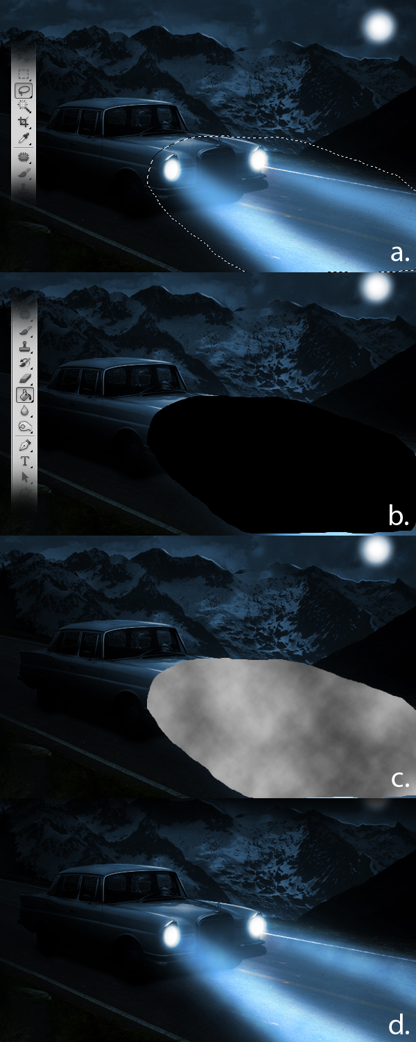
Next, add a subtle smoke effect in front of the car. To do this, first add a new layer and name it "Smoke." Next, using the Lasso tool (L), define an area as shown in below. Next, using the Paint Bucket tool (G), fill the entire selection with color #000000. Then go to Filter > Render > Clouds. Lastly, change the layer’s Blend mode to Overlay and decrease its Opacity level to 40% then use the Eraser tool (E) to erase some remaining hard edges.


Step 28

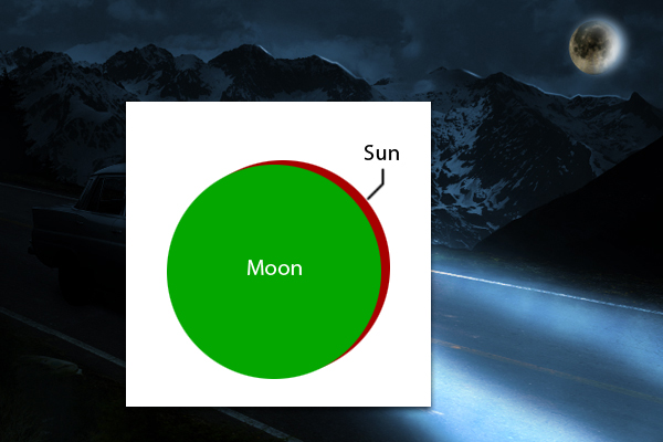
Next, Moon.jpg. Press Cmd/Ctrl + T to activate the resizing handles and resize the Moon as shown. After resizing, move the Moon slightly to the lower left corner.


Step 29

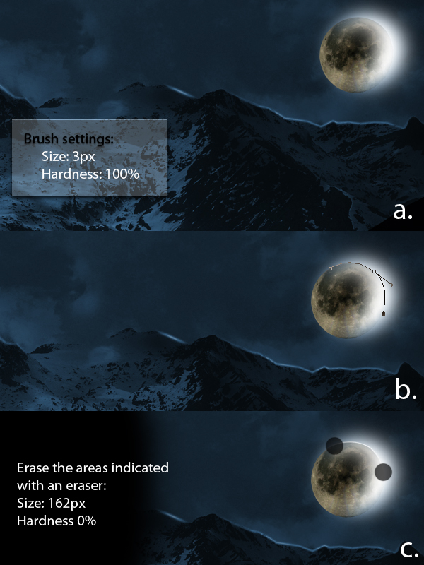
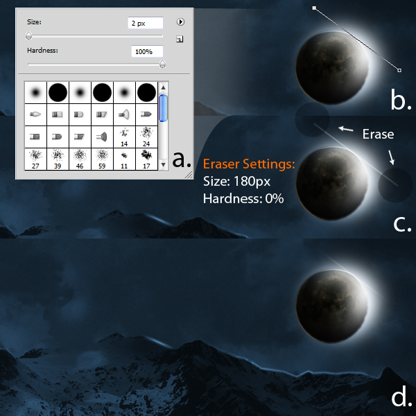
Next, select the Brush tool (B) and change its values as indicated below. Then, using the Pen tool (P), make a path on the upper right corner of the moon as shown. Finally, using the Eraser tool (E), erase the end parts of the path we’ve created.


Step 30

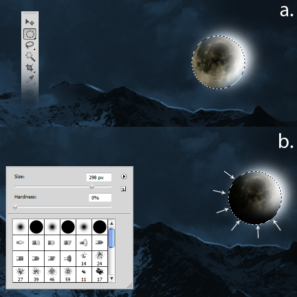
Using the Elliptical Marquee tool (M), make a circle just right with the size of the moon, a. You can hold down the Shift key to create perfect circles. Next, using the Brush tool (B) set to a size of 298 px, hardness of 0% and color #000000, brush the lower left corners of the selection we’ve made.


Step 31

Apply the following brush settings. After that, use the Pen tool (P) to draw a path as shown. After defining the path, right-click and choose Stroke Path from the drop down menu. From there, choose Brush as the tool of reference. Next, using the Eraser tool (E) with the indicated values, erase the areas as indicated.


Step 32

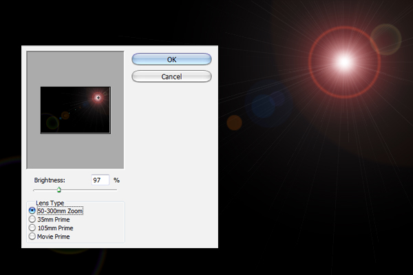
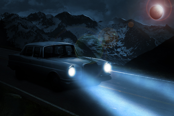
Next, add a new layer and name it "Lens Flare." Using the Paint Bucket tool (G), fill the entire image with color #000000. Next go to Filter > Render > Lens Flare and change the values indicated below. Finally, change its Blending mode to Screen and decrease its Opacity level to 70%.


Step 33

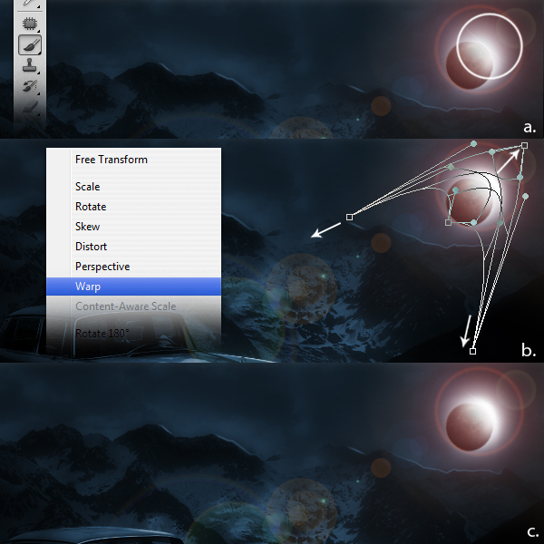
Create a new layer and name it "Additional Light." Using the Brush tool (B) set to a size of 250 px, a Hardness of 0% and color #fffffff, brush a small portion on the indicated area. Next, press Cmd/Ctrl + T to activate the resizing handles then right-click and select Warp from the dropdown menu. Warp the selection as shown.


Step 34

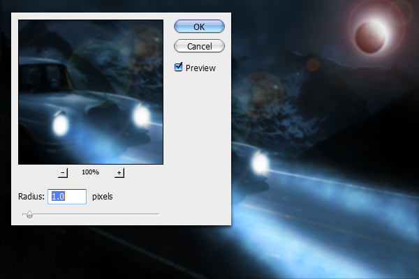
The next step is to duplicate all layers except the "Lens Flare" and "Additional Light" layers. Once duplicated, merge all these layers by right-clicking and selecting Merge layers from the dropdown menu. Next go to Filter > Blur > Gaussian Blur and change the value with the one indicated below. Finally, decrease its Opacity level to 51%.


Step 35

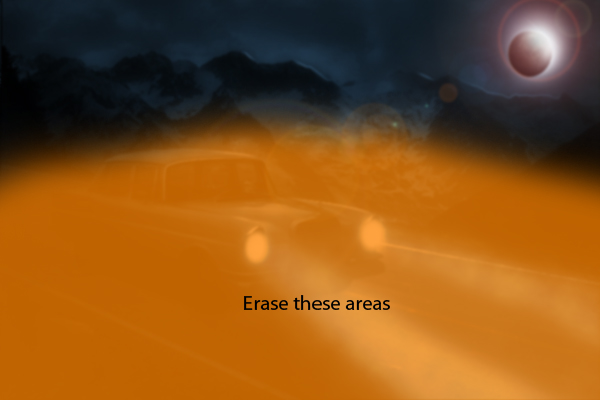
Erase the areas indicated below.


Step 36

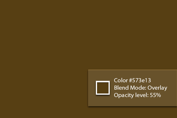
Finally, add a new layer and name it "Brown tint." Next, using the Paint Bucket tool (G), fill the entire image with color #573e13. Next change its Blend mode to Overlay and decrease its Opacity level to 55%.


Final Image

Flash for Android: Flixel Frogger on Nexus One and HTC Evo

In this screencast I show off how Frogger, which I built using Flixel, runs on a Nexus One with Android 2.2 and a HTC EVO running 2.1. Both play the same but the EVO feels more responsive due to the better touch response and larger screen.


Screencast: Frogger

Don’t like ads? Download the screencast, or subscribe to Activetuts+ screencasts via iTunes!

Don’t forget you can tart up your desktop and mobile devices with the Flash for Android Wallpaper!

20 High Rez Concrete Texture Sets – CG Premium Content Pack

Today we have 20 incredible high resolution concrete texture sets available exclusively to Premium members. Hand crafted from original photos by CGTuts+ author Clinton Jones, each of the 20 texture packs contains all of the different passes required to render stunning materials in all rendering engines. If you ever use realistic textures in your CG art, then this content pack is perfect for you! Learn more after the jump!

CG Tuts Content Pack 1

This new CG Premium content pack (415mb in total) was created by Clinton Jones and is available for CG Premium members to download immediately. Clinton Jones is a regular author at CGTuts+, and creates professional quality photo sourced textures on a regular basis. We are very excited to partner up with him on this release!


CG Premium Membership

The Tuts+ network runs a membership service called Premium. For $9 per month, you gain access to exclusive high quality screencast tutorials, extra project and source files, and awesome downloadable content packs like this one at CGtuts+, Psdtuts+, Vectortuts+, Audiotuts+, Nettuts+ and Aetuts+! For less than the price of a movie, you’ll learn from some of the best minds in the business all month long!!. Become a Premium member today!


Don’t miss more CG Premium tutorials and content packs, published weekly – subscribe to Cgtuts+ by RSS.

Blogging Advice for More Prolific Writing

Like in any other trade, there are certain methods and tricks a blogger could follow to blog more productively and efficiently. Here are six quick nuggets of blogging advice to increase your writing output.

1. Writing tools

Since 70-80% of blogging is creating content, a blogger needs to know how he could write in less time without compromising on quality. Hence, making use of some power writing tools is suggested.

2. Control Email Usage

Most of the bloggers frankly confess to being addicted to email. We’ve covered managing email overload before and those tips should help.

3. Write Every Day

Write every day. No, you don’t need to publish every day – but write every day. That helps you stay in the flow and also, it ensures that you have an oversupply of articles. Check out this nice article by Daily Writing Tips on how to write everyday.

4. Delegate When Possible

Your blog is your baby but if it’s getting too overwhelming to manage it, it’s time you bring in other people. That’d be good for your blog as well.

5. Avoid Information Overload

Bloggers need to consume more information than the average internet surfer. It’s a part of what they do. And hence, they need to take extra care to avoid getting buried under information overload. Check these tips to avoid information overload.

6. Enjoy the Process

Lastly, blogging is fun only when you enjoy doing it. If you worry too much about things like traffic, reputation, competition and all, it won’t be fun anymore. And then, no matter what you try, it’d be really hard to execute tasks productively.

7 Reasons to Switch to the Dvorak Keyboard Layout

“Something’s wrong with your keyboard,” a friend borrowing my laptop would say. “When I type, all that comes out is gibberish!”

“Nothing’s wrong with my keyboard,” I would reply with a grin. “It’s the layout on your keyboard that’s wrong!”

Click image to enlarge.
What usually follows is a long lecture on how the Dvorak keyboard layout is better than QWERTY in every way. My friends usually humor me — this has happened several times — but I’ll spare you the sermon and make it short. Out of the hundreds of reasons you should switch to Dr. Dvorak’s layout, here are seven:

1. QWERTY was designed for the typewriter, not the typist.

Christopher Sholes, who invented the typewriter, found that early prototypes of his invention had a mechanical flaw: When he struck neighboring keys in rapid succession, the typewriter jammed. He needed to replace the initial alphabetical layout with one that separated keys often struck successively. Thus the QWERTY layout was born. This did not solve the problem entirely, but it made the machine jam a lot less.

Good for the typewriter. But what about the typist? While QWERTY was designed so that the typewriter could work, Dvorak was designed so that the typist could work well.

2. Dvorak increases your speed.

Typists base their fingers on the home row of the keyboard. If you want to increase typing speed, the home row is where you place the most commonly typed keys . Which is exactly what Dr. Dvorak did in his layout — 70% of keystrokes are on the home row; 22%, on the top row; 8%, on the bottom.

In QWERTY, only 32% of keystrokes are on the home row. Which means most of the time, typists’ fingers are either reaching up for the top row (52%) or down for the bottom row (16%). So not only does QWERTY do nothing for typists, it actually hinders them.

Dvorak further increases typing speed by placing all vowels on the left side of the home row, and the most commonly used consonants on the right side. This guarantees that most of your strokes alternate between a finger on your right hand (consonant) and a finger on your left (vowel). Alternating between fingers from either hand is faster — just imagine texting with one hand or drumming with one stick.

3. Dvorak lessens your mistakes.

Not only is Dvorak faster than QWERTY, it’s also more accurate. Errors occur more when you type away from the home row, or consecutively with the same finger. When you combine the two problems (using the same finger to type consecutive letters not on the home row) you make even more mistakes.

Reaching away from the home row, typing consecutively with the same finger — these happen more often in QWERTY. And so do mistakes.

4. Dvorak is more comfortable and better for your health.

Although its only your fingers that do the extra reaching in QWERTY, the distance adds up. A study compared the distance traveled by the fingers of two typists in performing the same task. In Dvorak, the typists fingers traveled 1.5 km per day; In QWERTY, 30 km per day. This extra distance increases not only the likelihood of errors but the stress on your fingers.

The discomfort is often temporary. But with the amount of typing we do today — plus the prevalence of QWERTY keyboards — it is not uncommon for the pain to progress to repetitive strain injury. Some RSI sufferers have reported some relief from taking breaks, doing stretches, improving posture, and of course, switching to Dvorak.

5. Switching to Dvorak is easier than ever.

Studies have shown that Dvorak is easier to learn than QWERTY. If you already touchtype with QWERTY, it’s even easier, because you already have the finger coordination needed for touchtyping. There are online resources on learning Dvorak and a ton of typing games for practice.

But where do you get the keyboards? Today, keyboards with the Dvorak layout (or that can switch to Dvorak) are available if you wish to buy one. But you won’t even have to. Most operating systems allow users to make Dvorak their default keyboard layout. You can also make it easy to switch between layouts, but trust me — you won’t want to.

6. Dvorak is cool.

Aside from getting friends and coworkers to type gibberish on your computer (a useful security measure, by the way) Dvorak has other cool benefits. Using Dvorak puts you in an exclusive club — like having a Mac instead of a PC. But aside from mere prestige, you can flaunt your productivity and the ease with which you attain it.

You’ll also be in the company of some cool people, including Bram Cohen, inventor of BitTorrent; Matt Mullenweg, lead developer of WordPress; and Barbara Blackburn, world’s fastest typist.

7. Using Dvorak is a noble cause.

Dr. Dvorak created something great, but he died in vain.

“I’m tired of trying to do something worthwhile for the human race,” he said, realizing his failure to convince people to adopt his layout. “They simply don’t want to change!”

QWERTY has remained the default keyboard layout for over a century. It has outlived the purpose for which it was designed, yet its weaknesses still remain. By switching to Dvorak, you are joining a movement that empowers typists and honors the legacy of a great man.

Friday Photo Critique #46

Friday Photo Critique is our weekly community project, where we publish a photograph submitted by one of our wonderful readers, then ask you all to offer constructive feedback on the image. It’s a great way to learn more about photography, express your viewpoint, and have your own image critiqued!

Quick Ground Rules

  1. Play nice! We’ve deliberately chosen photographs that aren’t perfect, so please be constructive with any criticism.
  2. Feel free to offer any type of advice – composition, lighting, post-processing etc.
  3. You can also link to photographs that you feel offer a great example of this type of image shot exceptionally well.
Without further ado, here is this week’s candidate for Friday Photo Critique!

The Photograph

Photo Critique

Photographer: Stefan de Graaf

Please let us know what you think in the comments – how would you have approached the scene or taken the photo differently? A massive thank you to everyone who commented last week.

The most constructive and helpful comments will be featured on the site. Interested in submitting your own photo? You can do so here!

HTML5 for Web Designers: Book Review


HTML5 is all the buzz right now: some people think you need to wait until it’s “complete” to use it, while others are pushing the envelope and using what the browsers are supporting right now. If you’re not following the HTML5 hype and aren’t familiar with what’s so exciting, today’s book review will give you a great source to turn to: “HTML5 for Web Designers.


What’s It About?

It should be obvious what this book is about: HTML5. However, that’s a broad, tangential topic. More specifically, HTML5 for Web Designers is supposed to be a super-condensed, easy-reading version of the HTML5 spec, with a huge scoop of practicality stirred in. I’ve included a few quotes in this review so you can get an idea of what it’s all about.


Who Wrote It?

Jeremy Keith

HTML5 for Web Designers was penned (well, probably typed) by the brilliant Jeremy Keith. If you’re not familiar with Jeremy Keith, you’ve been missing a lot on the web. He’s an Irish web developer, the technical director at Clearleft, a web development firm in Brighton, England. He’s done a lot of work with Microfomats; for more by Jeremy, you should really check out his blog, Adactio. Mr. Keith was interviewed by Dan Benjamin and Jeffrey Zeldman on the Big Web Show, talking about why the book was written, why Jeremy was chosen to write it, and a lot of other fun stuff.

Listening to that podcast, you’ll agree that Jeremy Keith was definitely the right guy to write this book. If you’ve never read anything by Jeremy Keith before, then a small piece of your web-developer self has yet to be born. Nothing in this book could be more practically explained. The website says it well:

In this brilliant and entertaining user’s guide, Jeremy Keith cuts to the chase, with crisp, clear, practical examples, and his patented twinkle and charm.

You have to love all the fun quips Mr. Keith sprinkled in, from the subtle “an array of programmers” to the more obvious “If you ever use the autoplay attribute in this way, I will hunt you down.”


What’s In The Book?

The Pages of HTML5 for Web Designers

The table of contents shows what exactly you’ll read in this book:

  1. A Brief History of Markup
  2. The Design of HTML5
  3. Rich Media
  4. Web Forms 2.0
  5. Semantics
  6. Using HTML5 Today

Chapter 1: A Brief History of Markup

You might think such a concise book wouldn’t have room for a chapter on the venerable past of HTML . . . but you couldn’t be farther from the truth. In the very first chapter, Jeremy Keith takes you back to the beginning. He clearly explains the path from HTML 2.0 (there never was a version 1) right up to HTML5, visiting famous stops such as HTML 4, XHTML 1, and XHTML 2. He gives a great explanation of why it’s not reasonable to wait for full HTML5 support before using it.

After HTML 4.01, the next revision to the language was called XHTML 1.0. The X stood for “eXtreme” and web developers were required to cross their arms in an X shape when speaking the letter. No, not really. The X stood for “eXtensible” and arm crossing was entirely optional.


Chapter 2: The Design of HTML5

Before diving into too much nitty-gritty, Keith expains some of the philosophies behind HTML5. Among other things, he explains why the new doctype makes sense (and why doctypes are really irrelevant), what’s been removed since HTML4, and how some elements have changed their identities. One of the most interesting parts of this chapter is his explanation of why there are no longer any deprecated elements, only obsolete ones. And don’t miss the section on the new JavaScript API; I won’t spoil it, but I’ll tell you this: fun, fun, fun.

With HTML5, anything goes. Uppercase, lowercase, quoted, unquoted, self-closing or not; it’s entirely up to you.


Chapter 3: Rich Media

I think we’d all agree that the new media offerings in HTML5 are some of the most exciting additions . . . and some of the most controversial. If any of that controversy is caused by a lack of understanding, this chapter will make it all clear. Jeremy very clearly explains all you’d care to know about the canvas, audio, and video tags. He’ll steer your through the murky waters of patchy support and poor accessibility and show you how to use these features successfully.

Fortunately, there’s a way to use the audio element without having to make a Sophie’s Choice between file formats. Instead of using the src attribute in the opening <audio> tag, you can specify multiple file formats using the source element instead.


Chapter 4: Web Forms 2.0

This chapter is about one of the biggest parts of HTML5: forms. Usually, forms are a rather boring topic: not so in this book. Jeremy will take you through each one of the attributes and types of input, as well as teach you how to check for a browser’s support of these new features. You’ll be enlightened to read about why HTML5 includes things like native form validation, and whether or not you should style the new UI elements (Well, you can’t, but he answer the question “Should you want to?”).

I can see why the autofocus attribute has been added to HTML5—it’s paving a cowpath—but I worry about the usability of this pattern, be it scripted or native. This feature could be helpful, but it could just as easily be infuriating. Please think long and hard before implementing this pattern.


Chapter 5: Semantics

This is probably my favourite chapter; to start out, Mr. Keith discusses the issues behind the extensibility of HTML: should you be able to create your own tags, like in XML? Are there other ways to bring meaning to elements? He goes on from there to introduce several of the new elements that HTML5 brings to the table, and shows you how to use them correctly.

Before reading this book, I was somewhat confused about the roles of the new structural elements—things like section and article. Well, colour me enlightened; Jeremy Keith’s explanation will make it all clear. If you really want to challenge yourself, read his explanation of HTML5′s outline algorithm.

Back in 2005, Google did some research to find out what kind of low-hanging fruit could be found on the cowpaths of the web.
A parser looked at over a billion web pages and tabulated the most common class names. The results were unsurprising. Class names such as “header,” “footer,” and “nav” were prevalent. These emergent semantics map nicely to some of the new structural elements introduced in HTML5.


Chapter 6: Using HTML5 Today

It’s nice to know all the theories and specs, but can we really use it? today? As you’ll see, the short answer is “yes”; the long answer is, well, you’ll have to read the book. What’s supported? What’s can you use now? What workarounds are available? It’s all in here, and you’ll be up and running in no time.

I hope that this little sashay ’round HTML5 has encouraged you to start exploring this very exciting technology. I also hope that you will bring the fruits of your exploration back to the WHATWG.


The Summary

It’s amazing how much is actually covered on these subjects in only 85 pages. You’ll learn everything from the history of HTML to how to correctly use the <b> and <i> tags (eh? yes, their back in HTML5). If you want to “try before you buy,” you can check out the first chapter at A List Apart.

Is there anything I’d change in this book? I can’t find anything to complain about; both the publishers and the author are individuals known for their amazing quality of work, and HTML5 for Web Designers is just one more testament to their skill.


Who’s the Book For?

If you’re a web developer, you’ll appreciate this book’s practical knowledge and solid explanations of why things are the way they are. If you’re primarily an experience designer, this book will give you a good grip on using HTML5 semantically and accessibly. If you’re interested in the history of HTML, that’s here. And if you just want a small but elegant book for your shelf, look no further.

In sum, if Nettuts+ is one of your regular web stops, you absolutely must buy HTML5 for Web Designers.

Or, what if you’ve already bought it . . . and read it. If that’s the case, how’s my analysis? Is there anything about the book that you would change?

HTML is the most important tool a web designer can wield. Without markup, the web wouldn’t exist. I find it remarkable and wonderful that anybody can contribute to the evolution of this most vital of technologies.

Openinviter/sharetronix Integration

What I need is to have this integrated so when a user sends invitations using openinviter, it will also include a personal url that is generated for ever user.

This is the code snippet that would generate the url:
<?= $D->invitation_link ?>

http://sharetronix.com/sharetronix/download
http://openinviter.com/download.php

You would need to download both scripts (both are free)
Integrate the two and send me instruction on how to do it.

Website Posting

We believe everyone is good at something. This position is for every freelancer out there.

We need 1000 micro job workers for our newly launched site, please register and post what you can do at http://gigbux.com. The posting has to be real, not sample ones.

Note:

Each micro job worker should not post more than 10 gigs, please bid on what you’d charge per 10 gig postings.