In this quick tip we’re going to learn how to use layer styles to create cool looking text inside After Effects for your next project. Enjoy!
Quick Tip
Download Tutorial .flv
File size 16.5MB
Freelance Projects, Design and Programming Tutorials
In this quick tip we’re going to learn how to use layer styles to create cool looking text inside After Effects for your next project. Enjoy!
File size 16.5MB
This tutorial will show you how to fake the look of a low budget or homemade stop motion animation using 3dsmax and after effects. No plug-ins are needed.
You can find a real world example of this such effect here or here.
We will simulate the things that give a away an old fashioned stop motion animation which are:
File size 298MB
No matter what instrument you play there’s nothing quite like the satisfaction of working out your favorite solo by ear. Here’s 10 apps to help out with those tricky bits!
Working out riffs and solos by ear is an essential part of learning your craft as a musician. Not only does it train you ears to recognize intervals and chords that you hear on record but it also serves a much greater purpose, it helps you work out and deliver what’s going on in your head! Your ears are your biggest asset as a musician so putting them through their paces by transcribing is good practice.
As a young guitarist I was glued to my tapedeck. Play, rewind, play, rewind (add infinitum!). I spent an unhealthy amount of time working things out by ear. Don’t forget this was way before the Internet was invented and even TAB was a bit of a rarity. Play, rewind, play, rewind (add infinitum!). This is just the way we rolled back in the day!
I can vividly remember sitting at my tape player working out some Gary Moore solo and thinking, “I wish I could slow this down to half speed”. A couple of years later my younger brother (who also played guitar) got a Marantz PMD201 (which could play at half speed) for his birthday. Needless to say he didn’t get to spend a lot of time with it!

The Marantz PMD201. The holy grail!!
Being able to slow the music down makes transcribing fast passages a whole lot easier. The only drawback with tape based systems was that the music was now an octave lower.
Now technology has moved on considerably and it’s now possible to slow the music down to a managable speed ‘without’ changing the pitch. Here’s 10 applications that do exactly that!
First up is Quicktime. It’s free for Mac and PC. Although the quality is bit shabby (lot’s of artifacting) it does the job! Just go to Window -> Show A/V Controls and adjust the playback speed.

Download audio file (QuickTimePlayer_recording.mp3)
Guitar Rig comes with the ‘Tape Deck’ component. Load in the audio and adjust the tempo. Although the quality is good it doesn’t get near to half speed, although it should be fine for less speedy phrases. Mac and PC.

Download audio file (GuitarRig4_recording.mp3)
The stand alone version of Amplitube features a file player that can be slowed to half speed. Quality is not so good but again, workable!

Download audio file (AmpliTube2_recording.mp3)
Propellerheads new Record software has a pretty awesome time stretch algorithm. Import your file and either adjust the master tempo or Alt (PC) or Option (Mac) click on the clip and drag it out to stretch it. Mac and PC.

Download audio file (Record_recording.mp3)
The Amazing Slower Downer is made by Roni Music. Costs $49.95 (demo allows you to play the first 3rd of the file!) and what you get is a pretty darn good time stretch algorithm with the ability to loop sections. The example clip is slowed to ’25%’ of it’s original speed and still sounds intact! Mac and PC.

Download audio file (AmazingSlowDowner_recording.mp3)
Amazing Slower Downer Homepage
Logic Pros new ‘Varispeed’ function will do the job pretty well for slowing down complex passages! Mac only.

Download audio file (LogicPro_recording.mp3)
Audacity is a free audio editing application for Mac, Linux and PC. Comes with timestretching capablities.

Transcribe by Seventh String Software is a nifty piece of software for transcribing chords or single note lines. Has a built in ‘note guessing’ feature which works by analyzing the frequencies of the file. The algorithms sound pretty good too. Mac, Linux and PC.

I haven’t had the opportunity to try Capo yet as I’m still on 10.5 on my Mac but I have to say it looks pretty cool as a transcribing tool. Besides the ability to slow down the track it also has another pretty cool feature. “By simply drawing atop the spectrogram, Capo will generate tablature automatically for you”. Nice!! Mac 10.6 only.

Guitar Shed by Astoundit Software is a one stop shop for all your guitar notation needs. Chord Library, TAB organiser, Tuner and track slow down feature too! Mac and PC.

Transcribing music yourself is a great way to train your ear. Analyzing the music first and creating a blueprint is a really good exercise too. Having worked as a transcriber I can tell you that the more you do it the easier it gets. It will not only help you pick up songs, chord progressions, chords voicings, scales/modes (and their positions) and musical phrases a lot faster but also help you as an improviser too.
If you have any other suggestions on this kind of software or the benifits of transcribing in general don’t hesitate to leave a comment.
So the next time you hear a cool solo don’t reach for a TAB, try and work it out for yourself. Lot’s of people are doing it, I mean where do you think TABs come from? Happy transcribing!
At Audiotuts+ we regularly put up a reader track for workshopping and critique (find out how to submit a track). This is how it works: you upload your song, and every week or so we’ll publish one here and step away from the podium. The floor is yours to talk about the track and how the artist can fix problems in and improve upon the mix and the song.
This track has been submitted for your friendly, constructive criticism. They have put their track (and their heart and soul) in your hands to learn and get useful feedback.
Description of the track:
It’s basically a rap song but with some chillout/acidjazz influences. Oh and the lyrics there are in Estonian.
Download audio file (wst_kose_kraff_-_Maailma_Kodanik.mp3)
Terms of Use: Users can stream the track for the purposes of giving feedback but cannot download or redistribute it.
Have a listen to the track and offer your constructive criticism for this Workshop in the comments section.
Need constructive criticism on your own tracks? Submit them using this form.
If you are a designer who is looking to transition from a hobby to a career, choosing the right design school may be an important decision. Today, we have gathered a list of some of the best design schools on the planet from North America, Asia, Australia, and Europe. Each school listed has some amazing programs in several design disciplines. If you have been toying with the idea of going to a design school, than this article is definitely for you.
The Art Center College of Design is located in sunny California and has been cranking out amazing designers for over 80 years. In the schools statistics report it notes that 88% of the students who graduated from the basic undergrad program have landed jobs, so that is definitely a positive. This College specializes in Advertising, Graphic Design, and Illustration programs. Some notable alumni that have graduated from the college are Dustin Edward Arnold & Sandeep Menon.

Next we will travel to New York and show you the Parsons School of Design. Their curriculum trains students to be able to solve complex problems as well as creating new innovative approaches. This school pretty much covers every facet of design from Fashion to Art history. Parsons has produced big names such as Marc Jacobs & Norman Rockwell, this is definitely the art school to attend if you can get into the prestigious institution.

Only about 19 years old, this Canadian institution has made a name for itself by providing some of the best design education in Canada. This school focuses on Graphic design as well as architecture and fashion, and its classes are lead by some of the best designers in the area. So if you live in Canada and are thinking about attending a design school then you might want to consider this one.

This is another Canadian institution providing some of the best art education out there. This school focuses how to prepare students to apply their design skills in real life situations. The curriculum focuses on all the basic types of design as well as video game creation and fashion marketing. This is another solid school to consider if you are living in the area.

Pratt Institute located in New York has a huge selection of design associated programs. From the common Graphic Design to Digital Arts, and Interior design, it is all covered at Pratt. The institute has a long list of distinguished alumni that you can view here.

The Rhode Island School of Design is another well-known college that focuses on Graphic Designing. If you choose to enroll you will be engulfed in the fine arts learning about everything from Typography, to Design Theory. You can earn your Bachelors of Graphic Design in 5 years at the school, which will mean you are proficient in the arts. This school also has a very long list of noteworthy alumni which you can check out here.

Now that we wrapped up North America we can move onto Europe, and Central St. Martins is a great art and design college in the UK. This is one of the more prominent design schools in Europe having ties to many creative industries around the world. This school offers many different design programs that you can choose from if you decide to go. The notable alumni’s that have graduated from this college can be viewed here.

The University is over 138 years old and is dedicated to many different forms of design like media art, and motion graphics. You will definitely get a well-rounded education in this school because of its renowned curriculum.

This Swedish institute has a multitude of interesting design orientated classes and is renowned as the best art school in all of Sweden. The institute was even featured as one of the best design schools in the world 2 years running by BusinessWeek. Only about 14 students are accepted annually to their bachelors program so this is definitely a hard school to get into, but you won’t regret it if you do.

With their school mantra being “Mind over Matter” we can already tell this school is dedicated to learning. Although it is not known for its graphic design program, the school is recognized for architecture and industrial design.

This design academy in Italy is focusing on the future of design, it has amazing international programs accepting many students from other countries to come and study in Italy. The school has some impressive galleries of past students work in fields like Graphic and Industrial design. Classes are equipped with the latest models of all your favorite programs, so look into this school if you are in the area.

This academy located in the heart of Paris trains designers to think ahead and focus on the future of their fields. All the basics are covered in this school and then some other alternative majors as well. This is a great school for those who want to or already do live in France, so make sure to check it out if you are interested.

Our first Institute in Asia was recently rated one of the top 25 Schools on the continent. The NID focuses in providing its students with the very best design programs. They even offer some postgraduate work in 14 different design fields. The school only consists of about 300+ students, so it is a difficult one to get accepted into.

The core values of this institute are centered around what they call Humanistic Designs. The university preps its 1200 students to become strategic thinkers in regards to their art. This school has taught many now prominent designers which you can view here.

Even though this university is in China it offers a broad range of international programs. While its main art focus is in architecture it still offers classes for advertising, graphic design, and animation.

This 25-acre campus features one of the best design schools in India. The university explains what it means to be a designer and then teaches the students how to be a good artist, as well as a thinker. The school features all the major design fields and also focuses on making their students as well rounded as possible.

The Australian Academy of Design will give you a wide selection of majors to choose from in the art field. Each discipline has its own bachelors program and a strong curriculum surrounding it, this school immerses the student in a great environment. The school also supports international students, so it is a plus for anyone who wants to study in Australia.

This massive school holds a whopping 44,000 students but it is considered to be one of the best design schools in Australia. This university also offers an international program for overseas students, and its current courses focus on Photography, Graphic Design, and even Jewelry. This is another great choice if you are in the area and want to go to a design school.

If you are interested in checking out more design universities in your area please use this great directory created by Core77.
Last week, in Chicago, we held our first ever Envato meetup with our Australian, American, Canadian, and European staff. During the week, we held a community meetup with a group of Envato authors and readers at a local pub. We really enjoyed getting to meet our community and would like to judge your interest for more meetups. Would you like to attend a meetup if we held one in your area?
Right now, we are considering holding an initial meetup in New York City and possibly additional events in other major metropolitan areas. Please feel free to cast your vote and let us know what you think in the comments.
Would you like to attend an Envato meet up?survey software
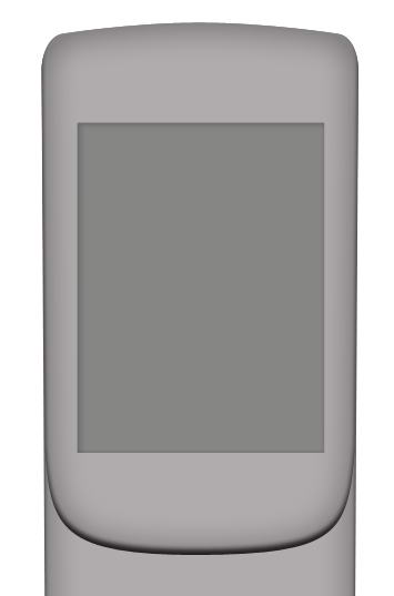
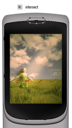
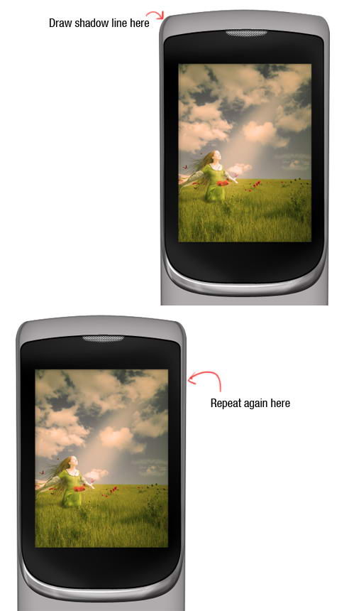
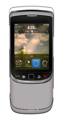
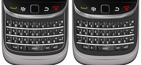
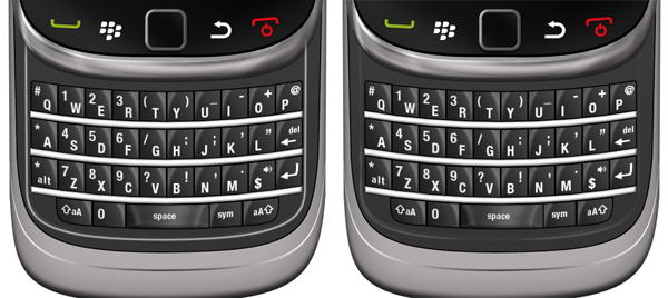
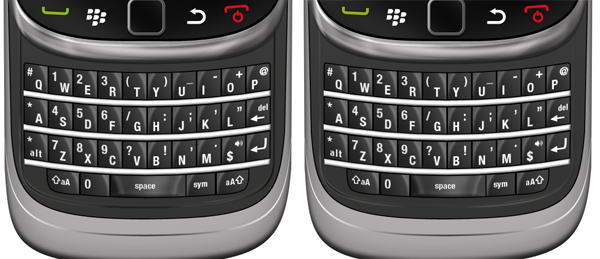
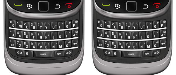
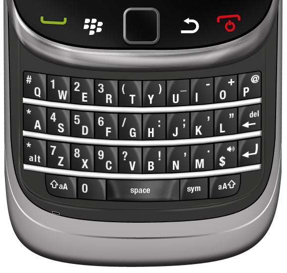
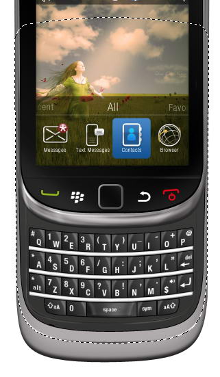
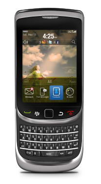
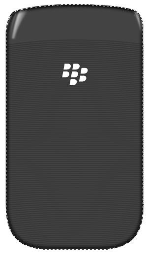
In this tutorial, we will draw a highly realistic blackberry torch using Photoshop and Illustrator. We’ll use Photoshop for basic shapes and shading and Illustrator for more complex shapes. Let’s get started!
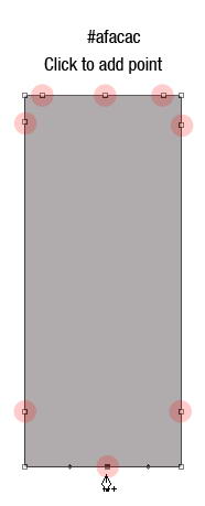
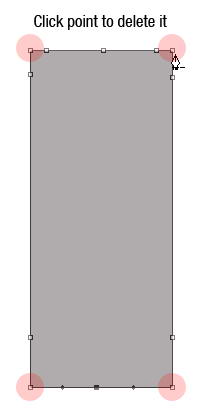
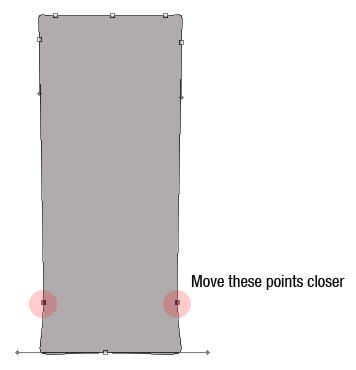
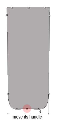
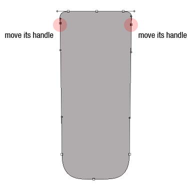
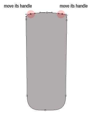
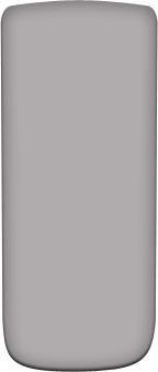
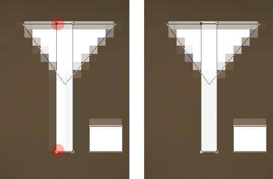
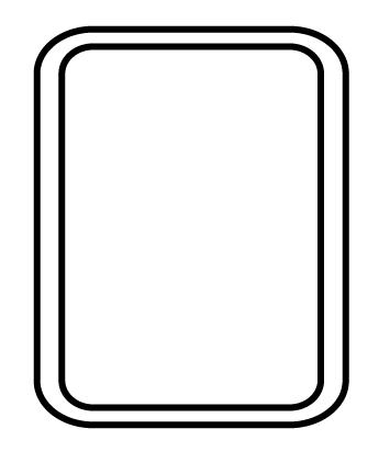
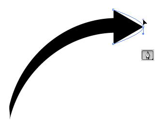
Let’s start by creating the basic shape of the phone. There are many methods to do this. I always find it easier to use a basic shape and modify it. In this case, I start by creating a rectangular shape with color #afacac then add some points, remove unneeded points, and modify its handle. See image below to see how I did it.
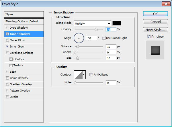
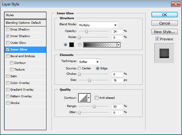
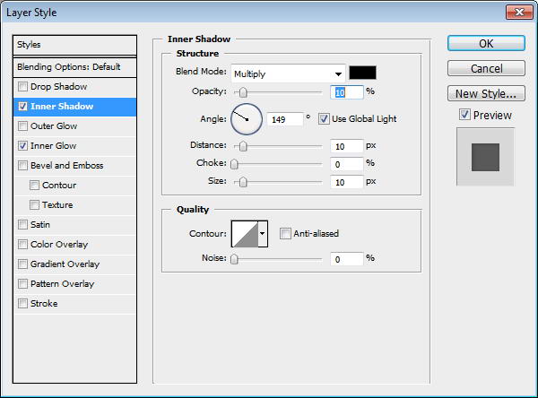
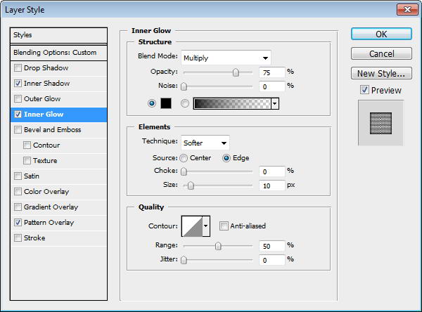
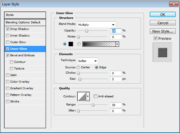
Add layer styles Inner Shadow and Inner Glow.
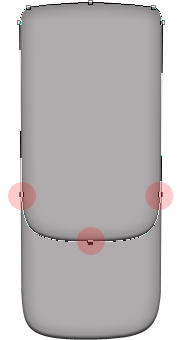
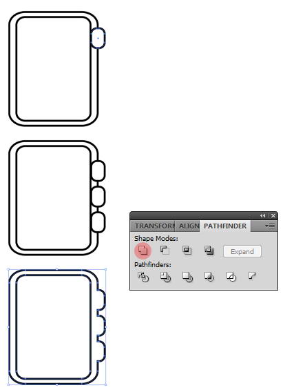
Duplicate shape by pressing Cmd/Ctrl + J. Use direct selection tool to select three points indicated below and move them upward. This is going to be phone’s front face.
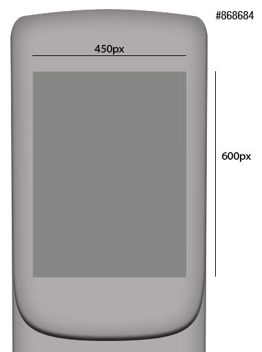
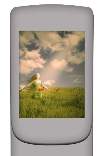
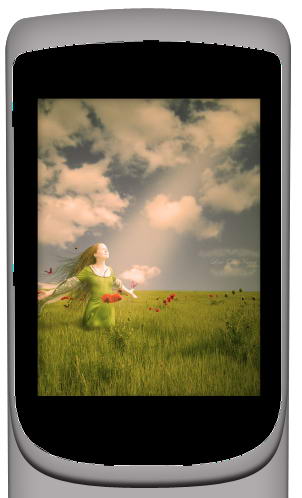
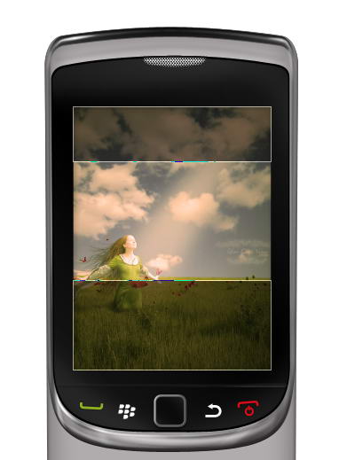
Create a 450×600 px rectangle on top of the shape. This will be screen area. Add Inner Shadow and Inner Glow to add depth into the screen.

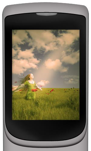
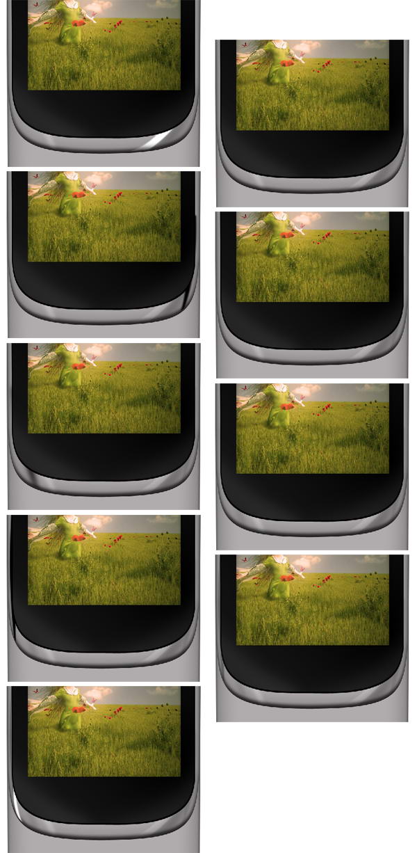
Add a picture and place it on top of the screen. Hit Cmd/Ctrl + Alt + G to convert it into clipping mask. The picture will automatically be placed inside the screen. You still can move or resize it if needed.
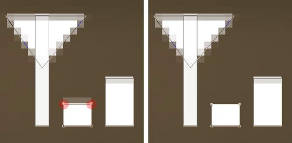
Draw this black shape behind the screen.
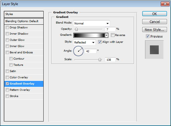
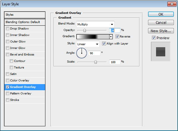
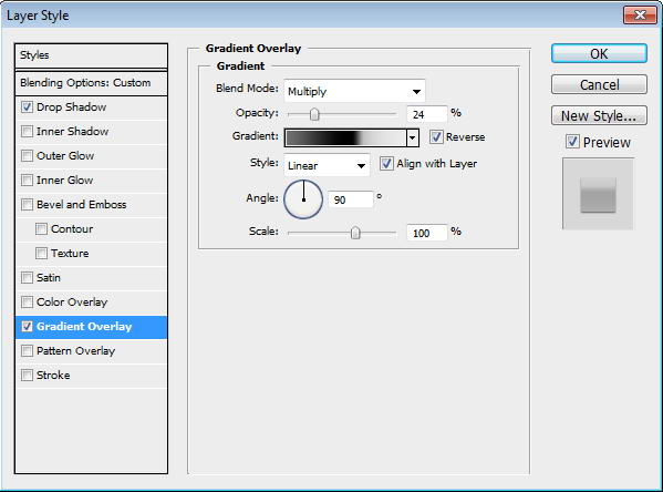
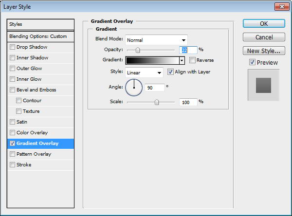
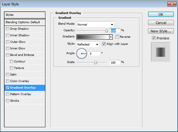
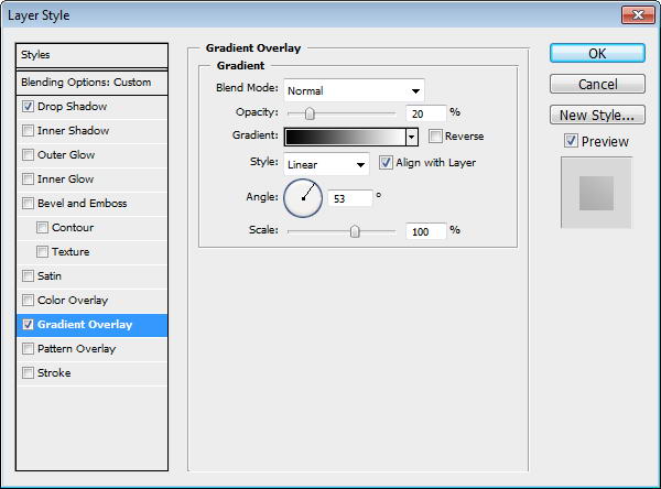
Duplicate shape and resize it to 99%. Add a subtle Gradient Overlay to the shape. I always add subtle gradients to add a natural look, since there is no perfect solid color in the real world.
Create a new layer on top of the screen and convert it to Clipping Mask by pressing Cmd/Ctrl + ALt + G. Paint white using soft brush and reduce layer opacity to 10%.
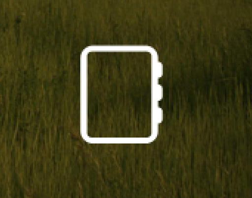
Duplicate screen shape, add rounded rectangle path on top of it and select intersect. Set Fill layer to 0%. This is going to be its speaker.
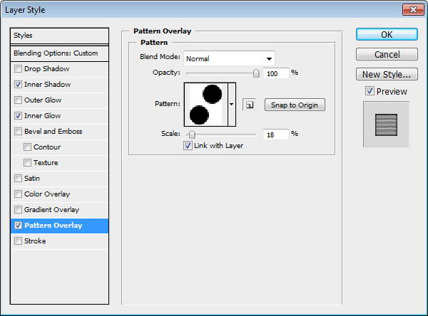
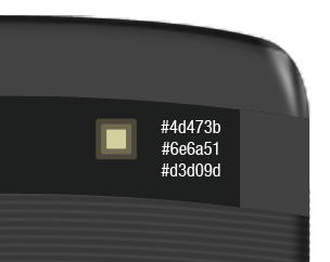
Create a new file with size 32×40 px. Draw two circles, place them on opposite corners. Fill it with black.
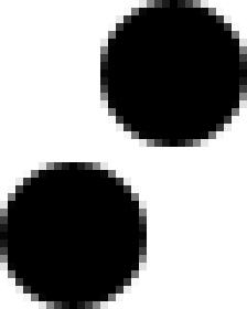
Select all (Cmd/Ctrl + A) and save it as a pattern by clicking Edit > Define Pattern. You may close the file, we won’t need it anymore.
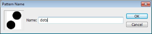
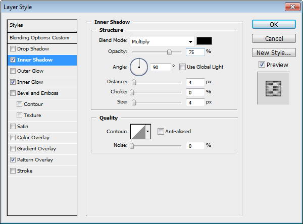
Return to speaker shape. Add Inner Shadow, Inner Glow, and Pattern Overlay. In Pattern Overlay, make sure to select previously created pattern.
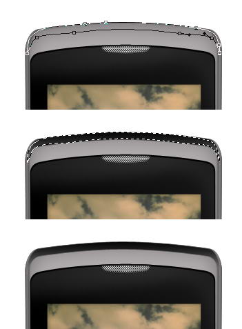
Cmd/Ctrl-Click phone’s front face shape. Create a new group layer and click Add Layer Mask icon. We are going to draw metallic reflections in this group.
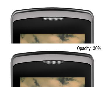
The idea is simple. We just need to add lots of subtle shadows and highlights on the phone surface. Draw a path using pen tool, convert it to selection by pressing Cmd/Ctrl + Enter. Create new layer. Let’s start drawing shadow. Fill it with black. Add Gaussian Blur to soften the shape then reduce layer opacity to 30%.
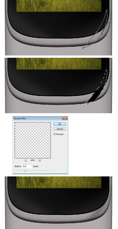
Use the same technique to draw highlights. Draw path, convert it to selection, fill it with white, add Gaussian Blur, reduce layer’s Opacity.
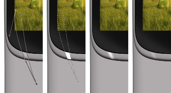
Keep drawing highlights and shadows using technique I described above. Place all your drawings on different layers, this will help if you want to modify it. Make sure to use different opacities to give it random reflections.
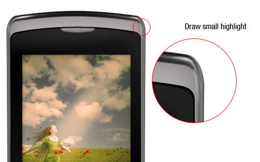
Let’s draw a coarse highlight. Draw a thin path under the screen, convert it to selection, then fill it with white. No need to add Gaussian Blur or reduce its opacity.
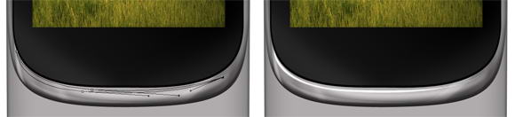
Now let’s add another shadow on the side of the phone. See picture below for reference.
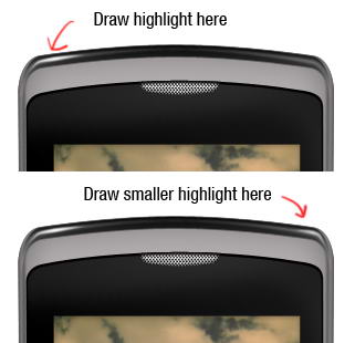
It’s important to add some coarser highlights and shadows on one side of the phone to keep it realistic. Draw a shape on top of the phone, convert it to selection, and fill it with gradient from black to darker gray.
Inside the shadow, draw a soft highlight. Reduce its opacity to 30%.
On top of previous highlight, draw smaller highlight but with higher intensity. Don’t just copy paste the highlight. It’s not natural to have perfectly similar highlight on both sides.
As I said, it’s not natural to have same highlight on both side. I decided to add another highlight on right side of the phone. This creates imperfection and adds more realism to the phone.
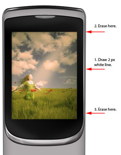
Let’s draw another detail. Draw a 2px white line. To draw a straight line, hold shift while dragging. Erase top and bottom of the line using a big soft eraser.
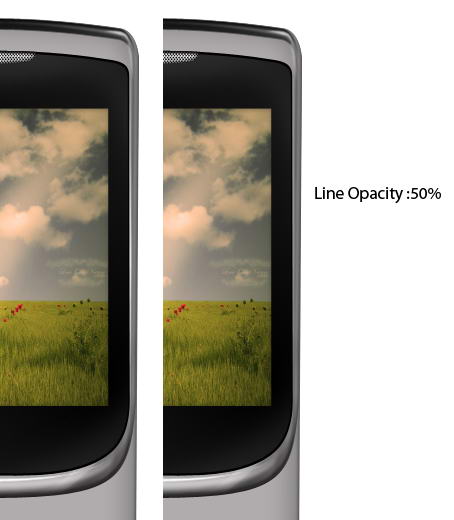
Reduce its opacity to 50%.
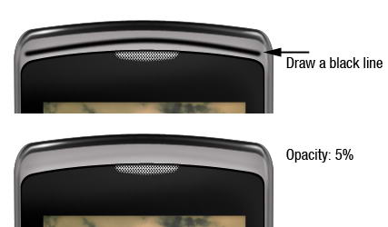
Draw a black line on top of the phone and reduce its opacity to 5%. This subtle shadow adds a sense of depth to the phone.
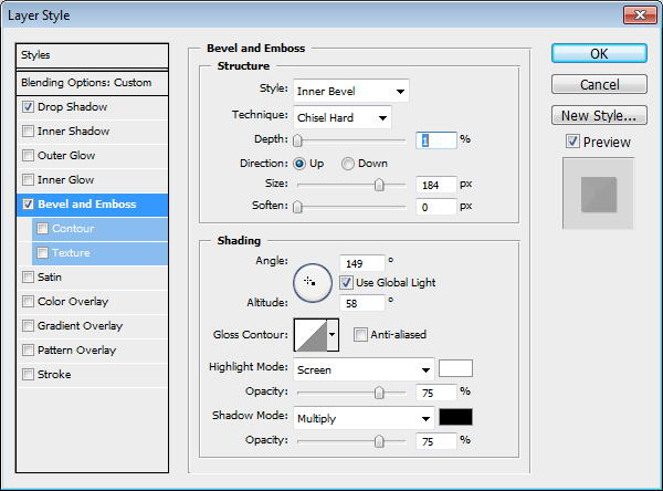
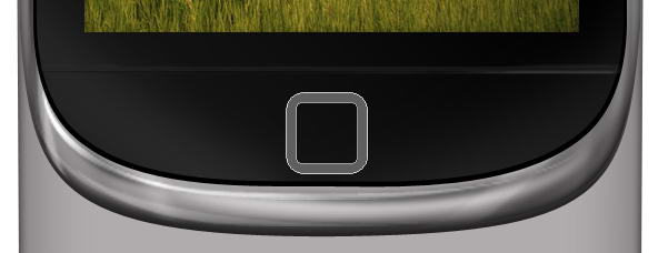
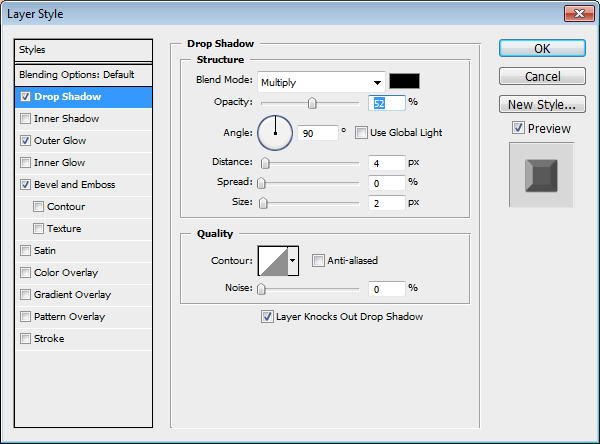
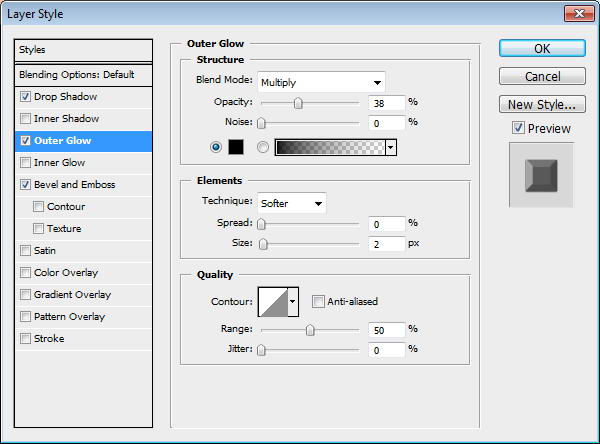
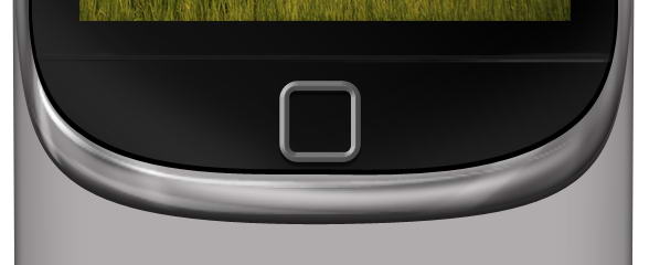
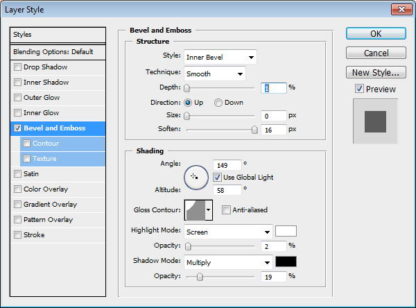
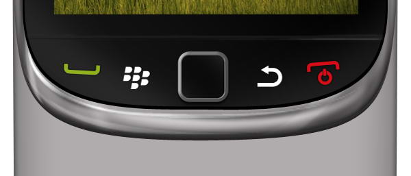
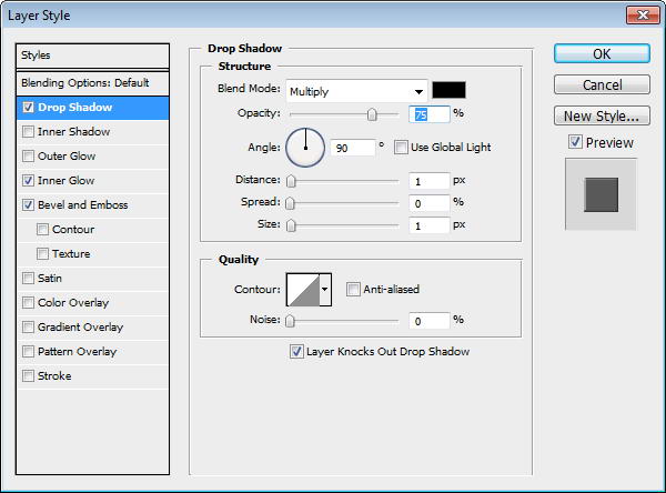
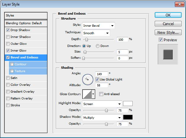
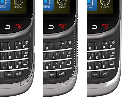
Draw a path to separate screen area and menu button. Change its Fill layer to 0%. Add layer styles drop shadow and Bevel and Emboss.
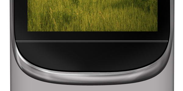

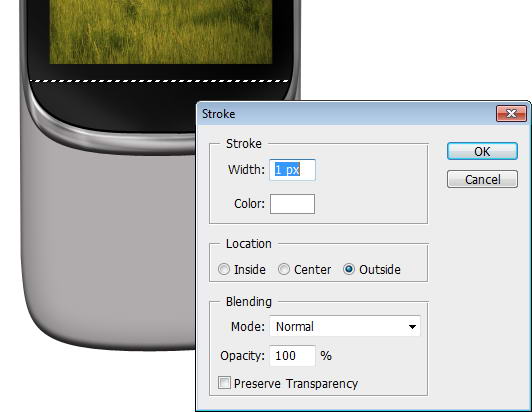
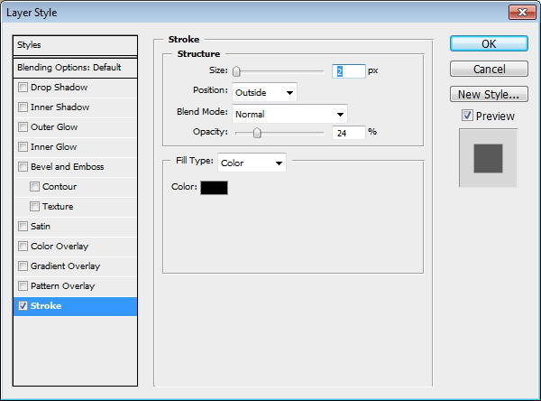
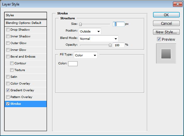
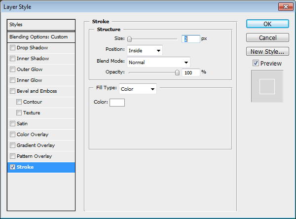
Cmd/Ctrl-Click shape to convert it to selection. Create new layer. Click Edit > Stroke with 1px width and Color: White.
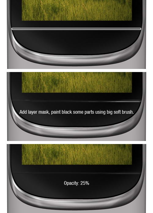
Add a layer mask and paint some of the line. Reduce its opacity to 25%. This will add a subtle highlight on the separator.
Create a rounded rectangle and inside it draw smaller rounded rectangle. Select subtract to create hole. Add Drop Shadow, Outer Glow, and Bevel and Emboss.

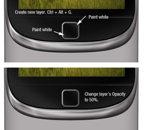
On top of the shape draw a black rounded rectangle. Add a small Bevel and Emboss to add depth.
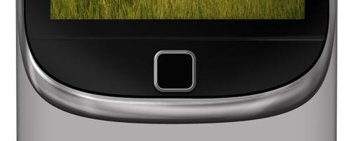
Create a new layer and convert it to Clipping Mask by pressing Cmd/Ctrl + Alt + G. Paint white on its corner and reduce its opacity to 50%.
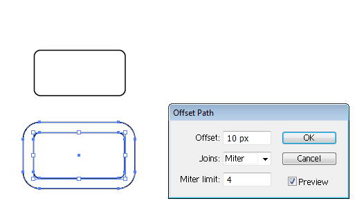
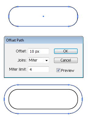
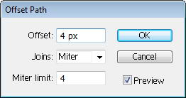
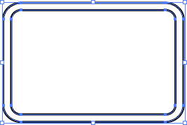
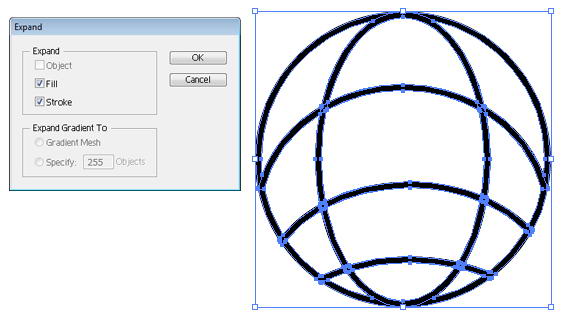
Now, open up Illustrator. Draw a rounded rectangle and click Object > Path > Offset Path. This command will convert path to a ring shape.
Create a rectangle on top of it. Select both shapes and from the Pathfinder panel select Minus Front.
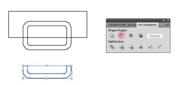
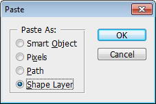
Copy shape from Illustrator and paste it to Photoshop. In Paste option choose Shape Layer. Set its color to green and rotate it a bit. Add thin stroke to add depth on to the shape.
Repeat previous shape to create a semi rounded rectangle ring. Under it, add a circle. Inside that circle create another smaller circle. Select both circles and choose Minus Front to create a donut shape.
On top of the donut, draw a rectangle, then Minus Front both of them. Finally, draw a small rectangle on the hole.
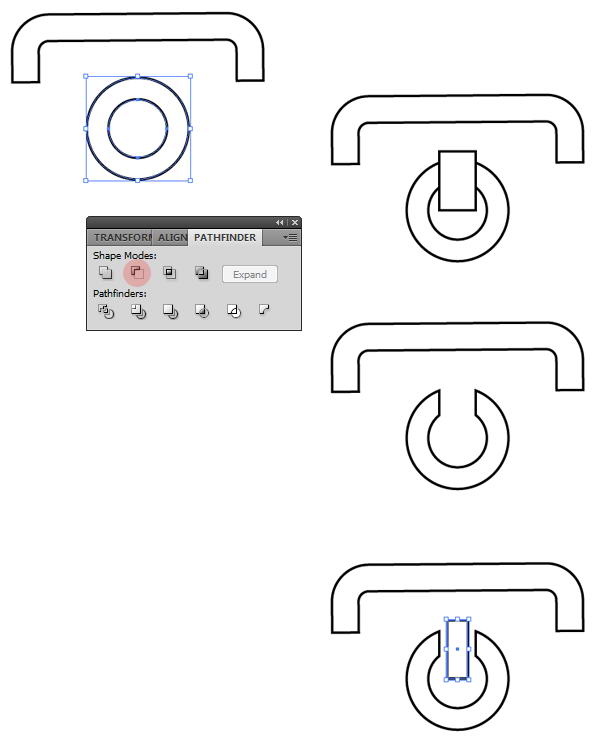
Paste the shape to Photoshop as a layer shape and use red color. Rotate it a bit. Just like previous button, add a small stroke.

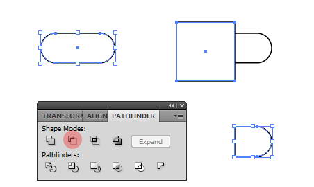
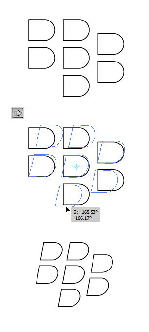
For Blackberry logo, draw a rounded rectangle. On top of it draw a rectangle. Select both shapes and choose Minus Front.
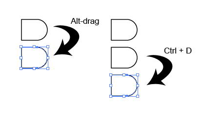
Using move tool Alt-drag to duplicate the shape. Repeat the duplication process by pressing Cmd/Ctrl + D.
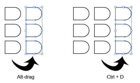
Select all shapes. Use shear tool to transform them.
Paste the logo into Photoshop. Use white for its color.
Return to Illustrator, draw a rounded rectangle. Click Object > Path > Offset Path.
Cover some of the shape with two rectangles. Select all shapes and hit Minus Front.
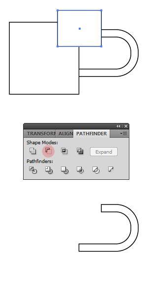
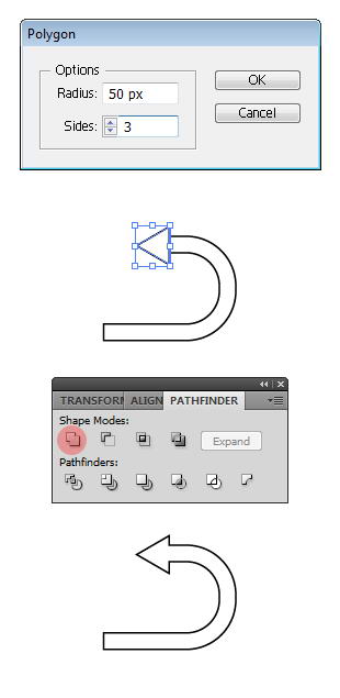
Draw a triangle using polygon tool. To change its side, you need to click once to open polygon dialog box and use 3 for the sides. Place the triangle on end of the ring and select Unite to combine both shapes into an arrow.
Paste it onto Photoshop with white color.
Draw two black rectangles on top and bottom of the screen. Set its opacity to 50%.
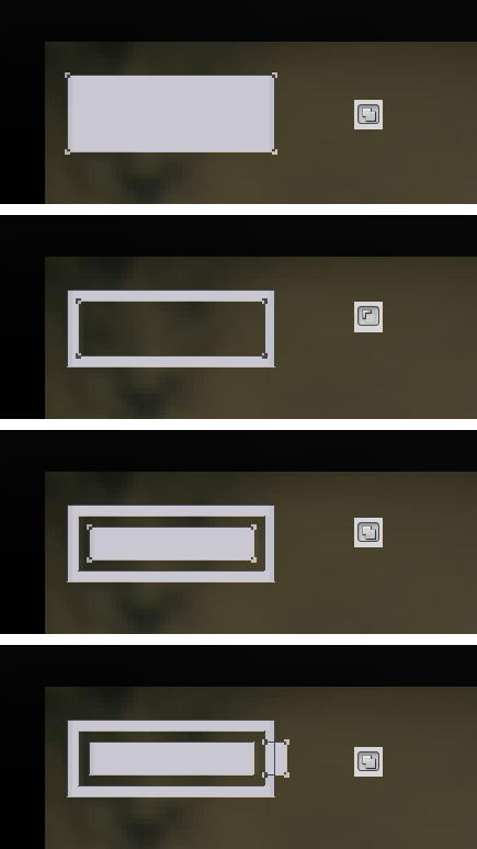
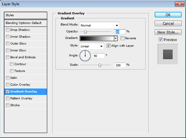
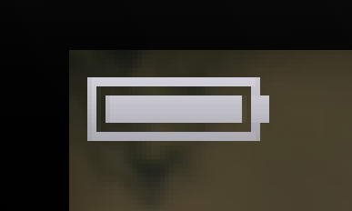
In Photoshop, draw a simple battery made from some rectangles. Add Gradient Overlay to make it shiny.
Draw a rounded rectangle. On top of it draw two overlapping rounded rectangles. Cut them using shape drawn with pen tool. Draw another line using rectangle tool.
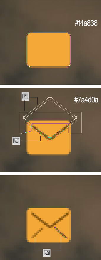
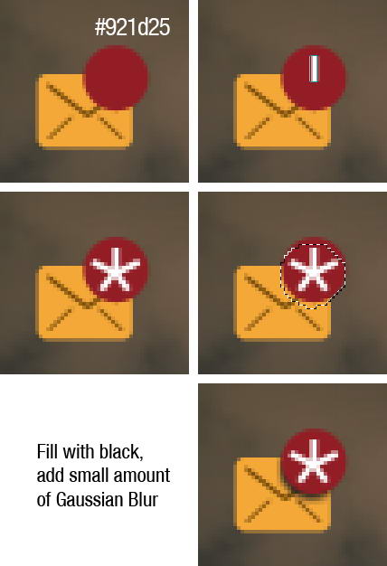
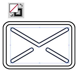
On top right corner, draw some white rectangles. Create new layer under red circle shape. Cmd/Ctrl-click red shape to create selection based on its shape. Move the selection a few pixels down and fill it with black. Delete unneeded shadow outside the mail.
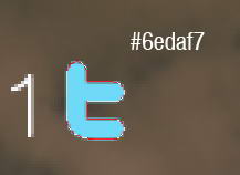
Copy Twitter logo, then trace its shape manually using pen tool. Paste the twitter shape as a layer shape and use light blue for its color. Add Gradient Overlay and white Stroke.

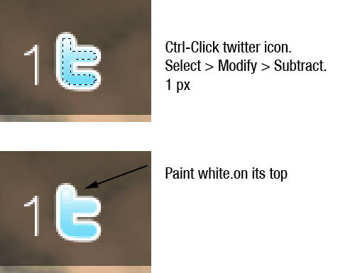
Cmd/Ctrl-click twitter icon to create selection based on its shape. Click Select > Modify > Subtract, 1px. Paint white on top of the logo.
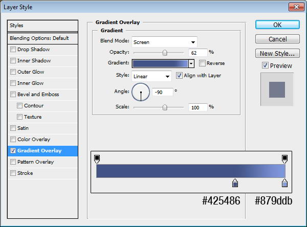
Create a rectangle shape and this Gradient Overlay. Inside the rectangle add an f.
Draw a rounded rectangle. On top of it, add another rounded rectangle them transform it. See picture below for reference. Set fill layer to 0% and add layer style Stroke.
Next to the speaker, draw some circle shapes. Each in different layers with layer style stroke. Put them into a folder group, add layer mask, and paint some part of it with black.
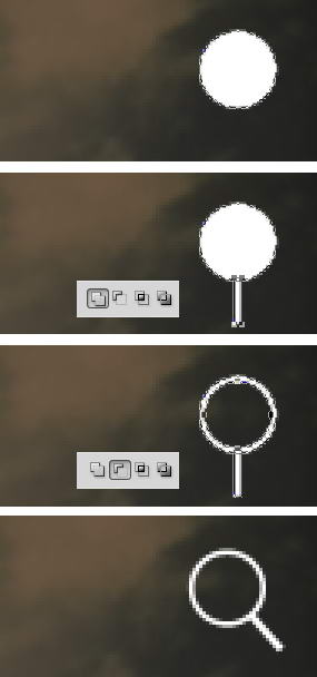
Draw a circle. Inside it draw smaller circle and select subtract. Add a rectangle for its handle then rotate the layer.
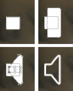
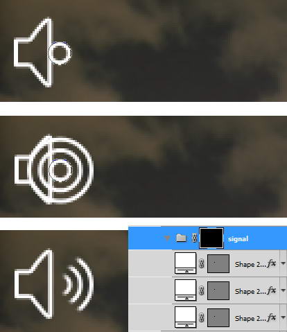
To draw a signal icon you just need some rectangles and a triangle.
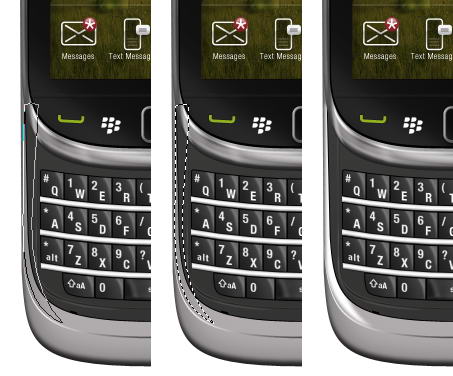
When we zoom in, you can see that there is some unneeded anti-aliasing going on. We will need to fix this.
To fix this, we need to select the points with direct selection tool and nudge them by pressing the arrow keys. Do this until the transparent pixels disappear.
You can see the result below, much sharper now!

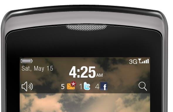
Add text for date, time, and other info.
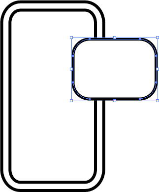
Let’s return to Illustrator again. Draw a rounded rectangle. Click Object > Path > Offset Path.
Using pen tool draw some lines until we have basic mail shape. Set its fill to none and stroke to black. From Stroke panel choose bigger weight and select round cap and round join.

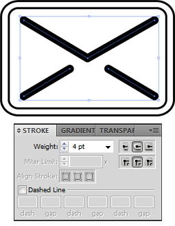
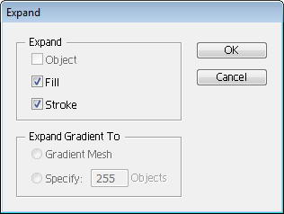
Select lines and click Object > Expand. This will convert lines into shapes. Set its fill to none and stroke to black.
Create a ring rounded rectangle shape, just like previous shape. On top of it draw another rounded rectangle.
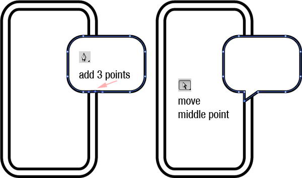
Add 3 points on lower side of the rounded rectangle. See picture below for its position. Move middle point until we have a speech bubble.
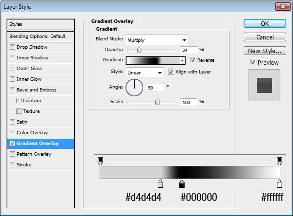
Paste both shapes into Photoshop. Add this Gradient Overlay.
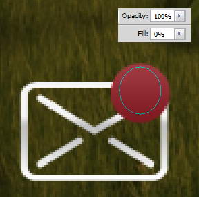
On the top right corner of the mail icon, add a red circle. Give it a Gradient Overlay.


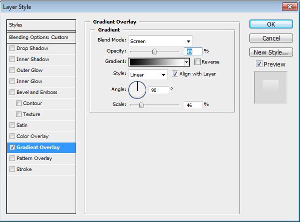
On top of it, draw an ellipse shape with fill 0%. Add a Gradient Overlay from black to white with blend mode Screen.


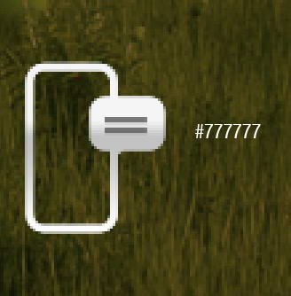
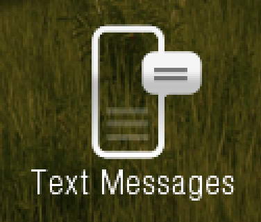
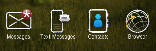
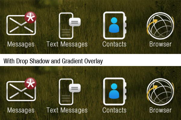
Add a star made of five thin rectangles. Under it, add text "Messages".

On top of speech bubble, draw two rectangular shapes with color #777777.
Inside it, draw a low opacity gray rectangle shape. Add text under the icon.
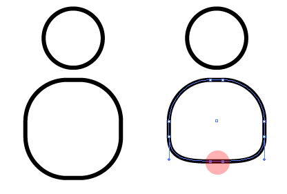
Again, return to Illustrator. Draw a ring shape rounded rectangle.
On its right side, draw three smaller rounded rectangles. Select all shapes and click Unite.
Paste the shape into Photoshop. Add Gradient Overlay.
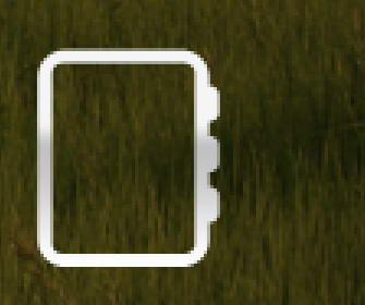
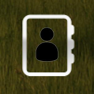
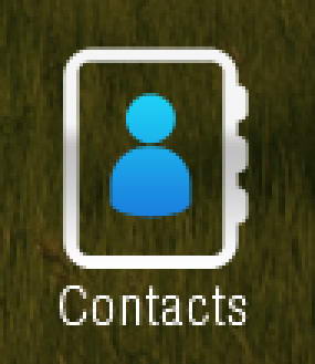
In Illustrator, draw a circle and a rounded rectangle. Modify lower points on rounded rectangle to get a person shape.
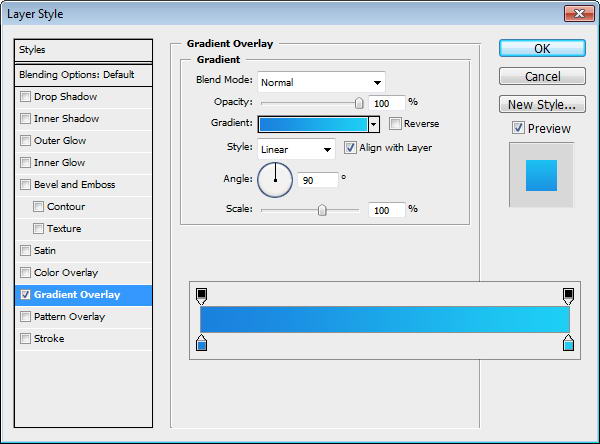
Paste the shape to Photoshop and put inside our previous shape. Add Gradient Overlay with setting seen below and add text Contact under it.
Draw a donut shape in Illustrator. Paste it to Photoshop. Add Gradient Overlay.

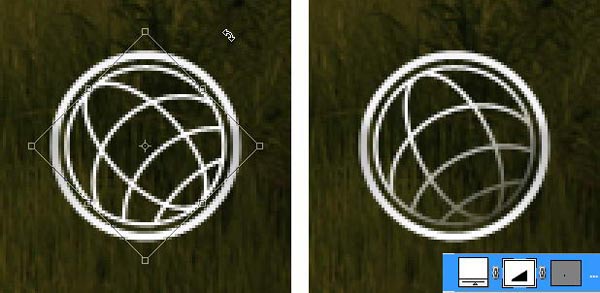
Return to Illustrator. A) Draw a circle B) Inside it draw another circle and transform it. C) Draw circle across it. D) Draw more circles. E) Select all shapes and click Divide. F) Select and delete unwanted shapes.
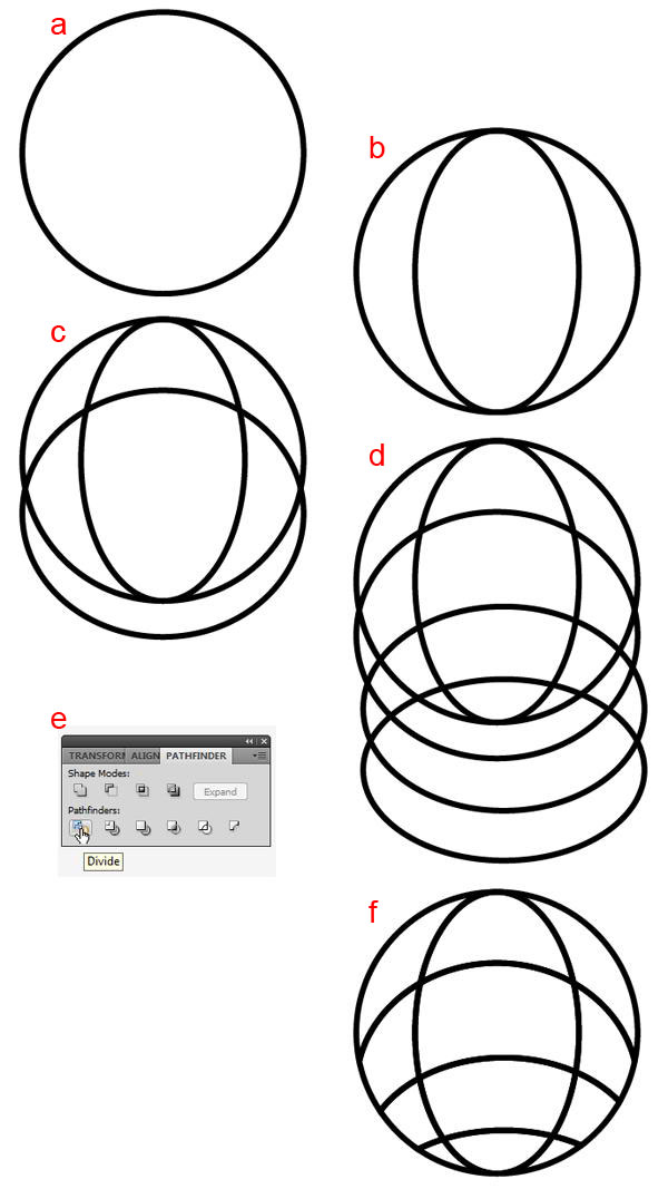
Select all shapes and click Object > Expand.
Paste the globe into Photoshop and place it inside the previous circle shape. Slightly rotate the globe. Add layer mask and add gradient to hide lower right part of the globe.
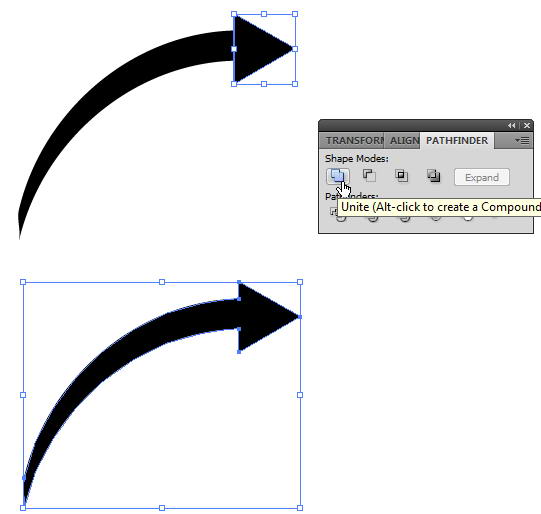
Return to Illustrator. Create a short curved line. From brushes panel select brush type that add weight onto the lines. Click Object > Expand to covert line into shape.
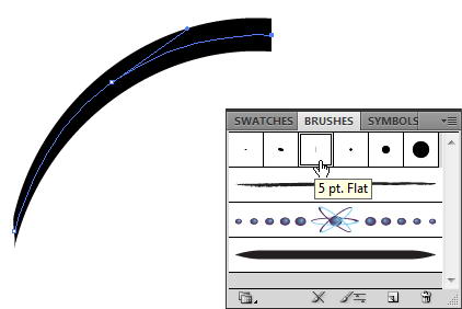
Add a triangle on its end. Select both shape and click Unite to combine into one shape.
Use pen tool and drag arrow’s end to make it curvy.
Draw one more line.
Paste both shapes into Photoshop. Use #e7bc3d as its color.

Copy all icons’ base path and paste it onto new shape layer. Place it under al layers. Set fill layer to 0%, add Drop Shadow and Gradient Overlay.

Our last step is just a subtle change. You may not notice it, but if you compared them, you’ll see that we have one nice glossy effect with depth.
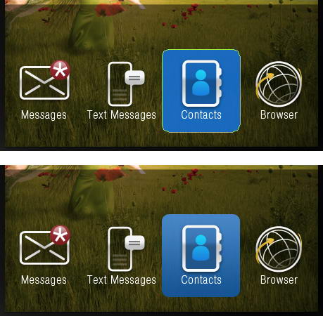
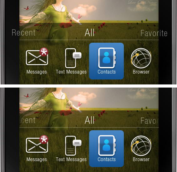
Create a blue rounded rectangle and put it behind one of the icon. Add Gradient Overlay.
Above all the icons, write Recent, All, and Favorite. Add layer mask and paint part of the text that is outside the screen.
Select base path created earlier in first step, duplicate it twice. Move one of the pathes three pixels up and set it to subtract. Add Gradient Overlay, dark gray to white.
Draw a dark gray rectangle. Add Gradient Overlay and Stroke.


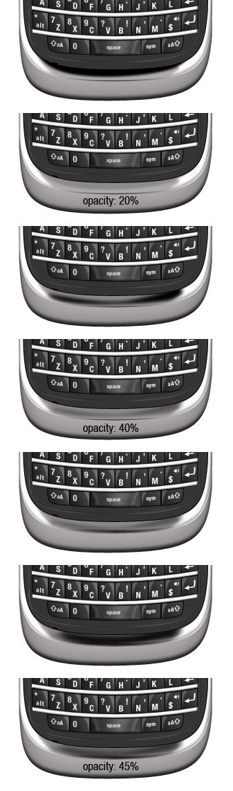
Create a new layer above the keypad and convert it to Clipping Mask. Use soft brush to paint some highlights.
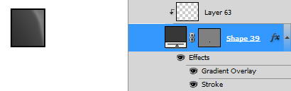
Image below shows the layer I used on a black canvas.
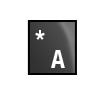
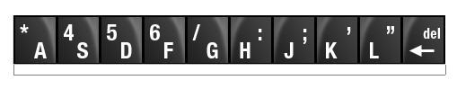
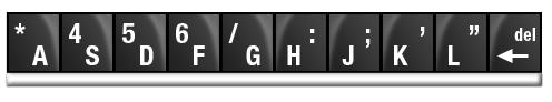
Add character to the keypad.
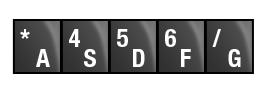
Duplicate the keypad five times and change its characters.
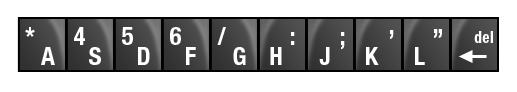
Duplicate all five keypads and flip it horizontally. Change its characters.
Create a rectangle under the keypads. Add Drop Shadow, Inner Glow, and Bevel and Emboss.
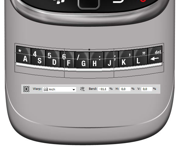
Select all keypad layers and hit Cmd/Ctrl + G to put it in a group. Right click group and choose Convert to Smart Object. Hit Cmd/Ctrl + T, right click and choose Warp. In option bar select Arch and change Bend size, see picture below for reference.
Duplicate previous keypad by right clicking it and choose New Smart Object via Copy. Don not use Cmd/Ctrl + J or Layer > New > Layer via Copy. We want a new smart object not its child. If you use Cmd/Ctrl + J, the duplicated smart object is basically the same object to the one you copy. If you edit it, all of its instances will also change.
Move the duplicated smart objects until we have a full set of keyboards. Then, double click all the smart objects to change each character.
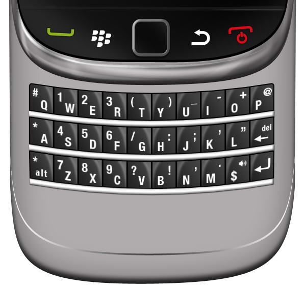
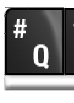
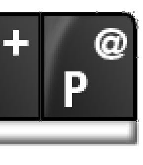
We need special treatment to keypad on top corner, Q and P. Modify its corner until it’s rounded.
Repeat step 89 to create the remaining keypad.
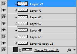
To draw a space, we need to use more complex steps. You can see steps I did in picture below. As usual, every stroke of brush in made in different layer.
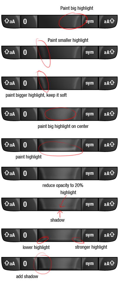
Here you can see set of layers I used to draw highlight on space key.
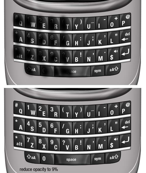
Our keypad here is too similar, they have same highlight, same shadow, same lighting. To add realism, let’s paint black on half of the keypads so they are darker than the rest. Set its opacity to 9%. Just a subtle effect but add a bit more realism.
Draw this shape manually using pen tool. Use black for its color.
Duplicate shape and change its color to dark gray. Hit Cmd/Ctrl T and resize it to 99%. A black shape behind it added more depth to its appearance.
Create a rounded rectangle path covering keypads. Convert it to selection by pressing Cmd/Ctrl + Enter. Click Edit > Stroke, use 2px with white color. Add layer mask and paint some parts of the line to hide it.
Repeat previous step, this time use slightly bigger rounded rectangle and add Gaussian Blur to make the lines softer.
Just as previous step, create a line. This time use black.
Again, repeat the same process.
What we did in step 104-107 is adding an inset lines. We use lots of black and white lines because in real life shadow and highlight is always bouncing. This process replicate that effect.
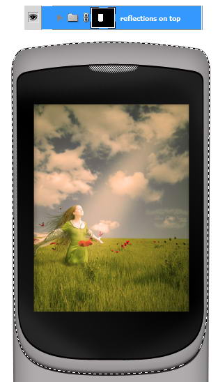
Select inner part of the phone. We are going to add some reflections inside it. Create group layer and click Add Layer Mask icon.
The process is similar to what we have already done in Step 13. Draw a shape using pen tool, covert it to selection, fill with white for highlight, black for shadow, add Gaussian Blur, reduce its opacity.
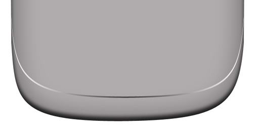
Draw some shadows on lower part of the phone.
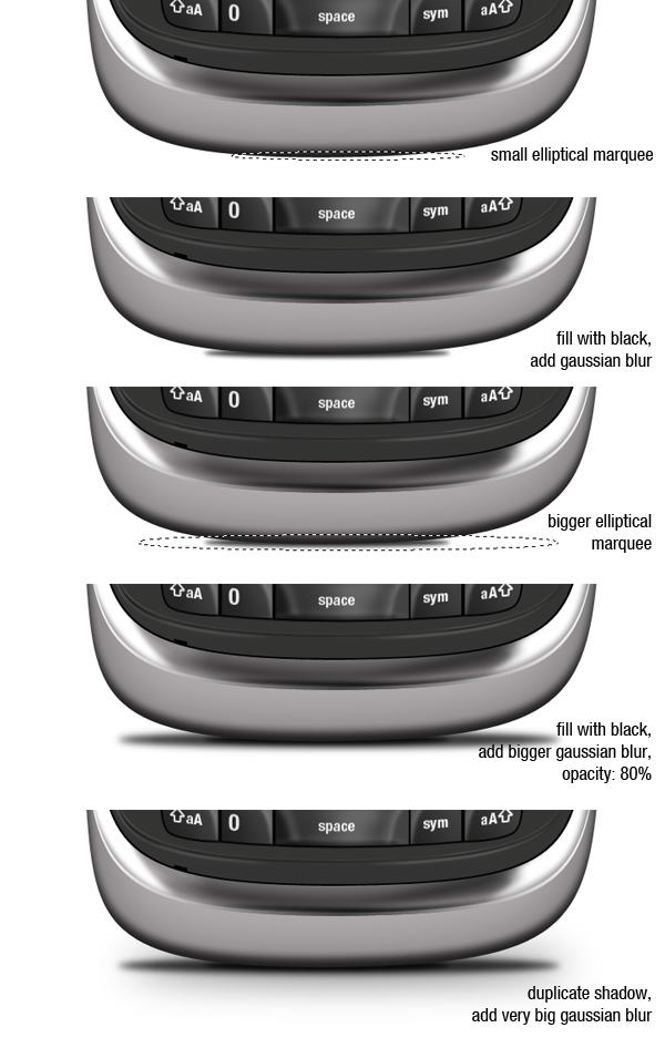
Create new layer and place it beneath all layers. Create a small elliptical marquee and fill it with black. Add Gaussian Blur to soften it. Next create new layer, add bigger selection, fill it with black, add Gaussian Blur, and reduce its opacity to 80%. Finally, duplicate previous shadow and add a very Gaussian Blur to get a very soft cast shadow on the floor.
We’re done with this one.
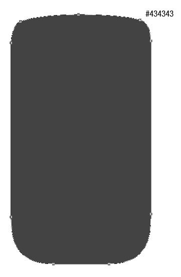
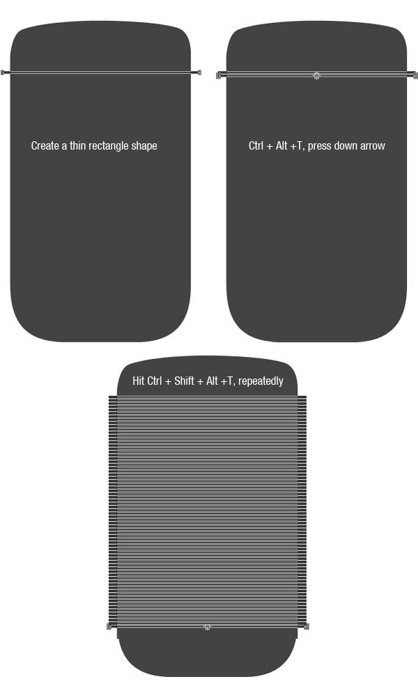
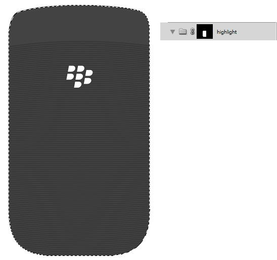
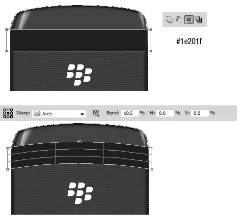
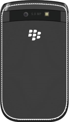
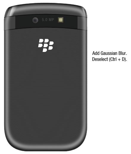
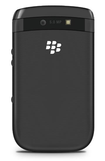
I hope you’re still with me. This time we’ll draw back side of the phone. Create this shape with color #434343.
Create a long thin rectangle shape. Hit Cmd/Ctrl + Alt + T to transform and duplicate the shape. Hit down arrow few times to move it. Repeat this transformation process by pressing Cmd/Ctrl + Shift + Alt + T repeatedly.
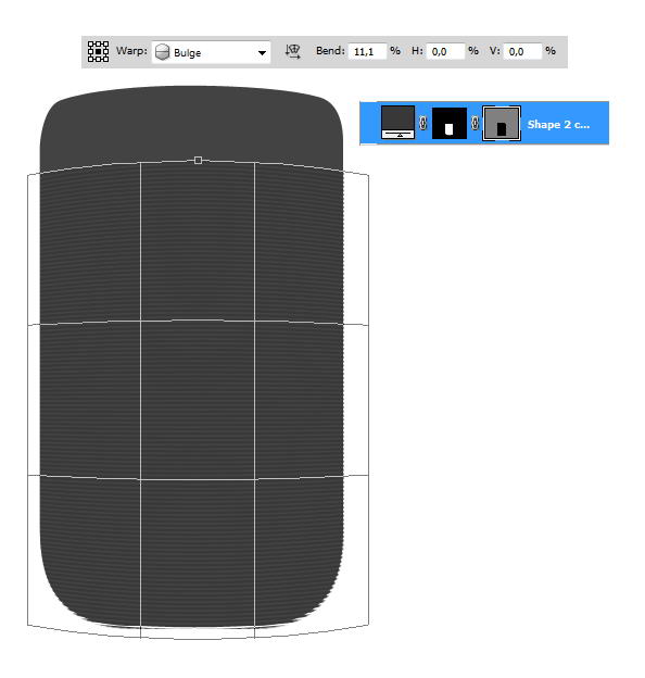
Cmd/Ctrl-click body shape and click Add layer Mask icon to isolate all shapes inside the phone’s body.
Make sure you have selected the vector mask. Hit Cmd/Ctrl + T, right click and choose Warp. Select Bulge in option bar and change its blend setting.
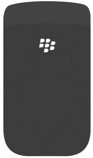
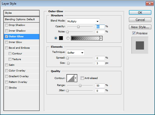
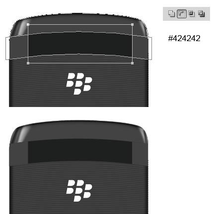
Place Blackberry logo on back of the phone. Add black Outer Glow.
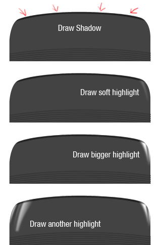
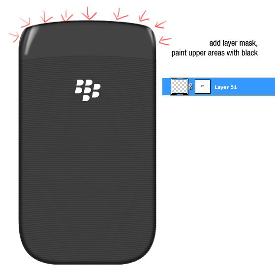
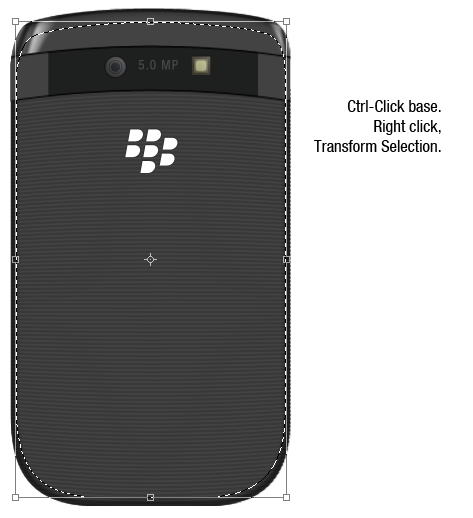
Cmd/Ctrl-click phone’s basic shape. Create a new group layer, click Add Layer Mask icon.
Paint some shadows and highlights. You can see what I did in picture below. Each painting is made in separate layers.
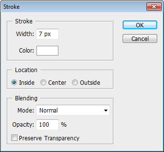
Create a new layer. Cmd/Ctrl-click phone’s basic shape. Click Edit > Stroke. Add Gaussian Blur.
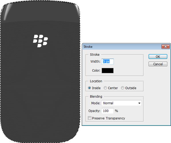
Add layer mask. Paint upper part of the stroke with black to hide it.
Duplicate path from phone’s basic shape. Add rectangle and set to intersect. Hit Cmd/Ctrl + T, right click and select Warp.
Duplicate the shape. In its middle add a rectangle and choose subtract.
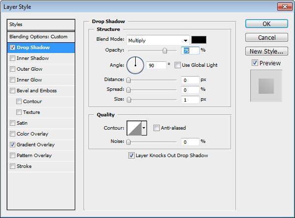
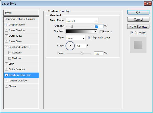
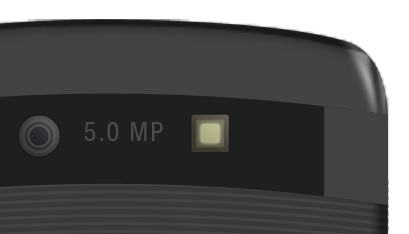
Draw a circle shape and add a slight Drop Shadow.
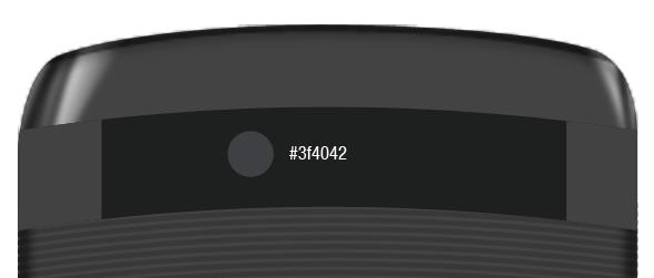
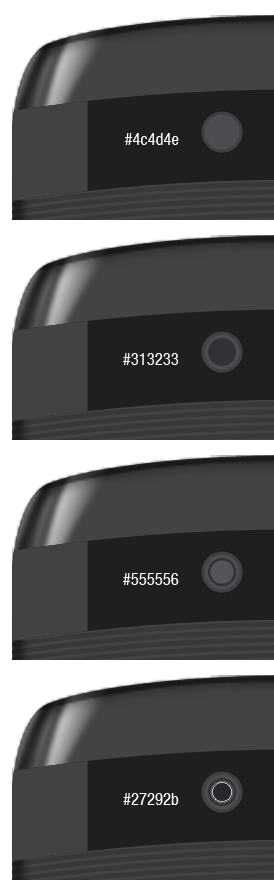
Camera is actually made from some small circles shape in different size. See the color of each circle in picture below.
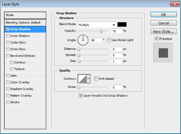
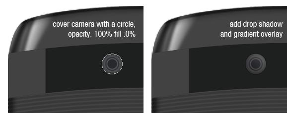
Duplicate the biggest circle and move onto top of other circles. Set Fill to 0%, add Drop Shadow and Gradient Overlay.

The same process goes while creating flashlight. It’s made from some rounded rectangles.
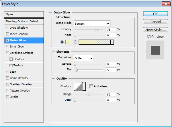
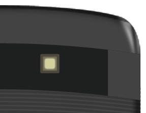
Add Outer Glow to the smallest rounded rectangle.
Duplicate biggest rounded rectangle and place on top. Add Drop Shadow and Gradient Overlay.
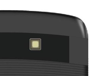
Add some text for information on its Mega Pixel size.
Cmd/Ctrl-click shape. Create new layer. Edit > Stroke, use black for the color. Add Gaussian Blur and erase left and right edge using soft eraser tool.
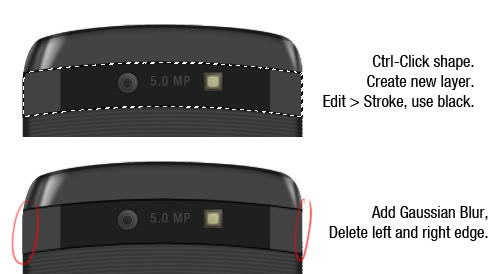
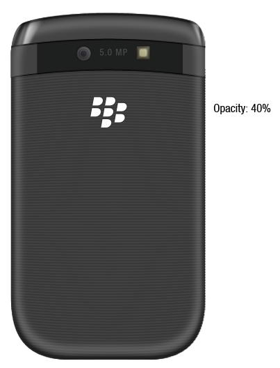
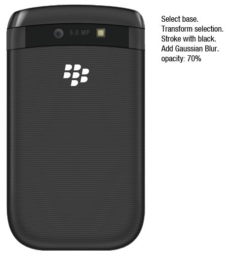
Cmd/Ctrl-click phone’s basic shape. Right click and choose transform selection. Make it smaller. Click Edit > Stroke, use white for its color. Add Gaussian Blur, deselect, then reduce layer’s opacity to 40%.
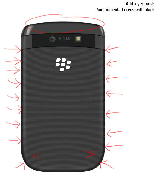
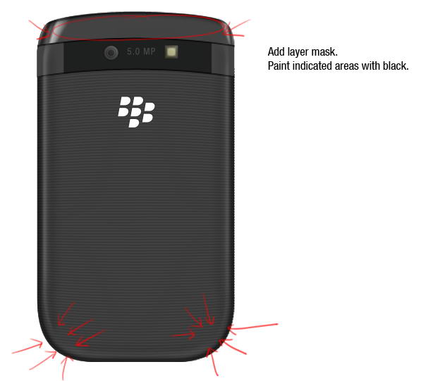
Add layer mask Paint indicated areas with black, we don’t want any highlight there.
Repeat previous process, but this time use black for its color and resize it more.
Add layer mask and paint areas on top and bottom corner with black.
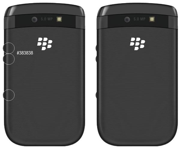
Draw three circles and place them behind all layers.
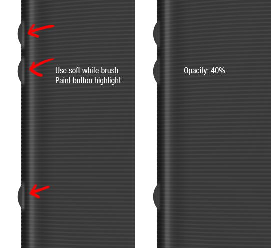
Use soft brush and paint white to add button’s highlight on the phone.
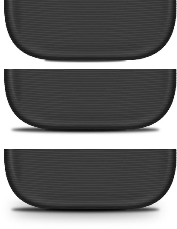
Create small elliptical selection right under the phone. Fill it with black and Add Gaussian Blur. Create slightly bigger selection, fill it with black, add Gaussian Blur, reduce its opacity. Create cast shadow by duplicating previous Shadow and give it a very big Gaussian Blur.
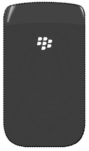
Finally, we’re done with backside of the phone.
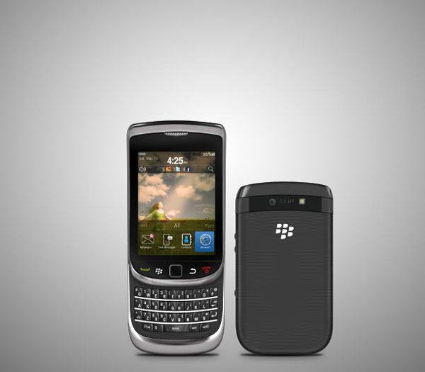
Let’s put both phones in one place. Create new layer above Background layer. Draw a radial gradient from black to white. Duplicate layer, hit Cmd/Ctrl + T then pull the new layer down.
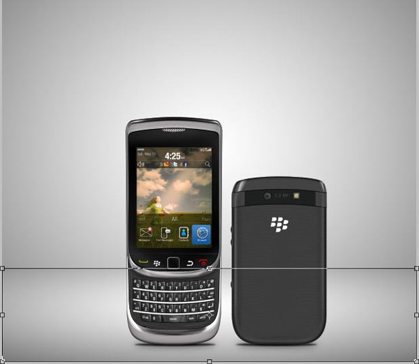
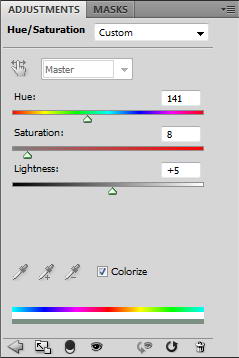
To add some color, click Add Adjustment Layer icon and select Hue/Saturation. Activate Colorize and change its settings.
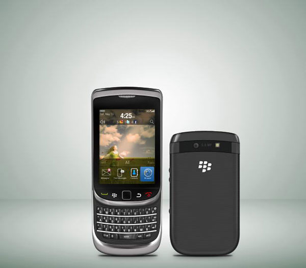
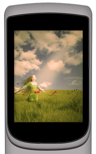
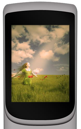
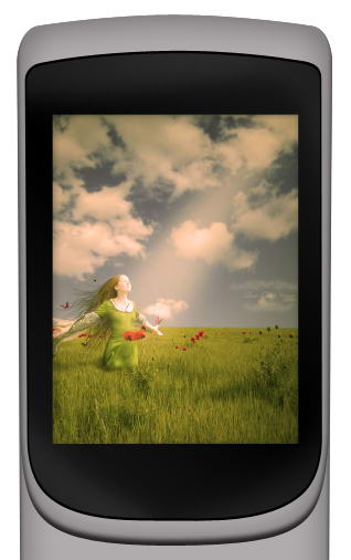
That’s it. I hope you like the final result and learned one or two new techniques from this long tutorial. In picture below I also added the phone with its keyboard closed.

Many of Perttu Murto’s designs are brilliant entanglements of photography and illustration. In this interview the Finnish designer talks about his continuous quest for self-improvement and his passion for all things art…and hockey.
When discussing goals with people, the typical responses have something to do with where they want their lives to be in five or ten years. I have a feeling if I didn’t phrase it as “professional goals” when speaking with Finnish designer and illustrator Perttu Murto, he would’ve gone into a monologue about ice hockey goals. That’s an exaggeration, of course. But the idea behind it is not: Murto loves ice hockey. So much, in fact, that the vast majority of personal questions I asked him came back to the subject. It’s only natural that a man who is so passionate about a sport is just as passionate about his art.
Murto is 24-years old and lives in northern Finland in a city-by-the-sea called Oulu. He shares his life and apartment with his fiancé and two (“crazy”) cats, one of which is his morning wake-up call. After giving in to the cat and going through his morning routine, Murto heads to his job at a local ad agency Työmaa, where he has been a Graphic Designer for three years. He loves the job and he loves working with “real professionals.” The fact that it’s a fun place to work is just icing on the cake.
Even though he’s got an “everyday” job, Murto still considers himself to be a freelancer…and a very in-demand one at that. Through his work at the agency he’s had the privilege of working with some big-name clients like Nokia, Lappset, Polar and Warner Music, and his freelance design and illustration business has padded his portfolio with works for clients like UU Theory, UNICEF and Dolce & Gabbana.
Murto is finishing his final year at Oulu University of Applied Sciences Business and Information Management where he studies Digital Media. All that stands between him and his degree is his thesis which, along with his day job and nightly freelance work, will likely make his schedule even more hectic. Murto doesn’t mind, though. As he puts it, “The best part is that I can [make] my living by doing what I love!”
His first love, though, is hockey. Before he even started anything artistic, Murto had aspirations to become a professional hockey player. Now he plays on a recreational team but he doesn’t mind because “these days it’s not that serious.” Nevertheless, he loves a good game.
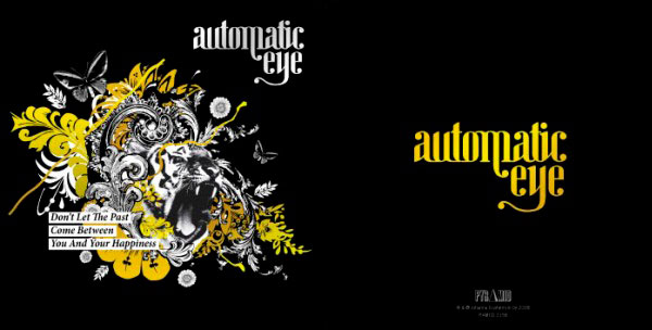
Murto saves all of that seriousness for becoming a better artist, something that he aspires to do for the rest of his life. One of the things he wishes to learn is the art of drawing more photo-realistically. He loves photography and, as one can tell, his art relies heavily on photos. Additionally, much of his work contains animal themes because as he explains, “I think that it will make the works more interesting when there is some kind of organic figure mixed with crazy stuff. I really want to use photos; I think that they are an important part of my work.” This was the case with one of his favorite projects for which he was the art director: a tiger-themed CD cover for a band called Automatic eye.
Always being open to learning something new is one of the most important lessons that Murto has learned so far. He spent 11 years perfecting his ice hockey game and his design and illustrations will no doubt receive the same level of dedication.
The best part is that I can [make] my living by doing what I love!
Like many newbie freelancers, Murto found that he rushed many of his personal projects and they rarely turned out the way that he had hoped. “In my opinion patience is pretty much the keyword in this industry; you don’t learn stuff from one sitting. It comes to you when you have time and patience to experiment and work, work, work.”
That patience is evident in the fact that Murto’s work process has him starting from scratch each time, something that is common for many designers. “I take a pen and I print the brief. I start underline things and sketching. That’s about it. I get some kind of an idea going on in the paper and then I start doing [the] first mockup with [a] computer.” Saying that simplifies his process, though. In fact, the sketching step can last a while. “I sketch, sketch, sketch, twist, try, reform, duplicate and there is one point when I see that “ah, this is starting to look right!” It’s at that point that the creation moves onto the computer where it is further transformed using mostly Illustrator, PhotoShop and InDesign.
With life lessons comes a professional maturity that Murto has achieved in the few years that he’s been out in the design world. While he always enjoys some good competition on the ice, he recognizes his limitations and won’t hesitate to pass a project request off to an artist who is better suited for that job. He understands that trust and communication between himself and his clients are things that will go a long way to producing work that both client and artist are proud of. He isn’t exempt from frustrations, however. One of his biggest challenges is when there are too many people involved in a project and too many opinions that lead to the entire project being chaotic and generally “bad.” But, as always, Murto chalks that up to part of the game, so to speak. “But that’s life and part of this job,” he says.
Murto finds inspiration from a variety of places. “Everywhere” in fact. “[It] could be a cool movie (“Napoleon Dynamite -so funny”), awesome songs, a great piece of art, annoying people, funny people, nature…. Pretty much everything around me.” Communication is also a source of inspiration for Murto: “When the project goes well and everything works well together and the communication between our team (or me) and the client is working, the outcome usually is something great. That is also really inspiring.”
Despite his full workload, Murto finds time to relax with his loved ones. His “awesome” family consists of his very supportive parents and a sister with whom he is very close. They all have been extremely supportive in whatever endeavors Murto has taken on, whether it was of the creative sort (his mom is very creative) or of the athletic sort (his dad devoted a lot of time to his love of ice hockey.) They are very proud of everything that their talented son has achieved in such a short time. “They are happy that I got into design and art so [heavily] and found something [that] I am really passionate about.” They are no doubt pleased that he found ice hockey at an early age as well since Murto describes himself as “a bit shy with people I didn’t know really well. But really loud with the people I knew… I had [a lot of] energy going on, that’s for sure!” That energy that was once used to outsmart the other team and score goals on the ice is now put into achieving his goal of artistic success. And this time there is no defensive line stopping him.


Visit Perttu Murto on the web.
Most designers are constantly in need of social media icons for their projects. Today, we have a nice set 10 social media icons for you to use in your next project.
This pack includes 10 high quality icons available in PNG format in two sizes including 64px, and 128px. These icons were created by La Glanz Studio and are royalty-free, so you can use them for any commercial or personal project.
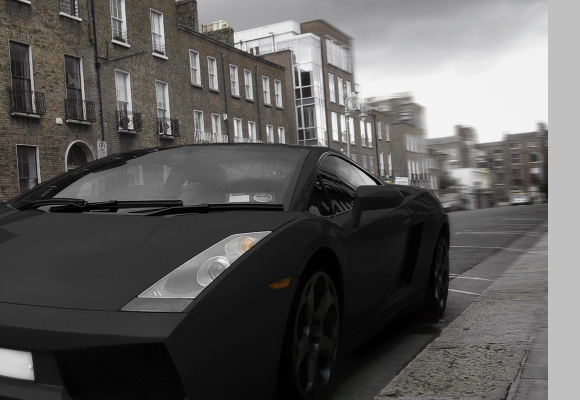
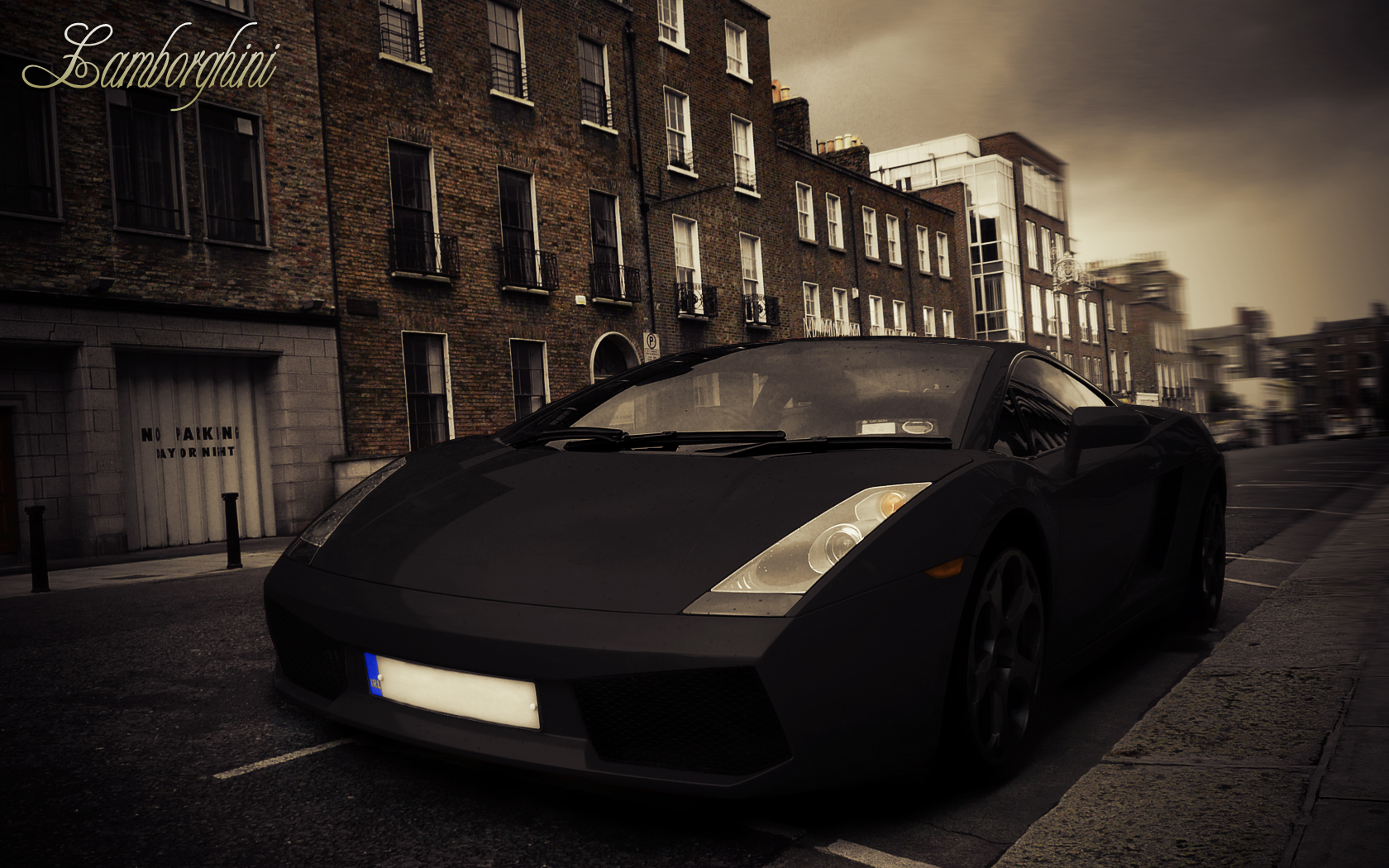
With Photoshop, just about anything is possible. In today’s tutorial we will demonstrate how to give your yellow Lamborghini a quick paint job. Then, we will add some cool effects. Let’s get started!
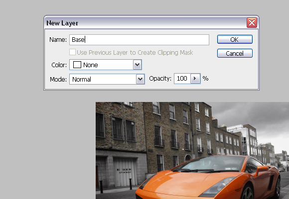
Open the Lamborghini image in Photoshop. Since the image is pretty large, you’ll need to resize it to 1680px by 1050px. To do this, go to Image > Image size or press Cmd/Ctrl + Alt + I on your keyboard.

Now, in the Layers palette, you need to unlock the "Background" layer. To do this double click on the "Background" layer, and call it "Base".
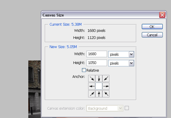
To finish with adjusting the image size, go to Image > Canvas Size or press Cmd/Ctrl + Alt + C on keyboard. In the Canvas Size windows, in the dropdown menu choose pixels for unit. For Height insert 1050 pixels. Click OK, and click Proceed on the new window, which alerts you that your image is larger than the canvas size.
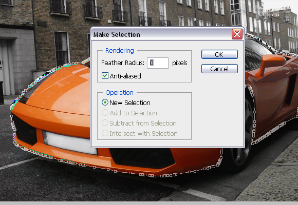
Using the Pen Tool (P), create a path around the car as shown below. Try to be as precise as possible.
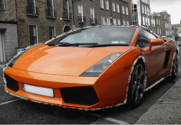
With Pen Tool (P) active right click and choose Make selection. For the Feather radius, set 0px.
Usually, when you’re changing car’s colour, this step is not needed but since we are changing car’s colour to black it is. While, the car’s body is selected go to Image > Adjustments > Desaturate or press Cmd/Ctrl + Shift + U. DO NOT deselect yet.
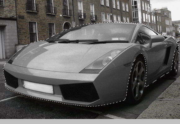
Using the Rectangular Marquee Tool (M), right click on the canvas and choose Layer via Copy, and rename the "Layer 1" to "Body".

Make sure that you’re on the "Body" layer, and go to Image > Adjustments > Replace Color. In the new window set the parameters as shown below, but DO NOT click OK.
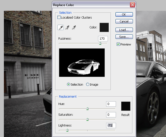
Now, click somewhere on the hood to choose the colour to replace, and start adding colours which will be replaced by tones of black. You’ll do this by Shift-clicking on the car’s body (but DON’T click on the glass, lights etc). The selection in the Replace color window should look like below.
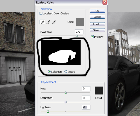
Now create a Vector mask for the "Body" layer. Using Pen Tool (P) make paths, which will be used to select registration plates, lights, mirrors and grill.
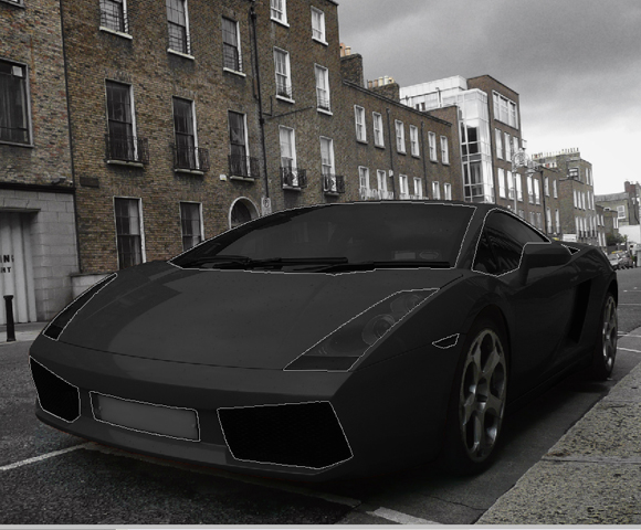
Right click with the Pen Tool on the canvas and choose Make Selection. For the feather radius insert 0px.

Using the Brush Tool (B), colour set to #000000, paint over selected areas on the mask of the "Body" layer. Image should look similar as shown below.
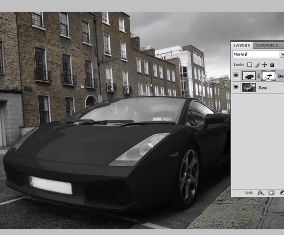
Now click on the “Base” layer’s thumbnail, and using Pen Tool (P), same as before, create path around rims of the car, right click, go to Make Selection, Feather radius to 0px, and click OK.

With Rectangular Marquee Tool (M) right click on the canvas and choose Layer via Copy. Rename created layer to “Rims”.

Now, while you’re on the "Rims" layer, go to Image > Adjustments > Replace color and this time set the Lightness somewhere around -60. Shift-click on the different parts of the rims to add more sample colours which are going to be replaced. The result should look as shown below.

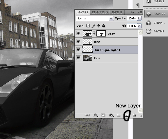
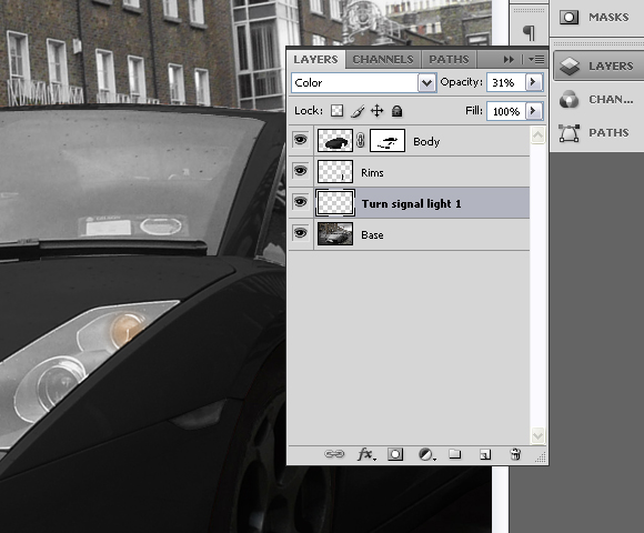
Create new layer, just above “Base” layer and call it “Turn signal light 1″.
Using Brush Tool (B), with colour set to #e48223, Brush size 34px, Hardness 0%, paint on the turn signal light on front of the car as shown below.
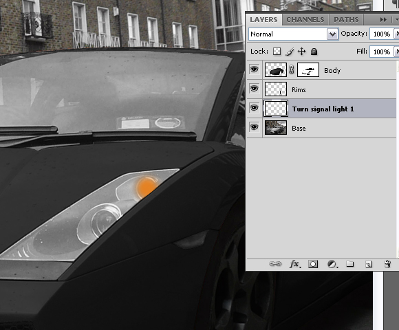
Now change the Blending mode for the layer “Turn signal light 1″ to Color and set the layer’s opacity to 31%.
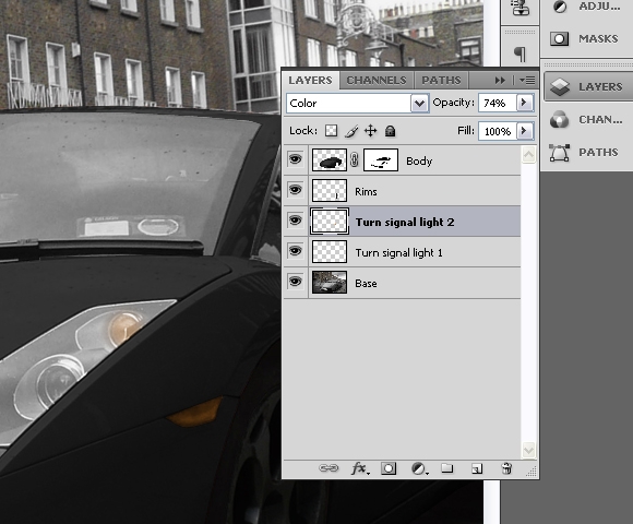
Create another layer above the “Turn signal light 1″, and call it “Turn signal light 2″.

Again, using the Brush Tool (B), with colour set to #e48223, Brush size 34px, this time Hardness set to 100%, paint over the turn signal on the side of the car as shown below.

Set the Blending mode for the “Turn signal light 2″ to Color and layer’s opacity to 74%.
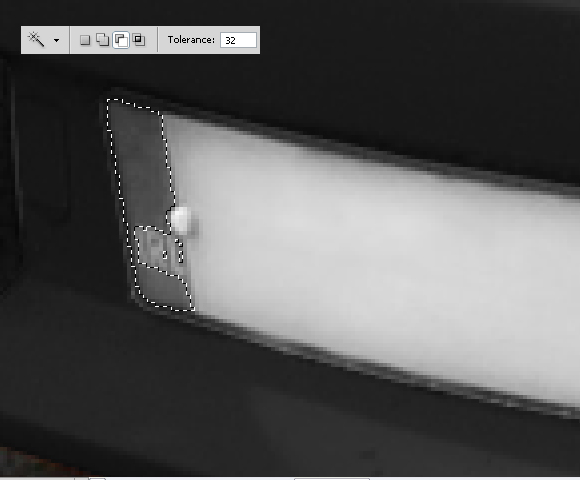
Set “Base” layer active (click on the layer’s thumbnail) and using Pen Tool (P) create path around the coloured part of the license plate. Right click, choose Make Selection and set Feather radius to 0px.

With Magic Wand Tool (W), and Substract from selection set, click on the letters until you deselect them from the selection.
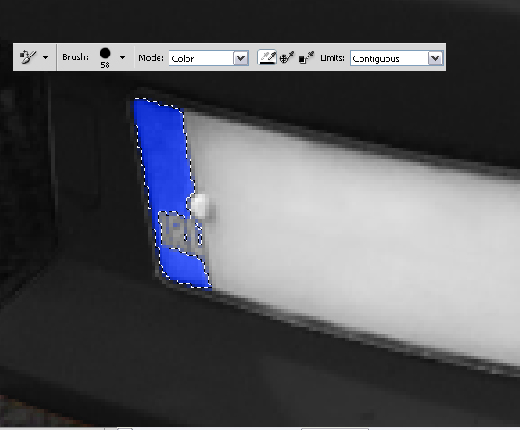
With Color Replacement Tool (B), with large brush, 100% Hardness, and colour set to #2343e4 paint over the selection until you finish with the following results.
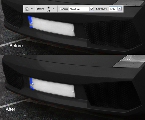
Now deselect by going to Select > Deselect or by pressing Cmd/Ctrl + D on keyboard. Using the Burn Tool (O), Range set to Shadows and Exposure to 17%; burn the grill on the front side of the car as shown below.
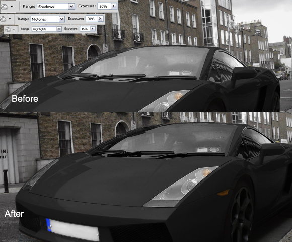
While still on the "Base" layer Cmd/Ctrl-click on the "Body" layer’s mask thumbnail to select mask. Go to Select>Inverse or press Cmd/Ctrl + Shift + I. You can use the Polygonal Lasso Tool (L), with Subtract from selection set, subtract everything except the windows from selection.

Using Burn Tool (O), Range set to Shadows and Exposure to 60% paint over the selection with big hard brush. Don’t deselect yet. Now, change the Range to Midtones and Exposure to 30%, and paint over the selection again. And finally, change Range to Highlights and Exposure to 15%, burn over the selection and deselect it by pressing Cmd/Ctrl + D or going to Select > Deselect.
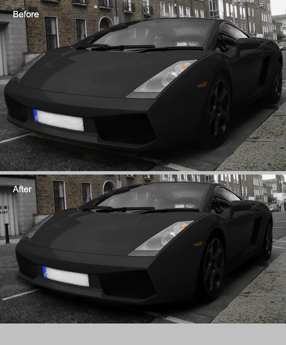
Again, using the Burn Tool (O), Range set to Shadows and Exposure to 60%, Brush size 60px and Hardness 15% burn the wheels, space between car and the wheels and shadows under the car.
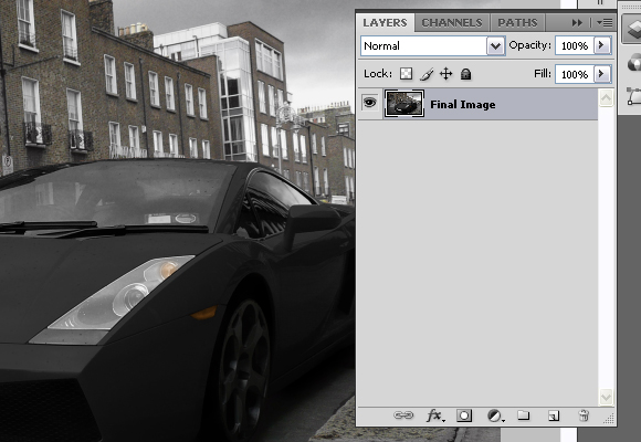
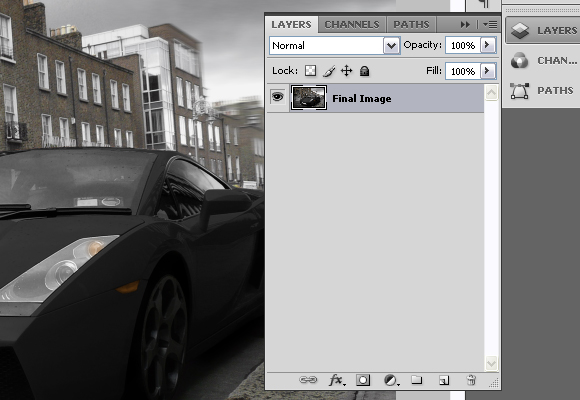
Select all layers, click the right click in the Layers pallet and go to Merge Layers. Rename the layer to the “Final Image”.
Duplicate the layer by pressing the Cmd/Ctrl + J on the keyboard. Now, while on the copied layer go to Filter > Blur > Motion Blur and set the settings as shown below.

Add a Vector mask for the copied layer, and using the Brush Tool (B), with pure black colour, diameter set to pretty high (around 130px) and Hardness to 0%, paint on the mask. The goal is to have blurred only the right part of the image, but not the Lamborghini as shown below.
Again, select all the layers, right click in the Layers palette and choose merge visible. Rename the layer to "Final image" again.
Now, using the Burn tool (O), Range set to Shadows, Exposure to 16%, Diameter 453px and 0% Hardness, burn entire image slightly.
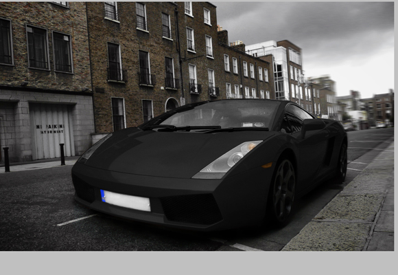
Now, let’s create the final effect and finish the tutorial. Go to Filter > Distort > Lens Correction. In the Vignette section, for the Amount set -100 and for the Midpoint + 28 and press OK.

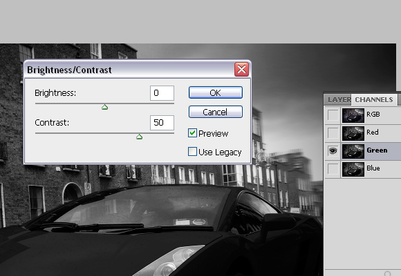
Go to Channels palette and choose "Red" channel or press Cmd/Ctrl + 3 on keyboard.

Go to Image > Adjustments > Brightness/Contrast and for the Contrast set 50, and press OK.
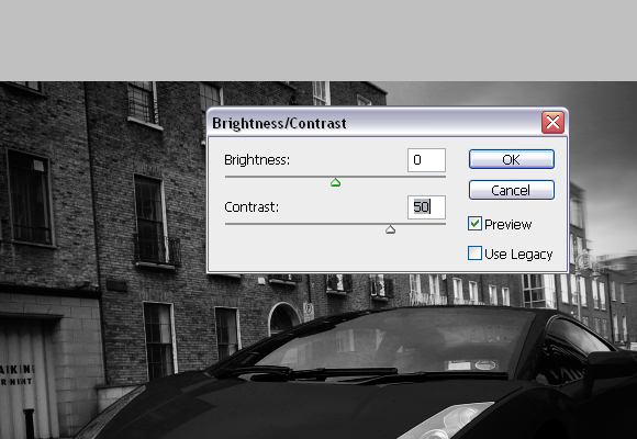
Select "Green" channel or press Cmd/Ctrl + 4, and go to Image > Adjustments > Brightness/Contrast and for the Contrast set 50 again and press OK.
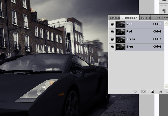
Now, go back to RGB mode or press Cmd/Ctrl + 2.
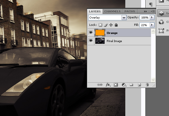
Create new layer, and rename it to “Orange”. Using Paint Bucket Tool (G), with colour set to #ff9600 fill the new layer. Set the Blending mode for the “Orange” layer to Overlay and Fill to 22%.
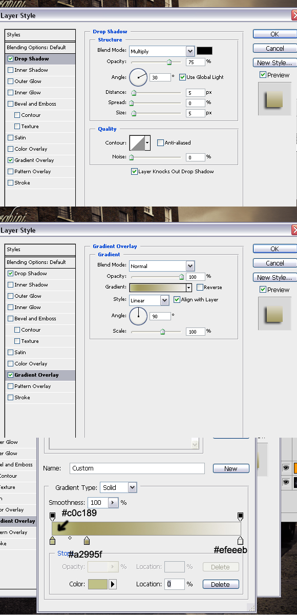
Now using Type Tool (T), in the upper left corner type “Lamborghini”. Go to Character window and for font set “Champagne”, for size 100pt.

And finally, right click on the text layer and go to Blending options and set the following values.
The final effect can be seen below. Thanks for reading the tutorial and I hope you liked it.
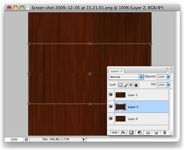
I use to do quite a bit of work with 3D models and texturing was something that I did on just about all my projects. The biggest problem most people have with creating seamless tiles in Photoshop is getting rid of the seam, especially with small file sizes. Today, I will demonstrate a technique that will get rid of the seam every time. Let’s get started!
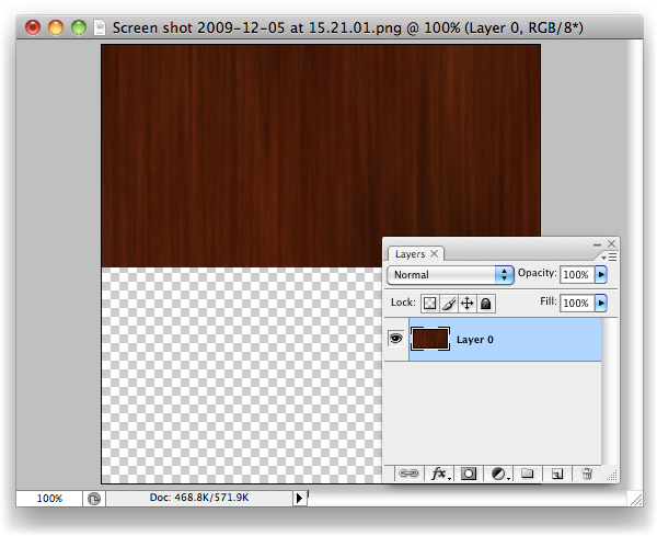
To begin, open up the texture you’d like to create a tile from. Any texture will do, for this example I chose a wooden background.
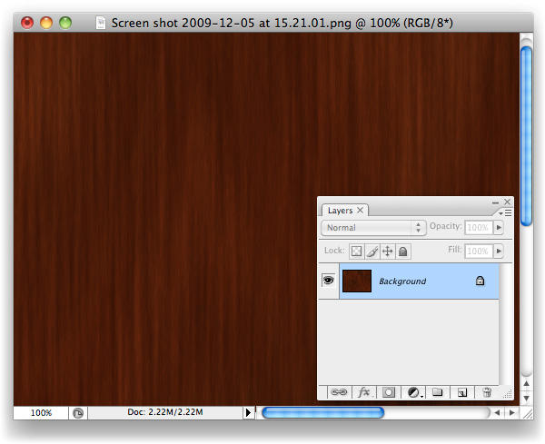
Create a new document 400 x 400 pixels.

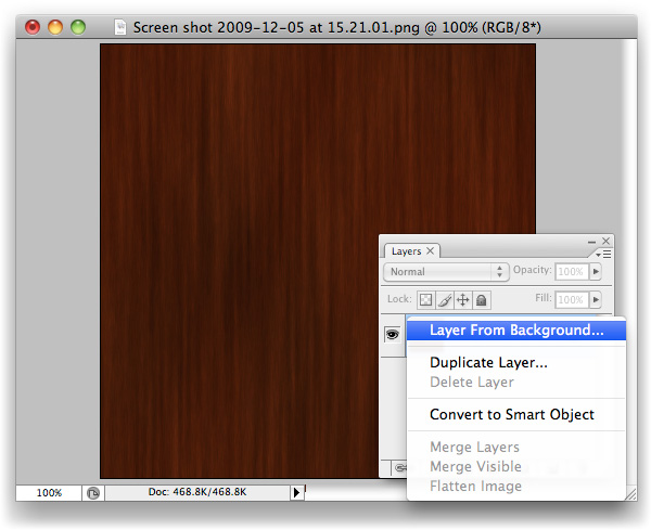
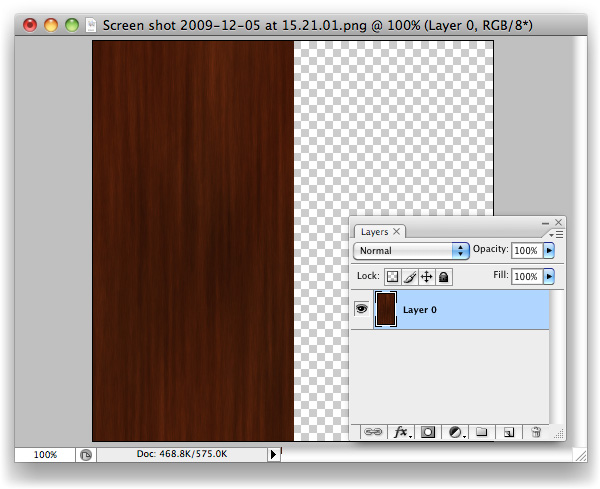
Crop the background layer down, if necessary and double click the background layer to unlock it and turn it into a regular layer.
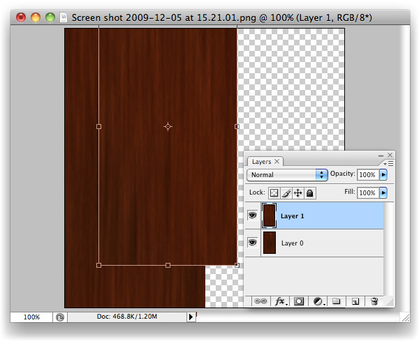
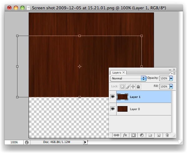
With the Marquee Tool, grab the entire right-hand side of the canvas.

Cmd/Ctrl + X to Cut the selection away. You’ll be left with the left side of the image, on your "Layer 0".
Cmd/Ctrl + V to Paste the selection that you just cut out back onto the canvas. It’ll be its own layer now, "Layer 1". You’ll want to drag it right over to where "Layer 0" is with the Move tool, snap it tight with the left-hand side of your canvas.
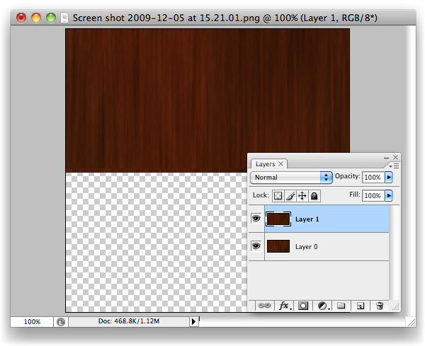
Now select "Layer 0", and Move its contents over to where the right-hand side used to be.
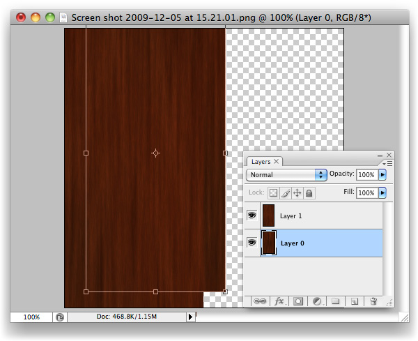
What we have here now is the original image, sliced in half, with its pieces put in the wrong places. Amazingly, the background that I chose actually looks spot on after having done this, but you’ll likely see a seam of some sort along the centre.

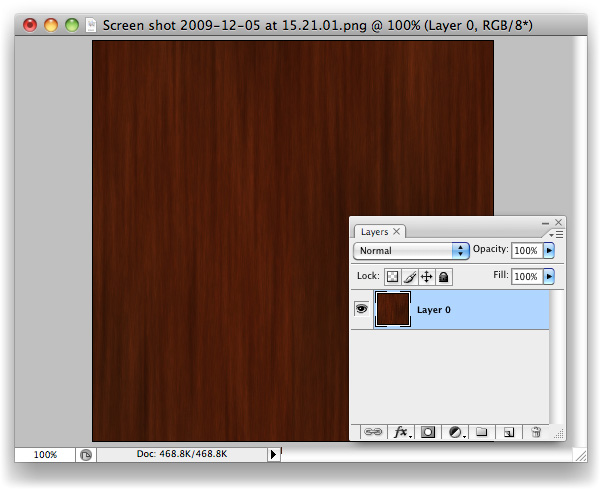
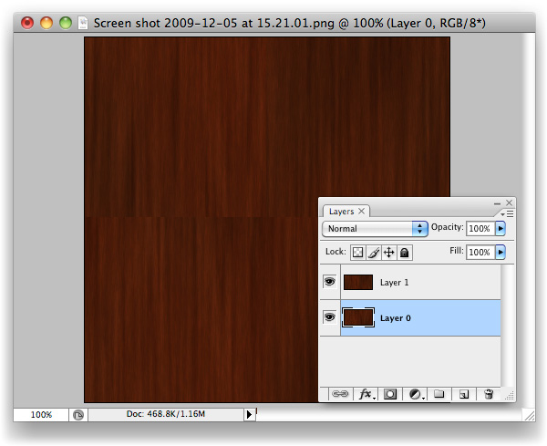
With "Layer 1" selected, hit Cmd/Ctrl + E to Merge Down the layers on top of one another.
We’re going to repeat the process once more, but vertically rather than horizontally. Grab the bottom half of the image with the Marquee tool (M).
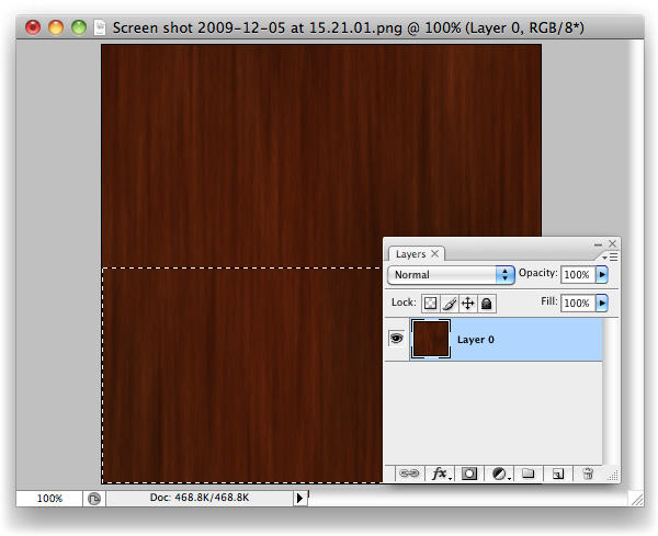
Like last time, cut this selection out.
Paste the bottom back in as a new layer and Move (V) it up so that it snaps tight with the top of the canvas, on top of "Layer 0".
You should be able to guess what’s coming next? If so, you’re getting it, and this trick will soon be baked onto your brain and will, hopefully, save you lots of time in the future.
Move (V) the contents of "Layer 0" down and snap it tight with the bottom of the canvas, where "Layer 1"’s content used to be.

Here we go, check out that beauty of a seam. You’ll likely have two of them running through your image, whereas I’ve been fortunate enough to only have one (I still can’t believe the first cut was so clean!) What we’ve done is basically mimic the effect we would normally only see once we’ve applied a tiled image, and wonder how on earth to fix it. The edges of this image will tile perfectly, however, as we’ve moved the nice-and-tidy central area of the image over to the borders, and the original seams through into the centre of the canvas. Now we know that the problem areas are in plain sight, we can sort them out.
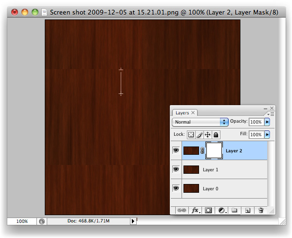
Paste again. You’ll have "Layer 1" twice now, this second instance named "Layer 2".
Drag "Layer 2" up to the top of the layer stack (just grab it in the layers palette, move upward.

Make a Mask on "Layer 2". It’s the third icon along at the bottom of the layers palette. Looks like a moon in a dark sky.

With the Gradient Tool selected and Black > Transparent selected as the colour to be used with gradients, simply drag from the top of "Layer 2" down to about where I did in the screenshot.
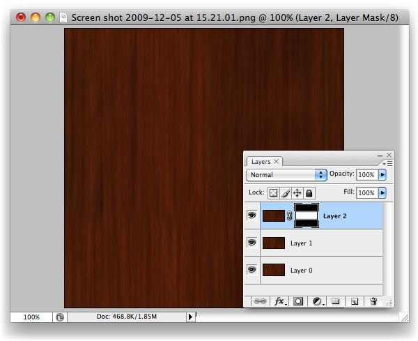
Same again with the bottom of "Layer 2", but upwards.

Duplicate the new "Other Page" layer, and drag it underneath the original. Using the Levels panel (Command + L), drag the black Input Level over to the right and the white Input Level to the left slightly like in the image above to increase the intensity of the Gradient. Nudge this layer down slightly from the original "Other Page" layer, to reveal the second "Other Page". The increased intensity of this layer’s Gradient allows the effects of the gradient to be visible in this small space.
At this stage, you’ve done all the legwork you should have to. If the gradients have left a sort of mushy, blurry edge, use a Brush and work into the mask a little to break the progressive line into a more choppy one. That should be all that’s needed to disguise the seam.

You’ll now have your very own tiling image with seamless seams. More importantly, you should have a new trick up your sleeve that will hopefully save you lots of time in the future.

Today, we have another Psd Premium tutorial exclusively available to Premium members. If you want to take your photo manipulation skills to the next level, then we have an awesome tutorial for you. Learn more after the jump!
In today’s premium tutorial, we will demonstrate how to successfully create this epic scene in Photoshop. This piece involved the use of several stock images and is loaded with useful tips and tricks. It took several days to complete, so let’s stop fooling around and get started!
Premium members can Log in and Download! Otherwise, Join Now! Below are some sample images from this tutorial.

As you know, we run a premium membership system here that costs $9 a month (or $22 for 3 months!) which gives members access to the Source files for tutorials as well as periodic extra tutorials, like this one! You’ll also get access to Net Premium and Vector Premium, too. If you’re a Premium member, you can log in and download the tutorial. If you’re not a member, you can of course join today!
Tonight at 7pm CST we will be streaming a live video feed from our Envato Community Night here in Chicago. This will give you a chance to “hang out” with the Envato staff as we have an informal meet and greet with those who use the sites. Each site editor/manager, including myself, will make a point to come over and say hello. For those who can’t make it, we’ll record the stream for you to go back and watch later.
For those of you who couldn’t watch the video live, feel free to watch the recordings below.
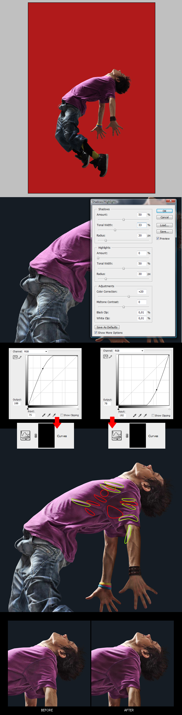
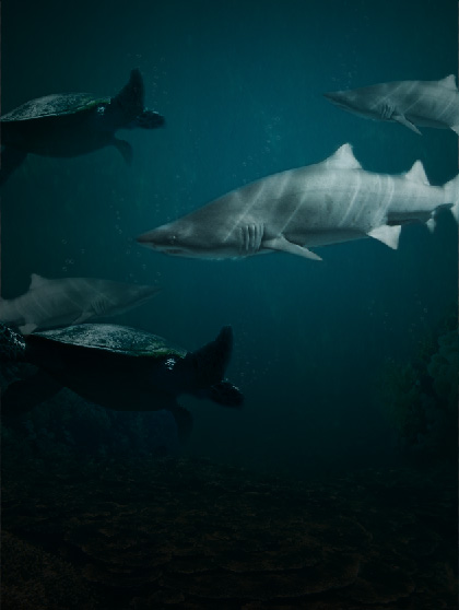
Sometimes certain scenes are too expensive, dangerous, or even impossible to photograph. This is when people often turn to Photoshop. In only a little bit of time, you can create a very realistic looking image. Today we will be learning how to create an eerie underwater scene. So, get your scuba gear on and let’s get started!
The following assets were used during the production of this tutorial.
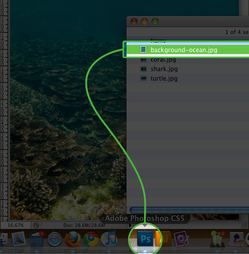
We are going to first open up the background ocean image, as this will dictate how large our canvas is going to be. You can do this by either dragging and dropping the image icon onto your Photoshop icon, or go to File > Open.
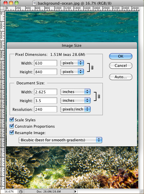
Once the background is opened in Photoshop, go to: Image > Image Size. In the popup box, we are only going to modify the Width. Set the width to: 630px.
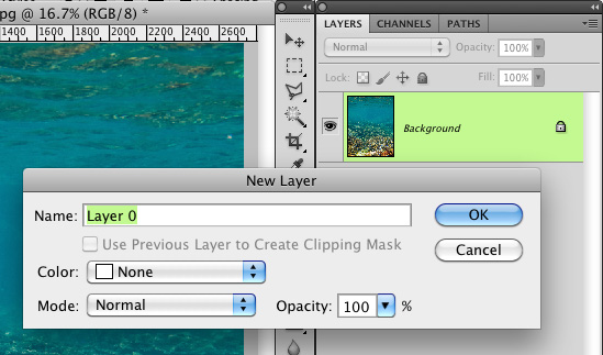
Before you can modify the background image, you are going to need to unlock it. We can do this by double clicking on the layer in the layer panel and by clicking "OK" on the "New Layer" popup.
Once the background is unlocked, you can go ahead and drag it down, just until the bright rocks on the bottom are no longer visible. This will allow us to add more water to the top portion of the image. Grab your marquee selection tool and select the bottom portion of the image up to below the waves in the water, and then click the "mask" button in your layers panel.
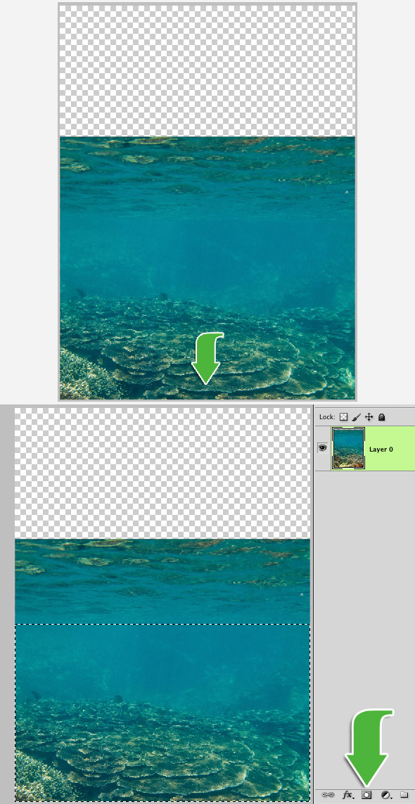
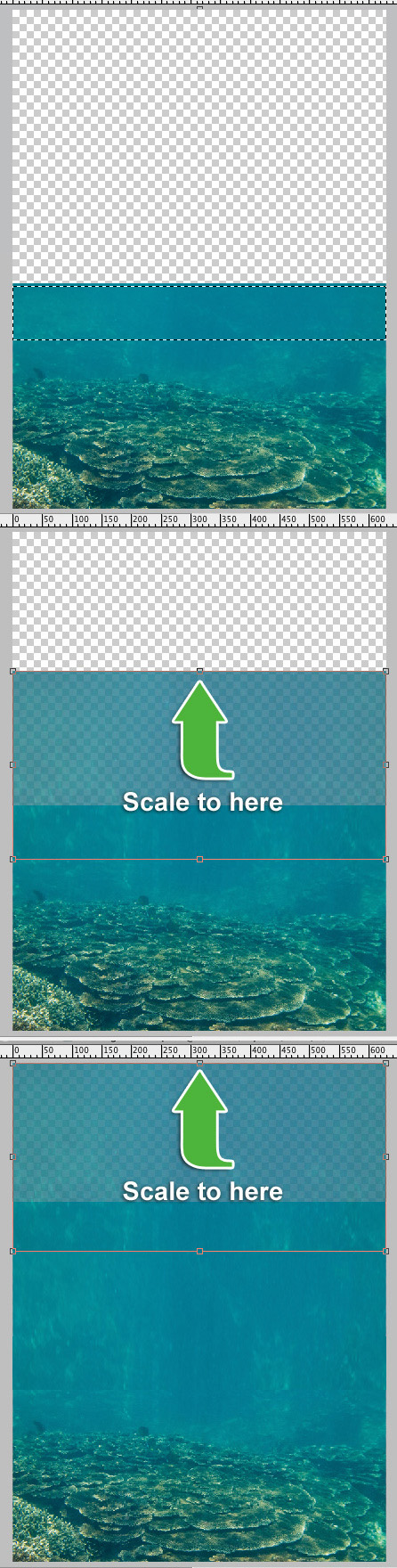
Select the top portion of the water and click "Cmd/Ctrl + J" on your keyboard to duplicate the selection to a new layer. Move the layer up just slightly and scale it upwards just so it covers about half of the transparent portion of the canvas.
Click "Cmd/Ctrl + J" one more time, to duplicate that layer. Take this layer, and move it upwards until it reaches the top of the canvas. Don’t worry about the water looking a little stretched. That won’t be noticeable once we are finished.
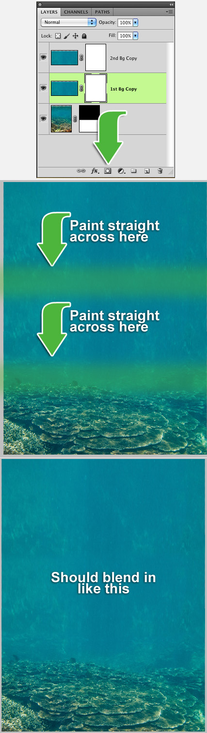
Now that we have the background filled in, we have to work on the bottom edges of the new layers that we created in the last step. We can do this very simply by using layer masks once again. We do this by clicking on the layer in the layers panel and then click the "mask" button. A new thumbnail image of a white box will appear next to the layer thumbnail.
You will now need to select a midsize brush with a hardness of 0%. We are going to use this brush to gently paint the bottom portion of the selected layer. By doing this, it will make the layer blend in. You will have to repeat this step for both of the water layers.
Import the Shark image. You can do this by going to File > Place and navigating to the shark image. Or you can just simply drag and drop the image from your folder directly onto your Photoshop document. Once it is imported, scale the shark to size, and then place it on the right side of the image about halfway up the image.
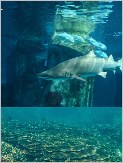
Now it’s time to remove the background from the shark image. We are going to do this exactly like we did in step 6, with the mask tool. Click on the shark layer and then click the "mask" button in your layer’s panel. With a small brush slowly erase around the entire shark, removing the background. The closer you get to the shark, the better the final image will look.

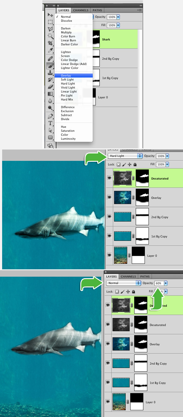
You can leave the shark as-is, but I prefer to give the shark more of a gray look. We are going to accomplish this by creating 2 duplicates of the shark and modifying them slightly. First step is to select your current shark layer and changing the Blending Mode to "overlay". You can do this by clicking the box with the word "Normal". This box is located at the top of your layers panel.
Duplicate that current layer (Cmd/Ctrl + J), change the Blending Mode to "Hard Light". We are going to want to "Desaturate" this layer. You can do this simply by clicking "Cmd/Ctrl + Shift + U", or you can do it the hard way by going to Image > Adjustments > Desaturate. This will turn the image black and white. Duplicate the desaturated layer (Cmd/Ctrl + J) and change the layer mode back to "Normal", but this time change the "Opacity" to 60%.
Now it’s time to give the background a dark eerie look. Create a new layer above the water background layers and fill it with black. Then grab a very large eraser brush (about 1000 px) and erase the top left portion of the black background. Lower the opacity of this layer to about 65%. Create one more layer and fill it with black. Using the same size eraser brush, erase the top right portion of the layer. This time lower the opacity to 80%.
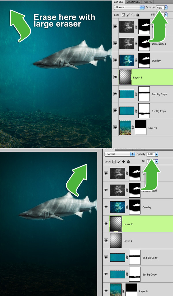
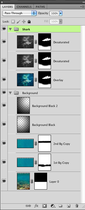
We now have 8 layers in our layers palette and it is looking a little sloppy. We can quickly organize it by selecting the 3 shark layers and clicking "Cmd/Ctrl + G". This will create a new folder with those layers in it. Lets do the same for the 5 background layers (2 black layers and 3 background image layers).
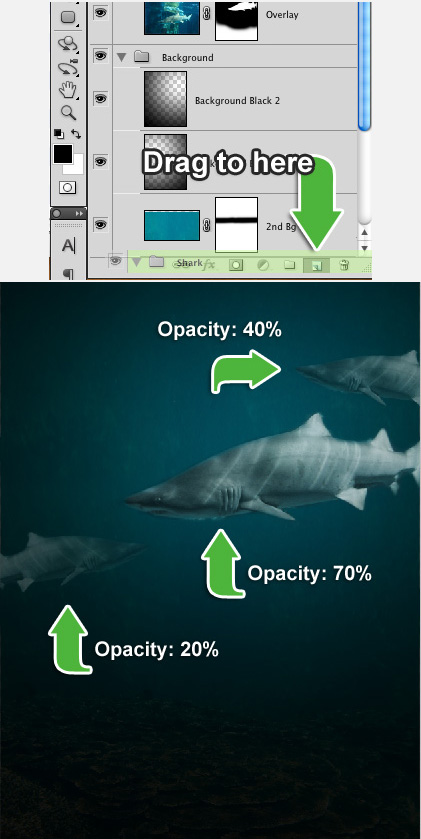
At this point, our scene is looking pretty empty. Lets fix this by duplicating the shark and giving him 2 friends. Select the "Shark" folder and drag it down to the "New layer" icon on the bottom of the layers palette. Go ahead and add one just above the current shark and then another on the left side of the canvas. Mess with the opacity and scaling of the shark to give the sharks more "depth".
Now that the sharks are all placed, we need to give them a couple of friends, turtles. Go ahead and load the turtle image into Photoshop, exactly like you did with the shark image. At the moment, the turtle is swimming towards the left. We are going to flip the image horizontal so the turtle is swimming towards the right. We can rotate the image horizontal by going to Edit > Transform > Flip Horizontal.
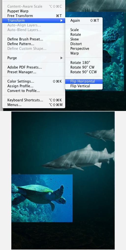
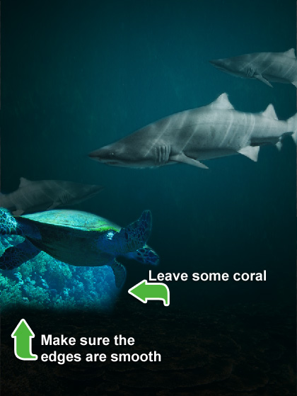
We need to now remove the background from the turtle image. We do this the exact same way as we did with the shark. Create a layer mask and then just paint around the turtle. This time, we want to leave a little bit of the coral that is under the turtle. You also want to mask a small amount of the background on the edges of coral. This way there are no hard edges.
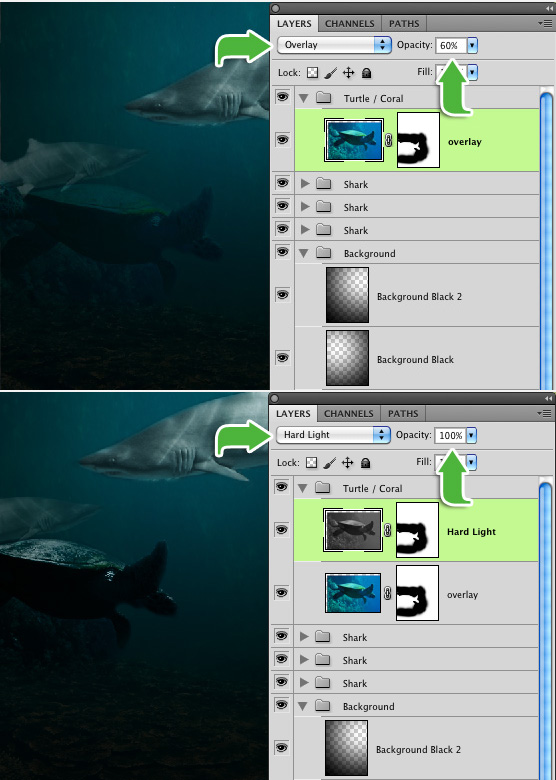
As you can see, the turtle stands out pretty badly. We need to do pretty much exactly like we did with the shark. Set the turtle layer’s blending mode to "Overlay" and set the opacity to 60%. Duplicate the turtle layer by clicking Cmd/Ctrl + J. Then set that layer to "Hard Light" with an opacity of 100%. As you can see, the turtle is standing out still, we need desaturate that layer. You can do this by clicking "Cmd/Ctrl + Shift + U", or going to Image > Adjustments > Desaturate.
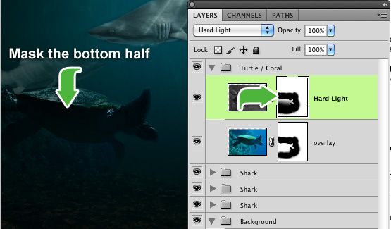
One final step for the "Hard Light" layer, is to slightly mask the bottom portion of it. We can do this by clicking on the "mask" thumbnail on the layer. Then with a black brush with the size of about 300px and a hardness of 0%, gently paint the bottom half of the turtle and coral. This will help make the turtle and coral blend in with the background Now, take both of those layers and put them into their own folder called "Turtle / Coral". You can do this by selecting both layers and clicking "Cmd/Ctrl + G".
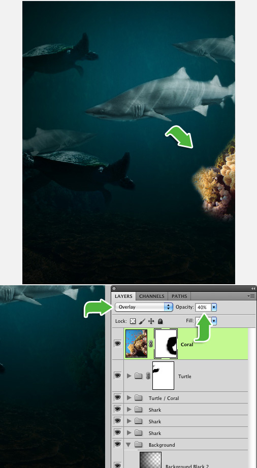
The turtle feels a bit out-numbered because there are so many sharks, so lets give him a friend. You can make a copy of the turtle, just like we did with the shark, by dragging it to the "new layer" button at the bottom of the layers pallet.
The problem with just cloning the turtle is that it has the little bit of coral at the bottom of the image, so we are going to have to remove that. Rather than redoing all of the previous steps, we are going to just add a layer mask to the folder. You can do this by clicking the folder, and just like with a layer, you click the "mask" button at the bottom of the layers pallet. With the mask created, paint away the rest of the coral with a small brush. Now, you can place the turtle at the upper left corner of the canvas. I recommend scaling, rotating and lowering the opacity to give it some depth.
There is one more image for us to work with. This will just be repeating the exact same steps as the turtle. Go ahead and load up the Coral image and place it on the lower right corner of the canvas. Mask out the background, just like we did with the other images. With this image, all we have to do is change the layer Blending Mode to "Overlay" with an Opacity of 40%.
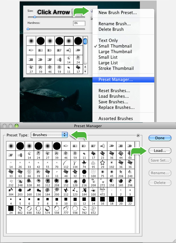
Now that we are done with the images, we can begin adding a little detail. We are going to add bubbles to the water, to give some character to the fish. First, we will have to load the bubble brushes. You do this by right clicking the canvas. In the brush selection pop-up, click the arrow on the top right, go down to "Preset Manager." In the "Preset Manager" window, make sure your Preset Type is on "Brushes", then click on the "Load" button and load the brush file.
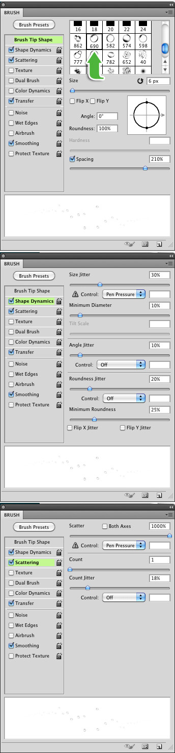
Your brushes are now loaded, but painting 1 bubble at a time would take way too much time. We can save time by simply modifying the brush. Click "F5" to open your brush menu, or go to Window > Brush. Select the bubble brush with the number "690." In this window we are going to do the following: Size: 6px – Spacing: 210%. On the left, click "Shape Dynamics." Size Jitter: 30% – Minimum Diameter: 10% – Angle Jitter: 10% – Roundness Jitter: 20% – Minimum Roundness: 25%. On the left, click "Scattering." Scatter: 1000% – Count: 1 – Count Jitter: 18%. You don’t have to worry about any other settings.
Now that your brush is set, create a new layer and make sure your brush color is white. Then paint the bubbles. I like to give 1 to 2 rows of bubbles (vertical rows) by each mouth and gills. You can also add a few in the background. Pretty much anywhere you feel bubbles should be placed. Feel free to play with the brush size. Once your bubbles are brushed, lower the bubble layer’s Opacity to about 20% to 30%.
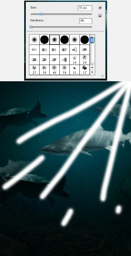
We need to go back to a "default" paintbrush. You can do this by right clicking the canvas and in the brush selection menu, just select one of the round brushes at the top. Set the size to about: 35px and make sure the hardness is 0%. Create a new layer and make sure your brush color is white. Now, we are going to paint "rays" coming from the top right of the canvas.
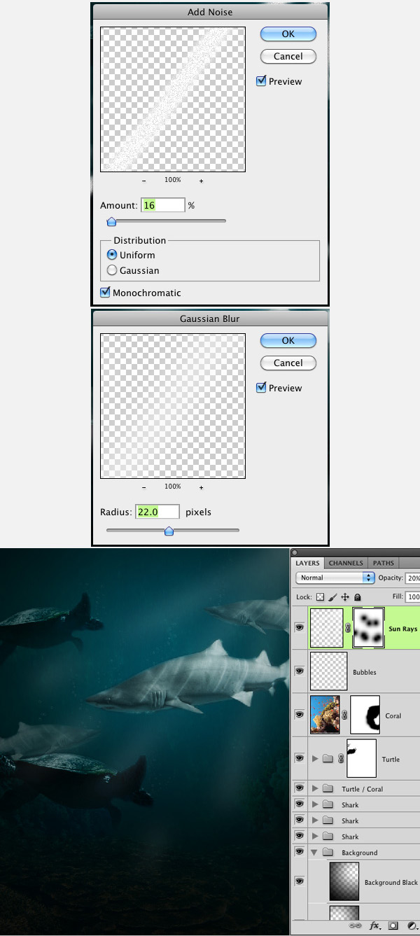
We need to now make the sunrays blend in quite a bit better. First step is to add noise to them. You can do this by going to Filter > Noise > Add Noise. Make the amount 16%. Then add Gaussian Blur. Filter > Blur > Gaussian Blur. Make the Radius 22.0 pixels. Lower the layer Opacity to about: 20%. If you feel that the light rays are a little too "heavy", you can create a layer mask, and gently mask out certain portions of the rays. For example: the bottom edges, and parts that intersect with the fish.
Congratulations, you have successfully created an eerie underwater scene.

We are looking to create a static page in our fan page in facebook, this page should look like our website, and should work as a gallery of our products, should also work as a store. (Budget: $250-750, Jobs: Facebook, HTML, Internet Marketing, PHP, Website Design)