Quick Tip: How to Create the Lead Sound from Ke$ha’s “Tik Tok”

Ever wondered how you can create the catchy lead sound from Ke$ha’s “Tik Tok”? In this tutorial we will give you an in-depth explanation of how you can recreate this killer sound. This includes using several subtle effects which make it a top of the notch lead. We only use Ableton Live and it’s built-in instruments and effects. We’ll explain all of these aspects in detail. But it all starts with…


Step 1: Creating a MIDI Track

First of all, set your tempo to 120 bpm. Then, create a MIDI track. Name this track “Lower Melody”. On this track you will create the lower voice of the lead. Insert Ableton’s built-in Operator and use the following settings:

You need to adjust Operator’s volume envelope. Set the decay to 3.08 ms and the release to 20 ms. Now, you need to select the right waveform, which is a square waveform. So select Square D from the Wave list. Switch the filter on. Keep the default setting, which is Low 12 dB. Set the cutoff frequency to 16.7 kHz, and turn the resonance (Res) all the way down to 0.30. Bring the volume knob down to -30 dB.


Step 2: The Lower Melody

Double click on an empty MIDI slot to create a new MIDI clip. Set the length of the MIDI clip to 4 bars. Then, right click in the piano roll area and choose 1/32 as Fixed Grid. Switch to Draw Mode by hitting CTRL(CMD)+B.

Download audio file (step2.mp3)

As you can see, we use three notes: A#1, C2 and D2. All longer notes are five 32ths in length, the shorter ones three 32ths.


Step 3: Vibrato

To create the vibrato effect in Live, use the built-in effect called Frequency Shifter. Drag it to the MIDI track you created in step one.

Download audio file (step3.mp3)

Turn phasing off by setting it to 0.00°. Click on the note icon to synchronize the vibrato rate to the project’s tempo. Set the rate to 1/8, and amount to 5.50Hz.


Step 4: Bit Reduction

Insert Live’s Redux effect to your MIDI track.

Download audio file (step4.mp3)

Turn Bit Reduction on and set it to eight. This is quite a subtle effect, but will make it sound more crunchy.


Step 5: Compression

Now it’s time to add some compression to the sound. This will give the sound some punch.

Download audio file (step5.mp3)

Use the following settings:

  • Attack: 6.00 ms
  • Ratio: 5.00
  • Release: 5.00 ms
  • Threshold: -36.0 dB

You can leave all other settings on their default value.


Step 6: The Upper Melody

The sound of the upper melody is almost the same as the lower melody. Therefore, you can duplicate your first MIDI track by selecting it and hitting CTRL(CMD)+D and change the name to “Upper Melody”. The only difference is the Rate setting on the Frequency Shifter. If you listen carefully to Ke$ha’s song, you can hear the vibrato is twice as fast on the upper melody. So change the rate to 1/16. Furthermore, the notes from the top track are different: D3, E3, F3 and A3.

Download audio file (step6.mp3)

As you can see, the rhythm is the exactly the same. So you can copy the MIDI clip you created in step two, and only change the pitch.


Step 7: Return Effects

The last two effects you are going to use, will be applied on both melodies. The easiest way to do this, is by creating a return effect channel. Insert two Return Channels by pressing CTRL(CMD)+Alt+T twice.


Step 8: Reverb

To add some liveliness to your sound, you need some reverb. Open the preset list from Live’s Reverb effect, and choose from the Room presets Ambience. Then drag it to your first return track.

Use the send knobs from your both MIDI tracks to add some reverb to the sound. Take a look at the screenshot to copy the value.

Download audio file (step8.mp3)


Step 9: Chorus

Insert Ableton’s Chorus effect to the second return channel and turn up the Dry/Wet knob to 100%.

Finally, select your two MIDI tracks and add some chorus on them by using the send knobs. Once again, take a look at the screenshot to copy the value.

Download audio file (step9.mp3)

Now play both clips at the same time and hear the original Ke$ha “Tik Tok” lead. Enjoy!


Read More

Best of Tuts+ in January 2011

The first month of the year was a very busy one for Tuts+. Here’s a catch up of the Editor’s picks from each site in case you missed them!

Cgtuts+ | CG & 3D Tutorials

  • Coding a ‘Blueprint Manager’ in 3DsMax

    Coding a ‘Blueprint Manager’ in 3DsMax – Day 1

    This month, Anton Vasilescu began his amazing three-part series focused on the creation of a ‘Blueprint Manager’ script in 3D Studio Max. The script allows for a “one click” solution to the time consuming and often challenging task of setting up blueprint images inside the 3ds Max viewports. This is a must see tutorial for any 3ds Max artist interested in learning to utilize the power of MAXScript, a skill that will allow you to tackle many of the repetitive tasks you face on a day to day basis, tremendously improving your productivity. Let’s get started!

    Visit Article

  • Create a Dynamic Building Asset Using Cinema 4D’s Xpresso – Initial Setup

    Create a Dynamic Building Asset Using Cinema 4D’s Xpresso

    This month also marked the launch of Cinema4D master Aleksey Voznesenski’s two-part Xpresso series. The focus of this series is the creation of a dynamic high-rise building asset using C4D’s powerful Xpresso expression system. Speed up your work flow by harnessing the power of this amazing, fast and flexible system!

    Visit Article

  • Create an Abstract Scene using C4D & AE – Scene Creation

    Create an Abstract Scene using C4D & AE – Scene Creation

    Abstract scenes are fairly common these days, however there is no denying their usefulness when it comes to learning animating, rendering and compositing techniques. January saw the release of part 1 of this brand new, two-part tutorial, were C4D artist Benoit Lavoie-Lamer shows us how to create a amazing-looking (yet strikingly simple) abstract scene, by first creating the scene in Cinema 4D and then heading into After effects for the final compositing. Enjoy!

    Visit Article

Audiotuts+ | Audio Production, Mastering, Music Theory and More

  • Quick Tip: How to Ensure Your Masters Are Not Overlimited

    Quick Tip: How to Ensure Your Masters Are Not Overlimited

    More and more relative beginners are taking on their own mastering. This is great but if you plan to get the job done yourself there’s a few key things you should know before starting your first mastering sessions.

    One of the key things to look out for is the final level of your finished master and the amount of reduction to your music’s dynamic range. In most cases you will only need to look to your final limiter to address both of these issues. Let’s take a look.

    Visit Article

  • Quick Tip: Use Multiple Audio Interfaces on Mac OS X

    Quick Tip: Use Multiple Audio Interfaces on Mac OS X

    This is a true gem for Mac users especially when most DAWs do not allow you to use multiple audio interfaces. This can be very useful if you have multiple audio interfaces and want to use them together for more simultaneous inputs and outputs. I am sorry about this tutorial will only apply to Macs so Windows users are out of luck.

    Visit Article

  • 20 Windows DAWs Worth Using

    20 Windows DAWs Worth Using

    Most of the world use Windows computers, so the chances are you’re one of them. So if you want to produce music on your computer, what are your options? Fortunately there are a heap of them – most of the big name digital audio workstation software works fine on Windows, and they’re not your only choices. So sit down and take a menu. We list the “big gun” software you can choose from, some inexpensive (less than $100) alternatives, and a few free options.

    Visit Article

Psdtuts+ | Adobe Photoshop Tutorials

  • Undress a Giraffe in Photoshop

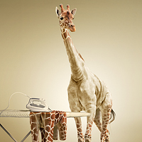
    Have you ever wanted to know what a Giraffe looks like without its spots? If so, this tutorial is for you, you pervert! This tutorial will demonstrate how to undress a giraffe by removing its spots. It will then show how to turn its spots into an outfit that will be draped over an ironing board. Pretty cool!

    Visit Tutorial

  • Quick Tip: Create a Chrome 4×4 Vehicle Emblem

    This quick tip tutorial we will demonstrate how to create a chrome 4×4 vehicle emblem using editable text and layer styles.

    Visit Tutorial

  • What Does a Histogram Tell Us?

    We’ve all seen histograms in Photoshop but very few of us probably actually know what they mean. In this tutorial we will explain the Histogram panel; specifically the Shadow/Highlights and Levels adjustments.

    Visit Tutorial

Activetuts+ | Flash, Flex and ActionScript tutorials

  • Beginner’s Guide to FlashDevelop – Basix

    Beginner’s Guide to FlashDevelop – Basix

    Two common misconceptions about Flash Professional: first, you have to buy it in order to make Flash apps and games; second, it’s a decent tool for writing code. Totally untrue.

    In this article, we’ll see how to use the free Windows application FlashDevelop to work on Flash projects — both with and without Flash Professional.

    Visit Article

  • 15 Useful AS3 Snippets on Snipplr.com

    15 Useful AS3 Snippets on Snipplr.com

    When working with Flash and Actionscript 3.0 you may often find yourself repeating code from one project to the next. Creating your own library of reusable code snippets (on snipplr.com for example) is a great way to speed up development. Check out these 15 snippets which you may find useful for integrating into your own code library.

    Visit Article

  • Use the Flash Project Panel? to Build a Dynamic AS3 Menu

    Use the Flash Project Panel? to Build a Dynamic AS3 Menu

    During this tutorial, we’ll use the Project Panel in Flash to create a vertical animated AS3 menu. The whole process will allow you to easily customize all aspects of the menu using the parameterized constructors. Read on to learn more!

    Visit Article

Vectortuts+ | Adobe Illustrator Tutorials

  • Create an Inspirational Poster Design

    How to Create an Inspirational Poster Design

    Today we will create a poster in the style of PSA (Public Service Ad). These ads are intended to develop new social values. Philippe Patrick Starck, an iconic designer, said: “The designer can and should participate in the search for meaning, the construction of a civilized world.” Well, let’s participate.

    Visit Article

  • Create a Painterly Landscape

    Create a Painterly Landscape with the Blob Brush Tool

    Illustrator’s Blob Brush is an intuitive and versatile tool. When used with a graphics tablet, you can create loose, painterly images that venture far from the sharp, clean lines usually associated with vector graphics. These files retain all the benefits of vector files, however, allowing you to experiment and be flexible with scale, color and composition.

    Visit Article

  • Create a Variety of Script Lettering

    Learn to Create a Variety of Script Lettering

    In this tutorial I will showcase three different approaches, which result in three different script lettering styles. We will start with a nice simple basic script, touch on a more athletic inspired lettering style and work our way to a classic, fancy script.

    Visit Article

Phototuts+ | Photography and post-processing tutorials

  • Step By Step: Taking Beautiful High Key Photos of Flowers

    Step By Step: Taking Beautiful High Key Photos of Flowers

    Flowers are a beautiful and popular subject, but taking photos of them outdoors is often a frustrating process. You have to wait until the flowers are in bloom before you can even start, and then you are at the mercy of the light and weather. But there’s an easy way to take photos of flowers at any time of the year, no matter where you live take them indoors, where you can control the light and the background. That’s how I took this high key photo of a lily, and in this tutorial I’m going to show you how I did it.

    Visit Article

  • The Complete Behind-the-Scenes Guide to a Commercial Shoot: Photo Premium

    The Complete Behind-the-Scenes Guide to a Commercial Shoot: Photo Premium

    When you look around at TV ads, movie posters, billboards, you see a lot of great styles of photography. You may wonder to yourself, how do they make it look so unique? Well with this tutorial, we hope to demonstrate how you can achieve a very commercial look to photographs through the use of strobes, lighting modifiers, lighting techniques and post-processing!

    Visit Article

  • 100 Beautiful Vintage Camera Photographs

    100 Beautiful Vintage Camera Photographs

    It’s easy to forget that cameras weren’t always defined by megapixels and the quality of their digital sensors. Once upon a time, photographers had to pay for every photo that they took, and they couldn’t see them for hours or even days after the shoot.

    Today we’ll pay homage to the countless cameras that have come and gone, paving the way for our beloved modern DSLRs. Below we’ll take a look at modern images of over a hundred beautiful vintage cameras (along with a quick history lesson!)

    Visit Article

Mobiletuts+ | iOS, Android, WebOS, Mobile Design Tutorials and More

  • Corona SDK: Game Development Path Finding

    This project steps through the basics of path finding in the Corona SDK via the A* path finding algorithm, a staple in the game industry since about 1970. This app lets you add obstacles to a 10×10 grid and view the path determined by A*.

    Visit Article

  • Augmented Reality: Getting Started on Android

    Perhaps you’ve heard about augmented reality—it’s a hot topic in mobile right now. Learn about what augmented reality is and how you can leverage this technique in your Android applications in this introductory article.

    Visit Article

  • How to Get Started in Android App Design

    In this article we will go through some very basic design topics for the Android platform. Aside from the documentation provided by Google, there are very few resources that provide a high-level view of designing Android mobile apps. This article will make it easy to understand the nuances of Android user interface design.

    Visit Article

Aetuts+ | After Effects News, Tutorials and More

  • Fallout 3 V.A.T.S Shot – Day 1 of 3

    Today we’ll go over setting up our scene and preparing it for keyframe animation. We’ll begin to build the elements of the V.A.T.S effect such as the outlines, grids, and percentage boxes.

    Visit Article

  • Invent Your Own Custom Logo Transformation Template

    In this tutorial I will show how to create a logo transformation template that can be re-purposed and features the ability to drop in any logo and have the effect and shadows update automatically… similar to something you might see on Videohive. Then, to finish off we will build a simple 3d environment plus some additional scene elements.

    Visit Article

  • Aetuts+ Hollywood Movie Title Series – Inception v1

    Continuing our Aetuts+ Hollywood Movie Title Series, today’s tutorial will explain how to make the “Inception” flying logo style, using Cinema 4D 11.5 and After Effects. In Cinema, we’ll be modeling a maze logo, then using Mograph module (Cinema 4D 11.5 v.), we add the buildings inside of the labyrinth scene. We’ll follow in After Effects putting together the final composition.

    Visit Article

Webdesigntuts+ | Web Design Tutorials and Articles

  • Designing for the New Fold: Web Design Post Monitorism

    Designing for the ‘fold’ has long been a priority for many Web Designers, but with so many devices capable of displaying your website, how on earth do you know where it is? Should we be worried? This article asks how important the ‘fold’ actually is, the variables at play, changing browsing habits and what you can do about it. The Death of the Fold is upon us, at last!

    Visit Article

  • Should Web Designers Know How to Code?

    Whether or not web designers should know how to code is a question that’s been around for over a decade now… and one that most designers have agreed on more or less: Yes, web designers should know at least a little bit about HTML/CSS… But as new standards, formats, and languages have been developed, the stakes of this question have gone up quite a bit… so, should modern web designers know how to code?… and how much should they know?

    Visit Article

  • Design a Sleek, Dark Mobile App Website (Updated!)

    Now Updated with a Coding Tutorial and the free PSD! In this tutorial we’ll be using Adobe Photoshop to design a sleek web interface that can be used for any mobile app website. We’ll be covering an array of techniques including shapes, textures, masks, custom icons, typography and much more that can be easily adapted and applied to your own web designs.

    Visit Article

Tuts+ Marketplace Tutorials

  • Object Oriented JavaScript

    Object Oriented JavaScript

    Ever wondered how you can write JavaScript with object oriented principles? Had a hard time understanding prototypes when working with constructor functions? Tried to write JavaScript that would do your laundry? This tutorial is here to help you answer all those questions, and more (actually, you’re on your own for the laundry). With both a written tutorial and -3 hours of screencasts (1280×800 HD).

    Visit Article

  • Setup a Dev Server

    Setup a Dev Server for PHP, MySQL & Ruby on Rails

    In this tutorial and screencast, you’ll learn how to turn that old computer you have lying around into a full-featured test bed for your websites! We’ll set up a typical LAMP server with Ubuntu Server 10.10, using Apache 2, PHP 5 , MySQL 5.5 and SQLite3. We’ll also build in support for your Ruby on Rails 3 apps!

    Visit Article

  • DIY Design and Branding Toolkit

    DIY Design and Branding Toolkit

    This is a premium toolkit designed specifically for bootstrapping entrepreneurs and small business owners who are operating on a budget and canÕt afford to work with a professional graphic or web designer yet.

    Visit Article

Nettuts+ | Web Development Tutorials

  • Free Mac Utility App: Structurer (New Version)

    At the end of 2010, we released an exclusive Mac utility app, called Structurer. This app allows you to rapidly create file/folder structures for your new projects. Less than a month later, the developer, Cesar Tessarin, is back with a much improved version which now provides support for template creation, as well as assigning custom content automatically to newly created files. It’s fantastic, and, even better, 100% free to all of our readers!

    Visit Article

  • 20 Ways to Save Kittens and Learn PHP

    There’s an old adage – dating back to the 1700s – which, in English, says: “A kitten dies each time a PHP programmer doesn’t follow best practices.” Okay, not really; but just go with it!
    Getting started in PHP can be a daunting experience. With that in mind, these 20 tips will teach you how to follow best practices, and save lives…kitty lives.

    Visit Article

  • 11 Lessons Learned After Running a Massively Popular Blog

    For the last three years, I’ve had the pleasure of managing Nettuts+ – a site with 80,000 subscribers, and over 3 million page views each month. In that course of time, I’ve learned a great deal about, not only what it takes to build an active community, but also the economics of running a sustainable and profitable blog. I’d like to share some of these lessons with you today.

    Visit Article

Read More

Start Using the Brush Tool – Basix

Are you new to Photoshop? Have you been trying to teach yourself the basics of Photoshop but have found the amount of educational material available on the net a bit overwhelming? As the world’s #1 Photoshop site, we’ve published a lot of tutorials. So many, in fact, that we understand how overwhelming our site may be to those of you who may be brand new to Photoshop. This tutorial is part of a 25-part video series demonstrating everything you will need to know to start working in Photoshop.

Photoshop Basix, by Adobe Certified Expert and Instructor, Martin Perhiniak includes 25 short video tutorials, around 5 – 10 minutes in length that will teach you all the fundamentals of working with Photoshop. Today’s tutorial, Part 10: Start Using the Brush Tool will explain a little about brush diameter, hardness, opacity, the brush panel, how to save a custom brush, and work with a tablet. Let’s get started!


Read More

Creative Mornings: Michael Bierut Discusses Clients

In the design industry there are meetups, conferences, and lectures occurring every day in just about every part of the world. We know that our global audience can’t attend every event so today we are posting a speech from the Creative Mornings lecture series held on January 1, 2010 in New York City by Michael Bierut of Pentagram where he discusses the subject of clients. Enjoy!


Read More

The Cosmos: Create a Red Giant Star in Photoshop

This entry is part 1 of 1 in the series The Cosmos

When a star like our own reaches the end of its life, it begins to run out of hydrogen fuel in its core. Like a car running out of gas, it will begin to sputter, swelling to a size that could encompass every planet in our solar system out to Mars. When this happens, the sun will swallow the Earth and will spell certain doom for all life on our planet. Today’s tutorial is part of a 4-part series depicting the journey of the inhabitance of a dying world that must travel into the unknown to find a new world to call home. Part 1: The Lost Home, will demonstrate how to create a red giant star as it is about to swallow an Earth-like planet. In addition to written content, this tutorial also includes about an hour of video instruction to help you along the way.

The rest of this series, we will explore the cosmos from the perspective of this fictional civilization as it makes its way through the universe and will demonstrate the techniques that you can use in Photoshop to depict your own cosmic scene or adventure. Each part of this series will teach something new. So what are you waiting for? Let’s get started!


Tutorial Assets

The following assets were used during the production of this tutorial.


Step 1 – Creating Our Brushes

This step is very important. We will be using these brushes, and this brush creation process extensively throughout, not only this tut, but throughout the entire series. So I will show you how to create three brushes and that will show you how to create your own collection. We will be using the amazing textures provided in the links 1 through 7 for this so go ahead and get those first, of course that is my selection, you might find something that you prefer from those fantastic textures provided. OK got them all? Let’s open up this one below from the package Abstract experimental Vol. 3.

Now this texture is clearly divided on two sections, light and dark, so we will be using each part for a separate brush. Let’s start with the light part, grab the lasso tool and with a feather of 20px define a shape of the features you want to have included in the brush like shown here, avoiding the darker section.

Next do a copy and paste on to a new layer so we get our selection out of the background.

Let’s repeat this but this time in the dark section of our texture like shown below let’s define a new selection like so.

Repeat a copy and paste on to a new layer and delete the background. We will start with the dark portion we defined so let’s hide the first one by turning of the little eye icon on its layer.

Perfect! Now let’s invert the image like shown below and then desaturate it so we get a nice black and white only texture.

Let’s first center our cutout of the dark texture and now if you don’t know already here are the steps to take to define a new brush in Photoshop. First define the selection, in this case we just select all, and in the edit menu find "define brush preset" as shown below; in the dialog that appears either name the brush or just click OK. That is it we have a new brush.

Time to test our new brush, so let’s make a new document with the size we will use for our final piece. I like this size below for most images I make, and just fill it with black.

Next select a nice yellow color so we can easily test our new brush; then scroll down your brush list and all the way at the bottom you can see the new brush we just defined.

Perfect now click once to see how it looks without any options modified.

Nice looking very cool, now here are some options to try out on your new brush. Shape dynamics tied to pen pressure gives you a nice randomized effect; and transfer gives you a nice fade during the stroke, go ahead and try these out.

OK let’s go back to our texture select the lighter layer and hide the other one.

We will now desaturate the layer and then apply some levels adjustment as shown below.

Nice, here we have our delightful texture ready to become a brush, now just drag a selection around it and define the new brush, then name it to your liking and click OK.

Now let’s go back to our testing document; browse all the way down of our brush list, and sure enough there is our new brush so click and test our document.

OK looking very cool now let’s enable a couple of options and test again with shape dynamics and transfer setup with pen pressure.

OK by now you have the idea what to do with our textures, so make as many brushes as you want, I will go into this next one because it has some differences from the previous two. Grab the following texture from the mud 2 package, and define a selection with the lasso tool and as previously set with a 20 px feather.

Perfect, now copy and paste it on to a new layer as we did before plus go ahead delete the background layer and desaturate the new layer.

OK now let’s apply some levels adjustment as seen below.

This time we will blend our selection borders even further by erasing with a big round soft brush as shown below.

Perfect we have softer nice edges; now its time to define our new brush, so drag a selection around it and go to define the brush…Umm seems It’s not available. Well when your brush selection its too big, the define brush preset option becomes hidden, so let’s scale down our texture a bit as shown below.

Let’s drag the selection again and perfect there is the option enabled, so now select it so we create the new brush.

Let’s test this new brush too and enable the options shown to test how it flows. Very very nice, now go ahead and create as many brushes as you like, test them out and delete them if you don’t like them, because big brushes such as these take up a long time for Photoshop to load.


Step 2 – Sun Texture

Now we will be creating the base for our main character the big red giant star, so let’s grab our ellipse shape tool with a medium gray and while holding shift we define a huge round shape that exceeds the boundaries of our canvas as shown here and if needed we scale and move it into position.

Next let’s rasterize the layer and lock the pixels in it by clicking the icon shown below.

And then let’s grab one of our new brushes and enable shape dynamics but disable transfer since we don’t want softness on our strokes, but we do want different rotation.

Then with a darker gray color selected let’s start clicking with our brushes so we get the surface texture interesting then clicking with some other brush, and then changing the brush once more as many times as required to get the look we want. Be sure to watch the video so you can grasp what we have done.

OK once you have something you like; below its what I came up with let’s click on the layer thumbnail while pressing the command key (Command/Ctrl + click) so we get our circle selected fast and easy.

Now let’s apply the Spherize filter twice with the settings shown here so we get the illusion of a spherical object.

Perfect, now we have our Sun texture looking nice, of course the sun will not be dull gray, so let’s take care of that.

On top of our sun layer let’s create a couple of adjustment layers; first of go ahead and create a levels layer with the settings below so we increase the contrast of our texture dramatically as shown below.

Now create a clipping mask for this levels layer by right clicking on the layer and select it as shown here. Now let’s create a hue saturation layer for our sun and apply the settings below, and be sure its also clipped to our sun layer.

Perfect now we have something that looks closer to a Sun, now we can start working on our big red star and make it unique.

Now our surface its looking good, but we need quite a bit of work to make it amazing so let’s start by grabbing the smudge tool and a brush such as shown below.

Now here below you can see what we are going to be doing, mostly on highlights we will be breaking it up by smudging it into something that is much more of a sun surface flow; you can see we are taking all the spots and turning them into some kind of burst flames.

Here is another example of what needs to be done; yet this step its one that really needs to be seen on the screen action video so you can really see what needs to be done all around the surface to make it look better and also to apply your artistic touch. So go ahead and take a good look at the video and smudge away!

OK now let’s grab our sun layer and both clipped layers and let’s duplicate them.

We will set this new sun layer mode to overlay, and you can see the dramatic result for these new layers below.

And we will then duplicate these 3 layers once more, but we will delete the clipped layers for this new one.

Next for this new layer we will apply a simple Photoshop filter to give our texture that random activity seen on the sun surface. So let’s go to filter-glass and adjust to the settings below.

After applying the filter just desaturate the layer, set the mode to hard light at about 28% and that is it we are finished with this step.


Step 3 – Painting Wisps

Now we will start painting wisps and more features to our sun surface so what you need to do its group all the layers we have so far excluding the background. Just select all the layers and drag them into the little folder icon in the layers palette. Then make a duplicate of that group, merge it together and of the resulting layer make a copy too. Now hide both the backup group and the second layer copy, we will be working on just one right now.

Now grab the smudge tool with a brush and size as shown here.

Now indicated below its what we will be doing all over our surface; we will break it up adding some hints of flow and modifying the appearance all over.

And in the edge we will start do define wisps coming out onto space like shown here, and for this we will use the second copy of our sun group on top.

We need to alternate between a brush and the smudge tool to create these solar wisps going out, painting some then smudging, then painting some more and smudging again.

As shown below we paint and smudge giving the wisp flow in one direction.

Then we pick up a yellow as shown here or just sample from our image and we repeat the process, paint and smudge a new wisp.

We will continue to add these features on our surface always following one direction and mostly making them appear from highlights or paint the highlights in.

OK this is what I came up with after brushing and smudging quite a bit. This is another step that greatly benefits from the video capture so you can really see all the work done and then apply it in your own way.


Step 4 – Adding Flames

In this step we will be creating the typical corona flames and wisps that surround the sun. OK so let’s make a duplicate of our last layer.

Then we do a selection of our first layer so we can create a mask; remember Command/Ctrl + click and then invert the selection because that is what we need as a mask.

You need to end up with a black mask that hides the sun’s circumference, and now we will need a duplicate of this new layer.

We will go ahead at this point and add a new layer below our new duplicates and fill it up with a deep red such as this one

And set this layer mode to soft light.

Next for this layer shown below, we need to erase all the long wisps that go outside the circumference of the sun; so grab the eraser and eliminate those only on this layer as shown below.

OK time to grab the smudge tool again with a brush and size such as this and start smudging out some flame like corona for our sun; as you can see the mask makes only what is out of the sun surface visible.

After we have done that all around then we will reduce the size of the brush and start adding very small wisps detail as shown below.


Step 5 – Glow and Finishing Up the Corona.

OK now we will work on the glow of the corona and also some detail we will make with our custom brushes, and we will use the last copy we made of our layer and set its mode to screen.

Then we will apply a radial blur to this layer as seen below

Next let’s make a duplicate of this layer so we can increase the effect look, and merge both back to one layer.

Perfect. Since we merged, the mask is gone so let’s add a new layer mask by clicking on the mask icon.

And we will use this mask to hide some of the glow as shown here so we get something more delicate and random with a big soft brush.

Next let’s create a new layer and duplicate the layer 2 copy 6

We will be using only the mask from this duplicate, so drag the mask to our new layer and delete the duplicate.

OK to work on this we will be using one of our brushes we created that gives us a nice cloudy effect, so grab one that you like or load my brushes included in this tutorial so you can choose exactly the same one.

And then in the brush palette let’s setup the brush like shown here with shape dynamics and transfer.

Then we will be using the same red we chose for the overlay layer and this bright orange; colors don’t need to be exact, so you choose what you like that is similar or sample from the image, there is no sense having you type color values for this.

OK let’s start with the dark red and start adding some cloudy effect as seen below.

Now let’s change up to the bright orange and add some more cloudy masses.

If it becomes too much just use the same brush with the same settings to mask it off a bit.

Once you are finished with this let’s setup this layer mode as screen.

Once you are satisfied, we will now make a new layer that we will use to add some glow

For this we will select a big soft brush and set it up for transfer only with the pen pressure option turned on.

OK now let’s use a color such as this one and paint a bit of a glow around our sun.

Next up let’s duplicate this layer, drag it all the way down and set it to screen mode and set the one on top to multiply.

There we have it now it’s looking much better.

Next up we will be finishing up work on our sun by adding more detail to what we already have so let’s pick up this brush and set it very small. Plus let’s sample from our colors for a bright yellow such as this one below.

OK let’s create a new layer and start painting some detail in our wisps and flames.

You can see the effect the delicate strokes have on the overall look of our sun detail.

And the result of our work here is shown below; be sure to check out the screen capture and have fun painting more or less detail, just don’t go overboard.


Step 6 – Earth-like Planet

For this next step we will be creating the planet in front of our huge sun and we will be using a satellite image from Visible Earth site included in the links so download that one or choose one you like.

Now just select it all and paste it on to the image we are working on.

Now let’s scale the image so we can see it all on our canvas.

Next just drag a circle selection over an area that we like to include for our planet and then invert the selection and delete what is outside.

Now let’s spherize it a bit so we can get the planet like illusion. With the settings below let’s apply it twice.

Nice, now let’s just scale it further and position it as shown.

Next let’s apply a levels adjustment layer to our planet so we have a shadow and let’s clip it to our planet layer.

And using the levels layer mask just mask out the shadow effect just a bit all around the planet, with a medium soft brush.

Now we will be locking the pixels in our planet by clicking on the icon for this as shown here, then let’s pick up a nice bright yellow from our image as shown and with "soft light" selected for our brush we will paint around the same area with the same soft brush to add this yellowish highlight effect as shown below.

Great, now we need another adjustment layer for our planet; this time a color balance layer so we can apply the red tone the sun its emitting, so go ahead and create the color balance as shown and set it up like in the example. We will be adjusting the mid tones and the highlights so there is an image for each of those settings below. And there we have our planet ready.


Steps 7 – 12 Continued Below

You can view steps 7 – 12 using the pagination below.

Read More

Interview With Pawel Nolbert

Pawel is a veteran designer who has been working with world-class design agency Ars Thanea. This experienced artist has created some professional looking advertisements and now shares some important advice about the many facets of designing. In our interview with Pawel, we cover his work at the agency, some of his illustrations, and how he deals with instances where he is not creative. Here is another great interview with a truly talented artist.


Q Welcome to Psdtuts+, please introduce yourself. Could you tell us where you’re from and how you got started in the field?

I hail from a little town in mid-western Poland, where pretty much no one but me was into graphics. Over the past couple of years I’ve been living in Warsaw, where I’m mainly working on commercial projects at Ars Thanea and trying to do personal projects on a side.

It started the same way it did for most of the people reading this interview I guess… Once upon a time, something around 2001, I got acquainted with Photoshop after a short episode with Paint Shop Pro, that I used to create wallpapers – my first ever digitally created pictures. After a few clicks, I quickly figured out, that Photoshop could do much more and much more attractive.

I could write and write on how it developed further, but these are the most essential beginnings (not counting my childhood, when from time to time I used to scribble on many undesired surfaces.

Q Many designers prefer to freelance but you are working for Ars Thanea which is a prominent design studio, what would you say are the pro’s and con’s to working in a studio? And would you recommend it for the upcoming designers?

It might be a pretty obvious thing that if you work in a studio, you usually work with other people, which is a big advancement over sitting in a room alone in front of a computer, as I did when freelancing remotely from home for a couple of years. If you want to polish up your skills, I’d recommend you to go to an agency first. In a collaborative atmosphere you receive a lot of feedback and can exchange useful advice everyday. One of the main things that might attract designers to freelance is that you can make much more money working that way on your own, but you often have to pay a fair amount of sleepless nights, as the deadlines are usually weak… at least to me and my working habits.

Q What happens when you lose your creativity for a period of time? How do you end up dealing with it and bringing it back?

There’s not much I can do to help myself in that situation. For me, as for many others it just goes along sinusoidal shape, so there are creative days and the ones that I better spend on anything but design. However, a great inspiration leads you to creativity, so watching exceptionally inspiring things can keep you on a high level of creativity. Luckily that’s what I do everyday, while I’m an extensive web digger and everyday brings a great amount of gems.

Q A lot of the work in your portfolio is centered around advertisements for different companies, in your opinion what makes for a good ad? 

If you are on the end of a chain, being left to the production side, the things that make advertisements good are very often independent from you, while many of the commissions come with a complete concepts, concepts that by many itself make an ad. But that’s not everything –  if we have more or less a clear concept, then the important thing is to make the visuals that match it. Sometimes you have to read minds of the people that are about to see your ad, to guess the way they would think about what they see, to help the idea sell itself, because in many cases ads are just like an intricate artworks made by creative’s and art directors just to feed their artistic ego and not the client needs.

Q “Art Direction” is an amazing and colorful illustration that you first started 2 years ago but just recently finished. Please talk a little about the creation of this piece and what went into making it. 

Well, I have to say that as I get older and older, I focus more on other things than design, aside from commercial work. I still try to work on some personal projects though, but it goes slowly, really slowly as you could see by the example of "Art Direction". That illustration took me – yeah – almost 2 years to finish! I had many breaks and comebacks, so I didn’t spend all my time on it.

Since the initial thoughts and a sketch, I had in mind couple different variants on how to make it. I started from a very old file that was supposed to be a collaboration with my friend but ended up sleeping on my hard disk, but practically, I used only parts of the background from that psd.

When I finally decided on the direction, I continued with that nice stock image I had, with a girl and a picture frame. I began form cutting it out very, very carefully. I don’t like it when in your illustration; the main subject looks like a photo poorly cut out from some tabloid. I needed it separated in the slightest details. As usual, the most problematic part to cut was hair. I spent a lot of time brushing manually the mask of almost a single hair. I also changed slightly the angle of the frame she was holding to look it more interesting. With that main subject, I sketched up the main composition and elements. Then I spent many hours on creating the elements. I mostly mean the hands and the liquids that were created from many different shots of pudding. That and the little colorful shapes every one of which is unique, took the most of the creation time. When I had it all done, it was just a question of putting a fair amount of the final adjustment layers on top of it and voilla!

Q What group of skill sets do you believe the perfect designer should have?

Let’s point 3 important skills here:

  1. Composition. It takes time to work out a good skill of composition, but it’s something that you can mostly learn, as it bases on some basic principles. However, it also takes some sense and intuition to create a unique, well working solution in more complex compositions.
  2. Sense of color. You have to have an eye for good color choices or just try to learn it. Ideally both. After all, the color is everything what you see there, so be sure you mixed it well. For rich, colorful images, it actually don’t require you much to follow the color theory guidelines as much as in more
    minimalist pieces, while there’s so many colors to mix and you can have that nice array of hues to play freely with. I don’t actually use any theories to put up my color choices – I don’t like to follow the rules, which are useful, but not always…
  3. Attention to detail – because details make a good, original design. In my works, the work on the details often takes most of time of the whole project. I just can’t let any smallest piece of the image to be left untouched. Everything must be polished up, especially if I have a lot of time.

ECO

Q When you are in need of a stock where exactly do you turn to and why? What does this website have that is special from the others? 

Most of the time, I use two popular stock websites: Shutterstock and iStockphoto. At a relatively cheap prices, you can get a huge selection of photos there, especially if I use many different photos in some extensive photo manipulations. It also happens that I use more professional services like Getty. They are more expensive, but it often happens, that the client supplies us with selected stocks for the project, which is a good thing

Q Thanks again for providing Psdtuts+ with this opportunity to interview you. Any final thoughts for our readers?

Thanks for the interview opportunity! It was a while since my last interview and I’m glad to have written some text other than a commercial email again ;)


Where to find Pawel on the Web

Read More

Create an Ancient Egyptian Tomb in Photoshop

Creating imaginary scenes from scratch can be a lot of fun. Today, we will create an ancient Egyptian scene using stock images, textures, and some basic knowledge of perspective. Let’s get started!


Tutorial Assets

The following assets were used during the production of this tutorial.


Step 1

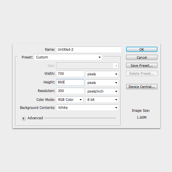
Start by creating a file with a size of 700×800 pixels and a resolution of 300ppi.


Step 2

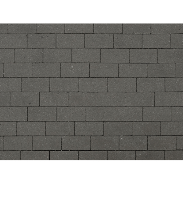
Next, start by opening the file Wall.jpg then desaturating it by going to Image > Adjustments > Desaturate, just like what I did below. You might need to play with the Level settings (Command/Ctrl + L) to add more contrast to the wall.


Step 3

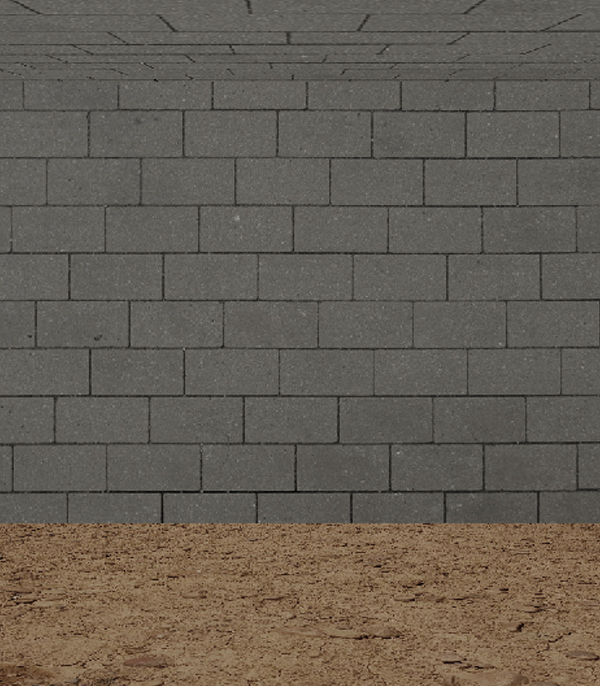
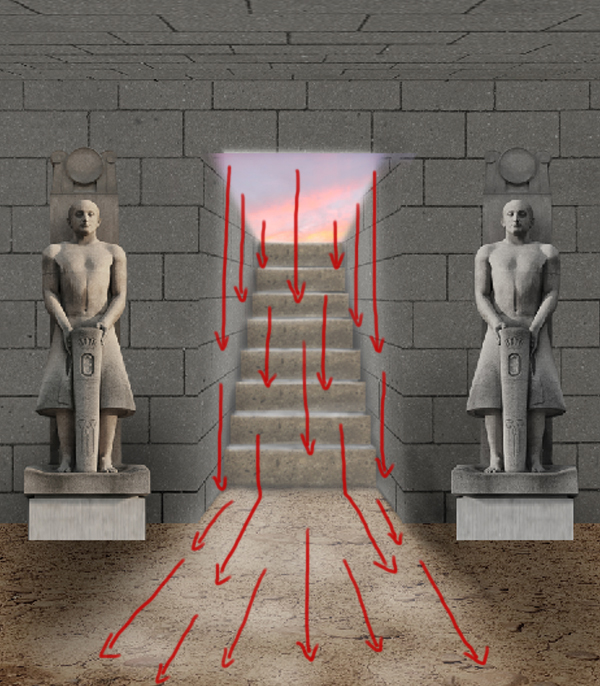
Next, is to add the ceiling. To do this duplicate (Command/Ctrl + J) the “Wall.jpg” then reshape it by pressing Command/Ctrl + T to activate the resizing handles. Press right-click then select Free Transform from the dropdown menu, then follow the indicated direction of distortion below.


Step 4

Next, open the Floor.jpg then resize it just like what we did with the ceiling. I also changed the image’s hue and saturation by clicking Command/Ctrl + U then adjusting it to decrease the overall brightness and saturation of the image.


Step 5

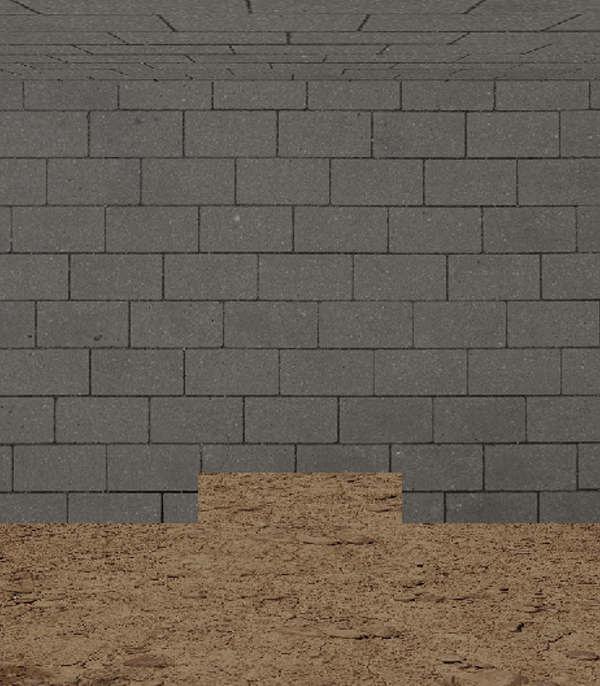
Next, with the use of the Rectangular marquee tool (M), I removed a rectangular section on the lower center area of the wall, just like as shown below.


Step 6

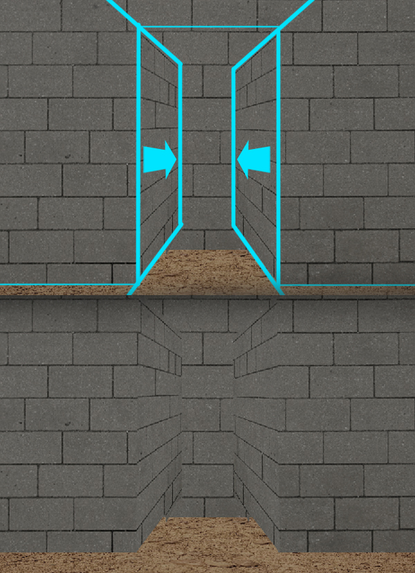
Next, reduplicate the Wall.jpg, our first layer, then reshape it by clicking Command/Ctrl + T then select Free Transform from the dropdown selection. I shaped/distorted it in a certain manner that would create a hallway like structure.

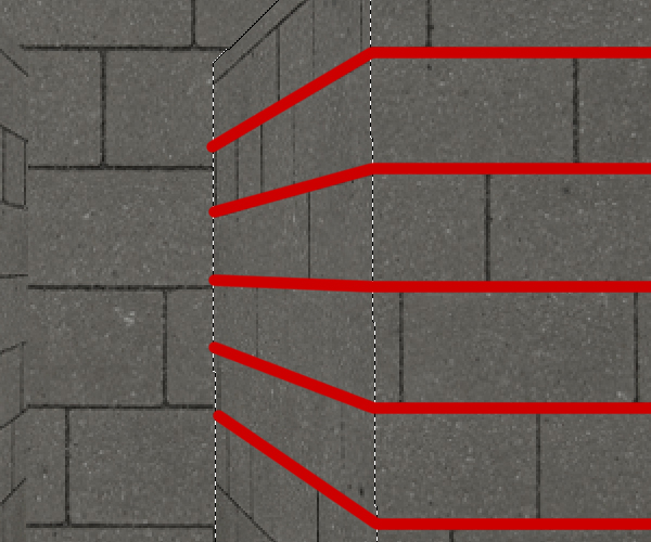
Make sure that the “gap” lines of the wall meet so that the flow of the blocks will be continuous.


Step 7

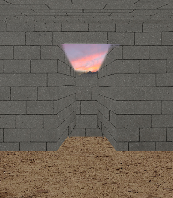
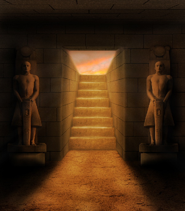
Next is to add the opening of the tomb, which opens to a sunset colored sky. To do this, open the Sunset.jpg, apply a layer mask then use the Brush tool (B) set to color #000000 and hardness ~85% then start to cover the areas we don’t need. You could also try to use color gradients and digital painting to make the sunset as another way to do this.


Step 8

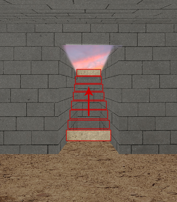
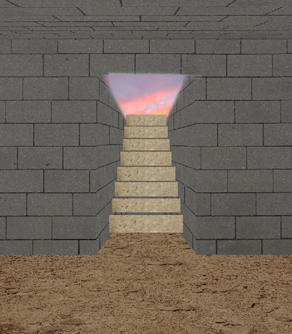
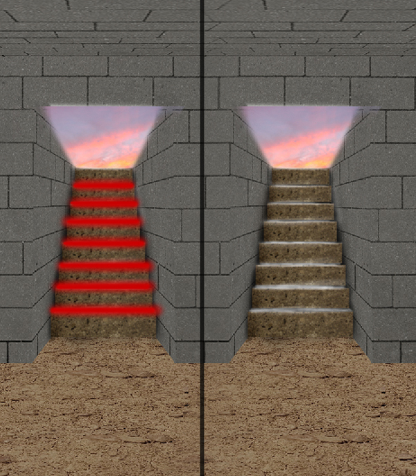
Next is to add the stairs going to the tomb. To do this, open the Concrete.jpg then cut rectangular shapes out of it just like as shown below. Make a set of these shapes from the bottom up to the main opening of the tomb. Make sure to decrease the size gradually as you go up through the stairs, you can do it by pressing Command/Ctrl + T to activate the resizing handles.

The final result should look like as shown below.


Step 9

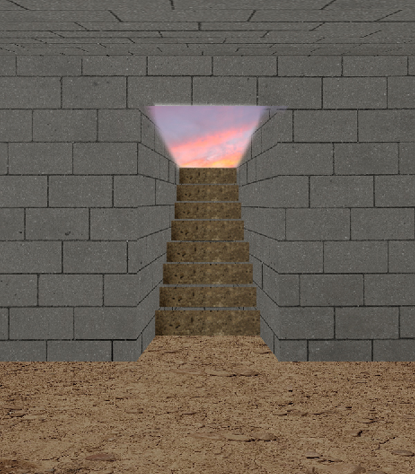
Next, I changed the color levels of the stairs. To do this, in the Layers tab, you should first select the components of the stairs by pressing Shift key then clicking the layers needed. Press right-click then select Merge Layers from the dropdown menu. Once merged, press Command/Ctrl + Alt/Option + L to activate the Levels window. Drag the handles so that the result will give you a somewhat dark-brown color just like as shown below.


Step 10

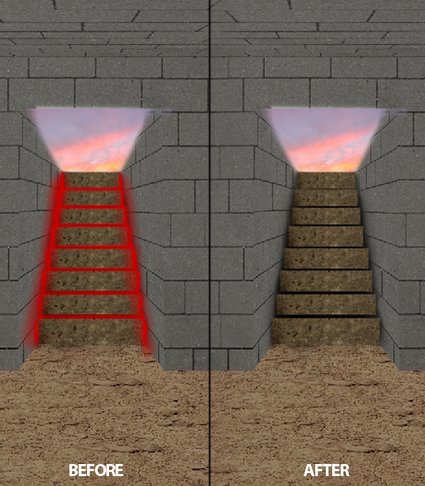
Next add a new layer just below the “merged stairs” layer. Then, using a soft, small-sized brush (B), paint the indicated areas with color #000000 with an Opacity level of ~80%


Step 11

Next, using the same brush settings we used for the shadows for Step 9, paint the areas indicated below but know using color #ffffff.


Step 12

Next, using a soft, mid-sized brush, about ~125px, and Opacity level of about ~30%, brush the areas indicated below. Don’t paint the entire indicated area, just paint some patch of small areas, we did this because we want to emphasize that the ground is uneven.


Step 13

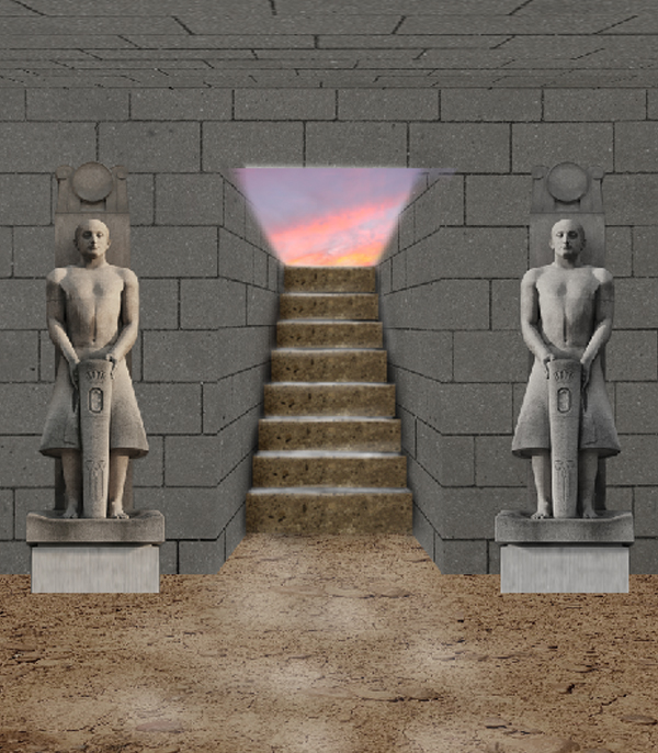
Next, open up the Statue.jpg. Using the Pen tool, trace the entire outline of the statue. Once selected, press right-click then select Make Selection from the dropdown menu. Next, press Command/Ctrl + Al/Option + I to inverse the selection, then press delete. Duplicate the Statue.jpg, then place one on both sides of the entrance. The color tone of the original Statue.jpg is far in comparison with the dominant color scheme of the environment. To fix this, press Command/Ctrl + Alt/Option + U to open the Hue/Saturation window. Here, you can slide the handles to match the color of the statue to the overall color scheme of our scene.


Step 14

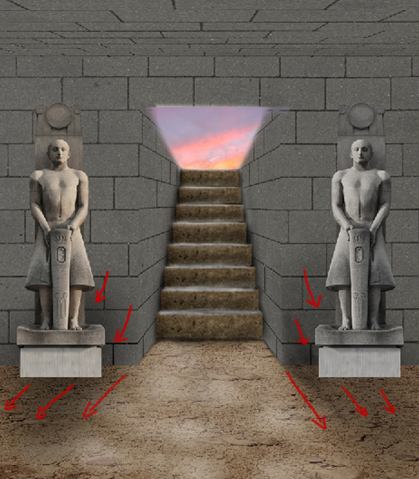
Next I started to paint the first shades of shadows in the lower areas of the wall and the statues.


Step 15

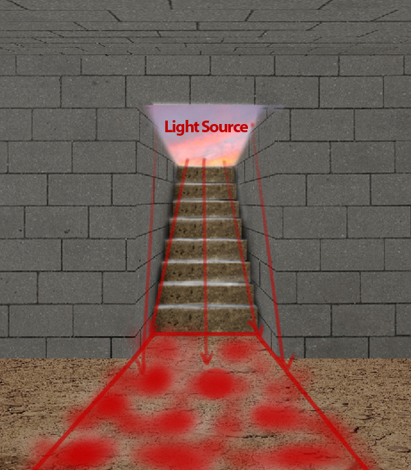
Next, using the Brush tool (B) paint the cast of light coming from the environment (light on the walls and stairs), and the one coming from our source of light, which extends to the floor of our tomb.


Step 16

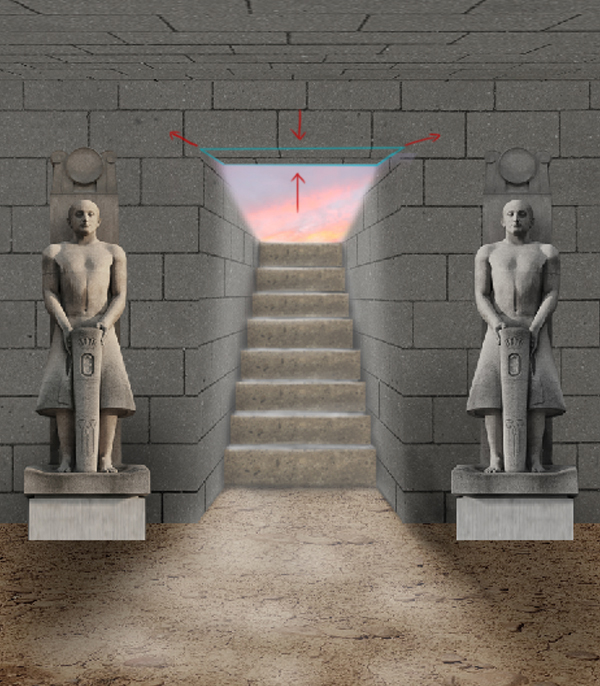
Next, using the Wall.jpg, I cut then reshape, base on the perspective of our scene, a small rectangular shape of the image then placed it on the upper portion of the opening.


Step 17

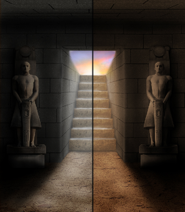
Next is to add the highlights for our scene. Using different variations on brush settings, paint the areas indicated below, paying close attention on the light source, light reflections, and surface lights. Like what I did below, I painted some highlights on the statues, which comes from the reflected light from the floor.


Step 18

After adding some highlights to our scene, I started out to add the primary set of shadows for our image. Using different size and hardness of brush (B), with color #’s close to 000000, start painting out the shadows to the areas indicated below. Use harder and more opaque brush settings for the corners on the ceiling, the shadows casted by the statues, and the corners on the floor.


Step 19

Next, I added a darker set of secondary shadows with the use of soft, mid-sized brush.


Step 20

Next, add a new layer then using the Paint Bucket tool (G), fill the entire image with color #8d4200. After that, decrease the layers Opacity level to ~36% and change its Blend Mode to Overlay. This step will help us blend the image and set the mood of our scene.


Step 21

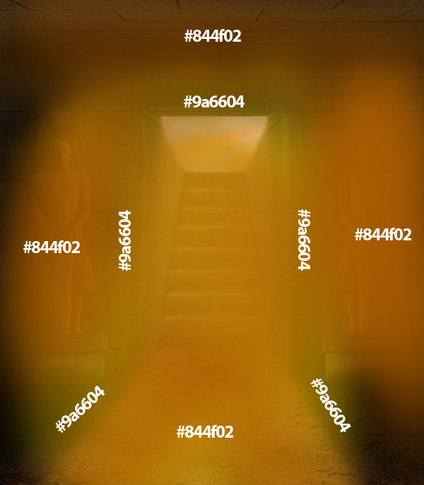
Next, using a soft, ~70% Opacity level, mid-sized brush (B), paint the areas indicated below with its corresponding color #’s. Just like what we did in Step 19, change the layer’s Blend Mode to Overlay then decrease its Opacity level to a higher value of about 60%. This layer will add the warm color effect we need for our scene.

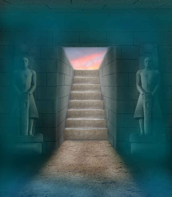
Here’s the final effect should look like.


Step 22

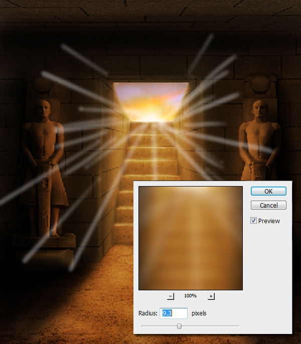
Next, using a small brush with hardness level of ~70%, paint some light rays coming from our main light source just like as shown below. Next go to Filter > Blur > Gaussian Blur, then apply a 9.3 pixel blur level.

Finally, decrease the Opacity level of the blurred lines we just made. The effect should look like as shown below.


Step 23

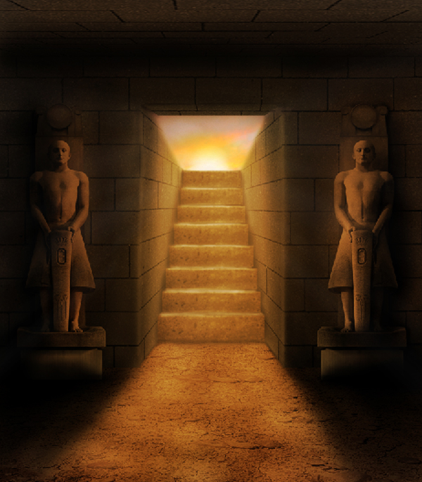
Next, using the Brush tool (B), paint the Sun in our scene. In painting the Sun, start with brushes with hardness level of about 60%, the gradually decrease it as you increase the brush size. After that, add a new layer then paint the areas close to the opening, upper areas of the stairway, with warm yellow to brown color tones, then use Overlay or Soft light as Blending Modes. You can decrease the Opacity level of the layer to adjust the intensity of the layer.


Step 24

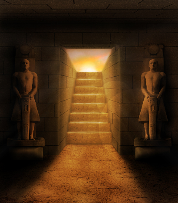
Next, I added some “boque”-like effects by using a 100% hardness brush with color #ffffff. After that, I change its Blend mode to Overlay then decrease its Opacity level to about 15%. Make sure that if you’re going to intersect two “circle lights” do this into two separate layers.


Step 25

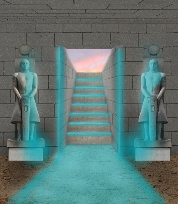
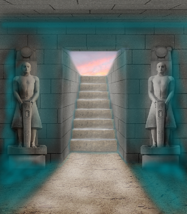
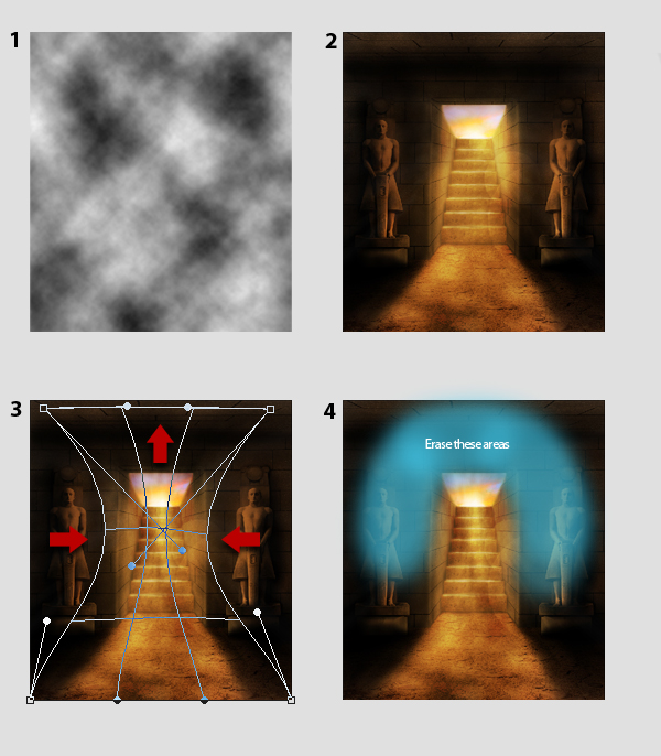
Next, add a new layer then, using the Paint Bucket tool (G), fill the entire layer with color #000000. Next go to Filter > Render > Clouds, Fig. 1. Next, change its Blend Mode to Overlay then decrease its Opacity level to 70%, Fig. 1. After that, press Command/Ctrl + T to activate the resizing handles, then press right-click then select Warp from the dropdown menu. Warp the clouds just like as shown in Fig. 3. Finally, erase the areas indicated in Fig. 4.

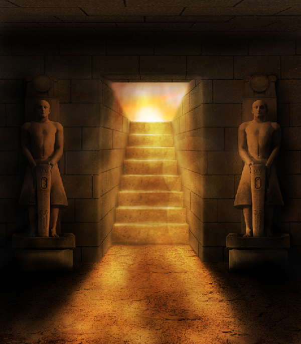
The final effect is shown below. We did this so to add an effect of air and dust rushing outside the tomb.


Conclusion

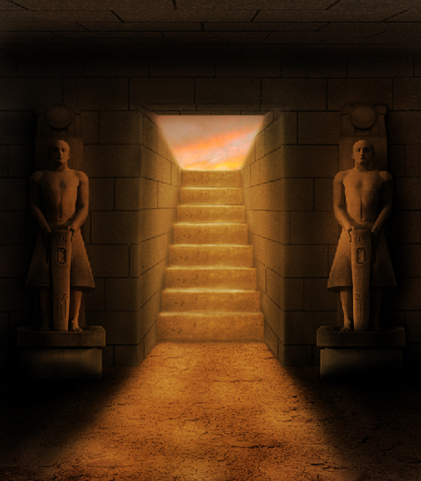
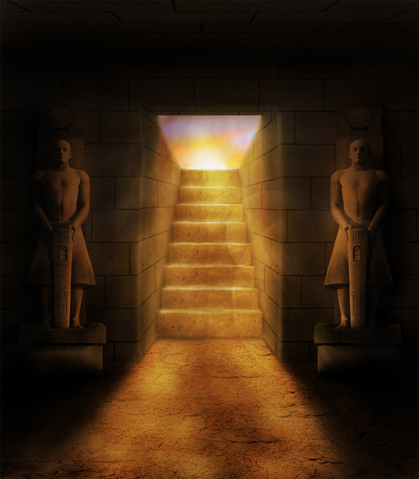
That’s it, we’re done. The final product is shown below. Hope you had fun working on this project and learned something new! Thanks for reading!

Read More

The Making of Temptation – Psd Premium Tutorial

In this Psd Premium tutorial, author Wojciech Magierski will demonstrate how to create "Temptation," an abstract piece that is part of SlashThree’s latest exhibition, Paradigm Shift. This tutorial is available exclusively to Premium Members. If you want to take your photo manipulation and composition skills to the next level, then Log in or Join Now to get started!


Professional and Detailed Instructions Inside

Premium members can Log in and Download! Otherwise, Join Now! Below are some sample images from this tutorial.


Psd Premium Membership

As you know, we run a premium membership system here that costs $9 a month (or $22 for 3 months!) which gives members access to the Source files for tutorials as well as periodic extra tutorials, like this one! You’ll also get access to Net Premium and Vector Premium, too. If you’re a Premium member, you can Log in and Download the Tutorial. If you’re not a member, you can of course Join Today!

Read More

Colour Correction Will Make Your Colours Happy – Basix

Are you new to Photoshop? Have you been trying to teach yourself the basics of Photoshop but have found the amount of educational material available on the net a bit overwhelming? As the world’s #1 Photoshop site, we’ve published a lot of tutorials. So many, in fact, that we understand how overwhelming our site may be to those of you who may be brand new to Photoshop. This tutorial is part of a 25-part video series demonstrating everything you will need to know to start working in Photoshop.

Photoshop Basix, by Adobe Certified Expert and Instructor, Martin Perhiniak includes 25 short video tutorials, around 5 – 10 minutes in length that will teach you all the fundamentals of working with Photoshop. Today’s tutorial, Part 9: Colour Correction Will Make Your Colours Happy will show how to adjust the white balance of an image using the curves adjustment in Photoshop and Camera Raw. Let’s get started!


Read More

25 Excellent Super Bowl Poster Designs

The Super Bowl is the most popular sporting event in America. Each year, the two best teams in the NFL square off for a chance to win the Vince Lombardi trophy and become Super Bowl Champions. To commemorate the occasion, every year they issue a poster to help promote the event. In this article, we decided to bring together 25 of the best-designed posters and programs from the various Super Bowls, just in time for this year’s big event.

Since the Super Bowl has been around for almost 45 years, there have been a lot of posters made for this occasion. During the early years, there was no such thing as digital art. This means that the methods used to produce these designs were quite different from decade-to-decade. Take note of how these posters have changed throughout the years and let us know which one was your favorite.


Super Bowl I

Our first poster was the first ever used for any Super Bowl, this classic poster doesn’t feature any digital work at all. It features a close range photograph of what looks to be a football player mold. As you can see this one dates back to 1967 so there wasn’t much they could have done at the time.


Super Bowl II

The next poster takes a more colorful approach to illustrating this epic showdown. The artist who created this decided to make a collage of an ultimate athlete using the stars of the NFL at the time. This was a very creative approach and can be looked at as one of the best posters in this collection.


Super Bowl III

The third Super Bowl took place in 1969 and this poster is a painting of two players from the apposing teams that would play each other, the Baltimore Colts and New York Jets. Not many posters after this one actually showed real players from each team, so this is another classic one with some simple yet effective art direction.


Super Bowl V

Next we skip to the fifth Super Bowl and take a look at the program from the event. Another unique way of illustrating the showdown that would occur on that night, this time it looks like a sculpture was made and then photographed. The details on it make for a fantastic sculpture and one of the best Super Bowl posters in this set.


Super Bowl X

The tenth Super Bowl was one of the first to have its poster feature the coveted Vince Lombardi trophy, many posters after this followed the pattern of having the trophy in the posters. This very simple yet elegant shot of the flag and the trophy make for a good color combo that is pleasant to the eyes and gets its point across.


Super Bowl XII

This poster was one of the earliest to follow the formula of Trophy + Location. A lot of the posters that follow will illustrate the location of that year’s Super Bowl and mix it in with a shot of the trophy. This one takes a very colorful approach of illustrating New Orleans with a parade going on in front of the place where the game would be played, the Superdome.


Super Bowl XIII

Super Bowl Thirteen took a more modern futuristic approach to the poster, the neon gridlines and soft skyline gradient made for a very original poster. This type of design style is used by many artists now so it is very interesting to see that it was used in 1979 in this specific context.


Super Bowl XIV

Hollywood was the setting of the next Super Bowl and the artist who created this poster definitely did the right thing by incorporating the Lombardi Trophy into the California skyline. Famous landmarks like the Hollywood sign were also painted into the scenery to give it an authentic look, and finally the warm sunset ties in perfectly with everything else.


Super Bowl XVI

The sixteenth Super Bowl took an abstract turn with its poster design. This elegant poster featured the Lombardi Trophy as a centerpiece that is surrounded by other intricate and ornate silver statues. This painting was done extremely well, as the quality is perfect and the colors really mesh together well. This abstract look definitely worked and did not require the use of any scenery or football related items aside from the trophy.


Super Bowl XVII

The year after the Super Bowl was back in California and the poster that was created definitely reflected that. I guess having in it California was a big deal and so a lot of flashy painting was used. This great color scheme with neon lights and the purple sky blended perfectly with the trophy again. This was another solid poster that utilized the common formula used by these Super Bowl posters.


Super Bowl XX

The twentieth anniversary of the first ever Super Bowl came in 1987. The tagline featured in this simple poster already says a lot and does not require an intricate design like the rest of the posters. The point was easily made with that tagline and a simple shot of the
trophy and the “XX” logo.


Super Bowl XXIII

Three years after that anniversary the Super Bowl was set to be played in Miami, Florida. If you are not aware Miami is known for its beaches and the artist was fully aware of that when he painted this poster. The trophy is standing on a beautiful beach in front of another sunset. Nothing too original but the detail and quality definitely take it that extra mile.


Super Bowl XXIV

New Orleans was the setting for the next year’s event and this setting is famous for its yearly Mardi Gras parade which was illustrated in that years poster. The artist did an amazing job of painting an abstract take to this annual celebration.


Super Bowl XXVIII

This poster didn’t use the traditional methods like painting or photography; it took a more digital approach. Mixing the location, the Super Bowl itself, and some ornate decoration this artist created a visually astounding poster. Georgia was the setting for this year’s showdown and it was illustrated beautifully in the main logo of the poster.


Super Bowl XXX

Three decades had passed since the first Super Bowl was played and this poster used a different type of art direction than the last anniversary. The desert of Arizona was the home of this game so it was fitting to have the trophy incorporated in a very colorful and wonderfully painted desert.


Super Bowl XXXIII

Miami was chosen again to host that year’s game but this time there was some diversity with the poster. No sight of a beach or a sunset, which was a good thing because a repetitive image would make for a bad poster. The artist surrounded the Lombardi trophy with some well-known animals and figures of Florida. The art style used here was also very unique and a nice alternative from the paintings used earlier.


Super Bowl XXXIV

Atlanta, Georgia is famous for its Georgia Peaches and that was the clear theme that was used by the artist who created this Super Bowl poster for the event held in Georgia. This might not have been officially used but the realism and detail in the painting makes it an amazing example of incorporating location and the coveted trophy.


Super Bowl XXXV

The Tampa Bay skyline was illustrated in the next poster featured. The art direction used took a more modern turn away from the
extremely detailed paintings, the more digital approach created a colorful scene using simple shapes and shading.


Super Bowl XXXVI

Patriotism was the theme of this poster and it was warranted because of the year it took place (2002), only a few months following the 9/11 attacks. Not much needed to be done here as a simple reflection of the flag provided its point clearly.


Super Bowl XXXVIII

One look at this poster by a designer they can easily tell you this one was made in Illustrator, this vector made poster of the Houston skyline makes for a very nice addition to the collection of Super Bowl posters over the years. This is one of the earlier ones that feature some of the newer programs that we are accustomed to using.


Super Bowl XXXIX

Another cartooned version of the event takes place in this poster; a great set of colors was used for the whole environment. Everything in this poster fits together and it is all centered around the main goal of the night which is the trophy. All in all the idea is heavily used but the execution is top notch.


Super Bowl XLI

Another Florida Super Bowl means more posters with palm trees, water, and the bright sun. This one is no exception, although instead of a painting we have a manipulated photograph of a pool and some common south Florida imagery.


Super Bowl XLII

This Super Bowl was held in the desert and like the last one held in Arizona the poster features the same types of setting. The execution is a tad bit different this time around but the whole point being made is the same.


Super Bowl XLIV

Yet another Super Bowl was held in Florida, but this time we see an unusual approach to the poster. No sun, not even a palm tree in sight. This is a fresh take on the poster because it has nothing to do with its location. Just a quality design, which is a photograph in this case, all centered around the Lombardi Trophy.


Super Bowl XLV

Lastly we have the poster for this upcoming Super Bowl that is to be played in the Dallas Cowboys newly built stadium. A very cool Illustrator made logo is the main focus of this poster and right under is the newly build mega-stadium that has gotten the chance to host its first Super Bowl.

Read More

Best of the Web – January 2011

As you know, each month, we round up some of the best Photoshop-related content from around the web. This month, there were some excellent Photoshop tutorials, articles, and freebies to choose from; including some fantastic photo manipulation tutorials, gorgeous textures, and a couple amazing releases from two top design collectives. So please take a moment to review our favorites from January 2011.


Tutorial Wrap

  • Create Dramatic Meteor and Burning City Effect in Photoshop

    Have you ever wanted to learn how to depict a disastrous meteoric impact, like in the movies? If so, than this tutorial from PsdVault is the one for you. This tutorial will demonstrate a burning city and a flaming meteor.

    Visit Tutorial

  • Create an Amazing Abstract Heart Surreal Photoshop Tutorial

    Creating abstract works of art is very popular. Most-likely because you can do just about anything with it. This tutorial from Creative Fan demonstrates how to take a single photograph and create a surreal piece of art from it.

    Visit Tutorial

  • Radar Icon in Photoshop

    At some point, most designers have to create their own icons. This tutorial from Abduzeedo demonstrates how to create a slick radar icon in Photoshop.

    Visit Tutorial

  • How To Give Your Photos a Vintage Polaroid Effect

    People are always asking how they can apply a vintage Polaroid effect to their photos. There are an endless number of techniques to create this effect. This tutorial from Spoon Graphics will demonstrate yet another way to create this popular effect.

    Visit Tutorial

  • Photoshop Reflections 101

    Reflections, in design, have been around for a while but it was Apple who popularized this effect. There are lots of ways to apply a reflection to your design but not every application is appropriate. This tutorial from Design Shack demonstrates how to apply a reflection, and how not to.

    Visit Tutorial

  • Manipulation Secrets 3 – Shading and Lighting

    Understanding shade and light is one of the most important aspects to any composition. This tutorial from PsdBox will demonstrate how to apply light and shade to your next Photoshop composition.

    Visit Tutorial


Free Downloads

  • Midpoint and Column Generator Panel for Photoshop

    Finding the midpoint on your Photoshop canvas can be annoying and frustrating. Most people do this by selecting the background, hitting Command/Ctrl + T and then by adding guides that intersect the midpoints. GuideGuide is a custom panel that you can install into your Photoshop installation that will do this automatically.

    Visit Download Site

  • 19 Vintage Book Texture Elements

    On your bookshelf, old rough-looking books can be an eye sore. On your computer, they can make or break a design. This set of 19 book textures from Lost and Taken are really nice and can be used to make just about any design look old.

    Visit Download Site

  • 27 High-Res Playdough Textures

    Everyone loves Playdough, right? If you’re reading this round up you’re probably a bit too old for it. Well, not anymore! This set of 27 high resolution Playdough textures from Think Design Blog will allow us all to play with this fun childhood toy and apply it to our designs.

    Visit Download Site

  • Freebie: Texture Pack 6 – Grunge

    This set of 6 grunge textures from Echo Enduring was created by combining several images into one. The result, is a stunning set of grunge textures that you can use in your work.

    Visit Download Site

  • Cracked Concrete: Texture Pack

    The best way to apply a concrete or stone texture to your work is to take a photo of concrete or stone and insert it into your design. This set of cracked concrete textures can be used to add texture and dimension to your next urban design.

    Visit Download Site


Articles and Inspiration

  • Beautiful Alcohol Related Advertisements & Designs

    People have been advertising alcohol since its beginning. These advertisements, showcased on DesignM.ag, take things to a whole new level. Check them out!

    Visit Article

  • How Blogging Makes You A Better Designer

    These days, it seems like every designer has a blog. Are all these blogs helpful? Do they make us better designers? This article from Van Seo Design says, yes!

    Visit Article

  • 15 First-rate Photoshop Brush Sites You Should Know

    Finding the right brush for a project isn’t easy. There are lots of Photoshop brush sites out there. This article from Hongkiat points out 15 first-rate Photoshop brush sites.

    Visit Article

  • DepthCore: Mirror Chapter

    DepthCore is one of the design community’s predominate design collectives. In January, DepthCore launched its latest chapter, Mirror. Lots of beautiful works to check out here.

    Visit Article

  • SlashThree Paradigm Shift Exhibition

    SlashThree is another one of the design community’s predominate design collectives. They also launched an exhibition of their own in January. Lots of great inspiration here, as well.

    Visit Article

Read More