Open Mic: How Old Were You When You Got Into Music?

People get into music at all ages – young, old and in between. How old were you when you when you got serious about playing or producing music?

Each week we open our mic to readers and lurkers alike to come out of the woodwork and tell us your thoughts and opinion, your experiences and mistakes, what you love and what you hate. We want to hear from you, and here’s your chance.


Read More

3D Mixing Part 5: Creative Routing

Sorry for the long delay in continuing this series. I just moved across the country which took a bit more time and effort than I had originally hoped. In getting back on track with this tutorial, we are going to begin to look at some interesting ways of setting up our mix routing to maximize our mix-down flexibility; allowing us to shape our sounds into something with a more personal and artistic feel. As with any artistic endeavor, many of the settings and choice of effects shown here are going to be largely subjective, but much of the routing and underlying principals will help give you a solid jumping off point in making your mixes and sounds more diverse, interesting and personal.

The first thing we are going to do is set up the routing of our most important elements (kick, bass, snare, hi-hat & vocal). I usually like to set up the kick, snare and sometimes the bass in much the same way so as to ‘de-correlate’ the sounds. De-correlation is basically the splitting up of a sound into different frequency ranges (low/high) or into it’s constituent parts (bass fundamental/twang; basically low/high again), applying different processing or plugins and then recombining them to form a new and cohesive sound.


Kick

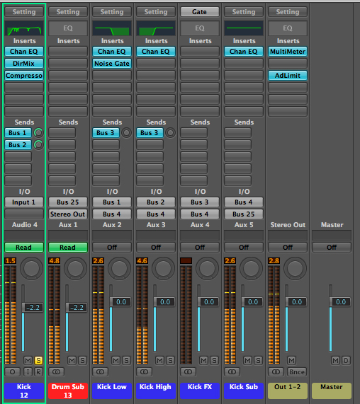
For the kick, I have set up the mix routing so the original channel has no output and the original signal is sent to both a low and high pass filter on separate auxiliary channels via bus sends 1 & 2 on the original channel. The low and high passed channels are then recombined by routing both outputs to auxiliary channel 4. Additionally, I have initiated a bus send on both de-correlated channels to auxiliary 3 where I may place some type of special effect later (such as distortion).

I have routed to the effect channel in this way to allow flexibility in the amount of signal I send to the effect in regards to low vs. high. This optional special effects channel is in turn sent to auxiliary 4 which is my kick sub-mix channel. This channel acts as the ‘glue’ and will almost definitely undergo further processing in the form of EQ and compression to more effectively shape the separate inputs into a single sound. This channel is then sent to auxiliary 25 which will be my drum kit sub-mix channel (where all of my individual, final drum sounds will be sent), which in turn will undergo further processing to make the entire kit sound as one instrument.

The kick flows from the ‘kick’ channel to the ‘kick low/high’ channels. From there it is recombined at ‘kick sub’ channel and then sent out through the ‘drum sub’. Additionally there is an optional kick FX channel being routed to the kick sub that is not presently in use.


Snare

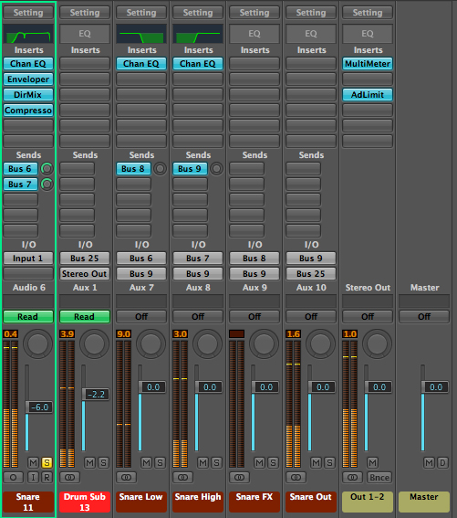
The snare has been set up in exactly the same way so as to de-correlate the sound. The only difference being the aux send numbers as those are going to be unique to the snare.

The snare follows the same routing principle as the kick, however it is sent to its own distinct aux channels for independent processing.


Bass

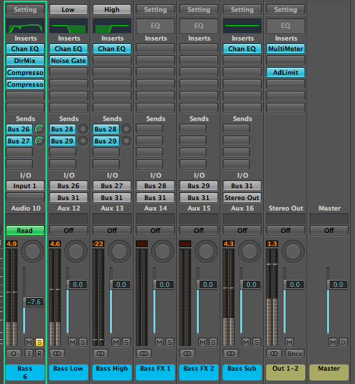
The initial bass setup is again very similar to the kick except for the addition of an extra effects channel (which may or may not be used, I just know I generally like to use a number of amp models on bass, so know to plan ahead). The bass sub-mix channel is also going directly to the stereo output rather than to a group sub-mix, as this is the only bass in this particular song. I have also added a noise gate to the low passed portion of the bass which will be set later to keep the low end tight and succinct.

Once again, the bass follows the same basic principle as above, however this time there is an extra effects channel added.


Hi-Hat

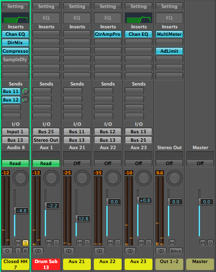
I’ve basically just set up two effects channels for the hi-hat (one with an amp on it as I usually like to add some sparkle to the hats) and routed them with the original signal to a single sub-mix channel. This is then routed to the drum sub-mix where it will be recombined with the rest of the kit.

The routing principle of the hi-hat is a basic effects send set up which then goes to the drum submix channel.


Additional Percussion

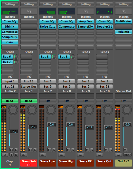
In this particular song we have a few additional percussion elements; namely an open hi-hat, clap and rim. I will route the open hi-hat in the same way as the closed hat, as they would be mic-ed and routed the exact same in a ‘real’ recording set up. I will also route the clap the exact same as the snare as it serves primarily as an accented snare hit in this song (although processing it as its own distinct entity and recombining it with the kit down the road would not be a bad strategy either.

For sake of space and time, we’ll just treat it as described for now). For the rim, I will give myself a few more options and set it up with its own unique effects channel and sub channel as it is serving as its own distinct percussive element.

The three images above show the open hi-hat and clap being routed to related elements while the rim has its own distinct routing.


Keys and Synth

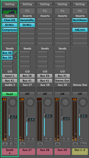
The keyboard and synth elements are pretty straight forward as well, so I’m really not going to do much more than send them to two effects sends and then recombine those sends at a keyboard/synth sub-mix respectively.

The keys and synth have basic, yet distinct routing paths.


Vocals

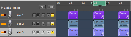
Vocals are generally pretty subjective, so really all of my decisions here are going to vary depending on the type of sound I am going for and how I want to creatively use FX. I first multi-tracked the vocal by copying the audio track twice (something you are usually always going to want to do). I then created a chorus/delay effect by pitch shifting one of the copies down slightly and also delaying it slightly. I then applied a slight pitch shift up to the remaining copy and delayed it by a different amount.

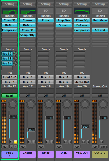
I gave it a larger width by creating a chorus effect track and widened it with the direction mixer. I also cut out much of the low end from the chorus track as you are usually going to want to place lower and main vocals toward the center and leave the higher chorus elements to inhabit the sides. I really just added the extra FX tracks (rotor & distortion) to add a bit more character to the sound and then worked back and forth a bit between the DeEsser and EQ on the vocal output to get rid of as much sibilance as possible. I then put a slight compression on it to help the vocal punch through he mix, while being careful to maintain as much original dynamic character as possible.

The multitracked vocals.

Although this image only shows the ‘Vox 3′ channel, all three vocal tracks are routed in the exact same way.


Drum Sub-Mix

For the drum sub-mix channel, I am simply going to put on an EQ and a compressor. I am putting the EQ on at this point and not really going to touch it until I am ready to go through my (more or less) final EQ pass. I am also going to mess around with the compressor, just slightly, in order to make sure the dynamics are controlled and that everything is peaking at more or less the same level with no major overs, but saving the final setting for a bit later.

At this point, things are sounding much better than when we started. we have everything acting in it’s own frequency and stereo space, so 2 of our three dimensions are pretty well covered. Next time, we will look at the depth aspect of our mix and accentuate that with careful placement of reverbs and delays before moving on to our final steps.

Download audio file (oldloop.mp3)

The initial loop.

Download audio file (newloop.mp3)

The loop as it sounds now.


Read More

Giveaway: Win 250 Die Cut Business Cards From UPrinting (x3)

Hello everyone! Today, our friends from UPrinting are giving away 250 die cut business cards to 3 lucky Psdtuts readers. If you have been around the design community for a while, chances are, you are already familiar with UPrinting. UPrinting has been offering online printing services for a while and is a frequent sponsor of design websites. We are very excited to partner with them on this giveaway. To enter, all you have to do is answer the following question.

What is the least thickest card stock available for business cards?

To find the answer, simply browse to UPrinting’s website where you can discover the answer. Once you have discovered the answer, submit it using this form. The winners will be chosen at random from those of you who answered correctly.


Up for Grabs

  • 250 Die Cut Business Cards From UPrinting to 3 winners.
  • Rounded Corners, Leaf, Rounded Single-Corner, Half-Circle Side, Circle
  • 1.75” x 3.5”, 2” x 3.5”, or 2” x 2”; 2.5” Diameter (Circle)
  • 14pt Cardstock Gloss / Matte / High Gloss (UV), or 13pt Cardstock Uncoated
  • Front and Back Printing

Rules

  • To enter, fill out this form and enter the correct answer. The answer can be found on UPrinting’s website.
  • Only enter once. If you enter more than once, you will be disqualified.
  • Follow UPrinting on Twitter of Facebook (Optional)
  • Make sure to enter a valid email address so that we can contact you.
  • Entries will be accepted until Friday, February 18, 2011 at 11:59 PM, EST.
  • Open to US Residents 18 years old and above
  • Free Standard Ground Shipping

Thanks everyone and good luck!

Read More

Top 40 Video Game Covers of All Time

Twice a month we revisit some of our reader favorite posts from throughout the history of Psdtuts+. This article was first published in October, 2009.

While video game cover art is often as carefully designed as any movie poster, this area of graphic design is rarely given much thought. In this post we’d like to change this by high-lighting 40 brilliant examples of game art and explaining why they are so darn good.

This post was compiled with help from Danny Outlaw.


40. Diablo II

While many games use a Hellish black and red color scheme in their cover art, no game has ever done this quite so well as Diablo II. The embossing used to accentuate the logo and the outlines around Mephisto’s facial (skull-ial?) features are a nice tactile addition, while the wizard style hood Mephisto is wearing and strange runes remind players that this is a dark fantasy game, not just pure horror.


39. Crysis

The washed-out blue/gray of color scheme draws attention to the points of red light on the power suit, as well as to the EA logo, which is cleverly modified for the cover. While the power-suit is distinctly sci-fi, the tropical mountain and palm-trees hint that the setting may not be quite what you expect! The colors are also extremely cold, consistent with the freezing temperatures that you encounter periodically throughout the game. This creates an interesting contrast with the tropical setting subtly depicted on the cover.


38. Resistance: Fall of Man

This game’s cover art uses the classic image of a helmeted skull in a battlefield with a new and striking twist. As you can see, the skull is thoroughly mutated, suggesting that the world is no-longer as we know it. The intricate detail in the logo design is also worth mentioning.


37. Killzone 2

While the ‘helmeted figure glaring out at viewer’ is a game art cover standard, Killzone 2 does this really well. The burning points of light in the character’s eyes are extremely intense and provide a central point of focus. This edges it just ahead of its rival in this cover style, Fallout 3.

Killzone 2

Fallout 3


36. Baldur’s Gate II: Shadows of Amn

The Baldur’s Gate game covers were all designed to look like mystical, leather-bound books with a central emblem. This demonstrated the game’s high fantasy setting while also unifying the cover art across each game and expansion pack.


35. Sim City 2000

An idyllic, colorful city. An absurd space-ship bordered with pink neon. An art deco logo. The cover is that special brand of Maxis-weird that you won’t find anywhere else. The signatures of Will Wright and Fred Haslam (the game’s designers) are a really nice touch and emphasize the craftsmanship behind the game.


34. F.E.A.R.

This cover art throws a spanner into the workings of the traditional ‘shooter’ cover. While it features action and armored, armed figures, the whole scene is overseen by the ghostly–and in this rendering, larger than life–Alma. As this image is really the iconic image from the game, the graphic designers have cleverly made this the centerpiece of the cover.


33. Star Wars: The Force Unleashed

The central theme throughout this cover design is the powerful Force-wave being unleashed by the central figure. It shapes the entire composition. The designer’s have also cleverly warped the game’s logo, as if it too is being affected by this explosion of power. While the game may not be an instant classic, the cover certainly is.


32. Age of Empires II: Age of Kings

This cover packs plenty of detail without cluttering the composition. By rendering the background illustrations in shades of the same color, focus is not drawn away from the three central figures and the game’s logo.


31. Gears of War

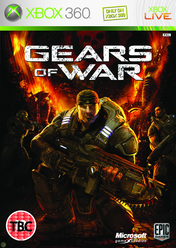
While ‘armored guy with weapon’ is a front-cover cliche, this one stands apart from the pack by virtue of its attention to detail. The characters and even the background setting are meticulously rendered, creating a rich overall image.


30. Jade Empire

The game’s regal logo and mythic concept artwork results in a cover that cleverly represents this oriental fantasy game. The cover offers a whirlwind introduction to a genre with few precedents.


29. Sins of a Solar Empire

The cover’s brilliant blue at the bottom contrasted with solar red at the top focuses attention on the game’s striking logo.


28. Elder Scrolls IV: Oblivion

While the cover art isn’t flashy, it’s remarkable for its clever use of texture. The design appears to be rendered on an ancient, fraying canvas. The game’s cover entices you to touch it.


27. Deus Ex

This cover is note-worthy because of the way it uses color and representative imagery to perfectly capture the mood of the game.


26. Alone in the Dark

While the Alone in the Dark games have been re-invented since the first debuted in 1992, the game’s covers have retained a remarkable sense of unity, paying homage to the original classic cover design with a modern horror update.

Alone in the Dark (1992)

Alone in the Dark (2001)


25. Lego Batman

The ‘LEGO’ games as a franchise have featured covers that blend established pop culture figures (Indiana Jones, Star Wars characters) with Lego imagery, adding a clever new twist to images we’re all familiar with.


24. Mass Effect

A classic space opera cover featuring the BioWare designed Commander Shepherd character. Though you could customize your character’s face with a variety of facial modeling features, BioWare’s default model was so realistic that it quickly became a representative for a new era in human realism in video games.


23. Little Big Planet

This cover fuses gorgeous hand-made elements with controlled explosions of color.


22. Contra

Another retro title, Contra is renowned for being one of the most difficult games in history. Its cover is remarkable for its clarity of message: “This is a game about being a bad-ass and shooting alien scum!”


21. World of WarCraft

The visual style of this virtual world is part of its branding, and this is portrayed faithfully in the cover art. The gold, circular frame around the central image is carried through the cover art for the expansion packs also, creating unity between each World of WarCraft product.


20. System Shock 2

The image of SHODAN, the game’s insane AI antagonist, is one that has become an icon in sci-fi/horror video gaming history.


19. Far Cry

The first installment in the Far Cry series was, at the time, a pioneer in the development of realistic natural environments in games. While other shooters focused on dark corridoors and gloomy, linear areas, Far Cry rendered a lush tropical environment. The cover conveys this perfectly and would have stood out brilliantly against the other dark and clichéd shooters on the shelves.


18. The Sims 2

‘The Sims’ franchise of games are among the best-selling in history. Here, the graphic designs have cleverly incorporated the ‘mood diamond’ (an essential part of the games’ user interface) into its logo. The figures chosen for the cover cleverly represent the key aspects of gameplay in The Sims 2.


17. BioShock

The BioShock logo is certainly one of the coolest in modern gaming, and the cover art ticks all the boxes when it comes to featuring iconic images from the game: the Little Sister, the Big Daddy, and the water that spills out everywhere. BioShock is all about mood, and this cover captures it perfectly.


16. Half Life 2

Every Half-Life fan recognizes the distinctive face of Gordon Freeman, the game’s silent hero. Though the game features many stunning visuals that could have been used to represent it on the cover, the designers cleverly simplified down to Half-Life’s most distinctive image.


15. StarCraft

Alien eyes stare out at you from the cover of the original StarCraft. The expansion packs unified the visuals by featuring different exotic faces on their respective covers.


14. Pokemon Blue

The Pokemon games for Game Boy were cleverly designed. Call the game a color, feature a Pokemon colored to match the game’s title, do the same with the background. It seems simplistic, but for the legions of kids who wanted these games it meant that you could spot who had what Pokemon cartridge from across the playground. The end result were arguably the most memorable Game Boy game covers ever created.


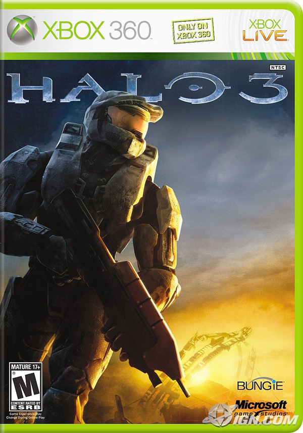
13. Halo

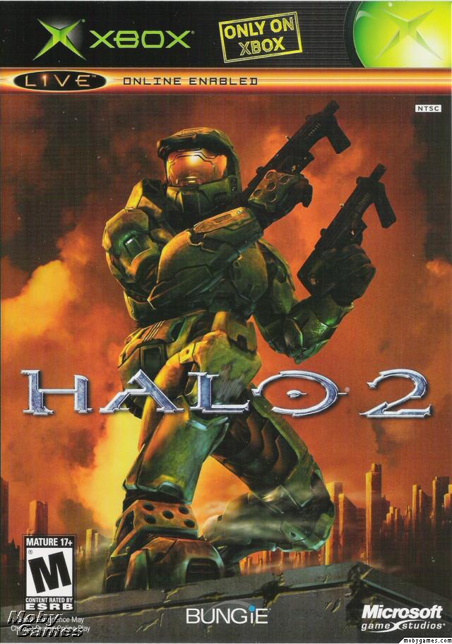
The Halo cover stands out from other first-person shooters with a lush green color scheme. This ties in perfectly with the lush green of Master Chief’s combat suit. The Master Chief character has since become a gaming icon and is the center-piece of the covers for the three FPS games in the Halo franchise:

Halo 1

Halo 2

Halo 3


12. DOOM

The DOOM franchise is remarkable for the way the games have, cover-art wise, stayed true to the original. The retro-horror logo and flame engulfed color scheme features right through to 2004′s Doom 3. By the time of the game’s released the DOOM games were widely-recognized pioneers in the FPS genre and the cover art for DOOM 3 was clever to remind us of this.

DOOM for DOS

DOOM II: Hell on Earth

DOOM 3


11. Super Mario Galaxy

The slick and vibrant graphics of this cover are true to the ‘galaxy’ setting while also updating Super Mario for a new console and a new era in gaming.


10. Tomb Raider

Every Tomb Raider game, from 1996 to 2008, has featured Lara Croft on the cover. The iconic Lara Croft image has always featured the protagonist in shorts, a singlet, gloves, and wielding two pistols — so recognizable that the designers behind 2008′s ‘Tomb Raider: Legend’ were confident you’d be able to recognize Lara even with her face obscured. The only deviation? 2000s ‘Tomb Raider: Chronicles’, where Lara is wearing some kind of freaky black body-suit. Nine years on that cover sticks out like a sore thumb, but the others have helped keep the iconic Lara image alive.

Tomb Raider (1996)

Tomb Raider: Legend (2008)


9. Final Fantasy X

Final Fantasy is one of the most successful game franchises in history. Its covers hinge around a Final Fantasy logo backed by a chromatic illustration of key themes/characters from the game. The logo is simple, yet the chromatic element provides enough interest for the game cover to feature nothing else but a white background. While there are many variations on this theme, the Final Fantasy X cover demonstrates the power of this simple logo to its best effect.


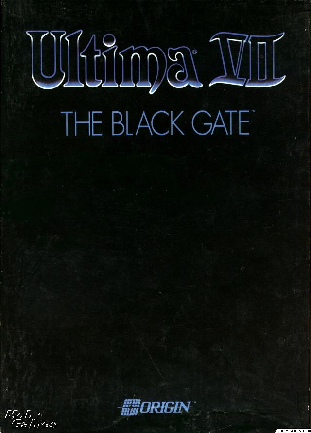
8. Ultima VII: The Black Gate

Once you’ve reached the 7th game in a franchise, people know what ‘Ultima’ means. That’s why when your game is called ‘The Black Gate’, you can afford to have a black cover with nothing but your logo on it. This brilliantly under-stated design allowed the Ultima brand to speak for itself: a clear statement of self-confidence. The game is widely regarded to be the best in the Ultima franchise and one of the best RPGs of all time.


7. Mortal Kombat

The encircled dragon logo has featured on the cover of every single Mortal Kombat franchise game ever released. It’s a brilliant icon that captures the spirit of the game. Of all the covers featuring this logo, the first is arguably the best: featuring the dragon logo, the game title and its distinctive red, yellow and black color scheme, the cover is an example of powerful graphic design that simplifies the subject down to its essential elements.


6. Metal Gear Solid 4: Guns of the Patriots

In a large franchise like MGS, it’s essential that each game cover ties together with other installments in the series. Except for the original Metal Gear Solid for PlayStation (1998), each cover has featured key characters illustrated in manga style, emphasizing the game’s Japanese roots.


5. Grim Fandango

The imagery of Grim Fandango, with its art deco style and skull-headed characters, was always going to make for a striking cover. The game’s warm colors, mysterious characters and old-school intrigues are brilliantly portrayed in this movie-poster style game cover.


4. The Legend of Zelda: A Link to the Past

The sword, shield and red ‘ZELDA’ logo have become pop-culture icons. In the limited size environment of an SNES game cover, it’s best to stick to what matters. That’s what the designers have done here. Even the background color choice — gold –helps to communicate that the game is a fantasy journey.


3. Super Mario Bros.

The first in a franchise of dozens, this cover marks the beginning of the iconic ‘Super Mario’ image. While Mario has been depicted in many different ways since this game’s release in 1985, Mario in all his pixelated glory has remained the most recognizable.


2. Half-Life 2: The Orange Box

The Orange Box cover design doesn’t feature complex Photoshop techniques and over-complicated imagery, and that’s what makes it great. It stands out on game store shelves and in your own collection due to the bright ‘safety’ orange of the plastic and cover and iconic imagery representing the content in the package: Gordan Freeman’s face representing Half Life 2, the portal symbol, and one of the distinctly recognizable characters from Team Fortress. The unique branding has also allowed Valve to tie this in with Half-Life 2′s web presence at orange.half-life2.com.


1. Grand Theft Auto IV

The legendary Grand Theft Auto games utilize a design theme that is recognizable from across the room. Covers feature split section artwork capturing the characters and scenes you’ll find inside the game, all illustrated in a distinct style by Ian McQue, lead concept artist at Rockstar North. The GTA logo with its iconic type-face has been consistent since Grand Theft Auto III. What’s special about the cover design is that it focuses on what makes the Grand Theft Auto games great: the characters.

Read More

Protests reported in Libyan city

breaking news

There are reports of violent protests in the Libyan city of Benghazi.

Eyewitnesses told the BBC that the unrest had been triggered by the arrest of a lawyer who is an outspoken critic of the government.

The lawyer was later said to have been released, but the demonstrations reportedly continued.

Pro-democracy protests have swept through several Arab countries in recent weeks, forcing the presidents of Tunisia and Egypt from power.

This article is from the BBC News website. © British Broadcasting Corporation, The BBC is not responsible for the content of external internet sites.

Farepak directors face court ban

A Farepak depot in SwindonFarepak had run a Christmas club and hamper business since 1968 before its collapse in 2006
Related Stories

Legal proceedings to disqualify directors of the failed Christmas hamper business Farepak have begun in the High Court.

The government’s Insolvency Service said it had applied to the court to disqualify all nine former directors of Farepak and its parent company.

The nine, including former CBI boss Sir Clive Thompson, will fight the action.

Farepak, which ran a Christmas savings scheme, collapsed in 2006 leaving the average customer £400 out of pocket.

It had more than 100,000 customers who signed up to spread the cost of Christmas across the year.

A statement from the Insolvency Service said the application to the High Court was made in the public interest on the grounds that “the conduct of each director in relation to the relevant company or companies makes him or her unfit to be a director”.

Farepak was not regulated by the Financial Services Authority and its customers subsequently received only about 17.5p in the pound from a government-backed response fund set up after the company’s collapse.

Last year they heard they would receive a further 15p in the pound after Farepak’s joint liquidators, BDO Stoy Hayward, announced that an action against the directors of Farepak had been settled for £4m, with no admission of liability by the directors.

This article is from the BBC News website. © British Broadcasting Corporation, The BBC is not responsible for the content of external internet sites.

US agent killed in Mexico attack

Location map

A US Immigration and Customs Enforcement agent has been shot dead and a second wounded in Mexico.

Officials say the pair, described as “special agents” shot “in the line of duty”, were driving between Mexico City and northern city of Monterrey.

An official told AP they had been attacked after stopping at a security checkpoint in San Luis Potosi state.

The attack comes as a US report says a fifth of the Mexico border, some 375 miles (600km), is not properly guarded.

The investigative arm of Congress, the General Accounting Office (GAO), said the area lacked enough border agents to stop illicit activity such as gun running and illegal immigration.

‘Line of duty’

The US Immigration and Customs Enforcement agency described the two victims as “special agents” based in the US capital, AFP reports.

The agency said they were “shot in the line of duty” on Tuesday.

The attack occurred some 200 miles (320 km) north of Mexico City, a spokeswoman for the state’s public security office told Reuters.

The agency said it was working with the state department, US law enforcement and Mexican authorities to investigate the shooting.

Though there are high levels of violence among members of competing drug cartels within Mexico, US officials are rarely targeted.

However, in March 2010 a US consulate employee, her husband and a Mexican linked to the American consulate were killed by drug gang members in Ciudad Juarez.

In July, it temporarily closed the consulate in the city after receiving unspecified threats.

The GAO report said the US had spent $3bn last year on controlling its southern border.

It said it had been able to increase the area under control by building more fences and almost doubling the number of agents from 10,000 to 17,500.

Security at the US-Mexico border has long been a hot political issue, with many in the Southern United States calling for more to be done to stop drug smugglers and human traffickers from entering the US.

This article is from the BBC News website. © British Broadcasting Corporation, The BBC is not responsible for the content of external internet sites.

Buttoned up

Mourners at Diana's funeralThe national outpouring of grief at Diana’s death took many by surprise

The death of Diana is often said to be the moment the UK lost its stiff upper lip and the British started being comfortable crying in public. But have we always been a nation for mass outpourings of national grief?

In recent years it seems Britain has become a nation of cry-babies, despite its long-held reputation for keeping emotions firmly buttoned up.

From the most unlikely politicians and public figures – including Peter Mandelson and Alastair Campbell – to just about everyone on a TV talent show, the tears are coming thick and fast.

Often, this shift towards public crying is linked with the death of Diana, Princess of Wales, in 1997. This collective moment of mourning is seen as releasing a nation from the restraints of being reserved and stoical.

But the British actually have a long history of very public outpourings of grief and their reputation for being emotionally reserved is only a relatively recent thing, says historian Dr Thomas Dixon, who is researching a history of crying.

Gushing

The public show of grief at Diana’s death is nothing new. She was one in a long line of public figures to be mourned en masse.

Admiral Horatio NelsonNelson’s death made people weep in the streets

“We’ve been a pretty weepy country through the centuries until the 20th Century,” says Dr Dixon.

“It was unusually dry in terms of tears. There was a lot of stoicism and reserve. But if we go back before the 20th Century, we have other peaks of sentiments, emotion and weeping in the late 18th and up to the mid-19th Century. There’s been more crying than you might think.

“Even in the 19th Century there were large outpourings of national grief in response to the death of famous figures.”

One comparable event was the death of Admiral Lord Nelson in 1805. He had won the Battle of Trafalgar against the French and Spanish navies, but died in doing so.

“There was a huge state funeral and there were many pieces of journalism reporting the event in the national press and many of them talk about ‘tears gushing from every eye’ and the ‘nation’s tears’, ‘Britannia’s tears’ at the falling of her hero and poems about Nelson and so on,” says Dr Dixon.

We are currently in a middle of a new wave of weeping in public life, he says. It started in the 1990s, with incidents like Margaret Thatcher leaving Downing Street with tears in her eyes in 1990. In the same year Gazza bawled his eyes out at the World Cup. Then there was mass crying when Princess Diana died.

Irritated

“We may have much more to come,” he warns.

So where did Britain’s reputation for the stiff upper lip come from?

Why do we cry?

From an evolutionary perspective, when babies cry it is about survival, says Virginia Eatough, a psychologist specialising in crying.

Infants cry because they’re hungry, in pain, because they want to be picked up and cared for. It’s about forming a bond with their care givers.

For adults it is about communicating, she says. When most people see a crying face, they feel an urge to ask what is wrong and offer help or empathy.

“That came from World War II,” says Dr Dixon. “The 20th Century is where the tears started to dry up. A time of war is no time for weeping, whether you’re on the home front or fighting the war against Hitler around the world.

“It’s at that point that this ethos emerges that however much private grief one might have, this ethos emerges that British people don’t cry because they are strong and determined and resilient and stoical.”

Social historian Dr Julie-Marie Strange says that until the mid-19th Century, it was considered fine for men and women to cry in public.

“It’s particularly surprising for us when you get Victorian men crying in public. It was deemed fine to cry at a bereavement at a particular situation, for example because of a child death. Lots of people admitted crying at the death of Little Nell in the Old Curiosity Shop [by Charles Dickens].”

Find out moreFor Crying Out Loud was broadcast this week on BBC FourWatch For Crying Out Loud on the iPlayer

Even before the Victorian period officially began, there were occasions of conspicuous public mourning, says Dr Strange.

“The heroes were Byron and Shelley, men who made careers and reputations from being very emotional.”

When Byron died in 1824, nearly 20 years after Nelson, lots of young men wore black armbands and wept openly, she says. But by the end of the century, the tone had changed so much that such behaviour was characterised as weak and intellectually stunted.

From the 1880s onwards, it became less acceptable for men particularly to cry in public, she says, partly due to the emergence of what has been called “muscular Christianity”, which emphasised a vigorous masculinity in the face of anxieties about the decline of the Empire and the degeneration of Britain as a nation.

This change was best symbolised by writer Oscar Wilde, who sneered at the grief displayed by fans of Charles Dickens over Little Nell.

“One must have a heart of stone to read the death of little Nell without laughing,” he famously remarked.

What Wilde would make of today’s blubbing, one can only imagine.


Comments

You are not currently signed in. Sign in or register.

posting

All posts are pre-moderated and must obey the house rules


All Comments (1) loading

1. hubertgrove

I remember seeing all the attention-seeking proles laying their service station begonias outside Buck House, and thinking: ‘I don’t recognise this country any more’. Was it a coincidence that we then went into thirteen of New Labour government with its appeasement, relativism and moral flabbiness?


You are not currently signed in. Sign in or register.

This article is from the BBC News website. © British Broadcasting Corporation, The BBC is not responsible for the content of external internet sites.

BHP reports record $10.5bn profit

BHP Billiton logoBHP’s profits are again at a record thanks to the continung boom in commodity prices
Related Stories

The world’s biggest mining firm BHP Billiton has made record half-year profits, and is promising to give back $10bn (£6.25bn) to shareholders.

First-half profits nearly doubled to $10.5bn as the boom in demand for commodities boosted prices of its iron ore and copper products.

The Anglo-Australian company said it expected demand to continue to rise.

BHP, which was forced to call off a merger with Canada’s giant Potash Corp, benefits hugely from Chinese demand.

The company’s chief executive, Marius Kloppers, said in a statement: “While we expect a slowdown in the growth rate of global commodity demand in calendar year 2011, the economic environment still underpins a robust near term outlook for our products.”

BHP has virtually no debt, and with the failure of the recent Potash merger has no obvious target for a new major tie-up.

Potash was the latest significant potential deal to founder in the past three years.

Shareholders will now see $10bn returned to them in a buy-back of shares.

Such a move reduces the number of shares in issue, meaning there are fewer pieces of the company, which then attract a bigger share of any profits.

A similar move has been announced by BHP’s arch rival, Rio Tinto.

This article is from the BBC News website. © British Broadcasting Corporation, The BBC is not responsible for the content of external internet sites.

Youtube if you want to…

YouTube LogoAdverts placed on YouTube videos can turn a profit for their creators.
Related Stories

It’s no secret that the last decade has been tough for the music industry. Hit by piracy, recession and falling sales, record labels have shed artists and staff in an effort to stay afloat.

Costs have been cut in almost every area, with one glaring exception.

“What people tend to forget is there is a fixed cost in breaking artists,” said Mark Robinson, vice-president of Warner Music last year.

“On average, it still costs $1million (£621,000) to promote and launch a new band.”

It’s a big figure – incorporating the price of recording an album, styling a band, marketing their music and everything else that finally, hopefully, pushes an act into the mainstream.

But is there an alternative?

A growing number of musicians are establishing their careers on YouTube, with little or no financial outlay. Last year, an unsigned band from New York even entered the Billboard charts courtesy of their online fanbase.

The Gregory Brothers first came to attention with their “auto-tune the news” series, where political debates and press conferences were transformed into miniature operas, thanks to pitch-shifting computer software.

Auto-tune The NewsThe Gregory Brothers insert themselves into news footage to duet with political leaders

Early videos saw Hilary Clinton singing about Somalian pirates, while the US Congress debated climate change as a call-and-response gospel song.

“Singing is happening all the time when we’re talking, but our brains are just too feeble to parse it as music,” explains Michael Gregory. “I can change that in the studio.”

The clips, equal parts technical experiment and political satire, became a word-of-mouth success, much to the band’s surprise.

“After playing a number of shows with 10 audience members we dreamed that, by putting videos online, we could capture double that,” says Michael.

“There’s definitely been interest in our group from record labels, but they mostly came to us out of confusion”

Evan Gregory The Gregory Brothers

“We knew at least that our mums and their six friends would watch, so we could garner at least 12 views,” adds vocalist Sarah Fullen Gregory.

The group (actually three brothers and one sister-in-law) regularly gain more than four million views every time they upload a video. Each viewer earns them money, thanks to YouTube’s partner programme, and fans have started buying their songs on iTunes.

The chart breakthrough came last summer, after they composed a song based on a disturbing news report from Alabama. A local resident had been assaulted by an intruder in her bedroom. Interviewed for a news report, her brother, Antoine Dodson, launched into a florid tirade against her attacker.

His warning: “hide your kids, hide your wives” became the hook for a propulsive R&B track, which sold more than 100,000 copies, peaking at number 89 on the Billboard Hot 100.

Antoine DodsonAntoine Dodson’s rant became a chart hit. Profits were shared with his family.

“It still feels really strange,” says Evan Gregory.

“This week, I was opening a business bank account and I was trying to explain what our small business is. And the banker was like, ‘Oh, so you guys make videos kind of like that Antoine Dodson video?’ and I replied, ‘That is in fact one of the videos that we made.'”

“It’s not much of a living, but we have one,” adds Michael. “Everything we do is independent and all of our songs originate on YouTube, so it’s kind of a new model that we’re making up as we go along.”

Advertising revenue

But they’re not alone. Over in the UK, a duo called Brett Domino have carved out a similar reputation on YouTube.

Based in Leeds, they play cover versions of chart hits on stylophones, drum pads, ukuleles and iPhone apps. Their songs are delivered in broad northern accents with a studious deadpan – sort of like a less charismatic Pet Shop Boys – and they’ve won a legion of followers.

“We did a Justin Timberlake medley played entirely on handheld instruments, and Justin Timberlake picked up on it,” says Brett. “He was a big fan of that video – and our profile’s just continued to build and build.”

Ste, the silent partner of the group, still holds down a job at a local theatre, but that’s partly because the duo refuse to exploit their audience.

“We’re making a bit off advertising on YouTube,” says Brett, “but the big money is made off pre-roll advertising, which means you have to sit through a three-minute advert before you watch our video, and we think that’s not really fair.

“So on a few of the videos, there’s little text adverts on the side, which can be annoying, but it does generate a bit of cash. We’re also making money off merchandise. We have a range of t-shirts. We’re thinking of getting some mugs.”

“People think YouTube is a place for kittens and puppies and babies and boobs – but it’s really an untapped marketplace”

Nataly Dawn Pomplamoose

Multiple sources of income are they key to surviving online, as LA indie band Pomplamoose discovered in 2008.

“I was sitting on my computer, trying to figure out how to make a better living in the music industry,” says multi-instrumentalist Jack Conte.

“I noticed I had about three plays on MySpace and I went over to YouTube and I saw somebody do a cover song and they had about 600,000 views. I thought to myself, ‘man, I’m in the wrong place!'”

Switching to YouTube, he specifically exploited the site’s visual capacity, filming the recording process and using split-screen edits to show every instrument being played simultaneously. Conte also realised the power of cover versions, picking a few timely examples to capture an audience.

“The first one that went viral was Single Ladies by Beyonce,” he recalls. “It coincided perfectly with a couple of other viral videos that were going around at the time, all with that song.

“The magic pool of events just swirled around in the right direction and led to a lot of exposure for us.”

PomplamoosePomplamoose’s “video songs” illustrate every stage of the recording process

As their reputation has grown, Pomplamoose have introduced fans to their original material – catchy, acoustic, jazz-pop. Because they operate outside the traditional music industry, they retain all the master tapes, royalties and rights in their own music.

Celebrity fans include Ben Folds, who joined the band to record a song on his latest album. Over Christmas, they were invited to soundtrack a series of car adverts.

“One of the revenue streams, a big one, is cover versions,” says Jack. “That turns people on to our original tunes, which provides another revenue stream. And then another source of income is licensing – letting a TV show use one of our songs.

“But I’m not sure that we would only be able to do one of those things. It’s only the combination that leads to a reasonable, yearly income.”

Confusion

So what does the regular music industry make of this?

“I don’t believe record companies know what we do,” says Jack.

“A lot of them say they do, and yet they still use language like, ‘Hey, let’s make a viral video.’

“That’s a silly thing to say. It’s like saying, ‘let’s make a smash hit movie.’ You can make a movie and it either wins an Academy award or it doesn’t. It’s not something you can seek out.”

Evan Gregory agrees: “There’s definitely been interest in our group from record labels, but they mostly came to us out of confusion.

“They saw a song on the Billboard charts that they had nothing to do with and they said, ‘How did you guys do this without any help from us? Can you tell us how to do it so we can push you out of the business?’

Pomplamoose and Ben FoldsBen Folds enlisted Pomplamoose to record a bonus track for his last album

“But in the end, we haven’t really found a model that will work for us on a major label. That’s not saying it can’t be done, we just haven’t done it yet. So we will continue to be independent for now.”

Brett Domino suggests the YouTube model is too capricious for a major label to pursue it.

“We certainly never had a business model – and if we’d set out and tried to do it, we probably wouldn’t have succeeded,” he says.

“But I’d certainly encourage people to make videos on YouTube and make their own songs, and upload them and promote them the way we have done. I just wouldn’t expect immediate success.”

On the contrary, says Pomplamoose vocalist Nataly Dawn. “We’ve recommended this to a lot of our friends, and a several of them are making a living out of it now.

“People think YouTube is a place for kittens and puppies and babies and boobs – but it’s really an untapped community and a marketplace.

“It’s hard to communicate to people who are attached to the old model of the music industry, but our model works for musicians who want to create their own music and keep that music for themselves.”

This article is from the BBC News website. © British Broadcasting Corporation, The BBC is not responsible for the content of external internet sites.

From Oscars to Muppets

Amy Adams at the BaftasAdams was born in Italy to American parents who raised her a Mormon

Actress Amy Adams may have missed out at the Baftas, but there is still a chance The Fighter could win her an Oscar.

One minute she is trading verbal jabs with Mark Wahlberg and Christian Bale in boxing biopic The Fighter.

The next she is sharing the screen with Kermit the Frog, Miss Piggy and the rest of the fuzzy cast of the all-new Muppets movie.

It must be fun to be Amy Adams, if a little disorienting.

Last week, for example, she travelled to London to attend the Bafta Film awards before going straight back to America and her nine-month-old daughter Aviana.

The 36-year-old was nominated in the best supporting actress category – a prize that Britain’s Helena Bonham Carter received for her role in The King’s Speech.

The occasion was unusual in that it did not pit Adams against her Fighter co-star Melissa Leo, against whom she will compete on 27 February for an Academy Award.

“I don’t know why Melissa wasn’t nominated,” says the actress, who was previously up for a Bafta in 2009 for her supporting role in Doubt.

“I think she’s fantastic. We have fun together and we had fun on the film.”

Adams admits Leo, 50, has been doing “pretty well” at this year’s prize-givings, having picked up gongs at the Golden Globes and Screen Actors Guild awards.

The smart money is on Leo to be recognised on Oscar night, though Adams – previously shortlisted by the Academy for Junebug as well as for Doubt – may yet pull off an upset.

“I came on [The Fighter] at the last minute and it’s extremely validating,” she says of the nomination.

“It’s always good to be a part of a film that’s received in this way.”

Amy Adams with Mark Wahlberg in The FighterIn The Fighter Adams plays a barmaid who becomes the lead character’s girlfriend

Adams certainly makes an impression as Charlene, the tough-talking girlfriend of Wahlberg’s pugilist protagonist Micky Ward.

So does Leo as his domineering mother Alice, while Welsh-born Bale has been tipped for Oscar glory himself for playing Micky’s crack-addicted older brother Dicky.

What of Wahlberg, though? While Adams, Bale and Leo have been singled out for praise, his unshowy portrayal has been largely sidelined.

“I do think that sometimes quieter performances don’t get the same kind of attention that the louder performances get,” his co-star admits.

“It just goes to show Mark’s passion for the project that he has been supportive all the way through of all three of us getting the attention we are getting.

“Mark is nominated for an Oscar as a producer and I know that means a lot to him,” the actress goes on.

“So I don’t feel from him that he feels he is missing out on anything.”

The same might be said of the real Charlene, who – unlike Micky and Dicky – has studiously kept herself out of the limelight.

“That’s more of her personality – she stays in the background a little bit,” says Adams. “She was at the premiere but she doesn’t draw attention to herself.

“She said she liked the film but she did not like that I was wearing so few clothes. She did not enjoy that.”

Amy Adams with Melissa LeoBoth Adams and Leo are nominated for this year’s best supporting actress Oscar

As adept at light comedy as she is with heavy drama, Adams’ eclectic CV contains roles in the Disney fantasy Enchanted, race-car comedy Talladega Nights and culinary fable Julie & Julia.

She will soon be seen in On the Road, based on Jack Kerouac’s seminal novel, while there are plans afoot for her to star in a biopic of tragic rocker Janis Joplin.

“Hopefully it will be able to capture her truth,” says the actress. “That’s what you always hope when you’re playing somebody of note like that.”

And then there is The Muppet Movie, a new big-screen vehicle for the anarchic puppets that sees them return to the old theatre where they presented their classic TV show.

“I don’t know if it’s because I grew up watching them or if it’s because I’m a bit nutty, but I completely believed them as my co-stars,” Adams says of Jim Henson’s legendary creations.

“I had wonderful moments listening to them and watching them where I relived parts of my childhood.”

The Fighter is out now in the UK. The Muppet Movie will be released on 17 February 2012.

This article is from the BBC News website. © British Broadcasting Corporation, The BBC is not responsible for the content of external internet sites.
Consumption focus urged for UK

Richard BlackBy Richard Black

Laptop computer displayThe urge to consume is all around but must be resisted, the commission says
Related Stories

The UK needs to consume less and share people around the country more equally in order to tackle its environmental problems, a report recommends.

The Royal Commission on Environmental Pollution says bits of the country, notably southeast England, are under pressure on waste and water use.

But simply aiming to reduce population size will have little impact, it says.

This is the final report from the 40-year-old commission, which is being abolished under spending cuts.

“If we act now, we can have an effect over 50 or 100 years – it’s not an either/or”

Simon Ross OPT

Its two-year investigation looked at issues such as water supplies, waste, urban pollution and wildlife.

The report, Demographic Change and the Environment, concludes that increasing consumption, the concentration of population in areas that are ill-equipped to supply its needs, and the trend towards single-person households – which increases energy demand – all matter more than the simple size of the UK’s population.

“The increase in affluence has a much bigger impact on the environment than simple numbers,” said Sir John Lawton, the commission’s chairman.

“If you’re going to have sustainable development, then to a first approximation if you grow the economy by 2.5% per year, you have to improve resource use efficiency by the same amount, otherwise you end up consuming more.”

The UK population reached 61.8 million in 2009, and is forecast to climb by another 10 million by 2033.

“The Optimum Population Trust (OPT) continues to argue that the UK’s population is too big and we need to reduce it to the point where we’re self-sufficient in food – to about 30 million or thereabouts,” said Sir John.

Landfill siteSoutheast England is feeling the environmental pinch more than any other region

“We’re saying, to be perfectly blunt, that that’s nonsense – it’s the wrong answer, and in any case you couldn’t get there by any civilised means in a democratic society.”

The OPT advocates policies that lead to the UK population first stabilising and then decreasing “by not less than 0.25% a year… by bringing immigration into numerical balance with emigration, by making greater efforts to reduce teenage pregnancies, and by encouraging couples voluntarily to ‘Stop at Two’ children”.

But the commission’s projections suggest that even fairly large changes in the rates of birth, death and net migration would not make a significant dent in the national population by mid-century.

However, Simon Ross, the OPT’s chief executive, said it was important to take a longer-term view – which ought to include government policies encouraging people to choose to have fewer children.

“Climate change, sustainability and resources are a long-term issue as well as a short-term one,” he told BBC News.

“If we act now, we can have an effect over 50 or 100 years – it’s not an either/or.

“Would it work? We don’t know, because there’s never been that campaign in the UK as there has been on waste or car use, for example.”

The commission concludes there is unlikely to be a stark limit to growth in the more pressured regions – instead, maintaining services such as clean air and water would get more and more expensive.

“I am worried that shining a light into those murky areas of public policy isn’t going to happen”

Sir John Lawton Royal Commission

Meanwhile, parts of Scotland and northern England face the social pressures of a declining population.

The commission said the government’s plans for localism did not adequately address how such pan-regional issues would be addressed.

“We’re not saying localism is a bad thing in principle – it’s a good thing,” said Maria Lee, professor of law at University College London.

“However, there are questions about how local decision-making feeds into national and regional and global objectives; we’d expect government to deal with these issues, but at the moment it’s not clear how they’re going to deal with it.”

The commission says spending money to attract people to areas of abundant resources might prove more economic than paying ever greater sums for water and waste treatment in southeast England – and that the government should study those figures.

The Royal Commission on Environmental Pollution was established in 1970, two years before the first UN environment summit.

But this will be its last report. It will cease to exist at the end of March, a victim of government spending cuts.

“The government’s perfectly entitled to make that decision – I happen personally to disagree, and I’m on record as saying I don’t know quite where the government is going to get the advice the panel has given it over the last 40 years,” said Sir John.

“We try to shine a light on issues that the government has been neglecting and where it doesn’t even seem to realise it has a problem, and I am worried that shining a light into those murky areas of public policy isn’t going to happen.”

The government has indicated that it will not formally respond to this report, as it has to every other one in the commission’s history.

This article is from the BBC News website. © British Broadcasting Corporation, The BBC is not responsible for the content of external internet sites.